Transcripts
1. Intro: Are you bored with
your art style? Do you want to try
something new? I've got just the idea for you. Go. Hi. I was in
Barcelona recently, and my wife
challenged me to draw La gradaFamia in five
different styles. First, I refuse because I do two different
styles, maybe, tops. But then I thought,
This could be fun. This challenge could
be a way for me to get out of my
comfort zone and try something new and maybe even find something
I might love. Hi. My name is Fati, but
everybody reads it as faith. If you did the same mistake, you owe me a comment
in the discussions. I'm a watercolor artist, a drawer, and an online teacher. I have 14 online classes
focusing on drawing, painting, and even productivity. Some even call me a top teacher.
Did you know that check? In this class, I want to show you that if
you look for it, inspiration is
everywhere, and there is no one answer when
it comes to art. And more than that,
you don't have to reinvent the wheel
every single time. A famous building like
La Sagrada Familia was painted over and over
again by Cantos artists. You can follow their footsteps and arrive at a
totally new place. Art isn't created in a vacuum. We will start the class with a little stroll through Barcelona. You will see the city
through my eyes, and we will search
for inspiration. After that, I will
analyze the inspiration I found in this city and
create a game plan. And after that, I will paint LesagraaFamilia in
five different styles. Through the process, I want to give you your
creative licenses to explore your own style and voice by painting
the same monument. This is an exercise
to make you come out of your shell and see what
else is available out there. During the class,
you will learn how to traditional pencil
sketching and inking, seeing the negative space and
painting the full shapes, continuous contract drawing
for expressive results, painting with watercolors
realistically, using brush pens for drawing, as well as creating washes, creating flowing
watercolor washes. Simplifying your subject
to fit your medium. I'm excited to share
this class with you because first of all,
Barcelona is beautiful. If you have never
been there, you might book a ticket
after this class. If you have been there, you
know how beautiful it is, and it wouldn't hurt
to see it again. You know what I'm
talking about, right? Jack, you have no idea. Secondly, I find this
challenge highly stimulating, and I want you to have
the same itch to try something new and make you
go out of your comfort zone. This class is for anyone who loves drawing and painting
with watercolors. If you're a beginner,
you can definitely pick a style and
paint alongside me. More advanced students
can challenge themselves with a style that is not
similar to their own. I'll be using watercolor,
watercolor paper, pencil, fine liner pens, brush pens, and acrylic pens
during the class. Your class project is to paint La Sagrada Familia in
two different styles. You can pick whichever
style you are going for. Alternatively, you
can do all five of them if you want to become
my favorite student. I'm super excited to do this. Let's go to Barcelona. But first, we need to talk about your class project
in the next video. But after that, let's go to
you guessed it Barcelona. Jack, can you believe
it Barcelona?
2. Class Project: Your class project
is to do what I do. Paint sagrada familia in five different styles.
No, not in five. Again, your class project
is to do what I did, paint Les agrada familia. If you have never heard
of this building, it's like the crown jewel
of Barcelona, Barcelona. Is that how people
say, Barcelona, I went to Barcelona
for the weekend. I'm going to say Barcelona. It was designed by the famous
Spanish architect Gaudi. Gaudi is famous for his
unexpected and flowing designs, and you can see his building speckled throughout the city. This building, however,
basilica, kind of a church. I don't know the difference.
Was his highest achievement or at least an attempt because he didn't manage
to finish building it, and in fact, the
building is still under construction since 18 82. Well, I thought my
procrastination was bad. So even if you
never heard of it, it is a remarkable building, especially when you
take into account it was conceived in
the 19th century. When you have a closer
look, it is super detailed. So for that reason alone, it is a great subject
for a painting. Like I mentioned before, I will do this in five
different styles. You can watch it all, decide which styles you are going for, and go back to that style
and draw alongside me. So your class
project is to paint this architectural wonder in
at least two different ways. You can choose which
two out of the five. I would recommend
you choosing as far away as possible
from your own styles. I would be thrilled if
you did all five of them. I would have goose bumps. Jack, Jack, can you see?
Even just a thought of it. Later on, you can
take it up a notch, and when you're on your next
trip or even in your city, you can do this exercise of
searching for inspiration, which we will talk about
in the next lesson. You can pick a building
that is important to you, see how other artists did it, and decide to go
down their path. And if you do, I would love
to see what you came up with. So this is your class project. Now we can finally go
to Barcelona Barcelona. Barcelona, baby.
Check. Let's go to Barcelona. Oh.
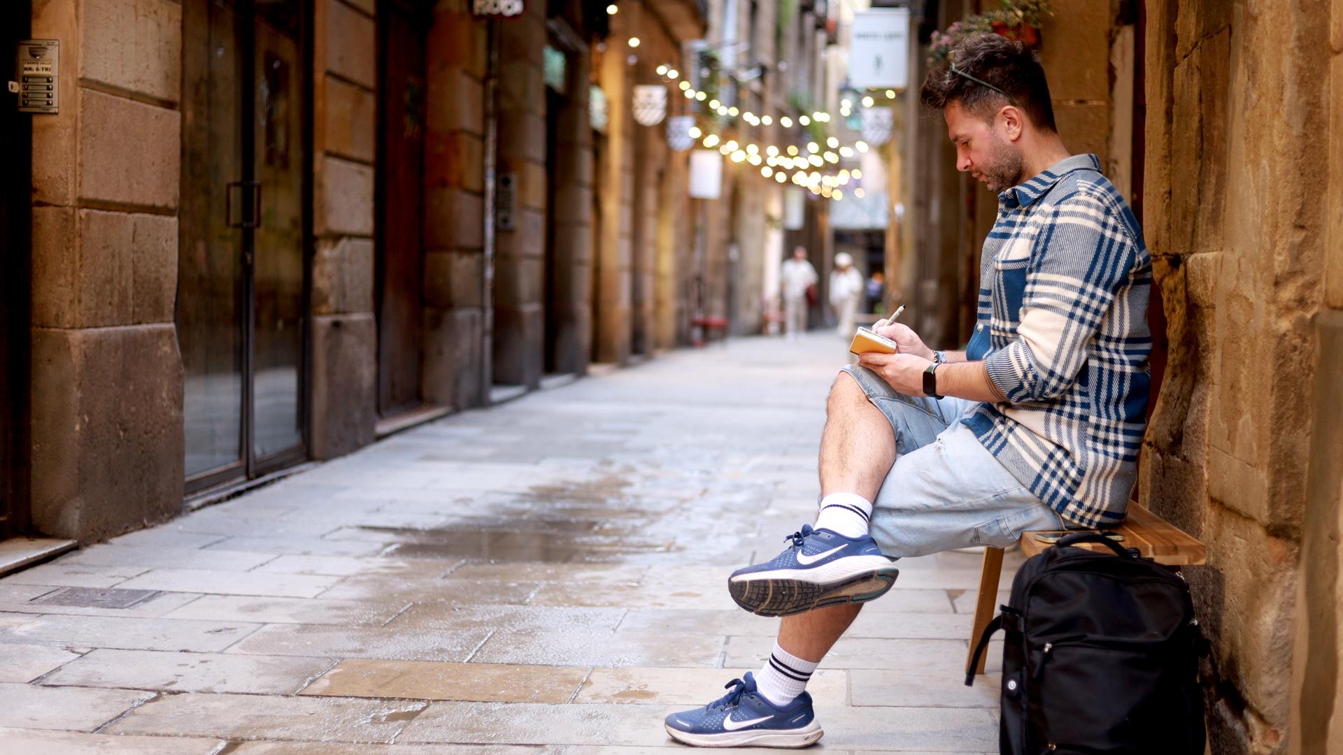
3. 1st Day in Barcelona, Finding Inspiration, Analyzing & Creating a Game Plan: So we were in Barcelona
for three days, and this was just after I
published my NIF droving class. I literally press publish
around 7:00 P.M. On Saturday, started packing my backpack, and at 4:00 A.M. We got up so we could make it
to our 630 flight. And to be able to do this, I pulled a whole night the day before, worked until 4:00 A.M. So I could finish the class and go on whole day
with a clear mind. As you can imagine, I didn't want to think
about work at all. And my wife was asking me earlier if I will
recall a new class from Barcelona because I like making Glogoses like the one
I made from Italy, and Barcelona is
a beautiful city. Was saying, I don't
know. Probably not. I'm too tired. We
arrived in Barcelona, and it was beautiful
as expected. I started recording short
videos immediately, and my wife told me, I thought you weren't going
to record a new class. And I said, Just in case, with a smile on my face. If I remember correctly, while walking towards
AsagraaFamilia, my wife asked me,
Why don't you draw LasagraaFamilia in
five different styles for your class from Barcelona. I said, I can't do five different
styles. I maybe do two. Then I thought, That's
actually not true. I can't do anything.
We continued walking. Arrived at La Sagrada
Familia, and of course, I was awestruck with the size and the beauty
of the building. It started raining and I saw in the distance a sign five guys. I said, This is that
burger joint from the US I always hear
about from comedians. My wife said, Come on, then, let's get you a burger. Didn't you deserve one
with all that hard work? She was referring to
my jump chart and my big reward if I ace 15 days in a month.
And she was right. I did deserve one.
So we went in to get some burgers and also
to hide from the rain. The burger was good,
fries were plenty. So we were there for a while, maybe not the best choice, considering we
were in Barson and we were eating at
an American diner. We went out finally.
It was still raining. We went to the other side
of La Sagrada Familia. We realized that this must have been the main side
we always see on the photos and started laughing at how we were taking
selfies at the back. Through all that, this idea was jumping around in my
head from wall to wall, La AgradaFamilia,
but in five styles. We escaped from there
because it started raining heavier and found
some cheap raincoats. We walked all the way to the
sea, and every now and then, I was telling Kasha
a new idea that popped into my mind
about this new class. And I started seeing
inspiration everywhere. This was a famous building. As artists, this
includes you too. We all stand on the shoulders of those who came before us. We don't need to reinvent
the wheel every single time. A building like La Sagrada
Familia was drawn and painted over and over and
over and then some more. If you are visiting
a city and you want to document this trip
in your sketch journal, but don't know what to draw
or in which style to draw, just walk around the city and
inspiration will find you. We visited art shops,
gift shops, cafes, from magnets to
the garage doors, this building was everywhere. Any of these drawings paintings could be
your inspiration. Whichever speaks to
you or makes you say, Oh, I like this one. Go with that one. This is not stealing, it is not copying. Whichever art style you are
taking as a starting point, imagine that the artist
carved a path with his or her painting and you
are going down that road. R. So I decided to do that for this class. I will paint La Sacre de familia in five different styles. Remember, I will also go
out of my comfort zone. I will also try something new. I will also do some of these
styles for the first time. If I can do it, so can you. These are the lessons I want to leave you
with this class. If you look for it,
inspiration is everywhere. If Fab can do it, so can I. Mm hm. And next
to these lessons, we will come up with five
different paintings. You can try all
five, pick three, do two, or even just one. Yes. After coming home, I looked through all the
footage, all the photos, all the videos, and tried to find all the
inspiration I could find. I think in total, I managed
to find 15 of them. And this was already plenty. I put them all together on one page on Photoshop
and tried to pick five styles more like three because the first two are going
to be my styles. But try to decide on five that I'm going
to do for this class. So this is what you
see on this page, all the different styles
I just collected from the city that this was just walking around and looking
around in the shops. So first of all, this on the very
left one and two, they look like my traditional and my no for Sketch
journal style. So I mark them as the ones I'm going to do,
number one and number two. After that, I looked at these ones look like watercolors and very
realistic looking. So I think this is close
to my first style. So I just eliminated them. After that, I decided I'm going to go with
this number three. I'm going to go with the
pink one as my number three because first
of all, it's pink. Why? I wouldn't think of that. So that kind of reached out to me as an interesting
style choice. And also, it's nighttime. So this will be my third
style. I'm going to try. And I eliminated the one underneath because it
was without color, and very simplified version. I really liked
that illustration. I decided it's not
for this class. And these three looked similar, like a simplified
version of the building. And now black fine liners is very kind of no high
contrast paintings. And among them, I decided to go with this one and
eliminate the other two. And this became my number four. And as number five, those remaining two are
the candle holders. I decided to go with
one on the top, because it was kind of a sunset. Look, I decided that
there is one daytime, one nighttime, and then another
one will be the sunset. And again, it's a
simplified version of the building,
but there are like, the details were put with
a thick black marker, and I found it interesting, so I will try to do that. So to summarize, this
is style number one. Let's call this
traditional my own style, pencil sketch, ink
with fine liners, watercolors, and very realistic, like whatever you
see you're trying to put on the page kind of style. I don't know how
else to call it. This is my own
style. This is how I learn drawing and
this is how I do. And style number two,
no effort style, again, my own that I do you know from my no effort sketch
journals, no pencil sketch, continuous contra drawing
and quick watercolors, and the results are
very expressive. And style number three, I decided not I decided to. I had to decide how I'm going to approach to these styles, yes, thinking the
skill sets I have and the supplies I
have art supplies. Because of that, I decided this is going to be
all watercolors. Pink color, nighttime. I will colour the sky later. No fine liner pens. I'm not going to use black pens, and there will be
acrylic white flowers and also the sky like
stars and moon later. Style number four for this one, looking at it, I decided, Okay, maybe this could be a
challenge for me not to use watercolors because
that's a medium I use often and I am
comfortable with it. I'm going to use all
brush pens for this one. And it's a daytime blue sky that it will differentiate from the previous one this way. And no fine liner pens again. Again, I'm not using
my favorite form of favorite tool to draw. And it's a very low
contrast building. It's like a brown
for the building, darker brown for the details, so I will try to keep that. And finally, style number five. This one, again, looking at it, I decided I will combine
the two together, and there will be a
different this kind of sky that you can
do with watercolors, but you can't go
around the building. So you need to do this
first. I thought this will be the challenge
for this style. There's a sunset that was one of the reasons
why I chose it, and I will do a flowing watercolor wash for
the background, and I will use thick black
pen for the details. And to color the building, I will use brush
pen, so it will be combination of watercolor
and brush pens, this class. But I will use two different colors to
create the sunset feeling. And this will be the
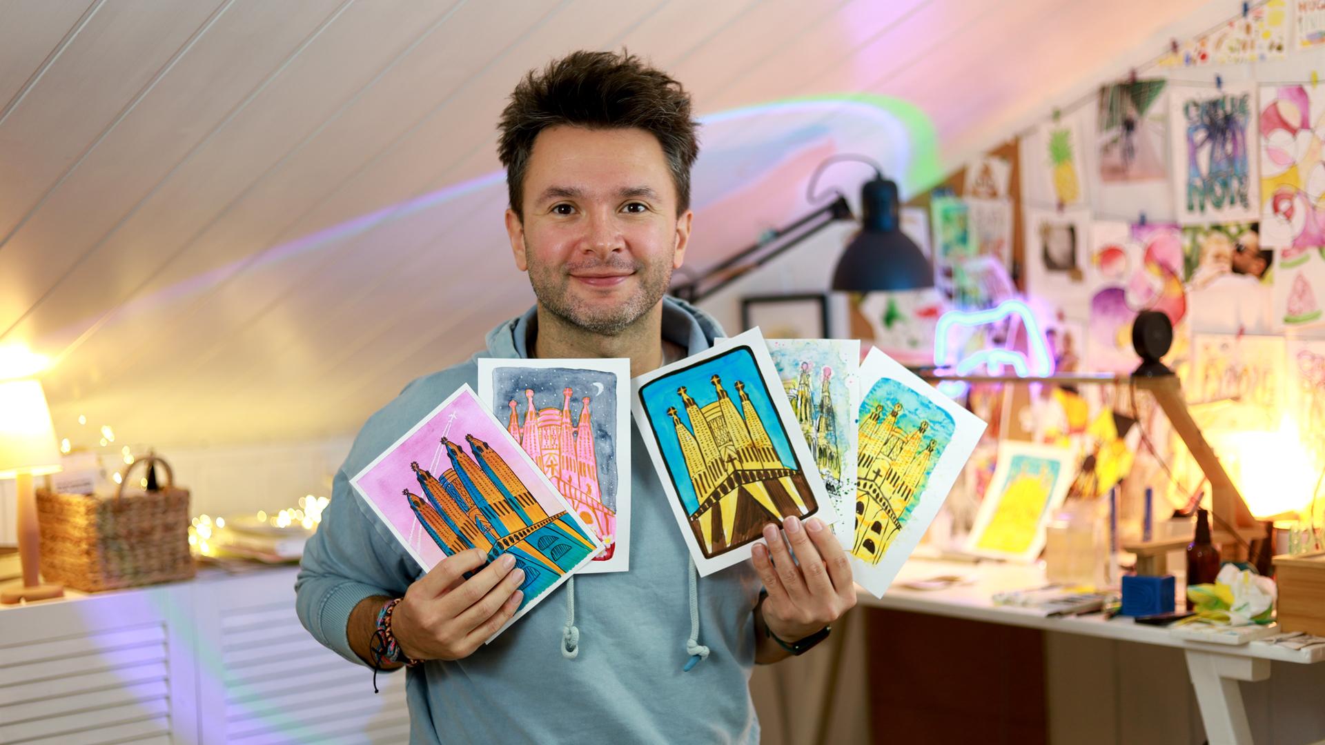
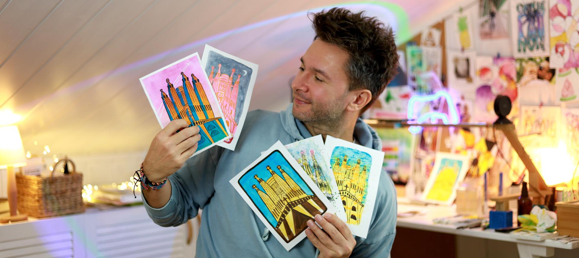
style number five. So this is the five
styles I decided after analyzing all
the inspiration I found from Barcelona, and this will be
challenging for me as well, and I hope it will be
challenging for you, too, and I hope you will
enjoy this challenge. That's the most important part. So if you are ready, let's
go with the first one. See you on the first
challenge or first style. See you in the first lesson. D. D.
4. My Own Style: Pencil Sketching, Proportions & Perspective: So, first project
is my own style. And to do that, I will
pencil sketch this building. I guess this is the most straightforward
project among all five of them. This is basically seeing the building and trying to
put it on the paper as it is. But of course, I think
in one of my classes, I don't remember
which one anymore. I was telling that
the difference between what you are
receiving and what you are able to put on paper becomes the kind of artistic difference, and of course, it's not
the same and I always like more what I end up on the page with than
the actual building. Like a very regular
building could be very beautiful and you might want
to put it on your wall. But among the five, this is the most
straightforward one. Now for this one, I want to
have how to approach this. I want to have kind of
a frame around this, but the frame will go around. And I want the towers
to peek through, like, break through that
frame I'm going to create. So I think let's say the towers will finish like
this, somewhere around here. So I will make this. And it's not going to be a straight frame two that I'm later going
to do with this ink. Kind of let me show it to you. Something like this. And then I'm going
to decorate the bit. And it will have this
kind of a frame, and the building
will be inside it, and there will be blue sky around
surrounding the building, but the towers
will peek through. So how do we do this? First, I look at the big shapes, what can I take in here? When I look at the whole
image, whole building, that this cross looks like
pretty much in the middle. But my middle is not the
middle of the frame, but let's say the buildings will finish somewhere here, so here. So I guess that will be
the cross and from here, This should be even
steeper, I think. Like this. This is a good
thing about sketching, we can put something
on the paper and look, Oh, okay, this didn't
work. Let me try it again. And I guess it's like
if it's two X here, it's one X here,
something like that. So I'm going to 2x1x. Did it make sense? I thought
if it's 2 centimeters here, I put 1 centimeter here
to get a similar shape. And under here, There are those big, very impressive impressive
looking columns. And where do they
end up they end up? Something like this. Maybe even wider. Okay. Not too bad. And from here, there's there's another one that's under
the second Towers. And in the meantime, sketching I can spend
hours sketching something, trying to make it perfect, and I will try not to
do that to you guys. So I think I'm trying to
keep it symmetrical now to the other one I drew,
something like that. So this is the bottom part. I'm just looking
around to see where my where my eraser was. And because I have a
whole recording setup, I don't want to
knock anything down. There are lights around me and the camera is standing
in a balance. I have to be very gentle. Okay. Now, from here,
where do we go? I think this main tower will
finish under the frame. But this tower will will
go all the way up like this and end up here. And this tower should
come all the way. Look, it's the same
alignment with this one. So this should come even
more from here, I think. Okay. And the second one. No when I compare the top of the tall towers
and the one behind, these are like, if this is
three X, this is one X. So it's like one third down. And it's kind of keep it close. Because of the way I took this photo very
close to buildings, really looks like a triangle
actually going to the top. So from here, I think it's
separating more like this. Now this is always the difficult
part because not this. I'm just correcting
something here. When you draw something, you have to draw the
symmetrically on the other side. Maybe that's why
I actually grown more fond of no effort to get tolling because I don't have
to worry about any of these. So I think it's
something like this. And it needs to end up here. And this needs to end
up about this here. Okay. And the second one here. Maybe a closer. Because I want to
have this triangular affected like we had here. Something like this. And
there's this big tower behind. And this tower, okay, it's I like it. I think the general
shape is there. As you can see, I went for the big shapes here
that looked at this triangle at the bottom, and then at these
cone shapes for the towers and the one behind. And something like that. Yeah, this makes more sense. Then later on, I try to
look at the objects and relation between each
other to decide where they're supposed to end up. This one comes like
this one. Like that. Okay. And now quickly
that in here, It's like over here, there are those decorations. And this is like, I feel like quarter of the way, there are those writings. And again, they don't
go all the way down, but there are these openings. Okay. Sorry for being so quiet. I'm concentrating on the
painting at the moment, trying to see all the
details that I need to see. Okay, I think it's
something like this. And this cross that I put
here is actually much bigger. That It has a very intricate
geometric shape with many sites. So
I'm trying to capture that at toment Okay. And O here are the
same openings. It is really amazingly
detailed this building. Like, I think, whatever
effort I put on to justice to how pitiful and how detailed
it actually is. Okay. And the ones on top, I see, actually,
they come like this. And there's one bridge. And then there is under this crown, There's
another bridge. I see this building behind. There's okay, this
is important detail. There's another
bridge here, hope. And just about cross. And there's actually a
character sitting on it. I called the
character. I'm sorry. I don't know what it is. This part is actually
covered with scaffolding. You can see There's the
security fabric over it. And this building has the two tower at the
back has several sides. It's more here and here. And here there are this triangle openings again into the tower. Crying all the way down. I'm not going to get
them exactly right. I'm just again, this is an
impression of the building, even though I'm trying
to do it realistically and keep the proportions
and perspective. Again, I have to pick my battles and decide how many
details I can take. In here, there is the I see this gate entrance to
the place, I guess. And above that. There's like a
shelf with statues, and above that, there is
another shelf with statues. Now this is reaching
much higher like this. And here's another shelf. And here is another shelf. I call them shelf because I don't know what
else to call them. I apologie I apologize
for my ignorance. Um, now let's ink this baby. Mm
5. My Own Style: Inking with Fine Liners & Adding Details: Now let's ink this baby. Where do we start? Let's
start from the cross again. So many details. This won't be easy to bring
together. I can feel. That makes me a bit stress because I'm recording
this. It has to work. In normal life. I don't
have this problem. But hopefully it
will be all fine. And again, this is a drawing. It doesn't have to be a
perfect representation of whatever you're drawing. You have a camera for that. Okay, now I need to
create these steps. Here I see this shape. I think this is the
beginning of it. It will help me decide the rest. And here I see P
with a X behind it. Two more shapes. This is now two detail. I'm not going to do for
every single one of them, but I want to do the first one. I'm looking roughly to
go through the tower, one, two, three, four, five of them, one, two, three, four, five. So this is more or less
the same proportion. I'm okay with that. Now, I will try to keep the
same for the other side. This diagonal I drew
at the beginning to as a general shape of these decorations
above the columns. It's guiding me, and
that actually helps. And at the bottom, this is, like, thankfully,
it's more straight. Before I go any further, I want to draw this frame
because that will stop me. In some places
when I come to it, that will be my border. I'm not going through the towers because towers will
be peeking through. Like that, the frame
is in place, and I'm going to give some
texture to it this way. Again, you can do the same
or you don't have to. I've actually seen this from
one of my students projects, and I liked it very much. How it looks so I want to
bring it to this project. We should I continue?
Let's do it from here. Her name is Bianca B the
student I was talking about. Almost done on this side. We started. Let's finish it. Almost there. There it is. And now we
can go back to this gray, very impressive
construction under the cross that I immediately can see this was
supposed to be taller. But again, this is a drawing
a photo a photograph. I feel the need to
simplify this a bit. This is not easy at all. Actually, it's not
true. It is easy, it's time consuming and I don't want this to get too long and too
boring for you guys. And I don't like speeding
up the videos either because then it becomes
something you have to sit down, watch rather than do it with me. I'm trying to avoid that. And here we are. So under
not every every second. It goes down like this. And then in between them, That's how the
columns are formed. When you look closely, you
really start picking up so many details and see
how intricate actually is, and there's much more to it
that I'm not able to take on for this painting drawing. This goes like this way down. Okay. Almost there. Now the other side I'm getting too close to here, I need to have the columns
here. I need to be careful. Okay. Okay. Back to creating the columns. How was it that it was from every These first ones have asteris on them. After that I see S U N E R A Z, a NUS, and I don't I won't
continue after that. R E X. And two asterixis, and
then I see I I think DNA, and after that, there's
a tree I can't see it. Oh. Okay. Back to from this one
and every second one. That's how these small columns are formed in close
inspection. And then In between them, there
are these round shapes that form this very
characteristic looking columns. In my interpretation,
they turned out more round but in the original, they were more they were taller. But this is the thing I always say that it doesn't have to be exactly the
same. That's one thing. The other thing is, the
more you put details, the better it gets, even though that you
might make a mistake with something might not be happy
with how you capture it. But just keep adding details
and it will be okay. Okay, now this part is done. I think I will do the
top first I want to do. So I will start from this tower. I'm looking at the details
from my phone in the meantime. You can download this. And you can also zoom in and have a
look closely how they look. And oh, I didn't wrote
the bridge on this side. Now, when I look
at it, this bridge was supposed to be lower than the main tower
behind around here. So I will correct that. And here is not visible
second bridge anyway. I just on side I was a bit
out of the camera there. Sorry about that. And now
this side is coming down. I switch to the other side. Again, I'm trying to decide how much details I
can take with me. Decide I'm looking. This is important to
keep them same level. So I just skip ahead to be able to
finish in the same place, same height, both towers. And then this same
goes for this one. And here, again, there's the cross decorations around it. Here there's another
cross. Okay. I think the general shape is turning out to
be pretty good. Um start these decorations again. Okay. Now let's bring them down. So now I'm going to this bridge, I realized it was
in the wrong place, looking at the height
of the main tower. It should be around here. I'm going to add that
like this one here. And the two towers join here. On the other side.
That's also ton. Now, and I'm gonna ignore the that there's a
second bridge between them. I think this is enough detail. Let's quickly do the main big tower behind. This is the scaffolding part. And here's the at the
bridge here there was a someone was sitting here. That's also done, and
I will put the details of the tower behind
that there is this Now, looking at the shape, I'm moving this line from my sketching that I think this is more accurate now with everything
falling into place. I'm throwing the windows again. But it is really time consuming. So I guess this also
plays a role in your preparations for the
type of art you want to do. If you have time and if you're enjoying this
because it is a very, um, what is the right word? Very relaxing activity. So you might just enjoy
doing this and spend lots of time on it and make it better and better every time. That's one way to go. But if
you are more time crunch, but still you want to use a little time you
have to be creative, you might pick something
like no effort, sketjournaling, and that style. This one, I feel the
same that it's more time consuming and makes
me a bit nervous, especially I'm recording
a class with this, and it goes into everything
from editing to how people are going to watch
and consume this class. That's also important.
But other than that, actually, I'm really enjoying
doing this detailed work. That once it's done, it has a different
kind of satisfaction. Now I'm adding these openings, the side of the towers. I moved to the other side. Okay, that's also done. What else? Let's now try to speed up a
bit as a challenge. Another challenge.
Challenge on top of challenges,
multiple challenges. I will try to at these writings. When I add this, I
usually add with my own writing rather
than try to create the font because I feel like I change it in a
way that it is more me, it's rather than writing A, like this type style, I'm writing with
my hands writing. I'm in here. Now, these big big
openings I need to add. I think for the sake
of the drawing, I'm going to add three of them. I don't think I'll
be able to add more. Another one. And the other side And the last tower. When I'm trying to do this, I'm trying to pay attention how he actually coyote designed it that
all these openings, they are in line, like going towards the middle, and I'm trying to keep that shape because
even though I'm not adding exact amount of
openings as he designed, this will still give
the same feeling as La grade familia, and it will be recognizable. And that's what
drawing is basically. You just draw something
from real life. And then when people
see, they just say, Oh, this is La grato fami. Then I think even if it's not a perfect copy of
it, it's a success. So under this left tower, there's a guy sitting. Here there's an opening, and here kind of another
shelf and shoulders. And like under every tower, there's a character like that. This one is even
looking to side. Shoulders and that I just want to keep
adding more details, zooming in because
I can see there are details inside these
openings as well. But then I just remind myself
this is not the challenges. The challenge is to draw the cycloamilia in three different styles,
and that's what I'm doing. Last tower, there's
another character here. And now I think I'm
happy with the top, there are these I
want to just add. I'm going to add these here. I'm not able to
say what they are. They look important. And it's a very big part
of the building as well. Like, it really
adds to the look. So I don't want to skip them. I can see they kind of start a bit separated
apart and in the middle, they get a bit
more concentrated. Again, they are apart and then at the top,
more concentrated. And again, I'm quietly
adding my details. Can you imagine me droving at a coffee shop and
narrating like some people would think I'm crazy.
Thankfully, I don't do that. It would be actually really
fun to record the class from a coffee shop, like in a cool spot. In a very natural spot for
me to do sketch journaling. But usually, I do the
recording at home then. Okay, almost there. This
is very time consuming, but I'm liking what I see. Almost there. And with these kind of drawings, maybe it's because the
drawing takes so long, it's always this excitement towards then that I just can't wait to finish the switch
to the painting part. And here I have a I have this column
coming from here and the other one like this. And another column. I can't even think how
they built those columns. They look very impressive. No. I'm gonna throw
this statue here, and then it'll be done. Again, I'm not trying
to draw them perfectly. I'm with the time I have, I'm trying to do
as much as I can. M. Here is the door. And there are some
more characters here. They like soldiers. I see. Cross hair. And quickly going
to the other side. In here, I see two characters. And here there's a knight, I guess of sitting
on top of a horse. And drawing the horse quickly on this shelf and on the other side, And this side I really
can't see from this photo. Unfortunately, I will just do that part like a represent representative of this space as a market
will look better. So I think I'm now done
with adding details. I just want to add
this extra line here that it looks a
bit too left alone. Normally, I would put even more details to a
drawing painting like this. Drawing. This is
the drawing part. Drawing like this, I
would put more details. That rather than a single line
when there are two lines, for example, if
you look closely, these parts that you
can see actually inside if I could
add all of them, it would give a
better feeling of the space and the texture, but it's taking lots of time. It's time consuming. I think at this point, it's good enough. That as a general shape, I think we have a impressive
building emerging from this imaginary barrier we created, and I'm
happy with that. So now to finish it off, I will gently without
knocking anything down, I'm going to remove
the pencil marks. And here we are. I think this is
ready for painting.
6. My Own Style: Painting with Watercolors, Adding Depth, Dimension & Texture: So now we can finally paint. For this, I have here
picked serlem blue, yellow ochre, or ochre. I don't know how
to pronounce that. And aureole. Are ol. And I will need a
bit of pink for the top. Mm Other than that, let's see. Let's start. And maybe I will add a bit of green because there were trees that I didn't
put a detail, but maybe I will put as a
accent to this painting. I think I want to start from no, start from dropping some
water to your paint. That's always the
first place to start. And I'm going to keep the colors inside of this frame,
except those towers. I think I will start laying
a bit of this color. This is the color of
the buildings for me. Let's try quickly. Yeah, when it's not too much, I think it does the job well. And now we are off. I'm going to add colors
to the building in general that is all made out of this sandstone kind of material, I guess, that to me, at least the color looks
like the sandstone. And later I will apply
some shadows as well. Okay. I'm not painting this part with the same color
because as you can see, it's very distinctive
gray color. So I might even leave
it as it is and just add shadows to it. Now the other towers The last tower is also colored. I think since I'm on this color, I will just continue with
this. I'm going to paint. This section is completely
covered with this color, so I'm going to go ahead
and do the entire thing. Okay, from the water,
I'm adding to the paper. I'm using 200 gram paper, by the way, for
all the projects. It's a little bit
buckling, my paper. It's not going to be very
water heavy this project. So I'm guessing I'm hoping I put a bit
of a tape behind it. I should help. Okay. And there's also
the tower behind. Going around the
cross because, again, cross is made out of same material as this
part, so it's gray. Okay. And now what? Where
shall we start? For this. For the shadows,
I'm going to use, I think, is brown. But it's not called brown. It's raw amber deep. Okay. And since I'm gonna wash my I think I'm going to go ahead and
put these pink details. That they are around the cross. This pink is opaque, so I'm trying to
apply a little bit. And later, I will once it's dry, I will let some
yellow there as well. I'm picking some up from
here. There was too much. It will take forever to try. And I think next I
want to do the sky. So let's get that out
of the way as well. It's a very unified
looking blue sky. I want to keep that.
Just I will probably add the main color to the top of the frame because
I'm going to keep the blue in this section. And then bring it down
like this. Like this. I want to put most
of the pigments here and keep bringing it down so it gets
lighter and lighter. Now the site. So this way, at least
we have a bit of a gradient going on, even though we use
just one color, that this is how sky usually is actually from
one side to another side is usually darker or lighter. And now let's go ahead
and add some details to meaning shadows to
the main building. So it will more come to life and we will see what
we are dealing with. I have too much
paint on my brush, so I'm trying to drop some of
it by touching many spots. Yes, I think this ops, that site wasn't dry yet, and I let my brown go into it. That's also okay.
This is watercolors. When I paint with watercolors, I also let colours
flow into each other, not as much as I do
with no effort style, but that's definitely something I like doing and
that's a problem. Okay. With these
shadows in place, the building started
appearing already. And in the photo I took, the sun is hitting the building
from the right hand side. I think I will keep
that for applying shadows to the L, not the shadows because
there are these openings, but to the general
shape of the building because these are round
buildings, towers. Okay. Again, usually, when I
do my sketch journaling, what I call traditional
sketch journaling for me, um, The way I paint
is more realistic, like, looking at the photo I took or the place I am and
try to apply accordingly. But also, I don't try to
do too details of a job, and I always use the same
brush to put all the details. And these mishaps
happened like over there, and this is part of it. I like it this way. And that's how I do it. And this is since
this is my style, I am free to do whatever I want. This side is also almost done. It was really a shame not
being able to see inside this building this really was a lesson for me to book
things ahead of time. I have this problem of
not planning things ahead and suffering the consequences
later, let's say. Um, so it was a really important lesson
for me to do that next time, especially our
friend told us you have to, and we still didn't. But like I said, at the
beginning of the class, I was very focused on finishing the previous class and publishing it before
going on holiday. And when I'm on the last, let's say 100 meters
of publishing a class, I really can't focus
on anything else. I'm trying to give all my
attention and time to editing. I guess that's not ideal because it cost us this
seeing this beautiful place. But still, I hope I
will go next time. That here, this whole place
is actually in the shadows, but this statue of Jesus
is standing out from that. So I'm trying to be
careful around it. Yeah, I will apply more to the side so they
will actually a bit separate from the rest. Because the columns
are definitely in the front end they stand lighter than the
rest of the building. So I want to make that visible. And once this is dry, I might add another
layer of shadows. Yeah, this way, you can see these columns are
now more visible. Thanks to these shadows. Adding some more to
the side as well. Okay. The first layer of shadows are in place
for this part. Now, this part is dried
and I want these buildings to give the feeling that
they are actually round. So what I'm going
to do, I'm going to apply a bit of brown all the way to the side, and then I will soften
that with a clear brush. Now, after applying this, I'm cleaning my brush. I'm picking some of this brown. So this kind of fades
into the side like that. So now let's do the
same for this side. This way, you can see how immediately the
building popped up. This sites also done. This building has different
sites at the back, but I think I'm going to
do a similar trick here. Apply the brown like this and I'm not going to go into the details of the geometry of
the building there. Okay, this also helped the
cross to pop out a bit. And I add bit of shadow here to the side of the bridge as well because it was being
covered by this tower. And this difference
actually makes it pop in front of the as a separate structure from
the tower behind it. Now a bit more here. That's also down. As you can see, that it
doesn't look like much, but the shadow makes a painting. The shadow brings
it all together. I'm pulling this shadow now. So that because there's
a bit of water in the brush after I clean and put it on the excess water here. And when I just pull it across, it just makes it all these
brown pigments come this way. Okay, I'm quite happy
how this looks. There was a bit of excess there. I tried to take it. And now I will do
similar thing here. This part is even darker. There's like a doorway there, I think, looks all black. This roof above and here I got some more harsher shadows
there to give the feeling. Now I can soften
this a bit to it. Now the other side. And these doors
look almost black, so I will also go ahead and
use this dark brown for that. Okay. And there are some deeper
shadows among the statues here. And I will soften this as well. Okay. And okay, overall, our
building is looking good. It popped up nicely. For the gray elements, I'm going to use this use black so that because it's gray, I'm gonna let's drop
some water here. I think the first thing, I'm
gonna paint these parts. Like like this. I don't want to be too watery, but I don't want to
be too thick, either. And, okay. And the other side. If there's too much pigment, I just wipe it onto
my paper towel. And I want to
because it's getting the sun from the right, I want to add these shadows to this gray Cross and with not much pigment left on my brush, I'm adding a bit of
texture because there is this fabric on the scaffolding up there to represent that. So it won't be just
white sitting there. And other than that,
looking, looking, looking that I want to two things are just
standing out for me. That these columns are
actually very impressive, but there is no
second layer to it. I will add a bit
of a shadow here. Oh there's that kind of groove to it when
you look closely. This will come from here. Similar thing to the
other side as well. Okay. And now, sorry for the
noise that my chair makes. I'm just going to add I decided not to add the
green, by the way. I'm happy with how it looks. I will just pick up a bit of aulin and I'm going to add to the top because
there are the cross is yellow. Very roughly. Not too much. These are very fine details. Quite difficult to paint, to be honest, at this scale. And and with that, I think I want to use urlin and the pink as the
accent to the rest, and I want to splash a bit, and I'm going to use these
two colors for that. So let's start with with this. You know, me, I always
like splashing around with And maybe use something
for the top part. Think splash Simon. And I think with that, I'm done. I'm happy with how
this turned out. Um, so this was it for
the traditional style, my own style, and I
hope you enjoyed it. I hope you will use it
in your own projects, and you will try to
do the way I do. And if you do, make
sure to share with me. I will see you on the second
style second project. Sea.
7. No Effort Style: Expressive Continuous Contour Drawing and Watercolors: So some Mm. D. Or now in this one, I'm going to use my
maybe favorite style. I kind of fell in
love with it recently and I can't seem
to stop using it. No effort, sketch
journaling style, which is continuous
contra drawing. I put my pen down and don't
lift up until it's done. This way, the results are much more expressive and interesting. And let's see. For this, I use thicker pen. That I like better
with ticker pen. This could be it. Just a second because I have even
a ticker one that was in my This was in
my backpack to go pack. And later on, I will, of course, paint it and I will put
some colors here to use. If I can get them out, this one is yellow ochre, and I have this urline and
some blue for the sky, that it could be this
pq is blue, maybe. And maybe I can mix that
up with erleon Look, it's here. I'm not making it up. ErleonKerolin, blue, and that there is a
tree going on there, so I will keep a green handy. And I don't know if you can see, but on the top of the towers, it's pink over there. So I want to have that. Even though it's
difficult to see, I want to have
that as an accent, and I will keep this pink here. Yeah, so let's see.
When we come there, maybe if I feel like adding
something else, I will take. Because my set is quite big
and it doesn't fit into the frame that's why
I'm doing like this, so they hang out here, at least. It looks a bit better this way. The thing about this
no effort style, I call it, that I
shouldn't think too much, just dive in and
see what happens. So there is no pencil sketching. There's no planning. I
just pick a spot and go. So I will pick the center spot. This is where the
crosses and I'm off. Sorry, I lift my pen up
because my watch was buzzing, my jump was over.
Sorry about that. And from here, it goes there's a I don't know the proper architectural
terms for these things, but it's going down steps here. And then I will try to go back up again
and do the other side. Mm hmm. And I think I want to
get the big things covered. So from here, I'm going over the existing lines to travel
where I want to start from. And there's a big,
big, big tower. No. And here, they join together, and the second tower to the left is about actually a bit taller. Then it goes all
the way down here. And then I will go back up There is a bit of a
crown going on here. And then there are some other
decorations on the top of the tower and here as well. And there are some more
decorations around this top of the Towers. And from here I will go down. There's a bit of a
bridge between them, and then I will go to
this one around here, there are those ornaments and and this extra decorations around I make it a bit
fettered towards the bottom, trying to correct the
shape of the tower. But I don't worry
too much about it, that it's that I
didn't get it right. The first time I fixed it, it goes straight and
starts narrowing down. Something like that. I will do the same
decorations here. Okay. And I'm going to the other side. Again, there's a bridge between them somewhere around here. Decorations, more decorations. As you can see, that this is a representation
of what it is, rather than trying to
capture it perfectly, it's like a quick study of it, but in the meantime,
I'm paying attention. I'm really trying to see all
the details as they are. So now, about the cross, I can see kind of
a bigger bridge between the towers
in the middle. And behind them, there's a huge tower from this
perspective, it looks short. The top part is covered with scaffolding that's
still under construction. And it has several sides. It has these windows. Again, I'm doing them
quickly without lifting my pen and probably they supposed to be
smaller than this, but I'm not going to
worry about that. And here is the same. You can see a bit
of these windows here as well on the sides, but they are very skewed. So I just represented them with some scribbles and
around the bridge, I'll actually go
to the other side. There are some writings
going this way. And then the same here. And this kind of
creates a separation for these long openings. I guess there are
stairways in it. This is the sad part
of this whole day. Our friends told
us before going, we should book ourselves
all these sites, especially LaGradaFamilia, and we didn't and we couldn't
find a ticket to go in. But we took it as a
reason to go back. We have to go back to see inside because, I
mean, of course, I looked at photos. It's incredible looking. And now I will do this site. I just stop for a second to
count how many are there? In the middle, they get a
bit close to each other because of the
curvature of the tower. U That is a general shape. This is how it looks. Of course, if you watch my no effort
schedule and classes, I say that these
drawings can be done with this style in under
10 minutes, but in there, I'm working in a
very small square, and this is a bigger page, so it's taking longer. Then there are these openings on the side of the Again, I'm seeing this openings there very long, but there's something
in between them. I'm doing them as
quickly as I can. This sides almost done. And I will go to the other side. No, the last towers. Okay. That if you look closely
if I look closely, I can see there are
more than three of these gaps visible. But again, I'm seeing
those details but deciding how much I'm going to keep that with this style
and amount of space I have, I'm using an A five size paper. This is the amount of
details I can contain. So I decide to let
go of the rest. And there are some
statues around here. That I'm not going into details, just representing them
with some scribbles. No, they were here under
the somos here them here. The general shape of the
church is or baslka. I don't know what
the differences. I think established. From here, I think I
want to go to top again, and I can see it's like this. There are lots of columns and this gets narrower
towards the sides. Okay, I will come back
to those columns, but first I want to There is this big
impressive column. And then there is another one. The other one is
metric to this one. Okay. And under here, There are lots of statues, lots of details on this
building. It's incredible. And, of course, I
got to see many of these details at home
when I was trying to draw the And I'm again, representing them as
quickly as I can to not use too much time. On this side. Also I'm going to the other side O here actually, I can't see much, but I can see because
there's a tree there, but it's following
the same pattern. So I will leave it at that. And this is the opening, and this is the column. I'm finishing the columns now. Again, if you look at it, I'm seeing how these shapes
and how they look like. But I'm not trying to
make them perfectly, trying to decide what details
I can take and whatnot. And I think with this, I'm having a last look
before lifting my pen. That I just noticed something
over here is a bit empty. Actually, I can see
behind here there is a triangular shape, so I will include that. And with that, I'm done. Okay. Now quickly, I will
move on to painting. Um, the space is limited because I want you
to be close to the painting, so I don't want to
lift it too much, but I have my waters here. One for dirty water,
one for clean. I'm picking up some
water for the building. I want to what I will do, I'm going to take some
water with this eye dropper and drop some water on my pain so it will
soften and open up. I want this to be
very I don't want to stay true to
how it looks like, but more like a
representation of that. And while it's still
wet, I want to, um, these pink accents on top. I want to give some yellow
as well to the building. Let's I'm adding some details
for not details, some color for the sky. I can let that go
around look like this. And I noticed I need a bit of a
dark comic. Black. Because I want to use for these parts
that are in the shade. And to make this gray columns visible. I'm going to add in the gaps, it is a shadow very quickly, so it will pop up a
bit and be visible. The same goes here they are actually giving this
distinctive look to the building those dark openings into the building. And for this tree here, I didn't put any details of it, but what I will do
that I will just splash some green here. And for the general
feeling of the place, I want to splash
some yellow around. And finally, because there are those pink details on the
top that towards the top, I want to splash some pink. And one last look, I think I'm pretty happy with this one,
how it turned out. I think it is a good representation of
what I was seeing there. I want to pick up some
of the extra paint here. And then I want to bring
them a bit closer here so it will the sky looks
a bit more unified. I'm not doing anything special. I'm just with the paper. On the blue parts, I'm doing a little tap tap tap. To give you a bit of
a texture as well. Then to break this, I can add a bit more water as well so it's not
same everywhere. An epitope after that. Splash with the torquis
blue, and I'm done. Yeah, so this was
it for this style. This is how I would, I think, normally do this building La grata Familia from Barcelona, if my wife hasn't challenged me. But next to this, let's see what else will come. I will see you on the next one. D.
8. All Watercolors: Negative Space & Seeing in Full Shapes: No? D. This is project number three, which means all watercolors. It was this pink, I think, postcard set of postcards I saw as an inspiration and it drew my attention
because it was pink. So I'm going to try to do that. And the way I
analyzed this picture was it used no black lines. And I decided, how am I
going to approach this? How am I going to do this? I will do I will have to I do
everything in watercolors. And I'm going to draw
the building first and then let it dry and add the sky afterwards so
that things won't mix up. And I will add the details later with brush as
well, with a thin brush. And then there were also white
details on this painting, and I'm going to I really like those flowers
at the bottom. So I will also add
some acrylic flowers at the bottom and the
sky. So let's see. We'll start with
the pink building. Here's my favorite pink. It's called Cherry Blossom pink. I want this painting to have kind of a nice frame around it, like nice white space. So I think I will
do what I will do. I'm going to decide
this is the middle. I want this much space, and This will be the bottom
part of the building. And then this part is actually come all
the way like this. I will create my frame, not go over it later. It doesn't have to be perfect. Um But I want to see some frame. And from here, I think the
middle tower will reach up here and maybe I
set that too high, but let's go with it
now. Or maybe not. Is a good example of
making a mistake. If you make a
mistake, you can Wow. Pick them up, especially with this painting we are doing later we're going
to add dark sky. Oh, I'm making it even worse. Because my paper is
very dirty. That's why. Because we're going to
add dark sky later, we can actually delete and
this whiteness want show. Now I need to find a dry paper to be able to lift
that and leave it dry. You see? This is a good
thing about watercolors. It accepts mistakes. So let's say this
will be the top of my one of the tall towers, low Tower and the middle tower. In the meantime, I shouldn't let these parts dry and leave marks. And from here, it
starts very narrow and then opens up a bit. Same here starts
narrow then opens up. In this part is already
joined and there's a bridge between them. So again, this is kind
of an exercise on the working on the
negative space and look trying to
see the total shape, and this is a very good
exercise for you too. Now I'm doing the towels
on the right hand side. Later and I'm mating
some more pigments because I want this pink to really show through
that this was, I think the key part why I like this painting because they chose to do the
building in pink. And here there's a grig and of course, this painting I found as an
inspiration, it is my guide, but I'm actually doing the
drawing from my own photo. So it's not the
same as the one we saw from the from the painting. I found as an inpresit that was inspiration for me was how did they tackle this subject
which way they decide to go. And I'm going the same way, but I have my own A picture to look
at and draw from. So then later with blue, we will create a similar shape, and also what I
like in this paint, I'm just adding some more
pigments where it gets pale. What I liked about this
painting was they used a darker color at the bottom. It was like, of course, there isn't a hill like that. It was artist choice, I believe. But it looked like a hill
with flowers on top. I also want to have that. So for that I'm
using this purple. Thinking if I should do this while it's still
wet or wait for it. No, I think I want
this to be very sharp. So I will wait with the purple. And once it's dry,
I will apply here. So for now, what
we have to do with this painting is to wait to dry, so then we can continue
with the rest. See you in a bit.
Now, my painting, the first layer of
it is now dry and I prepared my colors
for the next layer. This is we are doing this all in watercolors,
if you remember. In here, I have, and
this one is indigo. This one is, how is it called
blue gray deep, this one. And I'm going to
use these ones for the dark night sky because it's this night
scene, this style. And this one is maroon. It's going to be this kind of hill at the bottom where the
flowers will coming out. That was also inspired by this painting I
saw in Barcelona. And the orange is for the
details of the building. And I'm not using any pens. For this one, everything's
happening with brush, this one, and later, this one is number 12. This one is zero, a very thin brush. I'm going to use this
for the details later. I think I will
start from the sky. That's the most
challenging part here. Let's see. I hope I won a it up. Mixing the blue gray deep now, and before I drop it
onto my painting, I think I'm going to
start with this edge. What's going to happen is that I want to have a
frame going around, so I will maybe mark that first. I already drop a
bit of paint there. All right. And this will come
all the way down here and meet where the pink is. I'm trying to do
more or less evenly, but I'm not worried too much. I want this frame, the
white frame around it to be more nature. Not perfect. I think
it's part of it. Part of this style for me. Okay, this is the side. Of course, I will try to be quick so that I will
be able to apply this sky shape around the
building without letting my paint dry so that it
won't leave any marks. Now, the scary part
next building. Okay, that's done. Okay, now I feel the need to. Come on. Turn the paper over a bit to
be able to do the sideways, I'm much better side to
side than up and down. I would used to be afraid of doing these kind of
things in front of people thinking that they
might think less of me that he can't do it
this way or that way, he has to turn his page around and I would feel very
self conscious about it. But in time, I realized I
don't really care as long as you are able to deliver what you're
supposed to deliver to you. Do whatever you can. If you need to put
the page upside down, put it upside down. I picked up a bit
too much pigment. Last time, I'm trying to, um, dissolve it and make it
even around the painting. There was this gap. Okay. Don't try. Don't try. Since we are here, let's
do this part first. This will stay under my hand, but I will be careful. Okay. That was smooth. Don't try, don't try. It's like I'm saying,
Don't tie, don't tie. And let's take
care of this part. Okay, I will do this side, and then I will turn
the page around again. Now, I can see the sharp end
of the brush to this side. I think it's part of
this painting that I picked and I'm
executing a bit of me, a bit of the inspiration, a bit from the inspiration
photo, painting. I think this one part of the charm is that
it wasn't perfect. That's why room I was an approximation of
the building, the scene, but with different colors and a different time
of the day, night sky. And to this, I want to add
a bit of indigo to give a bit of glue going
on, but not too much. And I will mix this up with the rest and try to have
even color going on. Again, like I said, I don't
worry too much about it. I think it's part of the
charm for this painting. But like this, there's a bit
of a blue tint going around. Still, it's dark night sky. And like I said before,
with wet on wet, you can always pick it up and et the colors flow into each other, be careful if you
have too much water, it might try to leak
from the edges, and you don't want that
because then it will either seek seep
into your painting, the pink section or it will destroy your frame
by running out. Look, I was very close
here, for example. I feel like I I will need to dry this also the slant like this. But I also want to quickly apply the maroon
here at the bottom, so they will dry together so
we can cut from the time. We have to wait. Something like this. Just cover the
bottom part of this. I don't want to lay
this too thick. Because when it's too thick
and it dries with too much if it dries with too
much pigment in one place, when you put acrylic on top, that acrylic cracks
for some reason. I don't know the
chemistry behind it. But it does. So I think this is now good enough. Actually, these polls,
now when I look at the image on the screen, it looks like clouds for me. It's actually not too bad. But now what I will do, I will set it aside
to dry because later, I will add the details and those details might mix into the wet parts and
I don't want that. So I will with a bit of an
angle like 30 degree angle, I will set it up
like this and let it dry. See you in a tiny bit.
9. All Watercolors: Adding Details with a Brush & Acrylic Pen Additions: Now, I'm back. My second layer, the sky and this maroon hill that will be covered
with flowers is dry now. So I can, um, bring this orange
because I'm going to use the orange to put the
details of the building. Now I think I'm going to start with that and I'm going
to start from the bottom. I'm hoping by the time I
do all the other details, this part will be
dry and I will be able to straight away
without waiting, put actually flowers here. Now, of course, I'm
going to start from this section that there are these very strong
looking triangular I really don't know
what it's called. This gray section
with cross on top. So I'm going to start
with that because this will lead to hope, I think somewhere in the middle, it has to be like this. And the other side
will go like this. And underneath. The second layer of this. This is really challenging
for me because I'm not I don't use the thin brush for
details with my paintings. I don't do that kind
of watercolors, and this is a very
good challenge for me. I'm not going to go into details of the columns
with this one. I'm just going to
represent them like this. Okay. And columns are these columns are in and underneath there are the other part which I think it's like this is I'm not going to be able
to show all of it here. So part of it is visible. And this part and A. Columns are in place. And underneath columns
that are again, this painting didn't
have that many details, and I'm not going to go
into them either that these are representing the decoration statues
under those columns. Okay. And now that's done, I'm going to move
on to upper parts. Now, there are two things
here that should I put these details all around
or only wear pink on pink, this decision to make. Let's go with pink on pink, meaning that I'm not going
to put these orange contours around here where the building
is separating from sky. And later, let's see if I decide it's
necessary, I will do it. And here is the cross I think it's coming
together nicely. And here's one of the towers. And here's another one. Oh, it would be so funny if I knock this pan
over my paint now. I would be laughing so much. Mm hmm. And I'm doing the tower behind, but there's also the Bridge in the middle. Different sides of
the building behind. And let's see what else. There were these crosses
these decorations on the top. Okay, it's going so far. There was this triangular
detail behind the cross. And there are these openings. Okay. That's there. And now this side for doing these openings, actually, brush
feels very adequate. It's very easily done. Okay. And now that there are
these writings here that, of course, I'm not going
to go into these details. I'm just making some marks
with the tip of the brush, cascading down like this to represent those
details very roughly. And Now it's time for these other openings
on the side of the towers. Okay, that was quickly done, and now the other side. I have to say, I'm not hating it that putting the details, it's a bit out of
my comfort zone, but it's actually very
quickly and easily done. I will separate the bridges with orange because it's pink
on pink kind of an action. And I will put these openings on
the back tower. Okay. And there were those statues at the bottom of every tower. I will represent them here
as well, very roughly. And on the very top,
it had crosses. So I'm going to add
the crosses like this. And with that, I think I'm done. I'm realizing that
these openings they could have been now taller, so I will try to extend them. I will really knock it down. Yeah, I think this is
better and more accurate. Okay, we're almost there. I always feel excited towards
the end of a painting. This looking at your creation and the feeling of
accomplishment. There's really nothing
quite like it. Okay, I think, when I look
at the general shape, our building is
definitely in place. I think anyone who has
seen the Sacra family before would be able to
recognize this building. And with that, I'm actually done with
watercolors and the brush. What's left is That's what's left the acrylic details. I'm gonna add some stars. I'm just looking.
Is it too big to be a star or should I
use the thin one? Yeah, thin ones, I
think, doing better job. Let's add some stars. We can move this before
I knock it down. It's really gonna happen. Very starry sky. Maybe here, I'm going to
put the how was it called? We call this in
Turkish the Big Bear, this star system constellation. Or maybe I should have decided I want to put the moon as well. Where shall I put
the moon here on top or that here I have
this constellation, so there is this on
the left, right. Okay, let's go with the left. I want to make a crescent moon. M. And maybe one. Or two of the stars falling. Now it's time for the flowers. I think sees all dry dry here. Um For this, I will
use the big one. And my go to flowers usually daisy I will go with daisies. Okay. And let's get some more. Again, I'm not trying
to do anything perfect. This is very, I guess, the simplest way of drawing
flowers you could think of h because as I was
saying before, I think this is
part of the charm of this kind of painting where I picked as a inspiration. I have lots of acrylic
coming out at the moment. I will try to color
them inside with this Okay, it doesn't look
like much at the moment, but let's trust the
process here, shall we? I think the end
result will be cute. A filling them in it's a bit time consuming. And it's a long
class. I don't know. I don't have anything
to say at the moment, but I don't want to be quiet because I don't want
you guys to get bored. Yeah. But overall, I'm really happy. My wife said what she said and challenged me
like this because I'm very happy with the
result of this challenge and how I kind of stretch myself because as
I am also growing, I'm trying to keep an eye
on this flexibility thing that it is important
to be able to flexible in life when
something happens, something changes and how
quickly can you adapt? And I always praise
myself for that, that I'm very flexible and I can adapt to situations very quickly
without getting disturbed. But as you get
older, I realize I'm trying to hold on
to certain things and certain way of doing things. And this was a great actually
exercise. Oh, too much. Critic on that. And this stretched me a little, and I tried new things, and I realized I actually
enjoyed these new things. So I would advise
you to the same. Keep an eye on that
flexibility thing, okay? There is nothing
wrong with doing the things the way you like, the way you are used to. I'm totally in for that as well. Just every now and then when
life throws you a carpal, it's good to know that
you'll be able to handle it. Come on, Acrylic pen.
Don't let me down. Look at that. It's either coming too much or
coming too little. If you know any good
acrylic pens for that, I thought this Zika
was a good brand, and I had high hopes for it, but it could have been better. Okay. Now, we are almost done. I have just one
addition to this. Yellow. Yellow Arctic pen. This one. This posca, I'm actually a
bit happier with this one. This one is better. Of course, you can have daisies without
the yellow in the middle. Okay, it's coming together, as you can see, with
the yellow dots. It started making all sense. O. Almost there. Part of me always gets
so excited towards the end of finishing
a course, which I am. Now as you are watching,
it's finished. But as I am at home doing this, I'm starting to think what kind of class projects I will get from the students and what will they come up with. And that's really the
best part of my work. Okay. And the daisies
are in place, putting the acrylic pen down, and I will just it This Okay, I said that I'm not gonna
use pens for this pen, but it's just for the
What is it called? The stem of the flowers. Only for this, okay? A. Okay, I think every flower has its stem, and with that, just
ignore this one, okay? With that, I'm done. All watercolors, a bit of
acrylic pens. These ones. And We are done. I'm
happy with this one. This definitely something I
wouldn't think to go for, but as an end result, that I can totally
imagine this on my wall or as a notebook
cover or something like that. So I hope you enjoyed this one, and I will see you
on the next one, which will be all
brush pens, I think. See you soon. See you
on the next one. Bye. Ly.
10. All Brush Pens: Big Shapes, Creating a Wash & Simplification: I I I and so Videos recording too. So in this one, I'm going to I looked at the
inspiration photo, and this was, again, without contrasting
lines, which means there were no fine liners
like I use like these ones. So I feel like this is my
strongest tool in my toolbox. And without this, I
feel kind of naked. But that's why I choose
this one as an inspiration. I want to do something
to a similar effect. And so I decided, how can I achieve
a similar effect? Because it looks
like the color of the building is this
sand color, again, but the details
were put a darker, but much closer to
the sand color. So like brown. So I
decided I'm going to do this one as a challenge for
myself only with brush pen. Now I'm actually looking
around to find my brush pens. Where are they? They were
under a pile of paintings. So these are the
brush pens I'm using. I use them if you watched my no effort
Sketjournaling class. I use the same brush
pens to show you that if you don't feel like using watercolors, there
are other options. And one of them were these
brush pens from Ecoline. These are watercolor brush pens. So after applying them, you still have a chance to add water and blend them
into each other. And this way, you can still create watercolor kind of look. But it's much easier to
carry and you don't have to carry water with you if
you're just going to use pens. And I'm going to
use for this one, this yellow will stay? No. This orange, I want to use them for the building together because this is too dark and this is too light and
something in between. And one of the reasons I
picked this as an inspiration, I picked one evening. Lo daytime. This is the daytime, and then there is
one with the sunset, that covers three different
situations and so I will use this one
for the sky and then this brown one
for the details. So I'm putting the rest aside. And with this one again, what's important is to
see the negative space, like seeing this
building as a whole, not like one tower, another tower, and there is a bigger tower
behind them, like, not separately, but try to see from where you are
standing the whole shape. Now I will try to do
this as a big shape. And this will be my border line that I want to leave a bit of
a white space around it. Because I like to do more detailed drawings,
paintings, but again, I'm challenging myself
to this inspiration I saw I'm challenging
myself to do something similar to what date to
do something similar. Okay, maybe I will try
that sentence again. I'm trying to do I'm challenging myself
to do the way dated. And so this one look like a simplified
version of the building. So I will try to do the same. So this will be my building. With these brush pens, if you apply one line after another quickly,
they blend straightaway. But if you wait a little bit, then you are able to see like a highlight actually that you can see that they leave a mark
on top of each other. I don't like that much. But like I said, this
gives you an option to blend them later and I will show you a trick
to use brush pens, but have a much
interesting result by applying a bit
of water at tint. I'm adding this second layer it's more visible with
the orange, for example, if I wait a little and then can you see how
it's overlapping here. But after this trick I told you about with the
water, it won't matter. Again, I'm using
this inspiration I found in Barcelona
as a starting point. And I look at it, see what they did, how they
approach to the subject, how did they deliver it with amount of details
or lack of details. But still, you can clearly
see it is as agrada familia. This is also a very good skill to be able to do this
toil simplifying things. But I'm also looking
at it with the eye. How can I do this with
the skill sets I have? And how can I put my own twist? I'm not trying to change it that much because just even by going down this road and
doing it a bit my way, it ends up as the result is much different
than the original. I took it as an inspiration. And this blue will be our sky. I can brush pens give you this option with the very
pointy end you can actually get really close to what
you are drawing and you can deliver it with
greater precision. I. Even though I'm normally not too concerned
about these things, I'm trying something new. I'm trying to do my
best to do like them. That's why for looking
at this inspiration, I decided to go with brush pens. I thought after
doing the building, it will be easier
to apply the sky. Okay, so this much is done, so you can see the
general shape is there. The trick you can
just take some water with your brush and
apply to blend it. But then this comes
with a bit of a complication because
water tends to run around on the paper and
they get mixed up much more, which can be also
something you go for. But instead, if you put
a bit of a paper towel, good old paper towel
and get a spray bottle, And spray on your painting after applying this brush pens. This way, the water is still
applied to the painting, but it's sitting
in the same place. As you can see, it
buckles in some places, so it's not touching to the
painting like here, here. So I help with my finger so
that it's kind of everywhere, evenly distributed water that at least everywhere is touched
by the water, let's say. And then I'm going to pick it up and we are done
with this result, which I can see now. Sorry, I put a bit
too much of water. What I will do, I will
take excess water. So then suddenly, from this very childish
looking drawing, we end up with a
very cool effect. Whoa, what's going on here? This wasn't here a second ago. And I'm putting my
paper towel away. Now, if you start applying the details to brown immediately
while it's still wet, that also starts bleeding
while you are putting. So it also gives
very fun effects that you are putting
fine details, but those details
are a bit fuzzy. Um, Like, for example, in the middle, I
just touched and it just I will show
you as an example. I'm trying to touch as
little as possible and it immediately gets blended into the paper and the water
that's sitting on top of it. So I will go with this while I'm doing this,
it will dry more. So in some parts, it will be
more blended and some parts, it will be more sharp to lines, and it will create
a nice effect. And let's not forget the cross and I'm really trying to touch with the tip of the pen and Look in here, for example, it is dry, so it's not breaking so much, but in here, it is dissolving, which I really like the effect. I'm not trying to complete the lines everywhere.
That's also fine. Everything is recording. Good. During my classes, you can hear me saying
every now and then, okay, everything is recording this because a few
times it happened that the phone ran out of battery or ran out of space and it wasn't recording
while I thought it was, and I just went ahead and did everything and I had
to repeat those shots. So there's a bit of
a trauma, I guess. That's why every now and then, I check if everything
is recording. And so I'm doing the building
from my perspective, from my photo I took. But I'm doing in this style that I found and
decided from Barcelona. I'm trying to deliver this
building in the same style. And there were those ornaments and sexual there
are crosses here. Mm hmm. As you can see the building already
starts appearing in front of us from all
this mess we created. I will do the this impressive columns. Mm hmm. And we were able to see this building
behind this big tower behind us with windows. And for this, I will turn it
around and I will put this Again, these very tall openings on the side of the towers, very distinctive
to this building. I'm trying to do them
a little bit sideways, since that's how
they were appearing. And my inspiration also
depicted the same way. I used to have trouble turning my page sideways like
this to draw a line straight or something like that because I was thinking people will think less of
me that he's not able to do it in this
way or that way. And later I realize this
really doesn't matter, whatever you need
to do to be able to you're trying to
achieve a certain result, if you need to turn your paper sideways and if it makes it
easier for you, just do it. And under here that my inspiration didn't go into that much detail
with this part. I'm thinking if I
should just leave it as it is or at least put the general shape that there are some things
going on here. Because in my um, the photo I took these
details were visible. So I need to find the middle way between my inspiration and my prop that I chose for myself. Yeah, I think this feel
better, and also there were these columns. So I will actually to make
the columns pop, I'm going to paint the
gaps between them. And I think this way, another painting of
Las agrada Familia is done in a different style. I think I really like this one. This was the part I actually
really wanted to do this, why I wanted to do this
challenge because I didn't know I could achieve this or this wasn't something
I was going for, but here we are. And in a way, if I showed it to someone, they might not even
think this is related to the picture painting I
took as an inspiration. But that was a
starting point and I arrived here and I
didn't know this exists. This didn't exist before. This is the amazing part for me. And now it does. So
I hope this class, this challenge will
do the same for you. You will end up somewhere you
didn't know that existed. Okay, so this is
all for this one. This is all done with
these four brush pens, and I will see you
on the next one. D.
11. Watercolor & Brush Pens: Creating Flowing Watercolor Wash for the Background: I So this is the fifth and the last
style and the project. And for this one, this is
watercolors plus brush pens, I called it because I'm going to combine the two with
no fine liners, but the separating factor
for this one was the sunset, one of the reasons why I chose, and I thought it would be good
to show you guys as well. I looked at the sunset
from my inspiration, which was on the top
of a candle holder. And I thought to be
able to do this, when I was analyzing
the inspiration and deciding which
projects I'm going to do. To be able to do this, I need
to do the background first to give this nice
flowing like gradients, colors from one
color to another, sunset kind of look. I need to do the
background first and then put the building
on top of it. And the way to do this, we're going to create
the background with watercolors first, and then we will let
it dry completely, and then we will
come back and do the building on top of
it with brush pens. So otherwise, if you try to do this around the building after doing the building like
we did for the night scene, that will be nightmare, trying to make it perfectly around the shape of the building. So because of that, I'm going to tape this and I got this cardboard because
with this cardboard, I will be able to tape the
paper to this cardboard, and then when I need to, I can lift it up a bit and
let the water go around, and that actually gives the flowing watercolor wash effect. Now I realize I cut
this too short. So first, I'm going
to tape this. I'm using a normal TM masking
tape, nothing special. That sometimes it rips my paper, but if you are careful
and gentle, it's okay. And I like, try to
do half of a bit of the tape off the paper. And that will be my border
as well for my painting. U now I'm doing the bottom part. I try to keep you guys
close to the action. So these very edges might
not be visible sometimes. So sorry about that, but you
will see this other part in a second, the long sides. Okay. Only one side left. And after putting the tape, when the two tapes
land on each other, I try to with my nail seal
that part because there is a tiny gap because of the
thickness of the tape. So I just really
press that part down so that the paint
won't Go under that. Yeah, under the tape to stop the paint from going
under the tape. Okay. Now, the first
thing we have to do, I'm using a sponge for that
because it's much faster. I'm going to wet
the whole thing. If you want your watercolor
washes to be flowing, that's basically a
wet on wet technique. And where will the colors
to paint the pigments? We will they flow in the water, of course, on the paper. When you apply with
a bit of water, they have a very limited
way of moving around. But when you do like this, you need to keep it wet. We might need to spray later as well in case it starts drying. But it has to be wet on wet. And for this, I'm going
to use this purple, maybe some of this pink
orange, cadmium orange. And this what was it? A rolling? I think
for now, that's it. I don't want to make
it too complex. It's gonna be a simple sunset. And I'm going to
take some water. I already wet them, but I'm going to put these colors in the
order I'm going to use, let's say, for the page. I'm adding some water to
them. I love this pink. You can see it's
running very low. I will need to get
a new one probably soon. This orange as well. Okay, that's also done. Now we can start adding colors. I will just start like this. And I wash I'm mixing pink, mixing it nicely, so
there lots of pigments. This pink is very strong. So I will not put too much. Maybe in between, I will
add some more purple later. And Some yellows hit on tears. And now we can let them flow around a bit and see how they are
mixing together. When there's an excess, you can take these extra bits. But I want paint come all the way to the
site so I will help here. I'm lifting it up, letting
all the colors mix, and it can be time consuming
process. So be patient. I knock down my spray bottle. I'm adding more water so
it will mix up nicely. And add a little bit
to the site as well. And now I'm happy how
it's actually mixing up. But I have a feeling when
I look at the painting that I took too much of the pigments from the sites
and purple disappears. So I want the top part to
be a bit more Mm purplish. Now, this time, I will I will get some more water on those parts that the pigments are just sitting and not moving. There's a nice yellowish color
happening in the middle. I like that. And I'm letting
it come a bit more up. And probably what
I'm going to do, I'm going to let
this dry not flat, but I'm going to let it
dry standing up so that all the colors will be kind
of on the move when they dry. So there won't be any
L as you can see, as my paper buckled, there are some little lakes happening here,
collecting the pigment. So when you do dry this flat, that everything is going
down and it will be okay. So now I'm going to let this dry and we will and before that, I want to add a bit
touch more purple here. Then I will let it dry this way up to
be able to continue. We need to let it
completely dry. That's basically what
I'm trying to say.
12. Watercolor & Brush Pens: Drawing & Adding Details with Brush Pens to Create Depth: Now, I'm back with our
background. It's all dry. You can't see with this
light, but maybe slightly. There is a bit of a um like wavy ness going
on on the paper. And I will tell
you why. I thought I could speed up the process, and I let it dry like standing up so
that all these colors would flow down and it would create this
beautiful watercolor wash, flowing watercolor wash. You can use this effect by the way with any of your projects. This is a good skill to have. So anyway, I thought it
was the colors were set, but the paper was still
a little bit wet, and I needed to be completely
dry to be able to continue. I thought, Oh, how
could I spit this up? Because you can flatten a paper by wetting it and putting it under something
heavy like a book. And I do that with my paintings. I thought, Oh, I could speed
it up by using an iron. And I just use an iron on my paper directly and
ended up with this. So it's actually pretty flat. If I could show you that
it is actually okay. There are no big
waves and uneven. But tiny bit of maybe
this happens when you dry too quickly, and the fibers in the paper
are constrict too quickly, and that's what I end up with,
but it's not a big deal. But I thought this could be another additional
lesson for you not to iron your paper while
it's wet. So let's continue. Now, this part is done, our sky. Now we're going to put the
building on top of it. And we said that we're
going to do this part, this was the watercolor part. Now, it's the Again,
brush pens time. I'm going to use for this one, the orange and the blue. And at the beginning in this analyzing the
inspiration part, I said that to create a similar effect with this painting that I
saw on a candle holder, that I'm going to use a thick
black pen to not be able to put too many details and create a similar
effect as they did. And I'm going to use combination of watercolors
and brush pens, and the brush pens, I'm going to use two colors
to create the sunset effect. And this will be the
part that is in shadows. This one will be the catching the orange, yellow, sun setting. And I will imagine that the sun is actually
setting on this side. And yeah, so let's get
on with that. Shall we? First, I'm going to because this is the pen
I'm going to use. I just had a little
thought if this actually plays well
with brush pens. Very good. I was worried it
would smudg but it doesn't. Perfect. It's always
good to test on the side like this
before you if you never use two things together
before and you have a doubt always have some scrap
paper handy end check. Now I will stay there.
Can you stay there? Now let's bring this
building together. Again, I'm not doing exactly the same as on the inspiration. I have my own photo and the inspiration is
from the painting, so I'm bringing together. I'm using the stick pen. I'm going to decide
where everything falls. So let's imagine this is where
the cross is going to be. And this is where
those columns start. Mm hmm. It narrows down. So let's say this is
our starting point. That in the painting I'm
taking as a starting point, there weren't many
details, to be honest. It was a candle
holder, like I said, and it was an approximation
of the building. You could say you could tell
that it is LagraaFamiliar. But that was it. So I'm going to use
this as a base, and I think I will keep the cross details a little bit that I can see that it has these details. Okay, our cross is in place. And from here, I need to decide where my
towers are going to end up, and I'm going to
say the tall ones here and the low ones here, and the one behind is a bit lower than them and in the
center, so it's like this. I think I'm going to place The towers first. And where is it going to end up? It's going to end up
somewhere next across here. And the middle of that
would be maybe here and the other one over here. Here here and here. So let's try to
execute that now. Okay. And now the side. Here are the towers
that around them, okay, in the details,
say it later. And behind there is but this is the top layer. So this is the one below, you know, the part that is
covered with scaffolding. And above the cross, there is this bridge. That's about, I
think, this high. Again, I'm not adding too
many details about that. Behind the crutch, there
was this triangular detail. And There were these details, and I will draw these columns, this long kind of
diagonal shaped columns that's coming from here. And the other one. I'm trying to keep this symmetry. Okay, and the general shape
of the building is in place. I like how quickly it's going. Again, this building didn't
have that many details. So I'm gonna just there were these parts where the statues were. I'm just gonna put them as a general shape and like where they actually look like more in the depth
of the shadows there, and I will even maybe
black them out like this. Later on, they will also stay in the shadowy parts
of the buildings, which means I will use
the blue for these parts. This is to give the general feeling of the building without going
into too much details. And I guess now we can do that there were these
decorations on the building. I will try to keep some of them. Around these crosses here and around them diver these
circular decorations. So I'm adding them
only with some dots. And under this, how is it like around here, they have
these openings. Right. I'm doing two times the
thickness of the pen to give a similar feeling. And by the nature
of this painting, it's more flat design, and I'm not trying to
give the curve here, but just a general
feeling of how these openings on the
side of the towers, they are just climbing
up towards the bridge. No. The other side. Almost there. And the openings are also done. And for there are these
other openings here, and those I'm just
going to do like this. Just to represent just
a general feeling of the just to give general
feeling of the building. Now, the side. And the final tower. Okay. And now double those openings
also on the main tower. I'm going to Ts Again, I'm not trying to
draw those triangles. It's just approximation of the building to give
the general feeling. Why? Because I'm trying
something new that this is this was the inspiration I picked
and I'm trying to go down their path and
see where I will end up. You Okay. And I think the only thing left is to create these columns. And to do that, I think
instead of drawing them, I will draw the gaps
between them because the black is like
the shadow here, the opening so that the shape
of the columns will pop. Like this. Covering them in. So then you can see
what is standing. Here is the shadows, not the shadows, the
columns themselves. What I'm actually
drawing is the absence of the material here that these gray columns are the
ones that left untouched. Almost there. Let's do
this side as well quickly. Almost there's a few more. Okay. I think the building is in place and
sunset is going on. Just what's left
is the building. So for this, we're going
to use these brush pens, and like I said, the sun is setting on this side. So the building is getting
the sun from here. So these buildings
have a round shape. It means this side will
be in the shadows, but these sides
will be brighter, which we're going to
use orange for them. Now, I'm going to turn my
page sideways again and and the rest here, I'm
going to leave for glue. Can you already see that
it's starting to shape, and it will really give the, it will make the page
the beauty building pop really in front of
this beautiful sunset. Almost there with the towers. Again, this side of
this this tower, this side of this tower would be getting the sun from here. And, however, there
is this bridge here, and this bridge would be
actually behind this tower. So actually, this side of the
bridge would be in shadow, which will be in blue. And And this side of it would be still
catching the sun if it's coming in this kind of
angle I'm imagining. So in here, there
is a bit of a flip. But this side is catching the sun and this side is in the shadow because
of the building. And behind it, I will just follow the same as
the main tower behind it. This side is orange. Now, we can go into detail, trying to do every
single column here, but that will take more time. Or instead, we can imagine this part is catching the sun
that this side is orange. This side is blue, and I think I will go with that. I want to keep it a bit simple. I don't want to go
into too much detail. That simplifying is
also good sometimes. And for this part of
the columns, however, I can do that because they
weren't flat these columns. So I will separate
from the middle So I'll decide for
the glue and here. Also. And the same deal here. Can you see it's already
starting to appear so much three dimensional, even though it's a
flat design drawing. And now I think I'm just looking quickly
if there's anything else, I think I will switch to blue, and then we will be almost done. There's one more thing I
want to add at the end. Now the neg, again, I will start with turning
my page sideways. Can you see how this
tower is now in shadow, and this is catching
the sun. I love it. And this part was in shadows. Around cross. I'm thinking if I should
leave the cross as it is, because it has a nice yellow
color behind it or not. Let's see, let's leave it
to the end and decide. At the moment it
looks good to me. Kind of stands out
from the rest. There's a bit of a too
much mix up there. And it's turning into green
so you can avoid that on your own projects if you go
down the same road as me. You see, now the
building is like pop. And the sunset, the sky behind the building
is sitting perfectly. That's why it's good to
try different styles. And, you can always use a masking fluid to put your throw your building
and do the sky after. But I find masking
fluid very messy, and I tried a few times, but I'm not a big fan. This also done? Oh, the columns,
it's almost done. Adding the shadows. It is so easy to
cover the edges with this very pointy brush
pen, by the way. Okay. Almost there. Now this remaining part. And here we are. I'm so happy how
this turned out. It's like, perfect
sunset behind, and the building is
really popping into your eye that this was a very
simplified version of it, but I feel like, very
impactful somehow. I'm very happy with this. But to finish it off, I
want to do one more thing. I have this acrylic
pen, you know. And it works with, like, you pump it and it comes s. So what I want to do that I feel
like Sky needs something. And because this was this whole project
was about came out actually from
traveling and holiday, I want to Can you guess what I'm doing? I thought I would adhere like something to remind
me of our travel or our flight a plane long in the distance
and leaving behind this trail of I think they
have a name, this thing. How was it called? I really can't remember
right now, but, you know, that's when the plane are
flying very high and they leave these white
fluffy marks behind. And the more in the distance, the more they kind of separate. Cloud trails. I thought something
like this would make the whole painting
a bit more dynamic. I like these acrylic pens, but maybe I need to
find new ones that I'm not very happy with how they are flowing and how they
are delivering. Almost there. Almost there. How does it look? Yes. So it is a little addition from me that wasn't
there originally. And I think it makes it this painting more complete
and more dynamic. The sun is setting over there, the plane passing above
this beautiful building. And uh oh. When did that happen? I don't believe it. Great. Even more mess. Let's see if I can pick it up. Oh, no. Okay, maybe some more
blue on top, f fix it. But this part
became even darker. I think I can do
the rest the same. Okay. This was a little addition to her painting. But
mistakes happen. So this was it for this
project and the final project. And after this, we will go to, of course, as usual,
to conclusion. I will see you in
the conclusion. I hope you enjoyed this
one. I really did. I think this might
be my favorite. Bye. D.
13. Conclusion: Inspiration is Everywhere and There Is No Bad Drawing: Thank you very much for
sticking with me until the end. I wouldn't be able to do it
without you. Just kidding. I just did. No one else was
in the room, except Jack. But I would be able to do
it without you, as well, I think. No, I'm kidding. I wouldn't be able to do
it without you, Jack. None of this would be
possible without you. I'm telling you
with all my heart. But if you weren't watching, none of this would
mean anything. So thank you very much. Hmm. This video seems too long, just for a goodbye at the end. I wonder why, Jack, what's at the end?
Nothing. Yes, nothing. Nothing. So to
summarize all with it, we painted Les Agra the familia
in five different styles. We pencil sketched it,
continuous contoured it, painted only with watercolors, sprayed water on brush
pens, and so much more. I hope one of these
techniques stays with you, and later on, you will use it in your own projects
and remember me. Most important thought I
want to leave you with is that art is never final. It's always changing, evolving, trying new things,
and adding them to your repertoire
is a big part of it. So because of that, I hope
I managed to give you creative licenses to be more brave in your
own art journeys, and you will say
yes straightaway when your wife challenges you
with something like this. Once again, thanks for watching. Thank you, as well, Jack, for watching. That's all you do. Please follow me
here and also here, here, here and here. Don't forget to share
your class projects. Don't be shy, either. Remember, there is no such
thing as bed drawing. There is drawing, and
then there is no drawing. That's all there is. And
please leave a review. Tell me what you liked, what you didn't like, the good, the bad, the ugly,
give me everything. It helps me to become
a better teacher. That's all from me. I will see you on the
next one. Stay creative. Bye. Jack, we finished. Yeah, it's still
rolling. Take us out. Oh, the wrong side. I was supposed to
record the cathedral. I have 14 online classes
focusing on drawing, painting, and even productivity. Nailed it. Art is
increased in a vacuum. Vacuum vacuum. Is that how you say
vacuum, vacuum. Vacuum. Yeah, I think vacuum. Check. Accum? No, it sounds
like a raccoon. Vacuum. Tell me something funny and
Ibis whisper to my ears. Okay. It was very
nice. Yeah, yes. If you did the same mistake, again, if you did
the same mistake, yo yo yo way away. I'm holding a sneeze. You can pick which
is Giorgi Wii? Paint, agrada
familiar. That's it. I didn't put a full stop. If you have never heard
of this building, it's like the crown jewel
of for some reason, the word jewel is funny to
me, and I want to laugh. Jewels. What's his
Jew Barcelo now. Person. This video
seems too long. I hope one of these techniques
will stay with audio. One of these techniques stays with you because
this one it stays. My English lessons back in the day, they're
catching up to me. One stays, many stay that we were having
an English lesson. That's how I met my wife actually when we
were in England, we had a teacher called Jane. Lovely old lady.
She taught us well. I'm talking I hope she's not. Actually, we are not in
touch, so I don't know, but she was a kind lady
and she was a nice lady. And she would always
tell us nice is the most boring objective.
So use something else. She was a kind lady and fun. I hope I managed to give
you a creative license. Su means water in Turkish. Another use information for
 Fatih (fab) Mistacoglu, watercolor storyteller