Transcripts
1. Welcome To The Class!: Hello, everyone. My
name is Will Elliston. And in this class,
we'll be painting a beautiful and stunning
portrait in watercolor. Portraiture might
seem challenging, but I'll make sure in this
class to break it down into simple steps that are enjoyable so that you
can create a soft, luminous and lifelike painting without
feeling overwhelmed. We'll explore techniques
like wet on wet blending, soft glazing and lifting to
create delicate skin tones, natural shadows and
expressive features. Class is designed to
help you loosen up, embrace the flow of watercolor, and focus on capturing emotion
rather than perfection. I've been a professional
artist for many years, exploring lots of different
subjects from wildlife and portraits to cityscapes
and countryside scenes. I've always been entranced by the possibilities of watercolor. But when I started, I had no idea where to begin
or how to improve. I didn't know what
supplies I needed, how to create the
effects I wanted, or which colors to mix. Now I've taken part in many
worldwide exhibitions, been featured in magazines, and been lucky enough
to win awards from well respected
organizations such as the International
Watercolor Society, the Masters of
Watercolor Alliance, Windsor and Newton, and the SAA. Watercolor can be overwhelming
for those starting out, which is why my goal
is to help you feel relaxed and enjoy this medium
in a step by step manner. Today, I'll be guiding you
through a complete painting, demonstrating a
variety of techniques, and explaining how I use all
my supplies and materials. Whether you're just starting out or already have some experience, you'll be able to
follow along at your own pace and improve
your watercolor skills. If this class is too challenging
or too easy for you, I have a variety of classes available at different
skill levels. I like to start off with a free expressive
approach with no fear of making mistakes as we create exciting textures
for the underlayer. As the painting progresses, we'll add more details to bring it to life and
make it stand out. I strive to simplify
complex subjects into easier shapes that
encourage playfulness. Throughout this class, I'll be sharing plenty
of tips and tricks. I'll show you how to turn
mistakes into opportunities, taking the stress out of
painting in order to have fun. I'll also provide you with
my watercolor mixing charts, which are an invaluable tool when it comes to choosing
and mixing colors. If you have any questions, you can post them in the
discussion thread down below. I'll be sure to read and
respond to everything you post. Don't forget to follow me on Skillshare by clicking the
follow button at the top. This means you'll be the
first to know when I launch a new class
or post giveaways. You can also follow me on Instagram at Will Elliston
to see my latest works. So, whether you're
new to portraiture or you're looking to
refine your skills, let's dive in and create a stunning, effortless
portrait together.
2. Your Project: Thank you so much as always
for joining this class. I'm very excited
to share with you this engaging process
of creating a portrait. Portraiture can feel intimidating, but they
don't have to be. In this class, I'll
show you how to simplify the process and use watercolor's natural beauty to create a portrait full
of life and softness. We'll be focusing on
building luminous skin tones bit by bit with gentle
layers and soft transitions. We'll then move on to
creating expressive eyes and facial features without
overworking the details. We'll use loose brush
work and soft edges to bring an effortless look and artistic feeling
to your painting. We'll learn how to
control water and pigment to achieve balance
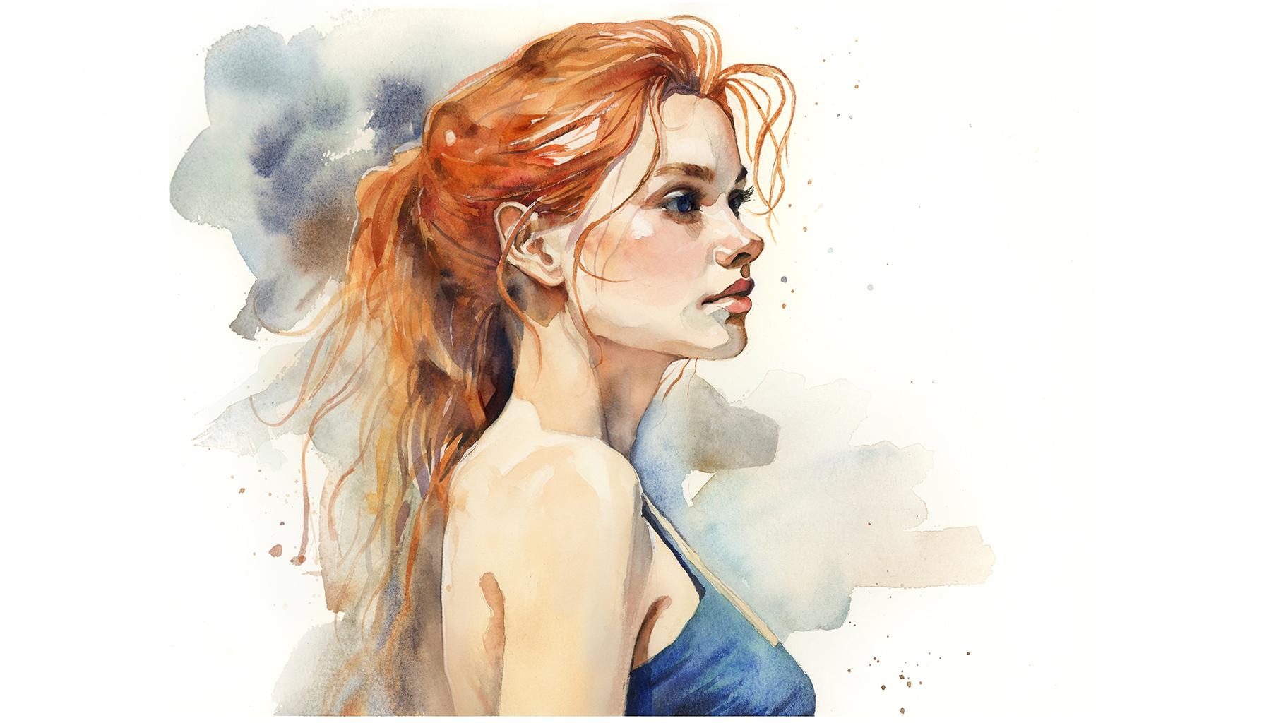
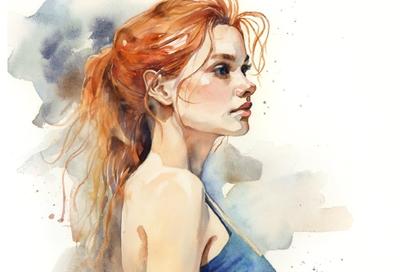
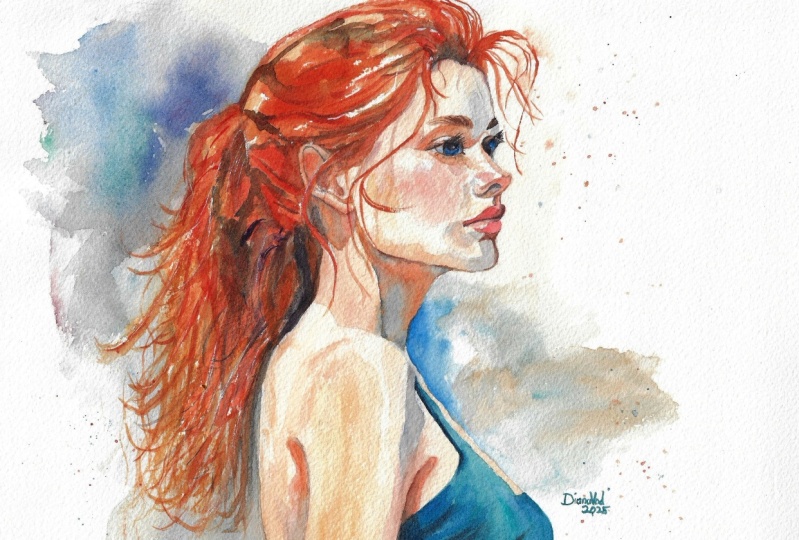
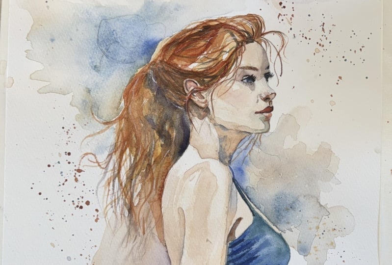
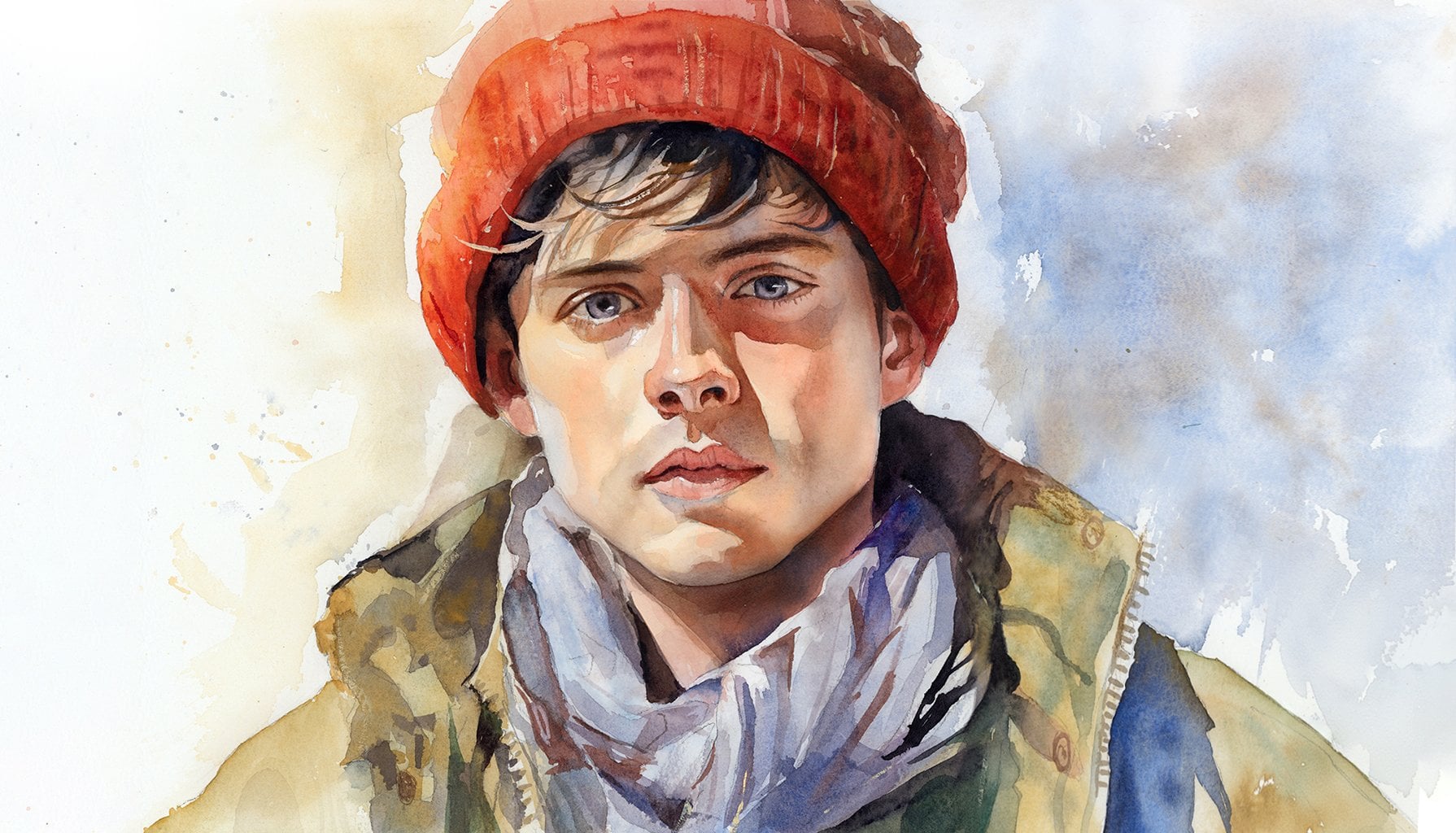
between realism and looseness. In the resource section, I've added a high
resolution image of my finished painting
to help guide you. You're welcome to
follow my painting exactly or experiment with
your own composition. As we're going to be focusing on the painting aspect
of watercolor, I've provided templates
you can use to help transfer or trace the
sketch before you paint. It's fine to trace when using it as a guide for
learning how to paint. It's important to
have the underdrawing correct so that you can relax and have fun learning the
watercolor medium itself. Whichever direction
you take this class, it would be great
to see your results and the paintings you
create through it. I love giving my
students feedback, so please take a photo
afterwards and share it in the student project
gallery under the Project and resource tab. I'm always intrigued to
see how many students have different approaches and how they progress with each class. I'd love to hear
about your process and what you learned
along the way, or if you had any difficulties. I strongly recommend
that you take a look at each other's work in the
student project gallery. It's so inspiring to see
each other's work and extremely comforting to get the support of your
fellow students. So don't forget to like and
comment on each other's work.
3. Materials & Supplies: Before we start the painting, let's go over all the materials and supplies you'll
need to paint along. Having the right materials can greatly impact the
outcome of your artwork. So I'll go over all the supplies I use for
this class and beyond. They're very useful to have at your disposal and we'll make it easier for you
to follow along. Let's start with the
paints themselves. And like most of the materials
we'll be using today, it's a lot to do
with preference. I have 12 stable colors in my palette that I
fill up from tubes. They are cadmium
yellow, yellow ochre, burnt sienna, cadmium
red, alizarin crimson, Otramarne blue, cobalt blue,
serlean blue, lavender, purple, viridian, black, and
at the end of the painting, I often use white gouache
for tiny highlights. I don't use any
particular brand, these colors you can
get from any brand, although I personally
use Daniel Smith, Windsor and Newton,
or Holbein paints. So let's move on to brushes. The brush I use the most is
a synthetic round brush like this Escoda Purl brush
or this Van Gogh brush. They're very versatile because
not only can you use them for detailed work
with their fine tip, but as they can hold
a lot of water, they are good for
washers as well. They're also quite affordable, so I have quite a few
in different sizes. Next are the mop brushes. Mop brushes are good for
broad brush strokes, filling in large areas and creating smooth
transitions or washes. They also have a nice tip that can be used for smaller details. But for really small details, highlights or anything
that needs more precision, I use a synthetic
size zero brush. All brands have them,
and they're super cheap. Another useful brush to have is a Chinese calligraphy brush. They tend to have long bristles
and a very pointy tip. They're perfect for
adding texture or creating dynamic lines
in your paintings. You can even fan them
out like this to achieve fur or feather
textures as well. And that's it for
brushes onto paper. The better quality
of your paper, the easier it will be to paint. Cheap paper cuinkles easily
and is very unforgiving, not allowing you to
rework mistakes. It's harder to create
appealing effects and apply useful techniques
like rubbing away pigment. Good quality paper, however, such as cotton based paper, not only allows you to rework
mistakes multiple times, but because the pigment
reacts much better on it, the chances of
mistakes are a lot lower and you'll be more likely to create
better paintings. I use archers paper because that's what's available
in my local art shop. A water spray is
absolutely essential. By using this, it
gives you more time to paint the areas you
want before it dries. It also allows you to
reactivate the paint if you want to add a smooth
line or remove some paint. I also have an old
rag or T shirt which I use to clean my brush. Cleaning off the paint
before dipping it in the water will make the
water last a lot longer. It's always useful to
have a tissue ate hand whilst painting to
lift off excess paint. Also, you never know when an unwanted splash or drip might occur that needs
wiping away quickly. I also have a water dropper
to keep the paints wet. When you paint, it's
important to have them a similar consistency to what
they're like in the tubes. This way, it's easier to
pick up sufficient pigment. A hair dryer is useful
to have for speeding up the drying time and controlling the
dampness of the paper. And lastly, masking tape. And this, of course, is just to hold the paper down still onto the surface to stop it sliding
around whilst painting. Also, if you plan on
painting to the edge, we'll allow you to create a
very crisp, clean border. And that's everything
you need to paint along. I encourage you
to experiment and explore with whatever
colors you want to use for this class and whatever
materials will help make this painting truly yours.
Now, let's begin it.
4. How to Sketch It Out: For this sketch video, I've actually sped the footage
up quite a lot because the sketching of a portrait is the most difficult part
and it takes a lot of time. I would add a lot of minutes to the class that you're not necessarily
directly interested in. This is about
painting a portrait, not necessarily the drawing. So there's a lot
of give and take, push and pull, going back
and forth, making edits. But I start off with a circle, then I divide it into thirds. Then I add a little triangle
shape for the nose, and you can see
I'm already using the rubber trying to
make corrections. I'll go over a few of my general key ideas and thought processes that I think about when I'm drawing. The first one is focus on
proportion and placement. In portraiture, in particular, proportions are everything. When we come to painting
landscapes or city scenes, we can be a bit more general and ambiguous with
what we're painting. But in order to make it
right for a portrait, we have to block out the main shapes before
committing with lines, the tilt of the head,
the center line of the face, and the eyeline. And these construction
lines help me to keep the features
aligned and proportional. And secondly, it's
not to overdfine the features because
it's tempting to draw every single
eyelash or wrinkle. But in watercolor, it's often better left to the brush
for that kind of thing. Now, you can see I'm using the rubber basically
rub it all out again because I need
to keep on going back and forth until it's correct,
and that'll take some time.
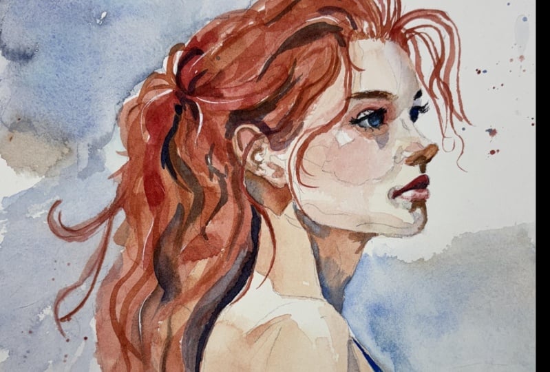
5. Starting Light: So this painting might
seem quite intimidating, but I'll do my best
to break it down into simple steps to make
it more manageable. And we're starting off with very light washes
in simple shapes, basically coloring
in to begin with. And then by the time
it's all filled up, the more complicated part, such as the detailing of
the eyes and the nose, they won't seem as difficult because we were already laying down the
groundwork before that. So I've just mixed a skin
tone using yellow ochre, a zarine crimson, and
a bit of burnt sienna. Those are the three pigments
that mix lovely skin tones. And it's quite a diluted
wash, as you can see. I'm using quite a large
brush with a fine point, a Chinese calligraphy brush. And you can experiment on your palette trying
to match that color, the ratio of the three
different pigments there, because depending on
what brand you're using, some of them are a bit
more potent than others, so I could tell you how I do it. But if you really
want to learn and build that intuition to allow
you to paint expressively, then it's best to trial error
and experiment yourself. But it's a nice kind
of orange tone, really, but it's not a
bright vivid orange. It's a bit more of a
subdued tone down orange. And there's different
ways to mix that color. So it's always fun
to experiment. So it's just a flat wash. There's no variation
in tone at the moment. I'm just basically starting from the bottom down, actually, and painting the shoulder, the top bit of the arm, and the left hand
side of the neck. Maybe as we're moving up, we're making a bit lighter
and I've just made my brush quite hungry so that it draws out that
pigment and water. Just on that edge where
the shoulder is and I'm also using a tissue
to help as well, so there's a nice smooth edge. It can be easy to
feel overwhelmed when you've got lots of running pigment and water on your paper. And very often, it feels stressful because
you're trying to avoid unwanted textures like
the cauliflowering kind of effect that happens. And one of the ways
to overcome this is by learning how much pigment and water you need
on your brush. Maybe you do need a lot of it initially to spread out all
that water into a big space. But there's times when
we're painting wet on wet, for example, where the brush doesn't have to be fully loaded. In fact, if you empty
too much water, it'll spill out and affect the transitions
that you've made. So you want a kind of medium
absorption of the brush, and it's quite difficult
to explain with words. It's more of an
intuitive feeling through experience
and practicing. And then there's times when if you don't have
enough water on your brush, it'll actually
reabsorb the water and pigment that's
on your paper. And sometimes that's wanted and sometimes that's not wanted. And that's what we did there
on the shoulder there. We created that smooth highlight because we did a brushstroke that was actually
drawing water away from the paper rather than
putting it back on. And it's that give
and take that creates these smooth transitions. Uh,
6. Warm & Cool Skin Tones: So whilst I've been talking, I've been gradually filling in these little areas basically
with a light tone. There's slight
differences of tone, but it's all a light tone. It's not dark or mid tones, and I've been using
those three pigments to do that yellow ochre, burnt sienna, and
alizarin crimson. But right now on the forehead, I've started to incorporate
some cool colors, some blues, cobalt blue, maybe or maybe you want
to use ultra marine. Or even purple because
purple is a nice way to link the warm tones of the cool tones because
it's halfway in between. You can use it as a warm tone if you add a bit more
red or you can make it a cool purple by adding a bit more blue
because red and blue, blue being the
coolest and red being the warmest color is
halfway in between. So on this forehead
on the right, that's where we've started to add a bit of gradation there, and you can take your
time to get that right. But you don't have
to overwork it. It feels like you need to
add a lot of detail when there's no other details
around to put it in context, but we don't need to get
these things perfect. We're just implying a soft little transition
of the edge there. It's the eyes, the nose, and the mouth that will hopefully have a bit more
detail and interest later. So I'm working this wash down, and there's a few
little areas where I'm allowing the white of
the paper to come through. On the cheekbone,
on the collarbone, we're not painting on that area. We're actually leaving
those areas untouched. And this is where planning
ahead really pays off because watercolor
requires a lot of foresight, especially in portrait work. Maybe on the cheek area, I'm adding more red, more lizarn crimson
or cadmium red. I don't think in
strict pigments, I'm thinking of
color temperature. So when I say warm red, you can use whatever red really doesn't need
to be Lizarum crimson or cadmium red or any
other red pigments. It's a very warm color.
It could be pink as well. I'm just dropping that
underneath that highlight wet on wet so that it's
going to blend out smoothly. And if you find the
paper is drying too quickly before you're achieving
what you want to achieve, it's best just to let
it dry completely. And then use a spray
gun to keep it even and re wet it
evenly because there's a temptation when you feel and know and see that the paper is drying to just add
more water of the brush. But that actually creates an inconsistent uneven
wetness of the paper. And it's that inconsistency of the paper wetness that creates those
unwanted hard edges. Because the pigments are
interacting, it's like, if you imagine the seashore on the coast when the waves are
breaking in to the sand, it's pushing all that pigment. You can think of the
sand as the pigment. It pushes that
pigment to the edge and creates a hard
edge because there's a difference between
the wetness of the sea and the dryness of the beach. So it's trying to keep it all even. A,
7. Second Layer: Now we've finished the
first part of the painting, and to briefly go over
what we've done so far, we've kept a fairly even tone, but in some key areas, we've drawn out some of the pigment to create
soft highlights, and we've added a
bit more pigment to create soft gradients, such as the cheekbone
and that forehead. But these are quite elusive
details at this stage. Now we're starting to build
on with a second layer, a bit more depth and detail. It doesn't need to be
pretty at this stage. In fact, some of those
classic watercolor textures, those organic happy accidents are perfect for this
first wash stage. So now we're moving
on to the next stage, and that is painting
medium sized shapes. So the first stage is
basically blocking out the main large shapes and
there abstract shapes. So the shape of the shoulder
and the head, the face. As a main shape. Now we're being a bit more intricate with the shape that
we're painting, the shading around the eye and the forehead and
connecting it all. I'm using two colors
for this at this stage. That's alizarin crimson. I prefer using zarin crimson in the early stages of a
painting because it's very translucent and you can build up the layers with a
lot more control than a more opaic color
like cadmium red. And to complement this Alyzarin crimson
red, I'm adding green. There are two
complimentary colors and basically opposite each
other on the color wheel. Together, they actually make
gray and you can see that on the bridge of the nose or where the eyebrows connect
on the portrait, it's gray, not green. And when it comes to adding colors with portraiture
in particular, I'm thinking about these
complimentary colors. If I want to paint orange, then I'm going to
mix blue into there. If there's a more of
a yellow skin tone, maybe where a highlight is, then I'm going to use
purple to balance it out. And here where I'm painting
red, I'm going to use green. And on these little details
of the nose, I'm allowing, again, the white of the paper just to show the highlights. I admire all your bravery
to attempt this painting because back when I was
beginning to learn watercolor, I feel fear and anxiety trying to attempt
something like this. But you got to think
of it as a journey, and there's nothing lost
if it doesn't go well. This is a great exercise, and that's the way
it should be seen as an exercise rather than
a finished project because it highlights what's best displayed in watercolor, the balance between
precision and flow. We've got a nice
balance of details, but we've also got a lot of expression which are
two lovely elements of watercolor that
contrast each other and they use different parts of the mind,
different techniques. Exploring both of those aspects really improves the
way we use watercolor. This painting is a
great example of that delicatet balance between the controlled precise details
we're starting to do now, and then the loose freedom of flowing washes that
we've just done and we'll later
do with the hair. And maybe the background will add expressive
background as well. So we can figure out, and you can, of course, use this lesson as a guide so that you can explore
your own ideas with this. But we need to be selective about what we're
going to detail, where we're going to keep
those important crisp lines, and then where we're going to let other parts
breathe a bit more and allow the watercolor to flow not exactly
where we intend it. Okay.
8. The Nose: I hope you watch all the way through before
attempting to paint it because there's often
things that come to mind later in the process that should be acknowledged
at the beginning. One of these examples is starting off light and
gradually building on tone. The very first wash that we did on the face and the
shoulders and the neck, it's actually very light and it looks almost
uncomfortably light. But we don't want to overcompensate by that at
the beginning by making it darker than it should
be because we're going to come back to it
later and later and later. If you don't watch the
whole thing through first, you might not realize why we've painted it so
light to begin with and you might paint it darker than it needs to
be at that stage. Take a moment to notice
the slight variations in color and tone around the eye, it's more of a red tone, but on the nose, it's a bit more burnt
sienna, a bit browner. Even on the cheek,
you can see how it transitions from a
bit of a brown to a red but they're not
dramatic contrasts in color. We've basically got a base tone, and then we add influences of other colors onto that
to vary it a bit. And now I'm starting to add a bit of a thicker tone, again, wet on too wet, I'm
laying it down quite gently bit by bit so that it doesn't go too out of control. This is pure Ben sienna,
I'm adding on to there. But because we
already added a bit of the neutral skin
tone that I mixed, it balances itself out a bit. I'm not so confident with the anatomical
terms of the face. I don't think about it that way. When I look at a
portrait or a reference, it can be at any
different angle. And whatever anatomical
feature there is, its shape will be different. So especially when the
lighting conditions are changing or the
angle or perspective. So rather than thinking of
what the way a nose looks like or the lip or this bit that I'm painting now in
between the nose and the lip, I don't know what
that area is called. I'm just trying to
look at the shape, memorize that shape, and
match it on the paper. It's an abstract shape. I'm not trying to think of what it's meant to look
like anatomically. Whilst it's wet, I'm dropping in dark pigment where nostrils are. It's got a hard edge on the top and a soft
edge underneath. We're mixing hard
edges and soft edges. See now how I'm mixing
green on my palate. But when I place it on top
of this red flesh tone, this pink orangy flesh tone, it actually looks
gray, pure gray. I'm trying to create a
soft edge on the bottom, a hard edge on the top, and
a soft edge on the bottom, so I use that tissue rather than a brush to create that soft edge just
dab with the tissue.
9. The Chin: Edges are very important, and this next stage is
a good example of that. I'm pre wetting with pure water the edge of
where the chin or the neck, the jaw line, basically. And then I'm adding
a few brush strokes, letting it fall off
my brush onto there. And because we pre
wetted that edge, it's going to be a soft edge. Lost edge, not a found edge. Before I go into a bit more detail on the
importance of edges, let me just add that if I don't mention what
color I'm using, it's always either going to
be a mix of yellow ochre, Elsarnchoms and burnt sienna. And actually,
whatever combination of those colors will work well, it doesn't have to be
exactly the way I paint it. It doesn't need to
match. They're just naturally good
colors to work with. And then for the shading, you can complement those colors. You can use blue,
green, or purple. So let me get into
the importance of edge variation or
edges in general, because it's fundamental to both the realism and the
emotional power of a portrait. One of the most important
yet often overlooked aspects of portrait painting
or painting in general, really, is edge variety. And like I said, it's the
contrast between hard edges, soft edges, and what we often
call lost and found edges. And it isn't just
a technical thing. It's an expressive language
of its own, really. And what gives your painting
life, subtlety, and soul. Hard edges create
clarity and focus, and we tend to use
them around the eyes, the lips, where shadows
sharply turn into light, areas we want to pull the
viewers attention to. So obviously, the nose, the eyes, the mouth, that
is the center of interest. And these edges help anchor the features and
give structure to the face. And then we have soft edges which have a different
kind of nature to them, where things gently
melt into each other. See on the forehead
where in the middle, it's light and then
gradually gets a bit darker. And then, of course,
that's contrasted to a hard edge on the left. Even the jaw line has this soft center and then a hard edge at either
end where I'm painting now. So these areas bring softness,
calmness, and atmosphere. They evoke a gentler,
more emotional quality.
10. The Right Eye: This is a good check mark. Let's dry the whole
of the paper before continuing on this eyebrow and eye on the right hand side, we're going in with a
darker pigment now. To create some real contrast. So we just went over the
importance of edge variety, and I'm going to give you
some practical tips while I'm painting out this eye. First of all, you need to know where to use each edge type. So you can ask yourself, where is the focus of this portrait, and where do I want the
viewer to look at first? In terms of portrait, it's slightly easier
to work out than a street scene or a nature scene or even an animal because
it is usually the eyes, the nose, and the mouth that will be the center of attention, and that's where we want
there to be more focus, harder lines, more
defined edges there. And then we can allow other parts to fall
away a bit more softly. That's why we're using a bit
more of a smaller brush now, a more refined tip. Also, we used a lot of wet on wet techniques to create those
smooth transitions before, especially around the cheeks, the neck and later on
with the hairline. We softened our edges by painting onto
slightly damp paper, rather than heavily wet
paper or dry paper. There's a nice little sweet spot between overly wet paper
and completely dry paper. And then we used a
clean damp brush to feather out and
draw out that pigment. And that's contrasted to
what we're doing now, which is we dried the
paper completely, and we're painting wet onto dry. And that's how we have
that sharp edge where the eyebrow is and the
shading of the eyelashes. We're using deliberate
strokes with a drier pigment, a more well loaded brush, not such a wet brush, but loaded with pigment.
11. Starting The Lips: Now let's start
painting the lip, and like I said before, we've completely dried it so that we're going to
work dry on to wet. And within this second layer, we're going to do a bit
of wet on wet painting to create soft gradients
within this hard edged lip. Again, maintaining that variety of soft and edge and combining
them in different ways. And we want to
vary the pressure. It's difficult to see visually
through footage like this. Even in live demonstrations, it's difficult to see how
much pressure I'm applying. But the pressure and how much water is on the brush affect the
edge that we create, and the lighter touch and the wetter the brushes
make softer transitions, and more of a firmer stroke with less water makes
a crisper edge. It's quite an intuitive concept
when we think about it, even if it's not
a conscious one, we only want to
blend selectively, and we only want to keep
hard edges selectively. Because if you blend
every single edge, the whole portrait
becomes a bit mushy. And likewise, if you leave
every single edge sharp, it becomes too rigid. So it's the contrast between these edge types that creates
interest and realism. And then we want
to step back quite often because we're very close to the paper
when we're working, and it's easy to miss
the bigger picture. So stepping back
and squinting to see where edges are
standing out a bit too much or where we might
need to lose an edge or soften one becomes a bit more obvious
when we step back. Now we're starting to
paint the details of this left eye, her right eye. And I'd say this is the
definite center of interest. The nose and the mouth and the other eye are also
centers of interest, secondary centers of interest. But this eye here is
the primary center of interest because it has
the most refined details, the biggest contrast of all
the different elements. It has a contrast of edges, a variety like we
just talked about, and this eye is a
perfect example of that. But it also incorporates all the other elements and principles because
edges by themselves, don't really exist in isolation. With many things in art, everything's incorporated
and overlaps. So it's not just about where one shape
ends and another begins. It's about the form, the light, the color. They don't exist in isolation. They're always working
in relationship with the other
elements like tone, color, shape, and space. When we understand
these relationships, that's when we can
make our art a bit more unique and captivating. But it is overwhelming
to begin with. So let's go over how edges are affected with the
other elements of art.
12. The Left Eye: The white of the eye
isn't actually white. As you can see, I've added
a bit of gray there. And I'm going to paint
her eyes blue this time, a lovely serlean blue with
a bit of cobalt in maybe. I'm actually going to
make it quite saturated. And by that, I
mean, very vibrant. But I will tone it down later. This is just an underlayer. And the reason I'm
choosing blue is because blue and orange
work so well together. And this skin tone
is quite orange. And this will also
work so well in contrast to her hair later
because she's a redhead, so we're going to
take advantage of those copper auburn or
strawberry blond tones, which will contrast
beautifully with the blue eyes and also the blue dress or
top that she'll be wearing. That's another reason why
this eye is definitely the center of
interest because of that contrast in vivid color, as well as the
contrast in edges. The thing that
connects edges and color is actually the third
element, and that's tone. Tone is one of the
biggest factors in how we perceive an edge. If there's a strong contrast
in value between two areas, a dark shadow next to
a bright highlight, the edge will read as sharp, even if the paint is blended. On the other side, if the
tonal values are close, even a crisp brushstroke
can feel soft or subtle. When we're controlling edges, we're also controlling
the contrast and that means we're
controlling the focus. When we talk about shapes, we're not necessarily talking about the traditional
shapes of a circle, a triangle, a
rectangle, et cetera, but abstract shapes,
how we look at a three D subject
in front of us or even a reference
online or printed out, and how we observe those shapes, the nature of those shapes to
convey them on our canvas. Edges define shapes. But the way we
treat the edge also influences how solid or
delicate that shape feels. A hard edge shape feels
more cut out or graphic, whereas a soft edge shape feels more three
dimensional and natural. And especially in portraiture, we're not just drawing shapes,
we're sculpting forms. And that's what
creates the illusion. Softening an edge can help
a form turn into space. Ask yourself if the
edge is describing a flat shape or a form
turning into light, and you can allow
that to guide you whether the edge should
be hard or soft. And that's whether
you're painting a large shape or a small shape. When we're painting
this eye here, we're dealing with
very small shapes. But still, the nature
of them is either soft or hard, lost or found. That's why it can take 5 minutes to paint the whole of the
shoulder or the face, but then take half an hour to paint a small little
section like the eye.
13. The Bottom Lip: You can see that despite using that vibrant blue
for the iris in the eye, I've actually gone over
it with a dark pigment. The blue is still in there. That was always the intention, but I had to paint that first to allow that soft wet
on wet blending. I'm just using a brush
to pull out some of the pigment underneath
the iris to create that three
dimensional form or that illusion of light
and the highlight. Now I'm going to start
to paint the bottom lip. If you think about the
nature of light and shadow, the bottom lip will be lighter because it's reflecting
the light from above, but the top lip will
be darker because it's not directly reflecting that light, it's more in shade. You could easily paint
this bottom lip first, but there was no reason why I decided to paint
the top one first. It just happened to be that way. Again, it's going to be darker at the bottom
than the top, even with the bottom lip, thinking about that curvature, that curvature and the way the volume is affected
by the light. Where the lips where the two
lips meet in the middle, is obviously going
to be a dark area there because the light
is even harder to reach inside And I'm leaving that little white of the paper underneath that
little crease of the lip there, where there's a
direct highlight. Maybe her lips are glistening. She's wearing lipstick
or something. The paper is very slightly damp because I want
that black line that we just painted in
between the lips to have a soft edge to them. If it's too wet, it'll
just spill out and make both lips dark
and black and gray. If it's too dry, there'll
just be a hard line making sure the lip
is absolutely dry before adding this shading
underneath the lip. I very much enjoy painting
lips because there's such a dynamic use of
the elements of art. You've got a nice
variation of tones. You've got the darkness
of the top lip. And then how it contrasts with the lightness of the bottom lip, and then underneath, you have the lightness
of that bottom lip, and then that contrasts with
the shadow underneath that, that little curvature that
goes inside and comes back out onto the tip of the chin that catches
the light again. There's lots of
tonal arrangements going on there that is
visually exciting for me. A.
14. Starting The Ear: Now we're starting
to work on the ear. And it's a strange one, the ear because it's not
a center of interest, so it doesn't need to be
so refined and accurate. But there's so much completion with the form and the variety of transitions and edges
and shapes that it is quite a difficult area to paint convincingly without
stealing the attention. If it looks like too much
effort has been put into it, then it will compete with
the attention of the eye. So I'm trying to find a balance of not adding too much detail, but making it visually correct. And one of the main pieces of advice I can give you
for painting areas like this is that you shouldn't be thinking about actually
painting an ear. Don't try to paint an ear, but paint what you see. It sounds like a
bizarre thing to say, but the ear is one
of those areas where if we try to paint what
we think an ear looks like, it almost always goes wrong. It's such a nuanced part of the anatomy that everyone's
ear is slightly different. It's pretty much impossible
to memorize it exactly. So it helps to forget
the idea of an ear altogether and approach it like an abstract study
of light and shape. I want to squint down and
look at it purely in terms of tone and form,
light against dark, warm against cool, and trust that if you get
those relationships right, the structure will reveal
itself automatically. And that goes to
any area of detail, whether you're painting
the eye, the nose, the lips, even
beyond portraiture. Try not to think of what you're actually
painting yourself. Just think of it as an abstract
study of light and shape. So once you have that initial
mindset ready in your mind, you can start by
grouping the lights and darks into just two
or three value zones. We don't need to
be distracted by every tiny little ridge
or shadow right away. You can see I'm splitting it up into just three value zones. You can ask, where is the
overall lightest part? Where is the deepest shadow? And once those big
areas are blocked in, it becomes much
easier to build up the complexity or tonal
shifts in between them. I've talked a lot about edges because out of all the elements, it's the most important aspect
of portraiture painting. And in the ear, specifically, almost nothing is
drawn with a line. Everything is made up with overlapping planes
and soft transitions. So this is where edge control
becomes your best tool. And a slightly harder
edge can define the curve of lobe or again, I'm not sure on the
anatomical terms because I try not to think of them
in an anatomical way. I just think about studies of
light and shadow and color. Or a lost edge can melt into
other parts of the shadow. So don't try to
define everything. Choose just a few edges to sharpen and let
the rest dissolve. The ear specifically
can quickly become overworked because we get
caught in chasing every line. But the truth is
you don't need to paint every crease to
make the ear feel real. A few well paced
values and a hint of the main ridges or
curves is enough. We can let the
watercolor do the rest. Again, it's not the
central area of interest, and that hint of abstraction actually keeps the
painting fresh and alive. So you have to have faith in the bigger picture
and the end result. We don't want to draw attention
to it at all, really, just enough detail to make it
acceptable for the viewer.
15. The Neck: And the same principles to detail apply to
every aspect really, including this shadow work
we're doing on the shoulder. I'm looking about the
tonal differences. I'm not thinking whether
it looks like a shoulder. I'm just seeing the relationship between the different elements, where the edges
turn soft or hard, where the color temperature
might change or the tones. When painting this
shoulder area, I'm taking advantage
of negative space. I'm being quite
intentional with it. You can see how much clean
paper is left untouched. And this negative space
creates a visual contrast, helping the subject
to feel a bit more luminous and light, a bit more dynamic. We don't have to fill the
entire canvas or page, so letting the
painting breathe a bit more is part of the
magic of watercolor. I'm making sure to
leave the areas where I'll be painting
the blue dress untouched. So I'm just trying to finish all the outside areas
of the shoulder, the arm, the shadows. Just testing that this
area was, in fact, dry because there needs
to be a hard edge where the arm and the shading creates
that illusion of form. And whilst that is drying, we can start working on the
shadow underneath the neck. Again, I'm using the same
similar colors Azaren crimson, burnt yellow, and yellow ochre. But the part that I have left white underneath the neck
is going to be shade, and the majority of this
painting is warm at the moment. So we need to create some kind of contrast
for this warmth. So I'm just thinking ahead to what color we should
use for that shading. We can start off with
a wash of warmth, this burnt sienna,
sarin crimson. And then whilst it's wet, we can just add in
some purple or blues. Notice how I'm maintaining
some hard edges here. When it comes to painting
an area like this, I think about where exactly
I'm going to go with the brush and what these
edges are going to be like. Do I need to worry
about a soft edge? Now I can start incorporating this cobalt blue at the bottom. And while it's wet and wet, it's going to be nice and soft. And just underneath the neck here underneath the jaw line, the chin, that's where it's
going to be most dark. Just dabbing away, not necessarily thinking
about brush strokes, but just dabbing and allowing water and pigment to fall
off my brush at this stage. There needs to be a bit
more contrast where that shoulder contrasts
with the shadow, so I'm just going to
dab a bit more pigment at the bottom there to
boost that contrast.
16. Supporting Roles: These areas that I'm painting at the moment can be thought
of as supporting roles in a painting because they're
not the main area of focus. They're not the second area, the secondary areas of focus. They're just kind of
subtle quiet areas where we can actually
have a bit more freedom. They don't need to
be so accurate. But just because they're
not the focus of the painting doesn't
mean it's unimportant. These supporting areas give structure and
context to the face. Much like in a movie, you have the main characters that take most of the attention, but a good film still has
great supporting actors in there that add to the whole feel and
the vibe, the aesthetic. So we don't want to
do them too harshly, and we don't want
to add too much contrast or they'll distract. But if they're too weak, the head will feel
like it's floating. So I'm trying to
keep things subtle and soft, and ironically, trying to keep things
subtle and soft sometimes requires a bit more intention, as well as attention. This is another great place to pay attention to your edges. I'm letting some areas
dissolve into the background, especially near the
shoulder to create that nice lost and found effect. In real life, not every
edge is sharply defined. So by mimicking that
soft transition, we add realism and
mood to the piece. And you'll notice that
I'm actually using a fairly diluted mix here just to blend these
shadows because I've got warm shadow above
and cool shadow below. I'm allowing the
water to do most of the blending actually for this. These kind of soft transitions are where the water
color really shines. It's more about
patience and restraint. I'm not trying to define
anything too much, just letting the shadows
settle in gradually. Here below the ear, we have to create a contrast, a hard edge, negatively painting in the bottom
of the ear, really. You can also use these
moments as a pause for reflection because it's a
quieter part of the portrait. I actually love this stage. You can finally take a breath after doing all those
details on the face, and you can step back mentally and check the
balance of the whole piece, thinking about the contrast, the temperature, the flow. So these in between areas gives us just a moment to
reflect before we adjust and move on to the final parts of the
painting and the hair. I'm also thinking
about color harmony, keeping the tones consistent with the rest of the
portrait because we're mixing these colors separate from when we originally
did that first wash now. So we still want to keep
that harmonious color. Burnt Sienna is basically
the dominant color in this, and then we just use
a is and crimson and maybe a touch of yellow ochre to give it a bit more interest. I might sneak in a bit of that cool tone used
in the shadows of the face just to unify the palette to avoid anything
too jarring rather than introducing a brand
new color. H.
17. The Clothes: Now I'm just going
to add a little bit of a shadow behind
the arm just to differentiate where the arm ends and the back begins because it's just a pencil
line at the moment. Just using a light bit of tone and blending it out softly. Starting warm and
then going cool. Now it's time to get very bold and we're going to paint in her top using nice
vibrant cool colors. Again, so it contrasts with
the warmth of her skin and her copper color hair
we're going to paint later, starting off with a bit
of a turquoise underlayer because the green goes well with the reds and the blue goes
well with the oranges. So starting off with a nice
bit of turquoise green, just literally filling
in this space, we reserved these whites, the white of the paper, so that it has a lovely
luminescence to it. And we're allowing the water to just flow in and spread
out all the pigment. It's just an even shape. There's no to begin with, while we're filling out
this space with pigment, we're not so worried about tone. We're just covering
the whole area and having a nice even wash. And then once that's filled in, we can start building on
the rest of the color. So starting quite
dark at the top. Using the point of the brush, we're just bringing it
down and connecting it This is cobalt blue. And only subtly trying
to create a bit of volume and implying
shadow and light. Trying to minimize
any hard edges.
18. The Background: And now is the time for the most expressive
part of the painting, and that is painting
the background. This is a personal choice. If you don't want to add a
background, you don't have to. You can leave it as
just a silhouette or a figure on a
white background. But I just want to experiment and explore more techniques
that might be useful to you. And again, we're using
cool colors to contrast the warm colors not using a huge brush, but making the most of all the brush strokes you
can achieve with a brush. So using it on its side, using the tip, using
slow brush strokes, fast brush strokes,
swirling it around, and mixing a bit
of brown in there, and that brown with the blue neutralizes it and
makes it look a bit gray and fading it out as if this just arbitrary shape here. There's nothing
in particular. Just to lead into the
white background. Add a bit of atmosphere to it. So nice wet on wet
technique going. We'll do a bit more
on the other side, but I think we'll do that
after we paint the hair. Now that we've given her
top a bit of time to dry, we can go back in with
some darker pigment. These brush strokes will be
slightly harder because, of course, the papers dryer, so the pigments not
going to move as much. Implying some creases
in the fabric. A,
19. Controlled Hair: Now it's time to paint the hair, and I'm very excited for this stage because
with this portrait, we're going to give her a
vibrant orange copper color, a strawberry blond kind of look. I'm starting with little
strands on the right hand side, following the pencil marks
that we left before. Because these swirls
are quite difficult to come up with spontaneously. With these random strands, they have to be planned. I worked out how I
wanted them to be with the pencil lines and
they're quite orchestrated. But on the left hand side, that's when we'll be more
expressive and free and spontaneous when the pigments
all bleed into each other. So I start off with a thin
line and just go back over with a variety
of thickness. And we use cadmium
red and burnt sienna to achieve this orange glow. Again, I'm trying to be mindful of the direction
and flow of the hair. My brushstrokes are following
that natural curve, which helps reinforce
the structure of the head and adds a sense of movement because everything
else is quite structured. So the hair is very organic. I'm using a slightly darker tone than the base wash we
used for the face. But I don't want to be
too dark, too early. Just like in other
parts of the painting, I'm thinking about edge variety. Some of these strands want to
be kept sharp and defined, mainly on this right hand side, with these individual strands, especially where
they catch light or cross over the other shapes. Then on the other side, we'll start softening them out with a damp brush and
letting them fade a little to keep things
feeling natural. I'm also leaving some
gaps between my strokes. Those little areas of untouched paper or
lighter color help suggest shine and bouncing off the hair or that
layered kind of feeling. It adds texture
without having to draw every single
strand as well. So it's all about
suggestion, not perfection.
20. Expressive Hair: So the hair we've painted so far has been quite
controlled and deliberate. Now we want to be painting the left hand side
with more expression because it's flowing a bit more. And of course, when you
look at a head of hair, there's thousands of strands, and it's overwhelming and it's impossible to capture
all that detail. You certainly don't want to try and paint every single
strand you see. So it can be understandable
if it's intimidating. But we're going to
use the watercolor to be expressive and
to imply the detail. So to begin with, I'm looking
at the big masses first. Because we're painting
the flow and the shape of the hair as a whole,
where the shadows fall. I'm leaving a few
little white gaps which might be seen
as highlights. But more than that, I'm just thinking about how
the hair curves. Think of it as
sculpting with tonee, not drawing with lines. And you can see we're almost experimenting with
tones as well. I've got some darker
areas, some lighter areas. Some bits are a bit more orange, some bits are a bit
more yellow, red. I'm trying to vary the edges
as well to show texture and depth using fast brushstrokes connecting everything
for the time being. I'm trying to avoid
areas being isolated. Even if there's a tiny
little connection, I want to keep
everything unified. And the paper is about
an even dampness, and you can see that
some lines are just slowly fading in, not
completely disappearing. So they've got that soft edge because I'm still trying
to vary the edges, even when it comes to the hair. I'm using a mix of
soft and hard edges, softer where the hair
blends into shadows or the background and sharper where I want to show
structure or movement. Just like in the face, it adds to realism and keeps the
painting feeling alive. We always want to use a soft
brush when softening edges, a damp brush, rather, to soften edges while
the paint is still wet. And we want to let some of the areas disappear
into the background. Of course, we'll be
painting a background next to this to really make
these oranges pop later on. I'm avoiding any minute
specific details at the moment. We'll come back at the end and add a few touches of detail to imply that
there's more going on. But I'm more concentrating
on the masses to begin with. A.
21. Splats: Now that's the first
layer of the hair done. I'm just going to
add a few artificial splats into the background, using the orange and some of the blue because I don't want
there to be too many splats. Just enough to give the
background a bit more interest. This is, again, an
optional thing. You don't have to add these
flats if you don't want to. I just feel it adds some kind of energy and atmosphere,
adds a bit of depth. Going back and forth, varying the tone,
varying the size. There's only about 20 of them. And maybe I will add
a few organic ones just using the tissue
to lighten them up a bit because they're
a bit too strong. Then again, using the
tissue to correct it a bit. Maybe a few down at the bottom. Those expressive background
strokes are actually dry now, so I don't have to be worried about splats going on there and affecting that wash.
And now the top is dry, I can extend that shadow from
the armpit, down the arm. And also, I'm just going to add this little line shadow
to add to the depth. Just a tiny little
detail that adds to that illusion of volume in three D using the very tip of the brush and
dragging it along and then building up until it's a thickness
I'm happy with. O.
22. Hair Tones: Now that we've given a bit of
time for their hair to dry, we can go back with
a darker tone, and I'm using that
same burnt sienna. Mixing a bit of blue in there to make it darker.
I'm not using black. I'm using blue
because the blue and the burnt sienna actually
already make a brown. With hair, it's so
easy to get caught up with trying to add
detail everywhere. But actually, suggesting
detail is much more effective. So I might use
confidence strokes to hint at strands
catching the light, but I try not to overdo it. Less is more here. And rather than focusing
on one particular area, I keep on bouncing around
from one area to the other. These restrained
moments of detail have more impact when
the rest is loose. And now that we have some
kind of flow to the hair, I can start thinking about
the movement and direction. Is it falling gently in
certain areas or is it sweeping across or where
should it be curling around? This keeps the hair
feeling natural and connected to the
form of the head. I'm again, making the most of all the possible brush strokes you can achieve with a brush. I'm using the side
of this round brush, but also the tip to create
these directional strokes, trying to create a
variation of width. I started with a lighter wash, and now, of course, I'm laying in slightly
darker tones to build depth. This glazing technique helps give the hair volume and keeps the underlying transparency
because transparency, of course, is one of the things that makes watercolor
so beautiful. I tried to make sure
that the first layer was pretty much dry
before glazing over it. But I wasn't very strict on that because sometimes getting these muddy mixes or the back runs helps achieve
interesting textures. I'm going in with
purple here and even a darkish kind of blue which on top of the orange
makes it look black. I'm trying to think about
where the light falls. So of course, we've got to think about the form and
the shape of the head and where the light catches underneath the ear and
around the back of the head, of course, the light is
less likely to reach there. So that's why it's a bit darker. Notice the variety of colors
inside my darker tones. We've got warm darks. We've got cool darks
and neutral darks. I'm really allowing the water
and pigment to just flow. I'm letting blooms or soft edges to create
texture on their own. I'm letting the watercolor
do most of the work.
23. Darkest Tones: The most interesting effects
come from letting go, and hair doesn't
need to be overly neat or controlled to feel real. The last thing I want is to
make it look too contrived. And now I'm adding the
darkest darks right now, and this really makes it pop. And if you look back at me mixing this color,
it's not black. I didn't use black to make this. I'm just using ultramarine blue, and that against
orange makes a black. It's they're
complimentary colors, so they balance each lever out. There's no need to use black. These darks really bring
out the full tonal range. Of course, we've got
dark going on in the eyes and the
shadow on the lips. But having these bold
darks now really makes the light pop and it unifies
the rest of the portrait. Tonally, it brings it all
into full composition. I'm also thinking about
the color harmony, trying to sneak in some of the same tones I used for
the shadows in the face, a touch of the cool
blue or the muted red, just to tie everything
together and avoid the hair feeling like
it's disconnected. And the background we'll
add in a minute will also help bring
it together, too. Frame the portrait, really. So hair is a great place to express a bit about the subjects energy or
even your personality, the way you interpret it. Do you want to go for something that's soft and gentle
or wild expressive? Just because I'm painting the hair a vibrant orange
doesn't mean that you can't be experimentive and
exploring your own ideas. Maybe you want to turn
it the other way around. Maybe she has lovely blue hair, bright blue hair, and
her top is orange. The same principles apply. It says something
about the mood. And it's nice to loosen up and let intuition
lead a little bit. So I'm pretty satisfied
with hair at the moment, and you can see that
it's quite random, but somehow it works because
we've got the tones in the right place and we didn't
overly do the details. It's more about suggestion and implying the detail rather
than actually painting. Combining a variety of edges, a variety of color,
a variety of tone. So now I'm doing
starting the background, connecting it to the hair, starting off with the
shoulder blade at the bottom, a few more twirls and
strands of the hair. It's easy to go over the
top of these strands, but using wet on wet, we're going to bring
out this wash. It's a muted orange, really. It's not as vibrant as the hair, and it's not as subdued
as the skin tone. So I'm basically
mixing a gray and trying to match the kind of expressive colors
on the other side, maybe a bit of blue
to neutralize it. And these dark grays again, will make the oranges
look even more vibrant. I'll soften some of
these strands as well.
24. Finishing It Off: Now I'm going to mix
a lovely cerlan blue. Of course, this cerlan
blue will be muted, much like the blue on the
other side in the background. I'm trying not to overthink logically how and what
shapes I'm painting. I'm trying to feel my way
into what seems right. I know there needs
to be some blue to match that blue on
the other side. But there's a lot
of red going on, so maybe add some green into it. Then go right up to the edge, not painting over that orange, but to the edge of that orange. So you got the transparency
of that orange contrasting against
that dull gray, few brush strokes of blue. Again, the blue and the
orange work so well together, leaving a little white gap
in between the orange, preserving the
white of the paper. Maybe we can add a bit of a darker tone to really
make the orange pop. Adding the ultramarine,
muting a bit with the orange, the brown, a few random
spontaneous brushstrokes. I just want this area to feel
expressive and atmospheric, like an extension of the
energy of the portrait itself. I'm not trying to paint
anything specific, just responding to the
shapes, the colors, and the mood we've already built up in
the face and the hair. I'm using much more
water here to allow the pigment to run freely across the surface and adding those tiny little strands
of hair underneath the chin to add that
illusion of depth. I've got this strand goes across the ear here that
I need to be aware of. Just adding the final
touches to the tones of the ear before we
highlight that strand. I have to decide wherever I
want to go lighter or darker. I can see that the ear is a lot lighter than
the rest of the hair. So it wouldn't
make much sense to make this strand go lighter. So I'm going to actually
go dark on light. I'm going to add a
dark brushstroke where this hair goes
across the ear. Very subtle. I
don't want it to be too high contrast and
steal the attention away. Now we can dry it all completely
for the very last step, which is adding highlights. We have white gh, adding subtle
little highlight strokes, not necessarily
adding anything new, just building on
what's already there. Because we could have been extra careful with the brush and maintained or preserved more
or the whites of the paper. But when we're in the
most expressive stages, when we're trying to
break free and loosen, create that energy, we don't
want to limit ourselves from that expression
by thinking about preserving these minute
little white strokes. So coming back at the end with the white wash is a perfectly
reasonable strategy. It's not cheating by
any means to come back with white wash to
bring out those whites. Correcting some of those shiny little highlights on the tip of the nose and on the face,
maybe around the eye. And now I'm going to disconnect. I'll give it a few days
and see if there's anything that needs to be
improved with a fresh eye.
25. Final Thoughts: Welcome back and
congratulations on completing this cast on portraiture.
I hope you found it fun. And if you gave this
painting and go yourself, I hope you found it easier
than expected because it's a very overwhelming
thing to attempt, and I'm so glad you
pushed yourself to do it because I'm sure the
results are worth it. The portrait that we painted
today is all about softness, flow and letting the paint do the work rather than
stressing over every detail. We explored techniques like layering for natural skin tones, lifting for
highlights, and using expressive brushwork to
create depth and character. Remember, portraits don't
have to be perfect. What matters is the energy and the motion you
bring into the piece. Remember, watercolor painting is not just about technical skills, but also about expressing your creativity and
personal style. I encourage you to continue
exploring, experimenting, and pushing your
boundaries to create your own unique
watercolor masterpieces. As we come to the
end of this class, I hope you feel
more confident and comfortable with your
watercolor painting abilities. Practice is key when it comes
to improving your skills, so keep on painting
and experimenting. I want to express my gratitude for each and every one of you. Your passion for watercolor
painting is so inspiring, and I'm honored to
be your teacher. If you would like feedback on your painting, I'd
love to give it. So please share your painting in the student projects
gallery down below, and I'll be sure to respond. If you prefer, you can
share it on Instagram, tagging me at Will Elliston, as I would love to see it. Skillshare also loves
seeing my students work, so tag them as well
at Skillshare. After putting so
much effort into it, why not share your creation? If you have any questions
or comments about today's class or want any specific advice
related to watercolor, please reach out to me in
the discussion section. You can also let me know about any subject wildlife or scene you'd like me
to do a class on. If you found this class useful, I'd really appreciate
getting your feedback on it. Reading your reviews
fills my heart with joy and helps me create the best
experience for my students. Lastly, please click
the follow button Utop so you can follow
me on Skillshare. This means that you'll be
the first to know when I launch a new class
or post giveaways. I can't wait to see
all your portraits, and I look forward
to future classes together until then
happy painting.
 Will Elliston, Award-Winning Watercolour Artist