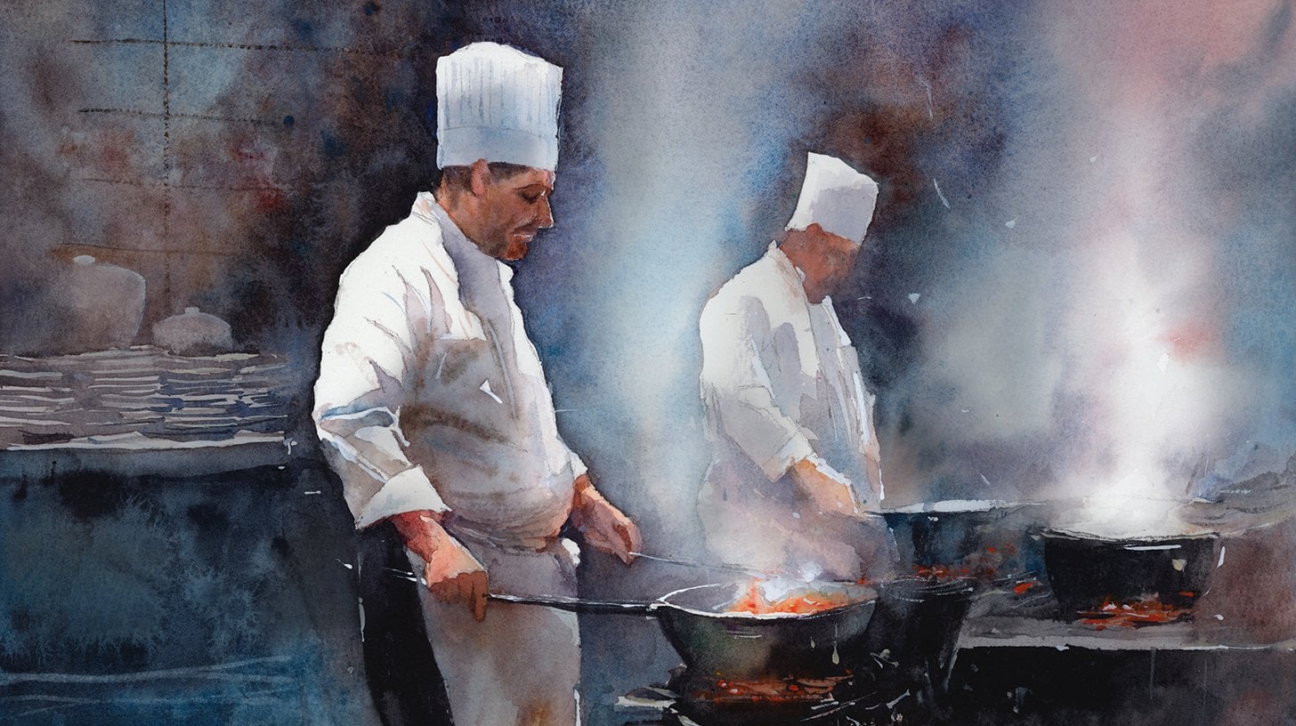
Transcripts
1. Welcome To The Class!: Hello, everyone. My
name is Will Elliston. And today, we're going to paint a portrait that feels alive. This class is about capturing character without
getting lost in detail. We will read the head
as clear planes, design a simple
value map and let warm and cool shifts
breathe life into skin. Glazing will build gentle depth. Wet into wet will
soften transitions, and a few crisp accents will lead the eye
to the features. The hat and scarf become
supporting shapes that frame the face while the background
stays calm and airy. I've been a professional
artist for many years, exploring lots of different
subjects from wildlife and portraits to cityscapes
and countryside scenes. I've always been entranced by the possibilities of watercolor. But when I started, I had no idea where to begin
or how to improve. I didn't know what
supplies I needed, how to create the
effects I wanted, or which colors to mix. Now I've taken part in many
worldwide exhibitions, been featured in magazines, and been lucky enough
to win awards from well respected
organizations such as the International
Watercolor Society, the Masters of
Watercolor Alliance, Windsor and Newton, and the SAA. Watercolor can be overwhelming
for those starting out, which is why my goal is
to help you feel relaxed and enjoy this medium in
a step by step manner. Today, I'll be guiding you
through a complete painting, demonstrating a
variety of techniques, and explaining how I use all
my supplies and materials. Whether you're just starting out or already have some experience, you'll be able to
follow along at your own pace and improve
your watercolor skills. If this class is too challenging
or too easy for you, I have a variety of classes available at different
skill levels. I like to start off with a free expressive
approach with no fear of making mistakes as we create exciting textures
for the underlayer. As the painting progresses, we'll add more details to bring it to life and
make it stand out. I strive to simplify
complex subjects into easier shapes that
encourage playfulness. Throughout this class, I'll be sharing plenty
of tips and tricks. I'll show you how to turn
mistakes into opportunities, taking the stress out of
painting in order to have fun. I'll also provide you with
my watercolor mixing charts, which are an invaluable tool when it comes to choosing
and mixing colors. If you have any questions, you can post them in the
discussion thread down below. I'll be sure to read and
respond to everything you post. Don't forget to follow me on Skillshare by clicking the
follow button at the top. This means you'll be the
first to know when I launch a new class
or post giveaways. You can also follow me on Instagram at Will Elliston
to see my latest works. So let's get started and use these techniques to create a portrait that's
full of expression.
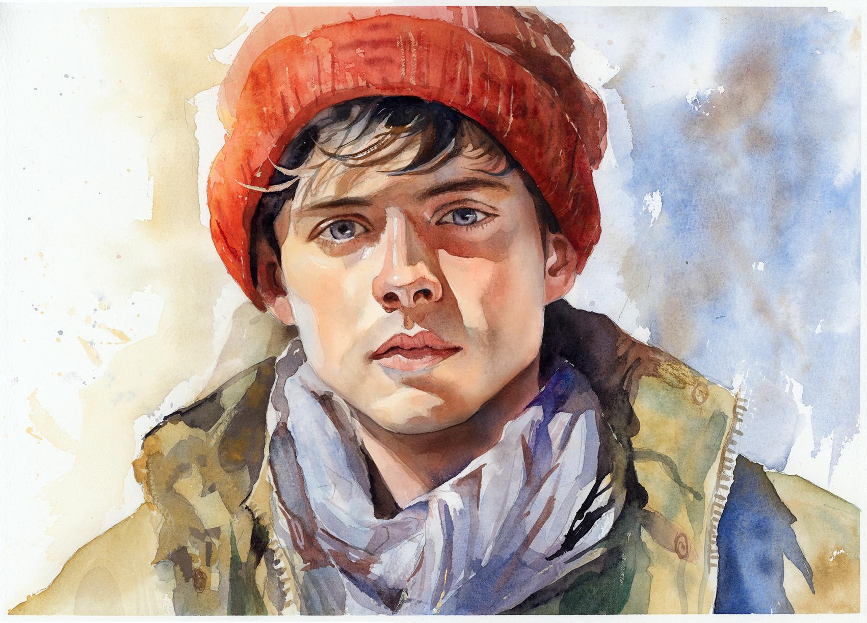
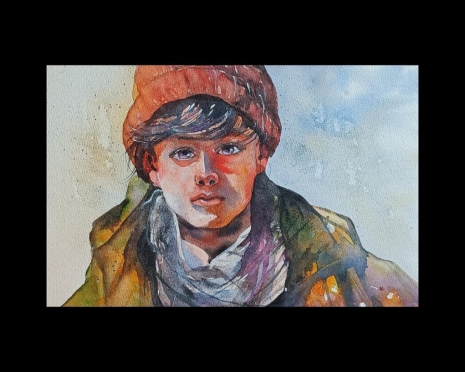
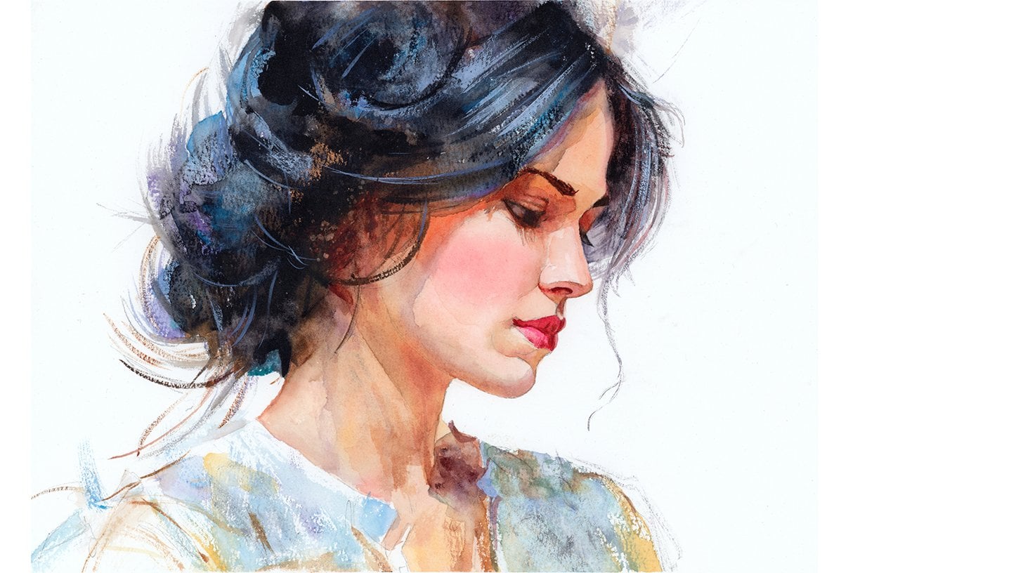
2. Your Project: Thank you so much for
joining this class. Our aim is to create a portrait that feels
alive and unforced. Think big shapes
and simple values, letting color drift from warm to cool across the
planes of the face. Keep edges varied, some
lost in the background, some decisive around the
eyes, nose and mouth. Allow blooms and granulation to suggest texture in
the hat and scarf, while the features
remain calm and clear. Choose a modest
palette and trust glazing for depth
rather than detail. In the resource section, I've added a high
resolution image of my finished painting
to help guide you. You're welcome to
follow my painting exactly or experiment with
your own composition. As we're going to be focusing on the painting aspect
of watercolor, I've provided templates
you can use to help transfer or trace the
sketch before you paint. It's fine to trace when using it as a guide for
learning how to paint. It's important to
have the underdrawing correct so that you can relax and have fun learning the
watercolor medium itself. Whichever direction
you take this class, it would be great
to see your results and the paintings you
create through it. I love giving my
students feedback, so please take a photo
afterwards and share it in the student project gallery under the Project
and resource tab. I'm always intrigued to
see how many students have different approaches and how they progress with each class. I'd love to hear
about your process and what you learned
along the way, or if you had any difficulties. I strongly recommend
that you take a look at each other's work in the
student project gallery. It's so inspiring to see
each other's work and extremely comforting to get the support of your
fellow students. So don't forget to like and
comment on each other's work.
3. Materials & Supplies: Before we get started
with this portrait, let's go over all the materials and supplies you'll
need to paint along. Having the right materials can greatly impact the
outcome of your artwork. So I'll go over all the supplies I use for
this class and beyond. They're very useful to have at your disposal and will make it easier for you
to follow along. Let's start with the
paints themselves. And like most of the materials
we'll be using today, it's a lot to do
with preference. I have 12 stable colors in my palette that I
fill up from tubes. They are cadmium
yellow, yellow ochre, burnt sienna, cadmium
red, Alizarin crimson, Opramarne blue, cobalt blue,
serlean blue, lavender, purple, viridian, black, and
at the end of the painting, I often use white gouache
for tiny highlights. I don't use any
particular brand. These colors you can
get from any brand, although I personally
use Daniel Smith, Windsor and Newton
for Holbein paints. So let's move on to brushes. The brush I use the most is
a synthetic round brush like this Escoda Purl brush
or this Van Gogh brush. They're very versatile because
not only can you use them for detailed work
with their fine tip, but as they can hold
a lot of water, they are good for
washers as well. They're also quite affordable, so I have quite a few
in different sizes. Next are the mop brushes. Mop brushes are good for
broad brush strokes, filling in large areas and creating smooth
transitions or washes. They also have a nice tip that can be used for smaller details. But for really small details, highlights or anything
that needs more precision, I use a synthetic
size zero brush. All brands have them,
and they're super cheap. Another useful brush to have is a Chinese calligraphy brush. They tend to have long bristles
and a very pointy tip. They're perfect for
adding texture or creating dynamic lines
in your paintings. You can even fan them
out like this to achieve fur or feather
textures as well. And that's it for
brushes. Onto paper. The better quality
of your paper, the easier it will be to paint. Cheap paper qwinkles easily
and is very unforgiving, not allowing you to
rework mistakes. It's harder to create
appealing effects and apply useful techniques
like rubbing away pigment. Good quality paper, however, such as cotton based paper, not only allows you to rework
mistakes multiple times, but because the pigment
reacts much better on it, the chances of
mistakes are a lot lower and you'll be more likely to create
better paintings. I use arches paper because that's what's available
in my local art shop. A water spray is
absolutely essential. By using this, it
gives you more time to paint the areas you
want before it dries. It also allows you to
reactivate the paint if you want to add a smooth
line or remove some paint. I also have an old rag or t shirt which I use
to clean my brush. Cleaning off the paint
before dipping it in the water will make the
water last a lot longer. It's always useful to
have a tissue at hand whilst painting to
lift off excess paint. Also, you never know when an unwanted splash or drip might occur that needs
wiping away quickly. I also have a water dropper
to keep the paints wet. When you paint, it's
important to have them a similar consistency to what
they're like in the tubes. This way, it's easier to
pick up sufficient pigment. A hair dryer is useful
to have for speeding up the drying time and controlling the
dampness of the paper. And lastly, masking tape. And this, of course, is just to hold the paper down still onto the surface to stop it sliding
around whilst painting. Also, if you plan on
painting to the edge, it'll allow you to create a
very crisp, clean border. And that's everything you need to follow along
with this project. Let's get on and
start the drawing.
4. Preparing The Composition: So let's break this
drawing down step by step. I start off all portraits
with a basic circle, and that just anchors
the placement of it on the paper where I
generally want it to be, and I roughly mark out where
the hat is going to be. These are very rough
lines at the moment, using a soft lead pencil, and then I mark where the
chin is and the jaw line. And I use little oval
shapes for the ears. So I'm breaking it
down step by step. Then I mark out where
the eyebrow lives are, which is about a third of
the way down the forehead, and then the bottom of the
nose is another third, and then roughly another
third to where the chin is. But these proportions can vary depending on the person
that you're painting, but they're useful to know as guidelines so that we're not just working out random shapes. We're breaking everything down as little anchor points that we can look at our subject, look at the person we're trying
to draw and paint and see how they're affected,
how they're different. Maybe it's not quite a
fd all the way down. So still using a soft pencil, and I will use the soft pencil until I believe everything
is in proportion, and that can take a long time. I can go back and
forth. So I suggest you use my tracing template that I provide to help you make sure the drawing is perfect for drawing because if you
want to follow along, I paint in different
sections all the time, and if the drawing is matching, it'll be much easier
for you to paint along. So when I think the
proportions are correct, I rub out the soft pencil lines and go back in with
some harder lines.
5. Painting The Background: So with whatever
painting I'm doing, I always like to start off with a few expressive brush
marks just to loosen up, get into the flow
of painting without worrying about detail
or getting tied down. I want to loosen up and feel that expressive
nature to begin with. So I'm starting off
with some yellow ochre. But notice how I even use
pure water to begin with, just to dampen some of
the areas so that we can crece a nice range of edges. We can have wet on wet, which is nice soft edges that will blend out into the
whiteness of the paper, and some of the
edges will be hard. And when it comes to designing a background for a portrait, you want to keep it very subtle. You don't need to
add a multitude of colors or a whole
range of tones. I tend to keep all
my backgrounds quite ambiguous for portraits, very light in color, not dark. So really, this background is just going to be yellow
ochre on the left, maybe neutralizing it,
making it even more muted with a little bit of black or
neutral tint is what I use. Then on the right hand
side, we'll use blue. Notice that I do, in fact, use neutral tint
by Daniel Smith, but other brands also do
neutral tint rather than black because you'll find black. Even though it's
meant to be neutral, it tends to be even too warm or too cool,
depending on the brand. So that really affects the
feeling of a painting if the gray happens to be too warm when you want it cool or
cool when you want it warm. So neutral tint is actually
bang in the middle. And because it's neutral,
you can incorporate it with any other color without it affecting the temperature of it. Which actually is particularly important with this portrait because it's a young man
or a boy wearing a hat. And because he's wearing
a beani hat like that, it's a wintry kind of day. So the background, the blue
has this kind of chills, coolness temperature to it. But to contrast that, we need some warmth in
the skin in the flesh. So having the idea about what temperature we want the colors to be is
quite an important step. But we'll get to that
later. At the moment, we're just having fun, being expressive with a limited
palette for the background.
6. Starting Light: So now we've had fun loosening
up with the background. It's time to actually start
painting on the face itself. And we're going to start
very light and step by step, working the tone
up, building up. I just mixed burnt sienna with a touch of a sarin crimson. It's very subtle that
alizarin crimson. You could even do it
with pure burnt sienna. It really has to do with
personal preference. When I paint this, I'm not consciously really
thinking of it. It's more of just
intuition, a feeling. There's no right or wrong. As long as you're not using a bright green,
you'll be correct. Bersiena is a lovely flesh tone. So is alizarin crimson
and yellow ochre. So you can use a
whole range of those. But you can see how lightly I'm using it with so much water, it's actually barely visible. It's just a way to
slowly get the ball rolling so that we don't feel intimidated because of course, when you see the end result, it can feel like a challenging
portrait to paint. But we never want to feel
like we were overwhelmed. We want to feel like we're
having fun the whole process. So we're building
it up bit by bit. So that at no point, it feels like we're lost or confused. Even when it comes to the
more detailed sections later, I try myself, not just
for teaching purposes, to break it down step by step so that even if I'm jumping
around different sections, because I don't
necessarily follow a precise order every
single portrait. I don't necessarily
do eyes, nose, mouth. Sometimes I wait to do the eyes last or sometimes I do them quite
close to the beginning. Either way, I try to break it down so that I
know which section I'm painting before I
move on so that I don't get lost and overwhelmed with
lots of different things. So at the moment, we're setting a base underlayer
all wet on wet. We don't want any hard
edges at the moment. So basically, the whole of the face is wet with pure water, and I'm just dropping
in different temperatures of skin tone. You can see I've got
yellow ochre there, burnt sienna, some red on the right hand side
of the face there. At the moment, I'm
leaving the nose alone. And if you have a
very careful eye, you can see on the
left underneath the cheek in between
the cheek and the ear, I added a very
subtle blue there. And even though
the tone is light, the temperature has changed
to a cool color there because sometimes you don't have to detail volume and
form with tone. You can change the color of it. So it creates this
illusion of form, even though it's the same tone. And if you think
about the planes, the form of a face
underneath the cheek there, where it slightly goes in
where the jaw line is, there's going to be
a bit of a shadow. So shadows tend to be cool. So that's why I've added that
little bit of blue wash. This stage can be
quite liberating also because we're
keeping it wet, so we can spray more water if it starts to dry or we can use as tissue or brush to take
off water if it gets too wet. So we can go back and forth
until we feel it's right.
7. Building Up Tones: So now that the balls rolling, we can get a bit bolder and go a bit darker with our tones. Hopefully we're starting
to ease up and get a bit more comfortable now that we've
started the painting, and we're less in our mind and more in the flow of painting,
ideally, of course. If you're still
feeling a bit stress, that's very natural
because water, especially for people very much still learning it can
be a stressful medium, but it's being comfortable
with playing around with it, it helps us deal
with that stress, and then we become used to it, and that becomes part
of the excitement, especially when it goes right. So it's still a
light consistency, but compared to that first
wash, it's a lot darker. It's more it's getting closer to a mid tone than
a light tone now. And you can see how the
paper is starting to dry, these strokes are holding
their shape a bit more. And I'm using my brush
every now and again to chisel and shape
the edges here. So if I'm getting a few
runs like I am now, I clean my brush, and make it a hungry
brush so that it reabsorbs water out of
that area onto my brush, like right now, it's
a bit too dark. And if you plan on
painting along, you can see how varied a
lot of these colors are. There's a bit of blue,
there's a bit of yellow, bit of red, a bit of brown. I wouldn't advise you
to try and follow along exactly every single
brushstroke with every single color because
it's quite impossible. Every time I pick
up from my palette, it's a slightly different color, especially as they
start to mix together. And as long as you're in the
ballpark, it should be okay. You can see that
they're warm colors. So as long as they're yellow, yellow ochre, Azirin crimson, camium red, burnt sienna, basically the bottom
five colors of my palette there,
you'll be fine. And of course, getting
the tones right, the tones are usually much more important than
getting the colors right. Because if this painting
was watched in monotone, in black and white, the painting would still be able to read. It's the tones that give
it form and make sense. And then once you
understand that, you can see how playful
you could be with colors, and you don't have to
be too concerned about what exactly I'm using. But if you do get lost
and you're finding that you want to achieve a color that I'm using that
you don't know how to use, then look up my color charts that I've provided in
the resource section, and every color that I mix is a combination of the colors I've
got on my palettes, and the recipe of that
is in my color charts. So the nose and lips, I've kept quite a pure
lizard and crimson. A pink color because
the capillaries and the blood flow
is usually stronger, especially in the cold
weather in those areas. So I'm adding warmth, specifically to those areas.
8. Starting The Midtones: Now we've completed
the underlayer, and we want to make
sure it's completely dry before we move on to the next stage because
we're painting shadows, and it's these shadows
that will give the face form and really
bring it to life. So I'm using bolder colors now, cadmium red with cadmium yellow, and the burnt sienna mix that I already
had on my palette. And when I'm thinking
of these shadows, these sections that
I'm painting now, I'm trying to disconnect from my mind that it's actually a face,
ironically enough. I'm not thinking This is
what a forehead looks like, this is what a nose
or an eye looks like. I'm purely looking at
the kind of shape. And after drawing so many faces, you kind of just get a idea of what that abstract
shape looks like, the form of it, the relationship between light and
shadow on the face, not the actual anatomy of it. Once I've filled out an
area with a warm color, see how I actually drop
in some cool tones into that wet on wet to keep it interesting
so it's not flat. I try and match the
same consistency. So when I'm swirling my
brush on my palette, I can see that it's
equal strength. It's not going to be too weak, which will actually push the other pigments away
and create sharp textures, and it's not too
strong in that it will affect the tone
and make it stick out. So I'm covering this whole area, but I'm preserving the eye and I'm following
my pencil lines because when I draw
out my sketch, I'm thinking in terms
of these shadow shapes, not volume or curves. I'm only drawing the hard lines. We can think of
the underlayer as one complete wash.
And at the moment, this shadow shape is
one wash, as well. It's quite an abstract shape, but it's one wash.
It's all connected.
9. Nose Shadows: Now we can extend this wash, connecting it to the
shadows of the nose. So it's a very abstract shape. You can see how when I'm thinking about this shape
that I'm painting now, it doesn't look like a nose
typically looks in our minds. But because I'm observing the
typical planes of the face, I know the nature of how
light and shadow works. It makes sense in our minds. It feeds that illusion
of a face on paper. Notice also how for
the nose shadows, I've actually made it a
much more monotone color. So it's not all going
to be a red tone, and I'm trying to connect it so there's
no harsh, hard line. It's just a soft line. Just using a hungry
brush again to slightly lighten up that nose shadow. Notice that I'm not adding
any specific details, no fine sharp details
at the moment. It's all broad shapes
to begin with, because that should be primarily
what we're thinking of. Even inside this shape, we can add tones dropping in a bit more pigment where it should be a bit darker, but it's not more detail. It's just more form. So where the eyebrow
will be later, I've made it a bit
more vibrant and red. We've got a nice sharp
shadow underneath the eyelid and towards the lip. But on the edge of the
cheek close to the ear, it's a very soft
transition at the moment. Of course, when we
look at a face, our eyes jump straight
to the features, the eyes, the nose, the mouth, because that's how we recognize people
in day to day life. But when we paint that way, if we go straight to the parts, we often lose the
sense of a solid head, and the features look kind of
stuck on or the skin looks patchy and the likeness
starts to drift away. So we're trying to
train ourselves to see the head as a set
of planes first, and then features later. Features secondary. We're seeing the head as simple blocks. Instead of saying eyes, nose, mouth, we can think the
front plane of the face, the side plane of the face, and how the planes that tilt towards the light
will be lighter and planes that turn away from
the light will be darker. We can imagine the head as a slightly rounded box basically with certain sections that
the light hits one side more directly and the
other side turns away before we even think about eyelashes or
the color of the lips. We need to decide which
plane is most in the light, which is most in the shadow, and where the turning
edge between them runs.
10. The Chin: So if we take this
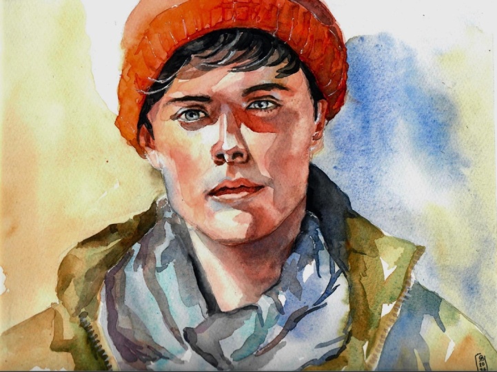
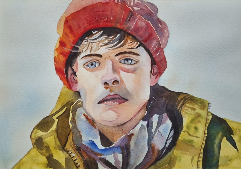
portrait by example and you can go to the
resource section to see the finished painting, whilst I'm talking about this, we can divide the face
into different planes. The forehead plane that tilts slightly back and
catches a softer light. Then we have the front
plane of the face. This is the central strip from the forehead down to the nose and through the
middle of the lips. Then we have the side
plane of the cheek that turns towards the ear
and drops into shadow. Then the under plane
of the chin and jaw, which is cooler and darker, we'll paint that bit later
when we paint the shadows, and then we have
the smaller planes, which can then be the nose, the top plane, side planes, and the little plane
under the tip. So even when it comes to
painting a nose or the ears, rather than actually thinking
of it as a nose itself, think of it as a set of planes. And what do I actually
mean by a plane? A plane is simply
a flat surface of the head or any object that
faces a particular direction. It's nothing too complicated. If the forehead tilts
upward, that is one plane. If the cheek turns
away, that is another. So if you think of a cube, the human head is obviously much more rounded than a cube, but thinking in cubes helps
us break things down. So the front of a cube faces us. The side angles away, and the top angles upwards. And the head does
the same thing, but with softer transitions. And then light hits planes differently depending on
the direction they face. And this is why planes
matter because they tell us the areas which should be lighter and which areas
should be darker. And most importantly, these planes stop the
face from looking flat. When we break it down or
separate sections into planes, we can be a bit more playful. We can mess around with
different color or different value or the
roundness within them. So planes aren't a new idea. They're just the
way light naturally falls across a
face or an object. And we're just giving a name to something your eyes
already recognize. And if we break planes down into three essential ones that
work for any portrait, it makes it easier for us to design our own
portraits in the future. So we have the front plane, which is the forehead, the nose ridge,
the lips and chin. We have the side plane, which is the side of the forehead, the side of the nose, the cheek, and the side of the jaw, and then the underside plane, which is under the nose, under the lips and
under the chin. And knowing that is enough to create a convincing painting.
11. Finishing The Midtones: I know it can seem like
an extra burden to have to think about planes and
learning this new concept. But actually, they simplify
the whole process. So when you're trying to
follow along like this, you might think this
is quite overwhelming. I don't know where
to place the tones, how is he working out what
to do when we actually, because I'm thinking of
things in terms of planes, there's fewer shapes
to think about, and there's clearer value
decisions about tone. And there's less temptation to chase detail because that's
not what I'm focusing on. And then it's easier to see big changes in
the head as well. And that's what
creates the likeness, especially if you do practice
drawings beforehand. Instead of thinking of
20 little features, we might just think
of three big services and how and where they vary. Also, Waka loves
thinking in planes because planes guide where we
place that first big wash, where warm and cool temperatures shift and where our edges
should remain hard or soft. Also when we might want
to come back to glaze areas to add a bit more tone or lift off areas in the future. Before I get back into talking
about tones and planes, I just want to point out a
few subtle color differences in this wash because it's still technically the same wash. It's all connected,
even though it softens in some areas or
lightens in some areas. You can see that the
main color is orange, burnt sienna, that
kind of vibrant brown. But there's subtle variations to that throughout this
wash. At the top, it's a bit more
red. It's warmer. So to complement that
warmth at the top, I have added a few
drops of cool blue. You can see just above the
eyebrow on the top right. But as we've moved down to the shadows around the
lips and the chin, it's gone from a reddish orange to more of a yellow orange. And the complimentary
color of yellow is purple. So you can see, instead
of adding actually a blue color like
we did at the top, I've changed it
to purple because that purple is a complimentary
color of yellow. So just subtle things that can help make a painting
a bit more interesting. And these things that you can put forward
into other subjects, whether you're painting a
still life or a landscape. So whilst it's wet, I'm just increasing the
contrast on this edge here, this tone of the chin because there's quite
a sharp shadow there.
12. The Eyes: So before we move on
to the next stage, I'm just going to add a little bit of muted
color. It can be gray. It doesn't really
matter a bit of brown, just to take the whiteness away from the eyes because I don't
want them to be pure white, suddenly muting them down a bit. Not overdoing it. It's
barely noticeable, really, but it does make a
slight difference. Now we've completed phase two. So we've done the underlayer. Then we've done the mid tones, and now we're just starting
to apply the dark tones. So we've used planes to
anchor the portrait so far. So it still looks a
bit funny because we don't have the
full tonal range. We haven't painted
the dark tones yet, so it doesn't look
complete, of course. We're still only a third of
the way through the painting. But it's anchored, nonetheless, we know that the general shapes
make sense at this stage. So adding the details on
top and these dark tones, which are a bit more
intricate and take a bit more time are going to be easier to work out now
that everything's laid out. These lines that
I'm applying now, I'm trying to achieve
a soft edged them. I don't want them
to be hard lines. But it's strange, actually, if we think about planes again, even though these are lines, as we're painting them, technically, they're
still planes. They're a flat surface, but because they're
basically eyelids, they're just sharp
sections of shadow, we paint them as lines. But even when we get to
small details like this, technically, we can think
about them in terms of planes. I'm using some pure water just to soften out some
of these lines, connect them a bit. Then using that more
diluted pigment that I've picked up from the paper to paint the
eyelashes, very subtle. You can't really see them from that distance, and that's fine. I'm not looking up close
to paint them either. So now to paint the eyes, I'm using what looks
like a dark black. But actually, you can see as I'm diluting it with pure water
and spreading it out, it's actually a purple, a very gray purple
that you can mix using ultra marine
and a sarin crimson. Doesn't need to be
purple, though. It's very subtle. It can be just a gray or whatever color you want to
paint your eyes. Of course, no one in real
life has purple eyes. And then I used a tissue just to dab them out so
they're not fully wet. Then painting the outline
so that it slightly bleeds. And the iris, again, so the edge is
slightly bleed out, so it's not a hard line. It's got a softness to it. Of course, the edge of the eye
is hard against the white, but the black bits have
a softness to them. The eyes are usually
the vocal point, the bit that gets
the most attention. So there's a lot of contrast going on from
light to dark here. I'm careful with the black to add it bit by bit. I
don't want to overdo it. Even though I can take away
with the brush as well. I don't want to go in with
pasty, thick consistency.
13. Nostrils: You can start moving down
to the nose, and again, I'm using burnt sienna to
paint the nostrils and the little shadow where the
lip or cheek meets the nose. Burnt Sienna is actually a very versatile color because
if you look at my palette, when it's concentrated, how
dark it can actually get. You can actually get 90% of the full tonal range
just with burnt sienna, whereas obviously with
cadmium yellow, one. Yellow ochre. You can see on my palette that's
the darkest it gets. That's why often when it
comes to mixing darks, you don't need to use
the black straightaway. You can only use the
black for muting things and affecting the
actual color of something. You don't necessarily
need it for the tone. Of course, you can
use it as a shortcut, but those three bottom colors, burnt sienna, Elazar and crimson and ultramarine
blue are so dark, you can use them for
most of your painting.
14. The Mouth: Now it's time to paint the lips, and I'm going to start off quite bold and then tone
it down afterwards. I'm using a camium red
just to fill out the area, starting off quite bold
and then using water to spread that pigment around
the rest of the area. There's the highlight, if you think about the way the
light falls on the planes, the lips, the top lip is actually facing away
from the light. So that's going to be
darker and in shadow. But the bottom lip curves
around into the light. So we're keeping that
bottom lip lighter. And then as the lips
meet in the middle, that's where no
light meets at all. So we're going to add
a little line going across later when
we've allowed it time to dry a bit to create that illusion of shadow
of the lips meeting. Now, this light is a side light. It's coming from the left and creating a
shadow on the right. So that also affects
the lip because the right hand side is going to be more in the shadow
than the left. But because the
lip curves around, it's not a hard angle. It's going to be
slightly gradual, so you can see on
that bottom lip as it goes towards
the right side, it softens a bit. The lip is a bit too
vibrant for my liking, so I'm just going
in with a bit of a muted brown to take
that vibrancy away. It's a burnt sienna which has a little bit of ultramarin in. So it's not the
vibrant burnt sienna that we're used to.
It's more muted. You could also use black as well, just a
little touch of that. You can see even
there at the bottom, that edge is nicely
defined and dark, and it gradually fades into the warm reds above when it
comes to painting skin tones, it's not about actually finding a single flesh color because
there's so much variety. There's constant shifting
between warm and cool notes. And what we're
really painting is actually light passing through
and bouncing off skin, not a flat layer of paint. So temperature is one of our strongest tools to
make the head feel alive. Even if we keep the
values quite gentle, we can use basic
temperature logic to work it out as well. So in many situations, the light is warmer and
the shadows are cooler. But there are other
situations where it can flip, maybe a cool artificial
light with warmer shadows, especially indoors
where warm objects are reflecting into
the shadow side. So what matters for us is
not memorizing one rule, but asking, is my light side clearly a different temperature
from my shadow side? Also, especially on the face, skin is slightly translucent, so warm light can
sink in and bounce around giving us those
gentle peach notes. But areas with more blood
flow tend to feel warmer, such as the cheeks, the nose, the ears,
and the lips. Then areas that are bonia or deeper in shadow feel
cooler or more neutral.
15. The Neck: Now it's time to paint the neck. And in painting this
neck in shadow, we're actually defining
the chin and the jaw line. So rather than actually
thinking of painting the neck, we're negatively
painting the shape of the head at the bottom. So we can only really
do this in one go. So make sure you are bold with your paints and
mix them dark enough. You don't want them
to dry too light. But you can still take it slow. It does take a while
for the paint to dry, so take your time. Don't over paint it. Make sure you can
see your pencil line so that you know where not
to paint over onto the face. And you can start off
light and then keep on dabbing in more color. You can see even in a
shadow area like this, I'm starting brown
on the left and then incorporating a bluish
purple in the middle there. And this blue and
the brown actually mixes to make a darker color. Almost looks like gray, but it's actually blue mixed
with that brown. This, of course, gives the portrait a feeling of
depth like the head is coming forward and the neck
is sinking into the scene. I don't want it to
be a flat wash. I'm adding little drops of
tone to make it interesting, emphasizing some of
the shadow areas. Usually with watercolor,
we paint light to dark, but I'm breaking the rules
and actually painting this lighter section on top of the darker action just so that it's not a
completely hard line. So although it
doesn't look like it, this is still skin of the neck.
16. The Coat Underlayer: Now it's time to get
expressive again. So we're starting to paint coat. And this is also where
you can experiment with your own personality and where you want to
take this painting. I'm mixing a yellowish green, but, of course, you can choose whatever color you
want for the coat. Looking up references,
I was thinking of a classic green raincoat. However, I don't want it to be I don't want a green
to be too jarring. I want it to keep with the color scheme that
we've already established, and green is just
a brand new color that is not really related
to anything at the moment. However, the yellow, we've already got some yellows
in the background, that Yellow Ochre,
and there's, in fact, a lot of yellow influences
in the face tones as well. Just painting this little hood that goes on in the background in a bit
of a more muted color, leaving a little gap where his red hat will
be around his ear. In fact, we can carry
this and connect it. It's a bit too green, so
adding the Yellow Ochre. I'm painting a larger wash now, so you can see I've
changed to a larger brush. And I can start messing around with it,
having a bit of fun. Even with something like this, it's not a flat color. I'm incorporating a few random colors like
that green at the top, making it a bit muted,
starting on the other side. Adding that green again and then mixing that
muted Yellow Ochre. It can be a bit
confusing because of the different layers of
the coat, the scarf, incorporating a bit of
dry brush in there, maybe flicking some pure
water to increase the feeling of texture, loosening up again. After all that tension
of details in the face, we can try and feel a
bit more liberated. This is just an
underlayer at this stage. So not much concern about details just filling
out the general area. It's usually the case that
the underlayer is where all the exciting textures are and that ethereal
feeling of watercolor. That's so exciting
to many people. And then it's the
shadows on top, the second layer
that angers it and gives sense and
reason to the chaos. It was starting to look a
bit too yellow and boring, so I'm adding a bit more green and this also
affects the tone. So now we can move
on to the scarf, which at the moment, I'm dropping in a bit of gray just to take
away the whiteness of some areas and then
adding in serlean blue. And then a bit of
brown on top of that to contrast with that blue. But I'm moving around all
the blues, not just Cerlean. I've got cobot blue, ultramarine, and then
building it up bit by bit. Again, it can look quite
abstract at this stage. It's not so important
to be refined. We'll come back later to
make sense of it all.
17. The Hat Underlayer: Now it's time to paint the hat, and this is where the glow of the painting
exists, really. This is a nice warm
orange and red. So we'll tilt towards
yellow on the left. And then to keep it exciting, we'll make it more red
on the right hand side. I'm pre wetting the area so that when we start
adding all this pigment, it blends nice and
softly and I won't feel the pressure to fill it out
as quickly as possible. I can take my time of it and have fun experimenting
with colors. So starting with a nice
vibrant Cadmium Yellow with a touch of Yellow Ochre, and then transitioning with this Alizarin Crimson
on the right, keeping it nice and steady, a nice steady mid
tone to begin with, just gradually
building up the tones. I'm using a brush with
a nice tip to it so that I can paint all
the way to the edge and achieve a nice clean line it Then dropping more actually, I'm starting to use cadmium red now rather than a
lazar and crimson, which actually has a lot more
vibrance and potency to it. It'll achieve more of that glow. Now we can start extending
it to the right hand side, and I'm going to have it a bit more muted on
this right hand side. As you can see on the left, we've got that yellow glow. Over here, I'm going
to keep it a bit more of a neutral brown color. And it's these little
touches that can make a painting a bit
more interesting rather than just having it
a flat red color. We can experiment with
the neighboring colors and also the vibrancy
of those colors.
18. Glowing Colours: So we can dry that
out completely now and start working on
the next layer of tone. And the reason I didn't paint this all in one
go is because I want to achieve a bit more
control with my texture. I'm going to try and convey that knitted feeling of the fabric. So a lot of it
could be filled in, but just doing it in two takes gives me
a bit more control, and it makes it a
bit more dynamic. This second wash is still red, but it's a bit more
of a muted red. As you can see, it's
not so vibrant. Alizarin Crimson and
a bit of ultramarine. So in fact, it's a bit cool. It's a cool red, edging
on purple, actually. But I'm also adding a bit of burnt sienna
in there as well. And as I'm filling
this area out, I'm trying to think
of where I can leave those little gaps
of the underlayer, the transparency of
the paper beneath. Even though 90% of this
hat will be painted in, I have to take my
time with it a bit just to consider which areas
I do want to leave in. Because when it
comes to preserving the paper, you can't go back. Of course, we can use
opaque white paint later, but I try not to rely on that. I only want to use that for tiny little highlights
at the end. So just like we did
with the underlayer, we started with the muted tones on the right and the vibrant orangely
yellows on the left. And we're going to
connect the two. Trying to get the
tones fairly correct. And then I can start to
experiment with texture. Applying a few guidelines. So these little marks
that help guide the eye where the possible direction of the thread or
the fabric will go, not painting into the hairline, making sure there's
a clean definition between the hat and the
hair for the time being. And then using this
tissue and a few slats of water to create some
interesting textures because that's what
watercolor is all about. We don't want to have
everything nice and refined. And continuing on here, leaving a tiny little gap so that it's not completely
connected everywhere. These two layers,
that darker layer at the top and this front layer.
19. Finishing The Hat: And then whilst it's still wet, we can add these
directional strokes, Alizarin Crimson, but more
concentrated this time. Seeing how it just melts
into that wet on wet. And as it's starting to dry, it's starting to hold
its shape a bit more. And we can give this
hat a bit more form. I've changed to a smaller brush because we've already
filled that large area out, so I don't need to fill
loads more pigment. I'm relying on the tip
of my brush a bit more, swirling my brush around so the pigment falls
out onto the paper. And the good thing about wet and wet, it's more ambiguous. It creates that illusion of detail without having
to paint it in. H. I decided the tones
weren't strong enough there, so I've gone back into it. Scrubbing the pigment that's
already on the paper, even using pure water to agitate and make it a bit
lighter in some areas. So you can use
water to make areas lighter and it'll push away the pigment to reveal
the paper underneath. In a very fun textured way. If we wanted a clean wash, we wouldn't want to
do these things. And that's where watercolor can be unpredictable in a fun
way rather than a rigid way. I'm finding that this hat
is actually easier to paint than hair because hair can sometimes
be hit or miss. It can be a complicated thing to get right because, of course, we don't want to paint every
single strand of hair, so it can be difficult to simplify it into a
believable mass. But this hat is a kind of
abstract shape that we can simplify in a way that's easily
readable for the viewer. And we're at the
sweet spot here where the paper is 80% dry. So when we apply these
brush strokes now, they just melt into the paper, creating that soft
wet on wet technique. You don't want to paint
this hat until you feel that it's finished because then it
will be overworked. So at some point, you've just got to move on and possibly come back to it later, and it can be difficult
to find that spot. So usually, when you feel like your tones are correct and you've got a nice
variety of texture, wet on wet, lost and
found, soft edges, hard edges, then move on and then possibly come back to it later
with fresh eyes. And then you'll
probably find that you don't actually
have to do much, and it already has that
ethereal feeling to it.
20. Coat Shadows: Okay. We can go back
to the coat and the scarf to add some shadows, and it's really these
shadows that make sense of the form and makes it
believable as a coat. And even these shadows don't
need to be rigid details. It just conveys the
feeling of structure. I'm using this very muted green. We're actually using a
similar kind of color for these shadows as we
did for the underlay, just a different concentration. The consistency is thicker. It's still this kind of muted
green slash Yellow Ochre. Being being a bit
more potent with it. And even when it comes to these very random shadow shapes, it's not like we can follow rules like we can
do with the face. We can paint lots of
different faces and kind of get an understanding of how
facial structure works. But when it comes to a
coat with random crinkles, we can't really apply
universal rules to it. So it all comes down
to observation. And again, in a way, thinking about it in planes, like looking at
direction of light and shadow and the
specific shapes as abstract as these shapes
will be trying to match those shapes by simplifying
them on your paper. And by simplifying, I mean, there's infinite
amounts of tones and different stages of
levels from light to dark. So I'm just changing
them to three. I've got light tones, medium tones, and dark tones. And then maybe within those, I'm kind of allowing a
little bit of wiggle room. But when I'm looking at a
subject or my references, first of all, dividing
them into three. What's light, what's
mid and what's dark? And then I can work on
those sections one by one. So of course, the light section, that's the easiest
because we're just laying down the
expressive underlayer, a kind of flat but exciting
expressive underlayer. With these mid tones, that's when we have to
start using our brains a bit more to figure out
how to simplify it. What's the difference between a tone being light and dark? That kind of middle range
can be a literal gray area. So that's also part of our own intuition and what
makes us unique as artists. Notice, as well,
that on the right, that cast shadow that bold cast shadow under the
collar or that fold, it's a deep blue
rather than the kind of mid tone shadows that
I've done on the left side. And that's really because it's
a bit more bolder and it's defining the general
shape rather than the kind of superficial
shadows on the left.
21. Scarf Shadows: The scarf in particular is
quite a weird one to draw because there's no clear planes. It's all crinkles and
wrinkles folded up. So it's going to be another situation
where we have to really simplify as
much as possible. So much like we would paint hair by blocking out the tones, I'm just going to paint
everything into abstract shapes, and then I can soften out
and arrange it afterwards. And whilst we go
through this process, let's go over some important
questions that I ask myself, and you can ask yourself when
trying to paint a portrait and really figure out what you want to tell and how to make it a successful one. The first one is, do I clearly understand where
the light is coming from? We've briefly touched on this, but what this
question really means is where is the light source? Is it warm or cool? Is it high or low? Is it coming from one side or
flooding the whole head? And before even a single
wash touches the paper, we want to know what direction the light is hitting
the planes of the head. And that's why sometimes doing a little sketch to
work out a composition beforehand really helps if you're working on your
own original pieces. The light direction
controls everything, the value shapes, the
temperature shifts, the edge softness,
the whole mood. So if we don't know whether
direction is coming from, we will paint shadows
that don't belong anywhere or our portrait will feel quite
flat or confused. So clear light direction is one of the
biggest differences between a believable
portrait and a muddled one. Then once you've
answered that question, you can move on to the next one. And this goes on throughout
the whole process. It's Have I separated light side and shadow
side clearly enough? With this, we are
checking whether the head has a simple readable
value structure, not details or features, but a clear division. The light family,
which is everything facing the light and
the shadow family, everything turning
away from the light. So it is similar to
the last question. But it breaks it down
into more simpler terms. Because if that
separation is clear, the portrait already works
before features are added. It's the backbone of form. Without this division, the
head just collapses into flatness and the details painted look strange on
a weak value structure. They'll never look convincing. And watercolor
specifically rewards us for organizing values early. Once the lights and the shadow
families are established, every little glaze and
wash becomes easier. And the next question we've
talked about quite a lot. So we don't need to go
into it too much again. It's, am I thinking
in big planes or have I slipped
into parts mode? Are we treating the
head as a collection of simple, large planes, or have we fallen into painting isolated parts such as eyes, nose, lips that are
not really connected?
22. Value Range: Another question
that I ask myself, I my value range strong
enough to carry the portrait? Have we actually committed a full value range or are we hovering in
the middle somewhere? That's why sometimes
we've got to think with the end in mind because
with watercolor, we usually leave the
darks to the end. So we have to be aware
of the full process. And we know that we
could be halfway through painting and
we haven't really touched the darkest darks yet. So we have to know
where we're going to put them before we
actually begin. And then on the
other side of that, we've got to think about
the preserved lights. Because when it comes to
painting washes and shapes, we have to be aware
of which parts we're going to leave out
before we actually put the brush to the paper because it can be difficult to
take those parts away. So a good portrait usually
needs preserved lights, a handful of true solid darks in exactly the right places such as the eyes, and even now, this little section
on the shadow of the neck, the nostral areas, the corners of the mouth, and the little well, we haven't painted them yet, but the dark shadows
of the ears, as well. And then, of course,
we need a solid, coherent middle tone, which makes up the
majority of the painting. Values rather than details, do the heavy lifting
in a portrait, which it doesn't seem like that when you first
look at a portrait, but the sign of a good
portrait is actually that you don't
actually notice it because you're drawn into it. If the values are wrong, that's what makes a
painting look off, but it's hard to associate
that with values, but that is what defines it. If we were to hold
back and never drop in the dark accents, the eyes will lack depth, the mouth will feel weak, and the head will have
no actual weight to it. So a strong value range helps us create believable volume. Watercolor has a
tendency to dry lighter, so we must paint boldly enough
to compensate with that. Even in a looser
expressive portrait, it becomes more convincing when the value
structure is clear. That's often how
expressive painters work how to convey a
scene most quickly. If you don't have time to paint, you must first focus
on the values, and it will speed up your work. This is a playful area that I'm doing now because
it's a solid black, but there's a tip of
it that connects to that larger brown shadow above. And these almost black lines, these staccato, sharp,
contrasty lines. It's all about value,
as you can see, and it creates that
depth, that interest. And it's not a large
part of the painting, these little diagonal lines, but they have a major
influence on the whole thing. We don't need a lot of darks, but when we do use them
in special places, it really makes
the portrait pop.
23. Warm & Cool Colours: The next question
I ask myself is, are my warm and cool colors helping the form or fighting it? Because we need to check whether our use of warm and cool colors follows the logic of the light or has become
random decoration. Of course, we can
bend the rules, but we can only do that if we know how the rules function. And every portrait has
a temperature story. So warmer planes turning towards a warm light and cooler planes turning
away from warm light. And then we have
neutral transitions that keep everything harmonious. When the temperature
shifts follow the planes, form
appears effortlessly. Skin is full of gentle
color transitions, even when the
values are similar, and warm and cool shifts help the viewer feel the
roundness of the face. They also create mood, so warmth in the lit cheek or cooler violets in the shadow, soft neutrals, where
the face turns. A nice way to do this, how to analyze any
portrait reference is by squinting your eye
slightly to see the values. By relaxing your eyes, you notice the temperature
transitions a bit better. You can start to notice that form doesn't always need
strong value contrast. Sometimes a subtle temperature
shift can be enough. If you look at the shadow above the lip on the right
and squint your eyes, it's basically the same tone
except underneath the nose, it's orange and in the
corner of the lip, it's a more muted
cool blue shape. Now we can start
painting in the ears. Again, keeping it a
very simple shape. I'm not trying to mix
any complicated colors, just sticking with
that Alizarin Crimson and the burnt sienna. But sometimes the colors
could become very unique because if you
look at my palette, they're all quite harmonious because they're mixing
with each other. And instead of mixing a
brand new color each time, I'm using the colors
that are already on my palette so
they're matching. And in doing so, then they become unintentionally
quite unique. H.
24. Focal Points: Another thing to keep in mind whilst in the process
of painting a portrait is where is the true vocal point and are my edges and
contrasts supporting it? And what do we actually want
the viewer to look at first? And have we designed the portrait so that the
eye goes there naturally? Of course, as I mentioned
earlier, with portraits, almost always it's the eyes, but sometimes the mouth or the overall light shadow
pattern can lead. It's basically about
checking whether our edges, values, and texture are pushing attention
to the right place. Watercolor gives us soft
diffuse transitions everywhere unless we deliberately
shape a focal point. And if every edge is sharp
and every shadow is strong, nothing really stands out, and the painting feels
quite flat in the end. So a controlled focal
point creates rhythm. One area reads clearly
whilst the rest stays calm. And when we decide where
the viewer should look, it actually becomes easier to decide where not to put detail. So if the eyes are going
to be our focal point, I'm saying the sharpest edges and the darkest accents
are for that area. And I'm softening certain areas on the cheek because
I don't want it pulling attention away
from that area of the face. And notice how the
background stays very light and loose so that the
features feel more present. It's not distracting.
It's a subtle feeling. And if a shape outside the focal area is
becoming too loud, I just soften it up a bit with a bit of clean water and I help it to melt back into
the composition. And you can
experiment with this. Maybe you can practice
doing a portrait where you deliberately
shift the vocal point. So maybe you can do this portrait once with the
eyes as the focal point, and then maybe the mouth or even the general silhouette emphasize that silhouette shape. Now that we have the majority
of the painting complete, we can actually acknowledge the background
again because when we first painted it as the very initial step
of this painting, there was no context, and it might have been
easy to overwork, but you can see how subtle
and random it is now, but it's intentionally quiet. At least it's not
attention seeking. It's acting as a
frame that enhances the portrait rather than actually pulling
attention from the face. But it supports the
portrait through value, color temperature,
and simplicity.
25. Painting The Hair: When it comes to
this hair section, I'm thinking about it again
in two different values. I've got the solid blacks, then I've got the brown midtns and then I've got that
light underlayer. I'm trying to incorporate
those three levels and then blending them
together somewhat naturally so that it doesn't feel for so there's
a flow within them. So even though when
they blend together, there's a kind of crossover between the three
different tones. In my mind's eye, when
mapping it all out, I'm thinking in light, medium tone, and dark. And there's not too much
variation of color. I'm basically using a pure black or neutral
tint for the darks. And the browns are
just as a brown. There's nothing special. There's no other real influence
in there at the moment. Sometimes it's very easy
to overwork the hair, but you just have
to ask yourself, am I adding detail because
it helps the composition or because I'm just
nervous and unsure. Are these marks genuinely
clarifying the form, the character or the expression, or am I adding them because
I'm unsure what to do next. Portraits are actually more likely to be
overworked due to fear rather than enthusiasm and
watercolor rewards restraint. Small unnecessary marks
accumulate quite quickly, and they can dull the
freshness of the portrait. And then it's easy to try
and fix a portrait by adding more detail and
more strands of hair, but this usually leads to more clutter rather
than clarity. So even when it comes down
to painting the hair, e expression comes from
the major shapes, planes, and value relationships,
not the number of strands or the amount of curls. And if you find yourself
stuck, you can tell yourself, rather than decorating
the portrait with detail, I want to strengthen
the bigger shapes. And whenever I feel the urge to add tiny
marks everywhere, it usually means I'm nervous. So instead, I step back and I look at
the value structure. We've talked a lot about the
techniques and concepts, but we haven't
really talked about the feeling and how we want the emotion to be conveyed or the quality you're hoping
the portrait will express. This is not about accuracy
or likeness, but feeling, and examples might
be like calmness, strength, warmth, curiosity, confidence,
these kind of things. And then you go to
ask yourself whether your choices in value, edge, color are delivering
that mood because portrait painting and
any other painting really is not only
technical, it's emotional. So if we only focus on
proportions and features, we can accidentally lose
that human quality. So feeling directs
design decisions. So a soft mood equals soft edges and gentle
values or a bold mood, stronger contrasts
and sharp accents. A distant or cold mood is a cooler palette or a warm intimate mood
is a warmer palette. And without emotional intention, a portrait can
become technically competent but emotionally empty, trying to keep in mind that portraits are interpretations
rather than tasks.
26. When To Finish A Painting: Sometimes it can be
difficult to work out when the painting has finished,
when you should stop. So one of the things you
can ask yourself is, if I had to stop right now, would the portrait
already feel alive? We're checking whether
the portrait has already crossed that threshold, even if it isn't polished. And if it's not, there's a few
things we can check because a portrait feels alive when the value structure is clear and the
planes read clearly, the expression is present. The warm and cool
shifts feel natural, and the focal area
has enough strength, and it doesn't require
perfect detail or meticulous rendering
to reach that state. And so much of that magic
actually happens earlier on in the earlier stages
when we're doing the underlayers and the
more abstract parts. So I'm using a bit of
whitewash just to add a little bit of sparkle,
not necessarily detail, just little touches
of this white to give it a bit of clarity or at least the
sense of clarity. I don't really want these
bits to be obvious. Just add a bit of
sharpness to them. A bit of dry brush
marks on this hat area. Just those three
subtle lines and a few dots help
build that feeling, that emotion, that
illusion, rather. Help anchor the chaos
without overdoing it. I'm using dry brush
on the hat to try and achieve that texture
of the fabric, and there we have it.
27. Final Thoughts: Welcome back. And
congratulations on completing this watercolor class on how to paint a portrait. Today, we explored
how expression grows from value and edges
rather than detail, how a limited
palette of warms and cools builds convincing skin, and how glazing, lifting and selective accents create
clarity without heaviness. The hat and scarf showed how
supporting shapes can frame the vocal point while the
background stays quiet. These ideas travel
to any face at any angle and to figures more
broadly where structure, rhythm, and light do
the storytelling. Remember, watercolor painting is not just about technical skills, but also about expressing your creativity and
personal style. I encourage you to continue
exploring, experimenting, and pushing your
boundaries to create your own unique
watercolor masterpieces. As we come to the
end of this class, I hope you feel
more confident and comfortable with your
watercolor painting abilities. Practice is key when it comes
to improving your skills, so keep on painting
and experimenting. I want to express my gratitude for each and every one of you. Your passion for watercolor
painting is so inspiring, and I'm honored to
be your teacher. If you would like feedback on your painting, I'd
love to give it. So please share your painting in the student projects
gallery down below, and I'll be sure to respond. If you prefer, you can
share it on Instagram, tagging me at Will Elliston, as I would love to see it. Skillshare also loves
seeing my students work, so tag them as well
at Skillshare. After putting so
much effort into it, why not share your creation? If you have any questions
or comments about today's class or want any specific advice
related to watercolor, please reach out to me in
the discussion section. You can also let me know about any subject wildlife or scene you'd like me
to do a class on. If you found this class useful, I'd really appreciate
getting your feedback on it. Reading your reviews
fills my heart with joy and helps me create the best
experience for my students. Lastly, please click
the follow button Utop so you can follow
me on Skillshare. This means that you'll be
the first to know when I launch a new class
or post giveaways. I hope you feel
clearer about what to prioritize and are willing
to let detail be selective. I look forward to
seeing you all in future classes until then, happy painting and Bye for now.
 Will Elliston, Award-Winning Watercolour Artist