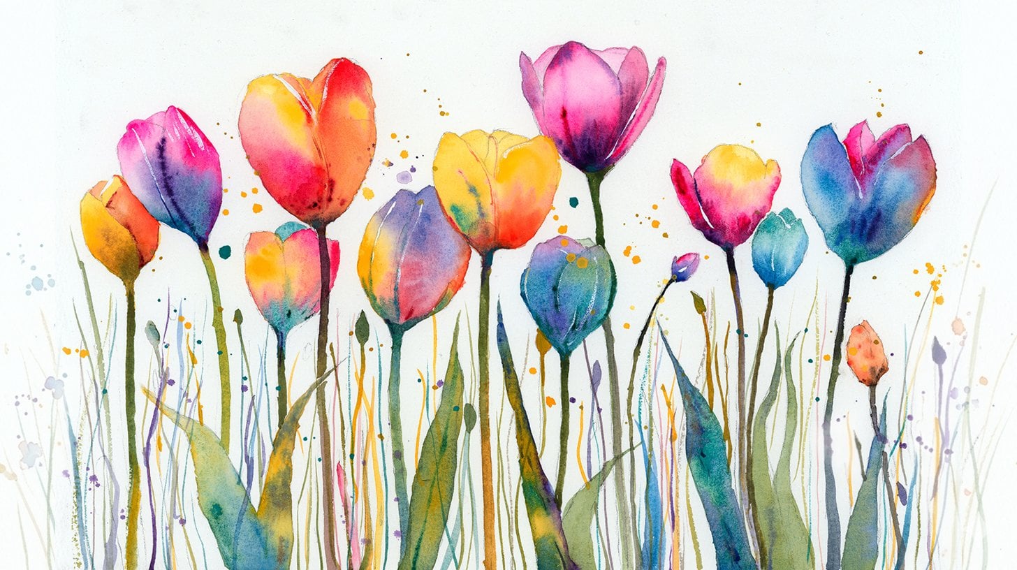
Transcripts
1. Welcome To The Class!: Hello, everyone. My
name is Will Alston, and welcome to this class where we'll immerse ourselves in the delicate but
expressive world of painting roses in watercolor. We're going to explore
the playful gradients and vibrant hues that
make a rose both a challenge but also
a delight to paint. Using a variety of watercolor
techniques we'll capture the natural elegance and
soft curves of rose petals, achieving a lifelike depiction
that blossoms on paper. I've been a professional
artist for many years, exploring lots of different
subjects from wildlife and portraits to cityscapes
and countryside scenes. I've always been entranced by the possibilities of watercolor. But when I started,
I had no idea where to begin or
how to improve. I didn't know what
supplies I needed, how to create the
effects I wanted, or which colors to mix. Now I've taken part in many
worldwide exhibitions, been featured in magazines, and been lucky enough
to win awards from well respected
organizations such as the International
Watercolor Society, the Masters of
Watercolor Alliance, Windsor and Newton, and the SAA. Watercolor can be overwhelming
for those starting out, which is why my goal
is to help you feel relaxed and enjoy this medium
in a step by step manner. Today, I'll be guiding you
through a complete painting, demonstrating a
variety of techniques, and explaining how I use all
my supplies and materials. Whether you're just starting out or already have some experience, you'll be able to
follow along at your own pace and improve
your watercolor skills. If this class is too challenging
or too easy for you, I have a variety of classes available at different
skill levels. I like to start off with a free expressive
approach with no fear of making mistakes as we create exciting textures
for the underlayer. As the painting progresses, we'll add more details to bring it to life and
make it stand out. I strive to simplify
complex subjects into easier shapes that
encourage playfulness. Throughout this class, I'll be sharing plenty of
tips and tricks. I'll show you how to turn
mistakes into opportunities, taking the stress out of
painting in order to have fun. I'll also provide you with
my watercolor mixing charts, which are an invaluable tool when it comes to choosing
and mixing colors. If you have any questions, you can post them in the
discussion thread down below. I'll be sure to read and
respond to everything you post. Don't forget to follow
me on Skillshare by clicking the Follow
button at the top. This means you'll be the
first to know when I launch a new class
or post giveaways. You can also follow me on Instagram at Will Elliston
to see my latest works. So gather your brushes
and paints and let's breathe life into these
beautiful flowers together.
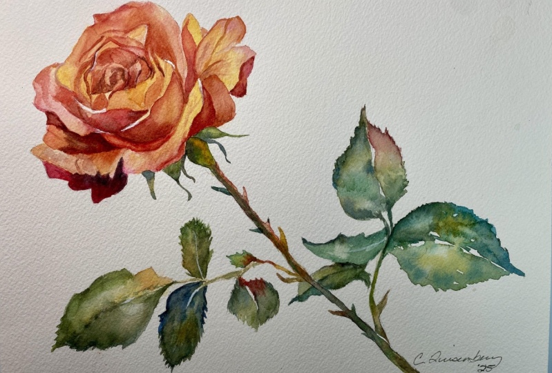
2. Your Project: Thank you so much as always for joining me in today's class. I'm so excited to take
you through this painting with the delicate flower
and the expressive leaves, we'll be focusing
on achieving depth and realism with
each brushstroke. We'll dissect how to mix
custom petal shades, manipulate water to
create soft blends, and employ detailing techniques to accentuate the roses texture. You will learn how to
observe and replicate all the different nuances
of the rose petal, creating a dynamic and
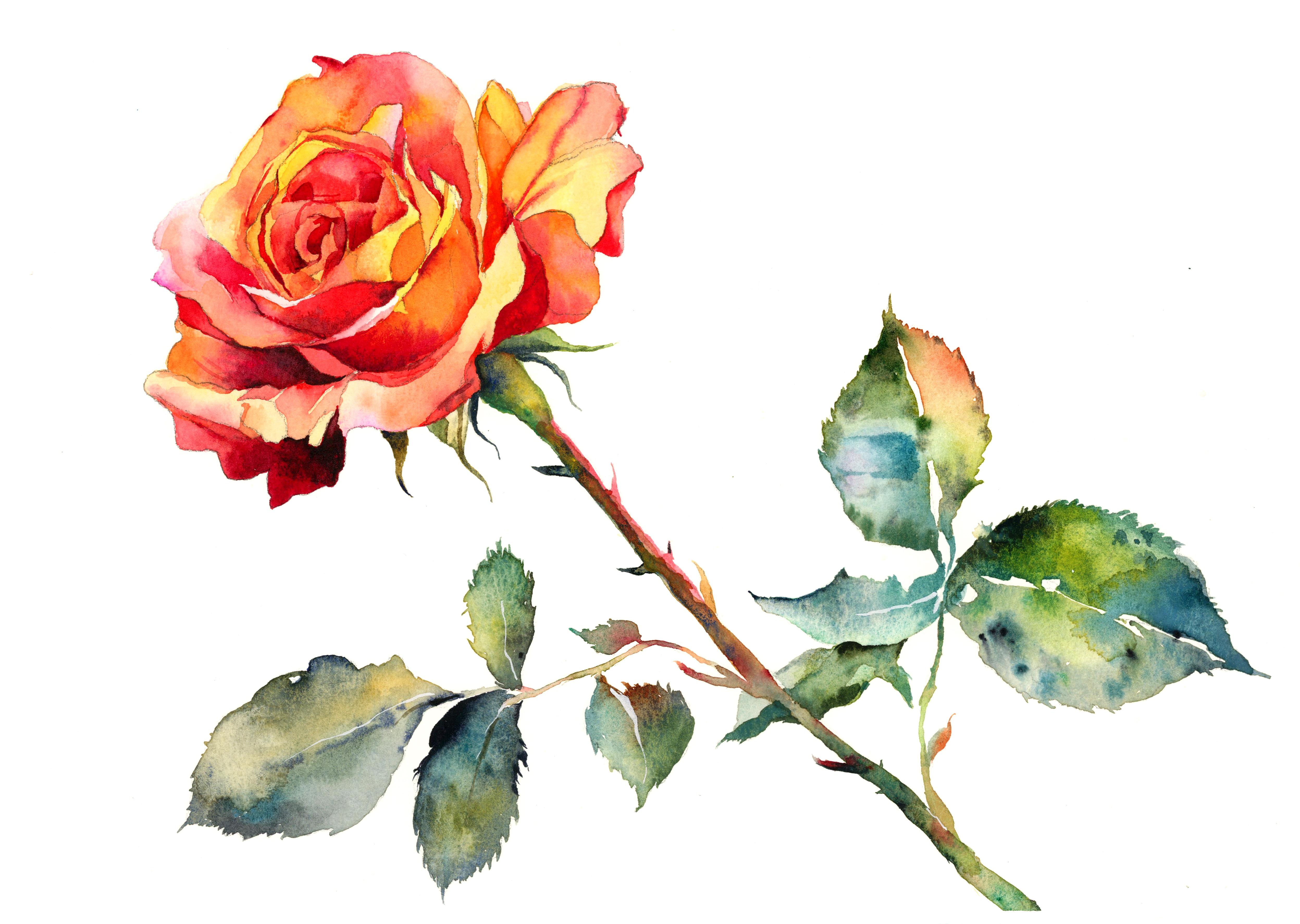
dimensional floral artwork that pops right off the page. In the resource section, I've added a high
resolution image of my finished painting
to help guide you. You're welcome to
follow my painting exactly or experiment with
your own composition. As we're going to be focusing on the painting aspect
of watercolor, I've provided templates
you can use to help transfer or trace the
sketch before you paint. It's fine to trace when using it as a guide for
learning how to paint. It's important to
have the underdrawing correct so that you can relax and have fun learning the
watercolor medium itself. Whichever direction
you take this class, it would be great
to see your results and the paintings you
create through it. I love giving my
students feedback, so please take a photo
afterwards and share it in the student project gallery under the project
and resource tab. I'm always intrigued to
see how many students have different approaches and how they progress with each class. I'd love to hear
about your process and what you learned
along the way, or if you had any difficulties. I strongly recommend
that you take a look at each other's work in the
student project gallery. It's so inspiring to see
each other's work and extremely comforting to get the support of your
fellow students. So don't forget to like and
comment on each other's work.
3. Materials & Supplies: Before we get started
with the painting, let's go over all the materials
and supplies I'll use. Having the right materials can greatly impact the
outcome of your artwork. So I'll go over all the supplies I use for
this class and beyond. They're very useful to have at your disposal and will make it easier for you
to follow along. Let's start with the
paints themselves. And like most of the materials
we'll be using today, it's a lot to do
with preference. I have 12 stable colours in my palette that I
fill up from tubes. They are cadmium
yellow, yellow ochre, burnt sienna, cadmium
red, Alizarin crimson, Opramarne blue, cobalt blue, serlean blue, lavender,
purple, viridian, black. And at the end of the painting, I often use white gouache
for tiny highlights. I don't use any
particular brand, these colors you can
get from any brand, although I personally
use Daniel Smith, Windsor and Newton
or Holbein paints. So let's move on to brushes. The brush I use the most is
a synthetic round brush like this escodaPurl brush
or this Vangh brush. They're very versatile because
not only can you use them for detailed work
with their fine tip, but as they can hold
a lot of water, they are good for
washers as well. They're also quite affordable, so I have quite a few
in different sizes. Next are the mop brushes. Mop brushes are good for
broad brush strokes, filling in large areas and creating smooth
transitions or washes. They also have a nice tip that can be used for smaller details. But for really small details, highlights or anything
that needs more precision, I use a synthetic
size zero brush. All brands have them,
and they're super cheap. Another useful brush to have is a Chinese calligraphy brush. They tend to have long bristles
and a very pointy tip. They're perfect for
adding texture or creating dynamic lines
in your paintings. You can even fan them
out like this to achieve fur or feather
textures as well. And that's it for
brushes. Onto paper. The better quality
of your paper, the easier it will be to paint. Cheap paper criinkles easily
and is very unforgiving, not allowing you to
rework mistakes. It's harder to create
appealing effects and apply useful techniques
like rubbing away pigment. Good quality paper, however, such as cotton based paper, not only allows you to rework
mistakes multiple times, but because the pigment
reacts much better on it, the chances of
mistakes are a lot lower and you'll be more likely to create
better paintings. I use arches paper because that's what's available
in my local art shop. A water spray is
absolutely essential. By using this, it
gives you more time to paint the areas you
want before it dries. It also allows you to
reactivate the paint if you want to add a smooth
line or remove some paint. I also have an old rag or t shirt which I use
to clean brush. Cleaning off the paint
before dipping it in the water will make the
water last a lot longer. It's always useful to
have a tissue ate hand whilst painting to
lift off excess paint. Also, you never know when an unwanted splash or drip might occur that needs
wiping away quickly. I also have a water dropper
to keep the paints wet. When you paint, it's
important to have them a similar consistency to what
they're like in the tubes. This way, it's easier to
pick up sufficient pigment. A hair dryer is useful
to have for speeding up the drying time and controlling the
dampness of the paper. And lastly, masking tape. And this, of course, is just to hold the paper down still onto the surface to stop it sliding
around whilst painting. Also, if you plan on
painting to the edge, we'll allow you to create a
very crisp, clean border. And that's everything
you need to paint along. As always, I encourage you
to experiment and explore with different ways that might suit your
own unique style. Now, let's get on and
start the sketch.
4. How to Sketch It Out: So starting off the sketch, I'm going to be using this
thick lead pencil just so that I can apply
some loose strokes and make the white of the
paper less intimidating. I'm using a circular motion, adding a bit of a spiral, and we can use these
lines of the spiral to help us guide the
petals later on. So we're breaking
everything down, even the complex things into simple shapes
as much as possible, adding the little stem there, and you can see how light I'm applying the
lead at this stage, just so that we can rub out. If I press too hard, it'll be too difficult
to rub out and it'll indent the paper. I'm just adding a
few ellipses here or circles where we might want
to place some leafs later, maybe one here close
to the main stem. You can be really adventurous
with where you want to place them and
the different sizes. You want to have them,
maybe you want some small. And at this stage, we're just thinking
about how we might want to balance the
painting as well. Maybe you want two small ones on the left and one larger
one on the right, for example, you can really
experiment with balance. And that was quite
quick laying that out. Now I'm going to change
to a finer lead pencil and start going in thinking
about how a rose might look. Of course, I've
got many different references that I've collected, and you can easily Google roses or maybe
you want to buy one from the shop and florists and observe in real life
what a rose looks like. But I'm following those spirally lines
that we applied before. But of course, the petals
are very jagged and uneven. So I'm allowing myself
a bit of freedom. I'm not completely
following the lines. I'm just using them as a guide. And, of course, if
you think about how a flower opens from its bud, you can see in the
center all the petals are tighter and smaller and
more concentrated together. And, of course, as they open up, the edges have much more
space and start to peel away. So that's something I'm
trying to convey here. The good thing
about these petals and drawing rose in general or any other flower really is
that it's very organic, and there's a lot of
room for inaccuracies, meaning that you can get
away with a lot of mistakes. But I wouldn't even
call them mistakes because they work at
the end of the day. So you don't have to be so
accurate with your drawing and it'll still give off the
illusion of being a flower. Of course, when
it comes to paint later on in the next stage, that'll be a bit
more complicated because the more details you
add with your pencil now, the more details you'll
have to paint later. But I'm trying to block
everything out into shapes. Even if some of them
are quite complex now, I can still see where
the lines are and where the borders of one shape is and where
it mixes with another. Of course, we'll have
gradients as well. We'll have reds flowing into yellow and purple
blending into orange. You can really choose whatever
colour rose you want. Now, I'm not so sure of the technical terms of these
parts I'm just drawing now, the little greeny bits at the bottom or the
bud that peel back. Now, I've finished with
the rose head now and now I'm moving down
into the main stem. Add a little thorn there. And now we can start moving
into the side stems. I don't know what
the word will be the sub stems, secondary stems. Creating a few jagged
edges for the leaves. Even the leaves don't have to
be so accurate and smooth. I'm using those circles
we did before as a guide, except as you can see, for
example, for this one, I'm going to add a little tip
to the end of it like that. Which of course gets
off the illusion of a leaf having that
jagged and tipped end I'm bringing it all back. You'll also notice how that's
basically all one line. I obviously had to take my pencil off the
paper occasionally, but I do make it a point
to try and keep contact with the paper as
much as possible because for whatever reason
it is, I don't know. I'm sure there must be a
scientific reason behind it, but it just always
makes my paintings better on my drawings, at least, if I try and keep the pencil on the
paper as much as possible. Of course, with this leaf
here, it goes underneath, so I have to take it off as
it goes underneath the stem. I guess maybe what
it is is if you keep on taking your pencil off the paper and moving
into a different area, it loses its harmony
and gets a bit disjointed because it's
not flowing naturally. You might start drawing in one section and then in
a different section, and they're not matched. They're not measured in
the same proportions. So, it's pretty much done now. I'm just going to take my
putty rubber and remove some of the light underline markings. So, let's move on
to the painting.
5. Underlayer Petals: So jumping straight
into the painting, not using a very large brush, not using a tiny
little detailed brush, just a medium size brush, I'm pre wetting some of the areas that I
want to underlayer. And I'm going to start off
with this vibrant opera pink. And I always add water to begin with in this underlayer stage, especially when
it's got a lot of detailed edges that I want
to preserve and protect. Because by adding
the water first, as you can see it, it spreads exactly where I put the water. And if I were to go in
directly with the ink, it might run out of control, or I might make a
mistake and paint over. But if I've already
pre wetted it, I know exactly where
it's going to go to. So that's just a subtle
touch of opera pink. Now I'm going in with
a sarin crimson. And now I might experiment
with a bit of cabmum yellow. So basically, for the
flower head, this rose, we're going to experiment with all different
warm pigments. We're going to limit
cool colors in this one. We're going to save the
cool colors for the leaves, so there'll be a nice balance. But in the actual rose head, we're going to have oranges, like I just mixed camium yellow with camium red then to
make this lovely orange. And in different ways, we're going to mix these paints to create a nice
array of warm colors, and this will be a good
opportunity for you to explore with how all these
warm colors interact. You don't need to follow this
exactly as I'm doing it. You don't need to
add yellow there. If you don't want to,
you can make that pink. It's all about exploring
your own personal vision. I encourage you to do so. But of course, if you're
not feeling confident, that's perfectly fine,
especially if you're a beginner. You can try and follow
this step by step. Adding yellow and then mixing a bit of red is
usually a safe bet. That's what I've
been doing so far. And we're using a
light to mid tone. And now I'm dowing a bit of a sarin crimson
into these areas. And then I'm assessing how
strong I want it to be. If it's too strong, then I use this little sponge I've got
to draw water out the brush, and then with an empty brush, I can suck out some of that pigment using
my brush like that. And I can repurpose
it somewhere else. The good thing about
sticking to warm colors is that none of them will go muddy. Whether you're mixing
orange with yellow, yellow with pink,
pink with orange. As long as they're warm,
they won't go muddy. So you can move your brush all around the paper
in this section, and you don't need to be worried about muddiness or gray tones. In fact, because of this liberation with just
sticking to warm colors, it means we can only
focus on tones. And actually, tones is much more important in general
in painting than color, because 90% of the time, if you get your tones right, then the colors will
look after themselves. And as an exercise, it will be very
insightful to see how different tones of different warm colors
interact with each other. Maybe, for example, the
darkest you can get with yellow is only actually a mid tone of the darkness
you can achieve with red. There's some limitations with the amount of tone you can get. So after a while, even if you've painted your
whole flower in yellow, you're going to have to
incorporate some other warm tone, maybe brown to keep it yellow. Likewise, alizarin crimson
is a very dark red, so maybe you'll have to
change to camium red to get the full vibrancy of
the red side of things.
6. Rich Yellows: You can see so far which
areas I've obviously painted, and that's going to
be the underlayer. I'm going to come
over these areas with thicker pigment later. Again, you can look at the
final image to see how I've chosen to keep some
of these colors and how I've chosen to paint
over some other colors. And it's pretty random
where I'm choosing to put yellow and where I'm choosing to put pink or red, et cetera. There's no actual pattern. It's not like I'm
leaving the pinks to the center or leaving the
yellows to the center. It's all quite random
and spaced out. So you don't have to follow
this strictly again. You can choose to put
pink where I'm painting yellow or orange where
I'm painting red. Take note of this part I'm painting right now because it's the first hard
edge I've painted, and it's going to be
the first of many. This pink next to the yellow, doesn't matter what color it is, but this section here has to be a hard edge because there's no soft transition between
one petal and another. This yellow one is directly
on top of that pink petal, so it has to be a hard edge. You could take a minute
to look at what I've painted so far and
see which lines I've chosen to paint up to the edge and which lines
I've chosen to paint over the edge because that indicates where I'm planning
to take the painting, where I'm going to come
back later and paint over or where I want to
preserve those hard edges. You can see the consistency of my paint is runny enough so that it freely
runs on the palette. It's got no stickiness to it. And that's the kind
of consistency that I like for this starting stage. It absorbs quickly and easily into my brush
without any effort, and it falls off the brush onto the paper without
any effort, as well. Later on, when we
use thicker pigment, then there'll be a noticeable
difference in its vibrancy, like right now, it's a lot thicker than that first
stage we just used. It always makes sense.
Most of the time, of course, you've got to learn the rules before
you can break them. As a general rule, starting light and then
painting thicker and darker as you progress through the painting is
generally a good plan. And the types of colors
that I'm using now, cadmium red and cadmium
yellow are opaic colors. And you can see that
because they're the lightest ones on my palette
on the right hand side. I don't really want to use
transparent colors yet, like Alizarin crimson
or burnt sienna, because I'm going to really use those ones for the
darkest darks later on. But you can see
here on this tip, I'm about to use a
bit of Alzarinson a transparent red to create that transition
from light to dark, taking a little bit
of azarin crimson on my brush and just dropping
it in that bottom corner. For it to blend out while it's still wet. Um,
7. Dark Tones: Notice how we're using
a darker pigment going over that lighter
underlayer we painted before. I'm even using a bit
of pure black just to get on the paper
the full tonal range, so I have reference to how
dark the darks can get. We're using a bit of extra water to blend it out into there. And there's something
ironic about painting this second layer
on top of the first layer, but actually this
leaf is meant to be underneath that layer
that we're painting over. And that's the whole
thing about watercolor. You have to think
about the order in which you're going to
paint it because with oil, even though I'm
no expert on oil, I imagine you could still paint that top petal over the dark. But of course, with
watercolor, as a general rule, you paint the lights first
and then the darks over top, no matter where
they're positioned in reality in real life. These brushes that I use in
every one of my classes, really, these Vangh brushes. They're similar to the
Scoda brushes as well. What's important is that
they have a nice, fine tip. So I can go right to
the cracks and edges, the little small details. But they also hold enough water because I can put more pressure and the
brush strokes get larger. I rarely have to actually
get a small detailed brush. Occasionally, when it comes
to fine details, at the end, I might do just because I'm only going to be using
that small point. And I don't need to soak up
a whole big brush full of white paint or fine
detailed black. I don't need to waste all that pigment
absorbing a whole brush. If I'm just painting a few dabs. That's when I'd move
to a small brush. But it's perfectly
possible to paint in the smallest details with small with this current
brush I'm using now. In fact, I find that this
brush is even easier to paint small details because when this brush holds up the pigment, when it sucks all
that liquid in, it brings all the strands
of the brush together, nice and compact and
creates that little point. Whereas a small brush, it doesn't have that liquid. It doesn't have all that pigment sucking it in together
to form a point. It's just almost
like a dry brush, or the strands just
pointing anywhere. So what I'm going for is at the very bottom
of the flower, you can see we've got a
dark layer of petals. Then the next layer up
of petals are light, and now I'm painting a dark
layer in between that. And I just go back and forth between light petals
and dark petals. That just makes it
easier to work out in my mind and easier
for the viewer and the audience to
understand what's going on. A, uh
8. Painting Characteristics: A every painting, of course, has its own unique
characteristics. What makes it special or unique? Maybe some paintings
are color orientated. Maybe some paintings are tonally orientated and have a
focus on the use of tone, maybe some are more texture, like dry brush or smooth
texture, subtle texture. Maybe some are high detailed, maybe some are very
loose and expressive. And we all have
different strengths and weaknesses in relation to
these different elements. Maybe some of us have a
better eye for color or tone, and maybe some of
us are better at loose expressive work and some can really refine
in the details. And that's, of course, what
makes our paintings unique and tells our own unique
personal voice and vision. And I don't think
it's black and white, so I don't think some
artists just want to purely paint with texture
or be expressive. And I don't think other artists just want to stick
to high details. They'll get bored of painting
in one way the whole time and want to try the other
way every now and again. And that's certainly true to me, that's why all my classes seem to be jumping around
different subjects and different styles because if I spend too much time
painting in one style, then I kind of lose
interest in it, and I see another
artist painting in a different style,
and that inspires me. So then I try to experiment with the other end of techniques
that I haven't tried. And it's through
this going back and forth all around
different styles, different techniques
that eventually you get a very good
understanding of the medium because you've tried all the
different techniques under the sun and you feel a bit more
confident in your style. You don't even need to
consciously think about it because you have an awareness of what you did in one style and what
you did with another style. And it kind of through
osmosis in your mind, it becomes more of an expression rather than a thinking part
of your painting. For example, with this painting, I'd say the unique
quality to this painting, what it's driving messages. It's more about the details, the subtlety of
edges of layering, connecting the dots like almost a three D puzzle because there's different
things happening. I'm painting different sections. And there might be one petal
might be behind the other, one might be on
top of the other. And that's what makes this
one interesting, I'd say. It's less about the overall
looseness or expression. And I'd say in general, I do prefer the more
expressive and loose style. But as I was just saying, after painting so much in
that loose expressive style, sometimes I want to work
on my refinement a bit. So doing a painting like this helps me get
back into what it means to be a bit more detailed and touch up on my weak
spots in that area. And ironically, I'm finding that when it
comes to detailed work, it actually takes
less concentration. I can put something
on in the background. But when it comes to
loose expressive work, you have to be
concentrating all the time. You have to be happy with spontaneity and things going
not as they're planned, and it's much more
stressful way of painting.
9. Local Colour: So I'm just taking
my putty rubber now and licening some of the lines because I can still see where they
are when I rub them out, but I'm just a bit concerned that when
they're so heavy and dark, they'll be easily seen
through the paint. And I don't really want to
go for that style with this. And the reason I use
a putty rubber rather than a regular rubber is
because there's no residue. There's no bits
left on the paper afterwards that will interfere with the paint or get stuck. There are basically
two different types of tone in a painting that we
need to keep an eye on. The first is local color, and I'll explain what
that means in a bit. The second is how light interacts with and
affects the subject. So going back to local color, and that refers to
the natural color of an object unaffected
by lighting or shadow. It's like the essence
of what that color is. For example, this leaf or these petals are
yellow, red, orange. That's its local color because it's not light that's
making it that color, and the leaves later on will be green because that's
their local color. When painting, it's important
to start with a base of the local color
because it establishes the true color identity
of that object, and it helps provide almost
realistic foundation to build upon whether you
want to stretch away, move away, and add a bit
more expressive color that might be unnatural, but have a bit more
artistic intention. So that's local color. And, of course, different kind of colors have different tones. Some blues are darker, some other colors like
yellow or lighter. And going back to
the leaf example, when leaves first sprout
out of the ground, they're usually lighter so their local color
is a lighter green. And then once they
mature and get darker, they have a darker
green, of course. So their local color is darker. So that affects the tone. And then there's second ways
that the tone is affected, and that is the way the light
interacts with the subject. And this, of course, is the main thing that we
think about with tone, light, and darkness is the way the shadows are
formed on the subject. And light does dramatically affect how we perceive
its color and the form. So I'm talking about
this because there's a lot of this form
work going on here. It takes a lot of perception, and it helps improve our technique and
our eye when working out what might be
the local color or how the light
is affected to it, because it's difficult
for me to explain what I'm doing of every
single brushstroke. You can see what I'm mixing
on my palette there, and you can see how
wet or thick it is depending on how fast
it moves on the paper. But when I tell
you a concept like local color or the way light
interacts with an object, then you can try and
understand what I'm doing or get inside my mind. And then that is actually more useful for you to take
and follow along with. So you can see that
the darkest darks are because that's where
the least amount of light gets to in the central little pockets
where there's overlapping. There's not many darky darks
on the top of the flower.
10. Light & Shade: This interaction with light can create a whole range
of tones and shades. Of course, it can bring
bright highlights where the light directly
hits the subject. You can see that
on the very top of these petals and to the
right side of them, we've got the
lighter areas there. And then we've got the
deep shadows where the light is, of
course, obstructed. And these variations
can add depth, volume, and that's what creates a sense of realism in the painting. So understanding and effectively rendering these light
effects can transform a flat image into a dynamic
three dimensional work. You can do this painting
in steps as well. This is what I learned when doing a lot of detailed work
rather than expressive, spontaneous impulsive
work, you can pause at any time and come back to it because a lot of it is layering, and I'm cutting the bits where
I'm using the hair dryer. But whenever I want
to take a break, I can just take a break
and come back to. So it's a good
project if you don't necessarily have 2 hours spare or maybe it'll
take you even longer. You can do tenets
here, tenets there, and you can have this
on the background or you can watch my color theory class in the background to
help guide you, even though it's a
different subject, the principles, the elements
and ideas help out. It's color that catches our
attention straightaway. It's the most obvious thing
when we see a painting, the vibrancy of it,
most of the time. But actually, tone is a much more pivotal aspect that has a lot more to say
than color does, actually. It's usually color that gets
your attention, but tone, what keeps you sticking
around and looking into the painting and getting
more captivated by it, is what helps create depth,
mood and atmosphere. So let's talk a bit
more about tone. Of course, rules can be broken, but for simple principles, we can break things down into a common kind of
understanding that darker tones often convey
mystery or somberness. And on the other side
of that, lighter tones can feel airy or uplifting. And the choice of
tonal range should align with the emotional
message you want to convey. Most paintings are,
of course, mid tone. They're not too dark or
they're not too light, or even if they are very dark, they have a few light pops
to have that contrast. And these tonal messages
that we want to convey have a significant role in setting the emotional
tone of a painting. And we can use tone to help harmonize or give
balance to a painting. And this balance
isn't necessarily about having things equal, but about using these elements to create a cohesive whole. For example, a
predominantly dark painting might have a few spots of light, like I was just saying and
provide interest or balance. And that little touch of
light is actually more attention grabbing than
the rest of the painting that's all black or vice versa.
11. Low Key Paintings: Let's go over what
low key paintings are and then high key paintings. Low key paintings primarily use dark tones to
create their impact. These artworks are
characterized by a dominance of shadows and a limited range
of midtones and highlights. And the use of dark tones contributes to a mood
that can be mysterious or dramatic because the subdued
light and the prevalence of shadows create a sense of night or dimly lit
environments, of course. A good example is
Rembrandt's paintings. His paintings are the perfect
examples of low key art and his use of Kioskuro which is strong contrast
between light and dark. It focuses attention on
specific areas on the canvas, and it highlights the
emotional expressions of the central figures against
a very dark background. This technique enhances the dramatic and
emotional intensity of what he's trying to convey. So I highly suggest
Googling his images, even though it
doesn't necessarily have to do with this painting of a rose or even watercolor because he was painting an oil, it does indirectly
relate to it absolutely because These are
principles of composition, regardless of what medium you're painting with or
what the subject is. This painting here
is fairly hi ki, and I'll talk about
that now, in fact, Hike paintings in
contrast to the low ki, of course, they consist of
predominantly light tones, and these kind of
paintings minimize the use of dark tones and are characterized by
their lightness and vibrant range of pale hues. Haiki works often convey a sense of airiness, innocence
and tranquility. They're typically bright
and are perceived as more energetic and uplifting than
other low key counterparts. An example, you can look up for high key paintings, moons,
impressionistic paintings. They can be described as
high key because his works, such as depicting water lilies
or many of his landscapes, they use a palette that's soft
and full of light colors, and it conveys a
luminosity of daylight or the vibrant but delicate
nature of the floor. The light values
dominate the paintings, and they create a serene, inviting atmosphere
that draws the viewers in in a kind of tranquil
way, a tranquil world. Most people see
watercolor as a kind of high key style of
artwork or painting when you see watercolor
illustrations on food packaging or in the magazines or
advertising wherever, it's usually kind of a sketchy, high key, light, low
contrast kind of style. And I'm not sure how that
came to be to fall into that kind of direction
or perception. But for me as well, when
I first started painting, I painted oil and I wasn't
interested in watercolor. I didn't think
about its potential or possibilities because
I thought of it in this kind of light
preliminary sketch kind of technique style rather than a finished final
artwork kind of style. So when I did start
out learning art, it was just with oil paints
and a bit of acrylic. And everything I was doing with watercolor was just
preliminary sketching.
12. The Potential Of Watercolour: But I came across
some artworks one day by Alvaro Castinet and Joseph Spokvich who
you can look up, and they use tone in a way that looks exactly like it
could be oil paint or acrylic. They don't hold back
on using darks. Sometimes their whole
canvas and paper is painted with pure black
with a few highlights, and it really changed my idea of what
watercolor could do. And since then it has been
my absolute favorite medium. Because these artists
really demonstrate the incredible versatility and depth that watercolor can offer, and it transformed my
perception of its capabilities. Alvaro Cainet captures the
vibrancy of urban scenes with a dynamic expressive style that really breathes life
into each composition. He doesn't really focus
on details so much, but there's a definite feeling in what he's trying to express, and you could only do
that with watercolor. The way the pigments
interact on the paper, it's so unique with
watercolor that you can't mimic that
with oil paint. The use of rich
saturated colors and bold strokes just
convey so much energy. And specifically
with urban scenes, it conveys the
rhythm of city life. And it shows the
watercolor can be as powerful and maybe even more
impactful than oil painting. It all comes down to the way
you handle light and shadow. The colors tend to look
after themselves if you get the light
and shadow right. All you need to think about
is the color temperature, and then they'll be harmonized. Also, when I first
started out painting, I was deeply interested
and impressed by ultra realistic paintings with the precision almost
photographic with its detail. And I was impressed by the skill it took to paint
in such a realistic way. However, as I progressed on my artistic journey and started exploring
how to paint myself, I became more appreciative
of expressive paintings, rather than ultra realistic. Those kind of
paintings that appear effortless and simple,
maybe even loose. But actually, once you try
and attempt them yourself, you realize that you need
a deep understanding of the medium to pull it off. And you'll discover that
in order to paint loosely, effectively, you ironically have to learn how to paint
detail to begin with. You really need in order to understand the medium well
enough to break the rules, you have to know how to
completely control it. So that's why a painting like this really helps me
personally because it's really forcing you
to figure out how to interact with the
pigments to control it. And then once we know
how we can control it, then we can start experimenting
with loose paintings. And that's when we
can start inserting emotion and feeling and
atmosphere into our paintings. We can use strokes that seem spontaneously placed yet
are actually the result of deliberate, even
skilled decisions.
13. Colour Gradients: So we're obviously painting
in a more refined, controlled way because
we're focusing so much on color gradients in this
petal rose head area. When we come to
paint the leaves, they'll be much more expressive. But when it comes to color
gradients in watercolor, it's almost like a
science, as well. 'cause it's a bit more
planned and a bit more thought out to allow
for the creation of vivid, lifelike transitions, we can dramatically enhance the whole visual
impact of the piece. And then of course,
you could incorporate these controlled
transitions with more expressive loose styles as you learn how to balance these things later
on in your journey, because we don't
necessarily have to use these techniques
just for painting a rose. We're just using a
rose today to help practice these things because it's a perfect subject for that. In this context of
painting a rose, we're working out how crucial just these gradients
are replicating subtle yet complex
interplay of colors across these battles is a nice
fun fun challenge. But a few key things that
can help you along the way is to think about the
ratio of water to pigment. So as I said at the beginning, when we're doing
the under layers, getting those nice,
fine gradients, we want more water and less pigment because
this creates lighter, more transparent washes that can be used for lighter
parts of the gradient. And because they're lighter, we can just gradually
work on them bit by bit. This is most useful in the areas where the
light hits the petals. So that's what now it's a bit clearer now that I've
painted some of the dark, so you can see that
those light tones that we painted before
the very first things we painted is actually part of the petals where the
light hits the petals, and it gives them this kind
of luminous appearance. And then as we progress through
the painting, later on, we can see how right now I'm adding more pigment
compared to the water. The water ratio is going down as we're building
up those tones. And we can create those transitions by adding more pigment and then
sucking it out like this, creating a nice smooth edge. It provides a kind of medium intensity that's useful for mid tones in
their gradients. It's crucial where the petal
curves away from the light, but it still catches some of it. It's just that little sweet
spot of the curvature and all these little
soft transitions imply and give the form. And then of course, the other end of the
spectrum is less water, more pigment, and this
is where we want the real richer, vivid colors. And we need them for
the deep dark shadows and right in between the cracks like I've
touched on before. Most of what's going on
is wet on wet, actually, even though we are
doing it in layers, the transition is a
wet on wet technique. Usually, we think
of wet on wet as large washes or lots going
on within a single layer, so to speak, but
you can still do wet and wet in tiny
little sections. All these little
sections of the leaf are small little parts that
we're doing individually, but it's still wet on wet. A
14. Wet On Wet: It's a good opportunity to talk about wet on
wet now actually, because like I said, it's particularly effective
for creating color gradients. In fact, it's
really the only way you could technically fade one area to white and then fade another layer to pure
water on top of it, and it would create
a transition, but you might interact with the previous
layer underneath. So when you can, it's
best to do it in one go. But even when I say that, I realize you can
break that rule. Like, right now, I'm painting on top of
that previous layer. And because they're all warm colors, there's
no muddiness. We don't need to
worry about that. When I mix this red on top of
the previous yellow layer, it all it does is make orange, and I'm perfectly
happy with that. If it was a different
color like red on green, then that would cause grayness. Or if it was blue on orange, then it would go gray, and it
would be harder to control, but because we're keeping within the warm side of
the color wheel, we have a lot of freedom. The basic idea of wet
and wet is in the title. We introduce a layer of clean
water or pigment water. And then we introduce a pigment on top of that to interact with
that wet surface. Many times I pre wet the paper
where I want that gradient to be trying to have
that area evenly wetted. Wet it evenly, rather. And if it's puddling
in one side, then it won't be
even, of course. It's one of these small things that gets overlooked sometimes. It's easy to overlook because
that still happens to me. Sometimes I'm not aware of
puddles of water building up. Maybe there's a
crinkle in the paper, and that will affect how
smooth the transition is. And when you start
introducing colors, maybe the lightest
colors to begin with, just for safety, add it at the point where you imagine the lightest part
of the gradient will be. This could be a pale orange
or a light pink or yellow. And then we want to if you want, you can introduce additional
colors gradually, add the next shade
into the wet area, and you can gradually
allow colours to bleed and they'll blend
into each other naturally. And this transition
from orange to red or pink to yellow can be managed by slowly dragging the darker pigment
into the lighter area. And I kind of subtly zig zag my brush as that
transition's happening. Of course, we've moved
away from the petal now. We've finished that section, but you can still creating
that transition there. See how I apply that pigment, and then I spread it out. As the colors begin to blend, you can use your
brush to help guide the pigments where they need to go because
sometimes, of course, the watercolor doesn't go
where we want it to go and we have to either take
away the pigment or direct it, herd it like sheep to
a different section. And then we might want to
soften some of the edges. An hard edges that
have been created, or maybe want to pull pigments into areas that need
more saturation. But now we're moving
on to the leaves, we can start exploring the more expressive
loose side of painting.
15. Painting Loose: So as a general rule, it's good to start off as
a beginner to learn how to paint in a refined control way before painting
in a loose way. And when it comes to
painting in a loose way, it's definitely more intuitive. You've spent so much
time practicing and refining your skills and mastering them
that it's automatic. And then by allowing
it to be automatic, you can let go and almost invite that emotion through
your brush onto the paper. And that is not something
that can actually be taught. You have to work through that yourself through
practice painting. Sure, you can follow along in these classes to work out
how to master the medium. And through that
repetition of practice, then you'll find your own
voice coming through. But it's not something
I'm teaching you. You'll be working
that out yourself. And I've seen that
with students. They're following my classes and working out how to paint, and then they're bringing
their own essence, their own uniqueness
to the paintings, which is so fantastic to
see in the student gallery, how everyone has their own
unique voice coming through, and that's not something
I've taught you or them. You're working it out
yourselves, which is incredible. That's the phenomena of art
and what makes it so special. And there's so many
different stages of the journey to become an artist and
learn how to paint. First of all, as a beginner, you don't know anything
about the medium, so you're just trying
to get the grips of how to work with the paint
and manipulate it. And then after that, you have so many different
inspirations and you don't know which
direction to go down, and you're inspired
by something, but you don't know
where to take it. So it can feel like a bit of a roller
coaster this journey. And it's not just
about practicing, it's about dealing with the inevitable ups and downs and the
mistakes and mishaps. It's all part of the journey, and it's all a
natural part of it. Watercolor is famous for being unforgiving
and unpredictable. Which can be very frustrating, but it's all part
of that acceptance. And it's the same for everyone. It's not a natural ability
bestowed upon people. Everyone had to work through this awkward nature
of watercolor. You might end up with colors merging in ways
you didn't intend or pieces inside the painting just don't look so balanced. So it's definitely
a test of patience, but stick with it because this part of it makes it even more
fulfilling when it does work, and you can pull off the tape
at the end of the painting and be amazed by
what you've created. Each mistake does teach
you something new about how watercolor behaves and how you can manipulate them to get
the effects that you want. And over time, you'll find that you can start
to let go a bit more, and you can trust your
skills and your sense of how the paint works to make art that feels true to what
you want to express. This frustration does fade
as your confidence grows, and it makes all those
trials absolutely worth it. But even now, you can for me, things just happen
every now and again, and there's days where the watercolor doesn't
want to play along, and I don't know
what is happening, and I just have to disconnect. And then sometimes watercolor surprises me and I'm reminded
why I like it so much. So at every level,
there's unexpected turns, and that's what keeps you on your toes and makes
it an exciting medium.
16. Starting The Leaves: The satisfaction of getting to that point where
you're really speaking through your colors and strokes
is definitely unbeatable, even if it's not forever. It makes all the trial and error worth it and makes you want
to come back for more. So embrace the mess, learn from it, and keep going. And you'll soon find the
groove of watercolor. And when you do, it's
incredibly rewarding. Somewhere on my computer, a folder within a
folder hidden away from sight are my
very first paintings, and I'd be absolutely
ashamed to share them publicly because they're
absolutely shocking. And every now and again, I take a little peek
at them and I can't believe basically how far I've come since those
early attempts. It's or at least I can't
believe I wanted to continue looking at how bad those paintings were because there are a mix of
clumsy strokes, uncertain colors, and
just a complete lack of understanding
about watercolor or how to create a painting. They are an absolute mess. And despite all of that, it shows that every painter
has to start somewhere. And those early paintings were my very first steps into
that journey that I took. And I had absolutely
I do remember having not much faith at all that I could ever
get any better, but for some reason, I pursued and wanted to carry on just because
I was so inspired by other artists and wanting to achieve what they did
in their paintings. So despite that lack of fins, those initial attempts
were crucial. They were filled with
learning experiences. Each brushstroke taught
me something new, even if I couldn't understand
what it was initially, bit by bit, knowledge
was chiseled away and I worked out how the pigment interacted with the paper, how colors mix. Of course, I had help from
online tutorials as well. And I never actually went
to art school, so to speak, I went to art classes in my hometown once a week for maybe five weeks
just to get the feel of it. And then at a certain point, you can teach yourself. You can work out things
yourself. That's what I did. So as much as those early
works of mine make me cringe, they also remind me of the
progress I've made personally. That's why I still
keep them there, even though they're hidden away. They keep me humble and they motivate me to keep improving. Do remember one thing that
helped me feel a bit more secure when I was learning
and faced a lot of failure. I collected a lot of images
of my favorite artists, but of their failed paintings, paintings that I saw mistakes in or I
didn't think that were successful from
my point of view. And it might sound a bit
of a strange thing to do, but seeing that my
favorite artists still make bad paintings
every now and again, gave me a level of comfort
that it doesn't really matter. You just got to try your best. Sometimes it works,
sometimes it doesn't.
17. Variety Of Greens: So I've done a few leaves now, and you can see I'm trying to create a lot of range in colors. And green is the mother color, so to speak, the principal
color that is the core. And I'm just straying from
that in different ways. Sometimes it's a bit
closer to black. Sometimes it's a bit
closer to blue or yellow. But what keeps them together is that yellow bond that
green bond, rather. And I'm also
experimenting with tones. I'm starting off
with thick pigment and then adding pure water in. Then I'm waiting a few
seconds and then adding a different pigment at a
different consistency of water. And I'm painting the leaves first and then connecting
the stalk or stem to them after because I
don't want to have to paint the stem and then find out where I've painted the
leaves don't really join. Of course, I do have a pencil sketch underneath
to help guide me. But it's nice to
paint the leaves at the same time because then I know whilst they're all wet, I can interact with them and
create a bit of harmony and unity by mixing and
matching the color. I've intentionally
waited about 5 minutes after painting the
first wash for it to get very close to drying, about 80% drying, and
then going in with a very watery wash to
create some nice blooms. I want to encourage
blooms on these leaves. Unlike the petals that we're painting before where I
want it to be controlled. I want there to be
more organic edges and textures on these leaves. Also notice how I'm quoting a transition on that main stem. It starts off red and then goes into an orangey brown and then into this
green at the bottom. Have a tissue at hand always to soak up any
splats or excess water. Quite a few times I've had a few splats on my canvas and I need to quickly use the
tissue to clean it up. And seconds really do make the difference because some of these pigments
stay in the paper. So if you're not quick,
even if you wipe it away, there'll be a mark
left afterwards. I understand as a beginner
or even intermediate, even sometimes I
forget about it. Sometimes the chaos
of watercolor can be overwhelming and you can forget quite
fundamental things. And there's also an anticipation and an impatience that comes
with watercolor because, of course, you have to wait
for the watercolor to dry. And sometimes, if you don't wait for
the watercolor to dry, it can be overloaded
with water naturally. And that, of course, affects the visual outcome.
18. Darkening Areas: So if you want a certain
area to be darker, sometimes the answer isn't to keep on adding more and
more pigment straightaway. If there's already too
much water on there, you have to wait for it to dry. You can use a hair dryer
if you're careful. But even if there's
too much water, using a hair dryer
can make the water just spread out
outside of the lines, which is quite risky. Sometimes you can use a tissue, like I've done a few times, just to suck out
some of that water, and then you can go back with a thicker pigment
with more control. But if there's too much water on the paper and you
add thick pigment, you'll end up not putting
more pigment on your paper, but actually drawing more
water off onto your brush. This impatience that
comes along with watercolor is not a blame because everyone has
to go through it. It's just a natural
kind of reaction to it. And it's part of the learning curve for artists
exploring this medium. It watercolor has
unique properties, and its behavior is quite
counterintuitive sometimes, and it demands a
level of patience that can be quite daunting,
at least initially. But it comes down
to reframing it, I think, at least for me. I like to think about why
I'm feeling impatient about it and realizing that
it's meant to be fun, so I can just take my time, relax, allow why am
I worrying about it? The watercolor itself isn't
giving me the pressure. It's me and my own
mind doing it. So it's quite useful in that kind of mentality
of allowing yourself to become aware of the pressures and the kind of intrusive thoughts that
we get whilst we paint. It can be very
therapeutic in that way. A lot of the impatience is
due to the drying time, and at the end of the day, by rushing something, if it's not dry enough
or if it's too wet, then it's going to ruin
the painting anyway. So getting caught up in that impatience really
does affect that aspect. And that's unique to watercolor. A lot of other mediums
like oil and acrylic, especially oil, where it can take three months to fully dry. Yet you don't need it
dry to carry on working. The reliance isn't on the
wetness of the medium. With oil, it allows for more immediate
manipulation or layering, whereas watercolor requires
waiting periods as layers do need to be fully dry to prevent unwanted
bleeding or blending. What I often end up doing is using these drying
time moments to pause and use it
as an opportunity to reflect or plan what
I'm going to do next. With watercolor being less forgiving than other mediums
like oil or acrylic, where you can easily paint over your mistakes in watercolor, once the pigment
is on the paper, correcting mistakes
without leaving any traces can be
very challenging. And this limitation often requires a more
thoughtful approach. So it can be a source
of impatience, really. Especially if you're
more accustomed to working more spontaneously or in a more corrective manner. You have to start
using techniques or developing techniques
such as lifting up pigment by using a tissue or scrubbing it
with a clean brush, but it still requires a bit of patience. A
19. Colour Harmony: Now that we have a majority
of the leaves painting in, you can see how there's a nice harmony of the
complimentary colors, the greens and blues of the leaves look
very nice against the red of the rose and
the pinks and the yellows. The rich greens of the
leaves do serve as a kind of vivid backdrop to
the vibrant reds and oranges of the rose, and they actually
amplify each other, having them together like that. The green pushes the
red or the rose to appear even more
brilliant or saturated, and it really makes
it pop against the background in a way that monochromatic or a single color
painting may not achieve. And with watercolor, it's
particularly effective because the translucency of the medium can be used to
layer these colors, and it kind of deepens
their interaction that you see the pigments in a much more visceral,
interesting way. I like this bit now where
I add very diluted pigment or water and then agitate it and touch it to the
stronger pigment up above. So it just spills out. You can see how that vivid
green is just pouring out into the more diluted
wash down below. And I kept the white
of the paper in the middle for fine
little highlights. Of course, you could wait
to do that at the end, but I like to create
that little barrier so that I can just dab little bits of pigment without
it spreading across. Complementary colors
also play a crucial role in creating depth and
focus in a painting. And by using them strategically, we can guide the viewer's eye to the focal points
of the artwork. In this case, in
the rose painting, the red petals are
the central focus, and the complimentary green
not only enhances the red, but it adds depth
to the composition. And the way I position
the stem naturally draws the eye and leads
it smoothly into the rose flower from
the bottom corner. And I've tried to control
the intensity of the color, too, trying to balance it out to avoid
overwhelming the viewer. You see how I'm using the
complimentary color red, and then when I add this green, it's going to
neutralize it somewhat. It's going to become
a lot more muted. But having that touch of red in this green helps with
that complimentary idea, that element we're
talking about. H.
20. Finishing Off: I tend to go on tangents because things pop in
my mind that might be useful and it might not be directly relevant to what's happening on the
screen at the same time. But I still think it's worth sharing and ultimately helpful in your journey as an artist and specifically
a watercolor painter, because a lot of the
things that will take you the next level are less
about specific paintings. So not necessarily about how
to paint a certain flower, but general techniques that
are adaptable to any subject. Sometimes I forget to mention
what exact colors amusing, but there's a bigger picture that I try and
explain or express, and that's that for example, I said, if you look after tones, then colors will look
after themselves. Or if we're painting
red for the petals, then green is a nice
complimentary color to that. And if we've also got
orange in the petals, then blue is the
complimentary to that. So adding a bit of
blue into the leaves is also going to help visually
make it more captivating. You could go to an
art shop and see 30 different shades or tones of blue and 30 different
shades of green. And I could tell you which
exact one I'm using, but it doesn't really matter
at the end of the day because I'm not thinking
about the color itself. I'm thinking about
the relation ship between that color and
the rest of the painting. So I just have
boring, so to speak, colors, just classic
ultramarine blue, for example, or cobalt
blue or Cerlean blue. I don't have any
of the funky names or unique pigments that
some of the brands sell. Basically, I choose
my pigments based on how well they can
mix other pigments, and I have them all listed
in my color charts. And I, of course, mentioned them in my materials and
supplies video, which colors I use precisely. But if you take my color charts and use them with
whatever class, not just mine, anyone's class, you can see how to mix
any color you want. You can even take these
color charts outside, look around in day to
day life in real life, and see whatever color
you see in front of you, whether it's a leaf or a car, and refer back to
these color charts to see how I've mixed them, because I've taken
every single color and mixed them with
every other color. And you could say, Okay, I like this leaf I
see in front of me. I've got to take two parts yellow ochre and one
part Cerlean blue, and that will make
that color for you. So now the painting
is pretty much done. I'm just doing a few tiny
little white strokes with my gouache paint, and that's it done.
21. Final Thoughts: So the paintings done, and
congratulations on completing this class on painting
a rose in watercolor. I hope that you found the
experience enriching and that you've added new skills
to your artistic toolkit. We've tackled both
intricate techniques and expressive techniques
today from crafting delicate petal transitions and gradients to enhancing depth
with effective shading. Remember, watercolor painting is not just about technical skills, but also about expressing your creativity and
personal style. I encourage you to continue
exploring, experimenting, and pushing your
boundaries to create your own unique
watercolor masterpieces. As we come to the
end of this class, I hope you feel
more confident and comfortable with your
watercolor painting abilities. Practice is key when it comes
to improving your skills, so keep on painting
and experimenting. I want to express my gratitude for each and every one of you. Your passion for
watercolor painting is so inspiring and I'm honored
to be your teacher. If you would like feedback on your painting, I'd
love to give it. So please share your painting in the student projects
gallery down below, and I'll be sure to respond. If you prefer, you can
share it on Instagram, tagging me at Will Elliston, as I would love to see it. Skillshare also loves
seeing my students work, so tag them as well
at Skill Share. After putting so
much effort into it, why not share your creation? If you have any questions
or comments about today's class or want any specific advice
related to watercolor, please reach out to me in
the discussion section. You can also let me know about any subject wildlife or scene you'd like me
to do a class on. If you found this class useful, I'd really appreciate
getting your feedback on it. Reading your reviews
fills my heart with joy and helps me create the best
experience for my students. Lastly, please click
the follow button Utop so you can follow
me on skill share. This means that you'll be
the first to know when I launch a new class
or post giveaways. I hope this class today
has inspired you to explore more with floral
watercolors until next time. Bye for now and happy painting.
 Will Elliston, Award-Winning Watercolour Artist