Transcripts
1. Welcome & Class Intro: My name is Mona and I am so happy to be here
with you today. I'm a self-taught
watercolor artist, and I've loved everything
to do with the arts. But my true passion is painting. Acrylic painting has always
been my favorite medium. Oil paint and watercolor. They've always terrified me because I didn't know
how to control them. And all I could do this, think back to elementary
school when I'd put my paints and
mix them up and be excited and put them on the paper and they'd
turn into mud. So I've always painted
with acrylics. It's always been my go-to, my comfort zone and
my happy place. I mean, who doesn't love it
when you put the paint on the canvas and it stays
exactly where you put it. I believe anybody can paint and it's a skill that's
developed over time. Over my last two years, I have set a goal
that I was going to learn how to
watercolor paint. I told myself that I would
dedicate some time every day, and that's what I did. And it's been a
joyous adventure, sometimes a little bit
stressful and frustrating. But for the most
part, I've loved it. There are some fundamental
building blocks that we must learn before we get started
in watercolor painting. In return, if you
put in the effort, you will learn to create
some amazing artwork. Watercolor is a free and expressive medium
that can create some truly magical textures that you can get with
any other paint medium. That's why I'm here today. I want to teach you all about beginning
watercolor skills. In this class I've put
together all in one place, everything I wish I had
known and wanted to learn when I first started
my watercolor adventure, I had to go looking
all over for things and it took me a long time
to put it all together. Now, I know some of
you might be thinking, I've never painted with
watercolors before. And where do I even start? Well, don't worry
about it. This class is perfect for beginners. But if you've already had
some watercolor experience, then this class is also gonna be a great
refresher for you. We're going to cover
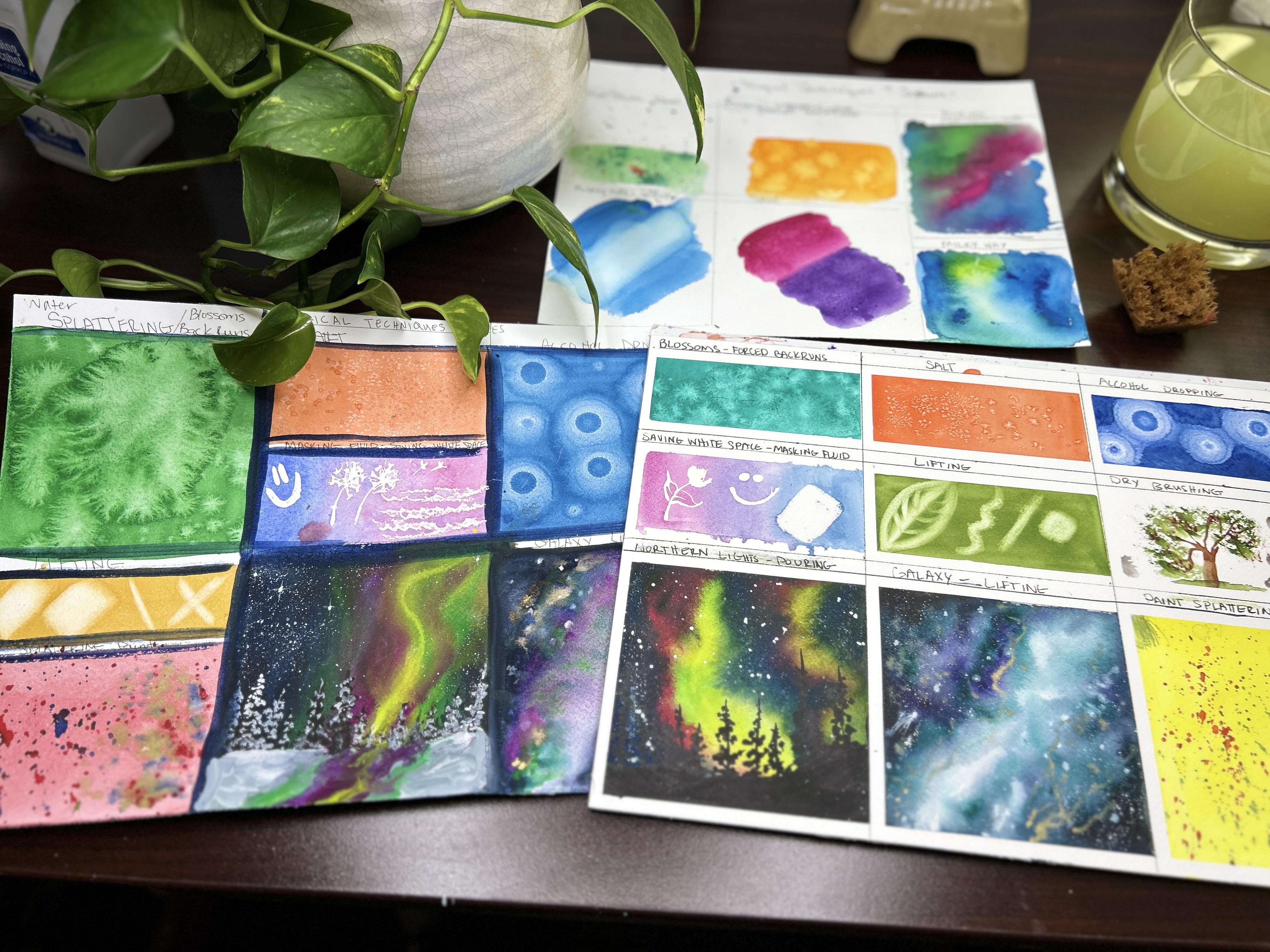
all of the basics. We're going to learn about color swatching and
pink consistency. That's a huge one. We're going to cover
intentional or unintentional covered
color bleeding, gradient color washes. That will give you
the ombre effect, which is a must learn when it comes to painting
beautiful skies. And it's a huge game
changer for me when I learned how to
save the whitespace. And of course,
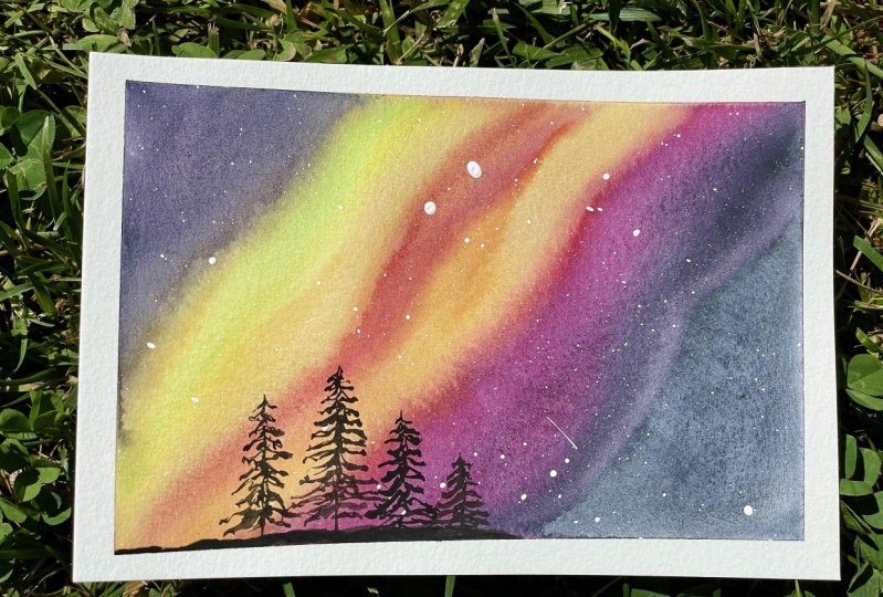
we're also going to learn to create some
magical textures. That's my favorite
lesson to teach. We'll use things like salt and alcohol to create some
really unique effects. And the best part, you don't need any fancy
supplies to get started. Just get out whatever
you have on hand. If you're like me, you
had watercolor paints and the cupboard that sat
there for ten years. And I'm embarrassed
to say if I would recommend investing in
some good quality paper, you're going to want
to make sure that it's at least 140 pounds or 300 GSM, either cold press
paper or 100% cotton. If you have no idea
what any of that means, don't worry about that because we're going to go
through that too. That will save you a
lot of frustration. I pull it, I promise you. Now there's a list of supplies that we're going to
need in this course. And it's listed in
the resource section and the about section
underneath this video. But we're going to go
all over all of that. So that's it, friends. I can't wait to get
started and teach you all about the wonderful world
of watercolor painting. Let's grab your supplies
and let's get started.
2. Let's Talk About Brushes: Hello and welcome to
our first-class today. In this first lesson, we're going to go over brushes. And we're going to
talk about what kind of brushes they are, what strokes they make. And we'll just go
through them quickly. I don't want to spend
a lot of time on them because I wanna
get painting with you. Now. I had been collecting brushes
for many, many years. I've been painting
for over 35 years. So I have quite the collection. I have brushes from oil
brushes all the way down to watercolor brushes
and everything in between. So there is no need to go out and buy all
these brushes today. We'll go over brushes later when we start our project
of what we're going to need and what I will
recommend to start this course. But for today we're
just going to go over what they are and what
they're used for. And-a-half quite array here. So first we'll start, we'll kind of go
from left to right. And then I'll make
some brush strokes to show you what they do. So right here, this is a
master touch scrubber brush. They come in lots of
different shapes and sizes and lots of different
brands make them. Now they're a very
stiff bristle. They are used to lift out color. And I will show you that in a minute when we demonstrate
how they're used. So there's many different sizes and you have to be careful
with these guys because they can do a lot of
damage to your paper. So the next thing we
have, our wash brushes. They, we use these a lot in watercolor and they come in
lots of different dials. This particular ones I
don't use very often. These are hockey brushes. They're basically the same size. The same type of brushes. This this I use all the time. These I don't use unless I'm painting something very large. And I've only used them
so far to lay down water. So that's why they're not
stained like these ones. You can get these off Amazon. These are made out of, in fact, all of these are made
out of goat hair and go terrorists very soft and
holds lots of water. These are hockey brushes. I'm just going to move
on over here either way. This is a mop brush. They also come in lots of
different shapes and sizes. These particular
ones are rounds, ovals and these ones are round. They also hold a lot of water and I like natural hair fibers. I know a lot of people
don't like that and don't agree with that.
And that's okay. They make synthetic versions and all these brushes,
which is what? These ones are there, Royal and lag Nicole. Now you can get these
at Hobby Lobby. You can get these off Amazon. You can get them at Walmart. They have these brushes
pretty much everywhere. Most of my brushes I buy
are for master touch. So you'll see a lot of
master touch brushes here. But these are for
laying down lots of water and big washes. So I'm just going to put some of these away. We
talked about those. They're flat brushes. They are also used for
the big ones are used for laying down lots of
color are big washes. You can come in all sorts
of different sizes. These flat brushes can be
used as your shader brushes, but they can be used for
making fine lines to. So those are our flat brushes. These are angled brushes. You can see there
like a flat brush, but they have an
angle ped on them. And they're good for cutting around things that you
need to make a detail on. And I will show you some of the I don't use
these very often, but we'll go over the
strokes that they make. So these are some of my
new favorite brushes. These are filbert brushes. They are sable hair brushes
also made by W lot. They come in many
shapes and sizes. They are a lot like
the flat brush. Instead of having a flat top, they have a rounded
top that's tapered. They make great brushstrokes that have round
edges on them and they're best for flowers
making fantastic flowers. Favorite. They come in
a set of nine brushes. This is my fourth step
that I've bought. And the only reason that I
have them in oranges so I can tell them apart for
my student brushes, which are black and I
have them all put away. These are WL brushes. You could get them. I've bought them anywhere, $20-30 depending on if they have them in stock can
supply and chain demand. And but right now
they're running about 23 to $25 for nine
brushes with real hair. That's fantastic. They hold a lot of water. That's why I like them so much. And I also like them because
they're a natural bristle. And if I lose the
tip of my brush, I can dip them in hot water without getting
into the barrel of the brush. Water will bring it
back down to a point. Now you didn't, these
are liner brushes. Now this is also known as a rigger brush or a liner brush. And they come in
different sizes. The ones that are long and have given you a nice, springy, less control of a stroke, you can get some
really cool look like script or really squiggly. They're great for
branches, grass. And then if you get
into fine detail, you can get into a
liner brush with the 80 bitty teeny
tiny bristles. So those are liner brushes. They're also called
this point spoiler, but this particular
risk is lighter. Couple of brushes
that I have up here. This is just a makeup brush. You might see me use
this in the future. I use this when I erase. I don't want the pencil shaving, eraser shavings shedding on my paper and I don't want
to smear it with my hand. I'll brush it with a cheap just a cheap dollar
store makeup brush. I think I got this at Walmart that you use with masking fluid. And when we'll talk
about masking fluid, liquid, latex, that
kind of stuff later. But it's got a nib on the end
that you can draw with or, um, and I've used this so much. You don't ever want to
use your good brushes with masking fluid
because this is what happens to it and
you can't wash it out. So this is a masking
fluid brush. Now this one here, and I have quite a bit of
them and I liked them a lot. I just I don't use them
unless I'm traveling. They're fantastic. And most of these I've
got when I bought sets at pans of my palettes. But these are travel
watercolor brushes. And you can see in here, I don't know if
you can see that, but it has water in here
and you twist the head off and you can take it with
you and paint on location. These are great for that. They're really good. They come in
different head sizes. They have flat,
they have rounds. I think they have some filbert and they have all
different brands. So they have some
really nice ones that have like a squeeze ball here. So you don't have to struggle so hard with pushing the water out. But these are fun.
I've used these in the hospital waiting room when
my dad was having surgery. So these are fun to take. I know I know people who've taken them on the
airplane as well. I haven't gone
anywhere for awhile but you can take them on
the airplane as well. So these are the brushes. So let's go over what they do.
3. Brushes Demonstration: All right, let's jump in here. We're gonna go over brushstrokes and what they do and what the, what the brush looks
like on paper. So we're going to start here. This is the wash brush. You can see here. I hope you can see that
in the frame there. This brush is goat hair, and like I said earlier, it holds lots of water. This is one of my favorite
brushes that I use when I'm doing skies
or landscapes. Cityscapes where I need to
put down a lot of water. So I'm just going to
wet here the top of the paper and give you an
idea what this brush will do. So we use it that's
called a wash brush. I'm washing the
paper right here, right now I'm going to grab some blues and it'll put it
in a nice wash of color. I can get a little
bit darker than that. See that? So pretty good.
Actually go darker. My teens aren't that
wet mixed here. There we go. That's
what I'm after. Just a nice thick wash of color. You can see that you can
cover a lot of ground, a lot of paper with this brush. I didn't tell you this
is master touched paper. This is acid free paper, 140 pound, cold pressed. I didn't put it on
a tape it down. So we're gonna get some bustling because I just
threw that water on there. Okay. We're just going to go
on because I want to show you what the
stroke still here. So this is our flat brush. I have two different sizes
here that we're going to test. This is the bigger brush. Now, you can throw down. You can do this same area
with this size brush. You just have to do more
strokes and to cover that in. But you can see it gives a nice clean line,
clean straight line. So I can go back
in there, right? You can see that this brush will put lots of paint down. We could cover a
little amount of area. You could cover a lot of area. So that's the flat brush. You can get good crisp little
lines here too as well. So that's our flap. I'll just show you with a
small brush here. This is just a smaller size. For this exact same thing here. Just smaller. You can make those
lines as thick or as thin as you want depending on where you help the brush. So that's our flat brush. This is one of my new favorites. This is the filbert. This could also do all of this up here if
you only had this. But what this brushes
fund for is you can see with the flat brush you got a flat edge right when
you started and stopped? Excuse me. I'm getting over a
cold so my voice kind of cracking in and out
and I apologize for that. This brush will give
you a flat wash, but you can see there
when I started, it gives me a
rounded edge, right? You can also get those flat
lines with this brush. You could cover a lot of
ground with this brush. Do a lot of washes with
these brushes are known for, is their great for
making flowers. If we think of flour strokes, there's, if you're in a compound strokes
who got a C stroke? Press, drag and release. Right? Then you could do
some compound strokes where you make flower petals. So there's lots you can
do with this brush. Press drag. So that's the big one. I can get carried away
and do a whole lesson. And just practicing brushstrokes In this particular video is just to show
you what they do. So if I wanted to do
a real quick flower, I kid me, think of what kind
of flower I want to do here. Let's do a cherry blossom. Press drag, drag, drag. And you could do roses
with this brush. They do roses beautiful. There's a cherry blossom there. I'm going to jump down
to the smaller filbert. Let's add in the black centers
with a cherry blossoms. Not a bleed up to it. Okay. So could also do a really
pretty rose here real quick. And we'll start
with small strokes. And then you go into C strokes. You get the idea here how that brush does nice
round edges there. So that's just a basic
really quick Rose. Know if that were to dry, I could go back in and
spend more time and put highlights and all that stuff. But I'm just giving
you the idea of what the basic shape this
brush makes today. So that's our filbert. Let's go down here. Jumped to the angle brush. Let's see if this head is
going to drive me crazy. Okay, this is the angle brush. I got two sizes here. Put a little bit more
paint in here, k. Now this does a nice
straight line as well. So when you put it down, you have it in an angle
you can see there. But this is the kind of
stroke you're gonna get. Again. You can get nice
lines with it. Okay? If I dropped down to the
smaller brush, you could use. Now, all of these
strokes I've done, you could do with a round brush
right from the beginning. But the reason they make different brushes is so you don't have to work
as hard basically. But when I started watercolor, all I had was round brushes. I mean, I had all of my brushes from all my painting
with oils and acrylics. But I didn't have
watercolor brushes. But of easy leaves. If you have an angled brush. Okay. It's good
for cutting around close corners and that
kind of thing too. With the little guy first. Now you can see that his
bristles are closer together, so we're gonna get a little
bit of a different stroke, but we're gonna get the
same general look, right? So you can go
upstrokes for grass. Makes really good grass. If I pull it down, I get the edge of
the graph, right? This one had strokes that
look like loose graphs. This gives me the
edge of the graph. Okay, so there's that, this one basically is the same. It just has a wider,
wider pattern. So he'd give me little thinner
lines with this brush. So that's our fan brush. Really great for grasses. Little lines that are even
kind of book like that. That's grass fan brush. Okay, let's go into, you remember our
main key brushes. These are our
brushes that we gave a really bad haircut
to use these, like I said before, when I do leaves, trees, I'm going to stamp in grasses anything that I want to have, some kind of pattern texture
but not really patterned. That's kind of sporadic as well. So if you think of trees Right? There's some leaves for tree. See how easy that was
with that main key. Brush, bad haircut brush. The reason I told you
in the other video, I've got that from Paul Clarke. One there. Let's take this one and put some little red
flowers in that grass. Little wild flowers. This ticket here. And stamp it in that dress. And it'll just look like there's
little flowers in there. Now we'll get into
pink color consistency and all that kinda stuff later. But so I gotta, gotta
mess right there. But you get the general
idea that you can stamp in some flowers with
this bad haircut brush. You can actually buy
brushes that are monkey. Or you can just use an old one that you have and give
it a bad haircut. Okay. Now, into my favorites, everything I've done
so far I can do with these brushes are my go-to and 99.999 per cent
of the things that I paint, I'll use round brushes for. So for a round brush, you've got your
rounded edge and then it straight column, right? Mrs, flat and straight. This is angled or this is round. So you get a round tip
and a straight line. Straight line. So what can we do this? We can paint anything with this, but if we're thinking flowers, you can do oh my goodness, everything that this brush, There's some sunflower strokes. Finish this one out. I'm going to just jump back and forth between these
two round brushes. So you can see here it
gets your tip lines. You could do real fine lines. And round brushes
come in every size. Along with all of these, they come in all
different sizes. So pretty much anything
you can think of. You can paint these brushes. It's one's good for anything. It's like that's why I said it's my favorite, It's my go-to. Some sunflowers in here. These are great for
compound strokes to who can do your left? So you can get good
compound strokes. You could do leaves
with this one, just like we did leaves
with the other one. I've painted portraits
with round brushes. I said most everything I
do is with round brushes. Alright. Here, let's put in
to a pine tree. By tapping and the round brush. We're gonna do a whole
lesson on trees. Before we paint some landscapes,
which is really fun. I'm already got some video
for that shot because I taught a lesson on it
to my private students. We did some lessons on trees. Just a real quick. Now with watercolor, you
had let that dry and you could go back in and
put more detail, more detail in this rows. You can do anything you
want with the round brush. That's why he's
my He's my go-to. Paint the tree here. So I can show you
this liner brush. Paint a tree. Please just gonna go
off in different areas. Nice going to cover some of this stuff over here because
we're just practicing. You think of a tree that
splits off all different ways. Okay, so this is where I
use my liner brush a lot. I use it for buying anything I need little springy Twinkie. How good that makes little
twigs coming off that tree. And not down in together. What you do is you
just wiggle it. And that's what gives us
those branches. Like go up. And you could either go in with your flat brush and
fill in the leaves. You could use your
main key brush to fill in the tree leaves. You could use your round brush and do your brow
brush, dry brushing. Tie this tree so
the ground here. Someone can read in there. If you do lots of stuff
with this round brush, that's why it's
my favorite here. Can either tap in and
around beliefs there. You can splatter. Gonna get into that thing, but texture as well. So, yeah, those are our
brushstrokes there. Of all the brushes that I use on a regular basis
that you'll see me paint with through here on out. 90% of it, 99% of it will
be with my round brushes, liner brushes once in awhile, a flat brush and well, that's a wrap up this lesson. I want to thank
you for your time today and spending
this last half an hour with me going over
watercolor brushes. And we learned a little
bit about types. They are what they're used for, different sizes, and what some of the strokes
look like on paper. If you have any questions, please feel free to leave that in the discussion section below, and I will happily answer
any questions that I can. And I look forward
to seeing you in the future lessons with
review of paints and paper. And we'll see you
in the next lesson.
4. Let's Talk About Paper: Hello and welcome. Today, we are going
to talk about paper. Over the last year-and-a-half
of my watercolor adventure, I've spent a lot
of time exploring different brands
and types of paper. So let's talk a little
bit about paper. When you go to buy your paper, you're going to want to
look for paper that's in the 140 pounds or 300 GSM. 140 pounds means that a ream
of paper that's 500 sheets, that 22 by 30 ". That paper is going
to weigh that Reims going to weigh approximately
about 140 pounds. And the 300 GSM means that
is 300 g per square inch. So what this boils down to is you want to purchase
a paper that's thick. Thick paper will
buckle and warp less, and that paper will
also hold water longer and you'll be able to
work with the paint longer. Watercolor paper
ranges 90-400 pounds. And 90 pound paper is very thin. So we want to stick in
the range about 140. Anything over 300 is
pretty much a board. So buying paper in the beginning it was kind of overwhelming. I generally stayed in the
cold press, acid free paper. In the beginning, I
tried lots of brands. I tried brands that were the academy student
brands all the way up to brands that were more cotton in the student to
professional range. These are two of my favorite
brands and they are on the lower end of artists
dreams papers there, uh, who, who their
Norberg London. They are a tough paper
and they hold water well, I get good color values on them. And I'm able to do all the
techniques that I like to do. And then I'm going to share with you here in future classes. Now as a beginner, I would recommend that you start with a pad of paper
there gummed on the top. And you can pull
out the sheets of paper and you can washi
tape them down or use painter's tape and tape them down to any solid surface
that's waterproof. This will leave your paper less likely to warp and buckle. And you can use that paper. Then after it's dry, you can use the other side. And I would recommend that
you use both sides of your paper when you
get a little bit more comfortable and you want
to branch out of the pan, you can maybe choose a
spiral watercolor journal. These are pads as well. You can go round and tape
the edge with washing tape. And then I clamp the edges. And then I would recommend
in this one as well, you can paint on both
sides of the paper. Now this is a block of paper there gummed on all four sides. They come in most every brand and all of the types of paper. It's my preferred method
of painting as I don't have to tear it out and
tape it to a board. They're less warping
right from the beginning. This is my cotton paper which I really liked by
the Hong Academy. This is my Yahoo who
acid free paper. You can find it in
most every type. You have two types of
paper to choose from. When you're ready to go
purchase your paper. You can choose an acid
free wood pulp paper, or you can choose
a cotton paper. What's the difference?
Well, the difference is going to be the strength. Their abrasion resistance sees the longevity and the price. Wood pulp paper is the
cheaper of the two. It's going to be a great paper. I've tried a lot of them. I've tried a lot of them here
that are not on my desk. So I know that there's a lot of good acid free papers out there. They're just not as
durable as cotton paper. They've had all of their naturally occurring acidic
components removed. So they're not going to turn yellow or discolored
rate over time, but they're just
not going to be as durable as what as cotton
paper, cotton paper. It's made with winters. And those cotton lynchers
are the pure source of cellulose and their fibers
are longer than wood pulp. And so it makes the paper more durable and it can take
a heavy treatment. Okay, So you've picked
your package of paper, either chosen acid free wood
pulp paper or 100% cotton. Now let's talk about texture. You have hot pressed, cold pressed or not, meaning not hot pressed. Or you have rough. Now, hot press paper. Has The least texture surface
of all the papers. It's not my favorite, That's my least favorite. It's been pressed between hot metal rollers
during the production. And the hot press
paper is favored by those artists that
like lots of detail. Think botanical artists. Or if you'd like to do
ink and wash and you're not going to use
very much water, then this is gonna be
the paper for you. Those who, who like
lots of detail, hot press paper tends to be least absorbent of
all the textures. And watery washes
consider on the surface for a long time because
it doesn't soak down in. Beyond watercolor painting. Hot press paper is
great for detailed pen, ink and graphite drawing. Now let's talk about
cold pressed paper or not being not taught pressed. It's made by pressing that Pope between
two metal rollers. And it has a slight
texture to it. And depending on
what brand you get, will depend on that
texture because every manufacturer is rollers
are a little bit different. It has a slight
texture to it and it's the it's the one that I
prefer to use the most. It's well adapted to many
different painting approaches. The paint will sink into the little dimples
on the surface, which is so fun to see what
texture you're going to get. But it's also leaves
the paint alive to where you can
watch the paint move. Cold press paper
tends to be a little more absorbent than
hot press paper. Now, rough paper, as it sounds, has the roughest texture
of all of the fibers. That's because those rollers, when it's pressed, are filtered. And so they get very big
dimpling in the paper. It gives some wonderful
results when painting. If you're using
granulated painting, it's going to fill in all of those crevasses and leave you
with some awesome textures. And you can create great textures with the
dry brush effect as well. So rough is really fun. If you're into bold paintings
and aggressive paintings. It may not be for
everybody though, but it is fun to play with. I want to thank you for joining
me in this last 10 min. As we discussed
watercolor paper, we talked about how you can buy your watercolor paper and the
packaging that it comes in. We talked about what types of watercolor paper there are
and what they're made out of. We talked about the process
of making watercolor paper. And then we also talked about the types of different textures. I hope that you learned
something from this class and that it was
enjoyable for you. I had a fun time. I look forward to seeing you as we talk about watercolor paints.
5. Watercolor Paint & How It's Made: Hello and welcome. I'm so glad that
you're here today is we take this crash course. In one of my favorite things. We're going to talk all
about different kinds of paints and the brands and
what kinds they come in. So hang on. Let's talk about paints. Watercolors are made
from powdered pigments. These pigments are found
all over the earth, from stone to gemstones,
to our earth. Dirt, even to the food that we eat and the plans
that are on the Earth. They're all ground down and processed into our
favorite colors. Then they're mixed together
with a binding agent, which is called gum arabic, which comes from
the acacia tree. Glycerin is then added to make it smooth and soften it and it slowly mold over with a rolling stone to make
it a smooth formula. Have you ever heard the
term being mold over? That's where it comes from. Now you can't forget water, 10% of the paint as water. But you'll also have
things like AUG scale, that's a wetting agent, but it's now more commonly being replaced by
synthetic versions. Honey is also added to help with the flow of
the paint and it keeps it soft and it helps with the rewriting process
when the paint is dry. Now clove oil is also
used as a preservative. Alright, so let's talk about paint pigments and
what that means. First, let's talk
about staining colors. Whether a color is
staining or non staining. That means depending
on the brand and the manufacturer and
how the paint was made, some paints have
very fine pigments. Those pigments will settle into the dimples and the valleys
and the crevices of the paper and make it very difficult for that
paint to be lifted off. So if you can't
lift off the paint, most likely you have
a staining color. Most good brands will label on their box or the
back of their tubes, whether they're paint is a staining or a non
staining color. Here I have three tubes of Grumbacher Academy
watercolor paint. Now on every good brand
of watercolor paint, be it in pounds or tubes. There will be a P number. P Y is for yellow, Pb is for blue. Prs for read. These codes have a number
associated with it, but tell what pink
pigments were used and mix to create that
specific color. So this international
color-coded index is a pretty cool thing. It helps us find our
favorite colors when different brands mean their
paints different colors. Now, granulating
colors are some of my favorite paints to play with. Granulation happens when
the heavier pigments sink to the dimples in the valleys of your paper and give you beautiful
textures and effects. Some brands make specific
colors just for this purpose. We're going to move on to one of the last distinguishing
characteristics of paint. Transparency. What does that mean? Well, some paints have
different transparencies. We look at this chart, you can see that it has
squares on the color boxes. Some are colored in, somewhere halfway colored in. Some are clear and some just
have a line through them. Well, the one, for
example, like the white, is colored in, that means that that paint is an opaque paint. The one next to it. Yeah, lemon yellow is
a transparent color, which means you're
gonna have to make multiple layers to get
a dark rich color. Now, if you look right
underneath that, fresh purple has a
line through that, which means it's
semi-transparent. And the one after that
is Hooker's green, and it means it's semi-opaque. And while I have you
here on this picture, if you look, they have
stars on the pictures. Those are the light
fastness codes. And the more stars, the better the light fastness. Meaning it won't fade over time
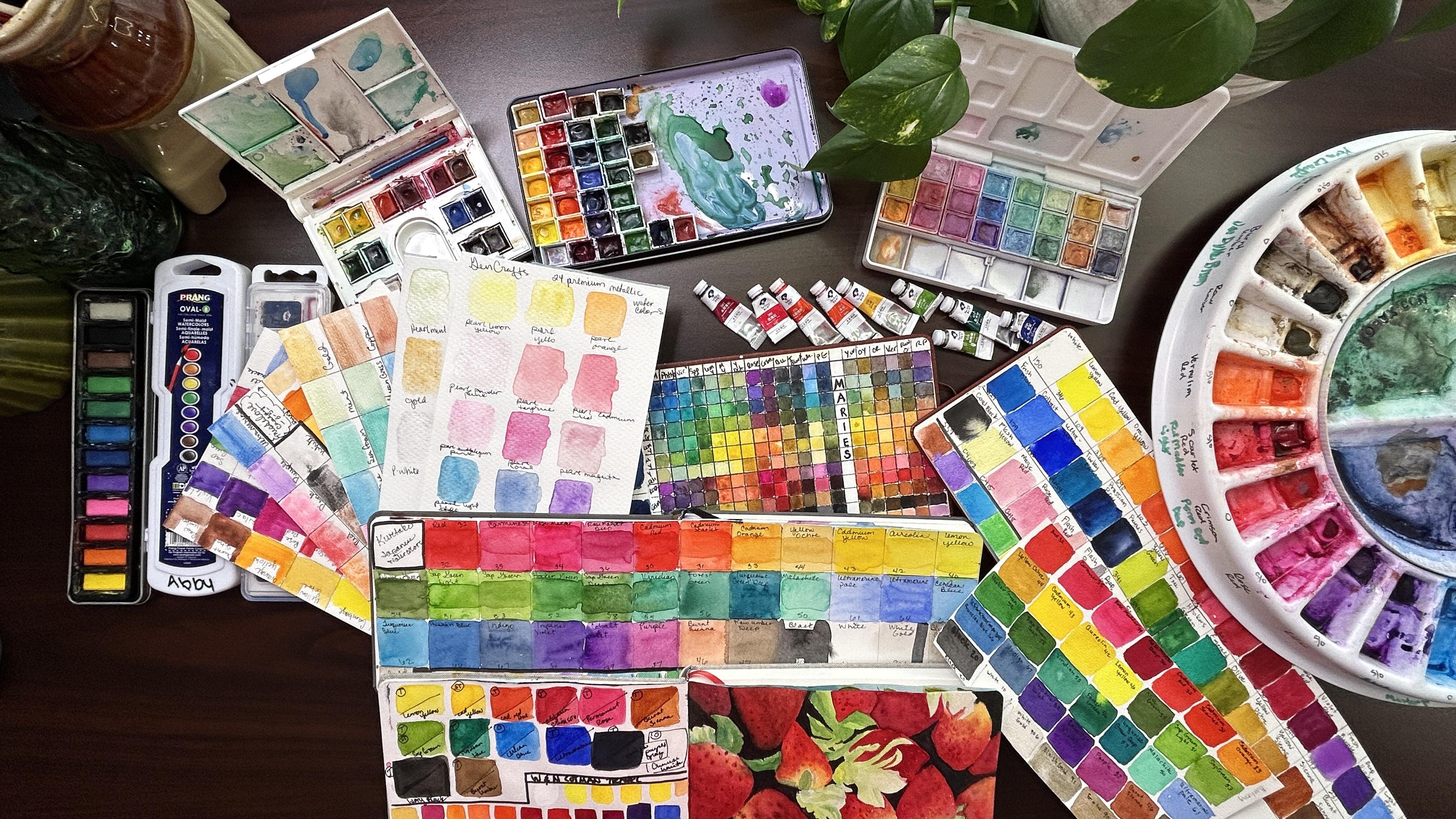
6. Paint Brands, What I Using Now, Beginner Recommendation: Okay. Watercolor to come in sizes five millimeter
up to 20, 1 mm. Now, there are some brands
that go larger than that. But this is the size that you're going to find
for the most part, there's two there's becoming
sticks which I don't have, I haven't tried that yet. They come in wallet,
watercolor, pencils. They come in inks. I'm trying to think of
what other inks and dies. And then 11 thing that I bought for my daughter for Christmas. So they haven't tried yet. I bought her sheets
of watercolor. So they're little they
look like little pieces of paper with pigment
color on them. And then you activate them with a wet paint brush and can
paint right on your paper. That's kinda cool. I haven't tried that myself, but she says they're
fun to paint with this Artesia's
for my first sets. And I painted a lot of
pretty pictures with them. And these master touch. Okay, then I branched in two once I got to a point where I wanted to start getting
a little better, I branched into the
Winsor and Newton Cotman. That was my first dabble in a good quality mid-range
paints would be Banko. I could find Reeves, Paul Rubin. Some, some artists, professional artists
could put Paul Rubens into the low-end of a professional category
and that's where I met. Those are the ones
I like to use. The Artesia's, the
master touches. Those all fall in the mid-brain. What's the difference between before I jumped to
the next thing? What's the difference between these travel sets
like this that are in the past versus a tube of paint? Nothing really other than
this is wet inside the tube and this has dried hard and you have to
reactivate it. Okay. So that's the only difference between the tubes and the pans, depending on the company. And what type of palette that you have
purchased will determine whether or not you can purchase individual pans to replace them. So that's the difference
between tubes and pans. That's it. You've got the wet
paint in here. This is dry and you
have to reactivate it. Also the convenience. If you want to go
somewhere and you have your palate and pat a block
of paper and a brush. You can go out on location
and you can paint. I've even painted in
the waiting room, can either do stationary here and leave them in your
tray like I have here, or you can travel with them. I don t ever wash my
trace and I'll tell you why I love color theory
of color mixing. You're gonna get
colors that you don't have in pans if you
make them yourself. So I don't ever watch this. I always confined
to a color on here somewhere that I can use in
the painting that I'm doing. If I need to get down to
the the original color, I'll just use a clean
paintbrush and clean it out until I can get down
to that original color. So maybe some purists, watercolor artists would be
like posture paint palettes, but I don't, I feel like
it's money down the drain. Then you branch into the
artists professional. So you've got Academy, which is the GPS, the students K, and then you get into the artist
and professional grades. Those would be brands
like married my blue, M Graham, Daniel Smith, white knights, poor, ram brands. Some would put the
Paul Rubens in their millennia a Winsor
and Newton professionals. But I am excited to take that next step,
but I'm not there yet. I'm still comfortable
in what I have. I want to use for
my husband's sake, kinda want to use up
some of the student paints before I start branching
into the artist paints. But I know that it will level out once I
do take that step What do I have here
now that we've talked about the difference between paints and pellets and brands. Basically, I'm
like, I like if you want to start out and
buy your first palette, I would say get a Winsor
and Newton Cotman. You can find that for anywhere between 18 for a twelv
set about this size. Two I got I got a
steel on this one. This is 246-810-1214. And I got this one for 21. And I think it was a misprint because the
next day it shot up to over 30 to have those two extra colors in
there. Two extra blues. I like Winsor and Newton is
a good starter travel set. But there's nothing
wrong with any of these. Right now. My favorite
is these main ones. I told you that these here are tube paints that I've just
put into my own palette. These are Paul Rubens. Paul Rubens has different
sets of paints. These are the brights. They're super pigmented,
they're fluorescent. You can paint some fun things
with these bright paint. Palette. Here is basically all my Artesia premium watercolor
paints here and the tubes. When I leveled up to my wheel. This is a those of you that would want to know
this is a rollbacks. We'll that my husband
got me for Christmas. When I level that my paints, I used to have my
Artesia premiums in here and I leveled them up and bought new Paul Rubens
and now they're in here. So I moved all my Artesia's into this travel set and I can just refill it
when they run out. Let's see here. These ones are also Paul Rubens. There the rest of the set that I didn't have
room for in my tray. So when, when I want some
different colors in here, I need to color swatch, see, so I think that's
what we're going to color swatch width is
this Paul Rubens set? And we'll talk about why we color swatch and why
that's important. But these are my Paul Rubens. This is an old tin
that I had from some old watercolors
that I didn't like that we're chunky
and I threw them away. And you can buy these individual
trees off the Amazon. You put a magnet on them and
put them in your own tree. Don't know if I showed you yet. I repurpose anything little
tins that I can find. Now this is wash, this is not watercolor. I mean, it is a
type of watercolor, but it's a chalk based
watercolor, so it's more opaque. But I just wanted to show
you how cute that is. My elbow tokens. And they're just the same. I had leftovers. That one, the magnetic state in the tree. So there you go. So these are fun to travel
with those or Paul Rubens, those are my main, I
think I opened these. I'll just show you
real quick again. Like I said, I don't wash them. You have to buy
the whole palette. And I've got these in
November and there's only a handful of them that
are close to the bottom now. So they last quite a long time. Very creamy, highly pigmented. They have good color
fastness on them. Some of them are
more transparent, some of them are more opaque. And I really like the variety that comes in this
particular set. So let's see here we've
talked about the tubes. Now. What do I have here? These are fun. These are a whole different
different type of paint. These are Japanese watercolors. These are cure a Talkie. These are a fact-based paint. From my understanding now
I may be wrong on this. They're not begin this photo. You want to go vegan by a
traditional watercolor. They're fun to paint with. I do know that they're
highly pigmented. They're great for
color fastness. What's the difference
between here? Well, these are
the professionals. Brant and these are the artist? No. Yes, these are artists. They're not students. So these one cost me eight, you can get them anywhere,
$18-25 on Amazon. These are Mozart come bomb
for Mulberry, a mobile phone. That phone number, I'm dyslexic. So if I say things backwards, I apologize in advance. But how are they different? Well, besides, when they come, they do not go clear
to the surface, to the top of the pan. So if be like, oh,
I'm not getting very much, I can't get that out. I'm not getting
very much paint in there because they
don't look very deep. But that's a pretty good
chunk of paint in there. As they, as you paint with them, they will shrink up
in the paint pan. And that's nothing doesn't affect the way the
paint quality. You can see in there how that's shrunk away from the sidewalk. It doesn't affect the
way they paint you just spraying with water and
they reactivate them. These are Japanese full pans. These are full pans this side. Okay. So these are
the same and then I bought over in my
Artesia paints. So when you paint with them, they are when they dry. Watercolor paints,
dry matte, finish. Japanese watercolor paints
dry with a sheen or a shine or glossiness to them. And they have just a
really pretty look. Now if you paint with
them, sure enough, they do give you the
look of matte finish. So that is the difference
here with these. They're very fun to paint
with their very creamy and are just something
different to fund it, to branch into your paper and your paints will
make a difference. So eventually,
start with whatever your budget can afford you. And let's start painting
in our next class. Thanks for joining
me with paints
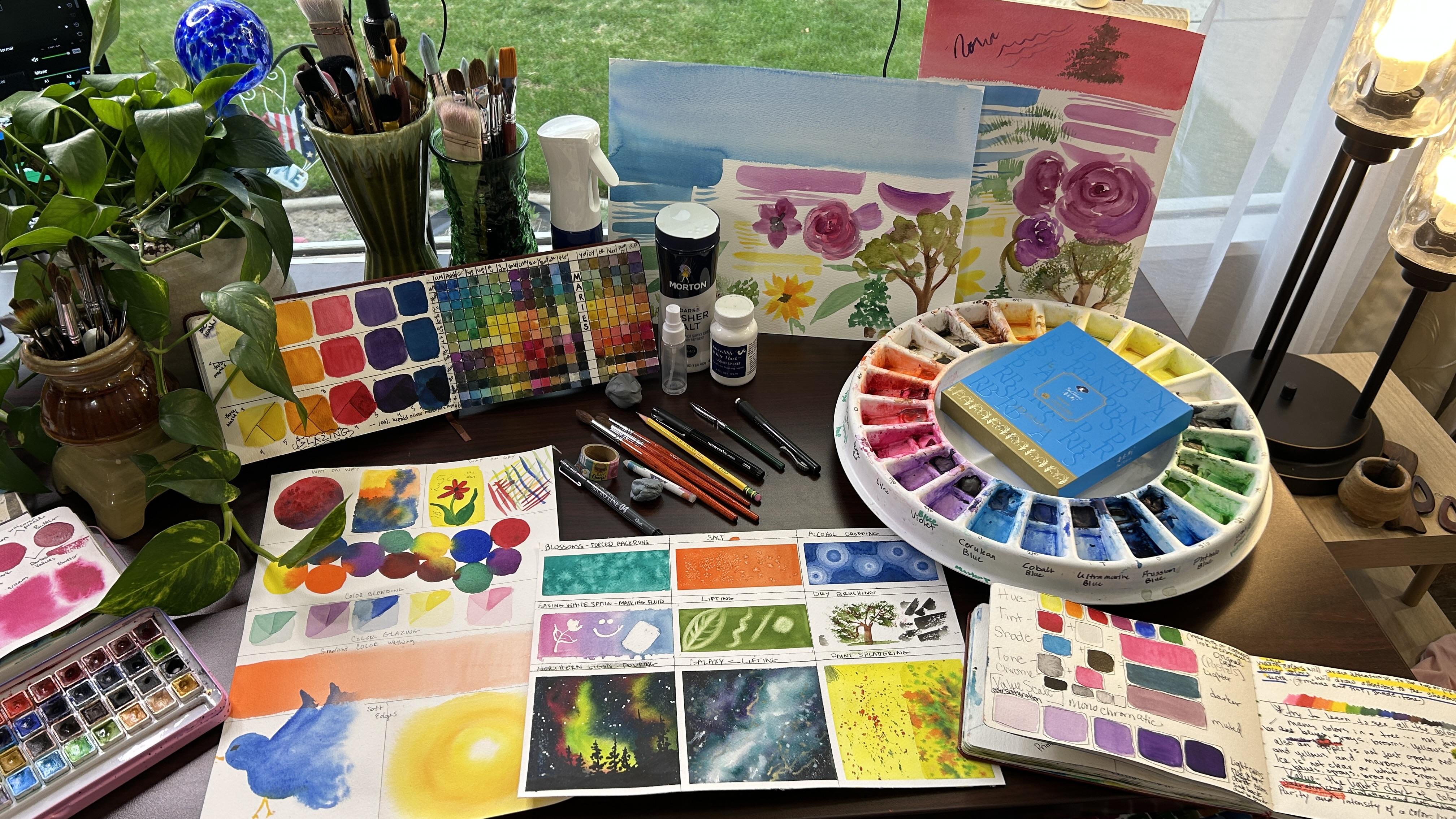
7. Color Swatching & Why You Should Do It: Hello, hi, I'm so glad
that you're here with me. I love color swatching
and I want to talk about it and why I think it's important and why
you should do it. I used to do it just for fun, but I learned about
color swatching towards a little bit into my journey about the time I learned
about pink consistency. And I wish I knew
where I learned this, I could give credit to
that wonderful person. I know it was a
girl, but I can't remember where I learned it. Why do we color swatch? Well, first of all, your paints will show up differently on
different types of paper, different qualities of paper, different brands of paper. Hot press versus cold pressed, 100% cotton versus
wood pulp paper. So that's one reason
to color swatch. Another reason is to see what those colors are that are
in your palettes here. Either fresh from the
tube or in your palettes. How they're going to show up. Different papers react
differently with your pain. These are this is a
sketchbook from Hobby Lobby. It's a master
touched fine studio. You see that? Master touched fine studio. This is a cheap sketchbook. The paper is not great. So you can see here, they don't necessarily look like the color that's in the
past and the pan, right? So that's red. This
pan looks darker. This one looks darker than that, but it's actually
lighter and Pinker. This one almost looks
the same color, but it looks a little
bit darker and it's more pink and a little
bit darker than that. So you can see what they look like in on paper versus what, what you're looking
at on your palate. K. So this is a wood pulp paper. The texture is very fine
texture of the paper. Okay? So to compare this two
really good paper, this is Bo Hong,
100% cotton paper. Okay? And this is the same
palette that is here. You can see just by
looking at this top row, if you're using a
good quality paper, you're going to get a better
result with your paint. Ok. So this red looks pretty
good as far as, you know, these strips here, I was
trying to do a layering and I think this paper
is just junkie. But I think when I hit it
with that second layer, it just lifted the
layer underneath. So this is what poor
quality paper will do. This is just one layer, but I felt like I needed
to put another layer on to begin with because
they were so dark. So you can see the
carmine here is really pink and it's very
vibrant on the 100% cotton. So this is a good way. This is one reason
I color swatch. I want to see on the particular paper
that I'm going to use, how those paints
are gonna go down. Whether they're gonna go down
very crisp and clear and whether they're
going to be a nice flat wash or if I'm going to have problems with peddling. And like this one here, this is just one layer C. And so I didn't get a really even coat and
a little bit did it. So maybe it suggests
this particular shade, but it looks like this indigo
is a granulating color. This is a really good
example of that. So this is just one example. These ones here are
royal lag nickel. Okay? So these are very, very cheap paints.
These are cake. They're very chalky,
they have lots of additives and
preservatives in them. These are definitely
in the student grade. You can get these at Walmart. And I think they were
like the under $15. You can look at them and say, Okay, they look chalky, right? But I want to see what they
look like on my paper. And you can see
here when they dry, they really start to separate. So I'm going to hold this up
here so you can see better. You can see how they pull away, and they can really see
that choppiness to them. Key. Now here is
another example. These are the same These are the same paints and they're on a
different paper. This is Ms. Love paper. It was
a it was a pad of paper that I had and it
was really junky paper, so I ended up using it just for color swatching
in the beginning. So you can see even
on this paper, that it's separated even more. So this is what a really low
quality watercolor paint is gonna look like. Okay. These ones are the actual Ms. Love paints that came
with this pad of paper. There also a a
lower grade paint. You can see how they separate. You can see that choppiness. You can fill the
choppiness to them. I would like to go back and
put this these paints on a 100-percent bot Hong
cotton would be interesting. Color swatch it just to
see how they laid down on 100% cotton paper. This is wood pulp. Okay, this is a difficult
press wood pulp. But you can see how that
would be very frustrating for a new student that
was going to paint. And they can't figure out, why aren't my paints doing what my teachers are
doing here on the screen? Or if you're in the live class, you've brought what you've had and you're trying to paint. What I'm painting or what
your pay teachers painting. This is also a piece
of that, Ms. Love. These are my Artesia
watercolors. Now I use these Artesia's
for almost like the first, I would say six months
that I painted and I painted a lot of really
pretty paintings with them. Any of that, okay. These ones actually know. This one is Artesia's. So you can see that they
do give you some good, you can do some good
paintings with them. This is not finished
by any means. This was just a play
around one day. I was practicing skies. I like the sky, so I
threw in the Hobbit hole, but this is not done. Okay. So you can see we start
to have a downpour ear. So if you hear thunder and lightning or you don't
see the lightning, but if you hear the thunder
rumbling through my house, really started raining hard. K. So these Artesia paints, I have used them. I've used them on
really good paper. I am have some really pretty
paintings I did with them. But on this particular paper, you can see how
poorly they reacted. So another reason
to color swatch. We talked about those ones, that's the bot Hong k Here are these are my mailing paint
on this particular paper, they went down fairly well. I think my page
here was a little bit tipped because
this is the new page, so it it ran a little bit. But they went down fairly clear. We're going to get
another big boom. They went down really nice. You can see how saturated
the color is, which is nice. You can also see how
what you're gonna get with the iridescent colors, the pearlescent colors
there on the bottom. Another, this really
surprised me. These are my kids paints. They brought home from school. So I threw them down here. I wanted to see what they would do because I hadn't
painted with them. And for colorblindness,
they did really well. I would save for
even wash of color, maybe not so great. Okay. But I have a feeling that
they would go down really nice on arches or even bow Hong. So that would be fun to color swatch to see
the difference. These ones here
are this other set from my kids brought home from school schools
out this week. So this is praying. And you can see here they
didn't really kind of puddles. Okay, they, they didn't
really spread out. And I think that's because of the pain and the additives
that's in there. Okay, Another good thing here that I've
recently started to do is write down the
number of the paint. K. Remember we talked about the
numbers like PR is for red, P, Y is for yellow, PVs for blue, and
then they mix colors. Okay, so I put down the
color number of the color. I put down the name And then I started writing
down if the paints have it, what their their key would be. So we've got transparent. And it's a permanent paint. This is a staining color
and it's transparent. This is a permanent,
transparent and staining. So I like to look at these
for references for that too. These are this palette here that are Winsor,
Newton, cotton Cotman. Here is the Winsor and Newton
on this miss love paper. See just doesn't look great. But when you put it on a better, better paper, it
goes down Better. Look, see. I would if this was
the only paper I had, I wouldn't trust these
watercolor paints from Winsor and Newton that are supposed
to be so fantastic. But when you go up in
quality of your paper, it makes your paint look better. So anyway, there's many
reasons to color swatch. Those are just a few. Besides, it's fun. One, I just want some downtime and I want something that's not stressful and
I don't have to worry about making
a masterpiece. Sometimes I'll
just color swatch. I always do it if I get
if I get new paints, that's color
swatching one-on-one. And why to do it now? Well, now it's your turn to
have a little bit of fun. I want you to get
out your paper. I want you to get
out a pencil or a waterproof pen
that you may have. And you need to make a graph. You need to have as many
boxes as you have colors. So whether you're using paint tubes or a paint
palette, it doesn't matter. I'm using a size, looks like about a size six
in my watercolor brush. There. You go ahead
and use what you're comfortable holding and
whatever you like to use. I'm color swatching
out what Paul Rubens. I'd love to see what you have. And if you would then
take a picture of that and share it with me in
the project section below. I'd love to see it. I went to thank you again for joining me in this
lesson as we talk about something simple as color swatching and
why it's important. And I look forward to seeing
you in our next lesson.
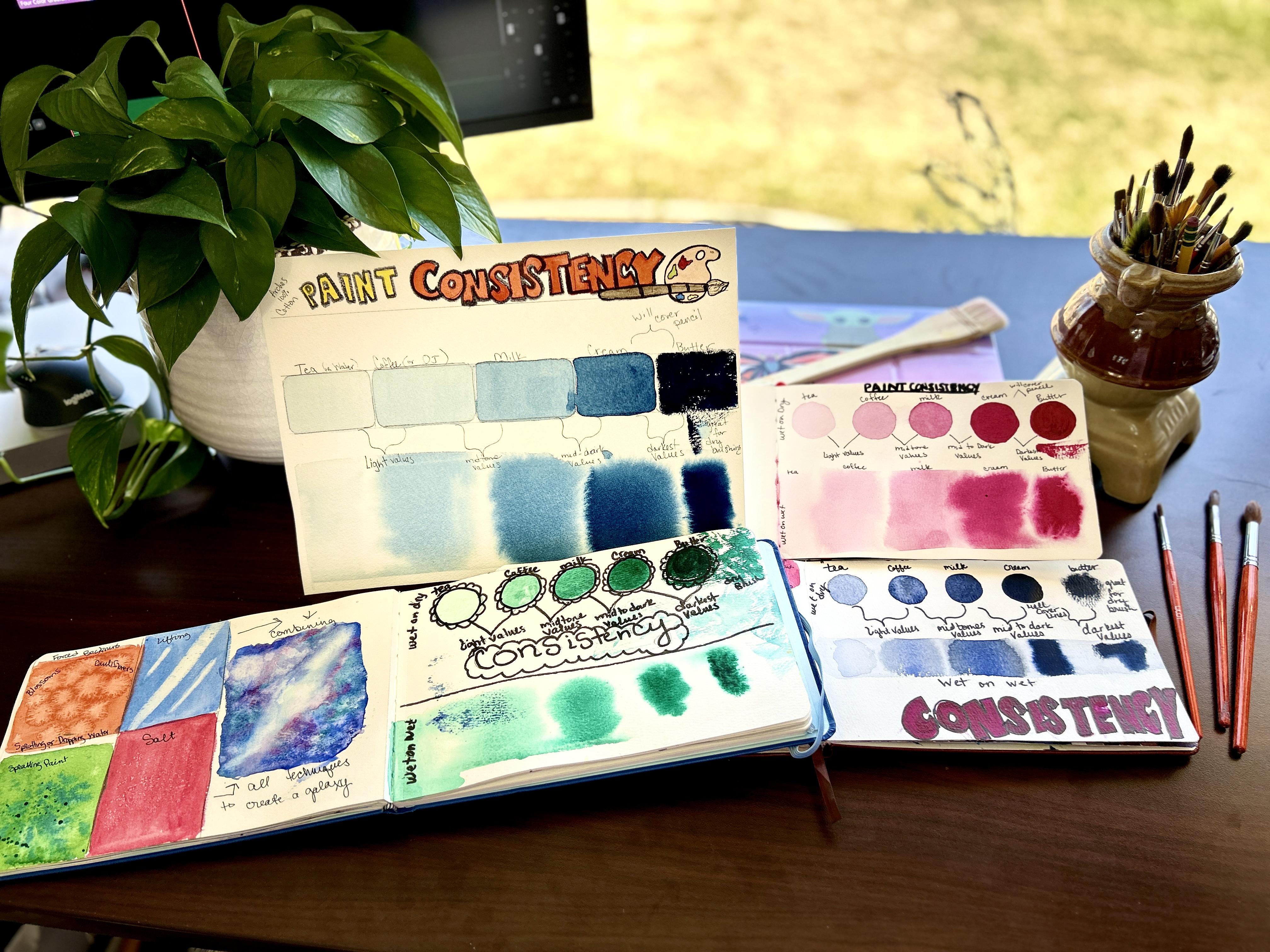
8. Paint Consistency: IT'S GAME CHANGING!!: Hi, and I'm glad you're
here with me today as we do this short lesson
on inconsistency. Before we get started, I'll let you know what
our supplies are. I'm just going to use a watercolor sketchbook
I have here by Artesia. This is 140 pounds
cold press paper. I have a number
eight sable brush and we need that
I'm going to use. The brush is going to lay
down a strip of water. When we get to
painting wet on wet, I have a glass of clean water. I've got a towel to tap my
paintbrush on when I need to. And then I'm going
to use my Paul Rubin paints here in the
color of rows. Let's go ahead and get started. I have taken and drawn five
small circles on my pad here, cross in my watercolor
sketchbook. You can do circles or
squares, whatever. If you want to take a minute and draw those out and push pause, and then join me back here. You can just do light
circles in pencil. Okay, so pink consistency
was a big one for me. It helped me learn values of
paint in the color scheme. And it also helped teach me the consistency
that I needed to paint on the paper and how that
consistency will react, whether it's wet on
dry or wet on wet. There's a big difference
between those two. After you get done drawing
those up here on the side, we're going to do wet. On dry. I'm just going to write it here, the side of my circles and above my circles in this order. I'm going to write t
from left to right. And then I have coffee, milk, cream, and butter. Okay? So we're gonna learn
these different mixtures. Basically it's taking
your paint and thin innate down to these
consistencies. Okay? So I'm going to hold my palette here so you can see and I'll go back-and-forth between my
palette and my, my paint here. When we talk about T, we're going to talk
about the thinnest and the lightest value that we can achieve in this water color, k, t is very light. It will stain if it spill, but it's very clear
and it moves. It has some tint to it, but it moves very freely. So I'm just going to
take I've already pre wet my paint
over here and I have a little loose watercolor
puddle here in the bottom. So I'm going to just
bring that over here. Now you can see when I
first bring it over, it doesn't move
very fast, right? So I'm going to wet this
down and dilute it. Tell it is quite
thin and very runny. You see how that moves
around on the palette here. That's plate. Now, this is just a
white ceramic plate. I bought it at Walmart. I think I've mentioned
this in some of the previous videos for $1. So it's nothing special fancy, you just use what you have. Okay, So this is super thin. It's very runny, right? Okay. I'm actually going
to dilute it more. So what would be some of
our something that we were painting that would
be in the T stage. Cain as I'm talking about it, I'm going to paint
this circle in C, so it's very runny. And when I run my
brush through it, it fills it in so fast that you didn't really know that I had a
brushstroke there, so it's very runny and very
light, almost very watery. And then I'm just going
to paint it wet on dry right inside that circle. Try to make that wash
is even as they can. So that's nice and clear. Very thin, and very runny. Okay? So some things that would
be in this value would be like rose petals that had the light coming
through them or highlights. Sometimes I do skies with
sunsets that are in this hue. And value light value k. So
we're going to just take this now and darken it up so it goes
straight into that wash. And I'm just going
to add a little bit. Now coffee is a little bit thicker than t. If you spell it, it's going to stay more. It has more color to it, right? But it's still quite runny Okay, So see there it's
still running quite a bit, but we're darker, right?
Or darker than the t. K. Want you to take that now, this consistency and peanut
here in the coffee circle. And you should be able to see
it quite a big difference between your tea circle
on your coffee circle. You're going up in the
darkness of the value. So this is one step up
in the value scale. We're still very running, right? That would, if I were to tip that glass over
it run pretty fast. Okay. So we've got tea and coffee that we're going to make it a
little bit thicker. Now with milk, milk stage
is what normally paint. This is the consistency
I normally paint in. One take a minute
here again and tell you that I'm on
Main Street again, so please forgive me
for any traffic sounds. I live right by the high school, so it's quite, oops, sorry, it's quite busy. And, um, I'll try to edit that muffled traffic out
the best that I can. Okay. So back to here. This is milk. Okay. With milk, it's little thicker. It doesn't move as fast. It's definitely darker
in color, right? Thin that down
just a little bit. See how we're moving faster. That's the milk stage, where it's darker and thicker. They coffee. And where a darker value. These would be your mid
tone values in a painting. So let's just go ahead and
fill that circle in there. That's nice. Light, little bit darker, quite a bit darker. K now, not only are
we can for Cream, make the paint darker, but we're going to
make it thicker. So it's going to not
move as quickly on our board and it's gonna
be darker in color value. So if you think about cream, if you have cream and
you knock it over, it's going to kind of puddle little bit if you had just a little
bit of cream, right? See how much slower
that's moving. If I drag my brush through it, it takes, well, let's see. It's not playing along here. It's slower to, to come back. And it doesn't run as fast as coffee or tea,
coffee and milk. So I'm just going
to thicken this up just a little bit more. We want that to run really slow. But not B. Thick and sticky. See it still runs,
it's still puddles. That's a nice consistency
there for cream. So we're going to
take that and we're going to fill that right in. That cream box or circle, whatever you chose to paint. I chose circles because
I had a washi tape here. It's like, Oh, I can just
trace that real quick. I always paint this lesson
with my students because once I learned how to
control Consistency, sorry about my sniffles, I'm
still getting over that. Once I learned pink consistency, it really helped me
become a better painter. It helped me in my value
scales when painting, I got out of the lines
there quite a bit. Let's make the best
circle that you can. Okay. There we go. Okay,
so that's cream Light, little bit light, little darker, a little darker. K, We're getting into close to the main color that this would be straight
out of the tube. Okay, now I'm going to set
my paint palette down. Because what I'm gonna
do is I'm going to, I want to make my brush, a thirsty brush case. I'm going to clean my brush out and I'm going to tap
it so it's still wet. I don't want to go
straight into that paint. And I don't want you
to dip down in here. I don't want you to have
water in your brush. I just wanted to if you
have your tube of paint, that would be even better. Just take the paint
right out of your tube. But this should be
nice and sticky. You should be very thick. Your brush. Okay. And I did not have
any dripping water. I've wiped all the
water out of my brush. So this is straight paint. And the more I rub it in here, the thicker it's going to
become in the my brush. So you really want
to be able to see that paint in the brush. You can see it here in the head. Okay. Go ahead and
paint in your butter. And it should be, you should be able to tell a big
difference in the way that paints and covers
in the butter stage. Now if you're using an Arches
paper or a rough paper, or you're gonna get some
really good texture here. Butter is good for
the dry brush stage. So if you take your
belly of your brush and just skip it across your paper, it shows the texture
through your paper. Let me see if I can't be phones disconnected here. Shoot. Okay. Let's bring this in. If I can zoom this in here, you can see they'll
be able to see your individual
brushstrokes with butter because it's very thick. It's almost like painting
with acrylic paint. Watery acrylic paint, of course. But then you'll get
these nice brushstrokes. Okay, I've got some puddle and happen in here on my cream. I'm just going to take and
make that a thirsty brush. And then I'm just going
to set it here on the side and my brush
will soak it up. So I won't have any puddles. So we don't want
puddles on there. We want to be able to see that the best they
can so we can see. So you can definitely see
that there's a color change, mostly on if in-person. But you should be able to see a dark value here between
cream and butter. So you'll start
out, these would be your skies, your water. And then you'd move in to your
distant mountains, trees. These would definitely be
everything in your foreground.
9. Paint Consistency Continued: We do need a separate
container of clean water. For this next step k. I'm going to zoom this
back out again so we can see our project here.
I want to see me. So I have clean water
and my dirty water. So what I'm gonna
take, I'm gonna take my hockey brush here. And we're gonna go because I have creams set up
here in my palette. We're going to go backwards now. So we're going to take
this hockey brush. And I'm gonna move my clamp because I have a feeling this is going to want a bow on me. So if you're, if you're
doing this in a sketchbook, make easter, you
have some clamps to clamp down these edges. If you are doing
it on a piece of paper or another way to make sure that you've I'm sorry
to throw this in here late, but you'll want to have
taped down your paper. So what I'm gonna do is
I'm just going to lay down a nice even coat of
water down here. Yeah. I'm glad I put
that on there because it wants to go on me a little bit. We're going to, I don't
want any puddles. I just want a nice even coat of water because we're
going to do is introduce this paint thicknesses to this water and see how
it responds there. Okay. So we're going to start
right out of the bat. Should have left my brush out, but we're gonna go right one to make
that a thirsty brush, right back into that cream
and load your brush backup. Again, don't get
any water in it. Don't dip it down in
your water to thin it. Because we want to, we're going to take that butter and we're going to introduce
it into the water. And we want to see
what that does. I'm going to paint
a rectangle here. Now you can see that
it's bleeding out. But it's really quite staying right here
where I'm putting it. Let's see if I can zoom
this in here for you. Okay. So it didn't bleed, but it's pretty much
staying right here. We're going to drop down. I'm just wet my brush here. And what we have here is cream. Remember we have
cream in our palette. So I'm going to take
the cream and I'm going to put the cream in the water strip and
write that in there. And you can see that the
cream because it's wet, is bleeding out a lot faster. It's a thinner paint k. So
we're going to go backwards and take our cream here and we're gonna
make it the milk stage. So it's still pretty dark. Moves a lot faster
than the cream. But it is thinner and lighter. So I go No, no. Okay. Let's mix
that back up again. So because it ran. So get back down in here to the milk stage where it's kind of thick but it moves fast. We're going to paint
that in right here. I might have to move these over. I do have a bit. I just use the same brush. Do have a bit of a puddle there. Okay. So when you hit the
milk and the water, it spreads out quickly
except for where I got it. There in that puddle. It's spread out quickly. It's a lot thinner
than the cream. Okay, so we're going to
go down and make this. Now, I can see, I can see that my paper
is starting to dry out, so I'm just going to spritz
it a little bit right there. If yours is drying out, go ahead and either re-wet
it with clean water with your brush or if you
have a spray bottle, but don't spray over here. Okay. So we're going to
thin this down again. Go back into the Make this in, I'm going to bring this out. And to make this thinner
up here in this corner, we want to be in
the coffee stage. So we're going to bring a
little bit of the color up. But it's quite, really
quite runny, right? Right in here. For coffee. If I tap my brush, it comes out pretty, pretty easy. This is coffee. I'm going to put
that on the water. We should see it bleed out a lot quicker and find those edges of the
paper there as well, except for I've got a puddle. Okay? Okay, and then with t is our
lightest where this value, someone just take a little bit. Fact, what I have in my brush is probably enough
for the T stage. And we'll just introduce
it right there. You can see it's very watery
and it's just going to wet. It's going to follow. It will take a minute. I'm going to hit this with a
blow dryer and let it dry. And then we'll go
ahead and compare and talk about how it does here. Okay, So now we're dry here. We can really compare them. If you look in the
tea on the wet on dry and the T on the wet on wet. It really spread out into where you can hardly see that
there's any color tone there. It will always do that. Wet on dry is always
going to paint a little bit darker
than wet on wet. And it will continue to just bleed out and find wherever
there's wet and it will stop. So if you have a hard line and you haven't gotten clear
to the edge of your page, you will get a straight line
where your waterline is, but where it was in-between. You can see how wonderful we
have soft edges here, okay? So our T and our coffee, I'm going to draw
just a little v here. And they are our
lightest values. Okay? Our coffee and milk. I'm going to draw
another V here. So we know that these two, these two are our
mid-tone values. Now if you want to
print this up and do a printed on a printer, that's all fine and well too. I like to just have
this in my sketchbook. And I do this with my students
so they can really see how that consistency is going to work when we do a wet on wet, because most of my projects
I like to do landscapes. So we do a lot of
wet on wet painting. Our cream. There's definitely a color difference and all
of these are cream and milk. And sorry for the loud row road. Or our mid to dark values. And then our butter and cream. There are darkest values. K. Again, this is great
for dry brushing. Now, when you get into
the butter stage, butter stage will
completely cover pencil. And it will complete, for the most part,
it will almost. If your light enough
with your pencil, you can get away with cream and butter both covering pencil. You can see the outline of
your pencil marks on milk, coffee, and especially with T. So in these areas, if you're ever drawing anything, you're going to need to either
really makes sure that you have a light under
sketch or you can go in. Sometimes. Sometimes depending
on the paper. And this one we'll sometimes
depending on the paper, you can use your kneaded eraser. Okay. And you can erase out that pencil to get rid
of your pencil lines. But just know with tea, coffee, and milk, you're going
to see your pencil lines. This gives us a really
good object lesson in how your paint in
different thicknesses. That's what I mean
by consistency. The thickness of your paint, how it reacts with water and how it also paints
on wet, on dry. And then when you
will use these tones, so this is always something
good to have as a reference. And something I wish I would've known from the very beginning. But I learned to, like I said, I learned it quite a bit into I'm after I learned a lot of techniques and this would
have been handy to know. Okay, how do I mixed up these panoramics up this
paint to get a light tone. You know, how is it
going to react if I, if I put a creamy
or consistency, there's something that I noticed with some of my students. They weren't somewhat paint when we'd start first painting. Like are even
first, for example, when we did some
color swatching, I would have some students
that would paint really light. And they would be painting in
the coffee and milk stage. And then I had some that
would paint really dark. And so once they
learn this lesson, then it leveled that
playing filled out and we could all paint
the same picture. All have a little
bit different look, but we can pretty close to have the same picture
when we were done. So this is the, the consistency that I have
in my watercolor sketch book. The very first one I
did that I use a lot. I've done it many times. I'm not going to
pull them all out. Just show you. I know I have at least
two more sketchbooks with this with different
students that I've done. So this is watercolor
consistency and how it reacts with wet
on dry and wet on wet
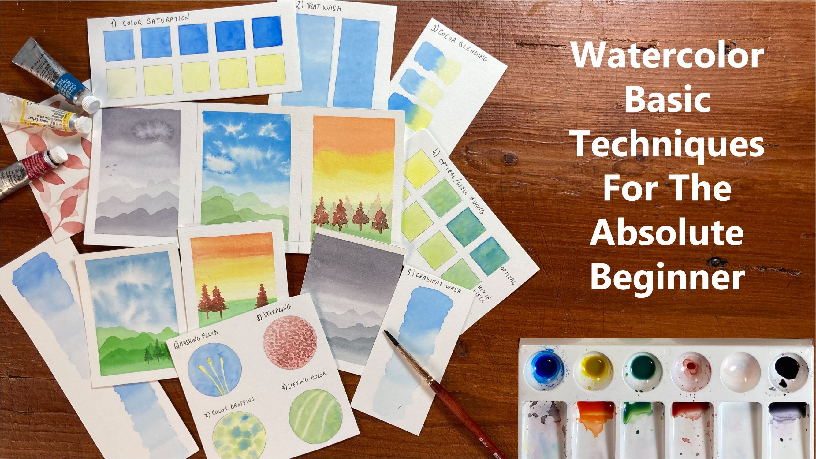
10. Intro To Watercolor Basic & Supplies: Hello and welcome to this
class on watercolor basics. I'm so glad that you're
here today and gonna be with us as we go
over this lesson. This is one of my favorite
lessons to teach. And I think it's very crucial before I jump in with any
painting with my students, I make sure that they
do this exercise. Alright, well we're
going to start. The first thing that
we're gonna go over real quick is our supplies. Today we're going
to use a size 14. This I save. Then if you have one, I'm going to use a one-and-a-half
inch hockey brush. But if you don't have one, you can paint it in with your
size 14. Worry about that. If you don't have one of these, this will do everything
that you need today. But I am going to use this. Things that you're
going to need. You're going to need a small
bottle or a spray bottle. I like to paint on ceramic
as it moves really well. But if you have just the pellet, something that you can mix your paints on, that
would be great. I have two glasses
of water here, one from my dirty water, and one for my clean water. This is a piece of
140 pounds, 300 GSM. Go home. 100% cotton Academy paper. You don't have to
use 100% cotton. I did do this exercise on actually I've done
it several times, but I've had camera
problems each time. So I've done it on cotton, I've done it on acid free, and I've done it on hot press. So you use what you have. I would suggest not
starting out on hot press as it's the
hardest to paint on. But I would suggest if you haven't gone out and
bought your paper and you're thinking about painting this here with us in the future, I'd either get cold press
paper or 100% cotton. It's just gonna be easier
than the hot pressed. And I'll show you why later. So we've got our
brushes, I've got a rag, wipe my brushes on. If you have paper
towels that will work. So here's my water
and I'm going to use my Paul Rubin paints today. So you use whatever
paints you have. I'm just going to use these
because they're here and it's convenient to just use
it right out the tree. So let's jump in. I'm super excited
11. Wet On Wet Sample: Let's jump in. I'm super excited for this. So what is wet on wet? Wet on wet is when
we take the paper and we wet the surface and
then we add paint to it. So the first thing I'm gonna do is I'm going to take
some clean water. And I'm just going to
paint a circle on this, on this side of the paper. Now, you will be able to see your circle because it will be, it'll have a nice shine
in a sheen to it. Can you see that and see if
I can get it to there we go. Reflect right there and you can see that circle
has a nice sheen. You shouldn't have
any puddles. K. It should just be a nice circle. And you can see that
it's nice and shiny. That's what we want
for wet and wet. Wet on wet. I'm gonna take I'm
gonna use a let's see. Let's go with a scarlet red. Actually this is red matter. I have to look at
the right color on my wheel here because I
changed some of the colors. So this is read matter. This is a semi-opaque. And as you can see, because this is
wet when I hit it with this paintbrush in there, it's going to come
alive and spread. We're going to take
this and we've gone over paint
consistencies already. So this is in between milk and our orange
juice or coffee. And you can see as I
hit it in that water, but it will just bleed
and move around. Now what's cool is anywhere
that I painted water this red will go it
will not go past it. So wet paint always
follows a wet. Wet follows wet. So anywhere that you
have wet paint, wet, wet surface on your paper, wet, the paint will travel there
even when you think it's dry. But if you touch it with
the back of your hand and that surface is cold, any coolness to it at all. That means that
your paper is still wet and you do not
want to touch it with a paintbrush or any kind
of liquid on your brush, paint or water until that
surface is no longer cold. What I'm trying to do here is
just make a nice even wash. I go back and forth, try to get it as smooth
and as even as possible. And this watercolor will continue to move around
and bleed around. And as long as my paint
surface is shining, see if I can pick that
up and show you again. It's got that nice sheen to it. It's got that nice
glistening sheen to it. As long as it's got
that wet surface, we can continue to
work that circle. Now. If this was a big surface, the pit area that you painted first will have already
started to dry. But as long as this is
shiny, you can work on it. So what I'm gonna do
is I'm going to rinse my brush out on a tap it
on my paper towel here. I do that for two reasons. I do it to see if
my brush is clean. Because you can see, see, I've
still got red on my brush. I'm going to rinse that really
good in the dirty water. Rinse it in the clean water. Okay, I can see here that my I don't want my brush to
be really sopping wet. So you can see here that this
is still nice and shiny. It has a very wet sheen to it. So I am okay to go ahead
and pick up another color. So let's see. I want to take, let's take some allylic
or a purple color here. And we're just going to be here. Now whenever you introduce
paint into a wet surface, you either want to have at the same consistency that you have or a little bit thicker. Because if you put too
runny of paint in there, it's going to push
that paint away and it's going to cause a
cauliflower or Blossom. You can see here that
paint is moving. So anywhere that we
introduced this peripheral, it will just move
and play around. So I'm just going to mix this thing because I
want a shadow down, down this side of the circle. Now what you don't want is if your paint is getting a
little bit thick here, see, I've got a little
bit of a roll of paint. You don't want to have a
roll of paint anywhere because that has more
pain in that area. It's going to leave you with a little bit of an imperfection. Let me grab some ultra marine Now I can see in this
area of my painting, it's starting to get less shiny. So that's telling me
that I'm running out of time with being able
to work on this. I'm just going to drop
some ultramarine in here, ultramarine as a
granulating color. It's one of my favorites to
work on because it will, these two colors will kind
of separate as it dries, give a really pretty,
pretty effect. So I'm gonna, I'm
gonna quit right here. I think this is going
to lift up some of that rolled edge down here because I don't
want that dripping. Okay. So this is wet on wet
when you can play with it and that paint will
continue to move around. You can get some
beautiful color washes, which we're going to talk about down here and a little bit. Okay? So you can see these
colors in here. I'm still shiny. So if I wanted to,
I can work on it, but I'm starting I can see that, that that water and paint is starting to soak
into that paper. And soon here, I don't want
to cause any blossoming. I'm going to stop right there. Okay. I'm going to grab
some more water. We're gonna do it again. And this time we're going
to paint a big rectangle. Now. I just put clean water on here, but my water's
little bit tinted. You don't know if
you can see that in the camera, but that's okay. Sometimes it helps you see where you're
putting your water. If you have a
little bit attuned. However, if you're
doing a soft edge, I will show you where
I had some tint or dirty water and it
causes a problem. But up here it's not
going to be a problem because I'm going to
paint in this whole area. I'm going to switch
over here to, let's see, back to my wheel. I'm going to use a yellow IC. Let's go with this. Is it. So yellow? You could use a cadmium yellow. So it's your mid tone,
It's not lemon yellow. And this particular one, I'm not going to blend it. I'm just going to drop it in. And I want the paint to do
what the paint is going to do. This is kind of some of the spawn spontaneous color
painting that I love. The unpredictability. You can control
watercolor to a point. If you know the techniques, but you do have to relinquish
a little bit of control. Let's put some orange in here. This is permanent orange. You don't have permanent orange. You could use orange, yellow, orange, red, and cadmium orange. I'm just going to
drop some orange in here and let it do
what it's gonna do down in here into
the milky consistency. Because I want, there you go. I want that to move
around a little bit more. Now I'm going to
wash my brush out completely in the
dirty in the clean. Tap it a little bit on the side, see if I can bring
that down little bit. I just kinda drag
it on the side. I'm not totally getting all
the water out of my brush. And now I'm gonna go over
to ultra marine again. And let's make that a coffee. Coffee stage. I'm going to drop this in now. I'm not going to mix it. Because if I mix
that or that blue, but that orange, I'm
gonna get a green brown. And I don't want that. I just wanted to
to spread around naturally on its own and
give us some pretty colors. I don't want to mix it with yellow because I
don't want green. But I do want that look of
blue and orange together. I think it's kind of
pretty sometimes when it has been contrast in colors. Now, blue or blue is not
completely a contrast in color. Orange and purple would
be contrasting colors, but they do have enough of a contrast that they do
make each other pop. And that's why I
like to eat with them and just drop some
more color in there. I want that bridge,
it's spreading out. I want the rich
mess of that blue. I'm still pretty shiny up there, so go back and get
some more yellow. I'm dropping some
more yellow here. Those colors play. And be alive and move around. It'll give us this really
cool tie-dye effect on marbling. Look in effect. Okay, So we look at our
circle is no longer shiny. It's nice and Matt now, well, it's got a little bit
of a sheen to it, but I wouldn't touch it. Now our block next to
it is super-duper, shiny and super-duper runny. So I don't want to
move it around too much because that
paint will move. But they wanted to show you that this one is no longer
as shiny as this. So we don't want to
mess with that anymore. And this is going to start, this stem here is
actually starting to dry. And I want to wipe up
some of these puddles. Now, this is called
a thirsty brush. When you take your brush and you tap it out,
it's still wet. But if you take it and you
debit along that paint, it will lift those puddles out. It'll just drink it up like
a thirsty, thirsty brush. Now because I picked that
up and move that around. I did get the green brown
that I wasn't after. And I can show you in some of the other ones when we compare
them what I was after. So if you don't want your
paints to move around, don't move your board. Her Don't move your
paint as much. But that's okay.
12. Wet On Dry Sample: So I'm going to take some of
this bright lemon yellow. Now we're gonna go
into wet and dry. So with wet and dry, you just paint
directly on the paper. Okay. And we're gonna make
another rectangle here. Now, I like to stay in
my paint consistency. The majority of the time I
paint in the milky stage. If I'm not telling you what
stage that I'm painting in, that's where I'm at. Okay. Now, one thing I want to tell you is when we
first put it down, it was wet on dry. But I had some what
more wet up here. So I went back in and
brought it back down. But this is going to start drawing before I
get down to here. So I'm not going to
touch this anymore. I'm just going to let it dry. Now over here, I'm just
going to take some more of that yellow and take
the tip of my brush. And I'm just going to draw some yellow lines through here. It out. Clean it on my clean
air, clean water. And I'm going to grab
some yellow, orange. And I'm just going to paint few orange lines across there. And you can see here
what I'm gonna do, I'm just going to go
down the color wheel and then paint some red. If they bleed
together, That's okay. I'm just going to paint
a couple of them. If you want to downsize and use your size eight
on these lines. If you're worried about
making straight lines, getting a real thin line, you're more than
welcome to do that. I'm just, I'm just drawn some lines on here
because what I want to show you is that when that
paint is completely dry, we'll be able to paint over it. Now, see right here. Because I hit because I hit that red and the purple,
they're bleeding together. And that's okay, That's fun. Now, take that thirsty brush again and just
lift some of that. I want to do it too much because
I'll lift the paint out, but it's running there, so okay. So let's go back up here and finish our wet on
dry and we will be done. So okay. What do we need? We need our pen, okay? Since this is dry, I'm gonna do this part
and work right to left because I'm or left to right because
I'm right-handed. I'm just going to take here in this yellow box and
draw a little flower. And you can draw your
flower however you want. I'm just going to do
mine like a daisy. I'm just it's just a little
just showing you that you can draw on wet paints
for wet on dry. You can paint on wet
paint for wet on dry. Like to just make some
scribbles sometimes. And you can paint different
colors on wet on dry. That is totally dry. Hay. So when you paint on wet on dry, it won't move at all. Let's take some crimson red
or this is permanent red. Permanent red is
an opaque color. So this is not going
to be see-through. It'll stay pretty dark. For the most part. This is my size eight brush, but I can still hear it
a really fine point. And because I loaded up
the belly of my brush, all that paint will flow
down to that point. But it doesn't come out unless
I touch it on the paper. Move it out of there,
but that's okay. So you can paint other colors, not just layer the color itself, but you can paint other
colors over wet on dry. Any anyone that is wet
or dry for that matter. As long as you do it carefully. And you don't push too hard. You can. And you
have good paints. If you have cheap paints, some cheap paints will
lift really easily. Okay, So there is our
little flower there. I'm going to just paint some strokes over this colors
over here so you can see. And you can do the same as well. I'm going to switch,
got some green there. You can see the colors
through your paintings there. Let's see, Let's
get a little bit. How many blue? So let's do some failover. We'll just draw this way across. So you can see all of those
different colors in there. Now, because I went over the
blue arrow for the green, I'm gonna get some
bleeding here. But I'm not gonna
get any bleeding on those colors that are underneath because they're completely dry
13. Intentional Color Bleeding Circles: Alright, now we're
gonna do something fun. I call this intentional
color bleeding, or color bleeding, but I'm
going to intentionally make these colors
bleed together. So I'm going to start here with a light yellow,
lemon yellow. And then I'm just
gonna put contrast in colors by each other. And we're just going
to paint circles. Now I'm going to be in
between coffee and milk. More, I would say to
the coffee stage, not so creamy milk. But I want these
circles to have some. We're going to paint
right on wet, on dry, but I want these circles to
have some paint in them. I don't want them
to be totally dry. Circle. I wanted to have a little bit of
paint still in that. So I want to get it
as smooth as I can. I'm going to take the
next color in Wikis. You kinda have to work fast. I'm going to take and go over
to an ultra marine blue. I choose ultramarine
Noah, It's my favorite. You could use a fellow Fellows, a really bright color that
would be a pretty one. K. And I'm just going to
a small circle up here, but I'm going to
intentionally kiss them together because I want to see what that
color is going to do. Because wet paint
follows wet paint and that yellow
circle is still wet. So they'll either push
into each other or they'll bleed into each other. And you never really know
what they're gonna do. That's what's fun
about this exercise. I'm going to drop
down to my size eight brush because this is
just a smaller area. When you have a smaller area, you generally paint
with a smaller brush. Okay, so over by blue, I'm going to put an orange here. I'm going to kiss it
up next to the orange one up. That's so pretty. I'm going to kiss it next to the orange one and I'm gonna kiss it up to that blue one. And I'll see what the blue, the orange went into
that and oranges going into the yellow. The orange went into the blue. Okay, clean my brush. I'm gonna go with, I don't know, let's do a rose red. And we'll just paint it up here. Let's see what this one does. We want to keep it away from that rectangle up there at
the top because that is still wet Even though It's starting to not be
shining anymore, there's no shine to
it that is still wet. And if I were to touch it, it would make that pink move and we would get a
cauliflower in there. So a cauliflower is a
blossom or a let's see, they call it a blossom,
cauliflower, a background. And depending on
what you're doing, will depend on whether or not you want that
back from there. I think this one right here. I'm just going to
paint some water. Want to see what
happens when I paint? Just a little happen to see if the water went into the paint or the paint
went into the water. To follow the water. It followed our role. Wet paint follows wet water. Lift some of that out because
I got quite a puddle. There we go. Okay, that was fun. Alright, let's take some green. Green is not a color that
you see in nature very much. So I like to paint
with it when I can. It's like it's
going to move into the piece that it's nice and smooth that out. Well, it's still a purple. I got a lot on my brush
there so I can quit. I'm going to do is wipe
that back in my tray. Always like to wipe my paint to it right into my water
because you're losing money. If I have if I know I have
a lot of paint in my brush, I'll wipe it down in the tree. Okay, Let's see. Can we do red and
green are contrasting. Think of our color wheel. They are opposite of each other. So that's why reading
greener Christmas Colors, they pop and make
each other stand out. That's what a contrast in
color does is it makes it takes the other color
next to it stand out. It looks like the
red is going to go into the green and the purple. So you get the idea
of this exercise. We want it to just one way. If you didn't want
a color swatch in squares like we did earlier, you can color swatch in, in circles and let
them bleed together. And then you have your colors
that you have painted with, you know what they
look on your paper, but you can also see, I
wanted to do together. Okay, Let's do the red. This is one of those
things that if you just want to de-stress and you don't want
to have to worry about the masterpiece. Sometimes. I like
to color theory, which is along the
lines of this. But sometimes just painting. Circles can be
therapeutic. The stressor. Okay. Stay low. Contrast in colors. Blue is so pretty. That's another one of those that is a really bright color. And you don't always
find in nature. So with that
exercises like this, that's interesting that that orange really rebuild that blue, couldn't get it up there in
that corner, pushed it away. You notice that or not? Okay. Let's do another one. Let's get another color and
then we'll do a water one. So let's do another yellow, lemon yellow and really went on that one. Now we'll just do
a thirsty brush. This time I won't really. We'll just see how
much that will follow. Barely touched it. And it's not sopping wet, so we'll just let it move on
its own and fill that in, see what the bubble looks like.
14. Color Layering / Glazing: Okay, here's where we're going
to talk about color layer. Now when you do color layering, we're going to do it
in this next section. Because we don't use white. If you think about other
painting like oils or acrylics, when you want to
lighten your paint, you start by adding
white to your color. We don't do that in watercolor. With watercolor,
you start out with your lightest value and will deepen the saturation with
each layer that we do. So when your watercolor dries, it's always going to dry lighter than you think that
you've painted it. So I can tell you, right now, this is going to dry lighter and it's not gonna be this dark. Okay, so let's go
with the purple. And how do we make
our purple light? We add water, we want it
very few can see that. It's very runny. That's what we want. We want we've done that
water consistency. We're in the T stage. Oh, I dropped down there. See, this is a background. I can fix that though because
it hasn't been too long. I'll show you how to
fix that real quick. What I'm gonna do is
I'm just going to take a little bit thicker paint
than I have on there. If I were to put the
lottery on there, it's just going to make that
horse that background worse. So I'm just gonna go over it. Well, it's still down. A little bit of a
thicker paint on that. So when I layered this one, I'll just have to remember that. I'm going to be a little
bit because it always, it's already got a
layer of paint here. I'm just going to
have this one layer or more than the rest of them. Let's see, I got that background out only because I caught it right away and
it's not a big area. If it was a big, huge area, I'm just most likely let it
go or I'd wait for it to dry, 100% totally dry, and then go back in and put some layering in there and you can
fix it that way. That's definitely down the
road and the skill level. Watercolors blossom. Okay, we're gonna take
some cerulean blue. And again, we're in the
T stage, very light. And we'll just go with the very, very watery stage. Nice and light. No puddles. Try to smooth that
out as soft as you can so your brushstrokes
don't show. So nice. Flat wash is what this
is called, flat wash. Okay, Then we'll take
those red cells. Now that's too, too dark
for what I'm after. I want that really almost the peak value, right? That is our first wash. We're going to do that
three more times, but we have to wait for
that to completely dry. We will work on these other
ones that while those dry. Okay, now we're gonna go back up here to this layering
color while these dry. So we're going to take
some of that green. Remember we made it super light on what we're gonna
do is we're gonna do a cross-section now. And we're going to paint
that right over top. Now, this is very light. You don't want to
scrub as your paint. You don't want to put
very much pressure on. Because zoom this in here. It will lift your
paint if you're too hard with these brushstrokes. Okay, so next we're going to
do purple or violet color. Again, very watery, very light, very much in the tea. Consistency Hey, we're gonna do a
cross-section back and forth. Try to keep it as, even as you can. If you can do it in one
pass, that's great. For nice. Even wash that up right there. Thirsty, thirsty brush. Okay, now let's go
on to the blue. Civilian blue. Again, very light, very watery. Now you can glaze color like glazing and layering
with thicker paint. But I wanted to show you what. But how we'd like
if we were gonna do a botanical painting or
something with very light, like a rose petals in the very background that looks like the light is
coming through them. They're gonna be this lightest
value that we have here. So that's why I want
to try to teach you to paint from your
lightest value. Multiple layers to make
your paint darker. Okay, let's go to lemon yellow. Again. We want to have that
nice and watery, too much pigment even
there in mind. Got it. Right here. That's too much pigment there. So I'm just going
to water that down. And then do a cross-section right across that yellow square. Very light. Two hairs and some
air. Bob Ross. I've loved watching
him my whole life. Oil paintings, not easy
letter where he says, But I did my toe and a
little bit last year. And I only did two paintings. So maybe, maybe maybe
I'll try it later again. Okay, so into the
rows, rows, rib, and we'll put a little
bit cross section of that square root. Finish that up. But we're gonna go back
up here and put in our third and final
layer of these colors. So let's start with
the thaler green. Again, very watery, very light. You can tap it with
the back of your hand. If it's cold. They're not dry yet. So just go in really light. I'm laying in that last
layer paint. Okay. Where's the green? That's the wrong peripheral across they're not twist in it. You need the lie. That
would make a big, big difference on our purple verifies that
the wrong color. Wash it that are just going
to spell it in half again. And try not the best with it. And lift, because
it'll lift that layer, which I may have done a
little bit right there. And let's see if
we can see that. If you can see that line, I can fix it by dropping
in a little bit more. I don't want to
touch it too much. It will continue
to move around and lift up what we've
just put down. Okay, we're gonna leave it a go. Alright, now let's go
to the civilian blue. This brand of civilian
is not all Rubin. For some reason, paul
Reagan didn't think it needed to have a cerulean blue
and I use it all the time. So I put my master
touch in there and I just am not like in that
version of civilian blue, have a hard time weaken it up. Hey, there's this civilian blue, that third layer on there. Tap it out if I
can lift up that. Now let's do the yellow. Might have enough yellow there. It's nice and watery consistency and lay it in their show. And I don't have
enough thickness. Layer, yellow. And our third and final
layer of the rows. I have a tulip that I painted from a wonderful
teacher here on Skillshare that did botanical paintings
and it was so pretty and this tulip that we painted had about ten layers of paint, at least on these petals. And it was so pretty. And it was all done by
putting a layer down, letting it dry, putting another layer down
letting it dry. We can do some
amazing techniques with glazing and create
some beautiful paintings. We're down to our
two last boxes. So let's go on to
gradient color washes, and then we'll finish
up with soft edges
15. Gradient Color Wash / Ombre': I have a completely
different piece of paper. I've taped it all down, like I've advised you to do, which I didn't do
in the last video. I apologize greatly. I am sick. I hope you will forgive
me about my voice. So let's try this again and see if the 100th time
is the charm here. So I've taken my orange
and I have it in mixed in the
consistency of milk. I have my board prompt
just on a piece of tape. I have a propped up,
as they would say, at about a 30 degree angle. That's gonna help
the water run down. We're going to start with
the wet on dry method. This method is a
little bit harder. What I would say is that I don't want you to
get frustrated because this is a technique
that takes lots of practice and lots
of time to master. And we're just doing
a little strip. Generally, when you do this technique, you
do it in a big, large area and you cover
your skies or water. But I do want you
to practice this in both ways and you decide
which one is easier for you. Now for me, I prefer wet on wet. I just get a nice
graduated wash that way. But I want to teach
you both methods. You can practice them. I would do this over and
over multiple times. So what we're gonna do here
is I have turned my board obviously from the
last orientation and you guys had wet
on wet, wet on dry. We did the gradient color, intentional color bleeding with the circles than we
had the glazing. Now we're at gradient color
washes, the ombre effect. Okay? So what we do is
with wet on dry, it is important that we start with a thick
consistency like this. And I'm going to start
up here at the top. Now, you're lying there was the blocks of
the color glaze k. So do this one right at the top. So you know that this
is the wet on dry. Okay. I'll do it right here and
pretend like this is my line. So what we're gonna do is we're going to really
load up your brush. And you can see, when
I load up my brush, I really drag that belly
of the brush across the top in that paint
k. So when I touch it, it's really the loaded. Now what we're gonna
do here when we do a wet on dry is we're
going to start at the top. It isn't important that
as we bring it down, that we have a bead
of paint here. Okay. It's starting
to roll down, so I'm getting a little
bit of paint here. So what is important is that
we keep that beat of paint. So I'm just going to bring
this down until my beat of paint starts to get a
little bit thinner. Then I'm going to quickly put some more water here on my hand, a little bit thinner. Okay, so now I have thinner paint and when
you do this technique, you kinda have to work quickly. That's why it, again, this is not my favorite k, But we started low. Now I'm backing
that thinner paint into that bead of paint. And now I'm pulling that down and making a
new beat of paint. And I'm going to pull
it down gradually. And as you see, I'm starting to get a
color change, right? So we can pull that down
until I'm starting, my bead is starting to get thin. And it's definitely changing
as we're bringing that down. I still have my bead. Can you see that row of paint? I'm gonna get my
brush wet again. I'm going to add more
water to that mixture. And you can see where
I'm bringing it down. I've still got my beat of paint and it's getting
lighter and lighter. One thing that's
important that I struggle with still to this
day is being a fuss bucket. This is where the perfectionist
in me really wants to make this perfect. And with watercolors sometimes
you have to let that go. So if I were to take my brush and go
back up into this top, into here where I've
done, this is already dry It's complete. It's a lot drier than way
down here at the bottom. So if I were to go
in and touch that, I'm gonna get a blossom, It's going to move. It's going to ruin that all. Okay. So you can kind of see my
brush strokes, It's okay. I'm just going to take
a little bit more water because I can't
talk too much here. Okay, That's really ready now you can see how much
that moves around. But it's important that
you don't go back up in to that wash. So this is one reason I'm not a big fan of this
particular method. Did we achieve a darker
to lighter wash? Yes. But I'm going to show you
a better wait for me. I prefer this way. Now I'm going to take
this, my thirsty brush. Remember we talked
about a thirsty brush and I'm just
going to wipe up that bead because if I
leave it there that wet, we'll move back as it dries
up into that dryer paint. And it'll just give
you grief and give your background and a line
and you're going to hate me. Now, see, mine is not perfect. I've got a darker section. We got lighter. I introduce water up. Now here I have a little
bit darker section and then it went lighter again. This takes practice, lots
and lots of practice case. I don't want you
to get frustrated, but I want you to practice it. Now I'm going to show you the
way that I prefer to do it. If you don't have
your hake brush, you can just use
this brush here. But I'm going to use
my hake brush king. So I'm going to take
water and I'm going to paint a strip down this side. Okay. I'm just going to paint it down. This is where taping
your board down. It's very beneficial.
Because if you don't, your paper is going to work because we're
putting water on it. And even with the tape, it's trying to buckle on me. So what I'm doing
is I'm just wetting this surface and I've
got a nice sheen on it. You can check it
from both sides. You just tip your
body a little bit and make sure you
have a nice sheen. That's all I'm gonna do
with that brush now. But I have a strip that's
the same width as this. It's just right here in water. Okay. So I'm gonna go back here and I'm going to
thicken that up again, back to the milk stage. I'm not going to dip
into this again. I'm going to load my brush. Okay? Now if you're doing a big sky, you would have to
get a bigger brush. Obviously, you'd
use your hake brush to do this and go
back and forth. Okay, so we're just going
to take this brush. Now. My paper because
I've been chatting here. This is where you
have to work fast, is already starting to dry. So I'm just looking to see
where my waterline was. I'm going to start here. And I'm just going to
go back and forth. Now what that water
on there is gonna do. It's gonna help this gravity of course, is going to move it. Okay? But it's going to
naturally smooth out those lines as I've
brought it down. And it's going to dilute the
paint in my brush naturally. I'm just going to try to
make it here. To the end. I'm gonna get a little
bit of line there. I lifted, I can see it already. K. Now this piece of paper that I have
is not 100% cotton. Okay? I'm not going to mess with it. I really, really, really
want to come in here. And I think what I'll
do is just tap it. I don't want to push
it back and forth in there because it will it's
already starting to dry on me. I just want to soak that up with a thirsty brush and get
that line off there. Okay? Alright, that's where the
first bucket and means coming. Now you can see as
this is drying, I've got a lot more
gradients, right? You can see the
difference in the two k. This one just looks
premier smoother. I don't see as
many brushstrokes. It definitely goes from dark
to light on the wet on wet. Now our wet on dry also
goes from dark to light, but it's not as
smooth and as creamy here as this gradient
wash, right? So that's why I
prefer this method. It's just a lot easier. You get a better
transition, I feel. But I'd like you to
practice both of these. You can do it on this paper, but on your own time. Practice this technique. Okay, now we're gonna
go on to soft edges
16. Soft Edges: So I took a minute here
and when it got me a container and
changed out my water. So we've been painting a lot. If you want to take a
minute here and go change your water from when we
started, that's fine. Just go ahead and
pause it and I'll wait with the wonderful
world of technology here. Okay, So what I'm gonna
do is I'm gonna take my hake brush and I'm going to wash it
out and I'm going to grab some clean water. And I'm going to pretend like
this is section off to K. So this bottom box here, I want you to paint a
full square of water. Just being a nice even wash of water with no puddles. Okay? So just make sure
that your seam of your paper doesn't have any puddles and there's
no standing water, but it's nice and wet. So what we're gonna do
is we're gonna do a son. So when I paint skies a lot, I love to paint landscapes
and cityscapes. And this paper's drain, so I need to talk fast, but I like this technique because it gives you a son
that looks hazy and foggy. So I'm going to take
yellow on my brush. It's about the
consistency of milk. K I usually paint in milk
stage if I don't say it. And I'm going to
paint a circle here. And I'm going to
leave the center white as best that I
can make a circle. And it's going to fill that
in a little bit because that whole sections wet
on wet and that's okay. So I'm gonna take
that yellow paint and I'm just going
to brush it around. And what it's gonna
do is it's going to travel to where there's
no more water, right? We've talked about wet on wet. It's going to give me
a nice fuzzy edge. I'm going to take a
little bit darker yellow. The first one was lemon yellow. Now I'm gonna make this gradient
k. So I'm just going to take some darker yellow
and blend it in here. Whether you want those
hazy circle lines. I'll leave that up to
you whether you want to blend those out
or leave them in. But just keep in mind of where the edge of your square is. I'm going to take a
little bit darker orange. This is, I'm permanent orange, so it's a little bit stepped down and it's going
to be bright. So I'm going to start out
here and then back it up. Now I can see in my box here
that it is drying already. Really well. I can see that
line starting to move in. So I'm going to stop
fussing with it here. Okay. Now this is still wet. I see a little bit of a sheen, but I want to stop
and it's going to still continue to bleed out. Alright, so I'm going to
leave that alone now. So now we're gonna go over
here and we're going to paint a little bird. Alright. This is gonna be easy birds, so don't freak out if you
see ****, I can't paint. I can't paint a bird. I don't want you
to worry about it. Okay. I'm gonna take I'm gonna
take a little bit of water here because I can
see I've got a hard edge. Now really want to make
sure that my brush is washed and it's thirsty. And I'm just going to run
that wet brush right here along that edge of that sun. Trying to be very careful
not to lift into it, but I do want that to
bleed out a little bit more and not have
a hard edge there. So I'm just running a
thirsty brush right along the edge of that and it'll
blend in nicely. Okay? Alright, it's really starting
to dry on that square. So I'm not going to class. I'm a fuss buckets, as I've mentioned earlier, so I'm going to try
to leave that alone. Okay, now I'm going to spend my wheel over here and I'm gonna go to cobalt blue. And I'm just going to pick up, we're going to paint
this one on wet, on dry. So what you're going to need in this section is a water bottle. This is where the spray
bottle comes in K, we haven't used it so far, but we're going to use it now. So I'm gonna take, I'm in between coffee and, and milk over here. And on this side, I'm just going to
paint a little head. So it's gonna be just
a little circle. We're just going to think
shapes here for a minute. So this is a circle and
this is wet on dry. So that's going to have a hard edge on it right
here and that's okay. That's what we want on
this little guy's head. And there's 100%, no,
this is not cotton. This acid free paper Is second my painting
pretty fast. So it's going to dry fast. It's I can't work this papers
as long as cotton case, I'm going to grab some more. Now. I'm going to paint a little
oval connected to that head. Okay? Just think
shapes for right now we're just going to paint
a little bit of an oval. Now, if your wings
backup into your orange because this section is in your papers down to here. Okay? If you get this bird up into
this section, that's okay. Hopefully we have
a little bit of dry time here between the Sun. And so if your wings go up over, it shouldn't cause too
much grief into this fact. It's still a little cold,
but it's still okay. So I'm gonna take, we've made
a circle and an oval now appear on the top between
the neck and the head. I'm just going to make a little, a little bit of an S shape and I'm
going to bring it up to a point and fill it
in a little bit. Okay. It's kinda fill that in. Now I'm going to make the
front wing in front of it. That's the back wing and
this is the frontline. So if they bleed together because they're
wet and wet, That's okay. I can see where my wings. I'm going to make it
a little tail here. Okay? Now what this wing, I'm going to pin it down a
little bit and brush it up, brush it up, brush it up, brush it up, brush it up. Okay. Now one way to take my, I'm going to set my blue
my brush down here. And I'm going to take
the spray bottle. I'm going to hold it a little
bit and I just want to spray right here on the edge of the wings and right here on the
edge of the tile. And you can see what
that's doing is it's causing this to run. And that's what we want on
this particular exercise. I want that paint to hit that water that we've just painted there
and introduce there. And I want it to
spread and become a soft edge into that water
that we just sprayed there. Okay. And into the tail.
Now this is kind of an abstract way to
do a bird's tail. This is not a realistic bird. This is just going to give
us a nice soft edge here. Try to just hit the tail part. There we go. You can see how it's bleeding. That's kinda what I'm after. And my head and my
bird is already dry. So I'm hug I want to go in
and I want to fix that. But we can as you can see, he's drawing in
different stages. Okay. So this is a lot drier. It's not completely dry. I'm sure if I touched it, it would really fuzz out on me, give me some grief. I can take these areas
that have the puddles in them and just move
them around a little bit. If I wanted to, I can wash my brush out and my dirty brush and my
brush in my dirty water. Ignore my dyslexia. Okay. I'm just going to make
a thirsty brush here. Now we talked about No, we haven't, we're talking
about that in the next lesson. But this is lifting. I'm going, I'm kinda make
some striations in the wings. I've taken wash my brush out
and it's a thirsty brush. And I'm just going to drag
it through that paint. Take it and drag it that way, and then drag it in
that paint and you can makes them like
feather separations. So if it doesn't do it
well, wash your brush out, tap it off, and go
back in and lift. And it'll fill in again. That's okay. Lifted up, back
in, brush it out. Lift. We're going to talk about
lifting in the next technique. So you're kind of
getting a preview here. A little bit of a definition
to that wing there before. Alright. So if we
look back here, this has a really
nice soft edge on it. This is a hard edge. You can see here in the head of this bird and the
top of the swing. This is a nice crisp, hard edge. This is the soft edge. See how it's fuzzy. Especially down
here, this is fuzzy. The inside of the Sun
is nice and fuzzy. And you're getting some really cool effects and that tail and that wing where that's drying
and hitting that water. Hey, it's making it nice
and fuzzy and giving some textures that
you can naturally do. Without the help of water, almost looks like an angel wing. I've done this
with mermaid tails with my students
and my kids before. Where you paint that
in and you spritz it. And it gives us just kinda
makes it turned kind of alive. So we're still drying here. This paper I'm going
to show you here. I didn't grab it. I'll go
back and above and type in what kind of paper that
says this is actually a first-time that I'm
using this paper. It's a Canson paper. So I'll put in I'll
put in a picture of the cover, a binder pad. It's got the spiral binder and you can either leave
them in or tear them out. I wanted to take this down
so it didn't buckle on me. And I'm kinda getting
a little bit of buckling in here.
And that's okay. I think one thing that we did do and some of those other pages that we're going to compare here in a minute is some of them have
a little box here. So as this is dry and
I'm going to show you, I'm going to take a
little bit of rose red and I'm going to just
paint a box down here. The reason I'm doing this as I'm giving that bird
some time to dry. So if I take a box here, I'm going to show
you one more way to give you a soft edge. So I've got a hard edge here, hard edge here, hard
edge on the bottom. And the paint is still wet. This is not my favorite
paper for sure. Okay. So we've got a hard
edge all the way around. Take my brush and we'll
wash it in the water. I'm going to make it thirsty. So it's not completely dry just by tapping it
here on this side. And I'm going to kind
of like we did back here where we push the
water from the side. I'm going to back out and paint a little bit
and I'm gonna kiss the edge of that with my brush. And you'll see that
it'll move into that. I'm going to get a
blossom right here. I'm going to move out and
give me a soft edge here. Now if I don't want it so
drastic to where there's a possibility of a blossom here. Just going to take
my brush is still wet and I'm just going to rub it softly along that hard
edge to Harrison Samir, like Bob Ross says. So that's soften that edge and kinda got a hard edge there. So to make that softer, just dab that out, go back in and touch
that with some water. Dab your brush and just
bring that water out. You can see here that you've got a soft
edge and a blossom. And a soft edge and a blossom. And that's okay. Because that's sometimes
is in effect that we're after blossoms are not bad. In fact, there's a
lot of artists like myself that love them
and I love to use them. We're going to talk
about blossoms here in the next section when
we get into techniques. Now this paper, if
this was cotton, wouldn't be getting such
a drastic hard edge. There are a drastic background. This is my first
time using this. So what I can do
if you don't like that hard line is
when this dries, you can go back in and I'm
introduce another layer. But if you don't mind it and
you're after that, look, I'm going to soften this edge to see if I can just
do it here with out washing my brush because I just have a
teeny bit of water in here and I'm just going
to scrub that edge. Let's see what
happens on this one. I've read, I've
taken off that line. Let's see if we get a
better one there. Right. Now we're getting really
close to being done. Just wash off your brush and wipe it off
here and we'll grab some yellow and give
the bird a little beak. Let's give him some legs up. It's going to run into
that red. I hit that red. Don't worry about
that. Okay. Just don't hit the body because
if you hit the body, it'll go back into the body. Now I'm going to grab my liner
brush and we're going to just grab a little black
and give him an eye. And we'll be done. I am so happy that
you have stuck around with me and
finished this project. It was a big one. So I would love to
see your painting. So if you would share
it with the class, I can help you if you
have any questions. I can review it and
give you some feedback. If you'd like. It's
always fun to see what everybody is doing it after
they've taken this class. Now, let's move on to
our magical textures.
17. Welcome Magical Textures: Hello and welcome to this
last lesson of our journey. In this lesson,
we're going to learn about creating
beautiful textures. It's one of my favorite
lessons to teach. I like to call it
magical cut textures. Because it's, I
believe it's one of the fundamental building blocks to creating amazing paintings. So grab your supplies
and let's get started.
18. Set Up & Supplies: So what are some of the techniques that we're
gonna be learning today? Blossoms are forced backgrounds. They're also called
water splattering, salt, alcohol dropping, saving the whitespace
with masking fluid, lifting, dry brushing, pouring. This is Galaxy lifting. That's what I call
galaxy lifting. If I'm gonna do a galaxy
painting and paint splattering. Okay, So let's jump in
and get going on this. You are welcome to use
whatever paints you have. Like I said, this is my
favorite class to, to do. And I, whenever I
start new students, they have to take this
lesson before we start any paintings because
I believe it's that crucial and I didn't find these. I'm adding this into the I wish I had known this
when I first started because I had to learn all of these different techniques in
multiple different places. So I decided that when I started teaching
and my very first, I did a workshop. That's when I put
these all together. Now I'm sure other
people have done it too, but these are the ones
I use all the time. So that's why I've
grouped them in this way. Alright, so let's get started. We're going to paint a few
boxes and then we're going to, if you see me jumping
around, I'll explain why. Let's go over real quick
the supplies that we need. First of all, I used this is Stonehenge aquifer,
100% cotton paper. And I have made a grid which
I will show you in a minute. And then I use some washi tape to tape off my
lines so my boxes. This is what I did earlier. I just wasn't happy with that because they kind of
went over with each other. So I thought I'll tape it off. If you don't have washi
tape, that's okay. I have done it this way in the past when I've
taught lessons. So as long as you can make your grid and you
understand what each section is and it's labeled washi tape
is just an extra. You don't need it if
you don't have it. I did use a black super
fine Creative Mark Penn that I was able to do my lines with
and with a ruler. You can use any
size paper that you want if you want to do it in. I think I've even done
this in a sketchbook. Let me look here. So I've taught this
lesson with some of my students when I've
gone to their house. And so you can even do it in
a sketch book if you want. The only one I don't have on
here is the masking fluid. So if you want to use a
sketchbook and you have that, let's see if I can get
that in that shot evenly. There we go. If you have that, that's fine. You can use this two. So this is just a five-and-a-half
byte eight, I believe. And if you have one of those, this paper is ten by 14 or
1510, somewhere in there. But you use whatever
size you have, whatever, whatever
paper you want. Cold press paper
works great on this. This is cold pressed paper here. This is, this is the one
that we're doing right here. This is stolen. Stonehenge aquifer. This one I've done, it's also cold pressed and
this is a lower grade paper. It's the papers sold
by Hobby Lobby. So these are just examples. You can do this on whatever
kind of paper you want. This is one I did in class
with my students too, so it's a little bit
different as well. I'm going to use a
bigger brush today. I'm going to use a
size 14 and this is a thing gets a 1 " hockey
brush, it's really soft. It is really I've had it
for about a year's time to replace it and
that's just going to be able to put down water. These two sections here with lifting and galaxy
will be putting, putting lots of water on
there for wet in wet. This brush here is a
polar flow Creative Mark. Just find an old brush
that you don't care about anymore because
we're going to use that for the masking fluid. Masking fluid has a potential
of ruining brushes. So just find one that you
don't really care about. I'm going to teach you how you can help prevent
ruining a brush. So I've got two jars. I use Dawn dish soap, it's the best for me. This is the masking
fluid I'm going to use. It is by incredible white
mask, less liquid, brisket. We're going to be playing
with some rubbing alcohol. So you just need to have
a little container, whatever size you'd have
to pour a little bit, or you can just dip it
right out of the bottle, which I might do two. You'll need an eyedropper. I bought a set of these Hobby
Lobby in the craft section. Or if you have an old one, you can use that too. But we're going to
need to drop her. I'm gonna be using my
Paul Rubens paints. We're going to lean a
little bit of gouache. You can use whatever
brand you have. This as my Da Vinci gouache. I really like this gouache. It's good quality. This little tool here. If you don't have
an old brush and you happen to have a
masking fluid tool. This will work too. I might use both of these to show you how they work today. Not necessary. Just if you have one Indian
know it is you can use it. This is a rubber eraser
and it's what I use. It looks really grungy, is what I use to lift
off the masking fluid. If you don't have one
of these, that's okay. You can use your finger
to get it off as well. We're going to be
playing with some salt. Table salt works. This is kosher salt is
just a little bit bigger. Both of these work
pickling salt is a smaller, finer salt. So we'll play with
both of these to let you know what
different size pictures, but they make okay. I have two containers of water. As we've played in the past. You know, it's important to have and I've already
cleaned some brushes, so I usually keep my dirty water on the right and my
clean water on the left. I have a microfiber
towel here to DHAP my paintbrush on and I do have my spray bottle
to keep my paints wet. If you don't have a bleed
proof waterproof mark, marker pen, that's okay. You can use a number two pencil, just a regular pencil
to draw your lines. I want to take a
minute and remind you right now that if you're not using a block of watercolor
paper like I am, that's glued on all four sides. That you'll need to tape your
paper down on the edges. Either ad that you're using or the watercolor sketch
book, paper goes down. Or if you have an
individual piece of paper that you tape that down to a hard surface that will prevent your
paper from buckling. In this next lesson, when we're doing the
pouring and we're doing the galaxy lifting where we're using a lot of water
and a lot of paint. And it will also help
you in picking up that board and paper like we
need to in this next lesson.
19. Blossoms, Salt, Alcohol Dropping: So let's get started. I'm just going to
wet my brush here. And let's see here.
We're gonna do. The first one is
blossoms or force backgrounds or
water splattering. Whatever you hear. I've heard people in different regions of the
world say at different ways, so I call it blossoms. Oh, it's also called
cauliflower ears. If you ever hear anybody, a teacher that you've
taken an online class, and they call it
cauliflower ears. That's what they're
talking about. So just go ahead and
paint this box in. Just being nice, consistent. I'm in the milk stage. If you're wondering what texts, pink consistency I'm doing, I'm just grabbing it out of my pan and I'm, I'm in the milk. So what we're gonna do is
while we have this wet, I am going to grab
one more brush. This also is a size 12. So grab you and
other clean brush. And what we're gonna do is
tap some water in there. So you can see already
what it's doing here. It's when you put
water in wet paint, it's going to push
that paint away and move it around so
you can splatter it. Or you can tap your brush. And as it dries, you'll be able to see those
blossoms bloom and grow. You can really see a good
example of the force back runs in the blue and green of this daffodil
painting right here. Okay, let's move on to salt. Now when you pick your color, I just wouldn't pick yellow
because salt doesn't show up on yellow paint very well. So let's pick an orange here and just go ahead and
paint that in this again. If I don't tell you
what I'm doing, just really remember what
I've said in the past that I usually paint in
the milk stage. So just go ahead and get
it in there with salt. You want to drop it in? Well, this paint is still shiny. See how I have a pretty
good sheen on that. So I'm just going to take
a little bit in my hand. What the salt does is really
awesome because it will go in and wake up that paint. I'm just going to
sprinkle that in there. And we'll see what these, so when these dry, they'll create
some fun textures. Timing is pretty crucial when
you're working with salt. You need to make sure
that you drop it in the paint when
it's nice and wet. Not too dry and you definitely
don't want any pedaling. I love how the paint reacted to the salt
in this painting. Up in the top left corner you can see those explosions that were created in that orange
and the yellow with the salt. So pretty alcohol dropping. This is one of my favorites. I'm just going to put
a teeny tiny bit, not much, just enough that
I can use my eyedropper. So just know if you can see
that in there. Let's see. If I write down in there. I just have a little bit
of little bit in there. I'm going to take some
blue. This is so fun. My little students
love love painting. And using the eyedropper
is with the alcohol. The thing that I want
to tell you that I've learned over time
is with alcohol. If you paint with
alcohol and use it, you want to put it in one of the very last steps
that you do because alcohol drops will repel any future paint that
you put in there. And we can show you that. So this is really wet and shiny. We're going to just take it. And the higher that you
drop it, the bigger, see how cool that is, the
bigger your spot will be. So if you drop a little one, but it goes out and
it spreads out. And these are so
much fun where we have something that looks
like raindrops have fallen. But you can see
how cool that is. It pushes along with blossoming. It pushes the paint away. But where you drop it, the pink kinda comes up
and then it splashes back down and you get
some really cool. You can make
mushrooms with these. I can see so much potential
of how to use these. But just remember if you ever paint over there and you
want to add more layers, if you get your
paintbrush in it, it will repel any
future painting. You do. The paint just doesn't like
it and it forces it away.
20. Masking, Lifting: Alright, saving the whitespace, this is one that we're going
to take our masking fluid. So whatever you have, I'm going to show you, um, yeah. The first thing we
need to do with saving the whitespace is draw or paint. Whatever you are going to be needed to save
the whitespace. Now I've done buildings
where I needed to have whitespace
saved beach scenes, where I needed to
save the whitespace. I've done that flower I showed you earlier with the
cool backgrounds in it. I painted water droplets will do that to those water droplets. Shoot, you paint
with masking fluid. First one I'm going
to do here is I'm going to use this
masking fluid tool. And I'm just going to draw
a little flower here. It's nothing fancy. Just something that you
can save the whitespace. So if you have a
flower you want to do is kinda looks
like a little tulip. I'm going to draw
some leaves on here. So wherever you put
this masking fluid, when you paint over it, it will say that
whitespace underneath. So let's see, let's just
do a Smiley face here. What I like about this
masking fluid tool is this little nut here. Allows this to open and close their better quality ones than I have I bought these
ones were cheap. Gps offer, Amazon, they
don't work that great. But they also, so you can get a different size line between however big your
opening is. Okay. So what I'm gonna do
is take an artist, an old brush that you
don't care about anymore. If you, if you take a
good brush that you have, so you don't have any that you just bought your
brushes for the first time. If you do this step by
putting it in the dish soap, it will save this brush because masking fluid is
basically latex. Latex is a pretty sticky
and very hard to wash out. Okay. So I'm going to dip it
right in the masking fluid. Let's see here. We'll just do a couple
of brush strokes. Well, this actually
we'll just paint a box. Now with masking fluid anywhere. If you're trying to
do a straight edge, you need to make
sure you really have that straight edge
because paint will try to get underneath
anywhere that it can. So sometimes you
might want to go over it and you don't have a very fast time
that you have to work with this because
it starts drying fast. You don't want to make
masking fluid too thick. These actually might be
a little thick because it will determine
your drying time. So if you're working on
a painting where you need a lot of masking fluid, you might want to let that dry, um, for quite awhile. Now I will tell you
a different papers will affect masking fluid. I have some see. This one did really well
with masking fluid. I used it on this bridge
and it did really well. The paper didn't tear. This book is 100% cotton. It's viva, I'm sorry. I like to decorate
my sketchbooks. This is VBA and it's a
very different type. I don't know if it's
handmade paper. I need to go in and
look at it more. But this paper does not do
well with masking fluid. I did that same flower, just did it in a different way. But the masking fluid ripped
when I was taking this up. So whatever paper that
you're doing, in fact, this one I've had problems
with in the past. So we'll see how this reacts. Sometimes it can
tear your paper, so you just have to be really
careful when you remove it. That's I guess is
what I'm getting to. Alright. You've seen me
lifts or talk about lifting here a few
times as we've gone along our journey through all of the multiple
lessons that we've taken. Lifting this very
important skill to learn. I think I'm going to
lift with a green. You can lift, say you have a
mistake when your paint is wet and you can lift as long as it's
not a staining color. You think back to
that first video, learning about
paint when we did, let's talk about paint So our staining colors one was sustaining and didn't
lift very well because the pigments
in a staining color or finer and they go deeper
into the paper texture. So this is lifting when
let me clean my brush out. So I've watched it
in the dirty washed it and the clear clean water. And then when it's wet, you can lift here too. So you just run it through
a couple of times. Clean your brush, tap out the water because we
want a thirsty brush. Remember when we talked
about thirsty brush. Thirsty brush is when
it's clean brush, but it's not sopping
wet and it's just damp. So we're tapping the water that would huddle and we're
just lifting that out. So if you think about a leaf
and a leaf has veins in it, I've done it with flowers
and the veins and the flour. So this is a bigger brush. You can do it with
smaller brushes and get really fine detail. That again, back to
that brush that I used for because we use the masking fluid in
it or the dish soap. I can still paint with it. So I'm going to grab that. I'm just going to put some
little lines in here. See, I didn't clean my brush. So it didn't it didn't
really do much. It's gotta be clean brush. Lifting is getting back
to your whitespace. Whereas masking fluid is
saving the whitespace. So let's say that you are painting a
project and you're like, oh shoot, I didn't
mask this off. If you have a good color that
is not a staining color, you can lift it back. Okay. So that's lifting. And then I'll show you here
when this is totally dry, that you can go back in and
lift with the good paint. You can also dab out lifting with a towel
after you've wiped it. Okay. So that's lifting. I'll show you we can do
that when it is dry to dry brushing is a technique that you've heard me talk about when we were talking about brushes. Dry brushing is pretty awesome
when you are doing trees. Let me see. I have some examples
here of dry brushing. So this all here
is dry brushing. Now, dry brushing is usually
in the consistency of paint in cream and butter, especially butter, you get
some really cool textures. So let's paint a
little tiny tray here and we'll do
some dry brushing. If you wanted to practice this again later with a bigger
this is dry brushing. So you have just took an and
make a streak across there. I see, see some other examples of I did a whole
lesson here with my students at they wanted to
learn trees for landscapes. So we, we learned lots of trees. This is dry brushing in here. This actually right here. You can see that salt. So we're starting to get some
of that effect going on. But that's what salt
will look like here. So that's pretty awesome. This has dry brushing. This has some dry brushing. So dry brushing is when you use the belly of your
brush to paint. Let's see. I don't think I have anymore. Those are all do one
with my little students. It was just a quickie, one that we practice. Let me see right here. So we did this cat in a tree and this is all
dry brush beliefs. So let's do this real quick. Let's take
21. Dry Brushing & Paint Splattering : One of your brushes. I'm going to tap it out and take a little bit of this brown. You can choose whatever
Brown you have. I'm going to mix mine. This is brown number
and burnt sienna. And I'm just going to
draw a small little tree. Not a big one. He's just gonna go off in different,
different directions. Use the tip of your brush. You'll get these fine lines. If you push harder
with your brush, that's when you're
gonna get more of I'm the thicker lines. So trees go off in
all directions. Actually can come
back towards you to give some dimension. This one is going to
come back towards me. Okay? We're going to let this
dry right here next to it. K dry brushing is you tap out
all of the water up here. So we're tapping out a
water and our brush, we're getting a thirsty brush. We're going to take, oh, let's see what color does
really doesn't matter. We can do, Let's do this. Black here, k. So we're going to rub
it in here and get it more into the cream stage. But I'm going to tap it so
the water's not in my brush. I've got paint loaded in here. But if I tap it on here, It's not going to
spread all over. So with, for dry brushing, we're going to use the belly of the brush and we're
just going to go fast. So if you can see there, what it's doing is
you're skipping. When you dry brush,
you're skipping out. See, I'm pushing too hard. Money, use the belly of the brush almost
down here by the, I think it's called the bill. So the further up here you push, you're going to
get the paint out because the pink comes down. But if you use the
belly of the brush, it's going to give you that fun. Dry brush. You can dry brush down here at the bottom of your
tree where it's still wet and connect that tree to
the grassy a tree should. I think I've waited a
little bit too long. I can see that the shine
up here but not here. If you catch this right enough
and you put green, right? And dry brush across the bottom, and you hit that Brown. The brown will come down
and link into the tree. So it looks like it's looks like it's attached to the grass. So this is dry brushing, basically it's skipping and
you're getting the texture, the referee, your paper, the better dry brush
effect you're gonna get. Dry brushes very, very, very hard to obtain on hot press paper
because it is so smooth. And this Stonehenge paper
or this off-white paper, it has texture but it's a
smoother texture as well. Okay, let's go over here
and do paints flattering. Because I want to have all of these before
we do the pouring in the galaxy because
we're gonna be tipping this board for
paints flattering. You can use whatever
color you want. So the milk stage, just fill in this box. K. Now you can do
paints flattering in two different drying
times in your paint. So say that you're painting a road or a sidewalk
or buildings or rocks, anything that you're
going to want. A texture too. Whatever your dry time is, you can, you can
splat pink in it. So the first thing I'm gonna do is if you have your
brushes handy, you can get a smaller brush. I'm going to do. The bigger the brush
that you have. For paints flattering,
the bigger the dollops that
you're gonna get and the harder that you tap. Let me show you here. This is paint splatter in
here and I used way too big of a brush
and had too much water. So these are the bigger
paint splatters. This is a medium-sized brush. And then this one
is a smaller brush. This is what we're going to do. I'm going to take
this, Let's see. This is a size two. Let's go back up to
about a size six k. You're going to
take a wet brush. And let's take, you're going to use
whatever color you want. Let's take some rose red. Now if paint splatter and
you want to be in coffee. Coffee, I would say coffee
or milk consistency. Okay. So so paints flattering when you paint when
your paint is wet? Oh, I waited too long. Let me do this. Okay. So when your paints flattering to things, and I always forget, you're going to want to cover
anything that's important that you don't want to see how I splattered it up here
and got it in the trees. So say you doing something and you don't want your splatters
to go everywhere. Fact, I'm going to
turn this over. You're going to want
to cover anything around you. You don't want. This yellow is actually
dried quickly. So our paint splatters here are not spreading out there steam. We're inputting them. Can you see that they're
not spreading out? K. I use this technique when
I'm doing gravel or sand. I'll splat when
the paint is dry. I'm gonna do is just
take my bigger brush here and just get some more yellow
because this has dried. And I'm gonna read peanut over here and just give
that another layer. If you wanted some textures, I'll show you examples. So some of, I've got some
flower paintings that I've done where I want to texture
to bleed and move around. So I splattered the paint. When the paint is wet. Splattering sometimes
takes a little bit of practice to learn. Again, I'm going to be over here and choose whatever
color you want. Be in the coffee stage. Now you can. I like to tap it on my finger. Some people tap it
with another brush. The harder you tap, the bigger the dollops of paint. So these were
little little taps. These are bigger taps. Now can you see how that's
hit that wet paint and it's bleeding and moving kind of like our intentional
color bleeding. It's going to move around
because this is wet. Okay. I'm just going to be consistent
here and teach teacher. So I'm gonna get back down in
here into the coffee stage. If I get some on this side, it's okay with this red. Because I used to
read over there. Now see you can see I'm getting paint
splatters up on here. So you want to make sure if your pet splatter
in your picture, I always make sure it's dry or in the area that
you want to cover. Or you let it dry and then
you can do another layer. Let's see how cool that is. It's definitely wet
on wet bleeds here. Let's see. Let's get some blue.
So blue in here. So now this is with my finger. I'm just using my finger. Sometimes you can
do it with just tapping your finger
on the brush. So over here on the dry
side, Let's put some, I've painted a picture
where I painted a clown and I want it to look like confetti was around him. There's definitely the
two different sections. Wet on dry. The paint
splatters stay in their form. So I use this a lot. I use both texture is actually, when I do trees, I'll paint them and
I'll splatter some of the leaves in when
it's wet or dry, brush him in wet. I'll show them here
on the screen. So this is one of my favorites. I do this all the time. This painting again back because I just did this
on thinking about it. These are all paint splatters
and forced backgrounds. So these are these parts
right here or drops of water. But some of this down in here, I splattered an end
to the wet and wet. And so it bled nicely. Here's dry brushing. Okay. We're going to do this
here in a minute. This is the galaxy. See if I have any more
paints flattering. Okay. This is a good one. I did wet on wet where I splat splat it in
when it was wet. And then on this side, on this green bush, the site one over here I
spotted or when it was dry. So I had the dots that
state instead of bled. There's some paint splatter in, in here for texture
in the grass. And there's some
paints flattering. See again, I didn't
cover it up so it kind of got into places, the green where it didn't
shouldn't, didn't want it. But I did put some down
here in the foreground. Paint splatter and
I use all the time. It's probably one of the most important textures
that I use the most. I can show you some different Different ones too. But that gives you
the best idea. So let's move that.
Let's move out. Let's check here,
k now this is dry. Let's go back in and just take this smallest
brush that we have here. And I'll show you you can lift and a really
good cotton paper. You can lift like an arches, almost all the way
down to the white. And depending on the
quality of your paper, will depend on how much you can do before you start
to damage the paper. Now, I know because I've
used this paper before. If I try to go any
further than that, I'm going to start damaging the paper and it's going
to start bawling up. You can just wanted
to show you that you can lift lightly scrub, and then lift off with a tissue cotton ball,
whatever you have. So this is lifting on dry. This was lifting
when it was wet. Now let's go back over here. Your masking fluid is dry. So I'm just gonna do
a real quick fun. Let's do an ombre. So let's take some. So to do that, remember
to do an umbrella. We need wet on wet. So we'll paint that
with water first. Clean water. Quite sure
why that waters bubbling. That's where I'm going to take them in the cup
between coffee and milk, probably more of the milk. And we'll just wash
that across to purple. Okay, so we're going to start
back here and come into it, and then pull it back. Okay, now let's switch
over to a blue. So clean your brush. Some of this Prussian blue, It's really pretty okay. So we'll start back here, go up into the purple, and then bring it
back down. Alright. Those will, because
it's wet on wet, it will bleed together. Not quite sure what's going
on with the bubbling. That's really weird. Rest my daughter clean my brush and I had
some soap in it. I don't know. Okay. Now you can see
here these are dry. Look how cool that is. You can't paint that
even if you wanted to. All those cool little
spiky textures and paints, water color, flowers are for, blossoms are forced backgrounds. They're very unpredictable
of how they're going to show up. These little are ones
you get little or spots. The bigger, harder
taps are dropped, she'll get bigger ones. If you paint splat. Let's see what's in this one. You're droplets of water
and you move it around. You can get them to move
and make bigger blossoms. I liked these because
they kinda look like flowers in the background. So that's kinda fun. And depending on your paper too, will also depend on what
your backgrounds turn now. So that, that's, that's
blossoms force backgrounds, cauliflower, water dropping
k. Now our salt is dry. So you want to take your salt and just wipe it off
into a garbage can. But you don't want to do this. You don't want to wipe it
off until it's 100% dry. Because if you try to
wipe your salt off when your paint is wet, you'll just smear it. So look how cool that is. I've used this in trees
at Christmas or like in a winter scene where I
want it to look like frost on the trees instead of splattering
paint for leaves, I dropped salt in, which gave it a
really cool texture. Looks like ice on
the tree branches. And R group that's dry at this corner is
still wet. I can see that. So this is our water
alcohol dropping. This is still wet so you
can see anyhow, cool. That's bleeding together
because we did wet on wet on wet. Our leaves are dry here. Okay. Let's go back here
and do our dry brushing. So take one of your
medium-sized brushes. We're going to load up green. We're gonna be in
the creamy stage. And your paint. When they tap out any water.
Where's my thing here? And a tap out any water here. You can see it's in my brush. Use the side of your
brush, dry brushing. It takes practice. So if you get done with this
and you have extra paper here that you've done some of our lessons on the backside. Use both sides of your paper
when you're starting out. So use the belly of your
brush and just tap it. Hey, tap it. If you use the tip, you're going to
get just puddles. You won't get that
sponge to look. And fact, I'm going to show you here while I'm thinking about, okay, see how cool that is. Use the belly of your brush
and drag it sideways and you get those really cool textures. Now another thing, you
don't have to do this, I just have to have
happen to have some here. This is natural
sponge to see oceans. Sponge. I don't know
what it's called. I know it's called something
else besides sponge. But you can create some pretty cool textures
with the sponge as well. So I'm gonna go back in and
make it look like maybe some apples might
be an apple tree. And see you can get some cool, cool textures with
the sponge tool. You can get that kind of that same dry brush effect with a sponge that you can with
the belly of your brush. You see that? Okay. I just happened to
have that here in my drawer and thought about it. So if you have a sea sponge, they actually sell them in the craft store
that's ripped up. Or if you have an old one, an old loofah. A loofah works. A loop has a little bit stiffer. This is really soft. So that's sea sponge. Okay, now I think everything here is dry enough that we
can do these bottom two
22. Pouring \ Northern Lights: These are a little
bit challenging, so don't get frustrated. If you don't get it and your
first try, That's okay. It's kinda tricky. For my pouring experiment
here. I'm gonna do. I'm gonna use darker
blues and blacks, and yellows and greens
and maybe some mob. So let's get some clean water. Let's use our hockey brush
and our clean water. And we're just going to
paint this one for now. A good sheen on here. No puddles, just wet hay. Because we're going
to be using with a lot a lot of paint here. So we don't want puddles. Okay? And it'll work quickly here. So let's mix up. And if you want to
mix up your paint to begin with before we
start, that's okay. We're gonna be in the consistency
between milk and cream. We're going to need a lot of it. Okay, so I've got my dark color. Let's get back in here. I'm going to use a lemon yellow. I'm going to use my brightest
yellow that I have. If I were to do this and choose the paints that
would be perfect for this. Would be more of your fluorescent
paint if you have them. May lean. My mailing palette
has some cool ones. I'm going to take this k, this yellow. Let's see. We're just going to put it
in like that. Like that. Okay? Now we're going
to work fast here. Because we wanna do this
while this is all still wet. K Now take who I don't
have a bright green. Let's make this one. Let's take like you want to make a
fluoresce and tea green. So let's take the yellow
and this is viridian. Lemon yellow and viridian. Can you see that mix there? Now I'm going to just lay
this right in next to it or over it wherever you want. And I can see that
my paint is drying. So, um, which is okay. Because you got your
spray bottle here. Okay. And let's take some rose red and we're going to
lay it in right in here. Okay. Now if I was painting
with my bright colors, I would choose a magenta. Now with my Prussian blue, I want this pretty dark, so I'm actually going to
take the Prussian blue over here and mix it
with some of this black. I want more of a Payne's
gray black, blue color. And then I'm going to paint this in all of these
sections down here. Little bit. Sorry, I'm not talking much. But you just want to paint
these sections in here, maybe some in here. Okay. Now we're gonna take this and add a little
bit more of this yellow. Because you want these, if
they're starting to dry out, you want to go back in
and put some more in. But you want to keep the red
away from the green or it will turn turn brown. So I'm tipping my board, which is then the paint's wet. So it's going to cause
that paint to move. So I can see as I'm doing this, you're going to want
to put some paint in here as it's tipped. Take more of the magenta. I'm going to pour it in. It's poured in from
the belly of the top, the tip of your brush for it in. Okay. Maybe tip it this way. Maybe tip it up. If
it's not running The way you want to sorry,
I have it off camera. If it's not running, just
hit it with your water, then it wakes up. Backup. Let me get it back down here. Sorry, I'm off camera and see how those are
running together. At paint is really running. Let's tip it back up this way. There we go. Get it to run. Let's take some more of
that lemon yellow color. Yellow and green. And I'm going to pour it and just with the
tip of my brush, don't try to don't
try to control it. Don't try to smear
it or brush it in. Just pour it from us. Why I want really wet, really wet texture paint. That's awesome. Okay, Now see here, we're getting a line
across the top. You just want to constantly
wipe that and it will, it will be okay if you get a
white line because it will continue to, to move. Here, Let's take some
more of the magenta, just pour it in. It was crazy here. I live in Idaho and I live
in South Eastern Idaho. We don't see the
northern lights here. And last week, there was
a great big solar flare. Know, in the areas
where you live if you've got to see
it, I missed it. I didn't even know about it. I was so bummed because I wanted to see the
northern lights forever. But my sister-in-law, I was able to get some pictures.
There we go. See how that's moving. So cool, so pretty. But the way that we get
this to work is you have to how about wet and just
have patients with that? And let them move around. This is another technique
that you can't really paint. But to get that to
be more yellow, to really move, we've got two. There we go. See,
that's really cool. We've got to have a pretty wet. Okay. I'm gonna take now that this
is watch your dry time. If you're losing your shine, Don't mess with that, okay? Because it will cause a
background and a cauliflower. But if you have it,
if you still shiny, you can work with your
paint quite awhile. Especially if you're using
100% cotton like this. Let's pick up that. I don't want it. I really want that green. Sorry, I'm painting
off off camera. Let me put this back down so
you can see what I'm doing. Pouring is one that you have to have to be able to move around. So if I've got off camera, I apologize for that. I can see someone here. I'm getting mat. So if you're getting mat, don't, don't try to touch that up here. I'm still shiny. So I'm going to bring
that down it over. Bring it back up into that. Here. Again, more water. Get into that. Get into that
coffee and creamy stage. Try to get that
green out of there. I really want the green,
I want the yellow. Clean water if your
yellows getting muddy. This is all Matt. I don't know if you can see
that this is super shiny. This is not shiny. I don't know if I
want to do this. There we go. That will cause it to move. You just spray it lightly. I want this yellow to be a
little bit more prominent. That's cool. I kinda got a streak
through there. I'm getting into pouring
because I'm in the tip of my Okay, now let's tip it. Let's tip it up. And I'm getting running
here down this side now. I'm going to just wipe
that with my rag. Yes, that's so cool. Okay. You're getting any paddling down the side, just wipe it with your rag. Because what happens? The reason I'm doing this, you can use a thirsty brush tool is because of your dry times
are different. There we go. I love that. Let's let that dry.
Oh, that's exciting. If you leave any water
here along the edge, it will dry in
different times and create a hard line
and a background. So we don't want to
touch this anymore. Let's just let this dry now. And we actually need to let this dry completely
before we do this one, because we're gonna be moving
it around a little bit too. And if we move, move it while
it's wet to do this box, you're going to lose your cool. Soon as this light is this dries, you'll
be able to see it. So actually here, let
me get my blow dryer. If you have one,
you can get one. Or you're a heat gun,
whatever you have. And I'm going to mute, mute this and just
drive this right here. Now let's look at this. This is so cool.
Can you see that? I hope you were
able to get this. Doesn't that look just like the northern lights or
are going through there? It's so cool, so pretty. And you can't do that
with the paintbrush. Wet on wet and moving the board. So now we're gonna take a
little bit of loss spot here. You can see that I've had
here before and my palette, so I'm going to clean a spot. If you have a white clean
spot, that's great. If you need to clean it off. Let's go ahead and do that. Here we go. That's better. That's more white. Okay. We're gonna get
that quite watery. Again, we're going to cover
I've been using this, so I don't want to don't want to put a wet rag
over by painting. So I'm going to cover
anywhere I don't want splat. And then we're gonna
make some stars. And we're just going
to barely tap, try to get it down in the
dark areas for your sky. These are your stars. My grandmother. Let me show you another way. You can tap them in here. Hey, are you if you have maya, all just happened to
be here because I use them earlier today. If you have a fan brush, you can take your fan brush
and get it in there too. And you can flip your fan brush. Now if you do it too much, it'll get really clumpy. It gives really cool stars. Cool. Can you see that? Kinda still looks shiny, but I like my new lights
pretty bright here. So our northern lights. Now if you wanted to take
that and make it a painting, you could put a
black line in here. Let's just do that real quick. I'm going to take the
black little heels. Don't do this unless
your paints dry. Now we're going to
take thicker paint. Rather than just going
to use the tip of my brush can make
role in your paint. I got a real good tip on there. The higher you stay on
the tip of your brush, the finer you can paint. I'm just tapping
it back-and-forth, making some pine trees. So it's just something
that you can do. You see those trees? I'm not going to paint
very many of them because maybe this
is a tall one. Well, their baby trees. We were up here on a hill
and this is tolerance. Bring that backup. I've painted. I can show you. I'll put them up
here on the screen. I've done some galaxy or northern lights with
water over a lake. I've done some with snow, did one with Santa
Claus and a sleigh. I can put some of those up. Let me these are going
off in the distance. Okay. You can see
that very well. Put some trees down there and made it look
like a forest over, over the northern lights. Cool
23. Lifting \ Galaxy Lifting: Alright, now let's go
on to my favorite one. You ready? Okay, this one, you have
to move and work fast. K, I've had a lot of
students struggle with this one because they
didn't work fast enough. Watercolor dries quickly. So you want to make
sure that you have your paints mixed up beforehand. So I'm going to
use blacks again. Use some of that Prussian blue because these are
gonna be my outside. Okay, I'm going to show
you here the painting again one more time so you have an idea of
what we're doing. So I'm going to use purple, I'm going to use
the viridian green. And I'm going to use black
and blue and mix that into a really dark sky color. Like we did over here
with the northern lights. It's gonna be a blue black. Again, this is going
to be in wet and wet, so we're going to move quickly. And let me get my
blue and purple here. I'm going to use a
little bit of blue in this and I'm going
to use some purple. So we want to have
those wet here. So there's my purple. I've got a good puddle
of it here mixed up. I got my black. Well, this more like
a Payne's gray. I take that back and
put it over here. So I can have the
blue there. We go. See that Prussian blue. You don't have Prussian blue. You can use aquamarine. Use Aqua Marina lot. And I love it because
it's granulating. That would actually
look really pretty. If I had as true magenta. I would use it in here too. You can mix up some
of that purple and pink here together if you want. Alright. Are we ready? We've got our paints mixed up. Let's take some of the
cleanest water that we have. It's yellow, but that's
okay because we're going to paint over it. If you have some yellow color here and it's not completely
white, That's okay. Again, we're going to paint
this in wet, not puddles. We just want a good
sheen and a shine. If you have to pick your
board up and look for your palate or your pad
or whatever you're using. Um, we wanna make sure that we have all the surface covered. Good back-and-forth over it. No puddles though. Okay. Wet, nice and shiny
but no puddles. Okay, here we go. Now let's look real quick. I'll set it right here as a
reference here to look at. Okay, so when I put this
dark color in first, I'll get it wet here. Okay, here we go. So we're
going to lay this in right here in the corner. Right. And if it's getting
gray on yeah. And it's not as
dark as you want. Just go back in and get cream, butter and lay
that in the water. That will give you your
nice thicker paint. So I want some more
blue on this side. Just paint that in there. Okay. As we get going, we're going to move this
around a little bit. Okay, Let's grab
some of that blue. Drop it in here. Drop it in. Remember that blue
and drop it in. Put it back in your
black. That's okay. All right. Grab some scrap, some purple. The purple back in
over the blue k. I'm going to use green here too. Just don't put the
purple by the green. Because if you put
purple by the green, it's going to give you
a yucky brown color. So I'm going to pick up
some viridian green. Or if you have a bright
green, That works too. But I like this viridian
green color when I'm doing my Milky Way's, just don't tap it
in your purple. If you, if you want to
put it back here in the black, that's okay too. Just don't put it on the purple. Okay? Alright, so we can see we've got a really good team and a shine on this, right? Can you see that? All shiny all over? So we're gonna take
our gonna take our Clean brush and
we're going to lift, lift that section out. Okay. Over here, it's a thirsty brush, but in this particular
painting we got a little bit more water in it. And if you see, because I've
got that water in there, it kind of pushes that way. It gives it that
fast looked nail. What you can do is you
can turn it and tip it. It'll cause that pink to run. And that's what we want. We want that too to run and
come back into that center. But maybe your galaxy has a
little side bump out here. Sometimes galaxies go out. You know, you can tip it. Got it off camera here again. Just K9. You can go back in and
put some more color in. I'm going to grab some purple because I kinda lost
some of my purple. So I'm just going to
put it back in here. Now galaxies have these
funny squiggly looks. This is where we're
gonna get this squiggle look in this stage
and wash that out. I'm going to grab some
of that viridian green. I'm going to put that in there. Oh, that's pretty I love
to do in Galaxy paintings. Some of my favorite. Okay. Now we're doing lifting
and pouring in this one. I'm just going to tip it
and get those to run. Take a little bit. Not much of that white
that we saw had over here in our palette,
this, this wash. And I'm just going to rub
it up through the center. Gouache is made with
a chalk based paint. So it'll give it
that fuzzy look. Let's put it down here. So you're kinda getting, you're getting the look with though. That's cool. You're getting the
look with the lifting. You're also going to get that really cool photos
that you can get with wash. All right. That looks awesome. I'm going to put that back
down and I'm going to tip it some more because I want that to look really kinda
almost looks foggy. I'm gonna take my
smaller brushes, I'm going to get more
of that viridian, that bright green. I'm going to pour it in there, just tap it in and
sections in squiggles. You see that? I have to do it with the I recall when I tip that
around some more. Get it to move. Fun. I really liked this painting. This technique. Again, I'm going to
lift a little bit. Give it that foggy look. Maybe a little bit more wash. Put this down here so you can
see take some more of that, wash, rub it up through
the middle there. All right. I'm getting some getting
some run in here. So if you're running, just
rub your rub your oh, shoot. Okay. Oh, that looks so cool. Can you see that? I hope yours turned
out as cool as mine. Kay? I want you to hit it
with your blow dryer. Blow dry this out, and then we'll put Neil
what? I take that back. I'm gonna get my
smallest brush here. Because I want some of these
stars to look like there. I'm still shiny. So I'm going to just take a little bit of that gouache
and I'm just going to up, my birds are waking up. It's starting to get morning. They must get some
dawn over there. It's early here. I don't sleep well, so I get up and paint. So if they start squawking, just know it's getting
to be morning. I think my daughter was over here talking to me a minute ago. Alright. So we've added
in some few drops. Now this is wet on
wet, splattering. Fact I might, there we go. I might hit some. They're going to phase out
and what that will do it, I'll make them look like
they're back in the background. Okay. If you put, if you splatter
in the sky like this, and let's see if I
can get it to shine. It will look like
they're more further in the distance and that they're glowing more in the distance. Okay? One thing I like to do and this is something you don't have to, because not everybody
has them. But I have. Whereas it out. If you have any glittery paint, I happen to have some chalky
paint set just sitting here. So I'm going to drop some
little bit of a gold. Can you see in there? It's going to drop a little bit. Make it look like a vein of
a gold going through there. I'm gonna do this where
my paint is still shiny. Because I can see this
center section is dry. It's mapped. So I don't really want
to touch the golden, they're just going to
put some gold stars. So anywhere that
you're still Shiny. Morning, little parakeets,
little buggies. This is going to
spread out on there. So if you have
gold, that's okay. You can put some gold
in there if you don't. That's okay too. It's
just an extra little fun. Okay, cool. Let's put those away. I've got a couple
of different sets. My mailing sets have
glitter paint and then I have some gen crafts
that have golden them. So that looks so cool. Alright, let's get this dried
and let's finish flattering it with some white gouache when it's dry and
we will be done. That's all dry now, I have some gouache
here that was thick. So what we can do is we can turn that into a shooting star. Not all hopes lost. Okay, let's take our wet brush, get it in that gouache. If you have a fan
brush, you can use it. Let's cover Let's cover up
where we don't want white. And we're gonna put our stars
back in the dark areas. Looks like I need a little
bit more gouache. I'm there. Now. If you only have
white, That's okay. You can use that to, um, it just won't be as white. Watercolor is transparent, even though it's an
opaque color compared to I'm white gouache. It's quite a transparent paint. I'm not worrying about
this yellow over here, seeing how that was splatter. So we put in our white stars, some of these bigger stars, you can put bigger stars. So we're doing some depth. The little teeny stars look
like they're further away. Now we can put in
some bigger stars. They're closer to us, so that gives us some
depth to the painting. This one right here smeared. I'm just going to Make it look like
he's a shooting star. Some rigor closer
up ones over here. Sure. We paint them a circle. This is at Yankee
brush that I have not real great
reason I use it in the masking fluid is because it has lost its zero point and tip. I've let the kids
use it too much and they're pretty
hard on my brushes and really rub them hard so
it kinda has lost the tip. Okay. Some circles in there. You could paint a little
constellation in there. That'd be pretty cool. Alright, let's lift
this up and then we'll take our lift this
up and look at that. That looks pretty cool. Alright. So now can
you see the difference between the northern lights where we poured it in
and really moved it. We did pouring here, but we also did lifting
we lifted it out and then we put Guassian at which
caused it to fuzzed out. So these are some of my favorite
galaxies that I've done. So these two here, so much fun. They're fun just to
practice over and over. There's one here. More purple. This one here. I did more of greens and
the milky way down here. I didn't put stars in it. In fact, this is the very
first one I ever taught. It's kinda just teaching the lifting part of it
versus the pouring. So these are a lot of fun. Let's take our ahead and go
in and take our tape off. And then you can have
those nice crisp edges. So the washi tape, if you pull it at an angle, can go really slow. You'll have better
luck not tearing your paper depending
on what paper you use. So let's real cool. That looks very
pretty, very cool. K. Now let's real quick, won't take this off and
then we'll be all done. So if you don't have
a rubber eraser, look, you can do
with your finger. Just comes up with your finger. And the rubber eraser
is just so handy. I know what I forgot to do. Okay. So I want to show you here. I'll do it real quick and
then on a little piece, because I've got
some here, dang it. I wanted to show you
what this waxed it. Will do. You ever done an Easter egg when you were a kid and
used a white crayon. Kind of the same thing, but we saved our whitespace. So masking fluid does really good to save your whitespace. See now see how I got
off on that Smiley face. Anywhere that you have
GFS or you missed. See, I've got some spots there that masking fluid
will go down through. Kinda gotta be careful. See, I didn't get a real
clean edge around there. Gotta be really
careful sometimes. And use a good tipped
brush, not a good one. An old brush that you
can get a good point too if you want a
crisp line there. So those are so-called. Let me show you real quick. On the backside. I'm one of these
sheets of paper. Let's use this one. Okay. I'm just going to flip this over the cover so I don't ruin
this that we've just done. Again, this is Stonehenge,
Aqua cold pressed. This is not an oh, yes, it is 100% cotton cold press,
so it has texture. Our wax stick real quick. If you're gonna do waves or
you want to save some water, I use it like on the edge of the beach where I'm
doing water against sand is take it and
you go across there. Now when you hit it with Let's take a little bit
the beach here. Let's put it on the bottom. You can see right in here, it'll hit that wax strip. Wherever I just
painted that wax stick and it won't let you
go across there. Okay. Let's take a blue that's
got some black in it, so it's not gonna be true. So I'm just giving you the
idea of what this does. Let's take some of
this color here. Okay? So this is our beach. See there. It does really cool to
save your whitespace. It's great with waves, it's good with any, anywhere you want a
little bit of a sparkle. The thing with the wax strip
that you gotta be careful of is that you do not
do not, do not deny. Hit it with a blow dryer
because wax melts, right? So just make sure that we don't
hit it with a blow dryer. If you're using wax, just have to be patient
and let it dry itself. Anyway. Just wanted to. That's another way we
can save our whitespace. And anywhere,
seeing how this is, I don't know if you
can see where this is. Pooling after your paint dries. You can wipe that off and you
can wipe those puddles off. So that's saving the
whitespace with a wax strip. I have really enjoyed this and I hope you have a great day. I look forward to now that
we have our basics down. Being able to jump
right in and start painting some really
pretty pictures. I have some fun things lined
up for our future classes. Thank you so much for
spending your time with me. It means a great deal. I know that there's
so many teachers on here that you could choose
and they're all fabulous. I appreciate you
taking your time, your valuable time and
spending it with me. So I look forward
to seeing you in future classes and
you have a great day.
25. Thank You For Joining Me In My First SkillShare Class: Well, we made it to
the end of the class. Thank you for joining me in this watercolor
basics adventure. I hope you found
the information and projects enjoyable
and informative. My goal in developing this
class was to provide you with the fundamental building blocks that will help you with
your watercolor painting. So you can feel confident
in your artistic abilities. If you're just starting
out in watercolors, I understand how
overwhelming it can be. That's why I wanted to make this class comprehensive
and approachable. And I hope it has been
able to help you. I encourage you to share your paint projects in the
painting section below. And I would love to
provide you with any feedback and answers to
any questions you may have. If you have a moment, please rate and review my class. Your feedback will
help me improve future classes and I appreciate any thoughts
that you may have to share. I love reading your reviews
as well as Skillshare. Thank you for investing
your time in this class. Watercolor painting is
a wonderful journey and I'm excited to continue
exploring it with you. We'll see you in
the future. Thanks
 Nona McCurdy, Artist & Teacher: Art Makes Me Happy.