Transcripts
1. Watercolor Landscapes for Beginners: [MUSIC] There's this amazing thing that happens when you begin to see yourself as a painter. It's like the world becomes one big piece of art. A compilation of color, shape, movement, and even every day sites are filled with wonder and opportunity. That's because you're not just an observer here anymore, my friend, you are a creator, an artist, and the world is yours for the making. [MUSIC] Hi, my name is Kolbie Blume and I am a self-taught watercolor artist, author, and online educator. I grew up in Utah, surrounded by trees, mountains, wilderness on all sides. But when I dove into the captivating world of watercolor, my favorite childhood places suddenly became even more magical. Instead of just seeing mountains or trees, I saw wild brushstrokes, soft gradients, layers of color and I wanted to paint them all. Over the years, I've taught thousands of artists across the worlds to love watercolor landscapes as much as I do. Part of opening yourself up to the power and vulnerability of art is learning to see the world in a different way. The trick is, it's not always so easy to translate what you see onto paper. In this class, you'll learn to fully embrace your inner artist's perspective and turn beautiful landscapes into unique, one of a kind watercolor paintings. While you can use this process while you're out in the wild, we're focusing specifically on using picturesque reference photos so that you can paint beautiful watercolor paintings even when you're stuck at home. We'll start by going over basic watercolor techniques and practices in case you need a little refresher. But we're going to approach it in a more intentional unique way, so that you can use these basic techniques to break down your reference photos into doable pieces and layers. Through a series of exercises, you will learn to make connections between what you see in the photo, like a craggy mountain and what you know about watercolor. Like layering multiple color values will mimic shadows and rocks, so that you can instantly know what to grab from your art toolkit to create depth, movement, and emotion in your landscape paintings. Seeing the world through the eyes of an artist can change everything for you, my friend, I know from experience and I want to help you see that world too. Are you ready for a watercolor adventure? Let's get started. [MUSIC]
2. Your Class Project: [MUSIC] What exactly goes into this process? What exactly does it mean to turn a reference photo into a beautiful painting? Well, obviously, that's what this class is going to explore. For your final project, which we will be working on basically throughout the whole class, we're going to paint a landscape photo from start to finish. We're going to start with the photo by figuring out what makes a good landscape photo, figuring out what to look for and what not to look for when choosing your reference photo. We're then going to take a little bit to break down the reference photo, turn it into doable, bite-sized pieces that you can achieve and that will help set you up for success. We're then going to paint. Once we have built a plan, we've chosen a reference photo, taken some time to hyper ourselves up, we're going to take this reference photo into three layers: the background layer, the mid ground layer, and the foreground layer. Through each layer, I'm going to take you through my thought process of when I stick to the plan, which is most of the time, and when I maybe deviate from the plan based on unexpected things that happen. By the end of this class, you will have painted with me a beautiful landscape painting that I based on a reference photo. I would love for you to use the same reference photo or you can take your pick from reference photos that I have selected for you. They are downloadable wherever you find your downloads in this class. Either way, I would love to see what you created. [MUSIC]
3. Water Control: Techniques for Depth: You're here. I'm so excited you decided to join me for this class and to start, we're going to go over the most basic watercolor techniques. The wet on wet technique and the wet-on-dry technique but we're not just going over it in like a simple everyday YouTube videos style. I'm going to show you not only what those techniques are, but also how to use them and recognize them when you're creating depth in your landscape scenes. Let's go right in. Let's dive right in. Starting with the wet on dry technique. The wet-on-dry technique, as you may know, if you have painted with watercolor before, is when you paint with wet paint, watercolor is always wet because it's activated by water on dry paper. The wet on dry technique is characterized by really crisp defined lines, and it is so helpful for us to remember that as we are breaking down our reference photo, because the wet on dry technique is what we will use to paint subjects that are really clear. If we want to paint a subject that is not blurry, it is probably in the foreground of our piece, then we want to use the wet on dry technique so that we can have those really crisp, clear, defined lines. Anytime you're looking at a reference photo and you see a subject that has clear definition. It's probably going to be painted with the wet on dry technique. Then one more thing to think about as we are practicing noticing the wet-on-dry technique in our reference photos. The wet-on-dry technique is most often going to be used when the subjects are close up. I think I already mentioned that that these, using this technique will probably happen in the foreground but that's one of the third thing that I want you to remember. As we're breaking down reference photos, if you see a subject that is clear, it has very defined lines and it looks like it's up-close in the foreground, then this is probably the technique that you will want to use. Next, let's talk about the wet on wet technique, which is the second most basic watercolor technique that we use in every watercolor painting. As a contrast to the wet-on-dry technique, the wet on wet technique is when you paint on wet paper. With the wet-on-dry technique, you're using a wet paint because watercolor, again, is always wet on dry paper but with the wet on wet technique, you're painting on wet paper and because the paint is on a surface that is wet, it has a little bit more freedom to move around. Notice how the paint is not clear. Once I put the paint down on the wet surface, it basically can do whatever it wants to. It has the freedom to move around and that's because watercolor is activated with water. When you add water onto the surface, it helps watercolor move and create less defined, more luminous textures. As far as that pertains to this class and learning to break down a reference photo, anytime we see a part of a reference photo or a layer that has really blurry subjects or really luminous textures, luminous meaning there's light coming through. If you're painting a sky or clouds, or if you're painting a subject that's maybe in the background, most likely it is going to be using the wet on wet technique because the wet on wet technique helps us to create really luminous textures where, because the paint is mixing with the water, more of the paper is coming through which makes it look like light is coming through the paper. That's what luminous texture is. If it has a luminous texture or if it is a subject that is blurry. If maybe you see a tree in the foggy background, and you can't quite make out the definition, that is something that to get that blurry effect, we would need to use the wet on wet technique. It also usually is something a technique that we use to capture subjects or layers that are further in the background. Then finally, let's talk about water control. The most important rule to remember about water control is the more water you are using, the less control over the paint you have. Just as a demonstration to that, when you use the wet on wet technique, you're using more water. With the wet on dry technique, there's not any water on your paper. When you have more water, the paint has more control than you do, or at least more control than if you use the wet on dry technique where the paint only is allowed to go where the paintbrush tells it to go and that's because there is less water on dry paper than on wet paper. You don't have as much control when you use more water. You can go even deeper than that though, because the wet on wet technique is not just confined to, the paper is either wet or it's not. You can control how wet your paper is and how wet your paint is, and how much water is on your paintbrush and by doing that, you can create even more subtlety. Say for example, you want to paint a tree that's in the background. We did this earlier in the lesson, but I'm going to show you just how to do a little more carefully. Say you want to paint a mystique tree in the background. If you painted that mystique tree, we're going to do two washes of water right here. The first wash of water over here is pretty watery. It has a lot of water. It's puddly and then this water over here, I'm going to do just a little bit more. This wash over here is more thinner. It's more like a thin layer, a lightly coated layer of water on my paper. If I try to paint a tree like a very light blurry tree over here, the tree just goes everywhere. It looks like a tree but it's really hard if I wanted to get more defined details that were blurry but still defined, it's tricky but if I waited, so over here I painted a thin wash of water and then I waited a few seconds while I was painting over here so the paper is damp. If I wait until it's over here, the paint doesn't quite go as farther. You see? I can maneuver my way. I can guide the paint to be a specific shape that's blurry and have a little bit more detail with the wet on wet technique as opposed to on this version of the wet on wet technique and that's because this puddle over here really has a lot more water and so the paint has a lot more freedom to move around as opposed to this wash over here. The paint stops. It stops after a while. Its still blurry. It still bleeds onto the paper but it can't go quite as far because the paper is not as wet. Just to sum that up, for water control, the more water you have, the less control over the paint you have. Then another way to look at that is the less water you have, the more control over the wet on wet technique and over the paint you have. It's your job to determine how much control you want to have. If you want to create like luminous sky textures where you don't really care. If you have a lot of control over where the paint goes, then you probably want to use a little bit more water but if you want to create slightly more defined subjects, but still have that blurry misty effect, then you want to use less water. That about sums it up for these rules as we're going to break down a reference photo later on in the class. Keep them in mind and let's move along. [MUSIC]
4. Color Value: Techniques for Distance: Another skill that is so important when trying to paint landscape paintings is how to manipulate color to create even more moodiness and that mysterious vibe that you get from a lot of really cool wilderness mountain forests scenes. Something you might not know or maybe you already do is, a really important trait to mastering that mood is color value. That's what this lesson is all about. To start our discussion on color and how it pertains to distance and depth in our watercolor paintings as we're breaking down reference photos, let's first talk about layering and how to think about placing your layers and placing particularly the order in which you place and paint your colors. When you are thinking about where and how to place colors, the most important rule with watercolor is to paint from light to dark. I'm just going to put some dark paint down here. Because watercolor is transparent, it is so much easier to add darker color if you need to, as opposed to if you need to make a color lighter, if you need to make an area lighter, it is considerably harder. For example, if I want to blend these two layers together, right now it looks like wet whites of the paper and then this dark mid color of the paint's gray, if I want to create more of a subtle gradient between the two, if I start with the dark color and go into the light color, all of the white is gone now. If that happens, I can take a clean brush and move the color out of the light area, but it's still almost always going to be slightly tinted with the dark color that I brought into that area. I could have avoided that if I painted from light to dark. If I try that again, I'm going to paint just like a wash of water and put some paint down here at the bottom. If I want to create a gradient that maintains the lightness of this light color down here, let's say I want this a little bit more up here, then I would start in the light area and paint from light to dark. That way, I can blend the colors together without diluting or just adding color to this lights area. Painting from light to dark is how you can use watercolor's transparency to keep the whites, keep the light parts of your paper, of your scene, which will be important, particularly as we think about contrast, because often when you're painting a landscape seen, some of the most evocative emotional parts come when you have contrast. Contrast between light and dark is a really important player. The way you keep contrast with watercolor is to make sure the whites of your paper stay white. The way to do that, again, repeating myself because it's worth repeating, is to paint from light to dark. That rule also applies when you're talking about layers. Now, there are a few exceptions, but for the most part, if you are layering your piece from background, to mid-ground, to foreground, the background layers are usually going to be lighter in value than the foreground layers. The background layers will almost always be the lightest, and then the mid-ground will be a bit darker value, and then the foreground is usually the darkest value. Similarly to how you paint in one gradient or as you are trying to create blends or contrast, you paint from light to dark, as you are figuring out how to paint your scenes, how to layer your scenes, usually that rule applies too. If there is a subject that's very light in value, probably you're going to paint that first or figure out how to paint that first. Light values in the background and dark values in the foreground. We've talked about layering and how to put together different layers in terms of value and color value. Now I just want to go a little bit deeper to grab some more guidelines or suggestions as we are going to break down these reference photos. Let's start with the background and color. We've already talked about that the background is probably going to have the lightest values. Just as a refresher, value is how light or dark a color is. The way you change the value in watercolor is by adding water. Because watercolor is transparent, the more water you add to the pigment, the looser the pigment particles are in the paint and it allows more of the paper to come through. The white of the paper is then mixed with the transparent quality of the watercolor to make a lighter value of the color. More water equals a lighter value. That is useful in the background because a lighter value also usually means farther away. If I want to paint a tree, I paint a lot of trees, it's my go-to, so you'll probably see a lot of trees throughout this class, but if I want to paint a tree that's farther away, then I will almost always paint that tree lighter. I'm going to start just to show you the contrast of that. I painted that light value tree, meaning it had a lot of water in the paint, and I'm going to paint a darker value tree. With a darker paint, meaning there's less water and more pigment in the paint. You'll see how, especially contrasted against the dark tree, the light tree definitely looks like it's farther away. It's helpful to remember because the background is usually farther away than anything else in the foreground, and so if you want to paint something in the background or you want to paint something that is supposed to be farther away in the scene, use a lighter value. Another thing about background and color is not only are subjects in the background a lighter value, they're also usually a little more muted. That means they're not always the pure pigment color. One way to get a muted color is to add water to it to make it a light value, but you can also add neutrals to it. If I were to add, say, black to this blue color that I have and then have it be a light value, that would be more like a muted tone of that blue color. Having muted colors in the background really just adds a sense of shadow, a sense of mist, a sense of distance and depth to them. Those are the two things that I want you to remember about color and the background or color and distance is, if you want to paint subjects that are farther away, usually paint them a lighter value and make sure their color is more muted, as opposed to lighter. We're going to talk about that in the next little bit. Finally, we talked about the background, let's talk about the foreground, meaning when you get closer, when the subjects are closer to you. Where the subjects that are in the background are lighter in value and more muted, subjects that are in the foreground are darker in value. I already painted a dark tree, but just to show you. Again, they're darker in value and they're usually more vibrant. That's because colors in the foreground are closer to us. Your eyes can make them out a lot more clearly. That not only applies to shape and how defined the shapes are, which is what we talked about in the previous lesson, but it applies to color and how vibrant the colors are, how clearly you can see the colors? Let's say if I were to paint a tree that had red leaves, if that tree was in the foreground, then most likely, I would want to use a very vibrant red. But if that tree was in the background, I'd want to use a lighter value, so I'm going to add water. Then maybe I also want it to be more muted, so I'm going to add just a tiny bit of black to my light value, red, and that just makes it a more muted color. It's in the distance as opposed to in the foreground. Now, normally, distance also implies size, so I would also make this smaller if it was in the distance. But just to show you the difference between a muted red, where I added a little bit of black to it, and a more vibrant red. In the foreground, vibrant colors and darker values. As I just mentioned, foreground subjects are also closer, so they're bigger. Using that size is another way to help maintain the depth in your painting. That about wraps it up. Let's take these rules, these guidelines, that we learned from basic watercolor techniques and apply them to breaking down our reference photo. See you in the next lesson.
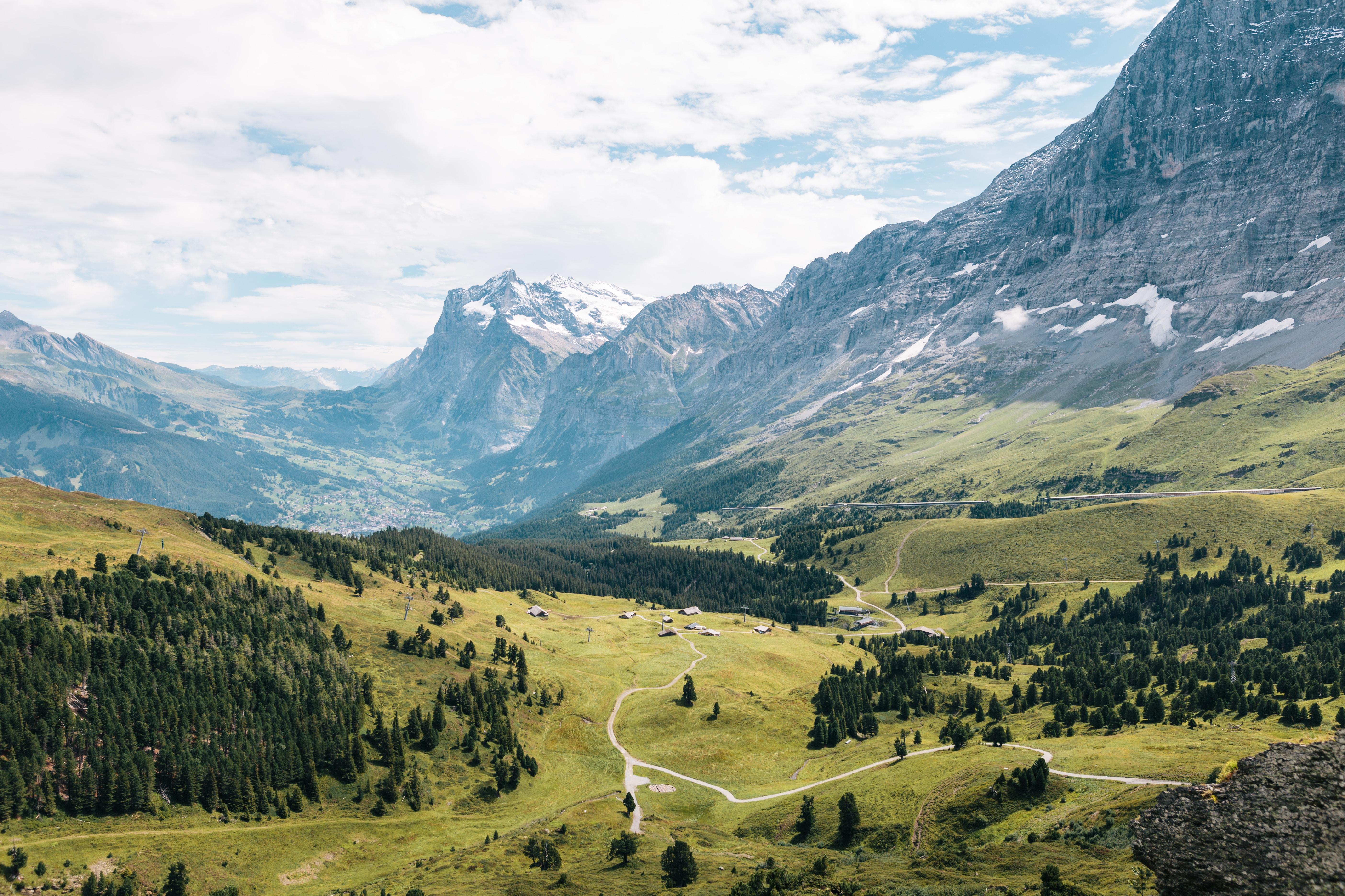
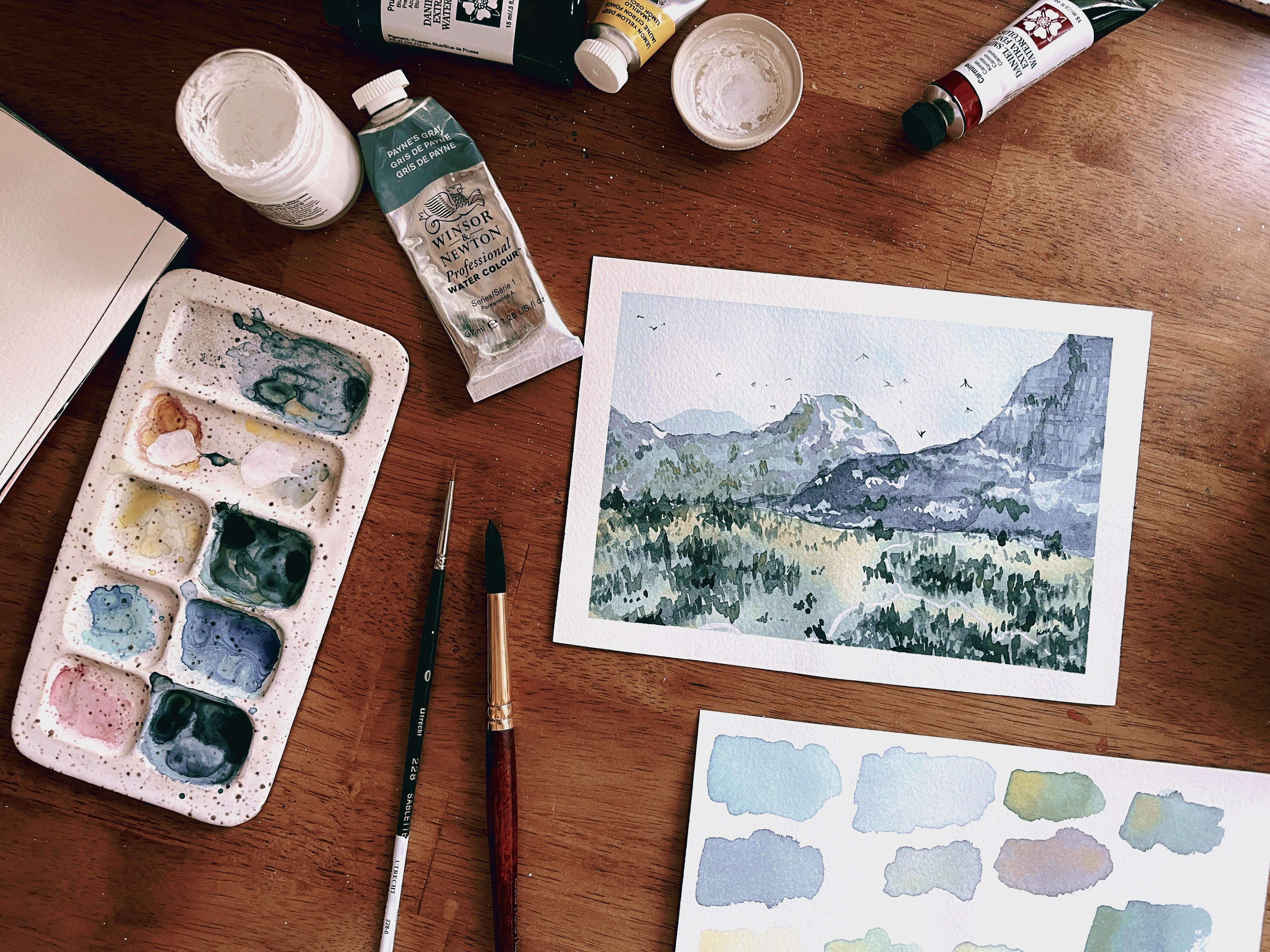
5. Choosing a Good Reference Photo: [MUSIC] Do not skip this video my friend. Because as boring or unimportant as it may seem, what reference photo you choose will definitely set you up for either success or frustration as you are trying to paint your landscape painting. When I'm choosing a reference photo, I like to keep three things in mind. First, I like to think about layers. I like to think about how many layers I can see, whether or not the layers keep in line with our watercolor rules that we talked about earlier. I like to think about if the layers are something I can easily achieve. The next thing I like to think about is subject matter. Are there subjects in this reference photo that I can paint? Do I know how to figure out, how to paint this subject matter? Is it something I can simplify? Then the last thing I like to think about is composition. We're going to talk about the rule of thirds, and we're going to talk about how you can tweak your reference photo if it's not exactly what you were hoping for, but you still want to use it for inspiration in your painting. Without further ado, let's dive in. My favorite royalty free, meaning, no need to worry about copyright issues, site for our reference photos is Unsplash. This is my Unsplash page. I have many folders because I peruse Unsplash often. You can access Unsplash from a desktop or this is my iPad. They're not paying me [LAUGHTER] to say this, I just really like it. Here are some photos that I've compiled for this class. There are three important things to think about when you're looking for a good reference photo. Good meaning something that will fairly easily translate into a painting that you can paint. The first thing to think about is layers. Can you identify easy layers within the photo? For example, this mountain photo, I can see that there's the sky, and then there are individual layers of mountain sides. That is a pretty easy. Like I can analyze this with my mind. I can break it down and see exactly where the layers are supposed to go. That would be a pretty good reference photo. Another example where maybe the layers are not the same thing. Here, the layers are also easily distinguishable. The sky, and then the mountain layers, and then this layer of trees. These layers follow the rules that we talked about, where it goes from light to dark. The sky is basically the lightest part, and then the mountain layers in the back, that are farther away from our perspective are lighter, and they get progressively darker until this dark layer of trees. That would be a pretty good reference photo to use. I also really like this one. It is way more simple. It's basically just the sky with a little bit of pink in it. We would probably use the wet-on-wet technique to add some pink into the blue as we're doing that. Then finally, this dark layer of mountain, and then you could add that moon on top of it in whitewash. Layers are important to think about, and just to show you where layers get hard, mean difficult. I think that whenever you're painting any kind of reference photo, layers are the most important thing to think about. If you are a beginner, sometimes the layers are really difficult to see. For example, if you wanted to paint this busy river scene, this is a beautiful photo. I think it would make a beautiful painting, but especially if you're a beginner, it might be tricky to translate the layers, partly because of the order in which the light is showing on the painting. For example, when we are doing just basic landscapes, we try to keep light in the background, and dark things in the foreground, but here, the background trees are cast in shadow, and on the other side, the foreground trees and this foreground space is lighter. It's obviously not impossible, it's very possible to paint this with watercolor, but at beginner stage, it's a little trickier. If you're looking for reference photos to practice this process, to practice painting as a beginner, this is probably one I would try a little bit later because it's going to be not quite as simple as other kinds of photos. Let's see if we can find another one. Here's another one where, this is clearly a mountain, and often mountains are easily broken down into layers, but this mountain has so many different shadows, and so many different contrasting places that's where they should all be really in one layer looks like. I can't really tell how to break this down into layers in a nice, systematic way. Once again, it doesn't mean that it's impossible to paint this, it would make a very beautiful painting, it's just going to be tricky for you right now. Another thing to think about in terms of how to pick a good reference photo is subjects. You want to try painting subjects that you already know how to paint. If you know how to paint trees and you know how to paint mountains, then these mountain areas are going to be awesome for you. One thing to note about that. Sometimes if you know how to paint one kind of tree, like say, you know how to paint pine trees, and then you come across maybe leafy deciduous trees in our reference photo, it can get scary. But if you don't know how to paint a subject exactly, that doesn't mean you can't paint it, it just means that maybe you need to simplify. Maybe you need to either simplify the composition or you need to simplify the subject. In this painting, there are some pine tree after the side right here, but then underneath are some deciduous trees. If you're thinking, well, I know how to do that pine tree shape, but how do I translate that into these more leafy, full, robust, deciduous trees down there? My answer to you would be don't get so much in your head, and simplify it. Instead of thinking to yourself, I'm going to paint deciduous trees, think to yourself, there are some green down here. Here's some light green and dark green, and I'm going to simplify. Instead of thinking, I'm going to paint some trees, think, I'm just going to paint some blobby texture with different varying values. That's something to think about. If obviously, you want to look for reference photos where you already know how to paint, mostly what's on there, but if there's something that is tricky or that you are not sure if you know how to paint on there, then simplify or just remove it. Another example, if you see this house right here, it's placed in a really cool spot. I like what the house as this reference photo, but if you're not comfortable painting houses, you can just remove it. You don't have to paint the scene with the house, and that's a beautiful thing about choosing reference photos, is you get to decide what you want to paint. Then the third thing to think about lines up great with this painting because we want to talk about composition. Thinking about composition, I want to keep in mind the rule of thirds, which just basically means that if you divide a scene into thirds, vertically and horizontally, wherever those lines meet, these four corners like in the middle right here, that's where it's going to be very pleasing to the eye to place a subject. This house right here is right in that bottom left-hand corner, and it looks really great in this scene. It's also good to keep those corners in mind when you are placing multiple subjects to create flow. You'll notice that this batch of trees is ending right here where these lines would meet, and then it goes right down over to the house, and then up the mountain peak is by this top one. It's creating this triangle flow. Then when you keep in mind the clouds, it doesn't look flat. This piece doesn't look flat or static, it looks like it has some movement. That is another important thing to keep in mind when you are choosing a reference photo. I think that composition is also something you can change. If you find a reference photo like for example, the houses and this one are in the middle. If you decided you want to paint this, but you wanted to keep the rule of thirds in mind, then you could just move the houses over a little bit in your painting, and that is a totally acceptable thing to do. Knowing all of those things then, we want a clear set of layers, we want subjects that we know how to paint, and we want to have composition techniques in mind. Then I think I am with you, going to paint. I really like this mountain scene, and here's why. It looks very complicated. [LAUGHTER] There are lots of crags, lots of shadows, lots of little trees and details. While I could spend a ton of time painting all of those intricate details, I want to paint this scene with you because I want to show you how you can pick and choose what you want to paint. But just to talk about the other things, there are clear layers. There's this layer of sky, there's this layer of mountain, like in the distance mountain with the snow, and then there's this layer of a grassy hillside with different areas of road and trees. It's just a very pretty landscape where all the layers are also different color. The only thing that's slightly is different from our rules in terms of light to dark is, you could possibly say that this light green, is lighter than this blue, but we also need to keep in mind vibrance. This light green might be lighter, but it's definitely a lot more vibrant. The color is much more pure as opposed to the blue back here is more muted. It does keep in line with our general rules. I think that this is one we can simplify and paint and turn into a beautiful painting. Let's move on using this as our reference. [MUSIC]
6. How to Analyze Your Reference Photo: [MUSIC] We have our reference photo, I think it's going to be a good one. Now, let's talk about how to analyze this reference photo. This is where the skills that we learned in the watercolor lessons just a few videos before are going to come into handy because we're going to look at this reference photo and figure out exactly what techniques and what skills we need in order to paint it. Let's take a look at this reference photo. I've downloaded it onto my iPad which is very easy to do with unsplash. They have a download button and I've opened it in my photos app. If you have an Android or you're not using a tablet I'm not sure how to do it but this is how I do it with an iPad. It's in the photos app, I'm going to press ''Edit'' up here and I'm just going to make sure you can see. Let me do that again. I'm going to press ''Edit'' up here and then there are these three dots at the very top and I'm going to press ''Markup'' after I open that Options tab. Now I can use a pencil to draw right on the photo. That's exactly what I'm going to do to analyze this photo and to just see what's in it. In this lesson we're going to figure out what we're dealing with and then in the next lesson we're going to create an outline for our painting. Number 1, we have these layers, we have three pretty distinct layers. We have a cloudy sky which if I'm going to paint a cloudy sky that means I'm going to use a lot of white space. That's because with watercolor because it's transparent typically you use white space when you do white subjects like clouds. There's also some blue like sky blue, so maybe like a light value Prussian blue up here. That feels pretty doable to me. That will be that first. That's the sky layer and the mountain layer, we have a lot going on, so we have some snow which is white. That means we'll probably try to utilize some white space or at least some negative space as we paint this. Then we also have a few different values of color. We have some like darker green and lighter green and these look gray or almost blue up here. As I mentioned in the previous lesson, I will probably not try to paint all of the very beautiful and specific details on this mountain. But I do want to capture some of the texture. Like for example I see up here the mountain has like a lattice texture where you can see the layers of rock and so that might be something I'd think about. I definitely want to keep some of the snowy white space. As I do the peak up here and maybe along the side I'll keep some of that white space in mind. I do want to have some contrast. It almost even looks like there are two mountain layers here. This is the background or even three. Like this is the farthest mountain layer, this is the middle mountain layer, and then this is the closest mountain layer. I can think about painting now. I'm going to keep that in mind when I move on to my outline. But generally because this is also the mid ground layer of the whole painting, I want the colors to be pretty muted, I want the value to be like a mid range value, meaning it's watery but not so watery that it's transparent. I want it to be visible but also very obviously muted to indicate distance to our eyes. Then things I'm probably going to simplify is, I doubt I'm going to try to capture these are all trees, like very small dots, I don't even know if you can see them very well. [LAUGHTER] But there are just like tiny little ridges and tiny little spots of trees. I don't think I'm going to go into that much detail. I'm probably just going to try to capture a very quite luminous layer with maybe a little bit of texture in some places. We will just go about that as we get there. Now let's talk about this foreground layer. As we're breaking down these layers, we look at layers and then within each layer we look at subjects and color and how we're going to paint them. In this foreground layer there are trees, there's this road, sometimes there are trees in clusters, sometimes there are trees just individually. Another thing to note is that all of these trees are far away. This looks like it's probably a drone shot or somebody is standing on a very tall bridge or something looking into this valley. Either way, we're not going to paint too detailed of subjects because they're so far away. When subjects are far away, that is easier for you as a watercolor painter because that means even if you were there in real life, you wouldn't really be able to make out all of these details. It simplifies it enough for you that you don't have to paint things right away. Then this road is white. Because it's a big white road in the middle of all this color, I might use some whitewash on top of it instead of trying to keep this white space white. That's something to think about as even for clouds and snow on the mountain, you don't have to utilize white space. You could use white gouache if you want, something that I do pretty frequently. I might do that for some of the snow, we'll just have to wait and see [LAUGHTER] as we go along. Something else, there's this little gray spot right here probably with rocks or dirt, something of that sort. I'm not going to paint that just because I would rather have my layers be individual. While contrast and having varied subjects often makes paintings better, like it makes them more interesting, this just feels intrusive. This is something I'm going to take out and eliminate. Something else to think about in terms of how we're going to paint each individual layer which we'll talk more extensively about in the next video is this foreground layer has a bright green. I mean, not enough but it's bright green, pretty vibrant though like a vibrant green grassy area with lots of little pockets of trees. I'll probably paint this foreground layer in multiple layers, like starting with this vibrant green and then maybe I'll do like a wet on wet vibrant green with some dark spots and then paint in some more details like tighten up some of the details in the next layers. We're breaking this down into [LAUGHTER] background , mid ground, and foreground layers, but you could also break down each individual layer into more layers. I know that's a lot of layers [LAUGHTER] but that's exactly how you accomplish this. That's exactly how you take a seemingly complicated reference photo like this one and you turn it into something that's totally doable, especially with the tools and the skills that you have as a watercolor artist, knowing all the rules about watercolor that you do. One thing that we talked about that isn't really in this painting is often the sky or mountains have a gradient to them. That's not really present here but that's okay. Really what we're going to be using is a lot of different combinations of wet on wet and wet on dry. I can use a little bit of a luminous texture probably for the sky and for the first layers of both the mid ground and foreground layers. Because luminous meaning, using the wet on wet technique to create light and a glimmer effect, that's going to help each individual layer be infinitely more interesting. This is just looking a little bit deeper at all these first glance, I keep thinking one more thing but that's how my mind works [LAUGHTER] as I breakdown reference photos. I also see tiny little houses right here. I may or may not add those. I haven't decided yet. They are an interesting thing to, like an interesting subject to have but they're so small, I don't know that they would make a difference. I'm going to tuck that in the back of my mind, fill it out as I'm painting. That's something that I often do. I start with a general idea after I've broken down a reference photo and then I decide a little bit later how I want to place everything. Then the last thing is composition. We talked about the rule of thirds. We break a scene down into thirds going horizontally and vertically. It looks like this mountain peak is already in that intersection between these two lines, so that's a great spot that I want to keep there. The layers line up too because if you have individual layers that are either going horizontally or vertically, it's good to place them along these parallel lines. It looks like this green layer and this blue layer are all aligned like that. But as we are keeping this in mind, we don't want the sky and the mountain and the green to be all the same size. We do want to keep contrast. Maybe I will have like the sky be a little bit, I don't know. Basically I want to have either the sky take up the majority of the scene or I want the mountain layers to take up the majority of the scene and just to provide contrast against these two opposing subjects. I think that I'll decide that in the next lesson as we outline this painting. But I think that's the last thing that I want to keep in mind in analyzing this reference photo. Just to sum up, as we broke down this photo, we're going to outline or basically make a plan for painting this in the next lesson. But as I'm breaking down this photo I want to keep in mind all of the watercolor rules that we talked about for layers and for subjects and for watercolor techniques. I started by breaking down the photo into individual layers, so the background, the mid ground, the foreground, and then I looked at each individual layer and identified techniques. I'll be using the wet on wet technique to paint the sky and probably I can do that just in one layer. For the mid ground layer for the mountains, this will probably have multiple layers. Not sure how many layers of mountains I'm going to do but in order to paint all of the contrasting details of each mountain I am going to have to paint each mountain in individual layers as well using the wet on wet technique and then letting it dry and painting on top of it which is glazing. Then for the foreground layer I can see that there are a lot of different subjects too. I'm definitely going to break that down into multiple layers as well. I hope this recap was helpful for you and now let's go ahead and make a plan in the next lesson. [MUSIC]
7. Make a Painting Plan: [MUSIC] Now it's time to make a plan. We have chosen a reference photo we really love. We've broken it down to figure out what pieces are inside and what we can do with them. Now let's build a solid outline so that when we start painting we won't be confused and having to think on the spot. Let's do this my friend. In the previous lesson, we analyzed the reference photo so that we could have a clear idea of what we are working with. Now that we have all of those techniques and layers in mind, let's go about making a plan. In order to make a plan for a painting, basically you identify the layers and then you identify the order in which you're going to paint the things inside the layers. Pretty simple. We have layer 1, which is the background layer, layer 2, which is the mid ground layer, and layer 3, which is the foreground layer. We start with the background, then we paint the mid ground, and then we paint the foreground. By that system, we're going to start with the sky. The first thing we're going to paint is the sky. We talked a little bit about this in the previous lesson, but let's just go over it again. To paint this cloudy blue sky, we're going to use the wet-on-wet technique where I'm going to, so I'm just going to put that down wet-on-wet with blue, and to get the white of the clouds, we're going to use whites-pace. I may end up using a towel to lift some of the clouds off as well to get that more cloudy effect, and we'll talk about that when we start painting. The sky can happen basically in one layer so that'll be pretty easy. In order to prepare for the rest of the painting below the sky, we want to keep the sky pretty close too, like we want to keep the colors of the sky in the area of the sky, meaning we don't want the blue to take up the whole page. We only want the blue to mostly be where the sky is and we'll talk about that again once we start painting. Something we discussed last lesson that we should resolve now is do we want the sky to take up just a little bit of the painting or do we want the sky to take up a lot of the painting? If we want to maintain a contrast of shape and maintain a contrast so that we don't just have equal parts. Because as we've talked about, when you have equal parts, like all of the layers look exactly the same or are the same size, that's not super interesting for your eyes to look at. You want to always have some contrast. This painting actually lends itself well. I think before I thought that these were pretty equal, but now I'm seeing that yes, it seems like they're broken into thirds, but also the slope of the mountain cuts into the line. When you can't have contrast in space to determine how much space each layer is going to take, it's also good to have a contrast between lines and curves. The curve of the mountain of this layer is slightly different from the curve of this layer and cuts into the lines that we can see also. Just thinking through all these things, for this class, I didn't want to give you a very cut and dry like this is exactly what you do because that's not always the process that I go through when I break down a reference photo. Actually, most often when I break down a reference photo and come up with a plan, I'm thinking through a lot of different things at the same time and make last minute decisions, and that's exactly what I want to teach you is okay. It's okay if you go into painting having a general idea, but then making last minute decisions and thinking through lots of different things, even if you don't end up changing anything. Back to the sky. I think I'm mostly going to keep it the way that it is where the sky is not the whole third top of the page, it's only a part of this top of the page. The mountain and the hillside are going to take up most of the rest of the page. Cool. That's layer 1. Then after that dries, we're going to go onto the mid-ground, which is layer 2, and before we talked about how it looks like there are three mountains. There might even be four, but I think we're just going to call it three. It looks like there's a mountain layer right here and one right here and one very much in the back. When thinking about how I want to go about painting and whether I want to keep all three layers, I like to consider the piece as a whole. We've talked about the rule of thirds. I also like to remember the rule of odds, meaning generally, if you have an odd number of things, it's more pleasing to the eye. Let's keep in mind this rule of odds. If we have one big hillside and one big sky, then if we add together the rest of these mountain layers, I want it to be an odd number. Either then I would want one big mountain layer or I would want the three layers. I don't really want two, just two mountain layers with the sky and the hillside because that makes four, that makes four really apparent layers, and I would rather have an odd number. I think the easy thing to do would be to do one big mountain layer. But I'm going to challenge you a little bit, and let's paint this mountain in three layers, and I say challenge, but it's actually a little bit easier than you think. That's my plan for the mid-ground, is three mountain layers. In order to do the three mountain layers, we want to keep in mind that distance means the colors are going to be lighter. The farthest mountain layer is going to be the smallest and also the lightest, and then the mountain layers will get progressively darker, which this painting pretty clearly shows. We have a plan for the sky, which is using the wet-on-wet technique mostly. For layer 2, we're going to cut that down into three individual mountain layers, and each mountain layer is going to be pretty similar. Well, the first mountain layer is just going to be probably just using a pretty luminous and light small layer to get that little blip right there. Then for the other mountain layers, there'll be pretty similar where we'll lay down one layer of the wet-on-wet technique in order to get some luminous texture, and then we will use the wet-on-dry technique to create texture on top of it and leave behind whites-pace. We're going to do a combination of wet-on-wet and wet-on-dry in order to get that texture that we want. Keep in mind, I'm not going to get all of these tiny little details here. I might get some of this lattice grid texture up here and some of the snow. But other than that, I want to keep it simple because I want it to be fairly easy to paint. I don't want to overwhelm myself, and so simplifying is the way to go in that case. Here's our plan, the sky, the three mountain layers, and then finally, of course, the hillside and the hillside, we're going to start with one light layer for this light green here, and then we're going to do another dark detail layer. Some of the details might be like this light road right here and we might put some of the houses there. I talked about, I'm still not sure if I'm going to keep the houses or not, but that's generally the plan. Number 1, the sky, number 2, the three mountain layers, number 3, the hillside starting with this light green layer, and then I'm possibly keeping some of the dark areas in that first light layer, and then the second layer in the foreground will be darker colors and adding a little bit more detail. That seems like a solid plan to me. I think it's going to go really well. Before we move on to painting, just one more planning video, let's look at the colors and see if we can mix them together using some pretty simple paints. See you then. [MUSIC]
8. How to Mix Your Color Palette: [MUSIC] Last video before we actually start painting. In this lesson, we're going to talk about color mixing, specifically, how to mix the colors that we need to paint our landscape photo. I am going to use a limited palette in this video, meaning I'm just using the primary colors plus Payne's gray and I'm going to talk all about my color choices, why I'm using the paint colors I am specifically, and why it's a smart idea for you to practice painting with a limited palette as well. Let's go right ahead. Just for reference, the four colors I am going to use in order to mix the colors on this landscape piece, which there aren't very many colors, but either way, I'm using Winsor & Newton's Payne's gray. I bought a big tube of this because it's probably my most used color, Winsor & Newton, lemon yellow deep, Daniel Smith, Prussian blue, and Daniel Smith carmine for red. Let's use these colors in order to mix what we need for our painting. I have this scrap paper, I have my ceramic palette. You don't need a ceramic palette, you could use just a plastic one, but I prefer to use ceramic palettes because I think that they mix colors a little bit better. I have this round number 10 paintbrush. I am actually going to grab a round number 6 paintbrush because I think that the 6s work a little bit better. The smaller brush sizes are better for testing different colors. First things first, I am going to take some of these primary colors that are on my main palette off to the side and just put them on this palette to show you what they look like. That's carmine, which is our red color, and that's Prussian blue, which is our blue, and lemon yellow deep, which is going to be our yellow. I'm going to use Payne's gray also because I think Payne's gray is super handy. Sometimes Payne's gray can act as a substitute for black when you want to have a really darker color or you want to make a color more muted. It can substitute for black without actually having to use black. There you go. Let's start with each individual layer. The first layer, the sky, I can see a pretty light value, meaning watery blue, and so I'm going to test out to see if this Payne's gray will work. Keep in mind, I'm not trying to mix colors so that they are exact, I'm just trying to mix colors so that they are adequate basically so they look good together and they get the gist of what I'm trying to do. This light value Prussian blue looks like it matches pretty well. Generally, when you're painting the sky, Prussian blue is a good way to go. Sometimes the sky has just a tiny bit of red in it. That makes it just a little bit more of a blue-violet. That one might be a little bit more sky blue with Prussian blue with just a very, very tiny tap of red that makes it very, very subtle blue-violet color. I'm going to leave it up to you if you want to do just Prussian blue or add that color as well, and that was pretty easy. Let's move on to the second layer. I am mostly going to be using a light value Payne's gray. I'm adding water to this Payne's gray right here. Payne's gray is like a navy blue in case you've never really painted with it. That matches the rock pretty well. If I use the wet on wet technique with Payne's gray to get lots of different values, it will work pretty well. There are a little bit of subtle greens right here and we need to mix green for the next layer. So let's take a stab at mixing some green. In order to mix green, first of all, you need Prussian blue and lemon yellow. Just as a tip, if you are going to mix blue with anything, blue is almost always going to be stronger than any other color that you're going to use, so you do not need as much blue as everything else, just for the record. I'm using way more lemon yellow than I have blue in order to get this green, and this green is pretty bright. I don't think any of the greens in my painting are going to be quite that bright, so I want to tone it down a little bit. I want to make it a little more muted. In order to do that, in order to add a little bit brown or just more of that gray washed out undertone, I'm going to mix green's complementary color with it. That's generally what you use to make brown, when you mix complementary colors together, using the color wheel as a guide, and green's complementary color is red. If I add a little bit of carmine to this green, notice how it turned gray, this gray-green, and that's actually a pretty cool color and almost close to what I want to be on this mountainside. I do want just a little bit more green to it and so I'm going to add slightly more blue and also slightly more yellow so that I get a little bit more of a muted green that still looks relatively green as opposed to this one which looks green-brown. That looks pretty good. I'm going to call that pretty good for the mountainside and that leads me to creating the green for the hillside. I want a light green, which in this case, it's not so much a light value green, meaning it's not so much that the color is washed out or has more white in it that turns it very light, delicate, subtle color. It looks light green, meaning it has a lot of yellow in it, and so because this green already has that red in it, it's not a bright lime green, it's not a bright yellow-green. I'm just going to keep adding to this mix that had the red in it and I added a bunch of yellow. That's pretty close. It's maybe a little more yellow-green than I wanted. There is a little more blue, that's a little brighter than I wanted, so maybe a little bit more red to tone it down just a bit. That's why scrap papers like this are pretty helpful and actually that looks pretty good. I think that's the combination I'm going for by adding blue and yellow with just a little bit of red, that with more yellow than blue to make it yellow-green, was just a little bit of red to make it that muted yellow-green. Now the final dark green color, I am going to use Payne's gray with this green that I already mixed. Payne's gray, as I mentioned before, is a great way to dark in any color without making it dull. When you add pure black pigment to color, sometimes they can muddy them or just dull the vibrancy and that's not really what we want. I added Payne's gray to this green, but it's still pretty blue, so I'm going to add more yellow to it and see what that does to it. That's pretty close actually, so maybe just a little bit more yellow to see how dark that is. That's pretty good. It's not quite as dark as the trees look in here, but I can keep going adding more Payne's gray and more yellow and blue. The problem with color mixing like this, especially with watercolors is in order to mix colors, you need to add a lot of water, and when you add a lot of water, it automatically lightens up the value. In order to make this mix a little bit more pigmented, in order to get that darker, pigmented, dark green, then what I'm going to do is mix it as much as possible with the color. When I'm picking up the watercolor, I want to use as little water as possible. I'm going to attempt to do that right now. I'm mixing this green and I'm trying not to get tons of water in it. Now I'm going to pick up some Payne's gray and mix it right on here, and that made it a little bit darker. I think that worked out fairly well. It's pretty bright, so I'm also going to add just a little bit of red to, again, counteract that green, to add some brown to it. I feel like that looks pretty good. That sums up the color scheme that I'm going to use for this piece, and I hope this little mixing tutorial was helpful for you. This class is not focused on color mixing so much, but one important thing to know is professional artists often use a limited palette like this. They use the primary colors or just a few colors and then some smart color mixing to get their desired results. Because when you use all of the same colors to get your desired hues, often your palette is a little bit more cohesive. So as opposed to trying to piece together pigments from entirely different tubes, having the same base and using the same color mixes just makes it all tighten up and fit together in a really beautiful way. This piece landed itself really well to that because there are only a few colors here that are very easy to mix together. I hope that you thought so too, and I hope this is helpful. Now that we have some of these colors down, let's start painting. I'll see you in the next lesson. [MUSIC]
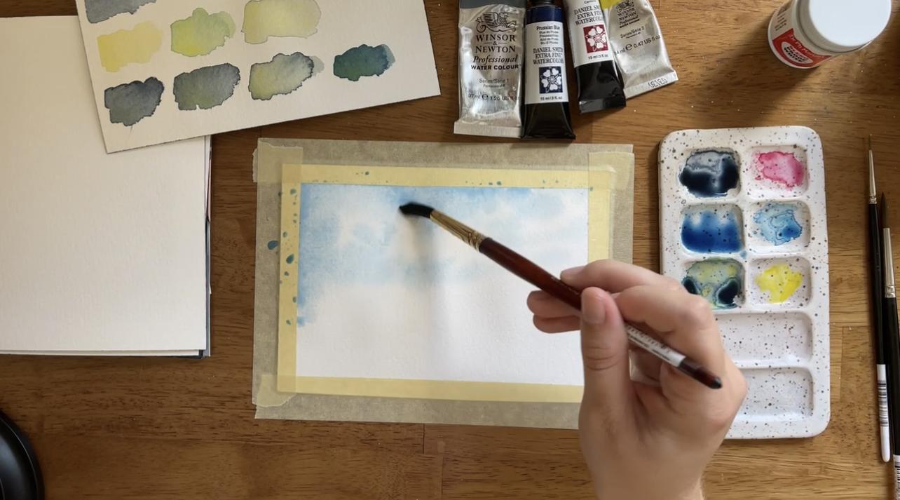
9. Project: The Background Layer: [MUSIC] [NOISE] We finished planning, time to start painting. This is layer 1, where we're mostly going to paint the sky in really delicate transparent layers that will make for a great contrasting layer when we finally bring out the other elements. The materials that I'm using for this painting are a round number 10 brush, this is a Princeton Neptune, a round number 6, this is Utrecht Synthetic Sablette series, and a round number 0. These three brushes are what I'm going to use to paint this painting. I'm also using these four colors, the ones that we mixed in the previous lesson: Payne's gray, Prussian blue, Carmine, and lemon yellow deep. I am using Arches 100 percent cotton watercolor paper. I have taped it down, as you can see, to my desk. It's just best to keep paper taut because watercolor paper is still paper, and so water will still damage it. Taping it down will just help to minimize the warping on your painting. Then I have a mixing palette to mix my colors. I'm also going to use Dr. Ph. Martin's bleed proof white for my white gouache as I add just some little highlights in the painting. I think that's all we need to get started. Let's proceed with layer 1. I'm going to use my round number 10 brush to put down a wash of clean water. If you remember, layer 1 is tackling the sky of the piece, and we want the sky mostly to stay in this corner up here. But we're still going to get most of the page wet. You don't have to get the whole page wet, but at least like two-thirds of the way down. That's just because we don't want any dried paint lines. If you don't get enough of the page wet and some of the paint meets the edge of the wet area, you're going to have a dried paint line of blue or whatever color we're using. We're trying to avoid that, and so we're getting more of the paper wet than we need to. It's okay if some of the blue of the sky overlaps into where we're going to paint the mountain area. Because we're using layers and slightly darker value for the mountains, it will look just fine so that won't be a big deal. I keep stumbling over my words. Thanks for listening. Let's go ahead and get started with the color of the sky. If I remember, we wanted a very light value, Prussian blue, so I've got some Prussian blue on here and I'm making it pretty watery. Then in order to make it just a very slight blue violet, I'm adding a tiny bit of carmine, very small amount, in order to get that really subtle sky blue look. I want to remember that this sky's supposed to be cloudy, so I'm going to paint some whitespace. I don't have to paint it so it looks exactly like the reference photo. That's something to keep in mind throughout this process as you're painting is, the reference photo at this point really is a guide. We already have a plan, we know basically what we have in mind, and if you spend all of your time frantically looking back and forth between the reference photo and your painting, you're going to miss the magical process that is watercolor. The whole point of planning was so that we can have all of the pieces generally in mind and then have the freedom and the flexibility to make this piece whatever we want, knowing that we have the foundational pieces already in place. I'm going to leave definitely, because I'm using the wet on wet technique, see how the colors blur together, and I'm intentionally leaving behind whitespace because I want those clouds to be there. Now, sometimes I'm using that very watery light value, Prussian blue, and then sometimes I'm washing off my brush and using water to spread this around. By encouraging the paint to mix with the water and to blend with the paper, that's what's going to create a really cool luminous texture. One other thing we could do, we could stop here honestly and just leave these clouds to be what they are, but one other thing we can do is we can use a towel. I have converted to using washable towels instead of paper towels. We can use a towel to just slightly mop up some of the white just so the cloud is a little bit more visible. In this case, I don't want the cloud to be super stark white. I think that it is in the reference photo, but I still want it to just be subtly there with pockets of sky. I think that will look great. I think that's where I'm going to land with the sky. The sky isn't the main event of this painting regardless, so I really want this just subtle effect. Maybe after I've mopped up some of that white, I'm just going to add a little bit more blue in some areas and then blend it in a little bit more so the cloud is slightly more defined. Honestly at this point, I'm just messing around, which is the fun of painting. Messing around and experimenting is what I find to be some of the most satisfying and fun parts of painting landscapes. Don't be afraid to try something and then to try something else because really the whole point of painting is not to get this painting right, it's to have an amazing experience for you. As you can see, this end result is very subtle. It's just a little bit of blue, a little bit of white. I think that's going to look really awesome. Let's let this layer dry and move on to the midground layer. [MUSIC]
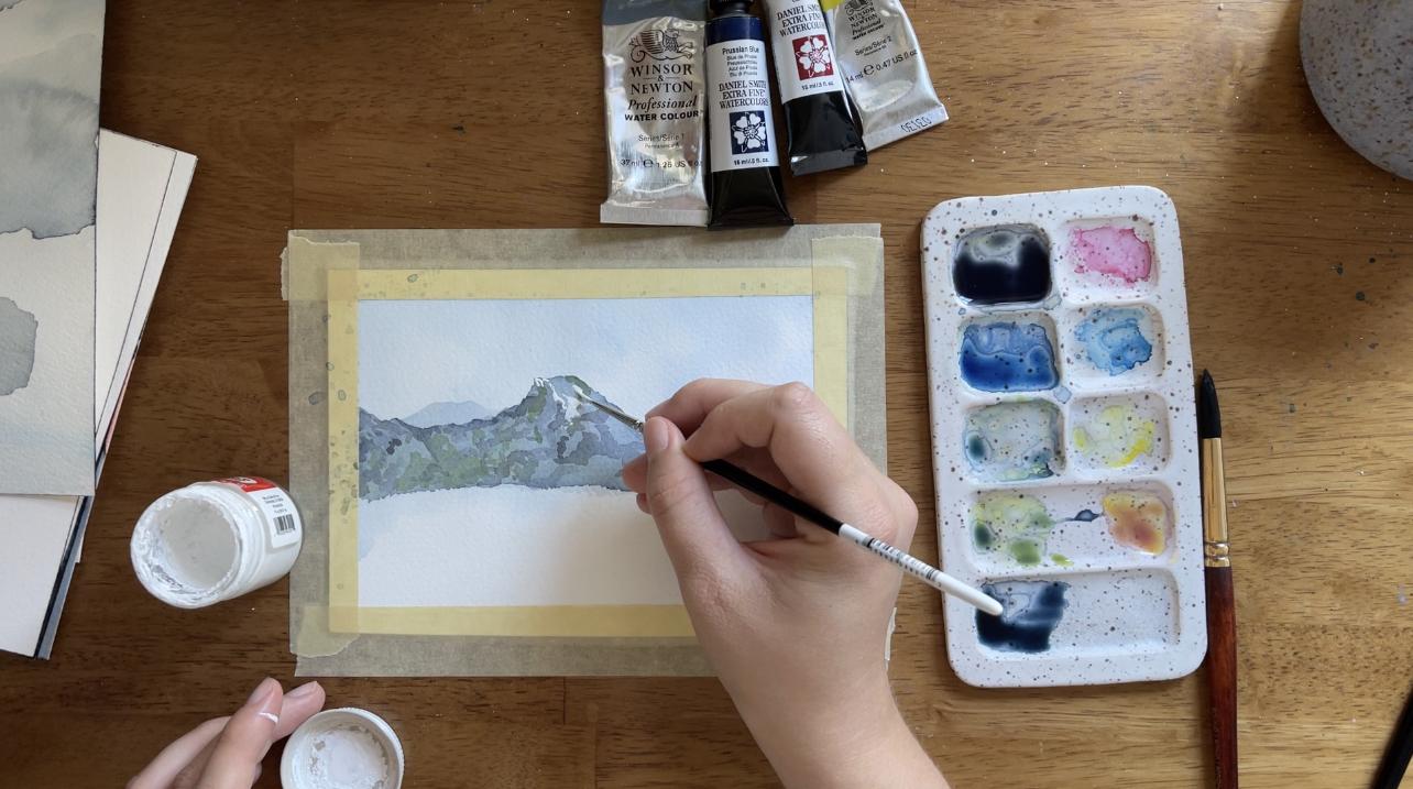
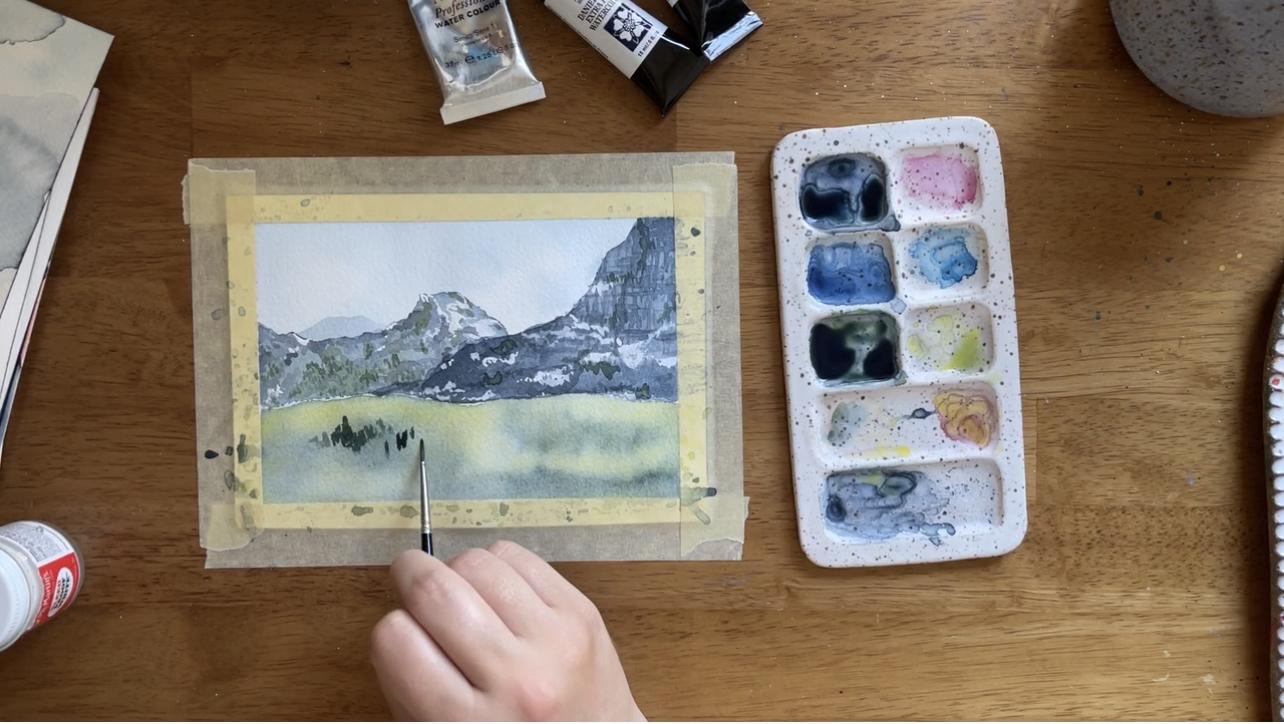
10. Project: The Midground Layer: The sky is done. It's dry. Now it's time for the harder part. We're going to paint the mid ground layer now which is that really cool layer of mountains that's in the middle of that reference photo. This layer is really going to focus a lot on color value. We're also going to talk about glazing and textures and when to simplify versus when not to simplify, lots of things like that. Let's dive right in. My friend, we completed the first layer, the sky. It is so subtle. We can barely see it. But honestly, I think that's totally fine for this piece, especially because as I've mentioned before the mountains and the hillside really are the star of this painting. We're going to let this very subtle blue cloudy sky be what it is and move on to Layer 2 which is the layer of mountains. We're going to do one mountain, very small, faraway mountain in the back right here. The lightest value we want it to be right here because this is the intersection using the rule of thirds. The intersection of these two points right here. This will be the starting point of the mountain range sloping upward as we layer on 1, 2, 3 layers of this mid ground layer. That was a lot of layers in a short amount of time. Anyway. Let's start with that layer and then we will move on to the other mountains shortly. All of the mountain layers, the base of every mountain is going to be just this very light value, Payne's gray. We're going to start. For this first layer is going to be pretty easy. Most of it honestly will be covered up by the subsequent layers. I'm just going to start right here and I want this peak of the mountain to just be peaking out right there. Then, so I'm going to make sure that that part of the mountain is visible and the rest will be probably covered up by the next layers. That was pretty easy. We're going to keep this layer very light value, not very much texture because this is going to be the mountain that is farthest away. We have this background layer of mountain. Now let's paint the mid ground layer of mountain on this layer. In order to get that color, I want it to be slightly darker value than the first layer, so I'm just going to add a little bit more Payne's gray, it's on this palette off to the side here. That was a lot. I still want it pretty watery. Sometimes when I mix colors, that's what happens. I add a little bit more pigment and then I add a little bit more water. That's exactly why I still have this scratch paper here, so that I can test it. I would say that's darker than this background layer. Maybe I'll just add just a tiny bit more. I think that's pretty good. I'm going to start with just painting the outline of where I want this mountain to go. The mountain that is going to creep up into the scene like this is the foreground mountain, meaning in this mid ground layer that we're painting in this lesson, it's the mountain we're going to paint last. The mountain we're doing now is the mid ground layer and it's peak is going to be right around here. It has a flat-ish edge, rectangular. I don't know. It's different. We don't have to paint it exactly how it is in the reference photo which is something that I've said multiple times throughout this class. But the point, the reason I brought it up is because we want to make sure to have some variation in the middle here. Then we know any part of the mountain that trails off on this side, will probably just get covered up with the foreground mountain. We don't need to pay tons of attention to every part of this mountain. Do note though that even the background mountain and the mid ground and the foreground, they all have pretty clear defined ridges. That means when we have clear defined anything, that means we're using the wet on dry technique. That's why this first mountain layer is dry. Now I'm painting on a dry paper to get the other mountain layer to also have that clear defined ridge. Whenever I'm painting mountains, I remember that I want there to be edges and I don't want very straight lines. I want there to be these fun edges. But I'm not trying to make it perfect. Nature paintings are more realistic when they are imperfect. That's why when I paint mountains, I move my hand up and down, back and forth. I want my hand to be a little shaky as I'm painting this. Here's that mountain layer honestly, it's a little darker than I think I was intending. I'm going to actually take my towel here and I'm just going to mop up a little bit of the pigment, so that I have some more of the white space underneath because I don't want this to be too dark. Now that I have mopped up some of that pigment, I'm just going to take some water, I grabbed the six brush instead of my 10 which is fine. But I'm just going to take some water, blend what's left of this pigment together. That's pretty good. I want this to be wet partially because in this layer, I don't want to end just with the Payne's gray. I want to also add a little bit of green. But I want a more muted green like we practiced in a previous lesson. I'm going to take some of this green add a lot of water to it, add some yellow to it and then add a little bit of red to make it more muted. That's more brown. Color mixing is always an adventure. That feels pretty good. While this is still wet, I'm just going to add some of this green right along here. It is so subtle, you can barely see it. That is totally fine because with this layer, it is technically still one of the background layers. We don't need this green that we're adding here to be super prominent. We just want to add a subtle effect to show that there is some variation within this layer. I wanted to put the green in while this layer is still wet just to lay down this base layer as we finish painting the rest of it. Now that this base layer has dried, I'm actually noticing I made it just a tad too dark. Ideally, it would have been lighter, so that I could use the white space of the paper to create snow. I think that the background mountain layer is light enough but this middle mountain layer, I would have liked to be a little lighter but because it's not, I'm going to use white gouache for the snow instead of the white space of the paper which honestly is fine too. I think it'll work out okay. In order to create the crags and the shadows on this mountain, I'm taking it in multiple layers with basically everything else in this piece. We're going to slowly build contrast. For the shadows and the crags, I'm going to use varying values of Payne's gray. I added a tiny bit of carmine to make that Payne's gray slightly purple which will make it look a little bit grayer. But honestly, with values this light, it doesn't really matter the Payne's gray as bases the most important part. I'm going to mix quite a light value Payne's gray and begin painting glazed lines all down the mountain. Honestly, I'm not really having much of a rhyme or reason here. I want them to look fairly natural. In order to make them look a little more natural like shadows on a mountain, I'm painting sideways. I'm painting really crooked on even strokes. I'm keeping the zigzag in mind. Zigzag and diamonds are the two shapes I have in mind when I paint shadows on a mountain. But other than that, I'm not really trying to create a specific pattern. I'm just letting my hand go wild basically. I'm using this light value, Payne's gray and slowly making my way across the mountain. Notice that I'm varying the pressure of my paintbrush as well, so that sometimes the lines are very thin, sometimes the lines are very thick. We want to create the illusion that there are perhaps cracks in the mountain and also maybe caves. I think that larger shadows maybe indicate there are some indents or uneven parts of the mountain. That's really what we're going for. At some point I decided that I'm done. Now I'm going to create a slightly darker value, Payne's gray, just by adding a tiny bit more. I'm going to continue doing exactly what I was doing. You can wait for the previous layer to dry or you can keep going while it's still wet. I would wager that at this point I can see some of the lines are dry and some of them are still wet. If I paint darker on the still wet lines, obviously they're going to bloom into the shadows and that would be okay too. Because really we're just looking for a contrasting textures and colors. I added just a few little highlights, I guess maybe low lights is a better term of that darker Payne's gray. Now, I'm going to try to capture the texture of a few trees, just along the base of that mountain with a very, very light green. This is the same kind of green that we mixed in the color mixing lesson for the hillside, where it's a green with a little bit of carmine added to it, so it's slightly muted. I'm adding a few strokes of green just, again, to create the illusion that there are little pockets of trees along the base and up the side of that mountain. Now that I have created most of the crags and the shadows, I am taking my whitewash, adding a little bit of water to it because whitewash, even Dr. Ph. Martin's bleed proof white, which is what I'm using comes in a paste form, and so you need to add a tiny bit of water to make it a little bit more malleable, not too much, otherwise, it will become translucent, but just a little bit so it's slightly liquidy. Then using the same strokes, meaning, sideways, diagonally, cricket, really rough, varying degrees of pressure, I am just painting patches of snow, basically, not really knowing exactly where I want to paint them, except, I do know that the left side of the mountain is cast in shadow, because I put a lot of shadows there. So just to keep the rules of light, which isn't something we talked a whole lot about in this class, but just as a fun fact, if you can see snow glinting on one side of the mountain, sometimes the other side is more casting shadow, sometimes. I'm keeping that in mind but not really making it a very specific rule. For that reason, I just wanted to put more patches of snow on the right side of that mountain peak. Notice how I'm not painting the right side of the mountain like the slope of that mountain. That's because the third mountain layer is going on top of that. I don't need to paint anything, otherwise, it will just shine through. For the final bit of this middle mountain layer, I am adding a tiny bit more Payne's gray to the green, and using my small detail brush to add basically like footprints of my paintbrush to mimic trees, to mimic the texture really of what trees look like in the distance, which I think they're speckled across the mountain. I'm not trying to paint individual trees. I'm just trying to paint little speckles in the distance. This is going along the lines with when you paint what you see, you actually don't paint what you know. You don't paint what you know, you paint what you see. I'm not thinking about painting trees, I'm thinking about painting the texture of what trees look like. We're going to talk about this also in the next layers. When you paint what you see, you don't paint what you know. You just focus on color, texture, shape, and try to mimic that without letting the knowledge of, I'm painting a tree get in the way. Now we have let that middle layer dry, and so I'm going to repeat the process with this closer mountain layer. I'm not going to quite call it a foreground because it's still in this midground layer. That's the one that we're painting right now. I started the mountain layer by painting with a very, very light value Payne's gray, and then I added darker value Payne's gray while that mountain layer was still wet. I'm trying to make this layer luminous. Which means that there are pockets of whitespace. If you find that you have perhaps added too much paint in this layer, you can use what's called a thirsty brush, which is a clean brush that you have loaded on your towel to remove all the excess water, so it's more damp. You can use a thirsty brush to lift some of the paint from that layer and help reveal some of the whitespace so that it really can be this luminous texture. That's just the base layer of the mountain. I let it dry and now I'm re-wetting it and adding even more paint, basically just repeating that process. Now, while this is wet, remember that latticework that we noted as we started outlining and breaking down this reference photo. Latticework, meaning there was textures on the mountain that looked like crisscrosses. This is just the base layer, it's not super important if this latticework shows through, but this was an experiment for me, where I waited a little bit while the mountain was still wet, but not so wet that my paint would bloom just everywhere, which is something we talked about in the water control portion of the watercolor techniques lesson. Where if I let the paper dry slightly so it's damp, but still wet, then I can hopefully add in some of that latticework in the base layer, and I'm not sure if it's going to show up because sometimes paint dries a lot lighter than when you actually start painting with it. It's not a big deal if it doesn't actually show up after this layer is dry. I'm going to just kind of have fun and experiment painting these crisscrosses on here knowing that in the next layer, when I start painting wet on dry, I am going to make sure to include it. Layer is dry, can't really see the latticework anymore, which is okay. Now I'm going to start with the wet on dry layer. Similar to the previous one, we started with the base layer, and now we're going to add the crags and the shadows with a slightly darker Payne's gray, the darker value Payne's gray. Though still pretty watery, we don't want it to be so dark that it's opaque. Payne's gray can pretty easily, if you use very pigmented brushstrokes of Payne's gray can start to look opaque. We don't want that, so we still want to pretty watery. We're just going to paint random crags and shadows. This time I'm keeping straightish lines, I guess. Instead of going downward, sideways or diagonally always, I'm still trying to do that zigzag diamond shape, but I want to make it into that lattice texture kind of, so I did some horizontal stripes, and then I did some vertical ones. But notice how I'm never using straight lines. I'm always making them crooked. I want to try to mimic that crisscross texture as much as possible while still keeping it fairly, "realistic," which for our mountain means using really rough strokes, zigzags, that kind of texture. Now I'm going to add some snow similar to the previous layer and just going sideways using varying degrees of pressure. I want to remind you again that I don't really have a rhyme or reason here. In fact, as I'm painting this, I'm not looking at the reference photo. I'm just letting my hands wander, and if you try this and you find it's difficult to let your hands just wander, you're not alone. It is difficult to let your hands just wander, because your mind is basically hardwired to search for patterns. It takes practice to be able to paint randomly like this. I painted just a little bit of snow at the base. This is like an early spring day, I imagine, so there's not tons of snow on the mountain, and now I'm going to add some dark green, darker definitely than the previous mountain layer that we did because this layer is closer. Just a few patches of green and now I'm done. In looking at this, I think that I made the mountain layers a little too dark. I think that if I had to do it over again, I would have lighten them up a little bit to make them a little bit more in the mid ground as opposed to they look very clear. But all in all, I feel pretty good about it. Thanks for painting this midground layer with me and let's move along to the foreground where we'll paint the hillside.
11. Project: The Foreground Layer: The end, we're coming to the final layer where we're going to be using our brightest, most vibrant colors, also our darkest colors, and try to tie everything together, even if that means including elements that didn't exist in the original photo. I'm really excited to get started on this one. All right my friend, this is the last layer that we're going to paint on this painting, based on the reference photo, and I think it's going to be a lot of fun. Let's dive right in with the first wash. If you remember, our general plan was to paint a light wash of green with some areas of dark where the trees are going to be, and then let that dry and paint wet-on-dry details in order to really bring it all together. One thing that I was a little nervous about earlier was, I was intending to bring this mountain layer down all the way, but I think it's actually going to work out just to paint the green right up to it. It's a harsher line than I really wanted, but we're going to go with it, especially because the dark green trees are probably just going to go right along the mountain ridge line right there. I think it's going to work out. The first things first is we want a yellow-green layer. I'm just going to mix some muted yellow-green, and I already had this mix basically on here. If ever you're mixing this yellow-green, you want it to be a little more brown. Just make sure to add some red to it and that will make it slightly more brown. I have this yellow-green and I'm just going to paint with my big brush, this watery yellow-green all across my painting here. I'm going to leave some spots open where I am probably going to put trees. I think I'm going to put some trees right here and along here, like the bottom here, right here, and then probably along the top. One thing to keep in mind is our rule of odds. If there are going to big clumps of trees, I want there to be an odd number of them. I'm going to have probably some trees here, and then along over here, just eyeballing it currently. While that yellow-green is still relatively wet, I want to add some slightly darker green in those areas, just to act as a base layer for the trees I'm planning to paint. I also want to keep in mind that I don't want this to be a flat wash, I want to pretty luminous, so that means I want some of the white of the paper to be shining through. Since this is the base layer, doesn't have to be perfect. This is pretty messy, and that is going to be just fine. I did another layer to add some more yellow-green and to add some more dark green and the dark green overtook the yellow-green, which is not how it is in this reference photo, but I'm digging it. I think that it's going to be okay. This is another instance where I went into this painting thinking it was going to go one way and it actually went a different way and that's going to be okay, I'm going to run with it. The most important thing is contrast. Instead of having there be pockets of dark green for the trees, I'm going to have the dark green trees be the main event basically, and have there instead be pockets of this light green grass going into the scene. Another thing that's different is, in the reference photo scene, the hillside goes up into the mountain like that and we did it more flat. I didn't really do that intentionally, it's something I think I just painted and then didn't realize that it was different until after, but that's okay. It's was a way to simplify things and to make this scene something fun for me to paint. If that happened to you, if you're realizing that you did things a little bit differently, just know it's normal, it's okay. It doesn't mean that you ruined this painting and let's keep going. Now I'm going to add in some details. Here's my dark green, I want this to be the darkest. Because I want this to be pretty dark, I want some fairly diluted use of Payne's gray. Here's my scratch paper. That looks like Payne's gray. I'm going to add a tiny bit more yellow to it to make it more green. That looks a little bit more green. Maybe a little red to make it a little more brown. That looks pretty good. I'm going to use this dark green to do basically the same thing that we did on the mountain. Just the trees are going to be a little bit bigger, and by trees, I just mean I'm using the footprint of the paintbrush, meaning when I just put down the bristles, that's what the result is. I'm dotting lots of footprints of this small size zero paintbrush across in order to get just the vibe. I'm just trying to get the mood or the feeling behind having lots of trees all clumped together right here. I don't want them to be all in a line. I want there to be little pockets of the light green underneath, but I still do want them to look fairly clustered. Honestly, this is what I'm going to do for a while. I just peppered these trees all across this green expanse. If I can make that green a little slightly darker by adding some paints gray and adding some contrasting trees even on top of those layers. I am honestly pretty much done with the trees. I notice how there are like three different tones of trees in here. There's some that's a little bit more yellow green, some of that basic dark green that we used. Then a few that are little more paints gray, and having all of those layers built up on top of each other provides depth in this scene. Even though we didn't even paint any trees really, we just painted little footprints of that size zero paintbrush and little dots everywhere, it still looks like it is an expansive trees flowing in this grassy area. One thing that's really going to bring it together because it could also look like if you're looking at it from the perspective of like if you're not looking at the reference photo and you are just looking at it, it could look like just some very close grass. One way to tighten up that perspective is by adding this road that's on the reference photo. I'm going to use some whitewash and mix it with a little bit of what's on my palette to make that off white road. I mix some gouache. I had a little bit of orange mixed over here. That was very light, just some colors. I mixed the gouache was just a little bit of that yellow and a tiny bit of red and that made the gouache look like a tan almost. I used that tan gouache to paint this road. Obviously, I don't have quite the hill and the layers that are in the reference photo. I try to replicate as much as possible. I noticed this fork in the road, I think in the reference photo it's a little more in the middle. I tried to put at least close ish to this rule of thirds intersection right here. Just so it was a point of interest where this fork in the road happened. Then once again, I wasn't like copying the road exactly. I was just noticing part of it's going this way, part of it's going this way, and then it forks and those twists and turns. I just intuitively created the road that way. I also added a little section of the road here just for some variation into the scene. Generally, having subjects go in and out of the frame can be pretty interesting depending on how you use it, that's something that I did. I think that one last thing I'm going to do for this piece, it's not at all in the reference photo, but I like to add them to big landscapes like this is, I'm going to add a few birds using a very small, my dip size zero paintbrush and using the rule of odds and the rule of thirds as my guide. I am painting a few. Generally, when I paint birds, I do a V with a little head and a tail, or I do an upside down V with the head down like that and a tail like that. Then I'm going to have some of them be like off in the distance so they're more like dots over here. That's 1, 2, 3, 4, 5, 6. Now, if I want an odd number, I'm going to have some B over here. I'm changing my mind. Now these look like they're like three clusters and I want them to have a little more flow to them. I'm adding some more birds and maybe we're just going to have them be like this line of birds of all together. Let's count now 1, 2, 3, 4, 5, 6, 7, 8, 9, 10, 11, 12, 13. Maybe just two more over here. Once again, I don't want them to be placed evenly apart. I want them to have some variation asymmetry, but they still have a little bit of flow to them. Now there are 15 birds of varying sizes, varying shape and that is a great way to finish off this painting. I'm going to do the most satisfying part now, take off the tape. While I do that, I'll talk about what's left for this class. Obviously, things did not go exactly as planned. This reference photo, we didn't match the reference photo exactly, but that's exactly what the next lesson is for. In the next lesson, I am going to basically compare, analyze what happened, figure out if there's something that happened unexpectedly that I liked. If there were unexpected things that happen that I didn't like. Because ultimately this is a practice. We're just studying how to paint landscapes. That's a big part of my reference photos are helpful. Instead of being down on myself for the ways that this didn't go exactly as I wanted, I'm just going to come at it with a very objective, morally neutral. This is what happened. This is what I liked. This is what I didn't like and here's how I'm going to move forward approach. We're going to talk about that in the next lesson. Before that, I'm just going to sign it right here. You should always sign your work. It makes you feel like a real artist and I'm done. I'll see you in the next lesson my friend.
12. Self-Assessment and Self-Compassion: [MUSIC] My friend, we're done. You've finished the painting. You have done all of the layers and executed all of your planning, and guess what? It probably didn't go exactly the way that you thought. You might be feeling a lot of different things right now. I know that I'm usually feeling a whole plethora of emotions, especially after I finished a painting that I really care about. The first thing that I want you to do is invite you to sit down with your feelings and let yourself feel them. Even if your feelings are, you really hate what you made, or you're really frustrated with your lack of skill or any negative feelings, it's okay to let yourself feel those. What's not okay is to turn those negative feelings into shame, is to turn those negative feelings into stories about you and your worth as an artist. Because I am here to tell you, my friend, your worth as an artist is infinite and it has nothing to do with how this painting turned out or how any painting turns out. That's because creativity is not even about the painting. It's not even about the end result. Creativity is about the process. It's about how creating makes you feel, how it makes you feel to be alive and how it can slow down your mind and help you remember, yeah, this is what it's like to be in the flow. This is what it's like to be an artist and to create something that didn't exist before. That feeling can come even if you've painted the worst painting in the history of mankind. You can still capture that magical feeling that comes when you bring something into existence that wasn't there before. No matter what you feel, congratulations, I hope you're proud of yourself because you did that. You made something that didn't exist before, and that's pretty amazing. Now that that little pep talk is out of the way, you can, if you want, look at your painting and try to figure out where you want to go next. Because while it's important to know that you have permission to enjoy the time that you've painted regardless of how your painting turned out, that's called self-compassion, by the way, when you give yourself permission to be a human and find the power in being a human and always growing, it's okay to lean into then curiosity. This is where we start to look at our painting with a critical eye, not a negative critical eye, but a constructive critical eye, so that we can figure out what we want to do next. I'm going to do that with my painting and I invite you to join me. Let's take this objective analysis layer by layer. As a reminder, this analysis at first we're just going to look at the actual differences morally neutral, there's no right or wrong. We're just trying to see where my painting is different from the reference photo. In terms of layer by layer, it looks like, obviously, I added birds. That is an element that does not exist in the reference photo. I did that because I like adding birds to paintings. I think another big difference with the sky is the clouds are pretty defined in the reference photo, and in my painting both the clouds and the sky are very subtle, very light. You can barely even see the difference between the blue and the white here. If I wanted to make the clouds a little bit more stark, I could have potentially added the clouds in white gouache instead of doing what I did which was leave behind white space, or I could have made the sky slightly darker and then, more intentionally, lift it with my towel to create sharper edges or lift more of the pigment. Those are some things that I could have done if I wanted to achieve this stark difference between the clouds and the sky. That's one thing to think about. Let's go on to the next layer of mountains. I think the biggest difference between the reference photo and the mountains is color value. The color values here are lighter than the color values here. That's something that I noted as I was painting. I remember I said, "I made this mountain a little too dark for the base layer." That's why it turned out a little bit darker than I intended. The way that I would go about doing it differently if I wanted to make this lighter is just to add more water to the pigment, maybe to be less afraid of making this layer the same color value as this layer at first. Because, remember, when you paint light to dark, so when you paint the first layer and then move up, it's okay if the first layer is too light, if it's lighter than you intended because you can always paint darker if you need to. I think that that's something that I just forgot or didn't think about. That's the main difference, I think, is how dark the color value on my painting is versus the color value on this painting. Also, obviously there are a little bit more details on the mountain. Mine are not as precise, they're a little bit loose. But I actually think that I went more details than I was intending with some of these trees right here. That's interesting to think about. I guess this goes into the next layer, so we'll just go ahead and do that. In the final foreground layer, the hill side goes up into the mountain because this mountain is far away. In the photo, the foreground of the very front of the hill compared to the very back of the hill, there's quite a bit of difference. In color value too, you can see that over here the hill is a lot brighter, whereas over here it's more muted and that indicates distance. That's not something that I took into account. I accidentally made the mountain straight across. That's one of those things when you're painting that just happens and then you realize and go with the flow. That's one of the differences. Another difference is I think these trees are grouped together a little more concisely, and the lighter green takes up more of your eye space in the photo than it does in the painting. That's something we talked about as I was painting. I did that unintentionally, but then just ran with it as I did with most things. I think those are the biggest objective differences between the reference photo and my painting. Some of them are differences I planned, some of them are differences I didn't plan. Now let's just head back so you can see my face and we'll talk about diving further into this self-assessment and going more even into mindset so that you'll want to practice this even more without feeling stuck. I have one last thing to share with you in this self-assessment lesson before we go. Before you move on, before you set aside the painting and turn your sights to something else, I want you to think about two important things. First, I want you to think about what you loved about this painting. Remember, creativity is about the experience. Creativity is about the process. A really important factor in determining whether or not you're going to continue this process is if you remember all of the wonderful, happy, magical feelings that you had. When you think about what you loved, you can definitely think about results. You can think about something in your painting that turned out beautifully, maybe something that you hoped would happen, did happen or maybe even something that you didn't know was going to happen, did, and it was really amazing. Results are important to think about. I want you to remember the results that you were really happy with, because I'm sure you can find at least one thing. But I don't want you to focus only on the results. I want you also to think about your experience, what moments while you were painting are you going to treasure? What were your highlights during the creative process that you can hold onto as you continue on your creative journey? Those are the things I want you to remember. Think about what you loved, and then think about what you learned. I think that constructive criticism is a phrase that's used all the time in a way to help you take negative feedback in a way that is a little more palatable. Honestly, I just want to do away with the whole idea of criticism in general and turn it into something of a learning experience. Instead of looking at all of the flaws in your painting, in the previous clip we looked at all of the differences that I could find in my painting, but you'll see that I never named any of them mistakes really. I think that every time you do something that goes not according to plan is an opportunity to learn something and to explore even more. I want you to think about all the things that you learned during this process. It could be something you learned that was exciting, and it could be something you learned that was a little disheartening. Maybe it's you learned you're not going to take a particular piece into the next project with you, and that's okay. Regardless, this whole exercise is to just reframe the idea of criticism into a learning opportunity. I hope that finding something that you loved and finding something that you learned is a practice you can incorporate and it will help your creative process. I really appreciate you being here with me. [MUSIC]
13. Final Thoughts: [MUSIC] Well, thank you so much for watching this class with me. Thank you so much for painting with me and for going on this journey with me. Honestly, creativity and watercolor and watercolor landscapes, this whole world is not something that I ever expected to hand in for my career. But I am so grateful that I did, not only because of the impact that creativity has in my life, but because it connects me to people like you. Thank you so much for being here. If you want to share your work with me, I would love to see it. Feel free to post it in the project gallery, and I will definitely share my feedback and comments with you. Also, please feel free to post on Instagram and tag me. My handle is this writing desk. I really loved to drop by the people who've taken my class and give them a well-deserved job well done, a million heart emojis, you've painted something beautiful. If you feel like you just need a little bit of validation that what you did actually happened, I'm here for you, my friend. Anyway, from the bottom of my heart, I'm so glad you're here. I hope you keep painting. I would love to see you in more classes of mine. Until then, see you next time. [MUSIC]