Transcripts
1. Class Introduction: Watercolor painting may seem
a difficult thing to do, and many people miss out on this greatest periods of painting with this
wonderful medium, just because they are
too scared to even try. But painting with watercolor, it doesn't have to be the scary, and it's not that difficult
once you know how to do it. That is why I have designed this class with a
absolute beginner in mind to show you exactly the techniques
that you will need to do any painting, from landscapes to still lives, to botanical paintings
like the ones. Behind me. The important
thing would be to practice and practice
and practice. In this class, I have included nine exercises for you
to try and practice. In exercise one, I'm going to show you a
color saturation. So I will show you
how to achieve a more saturated color
by using many layers. In exercise two, I will
show you the flat wash. So how to do a flat wash
with two techniques, wet in wet and wet on dry. In exercise three, I will talk to you
about color blending and I will explain how to
blend two or more colors. In exercise four will
show you the difference between optical mixing and mixing the paint in the palette. In exercise five, I
will show you how to do a gradient wash
from dark to light. In exercise six,
I will talk about masking fluid and I will
explain how to use it. Exercise seven,
that would be about color drop is just a quick
exercise just to show you the effect of doping color wet-on-wet exercise
eight will be about stippling and you will
learn this technique that can be used to
achieve texture. Exercise nine would be
about lifting color. And this will be useful when you want to lift color to
achieve highlights. By the end of this class,
you will have quiet, a solid foundation on the watercolor skills and
techniques that you need to do any sort of
watercolor painting from landscape all the way
to botanical painting. Once you have
completed this class, you can check out my
other watercolor class and I will put a link
in the description. If you're ready,
let's get started.
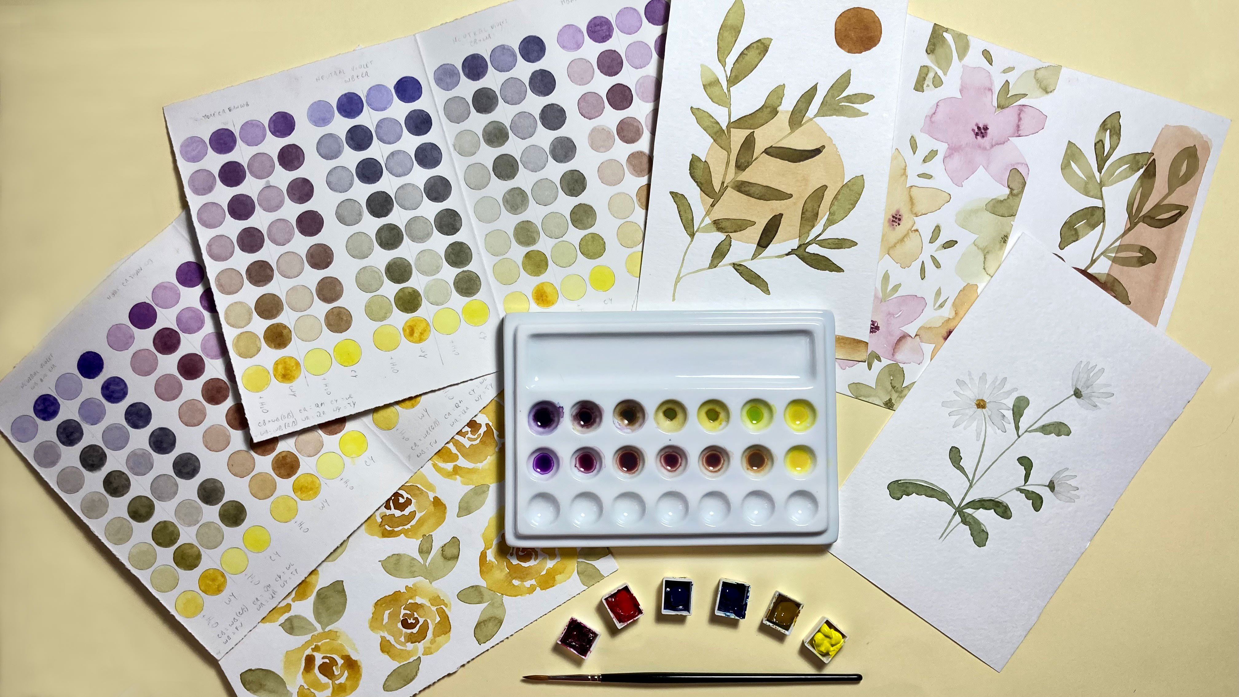
2. Class Project: The project for this class
will be not only to do the exercises that I show
you during the lessons, but also to do some mini
paintings like these ones, where you can use your
newly acquired techniques. I have included
some downloads for you where you can find e.g. a. Template for the exercises. You don't have to
use it, of course, but it's there if you need it. And also included pictures of the exercises and projects
as well as a reference. And also there's a tracing. It's very basic tracing of
the paintings that I did. But in case you need some
guidance with those. Also, you can find a template
for the coral cards. You will find one with a darker lines in
one light outlines. And you can use this for
the color saturation. For your paints. You can either print it
directly on watercolor paper, like I did, or you can just print it and trace it
on watercolor paper. Also, I added my short e-book, a guide to watercolor basics and how to find your
favorite color palette. Where you can find inside. My tips and information on
the basics of watercolor. You will find the
link to download everything in the description
or in the project section.
3. Materials: The materials you will need for this class are not too many. And I will show you here. You don't need
probably all of these, but I show you some
options as well. So you will need LR. From this side, you
would need a palette. You can have either a plastic
palette like this one. You can have a ceramic
one like this one. And this is a working on
a project at the moment. So I got colored in here. But I really like
the ceramic palette, however, you know,
are a bit expensive. So if you don't want
to spend this much, if you're just starting out, you can use a plastic palette. There is another like
the plastic palette is because they tend to stain. And you probably can
see that in here. But for these exercises
should be okay. Then you can have, also have this type of palette. But for the exercises
that we're going to do, you will need to have
quite a bit of color. So I would advise you not to use the flat palette for
this type of thing, but something with Wales. Then you can put just enough, quite enough color to complete the exercise without
having to mix color again. Okay, So this is the palette. Then you will need a
ruler because we're going to do some squares
or rectangles. If you prefer to do circles, you can use something like this. It's a, I think it's just
called a circle template. You can find it on
Amazon or art shop. And you would need a pencil. You can have either one of these mechanical
pencil or just a normal to H or HB pencil,
something like that. Then you would need a brush. Of course, these are
Princeton, Well, one is Princeton brush synthetic and the other one is priority. It doesn't have to be a
fancy expensive brush. Brushes. I find this a
very personal preference. So if you have brushes that
you like, you can use those. You don't need to buy extra
brushes for this class. So just should be just big enough for the area
that you want to cover. Rashes. And then we're
going to use in one of the exercises fluid. You don't have to do it
if you'd like to use masking fluid or if you
don't have it handy. But if you want to try it, this is from Winsor and Newton. Load lots of choices out there. I usually find that I prefer the one with
a little bit of color. This unfortunately
was the only one available at the time and
is the transparent one. You don't really see where
you applied it once it's dry. When it's a white paper, e.g. but he would do for now and you want to buy something they
want to use in future as well. So if you find the one
with the color, um, some, some of them but a bit
yellowish and some of them are blue, bluish color. But you can see them better when you get when
you use those ones. And to apply the masking fluid. Don't use your good brushes
because it would ruin them. So there are available brushes
like this from the SAA, which is especially made for masking fluid,
says here as well. And also the ruling
pen like this that you can use your open and close from this a little
thing here on the side. And what is that
called? I don't know. But anyway, you can make
smaller or larger lines. So it's quite good for
precise application. And even with these brushes, before you use them
for masking fluid, I would rub it a
little bit with it and rub it in a little bit of soap. And then you use it
for the masking fluid, and then you wash it
straightaway because it just sticks to your
brush and ruins it. So this for the masking
fluid and paper, of course. This one here is
Canson XL acquit L is 300 g. If you want to
use it with watercolor, that's important because
anything less than that, it will start to buckle bit. And this is cold
press is not too rough as paper for this exercise is quite
good and annoyed if you can see it on camera. If I put it a bit closer, I'm not sure officials, but it's not completely,
completely smooth. And for this type of
exercises is, is quite good. And then what else? Of course, you will need water. I used to just want to
wash the brush and one to dilute your paint
because this is going to get dirty very, very quickly. So just use any any
container that you like. Then we have some washi tape. Again, you don't have to use it. You can use just some
low-tech artist tape. This is nice and
fun and colorful. And I like to, to
use this as well because it's very low tack and it doesn't ruin your paper. But you can use whatever
you have handy. Of course, you will
need to paint. Now, I have these because I have accumulated over the years. You don't need that many pains, so don't run away. This is not necessary. In fact, I explain this in
another class that I have, but you can use six paints
when you start off. If you don't have
any paint at all, you can just buy
three warm primaries in three equal primaries. And you can use these to
mix a huge amount of color. So for this class you
don't even need that many. You can use like two
or three colors. So for colors, whatever
you have available. I'm not gonna give you
exact color to use. Just use what you have. You don't need to
buy more things. And of course, if you have, if you're using a pencil,
you even need a rubber band, you don't need me
to tell you that. Oh, whoops. Some cloth, some paper towel. This is an old face tower
that I use for my colors, which you can tell
it's all stained. And I think that's all. If I think of anything else, I will tell you while
doing the class, but I think that's all you need. So it's not, it's not a lot. You probably have these
things laying around in your house if you like,
painting already. Okay, So let's move on
to the next lesson.
4. Exercise 1 Color Saturation: The first exercise I'm going to show you is color saturation. And this exercise is quite
good for a couple of things. First of all, you will
see how a color can saturate by just adding more layers on top
of the first ones. So in this exercise, I'm going to put a layer of color in each of these squares. And then I will add
a second layer from the sequence square
onwards at third layer from the third square and so on. So the first square will
have one layer of color, and the last one,
the fifth square will have five layers of color. And you will see how color can saturate by just adding layers. Because we watercolor
is important, that you build up the
color rather than using a very thick mix
from the beginning. Because with a thick mix
is not going to work. So you would love
problems afterwards. And then also, you will
get to know your colors. By doing this exercise, you will get to practice
coloring inside the space. And I will show you this
exercise into colors. And they meet ten
it maybe this way. So I have a blue Winsor, blue, red shade and oriole in yellow. They both transparent. And this will show you how
for sample with light colors, you can really achieve saturation
after a certain point. So it would become darker
but very slightly. So when you want to
darken a yellow, you will have to
use other methods, which I want to discuss
here because this is just a class for exercises. Let's start with this exercise. And I've made quite
a bit of color here, because one important thing with this exercise is that you
need to use the same mix. You can't make more. If there's not enough
because he will change, then the strength of the color, and then you won't
have a good result. Something that you can trust, and the mix is quite diluted. So I will show you in this one. So it shouldn't be too diluted
that you barely see it, but it shouldn't
be a dark either. And I'm using a Winsor
and Newton CD27 brush, but you can use whatever
brush you have handy. And then I'm just going to do the same thing with a yellow. And if you notice every time I pick up the color, I mix it. Well, because the pigments, depending on the
color, but usually the pigments tend to
deposit at the bottom. So you want to mix, especially if you have two
colors mixed together. You want to do this, but
even with one color, you want to give it a little mix every time you
pick up the color. So the first row is dry. Now. And one way you
can see if it's tight, you can tilt it. You can see the yellow is shiny, so that means it's still wet. And this is not as much to know. And you can also W
finger like that and you can tell if it's cold, it means that it's still
not completely dry. So once it's completely dry, you can do the second layer. And this is how I like to do my watercolor paintings in
layers because it's easier to, first of all, if
it's quite light, you can start even
lighter than this. If it's quite light,
you will be able to correct any mistakes
that might happen. So let's start with
the second layer. If you have too much
paint, you can. We brush on the paper
towel and then just dab it in the drop here so
you can pick it up. So I'm going to do this again for the yellow and
then just the repeated. So the third layer is from the third square
and leave the first two untouched just
with 21.2 days. As you build up the color, it will take longer
and longer to dry, but just make sure that
the previous layer is dry. Otherwise, you might do some unwanted special
effects on your squares. So this one should be okay. Will do the last
layer on the blue. And this is, of course it's true for your
painting as well. You're painting in layers, makes sure that your
previous layer is completely dry before you apply
your next layer. Alright, so as you can
see from this exercise, when you put many layers
on top of each other, you build up the color. But you can build it
up to a certain point. Maybe we can add another one
or two layers to this blue. But if you want a
really dark blue, then you will have to
add another color. There are different
ways to do shadows, but this exercise is very good. Then you should do it
with all your colors, all the ones that
you want to use, at least because you will
really get to know them. And as you can see, the yellow is always, of course lighter and
it doesn't really get much darker no matter how many layers you
put on top of it. I can take a picture with
the in black and white. And this will show
you even better. What I mean with the
intensity of the color. So as you can see with the blue, you can see that
this is lighter. And as you add layers,
it becomes darker. But with a yellow, you
can hardly see, well, there's really not
much difference in there when you take a
black and white photo. And I advise you to do this
with your paintings as well. If you're painting like, let's say a landscape,
I'm the best. Nothing to do with the
painting is to have contracts in your composition. Where you want to do is
to see the contrast. You take a picture in
black and white and you will see if your painting looks like the yellow squares. So without much contrast, then you will want to add some shadows and some
highlights somewhere. Especially the shadows, they define your painting quite well. But if you're painting,
looks like there are different saturation
points like this. So you are delighted, you have the darks and you
have the mid tones, then you're doing a good job. Carry on. Okay. So this is the first exercise. In the next exercise
we're going to do a flat wash and I'm going to show you a couple
of ways to do it. Wet in wet and wet on dry. Okay, I'll see you
in the next lesson.
5. Exercise 2 Flat Wash: In this exercise, we're
going to do a flat wash, which is also quite a good skill to master for
your watercolor paintings. Okay, so the first one I'm going to show
you this wet-in-wet. So I'm going to wet
the page first. I have changed my brush
because this is a bigger area. So this is a larger brush, is a Princeton number four. And these are synthetic
so it's a bit stiffer. But for these exercises
is quite good. So you want to wet the
paper in a homogeneous way. And you need to
have a look at it, shining it with a light. So you see there are areas where maybe the paper
is not wet enough. And also you need
to have this as a sort of a Shane or
I should say xi1. I think that's the right word. So not too wet there you see
the water pooling on top, but not too dry either. And when he's like that, you just start adding your color. And I'm turning the paper
because it makes it easier. So don't be afraid
of moving the paper. And you just basically pull
the color from top to bottom, left to right, right
to left, like this. And just put a little bit more. And I don't start straight
from there because sometimes it's a
bit too much color. It might be on the brush. So it may create difference
between the two areas, the one you did before
and the new one. And you keep pulling and
pulling in the weather is, or the way the paper
is actually dying. I said the weather because I was thinking that the
weather is a bit hot today is September. The paper dries quite quickly. So if you want to try this on a smaller area first,
you can do that. And I have gone a bit over the edge with this because
I was trying to be quick. Um, but I'm gonna show you
a little trick that I use. I have this brush is from really show a collection
is called the eradicated. And it's basically
a stiff flat brush. If you have a stiff
synthetic flat brush, you can use that. You
don't have to buy this. I waited and then just go where you want to
remove your paint. And it's better to wait
every everything is j because otherwise it
might just move again. But you can just
use something like this to clean up your edges. So the ego is a
little tip for you. So that was the wet in wet. And then we can
do the wet on dry so the weight paint
on the dry paper. And one thing I like to do
is I like to tilt the paper. So I'm going to try and do it in a way
that you can still see it. So pick up enough paint on your brush and just
start applying. From left to right. I'm going to come out
of the lines here because this is not the
best position to paint. But hopefully you can see, and I always leave a drop here. And this will help not to
create like a hard line. So make sure you
always have this drop. I'm not sure which way is
best for you to see properly. I think this one like this. So when you tilt the
paper, it will help. I'm pulling the paint
in a consistent way. And because I'm
holding it in my hand, I'm gonna go outside the
boundaries of this box. But when you do
it, you will have, um, you know, this paper, nice, it is resting
on your desk. So don't do it like this. But as you can see, I always
keep this nice big drop of paint as I'm working
my way down. And of course, this depends
what shape you are using. But the principle
is always the same. Always use this little
sort of drop at the end to avoid
making harsh lines. You can also work from left to right if you
prefer like that. You have to practice and see
which way you like most. So now that I'm
almost at the end, I haven't put my brush
in the paint anymore. I'm just using going out, using whatever paint is left. And now I have this
drop left here. I'm going to dab my
brush on the paper and pick up this excess moisture. This is because the brush, when you dab it on
the paper is gonna be drier than, than the paper. So it's going to absorb the
moisture that is in here. And don't do it too much
because you're going to pick up too much paint and you're going to make a hole like
a white stain in there. Okay, So these are two ways
of doing the flat wash. And you just need to practice. See which one you like most. I mean, this one
probably comes up. Usually. You see with the
same paint a bit darker because when you
put water down first, it will dilute whatever
paint you put in there. So you will need another
layer or two or whatever, how many you want. This one is going
to be a bit darker because of course the
paint is not diluted. You just put this
straight onto the paper. So just keep that in mind. And that's it. That's the flat wash. In the next exercise, I'm going to show you how
to do color blending. To blend two different
colors together. I'll see you in the next lesson.
6. Exercise 3 Color Blending: All right, so in this exercise
I'm going to show you how to do the color blending. Basically you just pick
up the first color. I'm just try not to do too
much color in your brush. So I'm just gonna do it like
this just without the books. Then. Pick up the second color and start from the opposite end. This might be a bit
light actually, but, um, I'm going
to start from here. Again, not too much
color on your brush. And then just touch it slightly, delicately and just leave it
and they will mix together. There is another
way of doing this. So I'm going to try not
to have too much paint in my brush and do a little
square with a blue. Then pick up the yellow and work all the way
almost touching the blue. I'm not sure if it's too much. And then just rinse the brush, dry it a little bit, and then put the
brush between the two so that they start touching and they
will blade the gain. So there are different
ways of doing this. But generally, you can do it like I showed
you in the first one. But I'm going to
To do the yellow a bit more dense with the pigment. This is a bit too light. So it started with a yellow, a bit dark canal. And then maybe do the
same with the blue. Make it a bit darker. And start from this side. And you don't want to
have too much color, otherwise they will run
into each other too much. And then just touch
it like that. And let him do his thing. That's the beauty of watercolor. It just thus as his own mind. And if you don't like these
sort of feathering effect, you can rinse your brush and dry it on the paper
towel and then gently, gently touch it here so
that it's not so obvious. This feathering effect,
just a little tiny dabs with the tip of your brush and don't
touch it too much. Otherwise you would
start picking up color. That's the one key point
with a watercolor. You can play with it
until this nice and wet. But as soon as it starts trying, like this one, that you
just have to step away. And it's very tempting to go
there and fiddle with it, but it will mess it up. So try to keep that in mind. When you, when you
work with watercolor. So that's the color
blending exercise. In the next exercise, I will show you two different
ways of mixing the colors. So the color mixing in a well
and also optical mixing. So you actually mix the
colors on the paper. And I will show you that
in the next lesson.
7. Exercise 4 Optical Mixing: In this exercise,
we're going to see the optical mixing and
mixing in the well. So I've put more color in here. So I've added more
pigment to the yellow, so it's a bit stronger. And what I'm going to do
is for the optical mixing, I'm just going to add a first layer of yellow to
all of the squares here. So just yellow by itself. You can see this is a bit
stronger because I put more, a bit more pigment in it. Okay. So to this layer, I'm just going to add
the blue on top of it. Then for this one, I'm going to mix green with the
same blue and yellow. So I'm just going to
pick up some blue. Let's see. I don't want to
add too much to start with. And I'm just going to get
some scrap paper and try it. So a bit more. So it looks different
when you have it on the whale and when
you have it on paper. Always try your colors
on a bit of scrap paper. Because it looks much darker in there than it does in the paper. As you can see. We
start with this color, which is slightly more
tendency to green. Just pick up the little drop and then I will add more blue. You should really
rinse the brush between dipping the
brush here in the blue. But I'm being very careful. Okay. Let's rinse the brush. Pick up more blue. That's too much. We want to
sort of gradual darkening. Say Yeah, that's good. Just always add your colors in a literal the time if
you're making green or the blue in very small amounts, because it takes very little to actually have a
corridor is too dark. Especially when you're
mixing blue and yellow. Then let's make
this nice and dark. This is not the
brightest shade of green because we have a blue with the tendency to
read Windsor blue, red shade, and a yellow with the tendency to
orange, I think this one. So I have another class
where I explain more about mixing bright colors. But you get a less bright
color, which is quite nice. Actually, I'm not saying
that it's no good. Okay. So this is the mixed color. Then I'm just going to add layers of blue here
like we did before. I think this brush
is a bit too big for the squares. The change it. And then you just need
to wait for these to dry and then add another layer to this two and then
another layer two, the last one, just like the exercise that we
did at the beginning. And it will show you the different ways of
mixing the colors. And it will show you that also the effect is a bit different. So I like to normally
mix my colors before. But the fact that
you can add a layer, a wash of color on
top of another color. It means that sometimes
you can correct. A certain color. So if there is a
leaf that is e.g. I don't know, tendon
with a tendency to much to like a bright green, then you can bring it
down by adding a wash, maybe a darker green
or another color. Or you can brighten it up. If it's too dark with
a wash of yellow, of course, you can
do only so much. We want to color because you can still see the color shining through the one from
the underneath color. But it will help you to correct certain things when you
add the wash on top. So it's important to know this, to do this exercise, to know how color behaves when is sort of laid
on top of each other. So this is still,
still a bit wet. And I'm going to finish this
to show you the result. Alright, so that's
the final result. So these are us, no color on top and
then one layer of blue, two layers of blue in
three layers of blue. This is the Calloway mixed. And of course you can
make this darker. You can just add more blue
and it will become similar, a bit more similar to this. But the final result
is different when you lay the two different colors and when you mix them. First. Also, the results will be different according
to the paper you use. So I would advise you to do
these exercises on the paper that you use for
your final projects. If you want to
just try at first, it's fine to do it in just
any type of watercolor paper. But to really know how
your paint is going to react when you do
your final painting, then it's best to use the paper that you're going to use for your final painting. So e.g. I. Use arches for all
of my paintings. And when I want to do
an exercise that I really want to know how he's going to translate
in my final painting, I will use arches paper. And I have a little
notebook that I made. Brushes running away. And I
made it with Arches paper. This is, I keep it
for color recipes. So, and this is also from another cluster they have
as well on column mixing. And some of them are like this. Some of them are
just mixes that I do for the current project. So for tulips, e.g. flowers through like
an olive branch that I want to paint and so on. And so it's good
to have the paper because the color will change if you put it on this paper or
you put it on this paper, it will be different at the end. Once it dries. It's important to have
the paper, the EU. I want to use at the end and
do some exercises there. But if it's the first
time that you trying this and you don't want to
waste the lovely paper, then you can just use the
paper I showed you at the beginning or any other
paper that you like. Okay, so in the next lesson I'm going to show you how
to do a gradient wash. As See you in the next lesson.
8. Exercise 5 Graded Wash: In this exercise, I'm going to show you the gradient wash. So what I do is I
pick up the color, starts like the flat wash. I'm not going to use
a rectangle for this. And then after you have
a little bit of a match, you want that area to be, dip the brush in
water, rinse it. I mean, like touch it on the
side and then touch it just with the tip of the brush there. So it starts to
dilute the paint. And then keep doing this. So I start from not
touching it from just the very close to the
area where it was before. And then attached to
the tip of my brush. And keep going and then touch
it again, rinse it again, and carry on like this
until you have very little to no pain to left depending of light you
want it to be at the end. So this is all a
matter of practice, practice quite a lot because I'm not an
easy thing to achieve. And even so with
this paper, e.g. it tends to dry and it
tends to make some marks. And where you can do. If you have
differences like this, you can just wait until it dries completely and do it again. So do another layer
on top of this, exactly like we did here. So you just want to basically
start with a full-color, full strength, then
dip the brush, touch on the side to
eliminate the excess water. Start not touching it but
from a little way away. And then come down. And then again rinse, eliminate the excess water. Because otherwise it
would be too much water. And then just wait until you have very
little pigment left. So just practice this. It won't come up like you wish at the beginning because
it's not that easy. But it's the only way to do it is just keep
keep repeating it. Do like a page to page
four pages if necessary, and see how it goes. And I advise you to
also try it with different brushes
because according to the brush that you use, it will be different the result. So if you have e.g. a. Brush that holds
a lot of water, this one holds quite
a bit of water. A new rinse it by the, don't take enough
water from your brush. It will sort of put too
much water down and there will be some
blooming effect. I don't know if this
one actually does it, but let's say you don't
touch it too much. I don't know if
you can see this, but there will be some blooming here because there's
too much water. So the amount of water
that you live on the brush depends again from practice
and from the type of brush. So if I use a different brush, maybe I don't have to
sort of get rid of so much water when
a when I dip it. And as you can see, there
was too much water and now it's doing this here. So yeah, lots of practice. That's the only way they
will advice I can give you. And you can see the
word if this happens because this means that you
learned how your brush works. So as long as it happens while
you're exercising and not on your nice painting,
then it's great. You will have learned something. Okay? In the next lesson
I'm going to show you how to use masking fluid. As See you there.
9. Exercise 6 Masking and Color Drop: In this lesson, I'm
going to show you how to use masking fluid. And this, again, according
to the paper you use, could work or could not work. Some papers. This is not one of the most
expensive papers. So I'm not sure how
it's going to react. But some people's will tear when you remove
the masking fluid. So again, try it beforehand on the paper
that you want to use. But basically I'm
going to just IF made a little drawing here
and it's a bit darker, done is quite a bit darker
than what I would do normally, uh, but, um, just to simulate
some sample stamens, if you have a flower that you're painting and you want to keep these areas light because you want to paint
this another color. It might be a bit
fiddly to paint all around this little bit here. So I'm going to
use an old brush. You can use a brush
specific for masking fluid. You can use the applicator
like this, the ruling pen. Or you can use an old brush because the masking fluid
might ruin your good brushes. So just to pick up some masking fluid and you
apply it as you apply paint. So I'm going to do the
little stalks as well. And this masking fluid is white and then
it will dry clear. But I advise you to use one
that is a bit of color there. Some blue ones are yellow ones because you
can see them better, both when you apply them
and also when they're dry. But basically don't know if
you can see this on camera. I have played the masking
fluid on top of this. And again, try to keep the line, the pencil lines really, really light because
otherwise they were shot. And then clean your
brush straight away. Because it becomes like this plastic thing
that sticks to it. And never use your good brushes. Doesn't want to go. And another important
things to do when you use masking fluid is to wait
until it's completely dry because some other way, so we'll make a mess. He will move when you add,
when you apply the paint. So at the moment is
still quite shiny. So it's not dry yet. So once this day, I'm
going to apply a wash of color and show you how it works. I think is day enough. Let's have a look and just going to use
the same blue color. And you just apply
it everywhere. Because that part of the paper
with the masking fluid is protected and won't be
stained where the color. Alright, so once you
apply the color, it needs to dry completely because then you need to
rub the masking fluid to to take it off so you have to be patient and wait
until it's completely dry. And something that
I can show you, what we wait for this to dry is the color
dropping wet in wet. This is just something
to do for fun, for some specific techniques. Maybe you want to paint
something like a galaxy painting the equator in
fashion of the moment. So I'm just going to apply
a layer of yellow color. And then before it dries. So when this is quite,
still quite wet, I'm going to pick
up some blue color, not a huge amount, and then drop it in there. And you will get this sort of blooming like little
style effect. We can add the green too. And it creates this
abstract sort of effect. So that's quite a
fun thing to try. Okay, this is, I
think is quite dry. And while you can do is you
can either use a rubber, something like an eraser, like this, and be very careful. You can use your finger. But just be mindful that your finger might be
13 and stain the paper. So this paper is not
the best paper to do this because it will
lift but on the paper. But just to show you the effect. So it's been the paper, the white of the paper has been preserved by the masking fluid. I don't really like to
use masking fluid that much because he would
give you this uneven, sort of very sharp and even I'm edges and the
like, um, this effect. But if you need some delay
occurs more area that you really cannot leave without
using the masking fluid, then maybe you can use it. And then once you have taken
the masking fluid off, then you can paint
that area with a different color and
do some delay that. E.g. the paper here is
peeled off a little bit. So you can do
something like that. But I don't like the edges. You can always soften the edges with a brush like I
showed you before. But it might kinda ruined
the rest of the painting. So if you can, I would advise
you to avoid masking fluid. But I wanted to show you all use it with a very strong paper. Um, like when I use it on ashes, the very few times
that I've used it, I don't have any problem
with that paper. But even if you don't see
it with the naked eye, is still changes the paper
a little bit the texture. So I want to use it on a
big area because you would have different Stan on
how they colors appear. Okay, So this is
dice or you can use, um, less diluted
paint of course, and it will, defect
will be stronger. So I don't know if it
might be too dry now. Still see, this side is dried. So let's see. I think here it's
still quite wet. So if you use a
stronger pigment mixed, then you will have a
stronger effect at the end because watercolor becomes
lighter when it dries. So try to keep that
in mind as well. And in the next lesson
I'm going to show you the stippling effect and how to lift color for highlights, e.g. see you in the next lesson.
10. Exercise 7 Stipling and Lifting: Alright, so in this
lesson I'm going to show you the stippling effect. And it's a good way to give
texture to your painting. So I've painted a layer of
this is perylene maroon. So I like to use a darker
color for this exercise. The left that a bit later on one side and a bit darker
on the other side. And where you want to do for the stippling is to
pick up some color. Shouldn't be too
diluted the color. So not too watery. And then a while you
want to do is to touch slightly your, um, brush to the paper
towel and then do some sort of little
more mentally, this, I'm touching the brush, the tip of the brush on your, um, on your area that you
want to add, your texture. And some people like to use an old brush that hasn't
got much of a point. And a I don't mind. I like to use Just to any
brush that I have handy. So and this way, if you start from
the darker area, you also give the
impression that this area is in the light, so it's lighter as well. The stippling gets
lighter as well. So by the time you
start from here and go to the lighter area, you will have less paint in your brush and you
will be lighter. So it looks like
there's light in there. And of course you
can leave it like this limit Dre and then give it another sort of layer or stippling on top if you
want to make it denser. And you can make the
color a bit darker. So let's see, maybe add a
little bit of this blue. It will make it a bit darker. But it's important not to have too much color on your brush. And as you can see, it makes darker spots. So if you do it while the stippling
underneath is still wet, it will sort of mix the
two colors together. If it's already died, then it will stay on top. And you can make this impression of a darker area
and a lighter area. And this is quite nice
for somebody like e.g. if you want to paint a, something like a pair as
the stipple effect on the skin or any other thing
that has this type of effect. Some apples of the
skin a bit like this. So it's basically a matter of like touching lately and try not to make a pattern like a
sort of organized pattern. Because our minds tend towards making some
organized patterns. For some reason we
are wired to do that. But so try to work on different areas a bit
here, a bit there. Um, so it doesn't look
like a geometric thing. And it's quite a nice
effect as you can see. And then I just wanted to
show you one more thing. So I'm just going
to clean the brush. And I'm going to show you
how to lift the color with your brush because you can leave an area weight
without painting, but if you have painted
already somewhere. So I'm just going to do like
a flat wash of the screen. Hopefully it will be dark enough to see this effect,
but I think it should. Okay. So for this to work, it shouldn't be way too wet, but it shouldn't be dry either because it makes
it more difficult. And why you want to
do is you want to dry your brush on your
paper towel and then just sort of drag it where
you want to lift the paint. And as I drag it, I sort of turn it as well. And as you can see, it leaves a way to you. And if the paint starts to go to gravitate towards
this area again, you can just put
your brush in there. Again. Just make sure that
it's dried off though. Because otherwise we
will add moisture again. And you can just press it
and turn it as you move it. So press and turn your
brush and it will pick up the paint because your
brushes Dreyer than the paint. And when you must do this, you can use it to
make the sample, the midrib and a leaf
and the side veins, you need a smaller
brush or a brush with a nice point to do that. And you need to practice
as well because, um, is not too easy to do this. As it, as you can see, the color tends to go back there because this paper is still wet. But, um, yeah, that's the
way you lift the paint. If you want to do
an eye light, e.g. or a lighter area. And then once this is dry, if you put a wash, a lighter wash on top of it, or maybe a light wash
of yellow on top of it, then this area will be, will look more yellow. So if you have a vein in a, in a leaf, then
the vein will look yellow and the rest of
the leaf will look green. I hope all this makes sense. But let's see. Still a bit wet, bit more dry. So the yellow here from earlier. Of course it will change
the green underneath as well to do this. But as you can see, that white area now is yellow and you can
be very careful and just go with the yellow only on the area where
you lifted the color. So it won't affect the green
around it or the color, whatever color it is around it. And that way you have the
yellow just in there. Okay. I hope you have enjoyed
these exercises. And if you have any questions, don't hesitate to reach out.
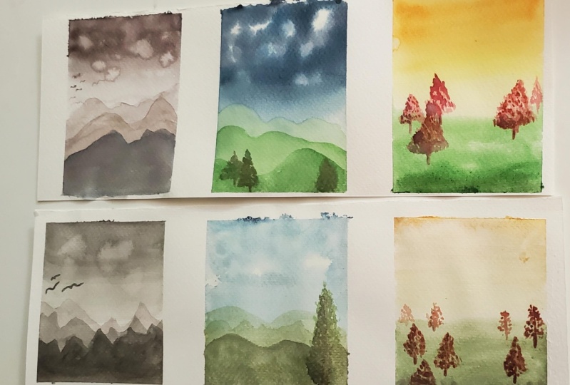
11. Class Project First Layers: The project for this class, I wanted it to be something a bit more fun than just the exercises I
showed you before. They can be quite relaxing and sometimes meditative,
some of them. But sometimes I
understand that they can be a little bit
boring. There are say. So. I wanted to show you something that you can do with your newly acquired skills. And so I thought something that is not too
difficult and it's fun to do. And I thought of
this Lidl sort of cards like a
Polaroid like cards, which is quite fun to do. And they're quite
fashionable at the moment. And so it's something
that you can add to your sketchbook or share
on your feed as well. So basically, what you
need is just on paper. I have here. This is a
strip that is not cut. So you can tape it down with your either artist's
tape or your washi tape. This one. I liked the washi tape
because it doesn't really affect the
paper too much, but it tends to lift
a bit sometimes. And then you can use, as I said, they add this paper as well. So it's a low tack tape. And other ways you can use a single piece of paper
like this already cut. And you can either leave it
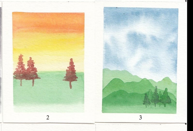
like that or you can tape it down like I did with this one. Okay, So I prepared some colors. I haven't done a
lot of mixing in this class because
I don't want to confuse you with
color mixing as well. Um, so I lift it pretty simple. This scene here, e.g. was done with just
the neutral tint. N is just the sort
of gray color. So something like this. And, um, and then
I have an orange, which is just the
transparent orange. I think this is from all pain. Um, I have transparent
yellow from Winsor and Newton and the Winsor blue
that we've been using so far, and some green that
we mixed their own. So this is with a
transparent yellow, I think, and, uh, and the blue. And this one is perylene maroon, also from Winsor and Newton. And with these colors, you can do this
simple paintings. So this one here, It's
basically a combination of your graded wash and
then some layering. So let's start. So we start with a slightly thicker paint. So maybe that is a
bit too dark in fact. So we'll add a bit of water. Let's see how it goes because we don't want it
too late either. And then of course you can
tilt your working space. I tried to keep it flat
so you can see better. Um, but let's have a look. I might need a bigger brush, but let's see how it goes. So make sure you have
quite a bit of paper, quite a bit of paint
on your brush. I don't think this tape
it was a perfect idea. And then dip the
brush in the water. Take off the excess water
like I showed you in the exercise and the
excess water and paint. And then let's see if
I can put it here. I can show you so deep. Touch it on the side and then
keep the transition here. And then again one
here to be lighter. So I'm just going to
wash it a bit more. And as you can see, becomes lighter and lighter. And in this kind of painting, don't worry if you get
effects like this. Because that could
sort of simulate the clouds or
something in the sky. Which is quite nice. And of course I had
to go and touch it. But we can add clouds. I can show you this. So if you wet your
brush, not too much, touched it on the
side a little bit, and then touch it on the paper. You would get this. Effect, which is called
blooming or cauliflower effect, which could be like a cloud in a worst k. So
something different. This is just a flat wash. And this is another
effect that you can have. And then once this is dry,
paint all over my hands. Here, once this is dry, we can add to the mountains. So now I'm going to
just rinse the brush. And I can show you
this the sky effect. So let's move that a little bit. For the sort of effect. I start with a wet paper. So I'm going to wet the paper. And it's good if you
can tilt it because you can see our wet the paper is and if it's
homogeneous or lower the space, it might be a bit more difficult if you are living
in a hot climate. And then the paper
dries really quickly. And if that's the case, then you can weight it twice. And it will the second time, it will stay a bit more
wet for a bit longer. So make sure there are no
pools of water on the surface. And there's a nice
sheen on the paper. And then pick up your blue or whatever I
want to use k to be. And then start dropping the color and leaving some whitespaces like that. Then at this point you can do the same transition
as we did before. So rinse your brush
a day on the side of the jar and just go over
the paint like that. And you can always touch it on your paper towel to
lift a bit of the blue. If you want to leave space for the mountains,
like we did here. Okay? And the color is closing
down a bit so I can sort of lift a bit to kinda like I showed you
in an earlier exercise. So you dry your brush and
you touch it on the paper. And you just lift the color. You need to rinse it because
it will pick up the blue. And the another way to lift the colorful clouds is to
actually use the paper towel, doing something like that, and then touch it on the paper. And if you have that
effect, Alright. So we can leave that to data. And then we can do
something like this. So like a graded wash. So to do that, to clean our brush. And then let's move this. Then we start with the orange. It might be a bit
too concentrated. This one, it's the
most transparent. Paint, this one. And with that, again,
like we did before. Then, hence the brush. Pick up the yellow and start just underneath and
then touch on the orange. Maybe. Dip the brush in
water, make it lighter. Then. I'd like to show you what
to do with this terror, but okay, So dip
the brush in water, touch it on the side. And then here I'm going to add the green mix it because
the pigment separate. I'm not sure if it's Turkey. And touch the tip of your
brush to the yellow side. And then this time I'm going to make it
darker at the bottom. This tape, definitely
not a good idea. And if it's darker, if something is darker, it looks closer as well. So let's leave that to dry. Really important not to
fiddle with the watercolor, which sometimes I do. But I have to repeat myself. Don't fiddle, stop fiddling.
12. Class Project Secon Layers: So we have a nice Cloud here this time instead
of just a gray sky. And then this is dr. So we're gonna do the
clouds, the mountains. I mean, I'm going to use
a diluted diluted paint. So we simulate the distance. I'm in the mountains. It's quite, quite diluted. And, um, I do have a class where they teach how to mix
your own neutrals. So if you want to check that
to make your own neutral, it will look much
nicer than this one. Okay, So for the mountains
just to some sort of moments like that, up and down. And then you just do the
transition as we did before. And just do the gradient like
that and leave it to dry. And for this one, we can do
the same thing with a green. Let's see. I'm going to dilute
it a little bit again to do the very light
mountains at the back. All right, so let's
start from this side. Okay. And again, we
transition like this. And then for this one, we can add some cheese
like I did here. So I'm going to use
the perylene maroon. And actually I will use
a diluted version fest. But just make sure
you don't have too much paint on
your on your brush. So I'm just going
to touch it once. Still kind of cold, so I might leave it just
a little bit longer. This one is virtually better. So I'm going to do live
there because they might just say spread
a bit too much. So I'm going to add the
second layer there. And whether do we
say make the mix a bit thicker so I'll
add more pigment. And always don't
be afraid to try. That one should be okay. I always have some
scrap paper may decide. And then we'd do a pic there, one there, and another one here. And you can do it to
the end like this. But I'd just like to show you the gradient every
time I do this. And it's good for you to do
that as well because you can practice your gradient wash. So that's another
mountain there. We can add the darker mountain
in front of this one here. So again, make the
mix a bit thicker. When what pigment? And let's do it like this. Okay. This one wasn't
completely day. It happens sometimes. But we can always go back
and just do it here. I do this sometimes
because I'm a little impatient and I can't
wait to carry on. But it's nice when you
have more than one thing going because I'm that
way you can keep working. You didn't get bored waiting. Um, so it's good to have a
different painting started. Okay, let's make these trees. So I'm gonna pick up some color, but try not to have
too much on my brush. And then with this cheese, you can sort of use
the stippling effect. So this is very light, is kind of a first layer to see where you want
to have your cheese. Okay? And then let's
put another one here. So just do the stippling
and making the tree larger and larger as it
goes towards the bottom. If you don't feel
confident enough, you can do very, very light lines
with your pencil. I'm, but these are
quite artistic. So you can just do it like
that, like I show you. And this one's, so make
a smaller tree here. And they kind of touch
with the other one. And then we can refine the look afterwards when we use the
other paint, the day one. And actually, if you want, you can leave this
lighter cheese, like you can do a few more
and leave them at the back. And it looks like g
is in a distance. So let's do another one here. Another one here.
And this one is, it doesn't matter if they, if they touch and try to do like different heights as well. So in maybe like
through if there was one here from the back. I think we can do the
final mountain over here. And I'm going to do even
darker color in this case. Alright, so that one's finished
and we have a nice Cloud. And if you want, I'm going to pick
a smaller brush. And big some of
these darker color. And you can do some
sort of little beds. Something very simple. Needs to be a bit more
intense probably, but something like that. Very naive, but quite
nice and effective. That one can be called finished. But you can add as many or as
little detail as you wish. And then here we need to go
back to these mountains. So I'm going to do the
second layer again here. Then we're going to add the darker mountain on top of that. Let's work on this trace. So I'm going to use slaves
are slightly thicker paint. Again, trying to not dwell
too much on your brush. And then just do some stippling. So this tree can be different. And maybe this tree. And we can put one in
between these two. Darker one. So it looks
like it's at the front. So as you can see, it looks like this lighter
trees out of the back. And you can do it like this. Or if you want, you can add some
stippling before adding the front
bit to the back. Trees, still trying to
keep it very light. Um, but I quite like you
liked this because it looks like is at the back which
are quite far away. And then if we e.g. pick up some of this color,
the perylene maroon, and I'm going to add
some of this blue. Too much blue. That happens. Okay, So that's
made quite a dark color, which I want to drop a
little bit in this cheese. So to give an
impression of a shadow, just very lightly like that. And then if you wait until it dries a
little bit and drop a bit more than we give this
impression of a shadow in there. Okay. So that's still wet. We can wait until it dries. So this one is, I think
should be dry now. And we can add the
last mountain. Okay? And then if you want, you can
add trees like we did here. Or you can leave it
like that where you can add birds like we did here. So lots of different things. Let's see. This one's maybe
I can add bit more color, dry but not completely j. Okay, So we've learned quite
a lot during this class. I have all the exercises here. So the saturation, the
flat wash, the grid bush, and the optical mixing, the stippling and
other techniques as well, the color blending. So all of these, well, not all of these, but quite a few of these we applied here. So we have, they get it worse. We have the layering
of the color. And here this blending of two or more
colors, the stapling. So there is a lot going on here. They're wet on wet. And as you can see with these techniques
that you learned, you can do some
lovely paintings. They're simple,
but nothing says. No one says that you
can't make these more complicated. As you go. E.g. you can add clouds here. So when you do your
wash before it dries, you can pick up the color
and add clouds or you can, um, sort of a lift the color
to simulate the sunshine, the rays of the sun. You can do quite a lot
with what you learned. And I hope to see
your creations soon. And I hope you
enjoyed the class, and I'll see you
in the next class.
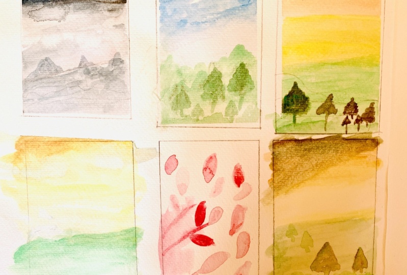
13. Class Project Extra Example: There are lots of
different things you can, you can do with these
sort of techniques. Um, let me see. You can do something like an almost negative
painting type of things. So we can draw some leaves with a very light version
of the color. Alright, and then
on top of this, you can use the transparency of watercolor and do
a darker version of this like we did here. And then at the end you will
have a negative effect. Here. We can do another
layer of leaves. So we can do something
that goes on top of this. Alright, so playing
with, Whoops, with transparencies
of the watercolor can give you some
really lovely effect. And you could design
something like this to make a pattern
for the sample. And you can add even still darker pigment
for another layer. And I can get even more
movement with this.
14. Final Thoughts and Next Steps: Congratulations on
completing the class. I hope you have enjoyed the
class as much as I have. And I hope you have learned
lots of new skills and techniques that you
will be able to apply to your future
watercolor paintings. Next step is to practice
those techniques. Unfortunately,
there's only one way to get better at something. Like anything. That is practice. A few pages of your exercises and you can practice with a little paintings that
I showed you earlier on. So it doesn't have to be just a boring exercise
just to lots and lots of little paintings and you will see how you will improve. And I will advise you
to date your paintings. So just underneath each one, just write the date. And you will see that
after a few weeks, you will have
improved quite a lot. Don't forget to post your paintings on
the project section. And I would like you
to post something now, the first exercises, little
paintings that you do. Then maybe something in a month. So we can all see
everybody's progress. Please remember to hit
the Follow button here on Skillshare if you want to be notified when I
post new classes. And you can also check out my profile for more
watercolor classes. If you'd like to keep in touch, you can follow me on Instagram
at cardiac anti-art, or you can check out my
website, kaggle.com. Thanks again for
taking the class and I will see you
in the next class. Bye.
15. Bloopers: The project for this class
would be not only to do these exercises that I
show you during the class, but also to do some mini
watercolor paintings like this, using the techniques I'll show you during the
different lessons. I have included some
downloads for you, which includes a template for your exercises and
also a tracing. For four. I have included some downloads
for you to download. And I also included a tracing. It's very basic tracing, but it's something to help you. If you want to use
this one and rambling.
 Katia Galante, Botanical Artist and Illustrator