Transcripts
1. Introduction: If you want to improve
your watercolor paintings, there are some techniques
that you need to learn. And one of these very
important technique is how to render 3D form over to the drawing using
lights and shadow. Now, I could tell you
to feel dozens of little squares with
graded washes. But no, that's not what we're
going to do in this class. Instead, we're going
to learn how to render 3D form by
painting an object. And the best objects to paint. To do this exercise is a ribbon. Ribbons can have various
folds and turns. And you can see the
light shining on them. So it's perfect for this
type of exercise festival. I will explain to you briefly
the structure of a refund. Then I will show you not
only how to draw a ribbon. And yes, I will say
the template for you, but also to trace your drawing. I'll give you a great tip here so you don't want to
skip this lesson. I will show you step
by step my process for painting the ribbon
from the first wash, the base wash to the
different layers, all the way to
adding the shadows. And I'll touch up on
dry brushing too. I'll show you how I mix the colors and there is
another gem of a tip here. In this lesson too. I'll explain what
a glaze layer is. And at the end, I will give you examples
of the versatility of the skills you've learned
in painting ribbons, demonstrating how
they can be applied. Other subjects too. The way if you can't draw
a ribbon straightaway, I have provided you with
a picture and tracing. So you can just use that and start here, Watercolor Painting. By the end of the class, you will have an understanding
of form, shadow, light, movement, and then you will be able to infuse this in your
next paintings. Whether you're painting
a ribbon or a leaf, or even the delicate
folds of fabric. So if you ready,
Let's get started.
2. Class Project: The class project will be, of course, to paint
your very own ribbon. You can use the templates and
pictures that I gave you. Or you can use your own ribbon. Just make sure that if
this is the first time you're doing this exercise,
to keep a simple, use just one color
ribbon and maybe use a short ribbons so you
don't have too many folds. And to deal with, be sure to posterior project
in the project section. And if you have any questions, don't hesitate to ask
because I'm here for you. And I have a special
treat for you. If you post your project
in the project section, you will be entered in a job. And then one lucky
students will win a signed print of death choice from a
selection of my watercolors. So join me and let your
watercolors shine.
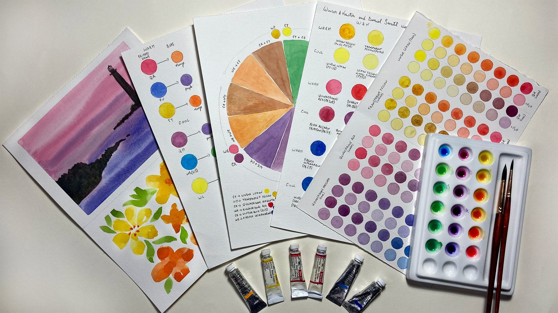
3. Materials: In this lesson, I'm going to talk about the materials
you will need. You might not need everything, but let's just go through it. So if you want to make the
template like this one, you will need some paper, the ruler, and
different colored pens. You can have one of these, which brings me back to
my school days. It's got different
colors or you can have just three different
colored pens, whatever, whatever
color you like. And then you can
just make this 0. You can download the template. I've put in downloads for you. So you don't have
to do it yourself. And you will need
some thin wire. If you want to do this template, you can always skip
that if you like. And then you will
need some paper or a notebook to do your
sketches of the ribbon. And if you like me like
to do the sketch and then trace it and transfer
it on watercolor paper, then you will need
some tracing paper. That's what I use very often, but not only this, so you can just use any
tracing paper that you like. And then once it's transferred, well, of course you will
need watercolor paper. So I'm going to use my old
sketchbook, which I love. It's with Saunders
Waterford paper and this Andrew percent
cotton watercolor paper, 300 g. And it's hot pressed, although it has a
little bit of a tooth, this paper, but you can use any watercolor paper that
you like to work with. So it doesn't have to be he doesn't have to
be hot press either. But I like hot press
because that's how I work for my botanical painting. And the smooth surface means
that you get cleaner lines, but just use the paper that you, the yellow window you work with. Then you will need everything
for the Color Palette. So you need a Palette. This is a ceramic palette. You can use a plastic one. I prefer these ones
because they don't stain. And you can use a flat
palette like this, which I'm currently
using as well. Or one where the whales. And then you will need
of course the paint. So you don't need
these many pains. This is just me being
enthusiastic about watercolor. So you can just a couple of paint or just even
one, doesn't matter. But I would suggest maybe just a few so you can mix and make
the color darker. But you could even just use
one color and start with a light wash and make it
more and more pigment. So you don't need a lot of
paint for this project. And then you will need some paper towel or
even a cotton cloth. As you can see, I've been
using this quite a lot. Stained just to
draw your brushes. And you will need, of course, a jar for water. I used to use one
for clean water and one to wash the brush. And then of course, brushes. Brushes are a very
personal choice. So I like to use the
C37 winter Newton. These are the miniature one. So these are like various specialists, stick
specialized brushes. They're quite expensive so you don't have to
use these ones. You can use a cheaper version, which is the Princeton brushes. I mean, this is a bit big. Probably for the template
I will give you. But if you have smaller ones, just use the brush that
you feel comfortable with. I really love the series 7 min your brushes for
the way I work in way. But I understand that they
are a little bit expensive. And of course, you
will need pencil and eraser if you decide to do your sketches, which I've asked. And I will give you a tracing of the ribbon I'm
going to paint. So you don't have to draw it. If you don't want to.
If you just want to practice your watercolor skills. And a radio address, which means right side. So I will understand which side needs to go
when I'm tracing it, but I can show you
that later on. Okay. So I think we're ready to start. So we see you in
the next lesson.
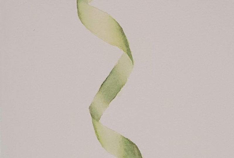
4. Anatomy of a Ribbon: Hi there. In this lesson we're
going to have a look at the structure of a
Ribbon and where the light and shadow fall. So if you've seen any
of my other classes, you will know how I like to make templates for just for
ease of understanding. And of course, this is a bit stiffer than a
ribbon would be. But basically you just make
a template to like this. So just three lines, red, green, and blue, but they can
be any color as long as they are different.
Then you cut it. And when you cut it,
make sure that you leave a couple of millimeters so
you can still see the line. Then you just stick
some thin wire at the back with tape and
then you give it the shape. So just turn it. And what it will do is it will give you the
opportunity to see, am I will look at how the light falls on
the folds of the Ribbon. So if you see this one here, so in here you can
see it's not strong, but you can see there is a shadow on this side because the light is
coming from the left. So there's a shadow
on this side. There's a shadow inside here, and there's a shadow
here and here. And then as this one turns, the light hits it in here. And then of course,
this sides this and this are exposed to light, the light and this one as well. So if you turn it, you will see how it changes. So if we put it this way, then we will see that
there's a shadow in here, and then the light
hits this side. And then again
shadows on this side, of course, the
light hits here and here where it starts
to turn this way. So this one catches the light. So if you want to make a ribbon like this template and then you can give
it different shapes. And he's just the, for you to understand the,
this particular structure. Then in the next lesson, I will show you How to actually
draw a ribbon like this. So I will see you
in the next lesson.
5. Let's Draw The Ribbon: In this lesson,
I'm going to show you how to draw the Ribbon. And it will probably look
a little bit different. You view from my view, but I just going to explain
the technique I use. It doesn't really matter
if it's exactly the same. My drawing to this,
what you see. The first thing I like
to do when during the ribbon is to draw the, let's call it the mid vein because acted as
if it was a leaf. Because this method
is also very good. If you want to Draw Leaves, very long leaves like a memoryless leaves
over daffodil leaves, which are long and
sometimes they they bend. So I follow them mid, mid trip and just go
something like that. Good. First fold. Turns again,
finishing below that. So that's our midrib. And I'm going to make it green. Because we were going
to do different lines. Of course we would need to erase these are some, a certain point, but it will be easy for you to follow if it's
a different color. So steady hand this morning. Okay. And then let's start
with the right side, which is the red side. So it starts on the right. So let's start like this. If you want, you
can do some lines here to show where the ribbon is intersecting
with the midrib. And somewhere here, there. So in here, this line
crosses the midrib. Somewhere there.
Follows the midrib. And then here it crosses
again and is at the back. So let's close this again. There is at the back. Then in here process again. And is actually crossing
probably around here. Then here it crosses again. So somewhere there. And then we can
draw the blue line. So somewhere around here. And the blue line crosses the midrib and it comes
out the other side. So somewhere like that. And then again, process the
midrib there like this. And then it causes
the midrib again. And there was follow
the midrib, the sides. And then it causes
again there. Okay. And now we just have to
link the sides there, which are these ones. And, or you have to do now is get rid of the lines
you don't need. So for example,
for this one here, and of course, this midrib here, you shouldn't be able to see it. But I made the green
so I can erase it. But it will give you
the idea anyway. And then here, you
don't need this line, which was the red one. And then here, this line, and here, see this line. Alright. What I'll do is I take some tracing paper and let's trace this without
all the extra lines. Alright, so now you can see better the shape of the ribbon. So of course you can take
a little bit more time and refine the drawing a
little bit better, but it gives you the idea
of the Ribbon already. And then where you need
to do is to just to add the shadow areas. So somewhere around
here. Then here. And as you can see, gives you already
daily over ribbon. So that's how to draw it. But I will add a downloadable
tracing of the ribbon. If you don't want to draw
it, The worry about it, you can just move on to the
exercise with watercolor. It's nice. I would advise
you to try and list and practice because we drawing, you just need to practice. There's nothing else
does not secret, secret sauce or something, magic pill or anything like
that to just practice. And you will get there. As CEO in the next lesson.
6. Tracing the Ribbon: Before we go ahead with the
painting of the rubber, I just wanted to show
you this little trick. I've already traced the
Ribbon in my sketchbook. Now, normally if you want to trace something on a
loose piece of paper, then you can just put this on a light box
with the paper on top. And that's it. Bob is your ankle as
the English people say. But if you want to do
this on a sketchbook, a bound sketchbook, then you can't put this on a light box. So what I do in this case is, is this little trickier. So you have your ribbon. And that's why I
wrote right side. So this is decide you want you want it to be
on your sketchbook. You turn it the other way round. I already trace it,
so it's quite dark, but I'll do it again. So what you do is you go
over the lines and trace it. I wouldn't need to
do the whole thing, but that's why you do
trace every single line. So this is quite simple, the more complicated, but you want to get
every single line and then get rid of you. You need some paper underneath, otherwise you will
have the faint, maybe you can see it probably. But you will have the faint outline of your
previous pencil drawing. I'll give you that. Put it on your sketch book
where you want it to, to be. Maybe do it on this side. Then I'm going to use this. I didn't put it in your materials list
because it's a little bit expensive and it's a specialized to I don't remember this
actor name at the moment, but it's something that
they use in bookmaking. I will look it up and write
it for you if you want to. Check. If you want to get one. But you can use a spoon. So just the back of a spoon. Sometimes if it's
only a small thing, you can use your finger as well. But it's really good. And what you do is
you want to guess some low tack tape,
some artist's tape. Again, if it's small,
you might just want to hold holds your tracing paper, but it might move. So I'm going to
fix it like this. And then with your
spoon or this tool, which I don't remember
what is called, you just press on
top of your lines. It might take a few
times going over it. And you can check to see where
the lines are transferred. So it's a bit faint, but you don't want it to dark either when you're
painting Watercolor. Alright. Well, I'll
stop here just, this is just to show you anyway. And when you remove it, you see here I needed
to go over it again. And then the as well, but just keep
checking it this way. I the tape one on one
side so I can lift it. But just be careful not
to move the the tracing. Otherwise you will
have a double line. So if it's a more complicated during then you might
want to fix it even more. Like for example,
I could have put some more on this side. And that's it. That's your you tracing. So I wouldn't bring it closer. Then you can use your
kneading eraser, for example, to lighten
the lines even more. If it's going to be
something very light. If you're painting
a white flower, you want even lighter
lines than these. But this is a handy tip that another incredibly skilled
Watercolor Artist, which is my uncle, taught me. So you can use it now. So now we can move to the next lesson where we
can apply the first wash
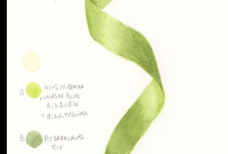
7. Color Mixing: Before we start painting, we need of course,
to mix the colors. Now. If you want to mix a color and if you don't
want to use green, you can use any color you want, just follow the light and shade. But if you want to mix a
green, you can do that. And it doesn't have to be
an exact, exact green. It can be something
similar because we're not painting botanical
painting. In this case. It's just an exercise. And what I do is I have this little booklet which
I show you how I did it. Did the template here
in another class. Which is, if I remember well, How to Mix Luminous colors. If you want to have a look
at that class to see this. But basically it's something
that I like to do in my spare time
because it comes in very handy when you want to find a color and you
want a starting point. In this case, for example, this is a very brilliant green, something that you don't really find in nature, I suppose. But if you want to do a still-life or a bunch
of flowers with a green bow. Then you can find these Kara. And it's something similar
probably to one of these colors on this I can
really brilliant greens. And again, I explain how to get 2 billion colors
and more opaque, more muted colors
in the other class. But if you want a
brilliant green, you need a yellow and blue, which have both a
tendency to green, Winsor lemon as a
tendency to green, and Winsor blue, green shade. So we can start
mixing these two. We are Winsor Lemon. And when to blue-green shade. This if you don't need a lot, is quite a strong color. So always add the colors
a little at the time. And always have a little
bit of scrap paper to test your color. This is not bad, but
it's very brilliant. So what we need to do is we
need to mute it a little bit. And to do that, we use a little bit
of quinacridone, magenta, just a tiny, tiny bit. Just add the magenta or the red. When you're doing
this very slowly. So in fact, maybe it was a
little too much already. Because this is not
a lot of color. I will need to make a more, but I think this
is close enough. So I'm going to make more color because it's good to have enough color to finish
the entire project. But this is a K. I mean, it's not exactly
the same and it looks even more different on
camera, unfortunately. But it doesn't have
to be an exact match. Then once you have this color, which I call the local color, you will need to make
another couple of colors. But the first one is just the local color
when more water. And that's gonna
be the base wash. So it's gonna be a
very light wash. Just to start with. Then you need the darker color. And to do that, you can use, I mean, some people say to use a complimentary color to the
green, which will be red. But if you put more red in this mix, you
will have a brown. So that's not advisable. What I normally do is
I use a darkening Mix. So it's this mix
here, the dark one. And it's basically a black. You take a little bit of
this and you add it to your base color until
it becomes darker. And I'm using that for another
project at the moment. So add some mixed already. And as you can see,
is become dark, but it's still green brown. And to make the darkening Mix. So this type of sketch
book is really good. It's, I call a recipe book
where you want to do. So. This is the doctrine mix. It mix Winsor blue, green
shade, quinacridone, magenta, and Winsor yellow
or lemon yellow. So it's basically the same
colors that are used here, but in different proportions. And you will get darkening Mix. So I'm just going to
do it for you quickly. So we have the magenta, the Winsor blue, green shade. And you would get a, a purple color, quite
a strong purple. And then to this you
start adding the yellow. This is Winsor lemon. And then it's a
matter of balancing. So at the moment is
a kind of brown. So you need to add then small amounts of blue and
red to get it to the right. Dark, light, dark shade. So it's going to
look like a black. So it's already getting there. Just studying a
little bit more red and is getting to the
right black shade. And then you can dilute it down. I'm just dipping my brush
in water without drying it. And the brushing water in touch it to the side like that and it will dilute it down. It's not exactly a
problem gray yet, but that's why you need
to do you just adjust. These are tiny amounts
of red and blue and yellow until you get
the perfect shade. So it needs to be quite dark like this and then
you can dilute it down. And this is a good mix
to paint white flowers. So I'm gonna make more paint and then we can start
painting the ribbon. I'll see you in the next lesson.
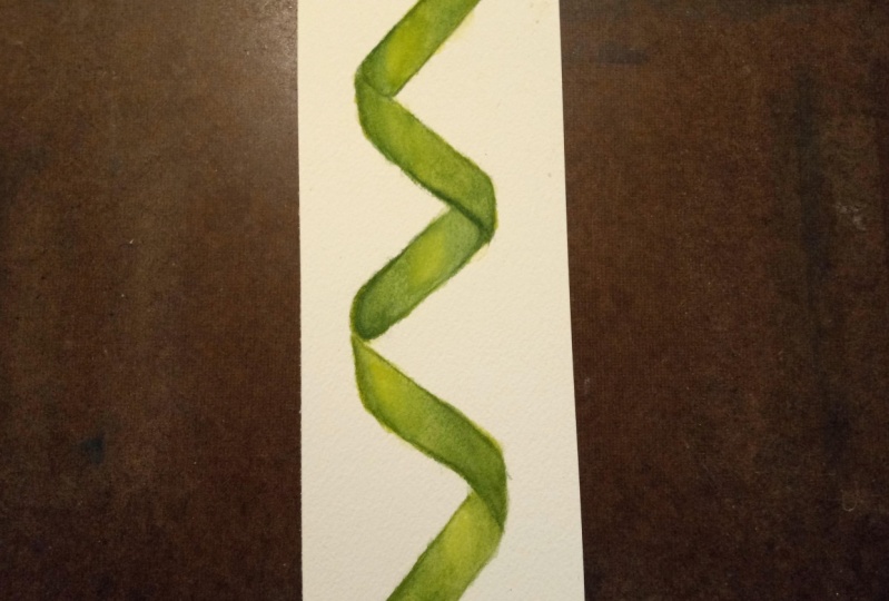
8. First Layer Base Wash: We're ready now to apply the first wash.
And I have printed a picture of the
Ribbon and they have a color version in black
and white version. And then going to put
these in your downloads. And the black and
white is to help you visualize the dark
and light areas without being distracted
by the color. So I always have something
like this to help me just visualize where the dark should be in the very light
color should be. And I have my three colors. So I have the local color, the main color of the ribbon. And then I made a
lighter version just by adding water and then
a darker version by adding the darker green mix. I'm going to apply some water. I'm gonna to this a little bit. And it's good to applies
just a water wash. This, especially
in dry climates, because this will prepare your, your paper for the
application of the color. In this case, even if it dries, is not a huge problem. But it's good to prime
the paper a little bit. Don't normally stretch the paper because I work quite dry. I mean, I usually work
like wet on dry paper so I don't use too much
too much water. Okay. And now I'm going
to apply the paint. I'm just going to do
a simple flat wash. And if you need to brush
up on your techniques, you Basic Techniques ever a
class that you can watch? Where I explain all the
basics like the flat portion, wait on dry and so on. And just adding
some water because it looks like it's
still a bit too dark. In this case, you can
just apply the color to the whole surface without
worrying about sections. If you feel the color is a
bit too much on your brush, just dab it on the paper and it would take some
of the color away. And then when you brush it back, when you when you're wash here, it will absorb
some of the color. Okay. Just make sure that the
entire surface is covered. And although this may look
like like everything is color, then you have highlights here. When you start applying
the darker color than disliked color
will look really liked. So that's fine. The important thing is
that you always start with very, very light washes. You can always
darken watercolors, but it's much more difficult, if not impossible to
lighten watercolor. So you will never
go wrong if you do. I liked wash and
then just add more. And if there are some
hard edges forming, you can just dumping your brush, touch it on your paper towel
and just rub it lightly on the on the side where
the edges are formed. Because sometimes when there is a wash like this quite wet, it might form some hard edges, but you can smooth
them out in this way. Okay, so we need
to let this dry. And then we can come back to carry on with a
with a darker color. See you in the next lesson.
9. Second Layer: The first layer is now dry, the base wash layer. So we can proceed with the next layer and the paint
has dried a little bit. So you just need to
basically reactivated. And I use a little bit of water and it just reactivate it. And now we need a little
bit of a thicker paint, still not too thick because
otherwise it won't. I mean, it will make
some unsightly effects if you use very thick
paint straight away. So let's make it a
little bit thicker. So add a little bit more
pigment to my first wash. And now what we can do
for the second Layer, we can either work wet on dry. So I can show you this technique then is
the one that I prefer. So start from here, moving up a little bit and they want to do is I pick
up some some paint. Then this closer, hopefully I will make a
mess because I need to show you what I do with
the water as well. I play some color like
this in the darker area. And then what to do is say, a dip my brush in water
and tap it on the side, debit on the paper towel, and then adjust the
color to feed it likely, and then do it again. So it's important that you know your brush because you don't want too much water
left on your brush. When you do this. Because
if there's too much water, it would click create
the bloom effect. So these brushes hold
quite a lot of water, although it's very short, but it still holds
a lot of water, so I need to tap it
on the paper towel. Another brush might
not need that. Then as I'm smoothing
slightly the edge. So it doesn't form a hard edge. And then a different method
is to wet the paper first. So this side just
put clear water. And I liked this method when
is a large village area where it's a bit
more difficult to do a weight on dry technique. But other ways I use the wet on dry and then pick up the color. And I start again
from the darker area. And they just dropped the color. This. Again, I will
rinse my brush as I did before and ties the
color pigment like that. And then there is another
darker area on this side. So I'm going to
apply some color. And in this case your paint could be a little
bit thicker because it's going to be diluted
by the water that is already in the paper. But I've used the same. And if you find that the
paint is spreading too much, you can always dry
your brush and just soak up some of
the paint to live. The white area. Don't really
like this method that much. It's not the one I use normally, and it's really a
personal preference. So I'm going to
do the same thing with the other sections. And why you need to do this. You need to look where the
darker areas areas are. And then just start from there. Then sometimes there's third. And I don't set like from the paint but next to the paint. It's very hot in here. In the paint is
drying very fast. But if you've tried to
work a bit quickly, you should be okay
with this is Technique And then while it's still wet, you can always add a
little bit more in mix the two techniques, really. There's a little bit of a
dark area on this side. But here's the darkest. This is dark but not
as dark as this. And this is the latest. We need to reproduce that. But it's starting to dry, so I'll leave it for now. And we can always
add more pigment. And then in here, the darkest
area is on this side. I'm just rinsing my
brush and tap it on the paper towel and
then fade the color. And you just keep doing it
until it's light enough. Sometimes you just left with water basically
on the brush. And I'm going to add a
little bit of pigment here. Because this area is
also a bit darker, is where the ribbon folds. And in here as well. Since today is a
particularly hot today, I'm going to wet
the paper first, then let it down a little bit. And this will help the
paint to stay a little bit wet, a little bit longer. So again, here we have a
darker area. On this edge. Watercolor painting. It's a very unique to so many things like the climate and
the paper you're using. This paper is nice, but it's got a bit of a tooth, so it tends to give
you a rough edges. And here as you can see, the Paint tried
really, really fast. Again, the paper is basically absorbing quite
a lot when I use arches. It doesn't do this
type of thing so fast. But that doesn't matter
because we painting in light layers and we painting lots of layers
on top of one another. So when we would paint
the other layers, this effect won't be
noticeable anymore. So we're gonna let this dry. And then we can carry
on with the next Layer.
10. Third Layer: I had to change paper. So I changed to Arches
hot press paper 300 g because the sketchbook paper wasn't that good for
this type of climate. We have close to 40 degrees
Celsius today here. So it dries too quickly. Even this paper,
they add this one. It's becoming a bit
difficult to work with it, but it's still better. But I did the same thing. So the base wash and
the second Layer. And you've seen that
the other paper, so it's the same technique and
we can carry on from here. So basically, I will just add another layer with a
slightly thicker color. So the, the local color
that we mix the at the beginning and is still
the same sort of technique. So you can do a wet on wet on
wet to dry like I'm doing. And I'm basically just
applying the color. I start applying the color
where I see the darkest areas. So in this case on the top here. And then once they
get to where it starts becoming lighter
than I did my brushing, what a reentered, um, then, uh, up at once on the kitchen towel, and then just the color forward. And there's a little bit of
a darker area on this side, so while it's still wet and
just to play this color here. And then do the same
thing with a dump brush. Just ties to Color. Forward. Then I just carry on with the same technique
for the other areas. If you see here, this area is lighter than this, but it's still darker
than the highlight. I'm going to play bit
more color in here. Like another wash on top. Would darken this area
and live this dark still. But not on this area. So I'm going to rinse my
brush and just to play, basically just water this side. So you don't have marks. Vo2max in here? One important thing to
do when you are working with highlights such as
these lighter areas. You shouldn't leave the
light area too small. So when you're making
your darker areas, when you're working
with your dark areas, always leave it
bigger than it is. Because you can always
make the area smaller. But it's very difficult to light in an area where you
already added color. Alright, so we have
our third Layer here. And notice there
is a little bit of a shadow there, little tiny one. I'm going to add a little
bit of color here. And then faded away. We might dump brush. This is our third Layer. And at this point, you can decide if
you want to add one more layer to smooth
out the color a bit more. And I'm noticing
there is a little bit of a dark area there as well. I'm just going to do the
same here and a little bit of color and smooth it out. And so you can either, as I was saying, I don't know the Layer or you can
do some dry brushing. The dry brushing. It's
a technique where you need a lot of
passions and end time, and you have to be
prepared not to rush because it takes
a very long time. But if you want, you can just add another
layer which is going, I'm going to do in
the next lesson. And then you can just
leave it as it is. You don't have to to
do anything else. Other ways you can take it to the next level and
start the dry brushing. So I will see you
in the next lesson.
11. Glazing: Now that the latest
layer has dried, we can proceed and
apply the next layer. So I'm, I've decided to apply
one more layer before I go applied the darker paint. So just to basically
unify everything, one way to do this
is actually to do a very light wash like we
did at the very beginning. So what I do is I get
some of the first, so the lighter color. And I make a little bit
of a light wash here. So just prepare some some color. And whether do is I would just applied this light wash over
the entire shape again. And this USE will unify
your your color basically. And it's still leaves the lighter area as long
as it's very, very light. So just to show you
how light this is, you can almost can
see it on camera. But it's very good for
unifying your previous layers. And just do this very lightly. Try not to disturb the
layers underneath, because if you rub your brush, it will start to disturb
the layers underneath. And this is a good way also to change the color a little
bit when you want to. If you have a
color, for example, that is not exactly
as you wanted it, you can correct it to a certain extent
with this technique. If it's too much
of a difference, then you won't be
able to do that. But if it's only slightly, you just need a small adjustment and then you can use this. Like a glazing is called on top. And as you can see, it
looks already more uniform. So looking at it, we will need to darken quite
a bit some of these areas. But to do that, I'm not going to apply another layer
of the same color, but I'm going to use
our darker color because you can darken a
color up to a certain point, but then it won't make any difference no matter how many layers you could
have put on top of it. It just makes it thicker
but not to darker. So I'm going to wait for this to dry and then I'm going to
Apply the darker color. And I would do that
in the next lesson.
12. Applying The Darks: So the wash layer has dried and now we're ready to
play the darker color. So it will start from
the bottom here. And do exactly as
I've done so far, but puts less, a smaller amount. And then rinse the
brush and then sort of ties the color towards
the lighter area. This point they're
almost a clean brush. And then it's just water
just to avoid leaving marks. And you just proceeds like this. Everywhere you see
a darker color. So as you can see,
it's just a matter of applying many layers and always working from
from light to dark. And this will be the
best way really to avoid unsightly marks made by the color being too
thick and trying to be to go too dark too soon. If you see it making
a little bit of a sort of small stains, don't worry about
it because you can always smooth them out
with dry brushing. So in, in here is the
most difficult part because it's kind of
in the middle there. The darkest, darkest area. Slant, slanting a
little bit like this. And then you have to be fast to soften the edges on both sides. And with the dry
weather we're having, It's not very easy. Because everything drains
in a matter of seconds. There are things you can use to make the paint
dry a bit slower. So Winsor Newton has this
media, I think the cold, and I actually never use them, but they're supposed to make the paint stay
wet a bit longer. I'm gonna leave it
and then come back to this because I want to
darken these areas as well. Because this one is okay, but this area is a bit darker, so I will come back
once this is dry. And then in here,
the same thing. And we can always darken this green a little
bit more with the darkening mix by adding a little bit
more delicately Mix. Don't make it too dark. Of course. Just
slowly step-by-step. I'm just rinsing
the brush until I have basically a clean
brush and just apply water. Maybe we can apply a little bit of this here on this side. Then. I think decide this
quite a lot darker. So what I'd do is say, I add, I will put
some of these here. When I add the decorative mix, it's making it a bit darker. You can see this area here is
much darker than this area, although here we have shadow. Always look properly or your subject or your,
your reference image. Then you just cannot. Some of this darker
Mixing here as well. Alright. This is dried. So what I do is say, I take the darker mix but
watered down a little bit. And then applied here from
where the darkest area is, basically until the fold. And that would darken this area. You might have to repeat quite a few layers
with this method. But then you won't risk having something too dark
and not be able to go back. So for example here, I want to make it
darker. This J. What I do is I just apply again a layer of
a darker pigment than just smooth out the edges. This ADA is probably a
little bit darker than this, but don't want to make it
too dark like on this side. So I'm going to use
the the mid color again and maybe make it
less watery. Layer here. Just move it down to Mix, decide also a little bit darker. So now it's just a matter of checking that you go all day, dark areas where they should be. So there's a little bit
of a darker area here. Just drinks. And then once you can again do a very, very, very light wash
like we did before, just to unify the colors again. And then at this point you
can just leave it as it is. Make sure you have all your
Darks where there should be. I realized that on camera, this these dark areas
look a little bit later than they actually
are in reality. But don't be afraid of making, making these as dark as
you need them to be. And then if you want, you can add the day Brush layer or you can leave it like this. It could be finished already. Just make sure, for example, here I can add a
little bit more of the darker green and probe is slightly darker here as well. But that's it. That's more
or less so we finished
13. Dry Brush: Alright, so we have
our final ribbon here. I've strengthened the darkest
area a little bit more. So there you can see
them on video as well. And then it's a matter of checking that you're happy with your Darks and your lights. And this is basically
how you convey a 3D effect to a Painting. And the next thing I would do if this was
a botanical painting, for example, I will take care
one of these small brushes. This is a double zero and
basically with a paint. So didn't follow
my own advice and didn't mix enough because now
there's very little left. But I would do use the darker paint and just pick
up a little bit of paint. And sometimes I use like a like a spear scrap paper and do
a little like a few lines. And then with the brush, just go over your, um, your painted areas just to
smooth out any sort of stains, any lighter areas where there
shouldn't be any bits where the color didn't go down
the page very smoothly. And just use it as you would
a like a pencil or most. And it looks like
you're not doing much. So i'm I'm sure you're thinking she's not really doing
anything at the moment. But if you do this on your, uh, when you're painting, you
will see that it will start smoothing these areas. Somebody in here.
Let me see if I can put the camera
closer just a second. Okay. So it's a little bit closer. Maybe still not close enough. So here you can see there was a little bit of a area where the color didn't
didn't go smoothly. So with this technique
of the dry brushing, you can just smooth out any of these areas and also add a little bit of
shadow where they were. There should be so darken
the color a little bit. Then sometimes they just don't rinse it a
little bit and just apply just to the
same thing with the water and smooth
out the color. So you don't have to do this because it's a
very long process. And it's basically if you
want to make this really, really professional
reader is mood. For a botanical painting. I would do this process. But I wanted to show you just
in case you want to do it. You can add a bit more. And it will take a very
long time to do this. Because as you can
see, it's almost like, I don't know if you've ever
colored we color pencils, but it's almost like using a pencil to smooth
out all these areas and using sort of little hatching and
crosshatching lines as well. So when you finish, you will have a very, very smooth painting
using this process. But it would take quite awhile. But this is the technique
really you need to use. Just do this little
tiny lines like this. And maybe crosshatching. And just tickling the paper. With your brush. With a weight is more Brush. And as you can see, it
looks like when you do it here that you didn't
do anything but he actually applying color. So it will smooth the areas
that need this sort of work. And I will put this in your downloads as well so
you can have a look at it. And that's it. I hope you enjoyed
making the Ribbon with me and I can't wait
to see your ribbons.
14. How to Apply Your New Skills: In this lesson, I
wanted to show you how you can apply
the skills that you've learned in this class to other objects
other than ribbons. Because let's face it, how many ribbons are
you going to paint? But I just wanted to know that the skills are applicable
to other things as well. So for example, if you
want to paint leads, I wanted to get
some long leaves, the normally naturally bent, but in some, I couldn't
find anything like that. I got some oleander leaves. I'm not sure how this is so big. Never seen these oleander
leaves this big, but it will serve the purpose, the normalised straight, but
I will bend them for you. If you will find the
plant with leaves that grow like this that
are naturally bent, then you can apply what you learned by painting the ribbon. Because as you can see, the shadow underneath here, you have a little
bit of a shadow is turning the light here
with the latest hitting, and then you have
the light here. So it's a bit like this situation where
you have the shadow and light in the leaves might be sort of twisting and turning. This is one thing. One instance where you can
apply, where you have learned. Then I have made
some quick sketches of some leaves that
I just came up with. But just to show you. So basically you,
you're painting the leaf that is turning
so you will have light with the light
is hitting it and then the dark here and then light again here and the same here. So this can be
examples of leaves. And here this is
a painting I did. So you have this
rebound effect here. So you have the dark side here, a little bit of a darker
area here, and then light. And light. So you can see is the
same thing so that there. But also you can apply this
knowledge to curling petals. If you have roses, for
example, this happens a lot. So you can see
this dark here and then the light where the petal is curving towards the light, needs the same thing
with the other petals. So basically, you can apply these to painting
flowers as well. But it's not just for botanical painting that
this scale is very useful. You can apply it. For example, if you want
to paint flowing hair, curling waves, even or even. For example, some fabric. If you want to do as
still-life and you want to add the fabric to it, then you can see the folds work a bit like
the ribbon effect. So I can turn a little bit. And so you have the dark here. And then as it goes towards the light and becomes lighter and then the lightest part. If you want to do
this sort of work. You can see is the
same principle. These are just examples
that highlight the versatility of the skills learned in painting ribbons, demonstrating how they can be applied to a variety
of subjects. Even for simple curling
stems and wines, can be something
that you can paint, applying this the skills
that you learned here. So by understanding the form, light and shadow and movement, you can infuse your
artwork with depth, realism, and a sense of life. Whether you're painting leaves, petals or the delicate
folds of fabric. I hope you've found this useful, and I hope you enjoyed it.
16. Final Thoughts: Congratulations on
completing the class. The next step is of course, to keep practicing, keep
painting more ribbons. And then you can apply this
skill to other objects to, for example, to Leaves. If you'd like, any
health will add. You can check my other
class on during leaves, and then you can combine
these two skills together. So keep practicing,
keep painting, and you will see your
paintings improve greatly. Don't forget to post pictures or your paintings in
the project section. And also don't forget to hit the follow button somewhere up there so that you can be notified as soon as
I post a new class. If you'd like to keep in touch my social links somewhere here. You can also check out
my Skillshare profile for more classes. Also, if you liked this class, if you found that useful, I will be grateful if you
can leave a good review, because that will
be really helpful. And also it would have to keep the class live here
on Skillshare. So thanks again for
taking the glass, and I see you in the next class. Bye
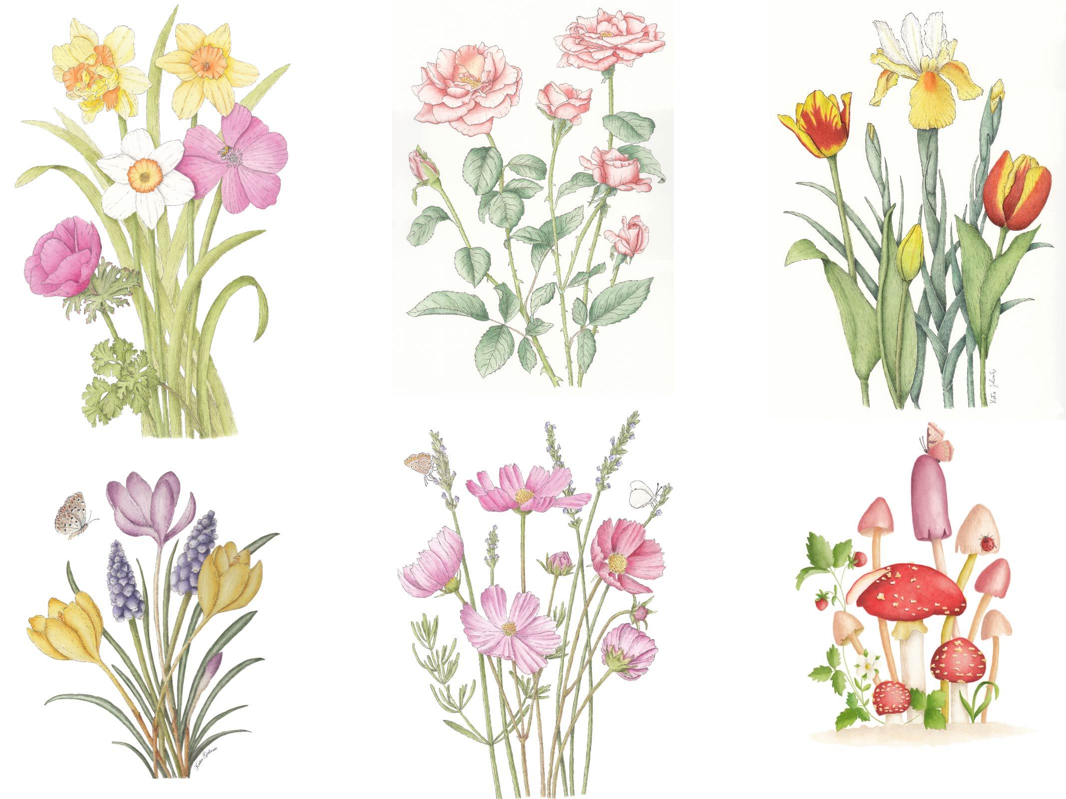
 Katia Galante, Botanical Artist and Illustrator