Transcripts
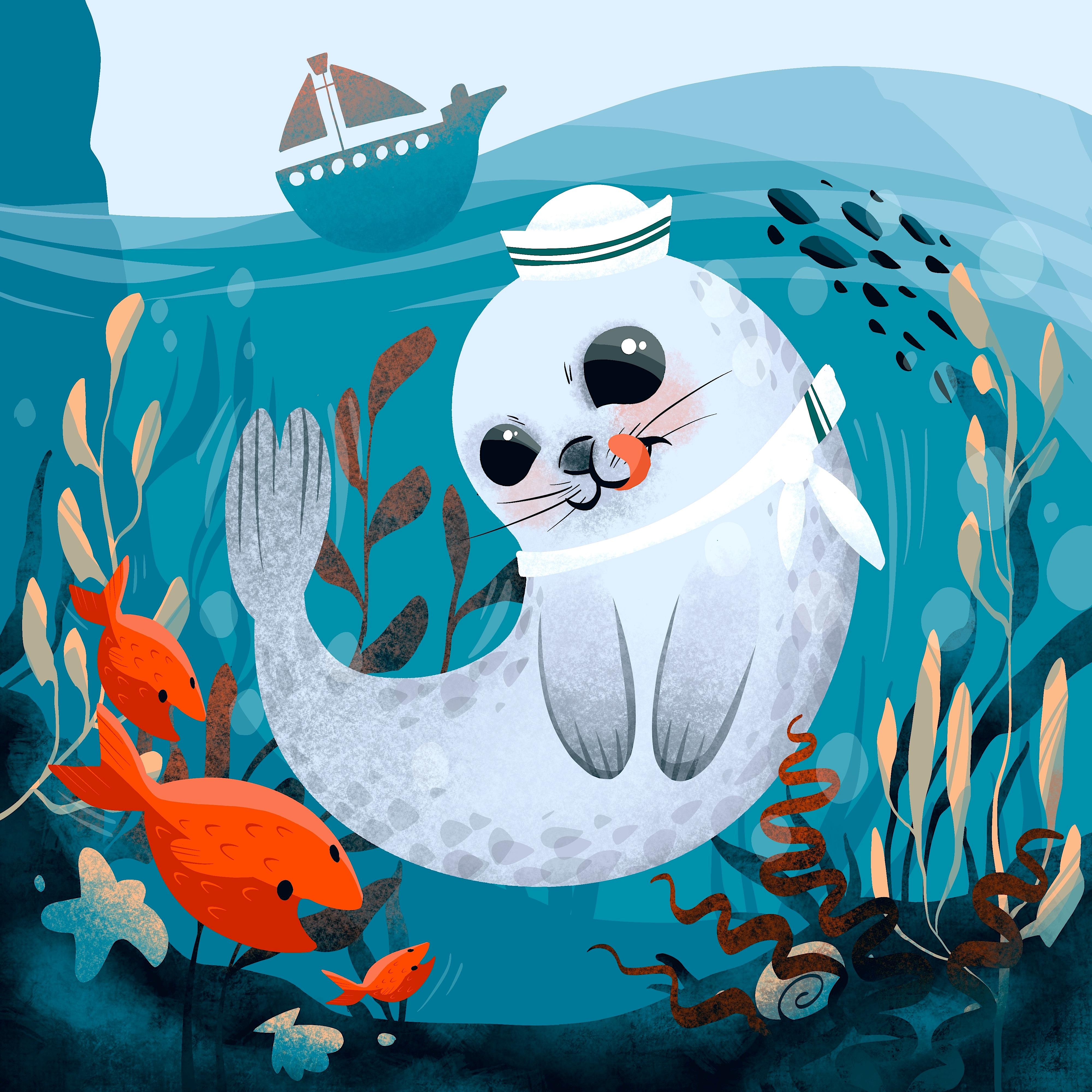
1. Welcome: Creating a rich and
deep composition with a sense of complexity
has never been easier. In this class, the Sailor Seal will adventure under the sea to gather the most useful
and beautiful pearls of information. It's a journey filled
with excitement, wonder, and plenty
of marine puns. Using beautiful marine images
as clues and examples, you will be guided
and carried through the class in a very
relaxing pace. This class will
teach you to explore and recreate a
marine landscape and how to create a
dynamic composition with plenty of
characters and details. One by one, each element will build up the scenery
of the composition, thusly completing this rich
and joyful looking artwork. Hello, my name is Christine and welcome to a new Procreate
illustration class. After finishing a bachelor's and master's degree
in fine arts, I've discovered how rewarding
and fulfilling it is to explore different
techniques and Art fields, among others, and
discovered how to use the Procreate app in order to easily obtain
beautiful illustrations in a very short time, have a lot of on while doing it. The theme of todays class
is a very important one for me as it brings a lot of
joy to talk about it. The class is all about engaging with core illustration
principles. You will learn
about color theory, composition, perspective,
and much more. Fear, not dear beginner for this class is designed
with you in mind. Every step of the process is explained in a clear
and concise manner, ensuring that you feel confident and comfortable every
step of the way, all you need is a
passion for creating and a willingness to learn to set Sail on this
artistic journey. You will need your trusty iPad, the Procreate app,
and the Apple Pencil. We are all aboard
and ready to go. So let's jump into
this joyful journey
2. Set Sail: Welcome to the first
step of the class. Today we'll be diving into
the depths of creating a beautiful composition
that captures the details beneath
the water surface. Establishing the water level
is the focus of this step. We want to create a realistic
and visually engaging image that really pops. The most important thing to
keep in mind is creating a smooth and elegant
line that suggests the flowy and dynamic
field of the water. Think about the ocean
waves crashing against the shore or the gentle
ripples of a pond. These movements are
what we want to convey in our artwork. As you can see in
the example image, we've captured the sea
level from under the water. This adds an interesting
perspective and allows us to showcase the unique
details below the surface. To achieve a natural
and decorative look for your illustration is recommended using curved and
free flowing lines. You will also experiment with a lower transparency
of the brush to add depth and dimension. So grab your pencil and let's make a splash
with this first step. Great job getting started on your illustration
in Procreate. Before we dive into the step, Let's make sure
everything is ready. To begin illustrating. You will need to create a new canvas on
your Procreate app. So let's tap on the plus
button in the corner. Now, as you can see, you can set the size of your
canvas however you like. This time, you will use a
4,000 by 4,000 pixels Canvas. This will give you
about 12 layers, which will be more than
enough for this illustration. At the end, press
the Create button. Lovely. Now that the
canvas is ready, it's time to meet the color
palette and the brushes. Before starting, make sure you
go to the resource page of the class on your browser and download the color
palette and the brushes. Looking at the color palette, the coffee time color palette, you may notice that there
are a lot of colors. Do not worry. You will get step-by-step instructions on
when and how to use them. For the brushes, you
will need just three. A textured one called
Grunge will be used for creating
textures on the seabed. The other one is an inking
brush called almond, and is mainly used to describe shapes that are later
filled with color. The third one is called kiwi, and it is used to
create beautiful and smooth color transitions
and gradients. You will get step-by-step
instructions on when and how to use them. So make sure you have
them downloaded. Of course, you can use your own favorite brushes that you feel comfortable using. But make sure you pick one for counters and another texture, one for light and shadows. And now let's slowly begin
with a very easy first step. The first thing you
will do is to change the color of the background
into a blue one. Let's select the
background layer. Now that the color
palette, It's open, you will pick the middle lighter nuance of
blue from right here. After the blue color is set
as the background color. Let's create on the first
layer of the Illustration, clear sky and the water level. Let's set the size and
opacity of the brush at maximum and select from the
brushes, the inking brush. And now you will create a curved line on the
top of the canvas, starting from the left side. Next, let's grab the middle
gray from the color palette. Create this curved line
quite wide and relaxed, going slowly down and then up, creating a bump for
some high waves. After the water
level is created, you will need to use a
low brush opacity of about 25% to create some waves
on the top of the water. When making these transparent
waves don't leave the pen so you can create
an evenly colored layer. You will make the first wave
close to the water level, starting from the left side and making it wider on
the right side. The second wave will start from the middle
of the sea level. We'll cover the
right side corner. Let's cover the top side of it. And now you will add one more level over
the previous one, closer to the right side. These diagonal lines will create a dynamic feeling for the water. It will make it feel
alive and playful. After these wave lines are done, let's create two more on the right parallel
with the sea level. These two lines will soften up the strong diagonal
lines made previously. And with this, the sea
level is complete and the waves are too great job. If you want to take your
painting to the next level, Let's add a little
shape on top of the sea level to
create the ship. Start on the top left side of the canvas where there is
plenty of room in the sky. Remember to use the
same blue color as the background for a
seamless integration. Now let's get closer
to this ship. Use a curved line for the
underside of the ship, ensuring that the brush opacity is at maximum for a bold effect. Once you've traced
the underside, link the two ends
of the line with a straight one parallel
with the sea level, then fill the shape with color. Looking good. The size of the ship is perfect. Don't worry about
making it too big. Now it's time to
add some details. So let's reduce the brush
size to about 30 per cent. Now, on the right
side of the ship, along the contour line
and raise the level of it to create a front
side of the boat. Keep it simple just
enough to give a feeling of detail and scale. Now, add a perpendicular line to the middle of the ship and
create two triangles on the right and the left
side of the line with two parallel sides with the
bulk and the middle line. Connect the ends to
close the shape of the triangles and fill
them with the same color. At the top of the middle line, add one more small line to
connect the two triangles and add a simple trapeze on the top of the line called
the crow's nest. Well done to add more detail. Grab the color of
the sky and create small circles around the
top side of the boat. Congratulations, the shape
of the boat is complete. Until the next step, let's dive into the water
and discoveries beauty
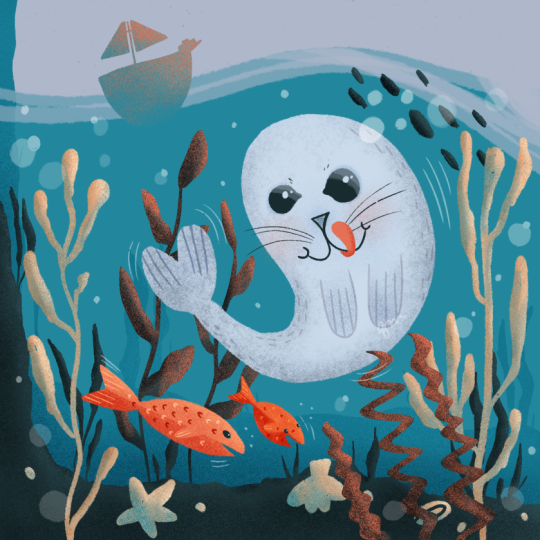
3. The Lay of The Land: Hold your breath
and get ready to dive in the underwater wonder, this next step is
all about exploring the fascinating world
beneath the surface. But first, we need to
understand the Lay of The Land or in this case, water, because the underwater landscape
follows certain rules, it's important to focus
on space and perspective. Take a closer look
at this image. You'll notice that the
elements at the bottom of the water can be separated
into three categories. Foreground, middle
ground, and background, color of each element. It's also an important indicator of its placement in space. The foreground
elements, for example, are often the most
vibrant and colorful, while elements further away from the viewer have less
contrast and more blue. Why so much blue? You ask, well, it's because the water molecules absorbs the red spectrum of the light. And all there is left to see
for us is the color blue. As you move from the viewer
point towards the foreground, you'll notice that
there is less water between you and the
elements in the foreground. This makes it easier to see the details and the
colors of these elements. Now let's move on
to the Fun part. In this step, you
will get to add some algae to our
underwater scene. Think of it as adding
some grass to a garden. Take a closer look at
this image and notice how the blades of the algae move
gracefully in the water. It's a beautiful site. Alright, enough talking. Let's dive in and start
creating our foreground seabed. Get your tools ready, and let's make this underwater
world come to life. Let's start this next step by taking a deep breath
and reminding ourselves that we are capable of creating something
truly beautiful. Now, let's begin by creating a new layer on top
of the others. This layer will be the foundation for
the foreground layer, which will bring to life with a little bit of
creativity and color. When the new layer is
created and select it, it's time to head over
the color palette and choose a dark gray color
from the top left side. This will add contrast
to the foreground layer, making it stand out in
all the right ways. The oman brush selected, we can start tracing the
contour of the seabed. Remember to Have Fun With it, will create two signs. One on the middle left side of the canvas and another a bit
lower on the right side. This will be our
guidepost as willing the two line descending in the middle to create a
beautiful concave shape. Once the top contour is traced, will fill the bottom side of the line with the color
we chose earlier. This solid color will form
the base of our seabed. The line may seem a bit
wiggly, but don't worry, this will give our
seabed Character, making it appear more
rocky and less Sandy. It's important to ensure
that we are happy with how much space it
occupies from the frame. So let's use the
move to adjust it, drag it lower so we
can make space for our Seal and the beautiful marine
vegetation will add later. We can even use the
transform option of the Move tool or the warp tool to play with
the shape of the seabed. Once we are happy
with how it looks, we can undo the
Move tool and move on to creating some
beautiful seaweed. We can pick a spot on the
right side of the seabed. Start by creating a group of
three or four grass blades. These can be wider or longer, pointing in different
directions and creating a diverse
and organic Luke. After this group of
seaweed is done, we can create a new
one on the right, starting with two small
grass blades on the bottom, and then adding a longer one. Let's make it thinner
on the bottom. So it creates some
shade diversity and has some space for a wider one
that gets outside the frame. For the third one, let's add it to the left
side and make it shorter. Now that the right
side is beautifully decorated with small and
big seaweeds shapes. It's time to move
to the left side of the canvas to
create some more. We'll keep using the
plasticity of the brush to create a fluid look of
these aquatic plants, by changing the direction, will make sure to group
these grass blades to not overcrowd the seabed. Although it may feel
like trial and error, we can let the brush create interesting looking shape
for our composition, giving a very nice and organic
look to the vegetation. Let's create a new group
of grass blades on the left side to close the
edges of the composition. As we look at the
center of the seabed, will notice that the grass is
much smaller. This is done. So there is announced
space left on the middle of the illustration
for the little Seal. Once all the grass
blades are placed, you can use the
selection tool to make a selection of the
seabed and the seagrass. This will make it easier
for you to work on these elements separately and
add more details to them. Now it's time to add some texture to the
seabed and seagrass. Grab the textured grunge brush from the brushes collection, choose the same color
of the water from the color palette to create a more natural and
realistic look, decrease the opacity to
about 30 per cent and lightly create some patches of light over the grass
and the seabed. Think of it as adding a
sprinkle of glitter on top of your artwork to
make it shine and sparkle. When adding light to the plants, be careful not to
scattered everywhere. Just place a little
bit of blue here and there to diminish the
contrast between the Shapes. Remember sometimes less is more. Let's brighten up the edge a little bit to make
it more visible. This is similar to
outlining your drawing with a black pen to make
it pop and stand out. Now that the seabed and the first layer of
vegetation are complete, it's time to move on to the next level,
the middle ground. This is where we will create even more depth and
dimension to our artwork. So let's dive in
4. Create Depth: Are you ready to
create an illustration that tells a story
and captures the eye? To achieve this, we
need to focus on consistency and rhythm
in your artwork. Is time to recreate the elements from the foreground
to the middle ground. By repeating the same elements, we can bring our story to life and capture the
viewer's attention. Let's not forget about the importance of
the middle ground. It captures the essence
of the waters colors. So we need to make it less
contrasting and more blue. By doing so, we create
a sense of depth and intrigue that will
keep the viewer engaged. Now, let's add some excitement
to the left side of our illustration by
creating a steep cliff, this element will add more dynamic to the scene and make it even more interesting to add
an extra touch of realism, we can also signal some rocks over the country of the
middle ground shape, but let's not go overboard. Keeping things simple
can help us avoid burnout and make the
process more enjoyable. So let's dive into this step. Great job on getting this far in the illustration process. In this step we will
create the middle ground, which is an essential part of the artwork that will give it depth and a gradient effect between the foreground
and the middle ground. So let's get started by adding a new layer between the
two existing layers. For this middle ground, we will use a darker nuance
of blue that we have selected from the bottom-left
side to create the illusion of rocky seabed. Make sure to select
the imam brush and trace the contour
of the rocks. Moving on to the left
side of the composition, we will create a steep hill that goes above the sea level. Let's begin from
the top-left corner with a descending line. As you descend, keep
this line above the foreground and ended on
the right side of the Canvas. Don't worry, you can hide it behind the foreground
at the end. Now it's time to
fill the shape with the same color and
bring the heel to life. Are you excited to
see the final result? We will create some
more cigarettes to add to the illustration. Just like in the previous step, make sure to create
the grass thinner at the base and
thicker in the middle. Group them by two or three and make some of them smaller
to create diversity. After the right
side group is done, let's move to the left
side of the hill, create some grass blades. You are doing an amazing job and the final result will be
worth all your effort. Keep going and don't
forget to Have Fun With the process after creating the second group of cigarettes. Let's add two or three
more to the middle. Remember to press
lighter or harder on the pen to create different
shapes and sizes. Now that a cigarettes
is almost done, Let's move on to the next step. We need to create some waves
in the middle ground to give the illusion that the
cigarettes is underwater. Don't worry, it's very
easy to create the waves. Use the automatic
selection tool to select the middle
ground than using a low opacity and the sky color trace over the
heel with a wide stripe. This will create the
effect of waves. Once you're done
tracing the waves under the selection and create
another small wave below. This will integrate the
hill and make it look like it's behind the
waves. Great job. Your middle ground
is now complete. Now it's time for the next step, yet ready to create the main shapes of the
curious and playful Seal. Keep up the great work
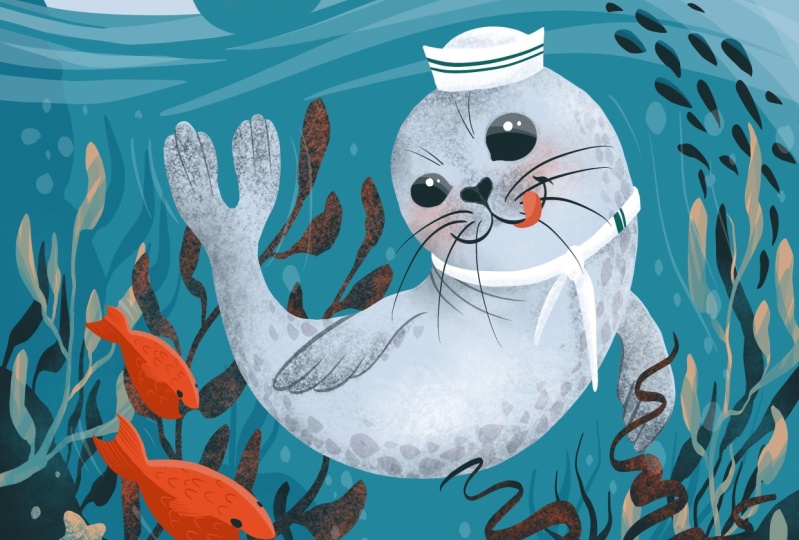
5. Contour the Seal: We're about to embark
on a journey to create the most adorable and
water service Seal. But before we dive in, let's get a glimpse of our
seals natural appearance. Seals are known for their
slick and hydrodynamic bodies, making it effortless
for them to glide through water at
breakneck speeds. Their body is shaped
like a water drop, which is further enhanced
by their smooth for acting as an insulation
against cold waters. Although they may not
be as nimble on land, they're cuteness is
definitely not compromised. They love to frolic, cuddle, and relaxed, both in
and out of water. So to capture the
playful and agile spirit of our furry friend. While keeping it simple, we'll begin by creating the
main shapes of the Seal. With this step, we can kick off our Seal sculpting journey and start making our little
water body come to life. In this step, you're
about to create the ultimate Seal shape
that will blow your mind. So let's prepare our
tools and get started. First thing first, create a
new layer above the others. This is where the magic happens. Next, let's grab the middle gray from the color palette and the ultimate inking brush
from the brushes panel. Now, let's make
sure the size and opacity of the brush
are set to the max. And start tracing a circle in the middle of
the composition. Hold that pencil down until
the shape becomes uniform, and then release it
like a true artist. After this click the Edit
Shape button from the top and press the circle button to
adjust the circles position. Drag it higher or
lower to ensure it's placed perfectly in the
middle of the Illustration. Keep a bit of space between the circle and the
waves at the top. This will make all
the difference. With this circle in place. It's time to trace the
second line of this step. This line looks like an in and young Chinese symbol,
so harmonious. But this time the
shape on the left should be a bit smaller
than the other one. Practice the shape a couple of times until you get it right. And by right, we
mean that the shape on the right should look
like a temporal shrimp. Yes, you heard it, right? Delicious them barrage ramp. It should have a round
shape on the right and the thinner tail
on the bottom-left. Congratulations, you've just created the
ultimate Seal shape. Once you've created the
slick and stylish S line, it's time to will your
eraser like a pro and get rid of the circle
from the top left side. Marvel at the transformation as the Seal begins to take
shape before your eyes, grab your brush and get ready to create some hind flippers. Trays too long, vertical ovals that extend all the way
to the end of the tail. Now that the basic
shapes are in place, it's time to add some color, filling the shapes
with your chosen hue and drag it down from
the top right corner. So satisfying. But wait, take a
moment to examine your creation and make any
necessary adjustments. Use the warp tool to modify
the shape of its head, making it bigger or moving it around until it's just right, is the shape looking
a little wonky? No problem. Just tweak it until
it's perfect. With a few simple adjustments, the main shape of your
Seal is complete. Now it's time to really
make this Seal standout. Let's move on to the most
important part, the face. Get ready to add
some personality and charm to your seals Features
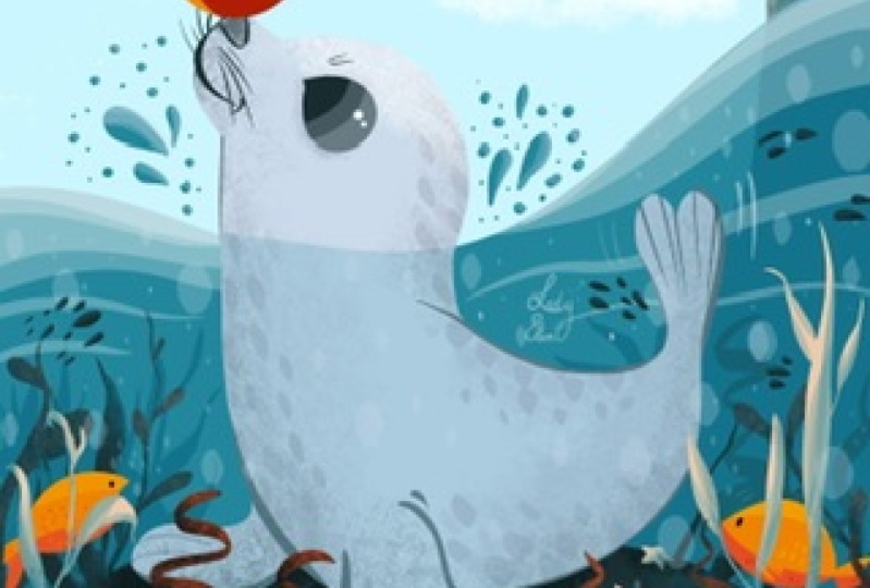
6. Create Features: Alright folks, let's prepare
to have our hearts melted by taking a gander at some
adorable Seal faces. But wait, there's more. We can also take a moment to
appreciate and understand the big 0 shapes that come together to compose their
delightful features. First up, let's
look at those two big black, glossy puppy eyes. Their roundness exudes
wonder and cuteness. And let's be real. Who wouldn't want
to replicate that? Just keep in mind
the small corner of the eye that adds a touch
of naturalness to the look. Next, let's move on to the Cute little nose
and mouth that pop out of their face than nose connects to the
mouth in a Y shape. And the mouth itself
looks like to scrumptious round funds with slick whiskers
sticking out of them. As you can probably tell, these features are
pretty easy to read and follow as they're controlled
by a clear black line. So without further ado, let's get to creating
those features and making our own Seal
inspired masterpiece. This step is going to be
a breeze and so much Fun. Let's get started by
preparing our tools. First thing first,
let's head over the layers and create a new
one on top of the others. Now, let's grab
the beautiful dark green from the top-left
side of the color palette. To really make
those features pop will be using the inking brush. Make sure the brush opacity
is cranked up to the max. And let's get to work. Start by drawing a circle right in the middle
of the phase. Once you've traced the circle, hit that circle
button from the top to get the perfect
beautiful shape. And now let's fill
it with color. But of course, our
little character won't just have one I in the
middle of their face. Let's create the second one on the left side of the first, a bit closer to the
edge of the face. Fill it with color just
like the first one. Now, let's use the selection
tool on automatic to select each eye and play around with their position until
they look just right. You can even make them bigger or smaller to give a
sense of perspective. Remember, small
adjustments can make all the difference
in the end result. Let's grab that brush again with the same eye color and correct any shapes that need a little tweaking to give the eyes
acute teardrop shape. Let's draw a V-shape in the
two coordinates of each eye. Once you're happy with ice, it's time to move on
to the nose and mouth. Start with a short line for
the left side of the nose. Then continue with a curved line that gets close to
the right side, high at the end of this curve at a perpendicular line to create
a Cute and small cheek. Trace the left side chick
with another curved line and then finish off with a curved line on the
top of the nodes. And voila, you're done tracing the features of our
little character. It was so easy and
straightforward, wasn't it? But now, let's get
ready for the Fun part. Let's give it some coercivity by finding a standard thickness, retracing the Features, making them look so uniform and nice. Now let's make that
phi Shapes smooth as butter and move on to the cheek corner to
adjust its shape. Grab the brush and create a cursive S line elongating
those mouth ends. Don't forget to check
the right side cheek to ensure the line
thickness is just right. When you zoom out, take a moment to appreciate the unitary look of the
whole mouth and nose. They are done and dusted folks. Next up, let's
play with the eyes and add some beautiful
reflections. First, use the selection
tool to select those papers. Once they are highlighted, grab the amman brush and choose a white color from the
top right of the palette. Get close to the first die, decrease the brush size. And at two small circles
on the top right side, this circles will bring
your character to life and make them
cuter than ever. Even better. Dale, show where the
light is coming from. And now repeat the
same for the left eye. After this, it
assigned to create the second type of reflection, increase the brush size, lower the opacity to
about 20 per cent, and create two
transparent washes on each as top-right side. Go over the first wash again without covering
the entire surface. And with that, the
eyes are finished. And now it's time for
some cute whiskers. You will need to
grab the color for the eyes and start increasing the brush opacity to the maximum while
decreasing the size. With this, you can create some short II whiskers
between the eyes. Two on each side of the
eye will be just perfect. Next up, let's move to the two cheeks and create
some thinner whiskers. Curtain down a little bit. Now let's move to the left
side chick and do the same, but direct the whiskers
slightly upward. This time, four or five whiskers for each cheek will be perfect. And now all that's left
to do is to create a Cute and pink
tongue for this Seal. Let's use the same brush and the pink color from
the bottom right side. Getting closer, you'll
make one more time that stream shape rehearsed
for the Seal earlier, but on a smaller scale, make the tongue look like it's coming from
underneath the cheek, from the middle of the mouth. As you can notice, this line go over the whiskers,
covering them partially. After the shape is
closed on the bottom, feel the shape with
the same color. If you feel like it, you can make the tongue a
bit thinner on the bottom. So it doesn't seem to peak. Use the eraser to make the
bottom part a bit thinner. It doesn't disturb to match
the ram look of the cheek. Okay, Now the face of
the Seal is almost done. Let's create a small
shadow on the tongue. So it seems like it
has some volume. Firstly, make a selection
of the tongue and then grab a red color from the palette following the
bottom side of the tongue. And using a lower opacity, you will create a subtle
shadow underneath. Congratulations
on coming so far. This looks awesome. Let's continue now with some beautiful textures for
this playful looking Seal
7. Sprinkle Color: It's about time we unleash
the true rainbow of colors found in this
magnificent seals. Check out this stunning
image and feast your eyes on the variety of hues that coat
this majestic creatures. You'll notice that the firm has different shades depending
on the location. For instance, around the nose, you'll see us Mitch,
of darker tones. And let's not forget
about the eyes where the firm has a touch
of depth and richness. With that being said, let's unleash our inner
artists and start getting creative with the
colors of this beautiful far. The face of our adorable
Seal is almost complete. But to make it
truly come to life, we need to add some texture to its beautiful gray for
first thing first, we need to move to the body
layer and start creating those textures behind
the seals Features. Let's begin by using the same dark color
we used before and our trusty kiwi brush to create some subtle
great textures. Think of it as
adding sprinkles to an already delicious cupcake. Now, it's time to
focus on the nose. We want to make it really pops. So go ahead and darken it up
with those gray textures. Next up, let's move to
the rest of the face. You can increase
the brush size a bit to make the process quicker, but be careful not to make it too big or you lose control. If you feel like the
dark color is making things a bit too
harsh, no worries. We can always switch
to the gray color and the bottom-right corner and
create more gentle marks. Using circular motions will create textures around
the mouth and cheeks. We want to avoid any
unwanted stripes, just like a barber carefully
trimming hair to perfection. Now let's make those
eyes stand out even more by adding
some subtle shadows. Decrease the brush size, and increase the opacity to
really make those eyes pop. Finally, let's add some blush to our playful seals cheeks. Use a textured brush and the same tongue color to create
a natural looking flush. Remember to keep the opacity low and build up the
blush gradually. And there you have it, folks. The face of our Seal is complete
and ready to move on to the next steps is like finishing a puzzle piece by piece
until it's finally complete.
8. Add Flippers: Alright, now that we've got the main blob of our
Seal sorted out, it's time to focus on creating
those adorable Flippers. To get started, we'll need
to focus on the body layer. We can keep it simple by using
some lovely oval shapes. Now, let's use the
freehand selection tool to draw two ovals
below the face. Make them nice and snug like two friends smuggled
up for a selfie. Once the ovals are in place, grab your inking Amon
brush and select a dark green from the top-left corner
of the color palette. Lower the opacity to
around 50 per cent and trace the contours
of the swimmers to create two U-shapes. Finish off each bulb with three lines to show
their Cute little toes. Now it's time to add some texture using
the textured brush, add circular motions to create
some gray fur on the paws. Make it a bit darker
on the bottom for some extra touch of realism. Then use the same
gray color to create a gradient from the bottom
to the top of the swimmers. With these textures complete, it's time to move onto the back. Swimmers using the
automatic selection option, make a new selection
of the body. Just like before. Use the inking brush to create three stripes to each
half of the back. Pause. Then use the textured brush to add a gradient
effect to the tail. Uses circular motions and a few passes until it
gets slightly darker, lower the opacity even more, and continue the texture of the Seal for a smooth
gradient effect. Finally, let's under the
selection tool and move on to the next step to create a
funky pattern for our Seal. But first let's give a round of applause for our
swimming Seal stars
9. Sprinkle Fur: Are you ready for a
Fun and fabulous step? Get ready to create the most adorable body pattern for our charming Seal Character. You'll be grinning
from ear to ear as you work your magic
onto this cutie pie. Now let's talk about
the first pattern. Sure, you can find it
all over the body. But Have you noticed that the belly is a bit
wider than the back? No worries though, because
in our illustration, we can even see the
back of our Seal. Instead, you'll be focusing
on making the sides of the Seal a bit darker than the belly when viewed
from the front. And oh my goodness, don't even get started on the sparkling
pattern on the body. It's so decorative
and eye-catching. You feel like you're
working with pure magic. That different sizes
of the specs will make the pattern feel so
organic and natural, just like the real deal. To enhance the
seals natural look will be using different
brush transparencies. This way we can bring out the best in our adorable
little friend. So what are we waiting for? Let's dive right in and get started on this exciting step. Let's kick off this
Fun Adventures step-by-step by ensuring you're on the right layer of the body. Then let's use the selection
tool to select it. Now let's grab the
perfect inking brush from the vast array of brushes and the gray color from the color palettes bottom, get ready to increase the
brush size to its maximum and start creating some
small specks of color on the outer
contour of the Seal. Think of it as sprinkling
confetti at the party. Make some bigger,
ensign smaller to add some organic
flair to the pattern. Remember the specs
should be bigger on the edge and smaller
towards the middle. Keep the distance
between the specs consistent as you move towards the lower
part of the body, create longer specs and drag them to the right to follow
the body's direction. Keep things exciting
by varying the shape. Create some big,
some small specks. Let's create a
couple of specks on the inside part of the body as well, following the contour. Once you're done
with design, specs, head to the color
palette and grab the dark color from
the top left side, reduce the brush opacity to 15 per cent and
create new specs, focusing more on the
edge of the shape. Expand the pattern a little bit on the inside part as well. Using smaller
sprinkles of color. Let's descend on
the tail and create a couple of more Cute
points on the left side of the Seal to It's important to make sure the pattern
has shaped diversity. So go over it a couple of times. If you see too many big shapes at a smaller one and vice versa. Once you're done with the tail, ensure the entire edge is beautifully decorated
with this pattern. It's time for some texture. So let's change the
brush to the Q1 and use the gray color from the bottom at first with a low opacity. Move over the edges to make the pattern look more uniform. Follow the edge of the shape
until you reach the tail. Then switch to a darker gray, gently create a
shadow like texture, and keep the texture
focused only on the edge. By lowering the brush size. Make sure you mask the light gray spaces between the specs
with this texture. And with this, the
natural pattern of the Seal is complete. Now it's time to create a lovely costume for
this adventure Seal, get ready for some more Fun.
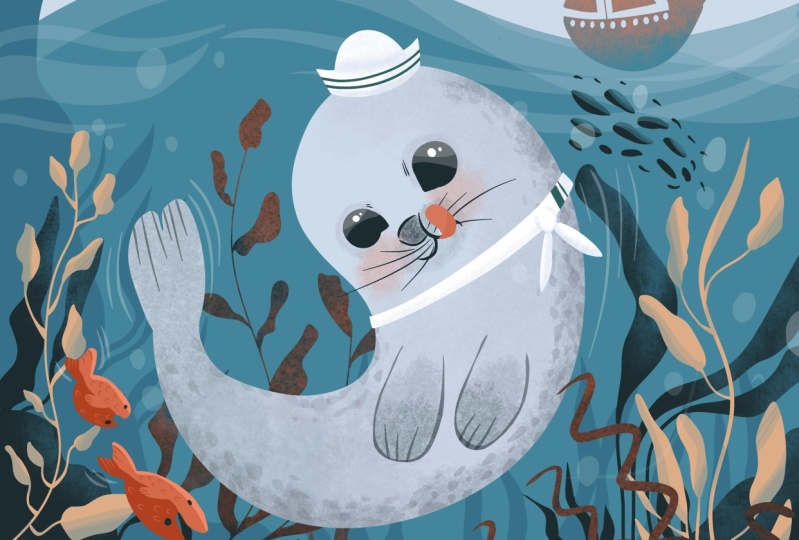
10. Design Outfit: Are you ready to accessorize
your little Seal? Let's give this
adventure spirit, a beautiful scarf, and a
nice little hat to match. First thing first, let's create a new layer on top
of the others. We don't want to mess up
our adorable Seal drawing. Now, pick up the inking
brush from the brush menu and choose white from the top right side of
the color palette. Let's start with the hat. Place it a bit decentered from the middle of the head
to give it a funky look, create the base of the head over the head as a smooth curve. Trays the two sides of
the hat like a trapeze, and then close the shape on top and fill it with
the same color. Finally, traces
semicircle on top of the trapeze and fill it
with the same color to, after admiring your work, It's time to move
on to this curve. Let's create the shape of
this curve starting with two parallel curved lines
crossing the neck of the Seal, you can make it a
bit crooked so it can have that charming
Lay in, perfect. Look. Don't rush
through this step. Take your time to make any more adjustments
over the shape. So it looks nice and smooth. And there you have it. Your little Seal is almost set. Now that we've nailed the tricky business of
tying a knot in a scarf, it's time to make some shadows. Use the selection
tool set on automatic to select both the hat
and the scarves Shapes. Then choose the kiwi brush from the brushes and the middle
gray from the color palette. Don't be afraid to play around
with the brush opacity, so you can create
the perfect shadow. And when you are ready, let's focus on the hat. Start by adding a
shadow on the top of the trapeze to get the round
shapes and definition. Then make another shadow on the bottom of the hat
where it meets the head. This will help give that
had some dimension and make it look like it's actually sitting on the top of the head. Next up, let's create a shadow underneath the hat
on the right side, following a diagonal direction. It's like we're bringing
our design to life. Then move them to the scarf and shape the two
ends of the nut. Follow that up by
shadowing the right and the left side of the scarf
where it goes behind the body. And of course, let's
not forget about countering the nuts shape
and adding texture. Last but not least, cast a shadow on the two ends
of the scarf and climb up to the right and
the left side of the circle with the same shadow. There you have it folks, a tiny masterpiece that's sure to make your grandma proud. Once you've tied the knot in your scarf and made
a circle shape, it's time to get creative. Grab your inking brush and some dark green paint
from the top-left side. We are about to make some
serious design lines. First, trace two stripes on
the right side of the scarf. Make one thick and
the other one thin. Now let's move on to the
hat across the trapeze, create two parallel stripes. Looking good. With this design lines, your costume is
officially ready. The Seal, it's prepped and ready for its
Channing adventure. But wait, there's more. Let's dive into the details
of the sea floor next
11. Aquascape: Now that we've
finished the Seal, it's time to step
of our game and work on the habitats
surrounding it. And let me tell you, the vegetation in the sea
is quite a sight to see. The colors are popping and we'll catch your attention in no time. As you feast your
eyes on the scene, you'll see an array of pinks and oranges that complement
the blue water. It's like a rainbow exploded underwater and we are here
to bring it altogether. We are going to use
these warm colors to create a composition that
will blow your mind. But wait, there's more, there's one element that brings everything together
and that's the light. Yes, you heard me, right? The light plays a crucial role
in shaping the landscape. The direction from
which the light comes will help us contour the interesting parts of the habitat and hide
the ones we don't need. For the bottom of the sea, we are going to add some tiny creatures to
make it more lively. These little guys will not only add complexity to
the Illustration, but they also
create diversity in shape and an extra
level of detail. Don't worry, they
are easy to create, so let's get started
and have some Fun. Welcome to the
exciting next step of your illustration journey. Now, it's time to add some styling
foreground vegetation to bring your
composition to life. First, let's make sure the
Seal layers are all in one place so we can make
space for the new vegetation. Merge those layers down
and yet ready to create a new layer for the vegetation
and grab the inking brush. Pick up a middle bash color
from the palette and increase the brush size to maximum
for some beautiful Shapes. Think of the algae in the bag and start giving shape to an elegantly flowing planned with a wiggly vertical structure. Add leaves with long and
thin petioles on both sides, just like the
branches of a tree, divide the plant and send small leaves in
different directions. Get creative with the shapes
and sizes of the leaves. Don't worry about control. The beauty of this process
is that you can always undo and try again or embrace
the weird organic look. Move higher on the stem
to add smaller blades. And remember that the purpose of this vegetation is to be
decorative, not accurate. So let your
imagination run wild. Ones. The first
plant is complete. Move to the left side
of the composition and start a new plant by
drawing the main stem. Play with different sized
leaves on both sides of the stem and make some
blades larger at the bottom. Don't forget to add
some shape variety by making some of the blades
smaller than the others. Let your creativity flow
and Have Fun bringing your illustration
to life with some beautiful for ground vegetation. And now with the two standing
plans flanking the Seal, it's time to add some exciting
crawlers to the bottom of the sea Using the same
vibrant color scheme. Let's start on the bottom-left
with a small C-star. Think of it as a little
starfish superhero. Make its arms round and round to give it
that adorable look. After completing the outline, feel the shape with the
same beautiful hue. Moving closer to
the bottom middle, let's create a small seashell, starting with the trapezoid
shape for its hinge, and then continuing with the shape that
looks like a glove. Now, let's head over the right side and finish
up with a tiny snail, create a horizontal oval and fill it with
that striking color. Then grab your eraser and add a simple spiral
in the middle. With our three sea
bottom friends placed. It's time to add some pebbles. Grab your brush and add some shape variety
here and there. This will help harmonize
with the shapes of the creatures and add some more excitement to
our underwater world. And now our algae and
sea creatures are done. It's time to move onto
the next step and blend them perfectly into
our marine atmosphere.
12. Create Unity: Are you ready to make these allergies pop
and rock in the sea? Let's get started. First thing first,
we need to make sure these allergies blend perfectly
with the oceans blue hue. Head on over to the color
palette and pick out a light blue shade from
the bottom of the options. Next, select the hormone
brush from the toolbox, adjust the opacity to
arrange of 2025 per cent, go to the layers and set
the alpha lock for the pink LG's to keep them separate from the rest
of the Illustration. Apply the blue color
to the allergies, but don't forget to keep some of the fabulous pink on top of
the blades for contrast, don't sweat the small stuff. Just let your creativity flow. Be sure to leave
some clean spots on top of the shapes
to make them pop. As you work your
way down the plant, feel free to apply
multiple layers of blue to create a more colorful
and vibrant seascape. Let's make this
painting pop some vibrant colors and
lively strokes. First, let's get closer to ensure a smooth
transition of colors. Apply multiple layers
of blue to create a mesmerizing gradient
that will catch the eye. Moving on to the
left side will add some light blue strokes
over the algae, living a hint of pink on
the top of the blades. This blue hue acts
like a shadow, providing Depth to the plant and adding some organic
charm to the artwork. Once both plants are complete, now let's welcome some
marine life into the scene. For these creatures will use a textured Kivy brush to give them a unique touch
compared to the plants. Increase the brushes opacity
to around 80 per cent. And first up, let's create those shadow sides by tracing
the bottom of the Shapes. Keeps some of that pink
picking through on top to really make
those shadows pop. Let's add some more
blue hue on the bottom and maybe even a darker
shade for some extra. This technique is
a piece of cake, but the result is
out of this world, your Shapes will blend in seamlessly with the rest
of your illustration. That's it folks, with nailed it, our layer is complete. Now let's dive in and add some more lush vegetation to really bring
our Seal to life.
13. Diversify: In this step, we're gonna
make that Seal look like it's living it's best life
surrounded by some greenery. So let's get started by
adding some plants around the Seal on both the
front and the back sides. First things first, hat
over the layers and select the foreground layer
that's just below the Seal. Now for the allergies, we want to use a
dark green color that you can find on
the top-left corner. And to help you create
those organic shapes, will be using the
inking almost brush. Now it's time to start tracing the main stem of the algae. We want it to be curvy just like those Cute little stems
on the left side. Let's raise another stem on the right side
of the first one, following the same wavy shape. Good. Now we move on to the blades, start from the bottom of the stem and make
some diagonal cuts Using the plasticity
of the line to get different organic shapes. Think of it like
giving the algae a little haircut to
make it look its best. Keep it up. And
pretty soon that Seal is gonna look like is
the king of the jungle. Let's continue with these
blades on the top side, switching from
left to right with some big and beautiful Shapes. Think of it like a dance
routine, but with plants. Now it's time to add
another type of plant. Let's select from the layers, the top one for more diversity. To make it interesting, let's create some wiggly lines that descend to the bottom. Think of it like a roller
coaster for your eyes and make these lines thinner on the top
and thicker on the bottom, like a fancy party hat. You can direct them
in different ways to obtain a circular
shape for the plant. And don't forget to hide that
little snail in the back of the wiggly lines is like a Fun little game
of hide and seek. Layering different shapes adds more atmosphere and
depth to your artwork. Now it's time to sprinkle a little bit of color
over there Shapes. Use the selection tool on automatic to select the
shape of the plant. Then pick up the
texture brush from the brushes and the pink color
from the top right side. Let's decrease the opacity
of the brush to run 35 and sprinkle over
the tips of the plants. Some of this pink color is like giving the blend
a little bit of blush. After this, it's time to create some textures over the algaes. Let's select from the layers, the one from the top, and get to work. Once again, let's will the
selection tool and make a selection of the
majestic plant to blend it in with
the background, we'll need to use
the blue color. Now, let's get closer
to the shape of the plant to tone
down the contrast, but still retain some texture. Once that is done, it's time to add some
contrast by painting the plant with that
dazzling ping from earlier. Remember, we want to focus on the top of the plant and
the top of the blades. Don't go overboard and cover the entire surface of the shape. We want to keep some of that lovely color
from underneath. And now let's use an even more intense pink to highlight the top
end of the plant, just like we did
for the other one. And now take a gander at
how gorgeous it all looks together is like a symphony of colors dancing before your eyes. At the end, you can
sprinkle even more of this pink textures on
the top of the boat. This pink is like a magic fairy dust that
brings everything together. So let's move on to
the first layer, the one from the bottom. Use the automatic tool
to make a selection of the boat and then
grabbing the brush, Let's get closer to the
top of the boat and create a light pink
textures over the shape. It's like painting with clouds, so soft and delicate. Just like you did
for the plants. Give the boat some extra color. Make it stand out. Now, let's undo the selection
made and the step is done. You did amazing look at how many beautiful nuances
of pink and blue are. Here is like a
cotton candy dream mixed with a seaside paradise. By sprinkling the pink on different areas of
the composition, you can create Unity
between different elements. It's like the pink is the glue that holds everything together. This helps a lot when you
want to create shape variety, and still keep a clean and less agitated look
for a composition
14. Befriend the Fishes: When it comes to creating an
engaging underwater scene, the fish are crucial detail. And let's be honest, Watson, underwater scene without
some flesh and fish. To really make it pop, let add some bright
orange herrings. Now, I know what
you're thinking. Why herrings? Of course, you can choose
any fish you want. But let's stick
with one color for all to keep it simple and Fun. Varying the size of the
fish will add depth and make the whole thing
look more harmonious. And don't worry, adding these
little guys is very easy. Placing them in the lower
corner of the Illustration will create a sense of dialogue between the
different elements, making it all feel more
dynamic and playful. Trust me, this fish are going to be the
life of the party. To begin this step, we will need to create a new
layer on top of the others. Just like a chef adding
layers to a delicious cake, we will add our own
layers of color and texture to bring
our fish to life. Once you've selected
the oman brush and the bright pink color, it's time to trace the
middle line of our fish. Think of it as drawing the backbone of our
little aquatic friend. Now comes the Fun part. Let's add some curves to
the sides of power fish. Just like shaping
an NFL football. Once you fill the
shape with color, it's time to create. The tail will start with a
line that splits into two. And now add those same two
curved lines to each side. To add some personality
to our little friend, we can give it a
big smiling mouth. Use the eraser tool to create a V-shape inside the
face of the fish. Don't forget to round off the corners of the mouth so
it doesn't look too sharp. Tidy up the a inside
of the mouth by erasing any stray bits of color. Now it's signed to
add some texture to our fish by creating
a fish pattern. First, we need to make a
selection of the fish on automatic Using the
same Oman brush and the intense nuance of
red from the left side will cover the bottom half
of the fish with this color. Next, let's get closer
to the top half of the fish and make the brush a bit smaller to
have more control. We'll create some
reversed U-shapes here and there of
about the same size. After a couple of these
beautiful fish scales will grab the same color from the top of it and
use it to conjure the fin of the fish
over the dark color. And after this, we'll fill the
shape with the same color. Let's make it a bit bigger
on the bottom side. And then grabbing the dark
color from the bottom, trace some thin lines to
the end of the shape. Moving on, let's grab
back the light color from the top and add some more scales on the
dark side of the fish, keeping them nicely
distance from one another. The tail will have
on its and some of those thin lines following
the direction of the fish. We'll do the same for both
sides of the tail fin. To finish up the
shape of the fish, let's add a little bit of
light over the top side of it. Will use the light pink
from the bottom to create a thin line of light over the tail and the
body of the fish. And now we will
continue by adding too dark colored eyes to help the little
fish navigate better. Will pick the dark color from
the top left side and Using the oman brush create on the top of the fish a smaller eye. That's the one from the back. And now the one from
the front side make it bigger and more
round than the first. And now the first
fish is done and it's time to create a friendly
school around it. Let's create two
more adorable Fishes to join our underwater scene. But first, we need to
make sure that contour, the Seal doesn't
overlap with the fish. Let's use the Move tool to
drag the fish down a bit. Now, let's get started
with duplicating our fish. Click on the selection
tool at the top, and then hit the Copy and
Paste button from the bottom. Awesome. Now we have a new
fish, but it's overlapping. The first one. No worries. Let's use the Move
tool to reposition it. We can drag it up to the top of the first page and
make it smaller, maybe even half of the sides. Once you've found
a spot you like, Let's use the warp tool to give are near fish a unique shape. You can play around with it, make the backside shorter
and rounder than the front or give it any shape you
want as long as it's Cute. After the second page has found is placed in the
back of the first, let's add one more. So let's use the selection
tool again and get started. Simply click the Copy and
Paste button from the bottom of the panel to duplicate
the second fish. Next up, let's use
the Move tool to drag the new fish to
the front of the group, will tilted upwards to give the school a
more rounded look. Don't forget to make
it a bit smaller, about half the size
of the second fish. This will add some variety
and make our school look more balanced with fish of all ages swimming together. Now it's time to add some
personality to our new fish. Use the warp tool
to curve its belly down and flatten the top side, giving it the look
of a little boat. Move it up a bit so it's right
in front of the big fish. And now our school
of fish is complete. Take a moment to admire their beautiful
colors and shapes. Making the whole
illustration come alive with Fun and energy. But wait, there's
one last step to make our artwork even better. So let's jump into
the next step.
15. Air Out: Get ready to add some magic to your underwater illustration. We will create some
beautiful underwater waves that suggests that movement
of your characters. These waves will make your
illustration come alive and make you feel like you're
diving right into the scene. Now, let's talk bubbles. Bubbles are the heart of
any underwater scene. Together with the blue
hue of the water, they are essential to
suggest the breathing life from below the water
is like a symphony, and the bubbles are
the melody that makes everything
harmonized together. Let's be honest. Who doesn't love bubbles? They are Fun, playful, and very easy to make. So let's end this
illustration with this very easy and
satisfying step. Get your creativity
flowing and add some bubbles of all
shapes and sizes. Make them big and small, fast and slow, and put
them all around the scene. So don't be afraid to let loose and have some
Fun With this step. So let's first head
to the layers and create a new one right
on top of the others. We don't want to mess up any of the hard work we've
already done right? Now, let's reach
for the white color from the top right
side of the palette. Now make sure you've selected the oman brush from the brushes. It's finally time to
create some ripples. Start on the right
side of the Seal with three lines moving outward. Think of it like skipping
stones across the pond. Once those lines are in place, it's time to lower the
transparency of the layer. To do that, simply click
with two fingers on the layer and slide your
finger to the left side, drop the opacity to about 17%. Now you are ready to
create even more ripples around the Seal to really
showcase that movement. Now onto the Seal, we want this
majestic creature to look like it's
swimming effortlessly. To achieve this, we'll add some delicate lines
to the back fin, really bringing it to life. Now we are going to add some
lines around the tails of the Fishes to really make them look like they are gliding
through the water. Let's zoom in and check out
those little Fishes up-close. And let's not forget
about those bubbles. They are a vital part of
our underwater world. Will make them beautiful,
round and plentiful. Don't forget, there's plenty
of air down here too. We want to make sure
that's represented. So we'll create
some air bubbles. This transparent beauties
are easy to make, will make sub the sizes to
keep things interesting, Let's sprinkle them
around the edge of the canvas where there's
a little less action. They'll look amazing next
to those background plants. And now we can forget
about our star, the Seal. Let's create a couple of
bubbles around its shape, really integrating
it into the water. Lastly, we are going to head to the top-left corner and add some small bubbles
over the darker blue. This was the cherry
on top, folks. With just a few bubbles. We've taken our composition
from blend to breathtaking. Now, get ready to create
a school of Fishes in the distance to add even more
depth to your masterpiece. First, let's move on to the foreground layer and
remove the whole fall. Ok. We don't want any pesky
restrictions holding us back. Now grab your brush and a dark color from
the top-left side. And let's start tracing some small Fishes on the
top right side of the Seal. Begin with some larger ones on the top-left side and continue to add smaller Fishes
down the school. This will give the school and natural and cursive appearance. Once you've created the school, zoom-out and add a
couple more Fishes on the outside to create an
even more interesting shape. To decrease the
contrast and make the larger Fishes similar
reflective to light. Cast a little bit of light
on the top side of them. Use the selection tool on automatic to select the bigger
Fishes from the school. Then grab your brush and select the blue color from the
bottom of the palette. Now, decrease the opacity and Castile little bit of light
over the top of the Fishes. You can even create multiple passes to
intensify the light. Once you're happy
with the result. Under the selection and bask in the glory of your
completed Illustration. Congratulations on creating such a dynamic and
beautiful piece of Art. It's been a blast to have you in the class and be part
of our community. Hopefully, you had
as much Fun and can't wait to see
what you create next.
 Cristina Handrea