Transcripts
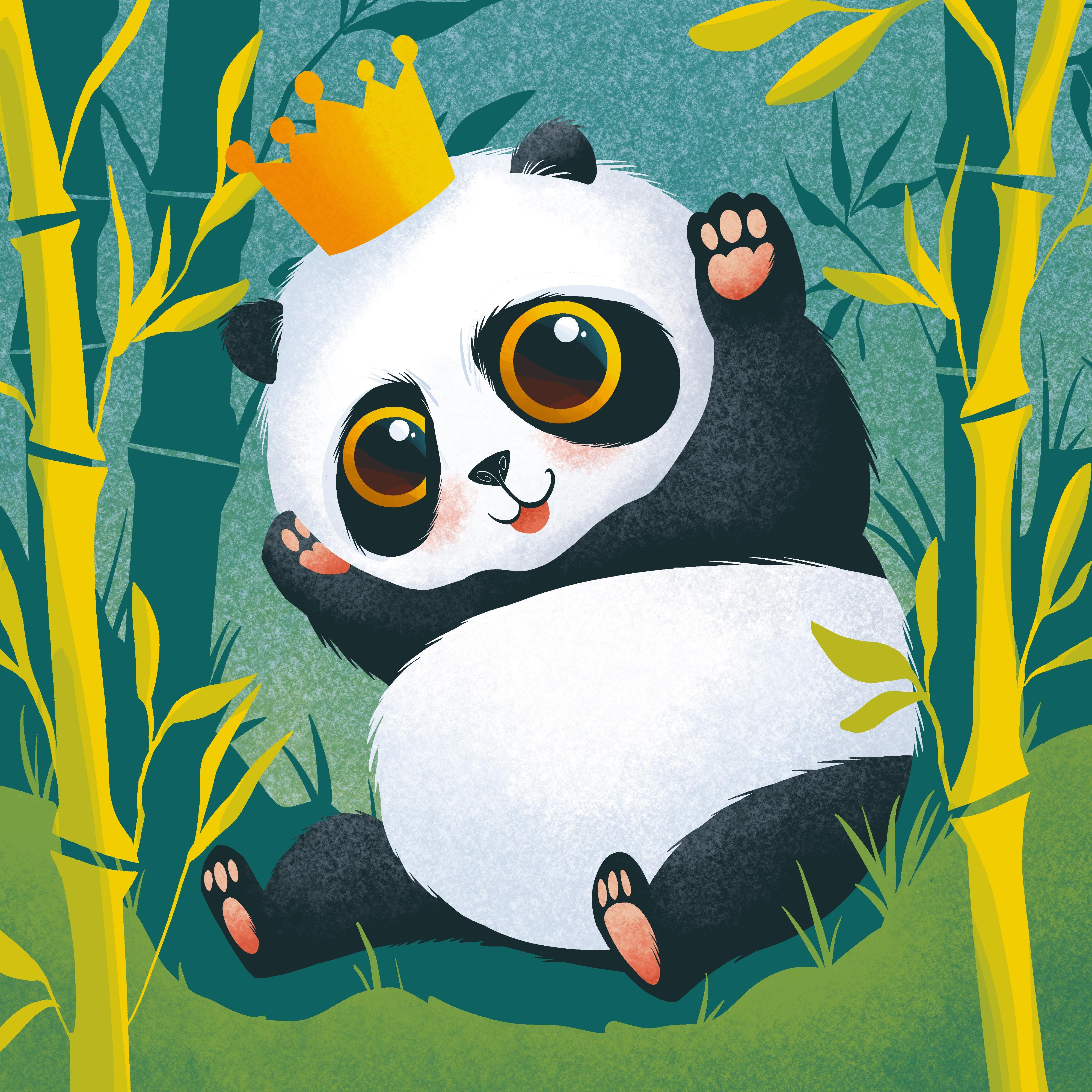
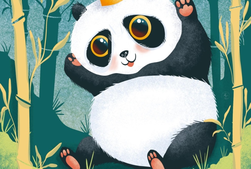
1. Welcome to the Class!: If you like animals and
digital illustration, this class will be
perfect for you. You will learn to describe the curious features of
your favorite animal. This time you will practice your illustration skills
on a chubby baby panda. Not only that but you will
understand how to create its environment and decorate the composition with
organic-looking shapes. The class will challenge
your creativity as well, encouraging you to create many more cute illustrations
after this one. It is great for beginners
because it includes visual explanations and
step-by-step instructions. Hi. My name is Christine and welcome to a new
Procreate illustration class. After finishing a bachelors and masters degree in fine arts, I've discovered how
fulfilling it is to teach creative skills and art. We will have a lot
of fun together. All you need is your iPad, the Procreate app, and the Apple Pencil. From shapes to refinements
and heartwarming details, you will go through
the whole process of creating a cute character. The class is structured
to guide you and show you how easy it is to create
a colorful artwork. Before you start, make sure
to check the resource page on your browser to download the two brushes
and other goodies. Leaving a review is very
helpful for all classes. Do tell how you feel
about this one. If you are ready, let's get into the class.
2. Introduction: Before we start, there is a whole culture revolving the lovable
appearance of things. You don't need to be a
child to enjoy the sight or once a cuddle a fluffy
plush of a cute chubby bear. It's a feeling of
care and nurture that is very strong
related with our core needs and makes you
feel good and peaceful. Cute things are
not just for kids. They help our busy minds relax and let go to any
tension feelings. As an illustrator, naturally you will want
to feel the enjoyment of creating cute characters
and express through shapes and colors the qualities
you like and want to share. You can choose almost
any describable object and transform it into a version that melts your heart
and suits your mind. The recipe for creating a cute
character is quite simple and I'm sure you already have in mind a couple of
the ingredients. The most important ones might
be the shape, proportions, and color but
throughout the class there will be other ideas or notions that may
not be that obvious. These ideas will
help you develop more flexibility when it comes
to your creative process. Before starting
your illustration, make sure you have
checked the resource page and downloaded all the
materials you need. There will be plenty
of other references and final illustration, you will also get two free
brushes used in the class and the color palette. Additionally, you
can use the pdf as an alternative support
of the class that contains the main
ideas and concepts. After you have finished
your illustration, make sure you share it on the
project page of this class together with any questions or anything else
you want to tell. At the end you can leave
a review as it is very important to know your
opinion on the class. Now let's begin this
wonderful adventure.
3. Background Environment: [MUSIC] You will begin
this lovely adventure by going on the plus button
from your Procreate app. After pressing the plus button, let's create a new canvas. This canvas should have 4,000 by 4,000 pixels which will
give you 12 layers. This will be more than enough for this
sweet illustration. After you've made
your square canvas, let's press the Create button. Lovely. Now that the
canvas is ready. It is time to meet the color
palette and the brushes. Before starting,
make sure you go on the resource page and download the color palette
and the brushes. Looking at the color palette, the coffee time color palette, you may notice that there are a lot of colors. Do not worry. You will get step by step instructions on when
and how to use them. For the brushes you
will need just two, a texture one that
is called kiwi and will be used for creating
color transitions. The other one is an inking
brush called almond and is mainly used to describe shapes that are later
filled with color. You will get step by
step instructions on when and how to use them so
make sure you have them. Of course, you can use
your own brushes that you feel comfortable
using but make sure you pick one for
clean counters and another texture one
for light and shadows. Now let's slowly begin with
a very easy first step. The first thing you
will do is to change the color of the background
into a gray one. Let's select the
background layer. Now that the panel with
the color palette is open, you will pick the
middle grade from right here to lower
the contrast. After the gray color is set
as the background color, you will create on the first
layer of the illustration, a gradient, nothing too hard. You will start with
a dark green from the top left side and you
will use the kiwi brush. Make sure it's selected. Before anything else
you will want to make sure that the opacity
of the brush is at a lower percent so you
can build the texture slowly and not create
an uneven gradient. Firstly, you will apply
this color very gently. Make sure that the
texture is applied evenly and then you can
apply one more layer. As you can see using
a low pressure, you can avoid creating a
contrast that is too strong. Later you will be able to come back and apply a couple
of more passes of color but for now let's continue with this yellow color
from the top right side. Apply this yellow on
the bottom side and use soft and organic
circular motions to soften the cold atmosphere. This yellow will beautifully
contrasts with the color of the forest in which a our cute
character will later play. Talking about the forest, did you know that the bamboo is actually just a very tall grass? [LAUGHTER] Let's look
at this bamboo forest and add the way this shaped. This will help you
understand the main lines you should follow when
establishing the composition. As you can see, the bamboo
trees are very tall and vertical and the branches are very thin compared
with the main trunk. As you can see, the slender
branches always grow from where the segments meet
and their shape can vary. You can use the
plasticity of the line to create interesting and
free flowing branches. The width of the trunk does not vary too much from one trunk to another so you can simply
stick to one size for all. It is very easy to identify it's very peculiar attributes. This stamp is straight
and vertical and it's composed by some segments
that are equal in length. These segments probably allow
the bamboo to grow very tall and still be resistant
at the same time. Looking at the leaves, you may notice that
they are grouped in a couple of them and
the number can vary. Their shape is long
and with pointy tips and their counter is
nice and continuous. As for the little branches, you can use the plasticity
of the brush to create from one single
stroke the leaves. Regarding the color, it can vary from a cold, bluish green, to a bright and healthy
yellow so you can play in this color range when choosing the color
of your bamboo. As you can see on these
bamboo tree trunks, all of them are lighted from
the same point and angle because in this case the natural light is coming
from the top right side. By giving your composition
and source of light, you can help the shapes
be more expressive and suggestive and give
them a sense of volume. This effect will be very
easy to suggest using some simple tools like the brush transparency
and the selection tool. Of course, you will want to give the composition a sense of gravity and stability so you will create some
ground as well. Looking at the ground
of this bamboo forest, it is very pleasing to see how
wild and organic it looks. It is not formed just
by a straight line. It has a small details like
lethal plants and stones. To better frame the composition, you will want to suggest the same way of
displaying the ground, raising its level in the sites and decreasing
it in the middle. This in combination
with layering, will offer a great base for the bottom of
the composition. This bamboo forest
will not only create a very peaceful ambiance
for the character but will give an organic feeling
to it by playing with the plasticity of the
inking almond brush. Now that you know
what is needed to start designing
the bamboo forest, you can go to the
layers and create a new one on top of the
one of the gradient. On this layer, you will
create the flat shape of the trees that will
build the ambiance. On the lower side, you will counter
the ground level of the forest with a little
valley in the middle. Now let's make sure the darkest green from the
top left side is selected. From the brushes, you will
pick the almond brush so you can create a smooth
counter of the shapes. For this step, it is
essential to make sure the opacity of the
brush is at maximum. Now you will notice how the
level of the ground changes two times in order to create that little valley
in the middle. After that makes sure the
direction of the bamboo is vertical and you create
two separate sides, one on the left and the
other one on the right side. Now you can begin from the
left side of the canvas with a continuous wobbly
line that crosses the canvas creating that
small valley in the middle. At the end, close the line on the right side of the canvas. After this wobbly
line is traced, you can grab the color from
the top right corner and drag it underneath the line in
order to fill the space. At this point, you
can use the eraser to sculpt inside the contour,
interesting rock shapes. Keep in mind that this
line should look organic. Now under the ground
level is finished, it's time to create
a bamboo trees. Two for each side
will fill the space nicely while creating a
little bit of shelter. For each tree, you
will need to trace two straight parallel lines directed to the
top of the canvas. Make sure you close the shape
of the tree on the edge of the canvas so you can then drop the color between the two lines. Let's add one more tree
on the right side, closing its shape with the
right edge of the canvas. After these two trees, it's time for the left side. Let's create a line directed
to the top side and hold the pencil down until the line created
becomes straight. After tracing the
two parallel lines, you can feel the shape and give structure to the last
sheet from the left side. As you may notice, the position of the
trees looks organic as the distance from between them vary and their
direction as well. This rule can be used
in many cases when wanting to create an
organic look for something, whether it's a pattern, a landscape or
even abstract art. Now it is the time to enhance even more organic
feeling of the forest. Placing some short grass
blades at the base of the trees will not
only mask the angle created between the ground
and the tree but will make the space feel more
alive and enjoyable. The small grass creates
as well more verticality for the ground level thus creating shape and
direction variety. Take your time to find the right spot for your
small grasp plates. They don't have to
look too complicated. Imagine drawing some
small whiskers. After scattering a couple of more grass blades around
the ground level, it is time to develop some more on the shape of the trees. As you can remember
from the pictures, the bamboo has from
place to place some small bumps that signal the segments
of the bamboo tree. Let's get closer and
create for each of these lovely bamboo
trees some small bumps, making sure you place
one on each side. Again, this doesn't need to be something to exact or fancy. These details add up and complete the big
picture at the end. Let's continue on the left
side with these little bumps, making sure you
don't miss any side. After the little bumps are done, it is time to trace those
small segments that create that emblematic
bamboo tree look. For that, you will need to use the eraser to create across the tree trunks
these lines that cut in half the bumps
created previously. Again, nothing too complicated. These lines don't even need
to be perfectly parallel. You can vary their direction to give them a
more organic look. Now it's time to
create some small, cute branches and a couple of leaves to complete the
look of the forest. For that let's once more
grab the almond brush. Living from near the place where the segments are created, you will trace some short
weekly lines upward. Remember, these branches are
not like usual branches. They are much thinner, just like some grass straws. At the end of the lines, you will use the
plasticity of the line to shape some thin
and sharp leaves, creating each of
them individually. Now let's move higher to
create the next thin branch, leaving from the next
segment of the tree. As you can see, these leaves look rather sharp and pointy and
keeping them grouped, we'll create a beautiful play between empty and full space. When creating the leaves, remember to lightly press when grading the
petiole and then press a bit harder to expand the line and create the
wide side of the leaf. If you find difficulties in using the brush in this manner, you can decrease the size
of the brush and create the contour of the leaf and
then fill it with color. Two or three branches for each tree will be
enough to create a little bit of shelter but you can add as many
leaves as you want. As shown in the photos, the foliage of the
bamboo tree is much more dense on the top side where
there is much more light. After the right side
trees are done, don't forget the one
from the left side. Repeat the process having small branches and
pointy leaves. These random looking leaves have the composition look
weightless tensioned. This tension can sometimes appear because of
the rigid shapes. In this case, the rigid shapes are the tree trunks
and the ground level. Expanding the green color
of the layer by placing smaller details like
leaves and grass and little stones
help you reduce that undesired
tension and create a much more organic looking
frame for your illustration. But this must be done
with measure as well to avoid over scattering
small details. You must let some places
breathe, so to speak. Let's now move on and create the main shapes of
the prince panda. When illustrating an
environment for your character, you must learn about this
natural environment. It is better to place it in the least hostile
frame possible. Surround your character with elements that are meaningful. In this case, the prince
panda is not only represented in its
natural habitat, but at the same time, it's surrounded by
its favorite food. This step is a great opportunity to play with multiple types of shapes and surfaces to create a complete frame in which you
can place your character.
4. Main Shapes: Most of our subjects
are composed of multiple shapes of different
sizes and proportions. When grading your subject, it is very useful to firstly name all the elements
you want to depict and frame them into simple
shapes like circles or ovals. When it comes to the
main shapes of the body, you will want to figure
out the big shape. In this case, the body of the panda bear fits
in a beanbag shape. Its fluffy fur smooths out any hard angles and its overall position
is a relaxed one. These bears look very laid back and happy to snack
on some bamboo. Because of the color pattern, it is very easy to read
the secondary shapes. The white-colored head and the body are the two
secondary shades. Then following the black, you can identify the two
front legs and the back legs. Keep the shapes simple and round to get in the mood
of the character. When making research
for your subject, it can be very useful to search for suggestive
reference photos. In this image, you
can take as example multiple features
of this panda cub, like the extended hands and the significantly
smaller size of the body in comparison
with the head. Of course, these animals
usually walk on four, but when it comes to eating, they love to sit
just like we do. It's a nice and relaxed
position in which you can capture them
into your illustration. When it comes to shape, there are a couple of
conclusions you can make about how to
make them look cute. Usually round shapes and curved lines are identified
with cute traits. Keeping shapes simple is
essential for creating a very cute character that gives a very soothing and
calming feeling. Find the position and
the relation between the elements and identify the big shape they
describe together. When it comes to sharp elements, meaning they create one or
multiple pointy angles, give them a nice and curvy look so they seem less threatening. Now let's get back to
the illustration to create the main shape
of the little panda. In this step, you will create the big shapes of
the little panda, which will be placed
in the middle of the composition
sitting in the grass. To create these simple
geometrical shapes of the body, you will need to create a new layer on top
of the forest layer. To create the shapes,
you'll use the white from the top side and make
sure the almond brush is selected from the brushes, and the opacity is at maximum, and the size is above half. Now let's create an oval shape around the top half
of the canvas. As you can see, this oval
shape is rather round, so don't make it too
extended horizontally. After tracing the whole oval, hold the pencil down until
the shape becomes smooth. After this, you
can fill the shape with the same color
from the corner. At this point, you can
press the Move tool from the top and setting
it on uniform. You can make it smaller and
tilt it to the left side. Use the green button
from the top to change the inclination of
the oval shape. Make sure the shape
of the head is placed in the top
half of the canvas. After you are pleased
with the position, it's time to create the
second shape of the body. For that, you will firstly
undo the Move tool. Now, going to the layers, you will want to duplicate
the layer of the head. Do that by dragging to the left of the layer and press
the "Duplicate" button. After the second
layer is created, you can use once more
the Move tool on uniform to move this shape underneath the one of the head. Now you will want to place this shape more horizontally and make it bigger until it
overlaps the shape of the head. After you are pleased with
the position of the shape, you can undo the Move tool. Now it is time to change
the color of the body so it can be different
from the one of the head. Let's choose from the
color palette the dark green from
the top left side, drag the color inside the
white shape of the body. After this is done, it is time to create
the shape for the two beautiful arms and the two legs that will be placed on the same
layer with the body. For that, let's get closer
and create on each side of the head two lines that reach almost the
half of the head. Because the two arms
will be raised, the face will beautifully show
up between the two hands. Let's create the inside
part of the hand now. For that, you will need
to go over the contour of the face and cover
it a little bit. At the end, you can
close the shape of the arm with the
small oval shape. Don't make it too extended, as the little paws should
look rather small and chubby. Now let's move to
the left side and close the shape of
the left hand with a simple curved shape
on top and then continue with a line along
the shape of the face. After filling this shape
as well with color, you can use the eraser. But don't go too much
into refinements as this step is focused towards establishing the main shapes. Now the two little
hands are done and it's time to create the
shape for the two legs. Let's start with a
beautiful bean shape on the bottom left
side of the body. You will firstly
create a curved line on top to signal the
knee of the bear, and then you can continue
the shape on the bottom, linking it with the body
with a very cursive line. As you can notice, the leg
still misses the foot, but this shape will
be later placed. Let's now approach the right
side of the bear and expand the round shape of the body in order to increase its stability. This way the bear
will look extra comfortable sitting
in the lovely forest. Now that these shapes are done, it is time to color the belly of the panda bear with white. For that, you will need to use the selection tool and make a selection of the body shape. Now going to the color palette, you'll pick once more the
white from the top right side. Using this white,
you will create a long line that continues
the curve of the belly. This line crosses the body
and goes to the back. After this line is done, you will move to the bottom
right side and create, as for the knee from the left, a curve that goes towards
the bottom middle. Don't close this
shape on the contour. Now to complete the round
shape of the belly, you will need to link
the end of the line with the round contour of the
belly from the left side. At the end, you can
grab the color from the corner and fill the shape
of the belly with white. Take your time to create
any more refinements or adjustments over the
white shape of the belly. After this is done, you can undo the selection
made of the body. At this point, you
can notice that almost all the main
shapes are described. Now let's take a little break
from creating new shapes. Still refine some of the
one already existing. You will need to grab the eraser and getting closer to the head, you will start sculpting
inside the shape of the arms, the one of the head. Let's move right
in-between the hand and sculpt inside the black
part a small chin. Make this chin a little bit more elongated on the left side. Let's bring down the size
of the brush in order to have more control over
the line we are tracing. Now you will link the shape of the cheek with the
one of the chin. You can now move to the
left side and continue the small contour of the chin with the left side of the cheek. As you can notice, because the shape of the hand had covered the one of the head, there is plenty of
color inside which you can sculpt and there
is no background showing. At the end, make sure
that the bottom of the head has a beautiful shape. If you've accidentally took
too much of the shape, you can always select
once more the color and add it back in
the necessary places. It seems like the right side of the right arm could be
a little more white. So it can better
continue the shape of the body so let's make
it a tiny bit bigger. Now let's finish this
beautiful step by creating the two feet
of the panda bear. So let's move to the bottom
right side and create a small vertical oval that overlaps the white belly
and the end of the leg. After filling with color, you'll go back to the
bottom side and link the end of the leg with the contour of the
body on the back. At the end, you will
repeat the same for the bottom left side
of the leg as well, continuing the shape of the
leg on the bottom to create the ankle and completing the shape on top with
a tall oval shape. After filling this with color, all the main shapes of the body are done and you are ready to expand even more on the subject creating even more
shape variety. So let's jump into
the next step. Most of the subjects
are composed of multiple shapes of different
sizes and proportions. When creating your subject, you will firstly need to name all the elements you
want to depict and frame them into simple shapes
like circles or ovals. Usually, round shapes and curved lines are identified
with cute traits. Keeping shapes simple is
essential for creating a very cute character that gives a very soothing and
calming feeling. Find the position and
the relation between the elements and the big
shape they describe together. When it comes to sharp elements, give them a nice and curvy look so they seem less threatening.
5. Refinements: In this step, you will understand
the ways through which you can refine the
shapes you have created. This doesn't mean the
shapes are wrongly described or they
are not good enough but this will allow you to
better describe your style or better say the
way you see things. It is essential to do
this before advancing with other shapes or
textures and features. This will help you better
structure the next steps. There are a couple of things
you need to keep in mind when you are refining
your shapes. The most important one is to create cursivity between shapes. This means that if you follow
the contour of the shape, you have to make sure
there are no odd or abrupt transitions
between them. You can fix this
by subtracting or adding to the shape more
materials, so to speak. For example, the back of the panda bear is too clumpy and can be very easily
fixed by subtracting some of the contour with
the help of the eraser. Moving to the lower side, you can see that the lines look a little bit shaky and unsure. In this case, you can add with the same color another line over the contour to create
a smooth transition between the shape of
the leg and the belly. Let's use the white color to continue the round
contour of the belly and the lower side as well closing the shape on
the contour of the leg. Let's move further and check
on the contour to make sure there are no
weird-looking interruptions. If there is no real reason why
that tiny detail is there, you should get rid of it
by adding or subtracting. Moving to the left leg, it seems like in this case, the oval-shaped looks rather
dull and uninteresting. If it is the case, you can add more on
the sole of the foot and create a little
bit more room for the small toe beans of the bear. These changes are not extremely essential
for the final look, but teaching yourself to bring these adjustments
in time help you have a much deeper understanding of what beauty means to you. Let's go to the right
side of the arm and add a little bit
more to its chunkiness. Moving higher, it's time to play with
the shape of the paw. Let's grab the eraser to
sculpt a little bit more and make some space
for some new shapes. Once more let's form the
round shape of the paw, and then you can form on
the top side of the paw three curves to signal the contour of the
little toe beans. After filling the
shape with color, the hand is almost done
and you can take a step back and make sure the
shapes flow beautifully, one into each other, thus creating together
an unitary look. Let's move to the left side and sculpt the bottom
side of the arm, giving it a less blocky look. Now, as you can notice, the body has a much
more fluid look. The shapes harmonize
one into each other. Now let's grab the white color and move to the
layer of the head. As you can remember
from the photos, even though it's an early stage, the main shape of
the head could be described by a simple
circle or oval. The shapes are actually
a little more complex. You don't have to make
them too complicated. Just pinching a little
bit from the contour can be enough to totally
change the final look. These cuts should be placed on the sides of the oval shape, the one from the left signaling what will later be the forehead. It is very important to make
these shape adjustments before you start adding
details to the contour. As you can see, now the shape of the head
is much more complex. Now, let's get into the next step to create
the features of the face.
6. Face Features: After finishing giving contrary to the main shapes of body, it is time to focus
on smaller details. First of all, you need to look
at the shapes you want to represent and find the
relation from between them. This is called
proportion, for example, looking at the fluffy
face of this bear, you can see a couple of features that you
want to represent, like the two small and
fluffy ears from the top, the two round eyes that
you will later enlarge, and the mouth and the
nose of the bear. After you've
identified the shapes, you can find ways to
represent them looking for interesting
angles, for example, the head is not
perfectly round but it has a small depression
to signal the forehead, the mouth is formed by multiple shapes like
the two sides of the mouth and the
chin from below that gets out from the
round shape of the head. The two patches from
the eyes are not round but they have a
rather elongated shape towards the bottom and
let's not forget of the two ears that are
far from being round. On the top side they have a concave shape and
then the bottom, they have a convex shape because
in this illustration you will want to significantly
enlarge the size of the eyes, you will need to make the
eye patches much more large so the eyes
can fit inside them. Looking at the nose, you can see that because
of the perspective, the nose is much more
far from the eyes. If you would look at the
bear from the front, the nose would be
located much more closer to the eyes
and much smaller. If you feel like you can
exaggerate this feature, knowing that you will
locate the nose of the little bear much closer
to the eyes and much smaller. From these guidelines,
depending on the subject, you can exaggerate some
particular features that give your
character personality. Now, let's get back to
the illustration to begin capturing the
features of the face. To begin creating the
features of the face, you will firstly need to
create a new layer for this. Let's go to the
layers and create a new one on top of
the head shape layer. For the features of the face as for the big
shapes of the body, you will use the dark green from the top left side and the
inking arm brush created, especially for counters,
you will start creating the beautiful
patches from the eyes. Let's start this by signaling the main directions of the face. Firstly, establishing
the vertical x and then the horizontal one. By doing this, you can create a much more symmetrical
and cute-looking face. On a separate layer, let's start to create the beautiful round
patches of the eyes, starting with an oval shape on the right side of the head. As you can notice, this oval shape is a bit wider on the bottom side
over the cheek part, and it is crossing
the horizontal axis of the face with about
half of its size. Let's fill this
beautiful shape with the same color from
the top corner. Now you can move to
the left side of the face and create
the second eye patch. Mirroring the first they
don't need and they won't look identical so you don't
need to stress over it. For the time, it's all just
about the main shapes. Now you will place
the two small ears on the top side of the head, the shape is very simple. Firstly, draw the
bottom of the ear as a short line and then a
curved line on the top, basically a semicircle
over-explained. After countering the second
year on the left side, you can feel its shape and move on to the
middle of the face, where you will want to
place the small nose of the panda just
between the eye patches. Notice, how the nose is placed
in the middle top side of the segment and it's about
half the size of the ears, even though the
size of the nose is small it is not exaggerated. After this, you can
go to the layers and erase the layer
of the two axes, as they are not needed anymore. Now, all the shapes
of the features are done and it is
time to play with their position and
counter to help them better describe
the small panda bear. At the beginning, you can
use the selection tool on automatic to make the selection of the right side eye patch. Use the uniform option
to adjust the position of the eye patch
and if it's needed, make it bigger so it can occupy more of the
big round cheek. After you are satisfied
with the position, you can undo the
selection tool and make a new selection of
the other eye patch. Place it lower so you can have some extra room for a beautiful
and big wide forehead. After you've established
the position of the two eye patches, as for the body shapes, this is the moment
when you can bring any more adjustments over
the edge of the shape, adding or subtracting any parts. It seems like the patch
from the left it's a little bit more space on the top side where you
will later place the eye. Let's now look at
ears and see if there is any need to
maybe make them a bit bigger so their size can seem of a medium-size
compared to the nose, which is significantly smaller. Now, it is time for
the final shape of the head and that
is the tiny mouth. To create the shape
of the mouth, you will need to place
underneath the nose two curves, one that links the nose to the right cheek and the
other one to the left side, a bit smaller than the first. After this, the features
of the face are done. Look at how nicely the big and round eye patches occupied the lower
half of the head. When it comes to creating
cute characters or objects, it's important to exaggerate
some of the proportions, playing with the size
of the elements. At the same time, make sure you keep the
symmetry of the elements, don't make the eyes or legs of different sizes to
avoid deformities. For the living things, the next attributes
that can make your character look cute
should be kept in mind. The head should be larger
than the body so make sure to keep the ratio from
between the two a bit lower. The eyes and the
pupils should be round and big and
of the same size. Glossy eyes are a must
when it comes to making something look cute so make sure you add some reflections. The nose should be
small and close to the eyes with small nostrils. The mouth should be small
and not showing teeth. Big mouths with teeth showing can be a
sign of aggression. The forehead should be
bigger and the chin smaller, make sure you place the
features lower on the face. Avoid making the limbs too
long or the natural size, you can make them a bit
more short and chubby. Fingers or other
digits should be small and round to match
the size of the limbs. If they are not essential, you can exclude them or
reduce their number. From these guidelines
depending on the subject, you can exaggerate some
particular features to give your character
personality.
7. Glossy Eyes: This is a very beautiful
and interesting step. You will create the two big
and glossy eyes of the bear. This feature is very important. This is because they let you
communicate through them any emotions or feelings you
want your character to have. This means that you
want to give it a pleasing and
welcoming attitude. This attitude can be expressed
through multiple ways, like the position of the body or the inclination of the head. Also, you can represent
your character while he's performing any
action that evokes empathy, like eating, playing, or
other harmless actions. In this step, you will create two white and shiny eyes that will express
wonder and enjoyment. The happiness from its
eyes will be later enhanced by its
tiny smiling mouth and its blushing cheeks. Let's now begin creating two
gorgeous amber-colored eyes. Now, let's start by
preparing our tools. For this, you will need
to go to the Layers and create a new one
on top of the others. After the new layer is created, make sure the almond
brush is selected and the opacity is at maximum. For the eyes, you will want
to use a bright color. In this case, it seems like the bright orange
will look perfect. Now, it is time to fit inside the shapes of the two
patches, the eyes. Let's get closer
to the right one and trace a big circle
inside its shape. To create a smooth
contour of the eye, it could be useful to bring
down the size of the brush. After tracing the circle, hold the pencil down until
the shape becomes uniform. After this, press the
Edit Shape button shown on the top and
select the Circle option. Now, you can drag
the circle from the outside and readjust its
position, if it's needed. As you can see, the circle is placed on
the top side of the patch. It is pretty big as well. Now, you will use the dark
green from the top-left to create a new circle
inside the first one. A bit smaller, in
order to create the contour of the pupil. After tracing the circle, hold the pencil down
until it becomes uniform. Then drag it in the middle
of the first circle. Just like that, the shape
of the eye is done. You can focus on creating interesting reflections to
give it a more realistic look. Let's begin by playing with
the orange color of the eye. Let's use the selection tool on Automatic to make a
selection of the eye color. After grabbing the brush, go to the color palette, and pick the yellow from
the top-right side. This yellow will signal the
light side of the pupil and the direction from
where the light comes. Decrease the opacity
of the brush and create on the
top-right side of the eye, using a bigger brush flow, a beautiful gradient, beginning from the middle and
moving to the top-right. Repeat the movement
a couple of times, each time creating an
even smaller light closer to the edge. After the light gradient
has reached the edge, let's enhance the bright color of the eye by creating with this darker orange some shadow
on the bottom left side. Just three or four passes
will be enough to give the eye a much more
beautiful and vivid color. Now, it is time for some
bright reflections. Let's enter the selection made. Go into the colors, pick the white from the top. Adjust the opacity to
maximum and decrease the size so you can trace
some smaller circles. Now, because the light comes
from the top-right side, you will want to place the first white circle near
the black edge of the pupil. Don't make it too
big so it don't compete with the
size of the pupil. After filling the
shape with color, create one more reflection near the other one way smaller, just to lower a bit of
the tension created between the shapes and
creating more shade diversity. Now, of course, you can play with
the position using the selection tool on Automatic. Play with the position
of the reflection until you are satisfied with
how they look together. With this, the first
eye is almost done, but it needs a little
bit of something interesting to make it
look much more alive. This can be done by adding a bit of color variety on the pupil. In this case, you
will use blue and red to make the pupil
look transparent. Let's firstly go to the colors, and pick this bright blue
color from the bottom. Next on, pick the
selection tool on Automatic to make a
selection of the pupil. As for the light and
shadow of the eye color, you will need to
use a low opacity and the bigger
brush size to have a better coverage
of the surface. Now, starting from one
side of the circle, you will want to create a curve that follows
the edge of the pupil. As for the color of the eye, you want to repeat the
movement a couple of times, each time getting
closer to the edge. You will want to
repeat the process for the bottom
left side as well. This time picking a vibrant
red from the color palette. Don't cover too much of the
pupil with the semicircle. As you can see, this red
color is very transparent. Two or three passes will be enough to contour
the beautiful shape. With this, the first eye
of the panda is done. Look at how beautiful its
colors vibrate together. They make our character look so much more alive and joyful. Now, you will create the
second one in no time. Let's go to the Layers. Dragging the layer of
the eye to the left, reveal the option, and press the Duplicate button. Having the layer of the
second eye selected, use the Move tool to drag it over the left side eye patch. As you can see, the
eye doesn't fit now. That's why you will
use the move tool on Automatic to make it
just a tiny bit smaller, and tilt it just a tiny
bit to the right side. For the moment, your
objective is to make the eye fit the
patch from the left side, letting it stick out of the eye patch shape
on the right side. After this, you will
use the eraser to shape on the right
side of the eye, a small cheek that covers
a little bit from it. This way, you will not
need to make the eye too small in comparison
with the other, and still make it fit the size. With this, the two beautiful
eyes are ready to see the bright future of
this prince panda bear. Let's jump into the next step to pay a little bit
of attention to the contour of the head and some small but very
important details. The looks are very
important when wanting to give a cute feeling to your
character or your subject, but the attitude
or the action in which your character
is depicted is the one that give a more
childish personality and invokes caring feelings. The traits that you can
depict could be playfulness, fragility, or
affectionate behavior. In other words, try to avoid contouring a negative attitude, like showing angry behavior. When creating the
features of the face, try to make your
character seem jolly with delicate smiles
and wide open eyes.
8. Face Details: When it comes to details, there are a couple of
things that you can easily do to enhance the cute
feeling of your character. As you may remember
from the first step, creating smaller size
details for the ground has created just a tiny
bit of shape diversity and help the layers
communicate with each other. As for the first step, you will want to
use the same idea for the shape of the bear. As you can see in this photo, the face of this beautiful
bear is lighted from the side, which means the
details of the contour become very clear and visible. You can see how clearly
all those beautiful hairs are showing on the edge, creating a wonderful fluffy
feeling for the bear. You can notice that when
it comes to the face, these details can be found
in a couple of places. The two beautiful ears, the forehead, and around
the eyes as well. These are the details that you want to
recreate in this step. Let's get into it. Let's begin this exciting
step by going to the layers and selecting the
layer of the features. Because you are still playing with the
contour of the shapes, you will use the almond brush and the dark color of the
ears and the eye patches. Now, let's get
closer to the eyes. Adjust the size to
about 20 percent and create on the edge
of the eye patches some small hair textures. These textures are
just some symbol and thin line strokes, a tiny bit curved. Don't make these details
on the whole counter so the bear won't look
too messy and ruffled. You can also make these
details symmetrical. If you do them on one eye patch, you will repeat it, mirroring it on the other side. After finishing the outside
part of the eye patches, you will use the
eraser to sculpt inside the shape the
same type of lines. As you can see now, the shapes seem like they're
part of the same thing. This time the white fur is coming over the dark
patches of the eyes. Even though these
details are small and they seem rather
insignificant because they are
not hard to make at the end they add a lot
to the end result. Let's move over
the ears this time and repeat the movement, sculpting on the base of the
shape some fan-shaped lines. See how these lines are
mirroring each other, creating a very beautiful
and symmetrical look for the little panda bear. Now, you will use the eraser to sculpt inside the
shape of the nose the two nostrils creating once more two
symmetrical spirals, each one fitting in
one-half of the triangle. Gorgeous. See how easy it was to create the fluffy look for
this little panda cup. Now, let's go back
and continue creating some nice fur textures on the top of the ears
using the brush. Pay attention to the
direction of the brush. See how the lines are going
to one single direction. You will do the same for
the other ear as well. Look at how much cuter
the ears look now. Let's move on the layer
of the head shape and create the same
type of lines, very short and at
a slight angle. Don't make it too raised. Look at how the hairs from the right side
are going to the right and on the left side
are going to the left. This is very important, so the result won't look messy. Again, see how these
textures are symmetrical and they are not placed on the whole surface
of the contour. At the end, you
will want to create the small mouth of the panda. For this, let's make sure we're still on the
layer of the head, and then you can select
from the color palette, the pale pink from the
bottom right side. Now, looking at little mouth, you can see the two little
curves of the small cheeks. Now, you will make a third one just underneath the other two, linking them with
this new curve. At the end don't forget to
close the shape of the mouth with the contour
on the top side. Now, after filling
the shape with color, this step is done. Look at these cute
and beautiful face, how nicely and delicately
the contours look now. Let's jump into the
next step and create the first shadow of this
gorgeously looking face. If you want to create
a sticker-like look to your illustration or detach any shape
from a background, you can create an
interesting-looking contour line to highlight the round and very beautiful shape
of your character. Depending on the subject, the details you make may differ. For a bird, you
will want to make some delicate feathers
or for a chameleon, you will want to make
some colorful spikes. Because of this, it is very important to
look for inspiration and get information
from pictures or other reliable sources.
9. Face Shadows: After you have created the beautiful contour
of your character, it is time to create the
detail from inside the shape. In this case, as you can see, the white of the fur is not completely white and
neither the black. Both of the colors
having lighter and darker nuances
depending on the shape. Because of that, in this step, you will use the textured
kiwi brush to create textures or the big shapes of the head and the small shapes
of the features. Let's begin this
step by making sure the layer of the
face is selected. After this, you can go
to the color palette to grab the light gray
fundamental right side. Now let's play inside the
shape with this gray color, creating some small hairs
just between the eyes. Now let's decrease a
little bit of the contrast from between the face and the
shape of the eye patches, increasing the
opacity of the brush and increasing the size. Create now this subtle shadow on the outside part of
the two patches. As you can see, this
gray helps the fur look less like a
simple block of color. Now it has a little
bit of dimension. As you can see, these
hairs are going on the same direction
as the others. Don't make too many, just a couple of them. Let's create a couple of small gray hairs
underneath the black ones. Now it is time to put at use
the textured kiwi brush. You will use the textures to
make the head look more like a sphere by adding the
shadow on the bottom side. If you want to have
a faster progress, you can use a bigger opacity. Before starting to
apply the shadows, be sure to make a
selection of the head. Grabbing back the brush, let's go over the edge of
the shape using circular or linear movements to cover with shadow
the bottom of the face. You can create a transition
between the light and the dark part by
using the lower opacity. At the end, if you want to
intensify the round shape, use the darker nuance of gray. Apply this gray
only on the edge to keep a nice gradient
between the nuances. At the end, you will
sprinkle a little bit of joy and enthusiasm on the face
of this little bear by making his little cheeks
blush a little bit. Let's go to the color
palette and grab the same color used for the
little mouth, the pale pink. Getting closer with the
textured kiwi brush and using a lower flow, you will create these
blush marks underneath the two eyes over the
white part of the face. Use circular moves and don't
make the blush too colorful. Just a tiny touch of
color will be enough, very pale and delicate. After you are done at the end, you can undo the selection
made of the face. With this, the head and the face of the bear are done
and it is time to move lower and take
a little bit of care of the contour
of the body as well. Resuming the step,
you can notice another very important aspect
of making cute characters. Those are the
attributes that you are associating your
character with. For example, depending on your
subject and its features, you can add small details that can completely change the final look of
your illustration. You can create small dimples, round and pink colored cheeks to express shyness, small, short eyebrows that
express amazement, circle-shaped light
reflections in the eyes, a small, pink tongue or
mouth, or small eyelashes. It is advisable to avoid
creating too realistic details to not make the
illustrations seem off, like two realistic eyes. If there are elements that are not essential to
describe your subject, you can replace these
rather unpleasant details with others that can
evoke positive feelings.
10. Body Details: Till now, I bet you've become an expert on doing small hairs. Let's create some more for the contour of
the body as well. You will follow the
same guidelines used more or less
on the other step, but following the big
shapes of the body. Let's go to the layers and
select the one of the body. Next on, you will
need to make sure the dark color of the
body is selected. After making sure the Amon brush is selected from the brushes, you can start to create
the hairy textures, starting with the two arms. Remember to repeat
the process on both of the arms in
the same manner, only in one direction. When doing the dark hairs, remember only to work from inside the shape to the outside. As for the arms, you will do the same for
the two legs as well. Creating a couple
of small hairs on the top side of the legs right where the knees would be. Very delicate these details, you don't need to insist much. Just a couple of small hairs
are enough to make the body and the head seem from
the same character. After you are done creating the small hairs for the
black side of the bear, you can change with
white to create the contour details
for the white parts. Notice how the hairs always follow the shape that
they are contouring. This adds a lot to the shapes making them look
dynamic as well, and not like some
simple color shapes. After you're done countering
the belly of the bear, you can move over the black and make the white parts
seem a bit more fluffy. Look at those cute shapes, how nicely the fluffy contour interacts now with
the background. Before creating a shadow
for the body as well, you will need to create some sweet-looking toe beans on the fore paws of the bear. Let's jump into the next step.
11. Paw Shapes: If you can do some paw
pads for your character, you should make them because you can play with
their shape and create a much more innocent and
sweet-looking feeling for your character. Let's begin this step by
going to the color palette, from here you can either
choose for the shapes, the bash color from the bottom, or the pink color used
previously for the mouth. After you've decided
on your color, let's move to the top-right and start creating the
first paw starting with a bigger shape on
the bottom is placed horizontally with
three curves on top. After the big shape is placed, you will trace three more
vertical ovals on the top side. Remember to make
these shapes small, don't exaggerate their size, they must look like
some small details, not like big shapes. Drag and drop the color from the corner to easily
feel the shapes. At the end, you can make any more adjustments you feel like you can redo the
shapes of the paw and give it a simple oval look. You can now move over the
top-left paw to shape the next paw pads
because these ones will be placed on the
edge of the paw shape, you will need to firstly make a selection
of the body shape. After that, let's create on
the right side edge half of the bottom pad describing only one-and-a-half
of the shape. For the top side shapes, again, you will shape only
one-and-a-half of the shape, the rest being hidden in
the back of the head. After the two paws are done, you can move on to
the bottom shapes. Before drawing, don't forget
to undo the selection made and now you can continue
with the bottom-right paw. This time, the big paw pad will be a simple vertical oval, a bit thinner at the bottom. These pads will be a
little bit more elongated so they can fit the smaller
place left for them, look at how nice they look
on the sole of the foot. Let's get closer to the last
leg and repeat the process. As you may notice, this pink is the same used to draw the small mouth
so at the end, they will look
wonderfully together. Before moving on with this step, make sure you are satisfied with the shape of the paw pads, if you want to
make them smaller, you can use the dark color of the fur to adjust the shapes. In this case, it feels
like the shapes of the two front paws are a little bit too big
on the lower side, it felt like they could
be a bit smaller. At the end, you can use the
same color of the dark fur to create on the edge of the toe pads shapes
some small hairs, this will make the pads look integrated into the
shape of the body, now this beautiful
and easy step is done and you're ready to create
some gorgeously looking light and shadow on the
shape of the body.
12. Body Shadow: This step will be a
very enjoyable one. As for the head, you will create some beautiful patches
of light and shadow, starting with the
small toe pads and continuing with the two
types of body color. Let's begin by grabbing
from the brushes, the textured kiwi brush. Now because you will
start with the toe beans, you will need to make
a selection of them. Let's use the selection tool on automatic to make a
selection of the shapes. Take your time to select
each of the shapes, starting with the
ones from the top and then getting closer, you will select the
rest of the small ones. After they are all selected, you can grab the brush and
select from the color palette, the light badge from
the bottom right. If you've used the beige
color for the shapes, now you will use the pink
to create the textures. Apply this beige color scarcely on the top side of the paws so the pink can seem
a little bit faded. After creating the textures, you can move on and make a
selection of the white belly. Now, as for the head, you will use a
light gray color to create a shadow on the
bottom side of the belly, adjusting the size
and the opacity so you can make a smooth
transition between the white color and
the gray shadow. At the end sprinkle a
little bit of dark gray on the bottom to make the shadow seem just a tiny bit darker. After this, you can
undo the selection made of the white belly and make a new selection
of the dark parts, the one from the top and
the one from the bottom. Now you can use once more
the textured kiwi brush and the dark gray with
a low opacity and size to create some light on
the top side of the knees. Create this texture
progressively using multiple layers of fine
textures to describe the light. Two or three passes for each
knee will be just fine. Don't make the
lights too strong. Let's move higher
and cast a tiny bit of light on the top
side of the arms, on the top-left side of the paw, and on the lower side
of the right arm. Don't go overboard with light. As you can see, just a tiny bit of light created
a new dimension. The shapes don't seem anymore, just like some solid colors. At the end, you'll
want to create the same type of flight
for the two ears. Let's move to the layer of
the features and after this, make a new selection
of the two ears. Now let's use the brush, decreasing its size considerably to create on the top
side of the ears, a tiny bit of light. Create this slide on the
top half of the ear, lightly applying the color
over the entire shape. At the end, you can
undo the ''Move'' tool. With this, the cute
looking panda is done. Look at how sweet its face look. Let's jump into the next steps and create some more
vegetation on the foreground.
13. Foreground Land: After the beautiful panda bear has found his place in
this wonderful forest, it is time to develop a little
bit more on the landscape. In this case, you will
create a new layer of ground in the front
side of the bear. You will have no
problem with this step, as it was previously
done in the first step. Let's begin by making a little bit of room
into the layers. Now going on the free
layer from the top, let's select the bright yellow
from the top right side. After this, you are
ready to create, as in the first step, a wiggly line that describes the contour for the
foreground layer, creating small imperfections, describe this contour
as an oval shape that avoids covering
the shape of the bear. After this, you
can fill the shape with color and
prepare to play with some small grass blades over
the contour of the land so you can create an organic
feeling to the landscape. This will make the
landscape look much more interesting
and dynamic. Make these small blocks
of grass here and there, and of different sizes in
order to make it feel organic. Let's now move
over the left side and complete the landscape
with some more grass blades, maybe covering a little
bit of the bear as well so he can feel immersed
into the composition. Take your time to make
any other changes, adding or subtracting
details if it's needed. Now, as you can see, the yellow color does not
match too well the landscape, as it is to warm and
bright for a base color. To adjust the color, you will want to go
to the color palette and grab the light green
color from the top-left side. Before dropping the color, slide the pen to the left
until the nuance gets lighter and you arrive to a
light green color, lighter than the one
from the background. The bar from the top will
indicate the level of color and how much you need to slide to obtain the desired color. After you are satisfied
with the nuance, you can lift the pen. Now to make this layer seem
less like a solid color, you will want to make
a selection of it and then using the
textured kiwi brush, you will use the same
green color to create a gradient on the lower
side of the canvas. This color is very similar with the one found
in the background. Now the layers will look like
they're from the same story and now it is time to move on and bring to the front some
of the beautiful bamboo with more organic details to make
the forest look more dense and complete the composition.
14. Foreground Bamboo Trees: As you may remember
from the first step, the bamboo trees
can vary in color from brown to yellow and green. In this step, you will create some vibrant yellow-colored
bamboo trees that will balance the
colors of the composition. The yellow will
make the white fur of the pair seem less striking and will rise the overall
level of the brightness. In other words, the bamboo will deflect a little
bit of the attention to the two sides of
the frame as well. Now let's jump
into this step and create these wonderful-looking
bamboo trees. For that, let's undo
the selection made before of the foreground land. Going to the layers, you will want to create a new
one on top of the others. Now, because you will want to create the contour
of the bamboo, let's pick the beautiful
almond brush from the brushes. After this, let's choose
from the color palette the bright yellow
used previously to create the
contour of the land. Now, you will begin from the right side with
a long bamboo tree, a bit thinner than the
ones from the background. You don't need to make
them perfectly straight. This time you will want to give a much younger feeling
to this bamboo. Now, as in the first step, you will pay some attention over the segments of the tree, creating on each
side of the tree some small bumps that will signal the place where
the segments meet. After two or three segments, you will use the eraser
to delimit the segments. After the tree trunk is done, it is time for some thin
and beautiful branches. For that, leaving from the
bottom of the segment, start creating small leaves using the plasticity
of the brush. Unlike the branches from
the background layer, you will want to keep
these ones short and sweet and near the tree trunk so they don't cover too much of the beautiful details
of the panda. After creating a
couple of leaves on both sides of the tree, you will go to the layers. Having the layer of the
bamboo tree selected, drag it to the left and press
the "Duplicate" button. Now you can move the layer to the left side of the bear using the Move tool from
the top, set on uniform. After the tree is placed
on the left side, you can use the distort and warp options to make
this tree look different. Don't worry if they
still look similar. You can later use the eraser to either make the
leaves look different or using the brush to add leaves where you can occupy
more of the background. Let's add one more
branch on the left. After this, you can look
at the whole picture and decide whether
there are spaces that could need a
bit more detail. Remember to create on
the bottom of the leaves a small petiole so
they can seem detached from the shape of the tree. When creating the leaves, remember to lightly press when grading the petiole and then press a bit
harder to expand the line and create the wide
side of the leaf. The petioles will
make the leaves look so elegant and delicate. Now, on the top right, add some more leaves
that point downward. After you are satisfied with the overall look of
the foreground bamboo, you can go to the layers. Pressing on the top layer, select the "Merge Down"
option from the panel. This way, you will have both of the bamboo trees on
one single layer. At the end, you can
use the Move tool on this layer to maybe distort
the look of the bamboos, maybe making them seem
less symmetrical. With this, the shape
of the bamboo is then, and you are ready to create some colorful shadows
on these bamboo trees. Let's undo the Move tool and
jump into the next step.
15. Foreground Bamboo Shadow: Now you will create some colorful shadows
over the bamboo trees to give them more volume
and make them feel much more integrated
into the illustration. You will begin by
making a selection of all the trees using the
selection tool on automatic. Also, you can go to the layers and having the layer of the
foreground bamboo selected, you can select the alpha lock. After all the trees
are selected, let's grab the brush and
go into the color palette, let's pick the cold cream
from the top-left side. Now, using the Almond
brush with a big size and a low opacity of
about 15 percent, go over the edges
of the bamboo shape and over the leaves to create some diverse nuances of green. It is important to
create a subtle gradient to create color variety as well. As you may remember, this technique of layering color was used for the pupils as well, this way of layering the color
to create shadow or light. Let's move higher
on the bamboo from the right side and
develop some of these green patches of color on the tree trunk and on
the leaves as well. As you can notice, this help you diminish
the contrast from between the background and
the foreground shapes, integrating them
into the landscape. Let's now move to
the left side tree and repeat the process, creating this gradient by following the edge of the shape. Zoom in as much as you
need from the shape, so you can have an easy read of the gradient
you are creating. Shadowing each leaf
individually will give the illustration a
little bit more complexity, so feel free to add as
much detail as you want, describing the shapes using this color with a low opacity. After this is done, it seems like the
background gradient is a little bit too bright to
be a background color. The contrast that it creates
with the background bamboo, it's a bit too high, so let's move to the layer
of the background gradient. For the color, you can use the cold green from the top
left side and of course, you will once again use the textured kiwi brush
to enhance the gradient. Now, using a bigger brush size, create this gradient
from the top to bottom. Immediately, you
will notice how much more special and wonderfully
shining the bamboo from the foreground
looks now that the color of the background
is of a darker shade. Now the bamboo from
the background seem much more better
immersed into the space, and layers are much
better the limited, and now this exciting
adventure is almost complete. All there is left
to do is to prepare the panda for his
priceless crown, so let's jump into the
last step and create it.
16. Adjustments: This step is optional
and consists of making some adjustments over the size of the background bamboo trees. Even though you are pleased with the look of
the illustration, going through this step may
turn out as very important. Let's begin this step
by going to the layers and selecting the background
bamboo trees from below. Now to adjust the position
of the background trees, use the move tool from
the top on uniform. After this, you can make the layer of the
bamboo trees a bit bigger and drag it lower so the layer of the ground
is less visible. When adjusting the position, you will want to follow
the details from the back of the panda and try
not to mask them. After you are satisfied, you can undo the move tool. Keep in mind that as you progress through
your illustration, many things can change and you will need
maybe to go back and readjust different
aspects of it so you can be pleased
with the final result. This doesn't mean that
you've done any mistake, but that now you're
seeing things differently and you can improve. Now, let's adventure
ourselves in the last step.
17. The Crown: Now, as you can see, the illustration is
almost complete, and it is time for the coronation of the
little prince panda. Let's go to the
layers and create a new layer on top
of the others. After this, you will go
to the color palette and select from the bottom-left the beautiful
and bright orange color. Now let's reposition the
canvas to have the top of the head closer so you
can have a better view. You will create a very
finely curved line on the top of the head. This will be the
base of the crown. Now, let's create the two
sides of the crown with two straight lines that
climbs at a slight angle. This will be the
height of the crown. After this, you will
shape two triangles by linking the two ends
of the bottom line with the opposite top ends. Let's feel the
inside of the shapes and then create one more angle just between the two having the top angle right
in the middle. Perfect. After the
three peaks are done, you will create two more
angles between the shapes, a little bit smaller to
create some shape diversity. After this overly complex
trapezium is done, will create on top of each angle a small circle to
make those edges look a little bit
less threatening. Nothing too complex,
just some small circles. You can also make them
of different sizes to create a bit more diversity. After the main shape is done, you can use a razor to bring any changes over the shape or get rid of imperfections or lines that are getting
outside the contour. With this, as for all the other
shapes of this illustration, you are ready to transform
the flat look of the crown shape into a
one that has volume. Let's use the selection
tool on automatic to make a selection
of the crown. After this, you can
grab from the brushes, the textured kiwi brush, and from the color palette, the bright yellow
from the top-right. Make sure the opacity of the
brush is at a medium level and the size as well so
you can have more control. Now you will apply this color over the top right
side of the crown, creating a gradient until you almost reach the
middle of the crown. At the end, you will
use the bright orange from the bottom middle side to intensify a shadow on the
left side of the crown, making the shape look much more interesting
and eye-catching. The prince will be so happy
with its shiny present. At the end, you
will want to make the crown seem integrated into the illustration
so you will cast a small shadow on the
head of the panda. For that, you will want to enter the selection made
of the crown first. After this, go into the layers, you will select the
layer of the head and pick from the colors, the dark gray from the bottom, or the lighter version and now use the selection tool
to make a selection of it. Now going underneath the crown, you will contour
the shadow linking the bottom line of the crown with the left edge of the head. That is because the light from the illustration comes
from the top right side. Let's mount and contour this
color a little bit stronger, accentuating the
line of the shadow and now our cute brains panda is ready for his
wonderful adventures. Congratulations
for coming so far and completing this
lovely illustration. If you enjoy taking this class and you found the
information useful, please share your project
and leave a review. Thank you once more
and see you soon.
18. Final Recap Thank you !: When you want to make a cute character illustration
as an illustrator, you must look at a couple
of things before you start and get your inspiration
from the outside world. In order to give contrary to the first shapes that
describe your subject, you must name the main ones and then frame them in
some simple shapes, like circles or ovals. After that, you will want to
scale down to medium shapes and small shapes and establish the connection
between them. At this stage, you will need to identify the colors you will use and what colors you can use to create volume and other effects. After all the shapes that you
want to describe are named, you will want to place
your character in a frame that evokes positive
feelings and also play with the position of
your character in order to make him look happy
or playful or jolly. Small details can
describe a lot of your character personality
so don't hesitate to add small details or accessories that can create that feeling of a story that your character is real and has
different attributes. Before advancing too much
into your illustration, take your time to polish the
shapes you've described. This will ensure that
the new layers will have a solid base and you have a clear direction
for the new shapes. Also, don't forget to take a
quick look back and reassure yourself that you
are pleased with how all the layers
look together. Remember that is very, very important to illustrate
the things that you appreciate and like and
enjoy the time doing it. At the end, the memory of
the moments you discover your abilities could be the
most precious and valuable. Thank you once more and see you in the next wonderful adventure.
 Cristina Handrea