Transcripts
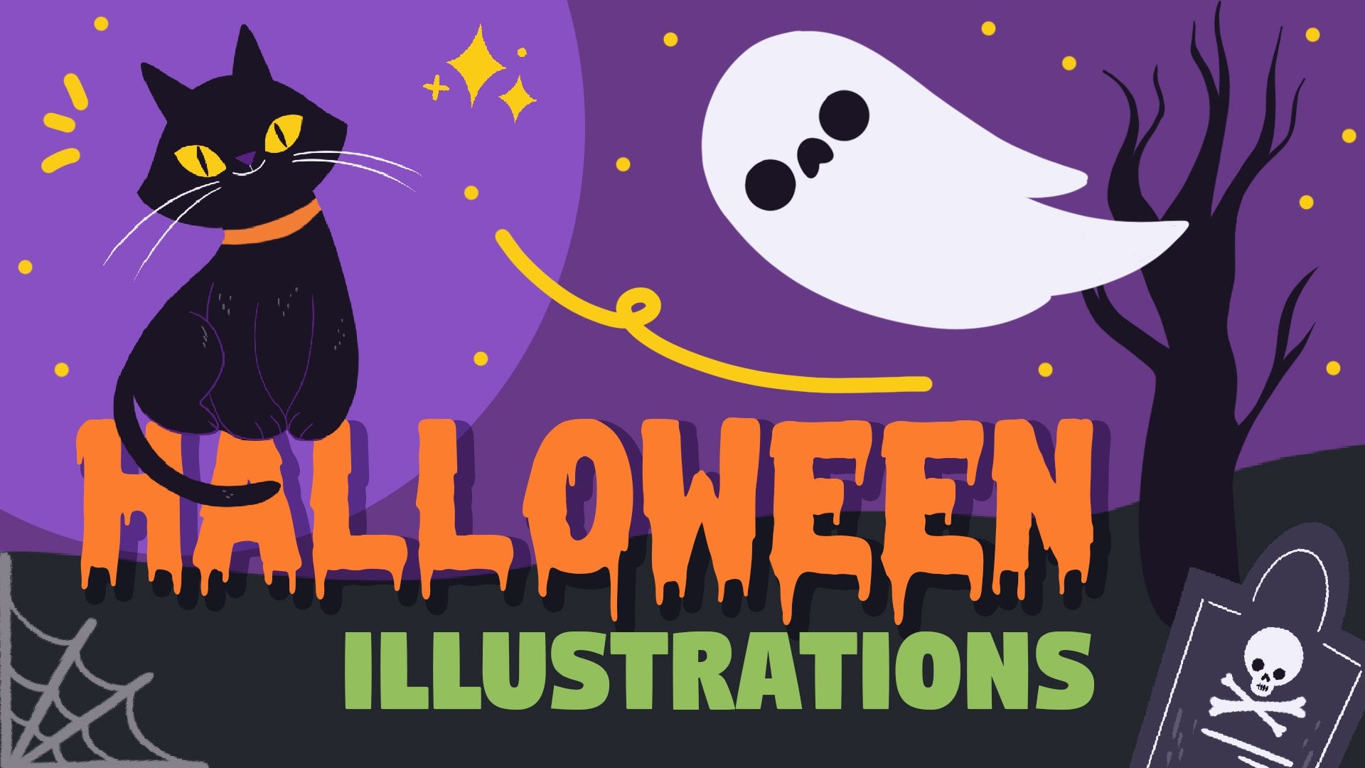
1. Introduction: Hello everyone. My name is senior and I'm an illustrator and graphic designer. Today we're going to doodle if you themed illustrations in Procreate, then later on, we'll turn into a seamless pattern. During the glass will find a theme and explore the references, come up with ideas, the right colors, and make a pattern. After completing this class, you'll have everything you need to start creating your own repeating patterns. You can find a use for the final picture of this class in many ways, from digital products to printing it on objects and globes. These class is for everyone. So don't worry if you have no prior experience. So with that said, if you're ready to launch your software and let's begin.
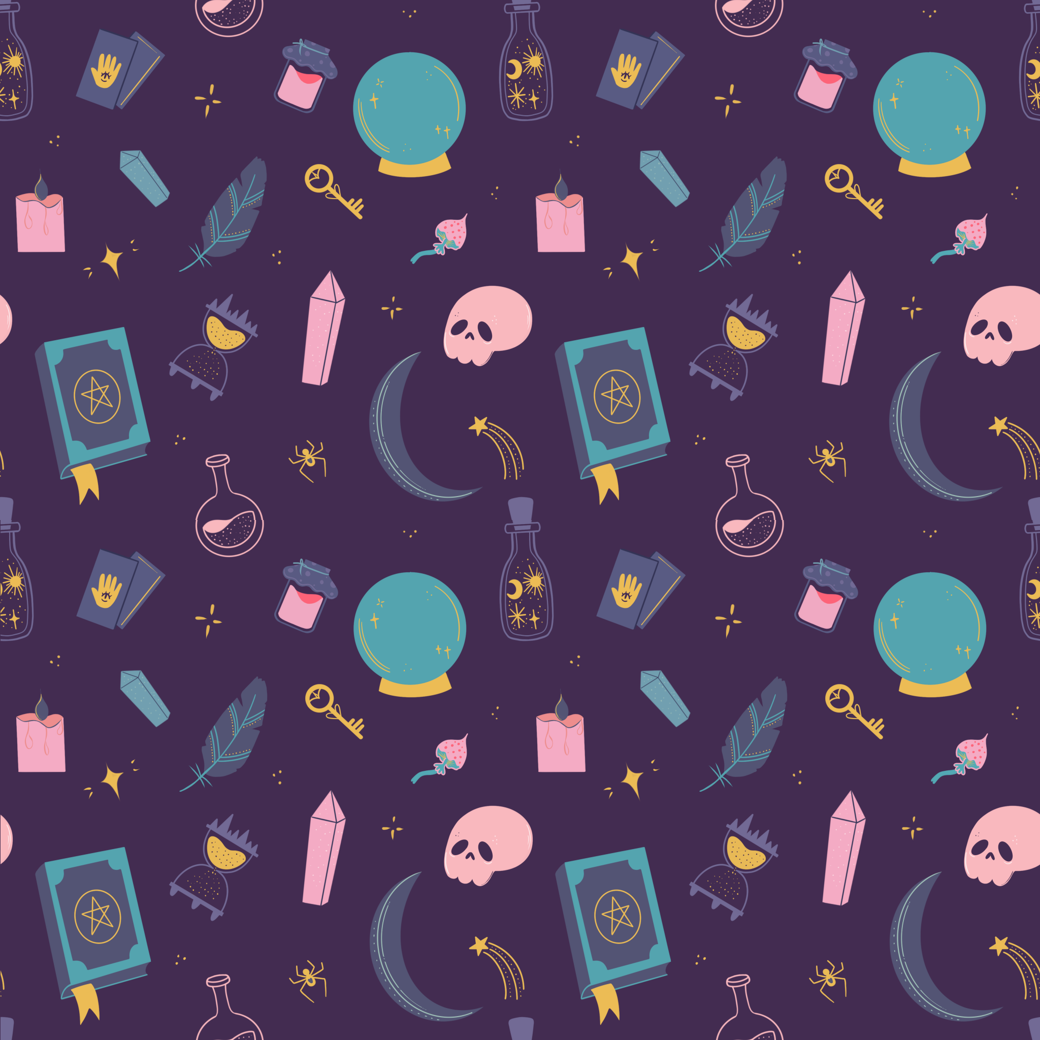
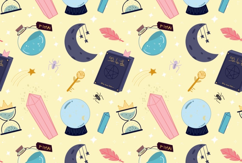
2. Finding a theme, exploring the references & sketching: So the first thing that we need to do is to determine the theme. Maybe you have an idea in mind, maybe not. Anyhow, one well-known website will help us a lot. Let's go to Pinterest, check out the references and find some inspiration. I am aware that it's really easy to spend the whole day browsing Pinterest, but for now, let's just have a quick search. Our goal here is to find a few related pictures with objects that we can turn into illustrations. I came up with a witchy theme. So I'm using which related keywords. A little tip here is to add the words like aesthetic or vibe because the result will be better. Use this section, ideas you might like for more keywords or use the synonyms, can't come up with synonyms. You can use the websites such as thesaurus.com or similar ones to find the right words for witchy theme that I chose. The other keywords to search our mythical, Weka, magic, esoteric, and so on. You get the idea. So find a few images that you like, save them somewhere or just remember the items that you'd like to draw. And let's move on to procreate and start making the illustrations. I had suggested to have any amounts of reference pictures that is multiple of 3, 6, 9, 12, etc. When you have all the references or ideas of what you are going to be making a Let's start sketching. Firstly, making you canvas. The default square one will be perfect. The square canvas will help us later with making the pattern. But of course you can use any Canvas you like Grep, any brush you like, peak some color and start sketching. I'm starting with the moon. Don't forget that you can use the quick shape to make the perfect lines. Just hold down your pencil and the end of the line and it will turn the imperfect lines are in nice and smooth Lab 8 in the shape with the edit option on the top if it's needed. When you are done with the first sketch, move on to the next add the sketch stage. It doesn't really matter if you're making everything needs. All you need is to transfer your ideas from your head to the canvas. We can fix everything later. So don't worry if your sketches are not so clean. If you can read them, your goods. Also, if you don't want to make the sharp and straight lines, it's fine as well. If you want to achieve some natural traditional look, go for it and don't use the quick shape. So if you're working with a reference pictures, tried to simplify every fan, you don't need to make your illustrations 100 percent similar to the photograph. You see the book, you know the book is rectangular. So start from a rectangle. All the complex objects are made from a smaller and simpler shapes. You need to detect the simple shapes and transfer them to the Canvas. Pay more attention to the aesthetical components and the details and distinctive features in accordance with a theme. You peeked. If you drew something and want to change the size or distorted somehow to make it look better. Use the selection and transform tools. Continue drawing your objects. Drafts and beautification for your objects on the stage. Or if you don't want to leave just the plain outlines and add them later, make your objects all the same size or scale them upwards out, try out different rotation. All your objects should be somehow connected and not random. If you can't explain how one object is related to the ones you already have. Better not edit at all, but you always can connect the objects by 18 some attributes. For example, if you are drawing cards, make the magical or it's 0, you can draw some similar objects like crystals, but vary their size, at least. Need to measure something. Don't hesitate to use the supplementary lines. Also, you can mark right away where you're going to be A1, the color, simply by shading the parts, add some story for the objects. For example, if you're drawing the Kansas, don't draw just a plane and a new one. It's a melting parts. It will be more interesting. If you draw in some complex shape, always start from breaking it down to the simpler shapes. You can add the details later. When you come up with a kneaded figure, add a few more objects to fill the canvas. It's always better to have more than less, even if later on you wouldn't use all the objects you drew. You just have something to choose from and we'll be able to find what will work better. Just remember to add some story behind the old. Simplify the shapes you see, all your references, adds attributes. When this is done, check out how many objects you have. Remember that we need multiple amounts of objects. Decide what she wants to leave and what she wants to get rid of or checkout, whether you want to add some fun when it's done, we can think a bit composition wise. We need to figure out which of the objects are going to be big, which medium, and which are going to be small. You can be guided by 1637 rule, where 60% of your objects are big, 30, medium, and small, or simply use the thirds, Divide the objects by three and each group will be big, medium, and small, respectively. Of course, you don't have to calculate the concrete amounts of objects, just do it roughly. We just need to achieve some sort of visual balance. You can even circle the objects with different colors in accordance with their size. And with that done, you can add up the images, use this selection and transform tools to scale your illustrations. And when the sketch is ready, we can move on to coloring.
3. Clean objects, color picking & coloring: In this class, we'll be making simple illustrations with no lines, will use just the solid colors. And there is a lot of ways of how to choose the colors the first way and the obvious one is to turn to Pinterest again, take a look at the pictures in the thematic you peeked, there'll be all the colors you need. A mere glance reveals that the most use colors for which a theme or a dark violet, all shades of purple, muted blue, green, some enqueues and golden. So Pinterest is the prior place to start searching for colors when you found the common vector and know what you're looking for, we can try out another option. So for example, you find the picture and the colors on it are stunning and she wants to have a ballads made from those colors. So let jump on to procreate and take a look how we can do it. In the meantime, save the picture to your iCloud or to the iPads. So here is an example picture. You don't need to insert it on your canvas. And being the colors one-by-one, I just have it here for you to see that the colors on the palette, we'll be matching. We will go to the balance and tap on the plus icon on the top right, select the new From File and select the file from the folder. You'll get the color palette with all the colors that are present on the peak chair. The last option is to go to the special websites with prepared color schemes and color schemes generators. There is a bunch of them on the web. I'll show you two of them and it will leave a list of similar websites in the description. So the first one is my color dot space. Here you can generate color palettes based on one color you choose. For example, let's select some dark purple and heat generates. You'll be given at those enough color schemes, all balanced and treated to be a part of your illustration. You just need to copy and paste or its side, the hexadecimal codes in the Procreate scholars panel go to the value and write it down in the needed gap. Another website is color hand dot co. And here you can find lots of prepared color schemes that you can use in your drawings. On the left, you have some navigation. For example, I'll choose dark and browse here, you can, again use the hexadecimal codes inside them into your procreate and make the samples where you can download the images and create the color palettes through them. For the mystical theme, I came up with six color schemes, which are all kind of similar and could be used altogether. I bring them up from the color hands and we'll share them as swatches in the Resources tab. So when you created the ballots, Let's move on to a fun part and start coloring the objects. Firstly, let's decrease the opacity of this sketch layer. So go to the Layers, said the N symbol and drag that capacity handles to the left. Then let's lock the layer and prevent ourselves from working on the wrong layer and drawing in the picture. So when the layer from right to left and SAP lock, create one more layer, and let's pick the color for the background. Go to the background layer and select the color. I'll go with the dark purple. It's always good to start by selecting the background color and by setting it as a dark one, you'll see other colors better. There'll be more vivid and she'll quickly see if something is not right. So even if you are drawing some cute cover peaks, consider choosing that dark background first. You can always change it later to them weren't appropriate color when you figured out that background, let's get back to the new layer we created. Move it under the layer with the sketch and start recreating our objects. The brush you'll choose will affect the coloring method you have to use. If you pick up some textured brush, you will probably need some colored your objects manually because color drop won't work properly. But if you don't mind, you're welcome to pick that section brush. I firstly started with a syrup brush, but didn't like the jagged edges that meet and didn't tolerate using the eraser to achieve their clean and smooth lines. So later on, switch to the technical pen. So the main goal on that stage is to repeat your sketched objects, make it as much clean as you can and feel the objects with color. I'm using the color drop as a coloring technique, just making the outline and then fill in it with the color. We're making all the coloring on one layer, say Help yourself with adding details and not going beyond the object's frame. You may use the Alpha Lock to turn on the Alpha Lock, tap on the layer and choose the option from the list. When you manage the main shape, you may also turn on the sketch layer and add the details in that way. When you're ready to start tracing another object, turn off the Alpha Lock and turn on the sketch layer. Work with your color palettes and try different views on one object for the colors, you may also use the 1632 and rule where 60% of your object is one color, 30 percent is an additional color, and 10 percent goes for the accents. That will help you to balance everything out and not make a colorful mess. If you're having troubles with feeling some elements with color, for example, like year with the book. Firstly, check out if your lines are closed. And if it didn't help, you can select the area with automatic selection and play with the threshold by moving one finger to the right across the screen, you'll see that the selected area is expanding. When you're satisfied with the selection, just drop the color onto the selected area. You might need to fix the color on the pyramids are, and you can do it just with the brush. Always get back and forth with switching on and off the sketch layer to check out if you're going to plan. You are not limited with one color palette. So try different colors from your swatches. You can see that all the ballots IGOs have something in common. They all are based on dark purple, dark blue colors. Some of them are made up from complimentary colors, the colors that are opposite to one another on the color wheel. Some of them are more analogous, or the colors on the wheel that are close to each other. But anyhow, they all work good together. If you're struggling with understanding the colors, consider checking out the basic color theory principles. If you want to learn more, check out the theoretical part presented in this class. Also, if you think that something will look better than you drew on this gauge, you can always change it. For example, like year with the bookmark. You don't need to trace every friend with 100 percent similarity, try different variations and find what works best. Separate the objects from one another with the lines of different color. For example, like here, we won't look weird if you choose the right color and it might add some volume to objects. You can feel the whole object with one color like here with the cell and then analyze to separate the planes. Vary the size of the brush on the smaller objects to make them look balanced. If you want to make some objects symmetrical, you might need a help older drawing guide, go to Actions and toggle the drawing guides. Then choose Edit Drawing Guide. You get into a new window where you can select different helpers. William, this symmetry option, you'll see a new guide, a beard on your screen. If you hold the blue naught, you move it. If you hold and move the green nodes, you rotate it. So we need to find the center of the object and putting it in accordance with direction, you can select the color of the guideline on its soap color slider. You can change its thickness and opacity on the boards on window when you're ready, step down. Now when we are back to the canvas, we can start tracing the objects will you do on one side, will automatically be repeated on the other sides. When you're done with tracing the object and ready to get back to a default draw and do the following, and get back to the actions and switch off the Drawing Guide, then go to the layers. You'll see that the earlier with the coloring says, I see set and we need to turn it off. So tap on the layer and select Drawing Assist from the list. Now nothing is limited you from getting back to continue tracing the objects. Try different colors just by color dropping them to an already existing sheep, find what looks best at some different colored lines to separate shapes from one another and to add an accent makes some elements just monochrome. For example, the smaller ones such as key. If you don't want to add more colors. But once you add an accent, you can erase parts. For example, like here with this cow. But remember that these parts will be transparent and if you'd like to change the background color, that'll be the color of the background as well. Remember that you can always use the drawing guides, the guides and make sure that the layer is set as SE steps. If it doesn't and go directly to the layer, tap on it and select Drawing Assist. Turn it off when you're ready to move on. Do it every time when you want to use the drawing guides. Don't forget that you can use Alpha Lock to recolor the elements you have already drawn. Just turn its own peak another color and paint over the needed areas. Take a look at your picture and find places you'd like to change something or recolor some beautification and minor elements that potentially will make your picture bad at.
4. Creating a pattern: When we have all the objects, we can start making a pattern. Firstly, to check out how the pattern work in general, we can use one website and put the picture that we have now to see how it looks, I'll use the split screen on iPad to open the website in the browser. So here's the service that we can use, not a perfect one, but it gives us the general idea in general picture of our pattern, the link will be in the description. Now let's do the following. Firstly, we'll go to the layers. If the alpha lock is turned on, turn it off. Now get back to the canvas and swipe down with three fingers. You have a copy paste menu on the board Sam and internet menu. We need to select Copy all when we cope It's a graphene, will need to base the COBIT concepts. So once again, swipe down with three fingers and choose Paste. We can see that we have a new layer that contains everything that we created, including the backgrounds all merged together. If we hold the layer and move it to the website, we'll see how the pattern looks. Now, you can see that we have a lot of blink species that are creating vertical and horizontal separation. That doesn't make it look like a pattern. We need to fix these blank spaces and position the contents and more evenly. So let's get back to the canvas and firstly, delete that flattened layer. We needed. Adjust the checkout how everything looks now without any changes. Now for convenience, let's move the layer with the main contents up and make a copy of it, swipe from right to left and choose Duplicate. Now we have two copies and we need to arrange them differently. One will move to the left and one will move to the right. That won't change the positioning of our elements on the canvas, but it will allow us to check it out from the different angle, but to make everything right, firstly, we need to turn on snapping. Snapping helps keep your transformations aligned. When moving an object, your quantities will snap to things such as center points of your canvas or items sitting on other layers. So go to the Transform tool and tap on snap n. So go on this napkin and also you can turn on the magnetics. Magnetics allows you to easily slide along the blue guidelines. Blue guidelines appear as you move your contents around your canvas. When it's all set, Let's start moving the first copy it to the left. We need to move the copy till the central nodes, that green one and the yellow ones are snap into the Canvas, ages, deselect the transform tool and get back to the layers. If you want, you can create one more copy of the original layer just in case you want to get back to their original position and just duplicate, lock and hide the layer. Now select the second copy and we'll move it to the right, activate the transform tool, and move the content to the right till the central nodes are in line with the age of the canvas. You can see that we have the blank space between the elements and that's what we need to fix. But before doing that, let's get back to the layers and we'll merge these two layers together. Tap on the top one and select Merge Down from the list. When we have everything on one layer will activate the selection tool and one by one, we'll select the elements and move them, thereby arranging them more wisely. So the goal here is to position the objects in a way there is no large blink areas. When you're done with this part, let's check out our bothered and once again, we'll do it the same way as we did before. Swipe down with three fingers, swipe down with three fingers once again, and choose beast. And now we have the new layer with everything we have on the canvas. So let's hold it down and move it to the browser to check out the seamlessness started to look better, but we still have some blink species near the top and bottom ages. So we'll need one more round of moving the elements. Let's go to the layers and delete the sample layer with Courbet concepts, duplicate the layer with the main elements. Now select one of the layers with the contents, activate the transform tool, and this time, move the bounding box down. Again. Pay attention to the central notes. They should snap the ages of the Canvas, select the second copy and move the bounding box up. Pay attention to the notes. Firstly, merge the two layers together and one more time, readjust the elements on the canvas at the way there is not a lot of blank spaces around. Use the selection and transform tools. And that stage, you can add some additional elements, create one more layer to try this out. You can always delete it. If you want to feel the areas, you can add some sparkles or indoors with the accent color. When you're done, let check out the pattern one more time. So again, swipe three fingers down. Select Copy all, swipe three fingers down one more time, and select Paste, cool down the layer, and drag it to the browser. And this time it's looking pretty nice. If you have some more gaps, figure out where they are, entropy the steps once again, if everything is okay, let's check out how we can scale down the pattern. Firstly, we'll delete the sample layer. As always, we will do the following. If you added some sparkles or any additional elements on a different layer and merge it with the layer with the main elements. Duplicate the layer with your elements, save the original elements just in case something went wrong. Where if you want to have different sizes of pattern, you can lock it and hide it. Now go to the Transform tool and we'll need to decrease the size of the selected area. Use the uniform method of transforming and diagonally drag one of the corners to make 1 fourth of the original size. Snapping and magnetics will help you with making the needed sites, deactivate the transform tool and go to the layers, duplicate the layer with 1 fourth and then move the copy to the site. When you have two parts, merge the separately or together, then duplicate them and move the copy to the board, Sam. And here's the smaller version of our butter, and that's the end of the class. I hope you found this class helpful and if you liked it, please check out the other classes geared follow and leave your review. And thanks for watching.
 Xenia Sorokina, Illustrator & Graphic designer