Transcripts
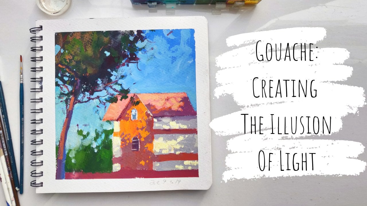
1. Intro: What Are We Going To Learn: hi guys. Lining is on a pace, Lee. I'm an artist from Moscow, Russia, and welcome to my third class that give it to wash already have two classes dedicated to painting with egg wash. If you're interested, please check them out. One is about starting to being with watch. If you don't know that much about this paint, I'm doing a little introduction. I show you have to manage the paint. What pains to choose how to store them, what to paint on? I talk about brushes, all of that. Today's class is going to be dedicated to painterly greens. I feel like green is a very hard subject, because usually it's so the some aeration hatreds so soothing to go outside and look at all the greens in the park or in the forest. But usually when you try to paint them, they turn out a little bit a like a little bit the same. A little bit too green, I would say, is usually the problem with painting the greens. So today we're going Teoh kind of face this complicated matter and try to understand how to pain the greens differently so they look painterly, beautiful and full of color. I will guide you through my favorite techniques two main grains more interesting and Nevers , and we'll show you how to use them in your work. We first analyze some of my work, and I tell you about the techniques that I prefer to achieve the desired effect we will talk about under painting. Why do we need it and what pain to use for it? We'll discuss the brushes that are best to be used when we pain something as chaotic is grass and foliage. I'll show you some additional tools, such as watercolor cranes and passed over. You can use to add texture to the final layers of your painting. And then we will proceed to completing the class project, which is painting this beautiful if it summer scene. We will learn how to apply pain so they under painting shows through and work with us. We will learn what is a driver's technique and why is it important for painting greens? We'll also talk about light and how to create the illusion of light when you paint a bright summer scenes such as this one. What colors to use for greens in the shadows and which for the greens that air kitchen, the rays of light. I will get you through the steps of layering the paint and color mixing process, giving helpful tips on achieving the best results. I would recommend this class for people who already tried painting with gosh and want to improve their skills. I don't think it's the best suitable class for beginners, as it is a little complicated and skips through some important steps that I already mentioned in my beginners video.
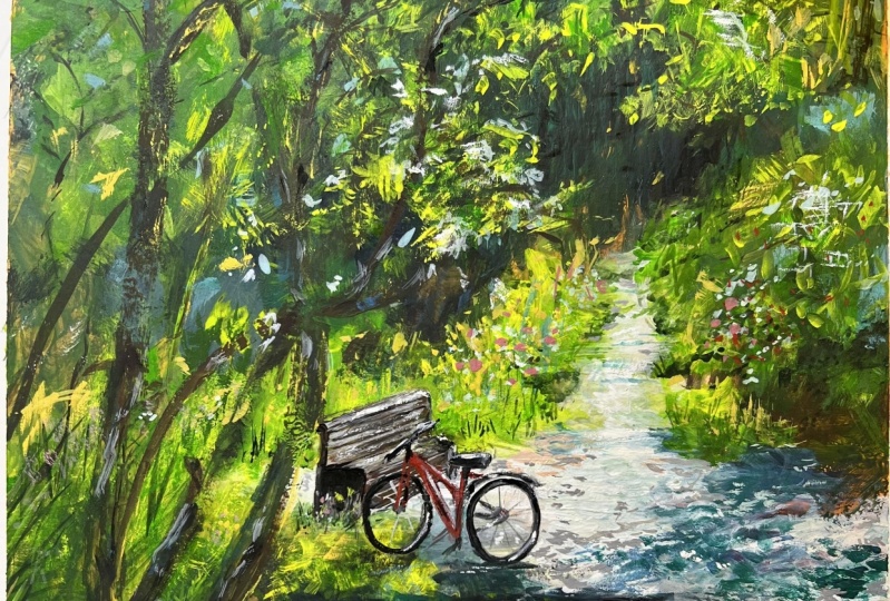
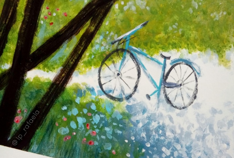
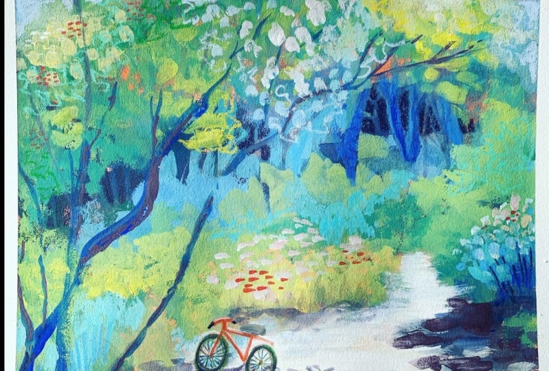
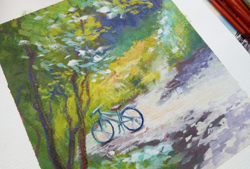
2. Ways To Make Green Landscapes Pop: So let's start with analyzing how an interesting green landscape can be achieved. Here. You see some of my recent artwork with Go wash. If you look closely, you can see that my greens very within one painting pretty drastically from bright yellows . Greens in the sun, dark pollution, the shadows too faded grains in the background. On this artwork, you see that within one patch of green grass, I use a variety of color that helps them build interest. You can see me using yellowish greens as well. A. Some compliment relight violet patches of ground peeking through the grass. All of this contributes to the beauty of your work, and here is one of my latest artwork, and you can see another tool that I'm using. Purity create interesting migraines, and that tool is texture. The variety of different brush strokes on big areas of green, as well as a lot of dry brush applied on the final layers, made this work really pop. Also, where you can spot on this artwork is a very helpful tool. When we work with green landscapes, an under painting an under painting is usually thin, prepared to relay or before you start your work. It can be a simple as just covering your whole support with one color or as complicated as a full tunnel sketch sketch of your future artwork. Here you can clearly notice a bright red under painting. Red is a complementary color to green hands. Green will always look more vibrant and interesting next to it. That's why adding bright pink and red flowers also help a lot. So now let's learn about the tools were going to use to create painterly green landscape today.
3. Tools For This Lesson: As far as the support goes here, I'm using a smooth paper. 300 GSM is a good thickness for gua. Basically, or 250 is fine, too. I suggested to you smooth paper because the texture is going to be standing in your way and will make it hard to work out some details. The perfect choice for this tutorial would be clear from 10 paint on Siris in color neutral or a strong, more mixed media tone tan paper. I, however, use a Russian brand paper in this beautiful base color. You can also use a white paper as long as it is Smitty's, because we're going to be using an under painting anyway. My first choice for under painting would be Acrylic Wash, and I have this one by Turner. Ah, colleague. Wash is the closest to finish and consistency to go wash, but it drives to a sturdy film that doesn't left anymore, which is perfect because we don't want our under painting to blend with the rest of the work. You can as well use watercolors, but I do suggest you get a little group of your technique first or Hughes, a special Akwa fix binder. CIA watercolor doesn't move when you apply for the layers. A good choice also would be Inc as it dries out permanently on your paper and has a very vibrant colors. This one from Windsor and Newton is perfectly fine. Total. They're very bright, also like it's very water consistency. It's very thin and doesn't mess with the texture of the paper. That's the main reason why the most obvious choice for under painting, which is acrylics, is not. My first acrylic dries out to create a synthetic film that tends to be very slippery with quash and will mess up my painting. You can Howard. She's a very diluted acrylic. Collect 1/2 here in a spray, for example, that will also dio Ah, however, will stick to a colleague. Wash for this lesson. Let's take a look at the brushes. Now. I like to use a variety of sizes. First, this funny cat's tongue brush that was in the set of brushes. I got firms and our supplies. It's a very good qualities and headaches as well as this. What number eight, which is the same brand. After that, I have a couple of literally no names I own from the longest time. Ah, what's important is to have this sort of fuzzy, worn out brushes because they create lovely textures in your landscapes, and these are honestly one of my favorites to use with a good wash. I also like to use these extra long synthetic brushes, notice how they are much longer than the regular ones. And then there's an assortment of run brushes, a big 12 in a couple of tiny ones for details. If you mean it's possible to shrink them out of brushes to just, for example, for and they will be a big tulip brush, one funny guy and one with long bristles and maybe a small detail brush, and that will do for the painting. And, of course, we need our paints, water and spray bottle. If you want more details on what paint I use and where to get this airtight case for the pain to please watch. My first washcloths was very detailed instructions about it. Oh, almost forgot. I recently discovered that wax water salable Kranz is the perfect add on the final layers off your work to create details, depth and texture. You can see in this artwork, I use some crayons, drugs on the final layers to add color variety to migraines. Also here, all the fun textures in the Trias well, asl impose, for example are painted with Krantz. They're very creamy and bright and what's important, water soluble, Just like watercolor and wash. Let's test them out. This ah, castles are by coke in Nor, I think I'm hopefully pronounce it right. Um, I have no idea. It's a check brand. I bought it in progress and Lee and you can see there are deluded by water. And how are I can also very much recommend the Swiss canton Dasha no color to They are very , very bright, and I really love to work with them as well. They only downside for the Swiss brand is there are a little fragile. They break easily and melt because they don't have the wooden coating. It's all just pure pigments. But, um, also because of that, I think there are a little brighter in a little creamier than previously showed. Ah, check brand. You can see the size comparison here, and ah, they're quite much smaller. So it's convenient. Also, regular color pencil. So work great with wash and is a fun way to at the interest in texture. However, they are not water soluble. And once you put them on paper, it cannot be removed anymore. So it must be pretty confident in values trucks. All right, well, I think that's it s so let's get to the fun part. And, uh, let's get to painting.
4. Sketch & Underpainting: I start with a very faint line mapping out my composition. Usually I can't help myself out by dividing the sheet into four equal squares. But this composition is fairly simple, so I just go ahead and start drawing it. I focus on big elements first, like big patches of grass and bushes, and only after that I switched to something more subtle, like a little road bath. You can see me often drawing this one continues line that sort of travels from one object to another, keeping my composition tight together. I do suggest you work with a faint line first and then switch to a thicker, softer pants elected here. Don't be afraid to use. Think confident lines wants your composition is set. The wash will cover it eventually. Um, but declines are always easier to follow. Sometimes I even go ahead and indicates dark areas by filling them with a little hatch. There is absolutely no point in drawing tree crowns and foliage or separate leaves, but I do recommend you break your composition in tone. That means if you see strong, divided areas of tonal contrasts, do suggested in your drawing with a line and you can see me doing a little hatch in the dark areas that I was talking to you about before. And sometimes I would even go ahead and suggest the shadow lines like I did here. When it comes to drawing small but important elements, ideas, chests and not to rush, this bike is fairly small, but it's the center of our composition, and even if we paint everything right and beautiful but was grew up this little detail, that painting will just fall apart. Also, you can even skip drone and at this stage, because we are going to cover it with paint well, first pain, everything and then and like at the very end. I just did it for the sake of the tutorial. For now, I then go ahead and mix them right and okra acrylic awash for this warm raton and start filling my growing. I use a white, flat brush, but you can choose whatever brush you want. It doesn't really matter. You can see me at in quite a bit off water. The consistency of the paint is not supposed to be thick for two reasons. First is not to cover the natural. Two's on the paper and second is to not cover, are drawing because we're still needed to paint. You can see me leaving a little light area in minder painting. This is where the lightest light is going to be. So I felt no need to fill it with a very intense red color and then in the and I just speed up the drying process with a hair dryer. After the painting is completely dried, the under painting is dried. You're good to go with the first layer of wash, so let's begin.
5. Painting: Filling in The Big Shapes: I start with opening my palace and squeezing zinc white on my mixing, trying our main goal and the stage is to set the tonal values correctly to create the sense of space in our painting. So I started by filling in the darkest spots. I make some of the violence and the grains and maybe a little bit off red to create this sort of very, very dark green. And, uh, but you can see me starting filling in the darkest spot. I can clearly see it in the reference when I look at, uh, this spot right here in the background is the darkest ones, and this is the one that's is going to help us create the sense off, off space inner painting. I makes a cold a green color because the greens in the shadow on a sunny day is are a little bluish. It gives a nice contrast with yellow, a bright greens and the sunlight. Ah, here I'm using a round brush number 12. I showed you earlier, but soon I will realize it's a little too small, and I will switch to the big cat's tongue brush cool so you can see me using a lot of circular motions when I paint. This is how a great dynamic brush strokes and the variety of textures remember. It's very important when we try to paint something so full of small, vibrant details like grass or foliage. It's really the easiest and the best way to imitate this dynamics on the bigger fields. Ah, the consistency of my paint is not so thick, and it is for a couple of reasons. First, it's easier to optically blend thinner layers. As you can see, I put on color and then I take another one, put it on top or next to it been a sort of rub it into what is already painted with circular motions. In the second reason, if I put them the layers, that beautiful warm bread under painting that we already have going on is going to big through it equate a beautiful, vibrant contrast with the green. And this is just what I want to create, more interesting my greens. You can see that my brush works tend to be very chaotic. I try to be bold and quick with my strokes. It takes a lot of practice and bravery, but This is what makes your green landscapes really pop, and this is how I took them to the next level. After I filled in the dark areas, I will start painting the light now, compared with greens in the shadow that are bluish, I use a lot of mixers off greens and violence and grays and blues, and the greens and the light are always this beautiful, warm yellow green color. It's a very crucially used yellow on the line, because otherwise it won't look. So let if you just used wide, for instance, to lighten your green, it wouldn't do because it would just create this cooler, cold grain that is light but does not create the sense off light hidden that green surface . You can see me filling the hole light area right now with this beautiful grass green color . It's also called leaf grain. Sometimes it's basically and makes off sap green and lemon yellow. That red under painting room put on is helping us a lot here. As you can see, it's popping through the whole green foliage and is creating a lot of interest and texture , and I just love it. I proceed with a little more intense green color on the bush. I try to vary migraines as much as I can. It's not always visible in nature, but you just use common sense and something you know about how to paint objects. And how did they interview with the light sources? For instance, the greens are not only affected by the solid but also reflect the color of the sky, which is cool. That's why the leaves facing the sky are from bail Kulish greens, So we will add some of that later as well. Now I will work on my shadows. I make cerulean and cad rat together. They give the most perfect way for shadows. I take my really fluffy brush and start painting when I paint shadows. I like using more less horizontal strokes because it's sort of contributions illusion off the shadow, laying on the ground, and you can see the same circular, fuzzy motions that I use throughout the entire painting. Basically, I do not really care about the shape of the shadow right now, because I am going to shape it later with the negative painting. I will say a little later about what it is and how we're going to use it when we are going to be in the light. But basically adult, those stress too much about the shape of the shadow Right now. I also add a little grain to my mix of shadow because I do not want to forget about the queen reflexes. The greens are obviously the light from the greens are bouncing to the shadow area, so that's why I would have to add a little bit of grain to our shadow. And don't forget about that shadow under their future bike, because we will need that now. I switched to painting light and a mixed attaining white with a tad bed off okra. It's perfect, a great delusion off a suddenly toe paths on the ground, and I basically proceed to fill in the space between shadow on pain, the path in the green so in the green grass that would just painted earlier. The interesting part about putting the light in is that you can use it to shave the shadow , which is cold negative painting that I talked to you about earlier. You can see me adding all sorts off a little patches. You will see me adding patches later off light picking fruit in the shadow and you can see me basically carved in the shape of the shadow with my light mix. That's why I told you not to stress about the shadow shape earlier, because we're going to be able to correct it. Gosh is very, very easy to maneuver like that. Because of this. It's an opaque paint that helps you do whatever you want with it. Basically. - Oh , - but in the light, I can just the overall values in my painting, and I decided that it likes a little contrast, so I wanted dark in the background a little more with the mix off green and violet. It looks quite dark right now. Would remember. Ghalwash tends to fade when it dries, so it will be just right later, when it dries out again, using my circle emotions rubbing in one paint into another. Last thing on this stuff is to soften the edges of the shadow a little bit. I'm just take a damn thrown brush and go over the edges with it. Gosh is regulated with water and spare very easy. I do just so it's not that harsh and I can work with it a little bit later, fixing what I want to fix and fix in the shape and the last thing I do before switching to the next step is cleaning my palate because I just like my palate clean when I worked with quash. So see on next up when we're going to paint in the trees and foliage details.
6. Painting: Trunks and branches: Now we have to start working on our trees and foliage. It's a several step process, and I start by mixing this yellowish green with Sabrina lemon yellow. You also use a color that Windsor nearing cold Lyndon Green. I use very little water on my brush is almost dry, and it's very important because that's what's going to help you create this chaotic, textured look in the treat ground. I use a fluffy brush, and I barely touched the surface of the paper for this effect. The brush strokes are very textured, and that's the easiest way to create the dynamics. In the green leaves and grass I see mean mixing even more yellow into migraines. Please avoid adding white to make sure is it will dull. The brightness of the color just makes yellows and greens. Then I take my long bristle brush, and I start creating more distinct brush strokes as if they were separate leaves or groups of leaves that catch light. Try to not follow us or in pattern just at some here and there, but also keep in mind the source of light. Those bright green leaves should really be concentrated in one area where the light hits the tree Don't have too much. In the lower part of the tree where the shadows are supposed to be, my brush is yet again dry. Use very little water for this effect. Now let's work on the trunks and branches. I keep my long bristle brush and makes this brownish green color. I use blue and dark red to the mix together and and a little bit off chromium oxide, which is adult green color. Now that's what legendary Barbara's called a bravely test. Just start from the top and lead your brush towards the bottom of your paper. Don't use a lot of water. You brush must be a little damp but not wet. And also it's not supposed to be solid color. It's good if your trunk is a little textured. He can see the color is not solid. It just keeps a little bit in some areas of the trunk that makes it textured and uneven. This is what what we want. It's actually really good. The reason why, like long bristle brush for this as it helps me create really natural looking trunks that air cricket and uneven it's easy to replicate this with the brush. You don't have a total control off. You can see me wiggling my brush, trying to create this cricket. Look off the natural tree trunks, some of the trunks, a darker, some lighter. It's perfect. Wouldn't want them to be even either. Now it wasn't place. The main trunks I started adding. Branches bring much fall in the same pattern that I used for the trunks. I'm just wiggling my brush, creating this natural looking cricket little branches, and I basically just folded in Amichai. Seeing the reference photo for that just don't overload. Ah, you're painting with too many branches. It's good to add a little bit, and then you can always add more in the finishing touches. If you need more, just a little will do for now. And when we finish, we just switch to the next deck.
7. Painting: Defining Details: Now we're going to add some details that will really make her painting pop. I started by adding more yellowish green to my grass to make it even brighter and emphasize the light. I use my fluffy brush again. Very little water. It's damp, but not what. Then take my long bristle brush, and I will start adding distinctive brushstrokes that will imitate the leaves in the tree and some flowers in the grass and all sorts of things happening in the sunny scene, with a cold green mixed with a bit of white to make it a little dull and light, I first put this leaves that catch the cold light from the sky. Remember, we talked about this earlier. They will add a really nice contrast with all the warm yellow greens that are already happening there. Don't forget to add some in the grass in the shadow areas. Well, then I want to add flowers. I take a smaller, long bristle brush, makes this live flipping with a little orange, magenta and white, and just put little strokes here and there. Don't put too much. It will take away the charm. I think that it's going to overcrowd the scene, so just a little bit will Dio again. I mostly worked with damn brush, not too much water, and you can also add different colored flowers. I just settle with the pain pinkish ones because they create a lovely contrast with the green. Then I decided to touch up on some of the trunks and brushes. Make them a little darker. Teoh. Make them really stand out in the scene. I moved to the shadow area, smoothing it out with a dem brush once again and adding more dynamic to it with the same mix of surreally in red and white. I used for it earlier. So basic who just makes the same color that we already did. And we're trying to imitate the foliage shadow here. So trying to make it uniform, making more chaotic making really seem like the riches oldest foliage that the sun is speaking through. With negative painting, I add somewhat areas to the shadow. Yet again, the multiple layers help us make ah work more complex and the light in it more believable. So that's why I go over the same areas again and again. The same mixture of okra and to tame yellow, to bring in even more of the light on the path and just to create some interest in the shadow areas with a smaller brush, I add some little glowing things that are just happening there. Isn't there a dental line Fluffy's loading in the air in catching light? I think this will add to the mood of a hot, sunny day. And then I just suggest a little more colder green leaves and then we just switch to the next part. We're done here. Oh, oh!
8. Painting: Finishing Touches With Pencils: I start with catching the details of the bicycle with a pencil. Try to use faint lines in the beginning because if you don't get it right the first time, you have a chance to actually raise it and start over glasses. Amazing like that. You campaign on top with pencils and just get rid of the lines if you don't like them and start over. - When I'm happy with the sketch of my bike, I pull out those wax watercolor pencils I showed you earlier, and I started by tracing the wheels with browns and blacks don't think declines just yet. You can always make them think later. I just follow the guidelines that I mapped out earlier. And then, with the tour goes pencil, I finished the frame of the bike. I add a tiny little seat with this fragile brown color, and then because the pencil is water soluble, I take my little brush and smooth out the lines. The reason I decided to do it with a pencil in the first place is because you can just have much more control over a pencil than a brush. And with this little detail we need for the lies to be as exact as possible for it to turn right. So then I go ahead and I start in some pain for the contrast in just so the texture off our bike and overseen kind of matches because when you just painted with a pencil so stands out alone more than it should really. - Don't forget the beautiful white highlights that make your bike look like it sit in the sun. - Oh , - then when that's done, I go ahead and add some texture. With the pencils in my scene, I decided to darken some shadow areas and yet again darken the background to make it really pop even more into highlight the contrast between the sun and the the shadow area. I used this self kind of violet pencil to do that because Violet is a very, very pretty contrast makes it pretty contrast with the yellowish greens. I use Mace, mostly vertical strokes, so the texture of it is not very distractive. And then, with all kind of tour close yellows and greens, I had a little more interest to my scene. Just putting some little dogs here and there, and little Strokes and Ivan add some blues to the shadows to make it more interesting. - And then basically that. See you guys, it's finished. It was a lot of work, but in the Anna Filic, it's worth it.
9. Conclusion: thank you so much for watching my class. Hopefully it was useful. And an answer. Some questions about this complicated subject that is greens and painting and hopefully also pretty spade in project and post. Your finish results in our little gallery here because I always say I would like to see your results and give you maybe a little feedback. If you have questions or anything, I will be very, very happy to help you. And obviously, don't forget to rate or review this clause because it really helps. You have to find your students and spread the village and maybe get more people interested in gosh just great. Because goulash is a great paint all the like to you guys. Bye.
 Ayna Paisley, Gouache Enthusiast