Transcripts
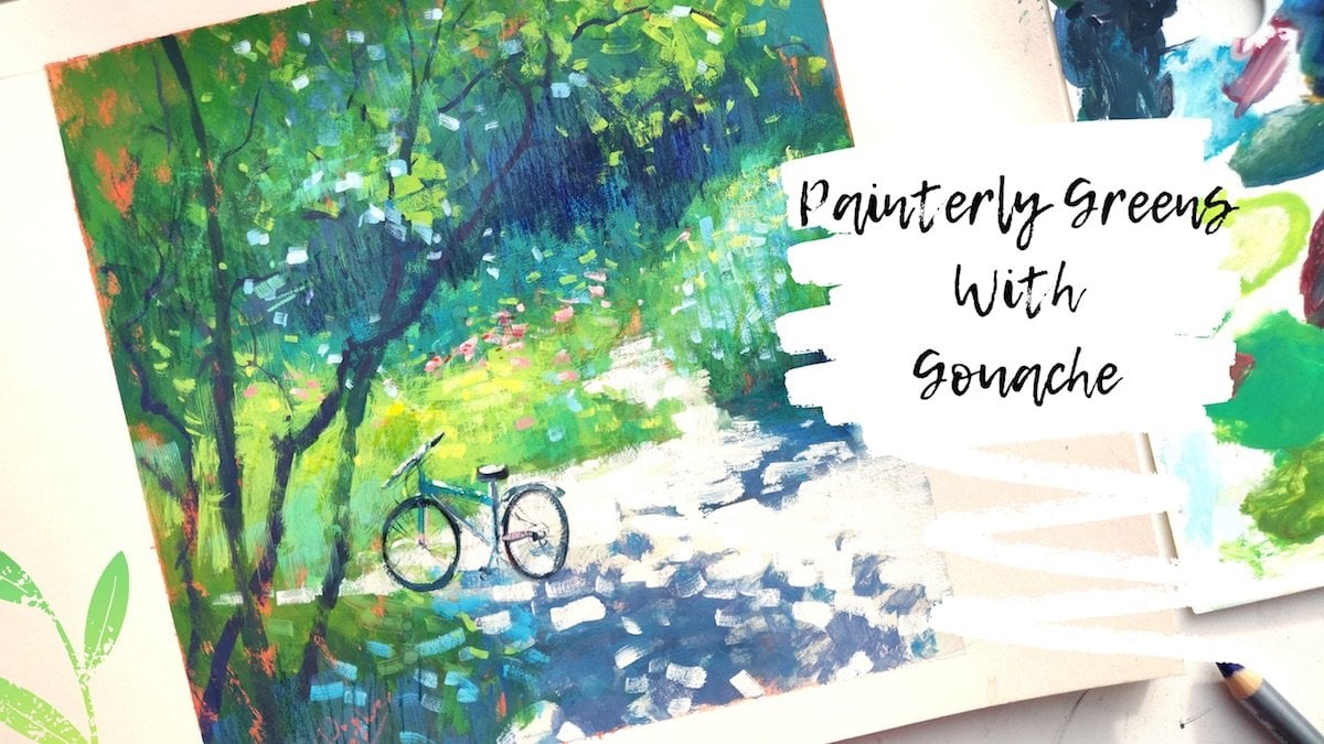
1. Why Gouache?: Hello, everyone. My name is Chyna. Basically, I'm an artist from Moscow, Russia. And today I wanted to film a video lesson about how to paint with Wash. Not a lot of people actually use it to paint anything serious, but I actually find that quash has a big potential and a lot of potential, and I use it to do a little sketches and studies, and I find that Gua Shi is perfect pain to substitute oils. Now oil's is a very I feel like just hard to maintain paint. It's hard to carry around because you need a lot of stuff, you know to carry with it. You need a lot of solvents, not to mention that sometimes they smell their squash is that they're very easy paint to carry around in dilute with water. So basically all you need used to carry some water with you. Some brushes, the little box of pains and some paper, and that's all you need. Not to mention that wash actually dries out right away. Where's Oils is, you know, needs some time to sell down, and if you do some sketches, plan air on plain air or even if you just do them in your notebook or in your sketchbook. It's not easy to bring him home because the oils air still not sad and they can smudge, and you need a system to actually carry your studies. Hold back home. So go wash is kind of the substitute for oils because it has the same feel to what? When you paint with it. Obviously it is not the same, but you kind of have the same feel when you paint with it. And also it's very, very easy to maintain. So I think that we should try it out. It's really easy. There are some obstacles. This is why people don't really choose Go wash over oils, for example in a lot of cases, but I find that it's worth a try, So let's try it out and see for ourselves. I will show you what material to use well closely. Look at pains and the low power that I used to keep them moist. We'll obviously look at the paper that I use. I will give some recommendations about the brushes and then obviously the mixing palette, which ones I prefer, and why What will proceed to paint our first subject was, which is a little yellow apple. We're starting with a tonal sketch and then quickly get to pains. I will explain what makes us do. I used to chief certain colors, understand how to start a study, how to make squash properly so doesn't create muddy colors. Then we will just quickly at some little details and we'll talk a little bit about color, harmony and how to create beautiful, transparent shadows and just, you know, get into all sorts of details that are possible. Within this class, results will be this cute little yellow apple that is very easy to create, and you're going to see for yourself.
2. Reviewing The Tools: first, let's revise the tools that we need to create even a small painting. So what will The lead is, obviously the pains themselves, and what I like to use is this a little airtight palette, the brand that I'm using, his Bianco, which is, I think, a Chinese brand. But you can basically use just anything that you find a like. I know you can order these on Amazon. I know you can order them from AL Express, so just you know, if you're planning to paint with glass, I recommend you get this one because it just makes painting so, so much easier now. First off, it is airtight. That means the pains that you put inside are not going to dry out. And that's really important for painting with Ghalwash because the consistency is primary, too, achieving the results that we want with this paint now. These pains were actually put in this box for about a week now, and they're still very moist. They're still really, really good, you know, in a consistency. It's ready to be like used right away, painting with it, and you can't even see that it's still shiny. That means a very, um ah, good consistency to be painting with it. And it comes in different sizes. I think this box is for 24 colors. If I'm not mistaken, there's a little bit one that's a little bigger. There's also this one that I ordered recently, and it's from this brand art secret. I know for sure you can order it from L Express because this is where I ordered it, and it came right away from China. It has the same kind of mechanism, but it's a little different. You can see that the the lid doesn't really, You know, I can really take it off. You just kind of opened the little box and you have 34 compartment 32 Excuse me compartments here, and I just ordered this box because it's a little bigger than this one. And this bounce were really fine because none of them airtight water color palettes actually work for me because all this paints would just, you know, mix up with each other. So I kind of cancel this one's. So let's up a closer look to what colors I'm actually using in my palette right now. We're going to be using this smaller palate just because you know it's always easier when you just start with lasted collars and more colors. And this way you can also keep it more affordable, because let's enough together to gosh is not a cheap pain, especially if you choose some you know, high quality brands, which I recommend he used right away. You can buy, for example, a starter starter said from Vincere Newton. Years also a good wash. Bihsh minke, which is a German brand. Ah, I used both, So I have different colors from different brands. I also use ah, brand that you can actually only find out Russia, which is a Russian go wash. I find some. You know the quality is pretty acceptable. It's also really cheap, So sometimes I use it for some basic colors, like Oakar or yellows or reds. Um, obviously there is no not a lot of choice and colors. So some complicated colors, like turquoise or it's really amore, even cobalt. I prefer to choose from ah from high quality brand. So the choice of colors are I have here is pretty basic, I would say, if you exclude, especially if you exclude a lot of the greens, which is not a necessity. I would say that it's very, very crucial that you have the reds, yellows, different, different blues that you have some off the earthly colors. But you can really skip the greens and just keep, for example, one green. Ah, these are the colors that I would recommend you use for now. Actually, don't forget to make to moisten your polit because it does get dry if you open it for too long. That's all the colors that you will be needing for or painting sessions. And I will be, hopefully filming more than one. So we can kind of, you know, have a whole range of lessons painting different subjects and different approaches to the paint. And obviously that let's not forget the white is very important. I always keep it on the side in a tube like that, or even bigger containers like this, because you just need so much of the white. Basically, when you paint with you are so I never actually put it in the containers because, you know, you just use it so much. I just put into breakfast on the palate. I recommend you do, too, because this way doesn't contaminate without the color is wanted. Sitting in the little container, you don't dip your brush, and you always have just clean fresh white color. So this is basically our pains for now. And let's revise the rest of the tools that we have obviously to paint where will need some paper. And what I like to use is actually paper that is a watercolor paper and not necessarily something expansive. Now ones are Newton. Brand is a little bit expensive, but sometimes I just by some watercolor paper from this Russian brands that is very, very cheap. What I'm trying to say is that it doesn't necessarily needs to be expansive or very quality brand A zit matters. For example, in watercolor. It doesn't really matter in Gua because it doesn't really interfere with the pain that much . What we really need is free to be quite sturdy various thick paper because, uh, it can get a little wavy if you don't choose a thick paper. The I personally like when the paper has a little bit of texture on it, but it's not a necessity if you prefer for it to be smooth. It's your choice. You can actually buy a watercolor paper and just try to paint from boys both sides, because sometimes or most of the times the paper is Onley textured on one side and on the other side, it's not. What I recommend you to do is to buy a sketchbook and doesn't necessarily needs to be big. You can just choose a regular size you can choose. Cold pressed hot breast is usually very various males and very expansive, so I do not recommend that one. The cold press is fine, and also, as you can see, 300 grams, this quarry meter is the thickness, and we'll actually need. So yes, just choose a sketchbook off your liking. And if you don't have a watercolor paper or you do not want to buy one, just choose a thicker, you know, cardboard paper or some sort. I do really recommend to buy a proper paper because it will kind of change the experience. Besides that, we don't need an expansive paper, so just go ahead and buy a little sketch book to be using for your exercises. Obviously, we will need a brushes, and I have a bunch of brushes that I like to use with wash. So here is my arsenal and what I like to be using more often, and I think this is what we're going to be using. Mostly in our lessons are the round brushes. This is the most used ones for me can even see how, how really used they are there in a terrible state, but then do the trick. Still, I do really like round brushes, Uh, and I prefer them to flat ones. I have a couple of flat ones, but I don't really use them that often. So I don't really use big brushes because I mostly paint with wash quite small, just quite really, really small catches or studies. It's not, you know, for big size materials are just not meant to be big and go wash is one of them. So, uh, yeah, just choose a couple of run brushes of this size medium sized. We'll also need some smaller brushes. Now this one's are by one Benzer Newton Again. This one is Cotman Siri's, and they are old synthetic, so make sure that the brushes are synthetic, are round and are different sizes, so you can just maneuver better size 12 11 than we have five. Teoh can also choose to have a really, really tiny brush like these ones. Ah, these ones are rushing brands, but the they are 1.5 size, and this one is actually double zero, which is so, so small. But sometimes, you know, sometimes you just need a small brush like this. So I think this will do just fine and you don't need the rest actually to be painting. We'll obviously need a pencil just to make the primary sketch will need an eraser in case we make a mistake and we'll need a little cup to put water in it. He can just use any cup. I'll just have this foldable cope that I love using for planner painting and ah, Scotch tape. This is a washing tape that I just like putting on around my sketch to keep the address so clean and smooth. I think the sketch just looks so much better when he has smooth, you know, clean edges. It just does the trick for me. And of course, we will be needing some off water and a spray bottle like this and we will need it because we will need to be constantly moisturizing the pains in our palate when it's open and honor little mixing ballot, which I forgot to show you. And it looks like this, So this one still has some paint on it. I will shit, obviously before we start. Ah, this one is just a random metal ballot that was sitting in one of my watercolor boxes, you know, foldable portable planter boxes. And since I don't really use watercolor that much, I decided this is a perfectly sized mixing politics for a planetary with wash, and I would say the most important part is that it is easily washed. This one is in metal, so it's not in problem. I find that plastic stains more than the metal. Uh, if you don't buy a special you know, type of plastic that washes out or kind of propels the color, the pigment. I really like my power to be a clean most of the time when I start working, and also it's important that it's white. Ah, this one is just It's actually a perfect color. It's not white. It's this light gray color which is actually even better for mixing and find than just plain white. So this is basically everything that we're going to need to proceed with our little lesson . Ah, and let's just get to it.
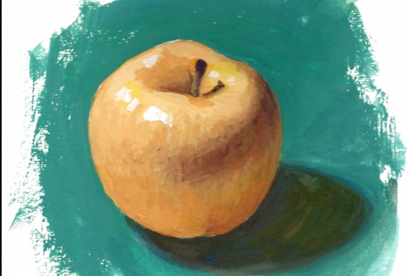
3. Quick Tonal Sketch: So I have my painting area here. I chose this little sketchbook, and today we're going to just, you know, start with some small sketches and I think that everybody knows that fruit is about as easy as it gets When you paint, so are you. Start paintings, though. This is where we go into pain today. Just, um, some apples, villages speak one little apple are kind of like this one and start sketching it on our paper. So this one is quite easy. Just go and try to follow the shape. You kind of remember that it is round, but, you know, it's not perfectly round, so we're just going to try to show what It's OK. If you don't know, make, uh, make it perfectly, make a perfect copy of it, not what we're aiming for, but just do you know, a basic sword of shape of apple and then obviously this damn just a little hole in here and there's a stem that's speaking out like this. And then there is a shadow. Let's not forget about the shadow. It's quite big and round and actually shadow iss around in an oval in its base. So We're just going to draw a little oval and we're going to remove the x X X lines. And we're just going to people lighten up the lines all together, just a little bit before we start with color. So now that we're down with a little sketch, let's just paid close attention. Teoh Tone and I would really want to make a tonal chart a total little chart before we start, just because it's going to be easier to work with pains if we do that now. So, um, Annapolis, basically a sphere atmosphere as divided in a light and a shadow, which we see here. There's also a little area that's gold rich flags. And there's this, ah, bright spot right, which is where the direct source of light is, Uh, and also we have this story right here, which is our lowest down where it's coming from, and this basically area is going to be in the shadow and this one in the catches the light . So that's why it goes. It goes as we see here and then a little stand that cast a shadow over here. So basically what we'll need to do is make this area quite light. This area is going to be darkest on our apple. This is going to be less dark than this area, but it's going to be lighter than this one, and this area is going to be the brightest spot on our apple, and also this is going to be very light. This is going to be in the shadow, and there's going to be a little bright spot just like this one in here. And basically all the shape all the shape goes a little bit folding over there. So it's going to go a little darker there, and you get familiar with the subject you needed, because wash is basically just, you know, a little complicated when mixing colors, it's shifts color when it dries out. That's why a lot of artists actually don't like it. But if you think of it, a lot of pains actually shift color when they dry out. The only medium that doesn't shift car is dry mediums like crayons, pastels, oil, pastels, you know, just something that doesn't mix with anything to be put on paper. Whatever makes us with anything to be put on paper. Even oils shift color. You just have to deal with that and washes does it More than any other painting is, the dark car goes a little lighter, and the lighter color goes darker. So whenever we make scholar, we have to keep in mind that whatever with mixing, which is a light color, is going to get darker. I know it sounds very complicated now, but in fact, when you start painting a lot with the wood, this medium, you don't find it so hard anymore, so you're going to get used to it. But meanwhile, it is going to pose a little problem, and you're going to be hating wash for some time before you get completely used to it. I'm just going to deposit a little bit of wash on my palette so we can start paint with it . I think one is a little more transparent than titanium white over literally that much, uh, and titanium would is just more opaque, and it does kind of white now, the color even more than nothing. Quite so. Also, what's important as a little cloth off paper, uh, which is a paper napkin because we need to be dabbing, are our brush a lot to take excess water from it. It's very important for your brush not to be wet at all times. It should. It's supposed to be not dripping. What like this one? Which one? Which is the one that you use? Watercolor. Even if you do this, this is not enough. You actually need to die obit in the paper and take the excess water out, so it's a little moist. But it's not what the consistency of the pain is supposed to be like. I'll say we've grain. Do say with cream. Yeah, it's very, very soft. So this is the consistency that we're going to be needing for work. If you have, um, a very Stig Wash. Ah, you just need to mix it with a little bit of water. If you have a very thin glass, you just need Teoh said it outside. So it dries out a little bit. Okay, so now we're ready to paint with the color. Let's proceed
4. Applying Paint: I started by mapping out my color areas. I feel in my light shape with a warm yellow color which is can yellow. Please notice the consistency of my paint. It's very creamy. Don't add too much water. Otherwise you will end up with a watercolor washed out effect. The right consistency of the paint is also crucial to blending out the edges later. Now I makes my yellow with a bit of blue and red Oakar to create this greyish brown, which will be my reflects and shadow area color. The color came out too light when I added white, so I decided to fill in my reflects area with it first. Then I add a little more blue and a little more red okra to it to make it darker. And this is the color I will fill in my shadow shape with at this stage, you have three distinct shapes off light shadow and reflects areas on the object. Now I started working on blending this areas with each other. You can see I'm mixing different shades of yellow to even out the transition by making a more won't less greyish brown. I'm working on the outer edge of the apple a swell as it needs to be a little darker because our object is basically round. Please notice that the area closest to the highlight is left untouched. It's crucial we have this pure bright yellow there. I also left untouched the area where the stem is going to be to even out the transition from my shadow shape. I makes a lot of color using the same makes already have on my palette and a bit of yellow and red okra. I add a little white to it and feeling the reflexes well, he can see me doing a lot of robbing circular motions while I put the pain on paper. It's to better blend the new colors with the ones that are already put to paper. I ended up with mixing more of that pure yellow color to sing without the transition with the shadow address on my apple. Now you can see the apple really take shape. Don't forget to add some of that color to the area right under this stem. As it catches light as well. I decided to add more red oak word to my shadow to make it less gray. Also, I want Haddon lighting of the reflex area by adding a little more yellow to it. Police mind that your reflex area cannot be brighter than the light area with highly dis situated, I will not take a smaller brush to work around the stand area. I started by adding the shadow shape and is before I try to plan it in with my layers again . Gua Shi is a very easy to blend because the layers on paper can be activated with water Again, I put a stronger highlight in this area because this surface catches the most light and we see that everything falls into place is now Sorry, quick transition to already blended piece of shadow around the stem. Now comes my favorite part though the highlight it Once you put that white low dot your object comes to life. Don't forget another little highlight right under the stem. I'm mixing this greenish grey to emphasize the shadow around the stand Mary again. And don't forget to blend. This is what a Creon pain is crucial. If the layer off your paint on paper is too thin, you wouldn't be able to blend one color into another, more red okra to bring in some interesting color reflections I see in the apple Oops! On good thing. You can quickly smudges and wanted pain before it dries out. Now take black at a tiny bit of white and red okra to it, and let's bait the state. I use an even smaller brush for that. With the leftover crash mixes on my palette, I pain the cast shadow off that stand here. Let's take a bigger brush and paint the cash shadow off the apple. The main rule is if the mainland is warm, such a sunlight or incandescent lamp, the shadows will be cool and vice versa. The cool light, like on an overcast day, will create warm shadows. Our apple here sits on a warm light, so let's make our shuttle blew. I make stork was blue with a bit of violet and add some white to it. The shadow gets gradually lighter towards the top, even darker, getting closer to the object. So don't forget to add the dark area right underneath the apple. I will add a little more light of blue and blunted out very well for the background that just makes tour Coy's with some white and feeling the whole shape. - I like how you can use the color of the background to fix the shapes that are not so exact. Like the shape of the shadow. I often use this technique when I paint, and here is the finished result.
5. Conclusion: so hopefully you like the finished results. And please don't forget to publish it in our project gallery so I can check it out and maybe give you some feedback. Also, if you have any questions, believe, let me know and obviously subscribed because there is a lot more lessons coming in this. Stickney, I really think it's a great technique for beginners but professionals. It has a lot of potential. And, you know, just little studies like this are so so handy to be before and in this particular technique in gua sh Thank you again for watching this video in Good bye.
 Ayna Paisley, Gouache Enthusiast