Transcripts
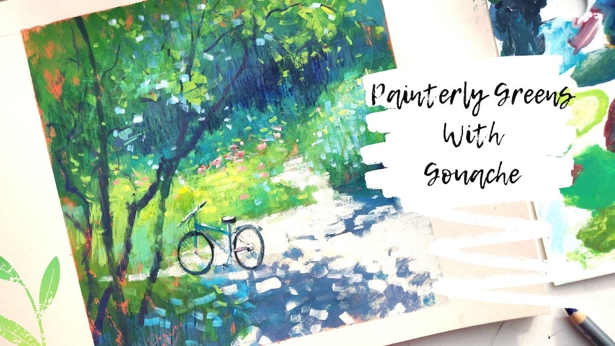
1. Introduction: Hi, guys. My name is on a pace. Lee. I'm an artist from Moscow, Russia. Welcome to my second class dedicated to go wash. If you have watched my first class called Wash for beginners tips and Techniques, please feel free to skip the part that talks about tools because that's going to be pretty much the same thing that I already talked about in the first class. However, you can have him watched my first class as strongly recommend you do, because there is a lot of basic knowledge and information you have to know before you start painting. But you're welcome to stick around with this video, even if you never painted with Ghalwash because it's definitely picking her friendly. The main aim of this classes to teach you how to pain light hands. How to great beautiful shadows. We'll start with a pencil sketch, simplifying the composition, place in the elements on your paper, measuring proportions and distances between objects. Next, we'll take a quick glance at a color will and figure out in theory and in practice, how to makes beautiful shadows were given to, you know, painting next up, using our knowledge will proceed to feelers catch with color. I will guide you through and through the color mixing process, naming the exact pain I'm using. Two great every mix. There's almost no way for you to get confused lost. And I'm sure you will end up with a lovely result, no matter what's your background. So if you're ready, let's begin, yeah.
2. Tools: for those who you haven't watched my first video, let's quickly revise my basic tool set up. I keep Monk awash in this very handy, airtight palate by beyond, You know the purpose of it is to keep my paints moist and ready to go whenever I want. I must say this ballot is pretty crucial if you feel like painting with gosh regularly. It has a tight lead with a silicon pat that prevents the pains from drying out. Here's a different palette by art Sacred A tested it out and found that the previous one keeps pains fresh for longer. So if you're choosing between the two, I definitely recommend beyond you. Both of them are purchased on Alex Press as the pains. I use a lot of Windsor and Newton, and I have a couple of shrink is as well as some Russian brand go wash, mainly in permanent white. I also used two types of white zinc wide by Windsor and Newton for my mixes and permanent white for the highlights. And here is the list of pains that I'm using in my palette. That's for the paper. I mainly use watercolor paper. I like the cold press type for the soft but physical texture. But I choose hot pressing. My painting suggests a lot of fine details. I use a lot of watercolor sketchbooks of different shapes and sizes to create my studies. I recommend you pick a thick paper approximately 200 or better 300 grams per square meter. I prefer synthetic brushes to use with my quash. I have a big selection. My main choices are usually big round brushes also like fluffy flat brushes for things like tree crowns. And, of course, you have to have small and tiny brushes for accents and details. I use a foldable cup to hold my water. I have a spray bottle to keep my paints wet. And, of course, my mixing trey in the next video are revised more detailed on what particular tools I use for this tutorial.
3. Setting Up Your Working Space: So here is how the finished work is supposed to look like. I will leave this painting in the reference part. Also, I will leave a photo that I use is a reference for this so you can use either to paint. Today I'm going to be using this paper, which is also watercolor paper. It is slightly just slightly textured. You can see it, but not too much. So I suggest you take not a very textured paper for this particular tutorial because them elements in this one are pretty thin. You have a lot of small details. It's going to be hard to pain if your paper is very, very textured. So I suggest choosing, for example, ah, hot pressed watercolor paper or even choose maybe something that's called a mixed media paper. Sometimes it's very it's smoother than a watercolor paper, and here I have my usual set of this. Well, I have my little box of saints, the one I showed you earlier. Also, I'll obviously have water and my tube off. Think wide or you can also use whatever. Why'd you have around the white? This permanent white is going to do as well or a titanium white. I have my little spray bottle for in my pain. And today, instead of mixing, try, I'm going to be using this canvass board that is actually packed in a in its original classic package, which is actually pretty good surface to makes you pains. And it's all bigger than my usual choice. I'm going to be using that. Of course I have my paper napkins and this set off brushes I'm going to be using today. You can see that there are not all round this time. I'm going to be using some flood brushes, and you can see that there are not too big. I suggest you don't pick a big brush for this painting. We will be mainly using some smaller size brushes like this one. Ah, this big brush is probably going to be used for the sky part, which is like a lot of blue that we have to fill in. So it's easier to do with a bigger brush. But just don't to take a very big bush because it's going to be hard to manage. And I'm going to start by, uh, putting the limits of my painting, which is of this size is 20 by 20 which is approximately this big. Also, I'm going to use a washing tape to kind of mark the border. So they're clean and sharp when I take it off. I really like when the engine is clean and also I'm going to use a little bored like this, so I can six my my paper so it doesn't wiggle around too much. Okay, now that we have are working space in order, let's get to the sketch.
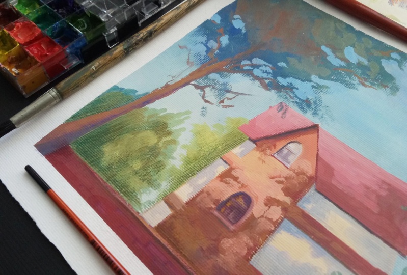
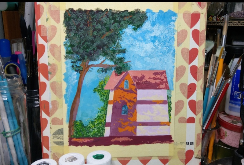
4. Sketch: I start off by mapping up a small grid to divide my surface in four squares. This will help me plan my composition. Now I know what part of the house and the trees going to fit in each square and can start putting first lines on paper. I see that the house is occupying the lower right corner, but it's left edge goes a little past middle of the grid. I'm using a faint pencil to map the objects, and then we'll finish my sketch with a decline. I put the roof in first. You can see that the walls of the house are not strictly vertical. It has a perspective, so the walls are slightly tilted towards the top. Every line on draw. I compare with the lives already put in. If you relate every new line to the one that's already on the paper, you can draw anything. The next element is the triangle shape in the roof. I measured the distance between the edges of the roof and map it out. Uh, now I dropped down a straight line from the top of the triangle. It will be a guideline for placing windows. Notice that the top window is a little smaller than the bottom one because of the perspective. - Now the decorative stripes on the house noticed that the bottom stripe is a little wider than the top one again because of the perspective way let out of the tree trunk got a little messy with my lines there, so I decided to erase it and starting new. The foliage is all concentrated in the left Quadrant, but I would extend it a little further for the sake of the composition. Now I take a softer pencil and make more distinguished line. I don't trace the guidelines or the grid, just that elements I'm going to paint later. Okay, By the way, if you want to skip this part, I will live a downloadable version off this sketch. You can print it out, can trace it and go right to the painting part. - I would also trace the distinct line off the falling shadows. It will help me paint later when you finished. It's always a good idea to check into your elementary in composition. By taking a picture, you will always see your errors on the photo. Even if you don't notice them on the sketch, this one seems correct. And now let's get to color
5. Mixing Beautiful Shadows: now, the thing that attracts are so much in this painting is obviously the light. And I think it's quite obvious to say that the light is indicated in the painting by adding shadows. So because out of the shadows on the house and I made the shadows in the trees a little bit more intense, the light on it actually stepped ahead. And it actually creates a really, really beautiful contrast. And this is the thing that we're going to learn how to do today. So basically, the main problem usually is to makes the right shadow color because sometimes when you don't know the color theory, you don't know how to mix properly the colors. The shadow ends up to be very muddy and dull, where in fact it has to be transparent and full of beautiful color to accentuate the light , not too dull it up. So today we're going to learn a little bit about color theory and why it is so important to know it, too, makes beautiful shadow colors. Now comes the Borden theory, But please bear with me for a couple of minutes. I will explain why it's so important. Call the theory is fairly simple. If you look at the color, will you have three basic colors red, blue and yellow, and you have secondary colors orange grain and violet. The colors that are opposite on the color will are called complementary colors, and they're very important for mixing beautiful shadows. If you look at the cold will, the complementary colors are red, queen, orange and blue, yellow and violet. And then you can see that there are variations of the colors called tertiary colors, and they, too, have their own opposites. Red orange is complementary to blue, green, yellow, orange to blue, violet, yellow, green to red violet. This color is mixed with one another. Create the most beautiful variations of great. Yes, you heard me not only the black and white grade, a great color. I would even suggest you skip mixing those boring, great and experiment with mixing beautiful grace out of the complementary colors. It's very important you pay attention to the type off the color. For example, notice how the deep, dark red is complementary to deep, dark green but red orange the one will call cadmium red better mingles with blue green. The color will will call Serie Liam. The newness is, and color is important to mixing. Beautiful greats and beautiful grays are key to painting Amazing shadows. If you are interested in more detail lesson on practical call a theory. Please let me know. I will feel a different tutorial of that. But now let's go back to our painting and see how this new knowledge will help us create beautiful shadows. So now, using the knowledge that we already have about color mixing, we're going to try to makes the shadows for this house. And I'm going to use a separate little little sketchbook here, and we're going to put the light parts in this little boxes going to put first the orange, the light orange off the house in this box. I'm going to put the color that indicates a light on the roof in this little box and the call that in a kid's light on the house and this box, and then right next to them, we're going to try to make the shadow colors that are going to match with all of the three colors that we need to use for the house. And this the easiest way for you to actually put it on paper. Later, I start off by mixing orange, which is cadmium red and cadmium yellow. You can also use Ah, premixed orange. I just don't have it in my palette, so I have to make my own. Then I put a little bit of cad red aside, and I'm going to mix it with Serie Liam, which is a complementary color to it. As we learned earlier, the mix should linger towards the red, so at a little more red than you do blue and also at a little bit of white, because our shadow can be so dark. Next is the roof color. I use cad red and Titania. What two makes a warm pink color. Maybe add a little bit more white. It's supposed to be fairly light. I want my shadow to be a little cooler, so I take a cooler red, which is a lizard in crimson, and I makes it with Tour Coy's. I used to work wars instead of green because it's lighter and also cooler, so it helps me achieve a beautiful color, easier and faster. Also, don't forget to it white for the color of the house. I take a lot of white and makes it with a tad bit of poker to achieve. A warm, beautiful white Oh two makes a shadow color. I just add a little bit of while it to it. You don't not need to add more white because the mix is already there. Very light. Notice how the lighter color has the lightest shadow. The shadow cannot be the same. Darkness and light and vibrant objects. And we're done. Now, though, we practice color mixing, Let's finally paint our house.
6. Filling Sketch With Colour: I find it easy to start my painting with a larger areas of color. It's easy to guess the tone and color correctly in this case here, he started by filling in this guy first using my biggest brush, I'm ex cobbled and why to achieve a bright blue. Please Berryman. That watch gets lighter when it dries out. So makes a color that seems a little darker than the one you came for. Even if the sky seems one color, it's always great to make a slight gradation. The sky gets a little darker towards a top and lighter towards the horizon so you can see me mixing in a little bit of white one. Getting to the house. Also, mind that whenever you add a color to the mixture, it will darken. It's almost always when adding color. You have to, at some white to the mixture to kid the same tone. Getting close to the horizon line. You can see them mixing in a little bit of toys and more white. I paint around the trade ground and keep nice, clean, anxious of the house. You can pick a smaller brush to get the most accurately but don't worry. The good thing about quash is that you can always go back and fix whatever you want. Also, the good part of Bag Wash is that it's very easy to make the colors right on the paper, quash as activated by water so you can basically mix in the new car in the old color that's already sitting on the top of the paper, which you can see me do here. - Way of life, part of the house that makes a vibrant orange with the help of cadmium bread and can be, um, yellow and following the pencil guidelines for the shadows I created earlier in my sketch, I feel in the light areas of the house. I'm using a really big bush for this, but it's actually better to switch to smaller brush, which I do here Now I will makes my shadow color. Remember how to do it makes cadmium red with cerulean blue and add a bit of white in it. You will achieve a beautiful, muted red color that's perfect for shadows. Switch to smaller brush and fill in the areas of the shadows on the house. My mix ended up a little bit too blue side and more right to it and a little more white police mind to not use a lot of water. You paint a supposed to be the consistency of yogurt, not milk. Your brush is supposed to be dumped when you pick up a color, but not what it's crucial to achieve the desired capacity of the paint. On paper, it shouldn't be transparent. Fill in the decorative elements of the house as well, and indicate the phone shadow off the roof. - Notice how I had little dots with shadow here and there that indicates the line that goes through the foliage. I know that I put it in. I notice that the color of my house is not light enough. I corrected by mixing and you orange with more whitening and more yellow, and I just go over the old orange color fixing this. Now I noticed that my shadow is too dark. I had more white to the early shadow makes with the orange. I had a little more light holds in the shadow to create a more dynamic shape at a literal crimson to shadow makes and fill in the fence in front. - Now I'm mixing the roof Caller, can you? Red and white is grating. A warm think fill in the light areas of the roof. Again, police noticed the consistency of the paint. It's pretty thick. I take a lizard crimson and add to request to it and a little bit of white. I feel in the roof shadow areas. Now, Uh, now that I did that, I noticed that my Ruth color that indicates slide is a little too dark. I add more white to it and fill it in again. - I tried to vary. The shape of the shadow here is Well, uh, I makes peril in violet and dial a blue to create a dark, almost black color and indicates on dark areas under the roof. I take a smaller round brush for that. Yeah, also indicate the window frames. I fell in the light area for the wall of the house with a mix off white with a tad bit off okra in it. But of all the guidelines for the shadows I put on earlier in my sketch for the Shadow, I had a 10 bit of violet in this mixture. I got one on the side, but you can mix yours with ultra wearing blue and magenta. They'll in the shape of the shadow noticed me adding various shapes and gots to it. - Oops , too. Got a little detail here and more light areas on the wall of the house to vary the shaping shadow for the windows, take Kobold. Mix it with red and at a tad bit off white. Net knows the bottom window is a little darker. I use the previous mixture of peril in violet and stale. A balloon and with a bit of white indicate the wide frames of the window. With various moment brush noticed. The brush has to be almost dry. That's a glare to the windows. With the light from mixture, the house is done for the tree. I pick up a fluffy flat brush. Please mind while painting foliage at a minimum amount off water to mixture. The pain cannot be liquid to achieve the desired effects. You can see when I put it on the paper. It's very, very try. I create a very dark green by mixing Elizabeth crimson, daily blue and dark green. I feel in all the area of foliage. Notice my brush strokes they're a little chaotic. The main thing about trees, you have to be bold with a brush strokes halfway through. I started at in different greens and Ludden mixture. I had chromium oxide, and I also add some burnt sienna to create the effect of leaves catching the sunset light. When the fully jerry is covered, I add a letter green on top to create volume. And then I had some burnt sienna mix with chromium oxide for that sunset light trap and leaves. Now I have to go back to this guy. I strongly recommend you change water and you use a clean white out of the 22 makes a perfect clean blue collar we used for the sky, which is global blue and white. Take the same brush and start working around the foliage, shaping and with the color of the sky. This is gold negative painting. Add more air to foliage by placing some sky holds. Try to be random with your strokes. Do not full a pattern. Uh, for the truck shadow poor. Just use the overall greenish reddish mixture you already have on your pallet and add a little bit of Coble to it. maybe a little bit of white, too. Take a smaller round brush for the light area. Makes some cat red with white, and it will immediately look like the trunk. Sketch of the last light of the setting sun with the same color at some whimsical branches to treat. Try to not follow a pattern. Just add them here and there chaotically with a dry brush and the same mix to the foliage very, very lightly. Make sure that there is no white areas left. Here's a dark grain to indicate the bushes in the background with the brush that you use for the tree foliage. Be careful not to overlapped already painted parts. You can take a smaller brush to work around the house, and the fans take a small round brush and finishing touches. I bring in the window frames and added some wide rams on the roof. I also went over the foliage once again with damp brush to smudge it a little bit, and we're done
7. Conclusion: So here's the finished result. Hopefully you like the class. If you did, please review my class. So I know that you liked it. And I know that I have to make more of these. If there's something you want to tell me on how I can improve my class, I would be a very, very grateful of course. Please don't hesitate Teoh posting project and shared with the community because I would be really happy to give my feedback when you work. Maybe that's going to help you improve in your painting with you. Wash for now. I wish you good luck in by.
 Ayna Paisley, Gouache Enthusiast