Transcripts
1. Introduction: In this class we'll be painting four flower fields and I'll be taking you through the entire process in real time so you can paint along with me the whole way As a beginner, I painted a lot of flower fields as not only were they pretty to look at, but I found them relatively simple to understand how to paint. I'll share with you my simple approach as to how I break down flower field paintings And once you understand this basic approach you can have a lot of fun painting them. We'll be using reference photos for each of them so I can show you how I interpret and deconstruct them. In one of them will be combining two reference photos as we take inspiration from each to create our own flower field This class will ease you into gouache and get you feeling comfortable painting a fairly simple landscape. After painting these four flower fields hopefully you'll be able to take the skills and apply them in your own practice of painting flower fields from reference photos or making them up from imagination.
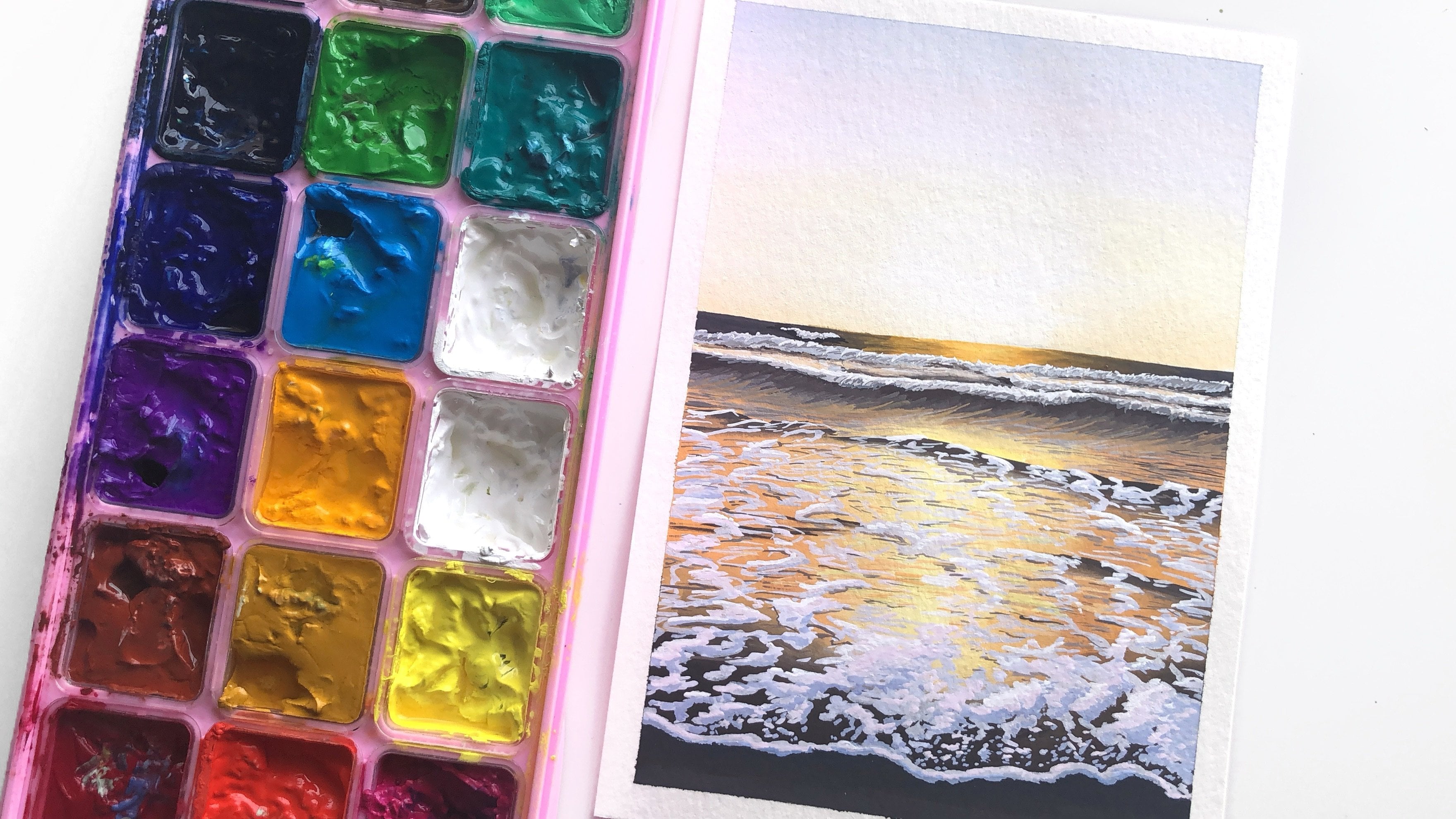
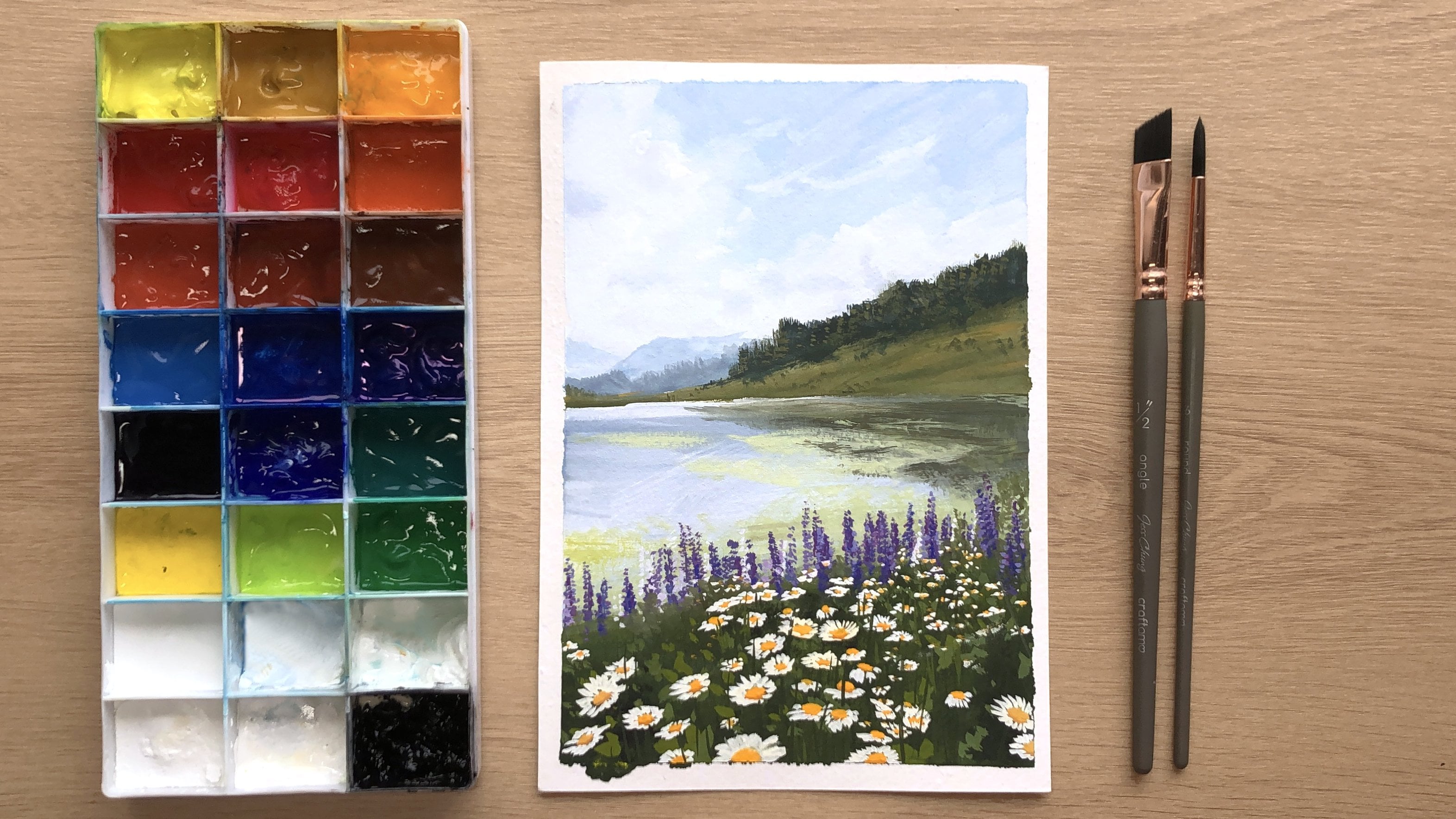
2. Materials: In this class I'll be using the Himi gouache But you're of course free to use any kind of gouache that you have Preferably the colors that you have are cool and warm of each of the primaries, a black, white, and burnt umber If you don't have burnt umber, you can mix it from the primaries, but I just prefer to have it as a premixed tube for convenience. I'll also be using the palette that comes with the Himi gouache. You can use any kind of flat palette that you have, or even the lid of a container will work just fine. For brushes I will only need to a flat brush and a round brush. Both of them are synthetic. I'm using a half-inch angular shader, which serves the same purpose as a regular flat brush. And I'm using a size six round brush. The round brush comes to quite a fine tip. Otherwise you can also use a liner brush if you want to do more detailed work. I'll be painting on water color paper This one is 300 GSM The higher the weight, the better it can hold water. But for gouache, anything around 200 GSM or above will work just fine. You'll also need two jars of water, one for cleaning your brushes in and the other for clean water to thin down your paint. I also recommend having a spray bottle to mist your paints, especially if you're using the Himi gouache or just a spray bottle to mist your palette as well to keep the gouache fresh on there. You'll need a cloth or paper towels just to absorb the water from your brushes. For tape, you can use washi tape or masking tape just to hold down the edges of your paper and to give you a clean border. A pencil for doing some light sketching and an eraser just to clean up your lines I like to use a kneadable eraser and this is optional, but a palette knife for scooping out your white from the Himi gouache just to keep it nice and clean.
3. Flower Field Overview: Before we start painting, I just want to quickly talk about my approach to painting flower fields and how I just break it down into three simple sections. So you start by first just placing in a horizon line where the sky meets the field. And then the first section that I think about is the sky. So you might have some clouds in there or some other kind of interest. It could be a really moody sky. And then in front of the sky you might have some element like some distant mountains or a row of trees or both. So that first section I just think of as the sky plus some kind of element or interest. The second section is the field and I like to start with the block in. So usually there's a gradation from dark to light, darker in the foreground and lighter as it recedes into the distance. And that's just because of atmospheric perspective. Things grow cooler and lighter as they fade into the very far distance. Once you've got the field blocked in, then you can paint the grass or the stem of the flowers on top. And here you can also build in perspective into the painting by making sure that the grass is longer and taller at the front And as it recedes to the horizon line, it grows shorter and shorter. And depending on how large this field is and how far away the very edge of it is the grass might fade into tiny little dots because it's so far away. So the second section is simply just the field block in plus the grass and stem of the flowers. The final section is of course the flowers and it follows the same perspective rules as the grass, larger at the front and smaller in the distant. Usually I like to paint the front few flowers in much more detail And then as they fade away, I just paint them in as little blobs and then into little dots And as long as the front few flowers are more detailed our mind will just fill in the blank for the rest of them. And even though the rest of them are not that detailed they still can have that effect of looking very detailed. Once you have an understanding of this basic approach, you can apply it to any kind of flower field you want to paint. For example, if you want to paint a field of tulips you can start by placing in the horizon line and then pulling out the rows of tulips from the vanishing point. And the tulips will be larger closer to the viewer and smaller as they fade away. So with that basic approach in mind, let's put it into practice and paint a few flower fields.
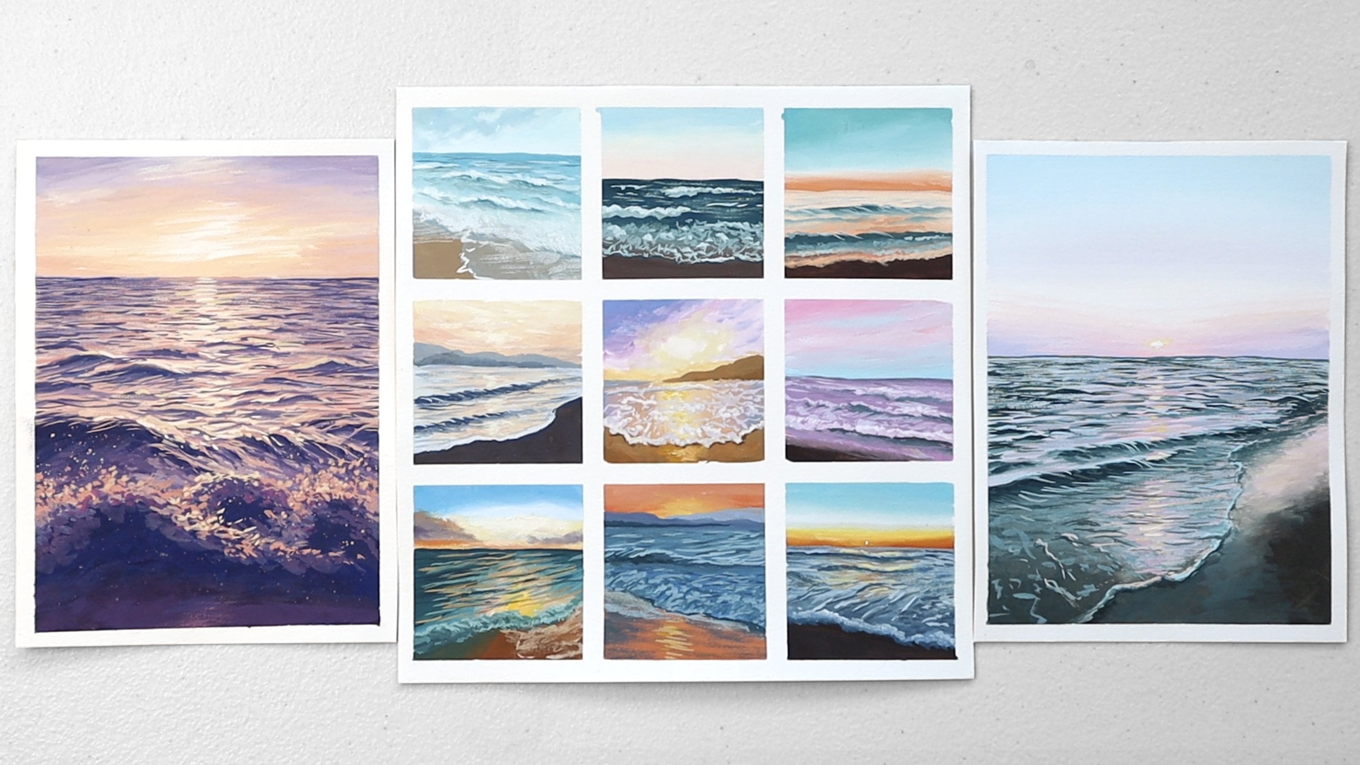
4. Sky - 1 & 2: We're going to be painting four flower fields And I'm just taping down the paper with some washi tape and splitting it into four sections. Each of these are quite small, they're no larger than an A6 size. I start by just penciling in where the horizon line goes for each of them. And I am working off reference photos, so I will have them up on screen so you can always look at them and see what I'm working with. I'm keeping the pencil nice and light so that way the paint can easily cover it. And I also go in with an eraser just to clean up some of the lines and also soften them a little bit. Most of this class will be in real time so you can paint along with me and also just see exactly how I paint. So I like to start usually by just misting my paints so they're nice and fresh and ready to go. And then I start with a flat brush and I just soak it through and take off some of the excess moisture. And then starting with the first flower field, I'm going to paint in the sky, which is just a very light blue. So I pick out lots of white and I pick up a little bit of the cool blue and also mix in a tiny bit of burnt umber, which just helps to tone down the blue and make it a little bit less vibrant. And I'm going to add a lot of white to it as it's quite a light blue. And I'm just going to paint in a nice gradation from a slightly darker blue to a very light blue. The more burnt umber you add, the more you push the blue towards grey. So if you feel like the blue's a little bit too grey you can just balance it out by adding in some more blue. Or if you feel like the blues too vibrant then just add a little bit more burnt umber. If you're completely new to gouache I do have a beginner's guide to gouache class here on Skillshare. So do feel free to check that out first if you are struggling with how to blend in gouache or how to use the consistency of gouache Right now I'm using the gouache quite opaquely and in a creamy consistency, so I'm using plenty of paint and I'm thinning it down with just enough water so it can flow across the paper nicely. And as I move down the sky, I'm adding in more white so I can get a nice gradation into very light blue. I also bring my brush back up as I try to lighten the sky little bit and just blend it out nicely. Now I'm going to move on to the sky for the second flower field. And I'm still using the same paint on my brush because it's the same blue. I'm just making it a little bit more vibrant by adding in more of the cool blue. And starting off with a bit of a darker blue at the top. I'm just going to repeat the process to paint a nice gradation. I added a little bit of ultramarine blue, which just makes the blue a little bit warmer. Now at about halfway down the sky, I clean off my brush and I pick up lots of white paint. And I place it onto where I placed down my last stroke and start to blend upwards into that dark blue. And this will just help me get that smooth transition. And then as I move down, I'm going to add in more white so I can transition it nice and smoothly. I clean off my brush and lightly dry it off and just go back into any area that I want to blend it out a little bit more and just lightly brush across it and also just fix up any other areas that I want to be a bit more smoothly blended. Once I'm happy with the sky, I'm going to go back to the first flower field and work on that tree line in the front. And for this I'm going to switch to my round brush and I'm going to pick up lots of yellow and a bit of the black and mix them together for a very dark green. And using that I am going to paint in the silhouette of the trees is how I like to think of it. I also mix in a little bit of the green from this gouache set if you don't have a premixed green, you can just mix up a little bit of yellow and a little bit of blue. And I like to mix in some green and yellow with the black because I prefer to have it as a very dark green rather than a pure black. I usually like to start by first placing in the tree trunks. And I'm only very loosely basing this off the reference photo here because I've painted trees like these so many times I don't really need a reference photo to know how to paint them. So I'm just loosely looking at the reference photo but mostly just making them up how I like. I mostly use horizontal strokes to paint the trees, starting with thinner and shortest strokes at the top and building it out to be wider at the base of the tree. This is just the first layer that we're painting. We're going to build it up into three or even four layers to really build up the depth of this tree. So this is just the first layer where we just paint in the shape of the trees. I tried to paint loosely and quickly so the brushstrokes are more natural. And I try my best not to paint the trees symmetrically as I want them to be different so they look more natural. Some trees are taller some trees are shorter and wider and I just vary them to make them interesting and look more alive. You just want to continue this until you build out the entire tree line. And then I'll come back and explain how we can start to highlight and build out the depth in these trees. To start highlighting the trees, I'm going to mix some more yellow into the mixture to lighten it. And I'm going to start highlighting from the right side. So I'm going to pretend that the light source is coming from somewhere in the right. And you wanna make sure before you go in with the second layer that the first layer is completely dry, otherwise your paint is going to muddy together. And it's going to make it difficult for you to layer on the slightly lighter green on top, although usually the paint should be dry because it does take a little bit of time to work through painting that entire tree line. So as you can see I'm going to concentrate that second layer more towards the right hand side of each of the trees and just paint on tiny little horizontal strokes just like we did for the first layer. Except this time I'm focusing the strokes on the right side. The green for the second layer might at first look very dark when you lay it down, but just give it some time to dry and it will dry a little bit lighter. You don't want to go too light with your second layer. as we're still going to go in with a third, and fourth layer to really bring out the highlights. Now I'm adding in more yellow to mix up a lighter green so I can further highlight the trees. And at this point I'm using a spray bottle to mist my paints and my palette because they've been out in the open for a while and I don't want them to start drying out. I concentrate these highlights more towards the right side of each of the trees. And up until this point, I haven't really used white to lighten the mixture because white will make the color more pastel and I still want to retain the vibrancy of the green. So I'm only adding in yellow to lighten my green so far. In the final layer of highlights I will add in a little bit of white just so I can really make some of the colors much lighter than the others and really highlight some areas of the trees. It's time to add in a little bit of white And I'm using a palette knife to scoop out the white so I don't contaminate it with the green of my brush. And I'm only going to select certain areas to highlight on the trees, mostly towards the tip of the trees as that is where it's receiving more of the light. Once we finish the tree line, we can clean off the brush and move back to the second flower field painting where we'll work on the distant mountains. I'm mixing cool blue with some burnt umber to tone down the blue And to me the mountains look a little bit more blue green so I'm using more cool blue I do mix in a little bit of ultramarine blue, which is a warm blue later, but mostly keeping it nice and cool and also keeping it nice and light because the mountains are quite far away in the distance. And the further away they are, the lighter they are, so I'm adding in white to make it lighter Once I block in the shape of them then I'll go in and paint on some of the details on them like some other green that I can see on the mountains. I clean off my brush before I go back into some of the green that we were using to paint on the trees from before, so just that same black and yellow mixture. And using that, I'm just gonna add on some details to the mountains and just place a few strokes here and there and make some parts a little bit lighter just to highlight the mountains a little bit and give them a bit more shape. I'm using white to lighten the green as this time I do want it to be more of a muted pastel green. So we're almost done with the mountains here And in the next lesson we'll move on to painting in the sky for the third and fourth flower fields
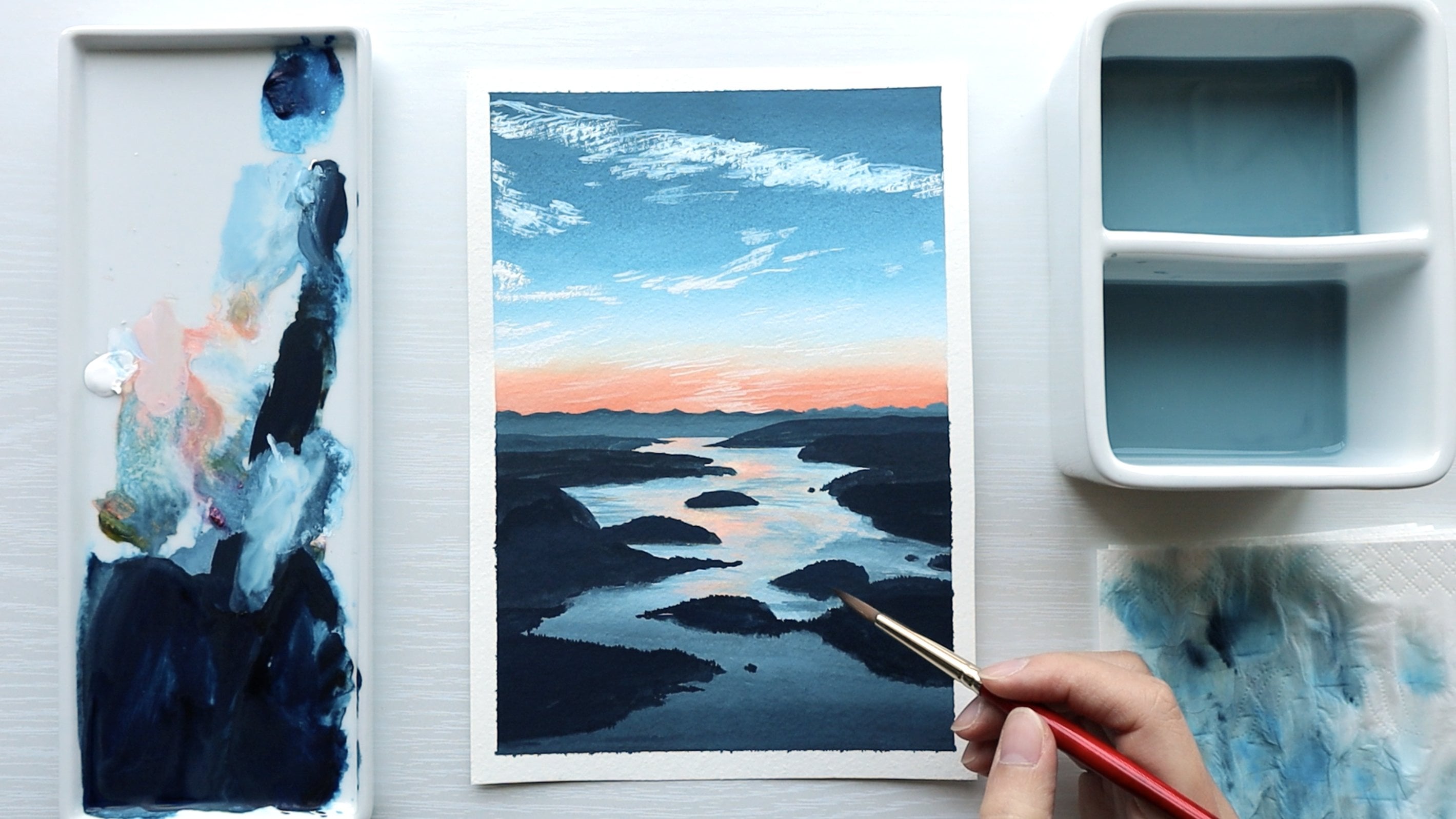
5. Sky - 3 & 4: For the third flower field I'm switching back to my flat brush so I can block in the sky and I'm going to mix up a purple using the ultramarine blue, which is a warm blue, and the cool red, which in this palette is the rose from the Himi set And the warm blue and the cool red will give us the most vibrant purple. I'm going to tone it down with a little bit of white and just make it a bit lighter and a bit more pastel. And as I transition down, I'm going to add in more white. And then this sky will transition into more of a pink and an orange. So I'll clean off my brush So I wash all the purple off and I pick up some of the cool red and I mix it with some white to mix a lighter pink. And I only mix in a little bit of the purple from before. So that way I can still get it to transition nicely because I'm using the paint quite opaquely and there's a lot of pigment on the paper. I'm able to blend out all the paint on the paper so I get smooth transitions. Now I clean my brush off again and I'm going to transition into this warm orange. So I'm picking up some of the warm yellow and a little bit of the pink. And at first it's a little bit too dark. So after I placed that little bit down on the paper, I clean off my brush again completely and I just pick up pure white paint. And I go into that bit that I placed down and just start to blend it out together. And that way I can easily make the paint lighter while continuing to blend on the paper. You want to be careful not to mix the purple and orange together too much because they are somewhat complementary colors on the color wheel and mixing them together will mute the color and make it a little bit muddy. I'm leaving a little bit of a triangular gap here as you can see, as I want to fill that area with yellow. So I clean my brush off and I pick up some more white and some of the cool yellow and mix up a very light yellow and just blend it into that triangle and blend out the edges. Now I like to go back and just see if I can soften out any of the edges between the blends So I just clean off my brush and lightly dry it off and I go in with a little bit of paint if I need or otherwise I just go in with a clean damp brush and just soften out some of the blends. Then I switch to my round brush so I can paint in that distant misty mountain and I'm mixing up more of the purple paint just using the ultramarine blue and that cool red. And I start by just placing in the outline of the mountain. And then I'm going to keep adding more white to the purple to make it paler until it eventually becomes a very pale and misty purple. I pick up some more ultramarine blue and some more of the cool red to mix up a tiny bit of a darker purple. And I try to outline the top of the mountain in a slightly darker purple. Because if you have a look at it, you can see it's a little bit darker at the top, just at the very edge, and then it fades out to be lighter at the bottom. Now for the mist effect, I clean off my brush and I pick up lots of white paint and I also thin it down quite a bit. And then I just scrub that onto the paper and I'll come back and blend it out with the darker purple above. The trick to making it look misty is you want to have a lot of paint on the paper, but you also want it to be quite runny So that way the colors can just easily bleed together and just create that natural misty look. I clean off my brush again and I pick up some more white and thin it down with water and go in with another line just below what I just painted in as I want to fade it out into white, you can see I'm just moving my brush back and forth as I try to let the paints just mix on the paper. I clean off my brush and now I'm just going to fix up the edge where the mountain meets the sky. And then I also want to soften out the top edge of the mountain as I want the whole thing to appear a bit more misty. So to do that, I just clean my brush, lightly dry it off, and go in with a damp brush and essentially reactivate the paint on the paper so I can soften out the edge. You do have to be a little bit careful here because once you place water back onto the paint, it will reactivate it, meaning the paint could bleed. And if you're not careful with the control of it, you might also pick up too much paint on the paper. And if the quality of your paper is not as good, the paper could start to peel or just buckle under the water. So do try to be a little bit careful in this step and just be a bit more gentle. The final sky is a very moody purple So I use the same purple as I did before, using the ultramarine blue and the cool red and I mix up a purple that leans a little bit more towards red this time. So I use a bit more of the cool red in the mixture. And I start by placing a few dark strokes of purple at the very top. And then I'm going to lighten it with white and I'll leave a little bit of gap between the two where the cloud is a bit more white in between There's a lot of paint on my brush, so I'm applying a lot of paint onto the paper. And now I'm going to wash all that purple off and just pick up some pure white paint and put it onto the paper in between the two purples And because there's a lot of pigment on the paper, I can just blend out the two and it will naturally create that moody look in the sky. Now I want to start to fade it out into pink So I pick up more of that cool red, mix it in with the very light purple mixture that I have and place it in just below that purple on the paper. I keep adding white as I want it to be lighter. I clean off my brush again and pick up some pure white and place it just below that pink from before And then I'll bring it up to meet the pink so it can blend out while still preserving that bit of white at the bottom. So the sky is pretty much finished. I decided to go back to that top part and just try and play around with it But the result was pretty much the same. So I've just fast forwarded that bit
6. Field Block In: Now it's time to block in the field And this step requires you to look past all of the details in the flower field and just find that base color and block in the average value of the field. So when I look past all of the flowers in this first reference photo I'm looking behind it and seeing what colors can I see in this field. So at first I could see a little bit of a warm yellow. So I used a little bit of yellow ochre mixed with some white and just roughly blocked in that patch. Then I mixed up a muted green just using the same green as I used to paint in the trees from before. So mostly just yellow with a little bit of black. And I'm going to just paint in a gradation from dark starting at the bottom to a lighter green towards the tree line. And this gradation helps to create the illusion of depth in this painting. I usually like to paint the base color a little bit darker because I'll still paint the grass on top and that can help to lighten it. So I like to pick out the darks just so I have a little bit of room to make things lighter afterwards rather than going too light and not having enough of the darks in there. So as I make my way up towards the horizon line, I'm just adding in more white and a little bit more yellow and just making the paint lighter and also just blending it out as I go. Now I'm cleaning off my brush because i want to pick up some more yellow ochre and blend in a bit more of the yellow into the field. So I'm mixing the yellow ochre with white and just placing it in certain areas just to create some interest in that base layer of the field. I basically repeat the same process for the second field, but this time the base layer looks a little bit darker to me. So I'm using more black in the green mixture. And I'm starting with that very dark base at the bottom. And like I said before, I will be painting on grass on top that's a little bit lighter So I'm making the base color a bit darker just so I can have those darks in there before I paint on the lighter grass on top and at the very top, I'm going to leave a bit of a gap between the mountains and the block in of the field because I'm going to fill that area with just red because the flowers there are so far away that they're all just grouped together. And I want to keep that paint as pure red as I can. For the third field, I'm mixing black with yellow ochre as I want a bit more of a muted green. And I'm again transitioning from a very dark green that's almost black. And then I have to fade it out into the misty mountains. So eventually the paint will become almost white as I try to blend it out with the mist just below the mountains. So I'm just adding in more white and more yellow ochre as I move up. And I also clean my brush off halfway because at some point I just have too much of that dark paint on my brush. And it would just be easier if I just clean my brush off and just pick up some clean white paint. Then I switch to a round brush for a bit more precision as I work on that blend between the mist. And I pick up a lot of white paint and thin it down with some water and just drop it onto the paper in between the mist and where the field is about to meet and because the paint is quite wet it makes it easier for me to just make the two parts bleed together naturally. For the final flower field, I'm mixing yellow with some of the cool blue, as this green is a little bit more vibrant. But then I also add in black to tone it down and make it darker towards the base. And I simply just paint in a gradation again. I also do the same thing where I leave a little gap between the sky and the block in of the field as I want to paint that top part in in pure yellow to suggest that the sunflowers there are very distant and are very grouped together.
7. Grass: Once the base color for the field has been blocked in, we can work on painting in the grass and any flower stems. So I'm starting off with quite a dark color using black and a bit of yellow. And I'm keeping that perspective in mind where the grass at the front is longer and the grass that's further away is a lot shorter and thinner until it almost just fades out into little dots. I usually like to just continue to build up the grass so I do jump around a little bit. Sometimes I'll start at the bottom and paint in some grass and then I'll jump towards the back and paint in some shorter grass or just go in the middle somewhere and I just go around and just build it up in lots of little patches and in layers. And because I started with the dark grass, I'm just going to keep adding yellow to the mixture to make it lighter. So I have a bit of variation, I have some darker grass and some lighter grass. So in this step, I'm just observing the reference photo seeing how does the grass grow, is it quite tall, is it quite short. Do they grow in patches And it's up to me how accurate I want to make it to the reference photo Usually I go quite loosely and just use it as a little bit of inspiration. So I'm just trying to paint in as much grass as I can Obviously, the aim isn't to paint on every strand of grass in there I'm more just painting in little patches here and there to suggest that this is a field of grass and once you paint in all the flowers on top as well. It will start to look quite full, after I paint in the flowers, I also like to just come back and fill in some of the gaps with some more grass. So I do come back to the grass at a bit of a later stage just to fill in some more areas I try to make the field Interesting and look more natural by varying the greens. Sometimes I'm adding in a bit more yellow, sometimes I'm adding in more yellow ochre, and just varying it So it's not all just one shade of green With the second field because the block in is very dark, I'm going to mix up a lighter green and paint on the lighter grass So I'm kind of doing the opposite of what I did for the previous one. Where there was a lighter field and darker grass on top This one has a darker field or a darker base color and I'm painting on the lighter grass on top. And that's one of the great things about gouache is that you can either work from dark to light or you can work from light to dark. So as long as that base layer is completely dry, which it would have been as we're working through four paintings So by the time we come back to one of them, they're all dry by now. So it's easy for us to layer on lighter colors on top of that dark green because everything is dry. And I am just repeating the process of painting on grass that is taller and a little bit thicker at the front, and then grass that is much shorter and thinner in the distance. For the third field, I want to start with some of the light leaves that I can see peeking through between the flowers. So I've mixed up a very pale green, just adding some white to the existing green mixture on my palette. And just using the tip of my brush, I just place in these strokes that look like leaves. If you have a brush that comes to a fine tip, then you'll be able to paint on these leaves with a very pointy tip. Or if you have a more rounded brush, you'll just get more of a rounded leaf look. So I'm just using the very tip of my brush to do this. And the leaves become much smaller as they fade out into the distance. So I'm almost just painting on these little dots. After I've got the leaves in I want to paint on the stems of the flowers that I can see, and they're quite dark. So I'm using mostly black with a little bit of yellow and I'm just going to weave these stems in around the field and on top of the leaves. And lastly for the sunflower field I also want to paint on the stems and the leaves for all of the sunflowers. So I'm mixing up a lighter green as that base is very dark. So I'm mixing cool yellow with the cool blue and a little bit of the warm blue, just to tone it down a bit since a cool yellow and a cool blue will give me the most vibrant green. So I don't want it to be quite as vibrant so I tone it down with a little bit of the warm blue. And then I just paint on the rough shape of the stems and I'm not going for a very realistic look. It's more just sourcing inspiration from that reference photo and just painting loosely. So I paint some larger stems at the front with larger leaves and in the background, they won't be as clear anymore. I'm just gonna try and fill in the space to block in most of the field. Once I've filled in most of the area in the field then I'm going to mix up a lighter green and start to highlight the leaves so there's a little bit of depth in them and they don't look as flat. It's time to start highlighting the leaves and stems now. So I'm just adding more yellow, into the green mixture to make it lighter. And I'll just randomly choose some leaves here and there to highlight just so the stems and the leaves have a bit more depth to them.
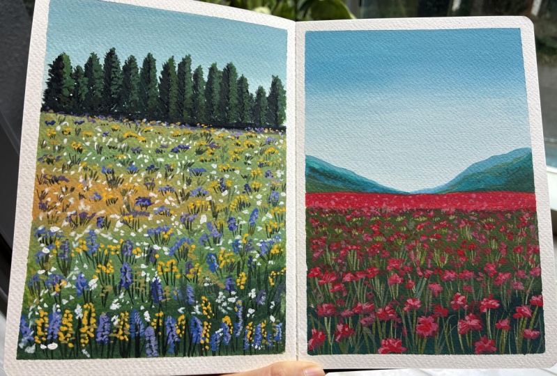
8. Flower Field 1: Now for the fun part which is actually painting in the flowers. So I just start with one of the colors I can see. So I'm gonna start with the purple flowers first, and I just mix up a vibrant purple using my warm blue so my ultramarine blue and my cool red. And I just paint on the shape of the flowers. And usually after I paint them in and I position them, then I'll go in with some highlights to bring out some of the shape. And then I'll also go in with some darks afterwards as well. So for now I just want to place them all in. And again, I'm keeping perspective in mind. The flowers are larger at the front and then they eventually just disappear into tiny little dots. I'm jumping to the back of the field now as I paint in the really distant flowers and I'm making them a little bit lighter. And I just jump around the painting as I try to fill in all the gaps. And once I'm happy with the amount of the purple flowers in there, then I'll pick out another color and move on to that. And pretty much just repeat the process. For the distant flowers, you can also bring them a little bit higher and paint them just above where the end of the field goes up to. So that way they're kind of covering the bottom of the tree line. And this also just helps to bring the two parts together so they don't look separate. Now it's time to start highlighting some of the flowers. I'm mixing a lot of white into the purple. And I'm going to highlight along the outer edge of the flowers. And that way it'll just make them pop a little bit more. I'm moving on to the yellow flowers now and I'm mixing the cool yellow with the warm yellow, and because the background is a little bit dark, it can be hard to make that yellow pop so to help make it a bit more opaque I add a little bit of white into it. And that way the yellow will just stand out a bit more against the dark background. I now move on to painting in some white flowers And this really helps to bring everything together. I try to fill in all of the gaps between the field so that way it just looks a lot more full At this point I switch back to painting in some grass as I like to layer in the grass then the flowers and then go back with a little bit of grass and then some more flowers on top. And I feel like that just ties the whole field together a little bit better as you have some grass sitting in front of some flowers and some flowers sitting in front of some grass. So it just looks a bit more natural to me. So we're pretty much done with our first flower field now At this point you can keep going and you can take it as far as you want. Or you can just stop, if you want to add more details If you want to fill in more of the gaps then you can keep going and you can keep building up the flowers and the grass or if you're just happy with how it looks now then you can leave it as it is
9. Flower Field 2: Let's now paint on the flowers for the second field, I'm going to start with the far away flowers first because I've left that little gap between the mountains and the field and I'm just going to fill it with some pure red. So I'm using the warm red and I'm mixing it with a little bit of that orange. If you don't have an orange in your palette, you can just use some warm yellow And the reason I lighten the red with yellow or orange instead of using white is because if I add white to red, it's going to make it pink. And I want it to be more red than it is pink, but I wanted to be a little bit lighter. So I just lighten it with some yellow or with some orange, and because I left this part white it's going to be easy to get a really nice and vibrant red, as you'll see in a little bit when you try to paint the red flowers on top of that dark green base, it's going to be very hard to try and get that vibrant red. So we're going to use two to three layers to build up the red to get it to be more opaque and just so it stands out more against the dark green background. When you're laying down the flowers you might immediately notice that they're quite dull against the background. And it can be tempting to want to try and keep layering the red to get it to be more opaque. But it's important here that you actually let it dry completely and then come back later with that second and third layer to bring up the opacity. Because if you keep applying brush strokes and you keep trying to apply more red on top, you're going to slowly start to reactivate that green underneath which will only make your red muddier and make it darker. So I'm trying to be gentle here when I'm laying in the red. I just do two to three strokes to build out the shape of the flower. And then I leave it and move on to the next flower. So I finished with the first layer of flowers and I've let it dry completely. And now I come back and I just lighten the paint a tiny bit. I add a little bit of white but I'm trying to lighten it more with orange and yellow rather than white, as I don't quite want to push it towards that pastel pink color. So instead of adding white I decide to add in more orange to lighten it And I'm just going to go over most of the flowers and just give it a second layer just to make it a little bit brighter. After I finished the second layer that's when I'm starting to highlight the flowers And now is when I'm more okay with adding white to it as I do want it to be a lot brighter So I can highlight the edge and the top of some of the flowers And I'm only loosely using the reference photo as a guide, I just add a little bit of a highlight to the top of all the flowers and that just makes them have more depth and just makes the whole field a little bit brighter as well. Now I'm trying to tie together that strip of pure red paint we laid down for the flowers that are really far away and that are really grouped together. And I'm trying to tie it with the rest of the field because you can see that red we laid it on top of the white of the paper so it's very vibrant. Whereas the other flowers were laid on top of that dark green background. So there's a bit of a harsh transition between the two. So I just try and tie it together by just painting some flowers in between And later, I'll come back and try and paint in some more grass in between here as well to soften out that line so there's no harsh edge between the red flowers in the far distance and the ones that are a little bit closer. So I'm almost finished with these flowers, I'm now just going to mix a little bit of black with a bit of the red and just add it to the bottom or the base of some of the flowers because that centre bit of the flower is a little bit black So that's the finishing touch to the flowers and then we're pretty much done with this second flower field as well. I'm now going back to the green paint and I'm just going to once again try and soften out that harsh edge between that red strip of flowers in the very far distance, so I'm essentially trying to paint in a little bit more grass and just bring it up a little bit higher up so that red isn't so vibrant and so separated from the rest of the field.
10. Flower Field 3: With the flowers for the third flower field, I'm going to start painting them from the center. So I'm mixing up a warm yellow using my warm yellow and a little bit of white just to make it a bit opaque and just like the red flowers from before, I will need to go in with two layers to get the center of the flower to be a bit more opaque since the background is a little bit dark as well. So by painting the center first, I'm just marking out the places where I want to have flowers And after I finish the center that's when I'll go in and paint all the petals around it. And because we're viewing the flowers from a side on perspective, I make sure that when I'm painting the center, they're not a perfect circle they're an oval shape since we're viewing it from the side on. And later when I'm painting the petals I also take this into account and make sure that I paint them in perspective. In the perspective of which we're viewing the flowers Once I've got the first layer down, I wait for the paint to dry completely before I go back in with the same mixture and go in with a second layer, it's very important to let your paint dry so that you can actually layer on top without reactivating the paint underneath. Once I've placed in all the centers then it's time to paint in the petals. And so I clean my brush off and I mix up some more purple using the same mixture we've been using for the other purple flowers in the previous flower field. So it's just the ultramarine blue with the cool red. And I mix it with quite a bit of white because this is quite a pale purple. So I like that pastel purple I get when I mix white into it. And I'm painting the petals in perspective, so they're not all even in length around the center of the flower. They're a little bit longer on the side and a little bit shorter at the top and bottom, since from the perspective we're looking at them from it's a little bit side, the flowers will look a little bit flat at first, but I'll come back and highlight them with some light purple later. So first I'm just going to use this one shade of purple and just paint in all the petals, although as the flowers recede into the mist they do get a little bit lighter because I want it to appear as though they kind of disappear into the mist. So I am adding a little bit more white as I paint the flowers that are a little closer to the mountain. I'm using a much lighter and paler purple to paint in those distant flowers And then I carry that over as the highlight into the flowers in the foreground. So I start to highlight the inside of some of the flowers, make them a little bit lighter. Now I want to mix in quite a bit of pink into the purple mixture and just add a little bit to each of the flowers and also just paint on some flower buds as well. At this point, I'm just trying to fill in some of the gaps so the field just looks a bit more full The last thing I want to do is just bring the mountain down a little bit. So I'm using some more that purple mixture and I'm deepening the top of the mountain and just bringing it down a little so that it fades a little bit more naturally into the mist. So as I move down, I add in more white and I use the paint in quite a runny consistency so I can get that mist effect from the bleeding that occurs with the paint when the paint is very wet.
11. Flower Field 4: So we're up to the last flower field now And these sunflowers are a little bit tricky because it is hard to layer yellow on top of dark colors. In the second one, it was already a little bit challenging, trying to get that red to be vibrant. And now we've got an even lighter color that we want to pop and stand out against the green background. So we're going to use the same technique of basically just placing down a layer first, letting it dry completely and then coming back with the second and third layer to increase the opacity and the brightness of the yellow. I start off by placing in the center of the sunflowers. I'm just using burnt umber mixed with a black I don't paint all of them perfectly round Some of them are a bit oval shaped Because again, I take into account the perspective of which I'm viewing them from. Some of them are a little bit more side on, so it's a bit more oval shaped After I've placed in the centers of the flowers then I wash off my brush and I'm going to mix up a really bright yellow using the cool yellow and the warm yellow mixed together. And I'm going to fill in that white strip that we left before between the sky and the field. So similar to the red field, I've left that area blank so I can get a really rich and bright yellow there. And later I will need to tie it together with the rest of the field. After I filled in that area, I'm now ready to start painting in sunflowers. And I'm going to start with a warm orange. And I'll just loosely paint in the sunflower petals around the outside of the center. And even though the yellow isn't very opaque I don't try to keep layering while the paint is wet, I just leave it as it is as I know I'll come back later and increase the opacity then. I've now painted in all the sunflowers and I now just want to tie together those really distant ones. So I'm just mixing up some of that green base color, and just indicating leaves in the very far distance. And I'll also go in with some of the burnt umber and black mixture for the center of the flowers and just place them in as well in the distance. The first layer of sunflowers have completely dried, so I'm ready to go back and paint in that second layer. And I'm using the same paint, just a warm yellow but with a little bit of white to bring up the opacity. And I'm still going to be careful here just using one or two brushstrokes at most for each petal. So I don't accidentally muddy the colors. So you can see it does take a little bit of time and patience to build up the opacity in the color. The other way you could paint these sunflowers is to paint them in first and paint the background around them. But it is a bit more of a tedious method as it requires you to paint around each of the flowers. But if you do want that really vibrant yellow, then that is a way you can go about it. I want to now bring out some of the brighter yellow around the edge of the sunflower petals, as you can see the part of the petal that is closer to the center is more of a warm yellow and the tips of the petals are more of a lighter yellow. So I'm using the cool yellow mixed with some white and I'm just going around the edge of the sunflowers and just adding on a bit of that cool yellow. Then I go back into the burnt umber and black mixture And I just fix up the center of the flower as some of them were covered by the petals So I just round it out a little bit more Lastly, I just want to deepen the yellow around the center of the flower. Just so it looks like the center of the flower is sinking in a little bit more And then the sunflower field is finished
12. Project + Closing Thoughts: Thank you for taking this class and I really hope you learnt something from it and that you're able to take it away with you and put it into practice by yourself. If you're looking for reference photos to practice from, some of my favorite places to go to for copyright free reference photos is Unsplash, Pexels and Pixabay, I challenge you to search for inspiration and make up your own flower field landscapes to really put what you've learned to the test Please share your paintings in the projects section as I would love to see them If you would like to stay up to date with what I get up to, you can find me on Instagram @Jesschungart and on YouTube at Jess Chung Thank you again for being here and I'll see you in my next class.
 Jess Chung, Gouache Artist