Transcripts
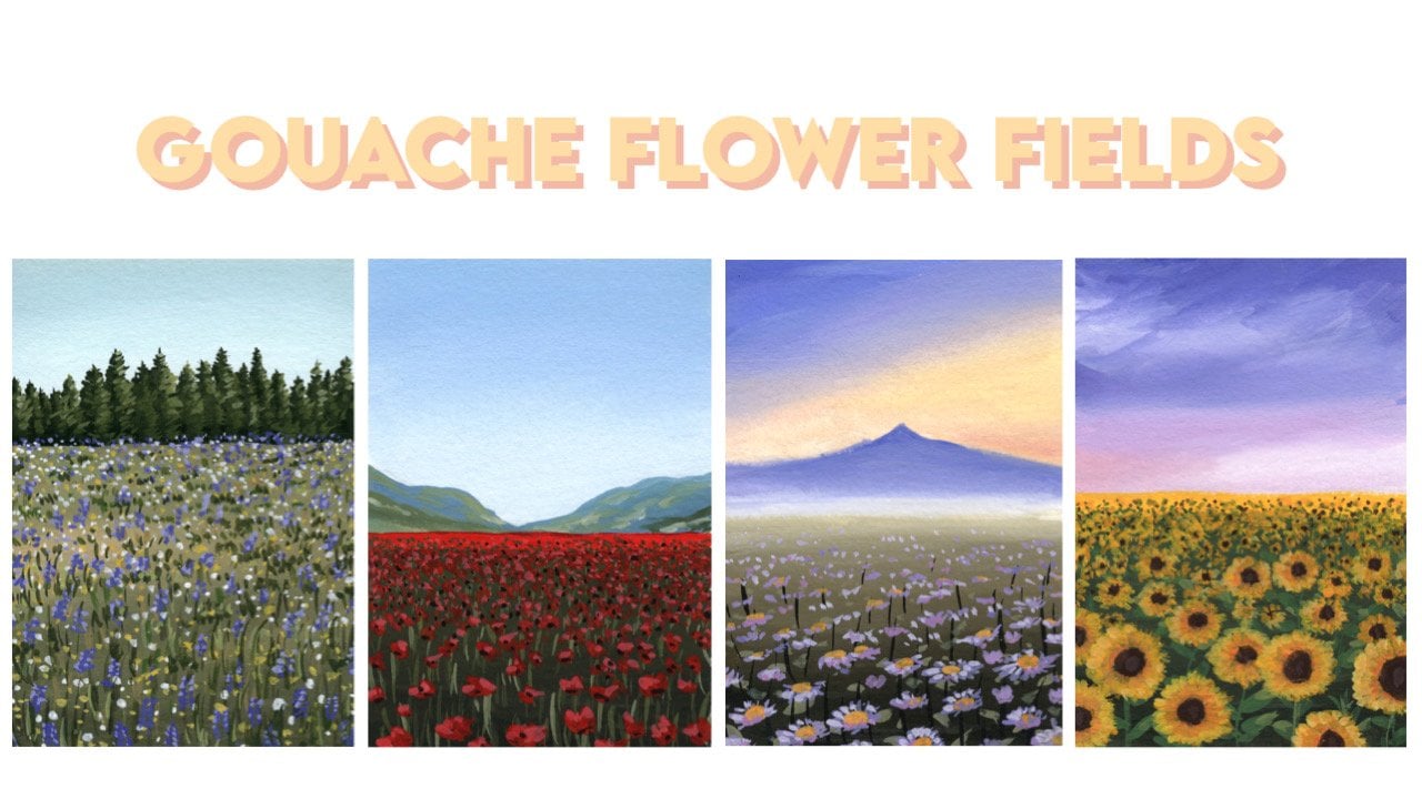
1. Introduction: In this class, you will
learn how to paint this beautiful
landscaping Gouache. I'll take you through
the entire process from start to finish, all in real time so you can follow along with
me the hallway. I'll start by teaching
you how to set up a simple sketch for a landscape like this
throughout the painting, I'll also talk
about Colour mixing and explain the
theory behind it. Then we'll look at how to
blend smooth gradations, how to paint fluffy clouds and water reflections will also explore other techniques like dry brushing and
Layering light on dark, which can be tricky
with Gouache. This class is most suited
to intermediate students. But if you're up
for a challenge, then there's no reason why
you can't give it a go. I hope to see you
inside the class
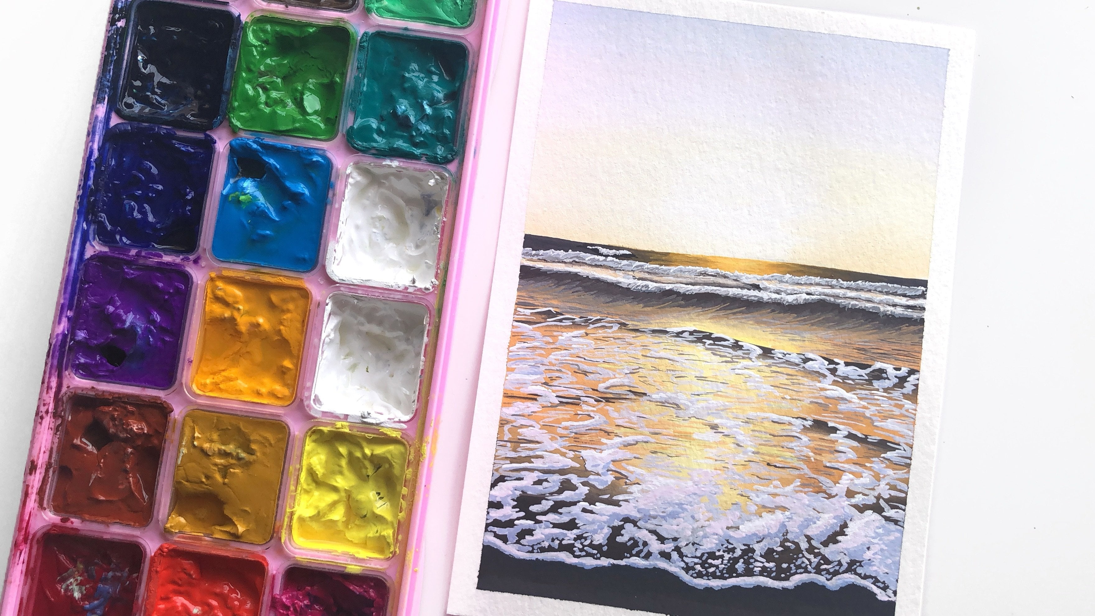
2. Materials: Let's start by talking about the materials that we'll
be using for this class, starting with our
Gouache paints. So here I've got a palette
where I've squeezed out various brands of artist
grade gouache into the wells. So the type of
Gouache I'll be using is traditional
gouache acrylic wash. There is a difference
between the two. Traditional gouache can be reactivated with
water wanted to Dry. Whereas acrylic gouache is more similar to acrylic in
that once it's dry, it can't be reactivated
with water. As for the colours are we using? I won't be using all of the colours you see
in this palette. So let me go through one-by-one, which ones I'm using and why you need them
for this class. Starting with our blues, you'll need to blues
for this class, a cool blue and a warm blue. So some examples of cool
blues, cerulean blue, primary blue,
phthalo, blue, cyan. So here I've got three
different cool blues. I have a cerulean, a primary, and Othello. And either of those blues will work just fine for
this tutorial. And then for the warm blue, I'm going to be using
ultramarine blue. Then for our yellows will
need three yellows will need a cool yellow and
to warm yellows. So for the cool yellow
that can either be a lemon yellow
or primary yellow, either one of those
will work fine. I might switch between
using the two. So don't stress if
you don't have both. If you just have one
that's more than enough. I would just be using the
yellows to mix our greens. For the warm yellows,
we've got yellow ochre and yellow deep yellow
ochre is actually optional. You don't have to use
this color though. I find it to be a
very useful Colour. So if you don't
have it and you're looking to add another
yellow to your palette. I really recommend
having yellow ochre. It's got this nice,
earthy, warm tone. It will be using it
to mix our grains. And then here we've
got warm yellow, which is a yellow deep. And I'll be using this to paint the center of the flowers. And I'll also use it to
mixing our greens for red, you just need one red, doesn't matter which red
we only need a little bit of red just to mix
into our grains. And then you'll
also want to have a burnt umber, black and white. You can see on my palette
I've got a couple of grains. I probably won't use
them for this tutorial. I tend to prefer to mix my own greens using
blue and yellow. But if you do have
some premix greens, feel free to reach for them
to use in your grains. The paper I'll be using is 300 GSM cold pressed
watercolor paper. My preferred paperweight for gouache paintings is 300 GSM. You can get away
with a lower weight. I go as low as 160 GSM, but just keep in
mind that your paper is more likely to buckle. Whereas if you use
higher white paper, it can handle more layers
of paint and water without starting to become wavy. You'll also need a palette. I prefer to use a flat palette that is one
without any wells in it. This one here is a
porcelain palette. You can purchase it from Muji
in their bathrooms section, or you can just Google
porcelain palette, find something similar. It is a lot more sturdy and it doesn't stain unlike
plastic pellets. Then here I've got
a water tank and you can see I've got
two separate wells and this just helps to keep the water cleaner and
you can separate, I'm colours that are
complimentary so you don't muddy your paints when you go
to add water to them. I would suggest that you
have two jars of water. And that way you won't need to change water throughout
the whole painting. Then here I've got a
tau and this is just a nice absorbent how that can take a lot of
water and paint. You can also use paper towels or tissues to soak up the
water on your brush. But I prefer to
use this because I can reuse it again and again, and it's just a lot
more absorbent so I don't have to worry about
soaking it through. Here are the brushes
that I'll be using for this painting. I've got For the first one here is a half inch angle brush. This is good for
blocking large areas. Painting in the sky
and the backgrounds. And then I've got a round
brush in size eight, round brush in size six, and a Size one rigor
or liner brush. Just to let you know
these brushes off from my own limited edition brush
set design with Kraft aber. But you can use any
kind of brush that is available to you. So this Size eight
round brush here, I've designed it
specifically to have software bristles than the
other brushes in this set. And that's because I find that soft bristles are really
good for creating textures. So I'd recommend that
you get a brush that has synthetic squirrel hair
because it is much softer and you can use it in
a different way to brushes that have more stiff
or springing textures. And these brushes, they
are all 100% synthetic. I love using synthetic
brushes for gouache. So there's definitely no need
to use real animal hairs. You'll also need a
pencil and eraser. This one here is a
kneadable eraser, but a regular eraser
work as well. I just prefer kneadable
eraser as you can lighten the
lines more easily. And I forgot to mention
that the tape I'm using around here
is masking tape. You can also use things like washi tape or painter's tape. They all work really well. And here I've got
to spray bottles. So the one on the left, this
is just a regular water. And I just missed my palette throughout
the painting session to keep them moist
and prevent them from drying out as
they're exposed to air. And I can also use
this to reactivate any paint on my palette
if it starts to dry out, say if I take a break between Painting than the one
on the right here, this is a mildew spray by Mia. And this has been
really helpful in controlling mode
that will grow in these kinds of palettes
that you set up yourself. So I used to have a
mode issue with this, but after I use this, it really helped to prevent
that from happening. So this I like to use at the
start when I first opened the palette and at
the end when I close the palate and then
the regular water, I like to use that
throughout just because this one has a little
bit of a smell. So I prefer to use
regular water if I can. So now that we've talked about other materials that we'll
need for this class. We get started with the painting by doing a simple sketch.
3. Just a note: Just before we get started, I just want to say
that this class is not an absolute
Beginner's squash class. So if you find the techniques in this difficult than I would recommend going back to my Beginner's Guide
to Gouache class, which goes over all of
the basics of gouache. And I include exercises to help you practice the techniques to get a better
understanding of them. But having said that, anybody
can attempt this painting, because I'll be
guiding you through it step-by-step the entire time. So there's no reason
not to give it a try.
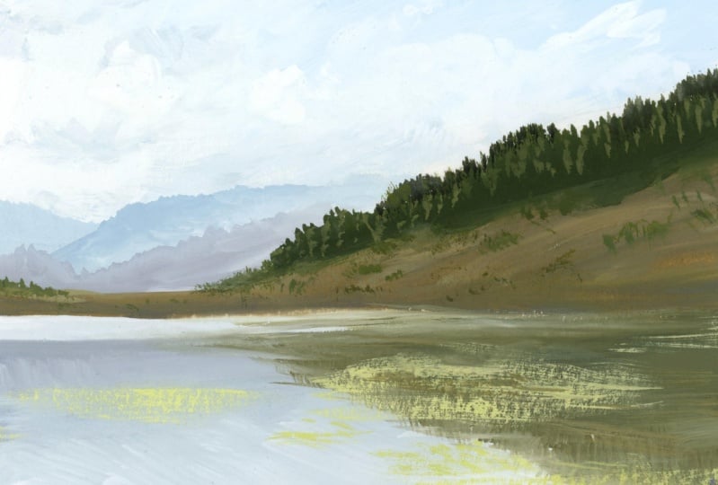
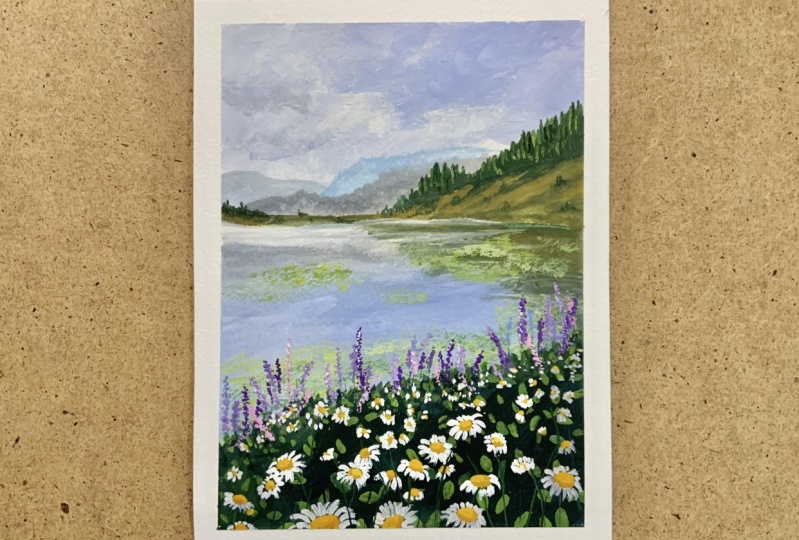
4. Sketch: For the sketch, we just go
in and do something very simple just to give us a Guide to work with
when we do our painting. I'm going to start by
placing in the horizon line and I want to place
it maybe just a little bit above halfway. So if this were about halfway, then I might go just a
little bit higher than that. And I usually like to do my
pencil lines very light, but for the sake of the video so you can see more clearly. I will do it a
little bit darker. So that's how horizon line. Then I'm just going to loosely
sketch in the mountains, starting with this
side on the right. And again, you can
look for proportions. So this, if this is halfway
between here and here, I think it starts just a
little bit lower than that. So I'll just pencil that in. That kind of dips down here. And if you want, you can get
the shape of the hill in. You can see it goes up
and down like this. And then you've got the trees that the treeline
that sits on top, which if you want to, you can also pencil that in. But do keep in mind that all
of this will get covered up with paint really quickly
as we start to paint. So there's no need to do
this in too much detail. And then we've got the
really distant mountains. He answered as a treeline. And also in mountains. Yeah. And that treeline is
just mountains as well. And you can always make
adjustments as you go in. So here I might want to
just adjust this and bring the trees down
just a little bit. Then for the water here, I think first I'll get in the
area where the flowers are, not including the
purple flowers. So so again, if I just
measure kinda between here, I think it's about halfway
between here and here. Maybe just a little bit below. So I'll just go like
this on an angle. And then you've got the
purple flowers here. You want me to sketch that in? And then that's about it really. You, you know, that you have
a reflection over here. And then you've got Augie kind of floating
across the water. And all of those details can
just be painted as we go. Now, I typically like to come
in with my eraser and just lighten all of the lines so that way they
don't show through. I'm after I do the painting, especially in areas
where the paint will be lighter so around the sky area. So one thing you can do with
your kneadable eraser as you can tap to lighten the lines. Or you can roll your
kneadable eraser. And then you can roll
it over your drawing. And that's why I
really like using a kneadable eraser
over a regular eraser. It's got a lot of advantages
to mention that it doesn't leave behind any of
the rubber rings. As you rub things out, just gets picked up into this. And then to cleaner,
you can just pinch it like this and
use a clean section. And you can also,
I'm pinched it into really thin shapes to
rub really small areas. So I really prefer using this. Now I might look like I've
rubbed out almost everything. But to me, I can still just see those faint
lines which will just act as a guide for
me as I start painting.
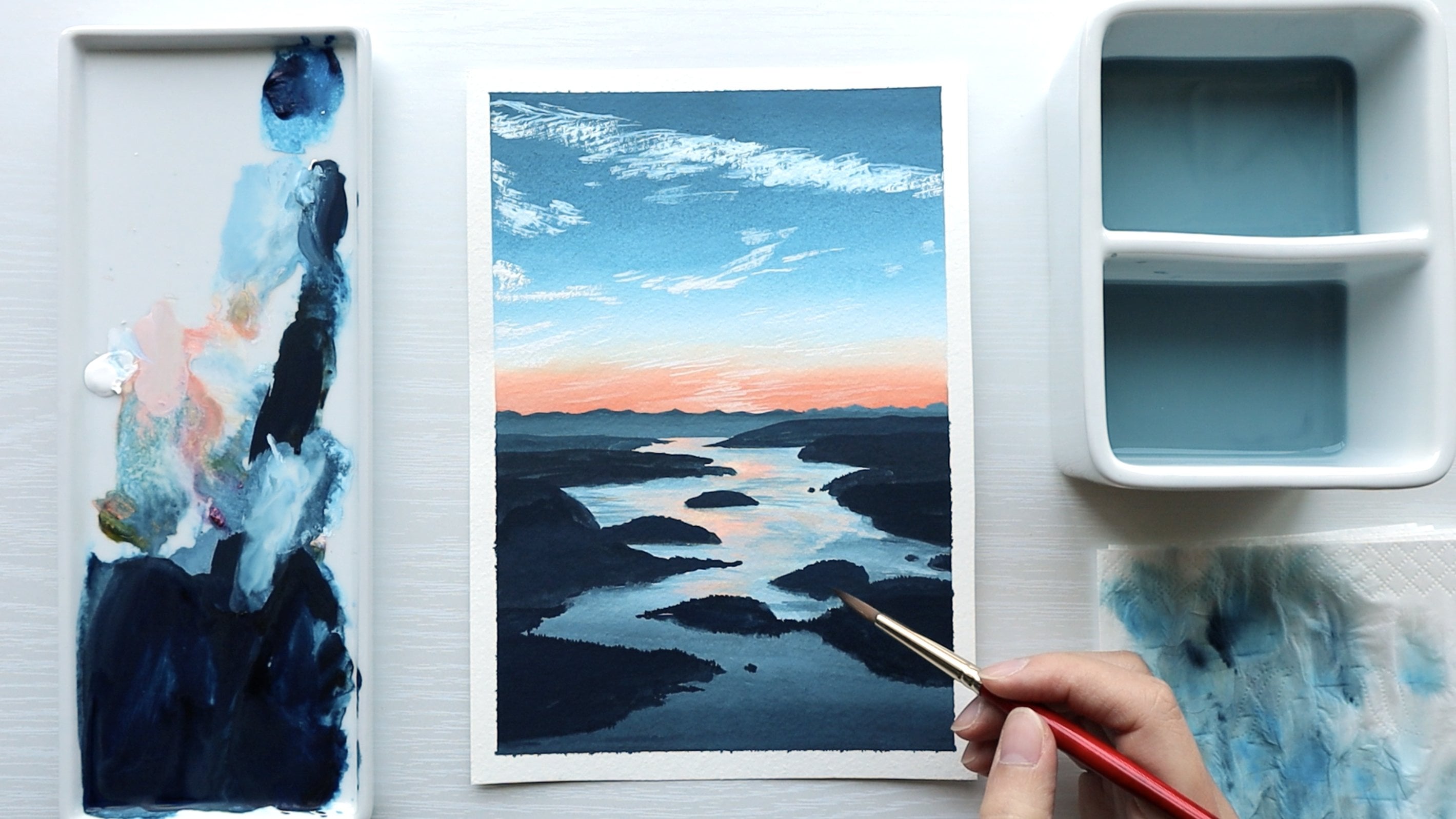
5. Sky: Now we can get started
with our painting. And I'm going to start
by painting in the sky. I'm going to paint this from the background
through to the foreground, which in this
painting translates from working from top to bottom. So we'll start with the sky
and the mountains or trees, the water, and then the flowers. I'll be using the
half inch angle brush to paint in the sky. Just want to dip your brush into a little bit of water
just to get it ready. And then I'm going to pick up white while my brush is clean, I'm just going to pick
up a generous amount of white and just bring
that onto my palette. And then for the
blue, for the sky, I will use a combination
of both blues. The ultramarine blue,
which is my warm blue, and the primary blue, which I'll dedicate
as my cool blue. So I'll grab a little
bit of primary blue and a little bit of
ultramarine blue and just mix that together
with the white. And we'll just start from
the top right corner. So I usually like to just
test the color out a little and then just
adjust as I need. So I want a little bit more
white in this mixture. And you can see here my
paint is really creamy. And that is really critical
to painting with gouache. Having that creamy texture
really helps you to get smooth transitions
and blends on your paper. I'll just bring that down.
And as I moved down, I'm going to add more white into my mixture and just see how creamy that
paint is on my paper. And the way that you can just
Blending really smoothly, then I'll pick up more white and I wouldn't even
mix it on my palette. I'll just pick it up
and put it straight in. And then at this point
what I'm gonna do is just clean off my
brush completely and go into some
clean white paint and just brush that in. So picking up the white, I'm just going to
brush that upwards. And I'll just get a little bit more water because I don't mind if
it's a bit runny. And I also would prefer that I cover the pencil
lines I did before. And now for this top corner, actually want the sky to maybe
be a little bit more blue. So I'll pick up a bit more blue and mix it into
my original mixture. Just to darken it a little. And I'll just sweep that in. So the clouds in the
sky in this painting, I want them to look
loose and fluffy. So just move your
brush around freely. And then for the clouds, I want to paint
them in using lots of white paint just kinda
dropped on the paper. So if you just pick up
some white and you keep the mixture really runny
and you drop it in. That will help to
create soft edges. And another thing I like
to use is to use this edge of my brush to paint that in. Just dropped down in, just sweep upward, sweep across. So it looks like the clouds
are moving across the sky. And then you need a little
bit of contour in here. Um, so that's a
little bit of the darker on the sides
of the Cloud. So for that, I'm just going to pick up a little
bit of burnt umber. Just a tiny bit and mix
that into your balloon. And what that does is
just graze down the blue. And then I'll mixing a
little bit of ultramarine blue and a little bit
more burnt umber. You can just drop that in, in some of the shadow
areas that you can see. And I'm just adding a tiny
bit more water just to soften this way you can see some of the shadows
underneath the cloud. You just want to drop that in and just try to be
loose with this. Because that will help give the clouds more of a loose look. And if anything looks too harsh, I like to go in
with a clean brush and just brush over it softly. Now you'll want to just pick up some clean white paint and you can keep it a
bit thicker this time. And just go into the sky and pick out those
brightest white bits. So up here I can see clump of clouds that's
getting hit by the light. And I'll just choose
a couple of spots, two, kind of get
that highlight in. Again, I like to clean off
my brush and just tap it semi dry and just sweep out anything that I feel
like it looks too harsh. And I'm just adding a tiny bit more shadow underneath here. And then I think we can say the, the sky is done. And we just have to wait for
this area to dry before we go ahead and paint
in the mountains. So I might do some minor just sweeping over with a semi dry, clean brush just to
soften out any edges. Now I think we'll need to
give that 2 min to dry because you can see we
use a lot of water here, so it will take one or 2
min just to completely dry
6. Mountains part 1: So now that the sky
is completely dried, we can go in and start to
paint them mountains on here. And I've purposely brought the sky a little
bit lower so that I can paint a mountain on
top and not worry about there being a white
gap between it. So now I'm going to
switch to a round brush and I'll use the Size
six round brush. You can use any size that
you feel comfortable with. And I'm just going to mix up a little bit of the same blue
paint we use for the sky. So you can start
with a little bit of the primary blue
or you're cool blue. And then just want a great down with a little bit
of burnt umber. Because colours and the
distance, a more muted. So saturated colors tend to come forward and muted colors recede. So we don't want this
blue to be very vibrant. And we've got four different
layers happening here. So we've got one layer
of mountains over here, one in front of it, another layer just
in front of that. And then the main green layer over here that's
much closer to us. So you're going to start with
a lighter color and then gradually dark in that color as you come forward in layers. Now I just want a little bit more burnt umber in
that mixture just to tone that down
ever so slightly, so it's just a little
bit more gray. And I'm making
sure to start with a lighter mixture just to push that back
into the distance. And so you can just bring
it over like this and then will overlap on top of that. One thing I like to do is using the tip of my brush to just nudge
along the edge like that. Just to give a bit
of texture and to suggest that there's
a tree line on here. And we'll leave that to dry. And while that's drying, we'll just go and mix
up the next color, which is gonna be
the same thing, but just a little bit darker. So I'll put a bit more blue. And then I'll add a bit of burnt umber once again
to tone it down. And again, you'll want
to wait until this has completely dry before you go over it so you get
a nice clean edge. Now, in the meantime, this is really minor, but I did get a little bit
of paint over there and I just want to soften that out. So if this happens to you, if he ever run into
a situation where you accidentally paint on your painting without
intending to, you can sort of remove it with a little
bit of water, though, it is tricky to do because the value of the paint will change
as you do that. But in this scenario, it a little bit easier
because there's no clear pattern here is just the sky so you
can get away with it. So now that this part is dry, I'm gonna go ahead and
get that next layer in. And I think I'll
mixing a tiny bit of ultramarine blue into
the mixture as well, just a little, little bit. And you'll see that it kind
of fades out into white. So I will leave
that section here. I'm just going to loosely
nudge it just a little bit, give it a bit of texture. And then we're fades out. What I'll do is I'll
just clean the brush off on pickup white paint. And I'll just faded out. Clean it off again and just
lightly dry it off and just soften out that
transition line with a semi wet brush. Then once again, we're
going to wait for this to dry before painting
in the next layer, but we can start mixing up the
color while we're waiting. So this time it's
a little bit dark. I'm going to go for a bit
more ultramarine blue in the mixture and a bit
more burnt umber, just a gray that down. It's still not going to be too dark because it's
very FUN a distance. We want these mountains
here to be a lot darker. So we want to push that
distance between the two by keeping this lighter. So I've just added ultramarine
blue and burnt umber. And I'll just wait
for that to dry. I like to just test my color
a little bit in the meantime and make adjustments as I'm
waiting for the paint to dry. So I'll just go a
little bit lighter. Also keep in mind that Gouache dries to a different value. Once it has completely dried to a lighter colors will dry darker and darker colors
will dry lighter. So you have to try
and factor that in. I think we can start
to get this in. Just get the shape
of it in first. And then once again, just nudge. Nudge with the tip of my
brush up and down like this. Just to suggest a
tree line on here. And once again, it
sort of fades off. So I add a little
bit of white to the mixture and just drop that in to fade it off, slightly. Cleanup, brush, smooth
out any transitioned. Then this will just
get covered up by the treeline So I don't
worry about it too much. This part, I'll just bring
it down a bit lower. It will also get covered up. So we've got that section done. And then we can go ahead
and paint this section. And so I'll start
mixing up to paint. But once again, you only
want to apply at once. This previous layer has dried
7. Mountains part 2: Now if you want, you can
switch to a larger brush. Do this area, I think does Size six round brush will be
okay for us to continue. So I'm going to mix
up a green now. And to me the green is, it's not a vibrant green,
It's less saturated. So I'm going to use
my warm yellows. So I might start with
some of this yellow deep. And then I'll grab
a little bit of ultramarine blue and just
mix the two together. Grab some more yellow,
some more blue. So I quite like that mixture, so I'm just going to
mix up some more. Add a little bit of
water just to keep the paint nice and
creamy and flowing well. And what you also want
to do to tone down a grain is to add
a tiny bit of red. So just a little bit of, LET tiniest bit of red can go a really long way when
you're meeting a green. So if you pick up too much, you can just leave it on
the side of your palate. Then mix that in. And that's just really
going to tone down your green to help it
look more natural. And another thing I'm gonna
do is actually pick up a little bit of white
and also exciting, that also helps to
turn down a green. Then move to the left. I think I want bit more yellow, maybe I'll go for a
bit of yellow ochre. And I'll just do a
line across first. Now we can just cover
this whole area first. And we'll get the treeline
in afterwards as well. I am actually going to switch to my bigger Size
eight round brush. I'm and I'll show you why
that is the case when, once I start using it. So switching over now to
my Size eight round brush. And I think I just want
to get some of the, um, different colors
into this Mountain. So we'll pick up a bit
more ultramarine blue. And we'll just sweep across, sweep into it while the paint's
still a little bit wet, can get some of that in there. Now this brush has softer hair, so it's like a
synthetic squirrel. So it behaves a little
bit differently. Two brushes that have
more of a snap to them. Now I want to get some
lighter yellows in there. I'm going to pick up a bit of yellow ochre and
also some white. And just mix that in with a
little bit of blue as I go. I may have added a bit
too much white in one go. If you want to brighten
it up a little, you can grab a little bit of yellow and get that in there. And once again,
I'm just sweeping in little bit of the contours in this hill just to
give it some dimension. And then I'll clean this off and just using a clean brush, I'll just soften it out. And we're going to
continue working on that later if we want first I want to get in
this tree line over here. So for that I'll
use a darker color. You can use a little bit
of black if you want. So I'll just show you what
he can do with black. So if you mix yellow, so I'm gonna use
my primary yellow, which is my cool yellow. And you mix that
with some black, you can get an olive green. And that's a really good
base for starting off with an olive green if you're looking to start
with that color. Now I'm just going to add A little bit of my
primary blue into the mixture just to make
it a bit more green. But I also want to
keep it quite dark, so add a little bit more black. And then for the tree line, I'm just going to
loosely get that in, so I'll find where
it starts and maybe around around about here. I think. I'll get that first-line in. And then I'm just going to
block in the rest of it. So it's got to run up
this hill like this, and it's not a complete
straight line. Now I wanted to switch
to this brush before because I like to use
this one for textures. So if you fan out the
tip of the brush, you can get all kinds
of textures and that's what I want to
use for this treeline. I just want to nudge it up
and down to get the texture. So that way I didn't have to
paint in trees individually, which would take a
really long time and probably isn't
worth the effort. So instead, I just want to suggest suggest
what this scene is. Now if you want the green
to be a bit lighter, just add a tiny bit of
yellow into the mixture. And try to keep your
treeline interesting. So instead of it being
one straight line down, have some areas bumping up and
some a little bit shorter. And then I'm going
to continue to add yellow to it
just to lighten it. And we can use this to add
other trees that are nearby. So maybe down here. So you can see the paint is
not exactly Dry on the brush, but it's not super runny. So that way I can use the
very tip of the brush to get the soft textures out of them just to suggest some
trees over there. And you can just tap them
in lightly like this. If you have too much
paint on your brushes, wipe it off, and then you can get more of a
dry brush texture. So this is just very
loose suggestions. Same with on the left-hand. I might want to just add a
couple of trees in there. And I don't like the bottom
edge being so harsh, so I will I will do
something about that. So what I'll do is I'll
just clean off the brush. And with a semi dry brush, just sweep over the bottom edge. Or you can have a
little bit of paint on your brush but keep
it fairly dry. And just do that to soften
it out a little bit. Add some texture in there. I like adding a scratchy,
Dry brush texture. Now the tree looks a little
bit flat, it's very dark. So what we're gonna do is just add a little bit of
light color to it. So I'll pick up a little
bit of yellow ochre and just mix that into
our green mixture. And using that, I'm just
going to say the light's coming from the left
side and I'll just At a little bit of
this onto the trees. That way they won't
look as flat. But they also don't
need a whole lot of detail because they are
very far in the background. So one thing I did just notice is that this treeline didn't completely cover this area with a Mountain fades off and
that's not a big deal. It looks it looks fine. Um, but I think I will
just go over it slightly. So I'm just going
to mix up some of that paint we will
using before the dark green and maybe just increase the height of these
trees ever so slightly. Just to cover up that
section a little bit. Again, it's not a big deal, so feel free to leave yours
if it doesn't bother you. While I've got that
mixture on my brush, I think what I'll do is
I'll just add a little bit more of little
trees over here. I like to just add texture
just to make it look busier. And one thing I
like to do is just use my finger to soften out any any strikes. And then because we've
added on that darker layer, I'm just going in
with a little bit of the highlight color again. Hey, so and then overall, I want this bit to be visibly
taller than this area here. So let me just bring this up
ever so slightly as well. So now we've got the top
half of the painting done. In the next section we're
going to work on the water, will start by painting in the
water than the reflection. And then will paint
on some of that algae or I'm leaves that
are floating on top
8. Water: For the water, I'm going to
switch back to my flat brush. And essentially
we're just going to mix up the color
of the sky again, but maybe make it a
little bit more DLT and then just paint in that whole section so we can
go back into this area here. And because gouache can be
reactivated once it's dry, I like to just get
a little bit of water and just
bring it into here. And here's a good example of Y would be good to have
two jars of water. So you can see this water
he has quite green. I don't really want to get
that into my paint over here. So I'll go into the clean water tank over here and use this water instead. And then I'll just
add a little bit of primary blue into it. And you can see in the
distance here it's a little bit lighter and
then it's darker over here. So I'll just leave
a bit of a gap. So that's a little bit too dark. I'll grab some more white. And how it looks pretty good. Maybe a little bit
more blue just to make it a bit more Library. And then a bit more white. I just go over the
whole section. Don't worry about leaving
the reflected pot out. You can just cover all of that. Bring it down and just
drop in some white into it as you're going because it's a
reflection of the sky. So there'll be white
clouds floating around. And once again, just
keep this loose. So this is when you
don't have to worry about perfect
transition or anything. You want it to be loose. Just like when you
paint it in the clouds. And again, I like to bring it a little bit lower
over here just to cover any gaps that might appear once you start
painting in the flowers, I'm going to pick up some
white and just drop it in like I did when I
was doing the clouds. Now they should be flowing
this way when I reflect it. So I just clean off my brush, grab a bit more blue
and just sweep that in. And then I want a bit more white just to sweep
in this area here. Cleaned that might make
this fit dark as it, this is the reflection
of the mountains. Then we can go ahead
and get the reflection of this hill over here. So once again, we're going to use the same
color to reflect it. So I'll start with, I'll start off with some of
the primary yellow, which is my cool yellow. And then I'll add
a bit of black, which when mixed together, will produce olive green. That's a good base
to start with. And then depending on how you
want to push this colorway, whether you want it to be a more vibrant green or
more dull green, you can mix according to that. And would be a good idea to just wait for that background at Dry. Otherwise it's going to start to pick up some of
that background. It might make your green a little bit lighter
than it should be. In the meantime,
I'm just going to mixing bit of primary blue. For this section. I'll just sweep this in. I want it to be a bit more dull, so I'm just going to
grab a little bit of yellow ochre and maybe a little bit of red that I
have on my palette here. Tiny bit more red. Then I'll just sweep it down. I'm just reflecting
what I painted before. And then I'll sweeping
a few different shades of green in there. So some darker, some lighter Some with a bit
more yellow in it. Clean off the brush. For the edge here, I think what I'll do
is I'll just grab a clean brush that
I just washed it, lightly, dry it off
and you can check the moisture level
using your fingers. And just downward
sweep like that. That just softens the edge. And I especially want to
soften this edge here. So I'm just wiping my brush off in-between so that way I'm not introducing too much paint. And then I just wanted to
soften out this line here. Says quite nice how much you can reactivate gouache
once it's dry, just a bit of water, you
can just reactivate it and integrate for hitting
those nice blends. Now for the edge, I wanted
to look a bit more natural. So what I'm gonna do is
I'll use this edge of my brush and just nudge at it. I might need a bit
of paint to help me, so I'll pick up a
little bit of paint. And then maybe I'll
switch to my round brush and just sweep over the edge. This can also look like
the ripples of the water. So just do a couple
of straight lines. There's no paint on my brush, just to clean brush
and I'm just sweeping over the edges to soften it out. And then you might want to
pick up a bit of yellow ochre, get that into the mixture
with a touch of white. And just sweep a little bit in. Once again, cleaning that off. So that all looks pretty good. Now we can go ahead and sweeping that floating
Augie on top. And I'm going to continue
to use my size eight round brush. For that. We'll use a really
light green color. So I'll start by picking
up some of my cool yellow, my primary yellow, or this case, our lemon yellow would
be slightly better. But it really doesn't
matter which one you use a, I'll just stick with
the primary yellow. And then you want
to mix a little bit of cool blue into it. So I'm picking up a little
bit of primary blue. And you can see I've already got some white on my palette, and I will use that as well. So I want more yellow than
blue in this mixture. And you want a generous amount
of white in there as well. I think I'm going to
need a bit more yellow. Okay, Now, here I want
to Dry brush at on, which means minimal amount
of moisture in my brush. So one way you can do that is either mix up really thick
paint where you can see my paint here isn't
exactly fake. So what I would do is just take off a little paint
on my towel over here. And then I can Dry brush, sweep this onto the paper. And I think I want a bit more white in my mixture
before I continue. Once again, take off some
of the paint on the towel and then just sweep like this. This is why it's good to use
cold press paper because cold press paper has a little
bit of tooth or texture. So when you Dry brush across it, you get nicer textures. If you were painting this
on hot press paper might be harder to get the same look. Dry brushing isn't the
easiest thing to do. So Don't stress it. This
is difficult for you. Um, it just comes with a
little bit of practice. The key thing is to have a minimal amount of
moisture in the brush. But you also need to have just enough moisture so that
the paint can still spreads. In this case, I need
a little bit more so I'll just grab the
tiniest bit of water. And then I might just
take off a bit of paint before I go
into the paper. And then over here, I'm just gonna do
the same thing to sweep over it because I know there's not much
paint in my brush. I can just sweep
boldly like this. You can even scrub your
brush on like this. But that's only if you feel
really comfortable knowing that you don't have a whole
lot of moisture in the brush. Something else you
might do is maybe tap, tap around like stipple
around the texture. A lot of different things you
can do to create texture. Okay, so a pretty happy
with how that looks. You can get some
darker areas into it. So maybe I'll just mix this with a little bit
of this blue down here. That's on my palette
and I'll just sweep a little bit of fat in. It's just slightly,
slightly darker. Clean that off. Another thing to do is add some more lighter areas into it. So maybe a bit more white
and a bit more yellow. But overall, I think
we're pretty good. Um, if you feel
like you've covered up too much of that reflection, you can go into the
reflection color and just sleep that in a little bit of just using a clean
brush tip shape this out a little bit. Okay, So for the most part
I'm happy with how that looks M. And then now we can
move down to the flowers
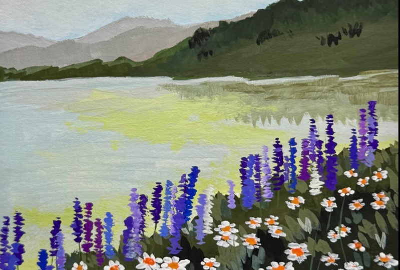
9. Grass: For the flowers, I'm
going to start by blocking it in with a
dark green base color. So you can either use the flat brush to do
this or the round brush. I think I'll just continue
using my round brush. So now I'm just going
to pick up some black. And if you have a premix green now would be a good
time to use it. So you can just mix
that with the black. But if you don't have that, we can just continue doing
what we've been doing. So adding yellow and blue. So add some of my primary
yellow into the mixture, and I'll add a little
bit of ultramarine blue. This is gonna be a
very dark green. It's not going to be pure black. And that's why you want to add some yellow and blue into it. So I'm just going
to continue the mixing some yellow and blue. And we're just setting up the
base color for this so it doesn't have to be
perfect in any way. So just get all of that cupboard in and give it a loose
edge around here. And then I might
just want to add a couple of darker areas. So on camera right now, my all look just like
dark black to you, but it is more of a dark green. I'm hopefully that'll be a bit clearer once it dries as well. So here I'm going to
pick up some black. Now, I'm just going to add
that to a couple of sections. This just helps to add
in some of the shadows. You can also do this after, but I do find it easier
just to drop it in. Now. I might mix in
some primary blue. So I'm just adding in these
little bits of shadow. And I like to just soften
them out with my brush. Just very loose suggestions
doesn't have to be perfect as the flowers you
paint on top will cover a lot of the brush marks. For the top edge here, I'm going to add a little bit
of white into the mixture. And using this mixture, I'm just going to paint
couple of leaf like shapes. We're going to paint
the pebble flowers in first before doing
the white flowers. And while you've got this
paint on your brush, you can do a couple of leaf-like shapes
over here as well. So we may as well just
paint the leaves on here. Now since we're
already doing this. So what I'm gonna do is
just mix up a green. So I'll use some yellow. And a little bit of the
ultramarine blue we have. Pick up a bit of black
to turn it down. And just paint in leaf shapes. Mostly just using the shape
of my brush to do this. Also, you do want to wait for the background is dry
before you do this. I'm the only other thing to keep in mind is the leave should be bigger in the foreground
and smaller in a distance. And we'll switch up the color. As we do this, you
don't want them all to be the same
shade of green. So in a distance I'd like
to just tap them on. So they're much smaller. Then I think I'll add
a little bit more blue into the mixture and
maybe some primary blue. So I get a different green. And then I'm just
going to drop this on. I don't want it to be two
drastically different, so I'm just going to
add a little bit of yellow back into the mixture. Maybe a little bit of black
in there to tone it down. Go back to adding
some more yellow in. This just sets us up for later. We've got our base
kind of structure. We've got shadows, dark
colors, we've got the leaves. We can just paint the
flowers on top of this. So I can clean up his brush now. And we will start working
on the purple flowers.
10. Lavender flowers: For the purple flowers, I will start by painting in
the center line and then I'll dot on the
flowers themselves. One thing you want to keep in mind as
you're painting them, is to keep them interesting. So rather than having them
in one straight line, all of the same height, you can have them kind of move up and down like in
the reference photo. I've noticed here
that I've had this, that I painted this line quite
straight to a bit boring. So I can either Mindanao
or I can do it afterwards. So I'll just add a couple of leaves up here just to remind myself that as
I'm painting the flowers, I also want them to be
of different heights. We can always amend this later, so I'll just leave
that as it is. Now. I'm going to pick up my Size
one liner or rigger brush. And I'll just pick up a little
bit of ultramarine blue. And you can just mix that with your existing green
mixture on your palette. And I'll use this
just to paint in the center line of the flowers. And this will just guide me. Once I start to
paint the flowers, I'll know exactly
where to place them. Although really doesn't matter. This doesn't have to
be perfect in any way. I really liked this liner brush because I can get really
thin lines with it. We just do a couple of lines, just a guide us a little bit. But even if we don't have
them, it doesn't matter. We can still paint the flowers on even without the center line. So let's just start
with a few of them. And then I'm going
to switch back to my Size eight round
brush because I actually don't need
such a small brush to paint the flowers. Purple flowers, I'm going
to mix red and blue, um, and in this case, doesn't matter too much
which red you're using. Any red will be fine though. If you use a cool red, which is more like a pink, you will be able to get
more vibrant purples. So in this case I am
using a cool red. You can also use a
premix purple as well. So I've just makes
primary blue with my red and we can just
start to tap this on. So when I do this, I do prefer to have a little
bit of a dryer brush. So I'm just wiping off some
of the paint on my towel. And then now I can just tap on the flowers like
this and hopefully do it a little bit faster. And there's not much
technique to this. I'm just going to
go along the edge and tap on the flowers. You do want to just change up the color a little
bit as you go. So some of them you want
to be a bit more pink. Some of them a bit more blue, some lighter, some darker. So I will change up
the color as I go. So I might use this color on every second or third flower. And then I'll add a little bit more blue or
a little bit more white to my mixture to
change up the purple So maybe now I'll add
a little bit of white. Just start by adding
bit of white. And then I'll continue to tab. And I might add that to some of the existing flowers
I already painted. And that way just gives
them a bit more dimension. Again, I don't like the paint to be too wet when I'm doing this, so I just take some of
it off on my towel. And I'm only doing this on maybe every second or third one so I can change the color again. Now, I'm going to
add a bit more blue. Make it a bit more
of a blue purple. And continue tapping. And don't forget to make
these different heights. And also, if you didn't, drawing that center
line doesn't matter, you can still add more
flowers. As you go. You want some areas
to be more clustered. In some areas to be a
little bit more sparse. Just add as much variety as you can to keep it interesting
and natural looking. And just keep adding
in bits of blue, bits of red, bits of white, and changing up the color
as you're doing this. And just start these colors
in all over the place. A more variety, the bad I think. And bring some of them a little
bit lower into the green. And then I think I'm going to add some more white
into the mixture, make it a light pinky color, and do a couple more dots. So the idea is to
just keep going until it looks
nice and colorful. Lots of different
shades of purple. And make it look nice and full Now I think I'll go in with
a little bit of white. I can say a couple
of wider beds. So I'll just tap
those in as well. And maybe just a
couple more red spots, I think so I've just
got some more pink in the mixture just for a
tiny bit more variety. So I like how that looks. And now we can move on to painting the white
flowers down here. So I'll just clean
up this brush. And for these flowers, we're going to start by placing in some of these stalks of them. So I'll switch back to the
Size wine rigger brush. And then you just want
to use a dark green so something that you've
already gotten your palette. You can add a tiny
bit of black to it. And you just want to get
some of these Stokes in. And this can be really loose. It's just going to set us up. For once we start
paying in the flowers, I'm going to mix a little bit
of yellow ocher into this. Some black, some blue. I like variety. Okay, so that sets the
base layer for us. Now going back to
my round brush, either the Size
six or Size eight, maybe I'll switch
to my size six. And I'm just going to pick
up some of the warm yellow. Now you might want to
clean up a bit of space on your palette as you don't want to mix that with
any other color.
11. Daisies part 1: So I've just made a little
bit of space on my palette. Now I want to pick up
some of that warm yellow. And ideally my water is clean so I'm not
Medina this color. And then I'll just
add in the tiniest, tiniest touch of red. So only a little bit and a tiny, tiny bit of white. And we can just paint in
the centers of the flowers, will probably need
two layers for it, as it's hard to lay a
light color on top of a dark color like we've
gotten the background. So make sure this
is completely dry. Before you do this, you
don't want the yellow too muddy with the
background at all, and it's best to paint it
in with as few strokes as possible so that way you're not lifting up the background color. So the flowers in the foreground
are going to be larger. Vegan, just have FUN
in this section, you can paint as many or as
few flowers as you want. In the background here. The flowers a very small, so I'll just dot them on. Just starting them on here. When I go to paint
in the petals, I'll also just be dotting it on. So that's the first layer. You can see that some of the
green is peeking through. Which is why we wanted to go in with a second
layer of this yellow just to make it a bit more opaque and so you can
pop a little bit more. Another trick is to lay down
a layer of white first, but I find it easier
to just use yellow that way you don't have
to cover any edges. So I'm going to just wait
a minute for this to dry and then we'll go over
all of these yellow centers. We painted one more time. And in the meantime, I'll just mix up a
little bit more paint and try to keep the paint
as creamy as possible. That way it's a little bit thicker and can be more opaque. So I'm going to start to go over some of the ones
that have dried, like the small ones
in the background. And you can see the second
time I go over it that yellow just to pop
a little bit more. So that second layer is in now. And then just as a
very minor thing, I'll just add in a little bit of shadow underneath some
of the bigger flowers. So what that means, it's just, I'm gonna mixing the tiniest
bit of burnt umber into the mixed judges to gray down
this yellow a little bit. And just go along the bottom
edge of some of these, I might add a tiny
bit of red as well. And just for the flowers
are close to us. And a beaker I will just at
a little line underneath. And it just adds the
subtle little bit of a shadow, hint of detail. And then we can leave
that to dry before we go in with the white petals.
12. Daisies part 2: So now I'm going to pick
up lots of white paint, just clean wipe Paint. Make sure you have a space on your palette where it's clean. And using this white, I'm just going to start
to paint on the petals. I want this white to be nice and thick on my
brush so that way I can cover the background
as much as possible. You can go in with
a second layer if you want it to
be more opaque, but I think we can get
away with just one layer. So I like to just
go from left to right because I'm right-handed, I guess, and I'll just go
around and paint on the petals. Now there is a little bit of perspective to be aware of here, which will help the flowers
to look more realistic. And I'll explain that in detail. Maybe in another flower. So the perspective here is we're looking at the
flowers side on and so therefore the leaves
or the petals around the edges are longer and the ones that are further
from us a shorter. Then the ones closest to us? Yeah, also shorter. And you can paint I'm all different kinds of shapes
and maybe some of them, you can have them
drooping down like this. That's an easy way to do. Some of the flowers. You can have them
standing up a bit more. And then the perspective
will be like this. So I would say to just study the reference photo closely
for a couple of flowers, get the feel for
how to paint them, and then just apply
that to the rest of the flowers and just work
through it at your own pace. Just make sure that you're not painting the petals
that exact same length all the way around as
that wouldn't make sense. And another tip I
have is try not to go over the same
pedal multiple times as, once again, you risk who lifting up the dark
green background color. If you feel like you
need to fix up anything, just let it dry before
you go over it again. And if you covered
up that center, the yellow center too much. While we can always go back
with some yellow paint and just bring some of that back
now for the distant flowers, I'm just going to dot around it just enough to give a
suggestion of the flowers Then make sure you
bring some of them up into the purple flowers or
just to mix the two together. Then once you've
done most of them, you might want to just
step back, take a look. Once again, I like variety, so different shapes, um, different sizes and areas that are more clustered in areas
that are more sparse. Might just do a couple
more dots here in their claim that off, I might pick up a bit
more of the yellow center Colour and dot on a couple more. And then you just
want to paint on a couple more of the stalks. And you want to purposely go on top of some other
flowers you've painted. So that way you can
push a couple of them into the background. So I'm purposely going
over some of the flowers. And that way just
looks like we've got a few layers at these flowers where some of them
are sitting in front and others are behind. Now final touch, you
might just want to add a couple more leaves
into certain areas. But other than that, I'd say with pretty much
done with this painting. So maybe I just wanted
to cover up some of the purple flowers
with a few leaves. Just to add a little bit of
Layering into this section. So overall, I'm really happy
with how this turned out. And I don't think there's any other changes
that I want to make. So let's go ahead and
take the masking tape off
13. Project + Closing Thoughts: Thank you for taking
this class and I really hope you
learned something new. Please feel free to upload
your painting under the Projects tab will
share to social media. Make sure you tag me so I
can see a beautiful artwork. You can find a scanned
copy of this painting, as well as the reference photo
under the Resources tab. If you want to learn more
about the basics of Gouache, have a look at my Beginner's
Guide to Gouache class. I have a lot of beginner
friendly exercises there that will help you become more confident with
painting with gouache. Thanks again, and I'll
see you in another class.
 Jess Chung, Gouache Artist