Transcripts
1. Introduction: Understanding Negative Painting: Hey, everyone, and welcome to the class on negative painting. In this lesson, we're
going to explore one of the most helpful and sometimes surprising techniques
in watercolor. That's learning how
to paint around objects instead of painting
the subject itself. If you ever wondered how to
keep light areas soft and glowing or how to create shapes without
outlining everything, negative painting is the key. We'll start with a simple moon study where
you're going to see exactly how this works in a real clear and controlled way. This first step is all
about understanding the concept of getting
comfortable with the process. Then we're going to
take it a step further into a more loose and
expressive project. Instead of planning out flowers, we're going to begin
by laying down soft, abstract shapes and letting
the paint move naturally. From there, I'll
guide you through how to start finding and shaping flowers within those
loose forms using negative painting
so your subject begins to emerge
almost on its own. This is a really relaxed
and approachable class and my goal is for you to feel more confident letting go a little and
trusting the process. Go ahead, gather your supplies and let's get started painting. I can't wait to see
what you've created.
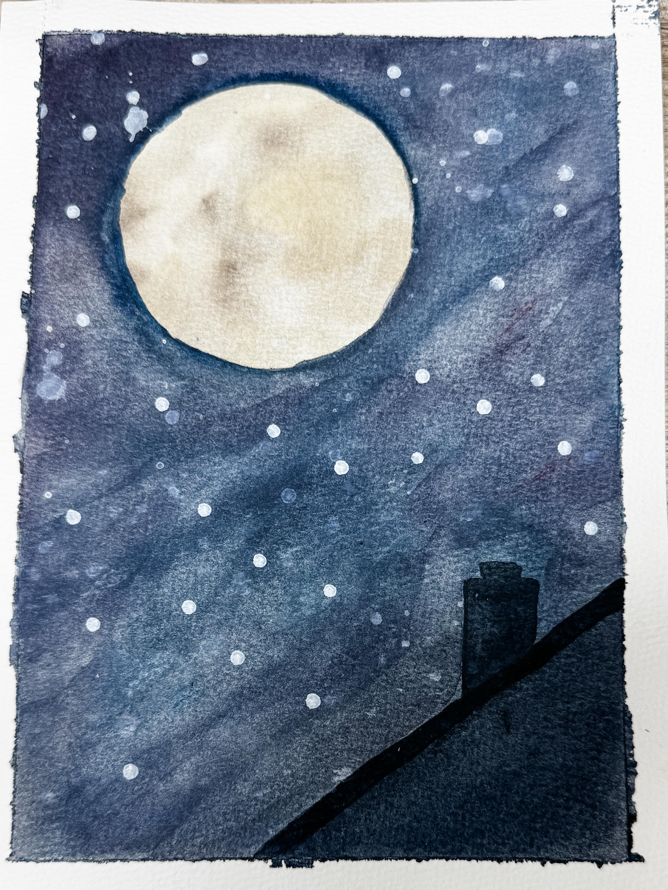
2. Moon Study: Painting Around Light: In this first lesson, I want to introduce you to a concept of negative painting in a really simple and
approachable way. Instead of painting
the subject itself, negative painting is all about painting around the
shape to reveal it. So in this case, we're not
actually painting the moon. We're going to let the
white paper become the moon and build
everything else around it. This is one of the most
helpful techniques in watercolor because it allows you to keep your light areas soft and glowing without
overworking them. Once you see how this
works in a simple example, it becomes much
easier to apply it in a more expressive painting
later on in today's class. What you just saw
me do was lay down a very thin light coating
of buff titanium. Then I'm adding on
just a slight color of brown in a round shape. Basically, I could have
put this anywhere, but I chose to make it up here where I think
the moon might go. I'm just kind of moving it around a little
bit because it's a wet-on-wet and I just didn't
want it to be too blotchy. Eventually, this is where
the moon is going to go. So I'm just adding
in that moon shadow look where the crevices and
craters are on the moon. You can see I'm not being
overly particular here. I'm just moving it around. I'm going to make sure that
this gets nice and dry. I'm going to use a
heat gun to do that. Now that it's dry, I'm going to trace a round circle
here for the moon. I'm just using a roll of tape. You can free hand it or
make something that's circle from a plate or however you want to
make yours round. Right over the top where I
made that splotchy area. Now using several
different darker colors, I'm going to be adding
basically the night sky around the moon to create that
negative painting effect. I'm using a wide
flat paint brush. I think this is 1 ". Wetting down the whole paper
so that my darker colors can move a little bit more
simpler and smooth flowing. I'm choosing to use a dark
purple and a dark blue, but you can use any
color you want to. I'm going to put it
down in a general wash, being very careful when
I go around the moon. At this point, we are
protecting the inside of our moon painting and
painting everything else sky. You can put several
different coats down until you come up with the look for the sky that you're looking for. As you start this background, I really want you to let go of any pressure to make
it look a certain way. This is not about
getting it right. It's about letting the
paint move and getting comfortable with the idea that you're building
around something, not controlling every detail. Go ahead and start
dropping in your color. You can use a mix of blues and purples or let them
just blend naturally. You don't need to overthink
where each color goes. Just let them touch, let
them mix, see what happens. If your paper is nice and wet, you'll start to see
those edges form, and that's exactly what we want. Those soft transitions
are what gives watercolor that really
beautiful flowing look. Try not to go back and
fuss with this too much. The more you move the paint
around at this stage, the more you can lose
that natural blend. Place your color, soften
where it needs it, and then just give it a
little space and time. And remember, you're
not painting the moon. You're painting
everything around it. So you can gently work your color right up to
the edge of that circle, but don't worry about
making it perfect. Slight variations and soft edges are actually going to make
this feel more natural. If something ends up blooming or spreading in a way you
didn't expect, that's okay. That's part of the process. Some of the most
beautiful areas in watercolor comes from
just letting go, allowing the paint to
do what it wants too. Step back and take a look at what happened
with your painting. Notice where the
colors are blending, where they're
staying stronger and where the water is helping
everything soften. If you want to add stars, you can splatter on some white
quash like I'm doing here. I just recommend that you cover over the moon to
protect that area. You could be done, or you
could add in a roof line. I've decided to add
in a very soft, simple silhouette
roof line here. Basically, I'm just
drawing a triangle here at the base using a straight edge
and a little tiny chimney, all very, very simple. Using my paints gray, which is a very nice
dark gray color, I'm just painting in the
silhouette of the roof. I will add in a
little darker edge, which just basically
means more paint, less water for that
edge of the roof line, just to create a
little transition. Of course, if you don't
want a roof line, then don't make one here. But I thought maybe the
edge of this painting needed a little
something down in the lower right hand
side to anchor it. I wanted this
painting to feel like I was in my backyard looking up at that great big w. Take
a look at your painting. Do you notice how much your big white moon stands
out from everything else? That's the beauty of
negative painting. You left that space there. You let it breathe.
You did a great job. I can't wait to
see your painting. After you've finished
your painting, let it completely dry. Take the tape off and see
how it all came together. What I want you to notice
here is how we created the moon without
actually painting it. By working around that shape and building up a darker
value in the sky, we were able to keep that
soft glowing center, and that's really the heart
of negative painting. It's not about
adding the subject. It's about revealing it and what you choose
to paint around it. In our next lesson,
we're going to take the same idea
a step further. We'll be finding flowers
in abstract paintings.
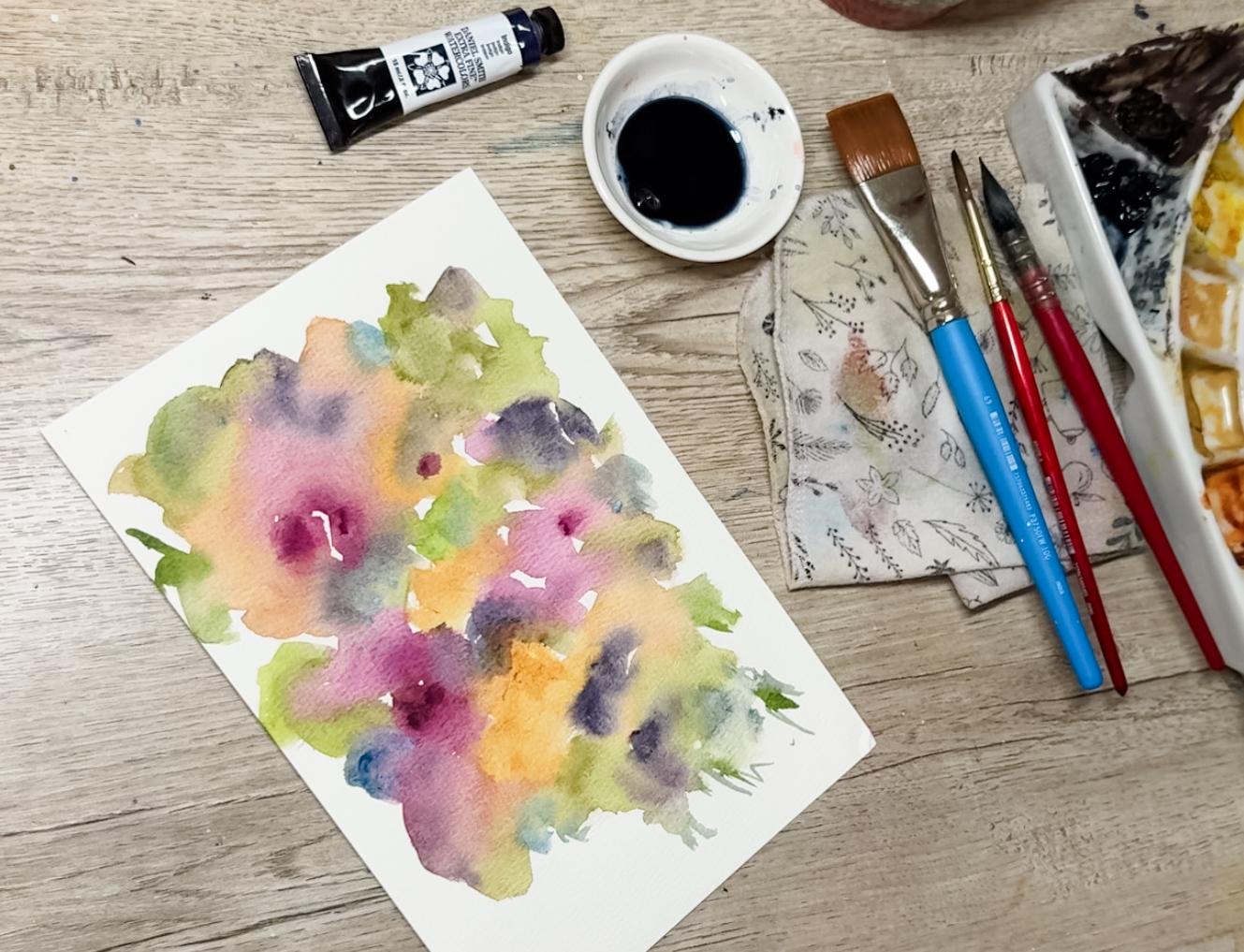
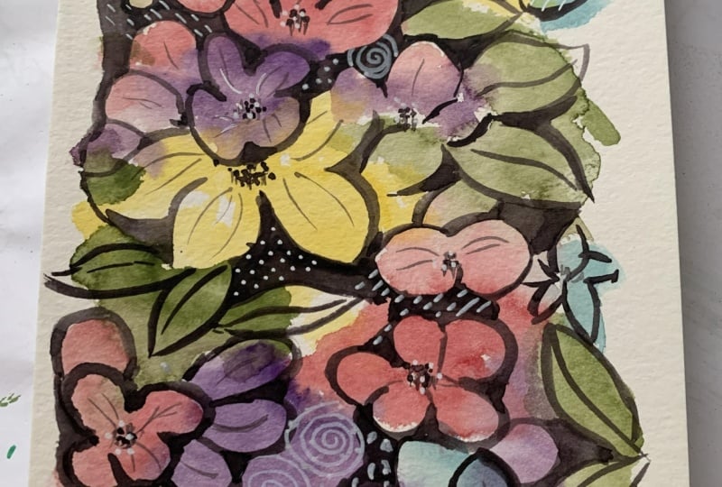
3. Loose Florals: Finding and Defining Shapes: In our class project, we're going to take what we
just learned about negative painting and move into something a little more
loose and expressive. Instead of starting with a clear subject like
we did with the moon, we're going to begin with color and let the shapes
develop naturally. Before we start our final piece, I'd like to take
a minute and test out a few colors for my palette. This just helps me get a
better feel for how they're going to look on paper and
how they might work together. You can do the same or
you can just jump right in if you already know what
colors you want to use. Once I have a general
idea of my colors, I'm going to tape down my paper. We're going to be using
quite a bit of water here, so this just helps
everything dry flat. One thing about your
color selection, it can be a little bolder
than you would typically go because we're going to
be adding indigo on top, and that's going to
mute everything down. So I went ahead and used some really bright colors because I knew that
this indigo color, which was going to be used
for our negative painting, it's going to go on top of
those really bright colors, which was going to tone
down the whole painting. Now I'm starting to
lay down my paint, and I want you to
notice that I'm not trying to paint
flowers at this stage. There's no real plan.
There's no need to make anything look
like a finished shape. I'm just dropping in color, letting it spread, and
move it gently with water. I did intentionally start with some pink because
I have a feeling those might become some of my larger flowers when
I get to that part. But even with that in mind, you can see I'm not
painting flowers. I'm just placing color on the page and letting it
settle in a natural way. Trying to keep my
hand relaxed here, letting the paint move, adding other colors,
letting them blend, and resisting the urge
to control it at all. This stage is really about creating a base that
we can work on later. The shapes we need will start to appear as
the paint dries, and that's where it
all comes together. We'll begin to define them
using negative painting. But for now, just focus on
enjoying the process and getting comfortable with a little bit of
unpredictability. You may have noticed
that I added in green along the edges
and some in the center. I'm just predicting that those will probably be
where the leaves are. But as you can see, I
didn't paint leaves. I did choose to
stay with my pinks and my yellows as my
biggest and boldest colors. And then adding in just
a hint of the purple, blue and green and moving that paint around and letting it
have fun together. Leave white space. Do not fill your entire page. Leave white space in between the different colors and
around the outside edge. I do recommend that you remove your tape because
you're going to want to be able to
move that paper around in the next process. Here I'm starting to
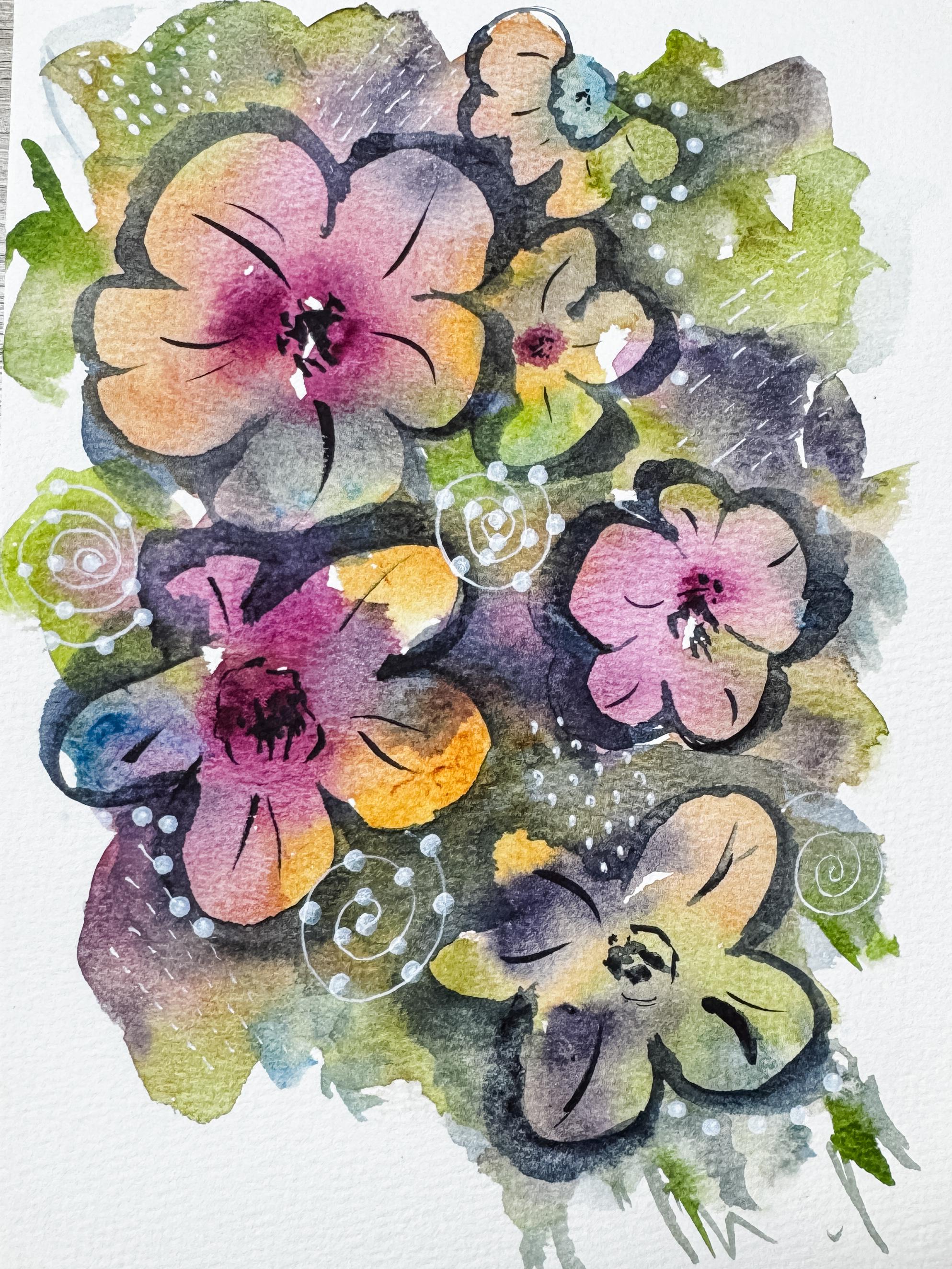
look for flowers. Is that a flower with
that little pink center? Could I make a flower there? How about one over here? Where are my flowers and how
am I going to create them? This is where abstract
painting comes in and you just can be free and wait
and see what happens. Now, I'm going to use
my small dagger brush. You do not need to. You can
just use a small round brush, whichever works best for you. I find the dagger
brush really keeps me loose so that I lose
control a little bit. But if you don't have that brush or don't
care to use one, a round brush will
work perfectly. Take your time, look it over, turn it around if you need to, start to notice where those
natural shapes have formed. You might already
start being able to see petals or
clusters or leaves. But instead of
drawing anything in, we're just going to
use negative painting to bring those shapes forward. I'm going to use indigo as
my paint color for this. It's a nice dark value. I'll start painting around the shapes that I want
to become flowers. So rather than
outlining a petal, I'm placing my brush
just on the outside of it and shaping the
space around it. As I do that, you'll start
to see petals appear. Try to work slowly and
intentionally here. You don't need to define
everything all at once. You can choose just one
area to begin with. Also, pay attention to
your brush strokes. You can curve them
slightly and suggest the shapes of petals
or keep them loose. We're not aiming for
perfect flowers, the feeling of them. If you're unsure where to begin, just pick one area
that stands out to you and begin shaping
around that one. Once you do, others will tend to become a
little easier to see. And remember, you're not
outlining, you're shaping. That's an important shift. As you build up
these darker areas, you'll start to create contrast, and that contrast is
what allows the flowers to become forward and
feel more defined. Take your time with
this step and enjoy watching your painting
start to reveal itself. Sometimes you might
find that it's just a half of a flower
like I did here. Or maybe the flower is
off the edge of the page. Slowly bring that
indigo painting out towards the other flowers as you start to
create more flowers. You're going to be
filling in some of the negative space
just like we did on our moon painting to fill in and cover up the
rest of the painting. Choose as many flowers
as you want to. Maybe you only want to
find three flowers. Maybe you're finding a
whole lot of small flowers. Maybe you have more
leaves and you want to find your leaves and
bring those forward. Just negative painting around them and bring them forward. Adding in your wash of
indigo or whatever color you've chosen to push those
flowers and leaves forward. Here you can see
that I'm adding that indigo over the top of the
painting a little bit more, softening those edges and bringing that painting
out into life. As you're working
through this part, here are a few things
that can really help. First, try working on just
one flower at a time. It can feel a little overwhelming if you're
looking at the whole page. Pick one area,
bring that forward, and then move on to the next. It keeps things simple and
helps you stay focused. Second, vary how close you
paint around your shapes. In some areas, you
can come in nice and tight so you can define
a petal and in others, leave a little bit more space. That variation is
what's going to keep everything from looking
too stiff or outlined. And third, don't feel
like you need to define every single
shape you see. Some of the most
beautiful areas are the ones that you left
soft or unfinished. That contrast
between defined and undefined is what gives your
painting depth and interest. Go ahead and add in
some of the details. You can put in centers
for your flowers. You can add little
details to the leaves, darken some of that outside
edge like I'm doing here. But most importantly, relax, have fun, and see what
happens when you play. How many flowers did you find? Just two. Is there one
more you'd like to add? Do you want to add in any
details to your flowers? The centers, the little
stripes on the flower petals, anything that would
make this painting feel more complete? Are you happy with the color
selection that you did? Are you surprised at how these
flowers just came to life? Even though you had never
painted flowers to this page. If this process is feeling a little uncertain, that's
completely normal. This is where you're
beginning to learn to trust your eye instead of
following a set plan. There's no right or wrong way for these flowers to appear. Each painting is going
to look very different. And that's exactly what
makes this process so fun. Just keep going one shape at a time and let your painting
guide you a little. You might be surprised at
what starts to emerge. At this point, your
painting needs to be dry and your main
shapes are in place. Now we can have a little
fun with the details. I'm going to go in
with a white gel pen and an acrylic marker, and this is just an
optional step to add a bit of interest and movement on top of the painting. You can add small dots, little dashes, soft lines, or even a few loose swirls. There's no set pattern here and there's no need
to overthink it. Try to keep your marks
light and scattered. You don't want to
cover everything. Just add a few areas that catch your eye and give the piece
a little extra texture. This is also a nice
way to bring a bit of contrast back into the areas that may have softened
as they tried. If you're not sure where to place your marks, start small. Add a few, step back,
see how it feels. You can always add more, but it's tricky to
take them away. Just like the rest
of this process, it doesn't have to be perfect. These little details
are meant to feel playful and natural,
not precise. Think of it as doodling, finding funny little things to add on top of your painting. Maybe you can even
add a little bug as something for
somebody to discover, just like you
discovered the flowers. Once you're happy with
how everything looks, take a moment to look at
your painting as a whole. Notice how those loose shapes at the beginning have now turned into something recognizable
just by working around them. That's really the beauty
of negative painting. When you're ready,
I'll meet you in the final lesson
where we're going to wrap everything up and
talk about your project.
4. Final Thoughts and Project Wrap Up: I hope you enjoyed
working through this class and getting a
feel for negative painting. It's one of those
techniques that can feel a little
different at first, but once it clicks, it really opens up a whole new way of
seeing your painting. I love how this process lets you move from
something very simple, like a moon study into something more
expressive where you're discovering shapes and letting your subject develop naturally. If your piece didn't
turn out exactly the way you expected,
that's completely fine. This style is all about
experimenting, observing, and learning to work
with the paint, rather than trying to
control every detail. Go ahead and give
it another try. You might be surprised at how much you've
already learned. I would really love to
see what you created. So please take a moment and upload your project
to the class gallery. It's always so inspiring to see how different
everyone's work looks, even when we're all
using the same approach. You probably use
different colors and found different flowers. If you enjoyed this class, I'd also appreciate it if you left a review and
followed me here. It really helps me continue creating more classes
like this for you. If you'd like to keep
building on these skills, you can continue with my other watercolor classes where we explore
more loose florals, layering and composition
in a similar style. Thank you so much
for painting with me today and I'll see you
in the next class.
 Brenda Jones, Watercolor Artist & Teacher