Transcripts
1. Welcome to this Class: Butterflies carry a symbolic significance. They are distinctive, colorful wings can represent the beauty of transformation, hope, and life itself. Combine that with watercolors, unique properties, and you'll be able to create mystical artworks like these lovely people. This is Bianca and aspiring watercolor artist from the congas fill beans. And I welcome you to this class. No prior experience in watercolor painting is needed to complete this glass. We will create two projects where we will explore a watercolor technique called glazing. We'll compare that with pre mixing colors in your palette. And I will guide you how to work on each layer of this project. It's a good way to experiment and see how each pigment we apps with each other. And to learn how to let go and let watercolor do its thing. Once you've learned how to glaze watercolors, you can now try it on other subjects and see for yourself the unique beauty that it presents. If you're ready to create something breathing. Let's get started.
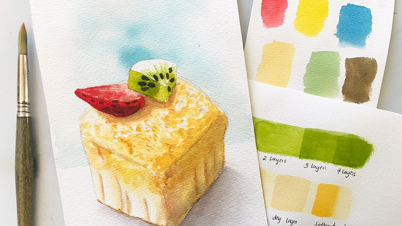
2. Glazing vs Pre Mixing: You will see in the succeeding demos how I was able to achieve these transparent layers of paint where each color can still be distinguished, will use that technique called glazing. But this time, let's try to premix all these colors, see if we can achieve the same effect. For this particular piece. I used manganese, blue, quinacridone, red, and two layers of Payne's gray. In contrast to glazing, let's mix all the colors together on our palate and they're regularly paint on our paper. You can immediately see the difference. Since we premixed all the colors, the pigments combined with each other. And we can no longer see the individual colors. But if we wet the paper first, well, the addition of law there make any difference. Not much and think. And since Payne's gray is a strong color, it overpowered the other two and became the dominant pigment of the mix. Now let's try the same. On the other piece, I used ultramarine blue, indigo, and quinacridone rose for this one. Again, mix all the colors together and then that faint the square on a scrap paper. Next, for you wet the paper with water and use the same mixture. Though the premixed one has ever the granulation due to the ultramarine blue pigment printing, mixing and glazing have obviously different effects. So if you're excited to work on the class project, please prepare the following and let's get started on the next video.
3. Layer 1 - Blues: Let's start with our first layer. For a crisp border. I have date the edges of my paper on a white board panel. And I will be working on both projects at the same time. To maximize the drying time. I have prepared two paddles, manganese blue and ultramarine blue for our first layer. If you have a flat brush or a mop brush, I suggest you use those. It's easier to cover a large area would have bigger brush. Our goal, do each layer with minimal strokes so as not to disturb the layers underneath. So let's start by wetting the paper thoroughly with clean water. Make sure to cover all the surface area, but no need for it to be soaking wet. I am gently brushing my paper and I will do the same as I work on each layer. Before I went the year before. Make sure you have your blue colors ready. I am using a 100% cotton paper, 300 GSM. So based on experience, it should the GI that fast compared to student grade ones. Using the same brush, I will loaded with manganese blue and work on the first day or off the background. Observe carefully how I've been thinking this layer. I am changing the direction of my stroke ever so often and avoiding going over the same area with the same stroke direction. Or else I might just lift up the colors instead of adding to it. I'll only cover about two thirds of the VBR and do the same on the second project. Note these how lightly I'm going over my strokes. If he can he tried to do the same as we will need this on to succeeding layer. Leave this to dry, and see you in the next video.
4. Layer 2 - Neutrals: Make sure that the first layer has completely dried. Before working on the second one, you can either leave it to dry naturally or assist the drying process with a blow dryer. I personally prefer letting each layer dry naturally. But during demos and workshops, I do use a hair dryer. I'm using my palette, slightly sled my board, and reading the paper with clean water. Again, be careful in rewetting this layer. Don't scrub, do hard or you might lift up some, reactivate the paint. Like what do you see me doing? If you can try to rewrite the surface with the least number of strokes, I load my brush with themes carry, and work on the second layer. Like what they did with the first one. I am varying the direction of each stroke and not covering up the first layer completely. Do the same on the second project. But with indigo. You'll notice that some of the first layer colors, manganese blue and ultramarine blue, have bled to the borders. But I'll leave them be. And that's why I'm slanting my board this dime to avoid that. With all good, if we have the same effect. Again with the light, this pressure that you can paint indigo as the second layer of our second project. Vary the direction of your strokes and make sure that some of the ultramarine blue layer is bulb. Leave this to dry. And let's write on the next. While we are, we will use our pinks and breads. See you.
5. Layer 3 - Pinks: We used blue and neutral colors for the first two layers. Now let's go for pinks and reds. Using a live pressure, I am once again be wetting the paper with clean water. If you're using a paper that is not a 100 percent cotton, it might be hard to achieve the exact effect you are seeing right now. Here be burned might warp, or the colors might be dealer, but keep going. You should still see the difference between pre mixing colors and glazing them on top of each other. I loaded my brush with quinacridone red and added the third layer. Again, don't forget to vary the direction of your stroke. And the sum of the previous layers big through and rinsing my brush and working on the second project. I haven't completely rinsed mind with. All's good. That color is too light to ruin the effect that I'm after. For this project, I am adding a layer of quinacridone rose, a cool pink. Live this layer to dry. And on the next video, we'll add our final background layer.
6. Layer 4 - Neutrals: On our last background layer, I will be using the same neutral or dark colors I used earlier. Payne's gray on the left, bronchi, and indigo on the right. Depending on their preference or your mood the right now, you may introduce a fourth and new color. I want mine to be on the darker side, so I will written forest the background using the darkest pigment on my palette. You may even go for a complimentary color. Though. Remember that if you mix red, a blue, and a yellow, chances are you'll produce brown. But who knows? If this technique will yield a different result? As always, make sure to vary the direction of your stroke and go as lightly as he can so as not to disturb the layers underneath. They might get reactivated with do much water and do harsh brushstrokes. Do the same on the other project. And all that's left are the details. I'm so excited to paint, the butterflies roaming and this ethereal backgrounds. I'll see you on the next video. And let's finish these projects.
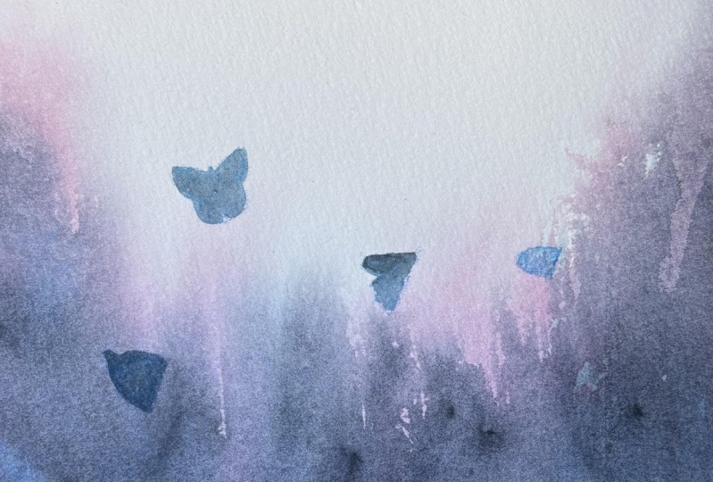
7. Butterflies Part 1: Onto our butterflies. We want Curtis butterfly silhouettes. So make sure that your paper has completely dried. No shine and not cold to the thatch. Here's my first child doing this piece. I haven't tested the new masking tape by BAD, so I got this messy border. That's why I always encourage others to test the compatibility of the paper and the tape to avoid mess like this. Anyways, I will use the same colors I used for the background. I'm mixing Quinn read with my Payne's gray and have shifted to a smaller round brush for the silhouettes. To introduce movement. In this piece, I will watch out for three things. First, that the erection of the butterflies should vary so it's not too monotonous. Second, I will slightly differ their sizes to make an illusion that some of them are farther from the audience. And lastly, we'll vary the pigment to water ratio and make some of the butterflies lighter than the other one's. Fill framed debate. As many butterflies as you want or as few as you prefer. From where I am. Butterflies are sometimes steam as angels or souls of the departed, loved ones who visit their families and friends to make their presence felt. It's a superstition, personally believed as a child. But even as an adult, I still think that butterflies carry as symbolic significance. We're going about you what this butterfly mean to you. The other superstitions about these lovely insects. I am also amazed when I learned about metamorphoses for the first time. The most interesting face of a butterfly's life. The transformation from being an earthbound caterpillar to a pupa, and finally to a butterfly, symbolizes rebirth, change and life itself. That's why I enjoyed creating these pieces so much. And I hope that you are enjoying this water color Project 2. I'll see you on the next video and let's work on the second project.
8. Butterflies Part 2: Let's work on our last project. The approach will be pretty much the same. Filling the background that butterfly shapes, varying their angle, opacity and size to create an illusion that some are farther away from the viewer. And repeating this process until I am satisfied. I personally like this project margin the first line, because of the cool colors. Speaking of colors, if you have other pigments in mind that you want to experiment glazing with, then please do so and share European things and discoveries with eyes. They start being a discussion thread or posting your lovely artwork in the projects and resources tab. This is a perfect project. If you just want to see help. Pigments are colors interact with each other. I rarely use quinacridone, red, but I gave it a shot on the first project. I didn't know it would work so well with manganese blue and Payne's Gray. Same goes for indigo. I almost forgot that they have this pigment. But things to this project, this color is proving to be attractive. And it's a good reminder that I should use it more. These exercise is also a good way to learn how to let go as to what we did with the background layer. It doesn't have a definite shape. And as I have encouraged you to do within tried to finish itch background layer with as minimal stroke as possible and that watercolor do its thing. It fills so liberating and handling at the same time as we wrap up this project. That me thank you for spending time to learn this watercolor technique. And I'll see you in the next video for a final suggestions on what to the next and a quick recap.
9. Before You Go: Yeah, you finish. In this class, we differentiate the pre mixing and glazing or layering. We worked on our project layer by layer, adding a glaze of different colors and silhouettes of butterflies roaming around this mystical back grounds. Now don't you try this technique? You can now try glazing on other subjects. These floral painting has a glazed background and the hint think is still picking through those dark layers. This gap as an underpainting of burnt sienna and burnt umber was glazed over it. And this seascape has a yellow undertone for the waves, and then glazed blue on top of it. To promote a sense of being together. I encourage everyone to upload their love the artwork in the projects and resources tab. Our review is greatly appreciated and will surely helped me improve my feature glasses. See you on my other classes and together, let's make this world a little bit more colorful with our paintings.
 Bianca Luztre, Watercolor, Productivity, Color Mixing