Transcripts
1. Introduction: Hi, my name is
Sandra and Curtis. I love exploring new mediums, where they come from
and how to use them. In this time, I found
a very obscure one, yet used by men for as long as we can date the
origin of painting. In this class, you will
learn about one of the oldest medium
known to man, casein. We will talk about its history, its properties, and the supplies you will need to get
started with our project. I will show you how
to mix the paint, how to apply the first layer. All the steps necessary
to complete your project. And by the time
the class is over, you will have a finished
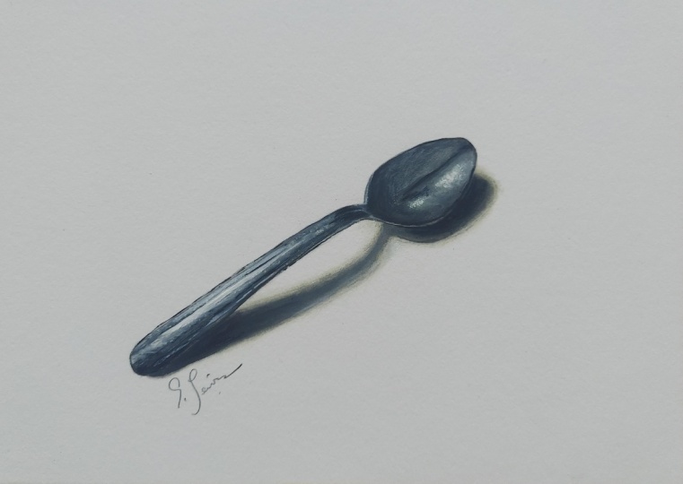
monochromatic painting of a shiny spoon. Once the class is over, I invite you to share
your painting with everyone and talk to you about your experience
with this medium. If you liked it, will
you keep using it? Really, anything
you want to share? I hope you will have
a lot of fun taking this class and I
will see you then.
2. History: Casein has been a
very versatile medium for very long time. It's a pain that's fast drying, durable and permanent,
and it's made from milk. In fact, it's one of the most durable mediums known to man. They were cave
paintings found in Asia dating from 9,000 years ago. And actually there's
some that are still being found
that are even older. It's been used
through the centuries by ancient Egyptians, Byzantine, Roman, and
run since artists. And it's been used for many different things
like murals, frescoes, Fine Arts paintings
and wall paint, decorative painting
for furniture. And even during World War II, was used for camouflage, and in the 18th century was
used to paint theatre sets. And it still is today. Because the recipe for casing
paint is very easy to make. Artists have been just
making it as they needed it. And since one of the
main ingredient is milk, it can't really be kept for
very long because it spoils. Now after the US Civil War, Paint cans started
flooding the market, but knock paint couldn't be commercialized because
of its short shelf-life. So you could only find
oil-based paint in those cans. But in the early 20th century, there were new recipes
that were developed which used synthetic
rubber and styrene. And he gave birth to the
first type of latex paint. And it was called Chem tone. And I was used mostly
as we'll paint. So that was a huge success because unlike the
oil-based paints, commercializing cans,
it didn't contain lead. In the 130s case. Instead of being tubed, fine artists and illustrators didn't have to make
their own paint anymore. So fine artists started using them more and they
mostly use it as underpainting for
their oils and even started using casein
instead of oils. Because casein has washed
capabilities of watercolor, it has this smooth
opacity of gouache, the rich texture of oils and
acrylic paints like wash. It was loved by
illustrators because it dries fast and has a
velvety matte finish, which makes the paintings
easy to photograph. But like wash also, it started losing
popularity when acrylic paint was made commercially available
in the 1950s. So casein is one of the
oldest mediums known, yet one of the least
familiar today. Next we'll talk about
casings properties.
3. Properties: Casein is a
water-soluble medium, just like watercolor,
gouache, and acrylic. And it shares many qualities
with these mediums. And yet it stands out on its own paints all start
with the same ingredients. The pigments were the
different types of paints. Very is how small the
pigments are ground and what binders is used to
hold those pigments together, for instance,
watercolor and gouache. They often have gum Arabic, or honey as a binder, yet watercolors
usually transparent and gouache is opaque. So the main difference between
the two is that watercolor uses fine or pigments that dissolve and spread
more on paper. And that's letting the
paper show through. Gouache has larger pigments
that cover the surface of the paper more and it's
making the paint more opaque. The same goes with casein. However, with casein, the
binder is the milk protein that gives its name to
the paint casing is very similar to gouache. It's a bit thicker than
gouache and it's opaque. But unlike gouache, when the
paint is dry on the paper, It's not as easy to reactivate, especially if it's a
thin layer of paint or if the paint has
been dry for awhile. So it's a bit like acrylic two, which is also a water medium. Acrylic does not
reactivate it all and dries shiny while
casein in gouache, they have a matte finish
when they're dry. Now what you need
to know is that casein has a funny smell. Although I quite like
it in a weird way. And some people either
like it or don't. But as far as I know,
it's not toxic. And also the paint
is very light fast. So you paintings will last for very long time
without fading away. Something else you need to know is that lighter color is dry a bit darker and darker
colors dry a bit lighter. And that's because when the
paint is mixed with water, it tends to make you
change tones when the water evaporates
and the paint dries, the real color reappears. It's the same with watercolor,
gouache, and acrylic, but the colors shifts shows more with some mediums and others. So because casein
tends to be a bit more like acrylic when it
comes to reactivating it. It has a limited palette life. What I mean by that is that
after a couple of days, it won't be as nice if you try to reactivate
it on the palette. There will be some
little pieces that are dry that won't melt
anymore with the water. So don't make yourself
a casing palette. Just use the paint fresh
as much as you can. You can save it. You can keep it a
couple of days. It'll be fine depending on
the type of weather you have. But I wouldn't keep it longer
than that on your palette. So that also means don't squeeze too much paint at a time. Only Squeeze what you'd
need on your palette. The last thing you need to know is I casing can be varnished. And if you do so, it can actually
make your paintings look more like oil paintings. And when it's done properly, the paintings can last a lot
longer than oil paintings. Next, we'll be talking about the supplies you'll
need for our project. I'll see you then.
4. Supplies: For our painting today will
be using only two colors. The ivory black in
the titanium white. Because when you're getting
familiar with the new medium, it's easier to use
just a few colors. It helps you focus more on
the medium itself and its properties rather than trying to find out the right color
for your painting. So black and white will give
us a nice range of grays. And we'll be able to make a monochromatic painting
with all the values we need. Now for the brushes, we need some synthetic
brushes because the natural bristles don't
work as well with casein, they're a bit too soft
because casing is thicker than watercolor and
in its bounds here, bristles to be able to be
pushed around on the paper. I'm gonna be using a round six, a round three and around one. As well as the filbert for the round brushes are great because they
have a pointy tip. So it's great to add details. And the filbert helps to add more paint and
push it around. And it's nice because it has a rounded edge and it's
just very versatile. For the paper. I'll be using a watercolor
paper and it's 140 pounds. You can pick watercolor
paper or mixed media paper. It doesn't really matter. The one I have here is
a five by seven block. It's 100% cotton,
it's cold press, and it's Fabriano artistically. It's 140 pounds,
as I said earlier. I'm very picky when I use watercolor paper
with my watercolors. But for gouache and casein, I find that any thick
paper will work fine. So there's no need to buy an
expensive watercolor paper. Just make sure that
it's at least on 40 pounds because we're
going to use it with water. So you don't want it to buckle. And I pick this one again just
because I had it on hand. Now, because this is a block and all the pages are
stuck together, it helps prevent the paper from buckling when
you add water. But if you just
using a loose sheet, you can just tape it down
on either your desk or a drawing board so you can use washi tape or painter's tape. Also, I chose a five
by seven format because I believe that
when you try a new medium, it's easier and less
frustrating to start small. Here again, the choice is yours. If you have a larger sheet of paper and you want to
work larger, that's fine. It's up to you, but you can always cut it down to
the size you want. Next, you'll need a
cup of water or two. You can have one that
you use to clean your brushes and
another one that has clean water to
add to your washes. But since we're gonna do
a monochromatic painting, it's really not
that necessary to have two of them,
but it's up to you. And finally, you'll
need a palette also. And I like to use
this ceramic tile. I got it at my hardware
store for $1 or two. I forgot. And I like, I like I like
it very much because the you can see that I still
have some paint on it. But I like it very much because the paint mixes
very nicely on it. And also it's very easy to clean and it
doesn't get stained. Here again, it's up to you
can use anything for palette. You can use a paper plate if you want or your
favorite palette. Whatever you have is fine. So that's about it for the supplies you will
need for this painting. Of course, you need
a graphite pencil or mechanical pencil to draw your little spoon
before you paint it. And an eraser, if
you make mistakes, if you're going to
transfer the line drawing, you can use tracing
paper or transfer paper. Let's thing that is not
necessarily needed for your, the painting that
we're gonna do today. That's extra stuff that pretty much everybody
already has. Now if you're watching
this class and don't have the case in yet. But she still wanted
to start painting. You can always replace
casing with gouache. If you have a black and white, It's not quite the same. But it's going to
give you an idea. Although the gouache is easily reactivated when wet
and casein is not. So you might find it
easier with casein, but if you're familiar
with gouache already, then you should know
what to expect. Next. We're going to see how to
apply the paint on the paper, how to mix it with water
and to make your washes. I'll see you in the next video.
5. How To Mix Casein: Now I'm going to
show you how to mix your paint and how you
can actually use it. So I mentioned that you
can dilute it with water easily and you can
make nice washes. So you can do gradients
with just water. If you add a lot of water, can even add more than this. You can get very
thin that washes. And then the more
pigments you add, the darker your washes will be. Eventually you just
have barely know water. And just pure pigment
or pure paint. It'll be nice and opaque. So when you use it like this is just like using watercolor. And you using the white of the paper to create
the different values. But because the pigments are
thicker than watercolor, they're not as fine
as watercolors. It might not look very nice and clean as with
watercolor washes. Now another way to
work on your values is to just mix your
color with white. Just like when you
just add water. The more white to add, the lighter the value will be. But you can create washes
that are opaque and not have to depend on the white of the paper
to show through. So again, you just
add more and more black to make darker
and darker washes. And eventually you can
just put black by itself. You can see the difference
between the two. And I think that using the white makes for a
cleaner gradient. Because if I'm using
casein is because I want the opaque result
rather than the wash. However, we will
use this technique for the very first layer of our painting just to
establish the values. Once that's done, we'll just
add the more opaque colors. You can apply your paint right out of the tube
without any water. But it's very, very thick. And if you don't put any water, It's a little hard to get fine details, but it's possible. You can even use
a palette knife. Create impasto effects. However, you need to realize
that when you do this, you paint is going
to be pretty thick. Gouache. Once it's dry, if your
paint is very thick, it's very prone to cracking. So you can still do
it just not on paper. I'm not even on Canvas. You should be using
a hard surface like a wood panel or
something similar. Now for our painting, because it's not
going to be very big and it does have
some fine details. If you want the paint to
flow nicely and smoothly, you're going to have to add
them just the right amount of water for the paint
to stay opaque, but to flow without any problem. Because when you use
a very fine brush, if your paint is
not diluted enough, you cannot create details. You want it to be creamy. Like I'm a little thicker than milk consistency
but not much more. Maybe heavy cream. If there's not enough water, then it'll be more like dry brush and you will have
hard time with the details. So play around with this, with the consistency
of your mixes. Play it on paper, see how it works, see how much water you need to have the
effects that you want. Once you familiar with
the consistency of the paint and how much
water you like to use, then you can move on to
Step one of our project. Next, we'll be talking about the very first
layer of our painting.
6. First Layer: Before we get started
with your painting, transfer the line drawing of the spoon onto your
watercolor paper. Can either sketch right onto your paper or use the
line drawing that I've attached to the lesson and trace it or just trace
the photo itself. And you can also use transfer
paper to do the same thing. The choice is yours. I personally prefer
to trace or transfer my sketches because I'm always afraid that if I sketch
right onto my paper, if I make any mistakes
and I erased too much, it might damage the surface
of my watercolor paper. So that's why I like
transferring my sketches better. Now for the next three lessons, I will suggest to
watch each video once and then watch it
again as you paint along. For instance, this lesson
is about the first layer. So you can watch it through and then watch
it again as you're painting and you'll be better prepared and you'll know ahead of time what you're
supposed to do. For layer one. Our goal is to
establish the values. It's always daunting to start a painting with the white
of the paper or via Canvas. So this is what I like to do. I like to just cover it all with color or black and white or
whatever color you've chosen. And then establish the values
just gives me a first step. And once that's done, then I can work from
there and add details. So we won't be paying much attention to
the details for now. And we're going to
use a lot of water to create a very light wash, just like we did in
the previous lesson. We want to be able to see the paper shine
through the paint. But this time we won't just mix the black casing with water. We'll mix it with white and
then diluted with water. It will give us a
nice diluted gray. And we need to remember that as we're building the values, we always need to keep an
eye on the reference photo. For this part of the spoon. I started with the mid tones and then I used the white of the
paper for the highlights. And then I painted the shadows. And I worked on the handle of the spoon the exact same way. So we can add more or
less blacks were a mix, but it's important to try and keep the same amount of water. For the shadow of the
spoon on the table. I worked wet on wet. So I use clean water to cover the whole surface of the shadow. And then I applied the
paint and let it spread. I found that it was pretty
easy to push the paint around on the paper while
the wash is still wet. And I made sure that the
points of contact of the spoon with the table
look darker than the rest. That is the very
end of the handle in the back of the spoon
that's touching the table. And last before the
wet on wet wash was dry with a clean, damp brush. I tried to feather it out making it bleed a bit
outside my outline. And that's going to help
me later on to give it a soft look once I add
my more opaque paint. Next, we'll talk
about how to apply the second thicker layer.
7. Second Layer: Once the first layer
is completely dry, then we can move on
to the second layer. We can keep our
palette as it is. And in fact, we'll
keep it as it is until the end of the
painting will only be adding more of this water and pulling in more white or
black as needed. So as you can see, we
start mixing the paint exactly the same way as we
did for the first layer, except that we put
a lot less water. So we have a little pool of black and a little
pool of white, and we just mix them together
to prepare the mid tones. Then I made a mixture
of not just black, because I think pure black
would be way too dark, but I did add a little
bit of gray in it. And I'm covering all the shadows in that part of the spoon. I need to be really careful not to go outside of the lines, so a smaller brush is
necessary in this case. However, the paint is a
bit thicker this time. So the filbert is helpful because I can paint a
lot of details with it and still push the paint around even though
it's a little thicker. Once again, I always
keep my eyes on the reference photo and I always adjust the values as I go. As you may remember in the
class about the properties, we talked about how
the colors darken, enlightened once they're dry. As I add more layers
in different places, I always go back to the
previous application once it's dry or it's drying, and I adjust the
value as I need it. Now, as you can see
before the paint is dry, it's very easy to blend all the colors and the values together doesn't dry instantly. So you do have a little
timeframe to adjust and blend and smooth out the
surface as you wish. And because on the photo of the spoon and you can
see that the shadows are not straight lines everywhere it was some places they are, but in most areas there
there are blended. There's a gradient between the lights and the
shadows and working with the casein before it dries really helps
blending the paint. For the highlights. I use, basically pure white, which I blend on the edges. So for awhile they're
not gonna be pure white because some gray is
going to mix with it, but later on add
more white to it. And it's going to pop out more. The good thing about casein, just like gouache, is
that because it's opaque. If you make mistakes
and you don't define your shadows
and highlights, don't put them in
the right place the first time around.
It's no big deal. You can always go over it
with another layer of paint. So it's a very forgiving
medium for that. So at this point again, I'm basically adjusting my values, pulling the dark and the whites, trying to make them look as much like the
picture as possible. And they're going
for perfection, but I'm trying to be
as accurate as I can. I'm working the exact
same way on the handle. As I'm going down the handle, I'm adding all the different
values that I see and I don't look at it
as a spoon really. I look at it as blocks of
colors or blocks of grades. There. If you struggle a
little bit to add highlights like wider values, it's okay because you probably not waiting
for the layer to dry. So just work on another area or weight or even use a hairdryer to make sure
that your layer is all dry. And once it is, you can
add your whites on top. And there will be
a lot more opaque. They will not be mixing with the previous layer.
With this painting. I was being a bit
too impatient and I didn't really wait for
the layers to dry. So I had to go over them several times because as I was mixing the whites or the lighter
grays, they became dark. Not only because of the shift
of values once it dries, but also because it was
mixing with the other colors. I took a round brush to
start adding a few details. And again, I'm not too worried of not being exact just yet. All I'm trying to do is not
to go outside of the lines. But if my lines on straight
and if it's not perfect, it's okay because once it's dry, I can go over it again
and make corrections. So once you're happy
with your values, opaque layers, make sure
you let your painting dry. And then we'll be adding
the final details. So next, we'll be talking
about those final details.
8. Details: Now for the fun part, still working with the same
palette and still making sure that our previous
layer is totally dry. It's now time to work on the final value adjustments
and adding the details. Now as you can see, I don't
have a very steady hand. So painting a fine line like this is not very easy for me. However, I don't really mind. I'm not making
something perfect. It's a painting. And as I mentioned before, casein is so forgiving
that if mess up my lines, I can always correct it by adding another layer
of paint over it. So that's really not a problem and there's no
need to stress over it. So at this point and more
than ever looking at the reference picture because
I'm adding the details. So I saw that on the
black line of the spoon, which is really an indent. Well, it's darker
than the other areas because the light
doesn't go in very much. However, right under that
line, the light hits, there's a pretty
sharp highlight, are going with pretty much pure white to make a
very nice contrast. And you will see that
that sharp contrast really helps to spoon
looking more real. I messed up again
with the white and I really wish I had
a steadier hand, but again, this is no big deal. I can fix it adding more
black so it's no problem. So since I started working
on this part of the spoon, I'm just working by sections. I might go back later on, but I'm trying to just
finish section at a time. So I added a few more highlights and shadows on the right
section of the handle. For the middle of the handle, I noticed that there was also a sharper contrast
than what I had before. So I added some darker grays and some highlights closer
to that black line. So all it is really, is looking at the reference
photo and looking at all those different
blocks of grays and trying to define the shapes
of those different blocks. And they keep in mind
that my whites or my lighter highlights will
darker and as they dry. So keep this in mind
because once it's all dry, I'm might have to adjust that. Again. I might not because
the the darks might lighten, but I will have to
keep an eye on it once I'm done to make sure
that I have the good contrast, something that I like is
something that looks good. For a nice dramatic effect, I use pure white for the
highlight on the handle. Now if you remember on the lesson about how
to mix your paint, I talked about the
quantity of water to use when you have to
make fine details. And here we have a
perfect example to create the indents on that spoon handle so that you don't
drag the paint to that. It's easy to flow and nice
and smooth on your paper. You get to make sure that you've got the
perfect consistency. You can, if you want, if you still not very
familiar with the paint, you can have a piece of
scratch paper next to you. And as you mix your color, you can try it on
the paper to see if using your fine brush with that mix will help you create a nice crisp line and flow
nicely on your paper. At this point, I'm pretty
happy with the handles, so I start working
on the other part of the spoon and I decided
to darken the shadows. I really want to give
a nice sharp contrast. And so making the
highlight slider and the shadow darker
will give me that effect. In general, whether
you draw with a graphite pencil or you paint. What helps you create a
more realistic painting or drawing is a sharp
contrast between your shadows and
your lighter areas. If you mostly have mid tones, then your drawing or your paintings is
going to look flat. If you have a nice contrast, then it will add
depth to your work. So now it's time to work
on the shadow and we're not going to leave it all
light like it was before. We're going to make
it opaque as well. So I started with a mid tone and looking at the
reference photo, I noticed that some parts of
it are lighter than others. So the left part
of the shadow is more in the light
if it makes sense. And so it's a little lighter than the right side
of this shadow. And I'm talking about the
shadow of the handle and also the points of contact
of the spoon with the table. There are darker. Obviously. I have to make sure that my grades
are darker there. And I do not cover the
whole watered-down wash. If you remember, we left
a little feathered area. So this will let it
show because again, if you look at the
reference photo there, there is a very light
shadow like that. That's the reason why we
did it at the first place, to let it show through. Once I'm happy with the shadow, I go back and add the final, final details to make sure that it looks as
realistic as I can, I would just hit the lines
also that we're not very straight or try to at least, and I tried to turn down a bit that very
white shadow that I had on the edge of
the spoon because it popped out a bit too
much for my liking. So that's it. Once I'm pretty
happy with the result, I just stopped because if
I start overworking it, then it's going to mess it up. And here's our shiny spoon
painted with casein. I hope I'll get to
see yours very soon. Stick around for the
very last lesson where we're going to sum up
what we've just done.
9. Final Thoughts: I hope that you
enjoyed learning about casein and that you had fun
working on your project. Remember to share your progress as well as your final painting. And if you want
to practice more, you can always find
an easy subject that interests you and do a
monochromatic painting of it. Now, please don't think that monochromatic only
means black and white. You can pick any color you like. Some colors are more
effective than others, but you can easily achieve
beautiful results with a blue, for instance, even if blue is
not the color view subject. So play around and experiment
and have lots of fun. I personally be
happy to see what else you do with
your casing paint. So thank you very much
for taking this class. I hope to see you
soon in my next one. Have a wonderful day. Bye bye.
 Sandrine Curtiss, Artist, explorer.