Transcripts
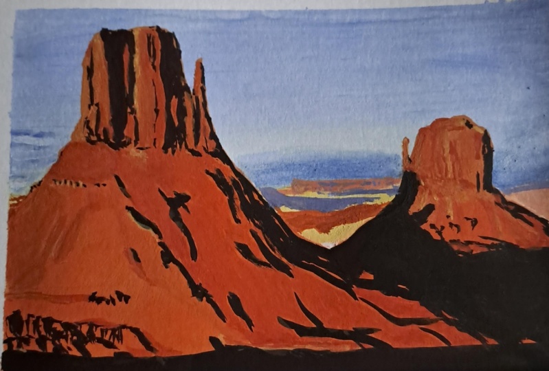
1. Introduction: Hi everyone and welcome to the third easy landscape
in gouache class. In his third class, we're going to emphasize
how important it is to break down the painting process into smaller, easier steps. The reference photo I chose this time can seem overwhelming. But if you take the
time to pause and think about how you could make
it simple to paint. You'll see that it
isn't impossible. Once you've completed
the sketch, you'll get to pick
the colors you need. And we'll start on the sky. Then we'll apply
our mid tone base for the rock and the shadows, and then the highlights. And in no time
you'll have finished a beautiful painting
you can be proud of, except for a few small parts. All the videos are in real-time. You can follow each
step-by-step at your own pace. Don't hesitate to share your progress photo as well
as your final painting. And you can ask
questions at anytime. And together we'll paint a beautiful and
colorful landscape. I'll see you in class.
2. Supplies: For this project,
you will need paper, and I'll be using the Canson
watercolor art board. It's a block. Once you detach the sheet, you see that it's really thick. So it's not going to warp. If you add a lot of water by painted with the
sheets still attached. But I didn't have to. And so I'm using a size eight
by 10 " or 20.3 by 25.4 cm. So you don't have to
use this exactly. You can use any
watercolor paper. It doesn't matter if it's
cotton or cellulose. Using gouache is a bit more
forgiving than watercolors. So anything that's 140 pounds will work great
because we're still going to add water so you
don't want your paper to warp or buckle. Even mixed media
paper will work well. You might also need some
masking tape or washy tape. You're going to need it to
tape your paper down to make sure it doesn't
buckle once you add some water to your paper. I didn't really
need it for this, but I used it anyways because I wanted to create a
border around my paper. And so masking the edge helped me make a very
nice and clean border. You will also need an eraser. I've got a kneaded eraser here. You can use any kind
of eraser you usually using mechanical pencil or graphite pencil for your sketch. If you're not going to
sketch it and you want to trace it, that's
absolutely fine. You can use tracing
paper or transfer paper, whatever you'd like to use to
transfer your line drawing, usually brushes an assortment. The brands don't really matter. Here for different brands. Either watercolor
or acrylic brushes. They work very well. Don't make them too
soft or too stiff. And I'm using a large
flat brush that's 1 ", but certainly gonna
be for small part. I'm mainly going to
use these three. So half an inch flat. This one I think is a quarter-inch
and this one is around and it has a nicer
point when it's wet. Again, you can use any
brand new want and any size as well because you don't have to stick to the eight by 10 ", you can do something
smaller or bigger. It's up to you. You need a jar where you're
gonna put your water in. Some paper towels or towels, whatever you use to clean
your brushes and plot them, you know, remove the excess
water, excess paint. And finally, you
need some gouache. So these are just random tubes. It's not the colors
we're going to talk about the colors
we're going to need. You can use any brand you have. I've got a little selection. I'm going to use
mostly Winsor Newton and I think it's a
great choice because it's usually available
pretty much anywhere in any country and it's
a reasonable price. You can go with
the Holbein or the M Graham or may marry
me if you want. That's another cheap brand. Artist makes also a
pretty cheap gouache. That's a pretty, pretty nice. So anything you have available, that's the one you need.
3. Sketch: Let's start by working
on the sketch. You can feel free to simply
trace it if you want to. Just make sure you don't add too many details
when you trace it, because most of them
will be covered by the opacity of the gouache. Some simple outlines we'll do. For our sketch. We're going to start
with the horizon line, which is maybe between a third and half of
the way up the page. Just draw a rough line. Find the middle of this line, and go slightly to the left
and you'll see the point where the left mitten and the horizon cross
path from there, you can start drawing the
mountains in the very back. And you can just draw
a very loose shape. For the left side of the mitten. You can start right at
the edge of the paper. I'm gonna be putting some tape on the edge
of it after that, so part of it will
be covered anyway. So the base of the
mitten goes up to about halfway than the
paper and then the top. And about a quarter of the way
down the paper from there, from all those points, try to find guidelines and compare those points
with each other. And that's how you are able to find where
to draw the lines. So you start first
with the size and shape of your paper
for the main points. And after you start drawing, you end up with more landmarks, I guess you can call them. There's a part right above the shadow line that to
me is important to mark. It's the base of the
base of the mitten. It's it seems like
a vertical surface, so jaggedy surface, but it's the vertical compared to
the slope of the base. The left part of the base
for the right mitten seems to start
about a little bit past a quarter of the
page from the right side. That's where the line crosses the horizon line or
roughly that area. Remember it's a landscape. It doesn't have to be
absolutely perfect. People will recognize
this landscape. No matter if you put a rock in the wrong place or
not, it's okay. It's not a person's portraits. Now the top of the
right mitten seems to line up more or less with
a dip in the left mitten. So that's where I
know I'm going to stop and I'm going to
place my flatline. And then also try to find a
reference point to see how far down the DEP goes
in the right mitten. From there, I tried to
refine the shapes a little bit and keep my eyes on the reference picture to try and be a
bit more accurate. Always looking at the
lines and comparing them with the position of other
lines or other landmarks. You don't have to
worry about leaving marks on the paper or
making a mess with the eraser because the wash is so big that it's
going to cover it up. On the left and mark the clouds. Then I tried to
refine the shapes and the outline of the left mitten. It's pretty jagged edge.
It goes up and down. So I tried to recreate that. Not perfectly well because we're gonna do that
later on with paint. But at least it gives me an
idea where everything is. And when I start
blocking in the colors, it will make it easier. And as I refine those lines, I can also tell what I get
wrong the first time around. If my proportions
are correct or not. Again, doesn't have
to be perfect. And in fact, I already can see as I'm looking at my sketch, There's a lot of mistakes that I made compared to
the reference photo, but in the end it really
doesn't matter much. So now I'm sketching the chunks
of shadows and the rock. Not all the details in the rock, but the main bits that I
will be painting black. The main big shapes. Refining the top
part of the base and the outline on both
sides of the base. I noticed that as the rock rebels are
going down the slope, in some areas, you
see some patterns. So I thought that this would be a good thing to mark
them because it seems to be a recognizable part of this
particular rock formation. I'm just marking the
edge of the shadow, the big shadow at the bottom, making sure that my
horizon line is aligned. Then I'm working on the, the right mitten, same way
as I did the left one. I sped up the video just to make this lesson
a little faster. But again, always checking
with the reference photo, always keeping an eye on it. And I'm drawing my lines based on other points
that I've already drawn. Trying my shadow on the mitten. The shadow on the mitten, on this mitten is the shadow
of the left falling on it. It doesn't have
those dark shadows that the other one has. And then the shadow
at the base of it, which is also the shadow
falling from the left mitten. Now that I'm pretty happy with my sketch with a kneaded eraser. I tried to lighten
it by doubling it so that it doesn't turn
into mud with the paint, the first layer of paint. But I can still see
the lines pretty well.
4. Pick Your Colors: Now that we have our sketch
before we start painting, we need to pick our colors. So I'm going to use mostly
Winsor and Newton colors, but you can use
whatever you want, any graphs you have on hand. And I'm going to show
you Swatches that way. You can figure out if the
color names on quite the same, you can figure out more or
less which colors to pick. So looking at the
reference photo, I can tell that it's
a pretty good photo actually to work with
a limited palette. And I decided to pick
a tube of ultramarine. I'm thinking about using
a convenience color, venetian red, which
is already pre-mixed. Zinc white, which is
a good mixing white. It's not as strong as permanent
white or titanium white. So it's not going to turn my
colors into pastel colors. That's what the
zinc white is four, and sometimes it's
called mixing white. So basically the pigment
is not as strong. And then ivory black
and then yellow ocher. So I decided to swatch them to show you
what they look like and also to make sure
that matrices are good for the project. I put the paint straight out
of the tube on the top and then with a wet brush, I diluted the paint
at the bottom to see what it looks like with
a thick and thin layer. So here we have the ultramarine blue with the yellow ocher
and then the finishing read, the zinc white, which we
won't see on this paper or just a little bit because
it's shiny when it's wet. And then the Mars Black, the Mars Black is not as
deep as the ivory black. It will look better, more
natural in a landscape. So as I'm looking at
the Venetian red, I realize that although
the color is not far, I think I would rather mix
this red with a yellow and red because I will
have a more orangey color, which will look better because
it's a sunset anyways. So I tried to mixes and that gives you a choice depending
on the colors you have. One of them is a Winsor
and Newton brand, and it's the permanent yellow
deep and the spectrum red. And the other brand is M Graham. And it's a combination of
gamboge and pyrrole red. So it should help you
find the right colors. And then finally at the end, I decided that I
will not need at all the yellow ocher
and that instead, I will use a primary yellow, which is kinda like
a lemon yellow, it's on the cooler side. And again, do what you can with the colors and brands
that you have.
5. Sky: To paint the sky, we're gonna go with
the ultramarine, the zinc white, and
the primary yellow. So we're going to wet the
sky with the flat brush, making sure it's nice and wet. We're not going to make
the sky super opaque. We don't need to. And it's gonna be
much easier to make a nice gradient with
a thinner layer. And you can go over
the mittens that it's okay because then we'll use a thicker layer that will
cover up the sky That's, that's painted on it. So you don't have to
be perfect with water. And when you paint this
guy with your wet brush, but not too wet, pick some ultramarine
and start applying it from top to bottom just
like watercolor wash. So little darker on the top. And then gradually will add a little bit of
white as we go down. Because you can see on
the reference photo that the sky gets
lighter as it goes down. Then the last
quarter of the sky, we're going to add a little bit of primary yellow and a lot of white because we can see
some kind of haze there. I'm the beginning of a sunset. At the very, very beginning,
it's still daylight, but you can start seeing
some colors in the sky and it kinda looks
like pollution almost. Don't go back and
forth with the blue too much because you don't
want it to turn green. And then if the top of your sky is just about the same color as
the rest of the blue. Tried to add a little bit more, more blue, a darker blue. So don't overwork it. If you see that
your brush starts to come apart and
make some lines, just rinse it and debate on your paper towels
so that it's not too watery. And then tried to be done quick.
6. Rocks - Midtones: Once the sky is dry, it's time to pick the
colors for the mittens. So I picked the mixture
of the Winsor and Newton, permanent yellow deep
and the spectrum red. Because I've found that in this mixture the yellow
stands out more. But pick whatever you have on hand and what you like best. Now it's time to start
mixing both of them. Red are often very strong, so you will most likely need to add a little bit more
yellow than the red. Then go ahead and cover
the whole surface of the desert and the mittens. You mixture needs
to be thick enough. It's not like watercolor, but not so thick
that it's opaque, especially for the bottom part. Because you still want
to see the lines and a nice Don't make it too
transparent though. Now when you apply the paint, it doesn't matter if for now
the coverage is not even. We just want to block
in the main shapes. For the smaller parts, like with the mitten
on the right, use the edge of the flat
brush to trace the outlines, to show the shapes. Take your time and try not to go over the
lines and onto the sky. And do the same thing
with the left mitten. Use the edge of your flat
brush to follow the contour, to follow the outlines
of the rock formation. Sure, you always go back
to your reference photo. He tried to determine the correct shapes and try to be a little bit more precise. When I see that, my brush looks a little bit
to dry on the paper. I tip it back in the water and debit on my paper
towel so it's not too wet. Then I go back into
the gouache mix. So this is going to
be a mid tone layer. Then we will have to
work on the shadows and the highlights to bring
this painting to life.
7. Clouds and Distant Mountains: Before we continue
working on the mittens, it's time to work
on the background. So we already did this guy, but if you look closely
behind the rock formations, you will see more of the desert. And there's also some
mountains and some clouds to. So because the white I have on the pellet is dirty with blue, I put more white on my palette. And I'm mixing it
with the yellow. I'm using this mixture
for the base color of the background
mountains, desert. Adding a little bit
of red to this mix, defining the
background mountains. Here again, the mix is not
too opaque, but enough. You can still see the
lines underneath. Now adding white to the
blue to make a pale blue. I'm kind of wiggling
my brush across the sky on the left to
form some uneven clouds. Don't go too much into detail. I think this will
be just enough. And I use the same mix for the clouds behind the
background mountains. So keep an eye on new
values to little wider on top and a little more blue or
darker blue at the bottom. You can keep some uneven lines to add a little bit of texture. Again, on the left side, I'm watching my values
and add some darker blue at the bottom of the
clouds to show the shadows. Mixing the blue and the red
and make it a dark purple. Add a little bit of white to
it to make it more muddy. And I use it for the
distance shadows. It's just like a hazy purple, which is perfect
for the distance, which does look a bit hazy. With a mixture of
yellow and orange at the last layer that's
closer to the mittens, not as far in the distance.
8. Rock Shadows: Now it's time to
introduce black. For the whole process
of the shadows, we're going to use
mostly black or black mixed with the
orange mix or the red, which will turn down
the darkness of the black and make it look
more natural on the rocks. So for now we're going
to mix it with the red. And I'm applying some black
where I see the shadow of the left mitten that
falls onto the right mitten. And at its base loosely follow the shape that I see
on the reference photo. And because the surface, the shadows falling onto
isn't even it's all rocks. Then you don't have to have
even layering of your color. The shapes can be jagged, they don't have to be perfect. Now for the bottom shadow, It's big bold shadow. I'm using a big brush and
it doesn't matter right away if it's really dark and let the orange shine
through for now. And with a second
layer of blocking the different shapes that I
see on the reference photo. Then I decided to make it
just simpler and make it just bold and have a simple
black shadow instead. It's okay, it's your painting. You can do whatever you want. Sometimes it's easier to
simplify the process. For the shadow on
the right mitten, I ended up doing the
same thing that I did. The thicker layer to make
it less transparent. Now back to the left mitten, you can see that there are some big bold patches
of black on it. Big areas of shadows with
a round brush this time. And always keeping an eye
on the reference photo. And with the guiding lines
from the sketch that I can still see through
my orange layer. I tried to determine
all those shaded areas. It's a slow process, but as long as you always
refer to your photo, you can determine
the right shapes. And that's all they are. They are just shapes. Blocks of black shapes. Don't think of them as rocks, are jagged rocks,
they're just shapes. And you can find them in
relation to each other. Once you have an area down, it helps you find
the other area. Now, don't worry if your first application
is not very opaque. It's okay, you can
go over it later on. You just try and
determine your sketching, basically the shadows with
your black right now. And then you can
refine it later. For the right part, just use the very
tip of your brush. You can always use a smaller brush if you're
more comfortable with that. Just take your time so that you don't go too far into the sky. But you can already
see that it starts shaping the rocks and starts
giving it more volume. It's not all flat anymore. So working the values is really what's going to make
your painting pop. You already put
the orange layer, which was the mid tones. And now adding the shadows, the darkest areas, add
some dimension to it. And later when we
add highlights, and it's really going
to make it look real. It's the contrast
between the shadows and the highlights that bring
things to life really. Now on the right mitten, there's not very many, really, really dark shadows. So I only add the
few that I see, mostly on the right side. Few at the base of MIT. The rest. I apply with hardly
any color on my brush. Then I apply another
layer of orange mixed with a little bit of white
to the far mountains. Just to add more contrast between the shadows
and the highlights. Back to the black
and the left mitten. At the base of the base, there is that vertical
wall looking formation. And with the flat brush, I tried to recreate
those shadows. They actually quite easy. I either use the edge
of the brush to make vertical lines or make
them a little wider. To make wider shadows. They don't have to be perfectly, exactly the same
as on the picture, but I tried to make them
as similar as I can. Then I use my round brush to add a few more
details in that area. Always looking at
the reference photo. Now go back to the top
part of the mitten. And I tried to refine a bit
the shape of the shadows. Since my first layer is dry, I can see if some areas
aren't super opaque, you can always add another
layer and make it darker. And basically refining them and adding a few more details. And again, it just requires
a good observation. Always keeping an eye
on the reference photo. Just look at the photo, see where you see some black shapes and
keep on adding them. Don't overdo it, but
add as many as you can. Please keep in mind that so that the video wouldn't
be too, too long. I have sped up this part
of the video by two, so it's twice as fast. So when I apply the paint, I'm going quite slower than what you see on the on
the video right now. So really take your time. On the right side, I'm adding another layer of black to make the
shadow more opaque. Now for the hard part, because I think
it's pretty tricky. Those shadows going
down the slope. It's hard to not overdo it. So be careful try to go
in the right direction. You know, your brush strokes
should go downward and try to follow the shapes
that you see on the picture, but don't put too
many or you risk just dumb covering
the whole area. Again, I can't
stress this enough. Really, really keep your
eyes on the reference photo. I think I'm pretty
happy with the amount of black shadows and I'm
going to stop right there.
9. Rock Highlights: You might have noticed that by applying that
first orange layer, the way dried kind of already gives some kind of
texture to the rocks, which is pretty neat. We are now going to
add more texture by applying a few more shadows, but now with black, this
time with more orange. So adding another
layer of orange, it will end up
being a bit darker, but it's going to show, it's going to let the
lighter layer shine through. So again, I'm starting with my flat brush and looking
at my reference photo, I'm adding some touches and it's literally
the Word for it, just touches of orange here and there where I see different
shapes on my reference photo. So what we're doing is
especially for the bases. You must have noticed that
the sun's coming from the top-left and therefore
the dark shadows on the right side. So those shadows at the base
or from protruding rocks. And right behind those
shadows to the right of them, the colors a little bit darker. The highlights mostly
on top of the rocks. Now on the right mitten, I'm using also that
for my shadows, since there's not very
many really dark shadows, I apply those vertical
lines with the tip of my brush held sideways to
determine the top of the base. Then I keep on adding the decide my brush different shapes that I see on the
reference photo. Now with a round brush, I can add finer details. I can go over the black in some areas if I
overdid it with it. And if it doesn't quite work, I can use a mixture of
the yellow and white, which is going to make
it a bit more opaque. Once down again,
wait for it to dry. Or if it's a small area, might be able to play right
away the orange layer. In other words,
if you can't make a color pop in that area, just put some white
or a color mixed with white to cover it because
it's nice and opaque. And once it's dry,
add whatever color you want over it and it
will show much better. So you see when the
second layer dries, it dries a lot lighter. And so we can barely see it. It's still there. We can
still see it a little bit, but you can add another layer
to make it look darker. And you can also make
that layer itself darker, add more red than, than yellow. So now for the
actual highlights, I'm using some yellow and
adding a bit of white to it. And at first she
will barely see it. But as it dries, you'll see that it's
gonna be lighter. And it will pop a
little bit more. So it's really just
like the shadows. Look at the reference photo. And wherever. It's
a little lighter, just add some lighter colors. So I stood up this part of the video a bit to make
it go a bit faster, because it's basically
all the same. But you can see now that the lighter layers have
dried, they really pop. So to add more contrast, I added more of the darker orange next to
them to turn them down. So with again a mixture
of yellow and white, but a lot of white and adding more highlights
on the left mitten. Now on the base, I kind of cut into the shadows. And here again you see as it dries that it really
drives light. And while this is drying, I'm using a darker
orange to again add some more texture on
the base of the mitten. Once more, sped up
the video a bit. Looking at the right mitten, I saw that the darker orange had dried a bit
lighter than I wanted, so I added yet another layer with a yellow. I'm working in the highlights
on the left mitten. And then covering
the white highlights that I had put at the base, at the edge of the
dark shadow at the bottom to turn them down because I didn't
want them white. I just wanted to add
some more orange there. So now I'm trying to
make those shadows pop by adding a highlight
right on their edge. That slope. If you take a closer look, you'll see this a lot of little rocks while they're probably much bigger
when you're up close, but they look really
small on the picture. And by using some
yellow and some whites, you can add a few of those. And you can also add those highlights at the
edge of your shadows. And it's going to
make that area look sharp and give it a
three-dimensional look. So you see on the
top of the mitten, the highlights and true lighter
and some darker orange. I can carve into it to
add even more texture. In that shadow there, I realized that I put
bit too much black, so I want to add
more orange to it. But I know that the
orange is going to mix with the black and
it's gonna make mud. So I'm added a layer
of white first, which I will let dry, and then later on I will go back and add more orange to it. I'm just defining this
literal details a bit more. It's just shapes
that I didn't see the first time around or I
didn't pay enough attention. So I can always fix
it now if I want to. Tonight I'm working on all us little rocks that are
protruding on the slope. There are not white, but they do stand out and I want to give
texture to that slope. So for now there will be white, but I will add some
orange to it later on. So basically it's
a game of pool and push between the shadows and
the highlights right now. As I'm defining the highlights and also defining the
shadows a bit more. Which means I have to pay even more attention to
the reference photo. Again, I have sped up the video because it's a
rather long process. I'm cleaning up
everything right now with the black cleaning up my lines. So there are a lot of
things to look at. There are a lot of
little details, but if you get stuck in an area, you can find where else to
add details or does too much and it's overwhelming to stop and go work
in another area. That's what I do. That's why I'm working on the right
side, on the left side, because sometimes your
eyes start playing tricks on you and it
can be overwhelming. You can also take a break, go, do something else, and
come back to it later. Within those dark shadows, there are a few
highlights here and there that I painted over
it with white. I'm adding them again. And I'll turn them down with orange later on.
Once they're dry. A great tip to make
rocks pop really well, where you added those little highlight
dots right behind it. So to the right. And sin black layer
for the shadow. And it's, it really is
going to stand out. If you don't want too
much of a highlight, only add the shadow on
little round half circle. It will still give the
illusion of a rock. And if it doesn't
pop out enough, then dab a little bit of
highlight on top of it. It works really well. Now you can see that
those white highlights, I already started
turning them down with the orange and mostly yellow. Actually. I'm adding more
little dots here and there. This is actually a fun part. Suggest turning down
those white highlights. I think the color
that I wanted there. I'm not happy with the
shadows on the right mitten. So I added a little bit of black to that red to make them stand out
a little bit more. In fact, in the left mitten and also turning down those
white highlights. Try not to touch
the black because gouache is rewardable and fed, touched up the black risk. I'm making some mud there. So try to go slow
and be careful. So at this stage and start
to refine everything more, I'll be adding
details pretty soon. But it's near finished. I still just have a few things to add before I call it done.
10. Final Touches: So now we're going to add the final details,
the final touches. Before we call it good. It's all about looking
at your reference photo, comparing it with your painting
one small area at a time. Refining those, those line
makes sure that you get everything as close to the
reference photo as you can. One more time, it doesn't
have to be perfect, so it's okay if he missed a
line of shadow somewhere. But the important part is to not have straight lines everywhere
to make them jagged. Make them look like
they're rocks there. They're not squares,
they're not cubes. There in all sorts
of different shapes. Make sure there's enough texture everywhere that's not all flat. Even if it's just subtle. Shadows are too
light, darken them. Compare them with
the highlights, and see if the
highlights are too bright or not bright enough. Hold this litter details can greatly improve your
painting in the end. And with that, I
think that's it. And I'm going to
call it finished.
11. Final Thoughts: This concludes the
third class in the landscaping course series. I hope you enjoyed it and
understand the importance of breaking down your painting
into several easiest steps. I liked that we painted the
sky with a lighter wash. It helped to bring
the focus onto the rock formations which have
many more thicker layers. If you have any
trouble with anything, please let me know and ask any questions anytime
I'm here to help. I would also love to see your progress painting
and your final piece. So don't be shy and
share with the class. Thank you very much for
joining me again today. I'll see you soon
with a new class.
 Sandrine Curtiss, Artist, explorer.