Transcripts
1. Introduction: Hi everyone. I'm Sandra and Curtis and
I'll be your teacher today. I've been playing with gouache and acrylic gouache for a while now and I thought I'd share with you what I've learned so far, as well as a few
tips and techniques. This new series is
all about landscapes. I've always been
intimidated with landscape paintings until tried painting them with gouache. And I was able to break down the process in
several easy steps, which made it a lot less frightening for me and
a lot more enjoyable. So in this first class, we'll learn about the
difference between regular gouache
and acrylic wash. And you'll learn how to apply different mixes on the paper, as well as how to
paint gradients, which will help you for
your final project. Once you're done
with practicing, it will be time to tackle
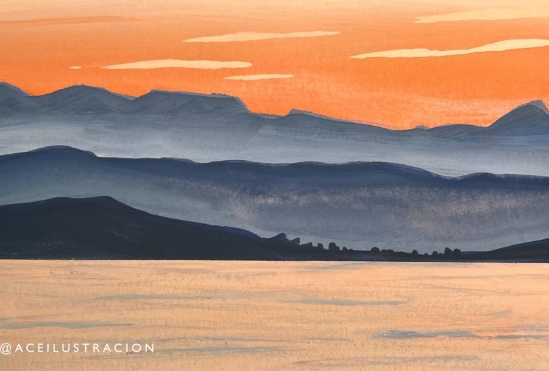
the first landscape. I chose a very simple
reference photo that you can easily sketch on your paper
or your watercolor journal. Then you'll apply the
paint one step at a time using the same technique as during your practice exercise. You'll repeat the process
several times until you end up with a beautiful
finished painting. I hope you'll join me
in this class where you can follow the
easy step-by-step instructions to paint an
easy and colorful landscape at your very own pace. You can share your
progress along the way and ask any questions. I'll see you in class.
2. Supplies: For this project, you're
going to need a pencil or a mechanical pencil with an eraser can be
any kind of eraser. I'm used to using
a kneaded eraser, but you can use
whatever you want. That will be to sketch
your landscape. Brushes. We're only
going to use a small flat and a small round. This you can even
get away with it. A watercolor or mixed
media sketchbook. This one is a handbook journal. As long as your paper is thick, I would recommend
at least 140 pounds or you don't have
to use a journal, you can just use a piece
of paper from a pad. It's up to you. I do not want to do it too big because we're
just practicing. And the bigger the painting, the harder it's going to be
to work on the gradient. So I made a small painting
and it's five by 7 ". I wouldn't go any
bigger than this to start with this and
it's totally optional. Some painters tape, artist's
tape, whatever it's called, or washy tape that
you're going to use to frame your painting. In other words, once you've measured the space
of your painting, you can put the tape around it. And that way you can paint and even go a little
bit over the tape. And once you're
painting is all dry, you can remove the tape and
have nice crisp borders. Again, that's totally optional. It's up to you now
afford the paint. You have several options. You can use regular
gouache and you've got plenty of different
brands you can use. The easiest one to find a little bit everywhere
is the Winsor and Newton. You can get the M
Graham, the da Vinci. There's a main memory as well. If you've been following
the jelly cup craze, you could even use
some hemi gouache. I'll be using acrylic gouache, which are very
similar to gouache. And in the next video, I'll explain to you the
difference between the two. So you really have a variety
of paint you can use. And if you do not have
any gouache at all, you can always use acrylic. And I would recommend some
heavy body because it's, it'll be easier to get the
same effect as gouache. It's thicker and it's a
bit more opaque as well. You can choose whatever
brand you have. To pick the colors. I used my swatch book where I
have all my paint colors. And I'm gonna be using
a strong orange, John Brilliant mixing white, ultramarine and burnt umber. So I realized that not everybody might have these
two colors is to oranges because
they're more like convenience colors
already mixed. But let's see if we
can make some colors to get as close as
possible to these two. For this, we're going to
need a mixing palette. And we actually
going to need that for our project to mix
our colors together. But I like to use are ceramic tiles that you can buy the hardware store for
very cheap, $1 or less. I've got all sorts
of different sizes. This is just gonna be my sample, so I'm going to use a small one. But I use a bigger
one for my painting. So first our strong orange. John, Brilliant. This is very orange. It's a little transparent, and this is a lot more opaque. It's more like a flesh color. I think that we can
achieve this color with maybe the permanent
yellow deep and the spectrum read
from Winsor Newton. Let's, let's try to use just a little
bit of the red. So this is a similar color. I think that could work. You should. I think it will work
pretty, pretty well. Maybe with adding a
little bit of white. Let's try very little. So I've got some zinc white. She's a mixing white. I think by mixing the right quantity of those three colors, we can achieve a
very similar color. We're going to
wait till they all dry because there's
always a color shift. And in the meantime, we're going to see what
we can mix to get this. So like I mentioned earlier, this is very much
like a flesh color and some brands have
actual flesh tones. So we've got named Mary
here that has a flesh tint, Winsor and Newton has
a flesh tint as well. So this with a hint of yellow, might actually get
the yellow from here. Maybe I'll mix mix
it with this mix. It looks like it
might work well. Very similar. With a bit of weight, might be closer, maybe
a different read. Other than that, we
could try the mix also that we did for this
orange with Naples yellow. Maybe it was more white. I think we're getting somewhere. My advice if you don't
have all those colors, is to make a color chart
of the colors you have. Here. I've got all my Winsor
and Newton colors and see what you could mix to get something similar
to the color you need. And don't hesitate
to take a piece of scrap paper and test it out.
3. Gouache VS. Acrylic Gouache: There's basically one
major difference between regular gouache
and acrylic wash. Use them both the same way, but with regular gouache. Once it's dry, you can actually reactivate it just like
watercolor and acrylic gouache. You can't just
like with acrylic. So let's do a few swatches so
you can see the difference. And we starting with some
Windsor and Newton ultramarine, It's very creamy and
semi-transparent. And when you add
water to the mix, you'll see that it
dilutes very well, just like watercolor and you can actually use it
like watercolors. The second swatch is ultramarine
acrylic wash by Turner. And the paint is a little thicker and a little
bit more opaque. But really the results will
vary depending on the brands, some brands of gouache or a little bit more
opaque than others. Some dilute better, some
spread better with water. And it will depend also on
the paper that you use. So here, just like
with regular gouache, acrylic wash can spread
very nicely with water. That said, it tends
to dry pretty fast. And once you add a little bit
of water to the end of it, you can see that it's
already a little bit dry and does not spread as
easily as the gouache. So you basically
have to work very fast if you want to do
special effects with the acrylic wash. Now
just for the heck of it, I'm using a second
tube of gouache, which is by Holbein, and it's another
ultramarine blue. And this one seems
a little bit more opaque right out of the tube. The Winsor and Newton spreads
very nicely with water, just like the Winsor and Newton. So to say to dry everything with a hairdryer just to
do more testing. As you can see, the regular
gouache reactivates with water very easily. You can even lift the
paint with a paper towel, just wet the area you
want to lift and then apply a paper towel on top and you can remove the excess paint. Now, depending on
the colors you use, some pigments are more
staining than others. So you might get back to the white of the paper
or very close. With the second wash swatch, I get the exact same result. I'm sorry, I must apologize
for the blurry picture. My camera has a touch
screen and I think I might have changed some
settings by accident. And so parts of this video
are a little bit blurry, but luckily I caught it and I was able to fix this later on. Now for the acrylic gouache, you'll see that it barely wet. Only a literal
stain on the paper. That's all. And you
definitely cannot lift it. Now I'm going back to the regular gouache swatches
and you'll see that even the diluted paint is about
to reactivate with water, but not for the acrylic wash. Now let's do another swatch
with regular acrylic. You can essentially
applied the same way, although to me it looks
a little bit more transparent and doesn't
feel as creamy. But you can also spread
it with water and do nice light washes,
just like watercolors. And once it's dry, this does not reactivate at all. It's totally waterproof
and it has a shiny, especially when you
apply a load of paint. The gouache and acrylic gouache
dry with a matte finish. Now let's see how we
can apply the gouache with different dilutions and
what effects you'll get. So with the first wash, you use a lot of water, you dilute it so that you can make it look
like watercolor. So there's only a little bit of pigment and a lot of water, and it's basically
colored water. For the second watch, we
add a bit more water and we tried to give it more
of milk consistency. So it's still pretty
liquid but more opaque. You can't really see the white
of the palate through it. So you see that on the paper
it's already a lot darker. The third wash will have the
consistency of heavy cream. So you add more paint
to your wash and you can actually push it on the palate and see
the white underneath, but it's thick enough that
you can push it around. The very last wash is the paint right out of the tube
with no water in it. And it's yet a little darker. But you brush load one, go as far because
you brush will dry out much faster and you'll
have some dry brush effects. Now it's time to practice our gradients for
our final project. But first, we're
going to put some. Washi tape or painter's
tape on the paper to create a few
rectangles where we'll paint are several gradients. What I like to do with the
tape to make sure it's not too sticky enters the
paper once you remove it, is to either tip it
to my clothes and remove it so that it removes
a little bit of the tetanus. But I do have cats and
whenever I do that, I often have some cat hairs stuck to it and I don't like it. So instead, I stick it to the inside of my hand and
if the tape is long enough, it might go up my arm as well. I found that this technique
works pretty well. I'm going to use the same colors I'll be using for the painting. So for the first gradient, I use some strong orange, John, Brilliant
and mixing white. If you don't have those colors, remember that you can use your own mix like we did
in the previous lesson. So the first wash
will be pretty thick. It'll be just like
the heavy cream. I know it doesn't look much
like hit with this paint. That's because for some reason this particular color
is very grainy. It's from a special set. I'm not sure why
they make it with, but it's pretty grainy. But anyway, if you using
regular gouache tried to make this wash with a
heavy cream dilution. The goal for this
first landscape is to basically do something
quick and easy. So we're not going to
do too many layers and we're not going to start
with a very diluted layer. We're going to go straight with a pretty thick layer of gouache. So you're going to work up the paper adding lighter
and lighter colors. First you start with
your darker orange. Then you'll add a little bit of the lighter orange to
the darker orange, then you'll do the
lighter orange by itself. Then the lighter orange
mixed with the white. Before the paint dries, you can go back and forth
with your brush to blend in-between colors so that you have a nice and
smooth gradient. If you took too long in
the paint starts to dry, That's okay because
you can paint over it. You new layer will not blend with the colors
underneath because it's acrylic wash. At the
end of this video, we'll do another gradient
with regular gouache, and I'll show you how
to deal with that. So you just work back
and forth up and down until you have the
colors that you want. I wanted the bottom
to be nice and bright orange and the top
to be a lot lighter. So I'm happy with it now and
I'll go to the next wash. So now we're going to work on the next two gradients
and they're not sky is, there will be two of
the mountain ranges, some using an ultramarine blue, but you'll see that on
the reference photo, it's not bright blue and the
landscape is pretty hazy. So I'm mixing that
John Brilliant with the ultramarine blue to
make it look more easy. For the first blue gradient, I realized that I
made my blue to dark. So it'll be for the middle
ground mountain and the bottom gradient will be
further background Mountain, which is supposed to be lighter. The further away from
you an object is, the lighter it is. Hi. So work back-and-forth, top
gradient and bottom gradient. I made the blue bit darker
for the top gradient. And the bottom part
of the gradient needs to be a lot lighter and more orange because of the
missed on the reference photo. So just like with the
very first gradient we did with the oranges, I work up and down back and forth until I'm happy with
the colors that I've got. There's two gradients
might look muddy for now, but that's kinda what it
looks like while it's drying because some
parts of it are drying, some are still wet. So it doesn't look even but it doesn't worry
me because I know there's a color shift
when the paint dries. Usually the dark
colors end up being lighter and lighter colors
and the pink a bit darker. Once I'm happy, I
let it dry and I'm going to show you
the shift of colors. Now that my swatches are dry, I'm going to re-wet
my Winsor and Newton gouache and paint a swatch
next to the dry swatch. Just like with watercolors. You'll see that while
the paint is wet, it's nice and vibrant and shiny. And once it dries and the
water has evaporated, the gouache is Matt
and intensity and their shade of the color
has shifted a little bit. You also saw that I was able to re-wet that Gouache very
easily in the palette. Now, let's see what the
acrylic gouache does. It obviously doesn't
really work very well. And you can see that
there are a lot of solid little
pieces coming off. It's just basically
the same as acrylic. Acrylic will do the same. Neither are gradients
are nice and dry. Let's remove the tape. Just be careful so that
you don't tear your paper. If you want, you can use
a hairdryer to warm up your tape and make it easier to remove without
damaging your paper. So like I said, the top wash is this guy. The middle one is the middle ground
mountains and the bottom one is the
background mountains. I think that turned
out pretty nicely and they look hazy like
they're supposed to, and the sky is nice and bright. Finally, we'll do
another gradient, but this time using regular
gouache rather than acrylic wash. And I do not
have quite the same colors, so I'm using something
slightly different. I'll be using cadmium yellow, orange, John
Brilliant number two, which is a little darker
than the one I use with acrylic wash.
And the zinc white, which is very similar
to a mixing white. I'm going to paint in
the exact same order, making a nice heavy cream
wash with a darker orange. Then mixing it with the lighter orange
for my second pass. And I'm blending it
with the darker orange. Then I'm getting lighter
and lighter all the way up. So you could be blending
each color with one another. But the nice thing with gouache is that it doesn't dry
as fast and again, it doesn't dry permanent. So what you can do to blend
all these colors evenly. Is clean up your brush
and with a damp brush, go over your gradient
and even it out. And then you can adjust
the colors as you wish. Gouache colors tend to shift a lot more
when they dried and acrylic wash. And so when
I dried this gradient, I realized that there was not a very big difference between
the bottom and the top. So now that the paint
is nice and dry, I decided to add
another layer if I'm careful and don't
blend too much, it's not going to be wet
the bottom layer very much. But since I'm working on
a gradient, I won't mind. And it might actually be to my advantage that it really wet so that I have a nice
and smooth transition between all the colors. So I added a lighter
color on the top, and before added more orange, I decided to blend my lighter color with the
first layer underneath, so I clean my brush
and with a damp brush, I lightly reactivate
the paint underneath. This is a technique
that works very well. Once I was satisfied
with this gradient, I dried it with a
hairdryer again to see what the final
clothes would be. And I already liked
it much better, but I decided to try and
add a third layer to it and have a nicer contrast between the top and the
bottom of the gradient. So basically we applied the same colors in
the same places. My goal right now is to have the top of the sky
a lot lighter. And this can be tricky because it most likely will
blend a little bit with the orange underneath
when you use acrylic gouache and your
first layer is all dry, then whatever you
add on top of it, well, not blend with
what's underneath. Once I was happy
with all the colors, I've dried the paint again and this time I really liked it. So since the paint is dry, I remove the tape and I was
really happy with the result. Now with regular gouache, you have to be careful
because the paint that's on the tape might flake
off as you remove it. Make sure that you don't
run your painting by squishing it on your paper
while you remove your tape. Try to brush it off at the same time so that you
keep a nice and clean paper. Alright, so now it's time
to practice your gradients. Feel free to practice with
all different colors. Anything you like. The more you practice, the more comfortable
you will be, and the smoother your
gradients will be. And once you're
done, you're ready to start working
on your project.
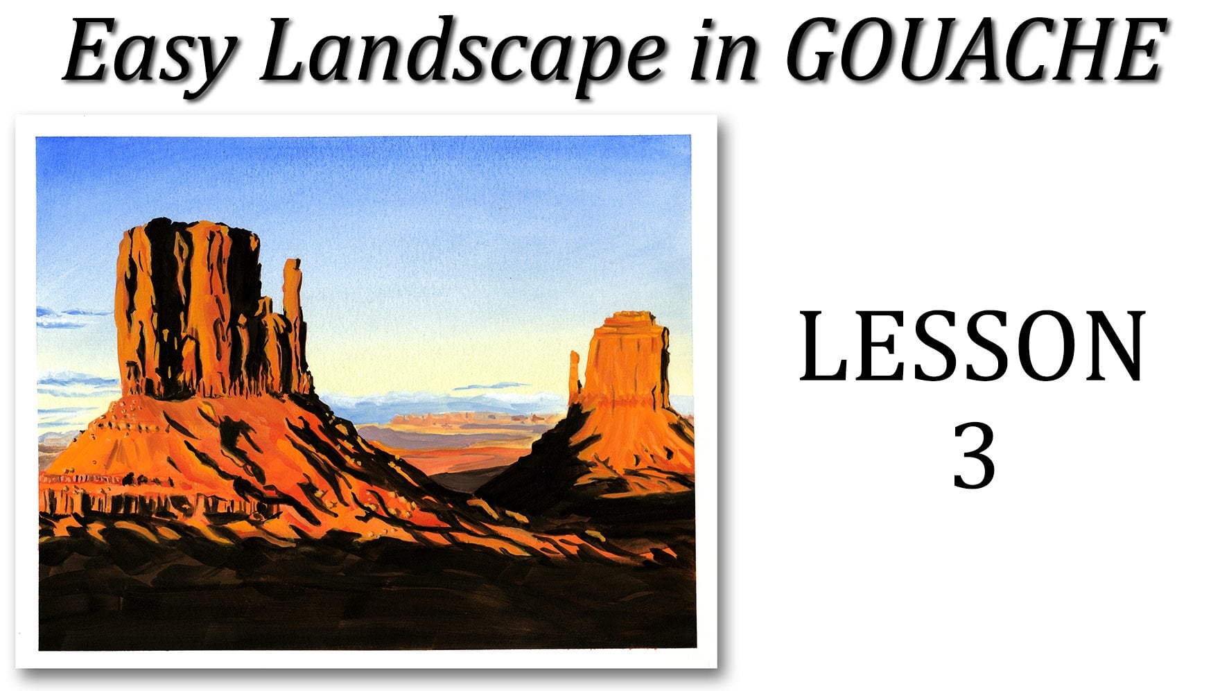
4. Sketch: For the line drawing,
you can either trace the picture or you can try to sketch it straight
on your paper. This picture is pretty
simple and you get to keep in mind that you
don't need to be perfect. You don't need to
have all the lines exactly where they are
is just a landscape. You only have to give
the impression of mountains and a horizon
line for the water. So it's pretty simple. Now if you want to
try to make it as close as possible,
It's fairly easy. And the way I usually do
it is by trying to measure roughly where some lines are located compared to the
middle of the page, or three-quarters of a page, either horizontally
or vertically. Sometimes I'll make little
marks on the sides to tell me where half of the page is or a quarter of the pages. I started with the mountain
in the middle ground because it's slightly over
half of the page. So if you draw an invisible line horizontally halfway
down the page, the left of the middle
ground mountains starts right above that line. It's lens down towards the
right with a little bump. And if you draw an invisible line vertically
halfway through the page, you'll see that that
bump slightly to the right of that
middle and then it goes down and on the right side
of the paper it ends up being slightly under
the middle line. The line between the
water and the mountain in the foreground is about
a quarter of the way up. And this is not quite straight
because you'll see that almost halfway through
is a literal indent. It goes up and then it
goes straight across. So that's this little
details that you can keep an eye on to try to make
sketches more accurate. On the left side, the foreground mountain
starts almost halfway between the waterline and
the middle ground mountain. It's slightly under
the halfway mark, but there's something that I
need to keep in mind is that my format is not quite the same as the format of the photo, so I need to modify it a
little bit and you can do it too if you need to make it fit within your own format. So I follow the line of went down a bit down the mountain, I did the tree line. You can see it's a treeline because it's not a smooth line. It has some little
peaks here and there, and then it goes up a little
bit on the right side. And then finally the
background mountain. Again, I made it a little
bit higher on my page and on the reference photo just because the format of my drawing
is a little bit different, that line is a little
bit more complicated because this mountain
has a lot of peaks. But if you draw
an imaginary line going through the top
of the tallest peak, you can kind of compare all the peaks with each
other so that you know, more or less where
they go if they're taller or if they look
lower on the page. And you can also compare it with the other mountains
you've already drawn, especially the middle
ground mountain. So for this sketch,
you basically needed to draw three lines. Again, they don't
have to be perfect, they don't have to be
absolutely accurate. In fact, you can paint them
whichever way you like. You can make your own landscape based on this reference photo.
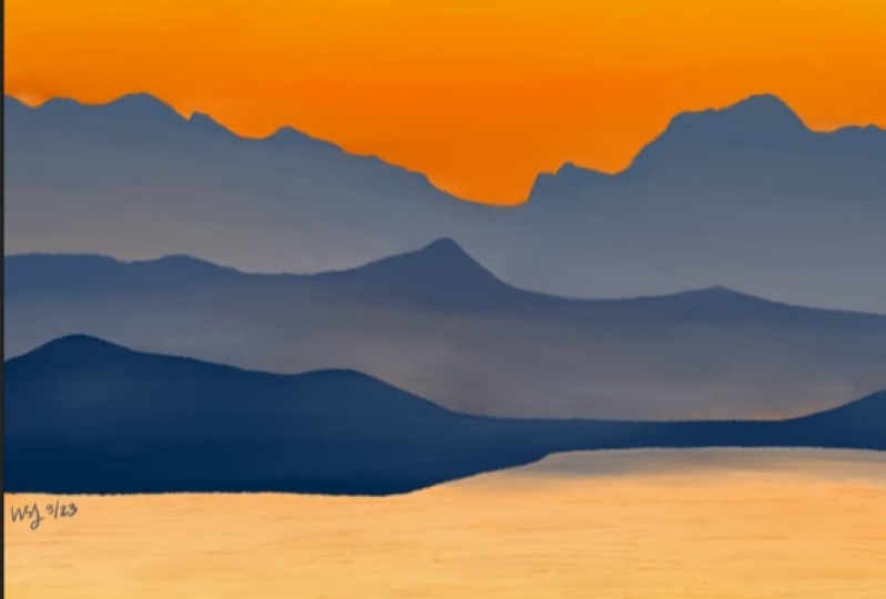
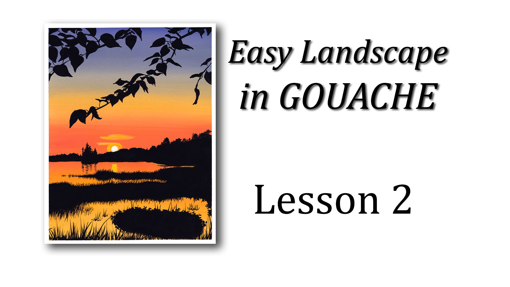
5. Sky: Don't worry, a few
sketches, a little messy. You can erase the extra lines if you want to put gouache is opaque and you will not
see the lines underneath. For the sky, I'm only
using three colors, the strong orange,
the Jordan brilliant, and the mixing white. For my first layer, I'm mixing the two oranges
together because I do not want my darkest dark
to be too dark. And also so that I
get a nice even wash. I'm mixing those colors
with a palette knife rather than the brush
because I don't want the color to be streaky, have a color residues
on my brush. I could very well
clean the brush once I'm done doing my mixes, but it would be
wasting my paint. So I'm using a palette
knife instead. I'm also making another mix
of the John Brilliant in the mixing white to make a paler orange for the
top part of the sky. I'm using my darker mix for
the bottom part of this guy, where it's darker
orange and I don't really pay too much
attention to the line. It's okay if I go over it, because since gouache is opaque, I can always go
back on top of it when I paint the peaks
of the Mountains. So right away my mixes
are pretty thick already and I tried to keep some water on my brush
but not too much. Once a darker orange is applied, then I go with the
plane, John, Brilliant. I don't want it to be too light, so I just go with color right under the
tube and I tried to spread it very nicely and blend
it with the bottom layer. Then for the third half
of the sky, the top part, when I'm using the
mixture with the white because it's
a lot lighter. So again, I tried to
use enough water so that the paint spreads nicely, but not too much because I'm trying to keep it
nice and opaque. And I keep on doing those
back-and-forth strokes to make sure that everything
is blended smoothly. Once that lighter
wash is applied, I use the medium color again to make sure that the
transition is nice and smooth. And then the darker
color again to, again blend to have
another smooth transition. And I go back and forth
between those three colors to make sure that I
have a very smooth sky. I also noticed that there are a few darker streaks
and this guy, maybe some clouds far
away in the background. So I decided to add those, but it's really up to you. You can just have a smooth
gradation or at those clouds
6. Water: I'm going to let the paint
for the sky dry on its own. And in the meantime, I'm going to use the exact
same colors for the water, except that it looks a bit
lighter than this guy. So I'm going to add more
white to the mixtures. It also looks a little
bit more yellow, but I did not want to add too many colours to our palette. So we're going to keep
the mixes already have and just add white. Now when you're
blocking the water, it doesn't matter if you
mix is not 100% well-mixed. You can see that there
are some darker lines, lighter lines that
shows the little waves, the little caps on the water. So if your paint is
not mixed properly, as long as you go back
and forth horizontally, it will already start giving the impression of
waves because you have your white paint in your orange paint,
not mixed entirely. Again, I want an
opaque layers so I'm not adding very much water just enough to spread the paint. If for some reason you think your paint is too
dry on your paper, you haven't added enough
water on your brush. You can always dip your
paintbrush in water just a little bit and
smooth out your wash. It'll blend the paint together. Now once you're happy
with your wash, it's time to work
more on those waves. And it's a very simple process. Just add a darker mix of
your orange on your brush and just make some little
uneven lines on your wash. Try to have some that are a bit darker and some that
are a bit lighter, but don't go overboard,
don't add too many.
7. Background Mountains: Before I continue
with my painting, made sure that the
sky was tribe because some of the paint will
stick out into the skies. And when I reshape my mountain and I wanted
to make sure that the paint was dry
so that it wouldn't mix together with the sky. You can speed up the process with a hairdryer if you want to. I decided to just take a break and go do something
else instead. But when I came back, my paint was drying
on my palette. And when I tried to
mix it together, I realized it was
just not fresh at all and had little pieces
coming off the palette. So I decided to take some
new paint from the tubes. We're using regular gouache. This wouldn't happen because I could have added a
little bit of water. It would have reactivated
the paint and I could have kept on going
with the paint that was dry. This is not the case for
the acrylic gouache. Once it's dry, you
cannot reuse it at all, just like regular acrylic paint. So when you look at those
three ranges of mountains, you can see that
they're basically the same blue, but
different shades, meaning that I use
the same color and ultramarine blue
for all three of them, but I added more or less of the orange to it so that I
could have a nice gradient. Again, my goal is to keep
a small palette of colors. They are in harmony. And again, I use the lesion brilliant that I mixed
with my ultramarine blue. And I put quite a
lot of orange this time because it's the mountains all the way in the background. So they're not as visible, not as defined as the
ones in the foreground. Or you can actually see
the color is much better. Plus it looks like the
weather is pretty hazy, so we'll have to take
that into consideration. So the way I see it is the top of the mountains
are a little bit darker than the
bottom part that's hiding behind the middle
ground mountains. So we'll, we'll have to do
another gradients right there. So I'm applying my first mix to the whole strip of mountain
in the background. And I'm trying to redefine my peaks while observing
the reference photo. Again, I'm not trying
to make it perfect. Everybody can see it's a
mountain range, so it's okay. And I know that every time I'm
going to add more paint to it and probably
going to slightly modified the shape
of those mountains, but I'm not too
concerned about it. Then I use a mix with
more orange in it. And I focus on the lower
part of those mountains. So like with this guy, I'm going to go
back and forth with that top half and bottom half, adding either some of the mixed with more blue or
some of the mixed with more orange and trying to blend it nicely to
make a nice gradation. At some point I use some pure
orange for the bottom just to make sure that it stands
out more than with the mix. Because as we've
already talked about, sometimes there is
a shift in colors once the paint dries
and I wanted to make sure that the bottom
part of those mountains or significantly lighter
than the top part. So keep on playing
back and forth with the paint until you're
satisfied with the gradient. And do keep in mind that it's going to dry a
little bit lighter.
8. Middle Ground Mountains: This time I use a
hairdryer to dry the previous layer
because I know it's going to have to paint over
the bottom part of it. And I wanted to make sure
that it was entirely dry. And then I used
basically the same color again as for the
background mountains, except that I used
less orange in my mix. Those mountains are
a little bit bluer. They are a little bit darker
because they are closer to us, slightly more defined. So I painted the top half with the Bluemix and
then the bottom half, the same mix with a little
bit of orange in it. Once more, I worked back and
forth with a darker blue. And then the more orange blue to try and blend them together
to have a nice gradient. Sometimes when you
use acrylic gouache, since it dries pretty fast, if you use a thicker
layer with enough water, it's not going to dry as
fast and you'll be able to blend those two colors
together a bit easier.
9. Foreground Mountains: Now it's time for the
foreground mountains. This is the easiest layer of all because it's
nice and smooth. There is no gradient at all. So I'm not going to
lighten my blue. I actually need to darken it. It's a blue that's darker
than an ultramarine blue. And I'm not going to
add some black to it because it's going to flatten
the color a little bit. Instead, I decided to
add some burnt umber, and I also added a tiny
bit of orange just to unify all those three
ranges of mountains. I'm redefining
again the shape of this mountain range and adding a nice and opaque
layer of the paint. I used a brown brush to add the little details
with the trees. Just a little peaks of
paint sticking out, just enough to give
an impression. Now I must say I had a hard time making a straight line with the paint on the left
part of those mountains. If I was not recording a video, would have moved my paper
and paint it vertically. So then I would have had a
much better straight line. And so feel free to do
that if you want to. You can see also there
the literal indent. And I mentioned to
you when we were sketching and make
sure that I show it. I made it a little
bit more pronounced than on the reference
photo, but doesn't matter. It's my painting. It's okay if I don't make it exactly the same
way as on the photo. Now you see that within
that indent on the water, there is a shadow. It's a lighter blue, almost like the mountains
in the background. So I use a mix of blue
and orange again, to paint that shadow
on the water. It could very well skipped that shadow if you wanted
to, It's up to you. I decided to paint
it just to show you. And now also notice that
when the water was dry, the lines that I had painted for the waves kind of
lighten up a little bit. So I touched it up real quick again with some orange paint.
10. Final Toughts: So that's it. We're done with our
first landscape class. It's time to remove the
tape around the painting. If your tape is not very tacky, you can carefully remove it. But if you're afraid to damage the paper
around your painting, a great way to avoid doing
it is to use a hairdryer. So you can either apply the heat as you're
removing the tape, or you can apply the heat
first for each piece of tape, then remove it, then apply the heat again on the
second piece of tape. Remove it until you're done. And now you have nice and crisp edges
around your landscape. So I hope you've
enjoyed learning about gouache and the difference
with the acrylic gouache. Both mediums are a
lot of fun and I really like both
of them equally. If you have any
troubles with anything, please let me know and ask
any questions you want. I'm here to help you. And don't hesitate to share your practice gradients in your final project
for the class. Thank you all very much
for joining me today. I'll see you soon with another easy landscape painting class. Bye-bye.
 Sandrine Curtiss, Artist, explorer.