Transcripts
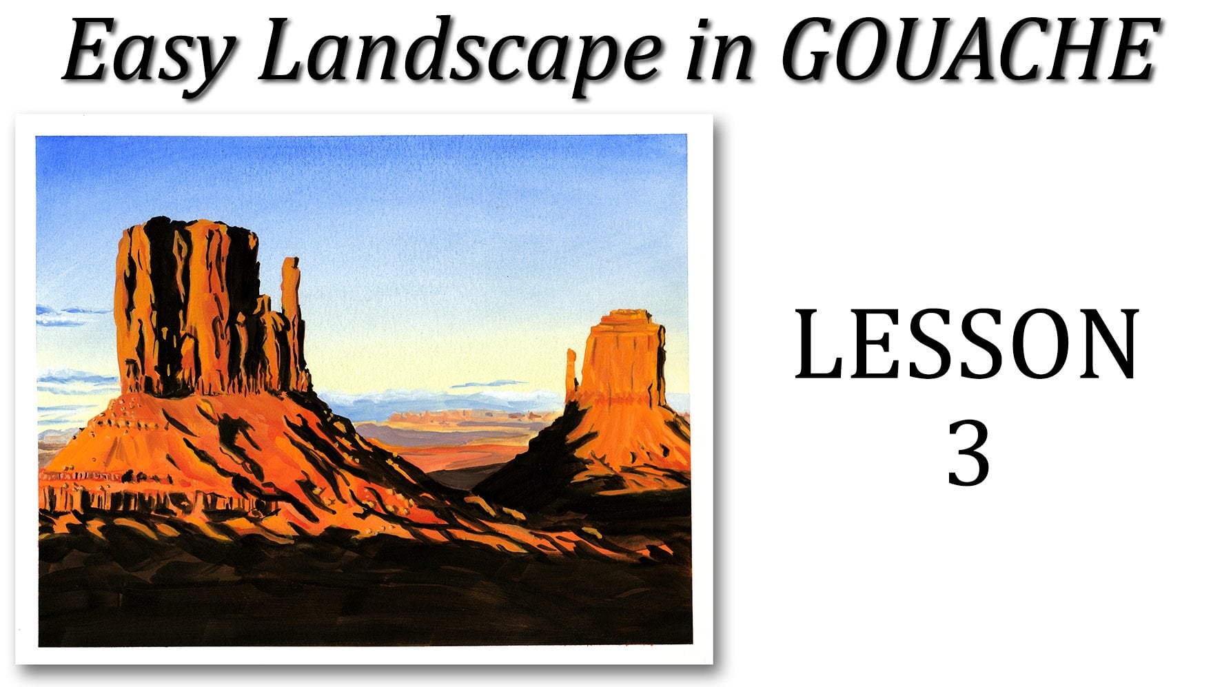
1. Introduction: Hi everyone, Welcome to the second easy
landscaping gouache class. In this class we're
going to build on the previous class where we
learn how to paint gradients. The gradients that we're
going to paint this time, we'll cover the whole page and has more colors than last time. But that's really the hardest
part of this painting. Once that's dry, we're
going to add a bunch of silhouettes which
represent the landscape showing against the sunset. That's a fun and easy way to
paint an evening landscape. So after doing a few
warm-up exercises, we'll get started
with the sunset and then add the silhouettes
one layer at a time. The whole class is in real time, and you can follow each
step-by-step at your own pace. You can share your
progress along the way and ask
questions anytime. And together we will paint a beautiful and
colorful landscape. I'll see you in class.
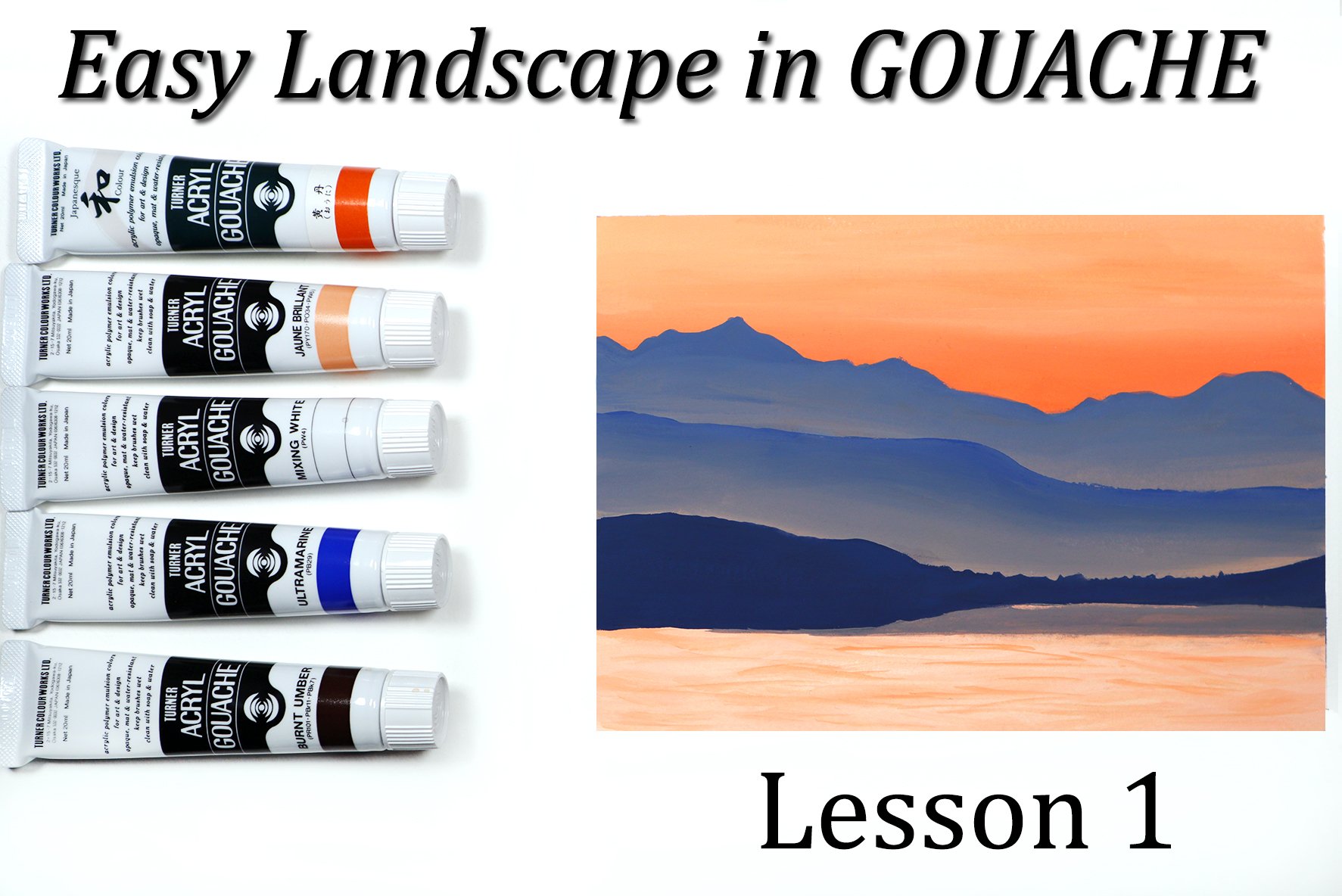
2. Supplies: For this project,
you're going to need some paper and I recommend
some thick paper. I'm going to use a mixed
media art board by Canson. It's eight by ten and it's very, very thick as you can see. But what I really recommend, especially if you're going to
use a lot of water because this is not going to
take a lot of water. I do recommend some
watercolor paper, at least 140 pounds, whether it's cellulose
or 100% cotton, it really doesn't
matter with gouache. So any watercolor paper that's at least 140 pounds will do. You will need a pencil or mechanical pencil for your
sketch with an eraser. Then some washi tape
or painter's tape, whatever you have, you can
use this to tape your paper down on your desk or
on the drawing board. Or simply, I didn't have to tape this down
because it's so thick. But I like to put some around the edge of the paper
to have a nice clean frame. This is optional. Then you need some
paint brushes. So for this project, I used a couple of flat brushes. They're not very big. I don't really have a
size for these two, but get a medium
and a small one. Basically, it'll depend on the size of the surface
that you're using. I recommend not to
use anything bigger than eight by ten
because it's gonna be a bit challenging for the gradients unless you
have very, very big brushes. Then I have also a
couple of round brushes. A very small one and a
small one and a liner. The liner will be useful towards the end when we start
working on the graph. If you don't have
one, that's okay. You can use your very
small round brush. You'll also need a
container for water, paper towel, and a pallet to put your paint on
and do your mixes. I just use a ceramic palette. It's basically a ceramic tile that I get at the
hardware store. Feel free to use
whatever you have. And finally, you
need some gouache. You can use any brand you want. I'm going to show you in
a moment all the colors that I'm going to use
for this project. And I'll show you the
swatches with them so that if you don't have
this particular brand, then you can use the chart as a reference to pick the
colors from your brand. So this one is
Winsor and Newton. And I picked this one
particular because it's the easiest to find for everybody. But if you have some hemi, Mia gouache or any other brand, feel free to use that. For the colors I used
the primary yellow, the primary red, the ultra marine, the ivory black, the zinc white to mix it with colors to
lighten the colors. And the permanent white, which is a bit more opaque
than the zinc white. For the highlights.
3. Painting Exercises: We practice painting gradients
in the previous class. This time we're
going to practice painting the details
on the silhouettes. So first we're going to
practice with the tree line. So I'm going to
just paint a band of black and it's just random, it's just groups of trees, I guess, on the horizon. And actually you can
see if you're using watercolor paper That's
really textured, that you might have problems
to make crisp lines. So if you want to use hot press paper which
is nice and smooth, that might help you with
that problem because your paint will not fall into the little
holes of the paper. To paint the tree line, you have to think about
just treat up sticking out of the horizon basically
with a round brush. You can just make it poke out of the band of black that
you just painted. And some places you can make your marks a little
pointy, simplicity. We can make them round, do a variety, and don't hesitate to make it
all just random. Now of course, when you
paint your landscape, you follow the reference photo. But for now that's
all you need to do. So it's really, really easy. Now let's practice
painting silhouettes of little pine trees and make sure you don't have
butter fingers like me. And you hold onto your
brush so you don't put paint all over your paper. So take your small
round brush again, loaded with black paint. That's about milk consistency. And then paint a vertical
line going down and then random little
lines going sideways. Remember that your
pine tree will be skinnier on top and a
little wider at the bottom. So make the horizontal line a
little wider at the bottom. And if you paint a
cluster of trees, then you can make them
close to each other. And eventually most of it
will blend into each other. But you can really give an impression of a bunch
of trees together. So practice painting a few of those until you
comfortable with them. Finally, we're going to
practice painting the graphs. Now again, you can
see that I'm having trouble on that textured paper. I have a hard time
making a crisp line. So I'm glad that for
my final project, I'm using a smoother paper. Now, again with a
small round brush, you basically need to make some very short wispy lines
sticking out of that band of paint that need
to be random and go in different
directions and overlap. Also. When you're done
painting the grass, make sure that that
horizontal line that she painted doesn't stay like this because it looks a bit strange to see it
through your grass. So with the airbrush, do kinda like a tree
line underneath. So paint some little
random shapes on the edge of your line. Always with them
milky consistency. Because you really
want your brush to be nice and full of paint. You don't want your brush to
run out of paint mid stroke, make some longer wispy
blades of grass. Now. Now if you have a liner which is kinda like a round brush but
with longer bristles, you can make much nicer grass. It looks a lot more
random and it looks skinnier at the end of
the blade of grass. Then you can also use it for
the small blades of grass. They will look a
lot finer as well. But just showed you
that you can use either brush and let you do not have to go get a special liner
brush for this painting. If you do not have one. Again in the area
of the long grass, you'll also need to make
this little random shapes at the edge of your
line so that you don't see a straight
line through your graph. Finally, we're going to
work a little bit on the branch and a few leaves. So the branch will
be a random line. You can roughly follow the shape of the reference
photo if you want to, if you have your liner brush, you can use that or you can use your round brush as well and observe the different
shapes of the leaves. Some are heart shapes. It's kind of like the
traditional leaf shape that we're all familiar with. Then some you can see sideways, only the thin part of it, but you can see that there's
a crease in the center. And you can see one side going to the left and one side
going to the right. And some shapes I
totally random as well. So practice a little bit
with those exercises. Use them kind of like warm-up exercises before you jump into your final painting.
4. Sketch: For the sketch, we're not
gonna go too much into the details and we're going to stick with the main shapes. So the horizon line
seems to be a little bit below the halfway
point of the page. And from that horizontal line, about a quarter of the
way on the left side, that's where that little
cluster of trees is. So I put a little line
there and then I drew another horizontal line just underneath it to show
that first inlet. And that goes about two-thirds of the way towards
the right side, then back from the tree cluster, I roughly sketched the tree line going up towards the right. I didn't even bother
adding all the shapes of the trees because we'll do
that later with the paint. And that goes all the way to
about halfway up the paper. Now back to my inlet
in the background, I tried to draw a very flat
elliptical shape and it comes back just a little bit
past the cluster of trees. Then again slightly under
that, there's a very, very skinny inlet and this goes back all the way to the
left side of the paper. From there, about a quarter
of the way up the page, you can draw a horizontal line, not all the way
on the left side. It just, it goes down a little
bit towards the left side. And then all you have left to sketch is the little grassy
island in the foreground. So we're not going to
sketch anything else. Will take care of the tree
branches and the leaves later on and we're probably
not going to even sketch those will go
straight with the gouache. It's really not that hard. But for now you can clean up your sketch and
then we're going to start painting the sunset.
5. Sunset: So put all the colors that
I need on my palette. I've got my white, my blue, my red, and my yellow. But before I paint anything, I need to wet my paper so
I make sure it's nice and wet and it's going to help me spread and soften
the first layer. Once the paper is nice and wet, then I used the yellow, just the yellow and
I start applying it in a pretty
milky consistency. On the reference photo,
you see that there is some yellow just over the middle line
across the paper. It's very orangey, but we're going to start
with a yellow and add the read over it and blend it together so that yellow will go all the way
down the paper. And I've tried to make it a
little darker on the top. Then I use my red and
I start applying it, but not from the very
top of that yellow line. That's about halfway
down the page, I'll say maybe a little
bit over the halfway mark. And as I go back and
forth with my brush, that red blends with a yellow and it's not
as bright anymore, It's more of a dark orange now. Then with a yellow start from the bottom of the red section. And I work my way up, but not all the way up. My goal is to blend
some of that new yellow up into the red. And then I go down again to drag a little bit of the
red down into the yellow. I'm just trying to
make a nice gradient. And with a damp brush
know pigments on it. I tried to soften the line between the yellow and
the red on the top. Now for the sky, I need to mix the blue with
a little bit of the red because this guy has a little purple
undertone to it. But be careful the red
is pretty powerful, so just add a tiny little
bit of red to the blue. You don't want a purple
that's too strong. You'd basically want to blue
with a tiny hint of it. So drag that blue all the
way down to the yellow. Try to make your wash nice and even if it's not, it's okay. We're gonna work
on it a little bit more with the next layer. Then I added a
little bit more blue because I thought there was not enough pigment on my paper. I really want my sky
and my son said to be very bright because the photo
is really, really bright. The damp, clean brush, I'm going over the gradient
again to try to even it out, to smooth it out. And that even pulled a little bit of the
yellow into the blue. Then I let it dry
because there's a color shift when
the gouache dries, the color changes a little bit. So I wanted to know where sued and see what the
colors really look like when they
were dry so that I could add my second
layer accordingly. For the second layer, I started working
with thicker paint, and I started from
the top this time. So I've made my mix again of blue with a tiny
little bit of red in it. And I started adding
a little bit of white as well to
make it more opaque. And as you can see
on the picture, the transition between
the yellow and the blue is quite pastel if
that's even a word. So I do need to
add some white to that balloon to make it
lighter and more opaque. One thing you need to
be very careful of is that once you do a
couple of passes, you want to make sure
your paint remains clean. If you go down into the yellow, don't go back into the blue. Otherwise you're
going to start mixing some green to clean off your brush and
load it again. Now you can also mix
the white with the yellow to help build the
layers of your transition. Now it's time to
brighten that red. So go straight with the
red on to that orange. It will blend a little bit with the orange and turn
down a little. So don't worry about that. Plus we're going to add
more yellow to it later on. So see about a
third of the way up near to where the
bright yellow sun is. This is nice and red. I mean, it's very dark orange. So don't hesitate to make
it look nice and bright. So now by adding some yellow to the top and bottom
of that red strip, we're making a
beautiful dark orange. I added some yellow all the
way down to the page again, but I dragged a
little bit of red as well because I need to work
on the gradient again. And once that's done, then I go back to work on the transition between
the yellow and the blue. Ultimately, I want the top of
the page to be darker blue, and then gradually
lightening down to a lighter blue as it gets
closer to the yellow part. Now as you keep on adding
more and more layers, remember to add less
and less water. You want your paint to
be more and more opaque. Now notice that
at the transition between the yellow and the blue, It's kind of a lighter, muddy, purplish, I guess. So if the yellow mixes with the blue a
little bit, It's okay. It will help make that
little light purplish mud. I don't know if it's haze
or I'm not sure what it is, but this transition into the blue sky is definitely
a little bit tougher than the transition going down because it's only between the red and the yellow going down. So take your time, be careful and make sure
you clean up your brush. Often. Continue working on your sunset until you
satisfied with it. And if you are having a
hard time letting dry, put it on this side and
get back to it later. If you cannot get a
perfectly smooth transition, don't worry because
it's just a background. And then we're gonna be adding the black shadows on top of it. So it's going to
cover quite a lot. And the background
is going to fade in the background and
the main features, the main parts of your
paintings will pop out so you won't pay as much attention to the details in
the background. So don't worry too
much about it. Also, if you're using a piece
of paper that's larger, it might be harder on, let's use a very big brush
to make a smooth transition. So if you're working
on the sketch book or a smaller surface, it'll be easy to blend
everything smoothly pretty fast.
6. Silhouttes: If you went with a pretty
opaque background, you might not be able to see your sketch lines
anymore. That's okay. You can redraw them over your sunset or since you
already drew them and you know where everything
else you can just try to go straight on the
paper with your paint. It's up to you. I'm going to go straight on the
paper with my paint. But if you want to go ahead and redo your sketch, that's fine. Just pause this video, go back to the sketch
video and do it again. Before we start working
on our shadows, we need to establish
where the sun is. So if you go back to
the horizon line, which is a little bit over a third of the way up the page. It's right there except
it's not quite halfway. It's a little bit to the left. So use some plain white paint and start drawing
a tiny little sun. We're going to keep
it white for now and we'll get back
to it later on. And now we're going to start
working on the shadows. And to me it's really the
fun part of this painting. All you need is black. Now that I've established
more or less for my horizon line is on
my tree line actually, then I'm starting from the sun and I'm going to go up a little bit and work
on the tree lines. My line doesn't
have to be straight because there are a
lot of tree tops. So let my brush poke
out from the line from time-to-time to make sure
that my line is not even. You block needs to be
diluted a little bit so that it spreads
nicely on your paper. And if you see the red
showing through, that's okay. We're going to add another
layer of black later on to even out the
whole black area. So all you're doing
right now is basically blocking this big
shapes of black, which is in my opinion,
very satisfying. So I'm looking again at
the right place to put my little tree cluster
and I'm trying to define them a little
bit, just a little bit. And I noticed that the tree line that's behind that
cluster of trees makes a horizontal line right above the line at the
bottom of this trees. So, so far I was working
with a small round brush and I needed it to add
the paint in small areas. But now that I'm
going to start adding the paint in the bigger areas, I need to block bigger shapes. I picked up my flat
brush and I'm using the corners to add the details because it
does come to a fine point. But then I can block in the rest of the trees very
fast and very easily. The first part of the shadows is already blocked in and it
already looks really striking. I really like that
effect over the sunset. So as I'm painting the coast, I noticed that there
are a few areas, little bands of water, some knots blocking
everything entirely. I'm letting a little bit
of orange peek through. And then I start working on
that first band of grass. I'm not going to do
the grass just yet. I'm only blocking
the main shapes because it's a skinny area. You can get back to the
round brush if you want to use your flat brush sideways. Now I'm working on
the thicker band of grass right underneath, just trying to determine
the rough shape of it and then blocking
in the bigger areas. So when you see me hesitate with our brush
from time-to-time, it's because I'm looking at the reference picture
and I'm trying to make sure that I'm adding the right shapes in
the right areas. That right corner of the grass. It looks like it's a reflection of the
trees on the water. So I tried to line up the
shapes of the reflection at the bottom with the shapes of the trees on top
of the tree line. Now it's time to work on that
little island of graphs. So make a rough elliptical
shape, very rough actually. And I tried to make it touch the bottom of
the page as well. At this point, I'm ready to add a second layer of black
to even out my shadows because I can definitely see the sunset showing through
the first layer of black. To be a little bit more precise, I used a smaller flat
brush this time. So clean up your shadows and then we'll start
adding some details.
7. Tree Line: Now it's time to
add a few details. But first, we're going
to take our yellow and cover the white
of the sun with it. So because the y is
nice and opaque, it created a barrier between the yellow and the red,
the background. Since yellow is often
a transparent color, it would have been tough
to build layers of yellow to make the sun
look nice and bright. That's why we painted
it white first. Once you're happy with your
son and your yellow clouds, it's time to get
back to the black and build the little details. Now the details on
really detailed per se, if you zoom in on the tree line, you'll see that we can see
the treetops sticking out. So it's a shaggy line
really because there are branches and leaves sticking
out in all directions. But of course we're
not going to paint every single tree top, every single branch, because
we can see all of them. We're just gonna
give an impression. Just make the tip of your brush poke out of the top line to give an impression of all the
little tree top sticking out. Now for the little
cluster of trees, it's a little closer to us so we can see a few more details. We can see that those trees
are pine trees, for instance. Because of their
triangular shape. To paint those,
it's pretty easy. Just draw a straight line for the trunk going down and then paint small irregular
lines going across the trunk
all the way down, making them a little longer
as you're going down towards the ground where the base
of your trees is wider. On the other side of the cluster of trees that's closest to us. It's the same thing
as at the beginning. You just make tiny little mark sticking out of the line just to show the
trees sticking out. Now, when you do it
against the sun, it will really stand out. Try to keep your eyes
on the reference photo because you can see that even with the trees all
the way in the back, they are clusters of trees that stick out a little bit
compared to others. Some are a little bit
taller than others. So they kinda look like bumps. So keep an eye on that. The trees on the third half, on the right side of the reference photo are getting
closer and closer to us. So we can see more details. We'll actually see some
branches sticking out. So we can actually
define them a little bit more without overdoing it. Because again, it's
just an impression of the streets and those
branches sticking out. We don't need to have
every single stick and leaf to show in detail. We can also take the
opportunity to define the shoreline against the water and add a few details
if necessary. Again, keep using
your round brush so that you can take
advantage of the fine tip. Now back to the sun, if you take a closer look, you'll see that there
is a halo around it. So we're going to paint that
with just plain yellow, since we did not put any
white around the sun, the yellow is going to blend a little bit with the orange and it's going to help
give that halo effect. We can also add another layer
of yellow on the clouds, especially if it dries paler because of the
white underneath. At this point, we
can also work on the sun's reflection on the
water directly below the sun, as well as a little bit
of glistening water within the black shadows on the right side and on the shore. Now that the trees are done, we're going to start
working on the grass.
8. Grass: For the grass,
we're going to take a very small round brush and with black strip
that's in the back, or we have to do is just flick our brush with the black paint on it just a little bit because that's the strip of grass
that's the farthest. And so the graph
doesn't look like it sticks out as much it does, but it will just look smaller
because it's further away. So don't make it
stick out too far. And make sure you don't make
straight vertical lines. Think about for on an
animal for instance, some will go a little
bit to the left, some will go a little
bit to the right. Some will overlap each other. That's what's going to
give it a natural look. I don't know if you noticed, but on the picture there
is a bird house and I decided to ignore it
and not painted at all. But feel free to paint
it if you want to. Now back to the grass. As we go towards the left, the strip of grass gets
thinner and thinner and it basically looks like it's flooded by the water
has taken over. So if you look carefully
towards the very end, some of the grass patches
do not touch each other. So take the sentence brushy have to add those
tiny blades of grass. Once you're done with
the grass sticking out, you're going to have to draw
the reflection on the water. Now, it's the exact same thing, but a mirror image. So if you painted a
little patch of grass, they came to the left, then the reflection
right underneath will also have to
stick to the left. Reflection cannot be random. It really needs to show
what she painted on top. So go all the way across that strip again and paint
the reflection of the graph. Once you're done, you can
get back to the yellow and cover the sun's reflection on
the water with the yellow. Also on the picture
you'll see that the sun itself is a little
wider, a little paler. So you can mix some
yellow and white and add another layer to that son to adjust it
the way you like it. With a thin layer of
black, nice and diluted, it's time to draw
the reflection of that cluster of
trees on the water. And you can make it
very simple by drawing some simple horizontal
lines under each tree, or at least the biggest ones. And you can make
those lines kind of zigzag all the way down
to this strip of grass. And just like with the treeline, you will notice that some of the grass patches are
taller than others. So try to follow the pattern. Keep your eyes on
the reference photo and make sure you show
all those bumps and dips to make it look a lot more natural than if it was
a line straight across. At the bottom of
the second strip of grass on the right side, you'll notice that the reflection
is not of grass but of the trees because those
trees are closest to us and they're
reflecting in the water. So follow the shape of the
trees that you painted on top and try to paint
similar ones at the bottom. And use the reference photo
as a guideline as well. Continuing to towards the left, you can start drawing the
reflection of the grass. You actually don't see
the grass in that area, but the reflection
is there anyway. So do just like with the
first strip of grass, except that the length
of the graph is a little bit longer because
it's closest to us. To continue working
on your grass and its reflection all
the way through. Always making sure
that the reflection of the grass goes in the same
direction as the grass itself. Again, make sure
your grass goes in all directions and
overlaps in some areas. And if your original black line was straight or even waving, make sure that you also
add a few bumps to it. Kind of like what you did for your tree line because
you don't want just a straight black line
with little lines poking out. You really want to
show that it's uneven. Now for the little
island of grass, I can see that there are
some little clusters of shapes sticking
out, really grasp. It's more like some
leaves or flowers. So I'm going to draw some
literal random dots and lines, making sure that the
water peaks through it. And I go all around
the top part of it. Next, we're going to take care
of the tall, wispy grass.
9. Long Grass: So the grass closest to us, it looks a lot longer and
we're going to have to be more careful when we
paint that because we do want to keep
it natural looking. So if you have a long
and skinny brush, like a liner for instance, that will be perfect
if you don't take the smallest round
brush that you have. The mix of black and water needs to be a milky consistency so that the paint
can flow nicely and that you will not run
out of paint mid stroke. On the island. Just go around and add those
long wispy grass blades. And then at the very
bottom of your painting, there are a lot of
blades as well. And you will see that in the middle of the
water there are also some patches of
grass by themselves. So pay attention to those and paying them
where you see them. On the left part of the
wide strip of grass. I believe that the
reflection of the long grass belongs to some grass
that is closest to us, not the graph that's sticking
out on the top line. But I think there's
also a lot of grass just in the water
independently from that strip. However, to just
simplify this painting, I decided to ignore that
fact and only painted it as the reflection of the
grass that is on the strip. Sometimes when you
make your painting, you can choose to edit it
whichever way you like. You're in charge of what the final product
will look like, like earlier, decided not
to paint the bird house. And this time I
decided to simplify it as well with the
reflection of the graph, feel free to do it
whichever way you want. What makes you more comfortable, what makes you happy, and what makes you
proud of your painting. Now for the long blades
in the foreground, at the very bottom of the page, you can apply a little
bit more pressure on your brush to make them
look a little bit wider. They are the ones that
are the closest to us, so they will definitely
look bigger. This area is the most detailed
of the whole painting. So you need to make sure that
your grass looks natural, that it's wider at the
bottom and thinner on top. All your blades on trust parallel vertical
lines that they go one way or the other way
that they overlap each other. You need to make them
look a little messy. You don't need to stick
strictly to the picture and what the grass looks like at
the bottom there. It's okay. Fine blade is not exactly the same length as the one you're trying to
paint on the picture. Has long as you focus on making your lines nice and
wispy, you're all set.
10. Branches: Alright, we're almost
done with our painting. If you like it this way, you can be done right there. But I decided to
add the branch and the leaves to give it
an extra dimension. And I think it looks
actually pretty good. We never sketch this. And the reason why we didn't
is that it's a little messy and pretty
tricky to sketch. And I wanted to show you
a simple way of doing it. So you need to focus
just on the branches, just the lines that
the branches form. If you're not quite sure, you can draw those
with a pencil, but go very lightly. And remember that if you need to erase a might damage
your painting. So if you need to
erase anything, just use a kneaded eraser and just dab at it
rather than rub on it. But you don't want to lift
your paint or damage it. So load your round paintbrush with black paint
again and again, we're gonna go with a
milky consistency because we want the paint to flow
easily on the paper. And about a third of the
way towards the left, we can draw the first bit of the branch and make it go back. So it goes down a little bit and goes right back up
to the top line. We're going to make it random. It does not have to be
exactly like the picture. And you can see that
mine isn't for sure. And we also have to take into
account that the format of my paper is not quite the same as the format of
the reference photo. My paper is a little
shorter than the photo, so it's not going to
look exactly the same, but the idea is
going to be there. It's not going to be
deformed because it's not a face of portraits
or an animal. It's just a tree branch
which can be any shape. Anybody will recognize
it as a tree branch. So I see that the
long branch goes down across the
painting towards the left and stops about halfway or a little bit
over the halfway line, right above the little
cluster of trees. Then there's the second
branch that starts about halfway across
the top line of my drawing and ends
a little above the quarter line mark on
the left side of the page. So this is my skeleton. And now all I'm gonna
do is that the leaves, It's gonna be a slow process. And I'm gonna look at
each leaf and its shape. And I'm going to try to
reproduce that shape. Sometimes it doesn't
look like a leaf at all because it's in a
certain position. But it's going to help you actually practice
noticing shapes rather than trying to just paint what you think you
know, is a leaf. Now I can see that
at the very tip of my branch, the bottom branch, there are two leaves
right there and they're kind of together about the size, the cluster of trees underneath. So that's what I need
to be careful about is to make sure that I paint
them at the right scale. So what I do is observed
the shape of the leaf. Try to just draw it when my
brush and then I fill it in. I tried to look
where it starts and where it ends in comparison
with the branch, which parts are
above the branch, and which parts are
below the branch. And then also try
to pay attention to where they are in
relation to each other. So about how far away on the branch it is from
the previous leaf, how high it is compared
to the other one. I might not have the room to paint them all, but that's okay. Nobody will ever know that
I skipped a leaf or two. Again, people will actually see this as a branch
with leaves on it, not a branch that's
missing leaves because I didn't have enough
room to paint them all. Once you done painting the leaf, you can also add the stem that attaches the
leaf to the branch. And make sure you
use the very tip of your brush so that
it's very thin. You don't want it to be thicker
than the branch itself. When there's a group of a
lot of leaves together, it might be tricky to figure
out what you're looking at. Make sure you observe
that area really well. And if it really overwhelms, you just make it up. Just go by what you've
already painted, the shapes you've
already painted, and you can paint
those shapes again, like I've already said before, they do not have to look
like the reference photo. This first part of the
branch is all done. And you can see that all
those abstract shapes we just painted really
look like leaves. Now I decided to add
another little branch on the right side rather than just a leaf that's
sticking out there. I thought it would
make it look better, but that's just my choice. You do whatever you want. And because I don't
have any reference for this particular branch, I just choose some
leaves that I already painted on the other branch
and just added a few. Now it's time to start
the last branch. That will be the very last
thing to add to our painting. Again, remember to
add the little stems. It adds a sense of
direction to your leaf and it makes it look a lot
more natural that way too. Now that part in the top-left
corner is very messy. You can barely see
what's going on. So I made it up. I just added some
black shapes and leaves wherever I wanted them because I didn't want
it to look too messy, just like on a photo. Finally, I'm going
over the leaves that have a lighter layer of paint. In some areas, I see that we
can see the sky through it. So I'm just touching them up. So that's it. Make
sure your paint is all dry and you can
remove the tape.
11. Final Thoughts: That's it for our second
gouache landscape painting. You can use this
technique over and over again with all sorts of
different paintings. And not just in gouache, or you have to do is
paint a sunset and then use black to paint the silhouette of
whatever's in front of it. It always makes for stunning paintings because
of the contrast of the beautiful colors
of the sunset and the black shadows of the
subject in front of it. So if you had fun
painting this landscape, I always look for more
reference photos of sunsets and use the
exact same technique to paint another one. If you do, I hope you will
share your new painting along with the painting
that she did in this class. If you have any
trouble with anything, please let me know and ask any questions anytime
I'm here to help you. Thank you very much for
joining me again today. I'll see you soon with another
gouache landscape class. Bye-bye.
 Sandrine Curtiss, Artist, explorer.