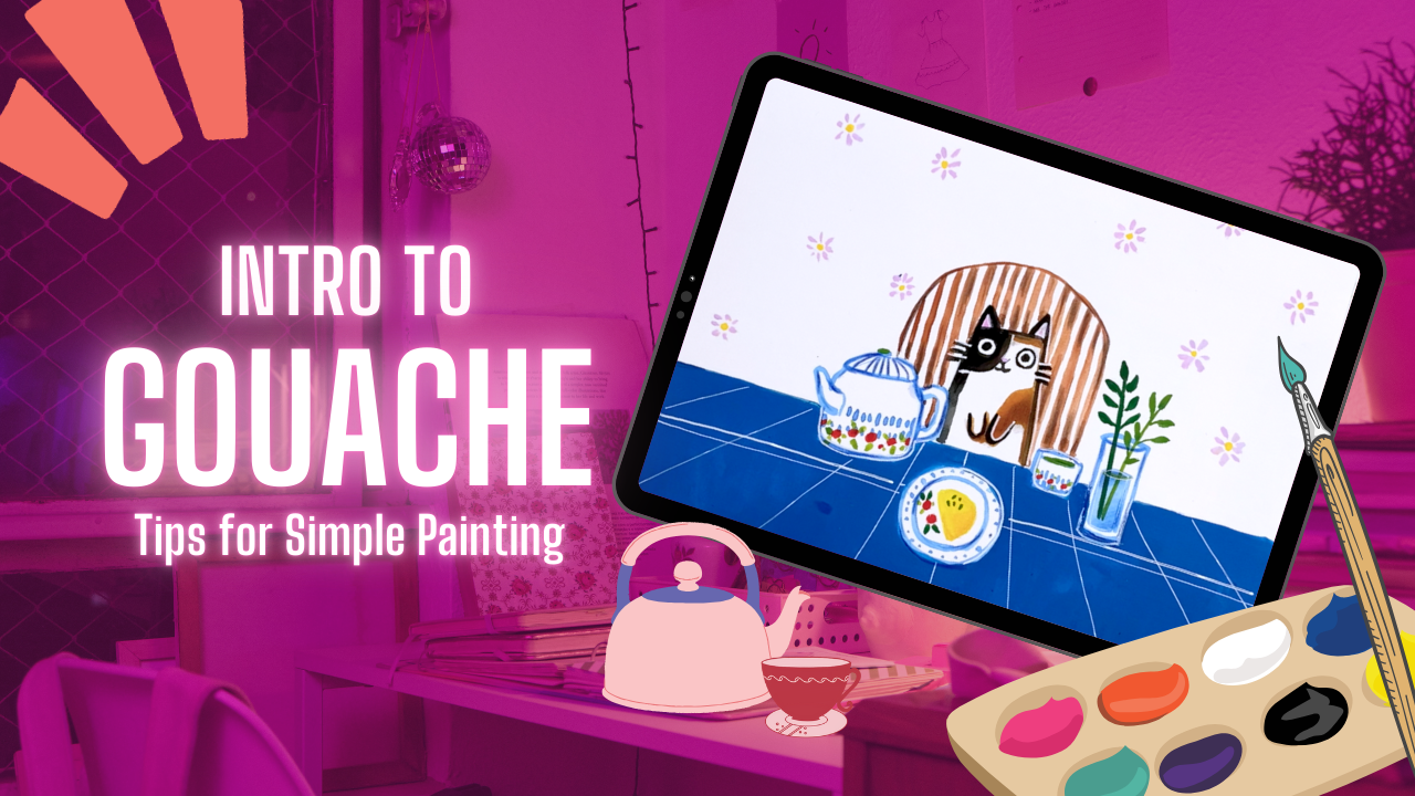
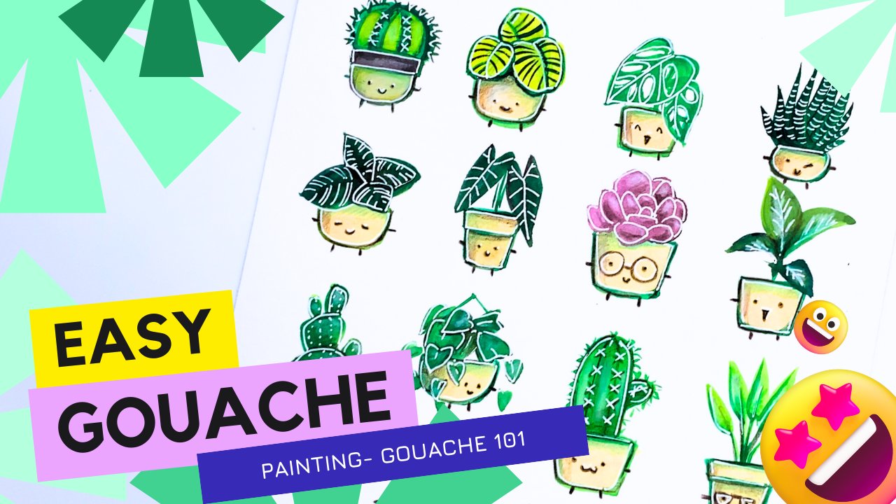
Transcripts
1. 1. Intro: So Are you new to Guash painting or
simply have dabbled in it, but don't really know how to progress and do further with it. Don't know where to
start? Well, this lesson is the right place for you. Today, we're going to
do a complete beginners guide to ah painting. And in particular,
we're gonna be painting breakfast of a cat. My name is Sharon, and I'm
an artist from Canada. I've been painting with acrylic for well
over ten years now, and I've learned a few
things along the way, and I'd love to share
it with you about some tips and tricks
that I wish I had known. If you've played around with
watercolor in the past, chances are you probably have seen or heard of
Gach at some point. And really, it's not
that intimidating. So for this lesson,
I want to show you how easy it is to come up with some really cute drawings using this unique medium named Gach. So for this lesson, I'm going to be teaching
you on how to draw this easy drawing of
a breakfast of a cat. And it's super simple. So my goal is for you to have a project like
this piece here that can easily paint step by step and post it in
your living space. Are you excited? 'Cause I am really excited to be doing
this listening with you. So let's get started.
2. 2. Materials: Materials. Let's start off by figuring out what materials
we need for this lesson. So here, I'm going to start off with some watercolor paper. This is a watercolor block. It is a hot press block, which means that this type of watercolor paper is very smooth. Whereas, if you look for
cold press water paper, it's going to have a
little bit more texture. So for me, I personally
love smooth white paper, so I decided to go with this
hot press water color paper. But personally, I
think you can choose any watercolor paper that you have just to try
and start off with. So don't feel like
you necessarily have to get the exact same
paper that I'm using here. So here's my watercolor block. So that's the first
item you need. The second item you
need is a paint brush. So for me, actually, don't need that
many paint brushes. I usually just use
one paint brush, and it kind of does all
the different things. So for this one is
a round tip brush. You can see this one
is a size eight, but I think anything smaller
would be good as well, if you're working on
a lot of details. So I'm just going to use one brush for this
particular lesson. The next thing you
need is a jelly roll or some kind of white
opaque ink pen. So this is like one
from Secure brand, but you can use certainly many different brands available. I picked it up at Amazon, but they also have it at
the local art store or, like, stationary stores
like staples and such. So here's how it looks like. It dries very quickly, and it comes out as a white ink. So I'll use this for
my highlight later. Nix, I'm going to, of
course, use guash. So I'm actually
using acrylic wash, and this one is by Holbne. There are, like,
traditional gathes, which definitely it's great. It can reactivate when you
add water even when it dries. I'm using acrylic wash because I really
like the fibrincy, but I don't want it to
reactivate with water. It kind of dries like
acrylic permanently. I'm also going to use
some oil pencils and pencil crayons to add some
gradient to my artwork. So a couple of mixed
media are very helpful for Gach
because for Gach, it does dry matt, so it's helpful to use different mediums
and have fun with it. It's also helpful to
have a water container. It doesn't need to be fancy. I'm just using a
yogurt container here, but you can use any water
container that you would like. So those are essentially the main materials
that you need. You can see that there
aren't too many items, and some are probably items that you've collected along
the way, if you've tried, different types of
artwork along the way, because I know most
artists like to try different materials
just to see what works. So these are the
essential materials, and we're about to get started. I find it really helpful
to turn on some music in the background of music that I like and paint along the way. Makes it so much more relaxing. So that is just small tip
that I would suggest. If you're starting
off and you want to relax, turn on some music. Have a pot of tea or coffee of you as you're
painting along the way. One more item I think I should mention is like
some kind of plate for you to mix the inkin
or, like, the gashing. So here I'm just using a lid. It could be a yogurt lid, or it could be a pasta jar lid, it could be any item that you can use to
get a mix painting. So those are all your
essential items. So I'm pretty excited. So let's get started on
this plant collection dry.
3. 3. Choosing a Color Palette: Choosing a palette. So for this particular gash
piece that we're doing, I think it's really
helpful to decide on what color palettes you
would use in the beginning. It doesn't need to
be a lot of colors. So you can see here for
this particular painting, I'll be teaching you. There's only four
colors that I'm using. Four colors, and even
like the darker shade, you can probably mix it with some lighter colors and
get the lighter shade, but these are the four colors. One is permanent
scarlet, yellow. I also have a sky blue
and a titanium white, in addition, like a deep green, if I really want to
add a pinch of green. Of course, you can choose to use different shades
of green as well. You don't necessarily need to choose the greens
that I've chosen. And then you can use some
olive green if you like. I generally prefer darker shades that way I
can add white to it and just create
different gradients of the same color scheme, and it just creates more depth for the painting that
you'll be doing. So here you can
see for the guash. I usually just squeeze out a tiny pellet of
paint because one, the drawing that I'm
painting is not very big. And, like, I feel like less paint is definitely
less intimidating, and I can always squeeze
more out of the tube. A little does go a long
way for ash because I find that I could dilute it
with a little bit of water, and I'll turn almost like
a watercolor consistency, and that can spread
really well as well. So here you can see, I'm just
doing a small p size for a lot of the paint that I'm using So it doesn't
feel as intimidating. And also, like I mentioned, you can always add more. So that's the lesson on
choosing your palette. The last tip I would add is out of the gradient
that you have, it's always nice to have, like, a dark shade for your shadows and a light shade
for high lights. So always make sure you
have a dark and a light so that they're not like
all neutral colors. So it'll make the
painting create more deaf and more like,
interesting in general. So that's it for this lesson
on choosing a palette.
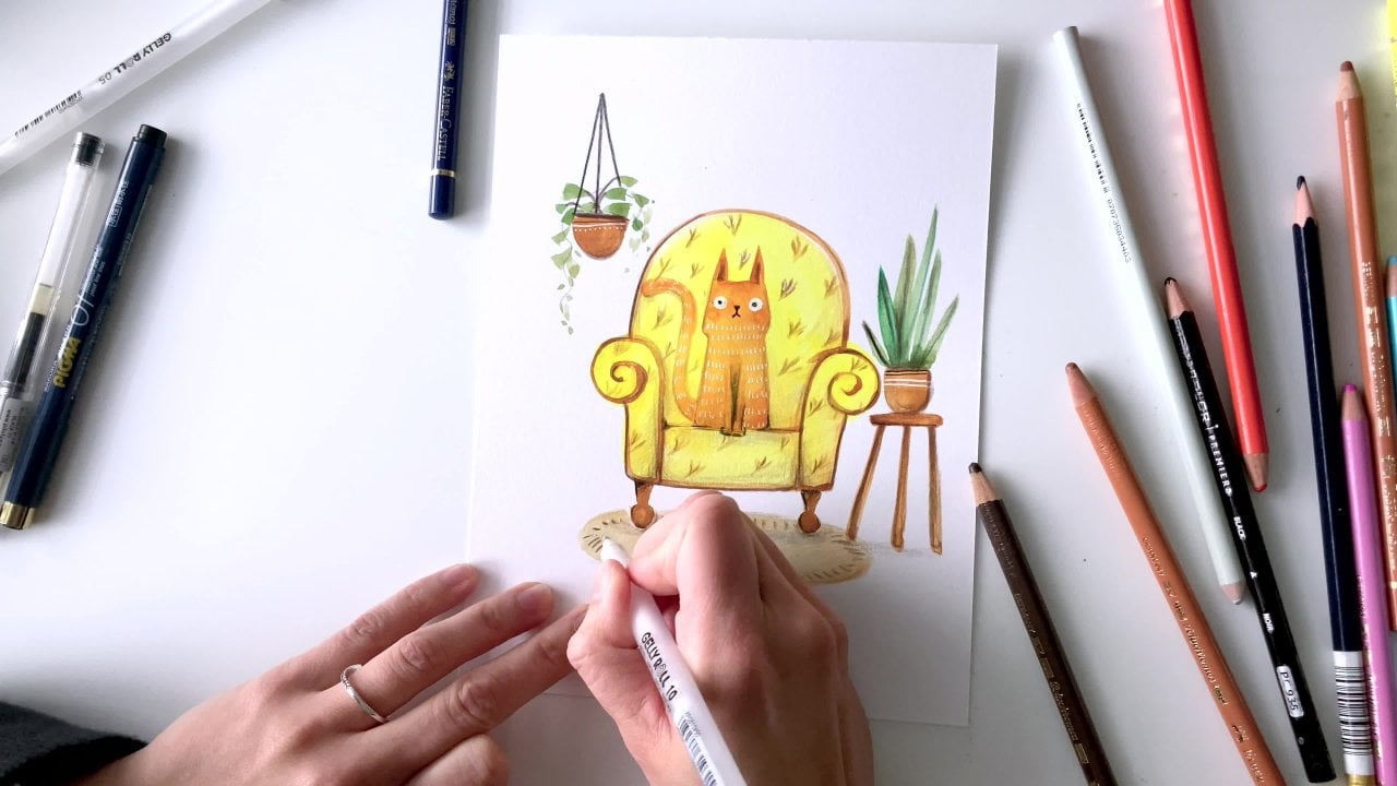
4. 4. Painting the Tea Set and Accessories: Painting the tea set
and accessories. Feel like this is one of the really fun parts
of this drawing, and it's just painting
the accessories and what you would imagine
on this breakfast table. So for me, I wanted to
do a really cute teapot with like a tea cup with maybe
a omelette for breakfast. But for you, breakfast
can mean very different. It could be some on the gris, it could be like a
fresh pot of coffee. So before you start painting, I really suggest you to
start by brainstorming. What does breakfast
mean for you and also, like If this is like a piece you plan on having as a gift,
for that individual, you're gifting it to, what kind of vibe or aesthetic
are you hoping for and go from there to decide what goes on
your breakfast table. But for ease of practice, if you don't want
to think about it, just paint along exactly
what I'm painting. Here I'm starting
off with a teapot. Yours could be bigger, rounder, more rectangular, up to you. And then I'm drawing a
plate in the middle. And then I want some patterns
on the plate as well, if you're looking
for ideas for, like, what kind of cutlery or dishes
that you want to paint, you may start with
something that you see at your own home
and just check out, like, how does a
teapot look like at your home and simplify it. It doesn't have to
be exactly the same, and just add a twist of
whimsy or creativity to it. So you can see I'm
also going to add a water flask here where
I can add on some plants. I'm just painting that in. So for the dish very simple, just like a dot pattern. And then I also drew
in a little cup there. From here for breakfast, I think it'll be awesome
to have an omelette, so I'm using my yellow to add a bit of color to my omelette. Now, probably add in
some cherry tomatoes and use my green to add a
little bit of leafy greens or, like, sprinkle of color
to the breakfast. Your breakfast can
be very different. It could be just like a sandwich
or pancakes or waffles, and just have fun
with the artwork. I think that the
teapot and also, like the little
coffee or tea cup. It is a little bit simple or
too simple for me right now. So I'll probably go back and add a bit of illustration to it. If you're looking
for more ideas for, like, what type of tea
set you want to include, you could go online and just, like, check out what they have, either on Pintra, Amazon, and just browse around
and have fun with. Alternatively, you might not
be a tea or coffee person. Maybe you have wine with your
breakfast, in which case, your little kitty cat could
have a wine glass next to it. So everything is slowly
coming together. I think that the tea set and the accessories is
looking really nice. For the water fast, I did something very simple, just like a stem with
a couple of leaves. But if you want, you
could add flowers to it, could be Daisy or roses or
any flower of your choice. So now I'm about wrapped up for my tea set and accessories
and my breakfast. Definitely one of
the parts I enjoy the most painting because
I feel like there's so many ways to have
fun with this drawing. By, like, thinking of how you would imagine
a breakfast being. I mean, I only have one
dish for the omelette, but you could have a more
lavish breakfast with, like, lots of different
dishes as well. So from here, I'll let you watch the remaining process of me painting the tea
set accessories, and I'll see you in
the next part of the lesson. Mm hmm.
5. 5. Layering Colors: Layering colors. Now, creating depth and, like, really deep colors
is a challenge for a lot of beginners,
especially with Gach. And I'm going to explain
a little bit more about this in this
part of the lesson. So easy enough, a lot of
times you think, like, I just apply paint to the paper, you get exactly what
color you're looking for. One thing you should
know about Gach is that darker colors tend to dry
a little bit lighter. Lighter colors dry a
little bit darker. So sometimes you won't
see what the true color is of whatever you're painting
until it completely dries. And with practice, you
know what to expect. But in the beginning,
it's going to be a little bit misleading. So here you can see I'm
coloring the tablecloth, and I use quite a bit of water. And looks initially very
vibrant and very dark. But as it dries, you'll notice it dries a little bit
lighter than I expected. The way to counter
this and you want a really deep dark color is to wait for the first
layer to dry and add a secondary layer,
as you can see here. And then after that layer dries, you wait, and then you
apply the third layer on. And that helps create
more depth and like a deeper color or
a more richer color. So here you can see,
it's still drying, looks super dark
and very vibrant. And again, when it dries it is going to look a
little different, and that's perfectly normal. Of course, does apply
specifically to acrylich, because it doesn't reactivate after you apply
water to it again. So that is how you layer on colors and create
dark shades with gah.
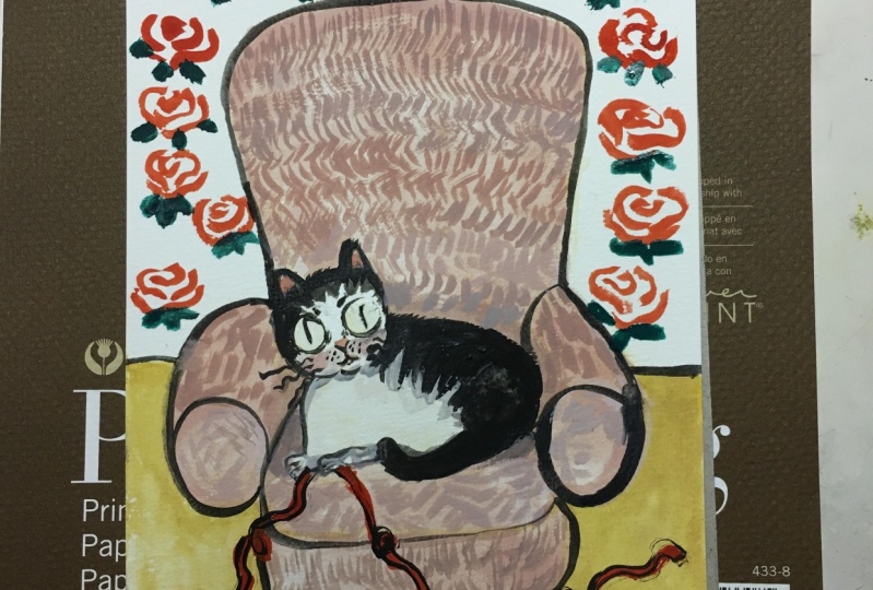
6. 6. Painting the Cat: Painting the cat. So the cat is kind of like a main
character in this drawing. So I'm going to
dedicate a fair bit of time in this lesson talking
about how to paint the cat. Now, if you like, in this part, you can choose to do
a different animal that really resonates
or speaks with you, or, you can do a cat the
same as what I'm doing or, like, do small
deviations from it. Let's say you don't like the
shade of cat that I'm doing, can do like a gray tabby cat, if that's the type of
cat that you have. So here you can start
off with, like, the years as you can see
a triangle in the corner, and I'm just using my black to create outlines for my cat. If you want, you don't
have to use a black shade. You could use, like, a mixture of some of the shades that I
provided you earlier. This was a little deviation from the palette that
I initially chose because I wanted
the cat to stand out a little bit more from
the rest of the painting. So that's why I chose this really sharp
deep color that is, like, totally different
from my palette so far. And I think it
looks really nice. And if you don't have, like, a black guash shade, it's perfectly fine for
you to use other mediums and start mixing it
in to your artwork. Like, you could use, like, a pencil marker or like a color pencil to do this
part if you so choose. And you don't have the color
palette for this black. With that side, you
can see I'm doing one side of the cat block. And the other side, I
think, I'll just do, like, a burn umber or some kind
of, like, brown color. I'm trying to do the two
sections of the cat separately because if I try to do
the brown shade now, as you can see from here, you're going to see because
they're wet on both sides, the black color is going to
seep onto the brown side. That's why it's really
important to be patient with your gouache
and wait for, like, the previous section to dry
before adding on, like, a second layer or
a second color, especially if it's going to
be like in close proximity. This is very similar
to watercolor and that the colors could easily
bleed into each other. So here, I'm just going to leave some parts white and then
some parts black and brown. You can see the brown has, like, slightly seep into
the black side, which is perfectly fine. I don't mind that gradient, I think it looks kind of cool, and I'll just leave it as it is. You can see I'm still
using the same brush, and I'm just using the tip of the brush to do some of
these finer details, which is why I love
a good round brush because you can be very
versatile with it. You can use a tip for detail, or you can push harder
on the brush and use, like, the thickness of the brush for some
broader strokes. So from here, I'm going to
draw the eye for my cat, using the finer tip
of my round brush. It's not going to be
absolutely perfect. And I understand that. And if you're striving
for perfection, this may not be the
step to really focus on if you are a beginner
gouache artist. Maybe I think what will be
helpful is when you check out my later part of the
lesson on adding outlines, that will be really helpful. As you will be using ink pen to make some small corrections. And I feel like ink pens are just so much easier
to work with, especially as a beginner artist
to watercolor or gouache, just because anybody can pick
up a pen and just, like, make these minor changes, and it's just so much
easier to control. So here, I have the rough
outline of my cat drawn. As I'm doing this piece, I can totally imagine
it being like other characters like
a panda or a dog. And you can really
add personality to your character depending on, like, the eye expression or, like, the mouth gestures. So, like, have fun with
the piece and just, like, try different
characters you like, you can even do two cats or three cats or a combination
of different animals. So that wraps up this
part of lesson on painting the cat or the main
character for your piece. Let's move on to
the next section.
7. 7. Painting the Chair: Painting the chair. I know that the chair may not necessarily be the
first thing that people would think of when they're looking at a
painting such as this, but, like, it's actually really fun when you're thinking
about, like a chair. There's just so many
ways to paint a chair. I would suggest starting off by doing some exploration on
types of furniture you like. If you have time, I think
that Ikea and taking a walk outside to some of the local furniture store
for ideas is a choice. Of course, not everybody
has the luxury or the time. To go out and check out
different types of furniture, admire their architecture
and their built and design. The other choice that I use very often for my artwork is
to look into Pintrest. And I use Pintrest to look at different designs of chairs
and the backing of chairs. It could be Victorian,
it could be modern. So use your imagination,
have fun with it, break outside that box, and take this
opportunity just to explore different
types of chairs. Really an art form, just
like painting itself, like the design of a chair, not just the
functionality of it, but like the aesthetic of
how it matches a room. So for me, I just wanted
to do a simple chair, and I loved the idea of just painting these straight lines. It was very therapeutic for me. So I went ahead and
just did, like, a simple, like,
round backing chair. I didn't want it to
be super angular. And I thought it was a good
challenge for me to practice doing straight lines
with painting gash. So if you like, you can do, like an outdoor
chair, a lawn chair, or use a completely
different color that makes the chair pop, and it could be a
center piece for this painting of
breakfast with a cat. And at the same
time, I think that, it would be a lot more fun if the chair matched the
aesthetics of your character, whether it is the cat,
as well as, like, the wallpaper and the tablecloth that goes with this piece. Are so many ways to play
around with this painting. So that wraps up the section on painting the chair
and just talking a little bit about design and aesthetic in terms
of furniture and, like, how it could possibly
match of your character and the general atmosphere or vibe you're trying to convey
with your artwork. Let's move on to
the next section.
8. 8. Painting Patterns: Painting patterns. So for this particular piece, there's a fair bit of patterns, including in the wallpaper, as well as the table cloth. So this is a great opportunity
for you to explore patterns in your home or
even outside your home, on your daily walks, get inspiration for this piece. If you don't have the time or the luxury to
kind of go outside, let's say the weather
is really horrible, or, you just don't have the time
to go out and explore this. I think, like going and
checking out online at home furniture stores
or even pinterest, is a great way for
you to explore patterns that you can possibly implore in this
particular painting. So for me, I'm doing
something super simple. I want to do some daisies. So I started off with
these like yellow dots that i.it randomly
on the backdrop. And then I'm going
to slowly paint in the petals for the wallpaper, using this lighter pink color. You can also get
this color by using the permanent scarlet mixed
with the titanium white. But I just happened to have the color with me, so
I thought, why not? But you can definitely
mix this color out of the four colors that we
chose for the palette. And I find this process
also very therapeutic, just, like, solely drawing
daisies in the background. I feel like there's
really no judgment. Like it can be as random
as you want to be. If you don't like daisies,
you can just do, like, a leaf pattern or it could
be different colors. Just have fun with, like, creating a
pattern wallpaper. It was your dream home. I was your dream studio. What kind of wallpaper
would you like? I think that is a great place
to start. At the same time. The table cloth is also an opportunity for you to
try out different patterns. Like a table cloth doesn't
have to be simply blue. You can add, like line
patterns or hearts or stars, and just have fun with playing with different
patterns and colors. So that is the short bit on how to add patterns to your
art piece and making it a little bit more unique and interesting. A.
9. 9. Adding Mix media: Adding mixed media. Now I'm going to pull
up my color pencils that I have readily available. And I think that as
most artists that we dabbled in different
types of art supplies, you're bound to have
some oil pencils or, like, various lead
pencils available. And I find these very
helpful when you're trying to create gradient for some
of your guash painting. I do find that this
is the most relaxing, and also one of my
most rewarding parts when I'm painting with
gah and mixed media, and that's using these color
pencils to create gradient. I love how it's,
like, very portable. Like, I can finish my quash
painting once it dries. I can bring it to a
coffee shop and bring some color pencil
and just slowly shade away in areas that I think warns shadows
at more depth, particularly like on the sides of the planters and
underneath the plants. And I just really
enjoy it, like, turning on some
nice bb nice music and just slowly
chipping it away at it, because when you use mixed
medias like this Gach, the great thing is
Gach drives Mt. So the mixed media does
go on very easily. One tip I would suggest
if you're using color pencils is to slowly
blend in the colors. Don't push on the lead to create those depth and,
like, darker shades. Actually makes a big difference
if you just slowly add in the gradient itself by slowly shading it in and
a layer by layer. It will look
fantastic. Trust me. I something I've
learned over the years, is not about, like, pushing hard, but just going gently at it one
layer at a time. Here you can see, I'm
using a darker shade of a oil pencil to create
some of the outlines. This is something you
can do with gah itself, but I love the effect and like
the softness when you use color pencils to go in and
shade in those shadows. I find that oil pencils work personally a little
bit better for me, and they blend a
little bit easier. And it's easier
to control if you were to use color
pencils to create highlights and
shadows as opposed to a water medium for guash. I think Gach does require a little bit more
experience for you to control it exactly the
way you wanted to, but anyone can pick up, like, a color pencil and start slowly adding in
these highlights. Personally, I prefer
to use a burnt ombre, like a brown color to do
gradients as opposed to black because I find that black
creates very hard edges, and I was aiming for a piece
that's a little bit softer. So that's my thought process
on why I decided to use this brown color to create
more of, like, shadows. So I'm going to let you see how the rest of the piece goes. And then for my next lesson. I'm gonna focus a little bit on adding outlines, in particular, with the white ink that I showed you in the
beginning for materials. You're going to be so
surprised by how big of a difference that white outlines
can make for your piece. I am so excited
to be showing you this next lesson on how to add
that little bit of detail. For now, I'll let you see
how I do the details and highlights for the rest of this piece using
my color pencils. And then we'll move on to
the next lesson. Enjoy.
10. 10. Adding Outlines: Adding outlines. Now, for this part
of the lesson, you need your ink pen. So for me, I'm using a secure brand jelly
roll in the color white. It comes out Opaque. And I must say that you don't necessarily need
to use this brand. It's completely optional. I just find this brand is
quite accessible and that, I can find it on Amazon or like my local stationary
or art supply store. Here you can see that once the
wash and everything dries, when I use this white
archval ink pen, it creates these really
beautiful highlights that, just make the piece
pop so much more. I find this process really
therapeutic as well because, like, I can be really
portable this. I can bring it to a
coffee shop and just sit down and just
do some outlining. And I really have an idea of what I want my
piece to look like. So it's not a lot of
planning in place. And like I can just
have a nice cup of coffee or tea and just, like, sit there and outline. Now, be sure to give time for the ink to fully dry before, like touching it
because it does much and it can come off
easily initially, especially when it's wet. So give it, like, at
least a few more minutes depending on how
much ink you add on. Here, I'm just going to speed
things up and show you how it looks like as I add
outline to this piece. With a white ink pen, it's very easy to add textures and little details as
opposed to gouache. So this is like a
really easy skill for you to adapt and
just have fun with it. I think it's like a lot more controllable when
you're using like a ink pen because all of us are used to using a
pen as opposed to, like, grabbing a paint brush
and painting with gouache. So this is something I think a lot of people
employed or try to do, especially when
you're using Gach because Gach is a
medium that lends itself very well
for you to add on other types of mediums, such as the oil pencils
that I showed you earlier and now the
archival ink pen. So let you enjoy the
rest of this lesson as I slowly add details of this white archival
ink to this piece. Besides adding
details and outlines, what I really find helpful, this archval ink pen is
also for correction. Let's say if like, I don't think that the pupil
of the eye of the cat is, like, as round as I want to be. It's, like, really
hard to get some of the details with gouache,
especially for beginners. So I'd like to go
back with this, like, white liner just to make the lines a little bit more defined and a little
bit more clean. And that's, like,
really easy with a pen as opposed to a
water medium, like, gh. So I feel like this
is kind of like a cheaters method, but, like, at the end of the day, I
think it looks really nice, and I still enjoy the process. So that just about
wraps up the piece. You can see a closer look, how it looks like after you
add on the white outline. The piece definitely
pops so much more. I'm really loving this so far. So don't feel intimidated. If your piece
doesn't look exactly like mine, keep in mind. Painting does need practice, so be kind to yourself
and enjoy the process. Now, let me just wrap up by
going over final thoughts and summary for this lesson. Mm.
11. 11. Final Thoughts: Thank you so much
for joining me on this lesson on doing
this breakfast of a cat. I hope you thoroughly enjoyed
it, 'cause I certainly did. I hopefully was able to
convey to you how you can use different mediums
such as oil pencils and, like, ink pens to create
highlights and also, like outlines for your piece. Guash doesn't have
to be intimidating, and I don't think
there's necessarily a wrong way to paint it. The main thing is just
to enjoy the process. Don't feel pressure. It needs to be perfect the first time you do
it, as you know, like, most art mediums,
practice makes perfect. I hope you do enjoy
this process. And hopefully, I will get to
see some of your projects coming up being posted because I would love to see how
your artwork turned out, what kind of, like,
wallpaper, or, like, what I will see for
your breakfast table. At the end of this lesson, make sure to sign your piece
and date it so that if you were to really do this project like a year or two
years from now, and you can see how
much you've progressed. So thank you so much for
joining me on this lesson, I would love to hear from you
if there's other feedback you'd like to provide
and how I can improve my lessons
in the future, or if there's other guash paintings you'll
like me to teach. Hopefully, this is
a good introduction for beginners who are just trying out guash for the first time and don't
know where to start. I think I've highlighted
some helpful tips on, like, how the paint dries and, like, some tips on, making sure the previous layer dries before adding
on the next layer. If you're interested in more
guash, Painting lessons. I have on the Skillshare. Thank you so much
for joining me in this lesson on painting
a breakfast of a cat. I hope you enjoy the squash
one oh one for beginners, and hopefully I will see
you in future lessons. Take care of, everyone and
make sure to stay creative. Bye for now, and I look forward to seeing your future projects.
 Sharon Leung, Life is serious, so have fun with art!