Transcripts
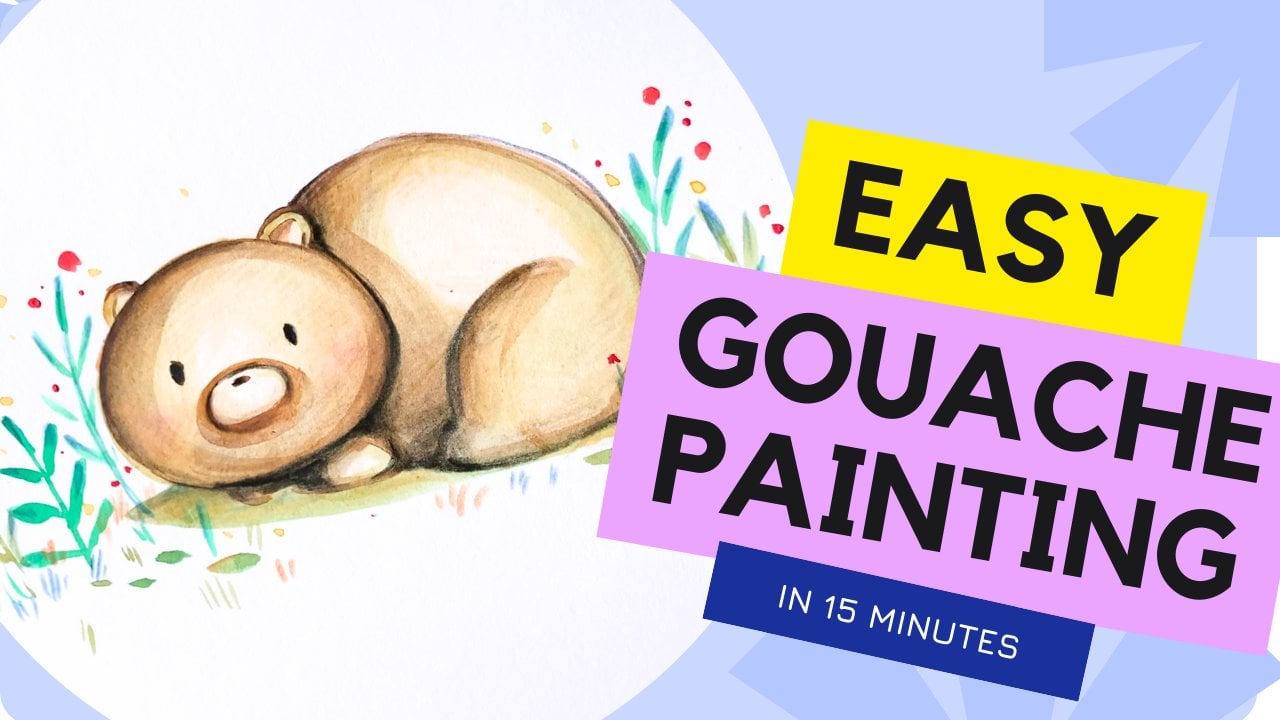
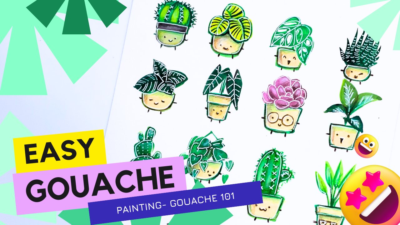
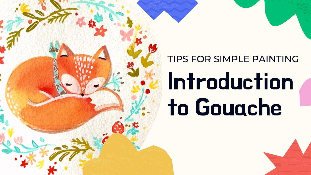
1. Intro and Lesson Outline: Welcome to this easy
step-by-step lesson on gouache painting
for beginners. Hello everyone. My name is Sharon
and I am an artist, a mommy, a health care provider, and also a teacher. When I am not busy with my kids, I like to paint a lot and I go and do present a lot of
my work to galleries and also our choose all across the country and also
globally as well. So I'm really excited
to be sharing my experiences with wash
if you in this class, this class is really
meant for beginners to intermediate level artists who are interested in exploring
the medium of gouache. Throughout this class,
I hope to showcase to you about some of
the tips and tricks and also just run
through with you the step-by-step
guide on how I would do a typical wash drawing. I hope that you find
this workshop helpful. And in particular
for this lesson, my goal is for you
to come out more confident about your ability
to paint with gouache. And also, the project for
this class is to learn to do easy drawing that
will be helpful for a greeting card you can do for the holidays or something
for a birthday. Something hopefully will be transferable art skills you can use in multiple art
projects to come. Many forms of painting exists. Today. I want to focus
specifically on wash. If you're watching this video, I hope you'll find it
helpful as I go through a step-by-step process on how to do a really cute and fun, easy illustration using gouache. Let's get started. But for this one,
I'm going to focus specifically on
getting out there, having fun with gouache
and just start painting. For this class, I'm
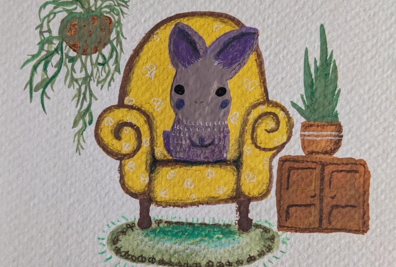
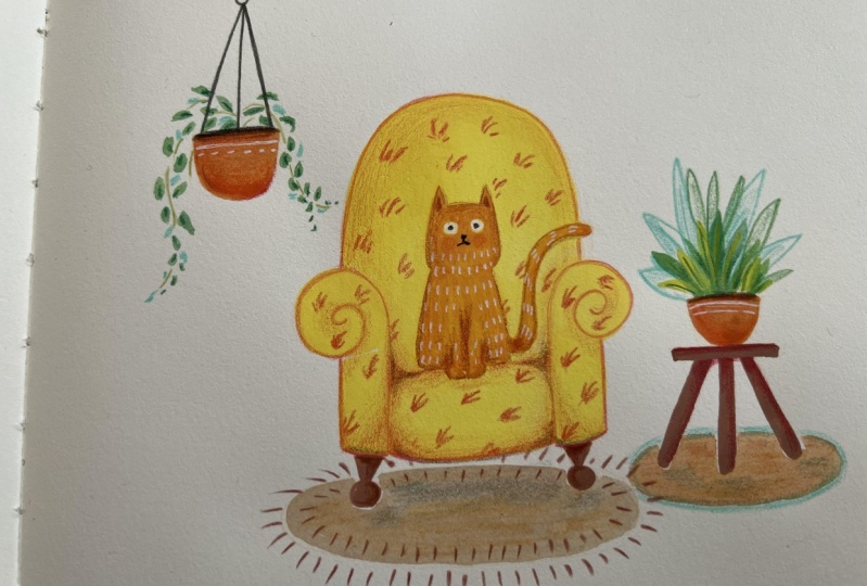
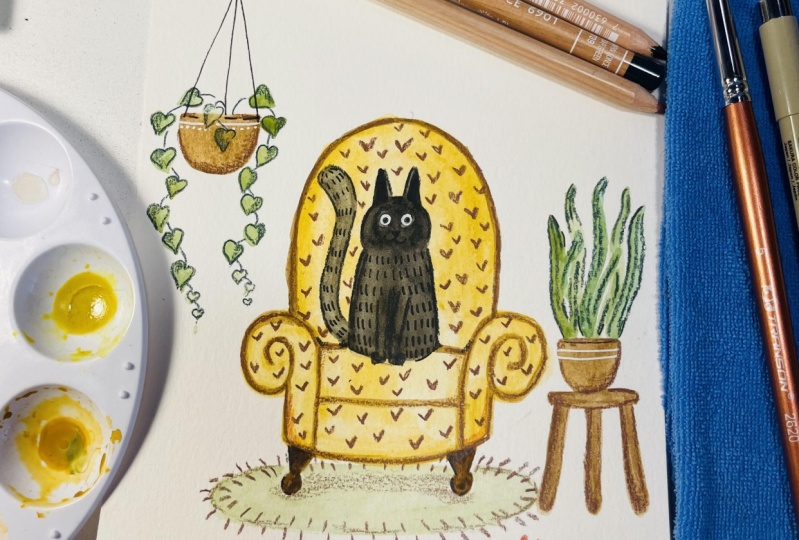
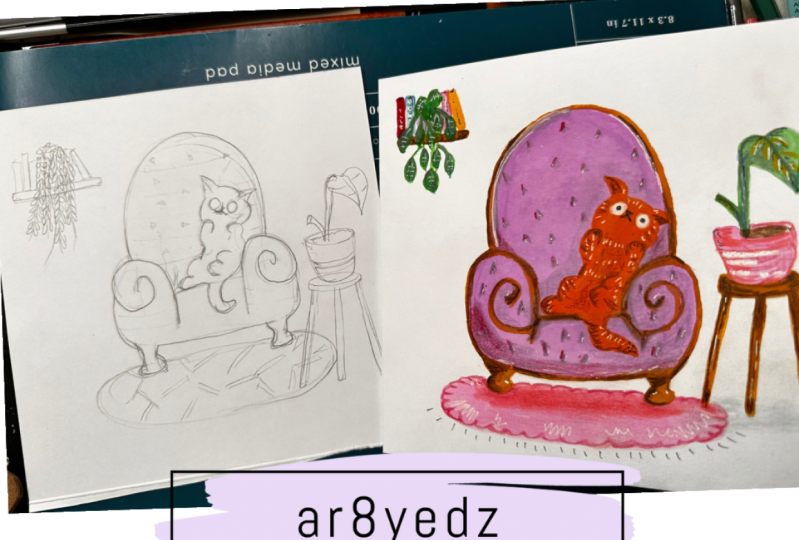
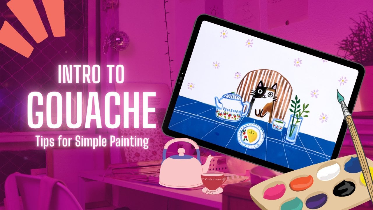
focusing on doing an illustration of a kind of a vintage couch along with a character which I've
chosen to be a cat loss, along with some
plants on the site, I think there'll
be a really nice illustration of you just wanna do like a small
card for a friend. And I think there'll be
an easy start before I jump into the different
types of medium. Understand that gouache
is a water-based paint. So it's a little bit
similar to watercolor, but keep in mind that there's
different types of wash. And the one I'm specific we using for this class is
gonna be acrylic wash. And I'll explain a
little bit different in terms of the material you need
once we get to that part. So that's my quick caveat. I look forward to seeing some
of your projects as you do a similar illustration
or tried to do a different
character of your own. Well, let's get started.
2. What to expect : So for this class, I'm focusing on doing
an illustration of a vintage couch along with a character which I've
chosen to be a cat loss, along with some
plants on the site, I think there'll
be a really nice illustration of you just wanna do like a small
card for a friend. I think there'll be an
easy start before I jump into the different
types of medium. Understand that gouache
is a water-based paint. So it's a little bit
similar to watercolor. So in the beginning
we will be doing plenty of dilution with water. And then later on we're going
to layer on more pigments. I hope to provide some
useful tips for you guys. But as you start
on this project, but keep in mind that there's
different types of wash. And the one I'm specific LEA using for this class is
going to be acrylic wash. And I'll explain a
little bit different in terms of the material you need
once we get to that part. So that's my quick caveat. I look forward to seeing some
of your projects as you do a similar illustration
or tried to do a different
character of your own. And I'll love to hear
some feedback and comments below in terms
of how it turns out, well, let's get started.
3. Materials : Materials. That is the first
thing I'm going to go over in this
class before we even get started on the step-by-step drawing on how this all works. The first thing you need
is some watercolor paper. I have water color
paper block here. Of course, you can pick up different types of
watercolor paper. There's hot press, cold press, this mixed media paper, and there's definitely
plenty of options, but let's not get
overwhelmed here. Picked up any watercolor paper, or you can get a hold
of what you find about watercolor paper is
that it doesn't buckle as easily and absorb
water a little bit more. The next thing you
need is a brush. Now, I don't think we need a whole lot of different
types of brush sizes. I usually just use one brush and I usually
use a round tip. And that seems to be
easy enough for me. In terms of brushes. I really like round brushes
because I love how there have a pointed tip that makes it easier for me
to find details. And then if I really want
to push hard on the brush, I can use the thicker
and not the round brush to get these
broader stroke. I also don't like brushes
that are super long. So I usually go for round brushes that are a little
bit on the shorter side. Next, you'll also need a water cup to continue
your water in, which can be a yogurt
cup, recycled cup. Anything you really like doesn't have to be anything super fancy. In addition to that, I'm also going to
be using gouache, which is really the highlight of this entire video
teaching you how to use this wonderful medium. So I have my acrylic wash here, which has kind of like
a more acrylic base, so it drives permanent
compared to traditional wash. And then I'm also going to be using some pencil crayon here. I'm going to teach
you how to use some other mediums and mix, using mixed media
for this piece. And it just makes it
so much more fun. So those are the materials
that you'll need for this dry. I'm really excited
to get started. There's also one more
thing I forgot to add, which I will show you here. And that's this
little dish here. And that's basically what I used to mix all of my
gouache paint on. I'm using really
a soy sauce dish that you can pick
up any supermarket. But of course you can
get fancier kinda plates for you to do your mixing on. I prefer a dish
that's a little bit on the wider side so you can see how the color mix and what the colors will look
like a white paper. So of course, it's up to you, but that's the last item I
want to highlight for you that you need to include
it before we get started. Of course, you can make this more fun by adding
on other mediums. You can add on acrylics, you can add on archival inks. The sky's the limit, but
let's just get started.
4. Color Palette: Alright, before we paint, we do have to decide on one thing and that's what
your color palettes gonna be. If you're new to quash
and you're trying to paint not just black and white. You might want to choose a
particular color scheme. You don't necessarily
need to pick all the gouache colors off the shelf that's
available at the store, I think is nice to
start off with like maybe like three or four colors. I usually start off
of my primary colors. But it's nice to
choose if you want a simple warm color palette
or like a cool color palette. So it's really up to you. I feel like everybody have their own niche and what
their preferences are. For this piece, I
wanted something, a combination of yellows,
oranges, and greens. And of course, if you have a
white gouache as your base, it's easy to mix
lighter colors and you don't have to buy as many
different types of pain. It's easy to get excited
and want to get like all the gouache paint
palettes for your piece. But I would say to start off
trial some primary colors, head over to store, play around with dishes, washes and see
which do you like. And even if you don't
absolutely like that color, you can always mix it up with other ones and create
different tints. And I'll show you how to do that by buying just maybe a couple of colors and mix it up and get like a whole color palette
that you see here. It's also less intimidating
when you don't have so many colors
to choose from. But I would say white gouache
is something that you be really helpful for you
to have in your arsenal. So limiting your
palate will make it a little bit easier if
you're a beginning, beginning to pink wash. Maybe do a color chart
or swatches of colors. So e.g. if I can do
like a white here, I can mix it with this darker green and get
a lighter green. So you don't need to
pick off like every sing cool green, e.g. if you want to get
different shades, long as you have like
some darker shade and lighter shades
to paint with. But I know that I'm going
to need some greens, but I don't think I need all the greens I'm showing you here. I'm going to limit
my palette just so you can see how I can get a lot done with just a few
colors and it goes a long way. And at the end, who's to say at the end you
don't like the Ps, you can always redo it. Don't feel like you're
limited that once I choose this color palette
and that's all I can use. If it's gonna be ugly,
it's going to be ugly. So you can see overall there's like three main
shades I'm using. There is like kinda this red, orange, green, and blue. And of course I can eliminate
more of these in-between shades and just
focus on a couple of colors and will
work just as well. So let's say if I choose just one color on this
red palette here, or like I can always add an allylic to kinda give
different shades of the color. So that is where
I'm going to start. How do you guys feel? I feel like it's
such a fun project. Just choosing color palette
before you get started. If you find it
really intimidating, you can always just copy the exact palette that
I'm doing for this piece. Just try it, try it out. And then later on you can redo the painting using a different
palette that you like. I think the first
big jump into the, to jump in and just
start painting. Here you can see I have two
different types of yellow. One is the cooler, one, one's a warmer color. That's just an example for you to know what
I mean when I say, like there's a
cooler palette and a warmer palette for
you to choose from. I. So you can see here, you don't necessarily
need to compare yourself to me in terms of
the number of colors I have. I've been painting for a while, so I have had built
quite a collection, but I can definitely
limit the colors I have and just go down to a few
core colors to start. Let's get started In
choosing a color palette. I think it's good to have a more limited color
palette when you start, I usually include a
whitewash no matter what for each of my pieces, because white is just a
really good essential. If you just get a couple
of dark colors you can easily blended and make
him to lighter shade. So here also have an olive color that I think would be nice. I know that there are actually quite a few number of
different shades of green. To begin when you're
painting gouache, I don't think you really need all the different shades of green that there is available. Maybe just choose a
couple of darker shade and have a whitewash
available to mix it up. Now I'm going to be painting a cute little bear
for this piece. So I'm going to include
some shades of brown, which you can see I have a
fair number of different guy like raw sienna, burnt umber. Also debating if
I wish to add in some highlight colors for
the flowers that can go on the background so
that it's not like so muted that it's just
a brown, olive shades. So those are some things
I'm playing around with. And of course, I'll be using
some pencil crayon to kind of mix up different
types of art media. So I'll show you how to
do that near the end. I think this is my
general palette, of course, my white gouache. And I'm debating what
kind of greens I want definitely don't need all
these different shades. I think it's good to have three primary colors
to start off with. Or at least like three
general colors here. I'll probably have
my green, my brown, and I'm also maybe one
highlighter colors. Test your colors out
before using them. Maybe even creating a chart
with different tense, mixing color, mixing
them with whites and different shades and
see what you can get. Quite expensive over time. So you wanna be like, not necessarily picking up
all the colors that you like, but like testing out different
colors and mixing them, you can get quite a
variety with wash. I find that like
the lighter colors generally look a little bit darker when they dry
in a darker color, generally dry a
little bit lighter, so it's good to test out the
different swatches here. You can see there's
like cooler color here and also a warmer palette. So that's another thing to think about when
you're creating it. Do you want something
a little bit warmer, a little bit cooler? So those are my essential
colors that I'm going to use for this
illustration coming up. Hopefully, this quick
run-through helps you decide what kind of color
palette you want to start. An OB less intimidating
for you if you just focus, focus on a few key colors. And yeah, so let's get started and start painting some
gouache paintings.
5. Tip #1 - Painting Background to Foreground : So here as I'm starting, you can see I have my
white piece of paper here. I'm going to start by
drawing the couch that the kitty cat is going
to be sitting on top of. Which is my first tip. I want to go over and
I'm going to try to like sprinkle a little tips throughout this entire lesson. But hopefully you'll take away, be able to transfer to your
different illustrations. The first ship I want
to go over is pain, always from the background
to the foreground. Now painting like a whole, like building or something
that's more complicated. It's gonna be harder to explain. So that's why I'm doing this
simple piece with this couch or chair that this cat is
going to be sitting on. So the reason I'm
painting the cultures, because again, I'm starting from the background to
the foreground. One thing you should know about gouache is that it dries opaque, kind of like acrylics. So the, the, the advantage of
that is that you can always layer one layer on top of
another after it dries. And it just looks
kinda covers up the previous parts that
you've been painting on. So what that means is like, I always paint everything. I want to end the background. And then once that dries, I can paint Leslie My
cat right on top of it. You can't really do
that so much with watercolor because it's a
little bit more translucent. But this is one of the
great qualities of goulash. So I usually lay in the
strokes with plenty of water diluting in with my gouache to layout where I want the
couch to be approximately. You can see that you can
have a different shape. Couch them me as
you're doing this, you can have a
really tall one or really maybe Angular one
or more rounder one. You can use a completely
different color for your gouache. For the couch, can play around
with the different medium. So at this point, I'm not
really worried about leaving space for where I think the cat is going to
sit on the couch. Because I'm just going
to layer right on top of this couch
that I'm painting. I don't think you
can say the same. Let's say use watercolor. You may have to leave
the white paper space for where you envision
the animal to be. So again, I think this is one of the great advantages of using gouache because it covers up
what was there previously. So here you can see
I'm layering on more and more of my yellow
with less water diluted. In order to get some really pigmented colors with gouache, you have to use less
and less water. One of the tips I would
recommend is wait for the last layer to dry before
adding on the next layer. This will create more
pigmentation without you like just adding in
more and more pain. One thing I should notice
I'm using acrylic wash. So it's not like true
traditional gouache because true crit,
traditional gouache. When you add water to it, even like months or weeks later, it will reactivate the
area and start repainting the spool the same spot and just rework it from
where you left off. Acrylic wash has
this acrylic kind of characteristic to it so
that it dries a permanent. So you can see that as an
advantage or a disadvantage. Okay. From here,
I'm going to add on the feet for
the couch as well. And then I'm going to speed up the process so you can
see the end product. You can see that it's not totally tell that it's
a couch at this point. But you will see more of it once you starting the
outline for the couch.
6. Painting Planters : For this next part
of the painting, we're going to add like
vases and tables on the side and focus less on the couch and the
character itself. I'm using this burnt umber, burnt sienna color and
diluting it with some water. I'm just outlining where I think the pot for the plant
is going to be enough, filling it on the inside. Later on we're going to add in other mixed medium to create more details for the vases that you see that we're
painting here. But honestly, don't
feel pressured that the outline has to
be exact will vary. Find two lines. Because what I'm going to show you later on with mixed media this and you can create more
clear outlines that way. I'm using very simple shapes, especially hopefully does
is especially helpful for you if you are a beginner
artist for gouache. So for my table, I'm trying to just use, do some simple lines. Creating a table for
my potted plant here. And then next, I'm going to draw in the pot for the
hanging plot as well. That wraps up this part of the class for
the potted plants. Now, I'm going to jump right into painting one of
my favorite parts, which is the main character of the little kitty
sitting on the couch. Let's get started.
7. Tip #2 - Drawing Outlines : I think this is the best time
to talk about my next tip, and that's creating outlines for your gouache illustration. So number one thing is to
remember to be patient. You do have to wait for the previous layer
gouache to be fully dry before adding in outlines
or else it's going to blend right in with the background color
that you've added. So here my yellow on
the couch as fully dried and I decided to mix the burnt sienna color onto the tip of my round
brush and just starting doing outlines
for the couch. Again, I can't
emphasize enough how important it is to wait
for the previous layer to dry before adding on the next layer or
else things are just gonna get really messy for you if you're playing
around with gouache. But you can see that once you add an outline for the couch, everything is just kinda
slowly coming together. Okay, so now that I'm
finished with this tip, I'm going to jump right into painting the main character of the little kitty
sitting on the couch.
8. Painting the main character: Painting the main character painting our little cat
sitting on the couch. I've decided I'm going
to paint an orange cat. If you want, you can choose
different colors as well. I don't actually have to use a lot of paint for this process. I'm actually only
using a tiny dip, orange and then blending
of plenty of water. The reason behind this is just, I want to stake out where
the character is going to be and it doesn't have
to be super pigmented. So it's going to be
diluted with water. Then I'm going to start doing the general outline of the cat and then
filling in the middle. So I normally start
with the years to kinda generally stake out how
tall the cat's gonna be. And then slowly drawn outer outlines and then
filling in the center. As you can see, I'm
also leaving space for the eyes of the cats. I'm drawing two general
circles on the head and then tried to avoid painting
into that circle. So just painting around it. I think the reason
I'm doing this is that later on I
don't have to use as much white paint to create that stark
contrast and mating, making the eyes lighter again. So kinda stays on pain. So I'm gonna leave them white
of the eye, not painted. And then I'll finish
coloring the rest of the cat so you can see
the heads come slowly coming into place. If you want. At this point, you can divert a little bit different
from what I'm painting and have a
really fat chubby kitty or you never skinny kitty. You can have a very furry kitty. Kitty could be lying
down or maybe holding a cup of tea or coffee. So you really can have
a lot of fun with us. Or if you feel it's a
little bit intimidating, just take it slow and easy and just follow along with
what I'm painting. There's honestly no pressure. One of the great joys of painting is just
enjoying the process. And if it doesn't
work out, it's okay. You can paint it again
another time using different colors and
another piece of paper is never the end of it. There's just so many opportunities
for you to try again. Now I'm just painting in
the tail for the cat. Just wanted to be a little
bit curvy and squiggle ish. I think it's just a little
bit fun and whimsical having that little
curve to detail. If you want the cat to be a little bit more pigment and
a little bit more orange. You'll have to wait
for this layer to dry. Usually trying depends
on how much water you add to the painting itself. It can take anywhere
from like a minute. You should have.
Maybe it's too fast, maybe like 5 min to
15 min or so really depends how large area it is and how much water
you've added to it. So after I wrap up
this part here, I'm going to work on painting the plots that's going to
be on in the hanging pots. And I think that's
going to little details really start putting the
whole painting together.
9. Painting Plants : Painting plants and vegetation. Here I think I'll do
some snake plants on the little potted
plant beside the cat. I'm using a green color and
diluting a plenty of water. You can see I use my round brush using the fine tip in
the beginning so that it's a little bit
moist point here at the end data snake plant and
then a little bit rounder. Now I don't love this green. So what I've decided to do
is to add a little bit of the burnt sienna
right here that I used to use for as well are actually used for the pot itself and
mixing it the green. And you can see that it comes up this beautiful olive green. These are a little tips that I think it's
really helpful so that you don't have to purchase
the whole color palette. That's a store. Just get a couple that
you like and you can mix and match and
get a nice palette. So I'm gonna do a couple
more leaves here. If you want, you can do different types of
plants or we can do something with flowers
on it or can't do a cactus. That's why I think this
illustration so much fun can seek a repaint it so
many different ways and you can have different
animals and different plants. So if n, next I'm gonna do this potted plant
and I think I'll do a little triangles
with the leaves. I'll have them a
little bit sparse and connect them with
a line later on. Again, mixing with my green
with my burnt sienna, create this olive green color. And then adding in different amounts of water
with the paint will create dilutions where there's
lighter shades of leave and also some darker shades
of leaves as well. After I finished with these potted plants
on adding the leaves, I'm going to add maybe
a small piece of carpet underneath couch so you'll feel it a little
bit more cozy here. So I'm going to wrap up here at the plant and then I'll show you how I create
the rug underneath.
10. Painting the Rug: Now I'm going to add
a little piece of carpet on the bottom
beneath the couch, like previously I mentioned, for the tip is to make
sure the previous layer dries before adding in
the next layer of paint. Here, I'm adding in
plenty of water to the green actually previously
used for the state fly. I really liked the
color and I create, I think it creates a nice
unison for the painting. I'm going to do a piece of
carpet underneath couch. Of course, for you, you can
do a circular or carpet or I can do a triangular
one or a square one. I wouldn't be too worried about making something
that is pigment in. My plan is to do something a little bit more
diluted water and then using mixed media like pencil crayons to
add texture to it. And that's actually one
of my favorite parts of doing these gouache
illustrations. And I'm really excited
to show you the tips related to using other
mediums with gouache. So this is how the
artwork has come so far. I don't think by any
means it's perfect. But we're going to
start adding on some pencil crayon and some maybe archival
inks on top of it. And it's definitely, it's
gonna look so awesome and so beautiful and ready to be gifted for someone as a card. Let's get started.
11. Using Mix Media: One of the great
things I enjoy about gouache is adding
on other mediums. I think watch plays really
well with other mediums. One of the reasons because
it does dry matte. So then it's easier
to add on like acrylics or color
pencils or pastels. And you can just do a collage, different types of media. And I think that's one of
the reasons why people are drawn to squash. The mat surface also looks great when you take
pictures of it. But in general, I
think wash painting is a little bit on
the fragile side, which is why I prefer acrylic
wash dries permanent. So here you can see I have
my pencil crayon here. And I think pencil
crayons are really great for you to
start blending in, creating some
gradient and shades. And you can use a composite
of many different colors. Of course, you can go with same concept that we started
with gouache choosing a template and palette of
colors you want to start from. Here, I have this brown color. I think it'll be great
for me to create a little bit of shade and
dimension to the couch. One thing I would
recommend when you're using pencil crayon is not to push hard to
get some dark colors, but you just like coloring is slowly and adding on layers just creates such a big difference in terms of something
creating a piece of artwork that with a little bit smoother of colors that
blend a little bit better. Here, I'm going to
speed things up a little bit to show you how I've in more highlights
and greed the couch. So we can see that this process does take a little bit of time. In the next lesson, I'm going to show you how
I use gel pens to help create highlights and fine lines for your gouache illustration.
12. Tip #3 - Using Gel Pens: This is my next big
tip that I really enjoy using as
using my gel pens. There's a lot of
archival gel pens that's available in the market. And I found that this drug Jelly Roll pen
works really well. I picked up the
white jelly rolls. I'm using the ink to
paint in the pupil, the white pupil for the
eyes, for the kitty. I think this is a pro tip
that I often share a lot of my fellow artists and students. And it's something that I use in a lot of my artwork
and it's no big secret. Using gel pens like this jelly roll here you can
add a lot of fine details, especially when
the quash drives, whether you want to
create fine lines are wanna do dotted lines. And I'll give you a closer
look how it looks like, but it's also very
easy for you to, once you do a whole
stack of gouache work and you want to go to a
coffee shop and you don't want to bring all your
gouache and your water. Water buckets are like all
your entire paints that there. You can just grab a stack of
gouache artwork that you've already done and just
bring a gel pen and just do some illustration
that coffee shop, It's super relaxing and I loved the effect
that comes out of it.
13. Adding Dimension : This next tip I want
to talk about is adding gradient your artwork. It might be a little
intimidating. I'd ingredient and
shades and shadows and light to your gouache initially
as a beginner artists. So my recommendation is take advantage of the
use of mixed media. Here, I'm using a
darker brown color and creating shading
on top of my wash. And you can see that immediately the piece just
looks so much better. You can see there's
darker and lighter shade and they transition really
nicely into each other. You don't have to feel intimidated that you
have to figure out the perfect kind of wet on wet or it well and dry color to mix your gouache in
the perfect gradient color. So I find using pencil
crayons on top of your wash. And just adding in those shadows just makes it so much easier.
14. Tip #4 - Drawing Black Outlines: This next tip focuses
on adding details. In particular like
blackout lines are like the pupil of this
kiddies, either I'm doing. So you can always use a really dark shade of
block of other mediums. So instead of using gouache, which you might not
get the perfect pointed tip and his
law intimidating. You can always use a
pencil crayon that you've sharpened quite a
bit to appointed him to add on the
pupil if you want, you can also use light pens. For me. I can either
sometimes we use a ballpoint pen that
I can pick up at a regular stationary store
or at office supply store. And I will just use that to draw in the nose or the
mouth of my kitty. And you really
don't have to limit yourself that it has
to be professional, great artists material
to do your drawing. Because at the end of the day, no one's going to judge
you to say that, oh, that nose on the
cat was not done with like professional
washing material. So here you can see, you can use black fine
liner if you want to use that for the drying in
the nose for the cat. Or you can use other types
of Office material as well. The sky's the limit
and I think you should not feel judged and
not feel pressured. Just try different things out
and see how it works out.
15. Adding Patterns: Now, like you're kinda got
used to using mixed medium. The next big thing that
will be really helpful for your wash artwork to
make it a little bit more interesting is
to add patterns. So for this particular
kitty of decided to use gel pen just to add on the
fur patterns on the kidney. I think adding on patterns
or like little flowers on the side will be
really helpful in bringing your artwork
to a whole new level. So you can see, I found that this process is very relaxing, especially when on turn on a nice music playlist
in the background, whether it's on
YouTube or Spotify. I just really enjoyed
this process of p-adic patterns and
textures to my artwork. Now you can see that I'm doing
it to the kitty cat here. But of course, for the couch that she's sitting
or he's sitting on it. We can also add pattern
to it afterwards as well. And of course, don't
forget about the tail, the kidney to add patterns to the entire character and
whether you're doing a cat, a dog, or a hippopotamus for whatever
character you decide on. I think there's different
ways they can add a texture. It doesn't need to be on
the entire character. It can even be on a
section of it as well.
16. Adding Depth: One of the great
things about adding gradient and shading
to your artwork. It does add more
depth to your pieces. So e.g. for the snake
plant leaves here, I'm using pencil crayons to
create more dimension to it. So I'll try to make the
tip a little bit darker. And it does make a
really big difference. So I implore you to kinda try out some
of these techniques that I've shown you here for
the purpose of this demo, to show you how to add depth
to some of the house plants. In this illustration, I'm just going to speed things up so you can see how I
make it happen. And I'll try to add depth and dimension to the kitty and
the sulfides off as well.
17. Adding textures and more patterns : So earlier I talked about adding on patterns
for the kitty. Now I'm going to show you
how I add textures to some of the different
pieces that we've illustrated here. So e.g. I'm adding on texture to the carpet that the the
couch is sitting on. Next, I think it's good to add
on a pattern to the couch, so it makes it a little
bit more interesting, not just like a random mill for another mill,
yellow carriage. Now if you're not sure of
what ideas you want for the illustration or pattern
to go on the couch. You can always Google, we can look on Pinterest. Let's look at different
fabric patterns when you go to a
local fabric store. I think those are all great
ideas to get inspiration. For me, I like to
use pencil to add on some of these
patterns on the back. I think I'll just do something
simple to go on this side. Of course, if you want
to go with something even more straight forward, you can always do like parallel lines are
stripy patterns. Or I can do flowers or
you can do feathers. I think these are one of
the parts that you can get really creative and make the piece something of your own.
18. Wrap Up: So that's all for
the piece today. I hope you enjoy the step-by-step process
of doing this easy, super cute gouache illustration. I hope you find some of the
chips helpful and you can try to do different types of animals or patterns
for your couch. I'm really looking
forward to some of the projects that you
guys can oppose and how I hope you enjoy the rest of your journey as you discover about this
gouache medium. In the meantime, I tried to
put together a couple of more classes on some
cute illustrations you can start off with, if you're learning wash
for the first time. I love to hear back
from you if there's any particular feedback on how I can improve my
teaching process. Well, that's it for now. I hope you enjoyed this cute illustration
and step aside class, and I'll see you next
time in another class, another lesson on Skillshare. Stay creative, and stay safe, everyone, Bye for now.
 Sharon Leung, Life is serious, so have fun with art!