Transcripts
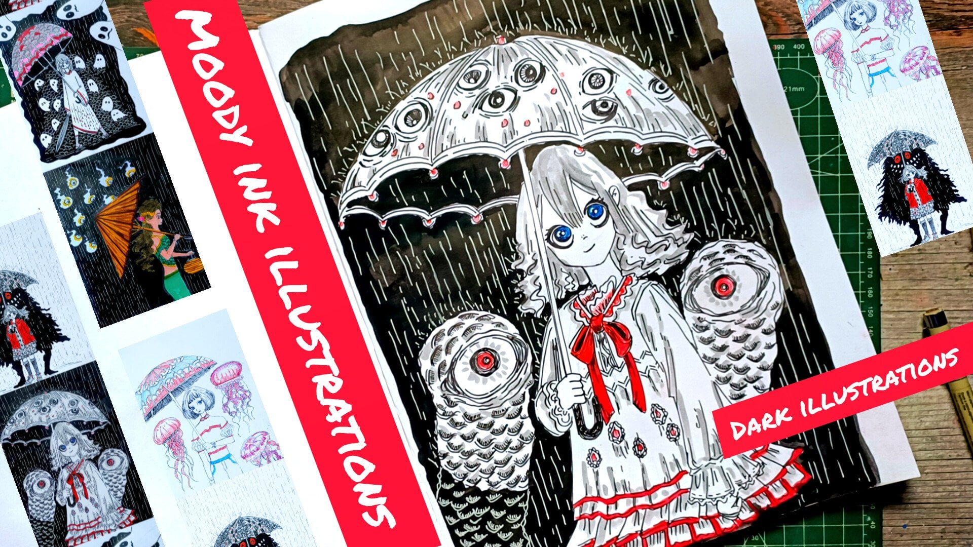
1. Welcome and Introduction: Hi, everyone. Welcome
to my new class, ink TubtGtTel simple and
spooky illustrations, drawing goes step by step. In this class, we
are going to explore the magic of ink drawing
while creating fun and slightly spooky
ghost illustration inspired by the
classic bedsitGhost. This is a big now
friendly class, so even if you are
new to ink and paint, you will be able
to follow along. So as the Nin menton we have got 12 project So this way the towel pen and ink illustration that
we'll be doing. Hi, I'm Michal an
artist from India. I love creating simple, fun and beginner friendly art classes that
anyone can follow. On a skill sae, I
teach a variety of classes including
oil pastels, doodles, watercolor
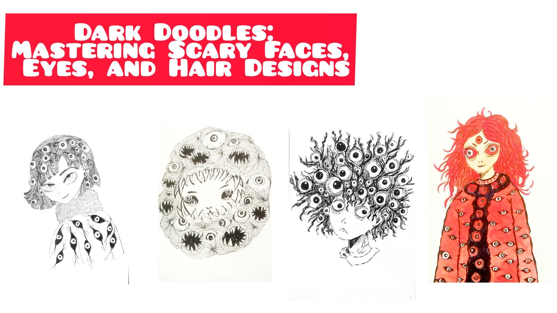
and ink illustration. You can check out Dark Doodles, mastering scary faces,
eyes and hair design. This class is similar to the class that I'm
teaching right now. My classes are designed
to be easy to understand. You can also find more of my art on Instagram and YouTube. In this class, we will start
simple first by tasting out our supplies and making lines with different
pins and brasses. So here we'll be using micron pen and all the
other ink supplies, brass pins or whatever else you have to practice and create
different kinds of line. And then we will move
on to the basics, creating different kinds of line spicing sides and few
other important things. Then we have
different strops and technique here I'll be showing you the
examples of hatching, cross-hatching, scrippling, stippling, and few
more examples. And then we will move
on to basic bedstGs. Here I'll be showing
you six examples and different ways in which you
can create this bedstGs. After this will jump
into the main project, which I have divided
into four parts. Each part contain
three projects. And before jumping into the
three projects of each part, I'll be showing you
the examples in the demonstration that I'll be using to create the projects. Like for this third
part, I'll be showing you how to
create the walls, the windows, the pavement, different kind of goes, that reese characters,
et cetera. So before diving into the
three projects of each part, I'll be showing you
the techniques, demonstration and
the thumbnails. And then we will move on
to creating this duel, beautiful and haunting yet
simple ink illustration, ink and paint illustrations. So along the way, you will also learn how to use different
paints for line, wheat, and different
kind of texture, applying seeding and
hashing to give depth, experimenting with
contrast using breast paints and the ink
taints and fine liners, creating atmosphere and storytelling with
a ghost drawing. By the end of this class, you will have spooky and
charming inkhostillustration, perfect for ink tuber or anytime you want to practice
your ink drawing skills. So grab your paints, inks, and pep and let's dive into the spooky fun
projects together.
2. Class project : For this class, I have created a total of 12 ghost
illustration, divided into four parts
with three projects each. There are all step
by step drawings of simple wet set ghosts and different spooky and
playful scenarios. Here's how the class
is structured. First, we will warm up
with some practice sats, tasting different
brass paints and ink. You will try out line variation, strokes, texture, and
sailing techniques. This warm up will help you get comfortable before jumping
into the main project. Then we have part one that consists of
projects one to three. We will begin with
the basis drawing out first ghost character and
keeping the setting simple. These projects are a bit
quicker than we have part two, part three, and P four, all consisting of three
projects in each. For this class, your
project will be choosing any of the
12 ghost project or create your own
boost illustration using the techniques
we cover in the class. You can also experiment
with red ink or different brushes if you did
like to add your own twist. Once you have finished,
please upload your drawing in the
class project section. I'd love to see
your spooky ghost, whether it's just one out
of the full set of 12. Don't worry about
making them perfect. This class is about practice, creativity, and having fun. And finally, don't forget to leave your reviews,
feedback and suggestions. I truly enjoy seeing. I truly enjoy seeing
students project and your feedbacks help me make
future class even better.
3. List of Supplies : For this class, you
may need a pencil, an eraser, and a micron pen or ink pen will do their work. Any paper of more than 200
GSM will do their work. Just make sure that
it's bleeding proof. Then you have got the ink. Here I'll be using
Jig kuratakik, white ink to add more highlights or to
cover the mistakes, or you can use even the acral
colors or gauze colors. Then I have got this brass pens. This Kuraaki zig
Kuraaki bras paints, here's another white
highlighted that I'll be using to add a bit of
highlights or cover mistakes, and all the other paints
and ink bras paints or sketch paints or
whatever else you have, watercolor brushes to
cover large areas. And yeah, the other ink and paint supplance that
I have watercolor, if you want to use
black from that. This class, you don't
need this much supplies. Only having a micron pen
or an ink pen will do the work a little bit of ink or watercolor will come handy. So only this few
supplies are necessary. And if you are
using a loose seat, use masking tape to
secure your paper. I'll see you in the
next video where will we tasting
out our supplies.
4. Testing supplies : A in to this section in
which we will be tasting out our paints and breast paints and the ink supplies
that we have got. So take out all your
paints, breast paints, watercolors and brushes, and let's do this supply
tasting together. So we'll be creating
various kinds of lines, different texture
using the paints. So first here I'm got
the Sakura Micron paint. So I'll mostly be using this
to do the outlining and for the first five or six project
I'll be mainly using this. So it has 0.4
millimeter thickness. And here you can see that I can create varieties
of lines using it, but I have to do three or
four layerings so feel free to use other micron paints of various thickness as it will
make the process each year. Next here, I've got
few brass paints. With the brass paint, the
main advantage is that we can create varieties of line
dynamic lines like in here, lines of various
thickness and thinness. Also, depending upon the brand or the company of
the brass pain, the intensity of ink varies. Some lines from
the ink paints are much darker as
compared to other one. Like here, in this
case, Zikurataki paint, the ink is very dark. The ink with this
Cura take pin is much darker as well as
it's waterproof. Then you can also use
normal ballpoint pen. The intensity is a bit low. But if you layer it
five or six times, you will get dark intensities. Then we have got the
spine liner pins. So with these,
I'll be using if I have to add tiny
or minute details, then here's another bras pin. This is from Brusto. Here, too, I can create
dynamic lines with it. I have got a few more
paints here another one, the Grey colored, so I'll
be using it to create a bit of sados for
some of the project. Instead of using
the gray paints, you can use watercolor, diluting the black to get different consistency on
different seeds of the gray. Yeah, these are some
of the lines that I have created using the
normal breast paints. Here's another from
Kura taki one. Here I have got
laced ink in here, so I'll be using this to create this kind
of textured lines. And here's the seam
paint with ink in it, so you can see with it, I can create this dark
and intense lines. And these are the
12 breast paints that I have got
of various seeds. Only using two or three sets of it for only a few projects. So you don't need this
kind of brass paints, you can make do with the ink, just diluting it
to the consistency you required or you can do. You can do same with watercolor, diluting the black
to the consistency of the gray that you required. For line variations, use different paints like
Sakura Micron bras, pain, chil paint, fountain paint or normal paint to taste thin, medium, and thick lines. So like here, we are doing
testing or supplies. Also, you can try
holding your paint at different angles to see how
the lines quality changes. Then we have presser control. Practice applying light
versus heavy presser to see how your lines
from delicate to bold, especially with the brush pins, where the pacer to make
smooth transitions. Then we have few line exercises
that we'll be doing in our next videos like drawing
straight lines, cirm lines, zigzag lines and spirals, also practicing parallel lines, cross-hatching and
seedings that I'll be covering in the next two videos. Also, I'll be covering
the texture and strokes like experimenting
with dots, tases, and stippling to create
tonal values using brass paints to make
ripe brush strokes for ghostly effect, like we did earlier with the
pain that have less ink. Then we have got ink
flow and paper taste. Check how different paints
react on your chosen paper. Some may bleed, some
may stay crisp. Ensure that your paper is more than 200 or
at least 180 GSM. See if your ink smerge
or dry quickly, which will help to
avoid ascendant. So with this, we are done
with 12 breast paints. Now let's check out
the highlighter. So here I have got
from Ziuratake. For this, I'll have to do two or three layerings
to get the kind of intensity of the
white retirement. You don't have to use this. You can use the white from the watercolor or white
acrylic paint or white gauze. So here I'm going
with the white ink. With this two,
I'll have to apply two or three layers to get
a desired consistency. In see that the ink has dried, then add it white, you will get a
smudged appearances. Now, let's create lines using
the watercolor brushes. With this, we can
create varieties of line from very thin
to very thick. I'll mostly using it
to feel larger areas. Also. This by wearing
the water content, we can create varieties
of seed with it. So it's more versatile as compared to the brass
paints and the fine liner. And with these, we are done
with our tasting symblies
5. Ben and ink basics : Welcome to this section,
ink and brass pain basics. Here we'll be creating some
simple lines and trying out various spacing sieges and different kinds of strokes
in the lines you can create. Also, we'll be creating lines of varied weight and thickness. For most of this video, I'll only be using
the Sakura Micron paint for weight and thickness, I'll be using
various bras pains, ink pains and a little bit
of watercolor brasses. The simple lines that we can
create with this micron pin, simple straight line a
little bit curved lines. So let's create three or four
lines with this micron pen. Feel free to use
other micron pints of various thickness
and the other pins and the ink pens
that you have got. To keep this video simple, I only use these two paints, this micron pen
and the brass pin. So let's move on to spacing. For this class, spacing means how far apart the
lines are from each other. The spacing plays a
very important role. The closer the line are, the more darker the intensity becomes the farther
apart they are, the less intense or less
darker the project appear. The lines appear, o the
same goes with the sides. Let's try out the spacing
and the sides together. The longer here, I'll be creating lines
from long to sort. So these are the long lines, and the spacing means
exactly the same that is A. And as we move
towards the right, I'll be creating a
bit smaller lines and making them less spaced. So the closer they are, the more dark it appear, the farther apart they
are, the less it appear. Also with the sizes,
the same thing here. Let's create a little
bit more small lines, and let's play with
the spacing more. So as you can see, the smaller
and the closer the lines are the darker it
is and vice versa. So for our project,
we'll be creating various sides of line
from long to sort. Also, we'll be playing
with the spacing a lot, creating dark tones
and lighter tones. Now let me show you
different kinds of line that I'll be using. I'll not be using all
this kind of line, but I'll just
showing you some of the different kind of line
that you'll be creating. These are the simple parallel
lines, a bit horizontal. You can do the same with
the bit curved lines, then we have got
more curvier lines. You can also create this kind of somewhat triangular lines, WC lines, inverted
triangle lines. So we can create any kind of
line using the fine liners. These are just some of the
example you can come up with. You can come up with
many more examples. Yeah, let's create a
few more examples. And with these, we are done with a different
kinds of line. I'll only be using three or
four of them in our projects. Let me show you some
of the example of different kind of line that I
used in different projects. Here are some of the examples
from our main projects. Next, we have got the
weight and the thickness, weight refers to the impact
or the heaviness of the line, and thickness refers to the
physical width of the line. What I mean is line
weight refers to the visible strength or
heaviness of the line. A line with more
weight looks darker, bolder and more dominant. Line thickness in
the other hand, refers to the actual
width of the line, how thick or thin it
appears on the peach. Thickness depends upon the tool. Micron paint creates thin lines, or bras paint, generally
makes thicker lines. So in here, I'll be showing
lines of various wet and thickness using various
tools that I have caught. As you can see, the lines that I created with the micron
pen has less weight. And as for the thickness, the bras pain has
more thickness. So we'll be playing
with various weight and the thickness
in our projects. And here I have got
normal wallpoint pain. It has got least weight
and no thickness at all. With the ballpoint pen
or the Micron pen, you can increase its
thickness by going over the lines three or four or five times to make it a
bit more thicker, thus increasing its thickness and thus increasing its weight. Let's greet a few lines with
the watercolor brushes here. With the water bros, we can create dynamic lines, having various wet and
various thickness. Also, we can create this kind of textured line by having
more ink as compared. Also, we can create this kind of textured line with it by
wearing the water contained. Now let's create some lines
with much more thickness. So for larger areas, we'll be filling the
entire sections with this kind of strokes, and let's practice
creating lines of less thickness and wearing
the meat of the line. So as I move forward, I'll be creating lines of
lightweight and less thickness. So, feel free to practice with the tools and the
supplies you have. And I'll see you in the
next video where we'll be practicing different
strokes and few techniques.
6. Techniques and examples : Welcome to this section here, we'll be creating different
strokes and trying different techniques that I'll be using in our main projects, techniques like hatching,
cross-hatching, and along with that, we'll be using this
piecing meat thickness and the sides that we learned
from the earlier video, and then we have scribbling, stippling, and a few
other techniques. So let's start with a very
basic and easy one hatching. So hatching is a
seeding technique where we draw parallel
lines close to each other. The closer the lines, the
darker the area look, the farther apart the
lighter it appears. The specing matters in
case of the hatching and instead of
creating the hatching lines in this straight line, you can do it in horizontal, vertical and in direction. So here's an example of
slanted line hatching. So I'll be using this
to create the valves or add pattern or texture to the doors and the wooden frames. So as I mentioned
earlier, spacing, weight, and size matters and kegs of hatching or any
other technique. So for our main project, we'll be playing with
different spacing, weight, thickness, and sizes while we'll be using the
hatching techniques. Next, we have cross-hatching,
another simple one. So cross-hatching is
cross-hatching generally builds on hatching by
layering another set of parlar lines at an angle
of a 90 degree angle, intersecting lines, this creates a denser texture
and deeper shadows. These are some of the other example of
the hatching technique. You don't have to stick
with the rule that you will have to intersect
lines at 90 degree. Also here too, you can
play with spicing, weight, thickness, and sizes, and we'll be using
this to create a bit of darker
regions or to create much darker shadows and mainly I'll be using fine
liner paints to do it. But if I want to have variety of lines of dynamic thickness, then I'll be using a little
bit of brass paints. Next, we have got
the scribbling. So scribbing uses loose
random overlapping lines to build up sading or texture. So this is just a very
basic simple example of the scribbling technique. Simple circular lines. You can create in any seep
sizes or different forms. So all you two or
three more examples. So it is less control
and more organic and adds energy to your
drawing by energy. I mean, it adds another kind of texture or arrect to
your illustration. It's work well for
mostly texture, smoky areas or background. So you can create more varieties of scribbling techniques. I'll be using this
kind of to create a bit of grass for
some of the projects. Now, let's move on to stippling. Stippling is a quite tricky one as it takes a lot of time, but the result that you will
obtain with a stippling, right stippling will be very
beautiful and really great. So stippling is just
seeing with tiny dots. The more dots you
place close to other, the darker it appears, Spiecedwnt create slight tones. It's excellent for
creating delicate, subtle seeding and adding
an airy atmosphere. I won't be using the stippling
that much for our project, only one or two project and
a little bit of stippling. And instead of creating the dots for the stippling, like in here, I'll be using small tiny lines, same as the hatching. So I'll be using that to create
stippling like technique. So let me show you three
examples of the stippling, the light, medium,
and the heavy one. So for the first one, I added the dots a
bit farther apart. For this one, I'm adding
a bit more closer, and for the final one, I'll be adding it much more closer. So the farther they are, the lighter it appears, the closer we are, the
darker it appears. So let's do the third one. As you can see, it
takes a lot of time and pieces to create tiny dots. So that's why I won't be using
that much for our project. But if you prefer,
you can experiment and use it for some of the ghosts and some
of the paintings. I will create very
good texture and make your painting much more
interesting and vibrant. After this, we'll be creating
various kinds of line, like we did in the last video, you can experiment with various
squeezing weeds, sizes, thickness and play with
different kinds of line, experimenting and
creating your own lines and different texture pattern. So let's add few more dots to make it a bit more
darker and denser. So this is our light stippling, then we have got the medium one, and this is and this is the high stippling with the darkest
side of the three. Now let's do some other lines. So here we have got a little
bit of hatching lines, but instead of the
straight lines, we have got parallel ones. Here we have got a center for the lines and it's
coming out from it. I'll be using this to
create a bit of grass. Here I have got
this kind of lines. So I'll be using this to add details to the trees
or the branches. Next, we have got
hatching lines here. The lines are bit softer
and much more closer. I'll be using it to create
a little bit of grass or shadows or to sew the
details on the wall. Then we have got
this kind of pattern that can be used for the doors, windows and texture for the
pavement or on the road. You can create various other
kind of textn and pattern. Then we have got this
jig jag kind of lines. So this is yet another simple
technique that you can use. It's very quick and fast. And I'll be using this to create some grass for some
of the project. Then we have got another one. Let's use the
scribbling for this. So here I decided to
show you an example of scribbling with
decreasing intensity. Here I added the lines or
scribble closer to each other. And as I move forward
towards the right, I'll be increasing I'll be
decreasing the intensity. So yeah, you can
do the same with all the other lines that
I have created in here. For the center, you
can make it a bit darker and on the
edges a bit lighter, or you can just do
the post darker on the edges and for
center a bit lighter. And with these, we are done
with a different strokes. I'll see you in the next video.
7. Simple Bed sheet ghosts: So welcome to this section here. I'll be sketching out
six simple ghosts. We will start with a very basic simple sketches, pencil sketch, and then we'll move on to adding more details,
eyes, mouth, and the last ghost
will be a colored one. Instead of the white ghost, I'll be creating black one. We have got six bedst
ghosts in here. We'll be starting with
a round s for the head, then flowing lines down
for the draped seeds. This is just a very simple one. So let's create the second one. So begin with the light circle
or oval for the head area. This gives the ghost its
central seat from there, imagine dropping a seed over it and sketch the the
fabric drapes. Don't worry about
perfect symmetry. Uneven folds make the
ghost look more natural. So this ghost is in movement, so it's moving towards Lab. Now here we have
got the third one. So adding movement to the ghost Ghost don't
generally stand stiff. The float create this
effect by making the seats edge curvy or wavy
like here I did. It's like flying
towards the left. Now let's add hands for
our meaning ghosts. Apart from the UN
experiment with the seat length,
short, long, medium, and then we have got
the bottom edges, smooth curve, jagged torn
look or uneven wavy ham. Then you can add subtle
props or poses like holding a pumpkin peeking
behind something or hovering above the ground, like we did for the third one. And let's create this
one upside down ghost. This ghost sketches don't
need to be too much deity. The charm lies in
the minimal look, focusing on the silhouette and folds rather than oversding. And with these, we are done with very simple basic outlines. So here I'm using Sakura
Micron fine liner. You can use the other
bras pin ink paint or whatever you feel free. I would recommend you to
use different paints or different ink paints
for the six ghosts that we have in here. Generally, use thicker
outlines around the ghost outer sea to separate
it from the background. And for the insides, draw fine lines to suggest folds
and shadows in the fabric, which I'll be doing in, which
I'll be adding it later on. And as for the strokes
that you can use, cross-hatching lightly,
under the ghost can give the illusion of sado making
it look like it's floating. I won't be creating that kind
of look for our project. But if you prefer,
you can go with the cross-hatching and the
hatching to create the sados for our
floating ghosts For this ghost, the upside ghost, you can treat each ghost
like a character, not just a C, giving
them moods playful, spooky sigh or surprise. So this one will be
a little bit scared. Also, we can exaggerate folds
and curves to make them cartoony or keep them soft and
flowing for a gentle look. Now let's remove
the pencil sketch, and then we will move on to adding itail to the
clothes and the drapes, adding eyes and mouth. After this, I'll
be doing the eyes. Two dark ovals or circles
are all it takes to instantly turn draped fabric into recognizable seed ghost. Placement changes the mood, high and white eyes
feels surprised, small, close eye feels high or cue, while tilted eyes
look mischievous. So for this one, we are
creating a little bit of surprise look for our ghost. So adding a little
bit of white for the highlight for this
second pair of eyes. I decided to cover it
and encircle it with another round Oval seep to create a different
kind of big, scary looking, not
scary looking, but cartoonist type
of eyes for this. Now, let's create the
eyes for this third one. So I'll be creating
the same kind of eye that I did
for the second one. I'll be leaving a little bit of a white of the paper to sew the reflection or a little bit of white for this third ghost. Now, let's add the eyes
for this fourth one. So this is somewhat
similar to the third one, but instead of a small
white for the center, I'll be creating a larger white. This is the fourth eyes. Now for the fifth one, instead of this circular or
oval seeps for the eye, I decided to create
just a single eye, the human like eye
with big pupil and is. I won't be using this kind of eyes for the ghost
in our main project. But if you prefer, you can
use this kind of eyes. And now for the last one, very tiny dots for the eyes. And let's add the
pupil around it. So it's looking towards the down or here in
case it's looking up, and we'll be using black
color for this one, as well as going in with the
white ink to add highlights. And we are done
with a simple eyes for our ghosts, six
different kinds. Now let's add the mouth. So this is a smiley mouth
and a tongue for the mouth, and let's completely fill this entire region
with the black. But the first one, I
did not add the mouth, so leaving it as it is. Now for this one,
let's create mouth, another smiley piece mouth, but here it will be having four tooth canine like draculs. So yeah, four teeth. And for the other three, I'll be creating a jig
ag kind of baby mouth, then an upside down mouth. Now, let's create the
wavy mouth for this one. Completely filling this
entire section with a black. And for this one, let's
create an upside down mouth. So he's sad, somewhat sad. And for this one, the eye is
not looking that much good, so I'll make adjustment
to the eyes later on. But he and I decided to
create a very small mouth. And yeah, we done
with the mouth. Let's add folds to our
cloth and the drips. So for this one,
very simple folds to our clothes simple lines. Not much detail, straight and
a little bit curved lines for the drapes of the clothes. If you prefer, you
can add more details, but this is the simplest version
of the fold that I'll be using for the second one,
just like the first one. But here, I'll be
adding more lines. For the first one, the lines
were somewhat uniform, but here they are
not that uniform. And instead of one or two lines, I have five or six
addition to each other. Adding a few more lines. And yeah, we are done with
the folds for the second one. For the third one,
let's add lots of line. So Jig jack lines, and yeah, following the pattern of the clothe and
adding more lines. So here, I'll be adding comparatively more
lines compared to the first and the second one. It will be a bit different from the second one since
for the second one, I use multiple lines. Here, the lines will be single, but the side will
be of varied length and the piecing will be less. And we are done with the
folds for the fourth one, just like the third one,
but not that many lines. I'm using the stippling as well as hatching technique to
create the lines for this one, single lines and few dots. For this one, let's
use proper hatching. So I'll be creating the dark
kind of hatching in here, and as we move upward, I'll be adding less lines. So here, the spacing is less. So decreasing the
intensity of the lines as we move forward
and thus creating somewhat of creating feel free to use other
techniques that we practice like hatching, cross-hatching and scribbling
and even stippling. Stippling will create something completely different
and more detail, but it will take time. That's why I did not use
the stippling in here, but if you prefer,
you can use that. So just like the third one or the fourth
and the fifth one, you can use stippling
instead of the lines. And for this sixth one, since I'll be covering the entire
section with a black, creating outlines, that will be white in color and the
rest will be the black. The eyesil not that defined, so I decided to add more blacks and make it like the
second or third one. Now, let's color it. So for this 61, I'll be using the black ink. So here I'm using the Jigurataki black ink and using watercolor brush
to completely fill it, you can use the brass
paints and other tools. With the breast
pin, you will get a with a bras pin
or the fine liner, you will get a lot of accuracy, but it will take much time. That's why I choose the watercolor brush to make
the process a bit faster. And if you want to go with the pre season and
more accuracy, use the fine liners
or the bras pins. Adding it carefully
for our hands for this gs And instead of this complete black ghost, you can play with
the breast pain or the watercolor brush in here, create rough or dry texture. Also you can change the
consistency of the water in the ink and create a little
bit of grease color for it, or combinations of
both grease and the black to create
this black ghost. Adding the white care
fully around the eyes. And later on, I'll
be adding or using the white ink to create
folds for this ghost. I'll only be using this black
ghost for a single project, and I want to be creating
this much bigger ghost, this small ghost for the
portraits on that project. So we have got a little
bit more black to fill, and let's talk
about a little bit about the weights it ghosts
that we are creating. The idea of a ghost under a white seat comes
from the that did we often buried in simple routes or seats in earlier centuries. And in the Victorian times, when ghost stories were usually popular artists
and storytellers often depicted the spirits in long white seats to resemble this burial clothed tradition. And over time, this turned into a cartoonist
and fun symbol, especially in the
Halloween culture, where children would
throw on a white sat with a cut out eyes as an
easy ghost costumes. We'll have to wait
for the ink to dry, and then I'll add the
details using the white ink or white breastpin that
I have got in here. So here I am using the
karataki white breastpin and let's make the
a bit more detail. I'll have to do two or
three layers to get the kind of consistency
of the white I need. Now using this white to add
more details to the clothe, the drapes adding fine lines to create the folds
for this black ghost. And you can add a bit more lines to make it a bit more detail, but I think we are
done with this one. Feel free to make adjustment or draw out any more variations. And if you have drawn any
other variations of it, please upload in
project section. Have fun with
painting more ghosts. I'll see you in the next
video. Happy painting.
8. Part 1 : Welcome to the first part.
So in this first part, I'll be showing you
the various things or the element or kind
of strokes that I'll be using to create
the first three project. The first one, the
tornado ghost, then we have gone the
ghost at the watch tower, and then we have got C of ghost. The third one in Doodle. So for this first one,
I'll be showing you how you can create the cyclones, the tornado and the cyclones. So I have divided
this into two parts. The first one is the
funnel and the second is the circular C for the tornado. Apart from this, I'll be
showing you how you can create the grasses and the
leaves for the first one. So let's go over the
outline of the funnel see. So very basic saves for this. So very basic strokes,
hatching lines, a bit of curved
hatching lines are varied length to create this
funnel for the tornado. The lines are not
that much far apart. So the piecing the
piecing is less in case. So here we'll have to
play with this piecing, keeping the lines not
that much far apart, and also the sizes. Instead of creating uniform same length here as you can see, I am wearing the
length of the strokes. So this is how I'll be creating the seep of this funnel
for the tornado. Now let's create
the circular one, just like we did in
our practice station. Here, once again, I'm
creating curved lines, and let's encircle
the main small circle that we added in the center. And yeah, I'm wearing
the line sizes. So if you want, you
can use them in the ras pins to create dynamic lines of
where it thickness. Changing sizes and
adding curve lines. These are the very
simple ways in which we'll be creating the todo. In our project,
we'll be making it with more detail and adding more lines and playing with
the thickness and the weight. Now, let's do the grasses. Two different kind of the
grasses that I'll be using. For them, I'll be using hatching and
cross-hatching technique. So the first one will
be the cross-hatching. Instead of using the vertical and horizontal line
for the hatching, here I'll be using
this angled nine, somewhat slanted lines
for the bottom region, I'll be using more
cross-hatching, adding another layer
of lines on top of the lines to create a bit darker sense for
the bottom of the grass. And for the second
type of grass, I'll be using simple
hatching lines. So as you can see, I'm wearing
the sizes of the lines, and for the lower regions, I'll be going over once again and adding another
layer of the lines. So simply using
the hatching lines and instead of the
simple straight lines, making it a bit curve following the seep and the contour of the grass or the shrubs
that I'll be creating. Another layer of the
lines on top of this one. For our project, we'll be using both this hatching
and cross-hatching to create the grasses. Now for the third kind
of grass or stubs, I'll be creating leaves,
starting with the basic seed. So this is this area in which I'll be
creating the leaves. Where is simple
seeps for the leave? Instead of the organic
uniform seeps. Here I'm creating
this kind of leaf. You can see it resembles
a save of the leaf. But instead of the natural
looking live leaf here, I'm making the lines a
little bit more edgy. So yeah, I'll be
creating this kind of leaf for our first project. Also, I'll be using somewhat same kind of
leaf for the second one. But instead of this, I'll be making a little bit
more changes to it and making the lower regions a bit more darker using hatching and
cross-hatching for that one. So this is a very
simple demonstration of the leaves that I'll be
using for our first project. For the second
project, so we have got two ghosts as
the watch tower. So this is this is
the second project. And for this, I'll be
showing you how you can create the tower or the bricks. Then we have got window and another kind of
grass and more leaves. So let's start with
the basic C for the wall of the tower. Instead of the straight lines, here I'm creating
somewhat of rough lines. And as for the bricks, I'll be creating
these kind of lines. The lines are not uniform. And instead of the single lines, here you can see for
the sum of the lines, I'm using two or three lines wearing thickness a little bit. And the bricks for this tower or the castle walls is
not that uniform. And instead of the
rectangular C for the bricks, here you can see, I am just sketching out the outlines
for the one side. So these are the kind of bricks that I'll be creating
for our walls. Feel free to use other techniques to create the walls or the
bricks for the walls. And in our other project, I'll be creating different
kinds of wall using hatching cross-hatching
technique and sometimes complete
different kinds of strokes. So this is just a
simple demonstration. For our main project,
I'll be making a little bit more detailed one. Let's add the borders for it. For the outlining sections, I'm adding more lines to make it a bit more darker and
a bit more detailed. Now let's sketch
out the top for it, adding this kind of line, the hatching lines to create
a little bit dark top. And yeah, this is a very
simple demonstration of the bricks for the wall. And now, let's create
a very simple window. So this is a six pen window, and I'll be using the
cross-hatching technique. The left side will be a bit darker as compared
to the right side, using cross-hatching
to create a bit of darker tones for the
lower left side. And as we move
towards the right, I'll be decreasing
the intensity. Going in with this
fine liner to define the seat of the window and
adding the different panes. Six different panes
for this window. You are free to create
different kinds of the window. You don't have to stick
with the same kind of the window that
I am creating. You can add more details, subtract detail and you don't have to even use the
windows. The choice is yours. And with these, we are done
with our first window. Let's use hatching lines to create a bit of darker
tones for the window. Here I'm using the
hatching technique, and later on, I'll be
using the cross-hatching. Overlying another
set of lines on top of it, intersecting
the lines. And for this other side
on the right side, here you can see I'm wearing this piecing and making
it a bit less darker. You can leave it as it is, but since I mentioned that I'll be using the
cross-hatching technique. So adding another layer of lines on top of it to
make it a bit more darker and to show you
how you can create the darker tones using the cross-hatching
technique for the windows. And yeah, we are done
with this window. Let's add a few more
lines to create more darker sets for the
left side of the window. Since this side is a bit darker. Since this side is a bit darker, Now for another kind of grass, so these are the
grass or the part of the trees that are
visible far away. So for this one, I'll be
using the hatching technique. The lower regions
will have more lines. The spacing is less so to
create a bit of darker tone. And as we move about,
I'll be decreasing the intensity and making
the lines a bit lighter. So from top to bottom, we are creating a gradient from dark tones to light tones. You can use other
kind of lines or other kind of strokes
to create the grasses. But in here for the
second project, I'll be using this kind to sew the grass or the trees
that are present far away. And with the with this
simple demonstration. Now for another sets of the, this will be somewhat same to the one that we did earlier. And instead of a bit
lighter tones here, I'll be using the target tones. So for the bottom section
apart from the normal leaves, I'll be using hatching or cross-hatching techniques
to make it a bit darker. Instead of this, you can go with the scribbling
technique too, and you can also use the
stripping technique to add more dots at the bottom
to make it a bit more darker. Here as you can see the
leaves that I'm creating in here is somewhat different from the ones that
I created earlier. The leaves are not
that much defined, and I am not creating the proper save of the
leaf for some of them. Just simple lines two or
three lines a little bit curved and especially
for the lower section where I am not paying that
much attention since I'll be using cross-hatching to make
this a bit more darker. So let's do the cross-hatching to make it a bit more darker. With these, we are done with the four demonstrations
for our second project. As for the third one, the
doodle Ghost. So C of Ghost. Let me show you how
we'll be creating the wave like pattern
for this one. Simple dove curve
C. And inside them, I'll be creating this
kind of random sieves. For the outlines, I'll be
making them a bit more darker. And then following
the contour of the rough seps that I
added, encircling it. This will be somewhat similar to the one that we did
for the tornado. And yeah, the outlines
would be a bit darker. So going over once again with the micron paint to
make it a bit darker, And just follow the
s rough outline and use curvy lines to
encircle the lines and add curvy lines to follow
the outlines as well as the center to
create this kind of wavy patterns for
this third project. Let's completely fill this entire section with
these curved lines. Feel free to add
more centers to it. Now, let's do the second one. Making the outlines a bit
more detailed and defined. So going over it with the micron paint to make it more dark. Adding random sees inside it, and the outlines
of the random sees would be a bit darker. And yeah, let's encircle it. Creating random curved
line and following the contour of the outline as well as the center
that we added. Let's encircle the
second one, too. And yeah, we are done with this very simple demonstration
of the wavy lines. Let's darken the outline
for this side too. And yeah, we are done with it. Now, let me show you how we'll be creating
the simple Ghost. For the ghost in here, I won't be drawing
the whole body, only this kind of simple sieves, tiny little eyes and mouth. I won't be adding the hands. Most part of the ghost body will be covered by
the wavy lines. And yeah, simple
seeps for the mouth. So happy feces, some sad one. And yeah, this is
the simple ghosts that I'll be using for
our third project. Now let's combine both the
ghost and the baby patterns. Apart from the wavy
patterns like this, we'll also be using
hatching lines to create a person in between
the wavy patterns. For this, I'll be creating
the outline regions and then fleeing with the simple
straight hatching lines. And for the other regions, I'll be adding the ghost, as well as using the curvy lines with the centers to
create the pattern. So let's create the patterns, some random centers, a
bit more darker edges. And yeah, let's go over
the outlines to make it a bit darker and adding
the curvy lines following the contour
of the centers and completely feeling
the insides of this outline section
with these curvy lines. Here you can see the
spacing in between the hatching lines that is
on top and at the bottom, is comparatively
more as compared to the ones that we have created
in here, the curvy lines. So the distinct feature
in between these two is the spacing in
between the lines. Let's add another one, two centers for it, and
let's add curvy lines. Following the contour
of the outlines as well as the center let's encircle the centers and follow the contour of the outlines
to fill this entire region. Another outline for
the hatching lines. So we'll be using the
combinations of the both. I won't be using the
hatching lines a lot. Most of the regions will be filled with these curvy lines. For some of the regions that
have a lot of curvy lines, I'll be adding the
hatching lines with the outlines like this. And now let's add two
ghosts. Simple ghost. For the outlines, too, I'll be making the outlines
a bit bolder for the ghost so I clear distinction in between
the curvy lines, the hatching lines
and the ghost. Let's add another ghost in here. And if you prefer, you
can add the mouth, but I won't be doing that
for now. The centers for it. And once again, adding
the curvy lines, encircling the centers
that we just added. And let's completely fill this entire section
with the curvy lines. Follow the contour and
the seeps of the outlines to make the curvy lines a
little bit non uniform. We are almost done with this. I'll see you in
the next project, the Tonado Ghost Happy painting.
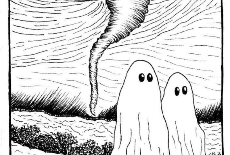
9. Two Tornado Ghosts : Welcome to our first
project two tornado Ghost. So this is the simplest
of all the project, and the main theme
of this project will be two ghosts and a
tornado in the background. So let's start
with sketching out the guidelines for
our two ghosts, simple basic seeps
for the ghost. One will be a bit larger, the other will be a bit smaller. And I'll only be creating the very simple
versions of the ghost, only the eyes, no
hands or mouth. Feel free to make adjustment. If you want, you
can add the hands, eyes, mouth, and
even more details. For the background, I'll be adding the tornado, as well as a small river and
grass on the background, as well as in the front, too. For the front, you
can add more details. Like in here, you can
add wall or fence. Here, too, you can
add electric poles. The choice, Yo, these
are just for examples. I won't be adding the wall or bricks in the
front or the fence. Now, let's do the
outlining for the river at the back and the two rows of the grass
that we'll be having. It's divided into two sections, and this is the
basic and this is the basic funnel shape
for our tornado. And as we move away from
the center of the tornado, we'll be creating somewhat of different kind of
lines for the sky. So this is just a
rough pencil sketch. Feel free to make adjustment, change saps gs or
add more elements. Let's go in with
this fine liner. Here I'm using Sakura
Micron, fine liner. Feel free to use breast pain or any other paints you have. Let's go over the outlines of the ghost that we
have created in here, not uniform or straight line, somewhat of organic
lines like this. Let's do the outlining
for the second one. This two ghost are
the main subject for this first project. Apart from these two goes, the second subject
matter will be the Tnendo at the background. Let's add the Let's add the
tiny eyes, small circles. And if you want, you can leave a little bit
of white for the highlight. But I'll be covering most of
the whites with the black. You can add the mouth,
hands, and yeah, I'll be adding the details for the bed sets or the
drives later on. So for now, let's remove
the pencil sketch, and we will move on to outlining our Tnendo at the background. Now, let's divide
the background into different sections
three sections. This will be the place where
the Toneto will be present. Now let's do the outlining
for our tornado. Basic funnel C a bit more curvier than we practiced
in the first part, and the detail for
the other side. This is somewhat
more detail than the one we did for
our first part, and the same kind of line a little bit of curvier lines
using hatching technique. If you want to make it a bit
more dark and more detail, you can use the
cross-hatching too, but I'll be using only
the hatching technique and yeah lines of varied length and the specing is somewhat uniform throughout the whole funnel
for this tornado. So this process will take
a little bit of time since we'll have to cover a
large portion of this funnel, not a lot, but the
whole portion. If you want to make it a bit more darker and more dynamic, you can go in with the
brass pins and create dynamic lines lines
of varied thickness. And the process will
be much faster. But for the first three project, I'll only be using the
micron pen mostly, and a little bit of rust
pen for the last one, one with the doodling. Let's continue with adding the lines for our funnel
for this tornado. As you can see, I'm
adding a little bit of more lines on the left side as compared to the right side, so as to provide a little bit of three dimensional see or a curve C for the funnel
for this tornado. Let's continue with
adding more lines. For this narrower section, we'll have to be a bit
careful and create even more smaller
lines for the tornado. Apart from this tornado
and the two ghost, you can add the
electric pole that I was mentioning fence in the front and you can also add one or two
houses in the background. Apart from this, you can
add the silhouette for the crows or you can add the silhouette for the
bats flying around. And with these, we are done with our funnel for the tornado. Let's do the spiral
C for the tornado. So just encircling this
funnel sap and creating lines and creating
lines of varied length. Also for this spiral sap, I'll trying to keep
the thickness of the lines same but
wearing the siges. So yeah, let's
continue with adding the lines encircling
this circular funnel. For the upper section, I'll
preserve the circular see. But as we move
toward the horizon, I'll be making it a little
bit open and then I'll making it somewhat
straighten s to sow the sky. Try to maintain somewhat of the uniform spacing
in between the lines, vary the length of the lines. The consistent thing
for both the torno and the spiral is the distance
between the lines, the spacing, as well
as wearing the, as well as wearing the
length of the lines. For the final seep,
we had curved line, but here we have
somewhat circular lines for this spiral seep
of the tornado. This will take a lot
of time since we have got half of the piece to cover
with this kind of lines. Also, as you can see for the
other side of the tornado, that is the spiral seed that
lies behind this funnel, it's somewhat denser, since I added a lot more
lines in there and I decrease the spacing to create that
region a bit darker. So for that region, add a little bit more lines
to make it a bit more darker. And with these we are done
with the top the spiral C. Now I'll be creating the
lines following this manner, a little bit of VC, or you can see check mark C. So to represent
the rest of the sky, here I am creating
straight lines. The spacing is somewhat
uniform, not that much uniform, but as we move
towards the horizon, I'll be increasing the spacing, and here too, I am creating
lines of varied length. Following the contour of
the outlines and let's add a lot of lines for
this whole region. One. After finishing this tornado and the
rest of the sky, I'll move on to inking the grass for the background
and for the foreground. Then we have two more. Then for the front, I'll have two different
kind of leaves, grass or you can see rubs a little bit more detail
than the other two. And as for the water body
or the river flowing, I'll be creating
simple lines and a little bit of spiral
waves like pattern. So yeah, let's
finish this and we will move on to the
rest of the painting. Also, I'll be adding the
shadows for the two ghosts. And we have got a
little more lines to add for this region, and then we will add lines
for the rest of the sky. So as I mentioned for the sky, I'll be increasing the spacing, and the sky will be
a bit more faster. Now let's completely fill
the rest of the sky with the straight lines and I'll be increasing
the spacing in between them to
make this region a little bit of lighter to make this region
of a bit lighter sad. Now you can clearly see how important role the
specing plays. The farther apart the lines, the less denser and more
lighter it appears. The closer they are, the denser and more
darker it appears. Now for the remaining sexon, I'll increase the
spacing further more. So to make it the lightest
of all the sky region, more spaced out lines for
the remaining region. Apart from this kind
of line for the sky, we can also create cloud seeds. So I'll be continuing to
add the lines later on. But before that, let's add
the outlines for our grass. Here I'm using
hatching technique to create the outlines
for the grass. If you prefer you can
create more detailed one, but I decided to create
very simple ones. Since this is our first project, adding the hatching lines
in between the two goes, now let's add the hatching
line on this side. And with these, we
are done with it. If you want to make
it a bit more darker, you can add another row of
hatching lines on top of this. Now, making it a
bit more darker, adding another row
of hatching lines, thus converting this
into cross-hatching. Now, let's create the
bank on the other side. So once again, using
hatching technique. But here, I am placing the lines a little bit more closer
to each other to create a bit more darker tones for this grass that is in forefront, not in the forefront, but on
the other side of the bank. Let's add the hatching
lines on this side. And yeah, we are done
with this for now. Let's add the pattern. Let's add the straight
and curve lines for the water body. You can consider this to be a
pond lake or flowing river. Simple straight lines and
a little bit of curb and circular lines to sow ripples
on the water surface. Let's go over the outline
of the grass to make a clear distinction between
the water body and the grass. So for the top section
of this grass, I'm adding a little
bit more color, a little bit more ink to create a distinction
in between the rest. Adding it on the other side. And let's continue with adding the texture and the pattern
for the water body. And with these, we are
done with the water body. We have only got the front and adding a little
bit of more lines to darken the weaver bank. And with these, we are
done with the background. Let's add details the folds for the clothe of
this bedsit ghost. So fine lines,
simple fine lines of varied length to create the
folds for our bedsit ghost. Let's add the line
for the second one, simple plain lines
of varied length. For the upper section, the
lines are a bit smaller. As we move downward, the
lines are a bit larger. Let's create the shadows
for the two ghost. So here I am using sading
or you can see hatching, adding more lines near the ghost and as we move
away from the ghost, I'm making it a bit
lighter in side. And with these, we are done with the sados for the two ghosts. Here I'm creating leaves like pattern for the
grasses in front. So yeah, let's create
this kind of pattern for the leaf that we
practiced in the part one. Simple leaf like seeps for the strus that is
present in the front. So I'll be adding this kind of leave on both the sides For the lower regions
of these leaves, add a little bit more lines
to make it a bit darker. And yeah, just very simple, very simple seeps of the leaf, a little bit more a little
bit more edged as compared to the natural seep and add few more leaves here and there wherever you think
it's required. And instead of the small
strp in the front, you can make it a bit
larger and bigger. Et's add it on the other side, simple plain seeps
for the leaves. And for this side, I'll be making it
a bit smaller as compared to the one
on the left side. And with these,
we'll be done with our very first simple project. You are free to make adjustment, add elements or
subtract element. And this was the first and the very simplest
of all the project. For the second one, we'll be adding a little bit more detail. We'll have washed our more grass and different kind
of background. Adding a little bit
more details for the clothes of the midst ghost, making it a bit darker
near the bottom to create a clear distinction between the shadows and the
clothes of the ghost. And with these, we are done
with the first project.
10. Ghosts in front of old building : Welcome to the second project. Here, too, we have
got two ghosts, and this time we are in front of the old castle or you can see
WatchTower or lighthouse. I have divided this project
into three sections. This is the front in which
I'll be adding the grasses. This will be the middle section where we'll have shrubs and plants as well as the cachel
and for the background, we'll have the trees. The shadows of the trees. I'll not be making
the detailed kind or defined kind of trees, just simple shadows
for the trees. So this is the shrub that
I was mentioning about. I'll be creating the leaves
that I did for the first one, and here's the castle. You can consider this as
a castle or old welding. Add a little bit more detail and definition to the
outline for this one. This will consist of two
windows with six pans. You are free to make
adjustment chain siges and the placement of the ghost, the tower, and the
remaining thing. So this will be a little bit extended portion
of the castle. For this portion, we'll
be adding more details. Now let's create the outline for the trees in the background. I'll be adding the outlines
for the windows later on. Here I'm going in
with a fine liner, sakura micron to do the
outlines for the ghost. The main subject
of this project is the two ghost and the
tower at the background. You can add more details. And with these, we are done
with outlining the two goes. Let's do the outlining
for the rest. So going over the outlines of the strubs that is present
behind the two goes. For the forefront,
we have grass, then we have serubs and in the
background, we have trees. Doing the outline for the
building in the background. So for the outlines
of this building, I'll be going over the outlines two or three times to make
it a bit more darker. Let's do the outlining for the extended portion
or this kind of details that we have got
for this old building. So you can see I'm not creating
street and uniform line. I'm just creating the
lines organically, going over the lines again and again till I get the endpoint. Now let's add the eyes, very simple eyes for
these two ghost. If you prefer you
can add the mouth. If you prefer you can add the
mouth or add more details, but I'll be keeping it simple. As for the folds, only a few folds like this
for these two ghosts. You can add more detailed folds, but I'll be keeping it simple. Let's do the outlining for
the trees at the background. Here I'll be creating
same kind of gradient that we practice
in the first part. For the lower region, it
will be a bit darker. And as we move upward, I'll be increasing the spacing and making the tone
a bit lighter. Comparatively more lighter. Now let's move on
to the forefront, the grasses and forefront. A lot of lines to create
the grass in the forefront. And instead of this
kind of simple lines, you can create dynamic lines. For that, you'll
have to go back and forth to make the lines
a bit more darker. But here, I'll be using
only the micron pen. If you prefer you can go in with the brass pen to
create dynamic lines, and we are done with
the grasses for now. I'll be moving back. To add
more details and more lines. Let's do the rubs, that is, let's do this rub that lies
behind these two goes. So the seeds of the leaf like we practice
in the first part, this is somewhat
different from the leaf that we did for
the first project. The leaves we not that much
detail in the first one. I'll be creating the leaves
in this manner for the scrubs and let me show you how I'll be creating the
background trees. As I mentioned, I'll be using
this hatching technique. For this, I'll be using the
hatching technique like this and for the lower
regions of the trees, I'll be making it more darker. With less spacing. As we move upward, I'll be increasing the spacing
in between the lines of this hatching and just decrease the intensity to make
the tone bit lighter. So this is how I'll be
creating the forefront, the middle, and the background. Let's continue with adding
the leaves for our stubs. And this will be
taking a lot of time. And for some of the section
that is too much repetitive, I will escape that part or
I'll increase the speed. So the whole video
is not in real time. It took me around
30 to 35 minutes, but the video is in 20 minutes. So I have escaped
some of the section, as well as increase the speed
of some of the section. I have not increased
the speed that much twice the normal speed
for some of the section, not all so yeah, let's continue with adding the leaves for the
entire section. To create a clear
distinction between the leaves and the trees
at the background, you can do the outlining. You can do the outlining
and make it a bit more bolder and more darker,
which I'll be doing it. But later on for now, let's add the leaves
for the entire region. Place where the leaves made
with the tall grasses, make it a bit more darker, use hatching or cross
hatching to create a bit more dark intensity
tones for that region. Let's add the leaves
for this region. Creating leaves carefully on
top of the second ghost head let's continue with adding and completely filling the entire
section with the leaves. Instead of the simple
building that I'll be creating in the
background, later on, you can make it a bit crumbled or broken windows or
no windows at all. So feel free to make
changes with the building. And instead of drawing
this building in front, you can create castle and less detailed and
only the silhouette of the castle in the background that will
be interesting too. And we have got only a little bit more poison to
add the leaves to. So let's completely fill this entire section
with the leaves, and then we will move on
to the background and adding more lines for the tall
grasses in the forefront. Adding it carefully in
between the two ghosts, so we don't want the
leaves to overlay. We don't want the leaves to cover the sections of the ghost. And as I mentioned earlier,
for the lower regions, the place where the tall
grasses meets the leaves, I'll be making it a bit more darker using hatching or cross hatching or adding more lines
to make it a bit darker. Like here I'm doing it. So this is a bit time
consuming process since we have to add
this much tiny details, and it will take
a bit more time. Doing the same thing in here, making this region a bit darker, and continuing on with
adding small leaves. Since this process
was repetitive, I added the leaves on my own, and now I am making the lower regions of this srub a bit darker by
adding more lines to it. And as I mentioned earlier, that for the outlines
of the leaves, I'll be making it a bit darker. So as you can clearly see, for the upper section of
the strubs of the leaf, I made it more darker
and more bolder. Here I'm adding more lines for the grasses
in the forefront. So for the grasses that
are in the forefront, I'll be making it
a bit more darker. And as we move
towards the ghost, I'll be making the intensity S. As we move towards the ghost, I will decreasing the
intensity of the lines. What I mean to say is that for the tall grasses
in the front, I'll be adding more lines to it, and as we move
towards the ghost, I will be decreasing
the number of lines. Let's continue with
adding more lines for the tall grasses in the front. Yeah, this two will
take a little bit of time since we'll have to
add a lot of tall grasses. Instead of the stall grasses, you can add fans in front of this that will save you
a little bit of time, or you can create
valves that will cover most of the
section of this grass. Yet to make it a bit easier,
you can choose that. Adding more lines for
the grass in the front. For some section of the
grass near the ghost, I'll be making it a bit more darker as compared to
the other sections. We'll have to move back and forth until we are
satisfied with the kind of grass we are
creating for the front. And yeah, also, we'll have
to move back and forth to create a
consistency in between the three layers of the
grass, the trees, the grass, and the tall grass
that we have in front, consistency in between them, that the intensity
of the colors should be a bit contrasting and
different in values. Otherwise, it will make the whole composition confusing one. Let's do the trees
in the background. So as we move towards the
and as we move upward, I'll be decreasing the
intensity of the lines, increasing the spacing, and also decreasing the
thickness of the lines. Carefully adding
these hatching lines near the top of
the first go head. Compared to the tall grass and the scrubs that
we just created, this is much more
faster and quicker. Let's continue with
adding the fine lines of decreased intensity to
complete the background trees. As I was mentioning,
I'll be adding two windows with six panes. And instead of this
normal windows, you can add broken
windows or no windows, or you can even add a big clock. I'll be creating clock
for one of the project. So you can experiment
with different kind of windows and add more elements. So we are done with the
trees in the background, add more lines wherever
you think it's required to increase
the intensity. You can only increase
the intensity, you can't decrease it. So we are done with the
grasses in the front, the strubs in the middle and
the trees in the background. Let's do the building. So for this here
I'm starting with this portion will be where
I'll be creating the bricks. I'll be adding the
bricks later on, but before doing that, let's do the outlining for the windows. If you're not comfortable, you can start with the
pencil sketch, but I think I'll be able
to create the windows, simple seats for the
windows, two windows So this is the first one, and let's create the outline
for the second one. For the windows, I'm not creating uniform
on straight lines. I'm creating this kind
of organic lines. So as I move forward, I add more lines to
the lines that I already used to create
this kind of window, a little bit of pattern
and textured window. Let's give a little bit
of depth to the windows. So this part is visible
and continue on with the bricks that we are creating somewhat same kind of bricks that we practice
in the first part. So completely filling
both the sides with this kind of bricks. Slowly and gradually, let's completely fill the
entire section, both sides of this
building with the bricks. Instead of creating
bricks for the valve, you can use brass paints
or watercolor paint to create textured pattern
or designs for the valve. You can use different
kind of strokes, scribbling marks or
stippling to create various pattern designs and different outlook
for the building. So feel free to
experiment and create different kind of valve or
pattern for this building. And with these we are
done with this side. Let's add a little
bit more lines for this side of the window
to make it a bit more darker. And for the outlines of
the sides of the building, I'll be adding a little bit more lines to
make it a bit more darker to create
a bit distinction in between both the sides. Let's add the window pans. I'll be dividing this window
into six different sections. Here, too, I'm creating
organic lines. Let's divide the windows into
further two more sections. And with these, we are done with our first outlines
for the window, making the window panes a
little bit more curvier. And yeah, we are done with
outlining for the windows. Let's add hatching lines to
make it a bit more darker. So for the windows,
I'll be using the hatching line
in this manner. So if you prefer you
can use cross hatching, scribbling or even stippling. And with these, we are
done with the left side. I'll be adding the line for
the right side later on. But before doing that,
let's add lines and details for the rest of
the section of this side. So adding more lines to
make the regions bit darker since it lies
beneath the upper sections, adding a bit more lines
to so the bricks, a little bit more
detailed bricks in here. Let's create more detailed
bricks or brickwork in here. Let's move on to the other side, doing the same bit
more detailed bricks in here and for the
lower sections, adding fine lines to create
a bit of darker regions. And for this upper section, creating bricks like we did
for the rest of the building. Yeah, we are done
with this left sign. Oh, I forgot to add the
lines for the windows. So for this side, I'll be making it a bit lighter instead. So as we move from
the left to right, I'll be making it a bit lighter. So less lines, increasing
the spacing in between the so less lines and increasing the spacing
in between the lines. So the left side is a bit more darker as compared
to the right side. We are done with the left side, let's do the same
for the right side, starting with the bricks. Before doing the bricks, I
decided to do the windows, adding more lines to the window to give it a three
dimensional s. And yeah, we are done
with the organic lines. Let's add the window panes. Let's add the window pans. So dividing the whole window
into six different sections. And we are done with
the four section. We have got two more sections to add another straight line. And with this, we are done with the outlines for our windows. So this is a speed up part. So let's add the
bricks for the rest of the tower and you can pause the video
and do it on your own. So since it takes a lot of time, so I decided why not
let's speed this process. Completely filling the
entire section with this brickwork If you want, you can make the
brickwork uniform, but I decided to
create this kind of natural texture for
the brickwork since all the bricks are
not that much clearly visible and we are done
with the brickwors. Let's do the seating or the
hatching for the windows. Same kind of hatching that we
did for the first windows. So for the left
side, I'll be using more hatching lines and the s piecing will be less
and for the right side, I'll be increasing the s piecing and decreasing the intensity. The distinction between
the outlines of the window and the hatching
lines were not that clear, so I decided to add a
little bit of more lines to make the window panes
a little bit more darker. And with these, we add
them with the windows, add more lines wherever
you think it's required. In here, I decided to add few more dark lines for the tall grasses that are
in front of the ghost. So yeah, adding a few more
lines for the tall grasses. And with these, we are almost
done with the project. Add more lines where you
think it's required, increase the
intensity of some of the portion where you think
it should be much darker, like in here, adding more lines in here to make
it a bit more darker. And yeah, we are done
with our second project. I'll see you in the next one.
11. Ghastly sea: Welcome to the third and the final project
of the part one. So for this one, we
have got a C of ghost. I named it a C of
ghost since I'll be creating a lot of
wavelike pattern. So that's why I name this
third project as C of ghost. What of the distinction
between this ghost and the rest of the
ghosts is that I'll be creating this ghost
in somewhat amoeba or bacteria like C, so not defined C. Not
that beats ghost like C, but somewhat similar to
random Cs of amoebas. So yeah, and we'll have lots
of ghosts for this one. I think the most number
of ghost for this one, and then the last project, the 12 project, Let's
create outlines, pencil sketch outlines for as
many as ghosts you prefer. Also, for this ghost, I'll also adding simple
and small hands. Most of the ghosts will
have smiling face. Let's add few more ghosts. And then we will create the wave pattern
and more texture, just like we practice
in the first part. I think I am satisfied
with the number of ghost. If you prefer, you
can add few more. Going with this micron pen to go over the outlines
of the pencil sketch. For this one, I'll be
using a little bit of the breast pen to create the outlines and to create the distinction in
between the different layers. I'll be using the bras pen as it will create a bit broader line, and that will help me
create distinction in between the different
layer and avoid confusion. In the beginning of
this part one, I said, I'll mostly be using
the micron pen. So only a little bit
of breast pain to do the outlining for
some of the sections. The rest will be the micron pen. Also, this project will
take a lot of time. It took me around
40 to 50 minutes, I think, since we'll have to create a lot of wavy pattern. So for some of the section, I have increased their speed, and some of the
section I have escaped completely as just we have
to do the repeated thing, creating the pattern, the wave like pattern and the texture. So for those time, you can
pause the video or you can decrease their speed so that you can follow
along with me. So let's continue with adding more ghost, outlining
more ghosts. Some of the things
that you can do to make this project
more interesting, you can use other color red ink, and instead of
this simple ghost, you can create other kind
of ghosts that we practice. Instead of this white ghost, you can create the black ghost. And instead of this
kind of pattern, instead of this
circular wave pattern, you can create something
completely different. So we have outlined
half of the ghost. Here I have increased the speed of the video, as you can see. So let's completely go
over all the outlines, and, yeah, we have got
seven or eight more ghosts. Also, to make it a little
bit quirky and fun, you can add
accessories like cap, sunglasses, necklaces, earpieces, headphones
and other things. So feel free to add
accessories element and make the ghost more quirky and make the ghost
more quirky and cartoonist. So we have got
only two more got. No, we have got only
three more goes, and then we will
move on to adding the wave like pattern
and doing the outlines. For that I'll be starting
with the brass paints. And here, we are done with the outlining of all the ghost. So this is in real time. Let's slightly erase all
the pencil marks. Okay. Before erasing the pencil mark, ensure that the ink has dried. Otherwise, you will
risk smudging. So lightly erasing
all the pencil mark, and now I'm going with the
Jig kurataki bras pin, creating this kind
of outlines to divide this ghost into
different sections. As I mentioned
earlier, I am using this bras pen to create
a bit broader lines that will help me in avoiding confusion while creating
the wave black patterns. So I'll be creating these
kind of lines throughout the whole page and dividing the ghost in
different sections. To make it a bit
more interesting, you can make the hands of the ghost on top of
the lines or below it. Feel free to do that. I'll be doing it for
some of the ghosts. And let's continue with adding these lines and
dividing the ghost into various different sections. Instead of the way blight lines, you can also create
straight lines, and we are almost done
with the half of the page. Let's increase their speed
and complete this whole page. To follow along with me, you can just decrease
their speed to half. Now here, I have
increased their speed and quickly complete
this whole page. You can also experiment with
hatching and cross-hatching. I'll be using the
hatching technique. So with the hatching technique, you can also use the
cross-hatching technique to make a bit darker tones for
the separating lines. And for the center,
I'll be creating somewhat ellipse
or random saves. Instead of that, you can create different or specific
pattern designs, et cetera. I did not outline
this, so outlining it. And with these we are
done with the outlining. Let's add the wave like patterns and hatching lines to
create distinction. So before that, I'll be showing
you some of the example how we'll be proceeding to
create the wave like pattern, random seeps inside the
different sections. So these are also
amoeba like seep or you can say bacteria like seep, small random seeps and let's
add few more random seeps. And then we'll be
adding more lines inside it and making it a bit darker for the inside as well as for the outlines too. So this would be enough now let's go inside the curvy
seeps and add random lines. As I mentioned earlier,
making it a bit darker, the outlines as well
as the outsides. I'll be creating
this kind of lines. These are somewhat
uniformly spaced. Also, instead of
the straight line, I'm also creating some dots
and this kind of pattern. Feel free to experiment
with various kinds of line. Also for some of the insights, I'm using hatching technique to completely fill it some section, not on the section,
this kind of line and encircling the circles as well as following the contour
of the outlines too. You get the rough idea,
but I mean to say, and we have also practiced in the beginning
of the part one. So we'll be completely filling the entire sections
of it with this. For the top, I used
hatching technique, and now let's continue
with inserting more of the random
shapes in here. As you can clearly see, I'm not only creating
the curve lines, but I'm also creating
a little bit of small and tiny lines that
are not connected properly. I'll also be going over
the outlines of the eyes, making it a bit darker. For some of the ghosts, I'll be creating this black
eyes and for some of them. And for the rest of them, I'll be creating another kind of eyes eyes with a little bit
of white for the insides. For this kind of lines, I'll be using hatching to
divide different sections. For this, I'll be using two or three rows of hatching lines. I'll be keeping
the spacing scene and I'll not be playing
with the thickness. Since this whole process
was so repetitive, I skip some of the part, not some of the part, but
most of the upper part of it. And as you can see, I used
hatching technique for the separating lines and fill the rest of the
section with curvy lines. And for the center, we have got a little bit rough
and darker sides. Now we have got about half
of the piece to fill. So yeah, let's do as
I mentioned earlier, if you want to follow
along with me, you can just decrease
the speed of the video or you can
pause the video. This is one of the
longest projects since we have a lot
of details in here, so it takes a lot of time. So this is the
normal speed of mean creating the wave like
pattern and the other where it seems that I'm creating the lines very fast
that speed up versions. Slowly, slowly and gradually filling the entire
section with it. So part of this project
is just like doodling, so you don't have to apply your mind or create consciously, just follow the contour of the outlines as well as the
inside seat and create it. So you can do it while talking
to someone on the phone or while listening
to their music or when you are feeling bored. Oh So after completing this one, we will move on to the Part two. That two consists of
the three project. And for the part two, we'll
be using the micron pain, but we'll also be increasing
the use of the bras paints. And instead of only
using this black paints, I'll be also using
the gray paints Grey bras paints or you can
use grey watercolor to create or add shadows or
use different color to create a bit of contrasting
image with shadows, more depth and
more complexities. A bit more complex
than the ones, and they will be
very fun to paint. Here, too, I have increased the speed to complete
this whole section. A let's completely fill
the rest of the sections. So we have here, we have got one,
two, three, four, five, six, seven, eight, nine, ten or 11 sections to fill. So as I was mentioning, you can play with
a different color. Instead of this white ghost, you can create the black
ghost that we practice. And also, you can
use red colour for the eyes or you can
create red colored ghost. You can also use red colour or red ink for the
weave like pattern. Some of the patterns
would have red colour or the distinct lines in
which we use the hatching, you can colour
those with red ink. And what else we
can do with this? As I mentioned earlier,
you can use accessories. Also, you can add crown
on top of the cost. And I'm not getting any ideas if you have got and more
ideas, let me know. So let me know that in the feedback and
suggestion section, adding the hatching
line to create the distinction between
these two sections. As I was mentioning, for the next project for
the next section two, we'll have one or
two project with this many weave not
wave like pattern, but street patterns,
stree lines like pattern, and that to will take
a bit more times. So this project took around
the most time it took me to complete a projectoss
around 65 minutes, and the least time it took
me was around 26 minutes. So the whole project, the 12 project
ranged 30-60 minutes on it might even take 70
minutes. Not sure about that. Let's be patient and completely
fill this entire section. We have got only
three more sections, and some of the outlines that I created with the bras
pin is not that clear, so I decided to make the
outlines a bit more bolder by going over it with the fine liner that
I have got in here. If you are satisfied with the kind of outlines
that you have got, you don't have to go over it. And if you are not, then just go over with the outlines or you
can use the darker sides of the brass pen to make the lines much more bolder
to increase its thickness. As after finishing this one, I decided to go over the
outlines with a black ink, black brass pen and
made the grey outlines a bit bolder and use the Kura thai brush pen to
make the outlines bolder. As you will see after
I finish this project, Now, let's go over the eyes, making the eyes bit darker, and we'll be doing the
same for the mouth, making the mouth bit darker
going over the outlines, making it more crisp
and more defined. So let's see how many
ghosts we have got here. So we have got one, two, three, four, five, six,
seven, eight, 19, 11, 12, 13, 14, 15, 16, seveteen 19, 20, 21, three, 24. I have got 24 ghosts in here. Let me know how many
ghosts you drew. We have got six more
goos to add ice to. So going over the outlines of the eyes, making it bit bolder, more darker, doing the
same for the mouth, too, and the hands too. And yeah, we are done
with this project. I was not satisfied with it, so I decided to go over
the outlines of the ghost, make it a bit more bolder
and more darker to create a clear distinction
to make a distinction in between wave like pattern of the background and the ghost. So using this breast
pain to create a clear distinction in between the ghost and the rest
of the background. Carefully going over
all the ghost outlined with this brrapen
making it bolder, darker and clear distinction in between the background
and the ghost. Instead of doing this
at the very last, I should have done
it in the beginning, but I was not sure
how it will turn out since I used a
lot of micron pin and the intensity of the ghosts and the background it somewhat
same consistency. That's why make it a
little bit more muddier. To cure it, I'm just going over all the outlines
with the black. I'll also be doing the
same for the outlines in which I added the
hatching lines, the gray outlines that divide the goes into
different sections. I'll also be going overdose
with the bras panes to make it much more bolder and darker to create a
distinction in between the And we have got only five more got to do the outlining for. If you want, you can add the black for the
insides of the mouth. Outlining for the
hand of this ghost. And yeah, we are done with
the outlining for our ghosts. Now, going back with
the micron pen to make the mouth a bit more
bolder and more darker, you can use the breast pin, but I was not sure
I was not sure to use the breast pin as it does not give me that much accuracy, and the seep of the mouth is much more small and more detail. So I choose to use
the micron pen. We are almost done with this third and the final
project of the part one. Feel free to make changes,
make adjustments, and add more lines wherever
you think it's required. So let's go over the outline
of the last ghost mouth, and we are done with
the third project. I was not able to record one part in which I went
over the outlines that I created with the grieves ping and made it a little
bit more black. So here's the picture of that. And I'll see you in the next
project, happy painting.
12. Part 2: Welcome to the second
part for this too. We have got three projects. This is the first one that goes in front of the farm yard, then we have ghost at
the windows and lastly, we have ghost in the forest. For this part, I'll
be showing you eight toteen examples of different things that I'll be
using in our main project. For the first one, that goes
in front of the farm yard. For this, I'll be showing
you the examples of how you can create
the wooden planks, the kind of texture and pattern that we'll
be creating for it, dark windows and
then different kind of grass and the ground. These are the outline for both vertical and horizontal
wooden planks that I'll be using for
our fourth project. Now, let's go over the outlines to make it a bit more darker. So here, going over the
outlines to make it a bit more darker and a
little bit more molder. And to create the texture, I'll be adding this
spire like pattern, one or two for each plank, depending upon the
length and the size. And then using this
kind of lines, lines of varied length and maintaining the
spacing in between them. So that's how I'll be creating the wooden planks for
our next project. Feel free to use other
kind of texture or strokes to create various
kind of the wooden blanks, but I'll be using this kind. Now, let me show you
another example. So let's go over the outlines. So when I use this kind of line, I prefer to call it like organic lines since I
had three or four lines. I call it organic lines. So let's add the
spirals and Once again, lines of varied length and maintaining the same
spacing in between them. Let's do another one. The goal here is to create the outlines distinct and then
lines to create the texture or pattern
for the wooden planks. Later on, I'll be using the brush paint gray brush paint to add it on the outlines to
make it a bit more darker. Now, let me show you the dark windows that I'll
be creating for this, I'll be using the hatching
technique and create a uniform kind of
background like this. Here you can see the
side is small and the spacing makes it
much more darker. So adding one layer
on top of the other till we completely fill this entire section
for the window. So I'll be using
this for some of the sections of the windows for our next project,
the fourth one. Feel free to use other
techniques, too, like cross hatching,
scribbling, or even stippling. But I'll be using this one. Next, we have got
grounds and grass. So I'll be creating
this kind of mounts on the ground and making
it a bit more darker and bolder to create to create distinction
in between each mold and adding more lines till we are satisfied with
the intensity of it. Yet, too, I'm using adding the organic lines and
this kind of grass. All the lines coming out
from a fixed center. So these are the kind of grass that I'll be
adding for the ground. You are free to
use other kind of the grass or you can make
it a bit more detail or even or you can even add leaves like we did
in our first part. To create a bit more distinction
in between each mound, I'll be adding or using hatching to add
seeding on one side. Generally, I'll be
adding the seedings on the right side to make
that side a bit darker. These are the
things that I'll be using for our fourth project. And now let's do the practicing
for our fifth project, the ghosts at the window. So this will be very fun to do. And I have divided
this project into two parts since the
video was a bit long. Now, for the windows
and the valve here, I'll be showing you how I'll
be creating the texture for the wall and the
coloring for the windows. The window will be
comparatively longer as compared to the one we
did in the last project. So instead of six panels here, I decided to go
with eight panels. The upper section of the
window will be a bit larger and the other six will
be of same length. Yeah, let's add the
dividing lines to create the eight different panels
for this long window. So this is the simple window, and as for the background
or as for the wall, I'll be using the same
kind of the lines that I used for the window up here. So for the wall, I'll be
using the same kind of the lines that I use for the
window in the upper part. But instead of making
it a bit darker, I'll be playing
with the spacing, making it a bit far apart and creating this kind
of lighter sides. Instead of this, you are free
to create other patterns, use scribblings or create
grades and seats for the val. Also, instead of this, you can go or add the texture for the bricks that we did in the last project, so feel free to experiment. And for the windows, I'll be making the windows
a bit more darker. In our project, I'll be making it complete black, but in here, let me show you darker windows, and as we move towards right, I'll be making it a bit lighter. Et's fill this
entire section this side with the black
and on the other side, I'll be using the
hashing technique and increasing the intensity
as I move from up to down. In the main project,
I'll be using the blacking to completely
fill the regions of the window as it will be a bit faster compared to
using the fine liner. Let's add this kind
of hatching lines. For the upper section
of each panel, I am adding less lines to
decrease the intensity. This are the kind of windows and the all that I'll be using
for the fifth project. Now, let me show you a simple demonstration
for the portrait. So simple designs like
this if you prefer, you can even create more
extravagant designs for the portraits or the
picture frames on the wall, but I'll be keeping it
simple few lines in here and there to create this
kind of picture frame. And inside this picture frames, I'll be adding black ghost. Let's create the inside frame
for this picture frame. So four petal
flower like inside. And now let's do the outlining
for the Black ghost. Completely filling
the entire section of the black ghost here
with the fine liner. In the main project, I'll
be using the ink paint or the watercolor brush to make
the process bit much faster. And as for the
eyes, you can leave a little bit of white
spiece from the paper or you can go in or
you can go in with a white ink or white
acrylic or gauze. X. And yeah, we are done with this
simple portrait or picture frame
with a black ghost. Apart from this for
the fifth project, we have a little bit different
kind of ghost like this, finger like projections
for the ghost. For this ghost, I'll be adding seeds of the
green for some of them, and the other will
remain completely white. So these are wavy finger
like projections, and yeah so these are the
kind of ghosts that I'll be adding outside the windows
for our fifth project. A simple beads like eyes. Feel free to add mouth
or other details to it, but I'll be keeping it
as simple as it is. And now for the next one
tree jungle, for that, I'll be showing you
three different ways in which you can create the trees. Before that, let's go in
with a brass paint to add grey for some of the ghosts. Instead of using the bras pain, you can just mix more
water with the ink or the water color to get this gradient or this sad
of the green for the ghost. Also, instead of this
gray, you can use black, red or other colors
for the ghost too. So the choice is for the walls and the wooden
plank, as I mentioned earlier, I'll be adding a little bit of different shades of the green on the outsides or
near the outlines, like here, to create more distinction in
between different planks. And for the mounts
on the ground, I'll also adding the
gray on the left side, the regions where the
regions where I have used the hatching lines to make that part a
bit more darker. Now, lastly, we have got this. For this, as I
mentioned earlier, I'll be showing you three
examples in which you can create the different texture
and pattern for the trees. So this is the first one, the type of tree that I'll be creating for our main project. Apart from this, I'll be
showing you two more one with a straight or a
bit curvier lines for the texture and the pattern. And this one will
be a combination of hatching lines to
create this kind of tree. Feel free to use any
of these trees or you are more than welcome to
create trees on your own. As for the outline, I'll be
making it a bit more darker, going over the lines to
make it a bit more darker. So for that trees of
our main project, I'll be adding this kind of circular somewhat
circular line for the horizontal and then using this small lines of varied length to add it on
the sides on both the sides. So I'll be keeping the
spacing somewhat seam, but just playing with the sides, making it a bit smaller
and a bit larger. Also, the lines are not
completely straight. I am using a little bit
of broken lines tune. Let me show you another example. Here, instead of the horizontal
spiral like pattern, I use the vertical ones and seam for the pattern
and the texture, vertical lines of varied length. So this is the second type
of tree that you can add. Now, let's do a third one. So here, I'll be using somewhat
of hatching technique. A lot of vertical lines
of varied length. And then horizontal lines. And the regions that you
want to make a bit darker, adding more lines in that region especially near the
edges of the tree. So near the outlined section, I'll be making them
a bit more darker. To do that, you will
just have to add more vertical and horizontal
lines for those sections. Like in here, I am
adding a bit more line for the lower regions and
near the trees branches. So yeah, these are
the simple trees that you can use for our six project. And here's another kind of grass that I'll be covering
the entire section, the ground section for
our sixth project. So I'm using this little
bit different kind of hatching lines to create the grass like pattern
for our main project. Feel free to use any
other kind of grass like the tall grass weed
or the trees in the background for
our third project. And with these, we are done
with this second part. I'll I'll see you with
the fourth project.
13. Farmland ghosts : Welcome to the fourth project, two Ghost on the farmland. This will take a bit
more time since we have got lots of lines to
add for our background, the wooden planks
in the background, and we'll have two ghosts in front that will
be our main focus. Let's sketch out the
outlines for our two ghost. So very simple saves
for the ghost. I'll not be creating
many details for the drips or the bed
set for this ghost. If you prefer you can add wavel pattern for the lower
section of the ghost, but I'll be keeping it simple this kind of simple
C for our two ghost. Now let's do the outlines, put the wooden planks
at the background. So I decided to create two
doors in the background. So two wooden doors, one on the left side, and
one on the right side. The the right side
one will be a bit larger and the left side
one is a bit smaller. So for the background,
I'll be using the combination
of both vertical, horizontal and two or three slanted wooden planks
like this one. And let's add the wooden
planks for the entire section. H Some of the process
are repetitive. So for those section, I
have increased the speed. So for the repetitive processes, I have increased the speed. If you want to join or
follow along with me, you can just pause the video or you can decrease the Video. Let's continue with adding the outlines for
the wooden planks. Instead of this kind
of wooden planks, you are free to use other kind of texture as I was mentioning in our second part that
instead of the wooden plank, you can add the bricks or
instead of the bricks, you can use other different
kind of texture or patterns. Let's add a little bit of different wooden planks for some of the cliques for
the background. Here's another horizontal plan. Now, let's add more straight
line for the wooden planks. We'll be adding
details later on, but let me show you the
beaks for our wooden planks. So this will be the
beaks, and for the front, I'll be adding the mounts
on the ground like this, the one we practice
in the part one, the one we practice
in the part two. So this is very simpler
version of the sketch. You are free to make
adjustment and changes. Using the fine liner to
go over the outlines. Here, too, I'll be
using the organic lines to go over the outlines, making the lines a bit more
bolder and more darker. But before that, here this I'm going over some of
the main sections, the horizontal wooden planks. And now let's do the
outlining for our ghost. We simplified see for our ghost, and for the mix of the ghost, I'll be adding more lines
and making it a bit darker. Also, for this ghost, I'll be adding a bit of black for their legs,
I think. So yeah. A lot of black lines in here for the legs of the two ghosts. And for the mound, just
simple seats for the mound. A lot many mounds on the ground, and on the sides, I'll be adding grasses. And on the left side, I'll be using the
hatching technique to create one side a
bit more darker. And also we'll be using the
Greek colour sketch paint. You can use watercolor
or ink to make the outlines a bit more
bolder and darker. So I'll be adding it over
the sides of the plank, the outlines section, and we'll be doing the same for
this mound in the front. Now let's move to the back and make the outlines a
bit bolder and darker. Here I have increased
the speed of the video, so you can just slow down the speed or you can
pause the video and yeah, let's go over all the outlines, making it a bit more
darker and more bolder, creating clear distinction in between each separate plank. And I'll be adding plaques
for this window, and Let's add more organic
lanes for lang. For this section,
I decided to add another And with these, we are done with
the wooden planks. Let's add the ice for our ghost. A bit different kind of ice, a little bit of white for the reflection for both the ghost. You can use other
kind of the eyes. And with these, we are done with the ice for our two ghosts. Now let's lightly remove
the pencil sketch. Ensure that the ink has dried from your paper and the
revile you will get smudgins I now here I'm going with a gray
brass pin or marker. So it's both marker and the
bras pain combined in one. So using the broader end to go over the
outlines on one side, here I'm using a darker
side of the gray. You can use the
watercolor or ink just diluting it to get this
kind of consistency. You don't have to even use exactly same kind of consistency
for the wooden planks. Feel free to use
other consistency or you don't have to
even add this kind of relines you can do with the
fine liner and just making the outlines of
each plank bit more darker to create a
clear distinction between different wooden planks. The lines are not that
much uniform or straight. Yeah, let's add
this kind of line with a bit more thickness, and for the vertical and
for the horizontal ones, I'll be adding a bit
more lines in here, too. And for this one, let's
add a bit curvier lines. And let's define
the ground with it. So this will be the best
for our wooden planks. Now here, I'm going
in with another sad, a lighter side of the gray to completely fill
the wooden planks. Once again, you can use
the ink or watercolor, the black from the watercolor, just diluting it to get this consistency
of the grey color. Also, as I mentioned earlier, you don't have to even use this. You can just make do
with the fine liner, you will have to add a
lot of fine liner to make different section
bit more darker. For this larger section
of the wooden plank, I'll be adding another
vertical plank and adding blacks
for the insides. Also, ensure that
the ink is dried, then add another layer, white, you will get smudges
all over the paper. Also adding the lighter side
of the ground for the front, so entirely covering the mounts that are present in the
front with this gray. Adding the same gray
for this ghost. Instead of using
the broader end, I used the thinner end to create a little bit of thinner
lines for our ghosts. Once again, using the thinner
tip of the brush panes. Let's go over the
outlines for the mount. Here, too. As you can see, I'm using the organic lines
to create the outlines, making it a bit more
bolder to create clear distinction in between each individual
mount in the front. And we are done with
the brush pins. Let's add spirals for
our wooden planks, and then we will completely fill the wooden planks for
the straight lines. I'll be completely filling each wooden plank with
this kind of lines, spiral pattern and then
lines of varied length. To make it bit more darker, you can add more lines, but I'll be keeping the consistency of the
wooden planks like this. Depending upon the length
of the wooden plank, I'll be adding more spirals
if the wooden plank is long, and for the smaller one, one
or two will do the work. So this is somewhat seemed
like the third project. Instead of creating wave like pattern here we'll be
creating straight patterns. So let's completely fill the
entire wooden plank with this kind of lines to get
this texture and the pattern. Here I have increased
the speed to completely fill each individual
wooden plank that we have got in here. And since we use varieties of and since we use
darker shades of the gray to create the outlines or go over
the uglier outline, the distinction between each individual wooden
plank is clear. Now for the small
window in here, using hatching line to completely fill
this entire region, if you want to make
it a bit more darker, add more lines, but I'll
be keeping it as it is. Yeah, let's continue with
adding more lines, spirals, and then straight lines of varied length for
our wooden planks. To make this background a bit more darker
and more intense, instead of using the fine liner, you can go in with
the breast paints, preferably using breast pains of dark intensity like
Jikuratak to make that outlines bit more distinct as well as the plank
more detailed and clear. Also with the breast pain,
you will get to create dynamic lines that will
be interesting too. But for this part, too, I'll be mostly using the fine liner and a little bit more bras
paints and the sketch pins or the highlighter that I used for the next three project, primarily using the fine
linen and a little bit of the crease to create
the three project. And with these, we are
done with this side. Let's continue with
the other side. The same straight
line of warn length and spiral pattern throughout
the wooden planks. First add all the
spiral patterns, and then we will be filling
the entire section with it. Since it was repetitive, I covered this whole
wooden plank on my own, and now we have got
only a little bit of the wooden plank
slab. So let's do it. We have got one, two,
three, four, five, six, seven, around
seven wooden planks. M. And as I was mentioning
for the other window, I added somewhat
slanted plank for it. So for that to, I'll be using vertical line. If you prefer, you
can use slanted line, but I decided why not. Adding the spiral
pattern for this one. And yeah, let's add the
lines for this plank. And for the ghost, as I
was mentioning earlier, I'll be adding more
lines for the mix, making it a bit more darker and carefully adding it near the ghost. Let's make the outline of the ghost a bit more
bolder and more clear to get a clear distinction between the background
and the foreground. You can use the bras
paint to do that. But I'll be coming
back to the ghost to add the outlines later on. For now, let's do this
horizontal wooden planks. As I was mentioning, you can use the slanted lines for this
slanted wooden plank, but I decided why not let's
add the straight lines. So this will be another window. So I'll be keeping these three
circles white, and yeah, let's completely
fill this entire region with hatching lines, the same kind of hatching
lines that we use for another window
on the left side. So small hatching strokes
to completely fill this region with a
bit darker color. And with these we are done
with the black windows. Let's continue with the
vertical wooden planks. Let's continue with the
horizontal wooden planks. And apart from this,
we have got one, two, three, and four, four more wooden planks to go. And then we will move
on to the front, the mounts on the
ground and the grass. The grass will be very simple. The one we practice
in the second part. So yeah, let's add more lines
for the four wooden planks. You can add more elements
to it like strups with the leaves that we did for
our first and second project. Then you can add big boulders or big stone in front of it. Apart from this, you can add
accessories to your ghost. And as for the ground,
instead of the sod grass, you can create the tall
ones like we did for the second project and you
can add more elements. So feel free to experiment
and come up with your own unique creations
for this fourth project. With these, we are almost done with our last wooden plank. And yeah, let's add a few
more line for this one. Et's make it a bit
darker near this region. And with these we done with olden planks for our background. Let's move to our ghost. And as I was mentioning, making the lower region of the ghost a bit more darker,
so adding more lines. Adding lines of varied
length for our ghosts. So let's do the
same for this first one for the lower regions, add more lines to make
it a bit more darker. And now let's add
the legs for it. So using hatching lines to create resemblance for the
legs for both the ghost. Let's do the same for
the second ghost, using hatching lines
to create this kind of resemblance of the leg
for this second ghost. And yeah, we are done with the And with these, we
are done with the ghost. So I was not satisfied with some of the sections
of the wooden planks, so I decided to add a
bit more lines in here. Now, let's do the mounds
adding grass on one side. Adding the grass for
each individual mound. Also, I'm going
over the outlines that we did with the gray. So making the outlines a bit more darker
and more organic. Instead of this small grasses
for the corner regions, you can add or completely cover this whole region
with the grasses. O. And, let's continue with adding more lines over
the outline and adding more grasses for the mound
or the ground in the front. And apart from this grass, I'll also be adding the
hatching lines on one side. For this project, I'll be
adding it on the right side. Adding the hatching lines. I'm not making the
sides more darker. If you prefer you can
make it more darker, increase the number of the lines and decrease the piecing. And with these, we are
almost done with the ground. Add more lines or more detail wherever you
think it's required. But I think we are done
with the outlines, the hatching lines
and the grass, moving back to the ghost to make the outlines bit more
clear and more crisper. So to create a clear distinction
between the background, the foreground, and the ghosts. Making the lower regions
a bit more darker. And with these, we are almost done with this fourth project. Feel free to add
more lines or create more dark texture wherever
you think it's required. Let's add some final touches wherever you think
it's required. So I decided to add a
little bit more lines for some of the wooden planks. Let's make the
windows a bit more darker as it was not that much darker as compared to the other window that we
have got in the left. So using cross hatching, so adding the horizontal
lines on top of the vertical lines to make
it a bit more darker. Let's make this blank
a bit darker, too. And with these, we are done
with the fourth project. I'll see you in
the next project.
14. Ghosts at the window a: Welcome to the fifth project. So this project is a bit longer, so I divided this
into two sections. For the first section, we'll be doing about three
fourths of the project, and then for the next one, we'll be completing it. Let's start with drawing out
the outline for the window, a very large window. So there will be two
windows for this project. And apart from that, well having a big clock and three
picture frames. A lot of ghosts will be peeking inside the
window from the outside. There will be eight panels
for both the windows, and, we are done with the
outlines for the windows. Feel free to change
the seats sides and the placement
of the windows. Instead of making the
windows this big, you can make it bit smaller or instead of this two window, you can only create
a single window. Let's do the outlining for the three picture frames
that we have gotten here. The three picture frames will
be below this upper window. Instead of this kind
of picture frame, you are free to use or create different kinds of them,
different different positions, feel free to experiment
with varieties of picture frame or instead
of this picture frame, you can add the
mirror and you can experiment with
different kind of monster or goes inside
the mirror, too. This two will be the
smaller picture frame and the one let's draw oval C, a circle C for the
big clock and here. So this is the basic
pencil sketch for it. We'll be adding more details
with the outline here too, I'll be mostly using
the fine liner to do most of the
detailing work, and then we'll be using
the Bs pin or you can see the grey highlighted that I have got to add the
colors, the green seeds. Let's define the windows
a little bit more, so this will be the lower
regions of the window. A little bit of a smaller
plate fan for both the window. For this, I'll be using somewhat of cross hatching pattern
for the sections. We are almost done with
this pencil sketch. So feel free to make some
adjustment as you see fit. Now, let's go in
with the fine liner. Here, I'm using
the sakura micron, fine liner to go over the outlines that we just
created with the pencil. For the ends of this window, I decided to create
this small saps, which we'll be adding
more details to later on. Let's continue with
the outlining. So you'll have to be a
bit careful in here. Here I'm not creating
the organic lines, precise lines for the
outlining of the windows, the clock and that three picture frames that
we have got in here. If you are not that confident, you can use the ruler to create
if you're not confident, you can use the ruler to
create the straight lines. Now, let's do the outlining
for the picture frame. Here I decided to ship the picture frames
a little bit up, and, yeah, we are done
with the basic outlines. Let's add a bit
more details to it, starting with a larger
window at the top. For both the windows, I'll be adding the eight panels. Feel to change the number. And yeah, let's Let's do the outlining
for this big clock. For this big clock,
I'll be adding a lot of designs to make it
look vintage and old. Let's revide the clock into
four section that will help us do the outlining for the designs that
we want to create. Feel free to create any
designs of your preference, or you can just follow
along with me and create the kind of
design that I am doing. So just simple lines and simple curve seeps
for this clock. After finishing this,
I'll be going in with the fine liner
to do the outlining. And 4:00, I'll be
using lots of green, a bit darker sets of the grey. Let's continue with adding a little bit more designs to it. So this is the basic design later on I'll be
making it more detail. Let's do the outlining for the intersection of this cloak, and then we will go over. Then we will go
over the designs. So for the center, I decided to create this square like pattern. Let's go over the designs. Here, too, I'll be adding lots of grade to make it
a bit more darker and create distinction between and to create distinction in
between the wall and the clock. Let's create more designs to it, a bit of square see. Let's create heart
like seep using this triangular Sp. But. You can keep it as it is, or you can continue
with me to add more designs to this clock. And we are almost
done with this. Let's add a few more curved
lines for this clock. And the last one. And
for the insides tool, let's create this
kind of pattern instead of the numerals. Half moon like saves
for the inside too. Now let's add the numerals. So we have got one, two,
and three and four. So a bit of cryptic old clock
that we have got in here, and let's create the
hands for the clock. Simple hands for our clock. You can play with it and create other kinds of
hands for the clock. So yeah, we are done with
the basic outlining and the designing for our
old clock on the val. Feel free to make adjustment, and yeah, we are done with it. Okay, I forgot to do the
outlining for this one. Let's do the outlining
for this one. Adding a little bit more
design to this bottom part. And yeah, we are done
with this old clock. Let's do the outlining for our frames, adding
designs to it. So here I have
increased the speed. So I'll be creating some
much simpler design for our picture frame, much more simpler than the
one we did for our clock. So very simple seats for
our picture frames in here. We are done with the
first picture frame. Let's do the same for the
other two at the bottom. Feel free to use or create different designs for
the picture frame. And, we are done with the
three picture frames. So we have got the clock, the three picture frames. Now, let's slide in the pencil marks before
proceeding further. Instead that the
ink has dried up. Now let's complete our window. So going in with the
pencil to divide the windows into eight
different sections. The upper section will
be a bit larger and the remaining will be of
somewhat same length. So I'll be dividing the windows into
eight different pans, vertical line to divide it. Vertical lines to divide
it into two sections, and yeah, we are done
with the pencil sketch. Let's go with the pin. Once again, if you're not comfortable with
directly using the pin, use ruler to create
straight lines. For most of the outlining in here for this project,
I use the fine linen. If you want to have
dynamic lines, you can use the brass panes, or you can use the
watercolor brasses. Let's do the outlining
for this second window, the horizontal lines
for the window pans. And yeah, we are done with
the horizontal lines. Let's do the vertical ones. Instead of creating this
vertical line in one go, I just divide it into
different sections to make it bit more easier and to
keep the line straight. As you can see, both the windows are a little bit different. If you want to create exact
same replica of the windows, you can use the ruler to create windows of same
length and width. We are done with the outlining for the panels of the windows. Let's create the ghost
finger like projection, a little bit curvy finger like
projection for the ghost. You are free to add as
many ghosts as you prefer. For this one, I added six ghost. For the next one, I
added seven ghosts. And for some of the ghosts, I'll be using the grey color, and the remaining of them
will be white colored ghosts. I'll not be adding the
mouth or the hand. If you prefer, you
can add the mouth, the hands, and other
accessories to the ghost. But I'll be leaving it as it is, and I'll also not be adding details for the
drapes or the clothes. And we are done with these
simple outlines for the ghost. If you want, you
can add a few more. Let's add the eyes for it. So simple circular
seeps for the eyes. Later on, I'll be making the eyes a little
bit more darker. But for now, let's do
the simple seeps for. But for now, let's just do the
simple seeps for the eyes. So we have got a total of 13 white and gray ghost for the windows and for the
picture frame, I have created. And for the picture frame, I'll add five for the bigger one, and for the other remaining two, I'll be adding three and five. So a total of ten black
ghost and hurting, white and gray is ghost. So a total of 23 ghosts. Let's add the eyes for
the last ghost in here, and yeah, we are done with the outlining for the
ghost and the eyes. Let's do the val. So using the hatching
lines to create the val. So same kind of
hatching line that we practiced in the part two. Here, as you can see, I'm
not making it darker. The spacing is less and
also the intensity. Feel free to use other
lines or other techniques or strokes to create
different kind of pattern or texture
for the wall. You can even create the bricks or you can leave it as it is, or like the earlier one, you can add the wooden planks to it. Or you can entirely
cover the wall with different accessories and
other various elements. Or you can even create
or add patterns and design as the wallpaper
for the wall, a combination of black
and white to create some beautiful pattern
and texture for the background for
the wallpaper. And this was a
repetitive process, so I did the wall on my own. So here I have only got a little bit of section
to complete this wall. So as you can see,
I have maintained the scene spacing for it, and I have not made it dark. And with these are done with these we are
done with a valve, let's move on to the window. For the lower section for the lower regions
of the window, I'm making it a bit darker, so using the vertical, so using the horizontal lines to completely fill this
entire section with it. I'm not making it a bit darker. If you want, you can make
it a bit more darker. And for this region, let's create somewhat of
cross hatching in here. A cross hatching with
a lot of spacing. The lines are of varied length. Yeah, let's create this kind of square pattern for
both the windows. Moving on to the second one, you don't have to stick with the same kind of pattern
that I'm creating. You can create the
appearance or resemblance of the brick or you can add different kind of
pattern or texture. With this, we are done with
this section of the windows. Let's move on to the rest of it. So with the background
of the windows, I'll be completely covering
it with the black. Here I'm using the Zig kuratake
ink and watercolor brush to make this process much
more quicker and faster. But with the bras pin or
the watercolor brush, you'll have to be
careful since you don't have that much precision and control as compared
to the fine liner. Adding it carefully in between the ghost and windows panels. Slowly and carefully
completely filling the entire section of
each windows panel with this dark black Apart from this, to make it a bit
more interesting, you can even add branches. So instead of using the black, you can create black branches that is visible from the window. So that is one of the
suggestion that you can use. And apart from this, what
else you can do? Let me know. And yeah, let's
continue with adding the black for the
remaining window panels. Here, as you can see, I
have increased eye speed, since this is a bit
slower process, so that's why I did it. So if you want to
follow along with me, just pause the PD or you can
just decrease eye speed. For all the project, I
only use the black color. To make it a bit more
sinister and more creepy, you can use sads of the red
or greens or even the blue. So you can add sinister
ice or fog with the green or with the red
or even with the blue. So that will be a
little bit more interesting and more fun to do. But I decided that I'll only be using the black color
for all the projects. And with these, we are done
with the first window. Let's move on to the second one, completely filling each
individual window panels with this black ink. Also, for the other windows that we did in our
earlier project, you can use cross hatching
or hatching to create a darker regions of art thickness or create
gradient for the windows. So I did the rest of the
window panels on my own. And yeah, we are done
with the windows. Let's create the black ghost. So once again, I'm using
the watercolor brush to create very simple person or
simple seats for the ghost. So here we have got
the black ghost. If you are using
the fin layer or the brush paint to
create this Blackhost, you can leave a little bit
of white for the eyes. But here since I am using
the watercolor brush, I'll be adding the eyes later
on using the white ink. For this picture frame, I'll
be adding five black ghosts. If you prefer instead
of this ghost, you can add any
other pattern design or can even create
landscape painting. Feel free to add any other thing inside
this picture frames. And for the remaining
two picture frames, I'll be adding three
and two Black ghosts. We are done with the five
ghosts for this one. Now let's move on to the
other two picture frames. You don't have to add the ghost the way we did for
the first one, so upside down ghost
will do the work too. So in here, we have got
one upside down ghost, and the remaining two will be the normal normal black ghost. Also for the colors
of the picture frame, you can use right. In here, I'll be going
with the darker shades of the gray for the background
of the picture frame. Also for the walls too. I'll be adding a
little bit of green for the upper section
of the hatching line, that section that is a
bit darker for those, I'll be adding the grey. Adding the black
ghost carefully, and let's add last the last Black ghost
for our picture frame. And with this, we add
with a black Ghost. If you want, you can add
few more black ghost. Let's add one more
ghost in here. So that makes it a total
of teen black ghosts. Since the Black ghosts
are a bit smaller, you can use since the Black
hosts are a bit smaller, you can use fine liner to
create precise Black ghost. But since I was using
the watercolor bus, so I decided why not let's
create it with this. Earlier, I was
seeing that I have added the five ghost
for the upper frame, but it was only four, so
adding one more black ghost. And with these, we are
done with this section. In the next section, we'll
be completing this project.
15. Ghosts at windows b: Welcome to the second part
of the ghost at the window. So here's a quick recapitulation of what we did in
the first section. Here I have increased
the speed of the video. It's I think around 20 X. Feel free to make adjustment, and for this section, I will be mostly
adding the gray color. I'll be using the breast pin that I have got the
dual tip bras pin. I'll be using two
or three sheds of the green for the
valve, the clock, and some of the ghosts feel
free to use watercolor or ink by diluting its consistency to get different
sides of the green. Also, you don't have
to use the green. You can just increase
the intensity of the sum of the saxons that I'll
be using the gray too. So feel free to
skip this section, and for some of
the saxan I won't be adding any greens
or any lines like the outlines of the windows and the clock and for the ghosts. So we are almost done with
this speed of worsen. Then we'll move on to
our ink illustration. So Yeah, we are done
with the recapitulation. Let's continue with
where we left off. So here, I'm using the
darker side of the grey. Let's completely fill
this entire section with this darker
side of the grey. I'll be adding this for
the outline designs, too. Let's add it for the
outline designs, too. Not for all the region,
but for some of the regions,
specifically in here. And if you want,
you can add it for the semicircles that we have
got, but I'll be leaving it. But I won't be
adding it for that. And yeah, we are done
with the coloring for our clock, and later on, I'll be using a little bit
of white for the inside, but for now, let's add the
colors for the picture frame. So instead that
the ink has dried, otherwise, you will get a
little bit of smudging, like it happened in here for this last ghost on
the upper frame, carefully adding it for the
second and the third frame. Instead of this darker set, I should have used
a bit lighter set on the green for
the picture frames, but okay, it's okay. And we are done with the
clock and the picture frame. Let's add the color for the aw. So before doing that, let's make the outline for this picture frame a
little bit darker and a bit more detail to create a clear distinction in between the all and the picture frame. So going over the outlines, making some of the Saxon
a bit more darker. Here I'm using
Zikkurataki bras pin. Let's do the same for the
remaining two picture frames. Here, we don't have
that many designs, so just simple square for the outlining of these two
simple picture frames. And with these, we are done
with the picture frames. So let's do the
outlining for the eyes, making it a bit more bolder. I'm not comfortable
with the brass pin, so I'll be going in with the file to make the
eyes bit more darker. So using the fine to go with
the outlines of the eyes, making it a bit more darker. For the eyes of the Black Ghost, I'll be using the white ink. And with these, we are
done with this six ghost. Let's move on to the
other seven ghosts that we have for
this second window. I'm not adding the
mouth to the ghost. If you prefer you can do that. And with this, we are done
with the ice for the ghosts. Go in with the whiting to add tiny little yes for
the black ghosts. Instead of using
this whiting that I have got the zikuratake whiting, you can use the acrylic
white or watercolor white of dark consistency or
even you can use the gaze. You'll have to be careful. So since the spec is very small, so carefully adding the little
tiny ice for the ghost, I'll have to go back
once again to make it a bit more darker not darker, much more lighter since the intensity of this
ink is not that high. So once it dries up, I'll be
adding the white once again. Now, let's do the
coloring for the wall. So for the upper section
of the hatching line, the section that is
of dark intensity, I'll be adding the
grease for there. Here I am using here I'm using a lighter
side of the grey as compared to the
one that I use for the clock and for
the picture frames. So this process is a bit faster. Also, I'll be adding the grey. For this section of the window. Let's continue with the valve. Now, moving on to
the second window, adding a simple
stroke of the grey. Now let's continue
with the remaining section of the valve
with this gray. Adding it a bit carefully
around the clock. And with these, we are
done with a valve. If you want, you can add
a little bit more grey. Now, for some of the ghost, I'm going in with
the lighter side of the green to add a
little bit more. So only for a few of the ghost, I'll be using this
side of the gray. Here the ink was not dried up, so a little bit of ink from the final liner got smrged
with this brass pane. So ensure that the ink has
dried and then add it. And to rectify it, I'll
be going back with the white ink to add the
highlight for the eyes, also covering the
smooth section with it. Let's add Gray for one
more goes, this one, and a adding it carefully near this reason
and near the window pan. I decided to make one
more ghost at grey, adding the gray for this
ghost for this first window, adding it carefully near the ghost and near the
intersection of the window pans. And we are done with
the gray for the ghost. Now going back once again with the whiting to make the ice
a little bit more brighter. So going over the ice
that we added with the white to make
it more lighter. So these are the final touches to add more lines
wherever you think it's required to increase the intensity or to
decrease the intensity, you can use a little
bit of the white. And for this goes
at the top, too, let's add a little
bit of white to cover the smooth section as well as blend the smoothe section with the rest of
the grays color. Carefully adding it to
the smoothe section. Since the consistency of this
white ink is not that high, I was easily able to
cover the smudge section. We are almost done
with this one. Just add fine details wherever
you think it's required. Since I created this small
seems for the windows in here, let's add black to cover it. I was going to add details
and designs to it, but gave up on the idea because this VD was
taking too long. And yeah, with this, we are
done with our fifth project. I'll see you in
the next project.
16. Ghosts jungle : A. Welcome to the sixth project, the final project
of the second part. So this is going to
be interesting one. We have got lots of textion and lots of pattern
for this one. So yeah, let's start with sketching out the
guidelines for the trees. A lot of trees, five
ghost and a black river. So this is jungle of trees. For most of the
section of this video, I have increased their speed for the repetitive process to follow along with
me for this video. You'll have to decrease their
speed for those sections. You can create as many
as trees as you prefer, but don't make it over
complicated or over saturated. As I move away, I'll be
decreasing the size of the trees, and I'll not adding the
trees for all the section, but for the center section. So the region where the
river will be flowing, I'll be only adding
it for that section. If you want, you
can add more trees for the other sections too. But for those, I'll
be covering it with the hashing lines
to resemble grass. And with these, we are done with outlines for the pencil
sketch outline for the trees, going in with the
fine and to go over the outlines and adding a
bit more details to it. Here, too, I'll be using
the organic lines. If you want resides and accurate seeps for the tree,
you can use the ruler, but here I'll be going over the sketched outline and using fine liner to make it bit
bold and more darker. So this will be a
simple C for our trees. I'll be doing it for
the remaining trees. For dynamic lines, you
can use the brush paints, but for this one, I'll mostly be using the fine line on it. I'll only be using
the watercolor or the brush paint
for the Black River. I have increased the speed
of the video in here to go the outlines of
the remaining trees. For the trees, I'll be using a simple variations of the tree that we practice in
the second part. So if you want, you can create different kind of the trees, but I'll be sticking with a
simple variation of the tree, the trees with simple
vertical slices. So yeah, that kind of trees. And after doing the
outlining for this, I'll be going back once again to make the outlines
a bit more darker, adding more organic lines to it to create a bit more darker
tones for our trees. Let's add the base
for our trees. If you prefer you can add
the roots for the trees. Let's add a few
more trees in here, and if you want, you can add a few more
tree in the empty spaces, but I think we are done with it. Now let's add the
outlines for the ghost. If you prefer you can start with the basic pencil sketches. Here, I decided to
just add it directly. A total of five ghosts
I'll be adding. And as I move away, I'll be decreasing the
size of the ghost. We have got three
ghosts in here, and I'll be adding one more at the back and
one at the front. The front ghost will be
a bit more detail and defined others will be simple
variations of the ghost. Here too, I won't be adding the nose or the
hands for the ghost. If you prefer, you
can add those two. And yeah, let's add
a big ghost in here. For this, I'll be
creating pattern and texture for the
drapes of the cloth, and for the remaining, I'll not be adding that much details. If you prefer you can make
all that goes detail. Now let's add tiny branches for all the trees that
we have got in here. I'll not be adding the branches for all the trees,
but for most of them, I don't want to make
it over saturated and bit complex and
confusing since we have got lots of trees
and we'll be covering the entire background with
the hatching technique. So specifically adding
small tiny branches for some of the trees. Here, too, once again, I
increase the speed a little bit. And yeah, let's continue
with adding the tiny, small branches for
some of the trees. And with these, I think we
are done with the branches. Let's go over the outline
for this whole illustration. A but after doing this, I'll add the ice for the simple eyes for the
ghost at the front, I'll be making a bit detailed eyes for the ghost at the back. I'll not creating that much
detail, just simple eyes. So going with the to ease it insure that
the ink has dried, otherwise, we will get
smudging on our paper. So let's continue
with adding the eyes, a bit detailed eyes for
the ghost in the front, and less detailed eyes for
the ghost at the back. Let's add simple eyes for
all the ghost, and later on, we'll be adding more details to the eyes for the
ghost at the front. So another circle that will encircle this
oval s for the eyes. But I'll be adding
that for the later on. Add the drips for the other
ghosts that are in front. For the two of the
ghosts in the front, the drips is visible and for the remaining
two at the back, the drips of the clothe
is not that visible. And yeah, we are done with the simple eyes and
drips for the ghost. Let's make the
outlines a bit bolder. Okay, I'll do that later
on, but before that, let's Let's do that trees because it will
take a lot of time. Yeah, let's continue
with that trees. Adding organic lines. By organic, I means adding four or five lines to make the lines bit bolder
and more darker. So I call this kind of
lines organic lines. So this section is
in the real time. I'll be going over the outlines of some of the
trees in real time, and for the other ones, I'll be increasing their speed since the process is repetitive. Feel free to make adjustments, change the sp and sizes
of the small branches. And you can even
add more branches to the tree, small branches. So yeah, let's continue with organic lines for the
remaining of this large tree. So this is the largest tree
that we have got in here, and this will be the
most detailed tree. And as we move forward, and as we move away
from the front, I'll be making the trees
a bit less detailed. But yeah, that too
will take time since we'll be having
to create a lot of tiny lines in the form of hatching lines to make
the trees detailed. Here I've increased sipeed, so going over the outlines of all the trees and making it
bit bolder and more darker. Instead of this jungle of tree, you can set up a different
kind of environment, and urban environment with
lots of electric poles. Then we will got lots
of electric wires, and you can add
the ghost peeking out from behind the
electric poles, the some of the ghosts sitting atop the electric poles and
others hanging around it. Apart from this, you can add the bats and there silhouettes
of the bats and the crews. You can use the silhouettes for both the project
electric pol one that I am suggesting and
for this one, too. Here, as I have not shown
you how you can create the silhouette of the
bats or the crews. That's why I'm not adding it. But if you want, you can
proceed with that, too. Apart from this, you can
even add dark mushrooms or dark scrubs or leaves that
will make it more interesting. And with these, we are done with the outlining of the trees. Let's add the pattern and
the texture for the trees. So this is in the
real time zoom. Starting with
creating somewhat of a spiral horizontal lines and encircling it to create this kind of texture
for our trees. So for all the individual trees, I'll be adding this kind
of horizontal lines, a little bit more
dense and dark lines, and then I'll be using
hatching technique to create lines on
both the sides, the lines and the
sizes of the line will be varying for the
hatching technique. For one side, I'll be creating a bit larger lines and for
the other one a bit smaller. We'll be creating the tree in the same manner that we
practice in the part second. Feel free to create other kind of trees that we
practice the other two, but I'll only be creating this kind of tree. Here. Once again, I have
increased their speed since this process is repetitive
to follow along with me, either you can pause
the video or you can decrease the
speed of the player. Adding this kind of lines. And as we move down,
I'll be increasing the speed of this kind
of horizontal lines. This is not completely
horizontal, but somewhat of curved
horizontal lines. As we move away, I'll be decreasing the sizes
of the kind of lines. And yeah, let's continue
with adding this kind of lines for each individual tree that
I have got in here. So these trees are
somewhat like birch trees. So yeah, a kind of
resemblance like that. And instead of this kind
of pattern or texture, you can create eyes for
the trees, vertical lines. So the horizontal lines
will be turned into the eyes and this and
that will be haunting, too, and that will create a little bit more
haunting trees of forest. And that will transfer this
project into haunting trees. Enough with that, let's
continue with adding this kind of pattern for the remaining three or four
trees that we have got. No, not three or
four, only two trees. After finishing
this, I'll be using the hatching lines
for the trees. And with these, we are
done with the last tree. Here I have decreased the
speed to the normal speed, and now I'll be using
the hatching lines to green more texture
for our trees. So lines of varied thickness. So lines of varied
length, and for one side, I'll be adding more lines
and for the other side, a bit smaller and less lines. Also, for some of the regions, I'll be even creating
a bit of curvy lines. So yeah, let's continue with using this hatching
line for the tree. This will take a
little bit of time, since this is a time
consuming process. And for the small branches
that we have got in here, we'll be creating small lines, but yeah, we'll be adding the hatching
lines for that, too. Here, as you can see, I use a little bit of curve
lines for those regions. So the places where the spiral patterns are
present for that region, so I'll be creating
or adding a bit of a spiral lines
of varied length. Let's continue with the
remaining part of this tree. So for one or two of the trees, I'll be keeping their
speed to normal, and for the remaining one, I'll be increasing their speed. Though this two is a bit
time consuming process, and you don't have to use
and mind while doing this, you can listen to the music or audiobook or you can do it while talking to
someone on the phone. Adding the fine lines for
the remaining of this tree. As I said earlier, for
the ghost in the front, I'll be making the ice a
little bit more detail. So to do that, I'll be adding another oval seep on top of
the already created eyes. Now you are familiar with
how to create the trees, how to add texture and
add patterns to it. So I'll be skipping the so I'll be adding that pattern and the
texture for all the trees. So I did it on my own. Now we have got
only the last tree. So as you can see, I followed the same procedure
for all the trees, the one I'd sodio for
the first one and that I demonstrated
in the second part. So yeah, let's continue with adding the line
for the last tree. After this, we will move on
to adding more details to our goes adding the black river and creating the grass
for the whole background. This sexton is in real time, so you have got a rough idea how much time will it
take you to cover all the trees around 30
minutes to do all the trees. And then put the grass to it
will take around 20 minutes to And with these, we are done with the last tree. If you're not satisfied with it, you can add more
lines for some of the regions that you
are not satisfied with. Now, let's create
the Black River. So a somewhat curvy see for the outline of
this black river. You can consider
this to be see of snake or a path, curving path. Now, let's add the hatching
line for the grass. I'll be covering
the entire section, adding it carefully near the ghost and the
bottom of the trees, but using the hatching
lines to create this kind of texture for the grass and covering the entire
section with it. So for now, this
is in real time. And after covering
some of the section, I'll be increasing the speed. Instead of creating
this kind of grass, you can even create the long
tall grasses that we did for the second project that
will be interesting too. Add it carefully near the
branches to sew a little bit of distinction in
between the branch and the grass at the background. Instead of feeling
this entire section with this grass using
hatching technique, you can completely
cover this section with the black and for the path, the black river that
I was mentioning, you can leave it with
a white color and add some pattern and spirals to
so that the river is flowing. Adding it carefully
near the ghost. Let's make the ice a little bit more detail as I was mentioning, adding another ovals on top of the ice that
we already did. Continuing with
the hatching lines for the grass for
the background. Also, you can play with the
intensity of the color. For the upper regions, you can make it more darker. And as we come
towards the ghost, you can decrease the intensity, or you can do the vie for some. Or instead of creating
this kind of grass, you can feed the leaf like
pattern that we use to create the rubs for our second
and the first project. Once again, adding it carefully near the small
branches of the tree. And instead of using this kind of pattern or taxion
for the trees, if you have used vertical lines, then using this kind of
hatching want wor for that you'll have to use the cross-hatching or different kind of grass for the background. We have only got a
little bit of section in between these trees
to fill with this grass. And if the branches of
the trees are very small, you can just completely cover it with these hatching lines. And with these, we are almost
done with this string. Let's add a little bit of the hatching lines
on the corner. And yeah, you have got enough idea how to add the
hatching lines for the grass. So here I've increased the speed and let's completely feel the entire section of this background to
resemble the grass. As the name suggests,
we have got the jungle of trees with ghosts. So yeah, let's continue with it. Also, if you are going
to use the color, you can use the red
colour to greet the river or for the trees, too, you can also use a
little bit of red for the spiral patterns
that we added in here. And for the eyes of the ghost, you can add a little bit of red. Apart from this,
you can also create black ghost in the
background, too. So that will be
interesting, too. Yeah, let's continue with adding the grass for
the entire attraction. To follow along with me, you can always pause the video
or you can just decrease their speed to 0.5 X or 0.25 X. Let's cover this
section two, and yeah, we have got only a little
bit of the person to cover. So continue with adding the hatching lines for
the remaining person. Instead of this kind of
a smaller hatching line, you can increase the size a little bit to make
it a bit more faster, or you can play with a different
sizes of hatching lines. Some are big, some are small. And as I was mentioning, you can even play
with the gradient, making the upper sexon
a bit more darker and the lower saxon a bit lighter
or doing the vice versa. Here I have decreased the speed, so this is somewhat
normal speed. We have got only a little
bit, only this cornon left, and then we will move on
to adding the details to the drips of the ghost and
creating the black river. With this, we are done
with the background using hatching technique
to create the grass. Now, let's clearly define
the outlines of the ghost, as well as add the
pattern as well as add drips and lines to
create the fold for the ghosts. So for this one and
the one at the front, I'll be adding a bit of details, and for the remaining ones, I'll not be adding
that many details. For the front one, let's add more folds and more
details to it. If you prefer, you can
use the gray color to create a more distinction between the trees and the ghost. So feel free to use
gray color if you want, but I won't be using that. So let's define the outline of the ghost a little bit more and making it a bit bolder. Let's make the eye
a little bit more detailed and a bit different
from the other ghosts. Other three ghosts at the back. And yeah, we are
done with a ghost, the trees, the background. The only thing that is
left is the black river. So here, I'm using the bras
been Jiuratakiblacking. And let's completely fill
this white pigon with black. Here, once again, I have
also increased in speed. To make it even
more interesting, you can go in with a white ink to add more details and wave like pattern on top of this
black for this black river. Or you can create small white
sieves to resemble small got that slice inside this Black River. So
the choice is you. And we have only got
a little bit of space to fill this black and
will be done with this. And with this, we are done
with this black river, feel free to add more colour wherever you think
it's required. I decided to use a little bit of this brush paint for the
base of the trees to make it a bit more
darker and more distinct from the grasses. So adding a little bit of this bras paint at the base
of the tree individual tree, you can also use it to create a little bit
of distinction in between the branches of the
tree and the remaining grass. And with these, we are
done with our six project. I'll see you in the next video.
17. Part 3: Welcome. Welcome
to the third part. From this part onward, we'll be using more breast
paints and more ink. We'll be creating
somewhat more detail and defined illustration
with lots of ink and a bit of darker themes. So darker themes
by darker themes, I mean darker backgrounds. And yeah, let me show you the three illustrations that
we have for this third part. So here we have got
the city ghost, and then we have got another 31. So this is snow covered mountain and the third one
is cacti ghost. So a total of three
illustrations. And here I'll be
teaching you how you can draw the different
kind of wall, different kinds of windows, square ones and pavement and a bit more
detailed brick walls, a different kind of ghost, and then simple versions
of the black trees, cactus and different
kind of the leaves, strubs and stones and pebbles. A lot of things.
So for first one, let me show you the walls that I created for the
seventh project. So using the organic lines to draw out the simple
seed for the wall, a section of the
wall, not a seed. For the outer
sections of the wall, I'll be using the darker sets of the green and for
the intersection, I'll be using the lighter tones. Also for the outlines, I'll be making it more detailed and more darker to show a
clear distinction in between different
sections of the wall. And for the insights,
I'll be using fine linen to create this kind of pattern or texture
for the wall. So simple line, simple
intersecting lines, and the lines are
of varied length. So this is the simple kind of all that I'll be creating
for our next project. We'll be making it
a bit more detail, but here's a simple example
of simple demonstration of the wall. Now, let's color it. So for the outer
sections of the wall, I'll be using the darker
sides of the green to sew a clear distinction in
between the different section. And for the inner section, I'll be using the
lighter side of the grey to completely cover it. Ensure that the ink has dried and only after that,
add the colors. You can use the diluted
version of the ink or the watercolor to use
to create the seeds of the green or you can even use sketch pens or even the pencil will do the seeding
with a pencil. Now, let me show you
the different kind of window that I'll be using
for the next project. So far, we have created a bit of curved windows,
but for this one, we'll be creating for this one, we'll be creating this
kind of square windows. And let me show you a few
more example of the windows. And yeah, I'll be showing
you three more example, a total of three examples. So two more examples. I'll and I'll also be showing you how you can create the terrace for the balcony. So a very simple
demonstration for that. And for all the windows, I'll be completely filling it
with ink, a total blackout. So if you want, you
can use hatching or cross-hatching to create
gradient for the windows, but I'll be completely
covering it with the black. For the insides, you can
add the white ghost, but I won't be adding it since our main theme for the next project will be
the ghost at the front. So this is the third example of the windows that you can
create for our project. Six panels for this one. And yeah, these are the simple
examples of the windows. Now let me show you
how you can create the terrace for the
veranda or the balcony. So this is somewhat simple see for the terrace for the balcony. And now, let's go in
with the rasmeO you can use the ink or watercolor to completely fill
the insights with it. So here I have
increased the speed since this process
takes a bit more time since I'll have to
be a bit cautious to completely cover
the entire section. So yeah, let's peel the entire
section with the blacks. And apart from this black, you can use the other colors. As I am seeing, the red will do the work too
instead of this kind of simple and plain windows you can create cracked or
broken windows too, or the windows covered with
the wooden planks that will also make the things
more scary and terrifying. And with this, we are done with black for the
insides of the window. Since this terrace was
not that well defined, so I am going back
once again with the fine to make it more detailed and bit more defined.
So this is the second one. Now let me show you
how you can create the pavement and the brick wall. A bit more detailed
pavement in the brick wall, both combined in here. So I'll be using this for both the sides of the road
for our next project, the ghost at the setting. Yeah, let's continue with
creating this see somewhat ALC somewhat reversed LLC for the pavement
and the brick wall. So I'll be creating
this kind of pattern to represent the bricks or the
stone for the pavement. And yeah, let's add it
for the other side too. Now I'm only using single lines. Later on, I'll be
adding more lines to make it a bit more darker and a bit more defined like here. So another set of lines. And to make it a bit more
detailed in our project, I'll be using a little
bit of hatching too. Let's create the rest
of the pavement. Here I decrease the
intensity a bit. Let's create this kind of
pattern for the pavement. So this is just a
simple pavement. And as I was mentioning,
reversed ASP. So let's do the wall brick wall, so a bit more
detailed and defined. So each individual brick is
somewhat clearly visible. So let's create a bit
more defined brick wall for this project for this
demonstration purpose. And this kind of pavement and the all I'll be using
for our next project. You can use it for the
other projects too, but mainly I'll be
using for the next one. You can use hatching and cross-hatching
or other techniques to make some of the
saxony bit more darker. And instead of this uniform
pavement in the walls, you can create somewhat broken or missing valves
and the bricks, too, so feel free to experiment. And this is the kind of ghost
that I'll be creating for our next project, so city ghost. So instead of adding
the fold at the bottom, I'll be adding it from
just below the eyes. Oh yeah, these are the type of ghosts that I'll be creating
for our next project. And now, let me show you the second project that I'll
be creating the eighth one. And for this, I'll be
mostly using the ink. Hidden ghost hide and
seek ghost in the snow. So for the trees simple
saves for the trees, I'll not be creating
a defined trees like we did for the
earlier project, simple saves for the trees and completely covering the entire section of the trees with ink. You can add as many trees in here since I'll not be adding the branches for it,
keeping it simple. So let's go over the outlines so make it more
clear and visible. You can increase and decrease
the number of the trees. The closer the trees
are, the bigger at t be the farther away it is
the smaller at wll be. And if you want, you can add
very tiny or small branches. But if you add larger branches, it will become oversaturated
and bit confusing. Simple trees that we
have got in here. Let's create very small tiny branches for some of the trees. And like the earlier project, we'll be adding the ghost
behind these trees. So these ghosts are
playing hide and seek in the snow mountains,
so something like that. So I'm trying to create somewhat this kind of atmosphere
for the ads project. So let's create the mounds lightly erasing the pencil maths ensure that the ink has dried. Now let's go in with
a brush paint to add color for the trees. For our main project, I'll be using the watercolor brushes, since the size of the
trees will be a bit larger and we'll have to
cover a lot of the sections. For the last project, we covered the entire section with
the grasses, but in here, I'll only be creating
a little bit of sados for some of the trees
that are in the front, using the grades to
create a bit of shadows. And this will be much simpler one as compared
to the sixth one. And with these, we are done
with inking the trees. So you can see the
resemblance of the trees, the trees with no leaves. And yeah, we are
done with the trees. Now let's add thes small tiny ghost peeking
behind the trees. And for the bases of the trees, I'll be adding a little bit of lines like this to
represent a bit of grasses or somewhat
small sticks or branches. Let's make the outline a bit
more clear and more defined. So these are the snow
covered mountains or snow covered mounds
that we have got in here. Creating very small ghosts in
here for our main project, we'll be adding the hands. So this ghost will be
a bit more defined. I won't be adding the mouth, but if you prefer you
can add those too. Yeah, let's add few
more ghosts in here and we will be done with
this demonstration. As we move away, we
will be creating smaller ghosts and you can add as many ghosts
as you prefer. So with this, we had done with this demonstration
for the trees. Now let me show you the last
illustration from this part. So here, I'll be showing you how you can create
the characters, different kind of
plants and stones. So get another simple one. So let's start with the basic
seeds for the characters, starting with the pencil
to do the outline. You can start with a
pencil to do the outline, but here, I'll be directly
starting with the pain. So somewhat of
this kind of line, not uniform on straight lines, a little bit of baby lines to create the outlines
for the cactus. So very simple illustration
of the cactus. I want me adding the
needles for the ac, just simple one, using two sets of the gray
for the coloring, so a lighter set
and the darker set. So let's go in with the
lighter set of the gray. Completely filling
the entire section of the cactus with
the lighter section, and then I'll be
going with a darker set to add more details to it. And with this, we had done
with the lighter set. Now, let's go in with
a bit darker set. So using this darker set to create this
kind of wavy line, using this darker set to create this kind of wavy
pattern or lines. So for the main branches, I'll be adding three
and for the periphery, I'll be adding two or three. So let's move on to
the main branch. So let's move on
to the main plant. In here, I have increased
the width of the lines, and yeah, let's create the third and final
lines a bit wavy lines. And this will be
the simple type of characters that I'll be
using for our ninth project. If you want, you can add
a bit more details to it, create texture and patterns, or use hatching lines or cross-hatching
lines or different strokes to make it more detail, but I'll be using
this simple one. Now, let me show you
the kind of plants that I'll be creating
for the ninth project. So this kind of simple
plant that I'll be adding six or seven or
perhaps nine or ten, very simple one, and this
is just a simple one. For the other ones, I'll be
making it a bit more broader. I'll be increasing or decreasing the size of the plant,
the leaves in it. And yeah, this is simple
representation of fw. So this is a simple
representation of the plants that
I'll be creating. You can increase the thickness and play with the
number of the leaves. So let's create one more. And So we'll be adding this
plant beside the cactus, as well as beside the stones. So after this, I'll
be showing you how you can create simple
stones and the pebbles. Let's create a few
more examples. Here I'll be creating
it a bit smaller one. So to make it a bit more faster, you can use the bras paints or the watercolor brushes to make it a bit more faster
and more clear. And with the brass pin you can
even create dynamic lines. Now let me show you how you
can create small stones. So just random seeds somewhat
oval, not completely oval, but this kind of seams and spiral patterns or this kind
of line for the inside, and then we'll be adding a bit of grease and hatching
lines encircling this pattern to create somewhat resemblance of
the rocks or stones, small rocks or the stones. So just simple demonstration, just simple rocks that
we have got in here. For the basis of the
skects and the plants, I'll be adding this
kind of small rocks. I'll be adding this kind of
small stones or the rocks, and to make it a
bit more detail, I'll be adding a little
bit of the grease for the inside. You don't
have to do that. If you prefer you can use the fine line to add
more details to it, making some regions
a bit more darker. Let's make the outlines
a bit more detail to sow a clear distinction
between different stones. And now going with the
darker side of the green, not covering the entire section, but some of the section with it and another side of the lighter gray to
completely fill it. So these are the normal
or simple demonstration of the stones that I'll be
using our nine project. I'll be making it
a bit more detail, changing the seeps
and the sizes. And with this, we are
done with the third part. I'll see you in
the next project.
18. City ghosts a: Welcome to the seventh project. So this is a big one, and the whole video is in
real time for this one. So I have divided this
into two sections. For the first section,
we will be mainly using the fine liner to do the
outlining and adding details. And for the second part,
we'll be inking it. Let's continue with
the sketching. So this will be the pavement, the kind of pavement that we
practice in the part three. On both the sides, there will be pavement and a small brick wall. The middle section
will be the road. And yeah, let's do the outlining for the
small brick walls. Beside these two brick walls, I'll be adding two
different poles. One will be electric pole, another will be traffic poles. You are free to make
adjustment to the length, seam and size of the pavement. You can make it cracked or some of the
bricks are missing. You can increase the
length of the valves, so feel free to
experiment with that. Now, let's create
the City ghost. So a bit different
kind of ghost, the scam that we practiced
in our third section, and we'll have multiple ghost. So this will be the
biggest of them all and then we'll have
small ghost surrounding it. I'll also be adding small
ghosts in front of it and few ghosts that lies
behind the other ghost. Multiple ghosts in here, and I won't be adding
the mouth or hands. If you prefer, you can
always add details eyes, mouth, hand, and
other accessories or other extra element
that you prefer. So feel free to create your own interpretation
for the city ghost. Now, let's do the background. So this will be the large door, and let's divide this whole background
into different section, and then we will create the
windows and the balconies. So I'll be dividing this
into three sections. And for those sections, I'll be adding six windows, and one will be the larger one, along with the balcony, along with the balcony
and terrace on it. You can divide it
into other ways, but I have decided but I have decided to
do it in this way. Later on, I'll be
adding later on, I'll be adding the outlines
for the windows, doors, and let's continue with going over the outlines of the city ghosts that
we have got in here. A bit of curvy lines to do the outlining for
our city ghosts. Feel free to add more
ghosts if you prefer. To give it a different
kind of look, you can add the extra accessories
that I was mentioning, you can add the
goggles, eyeglasses, sunglasses, hats or you can
even add the clothes to it. Then we have got chain,
earphone, headphone. So since these are 60 goes, so you can add other urban
elements to make it a bit more interesting and to add more arrected
to this goes. And as I was mentioning, you can make it you can make the brick wall or the pavement
a bit crooked or broken, or you can completely change
its design and signs. One pole on each side, so a total of two pole. You see, I was going to create streetlight but then I gave up on that idea since we have a lot of things
for the background, so I don't want to
make it confusing. So here's another pole. So this will be
traffic signal pole. Yeah, we are done with the outlining for the
two electric pools, the silhouette for the ghost, the pavement, and
the two small vals. Let's move to the background. Before doing that, let's add a few more ghosts
smaller ones in here. And for the road in front, I'll be adding some puddles
of water, not water, but some small this kind of seed to represent puddles of
water or liquid or anything. I'll be mainly
using black ink to completely fill that puddles
that I just created. Now let's do the outlining
for the background. So this will be the dough
that I was mentioning So you can just
follow along with me, and I'll be creating it in
the same manner that we practiced in the third
demonstration video. Also here, I'll be
creating organic lines to make the lines bit broader to add more
thickness to it. So this will be the
balcony, the terrace. Let's create a garb rail for it. If you're not that seer, you can start with
a pencil sketch and then overlay the
ink on top of it. But here, I can do it
since it's quite easy. Total of four or five
guardrail for this. It's not evenly spaced. So if you use ruler, you will get more evenly spaced. And let's do that, the door for the terrace. And, I'll be dividing
into six panels. The upper part will
be a bit smaller. The upper panels will be a bit smaller and the lower
will be a bit larger. Let's create another window
on top of this door. The same we practiced in
the demonstration video. For this windows and the doors
that we have got in here, if you want to make it
look old or rustic, you can add wooden planks to so that it's been blocked or you can make the windows pans a bit cracked or
some of them are missing. Also, you can add ghost that's peeking from the
inside of the room, white ghost or black
ghost like we did in the window ghost
terrace and the window, I'll be adding the
details to it later on. For now, let's add
another set of windows to very simple
square set for the windows. The upper panel I'll
be divided into two section and a
total of four panels. We have got three
panels at the top, and this one is the bigger one. A total of six windows
I'll be creating. Only the three of them
will be complete visible. The other will be lying
behind the city ghosts. So I'm adding this
windows following the reference lines
that I just created. If you're not that comfortable with directly drawing
on the people, you can use the ruler to add the windows at same distance or inting the exact distance in windows and making it
uniform and identical to each other. Another window. So these windows, the lines
for this window are simple. I'm not creating that.
Organic lines in here. This simple two lines to do the outlining for the windows, and I'll not be adding
any colors for this part. I'll be leaving it as I'll be leaving the white of the
paper for the windows. Then we are done with
the four window. I'll be adding the
other window later on. Let's divide the wall
into different sections. Here, I'll be using organic
lines to divide the wall. So before that, let's
create just simple lines, and then we will create the organic lines to make it broader and a
bit more darker. Here, I'll only be using the zikkurataki breastpin or watercolor breastpin
for the insides of the vendor to make
it darker and for a little bit for the water
puddle that we have in the front and the breast pain or the highlighter that I
have got the gray colour. I'll be using two sides of that, a bit darker and a
bit lighter sides. Tend to create different
sections for this wall, creating a bit of broader
outlines, not broader outline, but those kind of lines to make the division more
clear and more distinct. Other things that you can do for the background is create different kind
of texture for it. Here, I be creating the same
kind of a pattern that I practice that I showed you in the practice station
for the third part, you are free to
create other texture like the kind of
break we created, or you can just leave
it completely simple or even you can create graffiti or some pattern or designs. Feel free to experiment
at various elements and We are done with
the six windows. Here, I did not add the grills, so let's add the
grills to divide into. Let's add the grills to divide this window into four
different panels. With this, we are done
with the basic outlining for the city ghost. If you want, you can make
more adjustment to it. So now let's do the pavement. So for the pavement, let's make the corner or the edges
a bit more pronounced. And let's erase
the pencil ma and see that the ink has dried up to avoid
smudging of the color. And for some of the ghosts, I'll be using the lighter
sets of the grid, just like winded for
the window ghost. If you want, you can experiment with black ghost or you can just completely or you can just completely keep all
the ghost pure white. Now, let's proceed with the front gate or the front door that
we have got in here, adding more lines and detail to divide it into
different sections. So the front gate
is also in glass, so that's why I read this
kind of lines to sow different section that
it's been divided. Let's create the organic lines. So going over the lines
to make it a bit broader. So for the organic lines, I overlay over the top of
the already created lines and the lines and the sizes of the lines
are a bit different. So small and large lines just to create a bit of natural orV like pattern to make the lines more bolder
and more darker. Also, you can create
pipe or plumbing. That will be interesting.
You can also saw the presence of AC or
wenty lessons fan. Then for the terrace we can add flower pots, hanging
flower pots. Apart from that, we can add lights on sides of the windows. You can add a lot of
element if you prefer. It will make your project
more interesting. The more element you will add, the more time it will
take, choose wisely. And let's continue with
doing the outlines for the dividing
sections of the wall. The last dividing section, and we are done with this by adding this many lines, the background has become a bit more darker and a bit
more contrasting. Yeah, let's do the lines here, first time, starting
with the straight lines, this kind of line that we practice in the demonstration
of the third part, later on, I'll be adding the
horizontal lines to create the pattern or you can see
the texture for the walls. So completely covering
the entire section. So we have got one, two, three, four, five, six, and seven saxion to add
this kind of lines. The whole video is in real
time for this project, so you can always
follow along with me. Also, if you are going to
use other ink or watercolor, it will make it
more interesting. We can use reds and
blues and browns, so make it a bit
more interesting. As you can use As you can use browns for the
background for the walls, then we can use
red for the ghost or the electric posts
that we have got in here, or the railings or the
outlines for the windows, and yellow so the light present
in some of the windows, and other will be dark someone is present behind
the doors or the windows, feel free to use color instead
of using only the ink. Carefully creating the lines
where the ghost are present, I did not add the
line for this window, so let's add it. For the dividing
sections of the wall, I'll not be adding these lines. And with these, we are done
with the vertical lines. Let's go with the
horizontal ones. Once again, I am wearing
the length of the lines and I'm creating this kind
of somewhat cross-hatching. Yeah, let's continue. Instead of this kind of pattern
for the val, you can do the break, the hatching technique
that we used, or you can even use scribblings. So there are many ways
in which you can create the valves for this
City ghost project. Or for each different section, you can experiment with
different kind of strokes to create a totally unique
or different kind of look for this project. But let's continue with the
remaining four sections. Of the four sections, only a little bit is visible. The largest section was
the one with the terrace, and we have only got a little
bit of more to create. So for this two, let's
continue with adding the vertical lines first and now and now adding
the horizontal lines. And with these, we are
done with creating the pattern for the valve. So let's make it a bit darkened to represent the shadowy region or
the darker regions. And for in here, I decided to
create brick like pattern. The one we use for
the second project. Yeah, we are done with
this terrace tube. If you want, you can
create different pattern. So feel free to use other kind of texture
or pattern for it. And with this, we are
done with the background. Let's move on to the
valves in front. So we have got two valves. As I showed you in the demonstration, window
of the third part, I'll be creating the bricks, a bit detailed bricks. So let's create the bricks. Each individual bricks
is somewhat more defined as compared to the bricks that we created
for the other project. And for this section, I'll be only adding the
hatching lines. Later on, I'll be making it
a bit darker, but for now, let's add the simple
hatching lines, moving on to the other
side, doing the same. So let's create bricks for it. And as I was mentioning, you can make it into a broken all or even
no valves at all. You can add grass
or trees in here. So feel free to experiment. And also, you can
increase the size of the valves that we have gotten here that will
be interesting too. And, we are done with the walls. Let's do the pavement, starting with the corner edges
of the pavement, two or three lines to create a bit more distinctive features for the pavement that
we have gotten here. So just by increasing
the number of line, you can make the project
a bit more interesting. Now, let's add the
hatching line to add more characteristic to the
pavements in here. Also, you can add the manholes
and the white lines to divide the road into
two different sections, two or three manholes, or instead of covering
the manholes, you can just let it be open and one or two goes are
picking from inside that. You can do that, too.
That will be interesting. And let's add the hatching
lines for the second pavement. I'll be adding the
hatching lines for the upper sections of
the pavement, too. Before doing that, let's add the pattern or the texture for the pavement for this side. I'll be adding it
just like the vals. I'll be creating
the same kind of pattern that we did
for the bricks, but will be a bit more
defined and a bit broader. I just adding these lines to the corresponding
division sections of the pavement that we did, and let's move on
to the other side. I'll only be covering up to
this section in this video, so we'll continue with the
rest of it in the next video. Next part of this city
goes, see you there.
19. City ghosts b: So we were doing the pavement. I added more retails
and lines to it, and as for the road,
I added a bit of hatching lines to
make it a bit darker. So you have got the rough
idea how you can do that. So let's continue with the ghost and the remaining element
for this project. Starting with
creating the eyes for our ghost, once again, let's darken the ice a
little bit to make it a bit more bolder
and more darker. For only these larger ghost, I'll be creating this kind
of eyes for the others. The remaining ghost I'll only be adding the simpler
versions of the eyes. Feel free to use
the same version, or you can use other
variations for the eyes. So for the road, you have
got the idea what I did. So I was not able to record that Section
two or 3 minutes. It took me two or 3
minutes to do that. Let's continue with adding
the eyes for the ghost. We have got only two or
three ghosts remaining. Since this ghost lies
behind the pole, nothing is visible, so
I can't add the eyes. Now, let's add the lines for the ghost for
our city ghost. This kind of somewhat
hatching lines. The lines in here will
be smaller and I'll be maintaining a bit more
spacing in between the lines. Also, I'll be going
over the outlines of the ghost silhouettes
to make it a bit darker and bolder to create a clear distinction between
each individual ghost. You can use the bras pin to make it a bit faster,
the outlining. But here, I'll only using
the fine anon to do that. You have got two options,
you can keep this project as it is only using the ink pen, only using this fine liner, or you can add the brass paints or ink pen to make it
a bit more detail. So the choice is your leaving it as it is the
ink illustration, leaving it as it is only with the fine liner and move on or continue with
the brass paints or the ink paints to add a bit
more contrasting values to the ghost the background and the remaining road
and the pavement. Instead of this kind of line, you are free to create
or use different kind of texture and the patterns
that we have practiced. We have got only three or five. No, I think we have got one, two, three, four,
five, six ghosts. And yeah let's proceed with adding more
lines for this one. Would the lower regions
add few more lines. And let's continue with adding the lines for the
remaining ghosts. Apart from this ghost,
you can also create some flying ghost or some
of the upside down ghost. And with these, we are done with the lines to create fold or different
texture for our ghost. Let's continue with going over the outlines to make the ghost bit bolder and create a clear distinction between
each individual ghost. So this process will
take a bit of time. As I was mentioning, you can use the breast paints to make
it a bit more faster. You can use breast
paints, watercolor, brushes, sketch paints,
highlighter, ink paints. Any other thing or
you can even use the fine liner with
more thickness. It's 0.4 M in here
that I'm using. So the choice of tools
also matters a lot. I had other fine liner paints, but I was not able
to find it when I was recording the
video for this class. So let's continue with throwing the outlining for
our largest ghost. And as I was mentioning
for the road that you can create the white
stripes in the middle, the manholes that
you can create, two or three manholes. Some of them will be covered, the other will be open, and ghosts will be
picking from them. That will be interesting. And what else we can add to make it a bit
more interesting. Let me know that if you have
got any ideas for that. Going over the outlines for the remaining ghost
that we have got. Also, other thing that
you can do with the pool, the pools are a bit simpler. You can add crows or bats. You can add crows
sitting on the poles. You can have bats
hanging from it. You don't have to
create detailed version of the crows or the bat, silhouettes will do the work. And we have got only three more goes to do
the outlining for. And this is the last cost
that we have got in here. After doing this,
we will move on to adding the colors
for the window. I'll be using the watercolor, so here I'm using the watercolor brush
and Zi Gura take ink. I have a lot of ink
on my brush so add a little bit of ink for each individual window pan
that we have got in here, and later on, I'll be coming
back to spread this ink. So paying attention to
the amount of water or amount of ink that
your brass is carrying. If you have a lot, just
decrease the amount. Otherwise, it will
be a bit challenging and it might cause
a lot of smudging. That's why I distributed
this ink that I had on my brus to
different window panels, and now carefully, adding it and completely filling the window pans with this black. For more precision, you can use the fine liner or brass paints, since the window pans
are a bit smaller. So if you are not
that confident using the watercolor
brushes, in that case, use the brass paints
or the fine liner or decrease the size of the
brush that you are using. The smaller the brus the
more precision and accuracy. The smaller the Brush, the more precision and
accuracy you will get. It was a bit challenging for
me to cover this section, so I decided why not? Let's continue with
the brass pan to get a more crisper and precise
feeling of the colors. That's why I decided to continue with this Zikurataki brass. These window pans are even more smaller compared to the other
windows that we have got. And if I would have
continued with the br the watercolor brush, I might have I might have
ruined the windows a bit, so I decided My not
let's continue with the bras pin instead of continuing with
the watercolor brush. Carefully adding in
between the white lines, the white lines from the
terrace and the window pans. Now we are done with those. The largest one. No, this
is not the largest one. The largest one will
be the front door. Let's feel the color for the insights for
this largest one. And after this, we'll be using the shades of the
gray for the walls, two different seats, a bit darker set for the
dividing section. And for the remaining walls, I'll be using the
lighter section. I'll also be using
the lighter set for the road and
for the pavement, I'll be going in with
the darker seats. And as for the
corners of the walls, I'll be using the black
to completely fill it, the region where we use
the hatching lines, I'll be covering that with
the black for the walls, the walls in the front,
not the background walls, the wall alongside the pavement. If you're not
confident, you can use the fine liner since this
region is a bit smaller, so it won't take that much time, even if you are using
the fine liner. So let's completely fill the sections with
this black ink. Adding it carefully
to avoid smudging or blending it with a ghost
that we have got in here. So let's encircle
the ghost first and then filling the
remaining section. So this is the last section
for this front gate. Only a little section of
this window is visible. Same goes for this one. We'll be adding it the coloring
for this one later on. So always start from the top
and then move to the bottom, so as to avoid smudging of
the color from your palm. Sure that the ink has dried if you are going to use
the other layers or you are going to use the
fine liners or the ink pans. Only two more windows to fill. So a total of one, two, three, four, five more panels. And we are done with this one. Let's move on to the last one. Oh, for the traffic signal,
let's add the black. You can use the red for
this traffic signal. That will be interesting too. And yeah, let's feel the ink for the last windows that
we have gotten here. With these, we are done with the black ink for
all the windows. As I was mentioning,
I'll be using this black for the poodles
that we have got in here. So let's completely cover all the four poodles that we have created
with the black ink. And you can use a
bit of whiting to create a little bit
of reflections. Or you can add the
finger like projection, the ghosts that we created for the window pans that
will be interesting too. So those kind of ghosts are appearing from the black
holes or the black poodles. And yeah, we are done
with the black poodles. Let's make the outline
a bit more clear in between the road
and the ghosts. A bit of lines in here and there for some of the sections
alongside the pavement. Let's add it on the
other side, too. Yeah, we are done with it. Let's bet it a little bit so
that our ink a drains and then we will proceed with the
gray colour, the gray ink. Not the gray ink, the gray highlighter
that I have got in here. I was mentioning earlier
that I'll be adding the hatching lines for
the upper section too. So continuing on adding the hatching lines for
the upper sections of the pavement to make it a bit more detailed and
a bit more darker. And for the upper
section, as you can see, I'm adding the hatching
lines on the different side. If you prefer, you can add it on the same side as that
of the other side, but here I'll be adding
it on the other sides. And, yeah, we are done with the hatching lines
for the pavement. And the ink is dried up. Let's add graze for it. So as I was saying, I'll
be making the pavement a bit darker and the walls, too. You can use the ink
or watercolor dilute it consistency to get
the seed of the green, different shades of the green, and use the darker sets of
the green for the pavement in the walls and the lighter
seats for the background as. So with this bigger tip, it is much quicker and faster to cover the
large sections. Let's add another darker set of the gray for the edges
of the pavement. And here we are done with this. Let's move on to the background, put the dividing section using this darker
seat of the gray, and let's completely fill it. Adding it carefully in here, so you can see I did
a bit of mistake. A little bit of the gray is
overlaid on top of the ghost, adding it carefully in here, and here we are done with
this darker seat of the gray. Let's go in with
the lighter sad. So first, let's fill the
entire suction of the roll. Sure that the ink has dried, otherwise you will
get the smrging. Also, ensure that the
ink is waterproof. Other white, once again, you will get a little
bit of smirging. And with these, we are
done with our ghosts. Later on, I decided to add a bit of more grease to
some of the sections. So here's the final painting. As you can see, I
added a little bit of light seed of the
green for the walls of the background and see consistency of the green
for some of the ghosts. I'll see you in the next video.
20. Black tree forest ghosts : Welcome to the eighth
project, so black forest. So this is somewhat similar to the sixth project that we
did with the birch trees. And instead of that, we have
got black trees in here. This will be somewhat easier as compared to the sixth one. And yeah, let's continue
with the outlines. So simple seats for our trees as we move towards as we
move towards the right, I'll be increasing the
sizes of the tree. And as we move further away, we'll be decreasing the sides. I'll be adding a lot of tree, so feel free to play with
the number of trees, don't just but
don't make it over saturated as it will
make it a bit confusing. And it will be hard
for you to color them. Add as many trees that
can be easily colored. So using the ink, I'll be
using the black ink to color it. More trees. So the further trees
will be a bit smaller, the thickness will be less, and the trees that are closer will be having more
thickness to it. I'll be creating
very small branches for some of the trees,
not for all of them. And the seep will not be
straight a bit of curve lines, not that much curve but a bit of organic lines the kind of lines that I'm
creating in here. And I'll be adding
multiple ghosts. The ghost will be hiding
behind the trees. And for this ghost, I'll
be even adding the hands. And with these, we
are done with the outlining the pencil outlining, let's go in with the fine liner to make it a bit bolder
and more distinct. You don't have you don't have to just greet the same number
of trees that you skitched. As you will see, I'll
be adding more trees. Just going over the pencil
sketched outline will make it clear how many more
trees we can add. So this will provide us with a rough estimation that
how many trees we can add. Or if you are confident, you can just directly
start with the ink pane. So watercolor brush
or the brush pane. So directly covering or directly creating
the black trees. For this, I'll be using a bit of gray for the other section, for the outside sections, and some of the graze to create small shadows
for the trees. So these are the kind of small branches that I'll be creating for
some of the trees. And yeah, let's continue with
going over the outlines. So this project is
a bit simpler one. And if you want to make if you want to add more elements
to it, you can do that. So you can even add more
ghost on the upper section of the trees that goes flying or that hanging from
the trees branch. That will make it a
bit more interesting. And apart from that, instead
of this kind of black trees, you can create a bit
more detailed one. Let's do the outlining
for the background. So this will be
the snow mountain or snow mound that
we have got in here. Let's continue with
creating the trees. A bit smaller or thinner
trees for the background. If you are going to use
ink or other color inks, then I would suggest to you to use red ink for
the background. For the background,
I'll be using a bit of lighter shades of the gray and I'll be making it blend with the
white of the paper. So decreasing intensity.
Instead of that, you can use the red ink. That will create a somewhat eerie and sinister
appearance for this Let's add a few more trees, bit smaller and thinner ones. Just don't oversaturate it. If you oversaturate it, it will become confusing while we'll be adding the
ink on top of it. And with these, we are
done with the outlining. Let's remove the pencil marks. Insert that the ink has dry. And, yeah, we are done with it. Now, let's add the
outlines for the ghost. Very simple shapes
for the ghost. For this, I'll be
creating the hands to add only the eyes. If you prefer, you
can add the mouth, add accessories or
more elements to it. This will be the simple
variations of the ghost. Not much detailed
rapes or the clothes, so very simple ones. You can add as many
got as you want. I have skipped some
of the section, but most of the section
are in real time, so you can pause the video or
you can just slow it down. So here I have outlined
some of the ghosts. So yeah, let's add a few
more outlines for the ghost. Very simple saves
with the hands too. So feel free to increase or decrease the
number of the ghost. Also, if you are confident or if you want to make it
a bit more interesting, you can create small
bunnies with red eyes. Besides the tree
root, you can even add a bit of shrubs or grass. Or like we did in
the second project, you can create tall grasses. These are some of the
suggestions that if you want, you can use, but I'll be
keeping this project simple. And yeah I am satisfied with
the number of the ghosts. Let's do the
background. Here I'm using a lighter
consistency of the gray. So I diluted the black ink to this consistency by
adding a lot of water. And yeah, let's add water for the background to create a distinction in
between the foreground, the background, and
the remaining sky. Decrease the intensity
of the ink as you move upward and blend it
with the rest of the people. The lower sexan will
darker and as we move up, will be decreasing in intensity. Here's
what I was saying. If you add too many lines, it will become oversaturated. So let's rectify the situation. The distinction between both
the tree was not that clear, so I added one more
line a distinction between the larger tree
and the smaller one. Let's cover the remaining
secon with this lighter gray. Extend the screen towards
the upper section of the sky and decrease it intensity to blend it with the
white of the sky. So in here, I was saying, you can use the red ink. That will be something interesting
and bit more sinister. Feel free to use red
ink if you want. And now I'm going in with only the water to blend this gray with the
white of the sky, white of the background or you can see the white of the sky. And with these, we are done with a lighter side of the
green for the background. Now, let's use the
seam lighter side of the green for this
foreground, and here too, I'll be decreasing in
intensity entire regions with this lighter
side of the gray and for some of the sexon I'll
be keeping it a bit darker, but for most of the section, I will be having a
very light intensity of the gray and later on, I'll be creating the
shadows on top of it. Carefully adding it in between
the trees and the ghost. And if you add it over
the trees or the ghost, you don't have to worry about it since the intensity
is very, very light. And with this, we are done
with the foreground, too. Let's spread the ink
a little bit more. So to get a somewhat of
uniform consistency. Going to the background and diluting it a
little bit more. So yeah, we have got
a clear distinction between the background
and the foreground. So here I'm going with a bit darker consistency
of the grey and overlaying it on the wet
gray that we just used. So here I'm using wet on wet technique to create
somewhat of blurring effect for the sadosV
tiny dots in front of the root or the base
of the trees to create a bit of shadowy
regions for trees. Since I'm using this
wet on wet technique, the intensity of this
dark gray will be reduced further on
when it will dry up. If you want to create
sharper and more, correct sados, you can wait for the ink to
dry and then add it. Now let's move to
the background. So I divided the background
into two sections, so let's add a bit
of gray for this to create a bit more
clear distinction. And now let's blend this gray a little bit more
to the rest of the people. With these, we are done
with the foreground, the sados and the background. What we will do we will make the outlines of
the ghost a little bit more sharper and
more crisper later on. But for now, let's go in with the black ink to
completely fill the trees. So I waited for the ink to dry. I waited the pipe to dry,
and then I'm using it. So ensure that the watercolor
or the ink that you use, the gray ink that you use has dried up and then
proceed with it. Here I'm using the breast pain, go over all the trees and
make it the dark forest. For some of the sections, I did not record the video since it will be a
repetitive process, and you'll have to be patient and since it's going
to take a lot of time. You'll have to be a
bit cautious while adding the ink for the trees since some of the trees are thinner and if you're confident, you can use the watercolor brush that will make the process
a bit more faster. But I decided, why not? Let's stick with the bras
pain that I have got in here. So I'll be completely peeling or creating all the trees
with this bras pane. Also, apart from these trees, if I'll find a lot of empty
spaces in between the trees, I'll be adding more trees. I'll be adding more
trees among them. Let's continue with filling
the blacks for all the trees. After finishing this one, the other four projects
that we have got one from the third section and three from the fourth section
for most of them, we'll be covering most of the background with
the black color. So that will be much
interesting and more vibrant. The background will be the
black and the main thing, the main ghost or the
main compositions of the project or the
illustration will be the white. So we'll have much
more interesting and much more contrasting
illustration. Here, as you can see, I
have increased their speed. If you want to follow
along with me, you can just pause it
or decrease the speed. The speed in here is two X, so you'll have to
just half the speed. Let's continue with adding
the ink for all the trees. We have got lots
of trees in here. Since I use weight and weight
technique for the sados, the sados along with
the lighter side of the green that
we use has merged a little bit and has created a subtle seed for the
sados for the trees. Creating tiny branches for our
trees, very tiny branches. If you want, you can make it a bit larger, not that larger. Since the process
was so repetitive, I added these trees on my own. So as you can see, I
added a few more trees, smaller and thinner
trees wherever there was a lot empty species. And yeah, let's continue
with adding the trees. So this is the biggest tree that we have got for this project, and I mistakenly covered
the hand of the ghost, but it will work out. So yeah, let's
continue with filling this entire section
for this large string. Let's create the base for it. And now let's feel the rest of the section for the string. Here, too, once again, I
have increased the speed. So let's completely fill the
rest of the remaining tree and add few more trees in
between the empty species. I'll be cutting a bit smaller
trees for the empty spaces. Let's create a small
and thinner tree in here. It's too small. Let's make it a bit bigger. And now we have got
only two or three. I think four trees in here. Let's feel the ink for it. And to make the trees
a bit more detail, you can use the white
ink to create a bit of taxion and pattern on
top of this black ink. It will take a bit more time, but you can create some
beautiful taxion and pattern or you can create the trees like the Buch trees that we
did in our sixth project. So if you want, you can proceed with that using the white ink or white
acraling or white gauze. Ensure that the intensity
of the white is much brighter or you'll have to do two or three
layers of the white. So this is the second largest
tree that we have got. And yeah, let's
completely fill this. So, we have got a little
bit of a space in between this tree and the
tree at the corner, so I'll be adding one
or two more trees. How about adding
one tree in here? Let's do the tree in here. So here, as you can see, I have decreased the
speed to the normal one, and I'll be adding one
more tree in here, a very small and not very small, but a very thin tree in
between those two trees. Adding it carefully in
between the ghost and don't I don't want to repeat the same mistake that I did with covering the
hand of the ghost. Adding it carefully for the hand of the ghost and
in between the two ghosts. And, yeah, we are
done with this. Let's make it a bit more broader encircling this side
of the ghost's head. And yeah, we are
done with the trees. Now, all we have to
do is to add details, make the outlines a bit bolder for the ghost and
add the eyes for it. I see that the ink has dried, otherwise, you will smuge
the ink on your paper. So very small and we'd like ice. Simpler version of the eyes. If you prefer you can add a bit detailed
version of the eyes, but I'll be sticking with the simple ones since the
ghosts are a bit smaller. So we have got a total of
one, two, three, four, five, six, seven, eight, 910, 11, 12 ghosts. If you want and if there is more species in
between the trees, you can add few more ghost or you can also experiment
with the black ghost. So for that, you'll
have to create a bit distinct
outline in between the tree and the ghost
by using the white ink. So feel free to add
black ghost too. And let's add the ice
for this smaller ghost. It's very tiny dot
for two tiny eyes. And yeah, we are done with
the eye for our ghost. Let's make the outlines a bit
more crisper and molder for the ghost to get somewhat more distinct
impression for the ghost. Also for the bids of the trees, you can add small grasses, like we did for
our sixth project, but I won't be doing that. Add more details
or final details wherever you think
it's required. The sizes of this eyes
were a bit smaller, so I added a little bit
of more blats to it. And yeah, with this, we
are done with our project. I'll see you in the next one. I was going to make the outlines of the ghost a bit more darker, but then I thought, Oh, it's okay, so I did not add it. If you want, you can add it. And with this, we are
done with this project. I'll see you in
the next project.
21. Desert ghosts : Welcome to the ninth project, the last project of
this third part. So for this, we have got
something interesting. So the main project of
this illustration will be the ghost and the
beautiful cactus. And for this one, we'll be
using a lot of black ink. So the background
and a little bit of the foreground to will be completely covered in the black. Only the cactus a ghost will be white or
seeds of the gray. The other thing will be
completely covered in the black. For this, I'll be creating five to seven characters
and four small ghosts. One will be the
big one. The other three will be somewhat smaller. So these are just the basic
outlines for the cactus. Feel free to make adjustments, change the saps, and even the
number of the characters. The center characters
will be the largest one. We'll be adding two or three
branches for each cactus. And, yeah, we are done with somewhat basic outlines
for our characters. You can add a few more, but
don't make it oversaturated, as it will become a bit harder
for you to color it now. Let's create the ghost. So this will be somewhat
easier persons of the ghost. Once again, I won't be
adding much details for the drapes or the cloth so
a total of five ghosts. For this ghost, I'll also
be adding the hands. So feel free to use or create any other variations
of the ghost here, we'll be going in with
the simpler versions. And if you want, you
can even add ghost that is lurking or behind the
cactus on the upper sections. So the choice is yours,
but I won't be doing that. So it's just an idea. Now, let's do the
foreground, too. So for this patch, I'll
be using the white. For the remaining horson, I'll be completely covering
it with the black. For the bottom, I'll
be having a lots of small stones and some
small grasses, too. And with these, we are done
with a pencil outline. Let's ink it. So go in with a fine liner to define the see for the ghost. And as I was mentioning, I'll be adding the hands too. Let's do the outlining
for the third one. And we are done with
the three goes. I'll be adding one
more goes later on. For now, let's do the
outlining for our cactus. So this kind of lines, a bit of rough edge
for the cactus. And here, I'll be using two sets of the green for our cactus, a lighter set and a darker one. I won't be adding the needles or the thorn for the cactus. If you prefer, you can do
that, but I won't be doing it. Here, as you can see, I
have increased the speed. So for the repetitive sections, I'll be increasing the speed. If you want to follow
along with me, you will just have to pause the video or decrease the speed. Let's do the outlining
for this one. We have got one more cactus
to do the outlining for. And let's do the outlining
for this last one. If you want, you can create
smaller characters too, like we did in the right side. Let's create one
more cactus in here. The smaller cactus on the left and the right become
a bit troublesome. So later on, I covered
it with the black. So if you want, you can keep it, or I'll be covering it. Let's add a few more
small characters in here. And yeah, we are done
with the upper section. Let's do the outlining
for the foreground. So this section will
be in the black, and let's create small stones, the same kind of stones
that we practice in the third demonstration video, and we'll be creating the same kind of grass
or you can say fan. Let's create a outline for
one more ghost, a small one. Let's add more stones and a bit of details for
the insides of it, a bit of jig jag or
somewhat rough lines for the insides of the stones. Let's create the
outlines for the ferns and you can add as many
fans as you prefer. Just don't oversaturate it. So let's create a few more
fonts here and there. Instead of this kind of font, you can create the grass
or tall grass too. Some of the portions
of the ghost will be covered with
the tall grass, a combination of small grass, tall grass, and
this kind of fern. Let's continue with adding a few more fonts and then
we will move on to inking. And Now, let's add the eyes, pretty simple eyes
for our ghost. Let's create the outline
for this section too. So this middle section
will be in the white. The remaining will be
covered in the black. Going back with the eyes
to add tiny holes for it. And with these are done with our basic outlining
with the fine liner, let's erase the pencil marks. And see what the ink has
dried and then erase it. Otherwise, you will get
smudging all over your paper. And now let's color it. Here I'm starting
with the lighter side of the green for the characters. So a very light
seed of the green. I have diluted the watercolor. I have diluted the
ink with the water. So if you're using watercolor, you can do the same
with it or you can use the sketch gray sketch pen or the green marker or anything
of lighter consistency, even you can use the pencil. So a light seed of the
pencil will do the work too. I'll completely covering
the entire sections for the cactus, but this. Also, I'll be using
it for the stones. Yeah, let's completely fill the entire regions
of the cactus. If you want, you can
create the needles or the thorns for our cactus. Using some simple hatching
lines with a center, you can create the thorns
or the needles for our cactus or you can even add a little bit
more details to it. Apart from this, to make
it a bit more interesting, you can use red ink and create small flowers on top of the cactus that will
be interesting too. And as I was mentioning, you can also add some
smaller ghost or black ghost that is peaking behind the cactus on
the upper regions. So you can do that, too, and we have got only two more
cactus to add color four. And with these, we are
done with this one. Let's feel the grey
for this last one. And with these, we are
done with the characters. Now, let's add the gray. The same version of the green, put all the stones at the base. So and with this, we are done with this lighter
consistency of the gray. If you want, you can
add a little bit more wherever you
think it's required. I added a bit of gray in here to sew the sados four tones now. Let's do the background. I see that the ink has dried
and then proceed. So here, once again, I'm using the ikura take ink. I'll be completely covering the background and most of the foreground
with this black. This is going to take time since we have to wet causes and careful while adding it in
between the characters. So carefully adding it in
between the characters. So this process is a
bit time consuming. That's why I increase
I speed in here. So I'll be completely
covering the upper region, the foreground, and
the background, too. You can leave it as it is. So white for the background, you can create the
tone and or like pattern or different
kind of clouds. So the choice is
your if you don't want to do the background
with the black. Other than that, you can use
other sits the red for it, like as I was suggesting right for the flour
for the characters. Instead of that, you can
create red background, or you can create a
gradient using the red, just like we did for
the earlier project. We'll free to experiment
with other colors and add more elements
or make some changes. We causes while adding it in
between the cactus plant. And let's continue with
the remaining section. Also, on top of this background, you can go in with
the whiting to create some flying ghosts or you can add some kind of pattern or texture for
the background like moon, half moon or full moon. That will be interesting too. O. I'll be covering this cactus, the smaller one later on. So for now, let's do
the outlining for it. And yeah, we are done
with the background. Now, let's do the foreground. So I'll be completely covering this region too with the black. So only the middle section of this foreground will
be in the white. The remaining part will be
covered with the black. Carefully going
over the outline. You don't have to exactly
follow the outlines that you created with the pain, create this kind
of wavy texture or wavy pattern for the foreground
and completely fill it. Here, once again, I have
increased their speed since all I have to do is to completely fill this entire
region with the black. You'll have to bit
courses around the corner and try
to maintain the SAP edges for the
outlines of this project. You can see a bit
of the black ink has passed the outline. So if you want crisp
and clear outlines, you can use masking tea. Now, let's add the
black ink for in here. You'll have to admit causes
while adding it near the stones. This
was the same thing. I filled my entire region
with the black on my own. Now here, I'm going in
with a bit darker side of the green and creating
this kind of weave lines. For the main branch of
the aracus I'll be adding three lines and for the periphery or the
additional brand, I'll be adding two or perhaps a darker consistency of the gray, and let's add the lines
for all the cactuses. And you can use this to also create the thorns
and the needle. It will be a bit challenging. Instead of creating this kind
of lines for the cactus, you can even use hatching, crosshatching, or other
techniques to create some kind of pattern or
designs for our cactus. So feel free to experiment
with that, too. And now let's continue
with the lines. So here, I'll be
moving from left to right to avoid
smudging of the color. Instead of this
lighter verson or somewhat darker version of the cree, you can
use the black too. So that will be interesting too. You can also use this cree
for the smaller ghost. So like we did for the city of ghost and for
the windows ghost, some of the ghosts will
be of white color, the others will be
a bit grayer color. Instead of the grey colour, the ghost at the front,
the smallest one, you can even use
the black colored. So a black colored ghost. And with these, we are done
with the largest cactus, and we are done with the
first three cactuses. Let's move on to the remaining Here I've increased the speed, so let's completely fill all the cactus with this
kind of curvy lines. So as you can see for the perifery branch
of the cactuses, I'm only adding two lines. Now for the main one,
let's create three lines. And with this, we are done
with the final cactus. Here, as you can
see for this one, I tried to create thorns
using the fine end, but it did not
turn out the way I hope, so I'll be covering it. And let's So let's go back once again
with black ink to cover the mistake that I did. I'll be covering both
the small cactuses it does not add
that much value to the whole composition
and that's why I'm going to cover it
carefully covering it. So let's cover this section
to the small font plant. It for the other side too, on the left side. If you want, you can keep
your small cactuses, but since it was not adding that much character to the main illustration,
I decided to cover it. And with these, we
are done with it. If you want, you can
continue with this to add the color for
the fan plants. But I'll be going in
with the breast paint since it will be much more since it will provide
much more accuracy or instead of the breast pain, you can even use the fine liner. That will provide
the most accuracy. Let's add the leaves
for our fan plants. Apart from this, as
I was mentioning, you can experiment with
the different kinds of the grass or you can
create leaves too. So the choice is yours. And we have got
lots of for plan. I'll be increasing the
speed a little bit later. For now, let's go over the
outline with the bras pin. Also, I was not able to
record the process in which I added the
lines for the stone, but you have got the
rough idea how I did it since I showed you in the demonstration video
of the third part. So small lines, creating
hatching lines for some of the intersection of the stones to create
this kind of pattern. That's what I did. And yeah, let's continue with
the remaining phone. You can add more
phone if you prefer. So here I am adding
a bit more font to cover the small characters
that I created, the outlines for it
that I did earlier. So for this region, I'll
be adding a few more, one more fond to cover it. Since this is going to
be a repetitive process, let's increase the speed a bit. Here I increase the
speed to two X. So if you want to
follow along with me, you'll just have to pause
the video or decrease the speed, whatever you feel. So yeah, let's
continue going over the outlines for
the remaining fonts that we have got in here. You can use the
fine line at two if you want more precision
and more accuracy. And we have got
two or three more, and then we will move
back to the ghost. And then we will move
back to the ghost, adding more details
to the eyes and making the outlines a
little bit more bolder. For some of the sections for the ghost, especially the hand. And yeah, with these we are done with the fonts
for the front. And if you want, you
can add few more. So now let's continue
with the eyes. So here I have
decreased the speed, and let's make the eyes more
bolder and more darker. Here I'm using the
file an to get a more precise and
accurate colors for the eyes, not colours, but more precise and
controlled strokes to create somewhat circular and seeped
eyes for our four ghosts. And with these we are done
with our second ghost, let's add the ice for the
remaining two ghosts. Following the theme
for this project, the dessert like surrounding, you can add hats for
the ghost as well as you can add sunglasses. So it will appear that the
ghosts are in dessert. Let's add the ice for the last one encircling the white section and then let's completely
fill the first time. Then we will move on
to the second one. And In the next video, I'll be showing you the
example of the things that I'll be creating for the
remaining three project, the 1011 and 12. And for now, let's go
over the outlines of the hands to make it a bit
more bolder and more darker. You can do the same with you can do the same with the
outline of the ghost, but I think it's okay. So let's do the
outlining for this one. And with these, we are done
with our ninth project. I'll see you in the next
project, the fourth part.
22. Part 4: To the fourth and final
part of this class. So we have got three projects in here and for all the project, we'll be using
lots of black ink. So the main focus
for all this project will be the black backgrounds. So we'll be creating very high contrasting images
like this one. So we have got forest Ghost, then the second
one is ghost house is this JellyfisGhost,
a total of three. So let's start with
a demonstration that how you can create
this kind of scenes. So I'll be showing
you the somewhat of a small thumbnail for each
different illustration. So I'll be creating
the thumbnail for three illustration
that we'll be doing. So for the first one,
we'll be the black forest. So we'll have to use
a lot of black ink. And for these three project, you will need white
ink or anything else that can be applied
on top of the black ink. So you can use white gauze
or high consistency of the white watercolor or acrylic color or even
the pencil color. So white oil pistal pencil
will do the work too. So this will be
our primary layer. But we'll be creating but when we'll be creating
our main project, I'll be leaving the white
spice for the ghost. But in here, I'll be adding
the ghost on top of it. So using the whiting to do that. Let me show you what I mean that I'll be leaving the
spice for the ghost. So this will be so this will be the thumbnail
for the second one. So I have already sketched out
the outline for the ghost. So the background
will be the white, the ghost will be the white and inside this ghost,
I'll be adding the house. So this is a very big ghost that encircle the whole house. Outlining the seep
of the ghost and will be completely filling the entire section
with the black ink. Here I'm using a thinner
paper of 80 dSM. But for the main
project, use any paper, preferably watercolor of
at least 180 or 160 GSM. Otherwise, the ink will bleed since we'll
be using a lot of ink and ensure that
the ink is waterproof, or if it's not waterfoof then you will have to be
a bit more causes. So these small regions
will be the white, a little bit of reflections. So now let's feel the rest
of the region with it. Okay. Let's create the
house side, this ghost. So the house is completely
encircled by the giant ghost, very simple C for the heart. For the main projective, I'll be creating a simpler version of the heart and a bit more
detailed than this one. I'll add I'll be
adding a few leaves, plants, and stones too. And let's create
this kind of dots to resemble leaves flying or
something that's in the sky. Tiny little eye for our ghost, simplified version of the eye. And this is just a
rough thumbnail for our second project of
this fourth section. Let's add the doors
and the windows, and let's add the color
for the top of the heart. You can make it more detail. So the choice is yours, and yeah, we are done with
this second thumbnail. For the third one,
we have doodles. So jelly like ghost I'll be creating somewhat
jelly like ghost and it will be similar to the
third project that we did. And this will be the
jelly like ghost. So this will be the general
shape of the ghost, and this will be
completely different from all the ghosts that we
have created so far. I'll be covering the entire
page with this kind of ghost. So it will be divided
into two parts, the upper body and
the lower body. For that, we'll be
creating lines for the rest of the and for the
rest of the lower body, we'll be completely covering
it with a black ink. Let's divide the body
into two section, the head and the mouth, the head, and the
rest of the body, creating this kind
of curvy lines to differentiate in between the body and to differentiate between the head
and the rest of the body. Simple round eyes and
smiling face smiling mouth. Feel free to experiment with different seeps and
expression for the face, but I'll be mostly using this simpler verson
for the face. Now let's create some lines. Using this kind of hatching, adding this kind of
lines of varied length. As we move away from the fees, I'll be increasing the
sizes of the lines and instead of using the ballpoint paint
or this final liner, I'll be using the breast pain to further increase the width or the thickness of the lines
for the lower portion, I'll be using the ink. It is using this fine line to add a little bit
more details to it, I was waiting for
the ink to dry. Now let's go back with the
ink to sew what I mean. So using this ink to create more lines
like the earlier one, and as we move away from the up and as we move
away from the fees, I'm just increasing
the number of lines and completely filling the
entire section with the black. So small lines. And
as we move away, increasing the
thickness of the lines, giving it more weight and after covering the half
section of the body, just filling the entire
section with the black. And for our main project, I'll be creating a bit
crisper and defined outlines. I'll be leaving a little bit
of the white of the paper or use ink to create
clear distinction between all the ghosts. So you have got the
rough idea how we'll be creating our final
ink illustration. So this Dutton Jif
is like ghosts. This two will be a
bit time consuming. The other two, the
first and the second, the tenth and the 11
will be much faster, but this will take time since we'll have to add lots of line. But it would not take that
much time as the third one. The third one, the third one in which we created C of Ghost, so comparatively less time, but it will be much
more bolder and more defined since we use a lot but it will be comp much
more bolder and more distinct since I have used
so much contrasting color, the complete white
and darkest black it will be very fun to
do the last project. It And with this, we are done with a rough
thumbnail for the third project. Now let's go back
to the second one, adding a little bit of more details surrounding the house. So instead of this
kind of house, you can create any other kind of house you can create trees, plants, animals or humans. So the choice is yours, I'll be sticking with this kind of thumbnail and we'll creating
just similar image, but more defined
and more distinct. I think the ink has
dried for the first one. Let's go and use the
white ink to add the gs, the trees, and a little bit
of syrups and some stones. Also, I'll be
creating a little bit of highlights or reflection or you can say flying
butterflies or moth. So yeah, using the white ink to overlay it on top
of this black ink, you will have to use a thicker
consistency of the white. First here, I'm starting with creating the
seed for the trees. So not defined trees, but just some simple
saves of the tree, main branch and a little bit of tiny branches
coming out of it. If you prefer you can create
detailed kind of trees. But for the tenth project, we'll be creating this simple
variations of the tree. So after finishing this,
I'll be showing you how after finishing
this thumbnail, I'll be showing you
how I'll be creating the trees and the
different kind of leaves. Let's create some
small plants in here. So very simpler version, very simple versions of
the plant with few leaves, just like the pond that we
created in the last project. And let's create this
kind of tiny dots to represent something flying like butterfly or mouth or something, something of light intensity. Doing the same on
the other side, little ferns and a
bit defined plants. A bit defined plant
with defined leaves and small and for the ground, I'll be adding some
stones or rock, a bit defined one as compared
to the last project within. You can add as many
details as you prefer. Let's add another tree in here. Only the main trunk
of the tree will be visible and few branches. Not much defined
or detailed tree. A very simple version of the main trunk of the
tree and few branches. Finally, let's create a
very simple variation of the ghost. Very simple C. For our main project, we'll be leaving the white of the paper. We won't be using the
white ink to create this just like we did for
the second thumbnail. But here I'm just
showing you that using higher consistency of the
white ink or white gauze, white acrylic or white
watercolor or white watercolor, you can add it on top of the
blacking to create ghost and this kind of outlines for the
trees and other elements. So with these, we
are done with it. Here, the consistency
of the ink was good. Otherwise, you will have to
apply two or three layers. Now let me show you the kind of plants
and the leaves that I'll be creating for
our tenth illustration. So a defined plants
and leaves like this, I'll be using white inks to create on top of the black ink. Feel free to use.
Feel free to create any other variations of the
plant or tree or shrubs. But I'll be creating
something like this for our tenth illustration. Now, as for the stones,
simple sees for the stones, these are a bit bigger
than the last one. And also, I'll be creating small ferns with four or
five or even six leaves. I'll be creating this kind of plant for our tenth
illustration. And you can create even smaller plants like
this curvier plants, or you can even
create the cactus, using the whiting to create
cactus in the background. Now, let me show you the kind of trees that I'll be creating. This will be the main trunk and small branches
coming out of it. I won't be adding leaves or much more details
to the trees. If you prefer, you can do that. But I'll be creating just
simple variations or simple versions for the tree
trunk and a few branches. So you have got the rough idea how you'll be
creating the tenth, 11th, and the 12th project. Feel free to experiment
with the C sides and add or subtract various element to make the project your own, add more characters
and more drama to it. But these are done with our
fourth demonstration video. Oh, I forgot to add
the ice where goes, going back with a
fine liner to add the ice on top of the white ink, and we are done with this
demonstration video. I'll see you in the next video, the tenth one, the tenth
project. Happy painting.
23. Night ghost : Welcome to the tenth project. So this one is the
ninth at the Forest. I'll be creating
the same kind of illustration that we practiced
in the earlier part, the fourth part, the
thumbnail that I created. For that, I used white
ink to create the ghost. But in here, I'll be just drawing out the basic
soup of the ghost and then filling the rest
of the area with the black and leaving
this white space empty. So this will be our very
simplified version of the ghost. No hands or mouth. If you feel you
can add those two. And this will be a small
puddle of water in front or a small
reflection in here. I'll be leaving this
space white, too. Only these two sketches won't
be covered by the black. The remaining will be
covered by the black. I'm just showing you how
I'll be creating the leaves and add more details
alongside the branch, alongside the tree, few leaves, some small stones, and, yeah. The kind of font plant that we practiced and this kind
of leaf and some stones. These are a bit bigger than the one we did for the ninth one. I'll not be making
it overcomplicated. So only few plants and
three or 4 stones. So I am sketching this to show you how I'll be using the white ink
after applying the blank and how you can create the trees and the
additional elements. Feel free to add
any other element to make it more interesting, or you can even remove the
things that you don't like. Also for the background,
I'll be creating some hot like sap and a little bit of white dots to represent a sparkle or night
butterfly or moth flying. If you want, you can add few more trees in the
background too. Also, you can increase
the number of the ghosts. Instead of a single one, you
can create this one big. Instead of the single
one, you can add few more two or
three small ones. And, we are done with
the basic outline. Now, let's go in and completely cover the
background with a black. So this whole video
is in real time, so you can always
follow along with me. Here I'm using
Zikkuratak black ink. If you prefer, you can
use the watercolor. So I would advise you not to use the breast paints or
the fine liner to fill this large area since it would take a lot of time and it would not be that feasible. The other thing that
you can do is to use other colored ink like red or green or a combination
of yellow and green to create fog like background. You can do the same with the combination of red and black. If you want, you can use the other colored ink to create different
kind of atmosphere, a bit more dramatic
and more scary. Besides that, if you don't want to use the black
footer background, you can use hatching
and cross hatching to create different
kind of background. Carefully going over
the outline section. In the last video, I
made a bit of mistakes, and some of the ink was
sprayed out from the outline. So you'll have to make causes while adding it
near the outlines. Or if you want precise
and crisp outlines, you can use masking tape on
the four sides of the paper. Let's continue with covering the entire section
with this black. So apart from the elements, what else you can add or strike to make it more
interesting and fun? Let me know that. So here are some more suggestion
that you can use. You can create large grass, the one that we created
for our second project. So using white ink to
create that kind of grass. And like our eight project, you can create characters
in the background. That will be interesting too. And as we practice that as we practice in the
demonstration video, the second thumbnail in
which we had a house, you can create the silhouette of house using the white
ink in the background. So yeah, these are some
of the suggestions that you can use for
this illustration. Carefully defining the
sea food this goes and then I'll be covering the entire section with the
black. Not the entire sexon. A small poodle will be left. The rest of it will be
covered with the black. To make it a bit more faster, you can use large brass. The illustration
for this last part, the fourth one is
full of contrasting. So darkest dark
for the background and lightest light
like this for the goes very contrasting
and completely different from all the projects that we have created so far. There will be no middle tones like the green that we used, only black and white. And I won't be using that much of fine liners for this project. A little bit will be
used for the final 112, but for the remaining
two, the tenth and 11th, I won't be using that
much fine liner. You can use it to
do the outlining or create a bit of tiny details, but mostly, I'll be using the ink and a little
bit of breast pain. And with these we
are almost done. Let's carefully define the
outline for this puddle. Let's carefully
define the outline for this puddle in the front. You don't have to
follow the same. You don't have to follow the exact outline that
you have created. Feel free to make adjustment and change the seat
if you prefer. Also, one more thing
you can do is to adjust the ghost a little bit up or
you can create flying ghost, create a white river
on the foreground and on top of that, you can create black ghost, so. That will be interesting.
The kind of project that made it for the sixth
one, we had Black River. So in here, we'll have White River and Black
ghosts coming out of it. You can add stones and small grasses around
the white river. So that will be interesting too. And the other thing
that you can do is to create small flying ghost
for the background. So instead of this single one, you can create multiple one, 12 or 13 or five or
six flying ghosts. Also, you can create the finger like ghosts that we created for the ghost at the vendos.
That will be funny, too. That will be interesting, too. So you have got lots of idea and variation that you can
experiment on your own. And if you do that,
please sar it in here. Let's fill the rest of the
empty spaces with this black, and then we will move on to add details to our ghost and use the white ink to create
the outlines for our trees, plants, and stones. For the folds of the
cloth of this ghost, I won't be adding
that much details, only three or four lines if you want to make it a
bit more detail. You can add more lines, but I'm trying to create a
simple illustration in here. I'll not be adding
that much details our pattern for
our flying ghost. And, we are done with the
black for all the sections. Add more black wherever
you think it's required or wherever the intensity of the black is not that uniform. Here I'm going in with
the fine liner to add a little bit more details
to the white puddles. So some small curvy lines to make it a bit
more interesting. Now you'll have to wait
till the ink dries. And in here, my
ink has dried up. And as I was saying
that I'll be adding some white dots in the
background in the seep of small tiny dots or
oval or seep of heart to resemble moth or butterfly in the
background, like in here. So the number of dots and the
butterfly depends upon you. You can add as much as you like, but don't oversaturate it. Now, let's do the
outlining for our tree. So this will be the main trunk and two or three
branches small branches coming out and two or
three small branches coming out from the main trunk. I'll be creating very simple
versions of the tree like we practice in the thumbnail
of the fourth part. If you're not comfortable with directly using
the white ink, you can use the pencil to
draw out the sketch for the tree and then use the
whiting to go over it. Here, I am using
Zikuratake white ink. Ensure that the consistency
of the white is high, and otherwise you will have
to do two or three layers of white to get this
kind of consistency. Also, if you don't
have the white ink, you can use the white
from the gauze or white acreleOeven you
can use the watercolor. Just make it a bit saturated
and you'll have to use two or three layers of the white if you are using watercolor. Or if you are confident enough, you can leave the
white of the peper. So instead of completely filling the entire
section with the black, you can leave the outlines
for the trees untouched. So using the white
of the peper to create the trees and the
remaining plants and the stone. It will be a bit challenging, but if you want, you
can do that, too. Let's add small plants in here, so a bit more defined and somewhat of ovals
for our leaves. I'll only be adding
the mid ribs. And for some of the leaves
that are a bit more defined, I'll be adding the mid
rips along with the veins. For this one, let's
do this, the mid rib, and now the veins for the leaf. You can add more details for the plant instead of the two
or three straight lines. You can use a combination of
hatching or cars hatching along with a spiral pattern to create a bit of
more defined trees. Et's add few more leaves and a little bit of different kind of plants that we practice, small curvy lines
for this plant. So this kind of leave for
some of the smaller plant. And here, too, I'll be
adding some small dots. Let's make this poodle
a little bit longer. Small, tiny dots
or oval seep dots. Add more plants or
leave if you prefer. And we are done with this side. I'll be coming back
later on to add a bit more details
in the form of white oval dots or butterflies. Let's add that tree
for the other side. Seem like the one we
did on the left side, a main trunk and two or three
branches coming out of it. For the base of this tree, I'll be adding a few stones and the same kind of plant that we added
for the left tree. You can add the fond
once we practice in the demonstration video or the fourth part and that
we used in the third part, too. Feel free to do that. You can also use this
white ink to create some small ghost that are
hiding behind this tree. Let's add a butterfly or
this heart seed in here. Yeah, we are done with
the outlining for it. Let's add a bit
more details to it, some small straight lines. Make it a bit more detailed. For the lower sexon don't
add that many lines since we'll be adding leaves and
ferns and stones in here. Yeah, let's do the leaves. So once again, I would
like to remind you that whole video this whole
video is in real time. So you can follow along with me. These were the simple stones. Very simple and basics
for the stones. You can add more stones. I'm not creating that much detailed stones
like the one we did for our ninth project,
the one with the cactus. If you want, you can create
that kind of stones, too. Now, let's create fonts for it. Five or six leaves for the fern, and how about we
create few more fonts. Let's add one more font in here, and I'll be adding
one or two more. Instead of this phone,
you can just use the same kind of
leaf that we added. Adding a little bit of more defining characters
to this puddle. Now, let's add tiny dots and tiny ovals or waterfly like C. Let's add the final touches, make adjustment and
add more colors or more line wherever
you think it's required. So I decided to add some
veins for this leaf to make it a bit more to make
it more defined. And one more leaf in here,
peeking behind this. And yeah, we are almost done
with the important thing. Let's add the small tiny
butterflies and white dots, random dots in here and random
dots in the foreground. You'll have to be a bit cautious not to smudge the ink with your palm since the ink
won't dry this faster. And I was easily able to overlay this white ink on top of the black since the
black ink is waterproof. And I added a few more dots in here and there
to make it more interesting and add more
arrected to this illustration. And I think we are
done with this. So let's go back with
the blacking to add the eyes and a little bit of and some fold to the
cloth for this ghost. Before that, let's
remove the pencil lines. Now, here I'm using the
fine liner to add the eyes. You can use the brass pane, ink pen or the watercolor bus, but I decided to use the fine liner to create
this precise and detailed So you can leave it as it is, or you can continue with
me to add few folds. Two or three or
around four folds, and we'll have to make it
a bit more darker using the fine line to go over the created lines to make
it a bit bolder and darker. Let's add one in here. One small in here, and you can leave it as it is, but I decided to add
one more in here, so. And with this, we are done
with our tenth project. If you want, you can
add bit more detail or add more character to it. But I think I'm
done with this one. So I'll see you in the 11th
project. Happy painting.
24. Ghost Island : Welcome to the 11th project. This will be the scene like we practice in the
demonstration video, the thumbnail we created, but we'll be making it a
bit more detailed, more defined, and add more
characteristics to it. So here I'm starting with a basic pencil sketch
for our heart. So the main subject
for this illustration will be the big giant ghost. Feel free to change
the subject more. Instead of a single
house, you can create two or three or
instead of the houses, you can create any other thing, like you can add cactus or trees or multiple small Black ghost. So the choice is yours. But since I have shown you that, but since I have sewn the thumbnail and I'll
be sticking to it, and I'll be creating simple house grasses surrounding it and a small puddle or you can
consider that this house is on an island and surrounded
by the black water. A little bit of white
will be reflected on that water from the ghost. And you can add more
details to it more. You can create a bit
more detailed version of this house or this hut
that we have in here. And this will be the island that this house is resting upon. I'll be creating small
white petals in here. So I'll be leaving this a piece, white, not be adding
the black on top of it. Now, let's create our giant
ghosts that encircle or surround this entire
house or entire island. I'll be creating this kind of skull sap for the background, and some of them will
be a bit smaller. So for the smaller ones, I'll be using the white ink. Let's add a chimney. Yeah, we are done with
the basic pencil sketch. Feel free to make adjustment
and changes if you want. Once again, the whole
VDO is in real time, so you can always
join along with me. I decided to make this
a bit more detail. Instead of this square one, let's create a circular one. And yeah, we are done
with this pencil sketch. Now, let's go in
with the fine liner to do the outlining
for this house, too. For this house,
too, I'll be using the black ink to cover
most of the section. Only the windows, only the
windows will be left white, and the rest of it will be
covered with the black. I'll be adding a little bit of white lines to create a bit of highlights using the white ink. Now, let's do the
outlining for the windows. You don't have to stick
with the same outline that you have created
with a pencil. Feel free to make
some adjustment and completely override
it. So instead of the one. So instead of the one
door in this side, I decided to convert that
into two large windows. You can stick with
a sketched outline, a single door, but here I decided to create
two large windows. So it's a cottage on an island. Let's do the outlining
for the front. So this kind of
grass for this too, I'll be covering
it with the black and use a little and use a little bit of white ink to add bit more details and
more characters to it. If you want, you can also greet a bit smaller versons
of the trees. A few stones in here and there. And now let's define the
see for this small island. So this will be small poodles that will be sewing the
reflection in whites. And using a bit of curvy lines for the lower
section of this coast, let's do the outlining for it. Oh this is once again a very simplified
version of the ghost. You can make it a bit more
detailed and more creepy. Or instead of the single one, you can create multiple ones. So this will be our
floating skulls. A total of four, and
apart from this, I'll be adding a few small dots later on using the white
ink on top of the black. Simple ice for our ghost, and, yeah, we are done
with this outlining. If you want, you can add
few more details to it, but I think I am
done with it. No. I see that the ink has dried and then let's completely
erase the pencil outlines. This project is also going
to be high in contrast, no seeds of the green,
only black and white. Once again, here I'm
using Zikurataki ink. If you want to paint the
process a bit more faster, you can use larger
size of the breast. And if you are going to do that, first encircle the ghost and the small flying skulls and then fill the remaining
section with the ink. So in here, I am first
using this ink to define the outlined section and then I'll be filling
it with the black. Let's carefully encircle
this flying skull. And now let's feel
the area around it. If you're not that
comfortable with it, you can use the breast paint
to surround the ghost and the flying skulls and then use the ink to completely fill
the rest of the area. But since the skulls and the
ghosts are of easier saps, you can easily do it with
the watercolor brush. Instead of this
black background, you can use the red too, and that will be
interesting or you can use a combination of red, or you can use a combination
of yellows and the green to create somewhat of a foggy
appearance for the background. Also, you can just reverse
the color combination. You can create the
ghost in black color. The house will be
of white color. Then for the background, you can create more flying
ghost in black color. So Now, let's define the outlines
for our grass in here and the outlining
for the ghost too. So we have outlined it now let's completely fill
this lower region with it. You'll have to be
bit courses around the corners and the small edges. So you don't have to stick with the same outline that you have
created with a fine liner. Feel free to make adjustment, and if you overlay it on top
of the outline, then too, you can just rectify it by changing the seep of the ghost. Let's encircle this small skull
that we have got in here. So this is going to take
a little bit of time. So we patent and fill the rest of this space
with this black ink. Apart from this, if
you have more ideas, let me know that and
if you have created something completely
different, please share it. Now, going over the
top of the goes let's move on to the right side. Instead of the skulls, instead of this flying skull like shape, you can create some
small tiny ghost, small tiny mite ghost that
encircle this giant one. So this giant will be
this giant one will be the mama ghost and small
baby ghost encircles it. Also, you can add
small tiny ghost inside the windows
using the black ink. So black ghost inside
the white windows. Beside that, you can create some small white ghost
using the white ink on top of the house that
this white ghosts are sitting on top of
the roof of the house. On top of the chimney, too, you can add black ghost
that is coming out of it. So you have got lots of ideas
that you can put into use. We have got only a little
bit of the porton to color, and then we will move on to the remaining section
in the foreground. I'll be living a little bit of white poodles and covering the entire section
with the black. So when you are using
ink or watercolor, always start from top to bottom and move
from left to right. So top to bottom
and left to right. So this way you will avoid
smudging of the colors, and we are done with
the upper section. Let's do the front one. So this will be the
island that we have got. And between the island and
the rest of the foreground, I'll be leaving a little bit of white or if you covered it, then don't need to worry. Use whiting to create the
distinction in between that. So this will be
the white puddles that I'll be leaving white. And let's cover the rest of
the section with the black. Carefully adding it
near the corner. We don't want smudging
of the ink in here. Carefully adding it in
between the white puddles. If you don't want to if
you don't want to do this, you can just cover the entire
section with the black, and then when the ink dries up, come back with a
white ink to create the puddles in front of it. Let's create one more in here. And now let's feel the entire
section with the black So only a little bit
of it is remaining. And then we will move on to
adding details for our house, and you'll have to wait a
little bit till the ink dries. And we are done with the ink. Let's wait for the ink to dry. Now I am going to add the color for the
hurt in the middle. So this house all hurt Most of the section of this hurt will be
covered in the black. Windows will be in
white, and on top of it, I'll be using a little bit of white to add the highlights. And also, I'll be living a
little bit of space in between the different sections
of the hut to create a bit of outline using
the white of the people. If you are not that
confident with that, you can use the white later on to create the distinction in between different
section of the hurt. This is what I meant to say, kind of outline using the black. A little bit of gap
in between the roof and the remaining
portion of this side. I'll be doing the scene for
the other two sides besides the upper section of the roof and the remaining
on the other side. And we are done with this side. Now, let's add the
black for the grasses. If you want, you can use
the same thing that I did. You can use a little bit of white from the paper
to create a bit of separation in between the front of the house and the main house. I'll be doing that later on in here using the white ink to
create a bit of separation. But if you want, you can
do this in this manner. A bit of white piece in between
the house and the grass. Add the black for
the other side. Let's peel this side
with the black, carefully encircling
this circle. And if you're not
confident with the bras, you can use the breast
pin or fine liner in here since the detail is not
since space is small, it won't take much
time if you are even using the breast
pin or the fine liner. Now, let's do the
windows in here. For this side too, a bit of space in between the roof
and the rest of the house. And let's do the chimney. Now, for the grass in the front. Let's completely cover
it, and later on, I'll be going in with the white to add some more details to it. Or you can use the blacking to create a bit of
separation in between different layers of the grass and use it to create
a bit of outlines. Like in here, like in here, I'm trying to create
a bit of boundary in between the island and
the rest of the water. Since this outline
is not that defined, later on, I'll be
coming back with a whiting to make
it more defined. Now, let's completely fill this entire section
with the black. After doing this, we'll
have to add the ice for the flying skulls and more
details for our windows, some small stones
on this island. And apart from this, I'll be adding some oval
seeps for the background that around that fly or
floats around the house. And with this, we are done
with the front of the house. Now, let's add this flying dots, somewhat oval sap or
somewhat of leaf saves. So you can consider
this the leaves are flying in the background. So I'll be creating a lot
of oval saves like this. If you prefer you can use the fine liner or the brass
pain to create the saves. Insure that the ink is dried, otherwise you will get
smudging from your palm. Create as many leaves
like see as you prefer. Just don't oversaturate it. Let's add few in here. Now, let's add the
lines for the windows. For these two windows, I'm
dividing into three sections, and in here, let's make
it a bit more detail one. Two more lines lines to make the windows a
bit more detailed. And for the upper
one, let's create intersecting lines to divide
again into four sections. Now, let's do the eyes
for our ghost black eyes. Here I'm using bras paint to
have a bit more accuracy. Since the eyes for this ghost or the skull that I'm
creating is a bit small. You can use the fine liner too. And now let's do the small
eyes for this small skull. Big eyes for this giant skull, big eye for this giant ghost. Let's make the sip of
the eyes a bit larger. Let's add few more
flying leaves in here. I'll be adding it mostly
for the lower section, not for the upper section. One more leaf in here. And let's add a
few more in here. And I think we are done with it. Let's add the ice for
this final small skull that we have got in here. And yeah, we are done with the ice for our skulls
and the leaves. Now let's wait for the
ink to dry and then we will use the white ink
to add the details. Here, once again, I'm using the Zikuratagi whiting to
add some fine lines and details for the art and I'll also be using it to
add details for the grass. A few more lines in
here to create a bit of clear distinction in between the roof and the
remaining house. Now let's move on to the
island. So small stones. Now, let's move to add some
tiny dots in the background. So if you want, you can create. If you want, you can use this
to create some more skulls. But instead of that, I
decided to create this kind of somewhat circular small dots. So random dots in here and there and wearing
the sides a bit. So in here for this side, I'll be making the
sides a bit bigger. Feel free to add as
many as you want. Instead of this,
you can even add small white floating ghosts. Let's add a few more in here. And here, I think we
are done with this. Now let's move on to the grass. So let's create a clear
distinction between the house and the foreground adding this kind of tiny strokes to create a bit of
distinction and add more details for our grass in the
front of this house. Instead of this kind of line, you can use a bit
of longer lines to create a resemblance
of long grass, long or tall grasses
and you can even create a path that leads from the base of the
island to the house. I also use this whiting to create a clear
distinction between the island and the rest of the foreground and the rest of the background and
the foreground. With these we are done
with our Duelth project. I'll see you in
the next project, the duel and the final
one, happy painting.
25. Jellyfish ghosts : Welcome to the tools and the
final project of this class. So we have got JL ghost. So this project will be
somewhat like doodling. And this is similar to the third project with
it, the C of ghost. A lot of ghosts, JL is like
ghost for this entire page. Feel free to make changes and do a little bit of adjustment
to the seeps of the ghost, and you don't have
to create the ghosts in the same manner
that I am going to do. You can even use different
kind of ghosts that we practiced in our earlier
demonstrations video, and I'll be filling
this entire page with this kind of
jellyfish ghost, the one we practiced in the fourth section,
the thumbnail video. Let's completely fill this entire section with this ghost. And most of the section of
this video in real time, for the repetitive process, I have increased the speed
or for some of that, I also escaped that. So you have got the rough
idea how we'll be doing it. Let's add a few
more for the top, and these we are done with it. Going in with the fine liner
to do the outlining for it, you don't have to stick with the outlines that you
created with the pencil. Feel free to make
adjustments and changes. Let's go over the outlines of each individual Jelisgos
that we have got in here. This will be another
interesting one, a lot of contrasting color. For this one, I'll be using a bit of lightroct of the gray, and mostly we'll have
black and white. If you want, you can add
accessories to their ghost. So you'll have to use the same accessories
for each ghost, and you can even
add hands for them. So the choice is yours. Let's do the outlining for the remaining eight or ten
ghosts that we have in here. The C on this ghosts are
very simple and easy, and we have only got two more ghosts to
do the outlining for. And now, here I have decreased the speed
to the normal one, creating this kind of curvil
lines to create a separation in between the head and the
rest of the ghost's body. Instead of this kind
of line, if you want, you can experiment with
other kind of line, yeah, feel free to make
adjustment and come up with your own unique interpretation or complete new
and unique design. So we'll be adding it
for every ghost in here. Apart from this, you can even add horns for each
individual ghost. So that will be
interesting, too. So each ghost will
have two horns, and we'll be using the white
colour to create the horns. A combination of both
white and black. And instead of using
the green colour in between the white and the
black, you can use red. That will be interesting, too. Or if you're going
to use the reading, and if you are going
to use the reading, you can use it to create
the eyes or red mouth. So you can experiment
with other color ink, and if you are creating
something completely different, please sear it, and
now we are done with the separation in between the head and the
rest of the bodies. Now, let's create very
simple eyes and the mouth. So I'll be creating this kind of eyes and mouth for
each individual ghost. Very simplified
versonT tiny dots for eyes and a smiling
mouth and a smiling face. If you want, you can play
with different excretion, you can make it sad, angry, frustrated
or no mouth at all. Or you can use a
combination of all. So each individual
ghost will have different kind of
facial excretion. Here I have increased
e speed to two X, and now let's remove the
pencil skitch and then I'll be adding the ice and the mouth for the
remaining ghosts. Insee that the ink has dried
and then continue with it. Let's quickly add the ice and the mouth for the
remaining ghosts. So we have got one,
two, three, four, five, six, seven, eight, 19, 11 and 12 more ghosts. And instead of this generalized
portion of the ghost, you can create human like eyes and add eye lasses
to create female ghosts. It would be fun to
experiment with that. And yeah, we are done with this. So eyes and mouth for
all the ghost now. Now I'm going in with the grey, so I'll be completely filling the rest of the ghost
body with this. Here I'm using the bras pin. And if you want to make this
process a bit more faster, you can use the watercolor bras. You can just dilute
the black watercolor or dilute the ink if
you are using that. So I did a bit of
mistake in here. Instead of only adding the
gray for the upper section, I fill it for the
entire section. Initially, I thought
that I'll be experimenting a little
bit with the ghost. So I decided to create another
variation of the ghost as compared to the one that we created in the thumbnail
of the fourth vino. But then I gave up on that idea. But anyway, I feel the entire
section with the gray. So don't make this mistake. Just feel the upper section
with the gray as I'll be covering the rest of the
section with the black. The idea for me was to use a color combination of
the black and this gray. And instead of creating
and instead of creating the kind of lines
that we added in the fourth videos demonstration, I thought that I'll be
creating some kind of pattern and design using a combination
of gray and black. So a little bit of black, then gray, then
black once again. So a combination
of adjacent clear of black and gray
that I decided to do. But instead of that, but I gave up on that idea since it
would take much more time, since it would have taken
more time and stick with what I created in
the demonstration video. So here, as you can see, I
have increased high speed, and, yeah, let's completely fill the rest of the
ghost with the green. You don't have to fill
the entire section, only the upper part. I colored the rest of
the ghost on my own, so here's the final. So here's the final
result of it. Going back with the fine liner, now going back with
the fine liner to make the outlines a bit more distinct and using the fine lines to create
this kind of lines. So somewhat of hatching
lines of varied length. And yeah, also use
this to create a distinction between
all the ghosts. So make the outlines a bit
more bolder and more darker. And I'll be adding this kind of lines for each individual ghost. Also, use the fine liner to add more depth or more
details to the eyes and the mouth if you are
not satisfied with it. So once again, this process
is going to take a bit of time since we have
got a lot of ghosts. Let's count how many ghosts
we have got in here. It's one, two,
three, four, five, six, no. Let's do it once again. One, two, three,
four, five, six, seven, eight, 19, 11, 12, 13, 14, 15, 16, 17, 18, 19, 20, 21, 22, 23, 24, 25. I have got 25 ghosts in here. Let me know how many
ghosts you have created. If you are comfortable
with the breast pain, you don't have to
use the fine liner to create this kind
of line in here. You can directly use the fine
liner to create the lines, starting with smaller lines. And as we move away
from the head, just increasing the
size of the lines. And for the lower section, just completely filling the entire section with the blank. So if you are comfortable
and confident, you can use the breast pain directly or the watercolor
brush to do that. For this project, you can't add that many
variations or details, only some simple changes if you are just following
along with me. So if you have got any more
ideas or if you have added different element to create
it a bit differently, let me know and please
share it and please share your project or the illustration that
you are creating. Here, since the process
was repetitive, I have increased the
video speed into two x. So if you want to
follow along with me, you can just pause the video or reduce the player's speed. Also, you don't have to use
the fine liner to create the clear distinction in
between each individual ghost. You can use the breast pin
or the watercolor brush that I'll be using later on to create the remaining section
of this ghost. So we have got only
two more ghosts to add this kind of lines. And with this, we
are done with this. Let's go in with the brass paint to add another set of lines, the same kind of lines, but just increasing the thickness of the lines as we
move away from it. Also, try to create a bit of clear distinction in
between the ghost. So leave a little
bit of white space or the gray space in
between the ghosts. Oh. For this one, the upper saxon is not visible. So let's create this kind of
lines for the upper section, a bit of hatching, somewhat of hatching
lines, not hatching, but this kind of lines since most of its
body is not visible. Now, let's do for this one. First, encircle the ghost on
both sides and then cover the rest of the area with lines and the lower section
with the ink. So This kind of wine lines
and as you move away, just increase its
sides to create somewhat of dynamic
lines, length, small thickness for
the upper section, and as you move away, a bit broader and bigger, a bit broader and bigger. For the lower section, combine
all the lines together and add the black for
the remaining part. This too is going to
take a lot of time. So yeah, be patient and
let's completely fill the entire regions
with the combinations of black hatching lines and ink. To make this process
a bit faster, you can use both the bras pen
and the watercolor brush. So use the bras pain to
create the hatching lines. And then for the lower section, use the watercolor brush to make the process a bit more faster. Oh You can also use a little bit of white ink to create some kind of pattern and design for the black
sections of the ghost. This ghost is a quiet mix, so I'll be creating a bit more detailed lines for this one. Yeah, let's feel the lower
section with the black. And for the upper
section, I'll be creating a bit more
dynamic lines for it. First defining the
outlines for it. And now let's create a bit more defined lines for this one. After doing three
or four ghosts, I'll increase their speed since this is a repetitive process. And these, we are
done with this one. Add more lines for the ghost
you are not satisfied with. Now, let's increase their speed. So I have increased
their speed two times. If you want to follow
along with me, just decrease their speed
or you can pause the Video. So I'll be filling the black
for the rest of the ghost. So this is our final project. So if you have dowe any of
the project, please share it. And yeah, let's
continue with adding the color and the lines
for the remaining ghosts. Since this was too repetitive, I added the ink and the color for all
the ghost on my own, so here's how it turned out. We have only got
four more ghosts to add colors too.
So let's do that. And as I was saying, leaving a little bit of white
or gray in this case, space in between the gosts create a clear distinction
in between them. You can see I have left a
bit of green from the paper. I carefully added
the black ink or the black bras pin in between
each individual ghost and left a little bit
of and left a bit of gray of the pipe
remain untouched. If you are not that
comfortable with it, you can just go back
with the white ink to create the separation in
between each individual ghost. And with these, we are
done with the fourth one. Now we have got only
the three ghosts. Of the three, we'll have
to add the lines for only the two because
for the third one, most of it spot is hidden. I'm doing this in the
normal speed in here. Sorry, because of the
lights fluctuation, the project is
appearing like this, but it is not like this. I'll be showing you a
picture how it turned out. Just because of the fluctuation of the light, it
turned out like this. It's appearing like this. So here you can see I'm
leaving a little bit of white gray space to create a distinction between
the two ghosts. Oh Adding fine lines for this. So I decided to add some
lines for this one, too, a bit of black for the
outlines and the last ghost. Second ghost, and now let's
move on to the last one. So here you can see I'm leaving a little bit of white
space gray space to create a distinction in
between the two ghosts. Let's feel a corner
with a black and then we'll move upward
and fine lines. Let's create fine
lines and mixing it with the fine lines that we created using the fine liner. And with these, we are almost
done with this project. So if you're not satisfied with some section or
some parts of it, you can use the fine liner or this brass paint to add
more details to it. You can use it to add
more details to it. You can add more
fine lines to it, make it more darker or
for some of the mistakes, you can use white
ink to rectify that. And with these, we are done with our tool and the final
project of this class. So I'll see you in the
next and the last video. So happy painting.
26. Thanks and conclusion : Thank you. Congratulations
on completing this class, Inqure goes to a simple
and spooky illustrations. I leave that you have learned
how to taste your paints, dresses, and ink to create a
variety of expressive lines. Use techniques like hatching,
cross hatching, stippling, and scribbling to add depth and texture to your painting
and illustrations. Sketch and ink a whole
series of spooky beds it goes illustration with each its own unique character and style. And lastly, experimenting with details like folds,
floating saps, shadows, and even if you are
doing experiment on your using red inks and
other ink or watercolors. For your class project,
don't forget to upload your Ghost illustration to
the class project gallery. You can sa all to
drawings or you can even just share
your favorites. Feel free to include your
practice seats, too. I'd love to see how you explore different
textures and strokes. I'd also love to hear from you, leave a review if you
enjoyed the class. It really helps me
improve and also help other students
discover this course, drop your feedback
or suggestions for future classes in
the discussion section. If you share your work on social media, feel
free to tag me. I'd love to feature your ghost and celebrate your creativity. Thank you so much for joining me on this spooky
creative journey. Keep practicing, keep drawing
and most importantly, keep having fun with your art. Until next time, happy
inking and happy Inter.
 Vishal Munshi