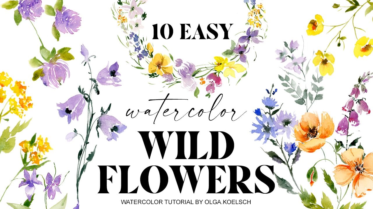
Transcripts
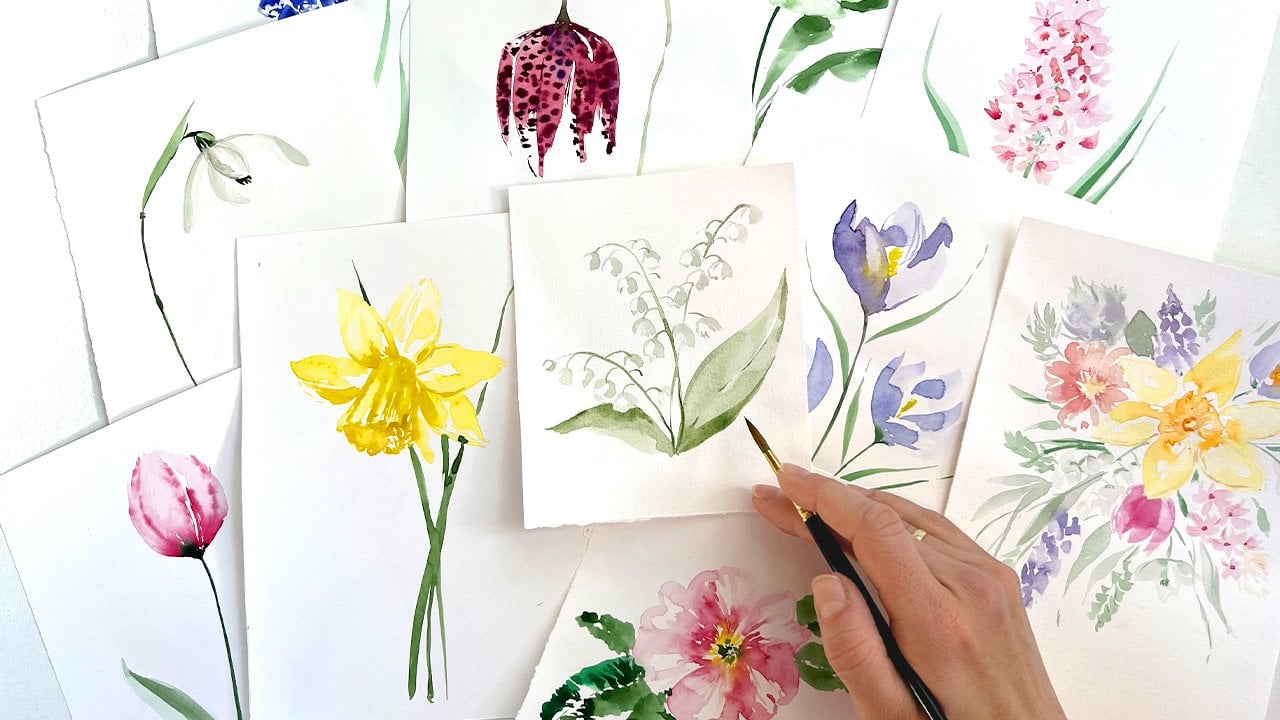
1. About this Class: Hi friends. I'm Olga coercion. Welcome to my studio. I'm a watercolor artist and a pattern designer
based in alright, thank you so much for
joining this class. This means a lot to me. I already have a YouTube channel where I teach
watercolor painting. But I realize that YouTube tutorials does not allow you to show all the practice, all the tips and
tricks in one video. So I decided to
create this class. And as we get through
all the steps, we will practice each
and every single stage. So you could learn techniques
and bring it into action, which is crucial, put
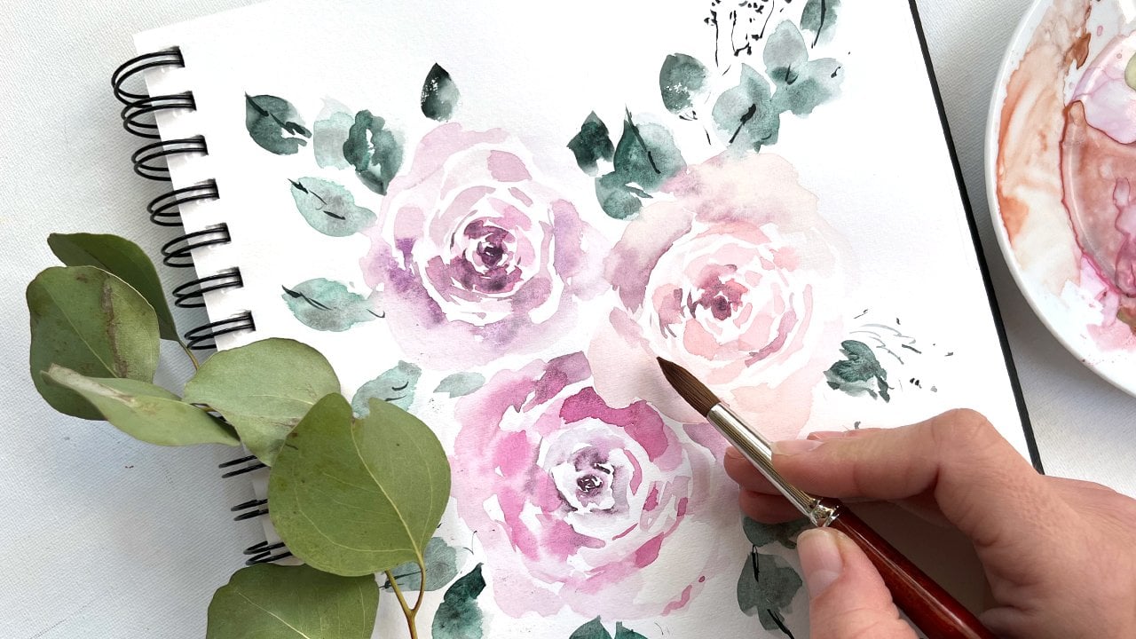
theory into practice. As a result of the course, we are going to paint
a beautiful winter, roses Bu care, and practice to create
eye-catching composition. My class is about
intuitive painting. Free can't painting, which comes organically and helps you to develop your artistic style and practice your
artistic skills, which later on might be turned
into commercial designs. You could use all your favorite
supplies for the scores. Follow my guidelines. It's important that you just
start with what you have. So let's dive into painting.
2. Materials: What we will need for this
course is watercolor paper. You could take either
100% of cotton cold pressed with very
soft texture or just, or usual watercolor paper. It's important that it is
for vertical or not for acrylic painting
with cold pressed, with soft texture, at
least 200 g. Best, if it will be 300 g, I would recommend you for practice intake of
the cheaper paper. And for the final project, use 100 per cent
of cotton paper. That's how usually I do that. We will need two brushes, round brushes with
very, very nice tip. I would recommend you to take different sizes of the brushes. E.g. 4.7. I will get you all
the recommended links and a list of materials. In this course. We will use just three colors. That will be Alizarin, crimson, burnt sienna, and
a phthalo green. Of course, you could try to
paint with your own mixture. But my goal is to show
you how to create a nice variety of colors
using just three of them. We will also need
a glass of water, tissue, paper towels,
kitchen towels, or some piece of cloth. To dry your brush. You will need a pencil, just the one which is
convenient for you, and maybe some soft
rubber soft riser. And you would also need
folate for mixing colors. It could be like these ceramic palette or
some plate from white.
3. Brushstrokes: Practicing brushstrokes, I would recommend you to practice, at least with two
of your brushes, to get hand to the
weight of the brush. How you hold each
and every brush. It's very different
feeling with each brush. So let's start with
the basic C strokes. We put our brush on a TPP, paint a little bit with
the tip of the brush. When start to press the
brush on the paper, make some round
around and let it go. Tuples the block,
belly of the brush. Tip of the brush. Let's try a different direction. Tip of the brush. Belly of the brush. Tip of the brush. As rose bud consists
of many, many petals. We're not going to
paint each and every, but we are going to pay
it an illusion of petals. And all these petals
are overlapping. So that's why we practice
our brush strokes like this. With painting it overlapping. We painted in different
directions, e.g. from bottom to top. Not necessarily
from top to bottom. Let's try this out. Tip of the brush, belly of the brush. Tip of the brush. Nice. Tip of the brush. The brush tip of the brush. Try to avoid moving paper. I know that sometimes
it's very tempting to paint everything from
your work inside. It would be really nice. It would add to your
artistic style if you are able to paint
with your wrist, with the most of your wrist. And so try different directions from top to bottom or
from bottom to top. Right side, left side. In different directions. More vertical or more
flat, more like this. That's a band will help us to shape a beautiful, nice roles. And once you're happy, try the same thing,
your other brush. And you will notice how different it could feel
with a different brush. Although the principle
is the same. Tea pot belly of the brush tip of the
brush, tip of the brush, belly of the brush,
tip of the brush. Different directions. Different curves will happen. Petals. That's how we do it. Another brushstroke. What you try to test is just
painting with the side, with the belly of the brush, with the side of the brush. And you will need this
when you paint e.g. flu. You will need it when you paint
a falling out petal, e.g. in the roles, roles open, this beautiful petal looks at you from different sides,
from left to right. From right to the left, your, put your brush on the paper and paint just to the side with some
wiggling vinculin. Vinculin moves, try
to make a curve. All this thinking curves, no straight lines for flowers. I will talk about later what
to do with stamps, etcetera. Once again, let's try it
with the other brush. Press on the belly of the brush, make some wiggle moves. I'm try to finish with
the tip of the brush. Nice. The last thing we're going to
practice is a dashed line, which is extremely important
when we paint flowers. Because dashed line,
It's treatments, Winds, stamps, and greenery. Sometimes. We really need our hand to be confident when we
paint the slides. And you might think that the thinner the
brush that better. But that's not the point. Important that your brush
has a very nice thing. So in principle, if you
have a really good brush, you could paint the picture
just with one brush. Try to bring, as an exercise. Try to bring all the
dashed lines to one point. And paint this line
out of one point. Try to move quick and hold your brush relatively
close to the Harry Potter, so you have more control. And the same with a thin brush. And while you're practicing saying things with
different brushes, you will realize for
which types of strokes, for which types of size leaves. You'll feel more confident. So you will understand your
brushes much more better. Try to paint out of one point. Try to bring all the dash
strokes to one point. And it's not
necessarily should be a really well painted line. It could be, it could have
a lot of gaps in between. That all makes a painting natural and spontaneous
and more artistic.
4. Watercolour Techniques: For training
different techniques, we will need two brushes. One is loaded with watercolor
and the other one is just with wide, with clean water. So let's start with
the first brush. I start to paint the middle of the rows
with small strokes. At some point, I switch to the other brush and go along the edge and
soften the edge. I clean my brush. I go alone, the battle and let watercolor mix
and bleeds like this. And again, all over
the other petal. I always have a
paper towel around. Once I clean my brush, dry it a little bit with
with tissue, paper, towel, another petal. And another petal. I would recommend
you to paint in this technique not more than
two petals in one goal. Otherwise they will dry and that will be a
bit of a difference. You still have some product
on the tip of your brush. So you could add few very
tender soft details around. Then you switch
to the other one. With watercolor one. Sometimes it might see very complex when you paint with
two brushes at the same time. But trust me, it's much
more handy than you have to wash your brush
each and every time, after each and every stroke. And it also saving the
products and your time, which is always pressure. And that's how we painted roles
with softening the edges. This technique is great
because you could really add a lot of softness, touch through all your painting. Let's try another way. Now. I load my main brush with
relatively light product on it. I again start with the middle. I paint some petals. But you see this term, it's much more diluted
because I would like to mix colors right now. On the other brush, I take a boulder
mix and I go along the inside edge of the petal and you see
what's happening. Our bold watercolor mixes
with the water E1 and creates the nice bleeds around. I could do the same
trick as before. I could soften the edges, but now with my watery call, with my watery brush, what you have to keep in mind
is the shape of the flaw and how petals are overlapping. How the petals growing
from the central tool, tool, the sides,
they get bigger, they get small, light and soft, and sometimes, sometimes
the petals are bigger. And the paper dries milkweed. So you could just go alone
with your watery brush. And virtually to gain some
water. At this point. You could help with
the tip of the brush. You could add some
details like wines or some Corey shades. Details on the petals. Because some petals, they
have these six sock away the area you could
edit on this stage. Have a look. If some areas feels still wet, maybe you could go
and add a little bit more of product in here. And the third
technique is slightly, is a combination of both. First, we prepare the bottom
part of the background. Let's say you have to remember that watercolor
does not have white-collar. What we are going
to paint white or very light should be
just left on the paper. Our paper is our white collar. And you need to think in layers. From light to dark. We always painted
from light to dark. Not possible to do
it in the other way. So we prepared a back
ground for the roles. Now we just combine all
these techniques, e.g. it is a little bit still
wet in the middle. So I could drop in
some water color around in some areas and
just let it let it fall. Some areas you see already dry and watercolor doesn't
doesn't go anywhere. It just stay as a straight line. And now we repeat the same technique with
clean and damp brush. I go along and soften the edge. I go along this dark
area that's often the H. And I could correct some shape. I made in dashed lines. I'm adding shades now. With the second layer. I add some shades. It takes time to get
handy to remember that. First with painting light, and secondly with
paint and shapes. But that's, that comes. And the shaded
part of the roles, this is where petals
are collected. It's in this area in-between
petals, roses, e.g. here. What I'm doing, I'm painting the darker area with clean
and dry and dump brush. I just soften the edges. And as I very much
like artistic feeling, I'll let it flow sometimes without
corrections from my side. But sometimes I
would like to add some details and
reflect a little bit. This technique is very handy if you like to have
some control over watercolor. Because when we page like this loose, it's
very spontaneous. It's very fun. But sometimes
it's unpredictable. When you paint in layers, you could build up your roles step-by-step and have a
little bit more of a control. And of course, painting layers, it gives you more variety
with adding colors. Because not all colors nicely
mix right in the water. But when they applied
to the paper, they could mix very nicely. Soften the edges. At details. Always have C strokes. You see I create C strokes. Maybe it's a different kind. But in principle,
it's all C strokes. I could correct and soft and
some edges as we did before. Just like this. And the darkest part of the
roles is the middle part. So it's always nice to
come back with very, very bold mixture and add a few details to make it really, really contrast to everything. Make it very sudden. Just like this.
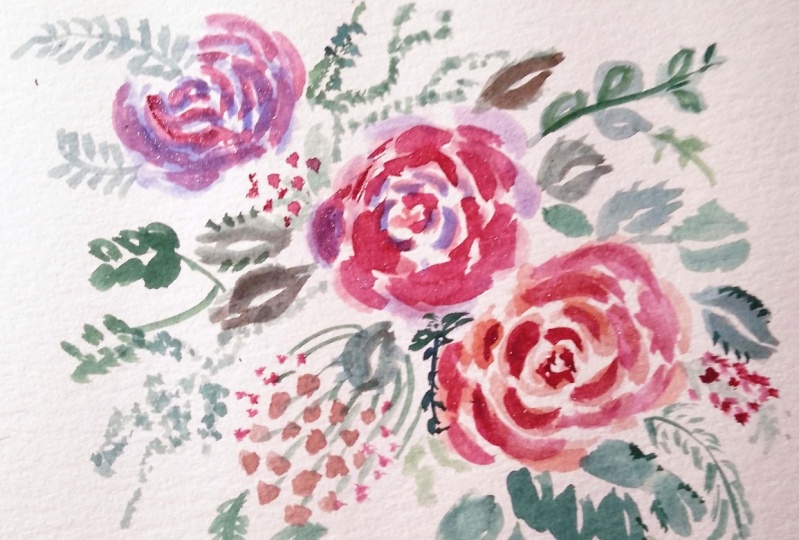
5. Practicing Roses: Let's practice our
rules painting. I prepared two brushes. One is loaded with the product
and one is just clean. And we will need them both. We are starting from the middle
with small, tiny strokes. Tip of the brush,
belly of the brush, lettered comb is
it's easy for you. You could change the brushes and start with the smaller one. Tip of the brush,
belly of the brush, tip of the brush, belly of the brush. And now as we move in a little
bit far from the center, we could add some water
and soften the edge. Just as clean brush with water. Just a little bit. Should be noted that watery. I soften the edge. And I'm kind of jungle
with all brushes. C strokes, tip of the brush, belly of the brush. Let it go. Tip of the brush, belly of the brush, let it go and soften the edges. Not necessarily alone. All the petals. The more variety you
bring the baton. Once you feel that you are
bored or making something, repeat and repeat
something again, it's time to stop
and change a bit. This software, some brush
strokes, some, some notes. And maybe one more final row, one more final
battle. The big one. Like this. You see IVY, the size of my brush, the pressure on my brush to really create
something mod boring. Mulatto, too little
bit of watercolor. At some fine lines,
some details. And maybe as a
lost moment thing, add a little bit more
contrast to the middle, because that's the darkest. Watercolor. Just do it. So that's one of the roles is another roles we will
paint from the side. That's very similar principle in the beginning with paint, the middle part with C strokes. But after that, we are
bringing our sister oaks, not around the middle part, but we are bringing our strokes to the point where stem starts, like this tip of the brush, belly of the brush to soften
the edge of the brush. Brush, brush, brush. Some extra petals. On the top. Teapots a brush,
belly of the brush, tip of the brush. The brush and enlightened and
calm and soften the edges. And fun to paint one
petal which is falling out bit tip of the brush. Brush. And all the lines
are coming to bed, central point where the
stem will start to grow. I didn't some dashed lines
and some more petals. In this stage, you just add some artistic touch and some watercolor effects. Like with a clean
and damp brush. You could lift up a
little bit of color. Soften the edges. If necessary. I will paint the stem just
to look at more natural. This is our rows
look from the side. Another way to paint rose
is dry and wet technique. We first prepare
the first layer. Very light, very,
very light color. Relatively poor throwing. Painting with C strokes, making just brushstrokes around. Leaving some more
Gibbs is always nice. It creates the airy
feeling like this. Think that's a nice one. Now, you could even take
your product right from the, from your pledge to
make it more dry. Soft. Tune, add a second layer,
which says strokes. Same, same technique. But now you see that strokes, the dry product dissolved. And so often in these
watery background. And in some parts of the
background is already dry, which creates more sharp lights. And from sample here, it's still a little bit wet. And that also creates
different texture, which altogether gives
us a big variety. And interesting, more
interesting design. What interesting shape
or false, not very flat. At some dashed line. Maybe correct this for a little bit weird,
but that's okay. You could just wash your brush and add something
else, something nice. Just here. Again, if you are
not happy, e.g. with the spot, you
could wash your brush and soften the edge here. But be careful once the
paper starts to dry, it's better to stop and
maybe paint over the top. E.g. you are not very happy if you're
not very happy with this exact trolls, wait until it's dry. Add more brushstrokes around. That will add more depth. Same principle says strokes. But try to do them
rather different. In a way cultic. And remember that
the darker parts should be in the shade. So it's usually where
two petals are, two layers meet some dashed lines around. And that's how you
got more variety and more sharpness to your painting. Same. Here. You could add with the second layer a
little bit more depth. I will stop here. I hope you got the idea
of painting roses.
6. Common Mistakes and How to Fix it.: The first mistake I see a lot of times is then
difficult to recreate. Then the roles is to
ornamental amine when the, the brush strokes are the same, almost the same length, almost the same distance. Like this. Maybe I slightly exaggerated. But that's the point. It's too ornamental,
it's kinda fun. But it's not
artistically pleasant. It's not catch here. What we could do in this case, we could take a clean, damp brush and soften some H's. Filling the gaps in-between. Not all. That will make a big
mess, but some edges, especially which are
look wet for now. If you soften them just a little bit and add some dashed
lines in between, that's already looks
a little bit nicer. Some dashed lines. So the idea is to avoid these ornamental filling because we are not painting the
stylized fork roses. We have Painting
artistic Croesus, and that's what's
all about artistic. Okay. I think that's slightly better. Maybe some more
fluffy H's around. Another mistake I see. Then you paint. It's usually happens
when you paint with too wet watercolor. And you try U-shape,
U-shape your roles. And at the end, it's a big loop. Just like this. And especially
even if everyone it is, a very round blob
also could be fine. I saw sometimes the
tin designs and in preference also possible. But there is also a way
to improve this thing. If it happens when you paint, when your watercolor
is still wet, you could add some dry
color, dry product. In some areas. Note on the top of everything
just in somewhere else with strokes to put the belly of the brush
tip of the brush. That's how we create a
little bit of volume. The next thing you
could do is trim. She brush, clean your brush
with tissue paper towel, and block out some color. That adds a little bit
opaque white areas, which makes our roles
more dimensional. But again, be moderate. Try not to block out all
the, all the flower. Just summaries. And after it is completely dry, you could add more texture, more of strokes
around to create, to make it more interesting, more multicolored, oval I
paint just with one color. It has a feeling of
different traits in it. The last, I mean, there could be much
more many mistakes, many more mistakes
about one of them. Very popular. Let's say when somebody paint petals
or leaves like these, outline and then try to color in the petal leaf. It could be lethal. So it usually comes when you
like this coloring books, which are very nice
and mind relaxing. But we need a bit of
different technique here. Try to paint the petals, especially big petals, just
with the side of your brush. So you put your brush
and in principle, you, What's your paint? You paint in a brush strokes. No outlines. No outlines should be rare. And while your
paper is still wet, it's easy to add some texture, some wines and some details.
7. Practicing Greenery: For painting leaves,
we in principle need the same
technique as before. We start with the
tip of the brush, then belly of the brush. And when they lose the
pressure on the brush. Same what we did with roses. And now I will show
you how to create leaves with the
help of face shape. In principle, this could
be a leaf as well. But let's do something
more interesting. Tip of the brush, belly of the brush, tip of the brush. And go back to the same point, tip of the brush, belly of the brush and
leave a little bit of white area in between and
finish at the same point. And now we get these very
certain leaves, middle wine. And now let's paint another
leaf, tip of a brush. Belly of the brush. Tip of the brush. And we go back from
the top to bottom, right now, tuples the
brush belly of the brush, tip of the brush. This is a leaves, you could paint eucalyptus
leaves in this style. Some roses leaves. Roses leaves have some
six OK, six sack around. To emulate this. The Press our brush. And again the bristle brush. And press our brush. You lift your brush and go back. No need to paint all
these six oak leaves. We just need to
get that feeling. And same for the other side. Just few. And leave some
white area in-between. Let's try the other direction. You start with the
tip of the brush. Lift your brush,
go back and create some very soft seek sock Hs. And then you go back
to the same point. Add a little bit of h's. And you think it's a
little bit too sharp, It's always fun to correct. Another type of
greenery which we need is usually called fillers. Extra greenery
form for bouquets. Same technique,
tip of the brush, belly of the brush, tip of the brush. But in this case,
that's already elif. We could pay and stem for the whole branch and
decorate it with leaves. Tip of the brush, belly of the brush, tip of the brush. Try different directions. Tuples that Raj
belly of the brush, tip of the brush. Sometimes it's very
tempting to turn the paper and paint
everything from your side. Try to avoid it because it will make all the strokes
a little bit too similar, I think, in curves. So don't note page
these straight lines. It's very rare when the
greenery grows like this. Think it curves, tuples the
brush belly of the brush, some wiggle of the brush, tip of the brush, tip of the brush,
belly of the brush, tip of the brush. Sometimes what you could do it, this is complicated more. You could start to build the
greenery from this side, from, from the top
tip of the brush, belly of the brush. Tip of the brush and
connected to the stem. That's also fine. Let's make another
one from top to or from psi to the
central tip of the brush, belly of the brush
tip of the brush. So I suggest you will try
different things out. And the last thing we
need to learn today with painting greenery is some
strokes, some loans strokes. When we emulate grass
and the bouquet. You sometimes just
need to paint strokes. E.g. when you paint a tree, just with your brush and it
requires a bit of a practice. But that's how you create these nice volume and
emulate that a lot, a lot of greenery is
here is presented. Very sharp, very sharp brush, very quick, very
quick moves around. Just try it out. E.g. try to bring all of these brush strokes to one point or put
them onto one stamp. Try this out. Practice and it will
be great at the end.
8. Working on Composition: I usually get a lot
of inspiration and references from the floor
of books like this. And this composition
really catches my eye with this
conquest and red roses. And we are going to
paint a part of it. We are going to paint just
this part with red roses, some greenery
around red berries. I think it will look very
wintery Christmas scene. As it looks a little bit more complex here on the picture. It would be nice if we think a little bit on the
composition before. There are various, the rule of three which says there should be uneven amount of big
elements on the picture. E.g. free. With five, it's more
complicated to count. For us. It would be very easy to
remember the rule of three. This will be our roses. What's important? We're
thinking in curves. So we imagine the
curve goes like this. This means on this area. We could add, we could
add different greenery, some more leaves, some grass. Sum, sum this special
leukemia feelings. To create this curve. On the paper, I see that it is a little bit too
much space here. So when I start to paint, I will shift it a little
bit to the right. I add some berries. I imagined that the
various area will be round here and some grass
and leaves around. We could add a lot
of greenery around, but it should not be too big in comparison with
our main curve, it should look more like extra, which creates some
volume and do not take too much attention from our
central, central main heroes. No need to paint all
the details and no need to think too much fruit. The main thing that we
subtract from this picture, from this complex
picture, the main heroes. We found for them a nice
place and the tone, everything into nice curve. So let's go to the next stage.
9. Colour Mixing: We already prepared
a composition, and now let's find best
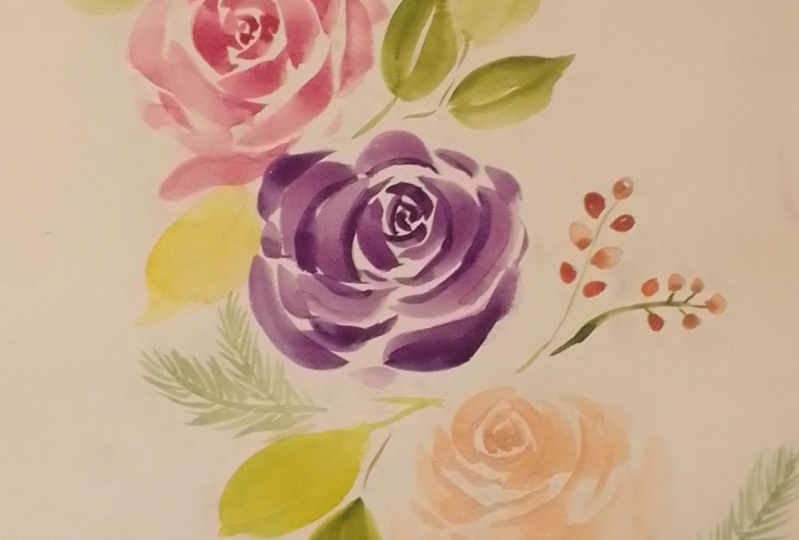
colors for our painting. I would like our roses
be very bold red. And as a basic color, I'm taking Alizarin crimson. This how it looks bold. And if we add more water, it turns into very
elegant, pale, pink. But these open color, maybe a little bit too bright. As a green opposite color. I'm taking phthalo green. Look how bright and a little bit unnatural it is when it
is just from the pen. Let's have a look how it will
be more diluted, very pale. What's happening when we
mix these two colors? Alizarin, crimson, just
with a hint of green. We get very beautiful. Violet, red, which will be great for some
shades in our rows. Let's paint right over our sketch so we could find
right places for our colors. Let's say this will
be our main roles. And the main color will
be Alizarin crimson. And for the shades and contrast, I'm mixing Alizarin
crimson with duller green. And look how beautiful, bold texture I get. So that's our main roles. To other roles. This will be in principle
in the same style. Maybe with some adjustments
of colors around. For yes, maybe this one
will be on the top. It will get more light. So I will use just the more diluted
version of alizarin crimson. For greenery. I do not like
this bright green color. What I'm doing, I'm
adding a hint of Alizarin crimson to
our green mixture. And I get these very, very beautiful, very
stylish, bluish green. I will use this green form, rose petals for Peyton or
a colleague to sleeves. Right now, I'm just trying out how all
these colors will look. And I would recommend you to do the same before we
start painting. A big picture. Just to practice
with mixing colors. And it's very handy if you
try it just on a piece of paper or on a white
plate, like here. But if we use just two colors, It's a little bit boring. And it's a little bit too
cold because both two colors, they are from the cold
part of the color wheel. That's why as a third color, I will take burnt sienna. And you think, where should I put this burnt sienna,
this brown color? I do not see Turn
the references. But what happens when we mix yellow green with burnt sienna? We get this beautiful
olive green. This beautiful olive green. Great. Nice extra
greenery for us. And that's how we
will get the contrast of cold and warm colors. I'm, right now,
I'm not painting. I'm just trying to find a nice
place for all the colors. If I add more or
form burnt sienna. My green became more
and more yellowish. That's how I get variety of different shades of
green in my composition. Another thing to
try out is to mix alizarin crimson
with burnt sienna. And now we get these rusty, rusty red, very chilly. It's so beautiful. Now I'm thinking I
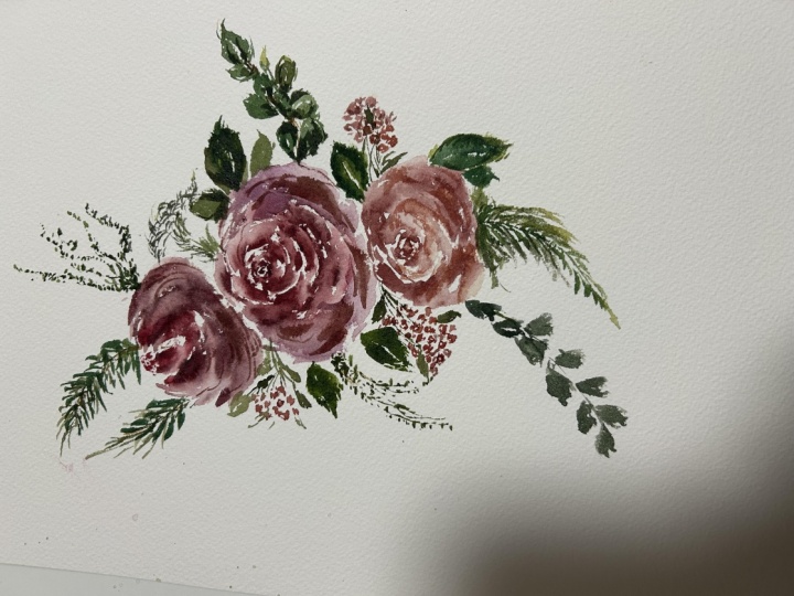
would really like to paint something with scholar. Maybe I will paint one of the Roses using
mainly this shades. That's why it's very
handy to practice on a small piece of paper
right on your sketch. But in principle, I was creating these rusty red color
for berries. Right here. I would like to have a
small bunch of berries. And I think this will
be very organic, very appropriate touch of Rome. Colors, e.g. right here you see it looks
a bit, a little bit weird. So I know that I would
not use this rusty here, but for berries, I think
that's really create. The trick is that here
we have warm red. This means that form
green parts around. It would be very handy to combine it with something
called with some cold green, which is our mix of Alizarin
crimson and phthalo green. And you see how it already
plays nicely with each other. Same here, this part
of the rows is warm. So it would be really nice to add some contrast of
gold leaf right here. This part of rows is cold. We use basically open our
Alizarin crimson here. This means let's take
our olive green, which we got by mixing
phthalo green and burnt sienna and add some warm
greenery right here. And in-between all
these called elements. That's how we set up our colors in our,
in our composition. And you see, I used
only three colors. Once again, Alizarin, crimson, fallow green, and burnt sienna. And just by combining
these three colors, we get really nice,
consistent color palette. We could mix them as
much as they like. We use just three colors, which means there will be no contradiction in
our painting later on. So try this out and see
you on the next lesson.
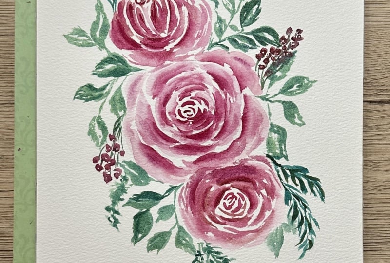
10. Painting Bouquet Part 1. Roses.: Finally, we are
starting our picture. Finally, we tried a lot with
practice, different things. And now it's time to apply all our knowledge of our
practice to the paper. I'm preparing mix of
Alizarin crimson. One will be bold, one will be more diluted. And as we tried before, I mix it with a hint of green to get more bold, more
bold consistence. And I would like to work with both more purple color and
the open Alizarin crimson. I prepared two brushes. One will be with color, one will be for water. As with also practice. Gravely start just
with the central, with a central roles. With C strokes. I'm painting the middle part. I start with really
small c strokes. I soften the edges
with the brush, with a clean brush,
just with photon. I use tip of the brush
and belly of the brush. I try to add different shades. I started painting
with more purple color and now I'm switching to Alizarin crimson to open
one tool, the bright far. And I soften the edges. I want our roles be soft. Very feminine,
very, very tender. Although it's a red
roles where painting, bouquet, which is more
appropriate for winter. I'm shaping from the
middle to the edges. I'm shaping the central roles. It has a lot of petals. And I try to make
them different. And sometimes painting Chesley, the tip of the brush and some terms with the
belly of the brush. And after painting, let's say free strokes about free
strokes, prefer strokes. I switch to my watery brush
and soften the edges. Soften the edges all around. As my watery brush already has
some product on the cheap, you could easily check it. It's nice to add some details just with the tip of this brush. Some details inside of the rose, some small lovely parts. The more our rose gets all been, the bigger the petals are, the more open they are. To not forget to add some nice curves around
and some shades. I'm switching between
this dark purple, open Alizarin crimson,
clean alizarin crimson, you could also say. And with darker color, I add more and more details. This Rolls has a lot of battles. They are, they have
very big density. And to show that, I add more and more
of dark strokes. While my paper is
still wet here, I could really apply a little
bit more of a dark color. This contrasts around that's how we are creating our first roles. I would recommend you to soften the edges before
we switch to another one. I paint with different
brush strokes, sometimes just with
the tip of the brush, sometimes with the
belly of the brush. I like these loose effect which
is created very soft one. Like this. I'm pretty happy
with this roles. Let's paint the upper one. The upper rows
will look a little bit aside on RR from us. So we see, we see its backside. So let's remember
how we try that. Let's start with the
middle of the rows. Few brush strokes. We bring see brushstrokes tool. To this point, to the point where rows board meets its term. In our case, it will
be around this area. Again, I'm switching
the brushes. That's very handy to
have two brushes, either of different colors
or different thickness. So you would note mix
them would not apply. Different one. I would like to create
some contrast in here. This part of the rows is pale. This means that the
operon could be really dark and shady in
this part, in this area. And that's also how
we get the feeling that these roles is
behind the front one. Just by making it a
little bit darker. And for the dark color, I used the mixture of
alizarin crimson and phthalo green as we tried that before. I'm soften the edges carefully and partly. I do not want to turn our
roles in tow just blocked. So I'm soften the edges. In some areas. With clean and dry brush. I bought out few few strokes. But even when bloating out, when removing some product, some watercolor from the paper. I do it in C strokes, and I want to keep this area
just white for the contrast. So now we set up two roses. And let's paint the Third World. Let's check out with our sketch. And I remember that
I wanted to try to add some warm
tones to this rolls. And for warm tones, I add burnt sienna to my Alizarin crimson mix and
get these rusty red color. Same principle. Same principle. Just keep in mind
that the third roles, it's not the focal point. It should be slightly
smaller, slightly tinier. Just mark this area. Start to paint strokes in
the beginning as usual. But we are adding a
little bit of warm, rusty red for these roles. Switching brushes. If it might feel a bit too confusing or complex for you
to paint with two brushes. I still would
recommend you to try. You will very quickly
get hang of it. And you will love it. Because no need to wash out my brush every time you need
to get some product on it, or change the color
or soften the edges. So just too many things. What you could do with two
brushes instead of one, and it saves you time. It says the product because
you do not wash out too much. You see, I'm very rare. Wash this brush out. The bigger brush,
almost, almost don't. I wash only my watery brush. While I was talking. I created petals for
these for the third row. And I really try to add more
and more of these warm, nice color to the petals. Rusty red. And if you can't remember
why we use that colors, you could just check out
the previous video when we wore mixing all the calls. And for those who
did not watch it, who skipped that video? Small spoiler. We are using just three
colors for the whole picture. Isn't that amazing? Congratulations, we are
done with the roses.
11. Paitning Bouquet. Part 2. Greenery: Now, let's decorate our
bouquet with greenery. We spent quite a lot of
time on painting roses. Now, let's really make a bouquet out of this by adding
a nice green colors. This is fallow green, and I mix it with
Alizarin crimson to get these dusty space, emerald green, which is great for my
colleague to sleeves. Let's check our map. Calypso sleeves,
some rose leaves around some random
winter greenery. And we're thinking in curves. I would like to
start here because the paper is a
little bit wet here and I think it could
create a nice mixture. I paint my colleague to slaves, tip of the brush, belly of the brush, tip of the brush. And I leave small area, white area in-between to
show the middle of wine. Keep up the brush, belly of the brush. And the second part, tip of the brush. I'm switching to
my watery brush. Bloat out few errors, just few errors more for
contrast. A little bit more. I want to paint these nice
branch of my colleague, two sleeves right here. Tip of the brush, belly of the brush. We leave these nice very
special eucalyptus middle wine in the middle of the leaves. And with the help
of watery brush, blot out here on
there some colors and create some some
curves, shapes. For now, I will
leave it like this. Maybe I will adjust, I will add something more. Let's paint a rose petals. And rose petals. I will paint in mix of blue, fallow, green, and burnt sienna. It will give me more room. Tone for greenery. I'm painting rose petals, tip of the brush, belly
of the brush, tip of the brush, tip of the brush belly of the
brush tip of the brush. Roses leaves. They have these sharp edges paid them rather vertically
with the tip of the brush, we could create these
nice sharp edges. Tip of the brush, belly of the brush, tip of the brush come to the starting point
tip of the brush, belly of the brush, tip of the brush. Some, some texture around
some texture or some, some variety for the leaves. Try always thinking
curves don't set. Leaves like this round. You could override
your greenery. Tip of the brush, belly of the brush, tip of the brush. Again, tip of the brush, belly of the brush, tip of the brush. The more our leaf
is in the shade, right now, it's in the
shade of the roles, the more darker it should be. So I add an extra color and I add some edges with my brush. Just with some random moves. I wash my second brush, dry it a little bit. And I would like to solve
slightly this area. Same here. It feels it's a little
bit to textually, I want to soften
this just like this. Let's have a look here. This part is more volume. We use warm red here. This means it's nice to add some code hint of
a cold color here. But same principle,
tip of the brush, belly of the brush tip of
the brush, tip of the brush, belly of the brush,
tip of the brush. And a little bit more
dark in the border between flowers and greenery. Tip of the brush. Tip of the brush. Just in one stroke. One leaf right here. In principle, I'm painting
just brush strokes. You see that I'm not
really painting too much or for really leaves, outlines. It's small like brushstrokes, just in different direction. And with the help of my brush and my watery brush could also helped me to
create this structure. Let's come back to the top. It's very cold, very
cold, tall, dark tone. And for the contrast, I would like to use, Let's guess, warm
and light colors. And I would like to
add some centers. The greenery here, maybe more like a third tree, greenery. In very light strokes. I add some nice variety for
our greenery in the bouquet. As it always a nice bouquet. There's one more
light and warm green. You could improvise
with your greenery. You could have a look
on the reference. You could have a look
on your bouquet on your table if you
like it to have one. But it's nice to improvise. And while this
part is still wet, I add a little bit of dark dots and sports and let it just flows that
creates the volume. Let's have a look and think. What else we could add. We could add e.g. these
doted amaranth was, I think it calls a moron force. These flowers, which looks like
branches with very, very tiny small flowers on it. And we emulate these just with TPN Moves of our of our brush, just a tip, it moves around. And that's the painted surface. It's always nice when some part has like a
twin somewhere around. And let's paint these
twin a moron for spot. Right here. It's very fun. Trust me. You might think or know
how I would paint these without outlines,
without pencil sketch. The thing is we we tried it out here and we could
improvise here. I'll focal points are roses
and the practice them a lot. And the, there is a good chance that we manage
to paint them nicely. And with greener you re, really, it could be
very, very relaxing. It could be very
pleasant to paint once you leave your
control a little bit. What I'm doing now, I use both of migraine
mixtures, cold and warm. And I add some strokes
to my warm parts, warm, warm strokes to
the coal pots, etc. Let's have a look where yes, these two branches,
they could have a twin. And this twin will
be right here. Try not to be too
symmetrical with this. But it's nice to have twin brothers and
sisters in the bouquet. It show that we have consistent composition,
consistent drawing. I just paint this with
sharp brush strokes. And I really would like this is variable
and this is very warm. And you see will lose
some hole contrast here. And to fix it, I take my cold
green and added in this area where green connects
with, with the flower. But not to the whole, not to the whole branch. Just to these areas and
maybe to some edges just to, just for the variety, just to create this variety. I'm pretty happy with
the greenery we created. I want to add just a few of
all colleague to sleeves. With small c strokes. It would be nice to
set them on a branch. And for the branch collar, I just take these burnt sienna maybe with a hint of green color to make it
a little bit darker. And while it is still wet, I add some branch here
for oil clip to sleep. I could see where I could
add some brown color. This, this plot, e.g. in the third tree, in these areas, just
small, tiny strokes. And that's how we
painted our greenery. Maybe one more detail. It is very cold here. And it feels like
some warm, green. Cool. Have a nice statement. Just here. We are done
with the greenery. And let's switch
to the final part.
12. Painting Bouquet Part 3. Details : Now let's paint the final
decorative elements as berries, as small leaves. Maybe some bots to make our
composition even nicer. For berries, I'm, I use mix of burnt sienna and
alizarin crimson. I get this rusty red and
I set up my berries. Berries cluster. In this area. I do not want to
paint berries red. And this is the
reason because if we paid everything in
the same color, it will be just boring. I will I will I will
see just something red. And it's a little
bit boring hour. I need to have a travel at
your knee on our picture. So that's why I try to create
as many shades as possible. So this is our berries. You could see I painted them in different tones.
And different. Some are mobile,
some are lighter. And they are variable,
which means form. For the branch, I'm taking. Cold green and I connect them. No, no need to connect them all. You just map out how the green part could,
could grow here. Always nice to add
some small elements. Extra leaves. Let, let your colors mix. Here. It creates these
watercolor feeling. It feels a little bit too dark. So I've washed my
brush and I blot out unnecessary water color, boldness and same here. This one I would like to keep. I would like to add more
berries right here. And I think few of
berries would be very nice in this area. And I want to paint them
a little bit lighter, so I dilute it, my mixture. When you paint berries, try to leave a small
little tiny area, white. It's it's a spotlight. And if you have a
look in almost wrong, almost all round things, they have the spotlight because it's the place where
sunshine reflects or chest. Just light reflects. Some some greenery around,
some leaves around. Let's have a look
on our book care. What's missing, what
could be added? I like this crispiness, which we have on this
on the left side. And I think it might be nice to add few berries
on the right side. Sorry, left, right. Even when I'm just painting, let alone benign,
walking in the street. So few berries. Just with the tip of the brush, you create very random variable, random clusters of Burmese. And you set them on, on branches and mix
warm tones, cold tones. Random greenery just with
the tip of the brush. Now we creating more artistic, artistic feeling in
individual feeling for our, for our composition. E.g. some warm detail. Small, small branch
would be nice here. Let's have a look. Sometimes it really helps to look
through the camera. So I got up, I have
a look through the camera and it
feels like these, this is a bit too heavy. This means that I
could add some. Amaranth knows, I might
be wrong with naming. But you got the point. These nice lace looking
very a URI flower. And I paint it just with
the tip of the brush. Very vividly. I remember about
the composition. So I, I keep everything
in shape in a curve. To make it more interesting. I make this a moron to
split a little bit of brownish towards burnt
sienna. Like this. Some dots would be nice. Just hear some final
touches, some contrasts. You could go over your
painting because it's dry now. And you could add a second
layer when it's necessary. And you see how crispy it gets. Same here. Some green tones, not on each and every part. Just in a few parts. That's how we created volume. And these nice contrast. Let's have a look. This part is empty. So, and it's cold. So I would like to
add something very warm and very delicate. So some some some
branch with no name, no name greenery on it. But you see it feels like
it's just right here. Let's have a look. Maybe one curvy little
detail around this area. And it really feels that
fund more or two more, or Calypso slaves will be nice. You see that's the
beauty of painting, loose painting into it. Intuitive. That you could always make
changes during your journey, during your painting and
you paint how you feel. Feel that it's better
to stop at that point. That's absolutely all right. But if you feel that
something is missing, e.g. some contrast in these roles, just in this one. You could come back
and add contrast. And now we're really done
with our beautiful bouquet.
13. What's Next?: Thank you so much for
joining this class. I hope you really
enjoy the process. I encourage you to share your
projects with the others, to support each other. Be more and more confident with bringing
your artwork to public. I can't wait to see what
we achieved together. What creativity
you could release, what magic you are able to
create with these tutorials. And what you learned from me. I think this is it. Thank you. And see you on
my next classes. Bye-bye.
14. Join my Membership!: Hi friends, I'm
going to be killed. And I welcome you to
joy, to my membership. I know that we all somehow
at different stages of our painting skills
and that's fine because I split my
membership classes, my membership offers
into sudden bundles. And you could start
either from the very, very basic steps and then short-time get to another step
and then to another step. And as my favorite thing, we could paint together complex botanical illustrations or loose floral compositions. It, somehow, it takes time to realize what you're more into, either into loose painting or
some more precise painting, it's okay to give
yourself a try. And another thing I
would like to stress out that most of my classes, you could stop at
any moment, e.g. when a baby cries or
dog needs to go out. So really at any
moment and heavy, just 15 min daily practice. Good. Bring you into really nice progress with
watercolor painting, withdrawal away,
anything basically. So I invite you to
try out free classes, to try out churn
membership, e.g. for a month and feel how
how does it feel here. So I hope you will like
it and we could make, we could create a
really nice together. I hope I see you there. Bye bye.
 Olga Koelsch, Watercolor artist and Pattern Designer