Transcripts
1. Butterfly intro 01: Hi friends. I'm all
welcome back to my studio. For today's scores, I prepared
something very special, something in
transparent technique. I know you liked very much my previous lesson about
transparent tulip. Now I'm inviting you to page
a transparent butterfly. I know I heard from different people that this
transparent technique looks a bit scary and a little bit high level
skill of watercolor. I'm here to assure
you this is not true, this technique requires
some patience. Yes, this is it. But I'm breaking
all these paintings into very small steps,
very easy ones. Once you follow it, you
will realize how beautiful, how relaxing, how meditative
this technique is. Now let's start.
2. Butterfly drawing: Let's first make a
drawing of a butterfly. I choose Chapman's blue, very beautiful
blue, very popular. But I want to paint
the butterfly flipped like it's
sitting on some grass. I find a place for the body, roughly how to paint
flipped butterflies. We are looking at our picture, we remove half and just transfer the second half on on a paper. Roughly, we have to
picture the main idea of how the wings
looks like look like. Our second step,
because it is flipped, we have to draw the second
half of our butterfly, But a little bit
shifted either to the top or to the bottom. It's all up to you, but think about proportions. Both parts should be shifted
about the same shapes, of course, should
be also the same. Now I'm outlining what I
have to make it more clear. As we paint in
transparent technique, all the lines will be visible. It might be confusing because it's already
too many lines. What you could do,
you could take different he pens, for example. For the drawing, you could
outline the main lines. For example, black will
wings with pencil. The four wings we have
body of a butterfly. Its head, small belly abdomen. I think this part called we are not painting botanical
precise illustration. Scientific illustration. This is a just for us what else we could
do when we are drawing. We could think
about some details. But I would strongly
recommend you to leave all details to the other step
when we will be painting. So that's enough to transfer our drawing into
our watercolor paper. When I transfer my drawing
into watercolor paper, I'm thinking about composition. For example, the
head and the body. I would like to place
in one third on the intersection of
one third lines, Very roughly, very soft lines. I map up the body place. I hope you could see that just
one half of our butterfly, I estimate how big I would like my butterfly be on the paper. Map out some borders. I do not want my
butterfly go out suddenly outside the
paper, et cetera. Then map out the first wing. I have a scheme here, it helps me to
draw it correctly, just first half of butterfly, to make life easier for us to paint and not to get
lost in all these lines. I just draw first
half of butterfly. That's some cute
details and that's it. Let's start to paint.
3. Materials: Prepare your brushes. I would recommend you
to use two brushes. One is slightly bigger, one
is slightly smaller piece of paper towel all your
favorites blues or purples. I will use ultramarine blue,
maybe Quinacridone purple. Let's see what we will get. Firstly, I prepare very diluted
mix of ultramarine blue. Very, very diluted.
It's very watery, Almost like a water with
some hint of color in it. I also would like to prepare
Ian or any other bright, even a little bit yellow, somebody used by watercolors. When I didn't see
it, no problem. We could wash it out and get
the nice, greenish, blue. I will use it for some accents. I think it will add a
nice touch of uniqueness.
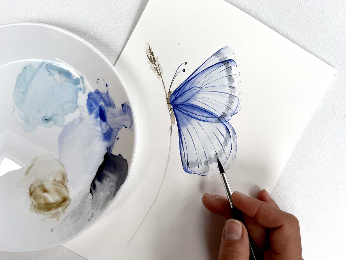
4. First layer. First wing: Firstly, let's glaze the
winging or the upper thing. I think in botanical it calls
for wing, the upper one. I glaze chest with water, then I use my mix
of ultron purple. I distribute it. You could see it's
absolutely very light. At this stage, I could correct
a little bit the shape of the wing, maybe some details. When we paint flowers, I always recommend you to add some curviness with butterflies. We do not have that flexibility. Not so much curviness, but we could correct shape
of the wing and have a look at the picture
of the wing has more density close to
the body of butterfly. I really bring most of the
color to the body point. I would like to add a
touch of sun color, maybe in this, in this middle
part just a little bit. But see how beautiful gradient
now works. No worries. You could leave the
age almost white. We will be back to
in water color. You have to think in
layers and remember that. Always possible to make it darker and not really possible. Make it light, let's say. Not that easy. Now we have
to dry each and every step. For example, we
painted one wing. We can't start doing the second one until this
one is completely dry. I could recommend you to
use a hair dryer for that.
5. First layer. Second wing: Once first detail, first
wing is completely dry, we do absolutely the same thing for the hind wing
for this bottoming, Firstly glaze it or cover
it just with white water, with clean water, and then
use our mix with from blue. In the same way, we try to keep the most
dense color around the body. Around the body. And then I wash my brush, I dry with the paper towel, I distribute gradient
very softly. I hardly touch the paper, not destroying the paper, and it helps me to create
real nice gradient. I could even add
a little bit more of darker color in the, in this very point. You look how lovely
part looks like. I added rope of sun in here. With my almost dry brush,
I slightly, slightly, slightly correct the edges because I want everything
very soft and smooth. Don't do that with dry
brush back here later. Now, let it all dry again. Once it's all dry paint, we could draw the second,
the flipped part. We just need to do exactly the same drawing,
but slightly shifted. I will shift it down. In this time, just follow
your initial lines and think about moving it a little
bit, a little bit down. Nice overlapping. You see when you paint and draw, and paint and draw in steps, it helps you not
to lose the focus, not to be lost in
all these lines. Now we're doing exactly
the same, same procedure. I'm glazing the folding with water as I use good
professional watercolor paper, 300 grams, it allows me to apply many layers
on top of each. Unfortunately, not all papers allows you to do that trick. So firstly, let me explain
what I'm doing now. Now I follow my initial scheme. What exactly the same, what I did with, um, with the first wing.
I do the same. Right now, I could
even add a little bit more of brightness Here, I remove the excess water. Just stepping on the paper
towel, distribute everything. Remember that
butterflies, they have veins that goes into the body. One, you distribute color. Move your brush
along those lines. If we have not drawn it yet, you know where they play. Don't do it tally in
the direction of wings. Once the wing is dry, we do absolutely the same
procedure with the other wing. First with water, then tro blue. Now you already could see
how this overlapping, this transparency magic happens, because now you see all these nice layers
overlapping one each other. Maybe still not clear, but we will emphasize
it a little bit later. Right now, we have to prepare the nice base for
our future details. Same, I distribute the
color very gently. I might drop a
little bit more of intensity into the
area next to the body. Of course, a hint of some color, which is, was with some young artist had turned into some true
keys, I would say. But still nice. I like this contrast
with cold and warm tone. So I'll just leave it like this. We are a little bit
improvising here and I like it you could correct with
your brush the shape. Try to make the line
very soft and smooth. Now, let it all dry before
we switch to details.
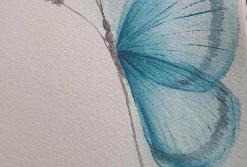
6. Second layer. Adding depth: At this moment I do not like
my pencil outlines anymore. They distracting me
from the main shape. I remove it, I remove
it with white. Is it's very important
that you use razor. No specific brand you have. Maybe to test few or
you are lucky with the first one should be white. All the rest they leave
color marks on paper. Don't press too much on
the paper very softly. You always could
remove it later on. Now let's emphasize details for that we are glazing
with clean water. That same wing,
just the four wing, one part of our butterfly. If it's difficult for
you to see the border, if it is watered or not, just move your head
around and you will see how good or not
you glazed the area, Just to have a look
from different angles. Now, magic trick, we
switch to the small brush. I grab Romer and blue
right from the ballet. Maybe soften it a little bit, it's quite a bold mix. On the tip of my brush, I'm going along the edge Along
the edge of the full wing. Of this wing. It looks like
I'm outlining it, right? Yes, it's actually
what we're doing. I go with my brush wing, along the sides of the wing. I allow my watercolor
distributes into the middle. This stage, I would like to add a little bit more intensity
into the body part. I would say now you
could switch to your other brush With
the tip of the brush, just go area and soften everything
to make it smooth. Always remove accessible. Same with this edge. It's not important
whether you go from top to bottom or
from bottom to top. It's important that
your brush moves along these planes, the
butterfly wings. Do whatever is handy
for your hand. Should feel very comfortable. Now, let's distribute, let's
drug out a little bit of this bold shape with
the tip of the brush. I go just dug out the color and see first
in is already there. I have this image
as my reference. I'm not doing
directly everything. Just a little bit
of improvising, don't bother about
this upper edge. We will be back to it. What nice is to really
show them the paper. It's more handy
for me to outline, to draw a nice shape of the almost said
petal of the wing. It could go along with the
tip of your brush and correct the shape that's soften
it with the brush. Now let it. All right.
7. Second layer. Adding depth. Part 2: Same steps for the
bottom wing, hind wing. I'm practicing to remember
to memorize these names. Now it's important to choose the right wing background, they are a little bit
upper, that's that shape. I think that's the
complexity which we face when we paint in
this transparent technique. What's on the top,
what's on the bottom, be lost in these lines with trembling blue on
the tip of my brush. And I go and outline
the wing shape. I have a look at my reference, but in principle, but what
I was telling you about, it's all right, but I
choose the wrong path. That's the wing. That's the wing. As I have to do all these steps later
on with the other wing, I'll just leave it. I do not try to correct. I do not do anything. That's the best strategy. I had a drop of Romel
blue into the body part. Body connection part. Then I wash my brush right
with the paper towel. Go along the edge, soften where it is necessary. Now you see how crisp
and nice it looks. Very beautiful. I have a look
at my reference and drug out according to the, to the reference.
That is enough. For now I have a look, I might like to emphasize
a little bit right here. And that's enough,
Let's try it out.
8. Adding Contrast: Now we're going to
paint the front petals. We will see much more
details on front petals. Now it's getting more
and more interesting. But the same steps. I glaze the wing,
glaze the wing. I remember that the wing is
a little bit shifted down, if that helps on the stage. You could again go with your
pencil and add some details, maybe some lines that will help you to remember
to all the things. Now I take my bold Romer in blue mix on very
tip of my brush. I set my brush, it's about 45 degrees to people. With the tip brush, I go along on the edge and outline the wing
tip of the brush. Meditative painting, very
meditative practice. You could just observe
how your water bleeds. And now with the front wing and more and more details and even more and more
outlines a tip of your brush, you could create a very
gentle line of the ring. Now, I always recommend
at this stage to use the second brush
with almost dry brush, Go along and soften it
when it is necessary. Sometimes it's okay to
leave it like this. That will bring your painting
to more impressionistic. If you would like
to be a little bit more in traditional style, being more precise,
just soften the edges. Right now I see that
here could be a little bit more of contrast and
my baby is still wet. I go around again and
add more contrast. You probably now ready. See all the intersection
of the wings. I stop it here and dry it out.
9. Wings ornaments: With the tip of the brush, I would like to paint vines. If that's helpful, you could firstly draw them right here. Let your hand a little bit, trust your hand a little bit. Now see how nicely I covered
that mistake, that line. When we paint vines, you could either use a smaller brush or if you
have a really nice brush with nice tip basically
you could just, you could just paint with this almost no pressure
where my hand is very light. I paint all these. You might be wondering
why I didn't paint all these details
on the background. I just think it
would be too much, it would be too much of
overlapping we made. When they drag out the color
from these blue puddles, it gave us an idea
of veins background. That's enough. That's
enough to bring the idea. Our point is to bring the idea. We are not outlining these
marks because they belong to the background wing to emphasize the transparency,
paint these lines. The in, it's very handy to have reference
in front of you. We could just check out whether you draw it correctly or not. Really During the process,
you might think, okay, there could be maybe one more and that's all
right, just one more. Finally, no need for us to stop, we could just proceeds for the need to find
a good position, lenient position for you. The butterfly does not have
too many structure around the body on the ing. This is very helpful for us because there will be
not too many stripes. But we for the idea, try to recreate the original, the original design of the
right now I would like to grab tine blue color. I wouldn't make it very bold. I would like to emphasize, I would like to bring
more color to the wings. I just go with all
dry path around this area and add
some thickness. Adding some thickness to the being to make it even
more impressive. Start with fine
lines on the top of the wings because they're fine in nature as well and they have a little bit more weight and
density next to the body. You could add a little
bit more pressure into your brush when you
paint next to the body, I find it very, very beautiful right
now how it all happens. Now let's outline the
same, another wing. Now I do all details only
for the pair on the front. I forgot about what's
on the background. Totally forgot.
Don't care anymore. I do all details on
for my front part. Now we could have a look
what's interesting, we could see here, for
example, the black outlines. I do not want to
paint them in black. I would like to paint them. Let me. I would like to paint that
CPM, very dark brown. You can take any
dark brown you have. I will mix it with,
from in blue. And I will get this indigo, shady, dusty color, much
nicer than just black. And it has a little bit
step from the edge, thinking how I better do it. I added firstly to
the veins wings. I could, I think I would like
to dilute it a little bit. I don't want lines
to be too heavy. And with the tip of the brush, it feels like I hardly
touching the paper. And my brush, I remove the excess color
and it's half dried brush. And that's why it creates
this nice texture. I just fall the edge, Sometimes I leave some space. But that's all
because I paint with almost the structure that the
texture creates by itself. If you trust your watercolor, if you begin to trust your watercolor level
up your painting, it will bring a lot of unique
touch to your paintings. We just lose control a
little bit like this. Same with the bottom line. Finally, no need for us to
stop every time and dry paper. Same thing. I paint with
the top third of my brush, a little bit of scltching. Once I feel that it is too wet, I just remove the excess
photo on the paper towel. Very, very light.
No need for us. Although in the
original of course, that's the darkest color. I want our focus
on the outlines, the transparency of butterfly, not on the black points, not on the black areas. But of course we could always
add some juicy juicy spots. We add a little bit of crispiness
in some ne veins area. Just about this. Also we could see that color is happening on
the edge as litch.
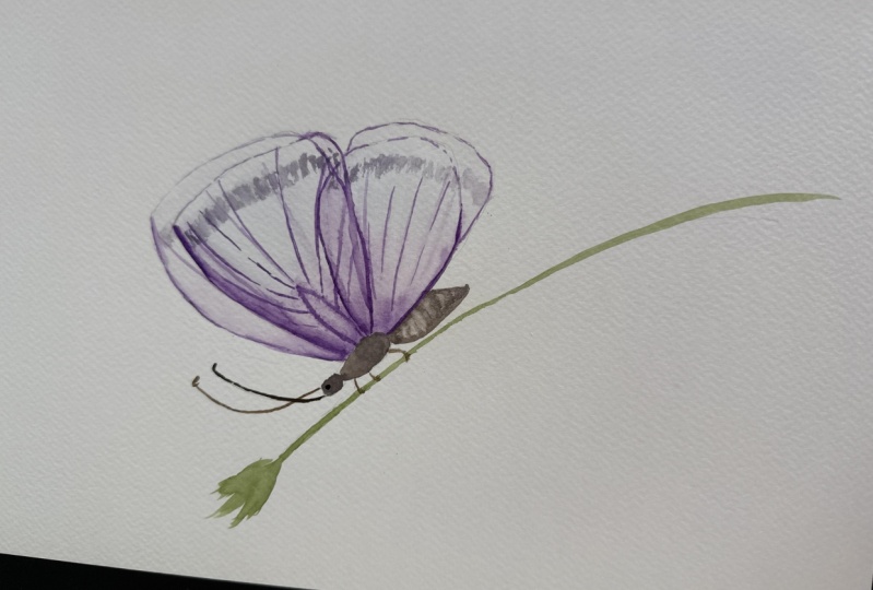
10. Last deatils: Now I would suggest that
we switch to the body. For the body, I use
the diluted papa, any brown light, very diluted. Just make wash with diluted color. I do not want body
in the big focus. Let's be honest. Not the most beautiful and
attractive part of butterfly. Sorry, butterfly. But
that's the necessary part. That's why I just paint something reminiscent
of the body. Now I think I will just
use my trembling blue. I want to paint as find
nice convenience spot for your hand with
the tip of the brush. Be Tina and the
other connect them to I like when it
has some bleed in it just like this. Then we let it all dry and put our butterfly on on the grass. For the grass I will use
some spa might be with. So I imagine that to
dried grass people. The brush we will details
to the grass later on. No, I just paint the stem then you do not feel confident
to do it in one go. That's really not necessary. Just do it in strokes we
one overlap in another. Let's add a little hint of firstly to connect butterfly and the stem. To make it one story, not the separate stories, let's some details for the top. Just with the tip of the brush, create some, some
dried grass texture. No need. Over think that part. Absolutely no need. Now we have to draw
three pairs of legs. Pairs of legs. I actually do not eye, because you see once
you draw an eye, it is central of attention, which we do not need
when you paint people. When you paint animals. When you paint birds, yes. Eyes are always focal
point butterflies. I don't think that we really
need that a little bit soft. I'm not happy that
I took that color. I use my paper towel, I just remove a little
bit of contrast with that toll in blue, I have a look where I could
improve why painting? For example, I could add
extra out y to the other, to the other, to the other wing. A little bit, emphasize this transparency
with the other wing. Now you could go with
the tip of the brush and add some maybe idea. I would recommend you to outline all the thing but get some idea. It's really nice. Same with the other one. The more gentle you are
on the stage, the better. The only thing I would like
to add is just a touch of gray color to this wing to show that it's actually
they are symmetrical. Same thing is happening there. I just get an idea. And same here, just one area. Just one area. I don't
do all of these. Now, let's add some
contrast to the grass. Some details, let's be sure that our
butterflies comfortably sitting on it and have
a look at this point. You keep adding details. Improvise a little bit, maybe add some extra being, maybe another extra ranges for the visible area of the kota. Nice to have some details
to soften that a bit. I think we have our butterfly
right now. Thank you.
11. Final Thoughts: Thank you so much for
painting with me. I hope you enjoyed the process. I hope you immediately put
the theory into practice. This is very crucial. I'm looking forward
to see your projects. Please download them,
share them on Instagram, on social media here on
Skill Share Platform. You are welcome, and I'm looking forward to paint with
you with the next class. See you. Bye bye.
 Olga Koelsch, Watercolor artist and Pattern Designer