Transcripts
1. Introduction: Hi friends. I will get Kirsch and welcome back to my studio. In these scores, I'm
going to teach you how to ten very easy Christmas
illustrations. And they are really super easy. So everyone, everyone
put painted. And it will be about
Christmas essential things. Christmas tree, birds,
Christmas ornaments. So I think you will find a
lot of inspiration and ideas. So let's start.
2. Materials: For the project, we will need watercolors, very
limited palette, as I describe in the next video, we will need watercolor paper. I prefer cold press paper because it has
nice, fine texture. Another cool idea I want to
share with you is to buy already pre-made or
vertical or cards. So you pay it on one side. And then you could just send it right away as a greeting
card as opposed to card. I find this idea
amazing and very cool. So I will paint on
these paper cards. We will need two brushes. I will recommend you to have two brushes at the beaker
and the smaller one. Important that they
are both synthetic and have a very nice fine tips. And we will need a paper towel.
3. Colours: We are going to
use very minimal, minimalistic palette and
mix will be duller green. You see it's very
bright green bar to make it a little
bit more natural, we will mix it
with burnt sienna. And let's see what's happening. That creates really
nice Christmases. Bruce. Hello, this trade
that will be our main mix, duller green and burnt sienna. All greenery which we are
going to paint today. For the red colors. I'm making it very simple. I'm taking permanent red. You could choose any
red from your palette. You could always add a hint of burnt sienna in it to
make it slightly warmer. And another thing, what we
will need in principle, that's our three main colors. Green, red, burnt sienna for all golden
elements, branches, etc.. And here and there, I will use ultramarine blue, very diluted, and a
drop of neutral tint. That's our basics.
4. Pine Cone Branch: For a branch as a main color, I'm taking burnt sienna. And I mentioned that my
branch will grow like this. Maybe with some
small branches out. Just let this out. No need to be that
a very precise. And take our basic mix, duller green and burnt sienna. Make it rather bold. And then wait, just
brush strokes. Very brave and very sharp. Eye. I move my arm, move my wrist very quick. I do not try to make
these slow line. It does not really work. To get to imitate this
idea of sharps, Bruce. We need to page four, we need to paint in sharp moves. And if sometimes your
brush strokes a little bit uneven or maybe a little bit too thick, that doesn't matter. First of all, that
creates the volume. Secondly, it creates
some variety. And thirdly, very, very, very good practice for
your brush stroke skills. So don't skip this. And I think it's much more
fun and much more useful when you train your hand
nor to inpainting jars, brush strokes, it's boring. But once you put it
into some practice, into a real picture, that suddenly get much
more interesting, kind of challenging ops, but much more useful for
your painting skills. We painted this branch. I would like to add some
texture for this branch. And I wash my brush. I grabbed some burnt sienna. I add dotted line
wronged or across the main branch to imitate the texture of them. The spruce. And now I'm going to
paint a pine cone. I use burnt sienna. And I start to press my brush, just pressing my brush
and then let it go. I do not move my brush. I do not make brushstrokes. It just, it's more like
a stamping technique. You have to leave whitespace between these
steps, between these strokes. That creates the volume of the pine cone
imitates the texture. As Firstly, we paint, It's a little bit beside, a little bit around. And then we go to the
end for the final code. And our brushstrokes
are getting smaller. No need to press your brush, just half of the brush. And that's how you create
a smaller brush strokes. And the more you get to the end, the smaller your strokes are. And it's nice to add some
smaller details and round. We get a really nice pine cone. Add some top topping for it
and hang it on the branch. Always nice to add
some darker texture to one side because some are light shines
from one direction, which means this part is lighter
and this part is darker. This is it.
5. Cardinal Bird: The most Christmas Bird
is a cardinal bird. I prepared permanent red. And I start to paint
from, from the nose. The bird triangle. Just a triangle. Firstly, I'm outline of
the bird, some curvy area. Then these feathers
on, on its back. And someday organelles,
that diagonal line go down, down, down, down, down, down. But could, you could
always correct. And of course, if that's
a bit too stressful, challenging to paint like this, you could always
draw an outline. But it's kinda fun to
paint in this way. Or I mean, without draw
when it really free, free, free you and allow you to experiment
a little bit more. Around here, should be the wing. I map it out with
some brush strokes. You could see, I do not
go into the details. I add some variety
to brush strokes. Just like this. I imagined. My bird is sitting on a branch,
can make it easier. I, I map it out
already this bright. With, I always
preferred to paint in some dotted line nor to in, in a plain line for
some, for some variety. So let's go to the
bird on the branch. 1 ft is slightly smaller. Another one is slightly longer. But in principle, you just paint three circles to
imitate their heat. And let's map out the
beautiful long tail, which goes for on the
other side of the branch. So let's leave some area, some space in it. I paint with some
pressure on your brush. Just brush strokes. You see 123 brushstrokes, the tail is done. Let's add a few details. I personally, I would like
to switch to burnt sienna. Or you could take any black because we are going to
paint these dark areas. Eyes. When you paint bird's
eyes are the key part. You paint the so-called you'll leave white area
of paper around. It should be very
sharp, white area. And that's all. That's all what you need. But it's very important to have these white spot in the eye. Let's add some dark texture. I'm going to add a little
bit of neutral TDD. So any black for these
ornament on the bird? It's just a few tiny details. But they're very,
very important. I'm sweet. I switch to the red
to permanent squared. And I, with the
tip of the brush, I create the texture,
the texture. I love to leave a little
bit more of whitespace. And to make it nice, I would recommend you
always keep in mind how the fetus grows on the bird. You could say so e.g. in the goals in this collection, then they turn a little bit. It's nice if you could just drag out some colors
from the dark, odd. Just like this. A little bit more pressure, a little bit less pressure. Arch. That's how you create these nice, fluffy,
fluffy feeling. The more you get
under the winning, the darker feathers off. From about this area, I start to mix my permanent
red with burnt sienna. And you see how it
creates the shade. I could even add a few
strokes to the tail. Let's page of the wing. The wing color contrast. I would like I want
to play it with a bigger brush stroke
and more diluted water. I keep my brush a
little bit on its side. Move from top to bottom. Just like this. Again, I leave a little bit of
whitespace, light area. I add for variety, I add some burnt sienna. And the loss probably
see is the nodes. I, I forgot all it
really pulled for birds. I just call it very
carefully with small little brush strokes
and Sultanate with water. So in principle, this is eat. What's missing is some
excellent on the branch. Let's paint the
branch once again, again with dotted lines, but now try to put the darker lines on
the different parts. E.g. here is some missing point. I put some texture here. Always move with some
dotted, dotted style. And that creates
this wooden texture. For the fit. I am taking neutral tint, same as we took
four for this part. And we have small dotted moves. I, I cover, I cover, feed. Our bird. Looks like it feels like I could add few more Brave
strokes to the wing. That's what I'm doing now. And now. It's ready.
6. Christmas Tree: For a Christmas tree
as a main color, I'm taking a mix of green
and a drop of sepia. It's our basic primary mix for all the collection,
for all the lessons. And I have my fine brush. I hold my brush
about 30 degrees. And I start from the top of the Christmas tree with
small, tiny little strokes. I hardly touch the paper. With these small strokes. I shape the tree. And as you could see, I leave quite a lot of whitespace in-between the needles
in-between the branches. So later on, I could
decorate this tree, decorate, put some ornaments. It's very random. I just keep in mind
the primary shape, the basic shape of the tree. And I sometimes paint few
branches a bit aside. Make it interesting. And the more I go down, the longer and thicker I'm painting the
green brushstrokes. If that's a little bit too complex for you to
paint like this, you could outline of
the Christmas tree and fill it in with
with the greenery. I like to have some
variety in the tree. That's why I keep my brush. I move my brush in different directions to make it a little bit more natural, a little bit more messy. I was looking for a word, but I think Missy
would describe it. Nice. So I keep in mind some
Christmas tree which was decorated with kids and it's
always a little bit chaotic. So that's what my goal to show. I want to put that
Christmas tree in a port. You could do the same or just
leave it like this report. I take our burnt sienna. First of all, I
outline the port. I think it could be
something like this. I just paint some outline. And with some pressure
on the tip of the brush, I paint these top top line. It's the most dark part because it's in the
shade of the tree. And I have in mind some bot
hostile or ikea style boats. Like handmade. Fourths, Very, very cool,
roughly equal cozy. Crucially, how it says here, no very cozy, cozy things. So how I create the texture, I'll just move on. Wavy my brush and I leave
quite a lot of space. So the bot is ready. Let's come to the fun part
to decorate the tree. For decoration, you could
choose any color you like. I think I would stick with red, this with permanent
red and might, I might add some burnt sienna. It's pretty fun. You just find some
white spots, paint, circle, leave some white area around because that's
where the light comes. Just fill everything in. More and more and more. That's very important to
leave this white area. Because usually our ornaments, they are glossy and
this texture has very sharp borders between light area and shady
area and dark area. That's how we create
this feeling. It's as we painted
relatively small, relatively little
for a postcards. No need to go much
into the details. Uhs. Have fun and maintenance. You decorate a real tree. So there is always some
variety, some, some difference. Try not to be too symmetrical, not to bring the same
ornaments to the other side. As I said, for the variety, I would like to paint few ornaments in
burnt sienna color. First, I will paint some balls, mobiles in the same principle
as I did with red ones. And maybe later on I add
some Golan garland around. It's could be a nice
trick when you somehow hang your bubbles under
the, under the branches. You just need to paint not
the whole so-called about, about half of the circle. And if that feels a bit
too dark, wash your brush, dry your brush with
a paper towel, and remove the extra color. And your brush will
work as a sponge. It just removes all unnecessary
color and you get very pleasant bot, hostile
bubbles, declarations. Of course. You could decorate your tree with
different ornaments. You could put some
stars on the tree. You could put some lawn
shaped details, e.g. let's paint something.
How you call it, Let's paint something long. And to paint this
type of decoration, you just paint a
few brush strokes and then connect
them, outline them. This is it. For the final touch. I would like with
a permanent red, I would like to
put some Garland. It's in principle,
it's just draws. And as usually we can Garland
in this spiral style, it's nice to follow that idea, to keep that idea
in mind and hand your Garland a little
bit in a spiral way. Just like this. And of course, if you think your tree is a little bit too much
whitespace is in the tree. You could fill in some gaps
and add few more details. And now, our cutest ever
Christmas tree is ready.
7. Gifts: Let's paint gift boxes. I want to paint a small
pyramid with gift boxes. First, I just outline the boxes. The first one, I wash my brush, I dry my brush with
a paper towel. And I go along the edges. Just soften the edges. And I distribute a little
bit the color from this hotline inside my painting. The only one moment where I would like to
go for the second time. These border between
the lead and the box, because usually the lead
creates a big shade. All the box itself. Let's put a green
box on the top. It's our mix of green and
a drop of burnt sienna. Page. The second box, a bit smaller in vitro
for different shape. In Wave with the lead. I like to paint these leaves. This term, I will paint the gift box with some
diagonal texture, like a gift wrap. And it will create
a nice contrast. We've read and relatively
soft bottom box. Now we have something, something very
ornamental, geometrical. And on the very top, I, I'm thinking I do paint, just some nice mix of red
and green on the top. Let's first paint an outline. And I allow my watercolor mix. That's how I like
to paint this box. I would like to decorate wave, silky red band on it. So to paint it, I just
paint brush, brush stroke. The tip of the brush eigenvector little
bit to make it look. Even. I want to change that lead. I step a little side, so I'm not painting these line right in there because
that creates some uneven. It catches the eye. Let's paint. Let's paint. On the top. Nice, big written, very festive. One. Top side should be narrow. And for the bottom side
waned, a big bold. Brush strokes. Like this.
8. Stockings: Let's paint a stocking first. Outline. Should not be too complex. And the upper part, I would suggest that we imitate the new team texture
and how I do it. I just paid with random
small brush strokes. And that's how I imitate these, the return of
Scandinavia ornaments. This is pretty, pretty easy, this technique, but it
brings to a lovely results. It also could be
imitating the floor if you make the strokes
a little bit tinier. Now, you just by inch,
thick brush stroke. Most your garage. Dry your brush on
your paper towel and soften the edges and just
let your watercolor. It feels like you
drag out the color from the color in parts down. Of course, the bottom
part of the stalking is more dork because it's the light shines
from top to bottom. That's why I take more of
permanent red and just go along the bottom edge and let
watercolor distribute by itself. You could stop right here. But if you want to add
some, some special touch, you could paint a
small her tree. Getting out of this
stocking. Chance like this. Isn't this cute? These small candy? No need to go too
much into details. Some summary here is just now.
9. Green Ornament: Let's paint a nice ornament, a nice glass toy. Paint outlines. I want to make into in
this shape, but of course, the same principal goals to any shapes you are
going to paint. I've washed my brush. I go along the edges and
sometimes I leave gaps, are just white paper. These very sharp
and not soft edges, which is very good for, for bringing the idea
of glossy texture. Glossy texture usually creates this very bright contrast
between light and dark parts. I want to put inside
these ornament. Extra decoration. I poured small dot. I paint strokes from, from it. It reminds me some vintage
or ornaments which we had in my childhood on
the Christmas tree. And that's how you create, recreate this idea. Let's change the handbook. Outlines and few tiny
strokes and with dotted line thing in part. In Part. Of course, you could always add a little bit more
contrast if you Mike e.g. to the bottom part, it's usually the
darker spot of glass. Glass shapes. You could go with
a very bold mixed, not watery, it's
important, but with bold, more dry mix, you could
even go right directly to your palette along the edge. And that's how you add
more contrast to the page.
10. Holly Berry: To paint it, to bind holy, I prepare mix of green
and drop or burnt sienna. Make it more Christmas
and more warm, a little bit warmer. I imagine that my branch will have pre release with
red berries inside. I keep this in mind
and I start to paint leaves with the middle. Why? I map out the middle wine. And with the tip of the brush, I paint these outline. Imitating holy, holy leads. Try to be a symmetrical. As I always recommend. Make all these sites uneven. And now I've washed my brush. I dry my brush with a
paper towel a little bit, and I go along the edges and
drag out the color down. You see sometimes these edges watery and they greens more
of color into the leaf. Sometimes H's are already dry. And that's also nice because it all creates these
watercolors special. Right here. It's nice to paint relatively
quickly when you paint with watercolor because you
have a very small window. When watercolor is wet, and that allows you
to create more. With some practice, it will
be easier and easier, easier. And while the paper
is still wet, I grab some green color. Just go along the edges and add darker shades
lot to everywhere. As you could see. In some areas. I always try to be all are
symmetrical and add variety. So first leaf is done. I'm going to paint the
second leaf and I will leave some space for
the red berries. Let's repeat this leaf. We'll look down. I first map out the middle by, I create these nice for leaves. It's really fun to paint. Because you could really, you could create your own
shape at your own variety, your own region to
each and every leaf. The only thing you need to do is follow the main
principles of the shape, like sharp edges or certain
very sudden middle wide. And of course colors. Let's grab a drop of green
color of our green mix and add to them a little bit, little bit along the way. Right now, I would like
to speech to buries. It could work both ways. Either you paid three
leaves and then varies, or you start with berries. But I want to show you some, some ways when watercolor mixes, when different colors and mixing and how to paint berries, always leave white
area on the top of berry because it's where the sunlight reflects
from the surface. And these sport is
very important. It brings a feeling
of glossy texture. Let's do that again. A diagonal. Repeat what I was doing now. So I am outline the Burry. I leave white sport. I paint around. I feel in this fight
their way around. I've washed my brush. I dry my brush with
a paper towel. And now my brush
works as a sponge. I remove a little bit of
color from the battery, and that creates the
volume of the battery. I'm always nice to paint
some uneven amount. So let's repeat the very, the very thin outline, the circle, map out
the white sport. You could leave more than just
one sport. You could e.g. leave some white area between or on the opposite side of barely. Wash your brush, dry
brush with a paper towel, and remove red color. Let's paint. I think one more
berry would be nice, which is hidden under,
underneath everything. And any way I leave
some white sport, although it's even
under in all the shade, that it really brings
the idea of where you, an idea of round glossy
shape or walking position. What's also nice to practice is to paint with
different shades. Even if you paint
from the same color, from the same palette. E.g. this bottom, bottom,
bottom, bottom Barry. I will paint in very bold, permanent tread without
diluting the column. And you see what's happening. First of all, we get the
feeling of different shades. And secondly, just some variety. Little bit outline,
some details. Let's paint the fraud leaf. I switch to the big
applause for me, it's more convenient
to paint leaves we, with a thicker brush
and this leaf will be underneath this group of Purvis. So I mentioned that
it goes like this. The middle line is probably
hear the sharp point. So it starts relatively
thick already. So I'm not bringing these two strokes in
one angle in one point. I let them go under. I worked, I brush and I
go and soften the edges. It's dragging out the
color down to the leaf. If you feel it's a
little bit watery. Remove the excess
water from your brush. On paper towel. Leave white areas,
get bold green color. Add it to the dots and
to these shady area. The more sharply
you create the H's, the more it looks like. Nice. Holy tree. The last thing I
would like to be neutral tint the top. So just like this, this is, it.
11. Mistletoe: I would like to hang
missile toll on the band, on the silky band. But firstly, I'm painting all these group of muscle
tone branches together. I start with the tip of the
brush and I paint the stems. I bring them all to one point. And from this point with
the tip of a brush, it's about 30 degrees
to the paper. I playing some curvy lines. Right now, I'm just mapping out how my mistletoe composition, mistletoe Bu care will hang. It's important that you keep in mind the shape
of the whole group. No need. If you, if you paint
from some reference, no need to paint each
and every branch. You just need to catch
the idea of how it grows. But usually it's some C shape. And everything
comes a little bit to this logical end here. Now, Let's paint leaves. Patient leaves. It's very fun. I put my brush on a cheap to
some place at some pressure. And I really, some pressure
to the other direction. I add some pressure are
really some pressure. The more you move your brush around in
different directions, the more interesting and make sure your brush will look like. You would try to page not
from the branch to the edge, barred from the
edge to the branch. And that also that
creates the variety. What we're looking for is some variety in
all the elements. So it's completely fine to move your head in
different directions. Try to paint leaves in
different directions. What's important that you
remember that they came, they attached to the branches and they all look
a little bit down. So that should be the
mood of the whole group. They could intercept the leaves. They could, we could see
more edge of the leaf. You could see it flat. We could see the
side of the leaf. So it's really quite
relaxing theat range. Again, if you paint
from, from reference, try not to, not to
paint everything. Just find or just might
find a really nice leaves, catch them and paint. Just with a freehand. I think this is
enough with leaves. Let's add some berries. Berries are white. And how we're going
to paint white, which has paint with gray. And for gray, I mix a bit
of green with a bit of red. And that's how it creates
these grayish texture. Very diluted. We are not going too
much into details. And with the tip of the brush, I just paint some
circles and shades in this so-called circle
and shade on one side. The only important
thing here is to play and shades on one side. In my case, it's
on the right side. Because I mentioned
that wide columns from the left or the lighter
area is on the left. That's why I always imbalance. That's a big mistake. When you somehow,
you forget about this shape things and shady
area in different ways, in different directions
that really strike the eye. No need to paint too much. I think that's enough to imitate the feeling
of real mistletoe. Let's paint red, nice
band on the top. Just for my own thread. I mentioned that my
band folklore comes up. I live. I start to paint it
like a paint leaf, tip of the brush, some pressure, less pressure. That's half of the band. And again, less pressure, more pressure. And connect everything. One more. On this side, try to avoid
being too symmetrical. As I tried to remind
you, one side, you could come back
from top to bottom, and in other side, the more curvy you
painted, the nicer sound. Band could go long. The leaves, just like this, with something on the greenery, but it feels like I could add a little bit more
thickness to the band itself.
12. Snow Globe: Let's paint a snow globe. You could use any round to
outline to help to offline it. Then we were trembling blue
with a tip of the brush. I paint these watery all fly
around all the so-called. Then I wash my brush
and I go again alone. The edges with the belly of
the brush soften the edges. I just sleep very
white area on the very top because it will be the place where the light goes and it creates
this reflection. And now I'm painting a
wintry landscape inside, one, here and another. He'll try to paint them slightly different at some variety
and add some shades inside. While it's all. Draw when drives file,
That's all drying. Let's paint the bottom. This nice autumn golden
rod with burnt sienna. I paint one screw symmetry
in another stroke. And I connect them with some roundish shape and try
to avoid the straight line. It's not that nice. And that's now comes your imagination because you
could either imitate one of snow globes you
have at home or create some ornament,
ornament by yourself. I would suggest
to, first of all, to vary the thickness of your brush strokes to
make it more intriguing, to make it different
from row to row. And that's how you feel. Then area of the globe. I paint them upper part on
the top of our snow globe. I try to add some design
and texture on these area. The more different
brush strokes you have, the more interesting it gets. Or you could hope, e.g. wait until the circle
part is completely dried. If you do not like these
too much bleeding. For me, I like the feeling
of vivid watercolor. I'm checking how it is inside. Inside it's okay. I would like to paint
a Christmas tree. Inside. I'm making and I would like my Christmas
tree be about here. We've small, tiny brush strokes. I am painting a tree. I leave a lot of
white area between the green brushstrokes
because that's how you get the feeling of
snow on the branches, the snow on the tree. So please be careful and do not paint the tree in one branch. It's very important to
leave a lot of white areas. And my tree is hidden
behind the front heel. So I'm not painting
branches here, but I'm painting quite a
lot on the right side. And that's how my tree and
my globe are looking now.
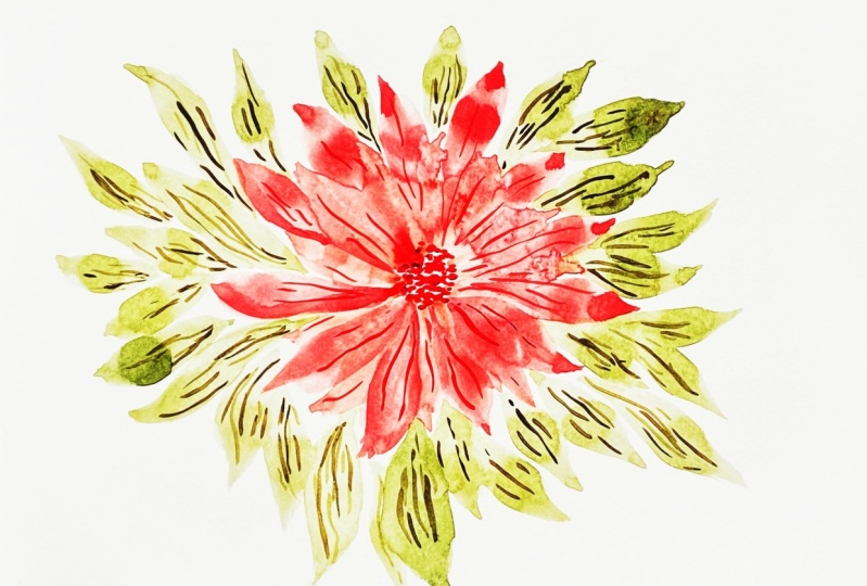
13. Poinsettia: For painting process,
I take permanent red. I find the middle part. And I start, I keep my brush about 30
degrees to the paper. And Firstly, I paint
the middle was a TIA. Usually it has some modes, not noted looking middle. So I create this. And then I place my brush
in one of the dots. I press on the brush
on the ballots abroad. And then I release the pressure. And that's how I create
these four said TEA leaves. And once again, it's nice when they are
little bit different. And then when they
are overlapping. To add variety, you could wiggle a little
bit to your brush. Let's, let, let me show you. You put your brush, press a little bit
and then move e.g. to the right a little bit to the right and then
release the pressure. And that's how you create
these movement in the petals. Vehicle, vehicle a little bit the brush and release
the pressure. Try to be not symmetrical. Try to add some variety. The more variety and the
more curvy lines you have, the more interesting and
unique your flower will be. Another advice. Now, we're getting to
an convenient part. Let's say if you
are left-handed, it probably will be
the opposite side. It's very tempting to turn
the paper and that's okay. But I'm encouraging you to
move your wrist around. Why? Because that creates on E1 and unsymmetrical
brush strokes. You could try it in different flowers and
indifferent papers and you will see how it changed. It really changed a lot
when you are either move your wrist or your paper. So we have pretty
lovely flower already. I would like now to make my
mix a little bit bolder, just a little bit bolder. I'm going to paint
the second layer. I put my brush in-between
these two petals. And in principle,
I paint the same. I add some pressure on my brush. I released add pressure,
released the pressure. At pressure. Release
the pressure. If you feel like
it's too big gap, you could add more petals
or the bottom side. It's nice if you manage to get the second layer
slightly darker. Because the second layer, it's underneath your
the first layer of flowers and under the shade
of a please upper layer. That will look very natural. And I'm not happy
with this shape, so I'm just fixing it with
the tip of the brush. I correct the shape. I might add one more
petal about here. Another thing you could try. You could try instead
of going from e1 out, you could go from out of the
floor back to the middle. For me, it looks a
little bit weird, but sometimes it's
when do you go to correct the shape with
the tip of the plant? And try to add, always try to add variety to
the petals, to the leaves. Just like this. Now, let's paint some
doted some strokes inside the flower to imitate
these stamens. Let's add some greenery. And taking our primary mix, basic mix of olive
green and burnt sienna. And once it leaves, they have the same
shape as the flower. I think it's not nice. So with paint them in the same, in the same manner, maybe try to go
from top to bottom. I like more
brushstrokes when they goes from this direction
from center to aside. I think that makes them
a little bit more. But I think it really depends
on how you organize it, what's convenient for you. As a small, tiny little details, I think it would be nice to just the small
simple brushstrokes. Nothing extraordinary. But somehow it brings air into our warm up, our composition. Don't overdo it. And dark green spots in the middle and our
porosity is ready.
14. Bonus: I'm going to show you a very cool way to paint
Christmas bubbles. Take a round glass cup, anything with round
age and color, the edge we've watercolor, it should be not too diluted. Rather creamy. Don't be greedy. That should be a nice
amount for everything. Nice mode of color. Then turn your glass, press it on the paper. Remove. Wash your brush, and then go along the edges
of these nice circle. And allow watercolor flow, ie two inside the bowl. Help it a little
bit to distribute. It's nice if you leave
some white areas. Just like this. Let it be a very random. So like watercolor flows, like it finds its way. Maybe add a few
more color drops, especially in the bottom area. And I love this way of
painting because it allows you to paint
perfectly round circle and to finish it
just few lines for the top and a dotted line
which will imitate the thread. And this is it.
15. Final Thoughts: Thank you so much for being with me on these scores
for painting with me. I'm looking forward
for your feedback. Which illustration boards the most easier for you or the
most challenging for you? What you would like to pay next. And I encourage you to give it a try to put all the
theory into practice. And secondly, share
your results with others on Skillshare
or your social media. It's very important. It is essential part to feel
confident as an artist. Have a great day and
Merry Christmas, Bye bye.
16. Join my Membership!: Hi friends, I'm
going to be killed. And I welcome you to
joy, to my membership. I know that we all somehow
at different stages of our painting skills
and that's fine because I split my
membership classes, my membership offers
into sudden bundles. And you could start
either from the very, very basic steps and then short-time get to another step
and then to another step. And as my favorite thing, we could paint together complex botanical illustrations or loose floral compositions. It, somehow, it takes time to realize what you're more into, either into loose painting or
some more precise painting, it's okay to give
yourself a try. And another thing I
would like to stress out that most of my classes, you could stop at
any moment, e.g. when a baby cries or
dog needs to go out. So really at any
moment and heavy, just 15 min daily practice. Good. Bring you into really nice progress with
watercolor painting, withdrawal away,
anything basically. So I invite you to
try out free classes, to try out churn
membership, e.g. for a month and feel how
how does it feel here. So I hope you will like
it and we could make, we could create a
really nice together. I hope I see you there. Bye bye.
 Olga Koelsch, Watercolor artist and Pattern Designer