Transcripts
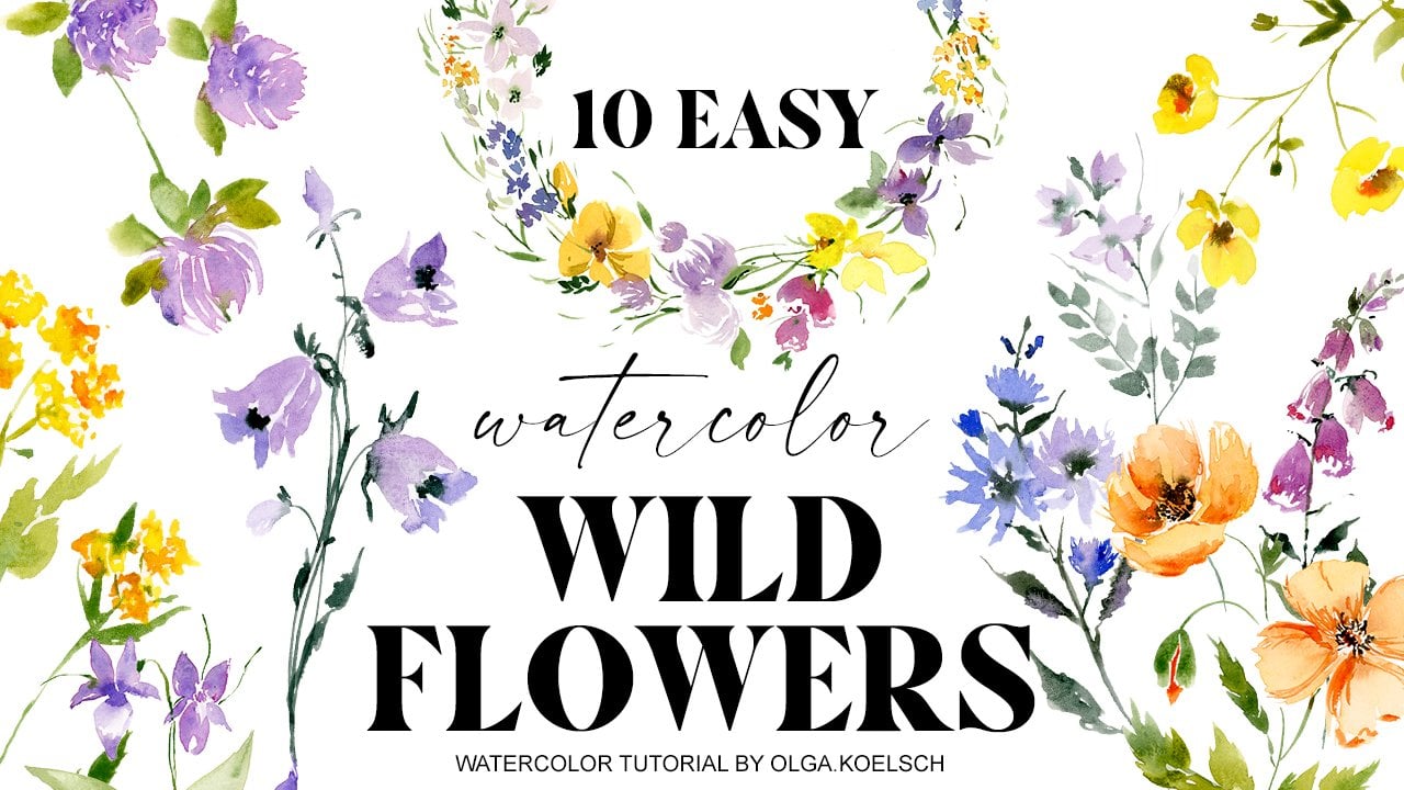
1. INTRO: Hi friends. I will get killed and welcome back to my studio. Today I prepared a
very special class. We are going to paint
a wild flowers. I know that this is a very popular topic for
artists because of diversity of wild flowers and their
shapes and their colors and the beauty of our class
will be that we are going to paint these flowers, just simple, simple
brush strokes. So if it is, you're really first-time
when you open your vertical books and took a vertical brush,
you will manage. And if you are
experienced artist, I would invite you to
give it a try and try this loose technique because
it's very mindful painted, It's very relaxing painting
and I hope you will like it. And as a result of the class, we are going to arrange
flowers in a beautiful reef, which you could use
for greeting cards, for Easter cards, for
some wedding invitations. So many things you could do. You could paint
with wild flowers. So let's start.
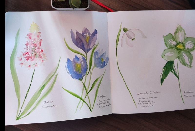
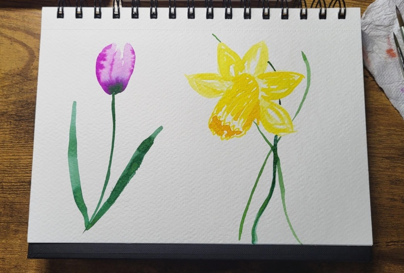
2. Tulip: For painting to live, I prepared very super diluted
mix of quinacridone rose. And we, the tip of the brush, I start to shape the BOD
of our future to live. And while I'm doing this, I remember that two lips, petals, they have very
glossy, very glossy texture. And I could emphasize it, or when I add, when I leave some white space. Right now, at this moment, it's important to water
vapour for rolling and shape. Pretty, pretty BAD. About this. Now I switch to another brush and grab a
little bit bolder mix, and I start to add these
bolder mix in the bottom, the BOD, and just let
it all flow by itself. Around this area, I
am thinking about. There will be two tulips or two petals overlapping
one another. And I add a little
bit of shady area. To emphasize this. I dry my brush. And with the tip of the brush, I distribute a little bit all the bold colors for
when the shape of the BOD. And this very special
thing about tulip, very recognizable
is that they have very sudden middle
wine in each petal. So I, first, I made out this area with the
tip of the brush. I just drag out the bold
color to the sides. And that's how I imitate these, these small, tiny little lines. I keep adding details into them. But it's nice to add
some little drops and dots to make the bot
little bit more intricate, little bit more interesting. But try to remember
about these middle. It's even fine to add a
little bit more if you see that the colors
vanished slightly. So you just keep
adding into this area. Now I will grab the fruit brush. But of course, if that's
more convenient for you, you could just watch one
brush, grab another brush. I, I really liked to
jungle with brushes. And I grab my green mix. It's fallow green and
see Anna 0 recipient. Because I really
like when colors are mixing by themselves. So I don't do anything extra. I just leave the green color, move into the pink one. I would say our, our tulip is almost done, but of course would be
nice to add some greenery. I dilute my mix. A bigger brush. And let's create a nice low leaves. One. How I paint leaves. I start with a tip of the brush. Then I apply maximum
pressure on my brush. Make some curves around, and then I release the pressure. And I really like when my brush
makes these fluffy edges, I think it looks very natural to imitate these
faults on the LEA. I go with the second
time on the same area, but just on the half of this. It's also nice to add a little bit more dark
shades inside these areas. Let's repeat. First mix a darker shade and then you paint just
half of the leaf. Really, apply the pressure,
release the pressure. And that's how our fold
wars was achieved. We could add few more strokes, few more details to the leaf. Wash your brush a little
bit and software, some areas often some
details, don't overdo it. This is it.
3. Daffodil: Another popular Spoonflower
is of course, daffodil. And that's a tricky
one because it's yellow and yellow color
are considered to be rather complex in watercolor because it's
difficult to create shades. I prepare two mixes. This is bold yellow, this is transparent yellow,
very diluted yellow. I start with diluted. We've diluted. I map out the middle of daffodil with some round
up, round stroke. I paint petals says I usually do starting with the tools, raj, applying some pressure
off the brush and bring them relatively
transparent. Yellow to this round point. I like to leave a
lot of white areas. It usually makes
flowers very shiny, very bright, and very contrast. So right now, I create the
outside part of the footing. If, if you're good
with geometry, you have to think a little
bit of perspective, because now we'll look at our daffodil from
little bit of side. And you somehow need
to imitate these. I like freehand painting. That's why I kind of not
very much bother about this. I outline the middle just
for, alright, for now. To see where should I place the other leaves,
the other petals. I just place them around. You see sometimes
I apply pressure. Sometimes I paint just
with brush strokes. What is nice to add
a lot of variety. So some very bright somewhere
a little bit in the shade. And if you feel e.g. it's a little bit too dark. Wash your brush, dry
brush with a paper towel, and lift a little
bit to the color. Just like this. Now, Let's go to our
bold watercolor. It's still the same cadmium
yellow. Cadmium yellow. And you see how
differently it looks like. It's suddenly very bold. And we got our nice contrast
between yellow colors, but it's the same, exactly the same color. It's just cadmium yellow
without anything extra. Another trick is
to add a drop of orange color to your yellow mix. I might do it later on. This is very curvy, beautiful. Part of just apply your imagination and create
something nice here. It's one, the top part of coal. And now we'll paint the
bottom part of the coal. Some wavy free hand moves. About this. I would like to wash my brush
and correct few things. For me. This part looks a
little bit too dark, so I lift strokes. Now, the complicated, now
comes the complicated part. This part is the darkest spot. Now, I would like to add cadmium orange into
my yellow mix. But just a little bit, I do not want to look at, I will look on nature and to write daffodils
very, very tender. And we would like
to recreate that. So I think more. I would call it cheapen moves. I dry my brush with
a paper towel and remove some times I remove
some excess watercolor. To create these fluffy,
maybe beautiful texture. I would like to add just a line, just a shade on this part because sun
shines from the top. And this is the darkest spot. With we have a snow storm and
I'm paid his bring flowers. It's it's a little bit
co-ops and feeling. So let's paint a green stem mix of phthalo green
and burnt sienna. To paint a try it. Let's make imaginary
line our stem. And then we need to always nice to add some curves
to the stems and let add some green cross
green leaves around. It would be nice to add
some greenery right on the top of the flower to
emphasize the contrast. With my slightly orange mix of cadmium yellow
and cadmium orange. I would like to add
few tiny strokes to some metals in them. In the central part
where the petals connects to the middle. Just like this. And I remove a
little bit of code. Here. We have it.
4. Hyacinth: For hyacinth, I prepared very diluted mix of cadmium orange with
tiny little strokes. I'm shaping the top of a flower. And step-by-step, I
add quinacridone rose. And when necessary, I remove the excess water from my brush. That's how I'm softer. Softer than the colors. Because they are very,
very, very tender. And we need to start to
paint them in a very, very diluted way, e.g. basis to write. And I keep diluting my
pink mix. If you e.g. will choose to paint
hyacinth in blue color, purple color, which is
also very super popular. You just do the same tricks
but with purple column. The more we go down from the top to the middle
part of the flower, the more evident became of them. Small little flowers,
the small little bars in the entire scene. So from around this moment, I start to shape, to shape the flowers. Usually they have six petals. Each small flower
has six petals. I do not right now, I'm not going into details. I'm not doing that very precise, but I keep in mind
that amount of petals. I, I would say I'm
mapping out the future. Flowers. Of course,
keep in mind that all small little flowers,
they're overlapping. And sometimes we can't
really see all six petals. Sometimes we could see
only one or two of them. But it would be nice if
you could show a few, a few flowers which are very
similar to the original. And now I grew up
a little bit of bolt quinacridone rose just
on the tip of the brush. And while my paper is still wet, I add tiny little dots in the
needles of these flowers. I like to do it when
paper is still wet so it could be very
softly, tenderly diluted. I wash my brush. I dry my brush with
a paper towel. And in some areas, I drag out these darker
color into the flower. Very gentle. Just with the tip of the brush. I drag out these bold color and sometimes even
soften the edges. Always wash your
brush and go again. No need to emphasize
all the petals. It would not look natural, but you could add a
few strokes to each. That will be really,
really, really nice. So we could paint
a little bit more, go a little bit down
with this group. Imagine the shape of the flower, I think our cluster
and about this area. So we need to, we could add a few big
flowers on this area. What I'm painting,
it's just two strokes. It's not saying I
won't go into details. It's just arranging
brushstrokes. Sometimes I'm overlapping
them one with the other. Keep in mind that once we're
going more to the stem, the Beagle, the Beagle, the petals are, the
bigger the flowers. To make it easier, I just switch to
another brush for bolder colors because
it will save our time. And I add this middle. Middle drops in-between. I switch to the other brush. It's a dry and clean brush. And I drag out a few brush strokes from the middle to the
tips of the petals. Once I feel that it's
getting too dark, I just washed my brush again. Go again. I could add a little
bit of water. We just, it's just water to the flowers which are
dry already and drop again. The bold color. In around. Now, it would be
nice to add some contrasts. I prepare a little bit bolder
mix of quinacridone rose. I will mix it with that
orange with cadmium orange. Just to make it a little bit a little bit
warmer the column. And I would like to add a little bit darker color
in between the petals. Just very few spots. When I switch to my clean brush. So often. You see how light or light
pink flowers popped up. That's what we were looking for. Just a few details in-between. Now, we could set our
flower on a stem. For stem, we use our mix of green and burnt sienna. Little bit more. Stems usually are quite
bold or quite thick. But anyway, I prefer to
paint them in more tiny way. And of course we have to
add some green leaves. How I paint leaves. I start with the
tip of the brush. I apply some pressure, and then I release the pressure. And same on the opposite side. Some pressure. Release the pressure. I would like to add few more
light flowers at the bottom. So it will look more like maybe fuel, darker,
darker petals. And right away, I add
bolder color tool. For our centrals. We could go back to our, to the leaves and
add some details. Just the tip of the
brush I go leaf. And that's how I
create them forward. So I'm painting over just
to hop off the leaf. And that imitates the folding, the fold of the leaf. I could add a little
bit of green color around the area of a
stem to make it neutral. As we paint with watercolors. Always nice to solve
ton everything. To let watercolor mix
in a very organic way. Um, I think these green
spots are two greens. So I take clean to clean paper
towel, remove the excess. Unnecessary greenery. Tiny little details. Oh hi, things is ready.
5. Crocus : For nice purple
color of Gropius's, I mix with tremor in blue
with quinacridone rose. And if you've arrived, the amount of both, you could get very,
very different trades. So I load my brush
with my purple color, and I keep my hand in about
30 degrees to the beat, will start with the
tip of the brush. Then I apply pressure and
release the pressure. That will be the point where
petals connect to the stem. And I paint a second petal. First we're painting
the front petals, which we could see from our, from our point of view. Same procedure,
tip of the brush, belly of the brush. Bring down to that very point. Now I will add a little bit, just a little bit of ultramarine blue for the variety of colors. I paint. One more petal, slightly
side tip of the brush, belly of the brush. And I mix them, I mix them all together. Help a little bit with
the tip of the brush at some details like this. Now, I paint the petal, which is on the very
back tip of the brush, belly of the brush. And I released the pressure in the bulb daily when it
touches the front petal. And I add some details with it. The brush and the last, the last petal should be, I think around this area, very small one, we
can't really see it. So I painted with the
tip of the brush. I switch to another brush. So I use cadmium yellow to mark the middle with
the tip of the brush. I imitate some of these
hormones in the middle. I let everything mix. Then I switch to green color. For green color, I use my mix
of green and burnt sienna. I connect my brush, bring my brush to the
same valley point. I even touch a little bit. Every eye blink Dog. Pain. I paint the stem. Um, it looks a bit lonely. Let's paint a few more
with the same style, but I would like to
add a little bit more of ultramarine
blue for the variety. More pressure, this pressure, more pressure on this brush. And we bring everything
to one point. And more pressure,
less pressure. A little bit more bold blue. One, petal. Mix, everything. And the background. I wash my brush slightly. This treatment down the
columns, I got everything. I have green color
loaded already, so I just proceed and
paint another step. And at the same time, I will paint these
leaves of Caracas. They looks like grass, and it's very easy and
pleasant to paint. You put your brush on the tip, on the tip of the brush, apply just a little bit of pressure and curves
and then let it go. I would like, right now, I would like to add
yellow yellow pot. Poland's side. I see now, I I'm
not really happy how yellowish it looks like now. I dry my brush with a
paper towel and I go along this top petal and
just leave everything. Now we have a very
precise, precise petal. Let's paint. Another brush will release the pressure. Backside. One petal. The petal. Petal. Bring everything to one point. Now I have, what do I have? I have yellow. So I
could paint Pullman. Then I wash my brush, grip, green color, stamp, and
some gross looking leaves. Grow quizzes already.
6. Snowdrops: Snow drops are
white and white is a scholar for watercolor because we do not
really have white. We have just white paper. So we paint in gray. And I would ask you not to
use a diluted black color. Always. It doesn't look artistic. Let's mix ultramarine
blue with cadmium orange. And I'm doing this, we will get our pleasant,
transparent, grayish color. Let's start. This
will be zero point, just mark the point with
this will be the point where the bot
connects to the stem. With the tip of
the brush strokes. It's the front petal. I met. Then I wash my brush and I dry my brush with
a paper towel. And I softened inches. And I always do it in one direction from
the beginning of it. And I will not finishing, I'm not outlining the petal. I leave a small white area because it will be the
lightest area of the petal. Now, I grab another
portion of gray color, comeback to that point and map out with the tip of the
brush, another petal. Wash my brush, I
dry my brush with a paper towel and
I soften the edge. And in the same time I'm
creating the second petal. Just like this. Again, gray color. I come back to the same pole. To that point. I create some curvy line. I've washed my brush. I soften the edges, and I create some grooves round. We will add more details
later. No worries. Sound very small, tiny
backside, background. I basically I'm
painting right now with dirty slightly
due to water, which is really nice. And that's why I recommend
not to wash your blood's too often because
perfect gray colors usually I write on your palate. So now we need to
bring it in vitro. Make sense to all of these. I prefer mix of green and yellow until I'm happy
with the sage green color. I paint. This green part. I forgot hold calls or calls
where the BOD, the flower connects
with the stem. I painted stripes. I wash my brush and I lift a little bit of color
on the top very carefully. Then I left out with
the tip of the brush. I map out their stamp. Of course, if it
feels easier for you, you could paint first some outlines with pencil
and then go on the top. I grab a little bit of diluted green mix
and paint these top leaves a little bit pressure
and then release pressure from i with the
tip of the brush, I mark the moment when the
leaf connects to the stem. Now I grab a little
bit darker color and emphasize this ten. So basically I go again along
the same, the same line. I could add some details. Some lines, some connections, and some green foliage, which are inside our
lovely snowdrop. Now let's add a few small,
tiny little details. The most bold white colors in the point where the bot
connects to the greenery part. So I apply extra gray
color just to that area. Just to that area. And I take a little bit of very, very diluted gray color
and paint a shade. So I'm not touching all
the, all the petals. I leaned a little bit to
side and that's how I, how I create the fall scene
with the background petal. Add a little bit of shade, and then soften it with
a tuple from brush. I would like to
repeat the trick. This petal. To
emphasize a little bit. Then fold of the petal and
some details to the front. Petal, just with the
tip of the brush.
7. Helleborus: For painting hullabaloo, I need a very bold mix of
green and burnt sienna. And the same mix bought
super, super, super diluted. But also I need a cutting cadmium yellow
to map out the middle. Just with random brushstrokes, you create the middle, leave a lot of white
areas in between. Now I change to a bigger brush and I load my brush
with diluted green. And I start from the middle. I drag out the color
from the middle. So I grab a little
bit of yellow and mix it with green and create
the first battle. With the tip of the brush, I add some crispiness
and details. Little bit around. Next level, it will be
underneath the front one. So I start to paint from
the middle of that bedroom. In principle, it
looks like I paint too bold, bold, bold outlines. And then I add some
details into it. Just with the tip of the brush. So very loose, very,
very free hand. And why are we doing that? Because elbows has very
suddenly middle wine. And instead of painting the middle wine
with a bold color, I leave white area. Emphasize it. That's the other way to
shore up the petals texture. I think it's nice to
know different options, how to, how to do that. A lot of white in the middle and details with the
tip of the brush. Sometimes you could,
sometimes you could load your brush a
little bit of bold color, but right now, don't overdo it. So the fifth, the last petal, it a little bit shorter because it looks
on us and it's global. It's this petal closer to us. And it slightly for
same principle, I little bit drug
out the yellow. I create lines, I create details with
the tip of the brush. And I remove excess
water with a dry brush, just lifting up the color. Now, I grab bold mix on
the tip of the brush. And I go around
this lovely yellow and it looks like I'm painting underneath the
yellow pollen anyway. Now you could see how the yellow part suddenly
lifted up and it feels like it's really a
big bulk of yellow here. Try to do it very random. Leave a lot of whitespace. In-between. You could take your small brush, just wash it, dry it out. You could distribute
some bold green parts. These strokes, bringing
them into the petals. Add some shades, some
wines, some texture. Above. It's about like this. No need to be very precise. A little bit. Dots and spots around. Small, little tiny
dots in the middle. To emphasize. And I switch again back to
the ball of bigger brush. I tried to find where this
term I paint the stem. I paint very, very roughly. I'm just trying to think how
it will look like for me. I need slightly
bolder caught mix, so I quickly and quickly exit. Green leaf.
8. Muscari: Muscarine have a cone shaped cluster of flowers
on a loan or tiny stem. Usually the top flowers, they're a little bit greenish as they did not blossomed yet. I paid them very, very diluted green column. It's my leftovers of my green mix of green
and burnt sienna. I leave a lot of wide space here and there between the
strokes to add crispiness, the tip of the brush. And once I'm going down, I start to add ultramarine
blue to the greenish area. First of all, to
make these gradient slightly softer,
slightly smoother. And also I apply more
pressure to them. To my brush. Then scary flowers. They looks like
small little buds connect very tight,
one to another. So I tried to emulate that. And I leave white areas,
white paper between. I increase the volume of my
cone and IVY, the color. Now I was a little bit in the middle because it looks a little bit of green and
it's a little bit propulsion. Now I paint with
ultramarine blue. I apply more pressure
to my brush. And at the very final flowers, small little buds, I add
more and more details. The body itself, they look, they look like these small, small coal, the middle. So I little bit emulate
that ceiling. I add. Sometimes I just go directly to my palette and
grab some bold, very bold, which
from marine blue. For the contrast. With the tip of the brush, I create these rounded areas. The more contrast you
have in your flower, the petrol, and Scurry. They are darker to the
bottom, docker to the bottom. That's what I'm trying
to emulate here. It's quite relaxing
to paint was Cory's. Uhs. In principle, you paint, brush stroke, just
brush strokes. Then wash your brush and load your brush
with the green column. It's a mix of green and
burnt sienna. Find. Now it's important to find the right position for the stem. And to do that, you just fold imaginary
line from the top. And bell curve. Maybe it makes sense to add a little bit of
thickness to this stem. Looks a bit more neutral, so I go along the same
stem with a second stroke, just applying slightly
more pressure. I could add few more leaves. They also then look like. So with some pressure
in the middle is nice. And I will add a little bit
more darkness to this ten. Divided from the cross,
muscarine is ready.
9. Primrose: For painting Primo I prepared cadmium yellow for the middle. With the tip of the gosh. I just create something looks something looks
like a sunshine. It will be the middle. I wash my brush and I
take Alizarin crimson, and I start to create
the second layer. The second layer flower. Now I paint in some clusters. It's important to remember
that Primrose us, they usually have six petals. Now, I'm painting
in six clusters. Should not be too
precise to geometrical. Just to keep in mind
the amount of six. I, sometimes alone,
yellow color mix with Alizarin crimson again helps
live and help a little bit. Sometimes I leave white
space for the variety. I switch to a bigger brush. I wash my brush, dry it a
little bit with a paper towel. And now we're going
to paint petals. What's the feature of
primrose is the battles. They have these
heart-shaped petals and that what we have
to keep in mind. So I start with the top one. I press my brush, I made some round. Just imagine like a paint hot. Then another side, I
draw out the coal, the pink color, bring
it to the hot shape. And now with a tuple
to brush some details. I could drag out a little
bit to the car from, from the petal, from the top. To emulate the vines. I wash my brush after each and every petal I've
washed my brush. And I create gain half of
the hot wash my brush. We need to know that half of
the hot add some details. The tip of the brush. In principle, I just
distribute that pink material, which I already have here. I've washed my brush. I drove up the color from the
middle. Half of the heart. Another half of the heart. I try to reward, my heart's beating
too symmetrical. I'm trying to add some fighting. Each and every wash
my brush off to every hot or even after
every half of the heart. I washed my brush and dry
it with a paper towel. When I drag out a column like this and
leave a lot of white space, that makes, that creates this very crispy
contrast feeling. Which have very much like now. Calm. The petals. It's a little bit
distribution of color. Wash my brush. And the last one, sometimes it's the
PayPal bought. It's better if you don't train your wrist more flexible
and paint from one angle, it just requires some practice
and then you do that. So in principle, our
primrose is destroyed. It's a little bit too pale. So I take a green, I prepared a great mix. It's green and burnt sienna. I like these sage green thing. Whether tuple for Bosch, I think the middle, the middle of the flower. Now a small step just with
the tip of the brush. Small curve is stamped. Try to avoid range. Just lines. And I
would like to add at least one green leaf. First, I mapped out
the middle, why? The stem like this. And then I switch to a
bigger brush, bigger brush. I grew up with my color. I press my brush. I create wiggle,
wiggle, wiggle moves. Lift a little bit to the brush. It will be the moment
where the petal turns. I proceed from underneath the petal with the same
wiggle, wiggle, wiggle. And I reduce the pressure
and come back here. You could add some
details now or later on. It depends a little
bit on your paper. For me, I better
not to do it now, let's repeat with the other with the other leaf painted a little
bit differently. Let's start from the top
of the paint off the leaf. I apply a lot of
pressure to my brush. It's almost the whole
body of the brush. I just freely wiggle, wiggle, wiggle along the middle. Why I would use the pressure. I come back to the
opposite side, stamp, bent a little bit, another part of the leaf. That's how we create
these folded leaves.
10. Lily of the valley: The tweaking with painting
lily of the valley. Firstly, that leases
or very tiny flowers. Secondly, that they are white. And painting whitewater
color is always a challenge, but we will manage. I start my painting with
mapping out future stems. Just with the tip of my brush. No need to be super precise. For green color, I
use cobalt green. Hi range. I prepare everything
for painting, flowers, for painting
white little barbs. And Firstly, I chest with Baer, nice, I would say less for them. It also reminds of decorating a Christmas
tree when you have first step and then you will just bubbles on the branches. So now we prepare,
ring that area. Now, I wash my brush and
I prepare a green mix. It tastes the same cobalt blue with a hint of
quinacridone, rose, and a little bit of ultramarine
blue or everything, actually, everything
from your palette. I would insist that you would not use a diluted black
color for your paintings? Slow, little bit dirty. So I mentioned
that my son shines from the top from left
side to the right, which means bonds has lighter
area on the left side, darker area on the other side. I dry my brush and clean
my brush and I could remove the excess dark
color if necessary. I usually paint very
small brush stroke on one side on the
sun, sun shines side. And a darker brush
stroke and bigger. Just moving slowly. From top to bottom. Paint tiny little flowers. No need to, to watch
attention to details. You would just bringing
everything to shape. One idea. And again, it's fine. Brush strokes on the left, darker brush stroke
on the right. Some curvy lines on the bottom. Just to bring the
idea of the bond. It's nice when you could manage to drag out a
little bit of green color. Once it feels too dark, just remove this
darkness, dark column. Usually watercolor
paper allows you to make a lot of corrections tooling to bring your painting. And so first of all, it works just wave
clean and damp. Brush. Finish this branch. Small, little tiny dots. I edit a little bit more of
a yellowish color to this, to this branch for the
variety, for some contrast. This is greenish, similarly,
gently, gently rename. Our branches are ready and now it's nice to
bring some greenery. I switch to a bigger
brush, bigger brush. I prepare lot of mix
of cobalt green. This is just cobbled grill. Or you could mix e.g. phthalo green with
ultramarine to get these bluish sage, sage green. And I start with the tip of the brush and paint one half of the leaf and load my brush
again and start with the top. Go back. I tried to leave a
small white area between these two brush strokes. To emphasize the middle wine. You could dry your brush
and remove the excess. Just with the just
like your brush. One more leaf would be nice. I buy a lot of pressure and
then I reduced the pressure. What if you'd like e.g. to overlap two port or
leaf underneath the fall, which has gently do that. It's like you first paint with a brush stroke and then
with the tip of the brush, you update you correct
a little bit to the shape and enlarge the shape and move the leaf underneath
of the flower, e.g. it's nice to add a little
bit more contrast. That's why I grab a green color. Bold variables right
from the bullet. And first thing I want to
emphasize a little bit, stamps. Also, it's a good moment to
correct some some stamps. This moment, always nice to add. A little bit more of
a darker color until the tips of the leaves. Live with Moodle. Once you add a little bit more
shades around Wildflower, it will really pop off. Forget about that. If we paint and bold
brushstrokes, brushstrokes, chest alone, then it will
imitate the fold of a flower. And this is it.
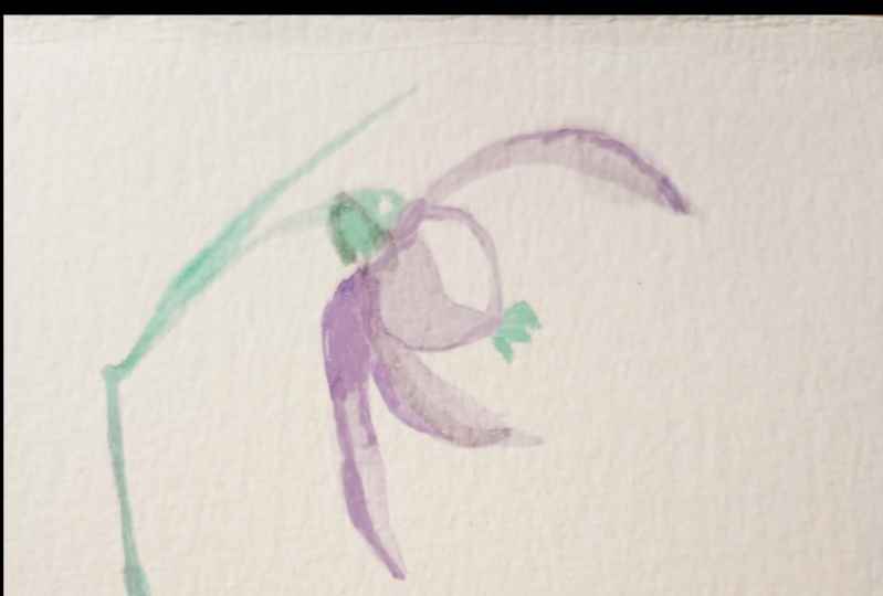
11. Fritilaria: A free tool. Every flower
I use a mix of Alizarin, crimson and burnt sienna. I find the spot where
the bot will connect to a stem and with relatively diluted color
with the body of the brush. I paint petals. Free to Lori, has quiet
geometrical structure. And I tried to emulate that
just with brush strokes. So I create a wreath brush
strokes, which book? Which forbade from
top to bottom. No need to be very
precise about that. That's all right. Right now, I would
like to add a hint of blue mixed with
Alizarin, crimson. Add more darkness. And now the fun part
with the bold purple, which is a mix of Alizarin
crimson and ultramarine blue. It should be very, very bold. I create these check texture. And as the First
Lady is very diluted and the second
layer is very bold. In principle, I took it
right from the pellet. It creates this nice, organic, organic looking spots which are a lot of flowing
freely and mixing. We have a little bit
of control right here. Also with the tip of the brush, we could slightly
divide node battles, emphasize the ribs, some
some details and shades. Now, checking my brush and use green mixture of
green and burnt sienna to stem some of connections. And it's done.
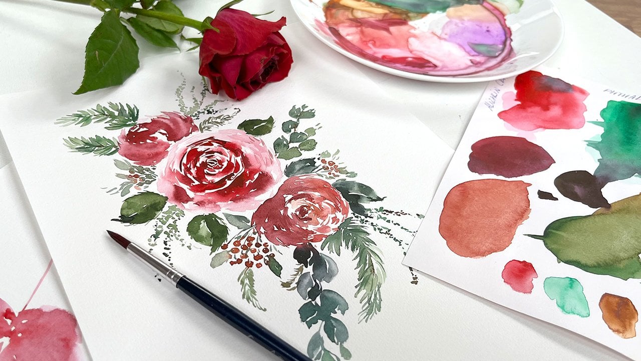
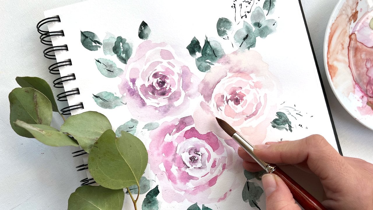
12. Bouquet : The fun part, painting of single flows is of course
to arrange them into. I would like to start with daffodil with yellow,
with cadmium yellow. I map out the central, either go around with cadmium orange and create
them orange middle part. Then I switch to the
yellow color and paint the petals as we did in the tutorial with daffodils. I remember that daffodil
has six petals. I want to paint them
very, very diluted. So I often wash my brush, dry it with a paper towel, and remove the excess water. I leave a lot of white space. I've arrived pressure
on my brush. I very much like when colors from the middle mixes
with the petals. So now, oh, now I have
just the last one. It's a very common thing. When you paint, you're in the process and
you suddenly paint the seventh battle to
your, to your daffodil. That happens. Count the pebbles. In next flower I would like
to add would be coffee. It's our mix which we used it some ultramarine blue
and Quinacridone Rose. I would like to make it a little bit more on blue
side, on purple side. So I will add a small clusters, small tiny clusters of muscarine right next
to our defaulting. I, again, I wash my brush and I remove
the excess dark color. I want all the kids be very, very supreme, very soft, very light, etc. etc. Now let's add a
crocus, grow slower. Front petal, very, very
diluted front petal. I leave, again, I leave
a lot of bite area. And I combine painting
with the tip of the brush with the
bulging of the plush. Always nice to add some
contrast for glucoses. It's the orange to orange and I just leave
it, leave it flow. Also, it's possible to add a little bit of
greenery right away, to scurry, to cocos. Very tiny, very, very loose
painting, very loose. Right now we could add, you could add a primrose. Good will look very great. Very nicely. Next to daffodil, yellow middle, some hot looking petals. I hope you really like this tweak that really
helps to paint. Primrose is when you think, then you think about
painting hearts. I almost do not take colors
from my basic palette. I use everything
what is in on my, on my, on my plate. And that approach creates the consistency of your
whole composition. There is no risk that you
will use some new cover, some weird color which is not intrude into all in
your arrangement. So as I always
recommend to not wash your pullets until
they're really, really worked out
all their potential. So primrose, what's next? Let's paint a little
bit of the wildly Here would be nice to add a
small cluster of the valley. I start to paint for
them with the stem. Then something something
grayish, imitating white. As you remember, we
do not paint white. We paint with mixes. And the tiny little secret. It's very convenient to make
some beautiful gray mix, again from your
unwashed late unwashed palate and bought these. I do not go into the
details with the book kit. I could add a little
bit of greenery around. Very soft, very,
very soft consoles. Have a look. I think
it would be nice to add samples some sense. It's, this word is really not that easy to
pronounce correctly. I paint loose cluster. I remember that
it has six petals and it goes tinier and
tinier and smaller. Once I go to the top, I I'm not a big fan of poor yellow color,
pure yellow color. That's why I add more
orange of permanent orange, cadmium orange and orange. And while the paper
is still wet, I will add few tiny centrals, just small, tiny little drops. Now let's add something
more bold. Weeks. Roles with ultramarine blue. B, B, B, B, sum. I paint tulip upside down. You might find it, I'm convenient and it's very
tempting to turn the filter, which is all right. But I would like to
challenge you a little bit and try to buy
it upside down. Why? Because the cost
of all your wrist. And secondly, each creates more neutral moves of all the elements which are in the bouquet,
the composition. Just about this. Now, let's add some greenery. We could rely our greenery. Little bit more pressure, a little bit less pressure. Remember the different flowers they have different greenery. Looks sample. Some leaves could
be more rounded. Some leaves could be long. Just looked like graphs, e.g. next thing I would love
to aid right here. Let's see what we
do not use yet. Maybe another query. Query element. Slightly bluer. It wouldn't be nice as it would be nice to add
something to this side. So I painted upside down, you see course, you
could turn the paper. That's not necessary. I've washed my brush and
I and I soften the edges. Soft and all the painting. Some areas I leave. Some areas I leave
almost vanish, almost removed from the paper. Some green leaves. When you need an aspiration
for a bouquet, of course, you could either
arrange yourself or Lot of inspiration I get form. Floral shops or floral
Instagram websites. Florists there really knows
how to combine flowers and they're great with
color schemes as well. So you could get ideas of which flowers on combining nicely. Subscribe to some
Instagram floral channels. Visit some Photoshop's. I like everything. What we're going to
solve for Little drop. I think one small drop, drop snowdrop would be
very nice right here. Getting gray color, which is even diluted, even more diluted. And connect with the green stem. That's green details. As you see, I read the book, yeah, when painting a bouquet, I do not go too much into details because otherwise
it would be too complex. Disturbing. Tabled
like to it to bouquet is different types of
greenery of green leaves. I use my brushes. In principle, I use similar brush strokes to
everything and everywhere. Sometimes I paint
more rounded shapes. Sometimes I paint
more tiny details. Clusters of flowers. Little bit weird what,
what's happening here. But we'll add some purple so
you see it's very easy to fix everything with
watercolor colors, and now we have a
nice light here. The last thing I would like
to do is to bring some, a little bit more attention
to their middle board. Warm the body. Usually if you look at daffodil
from right from the top, you could see the inside
of the flower pollen area. So I just add a little
bit more of details. Just a little bit. I again, I do not I do not
go too much into details, but I would really like
our the focal point. All the composition. And last thing I do, I go a lot, robbed. The petals with a darker color. It's difficult already
to say what is in there. It's mostly cadmium orange, but soft and quinacridone rose. Small, tiny little details
in just a little bit. Please be very careful. It's very tempting
to start to add and add and add more
and more details. No need, no less, a little bit. Emphasize really tiny green. Always, always nice to add
a little bit of details but very gentle and not to
each and every flower. Soft and everything with clean, clean down the middle. You see after each and
every bold stroke, I've washed my brush and I dry it with a paper towel
and soft and everything. I would like to paint
one tiny green leaf. To finish the composition. Add a little bit
more of very dark, very bold green strokes. Contrast for diversity. And this is it.
13. Final thoughts: Thank you so much for
joining my class. I hope you enjoyed the process, which is the most
important thing. And I'm looking forward
for your feedback. Which flower was the most
complicated to paint? Which flower you liked? Best of all, maybe which flowers you would
like to pick next. I encourage you to
paint as much as you like and bring these exercises, always lessons into practice. And looking forward to see
your beautiful pictures. See you next time. Bye-bye.
14. Join my Membership!: Hi friends, I'm
going to be killed. And I welcome you to
joy, to my membership. I know that we all somehow
at different stages of our painting skills
and that's fine because I split my
membership classes, my membership offers
into sudden bundles. And you could start
either from the very, very basic steps and then short-time get to another step
and then to another step. And as my favorite thing, we could paint together complex botanical illustrations or loose floral compositions. It, somehow, it takes time to realize what you're more into, either into loose painting or
some more precise painting, it's okay to give
yourself a try. And another thing I
would like to stress out that most of my classes, you could stop at
any moment, e.g. when a baby cries or
dog needs to go out. So really at any
moment and heavy, just 15 min daily practice. Good. Bring you into really nice progress with
watercolor painting, withdrawal away,
anything basically. So I invite you to
try out free classes, to try out churn
membership, e.g. for a month and feel how
how does it feel here. So I hope you will like
it and we could make, we could create a
really nice together. I hope I see you there. Bye bye.
 Olga Koelsch, Watercolor artist and Pattern Designer