Transcripts
1. Hello & Welcome: Come to another lesson here
on skill share. Hi, guys. My name is Claris and I am a watercolor artist
from Toronto, Canada. I first started
out my watercolor journey over on YouTube, teaching very basic
how to paint, insert a flower name
here, tutorials. Watercolor flowers are my thing, and if they're yours as well, you should check
out the channel. I am also an ambassador
for Prince and Brushes. You're always going to
see me using Prince and brushes in typically
all my videos. Art to me is very
therapeutic and I find the more you exercise
your own creative freedom, once you learn a technique, the faster you grow.
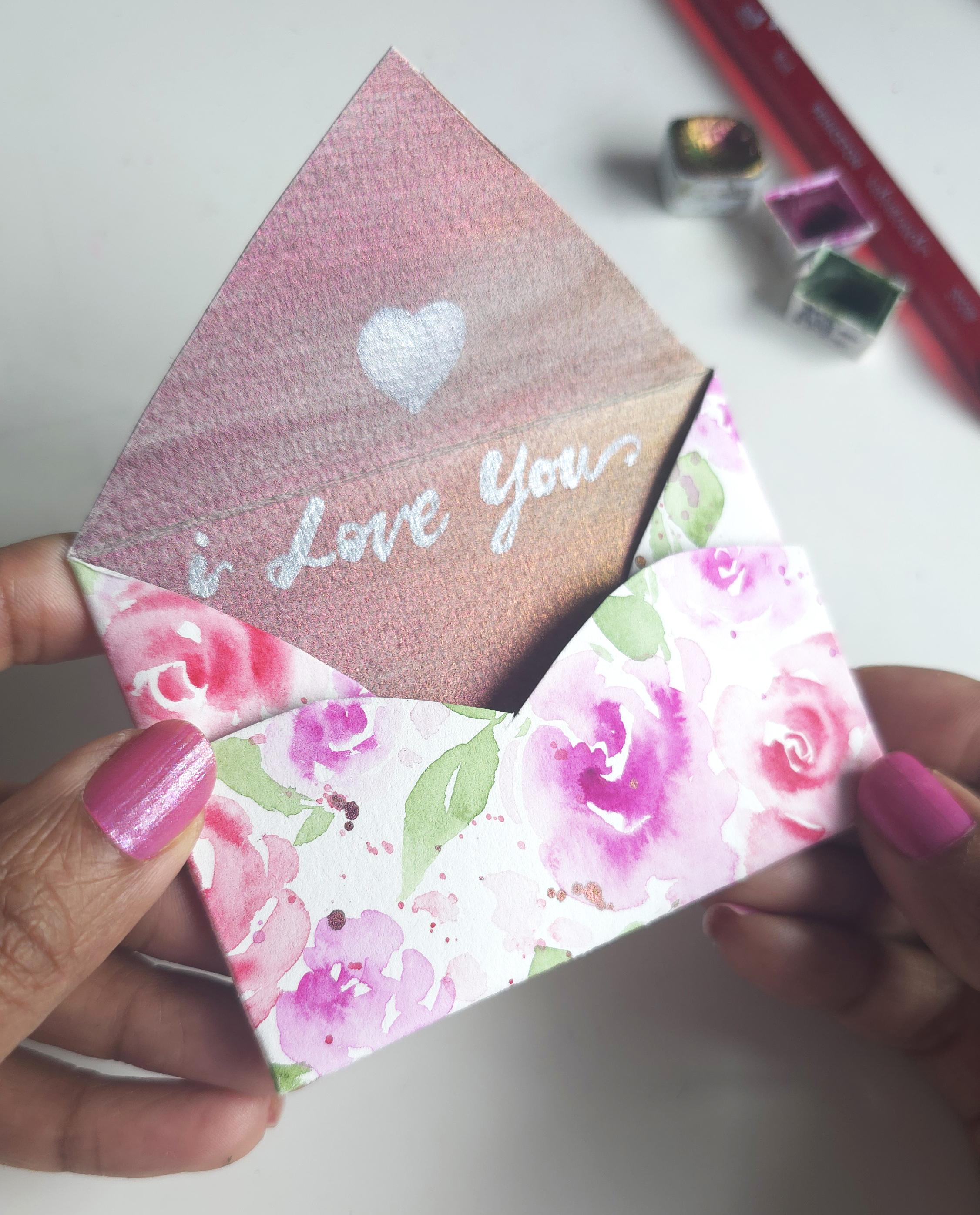
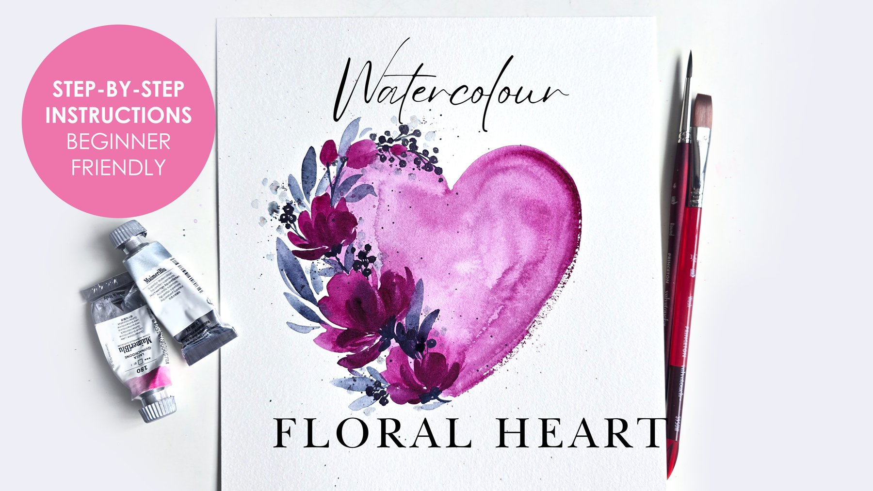
2. About this Class + BONUS: This class, I am going
to take you step by step on how to
paint loose roses, loose basic flowers, leaves, tendril like effects using the Princeton petals
brush, and more. It's also a very special
aspect to this class and that involves drum
roll, you ready for it. Using a little bit of metallic watercolor
with your florals. I'm super excited to show you creative ways how you can
incorporate a little glitter and shine in your flowers for those special occasions or
just because you like litter. There's also a bonus
aspect to this lesson, and that is, are
you ready for it? A template on how you can create your very own cute little
watercolor envelope. I've listed the
template as a download, feel free to download
the template, start your painting, do
the lesson along with me, learn how to create
your own flowers, do your own composition, spread it out on
the sheet of paper, and then trace the template over it and cut it out and
just follow the instructions. It's super easy.
3. The Project + DOWNLOAD: You finished
practicing, painting your compositions along with me and then maybe doing
your own composition, you can do one of the
two or maybe both. You feel free to post
your final composition, whatever it may be, it may be one of the two that you
have painted with me, or it could be one that
you've painted on your own, inspired by the ones you painted
with me or the envelope. If you do end up
doing the envelope, I would love to see it. Please do post your version of these cute little
watercolor envelopes in the gallery
section over here. This way, I can see your beautiful work and
comment on it.
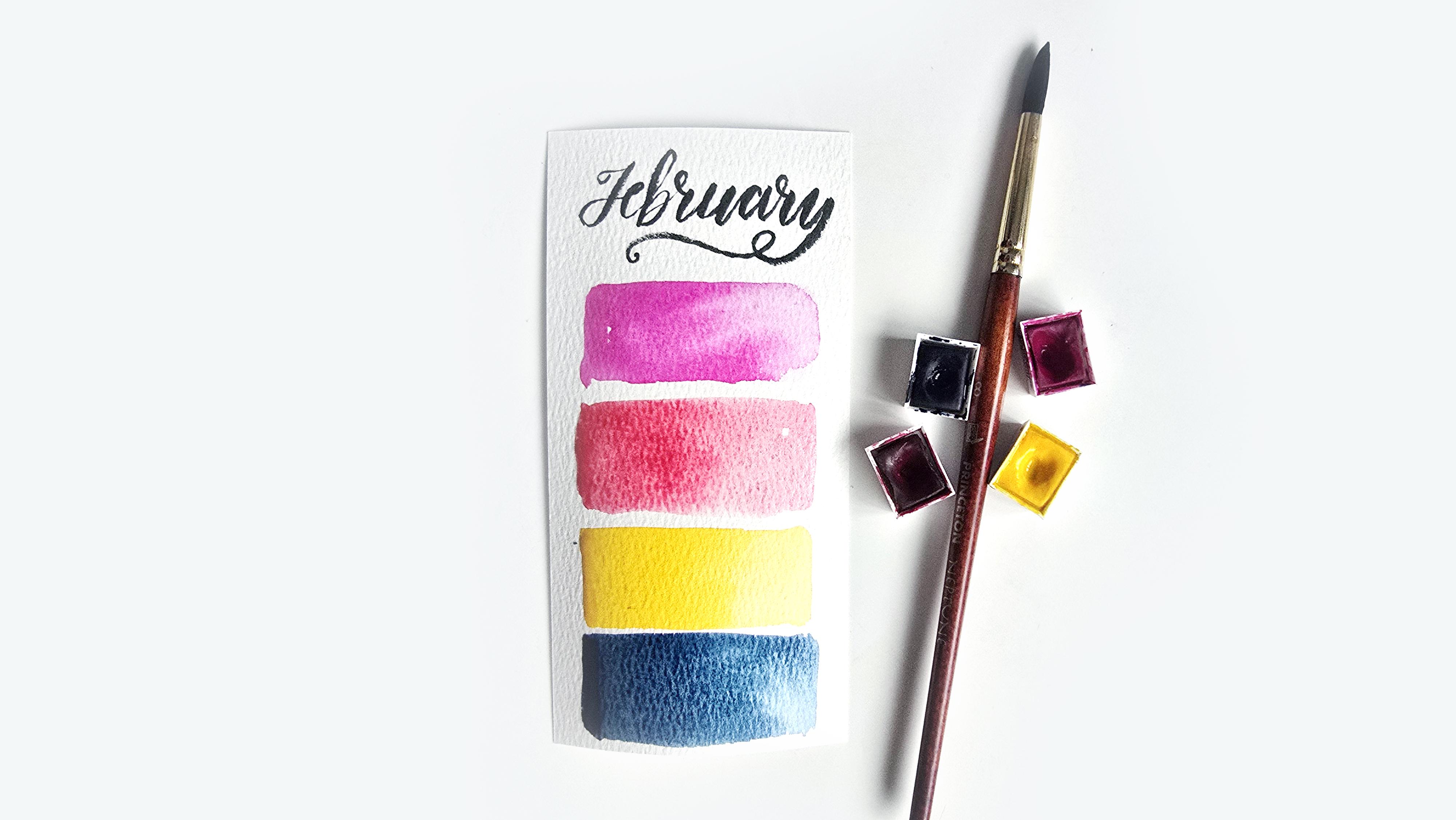
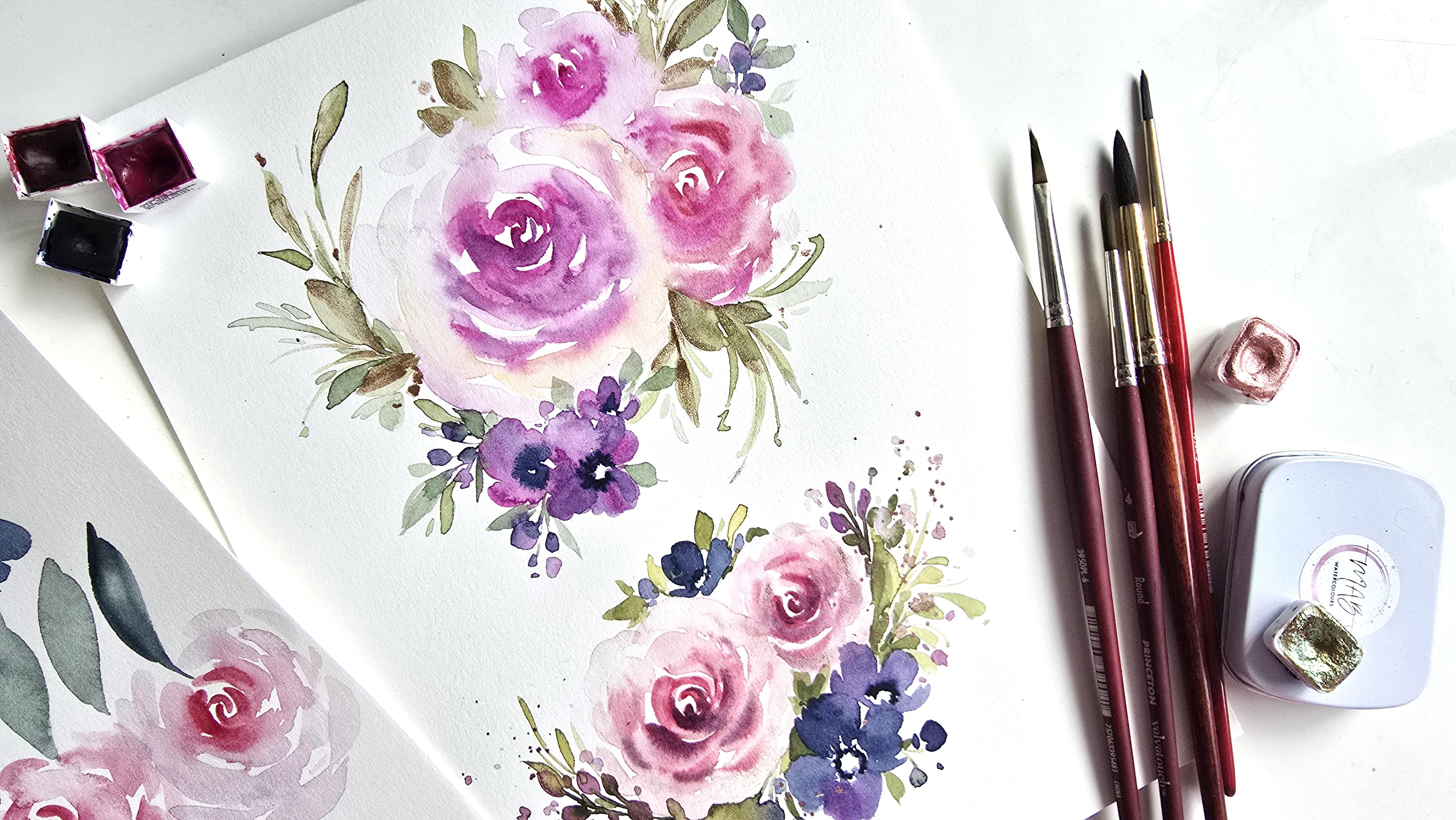
4. Supplies in this Lesson: Flies in this lesson are
going to be the following. We've got four brushes. I've got my Princeton
Neptune number eight, Princeton Heritage number three, Princeton velvet
touch number four, and then the Princeton
petals brush number six. We've got a palette handy on the side, and then for paper, I'm going to be
using my Stratmoor hot press premium
in eight by ten. Then for colors, we're
using the Dalerone these colors are from
the Dalarone set of 48 Aquafine watercolors. Specifically, I'm
using the following. These four colors are the colors I'm using in the
G with the flow membership, my watercolor monthly
membership for Fed. We've got indigo, we've
got Cadmm yellow, deep Hue, rose matter hue, then one of my favorites
quinacridone magenta. Then last but not least, because it's love Mondial, we're going to be using some
of MAB watercolors which are these two metallics This one's called Jasper and it's
this gorgeous pink hue. Like a pale baby pink. Then we've got pineapple, which is more of a goldish hue, but with a pink holographic
effect. Gorgeous colors. I'm listing everything
down in the description, but I want to mention
that there is a 10% cut off if you decide to get the MAB watercolors
for whatever reason, and I'm going to be
listing that as well. On that note, we
are ready to begin.
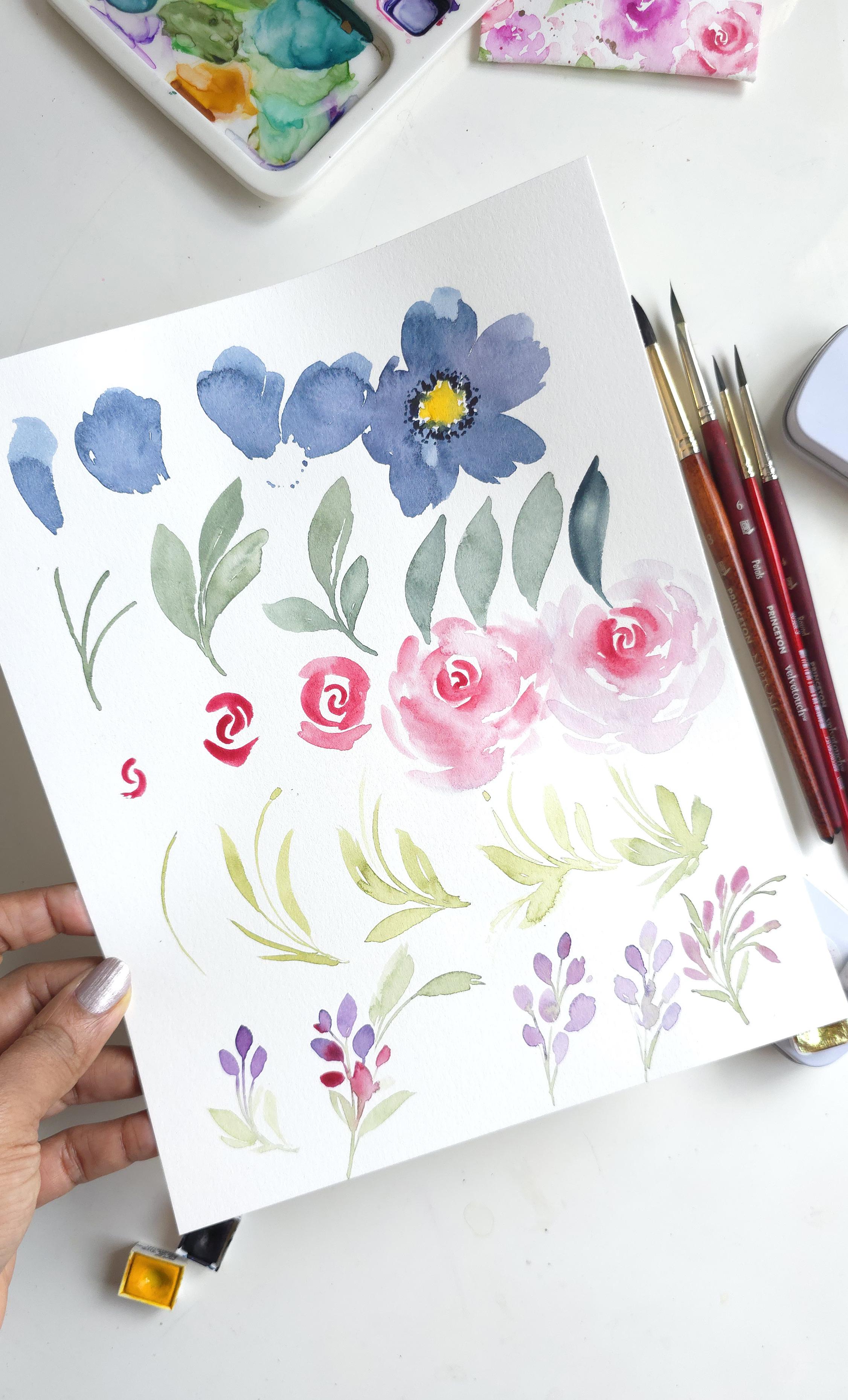
5. Practice the Elements - Simple Flowers: Section, we're going to
be practicing some of the strokes and the basic idea behind the elements
we'll be painting. For that, I'm going to
start off with using the Neptune number eight, Princeton and I'm
using the Indigo, feel free to use whichever
color you want really. I'm getting some of that color. I'm just going to
mix it in here. I'm not worrying too
much that there was a purple below because I'm literally doing this so we can practice some
strokes and just loosen up a bit before we get
into our actual paintings. First things first, getting
some nice water in here, getting that good amount
of color happening so we don't run out and
have to pause to remix. Good enough. Something I
have always mentioned. I like to hold my brush
about this halfway up the handle and then
holding it sideways, I like to use the full span
of my brush just so I can get more coverage with less strokes so that
once it's dried up, we don't get all that texture
strokes drying up on there. Holding it sideways,
we're going to practice the first stroke that we would
be doing for our flowers. I want to show that
to you right here, so we're just
holding it sideways and pressing down like this. I want the thickest to be at the top and the thinnest
area at the bottom. Let me just get more
water and color on here so I can show that
to you one more time. Clearly I didn't have enough
water here and you can see that because it's not
given me that full coverage. If I really press
down, let's do it again and then trail
off onto the tip, and then you can always
go back in and add additional strokes like
this and add maybe a little bit of a
frey scallop edge at the top and that's how you can create your first petal. Let's do that one more time
and build up on this flower. One more time, pressing down. Trailing off. Let's
do one more stroke. Another stroke. Now let's do another petal
off to the side. What does that
look like? Now, if you have problems figuring out spacing and how to leave that middle white
space, do this. This is just going to
give us an idea of where the rim is so not
to go beyond that. Here we go. Same idea. You can rotate your
sheet a little bit. Like this. One more. However you want
your petals to be. Then we build up on that as
we go all the way around. Let me do one more over
here on this side. This time, I'm going
to mix a little bit of as I progress
with the petals, I'm going to add a
little bit more. I'm going to add a
second color just for visual interest. Here we go. One. Again, you can tell that there's not a
lot of water on my brush, two, three, and then
we're going to do this. Now I'm going to get
a little bit of pink. I had some pink on my
sheet here already. Sorry, not my sheet, my palette. I've got a dark brown
sorry, a dark purple. Let's just do that here. As I'm creating
the side strokes, I'm just using the tip of
my brush to create that. I'm not pressing on the full
length of the brush anymore. Keep that in mind. I'm
going to switch back to the blue and I'm rotating just for
more flexibility and ease. You can even choose to do
just two strokes like this, touch that first
petal a little bit and look at those
beautiful blooms you're getting in there. Now, you can also
start your petals from the inside out like this, and you can just build
up on it like this. If you wanted to
touch a little bit or leave more white space, it's entirely up to you. Love what's happening over here, that loose edge to our flower. Now, we might not have a lot of space over here to
do another one, but let's just say you
wanted to show that this petal was curving upward
or what have you. Instead of extending
all the way out, you're just doing
something like this. And that could also just go with the whole
loose florals look. Mind you, I feel like this
is better suited if it was at the bottom of the flower because now if you turn
it sideways like this, this makes more sense where the petal is either flopping
over or flopping upward, however you want to
interpret that really. We're keeping this
loose and more fun with the colors more
than anything else. So keep that in mind. That's pretty much
how you progress on to painting your flower.
6. Practice the Elements - Leaves on Stems: Next thing I want to
show you is leaves. What we're going
to do is we've got some of that blue
mixed up already. I'm going to take
my number four, feel free to use
the number four or number three and then
taking some of the cadmm yellow and we're going to
mix this in with our indigo. This is what gives us green. So we'll practice some leaves and we're going to be
using the number four. For the leaves, again, halfway point and then we want
to use more of the tip of the brush to create our
stems and then press down similar to how we painted the petals to create the leaves. Here's what that looks like in terms of painting your stems. Lightly grazing and
then trailing down. This whole time as
I did this motion, and, the lower portion of my hand was
resting on the table. I'm going to show you
a different angle just so you can
get a better idea. Hand is resting on here and I'm starting from the
top with the tip and not pressing down,
trailing off lightly. Can also start from the actual stem itself
and go outward. That also works
something like this. This way, you can preempt
where your leaves are going. Here's another stem and feel
free to have a little bit of empty or a little bit of space like that,
white space in there. We're going to create
another two stems like this. Very loose and fun. Then dipping the tip of my brush in water. I'm going to start from
the top, press down, and trail towards the stem. Then you can do a second stroke to the side in case you want it to be a thicker leaf. Now we do the same thing one more time for the rest of it. Here we go. One, two. Then I'm going to get a
little bit more color, water on my brush. Your brush needs to be loaded, otherwise you will not get a
nice stroke. Pressing down. Watch how my brush
is really pressing down on the sheet to get some nice coverage
of color happening. That's all there is to leaves. This takes a little
bit of practice. You'll find yourself
using the pressing down, trailing off
technique that I talk about over and over again a lot between the petals and also the leaves and they
interchange really well. You might even choose
to do flowers that has similar shapes to the leaves in which case comes in handy. Here we go one more time. Pressing down, see how
my brush is almost off to the side and
then trailing back off. Then if you wanted to create
slightly smaller leaves, you just control how much you
press down and trail off. For instance, I'm going
to do small leaves here. And take your time and just relax and get
acquainted with this, get acquainted with your brush, with your sheet of
paper, with the strokes. This is you finding your calm. Just take your time to practice standalone leaves as well, using the tip, pressing down, and then trailing
back off on the tip. Simple and easy, that's for
your single stroke leaf. Then if you wanted to do a double stroke,
tip, press down, trail off, and then do
a second one off to the side and you are making
it a fuller looking leaf. Very simple, very easy to do. Can be super fun
to do on repeat. Notice the little tip that
I've created by starting slightly lower than
the first stroke and it gives you that
nice little shape. If you want it to be
exactly at the top, then obviously
don't start lower. You're just going to
start at the top. One more time before we
move on to the next thing. There we go. We're done.
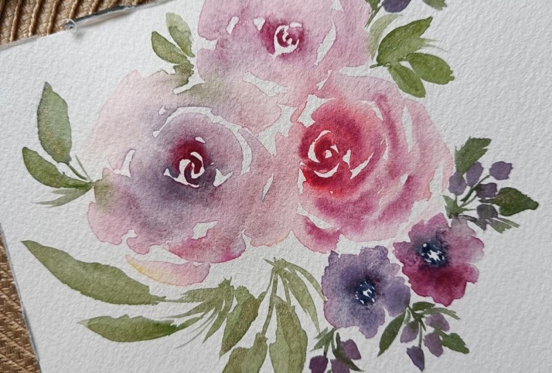
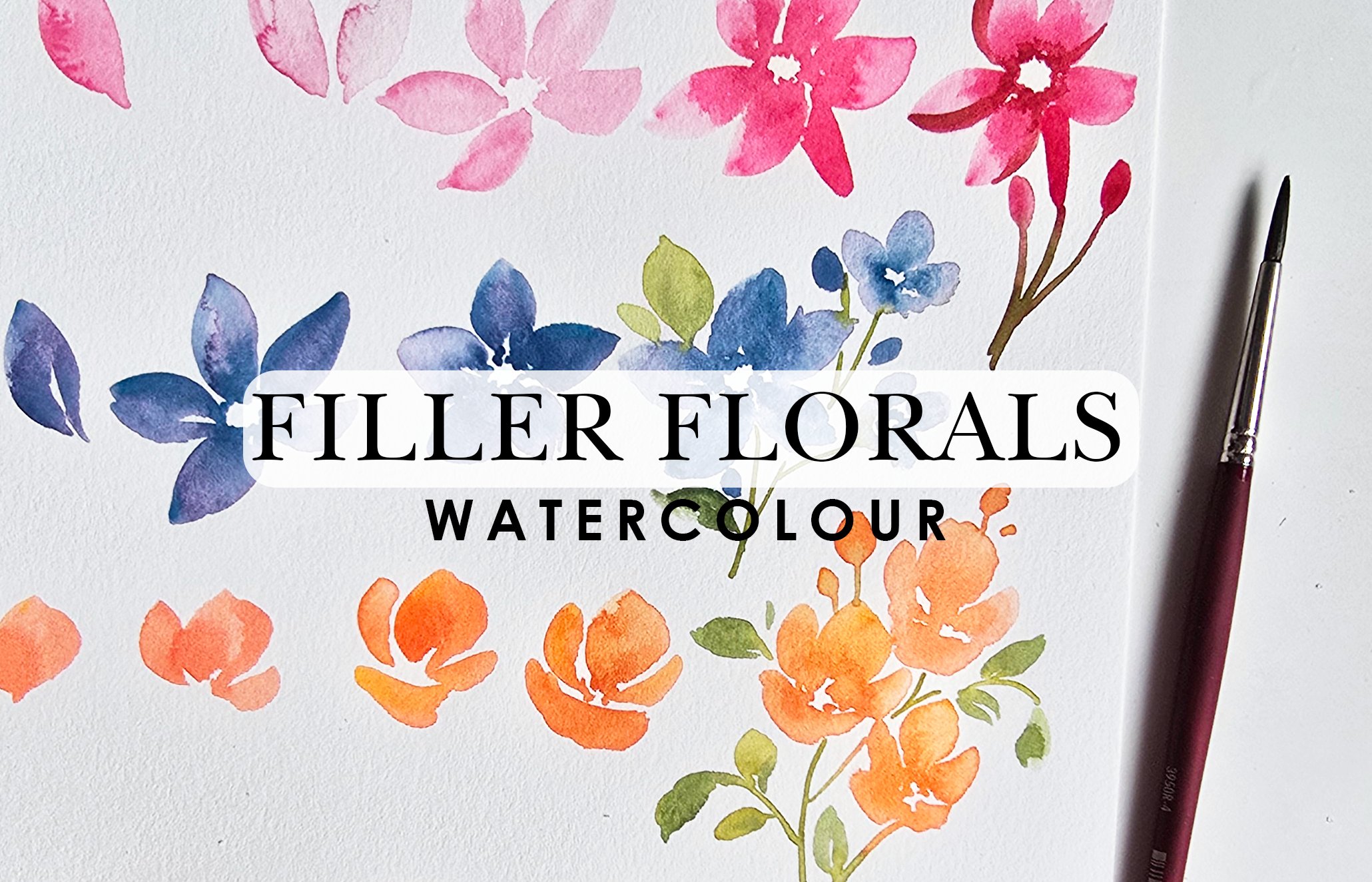
7. Practice the Elements - Loose Roses: Thing I want to
show you is roses. We're going to use
matter red hue and we're going to use
two brushes for this. We're going to use the number
four and the number eight. You can also feel free
to use number three and number four if you're
looking for smaller roses. The number eight just
gives us bigger roses because it's a bigger
bushier brush. Entirely up to you
your preference, what you're looking to
do, all that good stuff. Here's what I'm doing. We're going to be using one
brush to apply color and the second brush to use water and spread
the color around. Using the number
four, I'm going to be getting some of this
matter rose hue, and then we are
going to be creating S strokes and then
using this brush, we're spreading it
out. Here we go. We're going to just do
see strokes like this. This is the absolute
center of the rose. From here, I'm
going to progress. This way, you can see how
it slowly grows from here. Here's another one. Then as we're doing
the second layer, we're pressing and going on the opposite
direction like that. Let's do another one, a little bit too high
up there. Here we go. The hook. Then off to the side, I'm showing you other directions
that you can do that. Then you can also do one more. We're going to do one more here. Closing it up. We're going
to continue doing some more. This time I'm making
it a lot smaller because we're going to get some of that water
and move it around. We've got that and then
taking this brush, pressing down, I'm going over those edges to
spread out the color. Then as we're building on
this, it's going outward. I'm getting a little
bit of that red on here and we're adding
more of the C strokes, but looser or coma strokes, whatever you want
to call them and we are leaving a lot of white space in between and
that's how you build a rose. Show it to you from
a different angle and a little slower. The thing is when
you're going loose, you can't quite go too slow because you got to move
before the color dries up. Otherwise you lose your
opportunity for wet on wet. This is a very wet on wet style. Actually, everything we've been doing is really wet on wet, but this is where you
really get that whole idea of dark in the center and
then light as you go outward. Starting with our
tiny little strokes over there, building up. I'm going to try and control
how big this rose is. Let's just see if
that happens or not. Then I already had some of that leftover color from
the first rose and I'm just adding looser see strokes
or coma strokes around. I do have a little bit of a
lighter pink on my brush. Notice the amount of white
space in between these petals. Because that is key and then we're going to end off
with one last thing. All I'm doing is with
the number four, I got some more of the red and I'm going to
drop a little bit of these additional red strokes within the center of the flower. Essentially, what this is going to do is it's going to give us a beautiful dark center and
light outer areas as well. Now, if you're someone who loves your roses to be very full, just go in with your brush, your first brush and add loose little strokes
like this on the outer areas and
you can build it up.
8. Practice the Elements - Petals Brush Tendrils: Now let's get to using the
petals brush number six. I've taken some more of
the Cadmum lemon yellow, and mixed some colors so we can get a slightly different
variation of green. Now, this brush is fabulous
for tendril like elements, which is what I
typically use it for. Just to know how
this brush works, if you don't have this brush
in your roster of brushes, feel free to use a
regular round brush. But if you do have
this brush and you've been wondering
what this looks like. I've got a couple of tutorials on the YouTube channel which you can check out if this is not a good enough
lesson for you. No, it's a triangular brush. It's got one area that's completely a lot pointed
and taller than the rest, and that's what makes it such a great brush for loose florals and also thins and thicks. I'm going to use a nice fine
pointed tip and I'm holding that to be the closest
to the sheet of paper. Again, I'm resting my
hand just like I did with the other leaves and I'm lightly grazing to create a stem. Look how thin this is.
Let's do this again. I like to give it a nice
little flamboyant curve, and then you can just build
up and add more leaves on it, starting from the top
pressing down, trailing off. Look at those nice thin long
leaves that you can get. This is literally just practice, feel free to just take
a sheet and go for it. Things like elements like this is what would be nice to have on a looser scale in your paintings
when you're going loose. Again, one more time.
Now this is slightly thicker than the rest
because I went fast and had a little bit
more pressure happening. I'm going to do a
couple more like this. I'm really loosening up here. That's why my strokes
are not as perfect, but I like the results
because it's again, very organic and whimsical looking in comparison
to the ones at the top. You want to have a
good enough contrast of loose and also not so loose. White space is still there. I've got some nice
lights and darks. That is what I want to
see in my loose florals. Here we go. Very satisfying to do, and this is the aspect to watercolors that
makes it so relaxing. I didn't have
enough water there, so adding more and going over. Elements like this.
Look how cute that is. It really depends on
what your composition is all about or how
you want it to be. But look at that. All of
these can be great add on elements to your florals. Let me do this one more time. This is one of my
favorites where I like to have three
little strokes or three strokes
that are not even and then have the leaves
coming in from them. It adds a great tallest point to shorter point giving you more depth in this area because
it's going to be darker. If you just drop in more color, you're getting more
darker elements. It light at the top and
then dark in the area where all these elements
are there. That's that.
9. Practice the Elements - Bud Elements: Last but not least,
we're going to use the number three brush
and we're going to create elements that are going
to be reflective of either tiny bud like flowers or it could
also be a Wow, it's evading me right now. Yes, berries. That's
what I meant. Instead of being round, I'm going to do it more I'm painting these
more in an oval shape. Using the tip of the brush, we're lightly painting
down sideways like this to create little
elements like this. I'll just do three for now and then we can
progress from there. Say I've got these three
and then I'm taking my petals brush and some of that leftover green and
we're going to connect it. Using that nice
fine pointed tip. Look at that. How delicate
and pretty is that? This is also where
you're getting a nice trail of purple
into the green, which sometimes can be so delicate and pretty
to see in your artwork. The brush is it goes to the side a little and then back on the tip as you're
painting this. Now I can only do it more
to the right to the left. I'd have to turn my page over because maybe this is a
right hand left hand thing. I'm not quite sure, but if I did it this way,
this is what happens. You could just do
a second stroke and you're able to fill that up. This is also where
for these elements, if you take a second color
and just add that in there. I don't have a second
color in here yet, but let's just add a little
bit of the rose matter, for instance, and just
drop that in here. It creates a beautiful blend. Once it is dried up. Let's
just do another one here. We don't want the
elements too big. This one might be a
little bit too big, but we're just practicing
and playing around, so now is the time to be okay with seeing
these things happen. Again, using my pedals brush, I'm going to connect
these guys nicely, loosely We've got a
nice little element of delicate florals happening. Now, you could also choose to have the leaves
coming out sideways. For instance, something like
starting here at the bottom, going outward like this. Now, this would be the element
we painted at the top. I'm just giving you an idea
of how this would look. You can visually see this
and then maybe formulate something in your
mind that you want to do for your composition. Cute and pretty. Here we go. I like to have one at the top
and then two at the bottom, we've got that tallest
element there. Then as you're going lower, you can be a little
bit more random, but you still have to keep in mind you need to connect them. For instance, I'm going
at a little bit of a slant and then painting
these elements in. Let's just end with that and then getting my petals brush. I'm going to start with
the first guy first. And then give it a
nice little curve. As you're attaching this,
give it a curve like this. What do I mean by curve? For instance, now you
could just attach it let me do another example
and show you what I mean. Say you did something like this. And then you went in
with your green and you just did straight lines. There was no curve to
it. It's just straight. Now, this might not look like
a huge difference in this, but what I want
to see when I say give it movement is
something more like how we have a lot of
angles and curves at the top or arcs and
curves at the top. If you feel more
comfortable painting in your stems first and then
placing these in, try that. For instance, this is me
painting the stems first. I can have multiple stems, look at the curves
I'm giving in here. Now I can go in and actually let me do one more out
here this way. Really make it curvy
and then go in and just add or dabs of color. Now, this might be more
of your preference, more to your comfort level. In which case, go with what gives you the results
you're looking for. If it's this one or where you place the buds first and then join them
or if it's this one. This is usually my preference
just so I can create that nice pretty dance
like effect or movement. I like to call it dancing
sometimes. Things like that. It's just pretty. Practice this, everything that we've done here, and then once
you're comfortable, we can move on to the next.
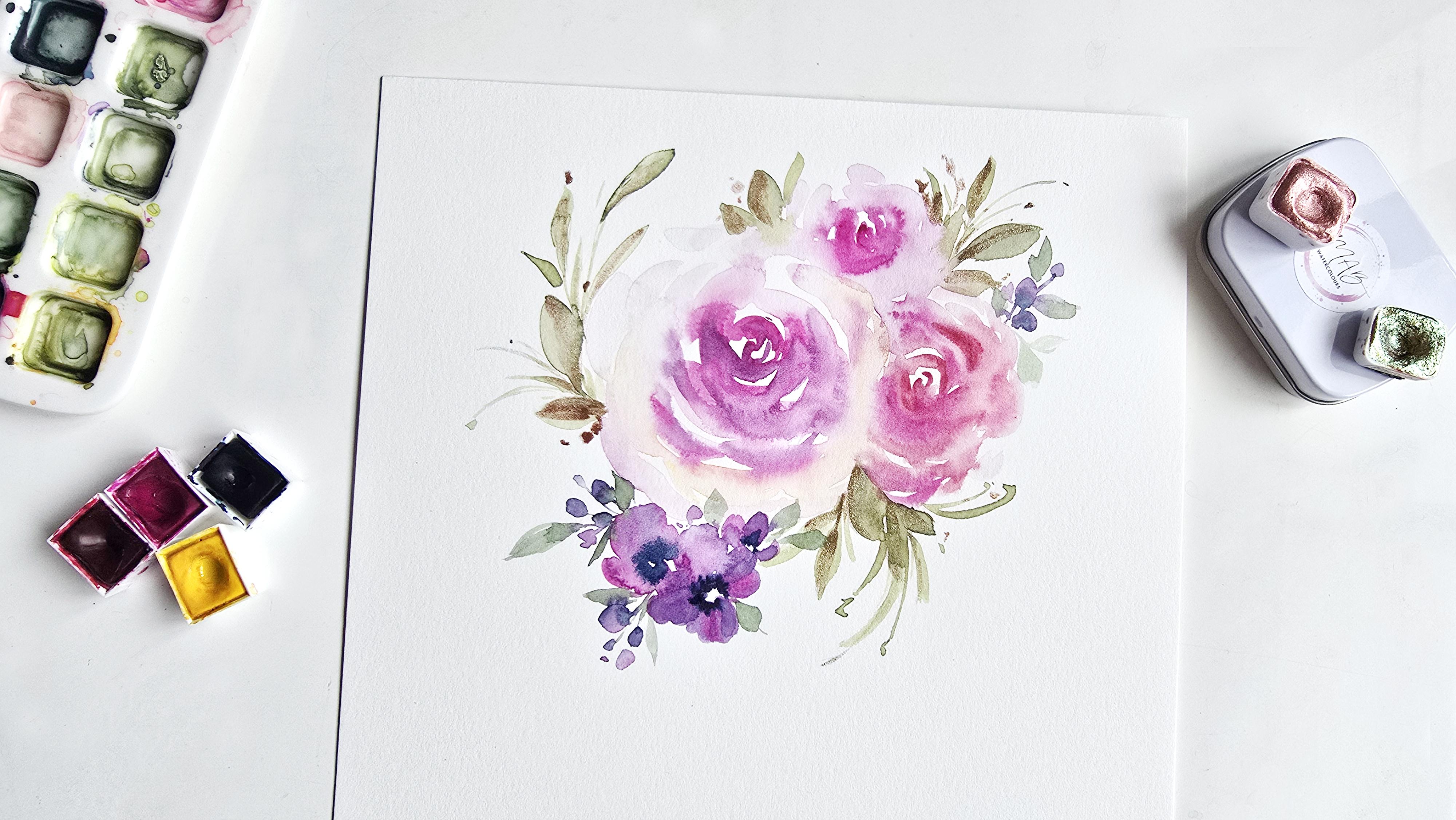
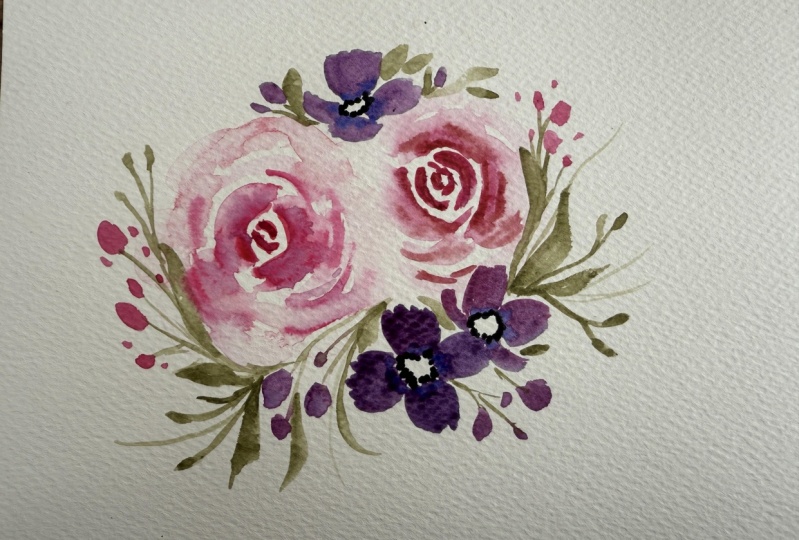
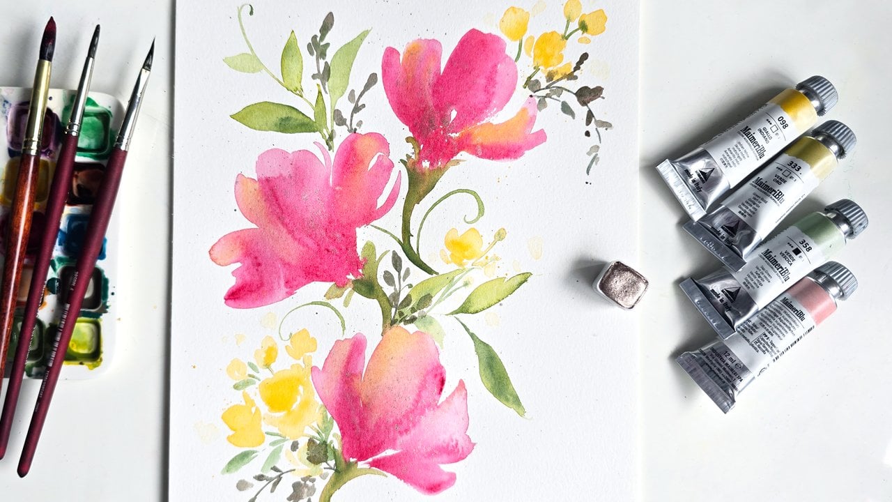
10. Composition 1 - Painting Roses: All right, so we've
got a fresh sheet of paper from the Stratmoor
set of eight by tens, and this is the right side. We're using the
same set of colors, as I mentioned, and the
same set of brushes. Everything is exactly the same, and we're going to be doing little mini compositions
based on what we learned by doing our
practice over here. Let's get into that. The
first thing I want to do is I always start my compositions by starting off with
the main flower. In this case, it
would be the rose. Just like we did
in our practice, we're going to do two
brushes to create the rose in the interest of time
and all that good stuff. We'll use the smaller
brush for our color. I'll start this rose off
in my favorite tone, which is quinacridone magenta, and then we'll use
the number eight for spreading out the color
and all that good stuff. In fact, in this scenario, I would love to add another
additional rose using the second jewel
tone that we have, which is matter Rose Hue. I'm going to keep that handy. My brush is full of
water and we've got beautiful color happening here and we can start
painting our rose. I'm going to start right
here in the middle. I love having a lot of
white space around, so I'm going to
try and control as much as I can in
terms of sizing. Sea strokes, more
sea strokes around. Trying to leave as much
white space as possible. Let's get one more stroke. And then we're going
in with our brush with water and we are
lightly grazing, touching the edges to
spread out this color. As I am creating more
on the outskirts, I'm going to use more of the tip of my brush
than anything else. Remember I said I'll use a slightly different
color. I've changed. Instead of using
the matter rose, I'm going to add a little
bit of this lemon in here. Just on the outskirts
skirts, skirts. While this is extra lemony, I'm going to add a
little bit of this hue. We're starting off
in the center first. This is what's going to give us those beautiful shadowy effects. I'm just going to add some of them around the
edges here as well. Now, because this is a little extra lemony and not quite giving me that peachy hue, I'm just going to do lifting, which is what I also
showed you guys over our um practice. When the color is just sitting there or you
feel it's too dark, this is where lifting
comes in handy. You can just go in and
move the color around, help it spread so that
once it dries up, it doesn't give
you a weird look. This is going to be
my rose for now, if you wanted to
take this a step further and I'm going to
do that a little bit here, I'm taking a little bit of my indigo on just on
the tip of the brush. I'll mix it in here just to
make sure I'm not getting too purple a color
and I'm getting a slightly darker hue than
the quinacridone magenta. I'm just going to drop
some of that in here. This is just to give it more of a additional depth feel
to your roses, really. Now, notice I've added
most of it at the bottom, and that's because
I want more of that shadowy effect
happening at the bottom. That's how we make sure the
eye goes in those directions. Now, I'm just going
to feather off by adding a couple more strokes
off to the edge here, and some at the top
on a lighter scale.
11. Composition 1 - Painting Roses & Leaves: Another rose. This
time we're using the other color and
same technique. I'm going to create this one
over here off to the side. Obviously, this one's
going to be a lot smaller. And I've deliberately
have it so close to the first rose so that I don't lose too much of my
white space around the edges. I still want to keep
as much white space as possible and this is why I am painting this rose so
close to this first one here. I took some of the wet
color from the first rose and I'm even adding it
back into this one here. Then just before this dries up, we're going to go in and get
a little bit of a darker hue and just add it into this
rose before it dries up. We're using a lot of wet
on wet techniques here and great blending to get
some beautiful results. Just to end off, I'm going to do one tiny one at the top here just to make it seem like a smaller little rose is
sitting at the top. And I'm spreading it around. Make sure you've got
ample enough white space happening, and that's lighter. Now once that is done, go in for those
additional little dark to light effects happening. I'm going to add some of
the same strokes in here, allowing it to bloom
and blend in nicely. Perfect. Now that we have
that, let's get some green. For our greens, just like
we did in the practice, we're going to get some off
the lemon first because I don't like getting indigo and then dipping it into my lemon, so I'm going to get that first, then get some indigo,
drop that in. I'm controlling how much
indigo I use so that I get a lighter lemon hue
and using actually, let's use the number
three so we can control how big our leaves are. I'm going to start off
over here at the top. I love the idea of
something just protruding here while it is damp and then just adding
leaves like this. This way, I get that
nice pretty bloom in. Then let's do a couple
more happening here. And using your
stem and then just painting in your
quick little leaves. I'm just adding it in certain areas because
we're then going to take our petals brush and add
a little bit more detail. I'm adding some darker hues at the tips here just to
get that added elevated, um, two dimensional look. Feel free to add
some more indigo to your mix and then
drop some of this color in because you'll get a
darker green and that's always a nice effect to
have within your leaves. Especially when you're
painting loose. Adding that two tone green look always elevates everything. Adding that, I'm going
to wash this brush off and now we'll get
our petals brush. Let's just get more of that
lemon hue mixed in here. Just like we did
in our practice, I want to get some
nice whimsical, thin tendril like elements. I'm going to have
some at the top. Some coming out like this. So protruding. Let's
add some over here. You're peppering these
effects all around. I'll do one over here. I got mine a lot thicker on this side here
and that's okay. I'm just going to add
additional thinner ones. H. Something like this, super cute, super pretty easy because we've already done
our practice bits. I want to draw your
attention to this area here. You're going to
notice there's some of the green seeping in. This is again, where
lifting comes in handy. Just take a clean brush, a clean damp brush. I'm going to use my number
three and I'm going to lightly swipe or
lift off this color, then this way it takes
that stuff right off and we are good to go. I don't want to do
too many leaves, so I'm just going to
end this over here. I've got enough happening. We're now going to be
moving on to doing our let's add a little bit
of those tiny flowers.
12. Composition 1 - Painting Bud Flowers: So for tiny flowers, we're going to do the
indigo and I'm going to mix that up with some of the quinn acridone which I love. Indigo was already in here. You've got that nice
purple hue happening, we're going to get
more water in here, water that down because we want these flowers
to be a little more muted in comparison
to the roses. This way, the roses pop more than the actual
flowers themselves. I'm going to get some more of that indigo and really
darken this up. Remember, once you have the color of your choice
or to your liking, get a lot of water
on your brush. And we're starting to
paint our flowers. When you start off light, you're able to build up if
you feel like it's too light. But if you start off dark, it's harder to lift
the color off, it won't be as easy as
what we've been doing with the green, just
keep that in mind. Now, we've got a
fairly big composition happening already and
it's very pretty as is. But I'm going to add some of these flowers in here just
to give you that exercise and that feel on
how to add flowers in your composition and also
because we've practiced it. Here we go exactly like how
we did it over practice. I'm going to really make sure
that it's a lot smaller in size and not overpowering. Can you even take
that second tone. I didn't quite show up
as dark as I wanted to. I'm going to get some more of that quinn and
drop that in here. This is how you can add those beautiful gradients
within your petals. We're doing this because I've
not used too much water, this would be more of a
wet on damp technique. Now using just
water on the brush, I'm going to take
whatever colors on the brush and I'm adding more little flowers
on the sides. Now, because I want this
to look a lot darker, I'm getting some of that indigo. I'm going to drop that in here right in the center just
like we had planned. In this way your eye is
pointed or directed in the direction of
where this stuff is happening to find the center. Now, because these colors are still fairly close
to what we have there, so I'm going to go in and
add a little bit more of our purple so that we don't
have too much pink going on. I'm just dropping
in a little bit of the purple I mixed onto
some of these petals. Okay, so something like that. Then just taking the remainder
of the purple we have, I'm going to add a
couple of dots like this very much so like our berry type elements
that we were practicing. What I want to do is get
some water now because it's nice to have different
variations of color, but also tonal range happening. Then this way, we're getting a nice halo or bouquet effect
of loose flowers going on. Going to get some of that
happening at the top. Now we can go in with the petals brush or feel free to use a regular brush as
well and just take a slightly darker variation
of the green we've been using and we're connecting. Now, it's very delicate, very thin and light, so you don't quite see
too much going on. And something just to kind of circle the area where
we have our flowers, and then we'll add a little
bit at the top as well. And that should be good enough.
13. Composition 1 - Adding Metallic Paint: Now, feel free to add because
most of this is dried up, feel free to add some
added darker tones to the centers of your
flowers if you wish. For instance, I
really want to add a slightly darker
hue going on here. I want that soft bloom. It's dried up enough that
I can go in and drop it in and it's going to give
a soft little bloom. I'll add a little
bit over here to these bud like elements
that we have happening. Nothing too crazy, just a little bit to
give that added pop. Now we are moving on to
adding some metallic. I would like to use
some of the pineapple, which is a very goldy effect. I'm going to use the
number three brush, and what I'm going to
be doing is just adding little dabs over on the
green aspect happening. Putting it sideways so you
can see how I'm just adding a little bit of that
gold I have it on. I'm just getting some
of it from my brush, dropping in some just
lightly certain areas. I'm going to get a
little bit of water on my brush so that we can activate more of the color and then
continue dropping some in. I just want a hint of
gold going on here. I have rotated my sheet and
I'm going to add some of this to these leaves
at the top here. As you can see, I'm just
adding one stroke and very lightly getting more of the color on the
brush or more of the metallic and
then just swiping. It's almost like a light glaze. Giving you a bird's eye
view now so you can see more of this in plain more plain vision, as opposed to a side angle. We're almost done. I just want little specs going
on here and there. I'm just dropping that in. And we are done. Here's a close up of
what this looks like. You see how we've got
a very delicate shine, not on all the leaves, just in certain areas of it and it just makes
for such a pretty effect. That's one way you can add
metallics to your florals and just elevate the
whole composition.
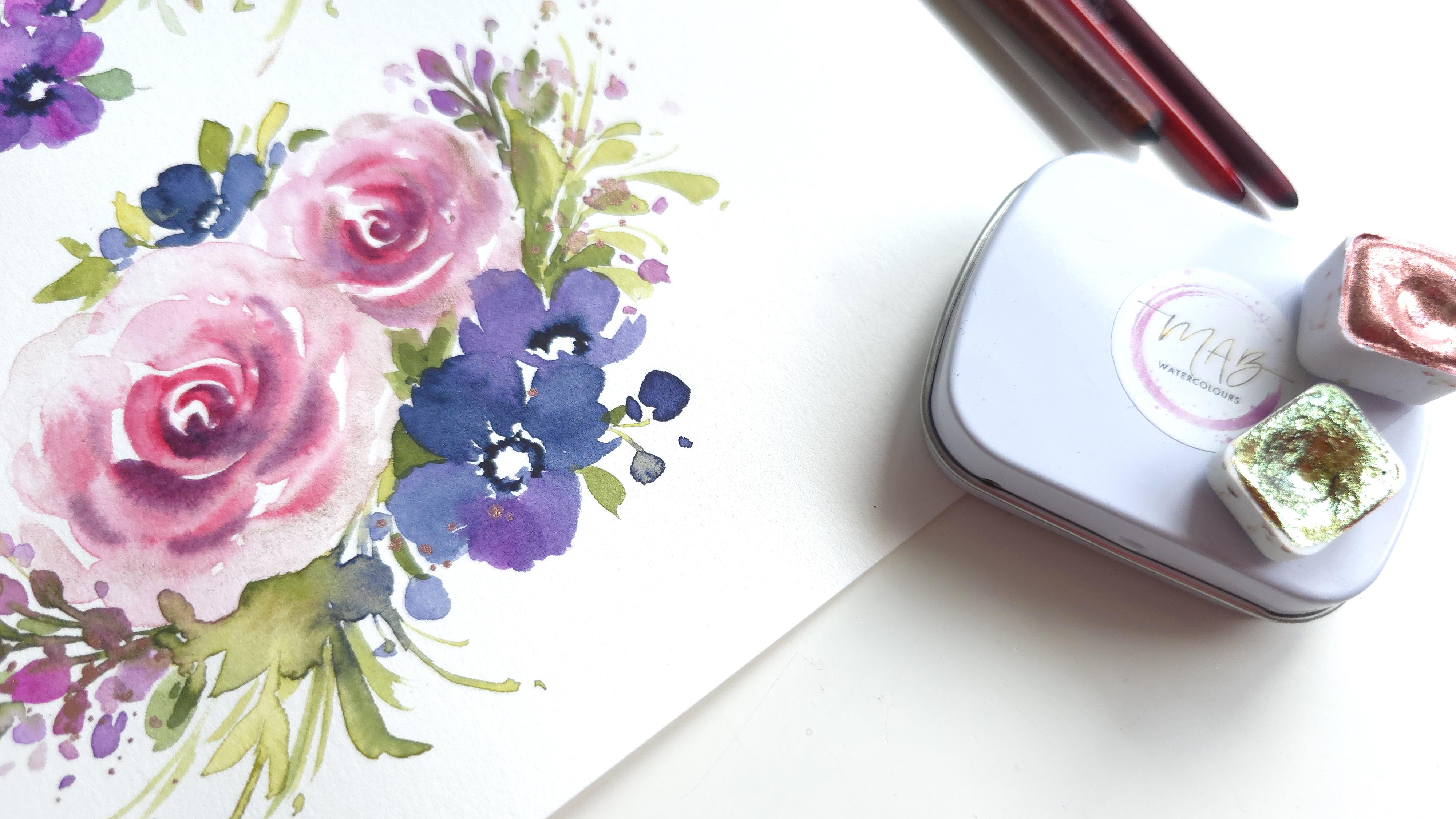
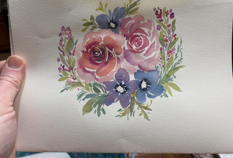
14. Composition 2 - Painting Roses: For our second
little composition. In this one, I'm going to
use the rose matter first, and we're going to
add a little bit of our Jasper in there. To keep the roses small, I'm going to start off with my number three and
number four and forfeit the number
six in this round just so that we don't have
too many big elements, so that's what we're
going to be doing. Now, we're going to start
off the rose and do it very similar to how
we did our leaves, but with the wet
on wet technique. We're going to add some
metallics in our roses, same technique for how
we painted our roses. Let's start off tiny
little see strokes. Getting a good enough
amount of water, pressing down as we
do our outer strokes, just adding more water to
the brush so that we've got some something to work with. Then dipping the tip
of my brush in water, I'm going to use the
same brush to go ahead and create these
outer petals to my rose. A little bit different from
what we've been doing with the two brush roses for the practice and then
also our first composition. You're going to
see why because my second brush is going in with more of the metallics. We're using this one
brush to create our rose. This is going to
be the last layer. And then before it dries up, I've got some Jasper
on here already, so I'm going to drop that in. Such a pretty effect. You're going to see that as soon as I tilt it
off to the side. But before this dries up, we're going to
intensify the center. Let's get more of that matter rose and drop it into
the center here. I'm going to add a
couple of these strokes on these outer petals as well. Look at that. I will add a little
bit of the indigo and the matter rose
to the center here C. Now that's way too dark, I probably should have mixed it onto my palette first
before trying that out. Again, guess what's coming
to our rescue lifting. I'm going to take the
number four brush, swipe this off and dab
it onto my paper towel. Now I have more of
a solid mixture of the color I want here. I'm going to use this
to go in and do what I first tried to do and failed. You can see if you
move quick enough, you're able to save things without having to
restart and redo things. I hope this happy
little accident that I've had was a
little bit helpful. Look at how we've added so much more detail
to our rose by just switching color tones and mixing a little bit of that indigo in with the red to
get a deeper tone.
15. Composition 2 - Painting More Roses: Going to do one more
and then we'll move on to our regular flowers
because I'd like to have that flower in a slightly bigger version in comparison to our first
composition that we did. This way, we are working with
different ideas but using the same elements we have learned to do in
the practice session. I want you guys to
really use this as an exercise to sit down,
try your hand at this, practice a couple more times
if you feel the need to, and then sit down and paint your own because you're so
comfortable doing this. I cannot stress
the importance of white space enough when you're
painting loose like this. You need the white
space, otherwise, you can't tell what that is. Make sure you have
that in there. I'm going to get the
Jasper and drop that in. It needs to happen
while the area is damp, the adding of our Jasper and this is so that the
color integrates with our base watercolor coat and
gives us a pretty effect. Let's add some detailing
to the center of our rose. Time is of the essence, you're going to notice with
painting roses like this, just because things cannot
dry up or things need to be a certain way when
you're looking for the soft fluffy roses like this. Last but not least
dropping in some of the purple it mimics
the first rose. Fabulous.
16. Composition 2 - Painting Flowers: So now we can do our bigger the five petal flowers that we had started off with. I'm using mainly my indigo. I'm creating one down
there at the bottom, doing my little dotted
bit to make sure I've got enough
room and then just spreading the color around
to create my petals. I'm going to get a little bit
of that quinrose in here. Just to get a slightly
different variation going on, and then just extra dots on the inside here because I
might just leave this as is. We'll see. Going to get a little
bit of the queen mixed up here and just add another flower right at the top here where it's
connecting to this flower. And I'm leaving it like this. It's slightly touching the rose overlapping or blending into
this bottom flower here. Then you can take some
of the indigo and drop that in the center
because it's beautifully damp and this is the
perfect time to get a soft bloom into the
center of your flower. Using some of the left
over hue that we have, let's just add one little
cutie at the top here. Then I'm just
adding little idea, little dabs that represent our smaller buds
off to the side. I don't have too
much room at the top because we've got that
other composition there, but let's just add
them at the bottom.
17. Composition 2 - Painting Leafy Tendrils: For the green tendrils, I'm
mixing some of the lemon with the indigo and I've got different variations
of green going on here. Feel free to mix and match. Then back with our petals brush, we're going to add some
stems connecting here first. Now again, I'm not rushing, but I'm doing this
now so that I can get a little bit of bleeding
happening with these guys, so the colors blending into
one another and giving us a nice different variation
of color mixing going on, which is so beautiful to see in loose style of
watercolor florals. This is what makes it so attractive to look
at and also people wanting to paint in the
style because that blending. It's so natural looking, it's so exotic looking, and we want to catch that
before our window closes. That's what I am doing here. You can follow along
this way or if you feel inclined to do it
slightly differently, your swirls want to go in
a different direction, then yeah, go for it. This is how you come into
your own style of painting, and this is how you grow best. I'm adding some in between
here as well. Look at that. We've got that beautiful green happening
right at the bottom. I'll add a little bit at the top sparingly because I don't want it to reach
too far high up there. We've got our sister florals
going on at the top. Now, there will be
times where you feel like there's
too much color. Just take your paper
towel and lightly dab and it'll work its magic. I took away most of
that color over there, and I think this is fine. I want that to just bleed
together and blend in nicely.
18. Composition 2 - Painting Buds: Start off with doing the stems. This way we have an idea of
where it's going and we can control how far
it goes and such. I'm going to use the
number four with my green and I'm lightly
painting in some stems. I'll do a little bit
happening here as well. Then we're going to go in with our pinks or mauve or purple, whatever
you want to call it. I'm going to get some
of that mixed purple, the darker hue that we
have, drop that in. Look how pretty that looks. We can just water things
down and just add a couple of dabs of tiny
little dot like elements. You're controlling
how big this is. This is just so
that it shows up as background elements
you're adding fluffing is what I call it. But you're adding tiny little background style
buds to your buds. So that's why they're
faded, they're tinier, they're looser, they're not as detailed or dark as
the ones in the front. Now, this is where you can
also go in and add a couple of cute little leafy style
strokes going on. Intensify the depth
area happening here. It'll be in certain
areas here and there, so it might vary because
we are probably painting, even though you are
following along, it'll look different from mine. I want you to use your
creative judgment and not be afraid to try it. The idea is to tighten up the spots in between
our flowers. We're taking this sorry, this darker green and
we're just filling up areas or even painting
over some previous leaves. For instance, I'm just
adding little dabs of color or this green over
the last few leaves.
19. Composition 2 - Painting Buds & More: I'm using the petals brush one more time because I
love how these elements are going on over here instead
of growing at the top, I think I'm going to add
a couple of strokes here. Then I know it
mixed in with that. That's okay. Then I want to add a little bit
more happening here. But again, make
sure it's lighter, there's more water, I mean, in your mixture and looser. You're adding movement to your composition by enhancing and adding length and extending. But you want your main
focal point to be there and the rest of
it is phasing outward. You're creating movement and a hierarchy within
your painting. Very intentional,
but also loose. It's similar to what we
had done in the practice. But what I need you
to do is really just practice your strokes
with this petals brush. It gives you such great details you know if you're not
afraid of it, first of all, if you just go with the flow and allow it to just don't
be scared of the paper, just work it and see what
you can get with it. It really just grows on you, especially the more you use it, the easier it becomes
for you to maneuver. Give it a shot and try it. This is where I'm going
to leave this at. Now, we added. We added some of the glitter
metallic in the roses, but I'd like to do
one last thing with it and I'm going to tell
you exactly what that is. Drumroll, are you ready?
20. Composition 2 - Metallic Splatter: Going to add a splatter. I was thinking of
doing the metallic, but let's use Jasper instead. Because I want to
keep the sizing of the splatter fairly small, I'm going to use the
number four brush. The larger the brush,
the bigger the splatter because it holds more water. The smaller the brush,
the smaller the splatter, because it holds less water. Holding your take a brush. Let me try explaining
this again. Hold it at a cross angle like this and you want to
splatter in the area. You want the brush
to be pointed in the direction that you
want the splatter in. So I want it to be around here where I keep saying thinking
berry like elements, but it's actually buds,
bud elements are. When there's not a lot
of splatter like this, you can tell that's because
there's not enough water, add water and then go in and do the splatter. There you go. Difference. Now, if you want to add a little bit of an
extra step to this. I'm going to get some of my leftover purple just
a little bit on my wet brush and I'm
just going to go over some of the splatters
and spread it out. So I'm mixing some of
the purple hue with our metallic and we're getting this metallic shiny effect
by spreading it around. Again, background flowers, very loose with a little bit of shine that adds some nice depth
to your composition. And entirely
optional, of course. If you don't feel like doing it, you can just leave it as is.
21. Composition 2 - A Once Over: Okay, so this is our
final second composition. We've taken all the elements we practiced and we put
it together to create our own little mini composition and we integrated
some metallics in it. I've shown you two
different ways over here.
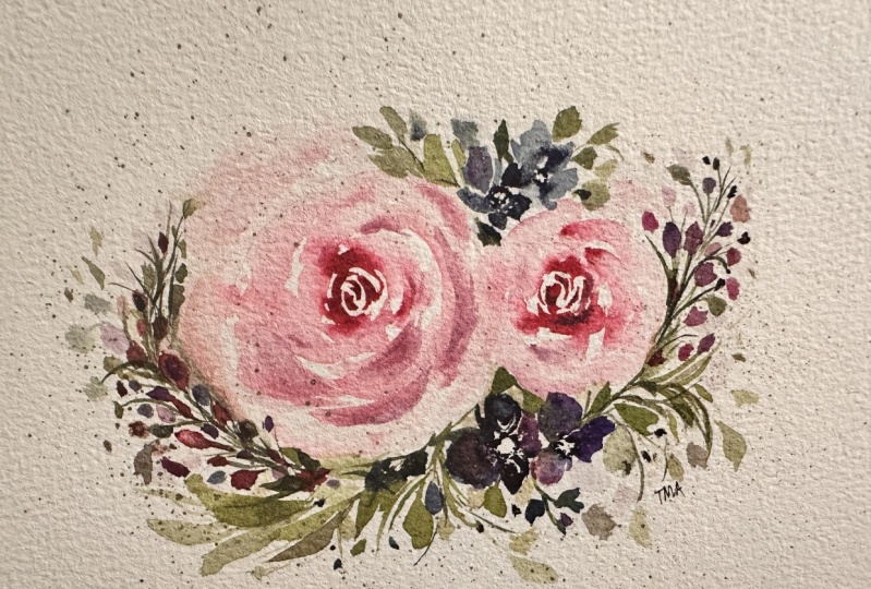
22. Here's the Final Two Compositions: [No Speech]
23. Post Your Project: If you've reached this video, that means you have
completed your lesson. A quick reminder, make sure you have painted
your compositions, whether it's the two compositions
you painted with me or if you're going to go ahead and challenge yourself
and do your very own, which I highly
recommend, by the way, post the one you are most
pleased with in the gallery. I'd love to see how you've done. Anna bonus, don't forget
the heart envelope. You can also create your own
envelope with your florals, with the metallic
and post that in the gallery and this way we can all see
your beautiful work. Thank you so much for watching and painting along with me. I hope you had a lot of fun. I hope you found your moments of calm and I hope you also
learned quite a bit about watercolor and why
it is so therapeutic and relaxing while also learning how to paint beautiful
loose roses. On that note, thank
you guys for watching. By the way, if you post any of your work on social media,
I would love to see it. Please do tag me. I've listed my handles in the lesson description as
well as in this video. For now, thanks
guys for watching. We'll chat so. Bye.
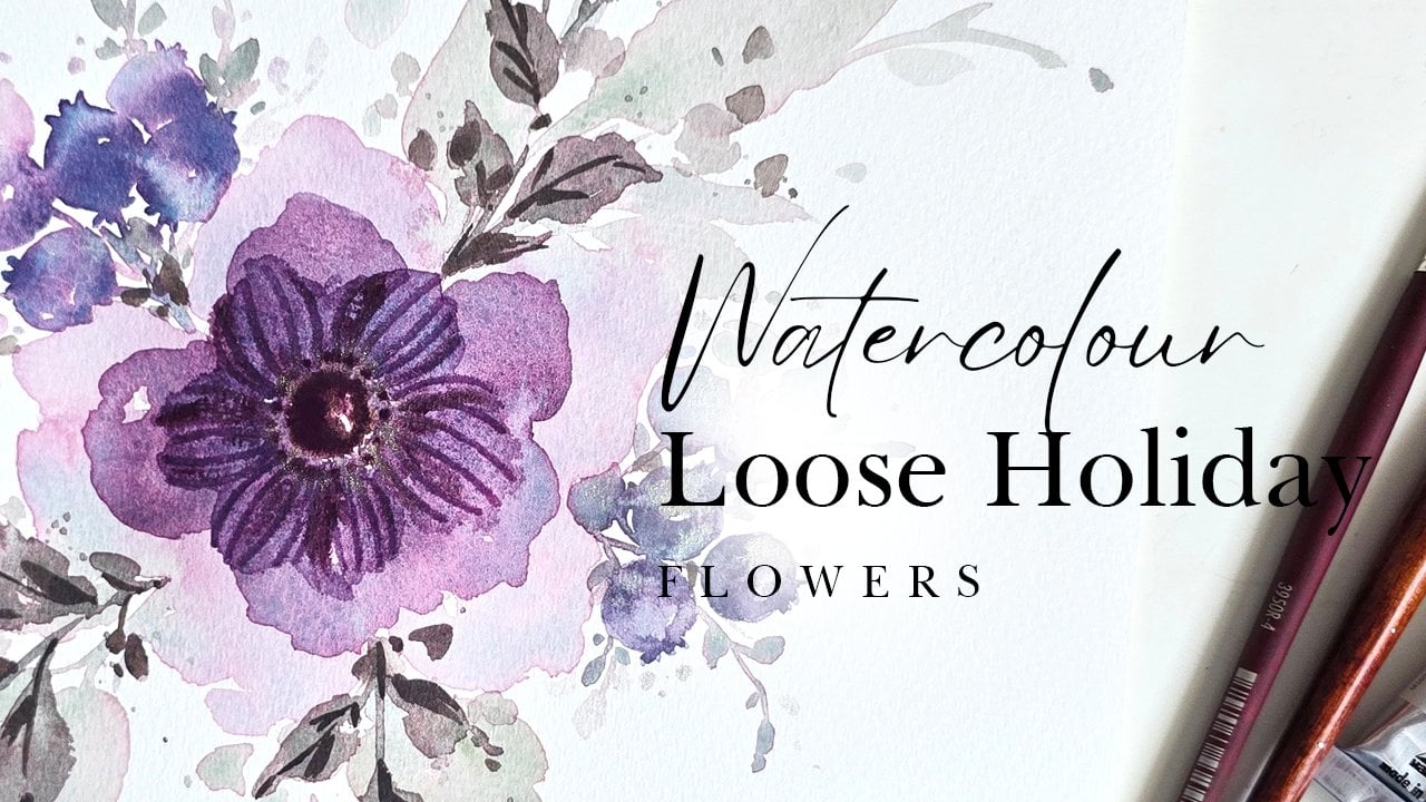
 Clarice Gomes, Go with the Flow in Watercolour