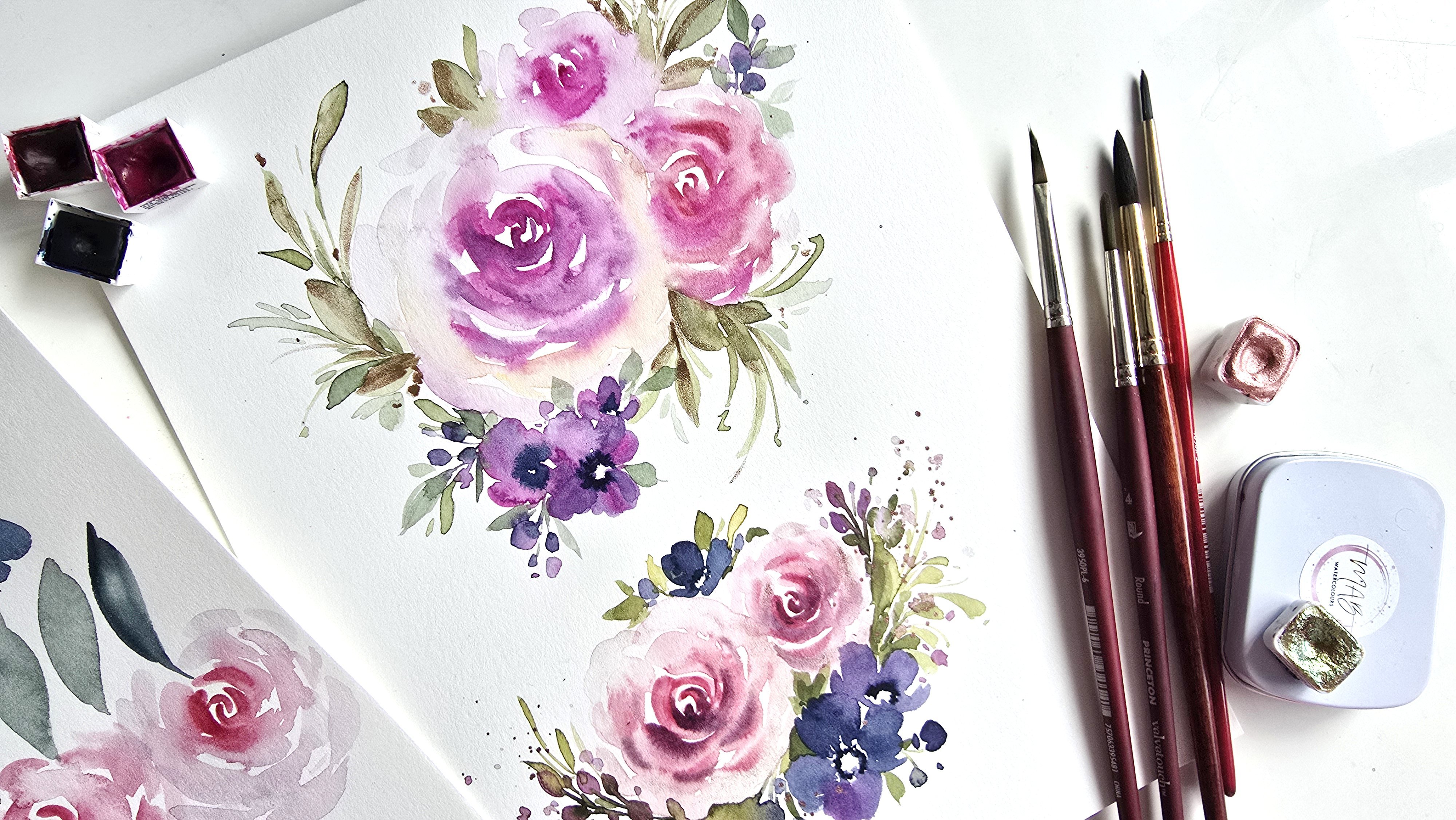
Transcripts
1. Introduction: Hi, guys. Welcome
to another lesson with me here, Clarice
on Skillshare. Really quickly about me, I am a watercolor artist, formerly a brand designer
from Toronto, Canada. I started off teaching little
tutorials over on YouTube, how to paint loose florals, how to paint a rose, how to paint a pony. Anything that you can think of, if you Google it on
my YouTube channel, you will find it.
That's how I started. From there, it slowly
progressed on to wine and sip events over
in the Niagara region. And from there, we progressed
onto watercolor retreats. I'm also an ambassador
for Princeton Brushes, you will see me using
Princeton brushes in pretty much all my videos.
2. The Lesson: Okay, let's quickly
talk about this lesson. In this lesson, I am
going to take you step by step on how to create little elements individually and then we're going to combine those elements and create a nice floral bouquet or
a floral composition. Because it's the holiday season, we're going to be
using some metallics, so I hope you're excited. Bring out those
metallics if you have any, if not, don't worry, I'm going to be listing
everything that I'm using to create these beautiful loose floral creations in this lesson, check it out and follow.
3. The Project: So for the project, I would love it if you can
take what you have learned, follow along, paint along, and then take what
you have learned and try and sit down and do
your own composition. This is the best way
for you to hone into your creative intuition and also create something that
is entirely up to you. Art is very subjective and
what I am painting and where I am placing things might not necessarily be
what you would do. I want to see what you would do. Once you have finished
that project, please post it in the gallery
section of this lesson. I would love to see
how it turns out. If you posted on social media, please don't forget to tag me. Again, I would love to reshare
my stories and just give my $0.02 cheer you on wherever you are in
your watercolor journey.
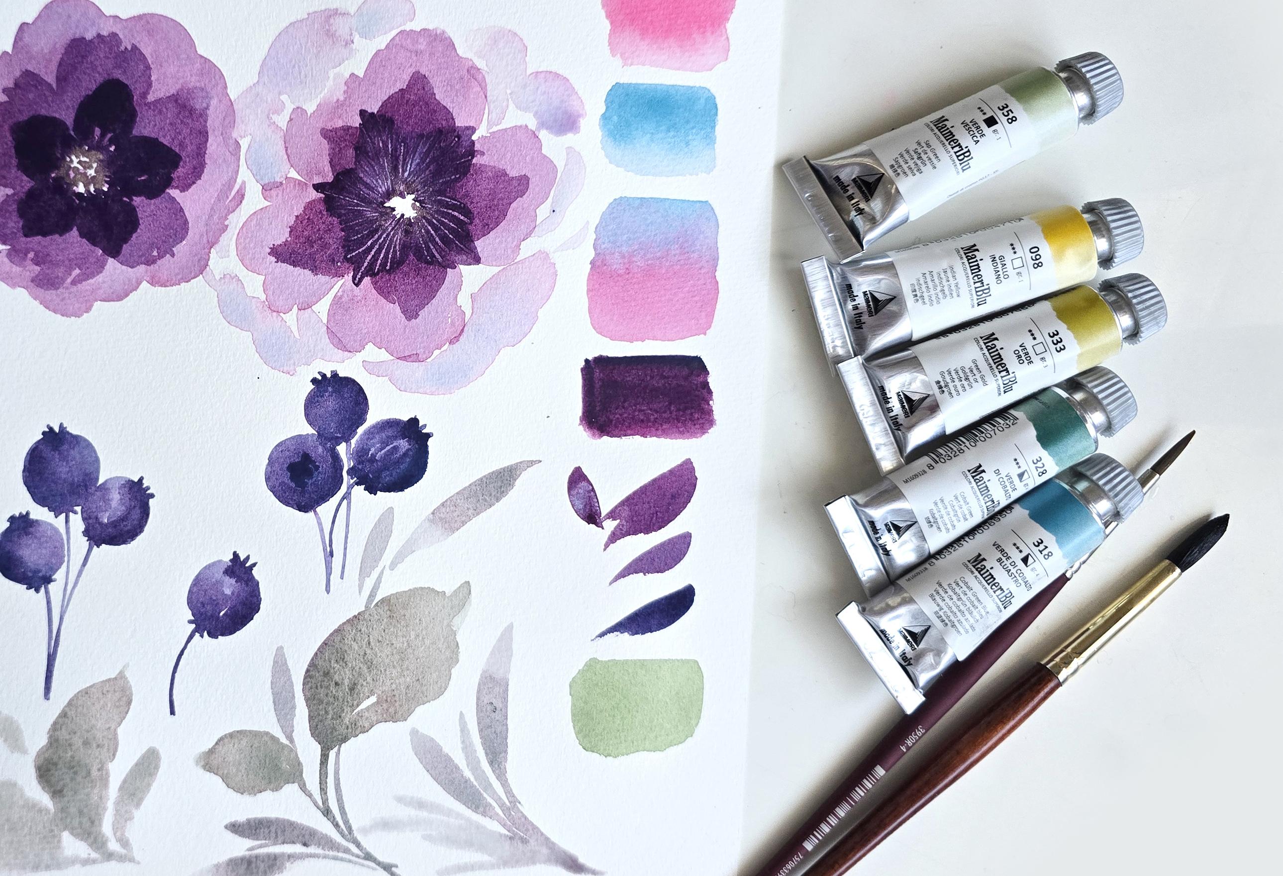
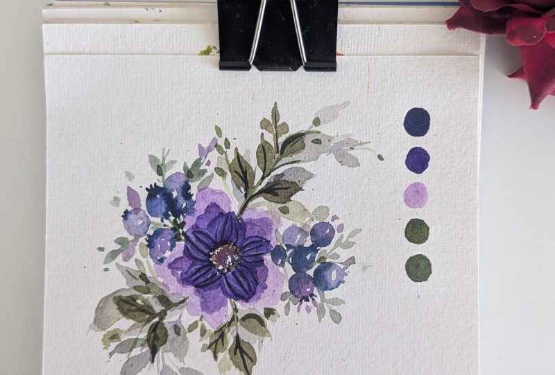
4. Part 1 - Swatching: We're on to more flowers. This time, I'm going to be
using the Princeton number eight mainly and we are going to be mixing some of
the primary red magenta with, I don't have the color out here with the cobalt green blue. I have those colors on
my palette already, so I'm just going
to put these off to the side and get them mixed up. It gives you a beautiful purple and I'm going to swatch that for you so you can see
what that looks like. The primary magenta, This is a very light
muted version of it. Now I'm just going to take
more color from here, drop that in so you can see
what it looks like with a bright red or more
color less water. Here's some of the
cobalt green blue, a very pretty combination, here's what it looks like
if it was just darker. Very nice blue. Now, I'm going to mix the
two of them to show you what you can get.
Starting off like this. If you're noticing,
I'm holding my brush up here and I'm really
pressing down to get full span coverage
or full length coverage. Then I'm taking some of the magenta and I'm
dropping some of that here. Where they intersect
is where you can see some beautiful
purple happening. Now, notice that the mixture that you get on here when you don't mix it in the palette is a little bit different than when you do mix it
in the palette. I just wanted to show
you guys what it would look like naturally when
they blend together. But now we're going
to be mixing these two in the palette to get a more authentic
purple result. Now, I really like my purples
to be with more pink, so I'll be adding
more pink in mine. Adjust yours according to how
you would like yours to be. I've got quite a bit
of blue in there, and I always like to say, a little bit of watercolor
goes a long way. This will be a lot of purple. I'm going to mix
this in right here. I'm actually just going to
mix it where the pink is because I don't want too
much of the blue mixed in. This is the color. I'm going to swatch that
for you real quick. There's just so much creamy
goodness happening here with the colors that I need to make sure I don't have
way too much happening. You can still see some
of the pink on my brush. I might just have
to move this onto another palette just
for easier mixing. Let's watch this color quickly. Look at that. Now I know it's
not fully mixed as great, but I'm loving this
deep jewel tone that we have just beautiful.
5. Part 2 - Flower Demos: Holding my brush halfway up, I'm going to start by
creating that petal. Then I'm getting water on my brush and I'm going to
continue creating more petals. I'm really not caring
too much about the white space in
between the petals, but I am caring about
it in the center. You could essentially have
a blob of purple like this and just leave
that center open. Usually when you
paint like this, sometimes you'll find
little bunches of color. You can just move
the color around. Like if you wish, just
a couple of strokes, you don't have to go over it in an insane amount of strokes because then
what's going to happen is you'll
you'll have a lot of leftover prints or marks which doesn't translate
to the best results. Less strokes, the better. I've got my basic setup. This almost looks like a
morning glory facing upward. We're going to allow this to dry and then we're
going to go in with a slightly deeper version of this color once this
is completely dried. We're using the wet on
dry technique here.
6. Part 3 - Flower Demos: While that is drying up, we're going to do
another one over here on the side just
to get a little bit more comfortable with painting something like this. Here we go. This time, I'm going to try and leave some white
space in between. Say, this is our first petal. Here's a trick, by the way, if you want to
really nail down on those five petal flowers, just do your little circle
in a basic circle with dots. Yes. Then just go ahead and paint your petals
loosely like I just did. Feel free to get more
water for some of them and just troll your brush different directions and
get those nice shapes. You can even do one standalone, one that looks not sure if it's connected to that or if
it's alone by itself, getting more water on my brush and I'm doing my fifth petal. Then just to keep things a little bit or
try something different, I'm going to get some of
that deeper purple and I'm dropping that in right in the center and then we're
going to allow this to dry. I guess we'll explore two
different kinds of flowers or painting styles in between
the two of them here. We're going to wait
for this to dry and then we'll come back
and add another layer. The difference between
the two, this one does not have white space
in between the petals. It also doesn't have the center
area. With added purple. This one has a little bit of white space so you can
tell where the petals are. Individual petals are, that is. Then we've added some
purple to the center.
7. Part 4 - Flower Demos: So this first one over
here has dried up most of it and it may be
just a tad bit damp, but I'm itching to
create my next layer. Here we go. I've mixed up a
little bit more color and I'm making sure
that it's not too dark. I'm going to get a little
bit of water on this. What we're going to do for this next layer is we're
going to create petals like this, but smaller. This will be our outer area and then we're painting on top. This is definitely wet
on dry, not wet on damp. This is a good indication, so we're going to do our
little dotted circle, just like we did with
the second flower. Then using that as your
area or your guide rather, we're going to paint these
loose shapes for petals. The point is to dab and get this nice wet on dry
effect and experiment to see exactly how things
dry up and how layering can also elevate your florals
layering with wet on dry. This one's done. We're
going to allow this to dry and then we're
going to go back in with a slightly darker
rendition or mixture of that purple and we're
going to create even smaller petals
on the inside.
8. Part 5 - Flower Demos: So this is dried up quite well. This might be just
a little bit damp, but I'm okay with it being
a little bit damp to get a little bit of a
bleed. If that happens. If not, that's okay.
We're going to continue with what we did here. We're reflecting the
same thing over here. Smaller petals, we're going to try and get more definition between the petals by leaving a little
bit of white space. Here we go. One, two, can use some of those petal
techniques that we did in the beginning
for brushstrokes. And you can always turn
your sheet around. Then I'm going to
go one more here. Now, this was a little
bit damp so you can see there's a little bit of bleed
happening and that's okay. I don't mind it overly. Now let's go in the
center and add more of that beautiful rich purple. I'm mixing more
of that purple on the side and I'm just going
to drop more of that in here. Make sure you don't close up all this beautiful white
space that's happening there. The goal of this is
just to dab or layer more color just in the center so we can get that nice
dark to light effect. Now that that's
done, we're going to wait for that
to dry before we do another layer of
smaller petals on there.
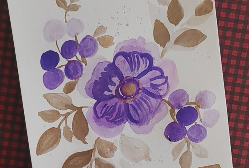
9. Part 6 - Berries Demo: Going to just essentially roughly draw or paint a
circle, something like this. Notice how I'm pressing
down my brush, swirling around and then
I go up the other way. And then I'm lightly grazing the edges to get
more perfection in. Then I'm going to get
a little bit more of the blue on the
tip of my brush. Then we're just going to create little protrusions at the top, three of them like so, and then we'll just do maybe
three at the bottom like this and we have a stem. Then let's do another one. Circle. Now, the circles
can get out of hand. That's okay when you're
first trying it out. This could almost be
one that's facing us. You can just drop
in more color and it'll do exactly what it did
with the flowers at the top, so this is going to
be a lot darker. That's a good enough indication
that it's facing us. Let's do another one facing upward this way.
No, let's this way. I'll try and make
it smaller so it doesn't touch the
flowers at the top. And they can touch one another. That's okay. Then we've got
our little protrusions. Using the tip of my brush, I'm just lightly gazing to
create these a little crown. This one can be
another stem, I guess. The stems are a little
bit off on this. Let's do this one more time, but this is the basic idea, adding the darker color to the center of this
is likely best done when it is wet on damp versus wet on wet or
even wet on dry maybe, but wet on damp will give
you smoother results. Let's try and add this
in a little berry bunch. Say if you wanted to add that
to your flowers at the top.
10. Part 7 - Berries Demo: Here we go. I'm going to
start off with one circle. In fact, instead of doing all the details and
then doing another one, I'm going to dip the
tip of my brush and create the next
berry right away. I'm lightly touching
this berry and notice how the color just seeps
into it, which is beautiful. I love when things
like that happen, especially when it's a
loose style of watercolor. It's so nice to see. Let's do one more
happening here. Then I'm taking more of that color on the tip of
my brush, the darker, more prominent blue,
and then I'm going to lightly add these little
strokes at the top here. I'm going to add some here, and then let's add some here. In this one, they're all
facing upward, which is fine. Then let's just add
little bottom for them. Just something very rough. I'm not even making it a green than adding the stems
in the same color. We're literally just painting and just going with the flow here to get the basics
down of painting, I guess, something
that resembles a blueberry that you can
add to your flowers. That's all there is to it. It's super simple, fun and
great with getting practice in for your brush
control and then also painting circles in and that wet on wet
versus wet on damp. Now, one thing I want to
just make mention of is, let's just examine the blueberry
or the berry as a whole. It's supposed to be a
filler element that happens more to embellish
your main elements. So say you go lighter than this blue,
that's totally fine. I'm just painting
this in to give you more idea of
where this is going. You can add depth to this very loosely by just adding
more color to one side. It looks like the light
is hitting on this side and then using that
same darker tone. You get this darker tone by adding more color, less water. You're creating your
little crown at the top and then at the bottom, you're just doing
your little bits there. And then that's it. This is very thin, a stem,
it's ridiculously thin, but you get the meaning or you get what I'm trying
to say here is just add more of a darker tone
on one side and then it immediately elevates the whole light and shadow
aspect to your berry. Now, actually, because
this is semi dried up, you can also notice if we go
and add that in right now, I'll give us a nice soft effect. Because it's wet on damp. I'm going to show you
what that will look like on this one on the side
here because that will be more on these shadows
should be on the same side. I'm just going with
where it was darker, but they really should
be on the same side. I should have always
been on the side here. But you can see how it elevates
everything right away. Let's just do that over
here on this side. I'm going to show you what
that will look like because I feel my preference is always
wet on wet or wet on damp. I need to add a little bit
more water. There we go. If I'm adding this rich color here and it's just
sitting there. It's not really doing much and this is the
difference between wet on damp versus wet on wet. Wet on damp will give you
those nice darker results, but it just gives
you that hard edge. You're not getting that beautiful bleed
that you get here. The bleed is best over here
because this is wet on wet. It's bordering a fluid, not a smooth gradient over here, but it still works. This here it just stops midway. I did mention if that is the case and
you want to experiment, just take a damp brush. And just rub that along
and see if you can get a blend in or not,
something like that. Same thing over here. This one's a little
bit wet on wet. Wet on damp there. That
was my fix for it. To be very honest, I figure these are
a great way to practice knowing the
difference between wet on wet, wet on damp, and then wet on dry and also showing
you the results.
11. Part 8 - Berries Demo: So this one has dried up. We're going to go in with a
darker version of the purple. Roughly mix that in here. I'm using my number eight. You can also use the number four just to get a
little bit more control over the shapes if you still working on
your brush control. That's just a suggestion. Now,
holding my brush loosely, I'm going to go ahead and
create little petals. Again, if you want to create that little dotted circle
that I spoke about, if that's more helpful, try
that and then also turn your sheet around if you
can paint better that way. And then I'm doing the little
jaggedy edges. Perfect. Now you allow that to dry and then you're going to
see what that looks like. Right now, it looks
a lot darker. We're going to find out exactly in a few moments
once it dries up. But I maybe could have gone
just a tad bit lighter to get a more gradual effect because right now this
looks very stark. But let's move on to
the next flower here. It's got a little bit
of damp happening, so I'm going to get a
little bit more water into my mixture here. Let's start. I'm
going to start off in between on purpose so that it kind of alternates. We essentially did
the exact same thing that we did with
the second set of petals just on a smaller scale with a slightly
darker hue of purple. What I want to add to this
is a little bit of metallic. I think what I'm going to
use is the champagne gold. You can also use the fire opal so I'm going to get some
champagne gold happening here, mixing it in with
my number four. I'm going to drop it
in first over here. What I'm going to do is just
lightly dab around the edges and random dabbing happening
in the center of the flower, but leaving that
white space open. I'm going to do the
same thing here. I'm dabbing at the edges. For the center because
the center is very tiny, I'm just going to
leave it white. But I'm lightly dabbing
into the petals here. To introduce one
more thing that we have done in at least one of these flowers and that's going
to be adding some texture onto the flowers using
the back of the brush. Now, if you remember correctly, I've said that the best way to get proper texture is
when the area is damp, I'm going to do it mainly in the last set of petals
that we have painted. Look at that. Look
at that stark. Indent or discoloration,
I guess you can say, where the lines are so prominent and that's mainly because we're essentially scraping
off the paint as we scrape in these lines. But look how much depth
and added texture it adds to your flowers. Look at that. I like to start from the center
and then go outward. I'm going along the shape of the petals so this way it
looks more whimsical and fun. This is what that looks
like. Super pretty and you can see exactly
how damp it is. Now, this one's also damp, very tempted to do
it here as well. But I think just for the
sake of this lesson, so you get a good understanding
of how things dry up, I'm just going to
leave this as is, and we're going to compare the two once they're completely
dried up properly. Let's just take a
quick moment to look at the shine
happening right there. Very pretty as well. But let's see how that dries up again. We've got the shine here too and it is integrating in with
the lines quite nicely too. It's almost like a
subtle effect on that last layer of
flowers or petals.
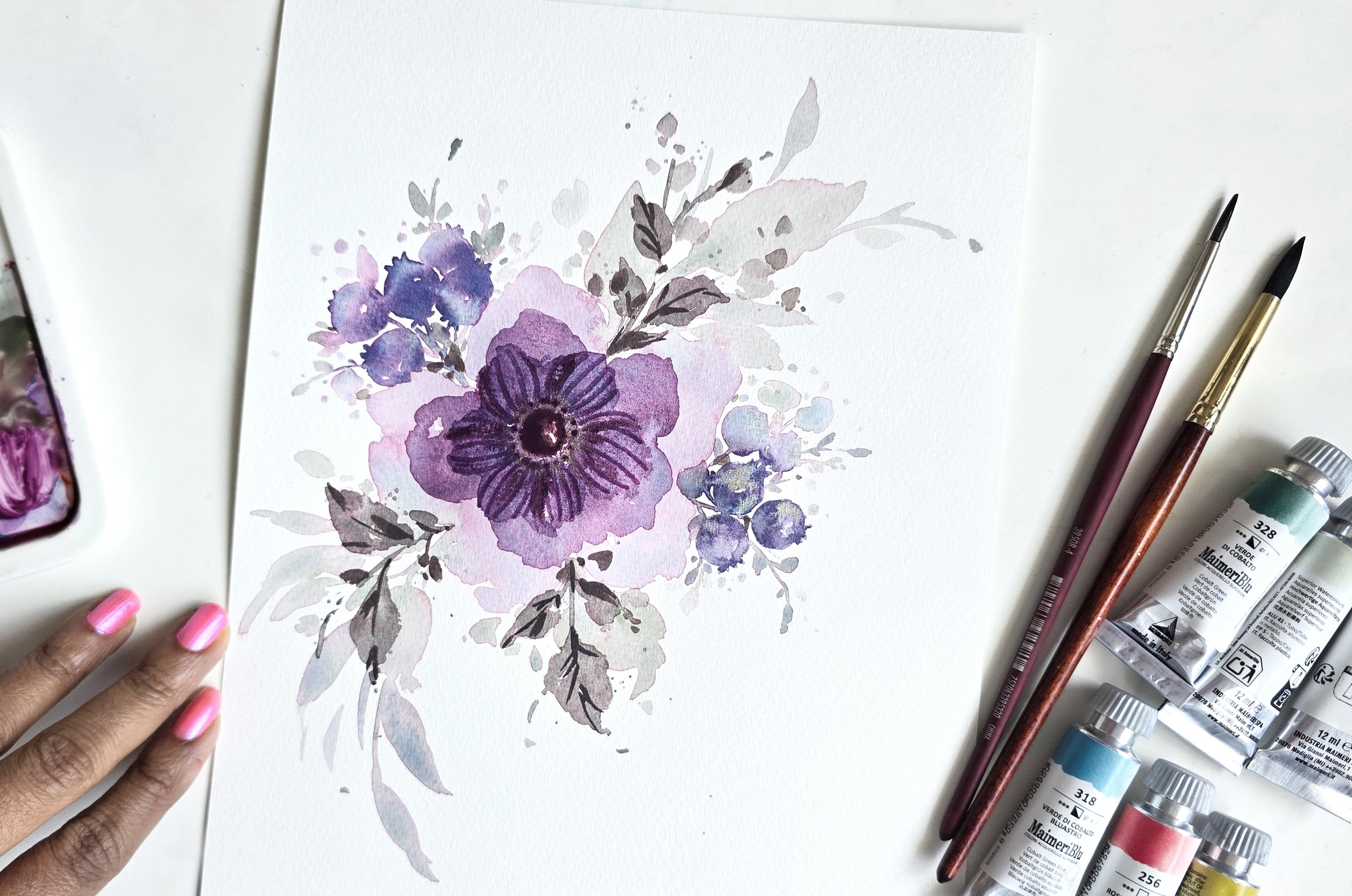
12. Part 9 Dried Up Flowers Purple Flowers: So it's all dried up and we can finish
off with a couple of strokes on the outskirts of this and it's what I
like to call fluffing. Now, I don't have a lot
of space over here, so I'll just do it on this one flower and it may or may not touch a
little bit of this. We want to get a
very diluted version of the base color or just
the colors we've been using. Actually, let me revise
what I just said. We've been using the same color. We're just using
different ratios of water to color mixes. We started with the
least for the base, and then we slowly
built mind you, for the third layer, I feel
like I could have gone slight bit lighter because this is very dark,
but that's fine. I don't mind it. It's a very
nice contrast to it as well. Here we go going lighter. I'm using my number eight
and I'm just going to lightly just add
little strokes around. My flour making these very
organic looking shapes to enhance the fluffiness of it. And you want to give it just subtle little strokes like this. I guess I could say that
I'm making little waves, but look at the variation in edge pattern, I guess
you could call it. It's very loose, it's organic
and I'm keeping it light. So we're going to
allow that to dry. You can also overlap
a little bit if you want just to give it
that extra interest. Otherwise, it's going
to look a little bit too concentrated
and intentional. This way now, we've got
a flower that's bigger, fluffier and you could do the same thing
over here as well. That's what I would term
as fluffing pretty much using a watered down version
of the base color to just add that loose light
effect around the flowers to imply background petals or layers of petals to your flower.
13. Part 10 - Leaves: So now we can do a couple of loose leaves just in the same style that we
did our flowers in. I'm going to introduce
some of the green. Let's try and mix
a little bit of this sap green because I feel like it's very muted and this is what the
sap green looks like. Let's just watch
that real quick. This is what it looks like here. What if I mix a little bit
of that purple in with it? I'm going to mix some of
that in my leftover section here and we're going to get
a more muted green tone, which I think is great
because then it'll give a nice enough balance to our elements like the
berries and the flowers. Now, for these leaves, what I would suggest is going lighter because these
are so much darker. For instance, we're using the
same techniques that we've done in our brushstroke
um session. Starting with a stem and then starting from out going
in, that's my preference. But what I would love you to do is love for you to do so
you can get used to this is doing that little pressing and getting that nice
edge to your leaf as well. This is something that
we did with the flower. Remember when we did
the petals and this just gives us more organic looser looking
shapes on the side. Then if you just add
the same detail. I did one stroke and then
I just went sideways and press my brush down
to get this shape, do the same thing that way. Then just to finish it off, if you just want to add that darker tone at
the base of the leaf, this way you're
creating some very loose looking depth and it adds something super pretty to the end result and I
overworked that there, but you get the idea. The whole theme of this is
to just be really loose in your strokes obviously,
minus the berries. I feel like we were a little bit more concentrated
with the berries. But with the leaves,
I want this to be a little bit more of a practicing by starting
with your stem, pressing down to really
zigzag your way and then get a loose enough shape like
this that can be a leaf. So it's that whole
experience of just taking water using a
water down version of the color and just creating
these lucid shapes that are supposed to
be your leaves in your nice thick flowers
or big flowers. Again, lighter tone, so
more water, less color, and we're just adding this
to offset the flowers to give it that extra interest in that beautiful loose feel. Now, one more element
that you can do in the same color, in fact, I'm just going to
add a little bit more of that purple in here to get more of a purply tone. Let's just see what
that looks like. If you can add elements like
the tendrils that we did, but just adding extra long
little lines like this and then just starting with the tip pressing down and
dragging for longer leaves, that can also create some
really nice beautiful effects. For these, all I'm
doing is starting with the tip and then dragging
and trailing off. It's like a flick of
the wrist situation. A couple of two different
leaves for you to try and this just adds texture. It adds interesting shape. You've got some really nice
thicks and thins going on, and we're keeping things
very, very loose. That's still the
main aspect to this. So we're going to take what
we've learned in this lesson over here and we're
going to put it together to form a
mini composition. I just want to show
you guys how you can take each
element that you've learned and put it together and create your own
little mini compositions. If you've been struggling
with compositions, this video is for you.
14. Part 11 Composition Purple Flowers: So I'm going to
start off with using my Princeton number
eight brush and we're mixing the same color that I had previously mixed
to demonstrate those flowers. We're starting off with
that very muted base, we've got a lot of space to work here and I'm not going to be doing this a lot
of instruction. I'll be able to move
a little bit more loosely and fluidly
over here. Here we go. Starting off with our very loose base section
and we're pretty much creating five petal
flowers using some very, very water down purple. I'm going to start with the dotted circle and I'm getting water on
my brush and we're going to loosely
press down and create these very watered down
looking petals like so. This flower that I'm painting, I'm going very fast with my strokes to
create these petals. I would suggest doing
that to get that more authentic loose
look to your flower. I'm aiming for five petals. Let's see if we can
fit five on here. I'm going to do one more here. And then just one like so. We allow this to dry
for a bit and then we come back to create that next
level of flowers going on. While this is still damp, I would love to take
this opportunity to go ahead and get some green happening for our leaves. For the leaves, all I
did was mix in some of that cobalt sap green, sorry, with that
same purple mixture. I have that mixed here already, and I'm taking a very
muted version of that, just like I did with the
base for the petals. We're going to start off
with doing some leaves. I like to have
things diagonally. I'm going to start a little bit of leafy action happening here. Then a little bit around here. And then taking more
water on my brush, starting with that first stroke
and then pressing down to really get a nice little loose
effect for my leaf there. I'm going to get
a little bit more green here just so
I can drop that in and then create another
loose looking leaf there. These ones I'm trying to keep smaller so that they don't
overpower this area here. It looks more like it's
just trailing off. I love that little
seepage of pink going on in there as well. I'm going to drop some
of that darker color in here just to give us a nice feel for
darks and lights. Then just because I like
to keep things in three, we're going to add one more leaf happening We've got diagonal. Let's do another one
happening around here. Let's do one here. That's good. Then just like we created those nice long
tendril like effects, I want to add some of
that for added movement. I'm going to drop
some of that in here. All I'm doing is lightly
grazing and trailing off. Then I did say we would do those longer looking leaves
which would look like this. Again, you're giving nice
movement to your painting. Now, feel free to pick
a different corner if you have done something
slightly different with yours, or if you've placed things
differently in yours. I love these little long
leafy tendril elements because they again, add a lot of movement
and it gives you some really nice contrast when it comes to
shapes and sizes, sorry, thicks and thins. That's what I'm looking at. Because when you paint loosely, you need to have elements
like this so then your eye flows nicer or more smoothly.
15. Part 12 Composition Purple Flowers: So I'm going to get
a little bit more. Again, just dropping the color into these areas
that are still damp. Right now, we've waited
for that to dry a tad bit. These areas are damp, not completely wet when we
first place the color down. This gives us a
more a nicer feel when we drop the
color in because it's going to not stick longer. It's going to be a little
darker because there's not as much water for
it to blend into. This is great for little
shadowy elements. Look at that beautiful
bleed happening over there. That's just so pretty. Getting a couple more strokes in here and maybe just doing
a little bit of fluffing, which is just adding a couple
of loose elements strokes like this. This will
come with time. I don't expect you to
get this right away. If you're struggling
with fluffing, I promise you just
make an effort to add this in and
then over time, you're going to automatically get how to tweet or
press down your brush because I know sometimes
folks end up trying to mimic and I'm
just going to get a scrap piece of paper
here to show you. Sometimes it might look
really weird like this. That's okay. We all have
to start somewhere. The more you practice
and try these out, the easier it will get for you. So now let's do some of
those blueberry style, they're not filler
flowers, but they're blueberries or berry elements. Same color mixture. We're just tweaking
the ratio a bit. I'm getting a little
bit of that pink in there and then
adding more blue to it, it looks more blue
than purple or like a a lighter indigo, I guess, could be a
good description. Again, we want to
start off very light. At a 30, 70 percentage, maybe just a slight bit deeper than the base that we
mixed for the petals. I'd like to start my blueberries
somewhere up I think it'll be nice to have
some falling down this way and then a couple of
them peaking up this way. Then again, we've got that diagonal
placement happening over here as well. Here we go. I'm a little bit antsy about starting with the
number eight brush, but we're going to
go for it and try. Feel free to use, the
number four brush. Let's do one in the number
eight first for me. Here we go. Very
rough little circle. Then just to make
sure that I get some nice little peaks
for our blueberry crowns, I'm going to use my number four and lightly just pushing upward. Now you can do this right
away or you can wait for this area to dry up just
a tad bit and then go in. You're using more of a
wet on damp technique. This way, that area will
be a lot darker because when there's less water on the base and it's
just a bit damp, you're going to get more
of a darker effect, which is what you
essentially would like to have for that element
at the top there. I'm just going to add
the bottom bits here. For this one, I'm
going to wait for it to dry just a tad bit, then we can see what
that looks like. Getting more of a
water down mixture. I'm going to add one more here. For some reason, my
elements are always a lot closer to the
flowers and tighter. But if you like to air
things out and have them spaced out a bit more and just leave a little
bit of white space, that is totally fine too. I encourage that. I'm going
to now add the stems. Then I want to add one more very light one
happening here. I'm using this element
here or this light one to reflect that whole
fluffing ideology of mine. This is to give more precedents to these elements versus
the ones in the background. Feel free to. Now I have four, so I'm going
to add one more and make that super light and keep
that in the background here. I love how there's a
little bit of separation happening in my
purple color here, it's actually very cute and adds a lot of
character to the elements. Okay. Now let's get
a little bit of that darker indigo mix. Using this brush again, I'm going to add that in. Notice how immediately
it's so much darker and more
prominent at the top, because this is wet on damp. I'm going to drop some of that
at the bottom of this too. Just on the sides here
where these two berries touch I want to add a little bit of
that happening here. Then just at the base. Then you can maybe add a little bit for the
background berries too. There we go. We've got
a lot of that going on, beautiful tonal range in there. Now we can move on to
doing some over here.
16. Part 13 Composition Purple Flowers: All right, we're back. We
move some of that out of the way and we're going to go ahead and do
more of these over here. So using the number four, getting some of that nice
muted purple or indigo rather, make sure it is indigo. I'm adding a little
bit more blue. Here we go. Love how it's almost like a
granulating effect. We've got that blue and
that pink seeping through. The more it dries, the
more prominent this is, and I think this is
going to look very nice. Here we go. Getting more water
in my mixture. This one can be
pointing up this way. I'm doing another one here, lightly touching that area. I'm going to add the
little crown right away. Why not? Very pretty. Then let's do one more. Let's do one more. Peeping this way, not
peeping fully this way. Now, for the so called fluffing, if you want to just add a couple just very loose looking shapes
in the background there, indicate that there's more
adding more water to it. I'm just adding something
here at the bottom, so I don't have to
draw in more stems. This is just hiding the stems. Maybe there'll be a stem here. Something like that. Have fun with it. Place things where you feel like you want to. Now I'm going in with
that darker tone because we've allowed things
to dry just a little bit. This is more of a wet on damp. So I'm going to drop in
a little bit more of, I'm just going to make sure I
have more blue than purple. I don't want it clashing with
this flower. Here we go. Dropping in some of
that darker tone here, some over here,
some at the bottom. I want it in the areas where
the berries are touching or close to each other, rather. Then obviously in that area. Now, this is a very muted blend. If you remember
what I mentioned, if things dry up quickly, I'm sure you do, but we're going to rejog that memory
real quick here. What I need you to do
is wash off your brush, dab it on your paper towel
and then with a clean brush, you're going to
just blend that in. There we go. We've got
our loose berries. Don't overdo the
blending because then it might look
overworked and weird. Try and restrain yourself. Now, getting some of that green. I'm getting more of that
green mixed in here now because we are
done with our berries. Then, sure, why not? Let's just add some there too. Perfect. Then getting those
tiny little green elements just like we did
at the top there. I'm going to turn this
a little bit sideways. Let's get some
happening this way. All I'm doing is pressing
down just the first half of my brush to give me these
very wiry style elements. The longest one can be
just protruding this way. Again, you're essentially
using this more to give movement and add a little bit of visual interest
than anything else. Having these elements
really do enhance everything in your artwork
because now all of a sudden these elements help elevate
your main character, which is the flower,
essentially. Then last but not least, getting some of our
opal and we're dropping some in into the berries, giving that nice shine, which we all love, or
maybe not all of us. I love adding shine and glitter. It's not the greatest
for I guess, if you're doing digital art, you're painting to scan this and create
elements or products, but you can just
eliminate them if this is not your vibe or goal. So pretty to watch. Then obviously the dots.
17. Part 14 Composition Purple Flowers: So our flour is dried up and it's now time to
do that second layer. I've just mixed up
another batch of that purple and I
have watered it down and we're going
to continue using the Princeton number eight. We're pretty much doing
the same technique to create these petals, but we're going to
make them smaller. And what I would suggest
is you can still do your little dotted center and you can just roughly go over the first layer
that you had done. Here we go. I'm doing mine. You can turn your sheet around if that's easier
for you to create this and it doesn't have to sit perfectly on top
of these petals. You can go in between. For instance, I'll do one here and I'm going to
overlap between these two. One, two, three, four. This one will intersect between these two as well here or touch
these two adjoining ones. Perfect. Now, at this point, because I want the center to be a little bit more prominent, I'm going to get more
using the number four, I'm going to get a darker
mixture, more color, less water, and I'm
just going to drop that in to the center. This is just me adding more
depth to the middle of the flower as I'm building up on the
layers of this flower. That's the reason why
I'm adding this in. So this is the wet
on wet layering. You can touch a little
bit of the petals just to get that nice little
flow of color going on. Then if you want to
add a little bit more definition
between your petals, you can just drop
in some strokes, not all the areas needed. For instance, I'm just del I deliberately did one there so that you can see the difference between the two
petals, did one there. It is still wet on damp, so it won't dry up
entirely like this. Be ready to see that
it's completely submerged into the petal,
so keep that in mind. Great. We're going to allow this to dry and next we're going to add some leaves overlapping
on these ones over here. Just a little bit of action
just so that it's got some hierarchy in terms of the background leaves
and the foreground leaves. Again, I've taken sap green. I've mixed it with some of that purple I'm using
the same area to mix new and remix more color as we go along with the layers. Now on another
note, I do want to say that if you really like
the light look and you don't want to overlayer or you can't be bothered with layering
and adding more depth, then you can totally leave it as is actually before
we added this one here. But I'm going to leave that
up to your discretion because everyone has different
preferences when it comes to things like
this. Here we go. This time I'm doing the
leaves with the number four, slightly darker
tone of that green, and we're going to do it the
same way not rocket science. We're doing the same thing. The only difference is I'm going to add this on a smaller scale. That's why I'm using
the number four. And it's a little bit darker. It stands out from the rest. I always start my leaves
off majority of the time, I should say, with a stem. This way, I have an idea of where I'm placing
things and then I find a spot on the stem to create the
leaf and go from there. Some people like to
place the leaves first and then do the stem, leave allow your own
creative intuition to kick in and go with that. I'm offering you suggestions because this is how I do things, but that doesn't
necessarily mean that this is the only way to do things. Gain inspiration from it
and then find your joy as you paint along. Okay. You will definitely
find yourself getting a lot looser
as you paint, embrace that and
pay attention to the loose strokes or results that you get
for your loose strokes. It's so awesome to see
things evolve and just grow. The more you practice,
the more you paint, the easier and the more
startling the results.
18. Part 15 Composition Purple Flowers: Last, I'm just going
to add more of that darker color to the base of the leaves
and along the stems. This way, we've got a tad
bit of depth added to it. Then another thing I want
to do is add a splatter. Getting a little bit
of water on my brush because I want the splatter
to be a tad lighter. I'm just going to
drop that in here. And then these are the fluffing
strokes that I'm doing. You can also find the areas
where some of the splatter is and you can mix that in. That is also completely a valid thing to do to
help with the fluffing. Something like that,
I did that there. Because a lot of
the time I do find, at least for me personally,
when I first started out, I found I didn't want to
touch areas that I had stuff painted on
already and why not? Because you totally can
paint over other elements. It's called glazing, it's called layering and
that should totally be a thing that people do because it gives you some
really great results. Everything is dried
up and we can now go ahead and do our
final third layer of petals in the center. I'm going to get a little bit
more of that color mixed up here and I'm going to try and control how dark it is because I do want it to still be light enough
that you can see through. I'm adding water
to my mixture as I go along mixing it up. This time, I'm going
to use my number four. I can't remember if I use my number four or
number eight for the second last layer or
the last layer we did. But if I use number eight, then I'm using number
four now so I can control the sizing of these
petals. Here we go. This time, I'm going to
start off deliberately in between these two right here
and we're going smaller. Something like
that, going to dip the tip of my brush in
water just to make sure that I'm getting move
everything around so I have room to turn things. Let's just go in
this one direction. The same technique just smaller. This one, I'm just going to
really just dab around here so that the shapes can be a little bit
more organic looking. Then last but not least, we are adding our
little dotted center and then if you want to have it touching more of the edge. Just get a more opaque mixture of the color and just
drop that in right now. Now is the perfect time
because it is wet, it'll give us a beautiful
bloom and we're just building up on the layers here. Then again, if you wanted to add some definition
in your petals, just drop in those
little strokes. Adding some of the opal. We're going to add
some of the opal right to the center here. Then we're using the
back of our brush. I'm going to create two
little roughly dotted circles here because the
first one is going to seep with the purple when we start painting
or drawing in our lines. Then using the
back of the brush, we're going to start
from the center and pull it in the direction or into
the shape of the petals. It is important that
this is done while this area is damp or wet. Make sure you're
not waiting for too long and that you've got enough of that nice opal in there or whichever
metallics you're using, you don't have to
be using fire opal. Then as you go around, you're just drawing it in following that
shape that we have. Make sure you're holding down your sheet. There we go.
19. Part 16 Composition Purple Flowers: Last, I'm just going
to add more of that darker color to the base of the leaves
and along the stems. This way, we've got a tad
bit of depth added to it. Then another thing I want
to do is add a splatter. Getting a little bit
of water on my brush because I want the splatter
to be a tad lighter. I'm just going to
drop that in here. And then these are the fluffing
strokes that I'm doing. You can also find the areas
where some of the splatter is and you can mix that in. That is also completely a valid thing to do
to help the fluffing. Something like that,
I did that there. Because a lot of
the time I do find, at least for me personally,
when I first started out, I found I didn't want to
touch areas that I had stuff painted on
already and why not? Because you totally can
paint over other elements. It's called glazing, it's
called layering and that should totally be a thing
that people do because it gives you some
really great results. Everything is dried
up and we can now go ahead and do our
final third layer of petals in the center. Going to get a little bit
more of that color mixed up here and I'm going to try and control how dark it is because I do want it to still be light enough
that you can see through. I'm adding water
to my mixture as I go along mixing it up. This time, I'm going
to use my number four. I can't remember if I
use my number four, number eight for the
second last layer or the last layer we did. But if I use number eight then, I'm using number four
now so I can control the sizing of these
petals. Here we go. This time, I'm going to
start off deliberately in between these two right here
and we're going smaller. Something like
that, going to dip the tip of my brush in
water just to make sure that I'm getting move
everything around so I have room to turn things. Let's just go in
this one direction. The same technique just smaller. This one I'm just going to really just This is what I
call going with the flow. I was going to leave it like this because this is what we had done in our little section here. I use a combination of the two. But as I'm looking at this, I'm really feeling like my creative intuition is telling me to go really dark in
there almost like a black. I'm going to mix some of the dragon's blood that I
have in my palette and I'm going to mix that in with the leftover purple to
get a darker color. And once I have
that darker color, I'm going to add that to the
center and almost give it a dark tone like you
would see in anemones, for example, I think
it's going to give us a very interesting result
because that's going to create so much contrast in
the overall painting. I think it's going to tighten
things up a lot more. Here we go. Run with me on this and let's see
how this turns out. I'm getting some of the magenta and the cobalt green blue, mixing that in here with some of the dragon's blood.
Look how dark that is. I think we could use I think this is dark enough
and I'm going to go very, very potent in color ratio
for more color, less water. Then I'm just going
to dab that in here. Now I need to have
more color lay on here because the center
seems to be damp, which obviously
we've not given it enough time to dry
up completely. If you can do this during your more of a wet
on dry, that's fine. I'm just layering on some
more and I'm leaving a little bit of white
space here just to indicate that nice
glten then just adding more color just to increase the depth that we have
within the flower. Then last but not
least I'm taking that nice rich color
and we're just going to lightly
add dots around. Then now we allow this to dry
and we're going to see if we need any more highlights
happening in there. But as I'm looking at this, I love how the
leaves are looking. I would just do one more
tiny thing and that is adding a little bit of a darker detail to the
leaves by darker detail, I mean more of a mixing
some of that color here. Leftover purple from the
center with a little bit of the sap green. I'm just going to
add little details to show the veins in the
leaves, for example, We just want to give it that nice contrast and just make it pop just
a little bit loosely it just elevates
things so much more. I'm also just adding little tiny fluffing
bits with this just to enhance the whole feel and have a little bit more
of this color tie in in the rest of the areas. Otherwise it just sticks
out like a sore thumb. You do need to have when you, it's nice to have
these colors all around so that they
tie in with everything happening on a tiny
scale so that it doesn't look like a lot of contrasts
happening in one area. Okay.
20. Part 17 Composition Purple Flowers: So we are finished and
this is still drying up. But a couple of things that I really wanted to bring
to your attention right away is make sure that when you're creating
a flower like this, you either leave
the center open, so white space or with a
little bit of dabbing in the center with tons
of white space showing just because you've got so much happening in the flower itself. Or if you decide to go the
route that I have gone where the darkest areas in
the center and then everything slowly gets lighter, make sure you have a
little bit of white space, so you get that depth, that feeling sorry, not depth. This would be more of light
hitting the flower center. Same thing with the
little white spaces that you see around
in the flower. Every spot is not closed up. All these beautiful
little bleeds that you see in the colors
that we've added, and same thing applies for
the way we did the berries, the way we added the
glisten in the berries, the subtle glisten in the
center of the flower, and then just the added building up of layers in our leaves. We've essentially taken
the three things that we learned over here, from the flowers to the
berries, to the leaves, and we have put it together to form a mini
composition like this. I hope this was
fun. I hope this is inspiring you to sit down
and create a whole bunch of these and maybe even try some ideas that might
come your way as you paint this as you
watch this video. Sorry. That's it. That's it. Thanks guys for watching. I hope you enjoyed this. I certainly did. H
21. You Made It! Congrats!: Okay, so if you are watching
this part of the video, that means you have
completed your lesson. I'm so proud of you. I cannot wait to
see what you do. A quick reminder, make sure you post your composition
or even the composition you painted along with me in the gallery section so I
can see what you have done. I hope you had fun
painting along. I hope this gave
you an insight more into how this therapeutic
medium of watercolor works. I hope you give this
lesson a try again. Use what you have learned. Try it with your
favorite colors, try it with your
favorite brushes or maybe entirely
different paper. I guarantee you will get different results because now that you know exactly
what you're doing, you're going to be
flowing much better. That guys is how you go with the flow in watercolor.
I hope you had fun.
 Clarice Gomes, Go with the Flow in Watercolour