Transcripts
1. Hello I'm Clarice: Art is therapy and
there's nothing like taking time for
yourself to sit down, let loose and go with
the flow in watercolor. Join me in this lesson as we take time to get
better acquainted with the therapeutic
nature of watercolor while we learn how to
paint all things autumn. Hi, my name is Claris and I am a watercolor artist and
designer from Toronto, Canada. Color started for me as a side project of just
painting for fun. And that slowly grew into little mini tutorials on YouTube showing other people how
to paint for fun as well. That slowly grew from teaching online to in person paint and sip type experiences in vineyards and also
travel retreats. As a Princeton ambassador, you'll find me using a lot of
these brushes in my videos. My two favorites are the Princeton velvet
touch number four and the Princeton
Neptune number six. This jam pack lesson is
about all things autumn, get ready to let loose
and go with the flow as we explore watercolor
painting autumn things.
2. Class Overview: In this class, we will get to
know watercolor better over small mini watercolor tutorials of all the little autumn inspired items that I
have planned for you. We're going to be starting
off with swatching colors. I'll also be showing you guys
how to mix colors to get different variants
in terms of hues, and then we will proceed
on to compositions. Now, because this is
a jam packed class, you can break this huge class down over several
days of painting. I recommend about 15
minutes a day at least. This will also help you create that habit of spending
time for you, painting, and doing
what brings you joy.
3. Project: Now, as I've mentioned
several times already, this is a jam packed class
full of autumn inspired items, and so I don't expect you to post every little thing
that you paint in here. But for the class project, I would love if you take one piece that you are
exceptionally proud of and you're really pleased
with how it turned out and post it in the
gallery section over here on Skillshare and also list what about it
that you really like, or maybe you even want to
enhance and share what is it that you have learned something that is new that you
didn't know before, maybe.
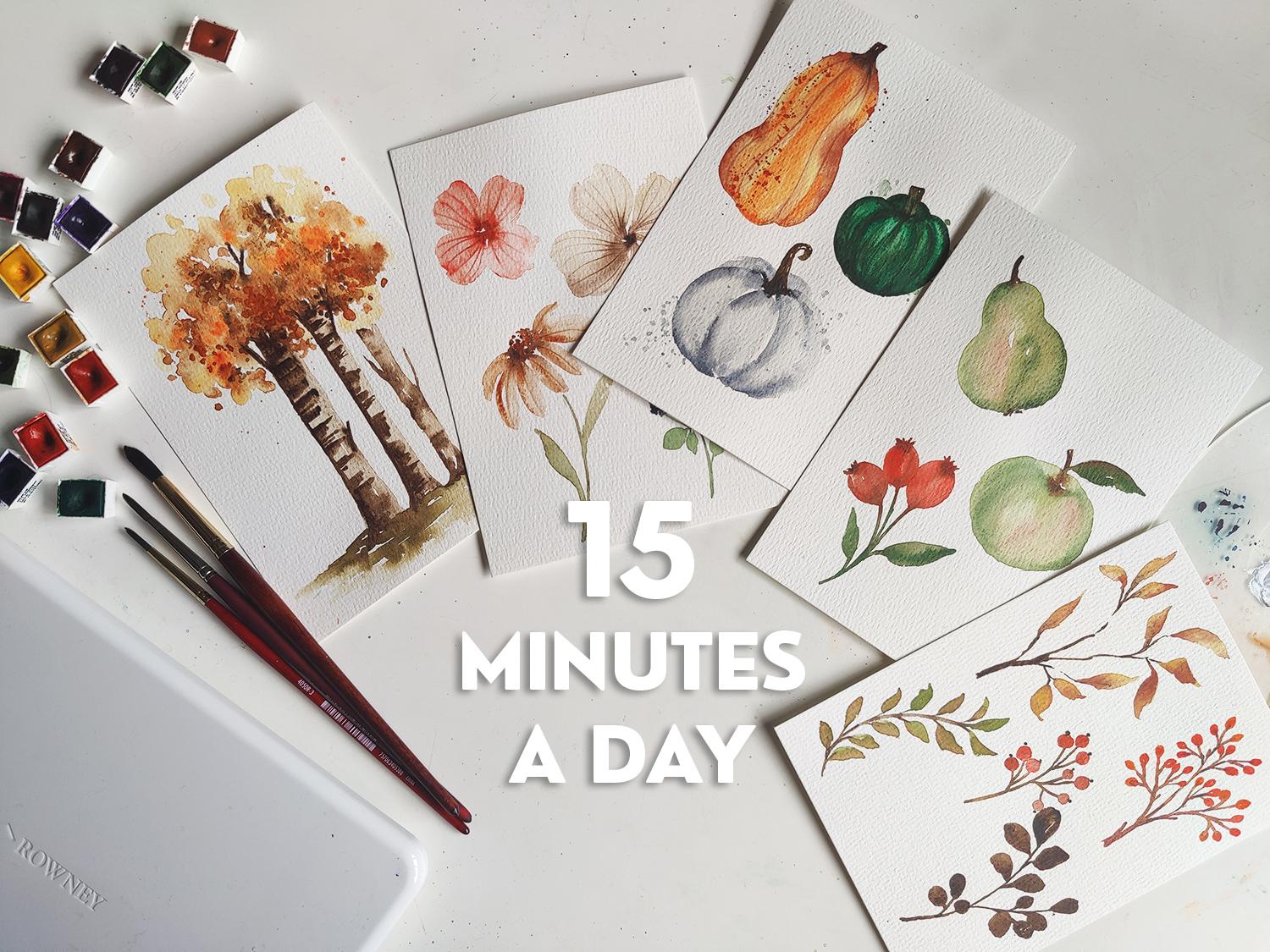
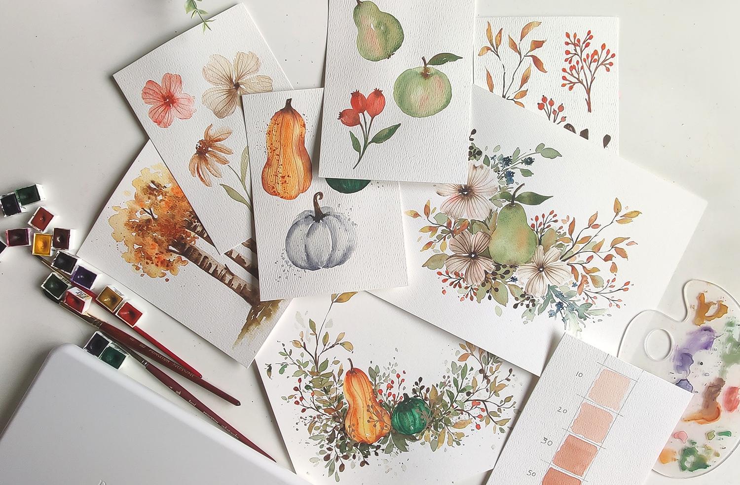
4. Supplies: So here's all the supplies
we're going to be using. I have my bow Hong
watercolor paper. This is the paper we're
gonna be using for our basic learning of the elements for our
final composition. We're gonna be using a sheet of Stratme hundred percent
cotton watercolor paper. Brushes, I'm going to
be using the following. I have all of these handy here. You might have some of them in a different brand, and
that's totally fine. I've got a Princeton
heritage, number three, Princeton velvet
touch number four, Princeton Neptune number eight. And then just in case
I need an extra brush, we've got the Princeton
velvet touch number eight. I've got paper towel
handy on the side. I have a palette, and then I've got my
Daleron set of watercolors. We've got a bowl of water or
a cup of water, in my case.
5. Swatching: And we're going to
start swatching the colors so you know
exactly which colors we're going to be using
for this exercise. So to swatch the colors, I'm going to use my Princeton
Neptune number eight. And as I am swatching
these colors, I'll let you know exactly
what we're using. So the first color right here, let's start with the yellows. Let's start with the
lightest, actually. We've got Cadmium
yellow, cadmium yellow. And this is what
that looks like. A nice bright yellow. Swatching is helpful so
that you are able to see exactly what colors
you have on hand and how they can go together
in your composition. And this is why I like to start most of my lessons this way. The next one we're using
is Cadmm yellow deep hue. And so it's just a really
nice mangoy kind of hue. It's one of my favorite yellows. The next one is also
a favorite of mine, but then using it more for
muted looks is yellow ochre. It's a fabulous
fall autumn color. Next thing we're going
to use is light red. Now, this is more of an orange, reddish kind of color. Like a brick color. Fabulous for moody flowers. Such
a great color. Next color I will use or
swatch is burnt sienna. This is also a great color. It's got that fiery
orange look to it. I think it's quite a popular
one with a lot of people. The next one we're
using is CadmumOange. We need those nice bright
oranges. This is autumn. I'm going to have to get
creative with my space here. The next color is cadmm red hue. So we're going right
into bright red, reddish orangish kind of hue. Look at that. Rich red. So I'll do the swatch of
green at the very bottom, the only green that I have here. And then the last three
are more darker hues to mix with any of these to get a darker
rendition of them. So here we go. This is
Hooker's green deep. Dark. Sorry. There we go. And
then the last three, I'm just going to
swatch the side. So then this way, we
also know that these are the colors we can mix with any of these to
get a darker hue. So the first variation I have is everyone's
favorite Payne's Gray. Pains gray is
stunning on its own. Also the results you get when you're mixing it with
any of the other colors. So if I wanted a darker version
of the red, for instance, I would mix a little bit of
Pains gray in it and get a shadowy darker
red, richer red. Next one is indigo. Panes gray is similar to indigo, or they are similar in color. But obviously indigo has
more of that not green, blue versus Pain's gray, which is more gray. And then last but not least
is our darkest brown. And that is Vandyke brown hue. And I love this color
for branches and anything that's dark but
more of an earthy warm tone. Also a great color to mix and get a darker
version of these. Okay. And on that note, these are all the colors. I'm gonna quickly write
the names beside them, and then we are
off to the races.
6. Colour Ratio Mixes: Let's get to swatching some colors in terms of
the color water ratio. So when I talk about ratios, and when I say
something like 30, 70%, I mean 30%
color, 70% water. There's no real way to
gauge this exactly. So having an exercise
like this will give you a better idea of how
to sort of eyeball things. So I'm going to start off
with a 10% color, 90% water. So this is where
your brush is clean, you get a little bit of color, you mix it on, and this
should be about 10%. And Okay. Now I'm going to add a
little bit more color to it. And this will be a bit darker, which is more of a 20%. I'm going to add more color a little bit of water because
we're running out of water. And this is the most
common ratio that I use. 30%. Okay. Now we're going 50 50. And as you can see, it's
progressively darker. Okay. Now we're going for 80%. Now, 80% is like
where you're getting that nice thick opaque look. So getting you can still sort
of make 80% see through, but as you can see the
progression from ten all the way to 80 is there's clearly
a very big difference. I like the median. The
median for me is 30% and then just building up from
this side or this level. This will come in
handy, especially if you're a beginner to
watercolor and you don't quite understand
the different variations you can get without having to mix in some white because you
get the white on the paper. So kind of overlying. And these are all the
different hues that are possible from using one color.
7. Autumn Squash #1 - Part 1: We are going to paint
some squash and pumpkins. So once again, I'll be
using a combination of the Princeton Neptune number eight and Princeton
velvet touch number four with a whole plethora of
colors by Dalarone over here. And the paper as per
usual is Bo Hong. I had to pause
there for a minute. Okay, so let's start
off with doing the Princeton Neptune brush for our base or using the Princeton Neptune
brush for our base. Because we are not using
any drawing or base sketch, we're just going to use this
to mix some loose color. I'm going to use
some of the yellow, which is the Cadmm yellow, and I'm mixing a very
loose version of it. I had some of the cad medium
Cadmm yellow deep on here. So mixing it in with that. And the idea is
just to get a very loose watered down
version of a yellow, and we're going to
paint in a shape of representing a squash. So the first one is going
to be a long a longer body. It's going to have
a longer body. So like this. And
let's just say, like, the top of it is kind
of flopping sideways, and then the bottom
is nice and round. Now, because these have
ridges in between, what I'm going to do is
have a second ridge, almost like you're painting
a frill at the bottom, so one, two, and then
a third one here. So this is our very
loose shape of a squash. Okay. So using that yellow. Now comes the fun part
of blending in color. So now we're going to
take in the number four, and I'm going to get let's see. I'm going to get
the Red Light red. That's what this is
called. Light red. And I'm getting
the color directly from my color cake here. And we're going to drop
some of this in first at the top and watch how it
immediately blooms in. Getting more color. Now I'm going to add some to the sides. Again, watch how it blooms in. It is so satisfying
to watch and see. We're going to add some
just at the dip here, pulling it all the way down. And I'm going to add some
more on the side here. Now, because we have
a lot of water, there's a couple of
things to notice. You'll see how it kind of
just goes in and sits. If you want it to
be more seamless, I suggest you wash
off your brush, dab it on your paper towel and
help the color move along. I'm going to move
some of this color on the top, moving some of that. But for majority of it, I'm leaving it as is. I'm getting more of the
color from the color cake, and I'm going to add
some of that to the top here because I want
this area to be darker. So, the more you drop
color in a certain area, the darker it'll get. Okay. Now for the ridges, I'm going to lightly using the tip of my brush,
start from the top. And go down. I'm going to do the same thing
here on this side. And in addition to this, I'm also going to
flip my brush over. Start from the center
at the top here, press down, and kind of just trace the ridge
that we have done. Doing the same thing over here. And this essentially
just gives us some beautiful detail without having to go out of
our way to do any. I'm adding another
one to the side here on either side, actually. And now we're going
to leave this as is. Last but not least, I will be adding last but not least in terms of
mixing the color here. I'm going to add a little bit of this orange cadmm orange
hue before this dries up. So all I'm doing is I got
color from the color cake, and I'm going to start from here and kind of
pull it downward. So we're adding
beautiful hints of orange within our squash. Watch how it blends
in with the yellow, with the brown or
the red light to be specific and pay attention to how it dries up
because watercolor, like I mentioned,
dries up lighter, it is important to
notice how this plays a huge effect or factor when we're painting because sometimes we think,
Oh, that's too dark. Let's not add any more color. Well, it's going
to dry up lighter, add more color if you need to. Okay, so we're
going to allow this to dry for a little bit, and when we come back, we're
doing the little stump.
8. Autumn Squash #1 - Part 2: Now we're ready to
paint the stump. I am using the Vandyke brown hue and the number four brush. I'm getting the color
directly from here. We want it to be dark and potent so that when
we go over here, it sticks out and stands out
a lot more than the rest. So to start off because
the stumps or the stems, whatever you want to call
it, are a lot thicker, and there's ridges here. We want to show a little
bit of the ridging. So what I'm going to
do is start off by adding little lines like this, kind of like going
along with the ridge, and I'm covering that
portion at the top. Then we're getting
more of the color, and we're extending pulling
from here, going upward. And however you want to have
the stump at the very top, sideways, flat,
entirely up to you. And then just covering
it with paint, I'm choosing to leave
a little bit of white space in between, you may, too, or you may not. I'll leave that up
to you. That rhymes. Okay, so you'll also notice that there's a
little bit of that blending or bleeding into the
fruit or the vegetable. So the way to avoid that, if you don't like that
effect, I like it, or the way to control it is just wash off your
brush, clean brush, dab it on the paper towel, and you can lightly kind
of pull the color back up. You don't want to
really scrub at it because then it's going to take off the base color as well. But you want to just lightly
pull it up and that'll push all the color back up.
And that's pretty much it.
9. Autumn Squash #2: Next item, we're going to paint more of a buttercup
kind of squash element. And for that, we're
going to dominantly use the Hooker's green, and I will use the round
Princeton number four to get more of a smaller circle. Also, I have issues using the number eight and
controlling size. So I'm going to do this instead. So this one also has ridges, so to speak, but not as
prominent as the one at the top. So here's how we're tackling it. We're just going to do a very rough looking oval
shape to begin with. I'm going to start off
with the top like this, dipping the tip of
my brush in water to get more of a diluted
version of the color. I'm just going to create
another little swirl like that. And we're just going
to paint this in. Getting a little bit more
color, dropping that in. We're first roughly painting
in the shape of our squash. Now, the beauty about learning or practicing watercolor
with elements like this is that the shapes are
so organic and so beautiful that you don't have
to kind of make it look in a specific way, this can be higher
than this side. It doesn't have to
be symmetrical, and that I think is a huge
relief for a lot of people. So I'm taking some color
directly from my color cake now, and I'm just going to drop
this in on the edges, exactly like how we
did for the first one, mainly doing a ton of that at the top here because this
is where our stump is going to be and pushing
some to the side as well, because it's nice to have
variations of color. Okay, I'm going to
get more color. And this time, I'm
just going to drop it in in ridges like this. Some can be darker
than the rest. You don't have to stress
too much about that. I'm really just making
the bottom more of a flat shape than anything else. So now we're going to
mix a little bit of the Vandyke brown
because we need to get a darker rendition of the color to add in
the ridges and such, especially at the bottom. So once you have your
color mixed and ready, where you're still
using the number four, you may allow this to dry
for just a little bit. I'm going to start
off by first adding my first stroke
here, outlining it. And then we're starting over the edges that we have
already painted, so to speak. I'm going to add
another one here. And this is a very
This is not a vary. It is wet on wet. And we are looking for those nice seamless
blends and bleeds, and that's why we are adding this in before the area dries. So I've created my shape. We've got some nice white
happening in there, too. I'm washing off
most of the brush. I'm going to dab it
onto my paper towel. And then I'm getting
more of the color. And I'm just going to drop in little lines in between here. Because as I mentioned
earlier, watercolor, I mean, yes, it dries
up a lot lighter. So I'm adding more detail. So I don't want those
areas to be super white. And I'm also dropping
it in the white area, not covering up the white area, so it can do a
natural bleed into it and still give me
some areas of white. Last but not least, I'm going to get some more of
that vandyke brown, and I'm just going to drop
more of that in at the base. I just want the base to
be dark, dark, dark. I'll drop a little bit more
at the top area there, too. And then we just wait for
things to dry before we can go in and add the stump. While we're waiting
for it to dry, we do what we did here using
the back of the brush. You can just redefine or bring more definition to your
squash by adding these lines. And this needs to be
done while at a stamp. So using the number
four, I'm getting the Vandyke brown
directly from here. And I'm going to start
by painting this stump a little bit above like that. And there we go.
We have the stump painted within this area here. And our squash is done.
10. Autumn Squash #3: We're now ready to paint our
third pumpkin or squash, and it's actually going
to be a white pumpkin, and I'm using the number
eight for this one. Feel free to use whichever
brush number that suits your comfort level,
and we'll be using. So I have Indigo out here. I also have Panes Gray. I believe you can use either or I am going to
opt for Paynes gray for this squash or pumpkin. So I'm mixing it down a very
diluted version of this, almost like a 10% color
90% water situation. And then we're going
to roughly paint in starting with the ridges. So brush always needs to be
full of water and color, so this way, you don't get
any white marks in between. And I'm going to start off
with doing a rounded one. So like this. Dipping my brush in water. It's fine if the
edges are darker. I'm going to create
this next ridge, but leaving a little
bit of white space in between the two ridges and always push the color
down to the bottom. Dipping to get more water, I'm going to create another
ridge this way here. Dipping to get more
water, you get the idea. And getting some
remaining color, I'm going to create
one more here. Feel free to give it like some really out there shape instead of making it just
look perfect because again, pumpkins to have some really whimsical looking
shapes out there. So now at the top, I'm
just going to create these two little ridges or
shapes to indicate the ridges. And then the center area is pretty much kind of left open. Okay, very loose
rendition off a pumpkin. So pull down all the
color to the bottom, as I mentioned previously. This is how you kind of maintain the whole white look
for your pumpkin. The ones at the top can remain darker because they're
kind of in the background. Now we're going to
take the number four, and we're going to get a
slightly darker version of this Paine's gray. So I'm going to get some color
from here, mix it on here. Again, I like to mix
the colors so I can see on the palette here for something delicate like
this, how dark it looks. And just like we did with the ridges for our
squash up here, we're going to start from the center and then lightly
trace all the way down, bringing it all the
way to the bottom. It's imperative to do it at this point in time because
now is when the area is damp and we want to get that nice smooth
transition happening. The blending of
color, so to speak. Now, for this one, we're
going to do it on this side. And then last but not least, this one here on that side. Feel free to go over any of the edges because
remember what I said, it dries up lighter, so I'm just going to
drop in a little bit more of these strokes in between so that it is darker
in comparison to the others. And any areas you feel like it's just blooming
out like that, and you don't like how it's
kind of what it's doing, just go back in with
a clean brush and help it blend in better. So taking my number eight, making sure it's clean
with just water on it, I'm just going to
lightly graze and blend. And then having your paper towel handy so that you can just
dab. Same thing here. I'm just going to
lightly push the color along and dab on my paper towel. You're lifting color,
you're blending color. You're doing a whole
bunch of things with this one simple move. Okay. Perfect. So now we have this beautiful, loose
looking pumpkin. We're gonna let this dry
for a little bit more. But while this is drying up, we're going to get a little
bit more of this color, which is pain's gray, and I want to add some of
this down at the bottom here. I want the ridges at the bottom
to be the most prominent, creating more depth
and shadow effects at the bottom, loosely. And then last but not least, I'm going to do a little bit of the same thing at the top. Perfect. So now
that we have that, we can now wait for this
to dry a little bit more before we go in and
add any more details, like adding the cute little
curly stump at the top. So pretty much
everything has dried up, and now we're just going to
go in and paint in the stump. So I'm going to start
off with using some of the van **** brown that I have here because this
area is a lot darker. So we're just going to start off similar to how we started
that one at the top. We're going to kind of go around the ridges and then
do our little stump. So I'm drawing this in, giving it a little
bit of a twirl. And I'm going to
just paint this. I'm going to draw it in
first. So kind of like this. And because we've got
that dark background, I'm kind of lightly
adding lines, but leaving white space in
between as best as I can. So trying to give
it a little bit of texture without kind of
getting too detailed. Then getting more
of the darker hue, I'm just going to
drop it in more to the left hand side of
what we have painted, leaving the right hand side pretty much the same color
that it started out in. So this way, creating
a little bit of depth by adding some shadow. A is pretty much it. So if you have little
bits where they are just kind of sitting
this way in your painting, I suggest this taking a
clean brush and with water, just going in and
spreading it out. And this should give you a
more seamless kind of look. And that's it for our
squash and pumpkins.
11. Add a Splatter: To enhance and give it a more looser effect,
this is optional. You don't have to do it if you like it clean and
neat like this. But a splatter is something
I always like to do. So I'm going to get the number eight to get a larger splatter. And then I will also cover up the area where I
don't want the splatter. So, for instance, over here and I'm going to cover
it up here as well. And then using the second brush. Any brush, we're just
going to Drop that in. So that's one splatter. And then we can do the
same thing for this side, covering the bottom portion
of this and using some of the brighter orange
with less water on my brush for a fineer splatter
on the orange squash. Concentrating mainly
on that area. Now I'm getting a little
bit of water on it, and I'm lightly adding
more on this side. Same thing for our
white pumpkin. I'm being a little
bit braver and I'm just adding it diagonally. And that's it. So
wait for this to dry, and I will definitely
show you what it looks like once it's
dried up completely. But this is how it
looks like right now. Imagine adding a couple of
leaves and flowers and just really intensifying and
adding to the detail in it. It would look so pretty.
12. Flowers #1: So now we're getting ready to explore a couple
of flowers that we can team along with our berries, leaves, and also some of the squash that
we've done so far. So here's a couple of flowers that I would
suggest, super easy, simple, and also helping us
along in our loose journey. So the first idea
is very similar to the watercolor and
lemon doodles that I have done here on skill share. And for this style of flowers, I'm going to be
using the light red. So let's get some color, and I'm using the number
four to add the color first. And then I'm going to
keep my number eight handy on here to spread it out. So here we go. So I've got color directly
from my color cake, and I'm going to add a dot here, another one here, one
here and one here. Now, there's a twist to this
idea because I'm going to get some of the cadmm red. And I'm dropping that in
just on the outskirts. Placing my brush aside, I'm going to get this
brush right here. Getting it nice and
damp, I'm going to pull. So clearly, it needs more water. I'm going to pull out like this. So make sure your brush has
enough water to be able to pull the leaves or the
dots of color out. And you need to do this before
the dots of color dry up. So feel free to
shape your petals, any which way you like. I like the rounded edges, so that's why I'm doing
more of a rounded look, and I've done four petals. I love this kind of look. Now, at this point,
I'm just going to take the leftover
color that I have, and I'm dropping it in
right in the center. I keep dabbing. And again, this has to be done
when it is damp because that's what gives
us a nice slow bloom. And at the same
time, if you would like to add any more
detail on the outskirts, you can drop in a
little bit of color to the sides to kind
of get that nice, slow bloom into your flower. So it's picking up
hints from the center. And yeah, can drop
in a little bit of a stroke in between the
petal, just like that. Okay, so that's an idea. Now, what I also like to
do to give my flowers more detail is using
the back of my brush. While it is damp, which is key, just start from the
center and pull outward. You're drawing in lines with
the back of your brush, which gives you
beautiful texture. So either use your
brush to create the lines or use the
back of your brush. They give you two
different results. So try both and see which one
you like and go with that. Or you might prefer not
to add any detail at all, which is completely fine. And that's the first flower. Now, like I mentioned several
times in this lesson, watercolor dries up lighter. So if you don't like
how the center is not as stark or
contrasting in the center, get some of the brown and
drop it back in there. It helps if it is
still damp, the area. If the area isn't
damp, that's okay. You're just adding little
dots in a wet on dry effect.
13. Flowers #2: Second flour is going to be
similar to what we did here, but with a few tiny differences, and here's how
that's going to go. I'm just going to be using more of a brownish earthy tone. So I'm using this
leftover mixture of brown and yellow ochre. And we're going to start by
creating similar to this. We're going to do
about five dots. And it's imperative that
we leave the center open like that, and here's why. So now I'm going to be
using the number four. I'm dipping my brush in water, and I'm going to be pulling. So make sure it's not dripping
with water like that. So just lightly dab
on your paper towel. And now I'm pulling from
this dot to create a petal. But I'm extending the pole so that this area from where it starts is a little bit
longer. Watch me again. I'm turning my sheet, so
it's easier pulling for a longer extension before it flares out into
the big petal. Dipping in water, I'm
going to turn this again, pulling for a longer extension and then fanning
out into the petal. Pulling out. Then fanning
out into the petal. Last one. We just need enough
space in between to kind of give us that
room, and you'll see why. So now I'm going to take the
darkest brown that we have, which is the Vandyke brown. And I'm going to be
dotting the center. And I'm pulling from each petal into the so called center. So now we have connected all
our petals to the center, and that's what's giving
us a very light bloom. Just like that. Now, at this point, you can just dampen your brush
really roughly like that and pull it outward to, like, perfect any
of your petals. So by doing this, you're extending the
color from the center, which is different from what
we are using for our petals, and you're kind of having it flow into the actual
flower itself. And as per usual,
like I mentioned, watercolor dries up lighter, so you can just go back
in and dab more of the brown for a
deeper, darker center. Okay. Now, last but not least, and again, this is optional. You can use the back of your
brush to create some lines. So you start from the center and then kind of curve
along with the petal. And that's what gives it that
beautiful whimsical feel. Because now all of
a sudden it's like your petals have movement. You're redefining it
in a very loose manner by adding these little
grooves within it. It is absolutely key that this part is done while
the area is damp. If it isn't damp,
you're not going to get this deep groove as
you see right here. There we go. And we are done. So similar but slightly different just with those little nuances
about the center, the color, and the
number of pits.
14. Flowers #3: Our next flower is going
to be almost like a daisy. And so for the center, we're going to go dark
again because we're doing very autumn style florals. So I'm going to start off
with the burnt sienna. And I'm going to do
using the number four, I'm going to dot like a crescent or half
moon half a moon, not crescent, half a moon
shape happening like this. So I'm just dabbing, leaving
white space in between. Just like that. Now I'm going to lightly
wash off my brush. I'm going to get some
of the Vandyk brown, and I'm just outlining the
bottom with tiny dots. And then also to the
side just a little bit. Now, washing off my brush, we're going to continue
using the number four, a damp version of it, and making sure that
there's enough water so that when we're pulling
out for our petals, we're getting a
nice full stroke. So here we go, and
I'm pulling downward. So when this happens, just help the color
along in the petal. Continue creating more, helping the color along
within the petal. Now, just like the other
ones that we have done, you have the option of
going in and adding a line. So I'm going to do that
right here right now. And this kind of creates a very stark impression of
exactly where the petals are. Now, at this point,
you can see that most of the color has seeped
into the petals. So what we're going to do is get a little bit
more of this brown. And I'm going to add
some of that on some of the petals here just to kind of give it a little bit
more definition. And it's key to kind of do
this when the area is damp, and this is how you will get that nice blooming
effect happening. Now, last but not least, we want to redefine that
center, like I mentioned. So I'm getting some of
the van **** brown. And I'm getting it directly
from my color cake, so it's more color, less water. And this way, when I
add it to my center, I'm getting a more darker result as opposed to it blooming
into the rest of the flower. So I'm starting
more on this side where the color seems
to have just blended in with the petals and then slightly going off to
the other side as well, but leaving majority
of the top open. And there we go.
We are done that. Now, you can finish
this off with a stem. So I'm just going to use a green So you can just start the stem from wherever,
really, like that. And then for the leaves, we can just keep it simple
because we're not going to be going into super crazy
detail, but for the leaves, kind of like what we did with in the leave section,
just press down, trail into the stem or
start from the stem, press down, trail outward,
pull the color down. And that's it. And
this is, once again, if you end up doing leaves in
your composition for this.
15. Flowers #4: Our fourth and last flower, I want to do something
a little bit different. We've got three
options that we can use along with the leaves,
along with the squash. Now, here's a fourth option that's going to be a
little bit smaller, almost like a like a filler
flower kind of thing. So it's going to be
something that looks like blackberries
or blueberries. So we're going to be using
some of the indigo right here. And all I'm doing is
taking my number four, mixing up some indigo, can have some on the side here. And then we're kind of dotting what would look like or what could look
like a blackberry. So kind of like this
and forming that shape, that oval shape to it. So we'll do a couple
and these would make a great standalone, I was
going to say stand alone. This would be a great addition to the florals because they are starkly contrasting
against the earthy tones and the more muted tones. So good contrast with the
oranges that we have, the reds, also the browns
and just works really well. And all we're doing is doing little dotting very much so like how we did the
leaves on the trees. So making sure that white space is there because that's very, very important to
make sure we're getting we're getting it
doesn't look like a blob, and it clearly looks
like the berries. Okay. Now, once that is done, just wash off your brush, and I would suggest getting
more of a greenish color. But again, this is up
for interpretation, so feel free to use what
you think goes well. Mixing some of my green here. And then we're lightly
grazing to create our stem. Okay, so just like that. And then for the leaves,
you can just do something a little bit thicker than all the other leaves we've
been doing so far. So like say, I do a leaf here, I'm going to do a thick side here and then pull
it outward this way. So it's a wider leaf. Dipping the tip of my brush in water because I
want the leaves to be more muted in color. So the opacity should
be a lot lighter, or that's what I'm aiming for. And continue creating
your leaves. Again, variation in sizing
is helpful for this. So big, some small. And there we go. So
keeping it very simple, something that can be added to our flowers and
our compositions.
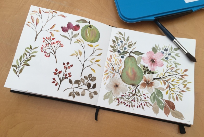
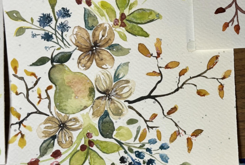
16. Fruit #1: Hi, guys. In this segment, we are going to be
painting some fruit. So the first fruit
we're going to be tackling is the pear. The pear is a lovely, lovely addition to any of
the floral arrangements, especially for fall, but doesn't necessarily
have to be only fall. So for this, I'm going to be using my Princeton
Neptune number eight, and we're going to be using
a combination of two colors, the hookers green dark. And I'm going to be
putting in a little bit of the cadmm medium lemon, which is, Cam sorry,
Cadm yellow deep. But I believe it's as
good as the medium lemon. So we're getting like a nice
young green, sort of green. And I'm mixing it down to
about 20% color, 80% water. And then we're going
to be painting in very roughly the pear shape. So starting off
with a small top, so you can just sort
of draw that in and then draw the base, and then dipping with water, go in and spread
the color around. Okay. Now, at this
point, we want to add. Notice there's a little
bit of white space in between, that's totally fine. You can kind of perfect
your edges if you want. But the beautiful
thing about drawing fruit and botanicals and flowers is that they're not specifically
exactly that one shape, so you get a little bit
of roundedness here and there and organic differences. Before this dries up, I'm
just going to quickly add some vandyke brown to
the bottom to the top. Okay, so we've got
that figured out. And I don't mind the
bloom that's happening. I actually think
it's very cute and whimsical and sticks with our whole goes with
our whole loose look. Now I'm getting some
of this yellow ochre mixed in with some of the green, and we're going to drop some of that happening right here. And you want to do this
right when the area is damp. So then this way you're
getting a nice blend. Okay. Now, some of the pears
also have a little bit of, like, a reddish, orangish hue. So I'm getting a very
slight muted tone of that. I'm going to drop that in here. So we're just keeping it loose, keeping hints of the color in. Then again, we're switching
back to the number four, and I'm going to
drop in a darker hue of the green that we mixed. So I'm going to mix
a little bit more. I had that green. I put a
little bit of vandyke in there, adding some of that hooker's green back in here to get
a slightly darker tone. I'm going to drop this in around the base
and to the side, and allowing it to
mix into the shape. I'm even dabbing some
at the very top. And you can help the
color sort of move around by just kind of dabbing
things around like this. Now, if you want a more stark in your face kind of
impression with the green, it is important to kind of mix more of the color,
less of the water. So let's just say I got
this color mixed in here and I'm going
to drop it in there. And you can see how it
immediately darkens everything. You can even drop some
of the color in between. But if you want it
to be whimsical, loose and soft, you can also just leave it as we
had it previously. Now, clearly, this is a lot darker in
comparison to the rest. So take your clean brush or your damp brush and kind
of help the color move along so you have a little
bit of control in terms of how this transitions,
but not entirely. And this is what makes
watercolor so relaxing. The fact that you have to let
go of things that you can't control and kind of go with
the flow and make it work. That might sound crazy to some, but trust me, it does
work at some point. The more you do,
the more you get used to this idea of
rolling with the punches, going with the flow, kind of just working to make it
something you want and like. And also finding ways to make it something you like and want. Okay, so that's great. I'm gonna get a little bit
more off that Vandyke Brown, drop more of that at the base, and the top. And we are done.
17. Fruit #2: The next fruit we're going to paint is going to be the apple. So much like we did the pear, the apple is also going to
be fairly loose and fun, and it will also be green, and it will also have
hints of pink in it. But feel free to use that
concept of a green apple and add make it a red one
instead. So here we go. I'm going to continue
using my number four, it just helps me get
more controlled results, and we've got a small space
that we're working with. So I have that premixed color that we used for the pear here. I'm going to mix a little
bit more of the cat Mm in this to the side, getting more of that
color, mix it in. And I want it
watered down a lot. We want that nice young
green look again. So that's good enough. And so for now, the first
thing we're going to do is we're going to
create the basic shape, much like we created that there. So I'm going to do
more of a heart. So a little curve
like this first. Let's break it down that way. Dipping to get water,
creating that outer curve, dipping to get more water, the next curve, a little
bend at the bottom, and then we're
painting in the apple. Again, feel free to leave a little bit of white
space in between. And then what I'm doing
is getting more of that color and we're
curving at the top. Perfect. So this is our
little apple shape. Make sure you are happy with it. I am not, so I'm just
going to be working on it a little bit more.
So let's do this. I'm going to get some
more of that green. And just like we
did with the pear, we're going to drop in
more green in the apple. So you want to highlight
certain areas. So, for instance, the forefront, that's more of a
background, so you want to add more of the green
in the forefront here. And then we're going
to get a little bit of that pink or red. And we're gonna drop that in. And then at this point,
if you feel like you've got too much
color in certain areas, you can lift color off. So making sure your brush is clean doesn't have
a lot of water. You can sort of lift and
dab on a paper towel. And you can also guide the
color just like we did in the pair. So take
your time with that. Now, we're going to get
some of the darker green, and we're dropping
that in the edges just like we did
in the last one. You've been dropping
some in between. Now, of course, this
is way too dark, so we're going to have to do
a little bit of blending. So washing off the brush, dabbing it onto your
paper towel on the side, we're blending this color in. Once you have blended to
your heart's content, we can then do the
little stem in our leaf. So waiting for it
to dry just a bit, you can wait for it to be
damp and then go in with the stem so you get that nice little flow like we
had with the pear. You can even give it a little
bit more texture by kind of adding those going over the
areas to blend in the color. Okay. Now I'm going to get
some of my van **** brown. No, burnt sienna mixed with a little bit
of vandyke brown. And we are painting in our stem. So I'm getting the color
directly from there. And let's paint
the stem this way. That's how we're doing it. Okay, so now last but not
least is going to be our leaf. So I'm going to start off
with doing a very muted leaf. I want to get a little
bit of brown in the leaf, as well, most likely.
So I'm starting here. And I'm doing that. I'm going to take some of
that reddish brown that we mix that we threw
into the apple. I'm gonna drop that
into the leaf as well. And then I'll take more
of a darker green, mix it with my leftover green, a little bit of my burnt sienna, get that nice rich, woodsy sort of green, and I'm dropping
it into the leaf. So the leaf kind of has some contrast and stands
out from the apple itself. S
18. Fruit #3: We've already done quite a
few of the berry elements. We've done some over
with the leaves. We also have we also have some of them with
the flowers right here, but you can't have
enough berries. So I'm going to show
you another version that can be bigger, as opposed to smaller and
more in the background. So a little bit more prominent
like our bigger fruit. So here's what we're
doing, and these are easy, guys. They're so fun to do. Using my number four, I'm
going to get some of the red. And specifically, that's
the Cadmum red hue. Going to mix some
of that over here. It's a nice bright color. It goes really well
with this green. I'm mixing it down to say
about a 30% color, 70% water. And then we are painting like
an oval shape like this. Dipping for water,
creating my shape. And then we're gonna get a little bit of that darker tone. So I mix some of this
with the Vandyk brown, if you remember, and I'm
adding that at the top. And at the bottom. Now, dipping to get more water on my brush, I'm gonna create another one. Washing off most of the color. I'm touching it
deliberately onto the side here so that it kind
of seeps in the color. Gonna get some of
that darker tone of brown because this
is a darker version. Even dropping some of
that into the first one. Look that beautiful blend. Even going to get some
of the red and drop it in here like that. And now we're getting a little bit more to do a third one. This one turned up to be a lot bigger, getting some of that
dark color to create the little bit of texture lines, crown, whatever you want
to call it. At the top. And then last but not least, I'm just taking this
dark green that we had mixed up for our apple, and we are connecting
this in a stem like that. And you can give it leaves. The leaves can be
something a little bit more looser if you want. Darker as well. So I'm just mixing from
the colors I have, dropping that in, dropping the darker tone right in
between, right there as well. Giving it a smaller leaf, too, just to give you an idea of
how you can place this when we're using it in
the composition. Now, I like to add a
little bit darker tones in the actual painting as well. Sorry in the fruit. So I'm
mixing more of that dark tone. And I'm going to drop
that in in these areas. And then if it's not blending, because obviously it's drying up and it's just in the process
of drying up or damp, just wash off your brush. We've done this many times
and help the color along. Because sometimes the color
kind of just sits there. And then this is how you take control of the situation
by helping it move along. And there you go. We have
our beautiful berries.
19. Leaves #1: In this video, I'm going
to show you a couple of different botanical
options you have that are more of the autumn
kind that you can use to create your compositions
or even reads. So the first one
we're going to try is going to be just
regular leaves, and I'm going to use the
Vandyke brown for our stems, and then we're going to
use the yellow ochre for the leaves combined with a little bit of be a light red. Okay, so here's what I'm doing. For this one, you can even include the round number three. If you want thinner strokes, I'm going to use this, actually, and getting some of my vandyke I'm going to
create the branches first. So get that nice
fine pointed tip. I'm going to do it at
the top over here. So we've got room
for the other items. So I'm just kind of
lightly grazing. Make sure you get the
color directly from here to get a nice dark hue. And you're using the
tip to kind of just graze and draw it in. So I'm kind of pulling
that downward, and now I'm just
going to extend and create other branches from this. Notice how I'm kind of just slowly lifting my
hand off the paper. So then it's giving me
more of a loose look here. Tiny little branches at the end. Really and truly,
there's so much you can get lost in when you're
doing something like this. You can use my video
as a reference, but I really do want to see you do your own get your own
little shapes like this. It is a lot of fun once you just kind of sit down and clear your mind from what
you have seen me do and kind of try
and do your own. Okay, so let's just keep
it at this for now, and then let's do some
of the leaves on it. So because of the size
of this, ideally, I would have used
the number four, but I want to keep the
sizing fairly small, so I'll use the number
three, and I'm getting some of the yellow ochre. You can mix it onto your palate because I want a slightly
lighter version of this. And then I'm just
going to go ahead and using the fine
pointed tip of my brush, start at the top, press down, and then trail off into
the stem or the branch. I'm going to do a couple
more and feel free. Like, you can do
the straight ones. I'm gonna do one that's kind
of falling off to the side. So notice how my brush
kind of goes sideways, pressing down, and
then trailing off. You can even do a little
bit of a zigzag and then trail back off onto the stem. I'm going to do a
couple more here. Try and get varying
sizes for your leaves. So this one's longer in
comparison to the other two. Variety of size helps with the looseness of giving that loose feel
to your painting. And you can give movement
to your leaves by just kind of swishing the brush around and trailing
back off onto the stem. Oh sorry, the tip. Smaller leaves here. These can be a little bit
darker in terms of coloring. No and so now we've
got our leaves set in, and this is where we're adding a little bit of extra detail. So it's key that this area these leaves need to
be damp a little bit. And if they're not
damp, that's okay. So I'm using the light red. And we're trying to get more of a wet on wet feel
here in our leaves. So I'm dropping this
in to give us more of that autumn leaf look. You know, when the leaves
are just like there's all of a sudden two different colors
in the leaves and you can tell that they're just
turning at this point. That's what we're doing here. Now, some areas are
going to be dry, so like this area is dry. So this is where you will realize time is
of the essence if you're really looking for those beautiful bleeds in your leaves. There's nothing wrong
with going in and doing more of a wet on dry. All you need to do is just
kind of press it along and give it more of a Well, I ended up painting
this whole thing here, but what I'm going
to do is get more of the color and drop it
in at the base here. So now what happened is I've painted the whole leaf brown, but it's gotten a
slightly darker version of the brown in
comparison to the others. So I'm kind of pinpointing, adding little dots of
color in other areas, too. Different leaves,
adding some over here. This one I'm just going to do in the middle and
leave it that way, adding more at the bottom for
this one, just at the top. And this is it. That's all I'm going to do
for these leaves. We're just adding beautiful
loose color to kind of really show the autumn effect that happens to the leaves
during this time of the year.
20. Leaves #2: In this video, I'm going
to show you a couple of different botanical
options you have that are more of the autumn
kind that you can use to create your compositions
or even reads. So the first one
we're going to try is going to be just
regular leaves, and I'm going to use the
Vandyke brown for our stems, and then we're going to
use the yellow ochre for the leaves combined with a little bit of be a light red. Okay, so here's what I'm doing. For this one, you can even include the round number three. If you want thinner strokes, I'm going to use this, actually, and getting some of my vandyke I'm going to
create the branches first. So get that nice
fine pointed tip. I'm going to do it at
the top over here. So we've got room
for the other items. So I'm just kind of
lightly grazing. Make sure you get the
color directly from here to get a nice dark hue. And you're using the
tip to kind of just graze and draw it in. So I'm kind of pulling
that downward, and now I'm just
going to extend and create other branches from this. Notice how I'm kind of just slowly lifting my
hand off the paper. So then it's giving me
more of a loose look here. Tiny little branches at the end. Really and truly,
there's so much you can get lost in when you're
doing something like this. You can use my video
as a reference, but I really do want to see you do your own get your own
little shapes like this. It is a lot of fun once you just kind of sit down and clear your mind from what
you have seen me do and kind of try
and do your own. Okay, so let's just keep
it at this for now, and then let's do some
of the leaves on it. So because of the size
of this, ideally, I would have used
the number four, but I want to keep the
sizing fairly small, so I'll use the number
three, and I'm getting some of the yellow ochre. You can mix it onto your palate because I want a slightly
lighter version of this. And then I'm just
going to go ahead and using the fine
pointed tip of my brush, start at the top, press down, and then trail off into
the stem or the branch. I'm going to do a couple
more and feel free. Like, you can do
the straight ones. I'm gonna do one that's kind
of falling off to the side. So notice how my brush
kind of goes sideways, pressing down, and
then trailing off. You can even do a little
bit of a zigzag and then trail back off onto the stem. I'm going to do a
couple more here. Try and get varying
sizes for your leaves. So this one's longer in
comparison to the other two. Variety of size helps with the looseness of giving that loose feel
to your painting. And you can give movement
to your leaves by just kind of swishing the brush around and trailing
back off onto the stem. Oh sorry, the tip. Smaller leaves here. These can be a little bit
darker in terms of coloring. No and so now we've
got our leaves set in, and this is where we're adding a little bit of extra detail. So it's key that this area these leaves need to
be damp a little bit. And if they're not
damp, that's okay. So I'm using the light red. And we're trying to get more of a wet on wet feel
here in our leaves. So I'm dropping this
in to give us more of that autumn leaf look. You know, when the leaves
are just like there's all of a sudden two different colors
in the leaves and you can tell that they're just
turning at this point. That's what we're doing here. Now, some areas are
going to be dry, so like this area is dry. So this is where you will realize time is
of the essence if you're really looking for those beautiful bleeds in your leaves. There's nothing wrong
with going in and doing more of a wet on dry. All you need to do is just
kind of press it along and give it more of a Well, I ended up painting
this whole thing here, but what I'm going
to do is get more of the color and drop it
in at the base here. So now what happened is I've painted the whole leaf brown, but it's gotten a
slightly darker version of the brown in
comparison to the others. So I'm kind of pinpointing, adding little dots of
color in other areas, too. Different leaves,
adding some over here. This one I'm just going to do in the middle and
leave it that way, adding more at the bottom for
this one, just at the top. And this is it. That's all I'm going to do
for these leaves. We're just adding beautiful
loose color to kind of really show the autumn effect that happens to the leaves
during this time of the year.
21. Leaves #2: For our second set of foliage, we're going to do
something that is berries. So we're going to start off by painting the stems and
the branches first. And this is mainly because it's at least for me,
this is my issue. When I'm doing my berries,
I like it to be whimsical. And I find if I just
create the berries, and I find it hard to
connect with the stems. So this is my foolproof idea or technique in first laying down the stems and then going
in and adding the berries. So for the branches slash stems, I'm using my burnt sienna. Feel free to try a
slightly different shade of brown, if you wish. This is what I'm going
to be starting with. So I'm getting color
directly from there, making sure we have a
nice, fine pointed tip. And we're going to start off by creating our first main stem. So lightly grazing with
the tip of the brush, I'm just going to pull
all the way down. And then this is going to
be the main stem or branch. So I'm going to make that
slightly thicker at the bottom. And then this top
one over here is now going to split into three, and then we've got more
happening within this first one or within each
of the three, rather. So you can just multiply
the amount of stems in each You can even make some slightly taller
and extend to create more within just like that. And now from here,
we're just going to extend and create another one. So really have fun with this process of figuring
out where you would like to place your stems
for these berries. And berries make such
a lovely addition to any sort of composition,
wreath, anything really. Because they're
circular and tiny, it kind of gives
you that impression of polka dots almost, and who doesn't love polka
dots along with stripes? So, like, the stems are almost like playing the
role of stripes, and then you've got
the berries that look very much like polka dots. So that's how I like
to look at it as someone who also loves fashion. Okay, so let's just keep
for the sake of this video, let's just keep this
as is over here. And now washing off my brush, we're gonna get a nice orange
or red for the berries. You can also use a darker
tone if you want to use something like a dark brown to sort of show
that dark detail. But I'm going to use
the CadmmRd light, I believe, or Cadm
orange, sorry. Now, I might use No, in fact, I will use a combination of the cadmm orange and
also the cadmmbd hue. So for our berries, we're just doing little round
strokes like this. I'm making it slightly
oval in shape, so it's not exactly round. And what I'm going
to do is start off by creating a couple of these within these stems
that we have drawn out. And then I'm going to
switch out and get some of the red and add that in. Now, make sure you
get varying sizes happening in there, too, because this also makes for a lovely composition or helps
with the look in the end. So now let's move on to the red. And you can drop some
of the red in there if your area is not
completely dried up, gives you a nice blend. So two things to keep in mind, keep in mind the variation in sizing and
variation in color. You could also go
the route of yellow, if you wish, between, like, the yellow and the orange. I think that would also
make a lovely combination for these berries. And these are more of
the oval shaped berries, as well, so keep that
in mind as well. We're probably the
next one we'll do is probably going to be
more of a circular one, and just giving you a different
variety or a couple of options of varieties
that you can add to your wreaths or
floral compositions. Okay, we're almost done. And there we go. So this is essentially what
it looks like. You can add some additional
little highlights in between the branches. So for that, all
I'm going to do is get some of the van **** brown. So it's a darker brown. And where I will be
touching these is going to be around where the
branches connect. To give some nice
shadowy effects. And a little goes a long way. So you don't need
to add it all over the place, just maybe in, like, the connecting areas, and it just kind of makes
everything pop so much more. Feel free to give
it a little bit of tiny little details like this, like, you know, broken
branches kind of protruding. I love adding details like this. It just makes your loose style of painting so much more nicer.
22. Leaves #3: For the third foliage,
we're going to create something that is more of like a sprig that has
leaves on both sides. So to start off
with the main stem, I'm going to be using the
let's use the medium brown. Actually, no, let's
use Vandyk brown. So again, I'm kind
of picking colors as I go along based on this
palette that I've picked. Feel free to kind of mix
and match as you go along because that really helps you develop into your own style, your own preferences
of painting as well. So because this is
going to be, like, a nice little vine like element, so we're just going to start
off from the top here, and I'm just going to do
a little bit of a curve. Something like that
is good enough. And then you can go ahead and add little tiny stems to it. And they don't have
to be lining up. They can be sort of one
slightly lower than the other. And again, you're kind
of giving yourself benchmarks and where
to add your leaves. Which is very helpful
when you're kind of just going with the flow
and painting along. Okay, so that's that, and now we can paint
the leaves on. Again, with the leaves as well, feel free to use a
mixture of colors. I'm going to be using some
of the hooker's green dark. And I'm mixing it with
some yellow ochre for a slightly lighter shade. But I'll also be dipping
in to get some brown to add in just like we did with that first set of
leaves over there. So I've got the color mixed up. I've got my brush full of color, and we're just going to
go in and start adding. So using the tip of the
brush, starting with the tip, pressing down and trailing
off back onto this tip, so we know exactly
where it ends. Gonna dip the tip of
my brush in water. And I'm going to continue
creating these leaves. But what I want to
do is also start from the side, press down, and then turn sideways
to meet that stem. So you can also start
from the stem going out. So here we go, starting
from the stem, pressing down, trailing off. I invite you to get wonderful
organic shapes like this, depending on how you twist and turn your page or
sorry, your brush. So continue doing
that all the way down can even do a little
bit of a wave to get, I don't know, a very
organic shape like that. Let's do another wave here. So it doesn't look
like we've got these wavy leaves only
happening on this side. It just adds something
so pretty and loose to your painting when you've got different shapes of
leaves in these colors. Now I'm going to move a
little bit quicker because I did say we were going to
add some of the brown in, and I would like
for this to happen before these areas dry up. Okay. So here we go. So let's add a little
bit of actually, let's add some of
the yellow ochre. And I had some of this brown mixed in there, so I'm
going to mix that up. And then I'm dropping
this color in now, it's not giving me
much of a difference. So we're just going to scrap that idea and get
more of the brown in. So I've got burnt sienna. And sometimes this will happen. You'll have a plan, and it's
not going as you planned. You just got to
switch so I'm adding the brown much more of a
difference when you add it in, so you can totally see that. It definitely looks very fall like and blends in quite
nicely with the green. So trial and error will happen
as you start painting by yourself once you learn
the basics. So embrace it. It's part of the journey, and this is how you learn, and this is how you
grow. And here we go. I've left a couple of them playing with
just the plain green, and the others have
added the brown. And that's what this looks.
23. Leaves #4: So for our fourth leafy foliage, we're going to be using
dominantly one color. I may or may not add
in a second color. Let's just see how this goes. I'm starting off with
the Vandyke brown hue, which is my darkest brown
for my selection of colors. And I'm continuing to
use the number four. And I'm using the number
four because it helps me get more control with
these tiny bits. Feel free to use a larger brush, feel free to use
a smaller brush. It's really up to
your comfort level. So I'm going to mix a little
bit over here just so I get more variations of this
hue within my painting. So this is going to
be simplistic since we've been going through
so many leaves already. So simpler and easier. So let's just start off in
on this side over here. So I'm going to
start off like this. So we're just doing,
like, a stem and then creating another stem. And I'll just do one more
protruding this way. Perfect. And now we're going
to be creating our leaves. So for the leaves, simple, almost kind of like these ones, but notice how these have
more of that pointed edge. These leaves will have
more of a rounded edge. So you're pressing
down, full span of the brush. Notice
how it's spanned out. And I'm kind of doing a
little bit of a curve, and then you can close it
up this way if you wish, dipping the tip of my brush
in water because we know we need water on the brush to be
able to finish our strokes. And you can continue creating these rounded sort of leaves. So I am doing them
in two strokes, and they are kind of
little curved strokes to help me get that
nice rounded shape. Now, just like with these
and those at the top, if you want to do a little
bit of a smush or, like, zig zag, but very minuscule to get more organic looking
curves within your leaf, you can absolutely do that. This is how we get those nice shapes by just kind of allowing
the brush to do it. I'm adding a couple
of dabs of color at the top in these areas because it's a little
bit lighter here. And we're continuing on
to create more leaves. So this set of leaves would be fabulous in an area that has a lot of bright colors
because look how dark it is. It gives us that
beautiful contrast. Amidst all the yellows and the oranges and the
reds, so you can see. You can also figure out or control the sizing
of the leaves. So if these are too big,
you can go smaller. Really and truly,
it's your call. So I'm mentioning these things
so you can be a little bit more aware when you use
them in your compositions. Now, these two are side by side, so notice how they are
connecting that way. And that can happen, and
that's totally okay. I'm gonna do another one
off to the side over here. So it can be like a very shadowy
effect. Over the leaves. So you're kind of losing that definition on where
is this one stemming from. And again, this is quite suited, especially if you've got details
on that level happening. So it's a good contrast in
terms of detail and color. So I'm just going to overlap this one over here on
top because I can. Everything doesn't need to be connecting And we can leave this as is.
Y'all get the idea.
24. Leaves #5: We have one final one to do, and this is going to be a berry, like I mentioned previously. And we're going to be painting that right here in the center, and it's similar to what we have painted with the orange
ones at the top. And again, I'll be using my number for brush,
and for colors, I'll be using the
Cadmum red hue, so we want something red, and I'll be mixing it in with a little bit of
the Vandyke brown. One of the things I like to say is try and mix your own colors, especially if you're using
colors that you can sort of get by mixing what you have on hand from your
composition already. And this way, you're
kind of tying everything in making it look like
one big happy family. So I'm just mixing
these two colors in so you'll have to kind of figure out the
variations in ratios, but for the most part, as long as you get
something dark or a darker version of what you've been using,
you're good to go. Okay, so this is
good enough for me. It's like a dark orangy brown, and I'll be teaming
it in with some of the actual red itself. So I'll start off with a very
muted version of the red. And this time, I'm going to
start with the berries first, and we're doing
solid round berries. So here we go. I'm going to
make this slightly bigger so it can be viewed easier. So the first one
at the top here, try and leave a little bit of white space in
between, if you can. I'm dipping the tip
of my brush in water to get a more muted
version of this color. Creating another one off to
the side because now we can have those three little sprigs happening right here
for our berries. You know what? Take away
all the white space. That's fine. We're going to add little dots at the top of this. Now I'm going to get
the darker hue and just tap that at the
bottom of these berries. Let's create a couple more here. This is where paper
towel comes in handy. If you've got too much
happening on your sheet, just make sure you
have your paper towel. So you can just dab any excess. So same thing on this side. Getting some of the darker hue and I'm creating
one more here. Okay, so I think these are
good enough for the example. Now I'm going to take a brown. I'm going to take the dark brown because we've used the light
brown for this one up here. So I'm just going to try and give you a different variety. Mix it in with whatever
green I have lying here. Get a slightly
different variation of brown to make
things interesting. And we're going to start off
by connecting these three. Simple enough? Let's
connect the next three. And then let's just
connect it all. And you have your first break. So at this point, if
you wanted to create another one off
to the side here, which kind of makes
sense, you can. You don't have to keep making
or painting three together. We can have four. So over here, I've just created one more. And then taking off excess
color from the brush, I'm going to take
the darker hue and do my first little
berries, second, third. And having variation of color, like I mentioned previously, not only makes for a more
interesting result and result, but it also kind of
gives your painting some dimension and
depth and, yeah. So that is that. And now for our final
touch, which I mentioned, adding little dots at the top, I'm going to use the
darkest brown I have, which is the Vandyk brown. And I'm taking the
color directly from my color cake so that
it's nice and dark. And then I'm just adding
a little dot at the top. So obviously, this one's facing down, so I'm adding
it right there. You can have it touch
the berry if you want. You will get because
it's still wet and damp, you will get a little
bit of seepage. If you don't like how it's
going all the way in, just wash off your brush. So with a clean brush and no
water on it, slightly lift. And then dab and you're good. And those are the
second set of berries.
25. Birch Trees Part 1: The first color we're
going to start mixing is going to be the
Vandyke brown hue, and I'm just using my number
eight Princeton neptune to mix some of that on here. I want a very muted version of this color because we're going to lay down the base
in a light color, which is the Vandyk brown, and then build up on that with a more stronger opacity
of the same color. So the first thing
we're going to do is paint in very loosely. The tree trunk. So I'm lightly grazing, give it the shape that you like. I'm just going to go
for just straight. In hindsight, I think most of the birch trees are pretty
straight to begin with. So let's just keep that simple, especially if you are new and you're just kind of trying to
figure out your way around. So get the technique first,
and then let's get fancy, okay? So I'm doing one here. I'm going to do one more mixing that same
amount of color. And let's just do that here, and I'll make this one thinner. Okay. So now that we have
our tree trunks, we're now going to go in before this area dries up
because that is important. And we are mixing the same
color with just more color, less water for a
darker intensity. For that, I'll be switching to my number four
Princeton velvet touch. And I'm getting the color
directly from here. And what we're going to
first start off doing is we'll let this dry for
just a little bit more. I'm going to start up by
doing a little bit of a branch coming up. Then we're going to do
another branch over here and kind of just drop in more of
that color at the top. How many other
branches you want, really? Leave that up to you. Getting more of that color, now we're going to add more of that color at
the base so we get this nice blend.
Same thing here. Notice how when
you get the color directly from your color cake, without mixing on your palette, you're getting a more
rich feel and look. Then we're going to
do the little lines. Now, noticing how much of a blend this is
giving you right away, perhaps it's in our
best interest to do the lines once it's
dried up completely. But before we do that,
I'm just going to lightly try just so that you guys can see
what that looks like. So see how it kind of immediately blends.
We don't want that. We want there to be
a little bit more, what's the word I'm looking for. We want it to be
a little bit more obvious that those are
lines happening there. So we'll just wait
for it to dry a bit more before we go
back to doing that. So in the meantime, we
can paint in some of the foliage happening
at the top. I don't have too much
room happening there, but we can still get
away with some stuff. So I'm going to start off with using the Princeton
number eight, and we're getting
some yellow ochre and I want the yellow ochre
to be very, very muted. So I'm mixing it on my palate and mixing tons
of water with it. And then we are going to
use big press down strokes, brush full of water to get nice big organic shapes
happening in here. So I'm going to
start off at the top like that and press down to kind of create fuller
looking cloudy strokes. The edges I want more like
tiny little organic dots, but the center can
be a little bit more intense in terms of having a fuller looking cloud, I guess, for lack
of a better word. So mixing more of that on here, I'm going to now move
on to this side, and I'm really pressing
down to, like, get those nice areas covered. They can kind of intersect
because the trees are so close together,
and that is okay. I'm going to have a little bit more happening to the
side just because our trees are super tall and we don't have too much
area for our leaves, and I don't want to go off. So we're going at
the flow here, guys. This is what I mean by
going with the flow. Notice the amount of white
space I have left in between. I'm only getting water and adding more strokes at this point because
I want there to be, like, a gradual fade off. At this point, without really
washing off our brush, let's get some of
the burnt sienna. So I'm getting a little bit of water to make sure
I have enough. And then I'm going to drop
some of this in here. I want little details happening.
26. Birch Trees Part 2: Continue adding a little
bit more of this color in. I'm concentrating in
the areas at the bottom here where the tree trunk kind of ends so that it covers up the area because the yellow is a
little bit too light. So now we're going to move on to our third color, and
for the third color, I'm going to be
using the orange, which is CadmumOange
hue specifically. Again, getting it
directly from here, we want to use the sparingly. So just use it in where the
other two colors are there. So try to use it sparingly
in just the yellow bits. So dominantly here, sparingly outside you want that
nice hint of orange, which really gives you
that nice autumn feel. And then also at this point because now is when things
are sort of blending in. So we've got a
nice bright color, we've got a light color, and then we've got a base coat. Just to kind of
offset all of that, I am getting some Vandyke brown, and I'll just have a little
bit of this in these areas. This is a magnificent exercise if you are completely new to watercolor and not quite sure how the blending works
and the mixing works. This is a fabulous
exercise to kind of help you get loose
while also giving you an idea of how the medium
works in terms of getting, you know, things like covering
up the dark branches, layering, adding
color over color. Fascinating results. Okay. And if I've not mentioned it before,
I'm gonna mention it again. Watercolor dries up very, very light, based on how it looks when it is
damp. So keep that in mind. That's why I'm adding
additional colors in there. Okay, so now that
we're done that, we're going to go back
and do the last bit, which is going to tie this in and make it
look like a birch tree. And that is pretty much taking our number four for a nice, fine pointed tip and using the Vandyk brown hue to paint
in our lines. So feel free. I prefer drawing
lines like this, so I'm going to turn
my page sideways, and I'm just using the full span of this brush instead
of just using the tip. This way I get more coverage, so I'm using this So clearly, I need more color on my brush. So I'm going to get
more. What you can also do is alternate between
using the full well, not the full, but
the quarter top of your brush pushing
outward and then also doing a couple of lines
in there because that can also give you the
result you're looking for. So making it uneven You can even paint in
the sides this way, if you want to even
out the sides. Just giving you guys a
couple of tips that you can do as you are painting these. Can even dab in more of
this color off to the side. This area is still
a little bit damp, and so I'm getting a nice sort of soft bloom happening
within the trees, which is nice, great texture. We've got lines happening. So we've got patterns as well. So for this one, I'm
going to extend from the top and loosely kind of just paint in the top area
because I know it's damp, so it's going to
bleed into or blend into the trees the
leaves that we have. And then I'm going to
lightly start from the bottom and do the same
thing that we did here. So here, I'm going to
actually, for this one, paint in the side of this tree
just so we can experiment, and you can see
both techniques and figure out which one you like
best and stick with that. I'm getting more color, and I'm just going to
drop more of that onto the side so it blooms
and bleeds into it, giving us a darker version
just for the side of the tree, creating a little bit of
a shadow depth effect. And then we are done. So we've got our trees. You can feel free to go
in and intensify some of the detailing within the trees but just
adding a couple of dots. So, for instance, I'm just going to take some of this
lightish brown. And if you just want to
do something like that, and just kind of add it over in certain areas here and there, just to kind of give it
that nice soft look. And then another
suggestion would be getting some of
the darker brown that we've used for our detailing
here and just adding it in between to show branches. Again, it's just an option. It kind of makes it look
really nice and holistic. But if you want to
keep it super loose and eliminate all these details, you can totally do that, too. Just a suggestion. And then, instead of having the trees just kind of standing that way. How about giving it a little
bit of a soft finish? And so, for that, I'm going
to take some of my hookers green and mix that in here
with my leftover brown.
27. Birch Trees Part 3: And I'm getting like,
more of this, like, olive green kind of mix, and I'm just going to
add this in like this. And I'm kind of mixing it in
with the base of the tree. So getting some of that color. So it's more color, less water, and I'm lightly adding
these little lines, like so, tapering
off to the side. Now, you can choose
to leave it like this or roughly wash off your brush
or use the number eight. And with just water on it, you can just kind of
lightly mix this in. Adding a couple of strokes. Make sure you leave some of
that white space in there. That's always always nice. But now you've got a
soft blend happening. So again, preference. What is your
preference? I'm showing you I've showed you
how it looked before. Without blending it. Now this is what it looks like
after blending it. So really and truly,
it's a matter of preference and what
you're trying to achieve. Now, one more thing I would add, and I promise this
is the last thing, dropping in some
more of that brown from the top of the trees. And this is what's going to
really smoothen things out because now we've got the
brown seeping into the green, which gives us a most seamless
gradient like effect. And that is it? We are done.
28. Composition Time: This video, we are going to take elements from these
three over here and we're going to put them
together and paint them together to create a
pretty composition. So I have got flowers with some berry
style elements here. Then we've got a little bit more berries along with some fruit, and we've got leaves
and more berries. So very fun elements
that we can sort of put together and create our own something or the other.
29. Pumpkin Composition Part 1: I'm using my Princeton
Neptune number eight. And the first color
we're going to get is the Cadm medium
lemon right here. And I'm going to mix it onto
this palette on the side. I got some color right there. Let's just take that
off real quick. So I'm just taking
my paper towel and pulling it off that way. Perfect. So mixing some
cadm medium lemon in a 20% ratio, 20% ratio, yeah. And then we're
going to paint in a really nice, whimsical, loose, organic, fun shape for
our melon or squash. So let's just create a nice
tall looking one right here. I'm using the tip to kind of give me a round
circle at the top. That's where the That's where
I was going to say twig. Not the twig. The
stem is gonna go. So I'm giving this this nice, robust looking shape, little
frilly bits at the bottom, for lack of a better
way to explain it. Keeping it loose and fun. So that's our shape. Now, using either the number
four or the number three, I'm going to use
the number four. We're going to get some of that I got to look
at the names, guys. Sorry, light red. And I'm getting the color directly
from my color cake. And we're going to start off
by adding some color onto the sides and watch that perfect bloom.
How pretty is that? I'm going to get a
little bit of that happening right at
this bend here, right at the top, as well. And I'm just going to
watch it bloom in. Perfect. Now, washing this off, you're going to see areas
if there's too much water. It's kind of just sitting there. So wash off your brush, wipe it off on your
sheet of paper towel and help the color along
because this will really help give you more
natural looking results. And this is also what I
mean by getting control, going with the flow
because sometimes the flow doesn't really go in the
direction we want it to. So this is how we kind
of help it along. Okay, once you're
happy with that, we're going in for
the next color. So the next color I'm
doing is CadmumOange hue. And I'm going to start
from the top and draw in the shape almost. So majority of the
color is at the bottom. I'm going to get
more of this color. I'm going to drop more of
it onto the sides here. Allowing it to blend in nicely. Now, one thing to keep in mind is the more potent the color, meaning more color less water, when you do this move, the starker the result. So if you're getting a very diluted version of this color, you're not going to
get these results. So make sure you're getting a more really depends on your preference, like
what you're looking for. So if you're looking
for a darker rendition of this color, I suggest you get the
color directly from the color cake and then come
back on here and add it in. Okay. Now, one last thing
I want to do before we kind of move on is get a little bit more of that color, the light red, and I want to
drop that in at the bottom, just to kind of give it more of that shadowy effects at the bottom here and to
the sides a little bit. Now, once this is done,
before we do anything else, I'm going to flip over my brush
and using the back of it, I'm going to draw
in these ridges. And it's key that you kind
of mimic the shape of this. This is what really
makes it stand out and makes it look
more like a melon. I kind of messed up
with my line there, but it still works. Okay, now, on that note, we are then using
our darkest brown. That's indigo, darkest brown, which is Vandyke brown. And again, I'm using
my number four, getting the color directly from here and I'm going to paint in a very loose looking stem. And I'm kind of leaving lots
of white space in between. I'm not really painting
the whole thing in. And I am giving a little bit of a dab happening right there, so it seeps into the
rest of the orange. And so we have our first squash, melon, fruit, whatever
you want to call it. And from here, we're
going to build on and add more elements.
30. Pumpkin Composition Part 2: So I'm going to start this
over here on the side. So I'm going to do a little
bit of a dip because this is where the stem portion
of it is going to go. And then we're going to
lightly paint the edges in. I'm getting color directly from the color cake and creating
these little ridges. Then washing off most of
the color from the brush, dabbing onto paper towel. We're painting this in So this is another way to paint them as opposed to
how we first did this one. So you can inter switch or switch about and see
which one you like better. But essentially, this
is how you build up on the shape when you don't
have a base drawing. So now we have underlines or little lines guiding us
as to where the ridges are. So at this point,
you can either get some well, I'm going to do this. I'm gonna get some
vandyke brown, mix it in with the green
to get a darker green. And then we're doing
what we did there. I'm dropping this at
the base right here. I know the stems
gonna go up there. I'm dropping it at the bottom. And then I'm even
swiping it like so. And then last but not least, we want to give it a little
bit of shading to the sides, right, just like we
did in the first one, so I'm adding it to the sides. And we have our base. So this is the part
where you can go back in and draw in your ridges. This is so fun to do. Perfect. And now you can just continue building
on the darkness. So, for instance, that to me, feels like it could
use a little bit more, so I'm just going to dab some more giving me more
depth in that part. And then also dab
some in between. The area is damp and wet, so it's going to give us a
nice bloom once it dries. Then we're going to
paint in the stem. For that, I'm going to use
some of the burnt sienna. We can also continue using the dark Vandyke brown if you just want to
simplify things. I'm just going to
just to give it. Okay, no, burned
sienna doesn't work. So we're definitely
using the Vandyke brown. So Van **** Bernsiena
looked way too bright. So you can wait
for this to dry up before going in and
adding this in, or you can just do what
I'm doing right now. And Charlie up to
you. So there we go. We have that. It is done. And then we're now going to move on to doing some other elements. So let's let's now paint
some of the leaves, kind of, like, extending into, like, a wreath almost. So for that, let's start
off by doing some of the really nice flowing leaves and then kind of going to
some of the berries, as well. We're going to mix
some of the green with the lemon to get
a lighter green. And I like my green to be more
of a woodsy kind of green. So adding some brown to it or even some yellow
ochre is helpful. So yellow ochre gives me more of a lighter
cromish kind of green, so I'm going to add a little
bit of brown to that. There we go. That's much nicer, roughly washing it off, getting some green back
in there. Perfect. So this is the kind of
green we're looking for. I'm going to start painting the stem and then build
up on the leaves, and then we're going to
go in and dab some of the color to give it
more of a two tone look. So starting off with the stem, but I'm going to switch my brush to the
number three because it'll give me a finer
line and results. So here we go. Let's start off
doing one this way. And we're starting off with a
nice loose leaf at the top. And proceeding to paint
these very simply. Give it movement,
give it white space, make it loose. Make it yours. So I'm kind of twirling the
leaves in all directions. I'm dropping in more of the
green in the actual stem. Notice how my leaves are loose. I've got thin leaves. I've got thick leaves. We're really enhancing on
the looseness of it all. Okay, so something like that.
Let's add another one of these on this side here. Now, feel free to turn your sheet around
if that is easier. So I'm gonna turn
my sheet like this. And I'll have this one
coming up like that. Okay. So the more watery it is the looser
the look and style. And then the more
ability for us to go in and drop in
that additional hue, because if it's opaque, then it's already dark enough. We're not able to
get another color. Like, I like how this is green in comparison to
the others that we have. Sorry, brown, not green. O and continue building. For these leaves, I love, you can just sort of get lost
in painting these leaves, starting with the
tip, pressing down, trailing off on the tip. And you don't even have to worry about the color difference. As long as we're using
the same set of colors, we've got that whole
fall vibe to it. Okay, there we go. So we've
got that. We've got this
31. Pumpkin Composition Part 3: Now we're going to use
the Vandyke brown and the number three and
create more branches, and this will be more of a
circular kind of feel to it. So I know I'm a little
bit off on here, but we can start a branch. We can start a branch
actually this way. I'm going to start
it from the bottom. Taking it up. And we can
even start one from here. And I like giving
little twirls and such, and because we have all
that space, why not? So I'm going to
lightly kind of create some additional stems here, and then this one's gonna go up. This is what I mean by
go with the flow guys. Sometimes you kind of have something in mind and
it just takes shape. You have to learn
to make it your own and just have
it work for you. So here's our branches. Notice how they're
not completely connecting, and
that is on purpose. And they're not flowy per se, but they're more like
little lines extending. So let's do this one first because I don't
want it to dry up. And now we're going to go in and get some of that yellow ochre. And I'm mixing some
of that yellow ochre next to the green here. This way, I'm getting, like, maybe both colors in there. And we want it to be
a little bit longer. So the drag in comparison to these leaves is going
to be a little bit longer. So let's start here. So you notice how it's longer of a drag can drop in some
of that darker green or color in go to add some of that
over here, too. And then we kind of build
on the shape over here. So we're essentially using our
leaves to create movement. And yeah, this is what I
mean by giving movement, making your art dance almost. Get some of that
green, drop it in, can even swap it
out for the brown because that's what we had
done previously as well. When you're going with the flow, it's harder to stop and get exact results because
there's a lot of elements. You got to make
it on time before things dry out and such. So just allow yourself
to just go with it and things will
fall into place. Happy accidents will happen, things will start clicking. You learn about what you
like, what you don't like. So just keep an open mind. Going to add a couple more
leaves here and there. Then you can even add
lighter looking leaves in the side on the side of darker leaves this way the
color kind of seeps in. Can overlap some in
between these, as well. So you're getting a
nice mix happening. So I'm just adding
some over here. And you can get some darker
brown in there just because it's closer to an element, so you want to make
it look fuller maybe and because
it's darker there, then maybe there's
more happening here. Okay, so now we're ready
to move on to this side, and this is the reason why I wanted to hold off from
creating any more branches is so that we still have some dampness so we get
some nice bleeds going on. So I'll turn it over. Turning it over. We're now going to get some of the Vandyke brown and allow some of this
to overlap some of these leaves since we left
these in the forefront. And give it flow, like I mentioned previously. So kind of having it
fanning out a little bit. Creating small branches,
connecting this part over here. Okay. And now we can build up on some leaves. So this I'm leaving a
little bit more open ended because we've got a couple of other elements
we can add, as well. But essentially the same mix of color that we used in the
last one here for our leaves. So starting off long
dragging into the brown. Getting more water,
adding a smaller leaf. Adding a twirling
looking leaf over here. So now I'm really
kind of loosening up here with my strokes. And like I said,
use your judgment, add a little bit of green
or a little bit brown or the red to give it a nice
variety of different colors. Darker looking leaves. This is the beauty of having or painting fall looking items. You're just able
to get away with so much building up on depth and stuff with
the simplest of strokes. Adding a little bit of green to this mix just to get
some hints of green. And now let me turn it over
so I can see what it looks like. Okay. That's great. So adding a little bit of what I like to call
fluffing at the end over here. So fuller, looser making it look fuller with
looser strokes of green. Adding some of
that same green on here sparingly, of course.
32. Pumpkin Composition Part 4: Mixing some burnt sienna with some of that
leftover green. We're going to get
into painting some of the berry style elements. So it's like a mediumish brown, not as dark as the
vandyke brown. And we're going to create
some flopping this way first. So I'm just making sure that my hand is not
touching anything. It shouldn't be touching. And there we've got
our nice little sprig or stem or whatever
you want to call it. Let's create another one. I'm going to have this
one happening right here. So, take your time,
paint this however you envision your berries to be. I'm going to make this one a little bit taller. There we go. And then let's do one more, and I'll have that
happening right here. There we go. And now for the actual painting
of the berries, we're going to get some
of the Cadmum orange hue. And I am going to mix
this with the red. So this is Cadmum red. I just wanted to be
a bit darker and not quite matching the
pumpkin or the squash. So muting it down
as much as I can, we're going to start
off with painting little circles or oval shapes,
whatever your preferences. I'll leave that up
to you. We've done quite a few of these
in the past, as well. So there are some
over here at the top. We're not looking
for perfection. We want some nice loose strokes. I can leave some white
space in between. It adds a nice shadowy light
and shadow kind of effect. It's adds some over here. Now, at this point, you
can add a little bit of that darker color to your mix. Remember, I mentioned having sepia or Pains gray added to your color for a darker
hue does wonders, 'cause then you're not off making a completely
brand new color. You're just getting
a darker version of the very same color. I'm gonna drop little
hints of this color in the background possibly in here too. Perfect.
33. Pumpkin Composition Part 5: We're going to continue
using the number three, and now we're using
Vandyk Brown to create some nice
eucalyptus style leaves. So let's create some of them happening off to the side here. So I'm getting color directly
from the color cake. And I'm going to have some of
it kind of edging this way. Then dipping the tip
of my brush in water, we're going to create
those nice rounded shapes for these leaves. So you can have some of them
starting from the edge, some of them overlapping over the other leaves, if you wish, just to kind of give
it more full detail there, make it look more full. Some kind of airing
off to the side. Look at that cute detail
that you get by just adding this additional shape that's different from the
rest of the leaves. Adding some of that over here. So this is a lot easier
because we're just using the one color for the
stems and the leaves. So you can kind of get
carried away painting this. I'll add some fanning out
on that side as well. This kind of creates some nice dark areas around
our squash and pumpkin, and then this way
or just squash, actually, squash and buttercup. So So take your time
painting these in, however you want them, or you can sort of eyeball
what I am doing and mimic the direction
that I am taking. In fact, I would
say, if you want to mimic the direction I'm
taking, that's fine. But try it again for the
second time and this time, kind of use your own creative
flow and go with that. Okay. Now we can
even add some of these kind of maybe starting
in between, as well. So I don't know, don't show the end of it. Just kind of maybe
do something like that. Add something like that. And then this way you're kind of covering up where it starts, but you've got that very
loose detail happening. So something like this.
34. Pumpkin Composition Part 6: So here's another learning
curve for y'all because I started this off intending
for this to be a wreath. But now we've got this
movement happening here, and then we've got
this curving in. So how do we tackle this? So here's what my intuition
is telling me we should do. I'm going to flip this over. And I'm going to create
some more elements kind of just protruding
off this way as well, but still keeping the
full length of this one. So then we can keep this area open for other items or
things if we wish to do. So continue creating
more leafy elements. So I'm going to create
more like these leaves, the loose leaves because
we don't want it to overpower all
the dark we have. So this is where we're going
to create some balance. And I'm continuing to use the number four,
sorry, number three. I'm just lightly creating some stems here so I have an idea of what
is going to be where. And then using the
leftover green. I'm adding leaves in between. But by leaves, I simply
mean I'm adding in loose strokes that are
indicating leaves like this. Delicate, lighter, not trying to overpower a lot of what's already
happening in here, but just building up on
the fullness of it all, maybe even getting some
brown, dropping that in kind of lightly adding
these elements in. So it's a repetition of using everything that
we have done so far and just trying to fill
up the space and giving our composition more
of a whole look. I'm going to switch
it back just so I can see what it
looks like facing forward and then add any last minute touches
that I want to add to it. So I'm adding more
of this darker green that we have just
to kind of give it a little bit more omph in comparison to some of the other greens that
we have going on. Oh And then we're going to add some of
that over here as well. Because like I always say, when you're adding a new color, it's always good
to have hints of that new color happening
in other areas, too, so then it ties up
the whole painting and doesn't look random. And I'm just going to do
a little bit of a stem here and have loose
leaves like that there. And then, these are the areas where you
want to go very light. So I'm just lightly touching and adding
these greens in there.
35. Pumpkin Composition Part 7: Add a little bit of shadow down here in between these guys. So I'm using my number four. I have a nice variation
of green mixed. I've combined it with
the hookers dark green, the burnt sienna, and
also the Vandyke brown. And we're going to have leaves coming out from here just to create more of a shadowy effect. We want the base to be
a bit darker curving around these pumpkins
to give us more off. To make it pop a
little bit more. Go to add a little bit of
these in between here as well. We've got quite a bit of
white space happening, and so just to kind of
offset the white space and have more have these guys kind of stand out some more.
This is what we're doing. So the solution is to add a darker version of
the green at the bottom. And then washing off
your brush roughly, you can kind of take
off some color if you want some areas to be a little bit darker sorry lighter. And then I'm just going
to add a couple of, like, lousy strokes for
leaves here and there. So this is more of a feathering fluffing,
whatever you want to call it. I call it fluffing
where you're kind of just going in
with a lighter shade of color and you're
kind of enhancing to make things look fuller
and stand out some more. So you can see immediately by
adding this, it just pops. So instead of mixing any
more dark tones to add here, instead, what I'm going to do
is get some Vandyke brown. And I'm dropping that right
around the edges here. And I'm doing this right now because these leaves are damp. So what's going to happen
is it's going to give me a nice bloom
from dark to light, and you can see that already. Light, meaning the original
green that we used. So yeah, we're just highlighting these areas for more
shadowy effects. And this will in turn make
everything pop so much nicer. Okay, so now because we have a little bit of this green
over here at the bottom, love how that pop is happening. Let's add a little bit of that around these
areas here, too. So I'm just kind of daving
in some of that color. And then I'm going to add a little bit of that
in between here. I and huge difference,
massive difference. We can add some off this screen. I just wanted to add some
happening around here as well. And I'm toning it down
by adding more water, toning down the opacity. And we are almost done.
36. Pumpkin Composition Part 8: If you like metallics like me, you can always add a little
bit of embellishments within your artwork by using something
like a bronze or gold, mainly the warm tones. So I'm going to use a
little bit of what I have. It's called champagne, and
this is by KMS watercolors. And this is one of my
favorite metallics to use in paintings. So you could use this
to do a splatter or maybe even something like
berries would be nice, or even if you wanted
to do long leaves. But because we've got quite a bit of leafy
action happening, so maybe that's not
the best idea for now. Another suggestion would
be if you wanted to add ridges within the
pumpkins, as well. I feel like that would
also be nice or just adding little detail
within the pumpkins. So just a couple of ideas
for you guys to think about as you might choose to embellish your your wreath
or composition at the end. So I'm using the number three, and I'm using the champagne, and I'm going to add a couple
of berry style elements. So we're gonna have
some happening overlapping these
pumpkins just to get some nice overlap
and shine on them. So I'm going to
start off by doing little dots or circles. And then I'm going
to draw or yeah, draw in the stems right away. And this way, I
can kind of, like, connect them and give them the look and
feel that I want to. So there's one. As you can see, it's kind of hard
to see this angle. I'm going to do a
couple more over here. And feel like I'm trying to
get in the darkest areas here just to get some
nice overlap and some glisten and
shine within here. So think about doing that. Think about the placement. Adding some right here as well, because I think, again, it's got some great dark areas, so the shine will
be really nice. I'm going to get some over here. And this way, we've
got more elements, but now we've got a
little bit of shine. So take your time.
37. Pumpkin Composition Conclusion: Okay, so on that
note, we are done. I just did a couple over on
the melons or the squash, pumpkin, what have you. I did a little bit kind
of coming out here, some over here, little
embellishments here and there, nothing too crazy.
And that's it.
38. Pear Composition Part 1: So I'm going to start off
with doing the pears, and we're going to
do maybe two pairs. So instead of the apple,
I'm going to pick the pear. So maybe two pairs, and then we'll get into
some flowers around it, and then we'll finish
off with some leaves. So starting off with the pear, we're going to mix a little bit of the hooker's dark green, and I'm also going to
be mixing it in with some Let me just take
off this little dab. I'm also going to be
mixing it in with some of the yellow ochre. And then last but not least, I'm going to be mixing
some of the Actually, no, I think yellow ochre,
and this is good enough. This is what that
color looks like. So we want a very, very muted version of this, and I'm using my number
eight brush Princeton. So I'm going to
start off by doing the pear shape around here. So pressing down to create
that top area for it, and I'm going to do a
little bit of a curve. Leaving a little bit
of white space there. This is how I am getting my
white space to ensure that we get our stem. And then this is the
bottom part of our pair. If it's more comfortable for you to do a base drawing
before you begin, go ahead and do that. I am I like painting like this. So it's more freeing for me, and it's also a great way to
sort of get used to painting without adding a base
drawing for yourself. Alright, so this
is my pear shape, and I'm pushing most of
the color over here. Now we're going to get
we're going to swipe or lift off a little bit of color before we add some of the pink. So I'm just swiping it off right here and dabbing
onto paper towel. And then for the so called pink, you can use a little
bit of the cadm red. And where is that for me? That is actually, I'm going
to use a CadmOange instead. Mixing some of that in, and I'm going to drop that in over here. I'm going to get a
little bit more. I'm dropping some of that
onto the side over here. Okay. Maybe a little
bit at the top, so we get different
variations of color. And then the next
thing we're going to do is get our number four, and I'm going to get a little
bit more of the green. What I'm going to do this
time is mix a little bit of the burnt sienna in
with my leftover green. And something I just need a slightly darker
version of the green, so we can sort of drop
it in onto the sides at the top here where the
stem is going to attach. We want certain areas to
have a nice variation of a slightly darker
green so we can get a whole bunch of different interesting greens in our pair. And the more you dab, like
I mentioned previously, the darker the color. Okay. So now that that's done, I'm going to get washing
off the brush roughly. I'm going to get some
of the van **** brown, and we are adding some
of that to the bottom. And then you can choose to wait for this to dry completely
or do it right away. I'm going to do it right away. I'm just adding a stem. I like getting a little bit of colors bleeding
into one another, and so that's why I'm
choosing to go in right now and do this. You can absolutely do this after it's dried up if you're
more comfortable that way. Now, washing off the
brush with a clean brush, I'm just going to sort of blend this color in so that it doesn't kind of swoosh all the way out, giving us a weird brown
color in our pair. This is how you're controlling the watercolor and
where it spreads. And then, obviously, I'm
just going to add a little bit more of this
color in so that it's darker and we are
done our first pair. Actually, before we
say we're fully done, I'm just going to get a leaf in. So mixing some of the green to get a slightly darker green. I want a variation happening. I'm going to start from
here and then press down and kind of go
outward like this. And I'm doing a second.
And that's that. That's our pair.
39. Pear Composition Part 2: Now moving on to our flowers. I'm going to I've decided
we'll do one pair for now. We'll see if I want
to add another one. We're going to start off with a little bit of van **** brown, and I'm using my
number four for this. And we're starting off by doing the dots exactly like we did in the video showcasing how to
do the flowers properly. I'm going to start off with
doing a flower right here. And then we're taking the number eight with just water on it, and we're pulling from the
center to create our petals. Because this one's so
close to the pair, I've kind of left the petals here a little bit
more open ended. And what I'm going to do is get a little bit of this color that we have
on the number four, and we're dropping it
back into the center. And then I'm also going to trail a little bit
off onto the side, one of the petals, pull
it down the center, add a little bit off
to the side here. We're kind of essentially
spreading color in this flower to kind of
give it more definition. Uh, where's the Vandyke
brown right here. Add some at the top here, add some right at the base. So it looks like there's
more shadow effects or shadows happening
on that petal. And then this one right there, just like we did with the pair, you can help the
color move along. And then getting more color, dropping it right
into the center. I just want the center to be
the darkest color we see, so it creates some
beautiful depth. And now final touch. Before this dries up, we're turning the brush over. You know what? I
like the results I get from using
the thinner brush. Sorry. Not that. This
brush right here. This seems to be a nice, fine pointed tip in
comparison to the other one. So before it dries up, I'm just creating my line, starting from the center,
going out into my petals. Take your time doing this, but not too much time where it ends up drying up completely. Perfect. Love how these two
go together side by side. So now we're going to continue creating maybe two
or three more. I like the simplistic palette
that's happening so far, where the pair stands out.
40. Pear Composition Part 3: I'm going to do another
flower in the same color. Notice how I'm
dropping more color in the center again just to
make it pop even more. This is how much you can
go back in and drop it in. This is also how light. A great example of how
light watercolor dries up. It looks a lot darker
when it's damp and then all of a sudden it dries up
and it looks a lot lighter. I'm going to do a flower
happening over here. And then taking my number eight, pulling from the center,
I'm pulling it outward, pulling the color
outward, that is. And take your time
forming the petals. Don't take too much time
because we don't want the color dot to dry up. So be mindful of that. So now we're going
with this brush and dropping in the color. I added a little bit more color in there just to kind of give us a more starker
contrast to this one. And you'll see exactly where I'm going
with this in a bit. Let's dot some color
right in here before. Add some around the edges. Okay, so now we're taking
the number six, or sorry, the number eight and just making sure it doesn't
have too much water, so dab it onto your paper towel. And we're going to
help this color along I want you to get used to the idea of mixing the watercolor or
helping the watercolor, sorry, the color
in the water mix according to your
taste a little bit. And so this is why
I deliberately added all that color
in to show you there is a possibility of getting some control in this loose
style of watercolor painting. And I'm also pushing all the
color down to the center. And I'm going to add
one more little detail, and that is adding a little
bit of either the orange or the red within these areas here. We're going to dab in more of the dark brown in the center. And then I'm using the back of my brush to draw in the
lines for my texture. This is a wonderful,
wonderful exercise. You can choose to sort of use this and
create a whole bunch of flowers all over the place and just kind of
go with the flow. When you're drawing
in the lines, a quick note and reminder, make sure you're
drawing in the lines to mimic the shape
of the flower. There we go. Let's
do one more flour. This time, I'm going
to make this flower. I'm almost contemplating
doing it in that orangy hue. So this way it ties
in with everything. Then we've got one of
each almost, like, a light version, a
semi dark version, and then an orange. But let's see. Let me start off with
adding the centers first. Here's a great lesson
in going with the flow. Okay, we'll do this flower
off to the side here. Slightly slightly outward here. Okay. And then taking the
number eight pulling. Now, this flower can be bigger because we've got all
this space around, so work with it and
look at what I'm doing. I'm rotating my page so I have better access to creating these. This one's going to be
this fifth one's just like a It's a big open ended petal. Now, turning it back,
we're going back in to dab more of that
color in the center. Oh, this is one of my favorite parts where it
just kind of blooms in. Also make sure to leave
that white space in there. I'm just going to add
a couple of touches of color in and
around the flower. Now, washing off the brush, we're gonna get some
of the orange bits or whichever color you have, and I'm dropping it in
within the flour here. Now we're turning
our brush over. Actually, before we do that, help this color along in areas
where it looks extra dark. Then we're turning things over. Let me just fix that first. Then we're turning
the brush over, and we're doing our lines. We are almost done.
41. Pear Composition Part 4: So now I'm going to add
some berry style elements. Let's do the Blackberry
version of berries that I had. So I'm using some indigo
and using the number four. We're going to add a couple of those right here at the top, so it could kind of
be sprigging upward. So I'm just going to
start off at the top, and we're leaving white space, and I'm slowly
kind of dabbing to create this Blackberry shape. So lots of white space in there. Dipping the tip of my brush in water because I
would like to get different variations
of this color happening in here,
not just all dark. Going to do one
flopping this way. In fact, I would almost
suggest start off super light and then go in and dab the
darker tones in there. And this will give
you a nice variation of hues happening. Let's do one more. Or you could even do a couple
in that and then go in with a second brush and
dab in the color. Now, this kind of made me
lose a lot of my white space. But try all these
different techniques and see which works
for you the most. Because it's such a loose
rendition of this berry, it's not necessary
that it needs to be super if you don't have any
white space, oh, that's it. You've lost it. As
long as there's a little bit of white space,
I think you should be fine. And then I'm just doing a
little bit of background kind of loose details like that. Alright, so now
that that's done, I'm just going to mix whatever's left over from this brush with the green that I have on here and get a
slightly darker green. Let me pull this in screen here. And then using the
fine pointed tip, actually, I'm going to use the number three because
it gives me a finer tip. And lightly grazing, we're going to attach
these to stems. Just like that. Okay. And now we're going
to add some leaves. So for the leaves, dipping the tip of
my brush in water, we're going to create a couple of lines like
this going upward first. And then I'm just adding
looser dabs of green there. So something like that for
leaves is good enough. Make sure that you've
got some looser looking, lighter green action
happening off to the side, so it looks like
it's nice and full. All I'm doing is dipping the
tip of my brush in water to get a slightly darker
variation of green, and I'm dropping that in
to different areas here. Even adding it by the berries just to get
a little bit of bleed, and then that makes
it a lot looser.
42. Pear Composition Part 5: So now we're going to add some leaves to
our main flowers, and then we'll we'll possibly do more of these berries
just in one more spot, but let's add a
couple of leaves. So I'm going to use
the number eight, and let's use actually, before we use the number eight, let's continue using
the number three, and we are going to get some of the Vandyke brown because we're going to
create those leaves that are more
yellowish with orange and more like on a branch
than anything else. So it's these ones right there. So let's just create
a branch that's happening over this way. And I'm getting
the color directly from my color cake, okay? So we're starting and then we're extending And so if you've got different variations of thickness happening
in your branches, that's okay because
that's normal. Branches are not
consistent in thickness. And also, if you've
got a little bit of white space in between,
that's also fine. I think it adds such great
movement and detail. Okay, so it doesn't have to
be anything over the top. So that's good enough. And now I'm washing it off. Getting my number four, we're going to start off
with the yellow ochre. Or actually, let's
do Cadmum yellow. And I'll mix that with a
little bit of yellow ochre. And then we're going to keep the number three handy with some of the Light red. Because just like we did with
the flowers and the pear, once we add our leaf in, we're going to add a little
bit of the brown in as well. So these leaves
are nice and long, so make them whimsical,
make them fun. I'm dipping the tip
of my brush in water. We're gonna get some
more happening here. Some can be extending
from the branch itself. It doesn't need to have
another stem to it. M. I'm dropping in some of that color now
before things dry off. Just in different
areas of the leaf. It doesn't have to be consistently starting
from the bottom. I'm starting some from the top, some from the middle. You can even leave
some all yellow, too. That's fine. Let's add one more dropping in some of the orange. Okay. And I think this is good. Let's add one leaf
here at the top. And And that's good enough. Um, you can add a couple
of yellowy dots as well within just to kind
of give it some fluffing. I like to call it fluffing, but it's essentially pretty much adding another variation of the color to emphasize
background details.
43. Pear Composition Part 6: So while we still
have this color happening and still
on our brushes, I'm going to add a little bit of the stems coming out from
here just on a smaller scale, not as big and
prominent as this one. Maybe something like that. And then using the number four, getting some of that yellow, painting some leaves in, tying the whole
composition together, Okay. Now, going back in with this, we're adding some of the brown. There we go. So now we've got a little bit
of flow happening. This one's going here. This
one's sort of going up. This one's going this way. So it gives us a better idea of how we want to shape
things some more. I was almost thinking
of adding another pear, but I think we're
going to hold off and do some more leaves
before anything. For these leaves that will be on a very lighter scale after, like, along with these flowers to go with the flowers, that is, we're going to use
the leftover paint that we have or the green
that we have from the pear, and I'm just going
to mix in some of the a little bit of
give me 1 second. The burnt sienna. We want another variation
of color happening, but we don't want
it to be too brown. We still wanted to have
a greenish sort of look. So I'm going to get something
that looks like that, and we're watering it down because it needs to
be light light light. Maybe percentage wise,
we're looking 2080, so 20% color, 80% water. I'm going to use
the number eight, and we're just going to
create leaves that give a little bit more flow
to this composition. So I'm using the tip of my brush going to create a stem this way. Starting from the
stem pressing down, I'm just trailing off twice. Doing another leaf there. So something like that,
just loose and fun. Then I'm taking the number four, and I'm going to take
more of the burnt sienna. And I'm going to start off, actually, before we
add it on there. Let's mix it onto the palette. And then I want to
add some to the stems here and have it kind of
almost going into the leaves. We still very much
so want to keep that whole autumn look. And so this is why we're mixing different colors
within our leaves. Continuing on with this. I'm going to create
a couple more. So notice how I'm, like, giving it movement, having little lighter colors happening here and kind of
filling up the space almost. So added some at the top, and we're going to add some
of this color there, too. I'm going to add a little bit
of that van **** brown in here to get a slightly darker
version of this color. So just like that. And then let's add a couple of
leaves happening here. And just like we did
in the previous ones, I'm adding some of the brown. And then what I'm also going to do is roughly wash
off this brush, and I'm going to help
this color along. And as I'm kind of
helping the color along, I'm swiping or lifting and then dabbing
onto my paper towel. Oh, I mixed. I mixed more of that color and ended up getting
more of a brown, so I'm taking some of
the leftover green that we have, mixing that in. So as long as we're using
all the same colors to mix and get these
shades, we're good. I'm going to get some
of that happening here. Because this is in between
flowers and the actual pear, it's fine if it's a
little bit darker. Something like that. Dipping to get some
water on my brush, I'm going to add very
faint looking strokes of green here on
this side to kind of indicate there's some leaves
happening over here, too. We'll get some in between these branches flowing
out a little bit. This is where you're
kind of using these light shades of green to give your to give your
painting more shape. So now you're kind of giving it a very faint sort of outline, and you're kind of tightening
up some areas that would otherwise be loose
because of all the white space.
44. Pear Composition Part 7: So we're going to go back in, get some of that cadmum orange, mixing that in with
some of the brown. And if you have areas
that are still damp, you can drop some of
that in to the leaves. It's going to give
us a very nice, faint, orangy feel to it. And this, in fact, would be the perfect
mixture for an autumn leaf. Okay, so now we're going
to go ahead and create a little bit more
of those berries. And this time, I'm going
to intentionally start off with using the number
eight brush first. So roughly washing it off. I want to create these berries kind of happening over
here most likely. So I'm turning my page
over for my convenience, and we're going to start off with adding some kind of
protruding from here, actually, a little bit here. So let's do light
dab with water, and then I'm going
in with the color. Creating my little berry shape, going back in with water, swiping some of that color off. I'm going to create
a couple more. And this time, I'm kind of using just the leftover
color from the first one to create the shape. Now, as it's drying up, if I feel like I want
it to be darker, then I'm going to
use this brush. And yes, I do want
it to be darker. So I'm going to use this
brush and drop some in I love the dark
to light effects, and so this is one
way to achieve it. This isn't the only way because there's so many
different ways to approach a certain look. Create some more of these
lighter looking berries, have some faintly kind
of hinting in that area. So faintly hinting, like,
behind the flowers. You want the colors that
you're using all around to kind of pick up in certain
areas in your composition. So that's another
great composition tip. So we've got quite a bit
happening here, which is nice. So now I'm roughly
washing off my brush. I'm going to take some
of this leftover color, and using the number four, I'm going to extend and create little stems. Sorry, that sentence
took a while to finish. So there we go. So we've got it kind of coming
outward like this. Now, taking some of
the leftover color, we're going to build up on some of the leaves
that were like that. So, for instance, how would
you like your leaves to be? Would you want them
to kind of protrude? I'm gonna have mine kind
of one come out this way, then like another one like this because we've
got all the space. And then I'm just swiping
to get like little leaves. I'm adding some right
here in that corner, and I deliberately touched the berry element so I can get more of a
bleed happening with it. I'm extending to kind of create more texture and
more loose detail. So my strokes are
extremely loose, and I'm just kind
of almost dabbing. Okay, so that's that. We're then getting a little
bit more of, let's see, maybe like a indigo
mix in with some of this green that we
have here to mimic. And then we're dropping
that in mainly in the areas coming out
from under the flower, which gives us more depth.
45. Pear Composition Part 8: So the next thing we're going to add is a little pop of color by adding some of
the orange berries. So right here, I have started
mixing my hookers green, along with some of the
burnt sienna to get, like, this nice dark brown. So instead of using
brown itself, I just wanted,
like, a dark green. Sorry, dark green,
not dark brown. And then I'm using
my number four, and we're going to get
some of the Cadmm red, which is a nice bright color, and will stand out quite nicely. In fact, maybe mix it in with some of the
orange as well just to get more of a Cadmum
orange hue, that is. So I'm going to get some of
this, and we're going to create these loose sort of smaller berries because the
color is extremely bright. So we want to go
smaller in size. And what I'm going to
do is they're going to be slightly longer berries. So we're going to create
there's two ways like I mentioned or have been mentioning when it comes to
creating something like this, you can either start off
with creating the stem first and then doing the
berries or start the berries first and
then add the stems. For me, I think I
would like to do the stem first personally. So I'm going to start
off with the stem here. And then add mini stems along. So I know exactly
where they're going. Add another small one here. So I'm lightly grazing
to create this. Okay. And now using
some of this, I'm just going to create little tiny almond
shaped style Shapes. Did I say shapes too many times? There we go. So,
something like that. And again, we're not
looking for perfection, so I like that some of the brown is mixing in
with it because it then gives us more depth
or an illusion of depth without us
really striving for it. So adding elements, we're
going to add more of this. So let's add some just adding a hint
of that over there because I'm gonna make it look
like it's behind the leaf. So we've got some
there. It makes sense to have some
down over here. Before I do that, I will just fill up this area
here to darken it. And then I'm going
to add a couple of lines in between here. So this is what I
would call, like, your tightening up the
elements to kind of make it look like there's more
background items happening. So I'll have some them
protruding this way. So just a little bit over
on this overlapping. So feel free to give this a little bit of brown
mixed in with it. And the reason brown mixed in with it because
it's the lower area, you can make it look like it's slightly darker for
shadow effects. And again, we can just
use the colors we have on hand to mix
in just a tad bit. So monitor how
much you're using. And that'll give you a
slightly darker variation of the bright orange or
red that you're using. Then dipping my brush in water, I'm just going to kind of, like, add little dots around here and there to kind of
really loosen it up. Okay, so that's nice. Like, immediately,
there's, like, a really nice pop happening. So we're going to get a
little bit more of this. And let's add it
in one more area. And I believe I am
thinking more along. I mean, either thinking
here or at the top. So let's just add it
over on this end. Just because we've got all
this space hanging out here. And what I will do is I'll
make this a little bit more aired out as opposed to how the others are a little more tight and close together. So, something like
that. And then getting the color dropping
in very loosely. And we are almost finished.
46. Pear Composition Part 9: One final inspection before we decide if we are done or not. And on a quick look at this, I am noticing that the leaves
that we have that we're supposed to be lighter are very much so on
par with the pear. So it almost kind of
blends in with the pear. And so this is where I'm going to make a
decision and decide to paint some of the darker
looking leaves over on here. And so those are going to be these ones that
are on this sheet. So using the Vandyke brown, so it's just one
color that we're using and just sort of one
shape that we're going to be using we'll create a
little bit of contrast between the background and the foreground using this brown. I'm going to have
some of these kind of protruding from this side. Almost using the leaf as a background, I'm
painting it over. And these are like,
rounded shaped leaves. And I'm going to
try and be as loose as I can in how they are done. They almost sort of look like
polka dots at this point. So they're also very much
so like branches or they kind of look like mini branches. So that's why I'm giving them
a little bit of a wiggle. And overlapping some
over the others as well. So make sure that the
leaves are small, big, different varying sizes, adds. This helps add some really nice contrasting visual effects. So we've got some here. I'll do a little bit
happening over here. Maybe it's coming from the
right hand side going into this area from under
these flowers. So something small like that, but it kind of looks weird, so I'm just going
to extend it a bit more and have more
of it coming out. So this can almost
be like under under all these big flowers is more of these guys hanging
out, hanging out. So almost done. And I think once this is done, are we can officially
say that it is complete. So we've got two here a
little bit at the top. And then we can
conclude officially. So I'm going to turn this
upside down so I don't interfere with what's
happening there. Give this a little bit
of a swirl and a twirl, creating some nice movement. Now, these are almost like
the eucalyptus leaves. So feel free to have varying organic looking shapes for this. They don't have to just be circular and they can certainly be overlapping
because of how dark they are. So if I wanted to have some overlapping on this side here, Okay. Let's see how that looks. And that looks great.
So now we have a little bit more pops of color dispersed
all over the place. You can use some of the
leftover colors just to kind of fluff the areas up
or even add, like, filler lines and
such in between, just to kind of
darken certain areas, make areas pop, make things
pop a little bit more. So, for instance, I'm
just roughly going over the shape of the pair with some of this green
that I have here. So kind of filling
it up immediately, it pops up a lot more. I'm going to add a little bit of I'm not going to
fill up this area here, but I'm just going to
add a couple of strokes. So it looks like there's
stuff happening underneath. And it makes everything else
just stand out a lot more. Same thing here. So it could look like a couple of lines
or stripes or whatever. Leaves, background leaves maybe. I'm going to add some
in between these guys. And we are done. Okay, and that is that guy. So this is how it
ended up looking.
47. Pear Composition Part 10: Going to be doing a
splatter for this. I'm just going to leave this the way it is. I think
it looks great. I may or may not
add a little bit of metallic detail
to the pair after, but that's an idea
if you wanted to. As I'm chatting with you, I'm just going to do one thing. You'll find little areas
within your painting that might need extra highlights.
Go ahead and do that. I'm just adding this darker
tone to the pear stem. And yeah, otherwise, look how easy it is or
not so easy it is, depending on how
your experience was. Once you learn basic elements
and then put them together and create a composition without really having too
much going on in your head, kind of just start off
with something and then, like, build on it and
slowly build on it. And this is how you get to it.
48. Conclusion: Congrats on finishing the class. You have officially completed all things autumn inspired
in loose watercolor fashion. My hope is that
you have one piece or composition that
you absolutely love. Please don't forget
to post it in the gallery section off
Skill Share on here and list what is
it that you really like about this piece of
work that you have created? My hope is that after going through all
these mini tutorials, getting to know watercolor more, maybe even spending
a little bit of time painting watercolor
for so many days in a row, or I don't know, maybe
you did it in one day, that you have grown to
learn the medium more, and you are more
confident now in how to put together simplistic items to create your own composition, thus coming into your
own style of painting. I hope this class
with me has left you with many a ha moments of getting to know
watercolor better. But at the same time,
I also want you to acknowledge all the failed
moments that you may have had because there's always
a lesson to be learned in an area where you feel like maybe you didn't
go as you planned. This is what it means to paint loosely and going with the flow. This is also how you learn and get to know the wonderful
medium of watercolor better. So even though this is the
end of the class for now, I hope this is the beginning of a fun watercolor
journey for you. Feel free to check out
my YouTube channel for other fun
watercolor tutorials. And thanks so much for watching. I will catch you
in the next class.
 Clarice Gomes, Go with the Flow in Watercolour