Transcripts
1. Introduction - Meet Clarice: Hi, guys. My name is Clarice and I am a watercolor
artist that teaches you how to go with the flow and paint loosely. In watercolor. A little bit about
me, I first started out over on YouTube teaching little tiny tutorials on little basic florals that
I would try on my own, and then I figured, Hey,
this looks pretty good. So let me make a video and
post it up on YouTube. That started around 2018. Then over COVID, everyone was
at home and painting along with me and that's where
things really took off. Then from there, I ended up becoming an ambassador
for print and brushes. You will always see me use awesome brushes in my videos and in this video
specifically as well, we're just using two brushes to create something beautiful, which we will get to in a bit. I recently released a book, Pain 50 Watercolor Nature in where beginners or people
who have never even used any kind of painting
medium can pick it up and learn to go with the flow with 50 basic elements from nature. Make it super simple, easy, 15 minutes a day maybe. That's what I like to say. YouTube and from spreading
the joy of watercolor online, I ended up deciding
to take it a step higher and organize
watercolor retreats. For 2026, I've got two
retreats coming up. We've got a watercolor
retreat to Costa Bravo, Spain, and then a watercolor
retreat to Tuscany, Italy. If you love flowers, if you like things that are
romantic, pinks, purples, bright colors, give
this lesson a shot, you are not going
to be disappointed. On that note, let's talk really
quickly about the lesson.
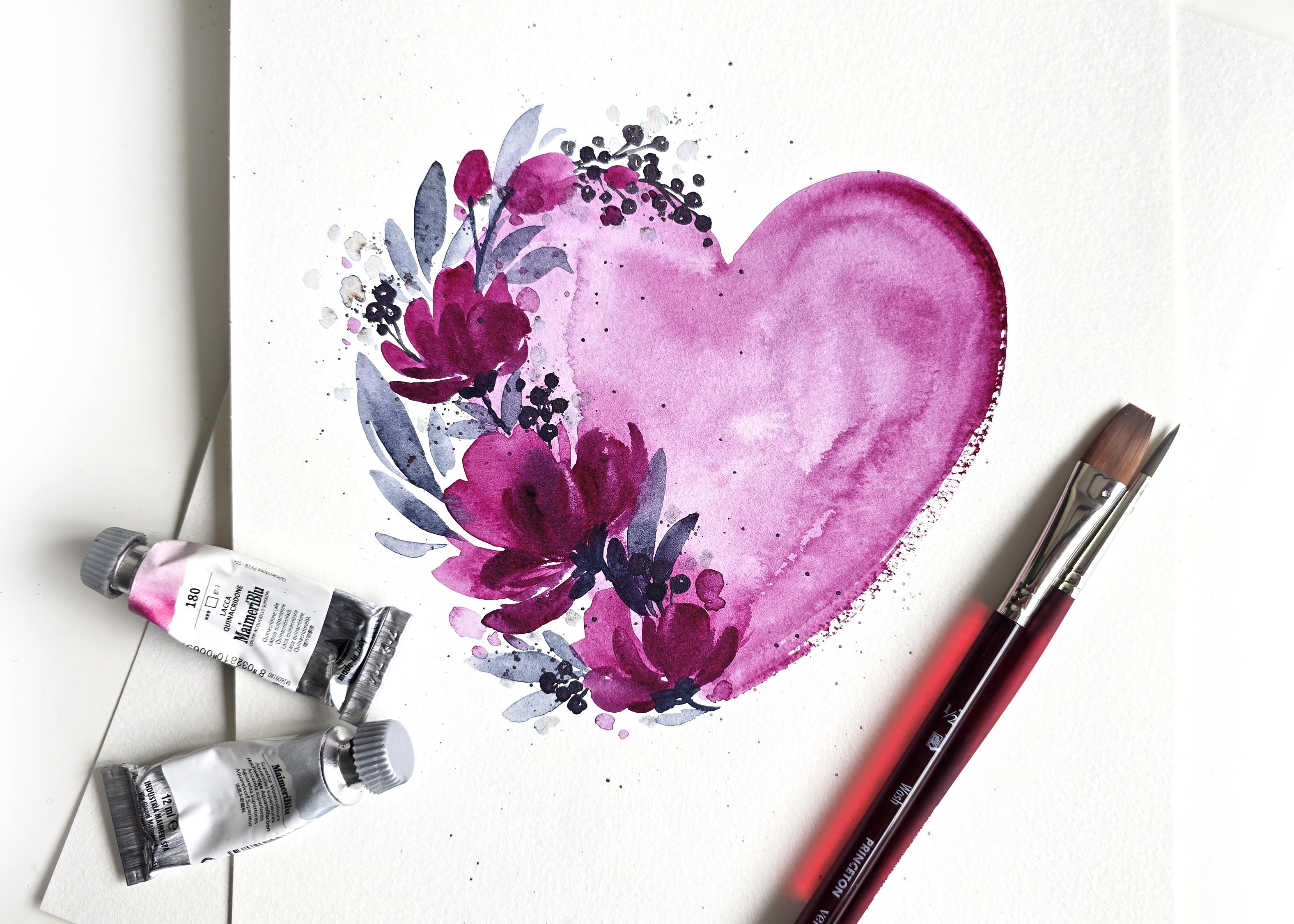
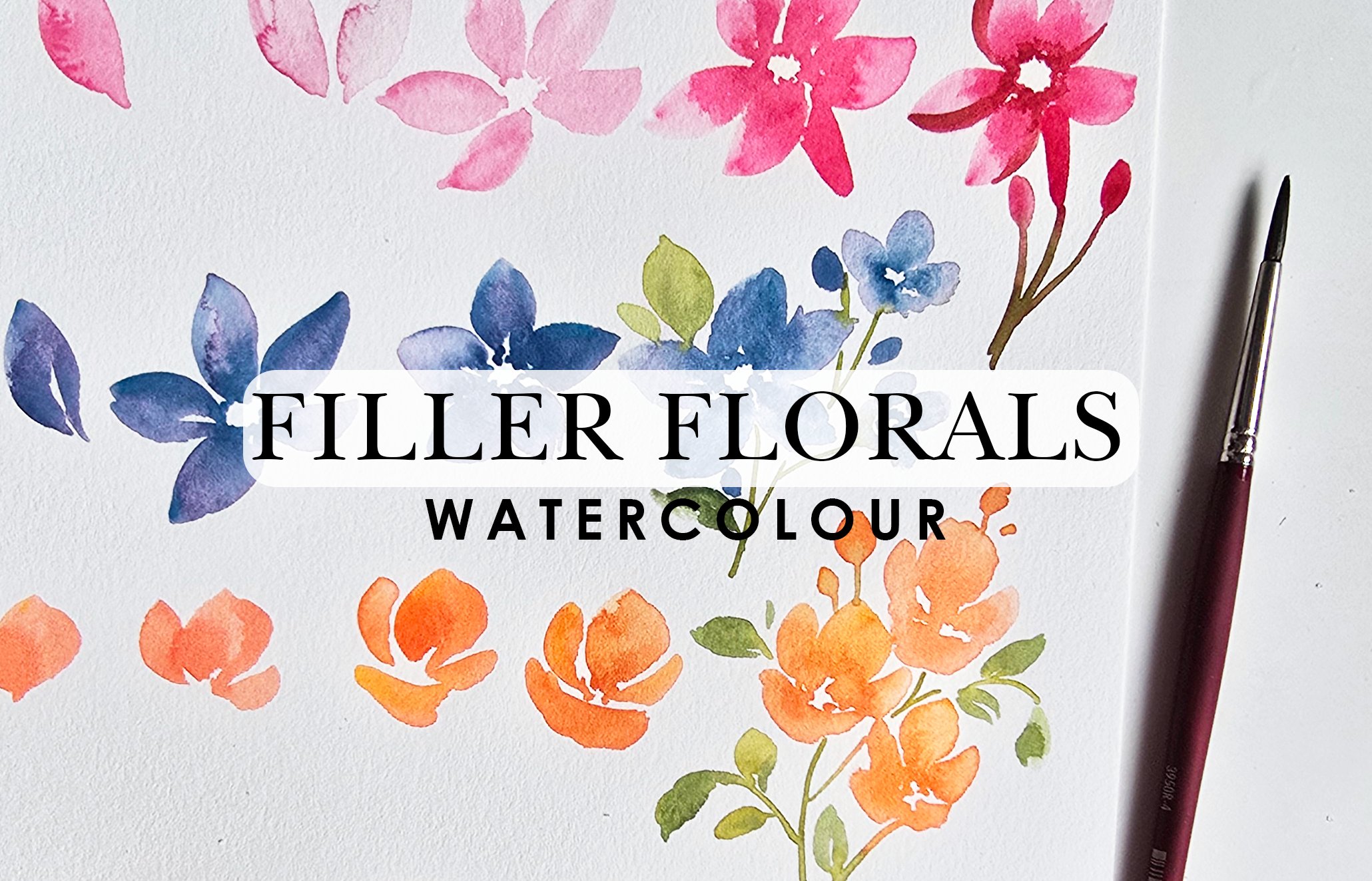
2. Project: Floral Heart: So in this lesson, I am super, super excited. This is something that
I did for a paint and sip event and I
decided to make it a Skillshare lesson and
make it available to everyone on here because it
was so pretty and such a hit. So we're going to
learn how to paint this beautiful loose
watercolor heart, along with watercolor florals.
3. Supplies: We're going to
start off by doing the elements individually
and then this way, once we've done
them individually, I'm going to explain to
you exactly what state of dampness or dryness you need to get this overall
effect or end result. We'll start off with the heart first and then we're going
to get into the rest of it. Putting this aside,
we're using two brushes. We're going to be using the
Princeton half inch flat. And then the Princeton velvet
touch number four round. For colors, I'm
using two colors. We've got the My Mary
quinacridone lake, and then we've got the
pains gray. That's it. Two brushes, two colors, and for our paper, I'm keeping it
beginner friendly, so we're going to
be using Canson. Just a quick note on the paper, this is not 100% cotton, this will dry up quickly. The blooms that you get might need a little
more finessing. But if you use
100% cotton paper, you'll get the dampness
lasting longer, you'll get nicer
bleeds and blooms, it'll be a little bit different. However, that being said, I do recommend starting
as a test on something like a canson and then going into the hundred percent cotton.
4. Mixing Colour: Will be using wash, the half inch wash and
we're going to get a diluted version of
the quinacdone lake. I've got some of that paint
on this palette already, and I'm going to start off
by damping my brush and then we are getting drops of water in here,
as you can see. We're just going to
mix that in casually. I want the mixture ratio to be about 60% water, 40% color. That's hard to gauge, but what I would suggest doing
is just adding more water, less color because then
the concept behind this is if you get a
darker version of color, it's hard to take away the
color from your sheet. But if you start off light, you can always add more
to build up on that. So get a scrap piece
of paper next. I'm going to use what I
have here on my desk. This is how you can quickly
do a test to see what's what. This is the mixture
I've got on my palette, and this is what that
looks like on paper, which might be okay
to begin with. But what I would typically
do is get some of the paint, dip my brush in water, just the tip of it, and
then go and add it. This is more the vibe I'm
looking for because the heart needs to be lighter.
Let's bring that in. We start off with a lighter
heart and then we drop in to add those nice little variations
of color within it. Hope this was helpful with
your mixing of color.
5. Learn to Paint the Heart: Some color, I'm going to dip the tip of my
brush in water, and then we're
using this portion of the brush to
draw in our heart. Here's how we're
drawing in the heart. I'm just going to do
a smaller version of the heart so we can break down these elements
really quickly. Here we go. I'm just going to
start from the middle here. Draw the heart in. Dipping in water,
I'm going to pull all of this down to color in that first
portion of my heart. And then going to paint in
this side of the heart. Now, your heart might
be a little bit lopsided and breaks that. See how I have
these white lines. I think I might just keep that in however the flowers
are going there, so that might not really work. Pointless, but I really
like this texture as well because your brushes
give you this texture. Fabulous. Just work on
perfecting your edges but or the shape rather. Before this dries
up, you can get the second brush this time just get more
of a darker color. It's less water, more
color and feel free to drop it into certain
areas around your heart. Now again, remember
I mentioned this is Canson watercolor paper, so it's not 100% cotton. It's the student grade, so it dries up quicker. You'll notice certain
areas are still damp. That's what gives me this blue. Certain areas are dry. That's what gives me this
hard edged feel. That's okay. What we're going to do is
get our damp flat brush and we're going
to just go around the edge touching that and just pulling it down so that
the color bleeds in. This is how we get
that nice bloom happening in areas
that are just stuck. Okay. We're not
worrying too much about how the transition happens
because at the end of the day, we need to just go with the flow and embrace all the variations of colors and textures that
we get within our heart. Now the next thing I would recommend doing for
something like this is just getting some rough
water on your brush. I've roughly washed it. That's what I mean
by rough water. So it's not completely
clean from the color. Then we're doing a splatter. The splatter simply
just adds more texture. And giving you that
whole loose effect. So let me bring
this closer so you can see exactly what's
going on right here. Now, the areas that
were damp because remember we went over
the color around here, you're going to see more of
these white blooms happening. The area that was dry, which we didn't really touch, you're seeing more of a solid
splatter going on here. This is, again, something
that creates more interest within your elements or your painting when you
do things like that. Also notice where we
added extra color versus the other areas that
didn't need extra color. It's darker. When you add
color to a damp area, yes, it's wet on wet, but it's also layering because you're layering the color to get a darker tone. Now, you can do the
layering part, sorry, not once, twice, three
times, maybe even more. I wouldn't recommend
more than three times because this is
very simple. Okay.
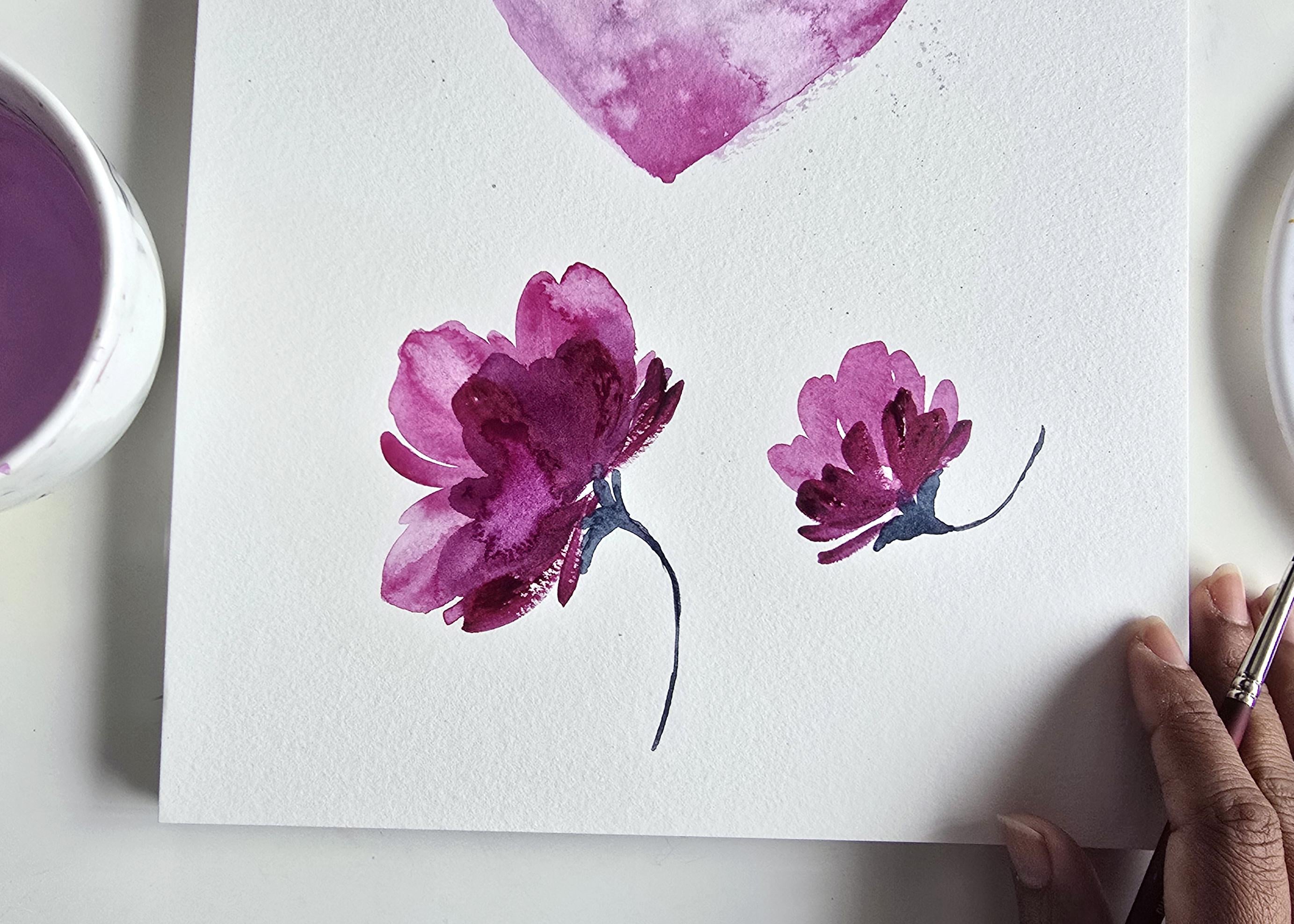
6. Learn to Paint the Flowers Part I: Going to show you how to do
the flower portion of this. We'll start off with
the main flower, which is right here, and then I'll slowly get
into the others. Now for this, you
would imagine that we're going to be
using the number four. You can if you want to, but I'm actually going to
challenge you and say, let's use the washbush for these flowers and let's
see the results we get. So I'm quickly
washing off my brush. Well, we don't
really need to wash it because we're
using the same color. I'm then going to get
a more muted version like what we did for
the base of the heart, actually not as light, but maybe more of a
50% water, 50% color. Like so. Once our brush is nice
and laden with color, we're then going to
get to painting. Now, the first thing I
like to do is create the background petals and
then here's how we start off. I'm going to start off with the flat portion of
the brush first. We're going to create that
flower. So that's one stroke. I'm going to create another
stroke to make that petal, give it a little bit of shape. You can use the tip
of your brush to just add more of a shape to it, then use the side
to enhance it more. Now I'm going to dip
my brush in water, just the tip of it and then we're going to create
another stroke. Lots of white space there. I'm dipping to get more water. I'm going to create more
strokes on the side. They're slightly smaller,
similar concept, right? Leaving the bottom portion
of this area fairly open. We want to keep
it loose. Try and keep a little bit of white
space if you can, right? Now we're going to get more
color on the same brush and then we're going to drop in
some strokes just like that. Now, you're getting that
bloom or I'm getting that bloom because this
area is very, very damp. This is the time to go in
and get those blooms in. Notice that that
wasn't fully damp. I think it was mostly
dry and so that's why I'm getting a
slightly different tone. This is how you're able to get some really beautiful
variations if you just time when you're dropping in the color to get the wet
on wet sweet blooms. Okay? All right. We're going to let this
dry just a little bit. I'm going to create
another flower here. The main flower is the one that looks like
it's blooming and open. The other ones are
just going to be more small and quick to do. Here's the other variation.
7. Learn to Paint the Flowers Part II: So same idea. This time, I'm going to angle the
flower upward. Here we go. Here same flat, and
then I'm going to turn it sideways to create
something like that. I'm going to get more color
and I'm just going to do two little petals flanking
on either side like that. Your second flower can
be as simple as this. Let's move back to this
flower right here. Now, I want the second layer
that we add on this to be a little bit more a little darker. Before we do that, this is
drying off fairly even. What we can do is use our number four brush and
we're going to take off color. Here's how you do that. Make
sure your brush is clean, damp, it's damp and not wet. What you can do is just go in and just lift off
color like that. This is where you need
paper towel handy. You can just wipe
off your brush, make sure it's
damp, and then you can go back in and
just wipe off color. This just gives you light
areas within your flour. That's one trick. Now, we're going to go back to this brush because now we're going to be doing some layering. I'm going to add a little
bit of pains gray to my red or to the
quinacidon lake. I've got some pains
gray over here. I'm going to get some of that. It gives you a really beautiful
purple if you just have just a teeny bit of the Quinn
lake with the pains gray. But I'm going to get some
of the pains gray mix it in here to get a darker
tone for this. This is going to be our darker
shadowy areas for this. I got that color. Now we're just going to go on top of
this and we're going to start our petals slightly around this portion right here because now these are
overlapping on top. These are background petals. This is going to be
overlapping. Here we go. Now, it's more water, less color, and that's why it looks like it's
going to be blooming. What I'm going to do
is just get more of a higher ratio when
it comes to color. I'm mixing that in here, probably going to be
needing a little bit more of that Quinn lake. Let's get that in here. It's a beautiful
color, very rich. This is where you
get more color, less water happening, and that will give us more stark
results, look at that. I'm using the side of the
brush to create these petals. You're getting a bloom
happening as well. Now, areas that
look like they're just getting out of hand
because water was pooling, you can just take your paper
towel and lightly dab to lift all excess water and color. Then you can just make sure you're either swiping
some color off or just smoothening some
of the areas that might be giving you patterns
that you don't want. Play around with that. We're going to go back to
this brush and this time, let's add some layers to
this flower right here. Getting some of that nice
dark color that I have, look, I even have some colors sitting directly on my
brush right there. What I'm going to do is very lightly create little
strokes like this. This has more color less water. That's why we're getting
those nice white spaces within our flower over
here, the texture. This is all we need to do. We do our background layer
and then we go in with a darker tone for the foreground and that's
how you get these results. Now this one has a
lot of water there. I'm just going to go in
with one more layer and I'm getting more color to add in these strokes and get some
texture in there as well. Notice all of that,
how it ties in. This is what creates
that visual interest.
8. Learn to Paint the Flowers Part III: Next thing I'm going to do
is using my number four, I'm going to get some
of the Paine's gray, and I'm getting it
to be more muted, not as dark as the flowers because we
want a nice contrast. We want the flowers
to stand out a lot and we want the gray
to just be subtle, delicate, romantic, it
needs to be lighter. I'm going to go as light
as I can, so more water, less color, and
then we're going to add the base for the flowers. It's very, very simple. All we're doing is using
the tip of the brush, we're just going to create
little strokes like this and feel free to leave a little bit of
white space just like that. Then we're getting more color. I'm going to drop that
in at the base here. This is what gives us that dark to light effect happening. Then using just the tip of
the brush to create a stem. Lightly grazing,
starting from there, just go quickly there. Now, you can take
your time trying to practice this because if you're brand new to watercolor, you've never really used the
watercolor brushes before. They are very soft and so when you paint with them,
you're going to get it. You can't be holding it like a pencil and really
concentrating. A lot of your strokes
need to be quick. So take a sheet and just lightly
practice if you need to. And help you get used to the softness and how much
you need to press and pull, because you could press down and you can get
something like this. Now, the white space indicates my brush doesn't
have enough water. Let's get more water. I'm going to show you the
stroke one more time. You start with the tip, you
press down and you trail off, and this is what we're
going to be doing for our leaves. That's from out in. But let's just say we have a stem and you
want to start from the stem going out,
S, that's our stem. You start from
here with the tip, you press down and you release. That's going to be the
leaves coming up soon. Let's create the base
for this one over here as well before
we move on to leaves. Here we go. Same thing
like we did over here. We're going to create
let's do one, two, and three if that's easier for you to understand and remember. Then again, we did
one stroke this way. Let's do this stroke like this. Practice the areas
and the directions. I love adding curves
because this is what gives you movement in your painting. Again, like I said,
once you add the base, you're going to notice
that it'll dry up lighter. Watercolor always
dries up lighter, so you can always go
back in and drop in a couple more strokes to get a slightly darker
variation happening, okay? Simple and flowy, see movement. Now, one more thing
to keep in mind, when you have a lot of water
happening in a certain area, you will likely get
something like this.
9. Water Stains: Zooming in a bit more so I can explain what's
happening over here. Clearly, the paper
is buckling because we've got a lot of water
in this area around here, what's happened is with the trajectory of the buckle,
which is around here, the color or watercolor mixture has fallen or rolled off
in this area over here. This is the only area that
is damp and that is why it looks it looks almost like a water stain.
It is a water stain. Again, this is another thing in watercolor that can be
annoying for some people, but other people might really
like it because it adds more texture and goodness
and all that good stuff. But technically, this would be considered as something that
shouldn't be happening. This is where you learn and grow in how much water you
need on your sheet. When do you need to take
your paper towel to go and lightly dab? All those things. I would recommend
pausing the video here, practicing your flowers
a little bit more, making sure you avoid
situations like this and just figuring
out your ratios before you move on
to the next step. This might be the
most important part of this whole process, but all the elements that we're going to
be painting require a basic understanding of the mixtures and the water to color ratios
that are happening. This is what makes
using two colors so effective when you nail
down your color ratios.
10. Learn to Paint the Leaves Part I: So the next element
we're going to do is the are the leaves. I'm going to
demonstrate the leaves right over our heart right here, and this is mainly so
that you can see what I mean by really hugging the edge to create that
movement in your leaves. But first, let's do a basic leaf so you get the idea behind that. I'm mixing my color
onto the side here. And don't worry too
much about ratios, but if you're able to get a 50, 50%, that would be
great for this part. The basic leaf that
we're looking to do for something like
this is going to be. Let's start it on
the flower itself. So getting my color using the tip of the
brush and making sure your brush is nice,
fine, and pointed. I'm going to create
one stroke right here, basic, it's lightly grazing. Then the next one we're
starting with the tip. I'm going to start
from out, press down, and then go back to the tip that's relief. Let's
do this one more time. I'll do it this way. This time, I'm going to start
from out here, press down, and go
down into this. Now, you see that little
curve happening at the top. Let's close that.
Just like that. Notice how light
the leaves are in comparison to the
rest because you can get pains gray to be a
whole lot darker than this. It almost looks like an
indigo or even a black. Light is best so
that you're able to build on it more
if you need to. Here we go one more
time for the leaves. This time, I'm going to create a stem coming out from
here so I can show you how you can enhance and make
it give it more movement. Something like that. I'm
going to start one leaf here. Here's a stem, press down, trail off. I'm going
to get another one. I'm going to do another stem. I'm going to get just a
little bit of water on the tip of my brush because I
can tell I've used so much. I'm running out of
color on my brush. Going to start from out, press
down, go back to the stem. We're going to get
more water in with my mixture and I'm going to
do one more leaf down here. I'm going to start here,
press down, trail off. Now you can always go back
into your leaves and add more another stroke
if you want to really enhance how it looks,
entirely up to you. But I feel like the more you let go and do more looser strokes, the easier, more whimsical and natural your painting looks. I'm going to do one more stroke, but this time it's going to be super light because
I want to go from dark elements to light
elements on the outside. Here we go. Just like that. Notice how this one
doesn't have a stem. It's just floating in between. That's what gives us
these beautiful beautiful loose I think the
best way to say it is it signals more loose
style of painting to our brain without us having to overlook or
overthink something. You can add many different
little strokes like this on a lighter scale and really give it that
beautiful movement.
11. Learn to Paint the Leaves Part II: Now we can paint some of the leaves right
around the edge here. I'm not going to be mindful
too much of the flowers because we're not
going to be doing the flowers on this as much. Here we go. I've mixed
some of the color. Nice fine pointed tip. We're going to start off with doing one little stroke
from the bottom here. Then I'm going to do
another stem this way and you can
start your leaves. I'm going to start
one from the top, press down, right to the stem. Getting more color, I'm
going to start from the top, press down, right to the stem. Let's do another one on
the outskirts right here. I'm going to press down, slowly
trail off onto the stem. Now if I didn't make
this clear before, let me repeat myself and
say it one more time, or let me just say
it one more time, is that you start
off on the tip, you press down and you
trail back off on the tip. Again, to show you
what that looks like. Let me just perfect
this leaf a little bit. Otherwise it's
going to bother me. And let's do this one more time. Let's say we've got a
leaf happening over here, start with the tip, press down, trail back off on the tip. Then you can create a
stem if you want to. You're going to
add another stroke if you want to perfect
what that looks like, and then you can simply
add more leaves. I like the curves. I like the little twirls because this is what gives you movement. Now say we want to
finish off with a couple of light looking leaves
and that's simple, we just make sure we have
a water down pains gray. Then again, with the tip, starting with the tip,
pressing down, trailing off. Even do something like
that, something like that. Can do some happening
on the top like this. Now, this is what it looks like from an aerial standpoint. But again, if you wanted to see what it looks like from
up here with the leaves, using the tip, paint in your first stem and then it's easier to just go over that and then paint
in your first leaf. Do a couple of little
smaller stems like so, and then you're extending
and adding more leaves. Keep in mind when it comes to really pressing
down and trailing off. For the larger leaves, yeah trail off a
little bit longer. Or sorry, press down
a little bit longer. For the smaller
ones, you want to contain them so that
they're not too big. You want to have
different variations in leaf sizes, leaf colors. When I say color, I mean
some should be lighter. The ones that are feathering
outside. I call it fluffing. It just adds so
much more depth and loose intricacy to
your paintings. Maybe you want to
pause the video right now and do a couple of leafy practice sessions
and just figure out what pattern you want
for your for your heart. You could even do this
heart with leave. Look how pretty this
looks just by itself. There's lots of different
variations that you can do just from this one lesson that
we're doing here. Keep that in mind. You can even extend that having bigger
looking leaves so over there. Really the sky is the limit. We're practicing. This
is how you learn.
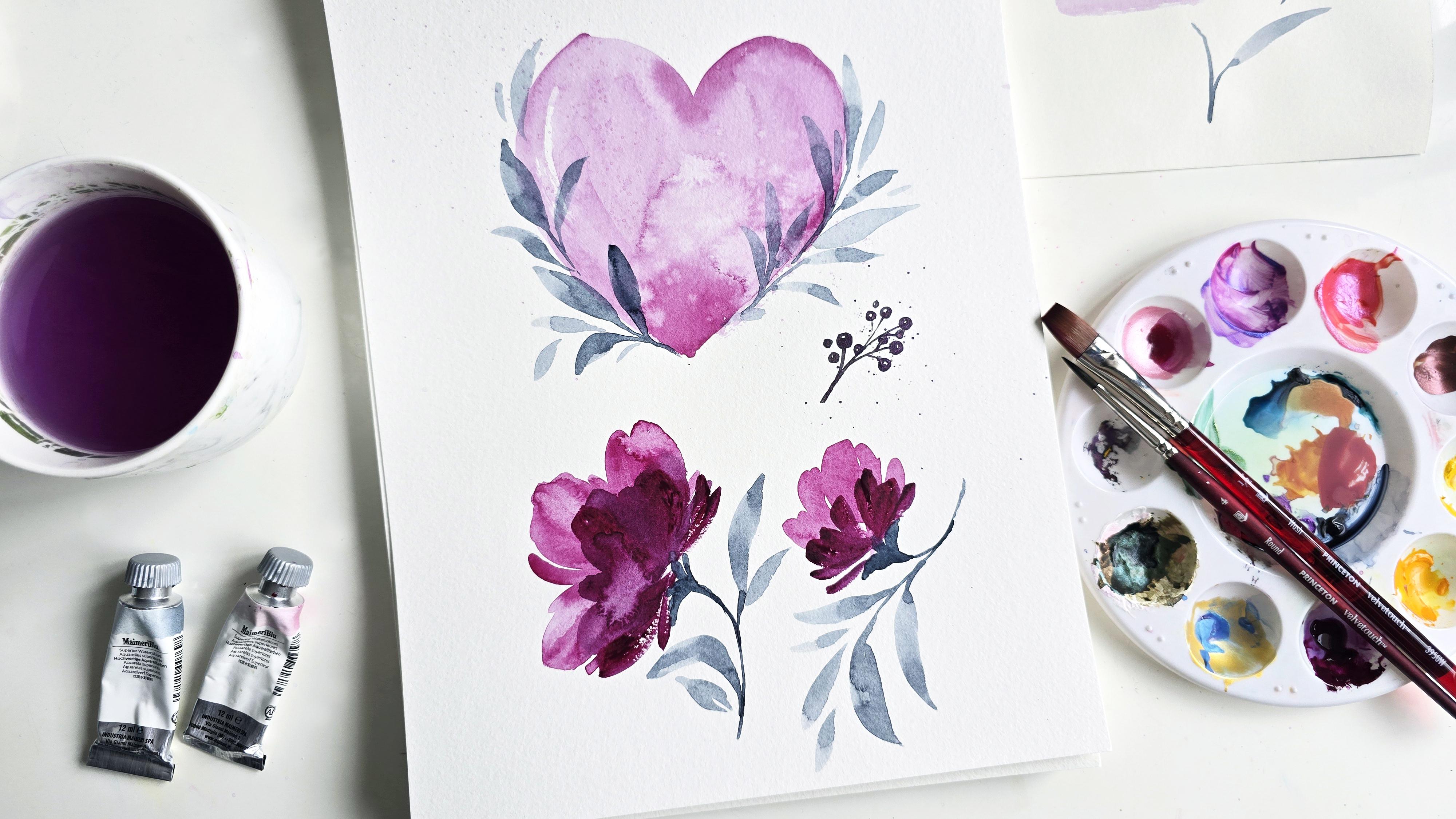
12. Learn to Paint the Berries: Last element that we are
doing is the berries. For the berries, what I did was, you can use the Panes
gray if you wish, just a darker version of
Pains gray and this way, the leaves will stand
out differently from the berries because the
berries would be darker. What I'm using here is a metallic paint watercolor that you can say it is from
the supervision colors, and I'm going to list that in the supplies so you can check it out there if you want to use
something like that. But feel free to also
use anything like a metallic or holographic
paint that you may have. Anything to add a
little more Pizzaz if you wish to your painting. I'm activating this here's how we're going to do these
berry style elements. Again, using the
tip of the brush, I like to do the stems first. I have my mixture of color, making sure that the point the tip of the brush
is nice and pointed. We're going to lightly
graze to paint in our stem and then we're
painting tinier stems around. I like to have them on
two different levels. There's one there,
there's one over here, and then you can add additional little stems stemming
out of these. This is where you're planning your placement for
these berries. Then we're going right in and painting little tiny circles. I like to leave a little bit
of white space so that it looks like it has a glisten. Again, just like
with the leaves, make sure you've got a variation of sizes when it comes
to these little berries. Make sure that you
have some big ones, some small ones, some just hovering without so much
of a clear stem to it. And this is what will give you
that beautiful loose look. Another thing you can do around the area where you have
your berries is to just get more liquified or add
more water to your mixture. Then your brush is nice
and full of water and the color and then do a splatter
right around this area. Just take another brush, hold it in this direction
and do a splatter. Then you get that nice little
loose splatter around it.
13. Conclusion to "Learning": We have gone over all the
elements that we need to create the end result for
this floral heart. We've used two colors to recap. I'm using Pains gray and quinacidone lake and
then two brushes which are my Princeton
velvetuch number four round and then the Princeton
flatwh in half an inch, water and Canson
watercolor paper, which is not 100% cotton. That's all we pretty much use to practice and we're going
to use the same elements right now to go ahead and do our own composition
and create this.
14. Composition Painting: The Heart: We're going to start
off with using our flat brush to get a nice water down mixture
for the base of our heart. And I'm going to use
the flat portion to draw that in first. I want to center it
nice in the middle. I'm going to start off like
this. Have fun with this. I'm dipping the brush
in water to get more water and time
is of the essence here so that you get that
nice wet on wet effect. Then I'm going to get more. We're going to create
the next side of this. I always botch up the shape of my heart by one side is
bigger than the other, as you can see, but roll
with it, run with it. Just be free and be
Be loose about it. I'm going to get more color
or the mixture rather. I'm just going to perfect
the edges if you need to. Instead of dropping
that color in like I did with the initial
demonstration of this, I just went in with that
darker tone, as you can see. We don't need to perfect
the site too much because we're doing the
flowers on it already. But what we can do now
is do a little bit of the layering with our round. If you want to do a couple
of dots or adding in paint in areas where you
are going to be damp. You can even add that there. Then remember, like I said, you go in with the
second brush and you just add water to it. Now all of a sudden you're
getting a nice little bloom. Areas like this where
it's just sitting, you can just help that
color move along. Give it some nice texture, and then let's end off
with a nice splatter. All I did was get
water on my brush. And we're doing this. You can
do a plain water splatter, but I had some of the leftover color and that's what I'm using. The splatter, as I
initially mentioned, helps you get that nice
beautiful loose effect. Now if you really observe, we've got this nice texture
going on on this side, we've got some really
great variations of color and water just
doing its thing on paper. We let that dry for a little bit while we're getting
ready to do our flowers. For the flowers, I'm
going to continue to use the Princeton ValvetuchFlat. And we're getting a slightly
darker tone of this. 50, 50%, most likely, slightly darker than what
we did for our heart.
15. Composition Painting: The Flowers: So I'm going to start
the main flower around this area here. Flat, one stroke there. I'm going to do just the
tip of my brush in water, create the two side strokes, and then two little side petals. We're going to let this
dry for a little bit. You want to do a couple more
additional little strokes like that with white space
in between. That also works. You want to pull down
the color to give it more of a nice color variation, so it doesn't dry flat.
That's also okay. I'm going to get more color
now to do our side flowers. And these ones can be
over here. Here's one. I'm slightly changing which
direction this one is. This one is in this direction, this is going up this way. Now, because it's damp, it's bleeding into the
background. I'm okay with that. What I'm going to do to
countereffect that is get my number four and get
more of the color, more color, less water. I'm going to drop in
little strokes like this. Not all over, just in certain areas where
we have the petal. Now let's do the
same thing up here. We're going to do one stroke. I'm going to get
slightly more color over here and just leaving this
open ended like that. Now we do our little
buds at the top, which are going to
be around there. Here's one stroke for a bud. Just like a roundish organic
shape is good enough. Doesn't have to
be super perfect. Do another one like that. Then I'm just going
to do a little dot to represent a smaller one. Now we have the basic placement
for where our things are. We're now going to
do the second layer because most of
this has dried up. For the second layer, which
is the front of the flowers, this is the back
end of the flowers. Now we're going to
do the front petals. I'm going to get a
little bit of that pains gray and we're mixing it in with this
mixture right there. Once we have that mixture, perfect, we're now
going to go in paint. I'm using the number
four brush to paint these foreground petals and we're getting a darker version of that color,
keep that in mind. And a more saturated
amount of color. I'm getting more color
on my brush, less water, and we're doing these nice
little loose strokes that will show up darker against that nice pinky
background that we have. Beautiful. I love how that's turning out. It's got a soft bloom
happening in the background. I'm okay with that as well. Then we're doing the
same thing down here. Dip the tip of my brush
in water and create these nice little side
petals just like that. Then we're going to do
the same thing up here. This is more of that
wet on dry effect. Beautiful. Now, like I
mentioned initially, if you want to go in and add more strokes where areas
are just blending in, just go back in and drop in
a little bit more paint. That should be good enough. Now, if you want to go in and
take off some of the paint, just to get some variation, make sure you wash
off your brush, wipe it on your paper towel so it's now just like a damp brush, and you go in and you can
just swipe off the color, lift off the color with your brush in the direction that you want this to show up. And then just make sure you're dabbing it onto
your paper towel. This way, you're getting
nice little variations of separation in your petal. Subtle, but not in your face. Now that this is done,
let's move on to the next step which is
creating some of the leaves.
16. Composition Painting: The Leaves: Number four, we are mixing a muted
version of our Panes gray. We want to start off
lighter, like I said, because we want the leaves
to be lighter so that the rest of this
stands out very well. Watered down version of Panes gray and we're going to
start off with the base, and we're just doing
light little strokes like this to create that base. Then a nice little stem might not even need
the stem because we're just going to be
doing leaves right away. Then I like to connect
the top portion here. We're just going to go
ahead and connect that. Take your time. I
like to rest my pinky for more stability.
Something like that, and now we get to
doing the leaves. For the leaves,
like I mentioned, I like to do a little line, then dipping the tip
of my brush in water. We're doing our first leaf, our second leaf, third. I'm going to do a couple here. I'm going to do a tad bit
darker over here, overlapping. Make sure some are curved
off to the side so you get that nice movement happening within your painting. I'm going to make sure this
one's a bit taller like that. Then a slightly
lighter version here, another light version
happening down here. I want that nice spray, light to dark effect going on. We're going to create a
couple of leaves at the top. I don't even think I need too many stems for
this portion here. I'm going to do
some leaves here. And then once you're pleased
with your leafy placements, let's get to mixing some
color for our berries.
17. Composition Painting: The Berries: I'm mixing a purply
metallic color, which also transitions as a super dark variation on
paper because it's almost like a granulating color and this is the mica layered infused colors, watercolors by supervision. We're doing our berries just in certain
areas peeping out. We'll start off with
some happening here. I'm going to start the
reverse this time. I'm going to paint
in the berries. Take your time painting it in. Just like that and then
you can connect it after. I'm just going to do
my placement first. Let's do a couple here as well. I want more of the
color more color, less water just so it's more opaque transitioning onto
this sheet of paper. You can overlap it on some of the elements too
because now this way it'll shine through. It's not just going to
blend in with the dark and that's what makes this
effect pretty as well. So take your time sitting and deciding where you
want to place this. Allow this moment to be your
moment of peace and calm as you figure out where your creative
intuition is taking you. Mine is hovering around
here. What's yours? Challenge yourself instead
of just following along, you can absolutely follow
along if you want to. But if you really
want to hone into your creative intuition, try and do this by yourself
based on your tastes. I'm going to add some on
the outskirts as well. Now, this is turning
out to look not vastly, but definitely different in terms of layout in comparison to what I did the first time and we're going to
compare it side by side. This proves my point about
you can never really recreate something
exactly the way you did it the first time and
that's totally okay. And that's the beauty
of art in general. A lot of how you transition
things on paper when you're painting has a lot to do with
your emotional regulation, how you feel that day. What are you liking?
What are you not liking? Pay attention to those moods or those preferences when you
are sitting down to paint. Now, in my original,
I had a lot coming out towards the
middle over here. I think I'm going to
draw in the stems first and then figure
out if I want to add any more that are going
all the way to the edge. Using my nice fine pointed tip, we are going to connect. All of them do not
need connection like a mentioning some you can just leave hanging out,
that's totally fine. A lot of these areas
are very tight space, so I don't even
know if we need it.
18. Composition Painting: The Berries II: I'm mixing a purply
metallic color, which also transitions as a super dark variation on
paper because it's almost like a granulating color and this is the mica layered infused colors, watercolors by supervision. We're doing our berries just in certain
areas peeping out. We'll start off with
some happening here. I'm going to start the
reverse this time. I'm going to paint
in the berries. Take your time painting it in. Just like that and then
you can connect it after. I'm just going to do
my placement first. Let's do a couple here as well. I want more of the
color more color, less water just so it's more opaque transitioning onto
this sheet of paper. You can overlap it on some of the elements too
because now this way it'll shine through. It's not just going to
blend in with the dark and that's what makes this
effect pretty as well. So take your time sitting and deciding where you
want to place this. Allow this moment to be your
moment of peace and calm as you figure out where your creative
intuition is taking you. Mine is hovering around
here. What's yours? Challenge yourself instead
of just following along, you can absolutely follow
along if you want to. But if you really
want to hone into your creative intuition, try and do this by yourself
based on your tastes. I'm going to add some on
the outskirts as well. Now, this is turning
out to look not vastly, but definitely different in terms of layout in comparison to what I did the first time and we're going to
compare it side by side. This proves my point about
you can never really recreate something
exactly the way you did it the first time and
that's totally okay. And that's the beauty
of art in general. A lot of how you transition
things on paper when you're painting has a lot to do with
your emotional regulation, how you feel that day. What are you liking?
What are you not liking? Pay attention to those moods or those preferences when you
are sitting down to paint. Now, in my original,
I had a lot coming out towards the
middle over here. I think I'm going to
draw in the stems first and then figure
out if I want to add any more that are going
all the way to the edge. Using my nice fine pointed tip, we are going to connect. All of them do not
need connection like a mentioning some you can
just leave hanging out, and that's totally fine. A lot of these areas
are very tight space, so I don't even
know if we need it. As you can see over here, lightly grazing to create these thin lines
to connect them. Then finally, in this area here, I do like the idea of
going around there. What I'm going to do is flip the sheet and then
paint it that way because I'm going to be more comfortable doing
it that way versus like this and then you not being able to see
what I'm doing. Let's just do that real quick. I'm turning it this way I
can paint it in this way. Here we go. If I add one little berry there, Make sure I have good
enough access to my palette and then paint in more as I'm going downward. Then this way, now I can just
go in and paint in my stem. I think that's it. Actually, I'm just going to do a couple more here because this looks vastly open in
comparison to the rest.
19. Composition Painting: The Splatter: Now last but not least, don't
forget our little splatter. I'm watering down
that solution or that mixture of color
and first splatter here, second here around the berries, third here, and then a
little bit down here. Now, one more element or one
more step that I had not mentioned if you would like to do is just wash off your brush
and with your clean brush, what you can do is some of these elements just to give
it that nice halo effect. Just take your brush
with water and just lightly mix the color
around so then you get these nice little
overshadowing glowy effects around your berries. Okay. Again, all of them
don't need to be done. Figure out which ones
you would like done, and this is how it
typically would look where you get these
little glowy bits all around your berries and a little bit framing
your flowers as well.
20. Quick Recap: To do a really quick recap. In this lesson, you would have learned all the little
basics that will help you to get a composition that looks
something like this, which is a loose floral heart along with loose
flowers all along. We're using just two
colors and two brushes, and that was all part of the
project to help you learn how mixing the color
with the water can really give you
very different results. This is also a great way
for you to learn how to how to maneuver with watercolor and all the little
things that you can get. Some of them happy accidents, some of them not so much. But remember, even the not
so much happy accidents are a great way for you to learn and grow in understanding
this therapeutic medium.
21. In Conclusion: Watching this video,
that means you have reached the end of all the
videos and you're ready to progress and post your work in the project project
gallery section on here so I can see it
and I can comment on it. Please, I would love it if you can also post a review
and just a couple of comments on what you really
liked and appreciated and learned from
this lesson as well. It really, really
warms my heart when I read words of inspiration
from you guys, which is exactly what
that is when you write to me talking about what you've learned
and what you like. I love it. Thanks so
much for watching. I look forward to
reading your review and seeing your
post on your work. Follow me on social media
if you feel inclined to. I've got lots of
great videos over on YouTube and lots of great
inspiration on Instagram. On that note, guys, thanks for
watching. We'll chat soon. Bye.
 Clarice Gomes, Go with the Flow in Watercolour