Transcripts
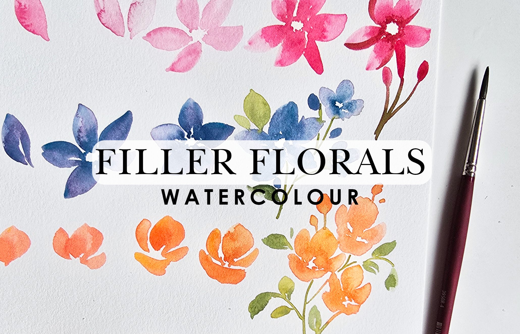
1. Introduction: Watercolor is literally
about water and color. Hi. My name is Clarice, and I am a watercolor
artist that specializes in loose
watercolor flowers. If you love flowers, this is for you. My teaching journey started
over on YouTube and slowly expanded over into
Patrion and Skillshare. I'm also an ambassador
for Prints and Brushes, and this is why you
will see me using a lot of Prints and brushes
in my content. Watercolor is therapeutic and such a great way to express. And this is why my thing is, or you'll always hear me say, take 15 minutes for yourself. Be present, paint for
you, paint for fun, get rid of all your extra
additional thoughts in your mind and just
go with the flow. What is this lesson
about? This lesson is all about doodling loose
flowers and lemons. This content, including
the color palette, was inspired by
my trip to Italy, and I just can't get the lemons and the
pinks out of my mind, including the little
bit of turquoise. You're going to see
it in this project. We're going to learn how
to paint loose flowers and loose lemons and
we're calling them doodles because that's exactly
what they're going to be. I would love it if you can take a sheet once you have learned the technique and just
go crazy painting on it? Just clear your mind and paint. Once we have finished painting, we are then going to be
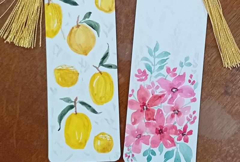
using our artwork to create little crafty ideas like cards, envelopes,
even bookmarks. I want you to see
how you can take your work in your
style and fashion it into little crafty
ideas that can also be great personalized gifts
for you or for loved ones.
2. Project: So get ready to
relax and let loose. Now, if you're wondering
who this lesson is for, this lesson is for any and everyone who wants to
sit down and paint. You don't need any prior
experience at all. Just come with the
intention of having fun letting loose and relaxing. Now, let's talk really quickly about the project
for this lesson. Your project in this
lesson is simply taking everything you have learned from our loose style of doodling, flowers, and lemons,
and then we're going to create crafty ideas, like I mentioned previously. Greeting cards, bookmarks,
and or envelopes. Feel free to pick one or pick just the greeting card just
like I have done in my video, you will see and
go with the flow. To fully complete the project, please don't forget
to post an image of your beautiful creation in
the gallery section here. This way, I can comment on it. I can also be encouraged by your beautiful works
and hear from you guys. On that note, I think
we're ready to begin. But before we begin, let's talk really quickly
about supplies. Head on over to the next
video and let's get going.
3. Supplies You Need: Supplies, I've got the following items that I will be using. Feel free to use whatever
you have on hand, but I have also listed
all my supplies in the description below if
you want to check them out. For colors I'm using my
white nights set of 36, as we begin, I'm
going to let you guys know exactly which
colors I'm using. For paper, I'm using these
little note card style paper, and I believe it's Bow Hong. Again, I'm going to
list this down below. And it's got some texture on it. Texture versus non texture
is really a preference, so I suggest that you use what you're
most comfortable with. Then we've got brushes. You all know I am a
Princeton ambassador. I love my Princeton brushes. I'll be using the
Velvett series, number four and number eight. Number six is also a great
size of brush to work with. We also have an
echo graphic pen, and this is in the one MM. And it's got a little tip that almost looks like a
calligraphy point. It's got that little slant. But again, you can just use a regular graphic
pen, if anything. I also kept my KMS metallic
watercolors here handy. I like to add little
embellishments for creative projects
like this that really enhance and take
your compositions and end results to
the next level. I'm keeping that aside. I've got scissors so we can
cut our beautiful artwork. Then last but not least, you can either use tape, or you can use glue to glue
the items once we are done. One more thing I
forgot to mention, don't forget some paper towel, just a little rag or something that you can
keep handy on the side. This is when we have
excess water on our brush, you can just dab
it really quickly, or if you get excess
water on your paper, instead of letting
it sit, just take your your little
paper towel right away and just lightly dab to take away that
water or color.
4. Loose Watercolor Techniques: We're going to start
off with the flower, and I'm going to
walk you through the very basic technique of
how to create these flowers. They are super fun, they're super beginner friendly. Even if you're not a beginner, I think this is a great way to elevate and try new things, twisting the brush,
trying different colors, and creating a nice
array or composition. For my colors, I'll
be using my car mind, which is my absolute
absolute favorite. Then I'll team that up with
some of the Quin rose. We're also going to be
using a little bit of burnt sienna to mix in with these colors just to
get a darker hue. As we mix these colors, you're going to see
this come into play. First thing we're
tackling is the flowers. I'm going to be mixing it onto this very handy palette
that's a part of this 36 paint set and we
will get started. For actual mixing, I'm going
to be using the number four. And I'm placing my
hand here because my camera keeps blurring out. I'm getting the color
from the color cake and I'm mixing it right here. If I need to add more color, I'm just going to get
more, which I do, by the way, not if, I do. Then I'm getting some
water on my brush, adding it back to my mix. This is how you essentially
mix your color. If you've been doing
watercolor for a while, you're probably a pro at this. If you're just beginning, you're probably just finding
your way around this. Either way, I think this is a very under rated
part of watercolor. People don't realize how
much of understanding the medium is figuring
out the ratios between your color
and water mix, especially if you're looking for certain effects in watercolor. I think I've got about a 30
70 or 40 60 percentage here, 40% color, 60% water. I'm going to be using
my number four to add five little dots and
then we're using the number eight to
spread the dots out. Here's my technique. We're adding the
five little dots. Let's add it right
here, one, two, three, four, five, there's
a counting lesson free. Now I have water on
my number eight, and I'm just going to start
from here and extend. With just water, I am using
the number eight to get the color from the center
and pull out into a petal. And it gives us this really
soft and romantic look to our flowers. This is the basic move. Once we finish doing our flower, what we need to do is
enhance the center. Before it dries up,
I'm going in and adding dabs of the same color, which is that I have mixed. You'll notice some
areas where it's damp, it's blooming into the
petals really nicely. This one clearly is
dried up because it just stops short right there. If you're looking for
that blooming effect, you need to make
sure you're getting it right when it is damp. Now the next thing I want
to show you or address is these little vein style
patterns that are showing up. If you don't like
what that looks like, just get a damp brush, so you wash off all
the color and you lightly just extend and blend
the color into this area. Again, this needs to be
done when it is damp. If you wait for it to dry up, you're going to get very dry
looking strokes on here. I felt this is a
good enough intro to the basics of watercolor. Notice how I'm pulling
this out here. You can do this as well
if your air is dried up. Good enough intro,
because these are tiny little details
that we take for granted or don't
really hone in on, and they're very imperative in understanding how
watercolor works. I hope this was helpful. Now, before we move on to the actual way of doing the lose flowers
because if you notice, these petals are
very they're almost like perfect ish with the exception of the
ends around here. But we're going to
go a lot looser, but I wanted to give you
the basic understanding of how to do the flower, and then we're going to
work on the strokes for the petals of this
style of flower. Before we do that, I want to introduce the basic leaf to you. For that, I will be
using my O olive green, just for fun because it's
a beautiful bright color. It's also one of my favorites. I'm going to mix that color
right here on the side. The leaves are going to
be very similar to how we created the petals itself. The stroke at least. We're not doing the dot
business again, but here we go. I'm going to use nice
fine pointed tip, extend to lightly
graze on my sheet. Then I'm going to start from
the base using the tip, I'm going to press down
and trailing back up on my I'm going to do it one more time and give
you a side view of this. You don't have to start
off with a stem but I am. Starting with the tip,
I'm pressing down, notice how my brush
is pressed down, how much of it, and then I'm
trailing off onto the tip. Now, I am going slowly mainly for the reason that I'm showing you and pointing
out certain things, but feel free to
go faster with it. I'll do one more. You can see that again. This
time I'm not doing my stem. I'm starting with the tip
pressing down and trailing off. Now if you want to make this a bigger thicker looking leaf, just do it one more time just on the outskirts,
pick one side. This is what it looks
like from an aerial view. You'll notice that
the first one, I just did a very
basic press down. The second one, I really
pressed down almost like sideways if you replay a few
seconds before and watch it. That's why I got
a thicker middle. This one right here, I did two strokes to
achieve that thickness. It really depends on what you're looking for
in your leaves. You can you can press down just a little or you
can really press down, watch how I'm pressing down, and then trailing
off onto your tip. Try this a couple of times and
then hop on back so we can explore doing more of
the free loose style, not free really, but y. Really, really loose
style of petals, and then we'll get into
the leaves as well. But the basic understanding
of how you can achieve basics is important and so this is why we're
spending time doing this. I'll see you in a bit.
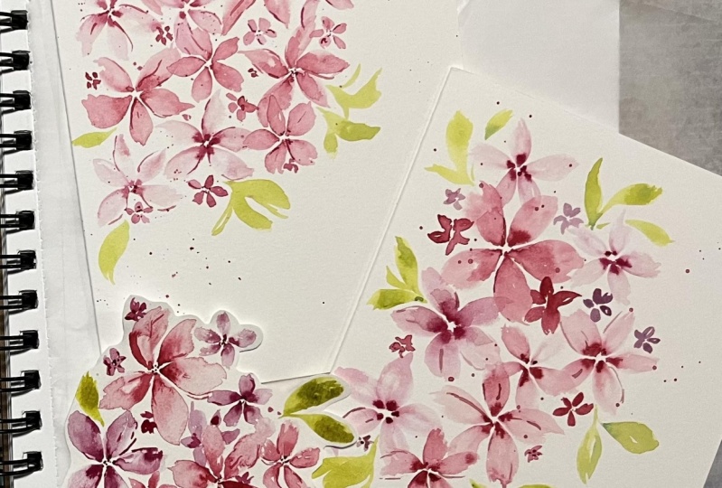
5. Practice Loose Flowers & Leaves Doodles: Now we're going to go right into loosening up with our petals. We're going to do
the same technique. Getting our carmine
using the number four. I'm also going to keep
this handy ahead of time. Also making sure that
your number eight is damp and has a little
bit of water on it. We're going to create our one, two, three, four, five dots. Now, using this brush
with water on it, because if you don't
have water on it when you're dragging it out, you'll get white
space in between. It's got water using the tip, pressing down, trailing off, and then I'm
going to do this. I'm really enhancing on
the shapes of my petals. And then rotating my
sheet for better access, especially if you feel
like you're not getting the same results if you were
to just do it all around, sometimes we struggle with
that and that's totally fine. You just got to figure
out a way around it. I'm almost doing the
same two stroke things that we did for our leaves. And now we're going back in to add that those extra
dabs in the center. Yes, time is of the essence
to make sure we spread out the color before it dries up
and leaves us with a dot. Time is of the essence to
go back in the center and add those additional dots, it's pretty much layering. So we get a nice
dark in the center to light on the outside
effect happening. Notice how my edges are
very open ended and loose. You can also go back in with
this brush that already has some color and really enhance
your sides if you want to. Just giving it some
loosey looking detail. If you like thin lines, if you like thick strokes. This also creates contrast
in your paintings and adds something really nice and
whimsical to your end results. Notice how these little
lines look right now. Look at the difference
between the two. So find your joy between which is which suits your
fancy and go with that. Now for these leaves, I'm using a slightly
different green. It's a little bit of
my chromium oxide mixed with olive green. I'm going to also do a slightly different
version of leaves. I'm going to do my dot with the number four and
with the number eight. Make sure that you
don't have pink on it or even if you do have pink, it shouldn't be the end
of the world because it'll give you a
nice green anyways. Starting with the tip,
pressing down trailing off. Doing my two stroke
leaves. Easy enough. Now I'm going to do it
without doing the dot. I'm going to extend starting
with the tip, pressing down, trailing off, going to get a little bit more color to
really enhance the other side. The strokes are the same. If you notice, watch me again, using the tip, pressing down, trailing off, starting again at the same tip, pressing down, trailing off, but we're curving on the right side as
opposed to the left. Again, this requires
brush control. This requires just being
comfortable with your brush and also knowing how to
curve your brush. Maybe take a sheet, take
a moment and just go ahead and try the
petals, try the leaves. Trust me, they work
in tandem almost because they're so similar in how the strokes you
use to create this. It'll help you in the long run because you're going to notice you're using the
same strokes for a lot of other elements as well. Take a moment and get a
little bit of practice in.
6. Practice Loose Lemons Doodles: The last thing we need to
also figure out how to do is a sliced up
or half a lemon. I'm going to do that up here, even though in our
actual composition, we'll do it down near
the whole lemon, but just trying to work with
the space we have here. The first thing I'm going
to do is very lightly draw in if this pencil works
an oval shape like this. Can you see it barely. Then we're doing
like a half circle. Just like this. This gives us an idea of where our little spinny Fan is going to be for lack of a better way of describing
it, the inside. Here we go. We're adding a dot, so we know exactly
where things are going to be starting or ending. Then I'm going to
extend and draw in if this pencil will work. Make sure you have a
nice sharp pencil guy so that it's not giving
you problems like this. I'm just adding little lines in the center here this way I know where I'm going to be
loosely painting my yellow. Feel free to draw in
that additional circle because we need a little
bit of white space around here and in between our ridges that we're
going to be painting. Yeah, do what is convenient for you because once we
start adding color, there's no going
back, essentially. Here we go. That's
our base drawing. Let's add some paint. I have some of my cadmum
lemon on my number four, and I'm just going to start painting the lower
portion of this. We'll start off by moving to the side or grazing to
the side like this. Then you can extend
all the way there. Pull it down if you need to. Then I'm going to get
some of my yellow ocher, and I'm dropping that in
right in this white space. There's so many different ways of really painting your lemon. You can use this what I've
done here for what we painted, how to paint your full lemon. Trying to put words into
play here as I am painting. Yeah. Just go with
the flow and try what works best for you. There we go. We've got this. I'm
going to wash off my brush and we are
going to close that up by adding more of the
cadm medium around the top. I'm just going to curve
very loosely paint that in. The base drawing helps
you for things like this. Next thing I'm going to do is using the same nice
fine pointed tip. We're going to paint in leaving a little bit of white
space in between. We're painting in almost like a outline to our first line. Then getting some water on my
brush, the tip of my brush. I'm going to start
loosely painting in little strokes right
to our.in the center. But I'm leaving a lot, but I'm leaving white space in between my painting as well. I'm not covering painting
up the whole whole thing. We need this to we need
the white space to mimic light and dark and
shadow and stuff like that. Now at this point, we
have our base color. We're going to go in
with a little bit of the ocher and drop that into almost like the ridges where we
have where they divide. This should be helpful as well. Another idea is just to leave those lines white
so don't paint over it, and that should
also be a great way of showing people the
different ridges.
7. Practice Practice Practice: Now we've completed doing
all the elements that are needed to put our
final project together. Feel free to pause here. Before you start the next video, if you need to really hone in on getting these details down, replay as many times
as you want or can, and just take a sheet and just go crazy practicing
these techniques, and then join me back to
put them all together.
8. Final Doodles - Flowers & Leaves: If you have practiced
and you're ready to begin your final, here we go. I'm going to do the flowers
with the same color, the carmine, and then
we're going to introduce another color as
well. Wait for it. This way, we've got a nice array of different colors that
complement one another. Starting with the number four, we're doing our five dots. This is going to be a nice
little bunch of flowers now. Feel free to now that
you've warmed up, you can go a little
bit faster with this. I'm using my brush. Number eight, and I'm pulling out the color
from the center, creating some nice
organic shaped petals. We're even going to add a
center to these flowers. We'll leave that for the end. You can also leave the
flowers white centered, nothing is happening there. But just to switch
things around, I'm going to add a
center at the very end. Here we go. This same style, we're going to
create more flowers. What I'm going to do
this time though is get some of my quin rose, which is also another
very pretty pinky color, and we're going to create
more flowers around here. What I like to do is create two in the two different colors, two full flowers like this. Then as we create more, we're going to add less detail. I'll show you how
to do the facing upward flower as well when
we get to that stage. How pretty are these colors? They are absolutely my favorite. If you're a pink lover, you would like these, or if you like bright
colors in general. Here we go. We've got
those two flowers dropping in my darker hue. What you can also do is add some additional lines in
between to really enhance some of the petals or really pull the color
from the center outward. I'll leave that up to you guys, how much detail you want to do or how loose
you want to leave your flowers you can
decide. Now we've got that. We can at some point, I stop washing my brush off
and I just go with the flow and use the mixture that I naturally get from
painting different colors. Feel free to try that as
well because it really is a game changer in terms
of getting different hues, but you're using the same
colors from your project. I know initially when
you're first new, you're so big on
washing your brush and spending so much time
making sure it's clean. But maybe let go of
that because you'll get some startlingly fun
results. Here we go. Adding some of that
color to the center. Lo how pretty that effect is. The more dabbing you do, the
darker the center will be. I want to do a flip of
what's happening right now. I'm going to take
my number eight and I'm going to use the car mine and do
lighter looking flowers. What I'm doing is creating my little dots with
the number eight, and then I'm using the same brush to extend
and create petals. Just like that. Now that
I have that one flower, I'm taking my Qin rose, and I'm dropping that into
the center of this flower. Notice how we're getting
different mixes, but they all look
like they're part of the same bunch, super fun, pretty easy to do,
relaxing to do, which is why watercolor is
so therapeutic in nature. Different arrays. Now we can do something super light as well. For that, we just need
to make sure that we have more water, less color. I'm going to do one more here. This one can have a
floppy petal, three, four, five, Getting
water on my brush. The floppy petal should have
probably been around here. Maybe we can do one more. Let's go with the flow
and see where this takes. The floppy petal is more of a curve. I'm going to do this. Then what I'm doing with
that little stroke is just adding I dabbed it to
take away the dot, and then taking my Qin rose, which I still have
on my number four, I'm just dotting it
all around here. Can add a little bit
more in the side. Can even add a little
bit more of the quin rose in areas where it's
touching other flowers, just to give it a
break in between. So much that you can
do with controlling. This is almost like
going and trying to control some of the
color and how it flows. That is, essentially.
We've got one, two, three, four, five flowers. I don't quite like the shape because there doesn't seem
to be much happening, so I'm just going
to dampen my brush. And I'm going to create
a couple more very tiny, quick, loose, smaller
looking flowers. And getting more water on the
brush when you create more. Now, also keep in mind, don't keep your edges to too intricate because then when it comes time to actually
cut things out, it's going to be a
little bit hectic. Something like that should
be fine. Feel free to. This is what I've
called fluffing or light looking flowers smaller in nature
around your main area. Now it looks like we've got mini clusters of these
baby flowers all around. Can you even have little shapes touching our flowers over here. These are not main flowers,
but you know what I mean. Create that impression
of clusters of flowers ing your very loose style
of ste bruh strokes. Can even do a splatter
to end things off if you feel like that is something that would
enhance your artwork. But essentially, we've got a beautiful little cluster
happening. This is perfect. I'm going to do one more
because I cannot help myself. Notice my little curve here. Look how quickly we
painted all of this. Progressing on, we
are getting more of that darker hue to just drop into some of
these centers here. Now if you have a lot of water
on some of these strokes, adding more color to it might
not be the best solution. Maybe wait for it to dry just a little bit
before going back in. Or you can wait for it to dry completely before going back in. I'll leave that
entirely up to you. But this is also the
stage where we mix in ale bit of burnt sienna. With our colors here just to get a slightly darker hue and now we can go back in and add a little bit
more to our centers. Most of my centers are
still pretty damp and that's mainly because the
watercolor I'm using, the paper I'm using
is 100% cotton, and I've also not
waited that long. I'm just dropping some of that in into these little flowers. Now, it'll spread out like this, but we already know what to do. We're just taking our brush, washing it off, dabbing
it onto paper towel, and we're going to
lightly graze and pull off that excess color
or smoothen out the color. If we don't like how
it's transitioning out. Here we go, dropping
some in here. This is where I say
experiment with waiting a little
bit of time before going in and adding this color because you'll get different
results every single time. This has dried up quite a bit. Look, it's giving me a
more darker transition. This is still
pooling with water. It's giving me a
lighter transition and just sitting on top. This is dried up completely, and so as I'm adding
my little dabs, it's just looking like dots. This one's also completely
dried. Guess what? I'm going to get just a bunch of dots happening over here, which is totally fine. This is a very lose
style of painting, and so we just want the brain to get an idea of,
that's the center. These little dabs of
color do exactly that. Our job here is essentially
done. Almost done.
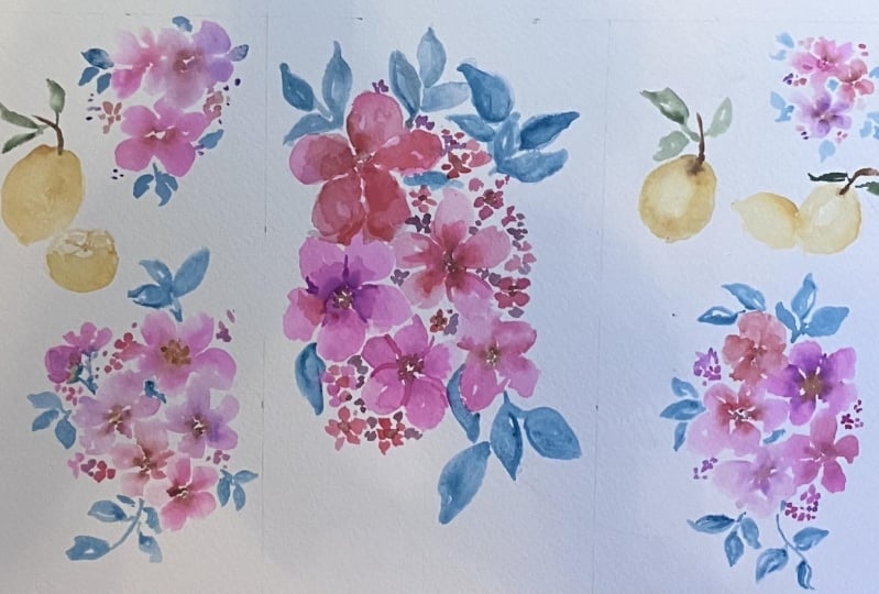
9. Final Doodles - Lemons: Okay. For our lemons, I'm going to zoom in
just a little bit. Using the number four, I've
got my Cadmu medium lemon. I'm just going to
do the arc first. Here we go, pressing
down, trailing off. Then I'm getting more
dmu medium lemon. Pressing down, trailing
off on the other side, then getting water on my brush, and we are painting this in. Feel free to leave a little bit of white space if you feel like. Then before this dries up, I'm getting some off my. You guessed it yellow ochre, and getting it directly from my color cake so that
it's a nice darker hue. I'm going to do a stroke
on the right hand side. Just like that, and then just maybe mix in a little
bit on the left. Using the same technique, I created another lemon and we used the Mars brown to create
a little stem on each, and now we're going
to go in and do some green leaves
using our green. Here we go. Reminder
how to do the leaves, start with the tip
of your brush, press down, and trail off. I like to do a little bit
of a twirl at the end. It gives you a nice little t. Perk perk almost
like it's dancing. I'm going to do one this way, curving around our lemon. This is what I was meaning by when your brush doesn't
have enough water, you'll see a little bit of
white space in between. But I really like
how that looks. I am going to leave
that in just like so. But we will be doing one more leaf just to make it a little bit more
different over here. Twirling my sheet. I am doing that fine pointed
tip pressing down, grazing. And we are done with
our two main lemons. We have the last lemon to do, which is half a lemon. Again, it's very, very
basic if we just do the drawing and then get
back into our painting. The oval shape. In
fact, you know what? I would like to make
this slightly slanted. I'm going to erase
this off. There we go. So I'm slanting my sheet now, and we're going to draw
this in like this. And then do our bottom half drawing for the base of this
or little.in the center. These are just guides for me, so I know exactly
where to put things. Now, washing up my brush
with all the green, we're going to start
with the on bottom. Again, this can be quick. We don't need a
whole lot of detail. I'm going to try
something new by leaving a little sliver of white here. And then getting some
of my yellow ocher, dropping that in onto
the right hand side. The shape is slightly changing, and that can happen sometimes. In this case, you
want to cover up your pencil drawings just
drop in more color really? Or hopefully it rubs
off at the end. Let's just see how that
goes. Getting some lemon. Again, going to close
up that top area. Draw our little lines in. This time, I think
I'm going to leave a lot more white space in between because I'm keeping
the sole loose at this point. Look how much white
space there is. But let's get a little bit of the yellow ocher
and drop that in. You can even wait for
things to dry up a bit if you really want to
get some stark results. But we're essentially
using two colors to give us detail in this
very loose style. So I went ahead and painted a little bit more at
the top on a lighter, looser, smaller scale, and
you'll see exactly why. I even added a little
extra fluffing onto the sides here just to
kind of fix my shape. I just wanted it to be broad there and then narrow
at the bottom. And now this is dried
up in that time. So we're getting ocher and we are dropping this
in around the edges, and then also for our ridges. And this is what's going to
give us that loose detail of where Our fruits part
or the fruit slices, You know what I mean, the
slices of the lemons, where one starts,
the other begins. Adding some yellow
ochre to the side here, just to give more of
a shadowy effect. And we are done. This is it. We're just keeping
it loose and simple, and we're not going in to too
much detail here for this. Now we can allow this to dry, and then let's get the
scissors to start cutting.
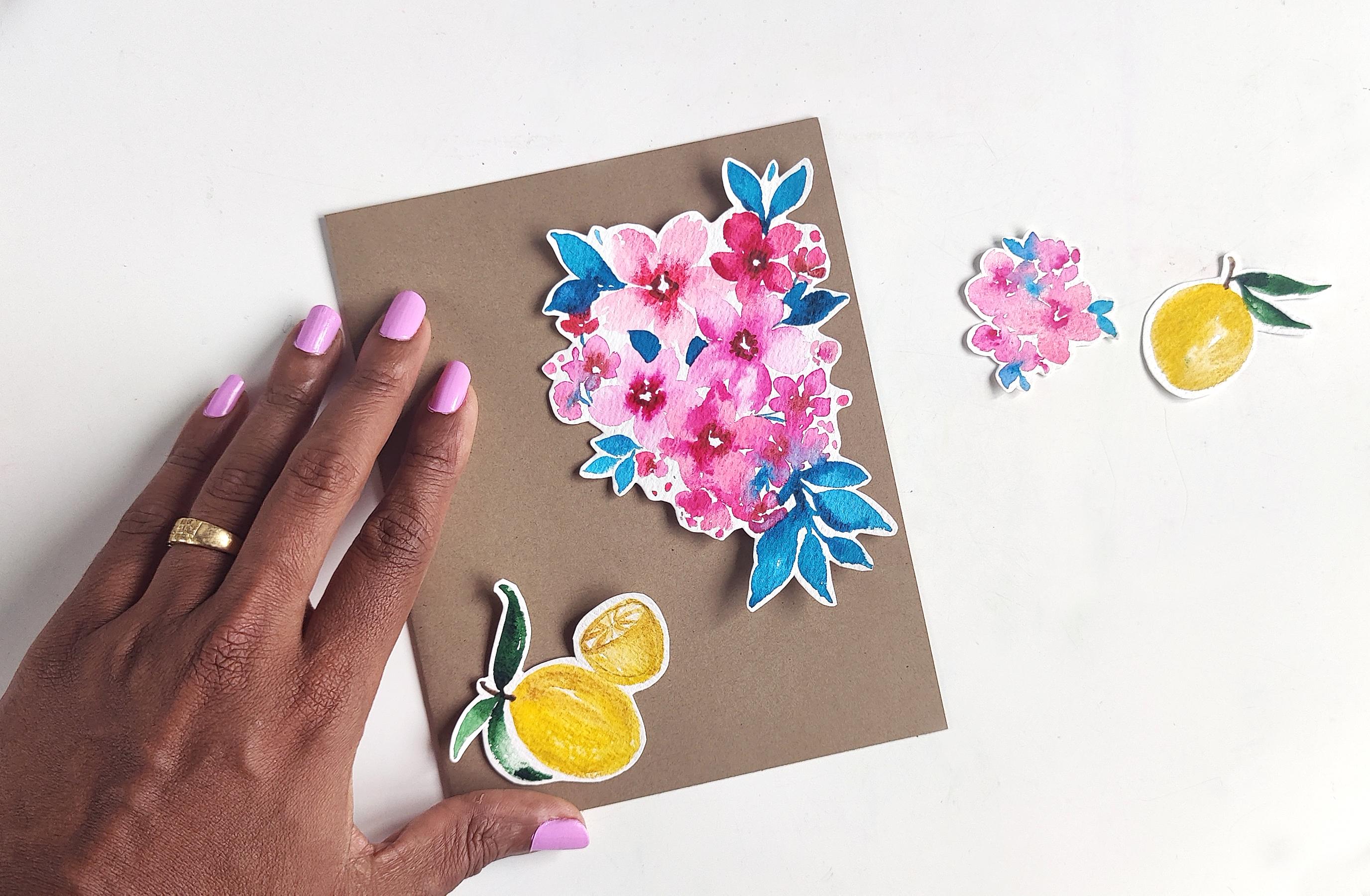
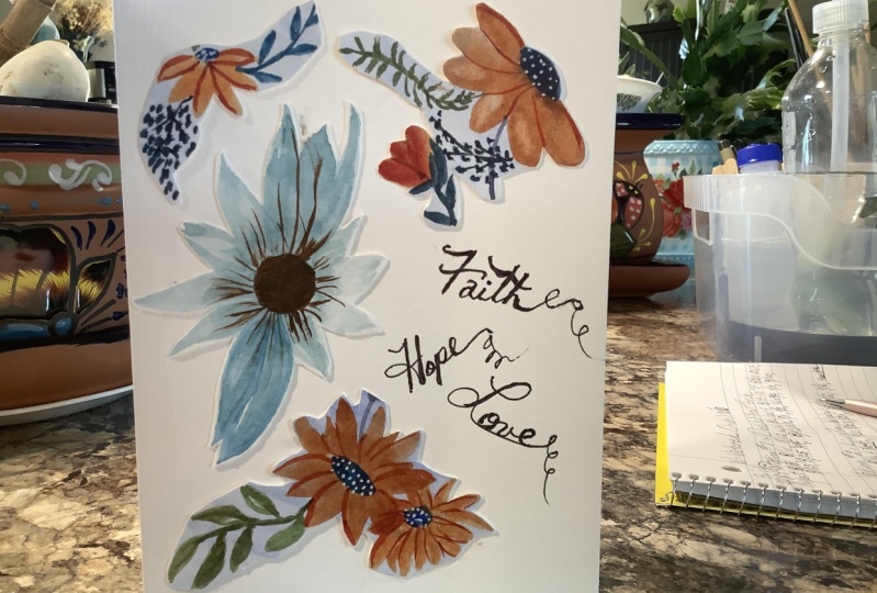
10. Craft a Card: All right, so everything
has dried up and it is now time to snip
snip. Here we go. I'm using a small pair
of scissors because it's just easier to cut, and what I will do to make
things a lot easier for myself is I'm going to cut out all these individually
first very roughly, and then take my sweet time, cutting each of these, leaving a little bit of white space just to give
it that nice sticker look. Let me just cut all of them
separately, like this. Then all we're doing is going slowly around our painting. Now, in areas where you've got
multiple things happening, just go around it roughly
and that should be fine. You don't have to
go around each and every stroke that's out there, and I'm going to show
you exactly what that means once I get to the flowers. But for this part, I'm just
showing you this here. Really quickly. I can just
perfect your areas like that. I'll give this a bit of a definition just to go
around my little branch. These end up looking so
cute and you're going to see that in a few moments
once we are finished, and you can literally do so much with and it's all
your own custom art. So you can trim some
more if you want to. But essentially, look
how cute this is. Now let me do the rest
and we'll be right back. Done with our two main lemons. We have the last lemon to do, which is half a lemon. Again, it's very, very
basic if we just do the drawing and then get
back into our painting. The oval shape. In
fact, you know what? I would like to make
this slightly slanted. I'm going to erase this off. There we go. And I'm so I'm kind of
slanting my sheet now, and we're going to So I'm onto the last piece
that I'm cutting, and I'm sitting here cutting. I was listening to some music, and I paused because a
thought came to mind. This action of cutting little cutouts of artwork
are taking me back. It's a very nostalgic moment to my childhood where I would
do things like this. I've always been
creative that way, and I'd like to create my own
cards and things like that. And it's just a very
aha moment coming to full realization how
a lot of what we grow up with in never
really leaves us, and just because you're a child and you're doing
things that bring you joy, doesn't necessarily mean
that when you're an adult, you don't quite like
it as much anymore, or you put away childish things. I know what the Bible
says about that, but this is one
thing I feel like that inner child is always
very happy to engage in. Just an aha moment for me. Here we go. We are done. I've got my four elements, and now we're going to be on
to putting them together. So now comes the fun part of
actually sticking these guys somewhere and creating something for us or for a loved one. So I have decided I had this colored paper that I had purchased for
cricket projects, and I had ton left behind. And I think these are
the three best colors based on what we have here. We've got purples. Like
this would go really well. Let's just cover up the rest. It could go well if you're looking for a nice bright feel. This is what that
could look like with the colors
against the purple. Then it also goes really well. With the beige, and then
last but not least. It also goes really
well with the black. So it really is a preference, just like color choices, just like our
watercolor supplies, our preferences of going light
or dark with our painting. It's one of those. Pick a color that you like for
your background. You could even pick white. Really loving this
color right here, the Bige that's what I'm going
to go with or going with the Bige what I will
do is make it a car And because the sizing
is a little bit, this was done very much
so a free style painting. So what I am going to
do is just try and match things about
as best as I can, and then place them into
a cute little card. So something like this maybe
with a message off here, which means that I'm going to
make this more of a square. I'm going to trim
some of this and perhaps put this little
guy on the inside. So let me just cut this
and be right back. Okay. So I have cut my sheet, I've even folded it. In half to make it a card, and this is what
I've come up with. You can also make it single, so then it's like a postcard
or even a bookmark. Then we're going to take tape. Feel free to use
glue if you must. I'm going to wrap the
tape around so that I can have it like this. Then I am going to
stick it on the back. Now, this is not a
permanent solution because obviously the
tape is not that great. But again, glue or even
those sticky tack things. I think those would
be a lot nicer. But for the sake of this tutorial and to
give you guys an idea of how to go about
doing these things and get you to think
more creatively, I am doing it this way. Also, I can always switch it
around if I want to after. So I'm placing this one here, and then I believe
this one was there and the lemons were sitting
on top like that. I'm going to do the lemons. Actually, let's do
the flowers first. Placing the flowers like this. You just look to the edges
and see how best you would like it placed because we just did the painting without really thinking much about placement, and that is That's the joy of just painting for
fun and going with the flow. Now, if you plan it better, if you've done this once and you want to do it
a few more times. Just plan it a little bit better as to where
you want to place it. When I started this,
I wasn't quite sure what my end
project would be. But for this project,
I want you guys to think about what
your project will be. Use this as inspiration to come up with other
ideas if you can, and if not, you can
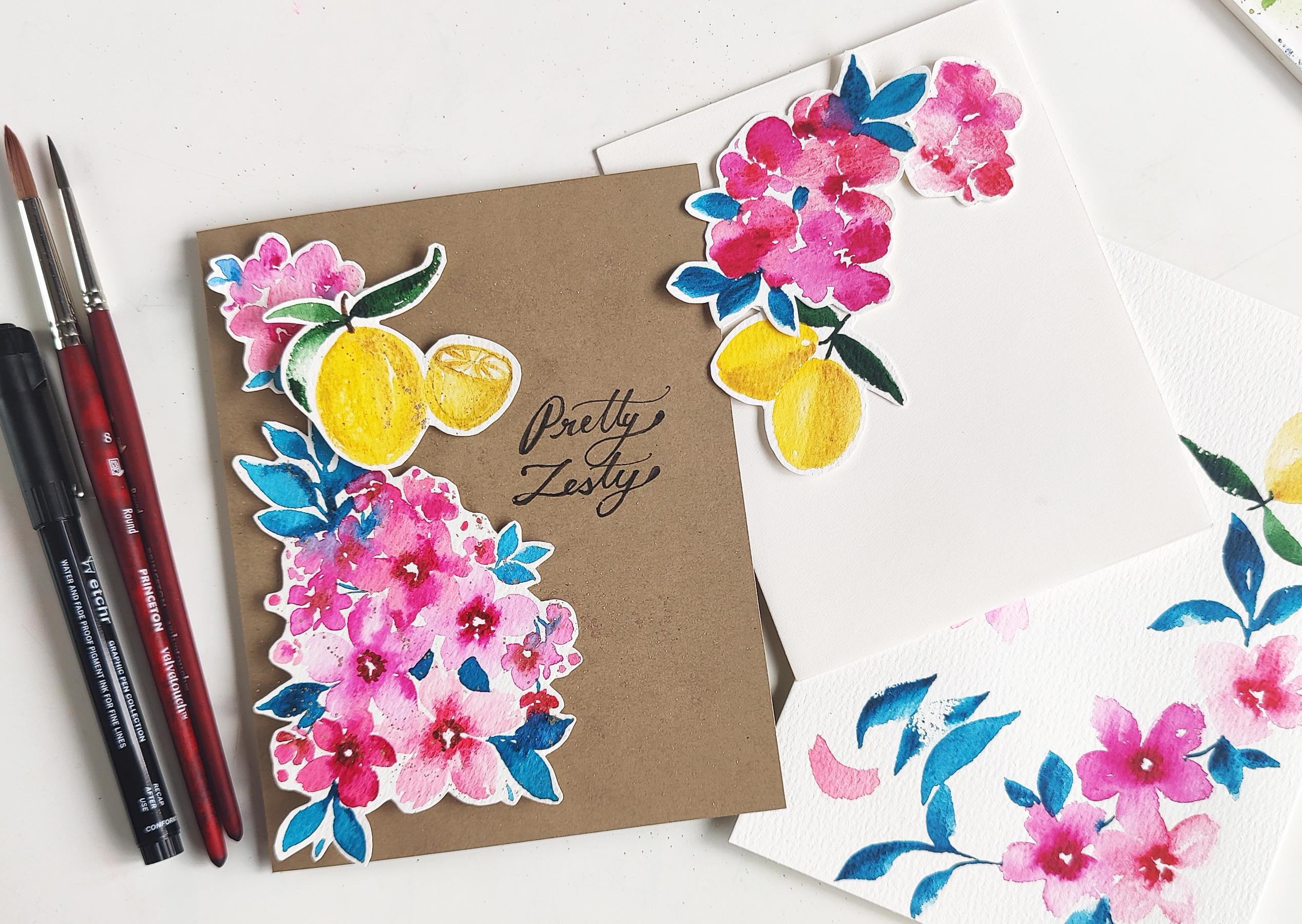
just do this one. There we go. We have our card. Now, for a little
bit of writing. In preparation for my writing, I've just drawn two little lines because we're going
to keep this simple, and the words I'm writing
is going to be pretty Zest. Pretty for the flowers
and zest for our lemons. For my pen, I'm the number six. I swapped it out because
the other one just wasn't working as
well with this sheet. And we are going to do a little
bit of modern calligraphy here. Here we go. Not the best with this, but we're going to make
this work somehow. And zesty. Now, at this point, if your transitions into one letter into another were not as smooth, I would suggest just going
in and thickening up some of the lines just to make things
a little more prominent. For instance, I'm just going
to go here and lightly the thicken it up
in certain areas. I'm going to thicken
up the ts as well. This is cheating if you're not able to get everything
perfectly on point. I've even rounded up the sides, I'm going to or the
ends of the ys. I'm going to round up the Z. And just thicken up the
rest of it as well, just to mimic the p. Yeah. The more imperfections
there are, I would say, don't feel like you have
to start all over again because remember we're all evolving into our own
styles of writing. The less we try to mimic something The more we can
claim that this is our style. I want you to get inspiration
from how I have written it and go with how you would write. We've come this far
in the project. I'm going to finish
off with adding a little bit of splatter
with our KMS metallics. But this is what it looks like
so far. This is the card. You can write your own little
personal message here. But here we go
with the splatter, keeping it simple and just trying to get a little
bit of glitter in here. The more water your brush has, the bigger the splatter. Keep that in mind and you
are not going to see too much happening from I guess
this regular camera on here. But once this dries up, I will do a little
bit of a close up so you can see how this looks. Here's what the
splatter looks like. It's still drying up a bit, but look how pretty this
little spray of glitter is. That is it, guys. This is the full
video on how you can take simple basic florals, Team it up with some
simple basic fruit. And create your own card. Well, this is a card. You can do it in so many
other forms as well, like I showed you or maybe showing you right
now the envelope as well. Look how cute that is. So many different ideas
when you are painting for fun and creating your own
little crafty projects.
11. Conclusion: If you have completed all
the videos with me so far, you should have walked away with the following key things. The amazing color palette
inspired by my trip to Italy. The loose techniques
that I use to get some loose simple flowers,
leaves, and lemons. Number three, the ability to use what you have doodled and put together a bookmark or something cute that you can
either keep for yourself or give to a loved one. Like I always like
to say, Watercolor is the gift that
keeps on giving. It's relaxing to do, and it's fun to give personal
gifts away to loved ones. Last but not least,
don't forget, guys, to please post your project in the project section over here so I can see your
beautiful creation. And also tag me in your social
media because once again, I would love to see it
over there as well and maybe even re share
it on my socials. Gratz Mila for watching and I hope to see you
in the next class.
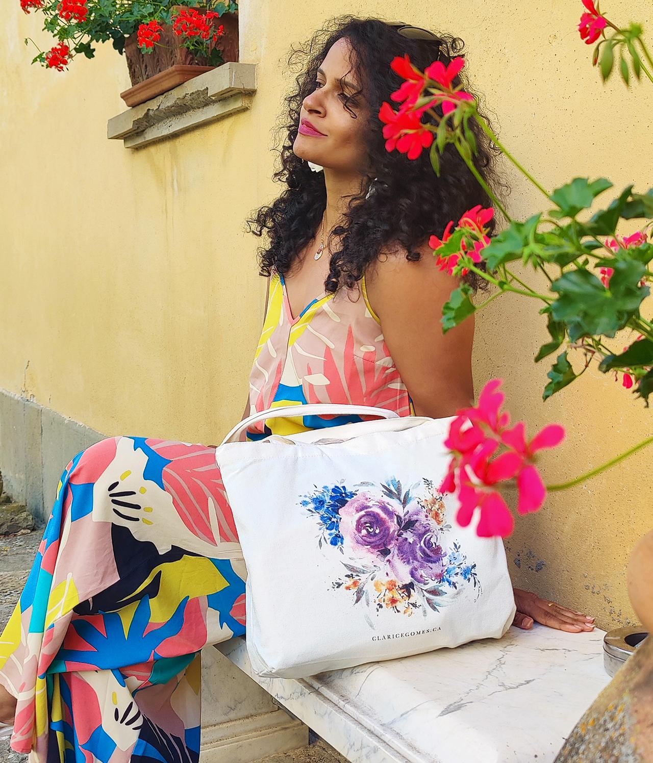
 Clarice Gomes, Go with the Flow in Watercolour