Transcripts
1. Introduction: Have you been struggling
with watercolor? You're trying to paint
these loose, fun, dreamy florals and you're
just not getting it. You feel like you're not getting the wet
on wet techniques, you're not getting the
brush control down packed, you're not getting
that white space, which is so important
in loose florals. Hi, guys. My name is Clarice and I'm going
to teach you how to go with the flow and paint beautiful loose florals in
watercolor. In this lesson. If you're brand new to
watercolor and you just don't know how this medium works and you're still trying to figure
out your way in the dark, I have a free download for you. I'm going to list the link in the description of the video, go check it out and then hop back on here
because you will be able to match what I'm seeing in the download
over here as well. A little bit about me. I
am a watercolor artist that teaches you how to go with the flow and paint
beautifully in watercolor. That is what my monthly
watercolor membership is called. It's called Go with the flow. And in this video, I am going to be
teaching you exactly how to do that by painting simple florals and getting
beautiful results. I'm also a Princeton ambassador
in Princeton brushes. Guys, if you don't know
prints and brushes, you got to go check
them out because they are economical
and they give you fabulous results
from a student level to intermediate,
pro, everything. Love them. Check them out. You're going to see me use
them in my videos as well. In addition to
teaching watercolor, I host watercolor retreats in beautiful places
like Tuscany, Costa Brava and just sharing that love for travel and painting loosely in
watercolor painting, and you really like everything
that I've said thus far. I encourage you to follow
me on social media. I am there on
Instagram and Facebook and couple of other
places as well, listing them in the description again in case you're interested.
2. Project - Learn to Flow in Watercolor: So for the project section
or portion of this lesson, I would love it if you
guys follow along, do all the videos to get you to learn how to paint these beautiful
florals that we're painting. And then once you're finished, put it together in a composition and share it with me in
the gallery section. I would love to see what you do. If you end up posting it
on social media as well, I'm there on Instagram
and Facebook, tag me so I can reshare. I love sharing your
work. It's always so encouraging to see
you guys do well. I love it, especially
when you guys go. I did this and I feel so
proud of myself that part. On that note, let
us begin, finally.
3. The Lesson - 4 flowers & 3 Leaves: [No Speech]
4. Supplies: So here's all the
supplies we're going to be using starting off with my Princeton brushes
because you all know I'm a Princeton ambassador.
I love these guys. And I also like to keep things fairly simple for those who
are beginners in watercolor. So I try to keep most of my lessons using the same
brushes or these two brushes, and that is Princeton
Neptune number six and Princeton
Velvetuch number four. For paper. Once again, we're using student grade
Canson Watercolor Excel paper. This is great for
students who are just looking to practice
and not break the bank. For colors, I'm using my
mailing set of colors. I absolutely love this. They're also very
economical and you get all these beautiful
colors in it. That's it for all my supplies. I've listed them in the
description of this video. There's also a PDF
download if you want to find links to where you can
find these beauties, right?
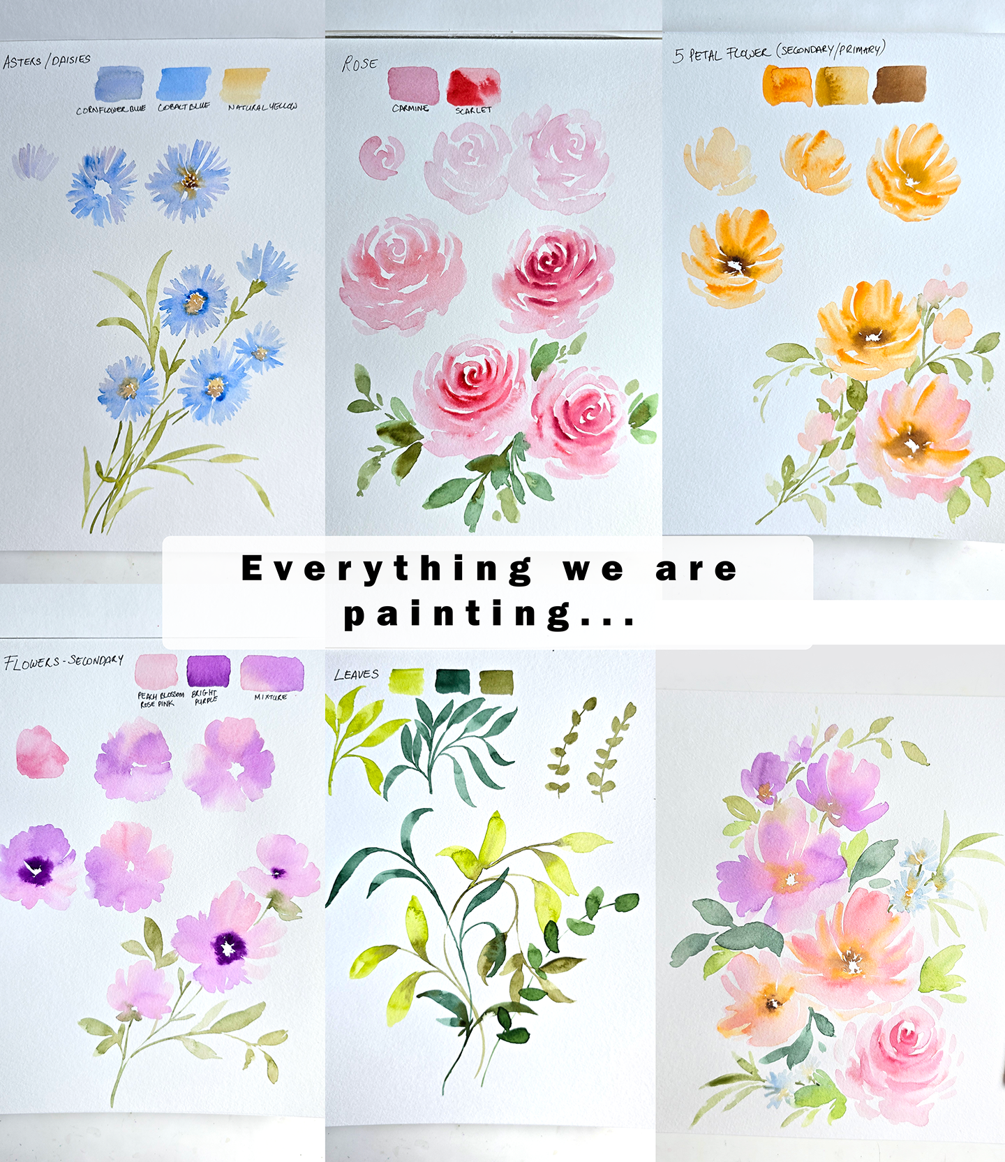
5. 1 Swatching Leaves: So the first thing we're
going to do is leaves. For colors, I'm going to swatch three colors that we have happening
that I've selected. We've got yellow green. I'm using my number
four and we're just going to quickly
swatch these colors right here. That's yellow green. Then we've got
Hooker's dark green. This is a great dark green for
darker foliage and leaves. Then finally, our final
color is olive green. These are all pre mixed
and ready in the palette, and I think they are
fabulous choices for leaves.
6. 2 Painting Leaves: So we're going to
start off with using the number four and I'm going to get some of the light green. We're going to do
or yellow green, and we're going to do a
couple of drills with this. The first leaf is the very basic one and also getting the stem, making sure you have
a nice fine pointed tip holding the brush about the midway point because that is important when it comes
to loosely painting. If you just lightly resting
your hand on your sheet, you can just do a
stroke like that for your stem and continue
to try additional. Notice how depending
on the pressure, you will get thicker
or thinner strokes. Be very mindful of things like that as you are
sitting down to do this. Then I like to start
from the stem going out. We can also start from outside going in. Let's just
start from there. I'm selecting my point
and pressing down, watch the fold span, and then
I'm going back on the tip. Then you can perfect your
shape if you need to. Showing you the
angle from this way, we're selecting the point
from the stem, pressing down. Notice how the
direction of my brush is off to the side and then
I'm going back on the tip. Now, I went super slowly just so you
could see and I could point out the little nuances when it comes to doing leaves. But it's much better result
when you flick of the wrist, do it very quickly as
opposed to sitting down and really pressing down
and trailing off slowly. Flick of the wrist is more
like starting from here, pressing down and trailing off. You get those nice
little loose ends. Really and truly,
the movement or the stroke you're looking
to do is starting from out. It can start off to the
side pressing down, and then trailing back off on the tip to the stem
or toward the stem. Or if you start from the
stem, you press down, trail off and give it a swirl or a twirl and this is how you can get nice little movement
in your leaves.
7. 3 Painting Leaves: Going to move on and
do another leaf, similar to what we've done here, same brush stroke that
we're going to be doing, starting on the tip, pressing
down and trailing off. That's how the leaves
are typically painted, especially when
you're doing loose. I'm now taking the
hooker's dark green, mixing it onto the side, and we're going to start painting leaves that
are slightly longer. I'm going to put
this palette here. Again, with the stem, using
the nice fine point to tip, holding your brush this way, you're going to start
go all the way down. What I want to encourage
you to do is lightly creating these stems
and extending them, create other mini stems, give it a twirl, give
it some movement. This is how you grow
your leafy structures. Now we can do another
style of leaves. What I'm going to do is
start from the stem. This time, I'm
pressing down longer, dragging and then trailing off. This gives us a nice
long looking leaf. Notice how I gave it a twirl. Again, start from the
stem, press down. And trail off. This one
I made slightly smaller. I'm going to do another
one starting from here, pressing down, trailing off. If you don't like
how the shape is, you can go back in
and just give it a little additional
stroke if you need to. Now these are looking extra perfect because
I'm going slowly, but say you had to
go really fast, you start on the tip, you
press down and you trail off. Notice the shape is
slightly different, and this is just getting
organic shapes in your leaves. Say I did two strokes there, I'm going to do
another one here. Extend that base of the leaf. Things like that. These are little tiny bits that
just come with practice. The more you sit down to
paint leaves like this, the more you're going
to be like, Okay, let me just add a
little stroke at the end because I don't like
what the end looks like. You can fix your little sections in your leaves if you want to. That's a control you do have that you can take
back or you can just let it be and just enjoy the experience of
getting organic shapes. Leave that entirely up to you, but this is how you would get added practice when it comes
to painting leaves as well. It's the same trick
of using the tip, pressing down, dragging, and then trailing
back off on the tip.
8. 4 Painting Leaves: I'm going to continue
using the Princeton velvetach number four for
even the third set of leaves. But you can do the same thing
with the thicker brush, which is the number six, if you wish to get bigger results. I just really love
this brush for leaves, so I'm going to
continue using this. The third color is olive green. I'm going to get some of
that olive green and I am going to mix it onto
this palette right here. This time, what we're
going to do is we're going to get leaves that are slightly different in shape. Think more like baby eucalyptus. The only thing that
remains same is getting the nice fine
pointed tip and then getting your stroke
in lightly grazing. Then what I like to do is
using the tip of the brush, I just like to add
little dabs like this and that's what's giving us these loose leafy structures, shapes that we're
going to be using towards creating our eucalyptus. I'm going to do a close up of these little strokes that
I'm doing so you can see how I'm holding
the brush and pay attention to what the
brush looks like. Nice fine pointed tip, we're going to add
a nice little stem. It's gotten a little
bit thicker because of the angle that I have
it at, but that's okay. Then again, watch
how I'm holding my brush and I'm just
doing strokes like this. Getting more water on my brush, pressing down, trailing off. Look at those beautiful
organic shapes that we're getting
for these leaves. You can even get more of
a circular look if you just twirl it around and
then leave it this way. Lots of great little
movements that you can do with your brushes to
get some beautiful shapes. Play around with it and see
what you're comfortable with and see which technique
resonates with you the most.
9. 5 Composition - Painting Leaves: So now we're going to take
a little bit of time, take everything that we've
learned up here and do a little bit of
freestyle painting with the two brushes and the
three colors that we have. This is a great way
to just play around, give yourself permission to
just go with the flow and embrace all the loose strokes and all the beautiful color
that we're going to be using. What I'm going to
do is I'm going to tag team with these two brushes. I'm going to start
off with this one. I encourage you to
really just focus in on getting getting a layout first where you want
your leaves to be. This will also help you
later on when it comes to composition and just
placement of things. It's just nice to be mindful of things like this
by just taking a simple composition of leaves and just making
it something pretty. I'm going to start
off with this brush and then use this one for color. Starting off with
the olive green. Then again, we want to focus in on getting some
nice loose strokes. I'm going to start like this and just go all the way down. And just really flow without a real plan of where I want this to go or
how I want this to look. For now, I'm just
going to go in with my first set of leaves. Here we've got an S. I'm
very happy with that. I'm going to get
some of that nice lime lime green, I believe, and same technique,
starting from the top and then pulling
down to the base. I'm going to make that thicker. I can start from the base, pull it outward, go
over it two times. This way you get a
nice thicker stroke. You're just allowing this to
act as not only practice, but also you figuring
out how you can twirl your brush to watch
this one right here. I'll start from here
and twirl it over. And then do that second
stroke to close it up. Have this as a time
that you just sit down to figure out how you want
your strokes to show up, turning your brush sideways, pulling it quickly,
sweep of the hand, like I like to call
it or flick of the wrist to get those
nice quick strokes in. If it doesn't quite touch
the stem, it's okay. You can go back in
and guide it along. Right now look at this nice beautiful array
you have happening. Let's add a little bit of the
darker green to this now. In fact, before the dark green, let's add some of
the olive green. So what if I drop some
of the olive green in the base of these and it gives us a beautiful bloom
because these areas are wet. Well, this one's
dried up. You can see it's just sitting there. But these ones right
here are still wet. That's why it's flowing
or just sitting on top. But for this one right here, because it's wet on dry, you can just take your damp
brush and pull that along. Now let's just add more leaves, but using strictly
the number four. Another way to get
more practice by just building on your
leaf composition. Let me just do that and then
pull one more out like so. I'm just creating
opportunities for myself to paint more leaves. Getting water on my brush now, I'm going to start
off from here, press down, trail off. Getting more color. I'm adding
more strokes like that. Remember to breathe, remember to just flow with the color and just allow yourself
to explore direction, pressure, all those good things. Look at these such
beautiful little shapes and really great
movement as well.
10. 6 Composition - Painting Leaves: So now we can go and do a
little bit more of these ones just to get it in that third
color that we're using, and then we can do a little
bit of eucalyptus to just see how we can get
some practice in and also make it part
of this composition. Now I'm going to go, let's do another stem like so. I'm just creating stems where
I feel is going to be good. Again, what we do is
make sure we have nice fine pointed
tip and then lightly graze on the sheet of
paper so you can get some beautiful thin stems. Getting some color directly
from that color cake, mixing it on here,
getting some water in it. Then let's create some leaves. Similar leaves to the long ones. Let's just start
from here, pressing, trailing, dragging,
and then going back on the tip once
we reach the stem. Let's do another one. This one I'm going
to start sideways, and then I'm dragging and then
trailing back on the stem. Let's do one more over here. You are the creator
of this masterpiece. You decide how long you
want the leaves to be, how dark you want them to be, what color you want them to be, how many of them you want
them to be, and just flow. That's how you find
your groove and grow in your creative
intuition and style. This one, I'm going to have it overlapping that one
and twirling down. This can be such a
zen experience if you just allow yourself some time to sit
down and just flow. Leaves are so fun to
paint and so therapeutic. I messed up a little so I added a second leaf right there. I'm mixing a little bit of
that olive green in here just to get I like mixing two different tones of green in my leaves
a lot of the time. This is me trying that. Beautiful. I love the
olive green mixed in with some of the
Hooker's green. Such a beautiful green
that comes out from it. That's it. This can be a little bit of
practice for you to take what we've learned and
execute and try it out. Notice this part here,
that area was damp, so the color just blossomed
into the base coat. That's what happens when
it's wet on wet or if you paint over an area that has
not completely dried yet.
11. 7 Composition - Painting Leaves: We're doing some
of the eucalyptus, I'm going to mix a
little bit of that lime green with some of the
hookers, dark green. I want to get a nice
No, it's not grayish, more of a medium tone to the green and create a different green just because we've used the first two here, and this would be nice
for the eucalyptus. I'm watering it
down quite a bit. I'm going to continue
using my number four. Let's just create a stem
coming out this way. Then like I mentioned,
with our strokes, we're going to make
sure we've got lots of watercolor on the brush and we're doing
strokes like that. You can drop a little
bit darker tones there just to have it bloom upward. Another stroke so literally, I'm just pressing
down and getting almost just shapes using
the full span of the brush. Let's do one more here.
I'll do some here. I don't want to overlap.
I always have anxiety ish when I try to overlap
these areas with other leaves. I'm going to keep
that to the last. This is pretty. I like the fact that
it's a little bit broken up and you don't see
as much happening. But it intersects really well, very nice and delicate, a nice fresh green and
complements what's happening in the rest with
the other two styles. This is how easily you can take three different
styles and just merge them together and get
some really cool effects.
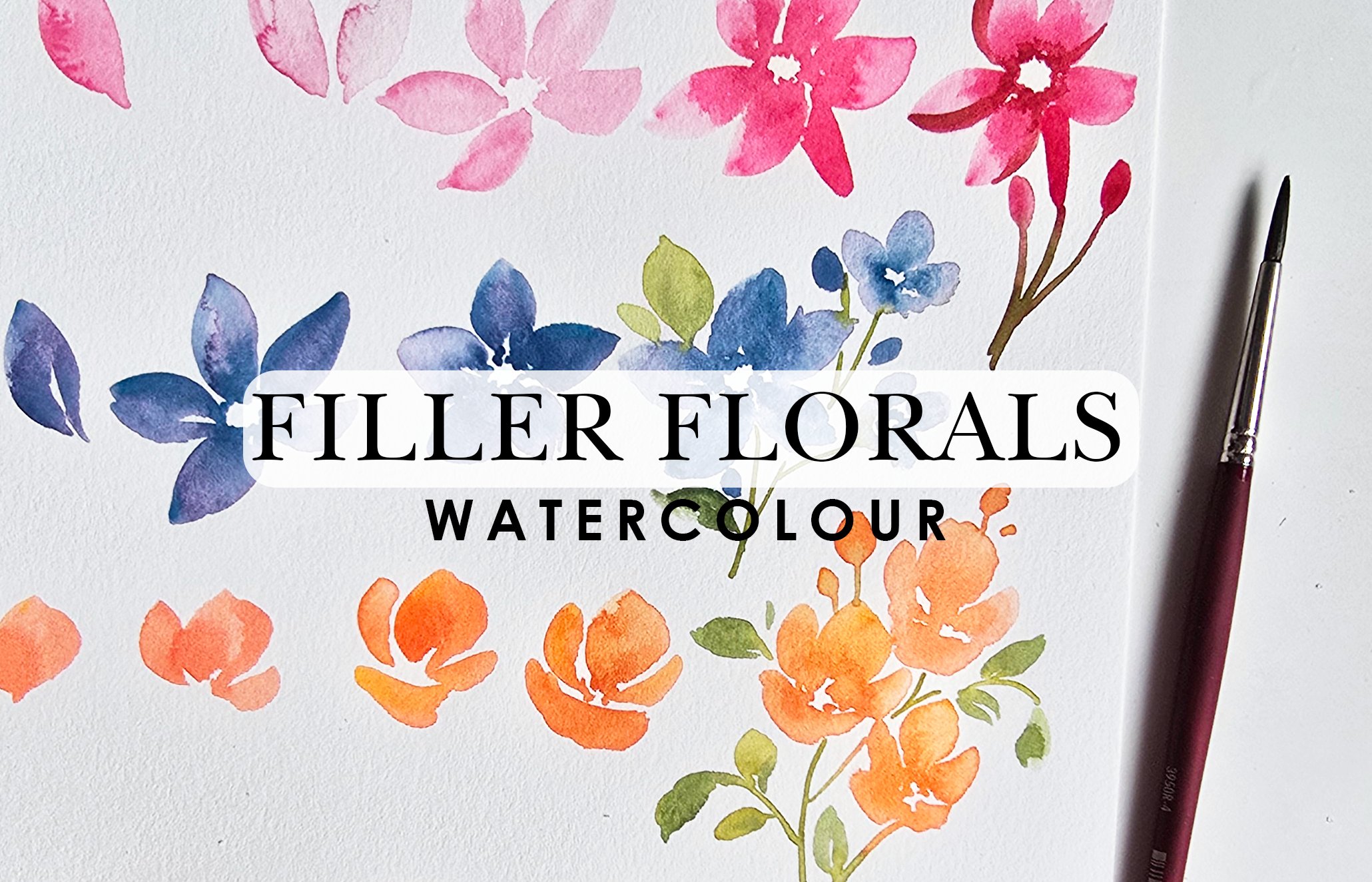
12. 8 Swatching Pink Florals: So now we're going
to get right into some beautiful loose florals. These won't be the main florals. These can also work
as filler florals and they are just going
to be absolutely dreamy, allowing you the joy of mixing colors and getting those
beautiful wet on wet bleeds. For our colors, I'm going to specifically use two of my
favorite delicate shades. We're going to be
using the rose pink. Or even the peach blossom
because they're very similar. I think maybe I'll do
the peach blossom and we will go with bright
purple, which is right there. Same thing with brushes, I'm going to start
off with using the number six because it's a nice thick brush
and this is what gives us some nice
coverage as well. This brush right here, the velvet touch, like I said, it works great for leaves
and things like that. You could also try it
for something like this, but we're going to use
this one just because it's nice and thick and it's going to give us the results we want. I'm going to start off by just labeling this chic right here
before we start watching. I'll just call these
secondary flowers. Again, you can use them you can paint these as
your main florals as well. This is just how I'm
structuring this lesson. We're going to start off with the number six and I'm going to take some of that peach
blossom, which is right here. I'm going to mix a little
bit of that over here. And then once I have
a 30 70 mixture, so that's 37% color, 70% water because that's what
we're going to be using. That's the blend we're
going to be using or the ratio we're going
to be using to paint. It's always nice to start off lighter and then add
color to make it darker. We've got our color on here and just like we
swatched right here, we're going to do the
exact same thing. I'm going to swatch the colors off to the side right here. This is what that
color looks like. It's a very pretty pink hue and I think it's going to go so well with that
purple. Here's the purple. What did I say it
was bright purple. Mix some of that on here. And that's what that looks like. Now I'll do one more
swatch and this time, I'm going to show you
what it looks like when the two of them
blend together. Getting some of that
nice beautiful pink, I'm just going to go back
and forth like this. Notice my brush is fully
on the paper and I'm going back and forth and then I'm
going to wash off my brush. I'm going to get some of
that purple and I'm slightly touching the pink
and I'm extending. You can see what that
looks like blended. It's actually quite
a pretty transition. You're going to just let it dry, but we're going
to get right into the flowers so we can start tackling the brush strokes
that are involved.
13. 9 Painting Pink Florals: So we've got some of the pre
mixed color on here already. The main stroke that we're
going to be doing for these flowers is like this. Getting some color on my brush, making sure it's nice
and full of color nice. This way, when we
actually do our strokes, it's not going to come short and give us those white spaces because that simply
indicates that there's not enough color on
your brush or water. So again, halfway point,
we're holding the brush. We're trying to use the
full span of the brush. This is what gives us
beautiful smooth coverage. You can go back and
forth like this and that can be your first
petal, for example. I'm just going to drop in a
little bit of a darker tone here so you can
see it for video. Then washing off, actually, I don't know why I wash my brush off because we're
using the same color. Now I'm going to show
you the next step towards doing that. We're
doing the same thing. Lots of water. Really this time, if you want to do simple strokes like
this and pull it down to form your petal, you can
do something like that. We've got that fly top. We've got two little
flanks on the side, giving us white space as
well that's beautiful. That's the loose look, now we go in for that purple. I'm mixing a little bit more of that because we
ran out of that. I want this to be muted. Lots of water on my brush and I'm going in
and this time I'm just zigzagging into that spot right there, allowing
it to blend. Now we're going to
just let this dry. What you can also do, if you
like the nice faded look, you can just add water and
extend it down and this way, you're getting that
dark to light effect, which also works and looks very pretty when it
comes to loose florals. Now we're going to
progress and do this a little bit one more time and this time really
paint the full flower. Getting that color on my brush, I'm going to go ahead and
do the same thing back and forth creating that beautiful
shape for my petal, push all the color
down to the center, and then roughly
washing this off. I'm just going to extend. This is something
slightly different. This is a different technique. We're doing the same thing. The only difference
is I'm extending to create more petals and now I'm going to go in
for that purple and now I'm going to drop
that in right here. I'm adding it on this side, a little bit on
the pink side too. I'm just going to leave
that because this is the whole wet on wet field
that we are focusing on over here to really
have the colors blend in and give us
that beautiful effect. Notice what I'm
doing right now with my damp brush, clean damp brush, I'm just pushing the
color down to the center, just in case you're getting those little straight
textured look, but you're not quite
liking how it looks. It's not that smooth.
You can just push it downward to the center
while it is still damp or wet because that's
your prime time to really direct and have a little bit of control over the watercolor. We're going to let
this dry for a bit. We're going to move
on to a slightly different variation
of this flour, and that is going to look.
Let's flip it this time. We're going to use
the purple first and then go in with the pink. I want you to really get attuned to really trying different ways if I show you one technique, try it backward and
see what you get from that because there's just so much to learn
from watercolor. I just hope that I'm giving you inspiration to sit down
and try these things. Starting with the
purple, I'm going to start that first petal over here and pushing all the color down and you can
flank each side by adding those nice
little strokes. I'm going to get most
of the color off. Then I'm lightly
touching with my brush, and creating more petals and just leaving this
open ended like this. Okay. And then I'm going to go in and get
some of that pink. I'm going to drop that
pink in right here. You can even drop
it into some of those purple areas to get a little bit of a
blend if you want to. You're essentially
pushing all the color towards the center. Like I said, if you wanted to
just take your clean brush and drop in some strokes, pushing the color down,
that is also something you can do and then just let
it dry a little bit. Now, if you really want to
add depth to this flower, notice we've got dark, we've got light. That's what
we're aiming for. We've got dark
areas, light areas, areas that are just
blooming into white. You want to add more
depth to the center. What I suggest is take
your number four, get some of that deep purple. Then you drop that into the center right when
it is still damp. Right now, some of these areas are slightly
between damp and dried. This is completely wet, you can see the difference in texture or the reaction of the color against
the background. It's really so important to notice these things
because that's how you know you can either get the
look you're looking for or avoid something that maybe you don't want to see
happening in your artwork. Again, see how these things
are just giving me a design, but do I really want
something like that? You can just wash off your brush and with your damp brush, just lightly pull it down. If you pull it upward,
it's just going to sit there and do a weird
dried up thing. I don't want to do all
that. I'm just going to push it down very lightly. Then this way, I'm
controlling the watercolor.
14. 10 Painting Pink Florals: Do one more. This time I'm going to start
with the pink first. Again, loose strokes to create
those beautiful petals, you're getting in lots
of practice here. This time, I'm going
to do another water down petal off to the side. Then now I'm going to get some of that purple on my brush. I'm going to go on
this side and really go loose with my strokes and drop in some of that
paint in between as well. Then I'm getting
water on my brush and I'm extending to
create other petals here. So notice how we
don't have a lot of white space in
between the petals, but what is working in our favor is the fact that we've got pink purple and then we've got super light blend of pink
purple happening over here. It's these little contrasts, contrasting nuances or details that really help that
loose look shine. If you notice even at the
top over here, or even here. It's the color or the
variation in color and tone that gives us that
impression that it's a flower, it's a different petal,
that's separate, things like that, light areas where maybe the light is hitting the petals, things like that. That's the beauty of
loose watercolor florals. The ability to achieve things
like that by simply using color and brush strokes or loose brush strokes and
white space, essentially.
15. 11 Composition - Painting Pink Florals: So now that we've
had a chance to practice a couple of
different variations, let's paint a sprig of these flowers along with
the leaves that we learned. Again, starting with
the number six, I'm going to start off
with that nice pink dipping the tip of
my brush in water, making sure it's nice
and full of color, holding my brush midway point. I'm going to go in and loosely
paint in at first petal, dipping my brush
and water again to get a more watered
down version of this. Notice how my strokes are
very whimsical and almost giving movement to the petals, getting some of that purple. I'm going to drop some of
that purple in right here, touching some of those areas, and then I'm adding it
at the bottom as well. I want to use this opportunity while these areas are
damp to really have this purple blending and give us those beautiful loose
watercolor effect results. Now I'm going to get
the number four, I'm going to get some of
that bright purple and I'm lightly grazing in the center with the tip and
going all around. Then we're going to
leave that as it is. We're going to
create more flowers. Same idea, get your practice in. This time, I'm going
to have this one maybe facing upward. Just like that. Then I'm going to get some of
that purple and drop that in that's my flower. I'm going to get
more of that pink. Let's do one more. This time now, I'm really
in the loose mood. I'm painting the full flower and then washing off
my brush roughly, I'm getting some of that purple and I'm going to
drop that in here. Perfect. Now, do I want to add
some to the center? Yes, I do. I'm just going to drop a little bit of that
over there to the center. This one can be as is just because of how we
have positioned it. Then taking my brush, we're going to get
some of the green and add some green details in here. I love the idea of adding
that nice dark green, but what I'm going
to do is mix some of that dark green
with my olive green because I think olive and this purple pink is going
to look super nice. Just a tad bit and I'm
watering it down again to a 30, 70 percentage mixture. 30% color, 70% water, this is so that it's
not overpowering against the flowers. So we're going to start off with that nice fine pointed tip, making sure we've
got tons of water. We're adding our stems. I'm going to give this a
little bit of a green bottom. Attaching this one down
here and then we're going to have one more stem like this because we've
got two flowers happening. That one at the top. Then again, see the green that's
happening there. You don't like that. That's
okay. Let's do this. Now suddenly we have a
leaf that's coming out. Very loose. Look how ambiguous
but organic that shape is, and then you can add
more little stems or little greeny bits that indicate leaves and other green elements
on the stem. Super simple. It's nothing
that you need to overthink. This is what it
means to just sit down and go with the flow. I'm dropping in some darker
tones just at the base. Get into the habit of doing
that because once you're used to how to get these
loose effects, the next thing you
need to do is get into adding little bits of depth here and there and this
is how you do that. Getting more water. Let's paint some leaves, guys. Here we go. Let's do
another stem right here. Leaves, not
overthinking, going with the flow flick of
the wrist to get those beautiful organic shapes. Et's add a couple here. Notice this is not even
touching the stem. It's just hovering in the air. That's what it means to
just have loose strokes and just not be bothered
by it, be unbothered. Find perfection in
imperfection, I guess, or what's the other
thing I like to say, Imperfectly perfectly
imperfect because that's what really
makes you stand out. It's these little things, the quirks in our artwork that almost acts as a signature. Embrace it, find what yours is, be encouraged by pieces
of artwork like this. When you do videos, when
you sit down to paint, it doesn't have to
look exactly like what you're you're watching. Take what you can
from it and then go with the flow and do
something that brings you joy because everything
might not bring you joy done exactly from another
artist's perspective, but learn the
technique and go out and then do your own thing. That's really it for
the leaves for this. We don't have to do too much. I just wanted to
give you an idea of what it could
potentially look like if you really tried to sit down and
paint these with leaves. I hope you've tried this. I hope it shines a little
bit more light on how to progress from painting flowers to adding a stem and then
giving a direction.
16. 12 Swatching Orange Florals: Moving on to the next item, which is going to be a flower, very similar to
what we did about, but we're going to take
it a step further. For this, we're
going to be using one color and that's
going to be well, maybe two colors because we want to have a nice deep center. I'm going to go for the
Orange, which is right there. Feel free to use any
other color that you might want to try this flower in. I'm
going to use the orange. I think it's a beautiful color and I love my oranges
teamed with pink, that will always be my go to. Here's what that looks like. Let me just write
the title down. Flower. Let's call this
a five petal flower. And it's still a
secondary flower. But it could also work as a primary flower.
I'm writing both. For the colors, like
I mentioned, orange. Beautiful sunny bright orange. Here's what it looks like
if it was very dark. Then for the second color, we're going to use
natural yellow. I'm dropping this yellow in because I think
it works so well. It's like a yellow ochre
and it works so well when it comes to giving highlights or even
adding centers. I'm just going to drop this in here and we're going to
see if we're able to team this with one darker
tone because again, when you add two different
tones to an area, you're creating
that nice contrast depending on the
color, of course. For the second color
that could go with this, I'm looking at burnt brown and over here,
that's over here. This is what that looks like. All these shades will go
so beautifully together. We're going to execute that and put that in
motion right now.
17. 13 Painting Orange Florals: Starting off with
the number six, we're going to get a beautiful
blend of the orange. For my petals for this flower, what I want to do is, again, we're sticking with
that 30 70 mixture, 30% water, 70% color, and we're going to
start off with again, holding the brush midway
point using the full span of the brush as we're
painting in our petals. I've done it in a 30 70 mixture. Let's
do this one more time. That's step one. Step two, Notice how I press down for
the first portion and then lightly
using the brush, I'm going back and forth and creating more additional
petals alongside it. Now the next thing I want to
do is get my number four, and I'm going to get some
of my orange directly from the color cake and I'm
going to start from the top and press down
while it is damp. Again, spreading it out. I'm not doing all of
them from the top. I'm doing some
areas from the top, but then leaving a lot of
white space in between. We're not painting
the entire thing. We're dispersing it out so that you see this blend
that's happening, the color seeping into
the water and blending, that's wet on wet or wet
on damp depending on how wet or damp your area is. But we want to give breathing
room because these act like folds or contrast
within your petals. That's the idea behind this. Now moving on, we're going to do the same thing again and this time we're going to
take it a step further. I'm going to show you how
that yellow or natural yellow is called, comes into play here. Getting some of that color, we're going to go
ahead and paint. Getting a little bit
of water on my brush. I'm enhancing. I'm going to get
more of that color. This time I'm going to do
more of a sweep underneath so and just very loose rough
buildup of the flowers. Now it looks like
it's pointing upward. We're now going to go in
with that darker tone, so I'm getting color
directly from my color cake. Before this dries up,
I'm dropping it in. I'm creating some nice
beautiful contrast and adding a little bit of depth and
direction into my painting. Okay. Once that is done, washing
off the brush briefly, we're going to go
in and get some of that natural yellow and
I'm dropping that in here. Now, this color is almost
on par with brightness. I guess, it's very
similar to the orange. It's very subtle that you see this little darker bloom
happening in the center. Now when we go in with
that darker tone, which is the burnt brown, it really enhances it and it gives us a really
beautiful soft bloom. Let's see what
that looks like in the fourth version or the fourth progression
of this flower.
18. 14 Painting Orange Florals: Okay, so here we go. Again, we're doing
the exact same thing, starting off with our petals, flanking those nice loose
petals on the side, dipping my brush in water. I'm going to get a little
bit more color as well. I'm going to progress and create deliberately
leaving white space in between to really hone in
on that loose florals, white space dreamy effect. This is what this flower looks like a bit different from this. You're never going to
be able to get the exact same thing and
you don't want to. You want nice variety
of different things. Now going in with this
for the next step, which is getting darker, some of the color directly from the color cake and dropping that in before
these areas dry up. Subtle giving us some
beautiful contrasting bits. Now, washing off my brush, I'm going to get some
of that natural yellow and I'm dropping
that in right there. I'm using the tip of the
brush and I'm creating little lines as I go all around the center
of this flower. You can drop a little
bit more if you want the bloom to the yellow to
be a little bit more stark. Drop a little bit
more color in there. Now, before this dries up, you want to get some
of that burnt brown. I'm getting burnt brown directly from the color cake
just on the tip of my brush and I'm adding it just at the base
of that yellow, maybe a little bit
into the yellow. You don't want to
cover up the yellow. The idea is to get some semblance of the
brown happening at the bottom, and then you want to see
it transitioning into the yellow and then the yellow transitioning into the orange. Now, again, the yellow has blended into the
orange really well here, so you don't quite
see it as much. But you can even
add a little bit of little lines bleeding
into the yellow, but not covering it entirely. Spacing those little lines out
giving adjusting the bloom or the texture that
you get and it just spreads out and opens
it up even more. If you compare the
two right here, this is muted and subtle. This now suddenly has so
much more depth to it and it just opens up the whole
flower on another level.
19. 15 Composition - Painting Orange Florals: Now let's put this into action, create a nice little sprig with these flowers and add
some leaves to it as well. Especially now that you have all the steps down packed,
you know exactly what to do. Here we go. Number six, getting some of that orange. I'm going to create
maybe three flowers or maybe two big flowers and a
bud or something like that. Making sure my mixture is 30, 70, I'm going to go ahead and create my first
flower right here. We've done this so many times. I'm not giving you directions. I want you to sit down
and try this or just watch me do it and
execute as you go along. Now I'm going to do the
darker tones within it. When you add your
strokes at a curve, you're mimicking the
shape of the petals, you're adding more movement as opposed to if you
were just supposed to add a straight
line or a stroke. Keep that in mind,
that is also very important when you're
trying to create movement and some beautiful loose get some beautiful
loose results in your work. Now, one thing I'm going to
make this a learning curve. Notice how these areas
right here are lighter, some are darker, some
are blending in. You can go in with your
clean damp brush and just lightly take off some color if you feel like it's too much. And this way you're maintaining some semblance of
white space and details without without really disturbing that whole
ecosystem of going loose. You're controlling
it, but not really. Just a little bit. Now, go
back in before it dries up. Let's get some of that nice
natural yellow, drop it in. You want to get that
before it dries up. Beautiful. Done very well. Let's go and get
some off the brown. Now for these two sections, because the base is damp, you're going into the color cake and getting the color
directly from there. That's what gives us
a darker tone when we are not mixing the
color with water, we're just getting it
from the color cake and then dropping it into a base that has water because
let's face it. This being damp with color
is pretty much indicative of the water content as
well on the sheet of paper. So keep that in mind. Let's move on to
the next flower. This time, just to shake
things up a little bit, what I'm going to do and
hopefully this inspires you is I'm going to
create another flower. This time I'm going to use
the scarlet, I believe. Yeah. I'm going to use a
little bit of scarlet, which we're going
to be using in the next flower we're doing. I have some of that
premixed here already. I'm going to start
my base off with scarlet and then I'm going
to drop in the orange. Same idea, same idea.
20. 16 Composition - Painting Orange Florals: Getting some of that scarlet, press, not pressing down, but really going
loose and getting some beautiful vase petals here. Then I'm just curving
these petals here at the bottom to show that
they are flopping over. Beautiful. Lots of white space. I like that. Now going to go in
and get some of that nice orange and I'm
dropping that in here. I love how these two
colors blend in. It's a little bit of a
pink with some orange. Again, areas like this, you can just take
your damp brush and blend it along so it
doesn't look weird. Then we're going in for
the center right away. Beautiful. Look how
pretty that center is. I love it. Then we're
going for the brown. If it seems like I'm rushing, it's mainly because
these things need to be dropped in while the area is damp for a beautiful
seamless blend effect. That's why if you think,
why is she rushing? Because this is integral. If you wait longer, you're not going to get a
smooth enough bleed, you might get some other results might not look that great. So that's why. What I'm going to do because I can is just add a couple of more strokes at the
bottom here just to fluff up this area. I don't quite like
how that area looked, so I'm adding that. Now it just enhances
it even more. Now we're going to go
in and add some, yes, we're going to add a
little baby flour. I'll just add a couple
here and dropping in some of that scarlet. I'm literally just adding dabs. These are literally dabs
of color, not much else. It's very muted, as you can see, so that it looks
like it's more in the background and it
doesn't fight with our focus for our beautiful
blooms that we've painted. Now we're going to go
in and paint some of the leaves and we're going to use the Princeton velvet touch number four
for the leaves. The Princeton number
four, we're going to get let's get let's get that mixture of the hooker's
green with olive green. Again, nice fine pointed tip, we're going to create
the first stem, second one, and you can have all the
little additional ones connecting if you wish. I'm going to add opportunities for leaves by opportunities, I mean I'm creating
little stems again. And we're just
painting the leaves. Love how delicate
and cute that is. Mixing a little bit more colors. I'm getting some of
that olive green, mixing some of the
lime green, sorry, light green, yellow green. My mistake. Then again, we're going to add Stince. You can pick and choose or figure out where you
want to have these. I love having things
flopping over just to create movement and give it
some visual appeal. You'll see me doing a lot
of these, a lot of those, a lot of little strokes like
this, lighter, just framing
21. 17 Swatching Roses: So the next thing we're going
to paint is going to be our primary flower and that's
going to be like a rose. For this, we are
using two colors. I'm going to be using dominantly the number
six Neptune for this. The first color we're
using is the carmine. The reason we use the
Neptune because again, it's a nice thick brush and it gives us beautiful coverage. Then the second color
I'm using is scarlet. Very, very pretty tones. If you go darker with scarlet, you can get something as
bright as this right here. V pretty color, as you can see, and so is the carmine.
22. 18 Painting Roses: Okay. So let's begin with the
strokes that we're using. So like I said, we're
using the number six. I'm going to start
off with using a muted version of my carmine. We want to start off very light this time. In fact,
you know what? If you want to go even lighter and make it like 20% color, 80% water, that's fine. We're using the
nice fine pointed, well, it's not fine pointed, but you want to use the
tip of your brush to create strokes like this. Now, what you need to do is make sure you've
got white space in between, as we build up,
so we've got one, two, the third one goes here. You want to maintain as much
white space as possible. Let's do that again. The first stroke goes like so, comma or C stroke. Then the next one hooks like so. Then as we progress, I like to go lighter
in tone and go opposite directions
to cover up the area. Again, dipping my
brush in water. I want this area to be
beautifully damp, not damp wet. As I'm building up on it, notice the white space
that I'm leaving. You want to leave
the white space, and this is how you're
going to get to pick and choose areas that you are going to
have stand out more. Again, we've done the second
one, let's keep building. The more practice you get
with this, the better. The more you do, I
promise it'll click, it'll make more sense. You're going to be flowing
before you know it. All you got to do
is just make sure you're listening to the little
details I'm giving you. Again, starting with
our little C curves and they never have
to be perfect. They don't have to
hook perfectly either. Then as you're
building, you're adding a little bit more
pressure on your brush so this is how you're
getting thicker strokes. If you have to watch this
progression a few times, replay this as many
times as you need. Now, what's going to
happen is at some point, you're going to have to decipher which direction is
this rose facing. If it's going upwards, you want the bottom to
be heavy and by heavy, I mean, have more
layers at the bottom. You leave that open ended with little tiny
strokes at the top, so that's facing upward. Then this is all the heavy beautiful
petals at the bottom. So you see how it looks like
it's in that direction. That's how you create
that illusion. This is coming awfully
close to this, but you get the
meaning behind it. If you really look at this rows, you can see all that bite
space is contributing to our brain deciphering which
direction it's going in, where the petals start, where it ends, all
that loose detail. Let's do it one more time. I'm going to do it at
the bottom this time. This time we're going to
add in some of the Scarlet. I think in carmine, but carmine is the base
that we're starting off with and we're adding carmine. Sorry, Carmine is the base. Scarlet is what we're adding in.
23. 19 Painting Roses: So let's go ahead and paint
the rose for the final time. It looks like we're going to
have to use another sheet for our little mini
rose composition. Starting off with our base coat, which is the carmine, I'm going to start
off with doing our two little strokes
and then pressing down for thicker strokes
as we're building up. I'm going to get some
water on my brush. I'm making sure that there's lots of white space in between. The top portion, this is
going to be facing upwards. I'm just doing very
light strokes there and I am extending the bottom to look a little bit
thicker than the rest. Less layers at the
bottom more at the top. And this is the whole rose. Now the next thing
we're going to do is get some of the scarlet. I'm mixing just a
little bit of it onto my palette because I want
to control the intensity. I'm starting off here, adding
it to the center for sure, then dropping it
as I go outward, and I'm pressing down and trailing to give little
swipes so that is important. This portion is important
guys so make sure you're making a note of that. Because as you swipe off, you're getting more of a loose effect when you're doing that. Then like I said, if you feel
like too much is blending, you can just lift off some color and then it won't
blend as much anymore. This is where we've
added the scarlet. I'm not going to go back in
and get some off the carmine. This time, I want it to
be more color less water. By now, this area has dried
up just a little bit. What we're doing is using
the tip of this brush, we're adding in little
strokes of carmine. And we're hugging the edges of some of these strokes where
the petals have started. This is just to show that the dark tones start where
the petals are overlapping. It's giving you that effect, it's a shadow effect. Now with my clean brush, you can smoothen out some areas that need to be smoothened, or you can go in with
your clean brush and lift off and dab onto paper towel
areas that could use a little bit of color variation. You're saving that over blend
that could possibly happen. Then again, if you
want to go in with a little added intensity
with your scarlet, I'm going in with the
scarlet and I'm going over the area where
I added the carmine. This is more controlled,
very shorter strokes and very selective in where I was
looking for the right word. I'm being very selective
of where I'm adding it, and this is going to be
the last area added in. Now all of a sudden you've got these little contrasting
areas that really jump out at you and just add something nice to your loose style of roses. That is it for the roses, guys. Take your time to sit
down and really make sure you're getting in
the right strokes, make sure you're leaving
in enough white space. Make sure you're
paying attention to the darkness
when you're going in that very last
step to highlight certain areas so that they
pop out more for your rose, and then you should be good.
24. 20 Composition - Painting Roses: So I'm going to take
this opportunity to just build up on this
rose because I like the idea of just keeping our lessons and the actual mini compositions in one spot, I think it's nice. I'm just going to
build on this rose, I'll do another one right here and then we're going
to add leaves to it, and then that's going to be
a little mini composition for the rose. Starting off with our
little tiny see strokes and then pressing down
to create larger ones. Dipping the tip of
my brush in water, I'm getting a slightly
muted version of the carmine and I'm
building up on my strokes. Okay. I'm pushing this color around here just
to make sure that it's moving along nicely. I'm going to leave
this rose as is facing a little bit
upward, as you can see. Then washing off my brush, I'm going to get
some of the scarlet. I'm going to drop
some of that in here while these areas are damp. This is what gives us
that nice two tone look with these flowers. O. I switched it up a bit. I should have gone
in with the carmine, but I'm doing the scarlet. Now I'm going to go
in with the carmine, so I'm using the
number four brush and then getting some of that color directly
from the color cake. We're going to go back in
here and I'm dropping it in. This is literally the
perfect dampness or wetness for us to get just those little areas dark and then it's slowly
blooming into the rest. Again, you're going to
find your sweet spot. The more you do it, the
more you pay attention to these little things
that I'm talking about. You will find it. You will know you can relate
exactly to what I'm saying, and then you can run with it. The only way to do that
is by giving it a shot. Try this as many
times as you can. I promise you each
time you do it, you're going to get
a lesson out of it. It's going to make sense to you. Again, washing off my brush, I'm clearing out
some of the areas to give me some nicer,
more controlled results. You don't go over an
area too many times, otherwise you will get not
the best smoothest results, but you'll get more
overworked look. Try not to do that. Then you should be
good. That's our rose. Now, we can add some leaves
to it and for the leaves, let's add some of that
nice hooker's green. Again, with my flowers
being bright all the time, I like when my leaves are
more muted in mixture, adding more water to them and just using a more muted color. I'm adding a stem so I know exactly where I'm
going to be placing my leaves, add another one. I'm going to add
extensions out like this. Then I'm going to use
this brush to give me nice thick leaves. I might even get a little
bit of that yellow green in my first leaf are. Then the next one here. You notice it's very leafy, but it still looks good. Now you can add some
at the top as well. Actually, I'm just
going to add one here. It looks like there's some emerging from under the flower. Pretty. I'm getting some of
that lime green on my brush. This is going to give me a
slightly different green. Notice how I'm adding
very simple strokes for my leaves and let's
do one in between. Dipping the tip of
my brush in water, I'm going to get a little bit of that olive green this time and I'm going to drop some of that into some of these leaves. And you're essentially
almost done. Very simple looking leaves, very much leaving it open for the viewer to find
the beauty in the roses, it's framing the roses and really enhancing
making them jump out. That's the whole idea
when you add leaves. It's supposed to be
an enhancement to your florals that really make your florals
pop out even more. If you wanted to
give some movement, you can add some
longer stems and some very loose looking
leaves emerging from it. And you are done.
25. 21 Swatching Aster Daisies: So now we're going to be
going into our final flower, and this is going to
be more like asters, a slight different variation in the typical five petal flowers. We're going to be
asters or daisies. Depending on the color
you pick for these, these could work as both. I'm going to pick more of a brighter tone and maybe
I'll even switch to lighter, so we'll see how that goes. The colors I'm using for
this are going to be blues. Specifically, we're looking at I got a little bit
of water on my. We're looking at cornflower
blue and cobalt blue. Two colors right there.
Let's get to it. The first one is
cornflower blue, and that's this light
one right here. This is what that looks
like, very pretty, subtle. I had a little bit of
green on my brush, so it's making it
look like a gray. There you go. Cornflower blue. Then cobalt blue is
this pretty tone. Both are very, very
nice for the petals, if you want to get a daisy
look or even asters. Then for the centers, you can use that natural yellow. I think that's very pretty. It goes well with these colors. That's what we're going to
be using for these flowers.
26. 22 Swatching Aster Daisies: So for these flowers, I'm going to use the
number four and I'm getting some of the cornflower blue first, mixing that up here. I got a little bit of that
purple mixed in with it, it's going to look
maybe a little bit mov. MV, not move. Here we go. Water down. The reason I'm using this brush is
because it's a thinner brush. When I do the strokes, it's going to be a lot thinner in comparison to
if we use the number six. This is why we use the number six for the roses because it's nice thick strokes and then thin strokes with
the velvet touch. All I'm doing is little
tiny strokes like this. Obviously, if you were
trying to do a daisy, it would be not as much and
it would be slightly thicker. Strokes like that. Let's
get a little bit more. Again, I'm muting my mixture a lot by adding
more water to it. Then as we progress, same thing. I'm going back and forth, thin strokes, thick strokes, some areas have double strokes. It's all good. Then
I'm going to get some of that cobalt blue, and I want to drop
that into these areas. What we did with the roses. Then actually even
in the first flower, then as we're going
all the way around, the zig zag continues. Lots of white space, lots of beautiful
wet on wet blending because we dropped in that cobald blue when
the base was still damp, now you're getting those nice two tones and
you're also getting a blend between the two
colors. Let's do that again. Mixing some of that tone,
the cornflower blue. Then we're going to start off with doing our strokes and I'm going to
do it really wide. Another tip in case you're new to watercolor and you
can't get that middle space, do your first few strokes
and then do this, and then dip your
brush in water, get a little bit
more of that color, and continue creating
the rest of your petals. Look how loose it is and don't stress the strokes too much, don't overthink it. That's what I mean
by don't stress. Just create that
repeated line pattern all the way around and
then once that's done, get a little bit of
that second blue, which is the cobalt blue. This time, what I'm doing is I'm going to mix a little
bit of that cobalt blue on my palette because I want to control
how dark it looks. Going in and I'm dropping these in while these areas
are still damp and wet. That is the best way to get these beautiful blending
or gradient effects within your flowers. Such a pretty effect, especially when you're
painting loose florals. This is where loose florals, the beauty of loose florals
shines because you're able to get these effects in watercolor. All right so once that's
done, wash off your brush. Let's get some of that natural
yellow and go in while it is damp and I'm lightly
dotting, adding little dots. I'm touching some of
the blue area too. I still leaving lots
of white space. What you're noticing is
now it's blending in. Now, when yellow and blue
blend, you get green. Even if you didn't
really get a green, do you really want this? Not really. What I'm doing
is washing off my brush, taking off added water, and I'm going to lightly lift. If you want to just throw caution to the wind and be like, Hey, I'm just going to leave
this because I like it. Absolutely. That is also
something you can try. I like this cute little faint halo of yellow
that we have. In fact, you want to take
this a step further, just go in for that burnt brown. I know I didn't put
burnt brown up here, but if you wanted
to really enhance your center a bit more, just sparingly add a couple
of dots of the burnt brown. In here and then leave that. That's pretty much how I would tackle these
flowers and I would do a bunch of them
and then team them with some of the leaves that
we've learned to paint. Let's try that here
at the bottom.
27. 23 Composition - Painting Aster Daisies: I'm going to make this so
whimsical and fun and flowing. Let's just see how this goes. So first, I got to make sure
I'm mixing the right color. Making sure that I put lots
of water on it so I can get that nice light base coat
and then we're starting off. Again, remember I said, if you're not able
to do that center or keep the center open and
you struggle with that, what I suggest is
start off with doing a very rough circle with dots
and then use that circle, go in with your brush,
go back and forth. And create these beautiful
strokes like so. Now I'm going to go in
with the cobalt blue. I'm going to drop
that in right now. Watch how much color you add, making sure that if the
areas are very watery, these areas are very watery, you're not adding
more water to it, but you're adding more
color less water. Something like that. Now again, I'm not going to
wash off my brush. I'm going to repeat
the same thing. I'm going to rely on the fact that I've used
these two colors to kind of have that tie in
for my end result. I'm getting a little
bit of the cobalt. This portion, the reason
I'm painting like this is because I want
you to see that yes, I've shown you a technique
on how to do it, but you can absolutely
mix and match and absolutely change
up your routine because this is such
a simple flower. At the end of the day, we
want to have a combination of these two colors and it needs to be wet on wet or wet on damp. You're able to
achieve this effect even if you do it like so. As long as you're getting your
dominant colors in there, you should be fine. I'm going to I'm going to
switch back to my technique. I'm going to get some of
this add my little circle. Then we're going back and forth. Very loose, fun.
Simple. Then going in with the cobalt and adding
that to our damp areas. Now, additional thing that
you can do if you want to, you can drop in
more of the blue at the base if you want to. This just gives you a
more intense center. Adding depth, very loose depth. I'm going to take
that leftover color, mix it in with whatever
leftover color I have and we're going to do let's do another
one here at the top. This one, I'm just
going to have it look like it's facing upward. I'm dipping the tip
of my brush in water. I'm going to create another
one just loosely over here. I'm getting some of that blue, I'm adding that to the base. This is touching the bottom
flour, but I'm not worried. My strokes are quick and loose. I'm going to add a couple
of loose water down strokes over here just to give me that
nice dark to light effect. Then you want to
add that center, a more intense center,
now's the time. Then let's add some of
the natural yellow. The first one we
painted was here, so I'm just going to
go in and lightly dab. And then a lightly
dab over here, too. All the flowers.
With the exception of that one because
that's pointing upward. Now, like I mentioned, if you see any seepage happening and you
don't really like it, you can just go in with
your brush and take it out. I'm moving quickly again
because I want to go in with that darker brown and get a little bit of that
nice shadowy effect. This time, what I'm
going to do just so that the brown is not intense, I'm mixing it a little bit
and then I'm going to drop it in that's good because I like this muted brown versus
the very dark at the top. This is where your
color to water ratio really plays a key
role because that's how you can get a
noticeable difference or a lighter result and you can
see that very blatantly.
28. 24 Composition: So I'm going to start off
with mixing some colors. We're going to do
the peach blossom. We are going to create some
beautiful flowers with this. Using my number six,
I'm going to loosely paint the first petal. Then I want to get that
second color in for that, we're using bright purple. I'm dropping this color into
some of the peach blossom. Then you can switch back to the peach blossom because you want to alternate
these tones. And you want the colors to
speak for the detailing. That's how loose florals work. When you allow the colors to
speak and tell the story as opposed to going in and adding
all those added details. Next one, I'm going to do
similar flour off to the top, getting some of that purple, dropping that in, loosely
allowing it to just flow. Now, if you wanted
to add any more of that peach instead of
adding the purple, I'm adding the peach
in these areas here. I'm going to do a little bit of this lilac color that I have. Let's just add a couple tiny
little bud like elements. You can drop a little bit of that bright purple
that we have in there. You can drop some within the flowers as well. I
thought that was damp. That's why I went
there and it dried up. I can't do anything there,
but you can drop some here. We've got our nice big blooms. Now we're going to go in
with the number four. I'm going to get some of
that beautiful olive green. I think olive green
and these colors are very pretty together. Muted because more
water, less color, I'm going to paint stems. Like those little
blooms happening, so I'm going to
leave them as is. Then I'm just going to extend to create loose petals that are flowing out and lighter,
smaller, very delicate. Now, these areas that
have blended in, you may or may not like them. If you don't like them, again, just take your clean damp brush and just lightly push
away or lift the color. Now, typically, every time
you do something like this, you need to dab it
onto paper towel so it transfers on there, but I was confident it
wasn't going to affect it, so I did what I did. Next thing we're going
to do is get some of that beautiful
natural yellow, and I'm just going
to drop some of that into the center of these two flowers because
these two show you the center. The others, you don't
really see the center. That's it for these flowers. Now we're going to add
more flowers to this.
29. 25 Composition: The next flower I'm
going to paint is the it's going to be a secondary slash primary
flower, not quite the main one. I'm using scarlet and this is a very pretty
sorry, not brown, peachy red, and I think
this goes really, really pretty with this
tone of pink and purple. For these ones, these are
my heart shaped flowers. I do the main petal first
and then I'm slowly flanking each side with
additional petals. I'm leaving white
space in between. I'm adding more
water to my brush. Then as we go lower here, I'm just adding layers
of these petals, leaving it open ended,
beautiful, and loose. Now, you can go in with
a little bit more of that scarlet and you can just drop some at
the base in between. I'm adding these strokes in the direction of the petals
to add more movement. Now you can also add an additional color
if you just want to go get some nice beautiful
two tones for that, I'm going to use the orange and you can drop some of that in and that's also
a pretty look. I'm using the number
four velvet touch and I'm lightly dropping in these little
strokes of orange. I'm taking the
color directly from the color cake and
adding that into my base coat or painted
area of petals and flowers. Perfect. That's what I want, and then we're going to add a center with the
natural yellow again. I think this is a great shade
for center of the flowers. Then before this dries up, I'm washing my brush off roughly and I'm
going to get some of that dark brown and then I'm dropping that into the
very base of this one. This one stands out a little bit more than these flowers
because of that. Then let's just do one more
of these pretty shades. This flower let me do it
off to the side here. I'm going to go
sideways, paint that in. Again, the whole
goal is to go loose, leave things open,
airy, fun, ight. I'm going to get
some of that orange. I'm going to drop that orange in so because look how
light my pink is. I'm going a little bit
darker with my orange. Disperse that
orange wherever you feel, you need to add it. Then some areas might
need a little bit of help like this. Go
ahead and do that. You can adjust things
based on how you like or what you're seeing
and just give it a shot. If it doesn't work out
for you, that's okay. Don't worry because
at least now you know the results you're going to get if you tried
something like that. Going back in with
that natural yellow, I'm dropping it in. I'm lifting a little bit of
that color off here just so that it doesn't
stand out as much. Then I'm getting some
of that dark brown and we're adding some of
that into the center here. I'm going to smudge
a little bit of this in so that it doesn't
stand out too much. Great. I like how
that is looking. I'm going to get a little
bit of that scarlet. I just want to add a few strokes in here just to make sure
we get that blend in. Beautiful. Now let's
add some leaves. This time, I'm going to
get my hookers dark green. Let's mix some of
that beautiful color. Then I like the dark green, but I still want it to be light. I'm going to be using
the number six brush to paint these leaves.
30. 26 Composition: As mentioned many times, using the number six brush, it's thicker, it's bushier, so it gives you a nice
full coverage and you're able to get some really
beautiful organic shapes. I'm picking and choosing where
I want to have my leaves. I'm going to get
some more color. Then let's just add a couple
of little areas right here. Beautiful. I'm not too
much of a leafy person. I would say, don't fill up
all the areas with leaves, leave room for other elements. Then if you feel like you've done enough flowers,
you don't need anymore, then you can maybe fluff it up with some leaves
and finish that off. Add a couple more
leaves to this. I'm using the yellow green, and we're going to let's add a couple over
here, for example. And mixing a little bit of
the hooker's dark green with the yellow green just to get a slight
different variation. I love my variations of green. Sure, I'm going to add it
right at the base here near the rose. H. And then just to have a semblance
of the colors all over, just adding bits here and there. Because why not?
This needs to look like one cohesive painting. Just dropping some
of those colors in so that it shines
through nicely. But
31. 27 Composition: Then I'm going to
add a little bit of those cornflower blue flowers. I'm just going to
add a couple here. Then I'm not getting
any more water, sorry, color on my brush. I'm just going to use this
to create a couple more, and this is what's going
to give us that nice faded dark to light look. As it's going outward of
the flowers, it's lighter. We just want that cute
fade delicate feel to it. That's what we're doing. If I'm going back
in to get more, it's just a hint of color, not too much, and then we can do the same thing to mimic that, do a little bit at
the bottom here. This can just be the one. Doesn't have to be several. Look how faint and light it is, it's barely visible and it's
going to dry up lighter too. Then we're getting
some of the yellow. I'm going to drop
that in. I should have probably mixed the yellow. Getting it directly
from the color cake has now made it very intense. What we're going
to do is just take our brush and paper towel
and take your time lifting. The ones at the bottom are fine. Yeah, that's almost everything mixing some of the olive green. Let's get some stems
here with these guys. And the leaves are
more grassy and long, so I'm just adding a couple
of those at the bottom. Then we can just add a
couple more at the top. You can add some here too. Use your creative intuition
for this part and figure out where you would
like to see these elements. I'm just going to
leave mine like so.
32. Conclusion Clarice: Watching this portion
of the video, you have finished doing
the whole lesson. I hope you had a fabulous time. If you had any questions at all, if you had any
positive comments, I would love to hear from you, find me over on Instagram, Facebook, wherever,
tag me in your work. I'd love to reshare. It's always so encouraging
to see you guys do well. Or even if you've got questions, something didn't work out for
you, I'm here to help you. Also, don't forget post your final composition in the gallery portion so I
can see how well you did. It's always so
encouraging to me. If you can leave me a review, I would absolutely love that. Thank you so much
for your time, guys. I am so honored that you chose this lesson to continue on in your
journey with watercolor. I hope it helps you
learn how to go with the flow and paint
loosely in watercolor. Thanks for watching,
guys, and I'll see you in the next lesson. Bye.
 Clarice Gomes, Go with the Flow in Watercolour