Transcripts
1. Introduction & Class Overview: So why do I like watercolor? I love watercolor because
I just love colors and I love watching the
colors just blend and flow. You know what else I love? Flowers. And if this is you, come watch this lesson because
you're going to love it. Hi, guys. My name
is Claris and I'm a watercolor artist
from Toronto, Canada. I first started out with
watercolor on YouTube by putting out basic and fun
video tutorials on how to paint loose florals. Any flower you can think of, I probably have a video tutorial for it on my YouTube channel. I'm also an ambassador for the fabulous
Princeton brushes, and so you'll probably
find me using a lot of your brushes
in a lot of my videos. We're going to start
off this lesson with learning brush control
and brush strokes. From there, once we are comfortable and we've
spent enough time getting accustomed
to our brushes and to the strokes
that go along with it, we're then going to move into the various elements
that we need to learn using what we have learned over brushes and brush
control and apply them. I'll be showing
you elements like the primary flower,
loose watercolor leaves. We're also going to be getting a little mini lesson on painting leaves using the
Princeton petals brush. We're then also going
to move on to painting regular leaves along with
our filler florals that really enhance our beautiful
primary flowers and then maybe a little bit of filler floral leaves
to finish off. Once we're done that session
of painting the elements, we're then going to take
everything we've learned and put it into a
mini composition. I want you guys to
paint along with me, learn along with me, and feel free to experiment
and go with the flow. This is the beauty of
watercolor where you're able to just flow with the color and get inspired by the
various blending that you see happening on your sheets and also what I'm showing
you in my videos. This is also how
you cultivate and grow your creative intuition.
2. Project Overview: Okay, so for the
project in this lesson, I would love for
you to obviously go through all the exercises we are going to be doing
over brush control, brush strokes,
learning each element, and then putting it
together in a composition. Now, you can feel free
to show me or post in the gallery section
the final image of your composition that
you painted with me. Or if you want to take
it a step further and do a little bit more
growing and flowing, I want you to paint by yourself based on what
you've learned and then put your composition that
you have done all by or lonesome over in
the gallery section, and that's going to
be your project.
3. Brush Control - Part 1 Thin Lines: Docks are so key and integral. It really does help
you get more practice, gets you better
acquainted with learning how the paper works
with the water, the color, then obviously
everything that we've discussed when I was showing
you guys the techniques. Here we go. We're going to start
off with pretty much just take any color you have really I'm starting
off with my number four. Now, brush control. Because watercolor
brushes are so soft, brush control is
all about lightly grazing across the sheet for thin lines and then
really pressing down and dragging off for
thicker results. Simply put, again, just like with the dabbing and
also the dotting, I like to rest the base of my hand on the sheet like this, reach out I'm just making sure it's a
nice fine pointed tip, but there seems to be
something at the end. There we go. Making sure your brush is nice, fine pointed to get
those nice thin lines, we're going to
start and go over. As you're painting,
just obviously go a little bit lower so you're getting those
nice stripes in, get more color when you
feel like you need it, and take your time
really exploring this method of
getting thin lines. This will help you realize when your brush
needs more water. I'll also give you little
results like that, which is fabulous
for loose style of florals or loose style
of painting in general. And you're just getting that
muscle memory in of just lightly touching the
paper and dragging along. Take your time doing this. It is a fabulous zen like experience, and then once you're done, we're going to go on to
the next thing.
4. Brush Control - Part 2 Thick Lines: For the sake of this exercise, I'm going to continue
using the same brush. I encourage you to experiment and try some of
the other brushes. I won't use the number eight, but I want to show you
guys the difference in when you press down
using the number four, how thick a stroke you can get. Now again, I'm going to
use the exact same thing. I'm using a different color, resting my wrist down here. Instead of going lightly
and trailing across, I'm going to press
down my brush. Let's start here, give
it a little bit of room. I'm not even pressing the full
span of my brush just like the first 25% of it, not even half of the brush, and this is how thick
a line I'm getting. Again, you can continue practicing until
you're comfortable. Feel free to throw
in little waves. It helps you get acquainted too. What if the line
was not straight? What if you had to
do little curves? How would that feel? Now, once this is done, I'm going to have you try one
more press down exercise, we don't need to do
the waves in that. I'm going to flip it this way. Now for this exercise, we're going to
really press down on the full span of the brush
and I'm going to keep this visible here so you
can see this one and then the next one that
we're doing and you can compare them side by side. I'm using some of the
olive green that I have. Let me bring that
on screen here. Getting a nice full amount
of color onto my brush like this and then lightly dabbing to the side to make sure you don't have excess
color on there. Watch how I press
down on my brush. I'm starting with
the tip and I'm just pressing down and
then trailing off. Now, the longer I trail, you can see that there's some white space in here
and that essentially means that I was running
out of color as I was dragging off,
especially at the edges. That's why it's giving
me the white space. Keep practicing so you can
really get comfortable with pressing down to
get a nice thick feel. This third time that I do this, notice how the bristles
of my brush fan out. And give me so much coverage. Now, I don't typically drag or go this slow when
I'm painting in my strokes, but for the sake of this
exercise and for the sake of alerting you in how you can get different thicknesses
by using one brush. I think this is a key
exercise just to get yourself better acquainted
with what is possible.
5. Brush Control - Part 3 Leaves: The next thing we're
going to do is the stroke that
we use for leads, and I'm sticking
with the number four and I've gotten a
good enough amount of dragon's blood on my brush. Again, colors don't really
matter for this because it's just a practice
exercise for you. Starting with the tip, I know my brush is nice
and full of water. I'm starting with the tip
and then pressing down, and then trailing
back off on the tip. This is what ensures
and gives me the tip at the beginning
and at the end, giving me a nice thick center. So again, starting
off on the tip, pressing down, and then
trailing back off on the tip. Just like with the thicker
strokes at the top, I don't typically go this
slow with my leaves, but this is strictly for your better understanding and I guess also visibility
of how this looks, how the stroke is
actually broken down when you are using
this for leaves, you could even use this
for petals, really. Go ahead and practice this. I didn't have enough water here, so you can always
add an extra stroke. That would be
considered layering. I'll do one small one here. Pause the video, practice
as best as you can, and then hop back on
here for the next one. The next thing we're going
to do is a leaf on a stem. We've done the thin strokes, we've done the leafy strokes. Now, let's combine the two together to get a
nice leaf on a stem. Nice fine pointed tip. I'm going to lightly graze
in an arc form or shape, and then making sure I got
enough water on my brush, I'm going to start from
outside using the tip, pressing down, trailing, and then trailing off onto the tip. The stem helps me understand
where the leaf needs to end. Now, you can also
do it the other way where you let's
paint the stem in, and then you start from
the stem and you go out. I'm going to start from the stem with the tip, press down. And then trail back
off on the tip. Both are totally fine. It's just a matter
of preference. Different people have
different preferences. Try both and see which
one works best for you and practice away because these are going to be a really good friend of yours once you start
painting your flowers. Similar to the leafy strokes that we've been doing so far, we're going to start
off with the tip of the brush or on the
tip of the brush. Press, I broke. Start off with the
tip, press down, back onto the tip,
drag a little, press down, and
back onto the tip. Again, just flowing and really practicing
the stroke so you can get better acquainted with the brush and
also the shapes. Starting off, pressing down, going back up again,
pressing down. I clearly don't have
enough water or color. That's why I'm getting
those white shapes or spaces rather. So I'm going to make sure I've
got enough water on here. Let's try this one more time. Sildly better. There we go. Now, you can feel free to go across a whole sheet of paper. I'm just doing these in little chunks to give you an idea of what you
need to start off with to get the ball rolling with the strokes that we're going
to be using a lot. These are great ways to figure out the little nuances that will help you in your
watercolor journey. Take your time really understanding these and
spending time with these so that when you do
progress onto how to paint a flower
or how to paint a certain flower or
composition rather, you have a better
understanding because you know how the medium works and you know your strokes
and you've done it and you've warmed up
and you're ready to go.
6. Brush Control - Part 4 'C' Strokes: All right. We are now on to, I save the pink for this. We're going to be doing
our strokes for flowers. Again, using my number four, mixing some of that
nice pink on here, getting good enough
amount of water. I was going to say a
nice chunk of water, so my brush is nice and full. For the strokes for the flowers, for example, the roses, for instance, I call them
see strokes or coma strokes, we're going to do
something like this. Simple enough. Let's
try that one more time. What I'm doing is
starting off sideways. I'm pressing down most of
my brush and then curving and then trailing back off
onto the tip of the brush. Similar is to
what's happening up there with the exception
that I'm starting sideways, so I'm not getting the tip, and then I'm curving, so I'm getting a
nice thick curve and then trailing
back off on the tip, it's giving me that comma
look or see stroke, whatever. Again, one more time. Now,
this time I got it more curved and that's mainly because I started off
slightly on the tip, so it gave me more
of a round center. When I started this
one, round beginning, when I started this
one right here, I started flat, so
it started off with that nice linear feel
to the beginning of it. Be aware of these little
things because they will help you progress
so much better. Pay attention again,
see how that looks. Then let me show you that
flat beginning again. If I started flat and
then pulled this way, that's how I got the flat
look. One more time. Now, if for whatever reason you don't like how
the edge looks, you can just go back in
and fix it. That's fine. But we'll get to that when we
actually start our flowers. For now, I just want
you to practice these little strokes so you get used to using the brush
and curving it this way. You want to do the flick
of the wrist to get that nice little
fine edge to it. Show it to you sideways so you can watch the
flick of the wrist. Now I have a lot of water here. You can see the little drop. I'm going to start and
then I just jerk upwards. That's what I call
flick of the wrist.
7. Brush Control - Part 5 Press Down Strokes: I also have some yellow here. I'm going to use
this yellow to show you another little
trick that you can do with your brush to
get leaves or flowers. Now this is very
basic, very simple. I really don't use
this very much, but it might come handy if you're just starting out
and you're frustrated and you're just trying
to ease up into things. I have my brush. It
is full of color. I've made sure I've submerged the full length of the
brush into the color. What I'm going to be doing is just stamping the
brush like this. I'm just going to do
it in a line actually. You could do it in a
circular format and then it'll give you an
idea of how this can very quickly turn into a
flower if you wanted it to. But little stamping like this or little stamps
like this using your brush can give you some very nice
pattern like effects. If you repeat them enough, can also give you a flower. Could also be little leaves. Lots and lots of great
ways to use it, I guess. Yeah. Practice this as well. Really get used to
pressing down your brush, especially the full
length of your brush. I think it is a
fabulous exercise to not only get a
feel for the colors, but just take away
the edge and repeat, not feeling pressure to get any fantastically
fabulous floral results right now, we're
just practicing.
8. Brush Control - Part 6 Petal Strokes: So we're now going
to progress onto another stroke that we'll
be using for flowers. Keeping with my number four, I'm using I'm going to use some of the yellow
and I'm going to mix that in with just
a bit of the pink just to get a nice
different color happening. Our sheet is nice and colorful. Now, I'm mixing something
that looks more like a 30, 70%, so it's 30%
color, 70% water. That's why you see me swiping and getting more water in here. This way, I can build up. A couple of things
that I'll be doing here is just using my brush to loosely get the same strokes that we have up here
with a slight twist. What we're going to
do is start off with the tip let me make sure
I got enough color. Starting off on
the tip, pressing down, trailing back off. Now, say I want to enhance
this to make this a really cute little thicker petal. I'm going to start
from the side. And go back this way. Now we have a thicker petal happening, that cute little
edge at the top. The whole idea is to use your leaf stroke that
we've been doing. Then we're just going in
with one more stroke, the exact same stroke
and pulling it downward. One more time. You'll notice the tops are different
each time I do it. You can start off, close off. Keep practicing
this because again, I feel like the more you
practice these strokes, a lot of them are repetitive and we're just adding onto it, the easier it'll get for you once you actually
start painting flowers. Now we're going to
do the same stroke, we're just going to
enhance it a bit. This time I'm taking
more of the yellow, dropping that in to get a slightly different
variation of color. Now I have more of
an orangy feel. Here's what we're doing. This time, I'm going to do one stroke and then I'm going
to add two to the side. Similar ish to what we
have at the top here, but you can maneuver
your brush to create these little frills along in your petals
if you want to. For instance, if I did
another one like this, all of a sudden now
my petal has one, two, three, four,
five little strokes. But keep in mind that
you're doing this while it is still damp and so you're able to build on to the shape of the
edge of your petal. Just another technique or
something that I'd like to point out so that
you're not wondering, how am I not getting
some nice petal edges? You can absolutely maneuver
and manipulate your strokes to reflect these nice
little frilly edges. It just takes a little bit of intentionality with the
strokes we're learning, and that's what I'm
showing you right here. In this one here I've left a
little bit of white space. Let's just say we
add a little bit of extra color at the bottom, at the top, get some nice variation of tones
happening in your petal. Then maybe even drop some of that dragon's blood in
there if you really want some stark difference
between everything. Although you could
absolutely use one color and with different
variations of mixes, watercolor ratios, I mean, you can get such a
beautiful effect. But you can also add
a second color that complements it or is
close enough to it, but maybe a darker version like the dragon's blood and it'll
look just as beautiful. A couple of different ideas to help you guys along because I'm sure your palettes
are full of color right now and you are
itching to paint.
9. Brush Control - Part 7 Petals: This last exercise, I'm
going to mix some of the blue and I'm going to take some of the pink and let's
make some purple. This is why I think it's so fun to have just a select
amount of colors so you can mix and match and get
so many different tones or create a nice
little cohesive look because you're using
the same colors to get new colors and it ties
in so beautifully, especially in a composition. I've got a very more color, less water ratio
going on over there, so I'm just going to
get more water in here. Now, what I want to show
you is more of a very loose feel a loose
approach to flowers. Say you got a very water
down color on your brush. You can actually start
off by just lightly dabbing like this and
spreading the color around. Then using the edge or
the tip of your brush to pull down the strokes. So you've got that
nice fili edge and you're pulling down
towards the center. Let's try that one more time. I am pressing down and going
back and forth up and down. I'm using this to my advantage the fact that
it's damp and all the water and I'm manipulating the shape to look like a petal. It's very intentional. It is loose because we're zig zagging our way
through things. I always love to drop darker tones right at
the base because then it draws your eye
to the center of the flower more
once you do five of them around. Let's do
this one more time. You can actually just
zig zag all around. I like to start lighter
and then drop and paint. This is our wet on wet. This would also be layering because the more you go in and drop in more of that color, those areas will be a lot more prominent and darker in
comparison to the rest. You're going to see
that in this exercise. One more time, my brush
is full of color. I'm going to press down
and wave and then pull the edges down and then light little strokes to get these nice little
indications at the bottom. Then you can get more color, drop it down at the edges of the flowers,
allow it to bloom, drop it down to the center, allow that to bloom, giving some nice tones, shadow effects
within your petal. I'm going to finish
off with a couple more Maybe just two more. Feel free to use the base with pink and then go in with blue after and just
watch the results. We're essentially
just doing the wet on wet or the mixing of
two colors that we did under watercolor techniques or the introduction to
watercolor techniques. Here we go. I'm just
going to do that to experiment here and give
you guys some inspiration. Here's my base of pink. I'm being extra loose
with my stroke. Then roughly washing it off real quick, getting
some of that blue. I'm going to drop some
of that blue in here. I have not mixed
this color at all. I'm just experimenting and I want to see what
this looks like. Now, you can see that the
blue has slowly turned into the purple with little hints of blue
happening still there. But once you wait for it to dry, it look more like a purple. Once you wait for the blue to blossom or bloom into the pink, at least in the areas
where it is still damp, you're going to see
a nice mixture. But these are the
little things to pay attention to when
you're painting. This is what helps you learn watercolor so much better
because then you're flowing and you're growing and you know exactly how
you want your flowers to look and you're more receptive to happy little accidents
like this or just learning curves as well because there's always something you can gain from every
time you pick a brush.
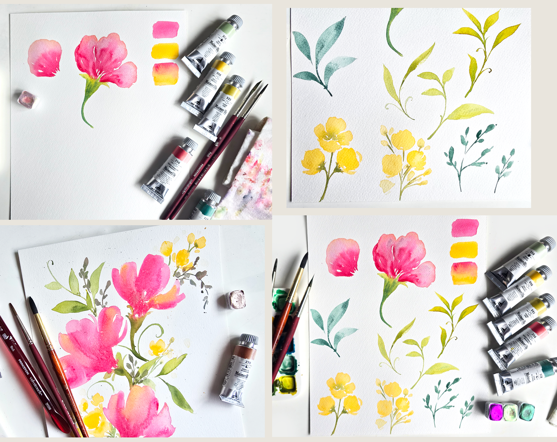
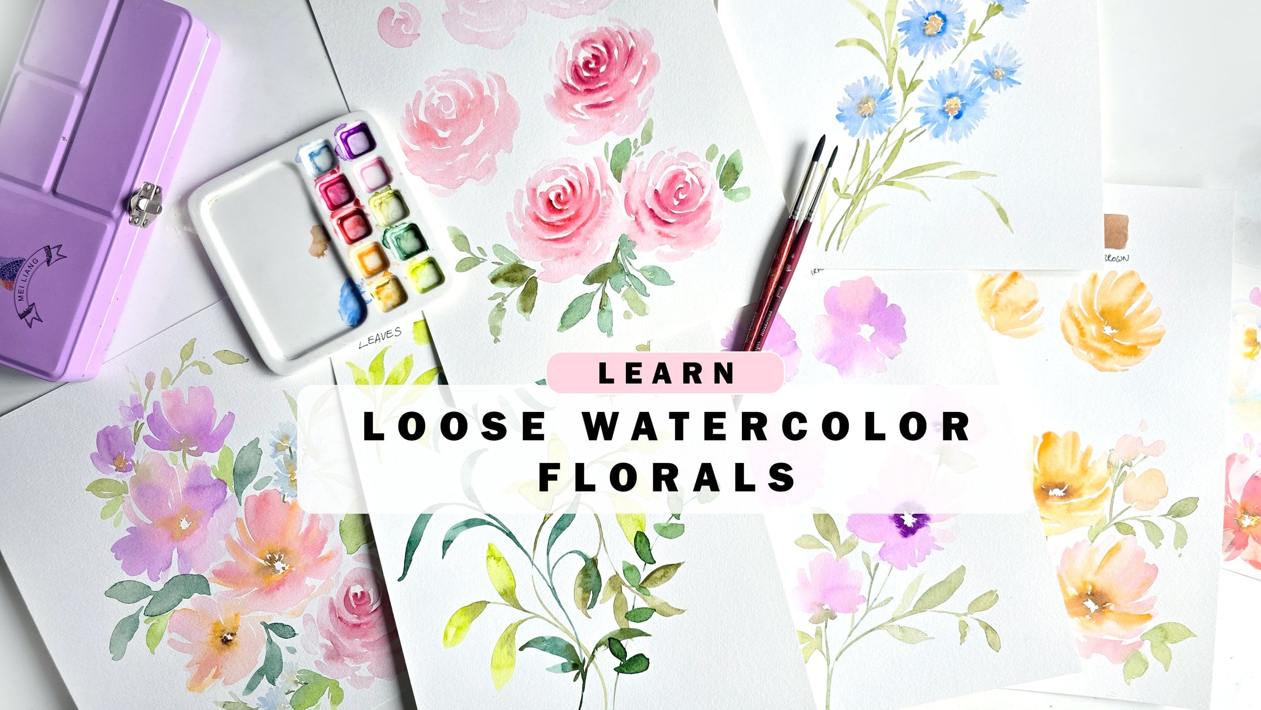
10. Elements - Supplies & Swatch: For this video, I'm going to be using the following supplies. We're using the Princeton
velvet touch number six petals, Princeton velvet
touch number four, and the Princeton
Nept number eight. I've got the following
colors handy here. We've got all these
mimary colors. We've got cobalt
green, green, gold, primary red magenta, Indian
yellow, and sap green. A couple of different greens, yellows and one pink. I also have the MIB metallic
watercolors in hummingbird, purple rain and fire opal. I'm unsure if we're going
to be using these two, but we'll definitely be
using some fire opal. I've got my palette handy. I've got some water
handy, and for paper, I'm using the strat more
500 series, 100% cotton. The colors you see over here are pretty much the colors
that I have over here, as I am mixing, I'm going to let you know exactly
what we're doing. The first thing
we're going to do is we're going to start off with the flowers that require a little bit of layering and we're going to
use a combination of two colors for this and also the Princeton
Neptune number eight. The two colors I'm
using are going to be primary red magenta,
and Indian yellow. Mix these colors, play
around with if you want more pink to show up or more yellow to show up
in your mixture. I am obviously partial
to more pinks, but I love that
beautiful peach effect that you can get by
mixing the colors. I'm likely going to be going with somewhere
along those lines, and then we can use yellow for another set of
flowers is what I'm thinking.
11. Elements - Wet-on-Wet Petals: First set, I'll start
by mixing a little bit of the pink with
the Indian yellow. I'm getting the
pink mixed up here. Then I'm going to
add some of that onto this side of my palette. I want the consistency to be more watery because
essentially what we're doing is we're
starting off with some very organic shapes
using the number eight brush. For example, I want to
hold the brush halfway up. This is how you get
nice loose effects. I want to make sure my
brush is full of color. We've got lots of color here or the mixture of color and water.
That's what I mean. 30, 70 percentage, maybe even 2080 where it's 20%
color, 80% water. Then I'm pressing
down and waving my brush around and then
perfecting the sides, edges, and then pulling it down. This gives me a petal,
wide at the top, narrow at the bottom,
and then this is the area where the
petal meets the center. I'm going to do little
using the tip of my brush, I'm going to do little lines to give us those nice jaggy
edges in the center. And you can also
fluff up the center or the sides if you
want even more. Now the next thing
I want to do is, how am I mixing this
yellow with the pink? Two different ways. I prefer mixing a
little bit of that yellow in with the mixture
that we have mixed already. Then drop that in on the edges. You can also by mixing
it on your palette, you're able to take more
pink in if you want, or take more yellow in. It's really entirely up to you. Now, I also like to see
different variations of this color happening within our petals. That's
what I'm doing here. I'm just dropping in some of the color on the edges and
then I'm pulling it down to indicate the little lines
or folds in our petal. The next thing I want to do
is add a little bit of depth. I'm getting more of
the pink because right now it's very light and we're going to build up on the color. I'm just dropping
more of the pink. This mixture over here is more
of a 80% color, 20% water. This is what gives us this beautiful bloom from
dark going out to light. Two key things, the
mixture of the color, which needs to be
more color less water when you drop it in here. Now this is layering. Well, it's not like it is
layering. That's number one. Number two is this
area needs to be damp. It doesn't need to be wet where there's a lot of water
and it's just puddles. We need it to be semi dry so that it gives us
this bloom as you can see. It's giving us this beautiful
bloom right into things. It takes a little bit of
science and a little bit of timing is obviously key. I'm going to go in and drop more of that red here in the center. This is how you build
up on the center. Say you are noticing that
it's drying up lighter, which watercolor typically does, go back in before
it's completely dried up and add
more of the color. I think maybe this
is my third time dropping in more of this color. See how we've got this
beautiful dark to light effect. If you want to add a
little bit more or sorry, not add subtract color,
take your brush. Make sure it's clean and
damp and you can lightly, start from the top, pull down, and kind of add a little bit of added
detailing within your petals. I'm starting from the
top, pulling downward, trailing off so that I get this nice faded
line into the pink. This is just to show you how to take away color
should you need it. That's pretty much
what we're going to be doing for our first flower. We're going to be
adding details like this and making
our first flower. But this was key so
you understand how the dynamics work of mixing when it comes to wet on
wet and wet on damp.
12. Elements - Wet-on-Wet Petals 2: So now let's take what
we've learned about mixing two colors and getting
these variations in gradients happening on our petal take what
we've learned here and maybe add two more to the edges and create a
flower that's sideways. Here's what I'm doing.
I'm going to start by getting my number eight. I'm going to get my loose
light pink or magenta, and I'm going to make sure lots of water
and we're going to go ahead and start our first petal. I'm going to press down, really get some nice
organic shapes. And then do the little
lines at the bottom, pulling down, almost like a heart shape or maybe
a teardrop shape. This is where the
petals will merge. Then I'm going to add because I've got pink
on this already, I'm going to add some of
that pink right away. I don't want to waste color. You can absolutely
do the pink right away if you have that handy. I'm dropping in more pink here. And pulling down
more of the edge. Now I'm going to wash
off most of this. I'm going to get some of
that peachy hue that we have mixed and then I'm
dropping that in at the top. Essentially, the two steps
that I've shown you here, you don't have to go in order. As long as you get to doing them before the area dries up, you should be fine and good. Now I'm washing off most or wiping off the color
from my brush. Let's try and get a
couple of lines in here. I'm just going to get a
little bit of linear action. Now I'm going to
go and progress. Let's do the next petal. This one can obviously
be off to the side, we're not doing it as
wide as the first one. It can lightly
touch this one too. That's okay. Then let's just get some of that peachy color right now because I have some of
that on this brush. Then let's get another
one happening here. I'm just going to tackle
this right away so that we get this out of the way and then we can
move on to the next thing. Again, time is of the essence, so I'm moving quickly. Feel free to do it one petal at a time if that suits you better. Now I'm going to get
some of that pink. Drop that in right here. I wanted this to be a
little bit more organic, so I'm giving that a
little bit of a curve, dropping more pink here at the base. Perfect. Now we have that
done and now we can join it up with some green
or before doing that, if you want to add
a little bit of the fire opal, this
is your chance. I'm going to activate
some of this color really quickly and
then drop it in. You can drop this in while the area is damp like it is for me right now and I'll give
you a beautiful bleed, just like we have
been getting with that second color every time
we go in and add that in. This is again, an optional
step if you would like to get some nice glitter
happening in your flowers.
13. Elements - Wet-on-Wet Petals 3: So now I'm going
to get my green. We'll use we're going to use let's get some
of the cobalt green. Actually, I have some over
here. I think I have enough. Then we've got green gold. I also have that. I don't need to get any more of these colors. Let's get some of that
cobalt green mixed up. Then I'm going to get
some of the green gold. I'll start off with green gold. Again, the basic rule is start off lighter and then
you can build up. I'm mixing this and I'm getting water on
the tip of my brush. Then I'm going to go in
and add this color in. We're going to do that
basic green portion that's below the flour. The name evades me. Let me know in the
comments if you have it. I'm just doing this. That's all I'm doing. It looks like a very tropical flower, loving the feel and then I'm just going to dip
the tip of my brush in the cobalt green and let's add some of that
to the very bottom. I love having two
different variations of green in my artwork. I just feel like it's so beautiful when you see
different variations going on. Now, over here, I
noticed that I didn't really mix the color
on my palette. I just added it to this and
I'm allowing it to blend. You'll notice little
areas like that where it just stops and gives
you a little pattern. You can go in and mix that so you don't
get a weird pattern. I'm getting more off the
cobalt green and I'm going to finish off with a curvy
looking stem like this. Now, again, you can wash off your brush
and with just a damp brush, pull down the color so
it's mixing in with the rest and you're getting that nice gradient just like
we did with the petals. We've got a very
beautiful gradient happening with our
petals and we've got a beautiful
gradient happening with this portion of
the flour as well.
14. Elements - Petals Brush Leaves: So the next thing we're
going to do is leaves because we've got the greens good and ready to go already, we're going to go ahead and
do the leaves really quickly. For the leaves, I'm going
to be using dominantly the number four and
the petals number six. So let's start off with the petals brush because if you're brand new
to the petals brush, this might be very
fascinating for you to see. It's one of my favorites because it's got this beautiful
fine pointed tip, and you're going to
see exactly the kind of results it can get you. So I use the nice fine
pointed tip to draw in my thin lines and this is great for little tendril like effects when you're
painting leaves. What I like to do is make sure that when I'm painting
the leaves themselves, make sure that the
longest portion is up because it's a triangle, the longest portion
is in one corner. I make sure that's up when I'm painting for lack of a better way of
explaining that. Then let's just say we
paint let me do it here. Let's just say we paint
a stem like this. Look how fine and thin that is. I'm going to get more color. Let's just paint another
one coming this way. I'm lightly grazing. If you've done the
brush stroke exercise, that'll be helpful,
especially with this brush because you can
get such pretty effects. Then you can do little
curves like this to get your little tendril effects. And obviously your
main stem needs to be a tad bit thicker so
I like to go over it. Then for the leaves, I start off with the
longest at the top, press down, and then trail
back off onto the stem. Now, I like to get a lot
more water on my brush. Then I also like to flip it
where the longest portion is right at the
bottom and we've got that flat portion of
the triangle there. Then I'll start from
the out, press down, and then trail back
off onto the tip. If you notice if I do
the longest portion up, it gives me this thin
dainty petal or leaf. With it the other way, it gives me a thicker
result because the bristle seems to span out a lot more when you have the
longest portion under. Look at that. You
can take your time doing these little petals. Do you a little
stem, press down, and then slowly trail
off onto the tip. You don't have to
go super quickly, especially if you're new to the petals brush. Take
your time learning this. It is a fabulous brush,
practice a little bit. And then you can add some
leaves to your flour. I can't stop myself from
painting leaves. I just love it. Now, if you want to add
any more color to this, just like we did
with the bottom of the flour, take the number four. We've got some cobalt
mixed up already. This time, let's go
the other way around. Remember, I added the cobalt right into this color
without mixing. This time, I'm going
to get a little bit of the green gold and mix it
with the cobalt on the side. You're going to see
the result is going to be a lot more smoother. Prettier, maybe, I don't
know about prettier, but maybe more natural looking than this where
it's really darker. I'm introducing you
to different ways of how you can go about doing watercolor and how you
can go about mixing paint. These are all fabulous ways. There's no really
right or wrong way, but as long as you
know this is possible, that's my end goal
here with this lesson. Now this area has dried
up quicker so you can see it's more of a wet on
dry stroke happening there. You can just take your
brush, wash it off, take off as much
water as you want, and then just blend
that color in. Again, if you are picky
about things like that, if not, you can just
leave it as this. But look at that beautiful
delicate gradient we have happening
in this, pretty.
15. Elements - Regular Leaves: So the next set of leaves, let's use the number
four, and this time, I will use my cobalt
green and same thing just like with these
leaves and the petals, we're going to start off
with a lighter color or mixture of this color. Then starting off with the tip, you lightly graze to draw in your stem so let's
just create one here. I have a lot of water. That's
why you can see it's a lot thicker and then I'm
going to start from out, press down, and trail
off onto the stem. This is exactly what we did with the brush strokes
video for leaves. We did the one stroke and then this is me doing
the two stroke. Now let's enhance on this because I don't want too many leaves
happening with our flowers. I would prefer if the flowers
remain the main focus. I'm giving you ideas on how
you can make these leaves a little bit more whimsical. What we're doing is
I'm starting from the tip here and then
I'm pressing down and almost going sideways to give it a little bit
of a curve and then bringing it down to the area
where it meets the stem. Beautiful. This is giving it movement as opposed to just
painting it straight on. Take this as inspiration on
maybe pausing the video and trying curving this leaf stroke so you can get better results. The next thing you can
also do is make sure you maybe you've got one leaf that's just stand alone doesn't
really have a stem, but it's implied,
something like this. You can absolutely do that. Everything does not
need to be attached, especially since we're trying to go loose and not super detailed.
16. Elements - Petals Leaves (Side view): So I'm going to show
you the petals brush and the strokes from the side. This is what I was talking about the longest
portion of the brush. Let's start off withholding this longest portion
at the bottom. So, and then I'm going to create let's create
a stem this way. I'm starting lightly grazing and I'm coming down this way. Notice, I'm not pressing
the full brush down. Then let's just go right
away and create a leaf. I'm starting from the top, pressing down, and trailing off. As you can see, I've got a little bit of white
happening in there. That pretty much means my
brush needs more water. I'm going to dip just the top
half of my brush in water. I'm coming back. Same holding
the longest portion down. Pressing down, notice how
the bristles are spread out, trailing back off
on the tip to come onto connecting with the stem. Look at how whimsical
the leaves are. Sometimes all it takes
is two or three of the leaves that
look like this on a stem and you're good to go. I'm adding a lighter version of little tendrils over here, again, very easy to
do with this brush because we've got such a
nice fine pointed tip on it. There's just so much
you can do with it. If you just get control
over brush control, essentially, and that only
comes with you practicing.
17. Elements - Regular leaves 2: Now we're going to do the
regular round leaves again. This time, I'm going to create a stem that's
curved this way. I'm going to start with the tip. Lightly graze and come down. Forming an arc shape, and then I'm going to have
one stem coming out this way. You can preempt or pre plan where you want
your leaves to be. I'm just drawing in
little stems like this to give you an idea of where
these are going to be. Then I'm going to get more water just on the tip of my brush. Say this time for the
leaves at the top, I'm going to control
how much I drag. I'm starting closer
to the edge of the stem for a smaller
leaf. Same thing here. This is how you can control
how big your leaves are. The less you drag, the
smaller the results. The more you drag, now watch, I'm going to start
with the stem, press down, and trail out. I clearly need more
color in there, but you all can see that. You can see how much I
really stretched it out. This is how you can control
how big your leaves are. This is also how you can plan for where you
want your leaves. I've got a lot of movement
happening by just making it curved and then fanning the leaves out in
different directions. Same thing with these
guys over here, the tendrils really add such a cute, delicate
little effect. Take note of all of this, pause this video if you
need to practice, and then hop back
on once you have a better understanding
of how you can use the number four petals, the number four around
and the number six petals to create these leaves.
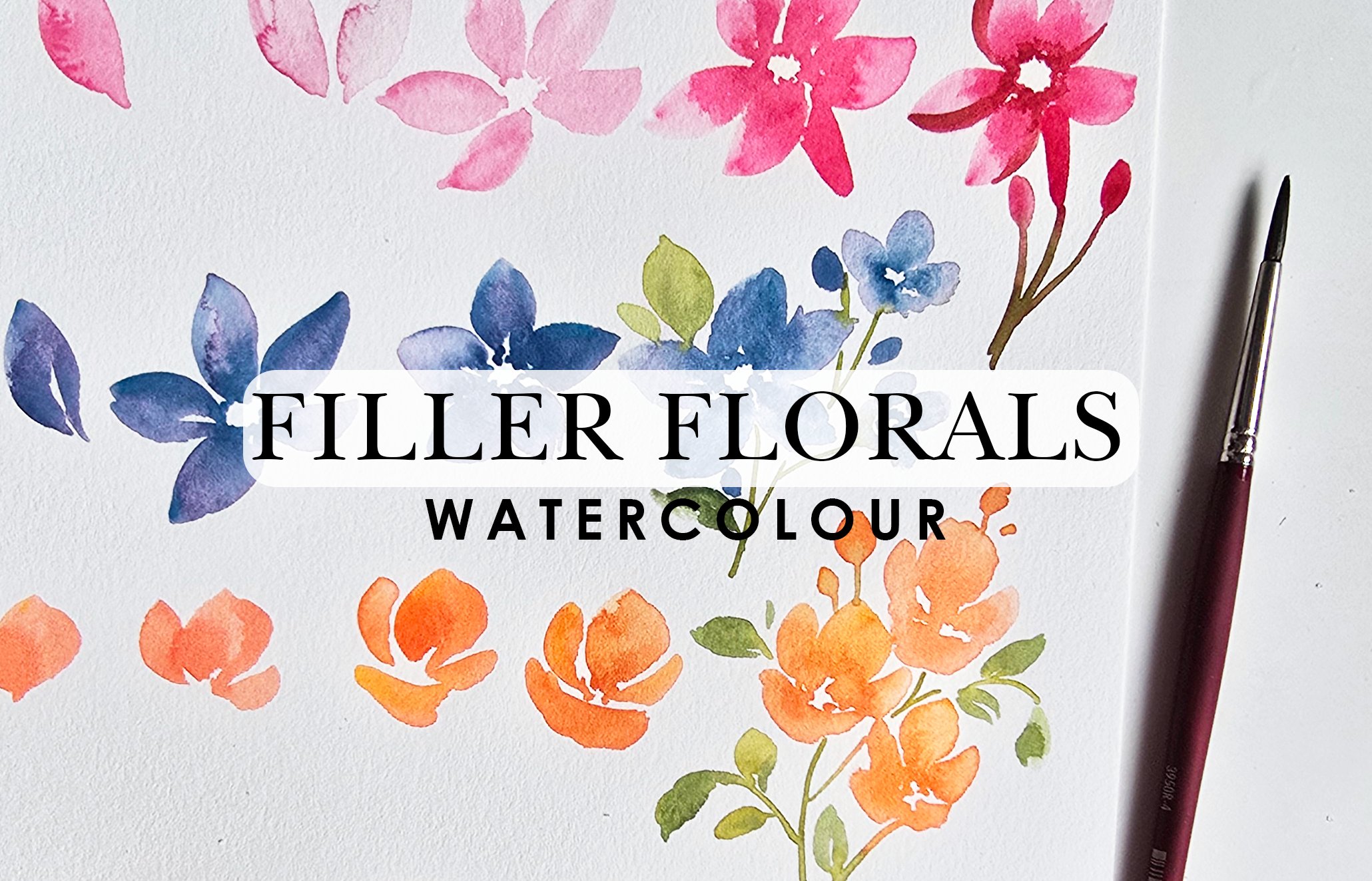
18. Elements - Filler Flowers: We're going to go on
to fill our florals, something very basic, simple, and loose to complement our really pretty main
or primary flour. I was going to say main
flower, but same thing. Here's what we're going
to do. We're going to use the Indian yellow and I'm
going to use my number four. Feel free to experiment
with using bigger brushes like the number eight that
we're using number six, whatever brush comes to mind. Same thing with the yellow. We always want to
start with mixing color in a 30 70 ratio, lighter and then
we can go higher. So these little filler flowers are going to be in clusters and the basic shape or how
you would paint them is pretty much like how
we painted that petal, but we're going to be
doing it all in one go. Pressing down,
zigzagging all the way to create our first petal, then we're going in
for more color and I'm going to do the
same thing over here. Another petal off to the side, another one off
to the side here, and then this final one, we're just going to
make it like a curve. We've got a very
basic loose flower happening and that's
the whole idea. Now, you can leave it as or
do the little centers where you're bringing the little lines inside to leave
that white space. White space is very, very
important when you're doing your filler flowers because they're going to be in clusters. So you need that white space
to determine what is what. Same thing with
the main flowers. You do need a little
bit of white space, but because they're standalone and they're the main focus, it's minimalshPretty much
similar in thinking that way. Now, if you wanted
to take this a step further and maybe add
something nice to the center, you can get a little bit of that light gold green
and drop that in. Again, this is you adding
an additional step. If you want to just leave it loose and just leave
it in that one color, leaving that white space in, that is also okay. But I'm giving you ideas
to inspire so that you can take some color and feel brave
to go and try new things. It's a very beautiful effect having these two colors blended. Now, let's try this
again and this time, I'm going to do a
couple of them. Actually, before I
do a couple of them, I want to show you more
and more variation, which would be easier. I like to have a couple
of them that are slightly sideways facing and then majority of them will
be mainly upward, and this is how I do them pretty much creating that one petal. And a little side
stroke like this. Et's do that one more time. One more time, I'm going
to do it this way. I'm going up and down, pulling it down to the center. We always want that
triangle shape. You can do a little bit
at the top there for background petals
and a little side petal here and that's
essentially it. I've got two of them over here. Let's connect them
with a stem or a stem. Again, roughly
washing off my brush, I'm going to take some
of that leftover green. It doesn't matter which green, just take a green
and I'm going to connect this very
loosely like this, leaving as much white
space as I can. Using the tip to paint that in, painting another one in, stem, and then the
final one here. I like to do my flowers first and then
paint in the stems. I also like to do it not rushed, but quickly so I can get this nice little bleed that you're seeing with the
green and the yellow. Try and see how
fast you can move. I feel like until you understand the paper and you learn how it looks on the paper when it is damp enough to get these results or when
it's drying up quickly, it'll take a little bit of trial and error for you to
get to that stage. Don't feel daunted by this, just keep going, take a sheet and just paint
a whole bunch of these. That is the best way
to learn and get better acquainted with
knowing when to move. I'm going to do these
flowers a couple more times. I'm going to do another sprig. Here we go this
time, I'm going to do less explaining
and more doing. You've already seen and heard my little comments on
how to get to the stage. Now, here's me painting it quickly as I typically would if I were not
instructing. Here we go. My main petal. And then I like to do a couple
of them all around. Again, notice how
it's fairly light. I'm going to do one facing
upward like this over here. Drop in some darker tones
right at the bottom, just to get that nice
little tonal range. Then what I'm going to
do is one more thing. I'm going to add little
dabs of color like that, and those are going to be a
little buds for this flower. Now this is done, washing
of my brush roughly, getting some leftover
green again, like I said, doesn't
really matter. I'm going to quickly join
lightly grazing with my brush. Like cell. We have a whole bunch of cute
little filler florals. Now, after this is done,
you might think, Hey, I don't really like how this
is curving extra over there. I want to add more. Totally can. I'm going to go
ahead and add some more just to fluff
it up a bit more. Like I said, you don't have
to connect all of them. Some of them can just be hanging out and that can indicate that looseness where you're not adding too much
detail with things. Sometimes I get really
motivated to go ahead and paint some of the stems in there despite me saying I
wouldn't totally fine. Listen to your gut
and go with it. Now, I know I've
said this before. If you find little
bleeding of color like this and you're not
intentionally wanting that, I don't mind this
bleeding in there. You can just take your
damp clean brush, swipe off that color, and dab onto your paper towel. Now, I've allowed this to dry a bit because I've been
talking and explaining. But typically, as soon
as you notice it, you can just take your brush and swipe that off or lift it off. Then if you get any
marks on there, just drop more of the
yellow and that's okay. It'll help mask as
much as possible.
19. Elements - Filler Leaves: Last but not least, are
these flowers going to have any greenery
like leaves? Yes, they can entirely up to you and it doesn't have to be
these were not complicated, but it doesn't have to be as intricate looking
as these either. It could be something as
simple as drawing your stem. Notice how I'm very loosely grazing just the
tip of the brush, leaves a little bit of white
space too, that's okay. Then what you can do is little
strokes like this, attach, very dainty looking elements that you're adding
to these flowers. All I'm doing is
little tiny strokes it's almost looking like it's part of a
branch and they've got sometimes I feel like there's leaves that have
little seed like elements on them or almost berry style elements. It could
be something like that. You're just giving
it more texture and a lot more organic shape. But the strokes we're
using are very small, there's not a lot of dragging. It's literally if I had
to isolate the stroke, this is what that
would look like. On our brush stroke exercise, that would be the equivalent
to something like this. Where you're just using the
full length of your brush to press down and get a color, but over here, you're using just the top half of your
brush to press down. Watch me do that
again if I just do this, but I'm pressing down. I'm starting with the
tip, and pressing down and lightly trailing
off a little bit. If this is too complicated
for you and you would prefer to have just a pattern which looks like a herring bone, that is totally something
that's possible too. You can attach them to stems and you've got
something like this. Lots of great
options to explore. Just make the painting or
make the leaves your own. We're not trying to aspire to look like something realistic. We just want to have
fun with the colors, let loose, and go with the flow.
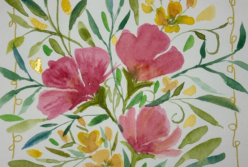
20. Elements - Conclusion: So this is it for
this set right here. I hope you enjoyed this. We didn't really end up
using all the metallics, but like I said, feel
free to take what you've learned and use metallics
to create them. For instance, if
you wanted to use the hummingbird color that I have here to create
these little guys, that would be a really
nice little touch to the main flowers. You're adding a little
bit of contrast, a little bit of shine,
very classy, very cute. Or, for instance,
if you wanted to use this really
nice purple rain, I know it's bright and use it for our filler
florals that also works. I think there's a lot of
different ways you can incorporate glitter or
metallics into your artwork. The whole point is to have fun and do something that you would love while mixing colors and just taking
time for yourself.
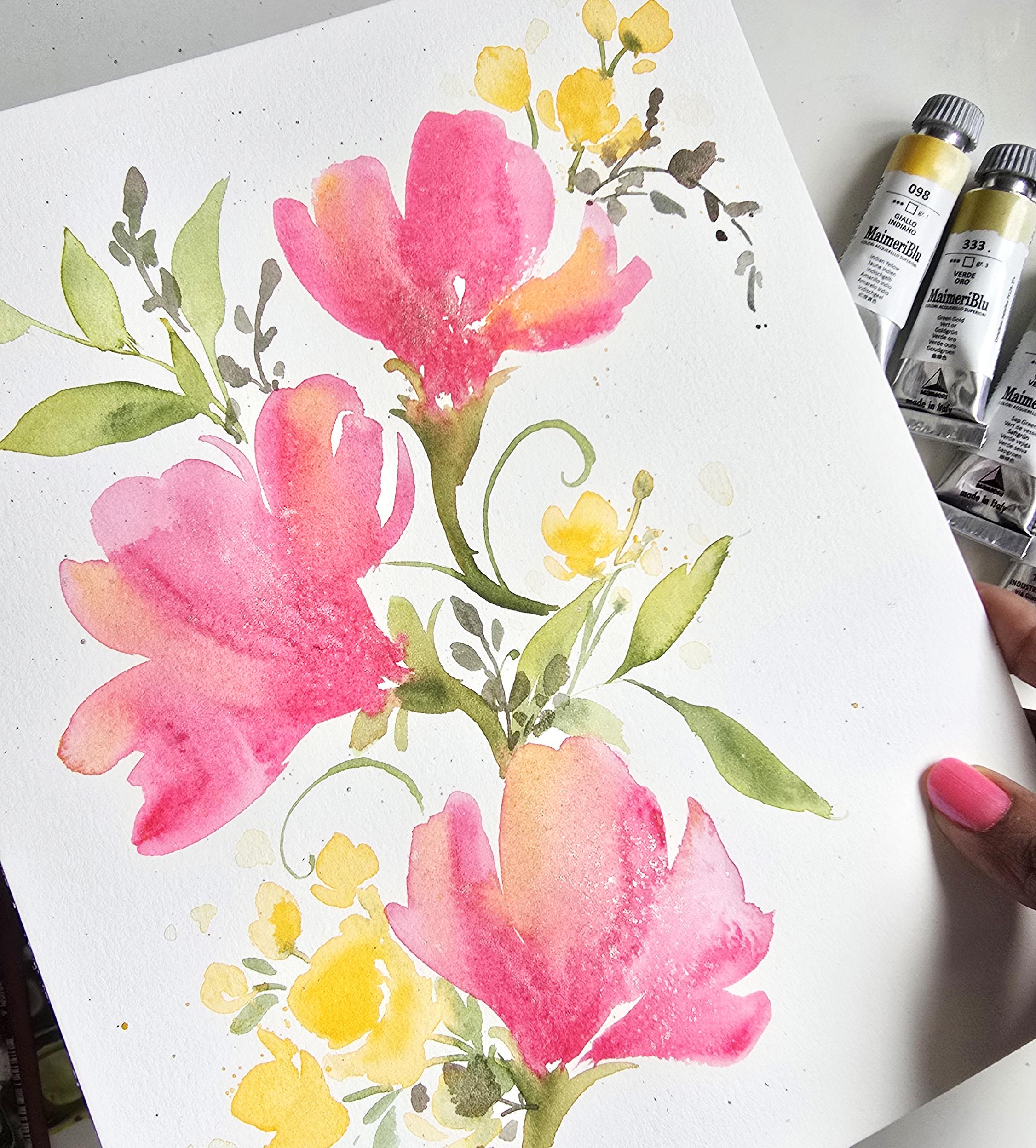
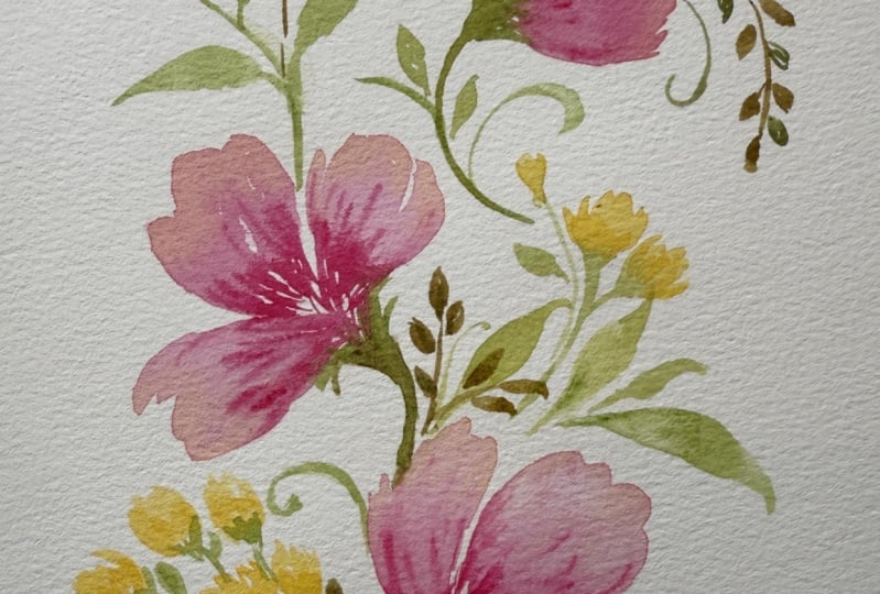
21. Composition - Part 1: Based off this sheet,
we're going to create a nice little composition
of loose flowers, let's go. A quick reminder in case you
want to follow me exactly. I'm going to be using
the champagne gold by MAB watercolors. I've got my Mmary colors consisting of
primary red magenta, Indian yellow, green
gold, sap green. For brushes, I've got my Princeton velvet
touch number four and then Princeton Neptun
number eight. Let's begin. I'm going to start off with
making sure my brushes are clean and I have it on my
paper towel on the side here. We're going to begin with
activating some of the magenta. I love how these flowers
are simple enough that I can just do them quickly now that I've
explained the technique to you and we can move on from there. That's what I'm
going to be doing. I'll be painting quickly
and swiftly follow along. And if there's any
technique that doesn't make sense to you, feel free to check out the video where I go in depth about
how to paint these elements. Here we go. Loose and fun. I'm going to create
my loose petals and I'm watering
down my brush as I go along because then this way, I've got a nice variety of
different colors going on in my flowers or hues
going on in my flowers. I'm also giving these
little tendril elements to the side and then
getting my darker tone, I'm adding a little spout
like area at the bottom. This is where they all meet. Then let's just get
a little bit more of this color because I feel like I'm going
to be running out. Now that the base is in, I'm going to use the
same tone to create a couple more of
these really quickly. I want these to be
fun, whimsical, and you should be
able to do these on a whim in a couple of minutes if that's all you have to
spare when you're painting. Here we go. I'm dropping in
more of this darker tone. Mainly at the bottom. I'm going to drop some over here as well. The point about painting this flower and
then going back to do that there after is that I'm allowing that
to dry just a tad bit, which gives me more
off wet on dry effect. That's what I was
trying to go for there. Here we go dropping
more of that here, highlighting some of the
petals a little bit so that I have got
some nice texture, some nice darks and lights, and then I'm going to
get some of that yellow. I have some yellow
with this mixed here. I'm going to drop
some of that in here. Drop some of that in here. Let's get a little bit of those nice color
variations happening. Look how pretty that is. Let's just get some lemon
and drop some of that here. Let's see what does
that look like? Do we like that? Going back in, I want to do just a couple
more of these flowers. Let's just add more of a
darker tone at the base here. Let's just do one more here. And then switching my
brush to get some of that yellow. I'll drop that in. I'm going a lot
faster than I did in the video where I was
explaining what I was doing. This is mainly because I want to show you guys how
you can take that once you know the technique
and really run with it. Here we go. Getting some
of my champagne gold. I'm going to drop some of
this in as a splatter. So this is almost like
I'm trying to get a iris kind of pattern
dotted pattern on this, but with metallic.
22. Composition - Part 2: Green I'm going to
get is a mixture of the green gold along
with my sap green. We're going to start off
here with the number four. Now, this is such a pretty
almost like a tropical green, and that's why I like this for this particular style
of flour and color. I'm going to do another
bottom portion for it here. Then last but not least, this is the last one. Then I'm going back to get some of that sap green and drop it in just so we get a slightly darker tone
happening at the base. Not advisable to wear white when painting such colorful things
and also doing a splatter. I love how this is
looking so far. Let's go ahead and
add some leaves. For the leaves, we're
going to add the leaves using the petals brush,
which is right here. Again, I'll do a mishmash of the two colors using dominantly the um, the green gold. I'm just filling
up that area here, doing little twirls
and swirls first. Love those little
whimsical elements. Let's get a nice little
trail of leaves here. Then we paint in some beautiful leaves that almost look like
they're dancing. Again, I want to remind
you, take your time to get small elements,
large elements, and also different mixtures happening so that this way
you have some nice interest and different tonal ranges
within your artwork. Let it flow, give
it some movement, use all the elements
that we've learned to paint and let this be your
time to just play around.
23. Composition - Part 3: Going to add some of
those filler florals. I'm going to get a muted
version of the yellow and I'm using my number four brush
and we're just going to go ahead and start. For placement, I think it would be great to have
some happening here. I'm going to make sure
I've got lots of color. And start my cute
little rendition of a cluster of these flowers. Now, remember what I said, do a whole cluster of them
and then attach them, so it's easier to make it look more like
a loose rendition as opposed to focusing
too much time on it. That's the best way. Now,
I've got some there. Let's add a couple down here. It and I'm not paying too
much mind to how these look. Again, we're going for
the whole loose look and bunches of them because they're literally meant to frame these flowers as
opposed to taking over them. A couple here and there. Perfect. Now washing it off, let's get some green
and attach them. Using my number four,
I'm going to start with these guys here because
they were painted first. Perfect. Then we
will go with these. Just cute little simple
attachments or stems rather. Then you can continue
adding a couple of smaller leaves just
to frame these nicer. I'm just adding little strokes
like this to enhance and embellish adding some
nice cute little details without really going out of
my way to over emphasize. That's blossomed into
a really big thing. Wash off your brush
and with a damp brush, just lightly lift the color and then dab onto paper towel. So I'm going to get a little
bit more of that yellow. If you really want
to embellish some of the insides maybe or
just here and there, just drop in another
layer as it gets damp. You can even do a little
bit of a splatter because that's always cute
for such elements. And then you can wash
off your brush and just spread out some of them to make it seem like it's phasing off in the background. Very loose, very
fun and delicate. We're not focusing too
much on perfection. We're going with the flow
and just allowing things to breathe and giving it a
lot of room to just be
24. Composition - Part 4: But not least, I just want a slightly different
variation of green here with some of the
tendril like leaves. I'm going to mix
some of the magenta. Is it magenta? Yes, magenta with the green. Let's mix that in here. I want the slightly darker brownish green and that's fine, something a little bit
more muted so that the so that it doesn't clash with the
nice bright colors that we have going on here. For these guys, let's just have some of these cute little
elements in between. All I'm doing is tiny
little leaves like this and they can be overlapping
and that's totally fine. The goal is to get these cute little elements that can work towards
adding some movement. But then also a little
bit of contrast like I mentioned. H. So a couple of elements
here and there. I'm just literally
lightly dabbing, lifting off, creating a
couple, and then letting go. Because it's more of
a muted dullish color in comparison to
the bright colors, it brings some nice
harmony almost, contrast, balance, all
that good stuff in here. Let's do this next one, possibly coming
downward like this. And feel free to give it
movement like I've been saying. This is where you can really excel or elevate rather
elevate your paintings by just showing up with a more loose hand for
these little elements. I'll do one more over here. I got a bit too much
green in there. Then I just want to keep
this a little bit looser. I'm adding more of these dabs
down here at the bottom. This is what it means
to just be loose and go with the
flow as you paint. I think this is good enough. It's a quick little
painting that we did based on the lesson. Feel free to take the
elements that we've learned and add something more
to it if you wish. I encourage you to really use your creative intuition
and try different things. There's so many
different techniques that we've learned and there's so many
different directions you could have gone as well. This was just meant
to be an inspiration.
25. Conclusion & Project : Hey, I'm assuming if you're
watching this video, you have completed
the entire lesson. I'm so proud of you. I cannot wait to see your work, so please don't forget post your finish project
composition in the gallery section of this lesson so we can
all get to see it. Lastly, guys, if you found your flow and you really
enjoyed this class, including all the bright
colors we've used, please leave me a review. I would love to read what
you thought about it. On that note, thank you
so much for watching. I hope you continue to paint
and go with the flow in beautiful watercolor.
Thanks, guys. Bye.
 Clarice Gomes, Go with the Flow in Watercolour