Transcripts
1. Introduction: Is the season to be follo la, la, la, la, Hi, guys. My name is Claris and I am a watercolor artist and
designer from Toronto, Canada. My specialty is loose
watercolor flowers, and I started out my watercolor teaching journey over on
YouTube a while back, and also find a ton of video
tutorials by me on YouTube, which is where I started out. In addition to teaching online
tutorials and workshops, I also host watercolor
retreats because why not introduce folks to watercolor while traveling
to beautiful places. This class, I am
going to be teaching you guys how to relax. And learn how to paint in
watercolor as we paint some beautiful, crafty
Christmas cards. I'm also a proud ambassador
of Princeton brushes, so you will often find
me using these brushes exclusively in all
my teaching content online and offline. As an artist, I
firmly believe that supplies are pretty important
in your learning journey. So if you're new to watercolor and are unsure what
supplies to use, I do have an Amazon storefront
that lists a bunch of my favorite supplies from Bginner to intermediate,
feel free to check
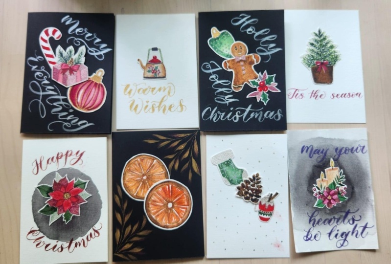
2. About this Class: In this class, you are
going to learn how to prioritize your time while taking time for you
to sit down and paint. You're going to learn some amazing watercolor
techniques that's also beginner friendly to
paint a couple of items. By the way, there is a
base drawing as well, so it eliminates that whole added pressure
of having to sketch. But if you feel challenged or compelled enough to
do your own sketching, I completely encourage it, go with the flow and do that
for you. Back to my list. We're going to learn how
to paint in watercolor. We're also going to be using shimmery metallic
watercolors because we are creating holiday Christmas
greetings after all, why not? In this lesson, you'll also find that I'm very specific
of the colors and the metallics I
pick because we're also learning how to create
beautiful compositions, we're learning how
to pair elements together so we can then
create our greeting cards. Now the whole purpose
of this lesson is, like I mentioned,
taking time for you, learning how to
paint, and creating beautiful artwork to send
to friends and loved ones. If you're ready to begin, I suggest you take a look at the supplies list in the
project description below. Download the base drawing
so you can trace it out, then hop back on here
and let's get to painting so we can create some
beautiful cards together.
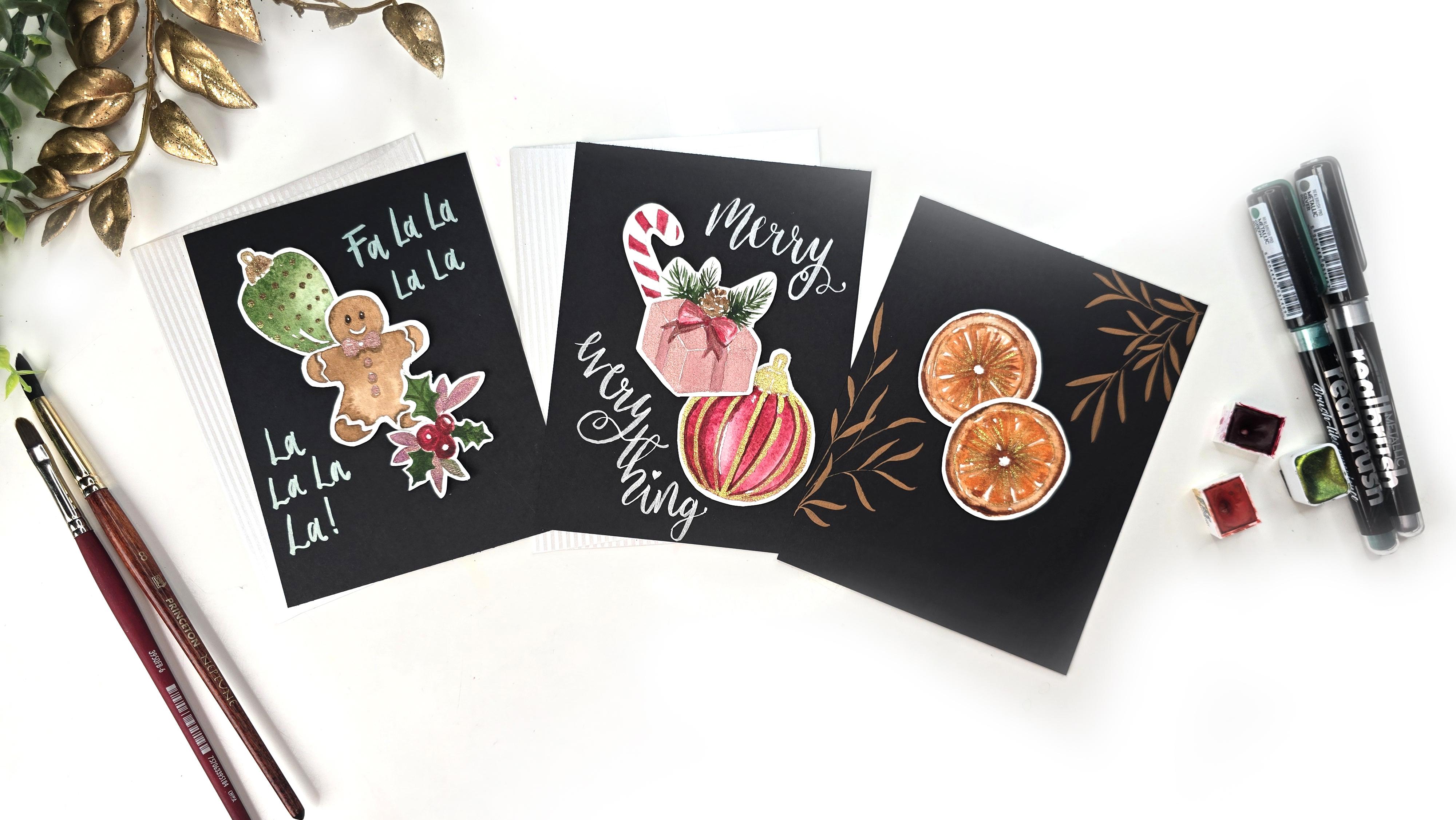
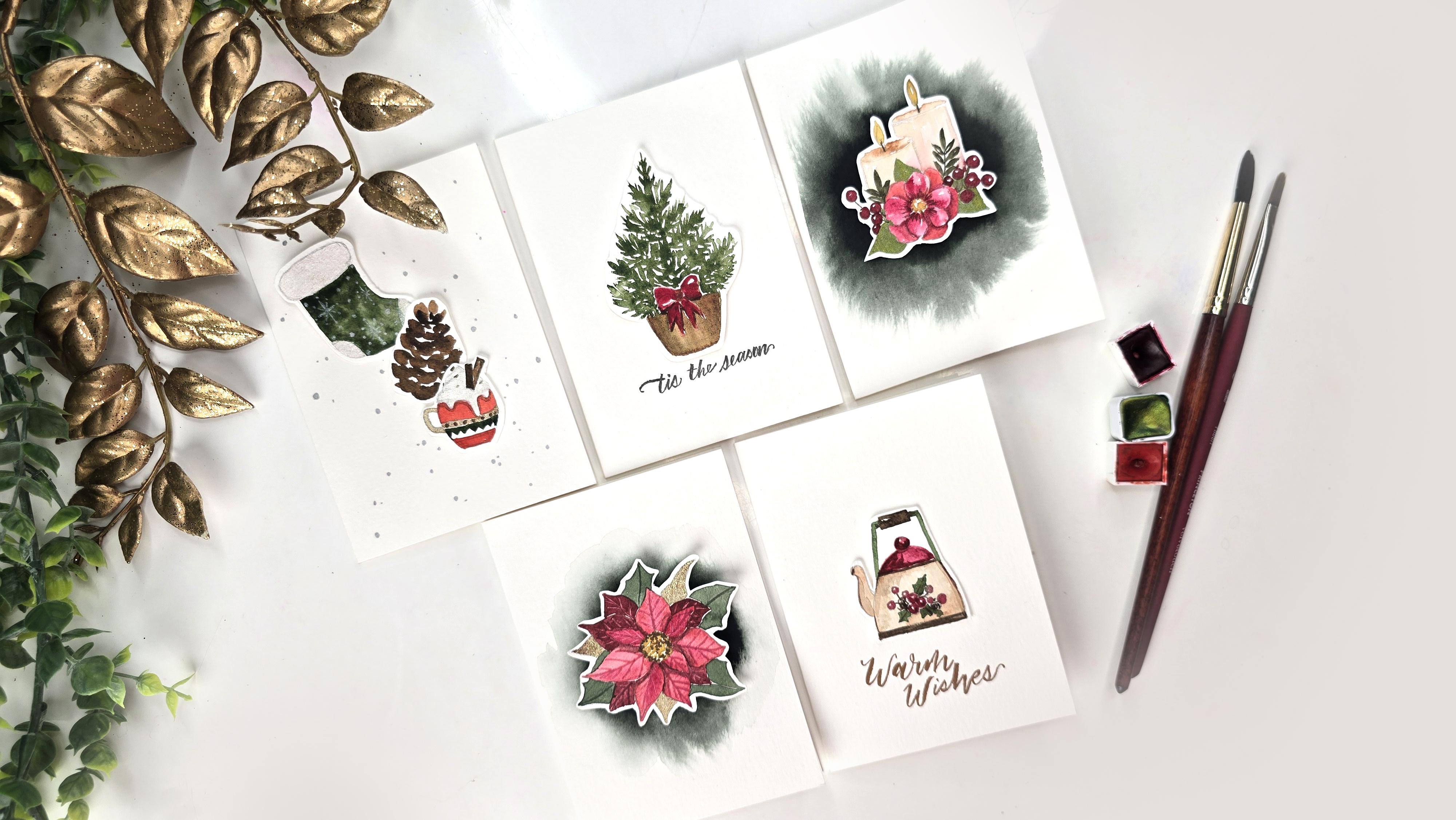
3. Class Project: So for your project, I would love it if
you guys paint along, create your beautiful cards, and then post either your
favorite or all of them. In the project
description below, I would love to see
how you guys do. It's not only encouraging
for me to see, but it's also encouraging
for others who are typically not that
comfortable sharing artwork. I hope you do that. If
you're ready to begin, I suggest you take a look at the supplies list in the
project description below. Download the base drawing
so you can trace it out, then hop back on here
and let's get to painting so we can create some
beautiful cards together.
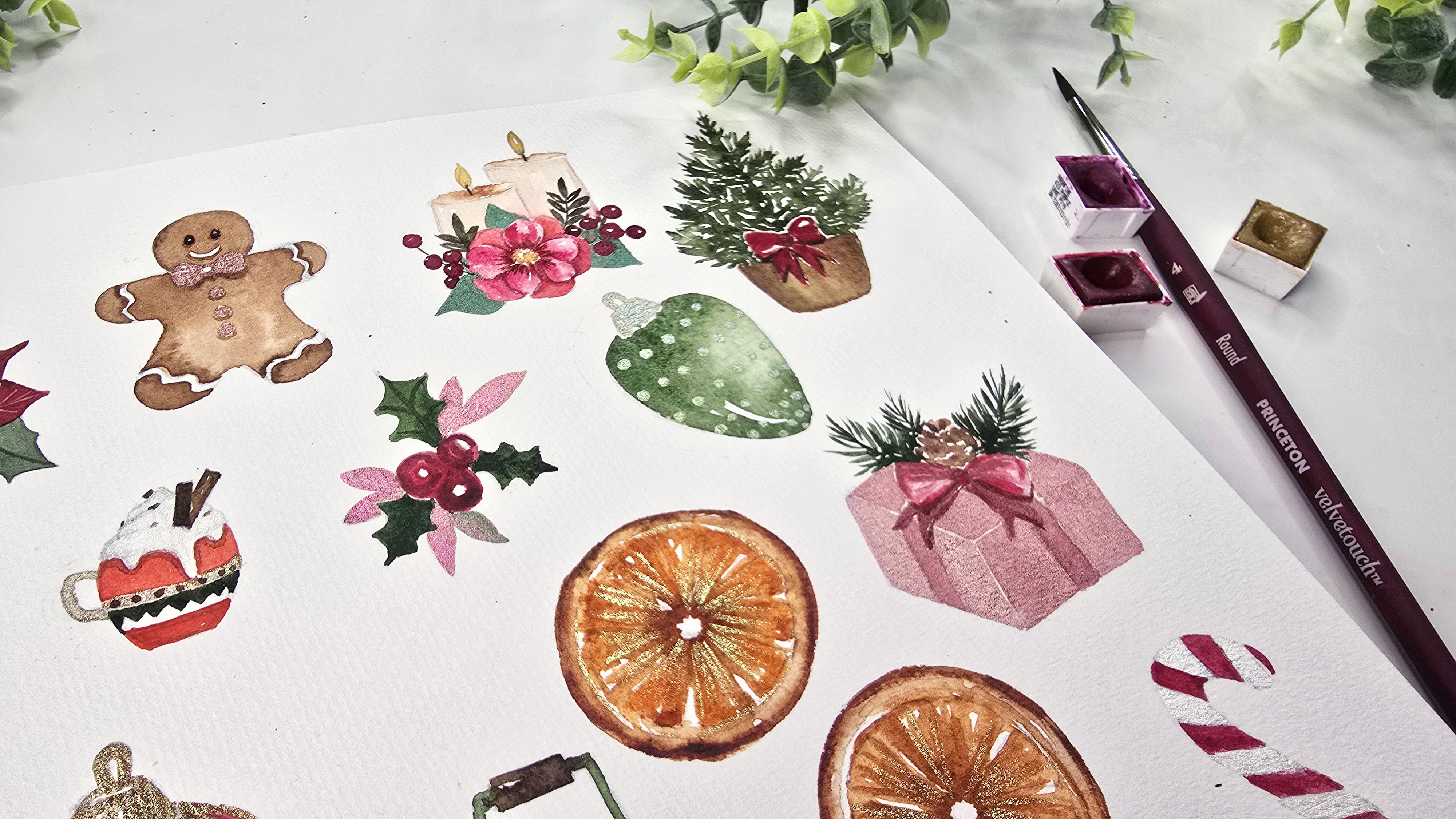
4. Supplies in this Class: So for supplies, here's what
we're going to be using. For the base drawing to
initially paint all our items, I'm going to be using
the Strat moore 8.5, sorry, eight by ten cold
press watercolor paper. For our cards, we're going to be using the Stratmoe
watercolor cards. They are beautiful. They
come with envelopes as well, which is why I picked them. For paints, we're going to be using the Daleroni set of 48, as I start painting, I'm going to let you
guys know exactly which paints we're using. For our metallics, I'm
using MAB watercolors. Again, I'll let you know
exactly which colors I'm using, but look how stunning these glittery holographic
watercolors are. For some of the lettering
that's involved, I am using Karen brush markers
in the metallic colors. Then we're also going to be using some of the
Princeton brushes, obviously, particularly the Princeton
Heritage number three. Princeton Neptune number eight, you can also use the number six and the number four
from the velvet touch. And last but not least, I have my Dalerone liquid acrylic pearlescent
pearl or sorry, in white pearl. That's it. These are all the supplies
I will be using today. If you are curious to find
out about these supplies, I have listed all of them
in the description below, feel free to check that out. On that note, let's begin.
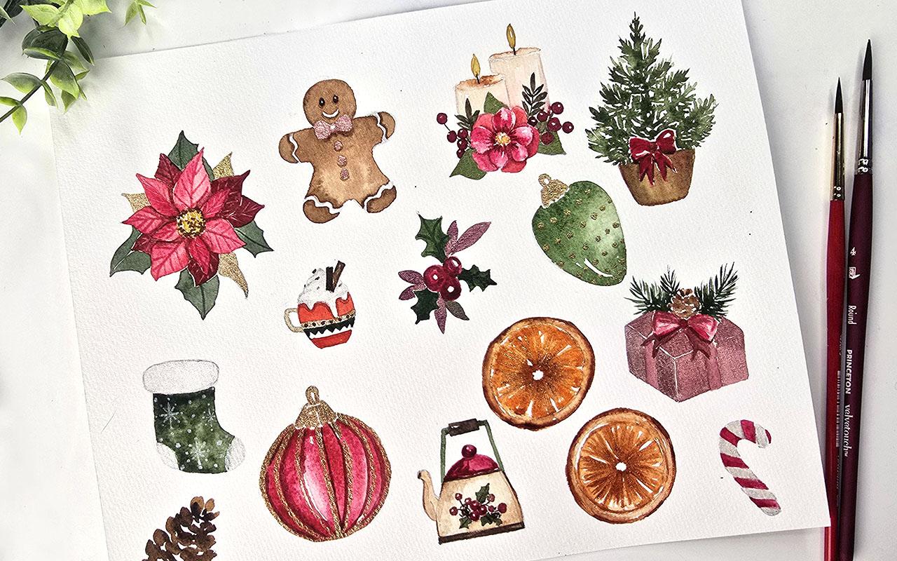
5. Painting - Part 1: The very first thing
we're going to paint is the tree right
here, and for that, I'll be using my
number three heritage, and we're going to start
mixing some green, and I like to use a nice dark wood woodsy green,
that's what I call it. For that, we're going to
be using Hooker's green, and I'll be mixing a
little bit of brown in it. And where's my brown. We're going to be using
some burnt sienna. I love the green that comes by just adding a
little bit of burnt sienna. You can get such
a gorgeous green. This is my favorite. Now, we don't need too much
because like I mentioned, little goes along
way in watercolor, so this is just right. If we need a more darker
version of this color, we're getting it directly
from here and we're going to drop it in and build on
the layers. Here we go. I'm going to start off with
starting down the middle and then from the top and
then I'm lightly adding these little strokes
to the side. Then what I'm doing is dipping my brush in water and
I'm going to continue. But this time what I'm doing
is doing a stroke and then adding mini strokes on that
stem. Same thing here. I'm just lightly grazing to create this in a
very loose manner, loose strokes, and then
towards the center, we're just adding more
strokes to make it look like there's another branch coming
facing forward towards us. I'm going to get more color, drop that in here, watch
that bloom in nicely. And we're going to
continue down slowly. Take your time, relax. Watercolor is
supposed to be fun, and this is meant to be more of a relaxing tone than
a stressful one. Take your time, especially because we do not
need things to be damp to get certain effects for what we are painting here. Enjoy the process of creation and the satisfaction
that comes from. Just lightly grazing and repeating the same thing that we've been
doing from the top, can drop some color right
here in the middle. We get that nice dark ist color happening in the middle
and then going out slowly. Now, right before
we reach the bow, we're going to do a very light, we're just going to go
with the light green. The reason is we want to make sure we've
got ample enough room. We're not going over the
bow and even if we do, we can probably fix
it by going with a darker color for our bow. That's just pretty much called
going with the flow when you're going with the flow and if you accidentally
add additional color, you're going to switch
and change routes in terms of what you
had originally planned. Now, there's still a little bit of leafy action
happening around here, so we're going to continue
extending and create our last layer of pie needles You can see exactly
why I have used the Princeton Heritage number
three because it gives us some really nice
loose thin strokes, um, once you know how to
lightly graze your brush. This is our tree. What I'm going to do next
is get a little bit of that darker tone to add in
here before it dries up. We're going to be mixing some of the I was going to say heritage. Mixing some of our Hooker's green and then I'm
getting more of that brown, which is burnt sienna. I know I said you could
mix it directly in here, but I figured let's
just do it here. Let's create some good habits. Now we're going back in. I'm starting at the
top and I'm lightly grazing to add a
couple of strokes to indicate that very
top tip to our tree. Then I'm lightly grazing to add these colors in
here in the center. You'll notice that
it's giving me a very natural, gorgeous bloom. And that is because guys, if you have been
following along with a couple of my videos
already or my lessons, it's because it is damp. I'm just dropping in the
color in the center and it's nicely blooming outward
wherever the areas are damp. Look how gorgeous that is. I'm going to add
a little bit more of this around the
edges of the bow. This is just to really
give it that nice stunningly contrast shadowy
effect right around our bow. Now you can wait for
this to dry or you can simply just be
extra careful and maneuver your way around to give our pot a
nice coat of color. I am going to do the latter. Feel free to pause
and just watch me or continue as you go along
if you're feeling gutsy. What I'm going to be
using is a mixture of burnt sienna and yellow
ochre for my pot. I'm going to start off
with yellow ochre. And it's a beautiful
yellowish color. Again, using my number three, I'm just going to
lightly graze creating the outline for this and then I'm lightly
adding strokes in between. I'm keeping this
fairly simple for you guys so that you don't get too overwhelmed
with a lot of detail. We're going to keep things
loose and fun and relaxing. Now you're going to
notice some green seeped into the yellow. This is not something
I intended, but this is why I mentioned
maybe wait for it to dry up before trying this because
we've learned so far, if you add color
where the areas damp, you're going to see
the color bloom. Now, I'm not too worried about this because
here's what we're going to do. We're just going to wash off our brush and with a damp brush, we're just going to lift the color and then dab
it onto paper towel. Again, I'm not overly concerned because we're
going to add some brown to our mix and it's
going to give us a nice beautiful blend. I'm going to get some
of my burnt sienna. I know it's got some
green in there, but I'm not overly worried. Then we're dropping in some of that burnt sienna
right here at the top. And just below the
ribbon as well. We're just going
to allow it to do its watercolor thing
and go all around.
6. Painting - Part 2: While that is drying up, we're going to get
some rose matter. Again, using the number three, I'm going to get some of
this mixed up over here because this green
and the matter rose is going to be
our dominant colors. I don't mind using two
little wells for this and we'll just build up from here as we paint the
rest of the items. I'm getting a utered
version of this, making sure my brush doesn't
have too much water, so I'm rubbing against
the side this way. We're going to start by
painting very lightly. Again, remember the
green is still damp, so I'm keeping a little bit
of white space around it. I'm just leaving
white space as I paint this in or paint
the bow in as well. You'll see exactly why because white space, I'm going
to tell you as well, white space adds so much
beautiful loose vibes, let's say vibes for
lack of a better word. I love this is the part that really is astonishing
to me because you can get these amazingly
beautiful results by just not worrying
about the details and just going with the flow and Less strokes, less is more. We're going to let
this dry a little bit. I have a little bit of
yellow seeping into that. Again, you can do the lifting technique with
your clean damp brush, and slightly lift or lightly lift and dab
on your paper towel. We're going to let
this dry a bit more before we do anything else. But we can definitely go back to our brown areas and
highlight more of that. I'm getting some
more burnt sienna and you can see that green
has really seeped in. Again, you might like
this, you might not. I like it because again, it's giving me the bleeds and the gradients that I really
love about watercolor. I'm getting more on the tip of my brush and this time
I'm going on this side, don't worry about the yellow if it is seeping too much into your ribbon because we are going to make
our ribbon darker. Perfect your little bottom
till you are happy. Pulling down some of
this color over here to have a little bit of
blending going on here. Now we're going to
go back to our bow. Back with the Matter Lake Rose, getting more of
this color on here. I'm going to go in and
start with the edges first. And pulling the color
inward to the center. I'm leaving that not open
ended for now and I'm going to go onto the next side of the bow and add
my details there. Then I am slowly
going downward here. I'm starting from the top
and pulling down my stroke. Then last but not least
for the absolute center, you can use a little
bit of brown in your matter red to
get a darker tone, and then that's how
we are going to get that nice depth within
our bow center. One last thing we're
going to do is go in and highlight or
actually not highlight, add more shadow right
around the top of our pot, what we're doing
is just getting a darker brown and
just dabbing it in here and it's giving us a nice bleed because
the area is still damp. So you can take some of your
vandyke brown at this point. I'm using some from here
and I'm going to lightly graze and add more of
these shadowy effects. I'm pulling from
the top downward. I'm not going to give
this pot any texture you can if you would like to
make it a wicker pot. I'm going to leave this as is keeping things simple and fun. Then one more thing because watercolor dries
up very, very light. If you're fine with this
bowl looking like so, then that's totally okay. But I'm going to
go ahead and add a little bit more like a
third layer of color. I'm going to start
that at the top. Right there, and I'm adding
a couple strokes down here. I'm not painting
the whole thing. I do not want it to look flat. I'm looking for those
beautiful variations of darks and lights
within my bow. That's why I'm adding it
just in certain areas. And we are done.
7. Painting - Part 3: Next we're going to paint our
little babble here and I'm going to use the Princeton. Actually, we're going to
start with the number three and do the
top portion of it, and then we're going
to do the bottom. For the top, because
it's that nice, it's supposed to be
a goldish color, so we're going to use
some of our metallics. In fact, you know
what? I'm going to make this portion of
the class where we're painting both of these
guys just so that we're not going back
and forth too much. I'm using some of my pineapple and we're going to simplify this whole process of
layering and stuff because these are supposed
to be elements in our card. I'm going to use the number
three and we're just painting little lines
over our drawing, painting in the top and try and get those little frills at the
bottom if you can. Perfect. Then I'm going to do the same thing
here at the bottom, getting some of my beautiful
shimmer and shine. Lightly grazing with the tip of the brush and we're
painting this in. Trying to get some of my
little scalloped edges at the bottom because
I love those. I think it adds such
a cute detail to it. Then the little top hook And I'm thickening
the hook just a bit. So I don't want
it to be too thin and you'll you'll
see exactly why. We're going to do
the same thing here. Now we are ready to
paint the bottom. For the bottom, let's use a beautiful I'm going to
use the number four. Let's make one red
and one green. Again, keeping in theme
with what we're doing. I'll use for the green, we're going to use the leftover
green that we have here. I'm just going to
paint this one first. Simple, easy, relaxing. What I'm going to do is leave a little bit of
white space in here. I started off with using
the paint from my palette, and then I'm dipping my
brush in water to get more liquid on it because
I shouldn't say color because I'm adding water
to the color on my brush. This is what's helping me get a nice gradient effect
from dark to light. If you notice between
the little ornament, the base of the
ornament and the top, I am leaving a little
bit of white space. Getting more of this color, I'm going to drop
that in right here. And then I'm dropping it in at the bottom off to the side here. We're just going to let this
sit to dry and we're doing the same thing for our
circle or the round babble. For this one, I'm getting
my matter Lake red or matter red. It's
just matter red. Rose matter hue, sorry. We are same thing, starting darkest color here that I have mixed on this side. I could have used
my number eight, but forgot about that. Here we are using
the number four. It's just going to take
a couple more strokes than the number eight would. Again, notice I'm trying
to leave a little bit of white space for some
nice glistening effects. In fact, it's not a requirement, but only if you remember you
can leave the white space. Sometimes that can be
stressful because so many of us are wired to paint everything in a loose watercolor is a little bit of
unlearning all of that. Getting more color directly from here and we are doing
our favorite part, which is just dropping
the color in and watching it bloom and maybe even helping it along if it's not blooming
to your liking, we're dropping some
at the bottom. So to the side. I'm going to pull some down
over here as well. The reason being is I'm
going to make this look like a nice dark rich red ornament. I'm getting more color and
I'm sweeping this color down while it is
damp because I want those nice beautiful
gradient like effects. I'm going to get some going
down the middle as well. But I'm not painting the whole thing like
I did over here, just keep that detail in mind. Then I just want to add more of the darker layers
at the bottom into the side here. Love it. One more little thing I
want to do is adding some brown to my red, and I want to drop
some of this in. I'm mixing that
on the side here. Mix it to your heart's content
where you're like, Okay, this is a good, dark red, and I want to drop that in here. I'm really adding
layers to my babble. Okay. So now we let this dry and then we're going
to go back in and add some beautiful details to
make them nice and festive.
8. Painting - Part 4: So while these are drying up, let's move on and paint
our present right here. Base for the wrapping
paper or the box part, we're going to use this metallic
color called Jasper and my idea here is to have
the base coat be a nice, gorgeous metallic shade, and then the details
on the top of this will be more of the mated watercolor or regular
watercolor, I should say. Just take your time
painting this in. I'm using my number
three heritage, making sure that I don't get
out of the lines too much. I'm going to do this side first. And then we are doing the same color
obviously on all the sides. But what I want to do is try and get a darker
version of this. What I'm going to experiment and try is mixing some of this in with this leftover
red that we have. I'm adding that here. This is
what's going to help us see a stark difference and add a little bit more
depth to our present. Let's do this half of it and
then I'm going to figure out what we are
doing for the top. Perhaps a slightly in between color between the two of these. I'll add more Jasper
to it most likely. Love it. Let's add a little
bit more jasper to the color. Then again, I'm trying to leave a little bit of white space in between these areas here because I want to hold
onto that loose effect, but we're also
being intentional. I don't mind that bleeding in. I like how that dark looks blending in just
in that one area. The shimmer when you watch
it kind of get on the paper. It's so mesmerizing. The number three is my
saving grace again, trying to get these nice
fine details going on here. This is done. We can now wait for it a
little while just to dry up before we get back to paint the ribbons and the beautiful
foliage on the top. Next thing we're going to
do is I got a little bit of my glitter on here. But we're going to be painting
this in, look at that. It's off. Quick revision
of previous lessons. If there's any little
marks on your sheet, just take a damp brush, rub it, zigzag over it, and then take your paper
towel and alla. It's gone. Let's do our orange slices
now, and for these, I will be using brown
where's my brown. Burnt sienna, Vandyke brown, and then we've got
Cadmum orange hue. I'm also going to
have a little bit of vermilion handy on the side. Let's see if we end
up using it or not. Now, for our initial
circle around the edges, we're going to be using
the burnt sienna. I'm going to get some
of the burnt sienna. Again, I'm using my
number three heritage, and we're just going to get a loose circle happening along the edges. I'm trying to make
it as watery as possible because we want to have a little bit of blending
happening between that outer edge and then where it comes to
meet in the center. What I'm doing now
is washing off my brush and then
with a damp brush, I'm going around and almost blending it into that second line that
we have happening. I'm also leaving a little bit of white space there or trying to keeping up with our
whole loose effect. Now this is great. I like how it's blending in. I'm going to go back
in again this time, get some of that
color directly from the color cake and we're dropping that in
right on the edges. This is going to give
us some nice contrast. Beautiful. Now, leftover color that
we have here really watered down we're going to
start painting these in. Actually, you know
what, too light. Let's get some of
the cadmm red hue. Did I say cadm red? No. Cadmum orange hue
and drop that into this mix because now we can get a nice loose orangy
hue for this. Dropping it in, I'm starting from that center and
I'm pulling out, closing up that semicircle
or arc at the bottom, leaving as much white
space as I can in between. And you can turn your
sheet around for best results or
convenient painting. Make sure your hand doesn't go over any of your other objects. I'm going to have to just put
it back this way and finish Notice the white space again. As I'm painting, I'm
leaving the center all white and I'm not painting my triangular
shapes completely. We're leaving white space. That's beautiful. I love it. What we're doing next is getting some of that burned
CNA mixing it in here, getting some of
the Cadmum orange, mixing that in here. We want a medium dark orange happening and we're
dropping that in before things dry up. We're adding little lines starting from the
center going outward. This portion of color is dark, you're using more color
less water for your mix. Then I'm just dropping in more
color right in the center. When you add more color in
an area that's already damp, you get that beautiful
dark to light effect, which is what we're looking for in the orange and I'm just dropping a couple of strokes
around our orange as well. And we are done.
9. Painting - Part 5: Okay, so our beautiful base for our present is all dried up, so now we can go in
and add some details for the bow and then the
little foliage at the top. I love how it's this
cute light pink, we're going to go ahead and use some rose matter or you
could even use Aasaran. But we're keeping things simple and less colors so that
everything ties up nicely. I'm mixing some of
my Azaren over here. And we're going to start
off with the base. Is Alizarine is more
like that color. Dropping some in Same idea, trying to leave a little
bit of white space. I'm just going to
lightly add these colors or add these strokes
throughout the bow area, and then we're going to
build up on the layering. Say we go ahead, we can
silty our pencil marks. We go ahead, paint
this whole area in, and then we are just painting
the bow that's on top. The rest of the ribbon, the edges and stuff, we're just going
to leave it light. This is what's going to
make the bow stand out. This is called layering. And just pull all the color down to the base of the ribbon. Now, layering, depending on
how much water you have used, some of you might have a lot of it might still be
very damp or wet. I'm starting off from here
the edge of the bow and I'm slowly cautiously making
my way towards the center. I am looking for those gradient bleeds and that's
why I am testing the waters to make
sure that these areas are still damp enough
to give me that bleed, but not wet where it's just going to get away and just
go all over the place. You can see how it
slowly built on that. Now we're going to do the center Then I'm doing that
flap area of the bow. Perfect. Now, we'll wait
for the rest of it to dry up some more before
we do the rest of it, and I think we can
now move on to doing our pine cone and
our pine needles. I'm going to be using the number three again and we're using burnt sienna and I'm using a muted version of
the burnt sienna. Again, muted meaning
we're doing more water, less color, and
building up on that. Starting off with a
nice burnt sienna vase, not too much water on my
brush because this is tiny. We're starting with two
little dabs at the top, very tiny and then lightly
going all the way across. Over the painting
over the sketch, and we're leaving white space. Make sure you're not
touching your bow because you don't want the pink blending into it right away. Then we're going in
with a little bit of the van dike and
we're going to mix it in with what we have
happening here. We want the van **** to
be a little bit lighter. That's where we're
mixing it in with some of the burn sienna. Notice how I'm dropping
it in and it's just moving into the areas
where I've added burn sienna. We're going to let
this sit for a while. I've taken away, I've not
painted in all our white space. We want to have
that white space. This is what gives us
that beautiful depth to our little loose elements. For the greens, we're going to use the same green that
we had mixed here. So that was some of
our hookers green, and I want to mix it in with
some vandyke this time. And here we go. So getting
more color, less water. This is more of an
80, 20% mixture. I'm getting Vandyke brown
on the tip of my brush, and we're going to start off
with doing the spine and then we're lightly going to
graze and create the needles. There we go. Dipping to get
a little bit more green. I'm going to lightly graze. You can build on it
however much you want. I'm going to leave it at that. I don't want to
overwork it too much, but I will drop in some
green at the base here to build up on that nice depth. Make sure your pine
cone is not super wet, otherwise the green is going
to go into it immediately. Here's my next one. I'm going to add more of
that green right there. I'm just using the
tip of the brush, it's a very light gray. The water and the
color is pretty much doing all the work
at this point. Then I know we have one more, so I'm going to get some more of this Vandyke brown on
the tip of my brush, and that is because if I'm creating another
one right here, I want to make sure the color
is slightly darker so it doesn't blend in and
become a part of this one. Here we go. And we are almost done.
10. Painting - Part 6: So the last thing we're doing
is touching up our bow, getting my clean damp brush, I'm going to get some
of the rose matter hue and we are going to
paint the base of this. Now, feel free to get make
a darker version of this, and for that, you're using a little bit of
the Vandyke brown. I mixed it in with the
glitter that I had and so it's giving me
a glittery effect. It's giving glitter,
as my kids would say. I'm going to touch up
the edges of the bow. Perfect. Then last but not
least because it ended up being a very
contrasting difference between the bow here and there, we're adding a little bit of
this color along the edges. O. A little ended up being a lot. But I'm still going to try
and make sure it's not. It won't be as dark as
what we have at the top. We're okay. It'll
be close enough. Great. That is it. Oh, we need to just fix
up this at the edge here. What I'm going to do is add
some of the green to overlap. And cover that up. Now, I know I've been saying last but not least
last but not least, but this is dried up and
it's giving me a nice blend. You could totally
leave it as is, but I'm going to get some of my van **** brown and
just do a couple of dabs within just to create
a little bit more depth. Now I'm going to leave this
and we are done our present.
11. Painting - Part 7: All right. Let's now tackle the mistletoe Berry bit
in the center here. Again, we're keeping
colors similar, so I'm going to be
using my rose matter. We're starting off by painting these berries and we're keeping the circle in the center white. Again, feel free
to get some color, then add some water on your
brush and then complete the full covering or the
coloring in of the berries. This is what just gives you those beautiful different hues happening in your painting. The elements will look varied in terms of
hue of the color. I'm taking more of
that dark color and I'm just dropping it in the center here where
all three berries touch. Also adding a little bit around the edge here to
perfect that shape, let's continue doing this
until we are satisfied. Now, at this point,
I just want to encourage and give some ideas. If you wanted to blend
in some metallics in your berries just to make
them look more shiny maybe, have a little bit of glitter in them, you could totally do that. I think that's a great idea. So these are what the
berries look like for us. We're going to wait
for this to dry a bit before we can
add anything else. We're now going to go
on and do the leaves. For the leaves, I've
already mentioned, I like mixing some of my hookers green with
the burnt sienna. So that's what I'm
going to do to get a little bit more mixed
up over here on the side. And the leaves too
just like the berries. You can feel free to just go in and add some metallic
to it if you want. What I will do is, I'll
make these leaves in green, and then the ones that are
on the outskirts here, to add we're going to do them in glitter or in
metallic rather. Nothing much to this painting. We're just going with the
flow and painting the base drawing to give us some
beautiful foliage. Just like previous
with the berries, you can drop in more
color at the base, so we get that nice
dark to light effect. Then I'm turning this sheet
over to paint on this side. Now, just like with all the other paintings
we've done this far, make sure if your
berries are still damp, you're not touching
your green there. Be extra diligent. Pause the video,
pause your breathing, whatever you need to get those
intricate little details in or get the
strokes in because I know sometimes I stop
talking like I just did just to get a stroke in. That's absolutely normal. Take your time and
go about doing this. This is the last one for me. This is super simple.
Nothing much to it. We're just going with it. I got a little bit of
water on my brush and I'm using that to
extend the green and create the rest or paint in the rest of this mistletoe leaf. Is it mistletoe or holly? I think this is holly. I
always get the two mixed up. Dropping in more
color at the base. There we go. Now we can
do the other leaves. Now, I was saying we
can do it in green, but the green that I have
here is called Vivid, and I think it might be
a little bit too close. Let's just see. It'll still shimmer and shine in
comparison to the other ones, but, you know, here we go. Starting here. Yeah. It's similar ish in color. I have maybe if you wanted to do gold, that would
work as well. What I'll do is I'll do one in that and then I'm going to
switch the color around. The rest, I think I will do in pineapple because a pineapple gives it's a nice gold or
actually, you know what? I'm switching. I'm going
to switch it to hibiscus, which is a golden pink color. I think it might go
quite well with the green and also the red that we have happening. That's
what I'm going to do. When you activate these colors, it takes a little bit of time
to really get those shimmer and shine mixed in on your brush nicely. Make
sure you take your time. It's like the nail polish. When you get those
glitter nail polishes, you really need to mix things
up to make sure you get a good portion of the
shimmer when you add stuff. Okay, so this is
exactly what I wanted, and I like how this
has turned out. I think it's a great contrast in comparison to the greens. I'm going to add a little bit on this green that
we had done here. Let me do one more. I think I can do one more here. Hopefully, it's not damp, and then we are almost finished. I'm just going to extend extend. Make sure you get
into those nooks and crannies using the
tip of your brush. It's a lot of grazing
with this brush. That's what gives us
those beautiful results. A little bit more here. Although I'm iffy about doing any more on this
side just because I feel, we need to leave a little
bit of white space. I closed up all my white space. Plan B, just go with the flow
and paint the whole thing, and then we'll
figure it out after. There we go. I'm pushing all the color or all the
glitter up to the top. Then let's do the last
one we have here. And then we are almost finished this little portion
of it. So hold on. Let's continue. Just keep
painting that edge in there, and I think we got all of it. I'm actually going to mix
some of the van **** brown in with the green and we'll get a darker green to
go in and add some details. Add that nice little stem
happening in the center for it, and then the little
veins coming out. I got some of that going
into the glitter by mistake. But it's very minuscule, so I'm not going to
stress too much about it. All of them don't have
to look exactly alike. I'm okay with this one being
a little bit extra dark. We've got some texture
happening there, that's great. Now let's do a little
bit on the berries. Now for the berries, mixing some of that Vandyke
brown in with the red. To get a nice dark dark red. What we're going to do is we're going to go
in here and add make this one a darker
looking berry and this is just going to give
it that nice shadowy effect. Adding a little bit
more of that over here and a little bit over
here on this side too.
12. Painting - Part 8: So now let's paint our
candy cane over here. For this, I'm going to use some of the liquid
acrylic by Daleron. I feel like it's such a
fabulous pearl white that we can use in lieu of having
the white stripes on this. I have a little
bit of that added over here on my palette, and I'm using the number three, a clean damp number three, and I'm getting some of this. We're going to start off by painting the alternate stripes. I've got one there. We're
adding another one here. This is also very straightforward like
some of the other well, the mistletoe flower bunch
that we just painted. I'm just alternating. Again, this is a great
shimmer and shine that I've used for white
areas, especially snow. If it's a winter scene, it just adds so much
decadence subtle decadence, I should say, to your artwork, especially if it's
cards and such. Okay, once this dries up, we're going to go
in with our red and we've been using
the rose matter, and then we're going
to alternate that and it's going to look fabulous. So now most of it has dried up and we're going to
go back in and get some of that red and paint
the alternate little stripes. Here we go still
using my number three because it gives me that
nice fine pointed edge. We're going in and taking our time to just
paint these areas. I'm not going to
bother with leaving any white space for this. I think it's pretty
self explanatory. It's a simpler element, so we are just painting
the whole thing. Okay. This exercise is
great practice for your brush control as well
just because it requires a little bit of control when it comes to painting
these areas in with something really practicing
using just the tip of your brush to paint an area in as opposed to the
regular pressing down. Great exercise. And we're almost done. Now, if you like to
add a little bit more, what's the word I'm
looking for, detailing, you can go in with a darker
color and just outline just the edges and
that will give it that shadowy effect
or like I mentioned, it's just a simple painting, we missed a little
corner right here. You don't really need
to get too technical. Perfect. And we are
done our candy cane.
13. Painting - Part 9: So I think now is a good time for us to
get back to our bubbles. And what I'm thinking
of doing is getting some of our pineapple glitter. So activating that. And what we can do is we can
just keep things very simple and add polka dots to
one and stripes to another. So I'm just going
to do this across. And then this way, I'm not trying to figure out
and even things out. I have a pattern happening. Make sure you brush
doesn't fall. I almost feel like my brush
is loosely held in my hand. There we go. We've got some nice polka dots
happening on this one. Very simple yet elegant. Now for this one here, we can just do lines. Now, feel free to go
this way if you want. You could also just
keep it simple and just do one or
two lines across. You know what? Maybe
let's do that. That might be nicer.
No, you know what? Let's go with the original
my original idea, which is adding lines
across this way. The reason I picked this
is because we're just mimicking the shape that
we have for this already. We're not trying to
make things look even or recreating something
that needs eyeballing. I wanted to keep it simple and that's why I'm
like, let's do this. Now, my only comment would be, I feel like this brush is still a little bit
too thick when it comes to applying
glitter like this. I possibly could have gone
with a smaller brush. I'm adding one on
the outskirts too. Love how beautiful this shine makes something as simple
as lines on this element. Beautiful. Here we go. This is what that looks like. So let's allow this to dry, and then we will
continue painting.
14. Painting - Part 10: The next thing we're
going to paint is a little kettle
at the bottom here. And so, again, I'm going to continue
using my number three because it's fine pointed tip. It's beautiful for all these tiny details we have
happening here. And I'll be mixing
a little bit of the burnt sienna and
we're going to get a very muted watered
down version of this to do our background, and then we're
going to build and add some nice traditional
looking details within. We'll do a nice water down wash. I think I got about 3% color, maybe even 5% color, and then the rest is all water
and we're going to lightly graze and just pretty much roughly color
this whole area in. I'm going to get a little bit more color happening in here. It's almost like an orangy hue. I don't mind this. You can
also use the vandyke brown. Actually, I'm going
to have a little bit of vandyke brown in there just to give us some
more brownish looking details. I'm just dropping this
color in around the edges. And just a little bit below here under our flowering details. So it doesn't look too orange, but we're able to get some
nice organic yellowish kind of tones to it. Now for the base,
I'm going to do a nice hard dark color,
the vandyke brown. I'm just getting some of that
color directly from here. I'm going to turn the sideways
because I find it easier to paint at an angle. Again, remember the top
portion is still damp, try not to get this layer touching that as
you're painting. Otherwise, the color is
just going to seep into it. Unless you're looking
for that effect, then of course, go for it. We got that. I'm going to get a little bit
more of the color because I forgot
to do the spout. And again, just like a
rough coverage of this. And then let's do a little
bit more of the burnt sienna. I'm just dropping some at the top here and
pulling it down. I'm adding a little
bit more down here. Okay. And then now let's add
some color to our top there, and I'm thinking, let's
make it nice and festive. So let's go all in on our matter red and drop that in right here. I'm just getting water from my cup and adding that
to our nice dark red. We're gonna get a little bit
more of where's the red? Oh, it's right here.
And drop that in here. Then finally, for our
little circle at the top, I think if we just keep it
with red, that should work. I'm just adding a little
bit more of that here. But I'm going to carve out tiny little spot at the
top to leave that open, so it looks like reflection and a little bit of a cherry
effect happening there. Getting more of this color
and mixing it in with some of the Vandyk brown to get
a darker version of it. I'm just dropping a whole
bunch of color right here. And a little bit to the side. Great. Now, because we've got
this color going already, let's go ahead and paint some of our berries happening here. Again, for the berries, too, we're just leaving a
little bit of white space. To have a little
bit of reflection, which also helps us
continue to achieve that beautiful loose effect
throughout our painting. Then from here, let's use, we're going to wait for
that to dry and have the same Vandyke brown
here reflected at the top. But we can absolutely
go ahead and get some green to add for our leaves. Then we've got more berries
happening out there, which I think would
be nice in a ruby. I got some of my
green and again, make sure that areas are nice and dry before you attempt
to do this just in case, um, there's any seepage. We don't want some wet on wet effects happening over here. Continue on. Just make sure
that things are not damp. And, in fact, if you wanted
to get a little bit of the Vandyke brown in just to
highlight those darker bits, just drop that in right now. And I think we've only got the three leaves happening here. Um, for our additional berries, like I mentioned, let's
get a nice metallic. I'm going to use the ruby
and mix that up real nice. I'm just dropping that in. Let's start off with
these guys here because there's nothing
damp in this area. You could even go
gold if you want it. I think that would also be a nice little addition and making things pop. I think that's good, let it dry and then we're
going to go in and add some of the details
like the stems. But in the meantime, let's
handle the actual handle. For the handle itself, I was thinking, let's make it. Let's make it green. I'm going
to use my leftover green. Then for that portion
right there at the top, we'll switch back to the
Vandyke brown. Here we go. Again, even with the handle, if you wanted to make
it more of a metallic, just to give these tiny elements of shine happening,
that also works. I think that would be a
nice little alternative if you really like metallics. Now I'm also keeping in
mind that we will be combining some of these
elements in different cards. So I want to have a little
bit happening here and there. I'm being a little bit
intentional in how much metallic I put in. Okay. So we are now getting some of the Vandyk brown and moving on to doing our
top portion right here. So most of it has dried up. I'm just going to roughly
go in and paint this in I'm just also going to turn the
sideways because it's easier for me to manage. I encourage you to move your sheet around if
you have better access or more comfortable
painting it at an angle or in a
certain direction. You do not have to keep
it standard facing you and try and wiggle your hand in different
angles to get it. You can always turn
your sheet as well. Getting a little bit more of
this color here and we're dropping it in Again, in this corner and I want to just get some
nice variations of brown to give it more of
that in depth feeling. Adding a little bit of depth. Also adding some strokes
at the bottom here, again, giving it more depth. And then last but not least, let's add that little
line at the top as well, leaving a little bit of
white space in between the red and the brown. Then one more thing
is adding the stems. I'm going to continue
using this color. I'm just painting in lightly grazing to get my nice
fine pointed stems. I think these also were
attached to stems. And this one right
here, You know what? We can add. I'm going to fill it up
with little strokes here. It can look as if there's some other element
happening in there. Okay, this was totally
me going on a whim and making things happen
because it's so tiny, but then we've got
all these colors that kind of blend in nicely. I don't know what
that's going to be, but I think it kind of goes. So we're going to
leave that as is. And then I like how things
are happening here, but I just want to
add a little bit more depth to that area. So I'm mixing in some of the Vandyk brown in
with the burnt sienna. I want to just
highlight this area right here to kind of give it more um, more depth. Trying to find a better
word, another word instead of depth because I feel like I've used it so much. But, yeah, that's what
we're trying to do. We're trying to add
depth by layering. Okay. And so this part is done. Gonna let this dry up.
15. Painting - Part 11: Next up, we're going
to do our candles, and for the candles, we're going to start
with doing our flour, and then, actually,
let's do the candles first because I have some of
the burnt sienna already. So just that water down version that we used for our kettle, we're going to go ahead and
paint the candles in a bit. And again, you can
just do it roughly. We want to keep this looking
like they are white candles. While I'm roughly adding this
color in, it is so light. When we go in with
the details on top, it's going to still
show through. Sorry, I won't show through, so the details will
stand out quite a bit. And uh it's just a
light glaze of color. That we're doing to give it
that nice illustrative look. Now, the centers of these
candles at the top, you can add more color in there, so they stand out a bit more
in comparison to the rest. I find that works nicely. You get a little bit more of
that and drop that in here, dropping that in here
at the top as well. I'm just letting
that sit that way. We're going to see
how that dries up. Then with a clean damp brush, I'm pulling all the excess color and just painting in the rest. But notice how I've left
tons of white space as well. Don't worry too much
about that for now. We're just going to
allow this to sit. And dry up nicely, and
we're tackling the rest. So for the center
of this one here, we're going to do a very
similar color color palette to the poinsettia that
we're going to be doing. So I'm starting off
with my yellow ochre, and I'm just going to
dot that in like so, I'm leaving a little bit
of open white space there. Then without further ado, we're just going
to take some I was contemplating between
vermilion and Azaran. But I think I'm going to be adventurous and try to mix
both and see what we get. I'm getting some of my Azaran I'm going to do a new
technique for you guys. I'm just going to
add some color here. Not exactly a new technique, but I'm showing you a
different method to getting your painting or your
flower in washing my brush, and I've dabbed this on paper towel and I'm pulling and extending
the color from here. Now, because I waited
a little while, some of this might
be dried up already, but I don't mind
that because then it's going to give
me that nice dark to light effect for some of
them, not all of them. So we're going to
see how that works, and then I'm going to go back in and add more color just
to create more depth. So it looks like all of them
blended in quite nicely. I'm not getting any hard edges. This is also really good paper, by the way, so I can't
really complain there. But I'm going to take some of the color directly from here and I'm dropping that
in right in the center. Because I'm dropping it
in the center right now, it's blooming into
the rest of it, giving me some nice
dark to lights. Then I'm also pulling some
color out into the petals. The reason being is it's
giving me nice shadowy effects and adding more
depth features to this because it's still damp, so it's giving me a
nice smooth transition. Now, I'm not fully
washed off my brush, but I'm going to take
some of this vermilion. Let's see where this goes and
I'm going to skirt around here and add and paint
the other petals in. I'm not worrying too much
about all the details in terms of touching the inner petals because my lay off
color was fairly dry. So I know even if it touches, it's not going to be a super
intense blend or a mix. I've got a little bit of that
happening in the candle. You can see that
blooming in there. Again, I don't wholly mind that. But you all know already if you've been following
along for a while now, the easiest way to get
rid of that is take a clean brush and blend it out. Alzarin and vermilion
together look phenomenal. It's one of my
favorite color combos, which is why I was very
tempted to try it here. So before the orange
gets too much in there, I'm blending it out. And now we can build up on this, but we can also let it dry
a bit before going back in, mixing either the Alizarin
or the vermilion in with some Vandyke brand to get a slightly darker tone and
just highlight those areas. But let's go ahead and
do the leaves first. I'm going to be
using my holographic vivid number 12 color to paint these large leaves. This is going to be the area that is metallic and shimmery. I could have also made this
a really nice dark green by just adding some
Vandyck brown in it, and then the flour would
have popped a lot more. Just a thought after the fact. Okay, and there's
one more at the top. Okay, that's done.
So for the berries, I'm going to mix some of the saran in with
my Vandyk brown. And I want a darker tone berry. I was thinking about doing the
berries in a yellow ochre, but then I thought, we've
got a flame happening, which is going to be
yellow and we have the center of the
flower which is yellow. So let's not overthink
this and go with a nice dark wine red
for our berries. Like we've been painting
the other berries, I'm leaving a little bit
of white space at the top. And this is what's gonna give
our painting a nice pop. We've got some of that red
seeping into the green there. And then I'm going to get
a little bit more mix that in. Add it right here. And then in this area here now, this is a little bit
tricky because I know the green is a little bit
damp still. It's not too bad. Then I'm washing off my brush, rubbing it onto paper
towel and then I'm just going to lightly push
this color back up. Then once it's dried, I can always go back
in with more of the green and
solidify that area. But this is just
different techniques of how you can go
around doing things. Then adding some more of that light background
color here. A little bit in between here because there's
nothing else. So it's just going to be the stem that's going
to be painted in there, so one fine little detail. That's why I added that
in there. And then Now we can add a little bit more darker details to our flour. What I'm going to do for this is I'll just use the one color, and that is using Vandyke
brown mixed in with some of my Azaran it gives us
that nice dark red, as you can see from our berries. What I'm going to do is just add a little bit of underlining
strokes below here. So it looks like a
shadow for our flowers. And then just a little
bit at the top. And then washing
off my brush and making sure it's just damp and doesn't have too much water, I'm just going to lightly blend this color
in the background. And that's perfect.
Last but not least, actually, I don't
know if this is last but not least. I
have to look at it again. But I want to go in and just add little tiny strokes in
the center of this flower to really deepen that center
so the eye goes there. So using that Nas
Azaran mixed in with some of our Vandyke brown, I created that dark tone, and that's what I'm using
to drop in the center. Okay, so one last
thing we need to do, actually two last things
is the tiny leafy stems. Okay, no, three. I light. We've got the leaves,
we've got the stems, and then we've got the flames. So for the leaves, I
really like the idea of using really dark green, something that's darker
than this right here. And so we're going to use Hooker's green mixed
in with Vandyke brown. And we've got a nice
dark dark dark green, and then we can
use the same color to add our stems over there. So here we go, lightly grazing and
then using the tip, we're painting in our leaves. Make sure your brush doesn't fall because mine almost did. Perfect. I had to hold my
breath for that one, guys. Here's my just dropping in
some of this green in here, so it just blooms. I meant to do a stem, but the area was damp, so it just went all over. And because it's such a tiny
spot, I was okay with that. Lightly grazing to add
stems on those guys. Then I'm adding the leaves. Perfect. So now,
like I mentioned, we are doing the flame
and for the flame, I'm going to use
my yellow ochre. Just doing that. Then I'm going to get I think
this area is dried up. I'm taking that vivid green
again and I'm going in this area and
covering up our fopa or my fopa I'm even going to skirt
around these berries because that green
blended all over. I can just look like this
leaf is right behind it and it's sitting quite nicely
on top of this leaf. Great. So that's it for that. I like how this has turned out. I'm going to add one
more little thing, and that is just adding a stroke of that nice
blended, what's the color, burnt sienna, just to kind
of give a little bit of a shadowy effect
here and kind of really differentiate the
two candles that we have. And that's it for our Oh, no, one more. One more. One more thing, and then
I promise we're done. We need to do the candle wick. So I'm using Vandyke
brown and just adding little stems or little lines rather for our candle
wick, and we are done.
16. Painting - Part 12: So we're now going
to be painting our little stocking
and I'm bringing back the Daleroni liquid acrylic
in the white pearl. And what we're going to do is instead of leaving
these guys white, I'm going to be painting them
in this beautiful acrylic, so I'm getting some
more color on here. I've shaken the bottle to make sure all the metallic
is nicely dispersed. With a damp brush, I am mixing some of this color and I'm just going to lightly make sure there's
not too much water on it. Then we are painting this in. Now, ideally, I
would have loved to give the edges a little bit of some zig zag organic
looking for texture. But because we're going
to be cutting these out, I'm just going to leave this as is and simplify
our whole process. Because these are
tiny elements and these are ultimately
going to be cut, I want to be able to make my life easier as
well while cutting, we're going to just keep
things simple and fight that urge to add more details. That's that. I've washed it off. Now for this portion
of it, again, we're trying to tie
in the colors so that we can mix and match
items in our cards. So we want to keep the colors along the
same line or route. We've got a lot of
pinks and reds. I think it's best to go
with a green for this one. For this, I'm going to use, we've got a present
that's fully metallic. I think this one should be we're not going to
go fully metallic here, but I'm going to mix
some of the hookers green in and let's get some of the van **** brown and we're going to do that whole wet on wet technique with this one, we'll dampen the base, and then we're going to allow drop in the color.
Here's my color. It's like a nice dark green, and I'm going to use the number eight to dampen this area. Feel free to use the number
six or number three, whichever floats your boat and I'm just dropping in water. I'm dampening this
whole inner area here. And I'm sure I'm going over it multiple times just
to make sure that it's properly dampened
it helps to have 100% cotton paper because this is where your areas
remain damp longer. If it's not 100% cotton, you might be fighting
against time to make it in there
before things dry up so you can see that beautiful natural
watercolor bloom. So, just be mindful of that
when you're doing this. I'm almost done dampening
this and I'm going to be dropping the color in
shortly. Here we go. I already had the
color ready on here, so I'm just going to drop it in. Sometimes you need to do larger strokes to really
see that flow in. That's what I'm
going to be doing. Because I can tell that
yes, my area is damp, but I have a lot of water kind of just sitting on top too, which I would typically
call pooling. And so it's giving
me a nice bloom, but it's not kind of dispersing all over without
me having to push it around. Going to get more color, drop that in and look
how pretty that is. You can go however
dark you want and you can decide where you want
the dark color to be. I know I'm covering up all our our little
background details, but my idea was to go in
with a metallic or a gold, maybe the pineapple and just add those details in using our
nice number three brush. But I'm loving this silver
with this dark green. It's a beautiful contrast. We are dropping more right
below in these shadowy areas. Yay.
17. Painting - Part 13: We're going to give this a
little bit of time to dry up. I got a little bit of
green running into the foot of the toe
area of our stocking, but we're going to fix that
up once it's dried up. In the meantime, let's tackle
this little cone here. I'll be using my
number four for this, and we're going to
be using two colors, the burnt sienna
and Vandyke brown. I'm getting some of
my vandyke brown. I'm going to mix
it in my palette. I want to mix a little bit of
the burnt sienna in just to get a slightly different
variation of brown. We're going to start off
with something like this. I'm starting in 30, 70 percentage mixtures
of 30% color, 70% water. Actually, let's get
a little bit more. I want it to be a
little bit brighter, like a orangey brown. We're starting off by painting our three little
strokes at the top. Throughout these, we're making sure we've got ample
enough white space. As we're going lower, notice
how I'm lightly grazing. We want that shape where it's pointed at the top and
then wide at the bottom. The little shapes that I have drawn in are meant to be more of a guide on where you can roughly add this first layer of color. When I say rough, I mean, you're not painting every
little nook and cranny, but you can see how I'm leaving a little bit
of white space here. Same thing at the bottom. You're almost creating a
frill at the bottom here. And then we're tapering back inward as we go to the very end. This is this and now we're going to get some color directly from our vandyk brown and I'm dropping that in
right in the center here, and then I'm adding a couple
of strokes at the base. Of each layer. This is what gives it that beautiful loose cone look because you get the idea right
away when you look at it, your eye knows or your brain knows exactly what
your eyes are looking at, and that's the beauty
of loose watercolor. Less strokes and where your brain is giving the colors are speaking
for themselves. That is our cone. Simple enough. Easy enough. Okay.
18. Painting - Part 14: Our stocking is still drying up, let's move on to our
nice hot drink here, we're going to start
off with painting the little cinnamon
sticks at the top. I'm going to use the
leftover color we have from painting our pine cone and dropping I'm just
painting these sticks in. Now obviously because they're
overlapping one another, I'm leaving a
little bit of white space and we'll definitely go in with one more
layer to intensify the shadowy area so that they you can tell
that there's two of them overlapping for lack of a better way
of describing it. Now for the rest of the cup, let's add a little
bit of detail. Using the same colors that
we've been using so far, you pretty much you've
caught the gist of things. We're going to I really
like the idea of continuing using our DaleroniPearl white
for the white creamy area. The rest of it can be
a nice brighter shade. We'll fluctuate between red
and green and for the reds, I'll do the matter rose. That's been our dominant.
Actually, you know what? Let's use the vermilion and then the regular green
that we've been mixing. Vermilion because we've got
some of that in the flour, but I don't have
it anywhere else. Just painting this in if
this was a larger cup, we could have done a lot
more in terms of adding some nice hues or trying to get some nice bleeds
happening with the color. But because this is so tiny, I feel like it's not really
worth all that effort, especially because we're
going to be adding multiples of these
together in a card. This is our first layer. Let's do the next layer. The next one this one can be white and we'll have
some green stuff on it. This one can be green. Then let's make this
bottom portion red. Perfect. Allow
this to dry a bit. I think the handle can be in a nice glittery color, maybe. Let's see. Let's
go to the green. Getting some of my green
mixed up because I've run out a little bit then be very careful
how you're doing this because we want to make sure
we've got enough space. I'm just going to do
green here and we'll leave the top and
bottom portion white. Unless I mess up in my painting, then everything is
gonna be green. That's also part of
going with the flow, guys. Yeah. I think I like it. I wish I perfected my
little peaks better, but we're okay with it. Okay, now I'm going to
get some of my pineapple, and we're going to
add a little bit of pineapple in there. So I'm going to use this for the handle,
first and foremost. So getting some of that
on here. Paint this in. Now, depending on how
good you are in cutting, you can even thicken the width of the handle just so that it's easier
when you're cutting. I'll leave that up
to you to decide. And then over here, I'm
just adding this line in. Then we're going to do
the little dots on top in maybe in the dark green or maybe even in
the Vandyke brown. I've not quite decided yet. But either should work. We just want to get that
idea of glitter going on. Perfect. Now let's add some of the pearlescent
white to the top. In fact, we don't have to be painting the whole
thing in parlescent. You can actually just
add hints of things. Again, I think it's a preference
if you would prefer to just stop stressing and just
do the whole thing in it. Let me see where it takes me. I'm adding these little flakes not flakes, strokes of color. And I'm kind of not painting
the whole thing in, but adding it here and there. Okay. I'm leaving mine
like so you can see, and then we'll let that dry and see how the
rest of it goes. But in the meantime,
let's go back in back to our cinnamon
sticks and I'm adding in one more layer for this guy in the forefront just so he stands
out a bit more. Oops. Now we have chocolate
sprinkles happening. On our yeah, this is what it means to
go with the flow guys. It little strokes happen that were not meant
to be, here we go. We suddenly have
chocolate sprinkles. We do not stress. A lot about art is going with the flow and just kind of
rolling with the punches, so to speak, and this is
what we're doing here. We got a little bit of
chocolate sprinkles happening. Leaving it at that.
So we'll let this dry and then do our little
dots and we should be done.
19. Painting - Part 15: So our stocking
has finally dried. I can't quite see the base
drawings for the snowflakes, but I'm going to
be using the white white perscent aqua
liquid acrylics. That's what I was trying
to say. We're going to create very lightly, we're adding these lines in, so it's like a cross and
then an X within it. And then I'm just
going to do dots all at the end of these guys. That's mainly because
I know if I try to add any extensions to it,
it might not work. My brush is thin, but I don't think
it'll be super thin. It would be nice to do this with a pen with a nice
fine point maybe. I'm going to create
another one here. A little cross and
then criss cross, and then we're adding the dots on the edges or the ends of it. Keeping things simple yet fun. Criss cross, and then adding your little
dots on the side. Then obviously, just do
little polka dots to fill up the space and make
it more jovial and fun. I might just even add some
details in the pineapple, which is a goldish color, and that might be nice
little fun thing to it. Adding some of my green to this area at the bottom
here, actually not green. We're supposed to add more of the white to cover up
that little smudge. Because I just need a
very little bit of it, I'm just going to
take some adding any more to my palette. And it's kind of like
a rough cover up, but we'll see how this dries up. And our little stocking is done.
20. Painting - Part 16: Taking a quick pause to admire what we
have painted so far. We've got two more left and
then we should be done. Now it's time to
do our last two. We're going to be focusing first on the cute
little gingerbread guy. If you've been thinking about what base
colors we're going to be using based on all the colors we've used thus far,
you are correct. We'll be using a
mixture of burn Sienna because Burn Sienna by itself
is a little bit too orange. We're going to be
using burn sienna mixed in with a little bit of Vandyke brown or actually, Yeah, I'm definitely
going to be using a little bit of
Vandyke brown in it. I pause there for
a moment thinking, maybe you could get away
with using burn Sienna, but I'm not feeling the
intense orange look, I would prefer mixing it in with a little bit of the van **** brown as
I'm doing right here. And just getting that nice
chocolate milk chocolate color and then we'll start
painting this end. Now, watering it down a lot
because we're going to be layering as we have been since
the beginning over here. I'm using my number three. In fact, it would make more
sense to use the number four, but let's stick
with number three. Indecisiveness here and
that's mainly because I want these little squiggly bits
of icing to remain white. That's where I paused and I decided let's continue
using number three. Number four would
work really well too. It's just this would be a lot easier and I already had
it on hand, why not? Now, same thing with this one. If you wanted to start by dampening the area first and
then going in with color, you can totally do that as opposed to doing it the way
I am doing it right now. It really is a matter
of preference. I started doing it this way. You can also carry on or
do it the alternative way. If you like those nice
beautiful bleeds and blends, it's easier to achieve doing
it the alternative way. Especially if you want
to take your time. I'm dropping in more of
the color as I go along, especially in these areas
here where I know it should be a little bit browner in comparison to some
of the other areas. Then washing of my brush, I'm just going to take water
on it and blend these out. This is me doing half of
this in proper wet on dry, and then the rest of it
I'm doing wet on wet. I'm moving quickly, as you can see because I do not want
to get any hard edges here, and I'm moving the
color around as well. Then getting more of this color, I'm dropping it in in these key areas here
around the edges. Then allowing it to seep in. Now using what we
have left over, blend in some here and there, and then complete the
edges or the hands. I've not left any real intentional
white space this time, but you should, if you can, All right, so that's done. Let's do our little feet. I managed to keep our
little icing areas white, so I'm happy about that. So there's a little bit of
white space right there. Take your time doing these
areas just to make sure you're pleased
with it and you're getting it to your satisfaction. Oh, last but not least, we got to do a head as well. Let's go for it right away. If you end up I guess painting over the eyes for
whatever reason, a solution would be using
white gouache or if you have a white Posca
pen, that also works, or if you've got the acrylics, the
DaleronePerlescen acrylics, I would try using the white for some nice glistening pearly
white eyes, just a thought. Or if you're really steady and your hand is really
good in making sure you get just the right
areas void of color, then go for it. Okay, not bad, considering. Okay, so I'm going to
get a little bit more of the color just to kind of
intensify some of these areas. As I had mentioned, so I'm going to drop some here. But the thing is, when you're
dropping color on an area that's damp and has considerable amount of dampness still, you want to make sure your
brush has less water, more color so that
it's just the color that sticks on and you're
not dropping in more water. I want to add these
darker tones more at at the base of the bow, for example, maybe a
little bit at the top, a little bit to the side. And then we should be good.
21. Painting - Part 17: Finally dried up and I think
it's a safe time to go in and do the bow
and the buttons. For this, I'm thinking
it would be nice to do some metallic, for
the metallics, I am thinking if
we did something like we've got enough green,
we've got enough that. Let's do a little
bit of Jasper so we can have it match some
of that happening there. I think the cute
little Jasper pink bow would be just cute. Delectably cute. Holding it sideways
or positioning the sideways just so
it's easier for me. I'm going to start
by outlining my bow. I'm being a little
extra cautious, even though I know
it's dried up. I just want to make extra
sure that I am not wrong. What I'm doing is leaving
the center white, and then I'm doing lines going outward into the main
portion of the bow. I was thinking of leaving a little bit of white
space in between these, but I think I covered up most
of the white space here, so I'll leave maybe just a
little bit on the top here. I might need a little bit
more glitter infusion. Then I think for our buttons, the same color or
the same metallic. Um, Beautiful. Now for the eyes, we're going to go with
the Vandyke brown. I've washed off my brush, going to get some of
that vandyke brown, making sure you don't
have too much water, make sure you dab your
brush onto paper towels, it's just a damp brush, color on the tip of your
brush that you are using to draw in the eyes
or paint in the eyes. I am leaving a little bit of white space. Cute. Our metallic in the
gingerbread guy has dried up and I'm
just going to use the leftover brown that
we have on a damp brush. I'm using my number three
and we're going to add little arcs right below the
buttons and also the smile. Also the bow. I think Then once that is done, we are finished our
gingerbread guy, doing a little bit
on the eyes too. Don't make him look too tired. We're just trying to show
a little bit of shadow. That's that. This is
what it looks like. And now it is time for our
final little painting, and that is the ponsia. Much like we did this
flower right there, we're going to start
off the Ponseia with the center for the center, I'm using Yellow Ochre
using my number three, and I'm starting off by doing little circles within the
center portion of this flower. You can do very rough looking
circles or you can just do a haphazard dotting for lack of a better way
of explaining that. That pretty much means you're going back and forth
with your brush, just pressing down the tip, pulling back up,
going back down, and roughly covering
up the area, but leaving a little bit
of white space in there. I'm going to get a little bit of that leftover brown and I'm dropping that in on
the outskirts of this. Adding that nice two tone
color shade to our center. Now once that's done,
this is where you can always fluctuate and move over to your number
four, if you wish. I really like that combination
of Azaran with vermilion, but I'm still not wholly sure if we should use that combo. So what I'm going to do is I'm going to start
off with using the vermilion and I'm going to mix some of that
on here onto my palette and then take a moment to decide if this is
what I want to do. Now I love how vermilion looks. I'm just not entirely
sure if this is good for our Pinsia. I'm going to mix some
Azaran in with it. I think it'll give us a prettier jewel tone that I
think would work. Yes. I really like how this is looking and we're
going to start off with using this color
that we have made. Mixing the tube.
Now, keep in mind, these guys right here
with the stem note, the middle veins drawn in, those are leaves and that
should be I did that on purpose so you guys would know the petals from the leaves. Take your time painting this in. I went a little bit over
the edge for this one here and Enjoy this moment. We want to paint the
first set of petals. We're leaving the
second set of petals or the background layer for a tad bit later and
you'll see why. Now, if your center is damp, just make sure you're not
touching it too much. Now I'm going to
get a little bit of my Azaran and I'm
going to drop that in because I still
want there to be a clear distinction
between the petals. While they tie in, I also
want them to look different. This is my way of
creating that difference. Before these dry up, we're going to go in and add a little bit of
detail in there. The way to do that is the way I'm doing it
is using the back of one of my brushes and I'm going to go in
and drawing a line, it is important that this
happens while it is damp. Then from that line, I'm extending and creating tiny little veins
for our poinsetia. This is such a fabulous
way to create texture, create interest
in your painting. Look at that. Turning
my sheet around, we're going to continue
doing the same thing in these other petals. And let's do one more. And finish it off with this tiny one here
because we have time. And just like I did
the first time, I'm going to drop in
some of that Azaran then using the back of
our brush or creating those beautiful veins and
details within our petals. Now, keep in mind
these areas need to be damp for best results. You can get results
when they are dried, but it's underwhelming. So if you're looking for really good
results, try them both. You can experience how it looks. I feel that experience is
the best teacher most times. And when you try
things like this, you get a better feel
for how you can achieve it and also how you can overcome
that if you don't want, if you don't want to see those
results, like what to do. That's why I always say
experience is the best teacher. This is why I always say, if you want to get
good at watercolor, the best way to do
it is picking up your brush and painting. So this part's done. Let's
get ready to do the bottom. For the bottom, I'm
going to mix more of the Azaran in my
mixture, and this way, there's a stark difference
between the two layers and maybe even mix some of
the Vandyke brown in with it. It's a nice dark red.
22. Painting - Part 18: This is where we are very
intentionally taking our time and skirting around
all these layers that we have happening
for this poinsettia. Remember if the top
portion of it is damp, just wait for it to dry
up before you paint these in for best results. Now, it looks like we
just have three petals under I and the rest of them are all leaves, I guess. I'm just dropping
in more color for some nice added shadow. We've got one there.
Let's do one here. Because this is so close, I'm leaving a little bit of white space in
between, a tat bit. Um, I almost feel like there
should be one here. I'm actually going
to go rogue and create one here just
because I feel like this area needs
one on this side. Join me as I go rogue and
create a petal in here. Now before these dry up, actually should do
one up here too. Why not since we're in it? I'm going to do one more here. Now I think we're a
little bit more even. Perfect. Do your little textures. But for this, because they're
underlining underneath, I don't know if they're
wholly important, but do them anyways. They just do add something
nice for your end result. Giving you some really
nice contrast as well. Perfect. This is what that looks like. Now we're going to get right
into painting our leaves. For the leaves, I'm
going to use the green. What I'm going to do
is mix the green in with the leftover
red that we have. I'm using my number
three as well, let's start off with
the hooker's green, mix it in with this. When you mix red with the green, that also gives you a
beautiful compliment. Well, just a really
nice contrasting color. Start off with the side
that you know is dried. The most. Then again, take your time painting this in. For the leaves as well,
we're going to do the same texturing using
the back of the brush. It is something that won't I promise it will not make your flower petals look
the same as a leaf. In terms of texture, yes, but because of the
color difference, it'll just add
something really nice. Now, another option
and I think I'm going to go with
this one is just adding one line
your main vein in the leaf and then letting
it be, like that. I think I like
this. I'm going to leave it this way because
I want to keep things still fairly loose or
lacking of detail. Another way to do
it is if you want to just paint half of your leaf, for instance, leave
a little bit of white space and then paint the other half like
I'm doing right here. Different ways to show the
partition in the leaf. A third way would be you paint the whole thing and instead of using the back of the brush, you can just use
a darker color to go in and drop that line in. There's a lot of different
ways to do things. It's all about knowing
what's at your disposal. I'm dropping in more
color at the edges here to give us that nice
dark to light effect. I'll leave that one
with a little bit of white space so you can have something to see and
compare at the end. I'm excited to be finishing
this so we can sit down and cut these out and
see what they look like. For this one, I'm going to
definitely do the middle. Then for the others,
what I'm going to do is I'll do
a dark one here, and then the rest, I'm going to make it
a really light green. In fact, I think I
might just use one of the metallics since
this flower has none. M. For, let's do a little bit of green
here before the metallics. This is a hint of a
leaf in the back. Now, time for the metallics
I was talking about. I think this was the vivid green that we
have and I'm not sure if I'm not sure if the vivid green would
stand out as well. Instead, I'm going to use I'm going to use
pineapple instead. Pineapple is what we've been using dominantly throughout all of this for our goldish effects. Mixing some of that in here. Let's get some on. Uh, Perfect. And then one more. And I like, again, some of you might have
seen this coming, but I like to do
things in threes. And so I'm going to do one here. Uh, Perfect. We are done painting the leaves. One last thing that I would
do just to give things a little bit more
depth is the center. I want to add a little bit of a darker brown
around the edges. I mixed a little
bit of the vanike brown with the yellow ochre, and I'm going to dot some of
that in around the edges. Then just a little
bit in the center. Mainly around the
edges to really show those um shadowy spots, and then a little bit
towards the center. And that is it. We let this dry and then
once this is dried up, we're going to
start cutting these out so we can add
them to our carts.
23. Painting - Part 19: I want to introduce
one more thing before we actually get into the whole cutting aspect of
things and that's just adding shadows to our
simplistic pieces here. Majority of these are
are reddish or orangish. Again, we're using the
Van **** brown and mixing it in with that base color to
get a slightly darker tone, and then we can go in and
add a couple of lines. Let's start off with doing
this one right here. I'm going to add
first and foremost. Let me add the dots that
I wanted to add here. That I had said I would add
and conveniently didn't. Starting off with that, then I'm going to be mixing some of this color with the vermilion to get a slightly darker hue. Then what I want to do
is add some of this to the base to the base over
here, just outlining. This is what gives us a
nice simple shadowy effect. Perfect. Now, we're going to do the similar thing that we've done here with some of
the other components. For instance, I really
like this here, and I think we add
some of the Azaran mixed in with Sorry, this was Matter Rose. Matter Rose mixed in
with the Van ****. For a darker tone like
this and then just dropping it on like, pick a side that you wanted to reflect and just paint it in. So I'm just lightly grazing
and adding that in. Make more color if you need to. Perfect. We've got some there. Now, because we've used
similar colors for this, we can use the same
thing here and just add a little bit of outline to
these overlapping petals. Good. And then what we're doing is taking that second
brush, which is damp, so not a lot of water and
we're just going to fade it out smudge it out so we get
a nice dark to light effect. Now, it might dry up quickly, in which case, that's
okay. It's not a big deal. You can just go back
and add a little bit more and then try it again. But don't try it too many
times because then it might just not work out well.
Then all your hard work. Really makes things pop. Okay, so we've done it there. We've done it here.
We've already tackled a little
bit on this guy. We've done it over here. So over well, we can leave this one out. A little bit here on our pot. What I'm going to do
is get some of my red, and I'm just highlighting certain areas here
to kind of make it. Less flat looking. Adding some in the
berries as well. The tiny little
details do matter. Then I also want to add
some of this in the spout. For that, we just need a
little bit of the Vandyk brown in with the burnt sienna. I'm just lightly grazing
to get a little bit of outlines happening here. And I think this should be fun. I also want to add
a little bit of this around these
ribbons right here. All I'm doing is just adding almost like an outline to
the base of these ribbons. Making them pop. And then we have
the ribbon over at the on the Christmas
tree pot, as well. This might be a bit too dark, but I'm still going with it just to see where
this takes us because I like how it's
lifting it up for me. I do want to enhance
this ribbon a bit as well because
I feel like it could have looked a tad bit
better with a darker tone. Okay. And then I do feel we need a
little bit of that happening for our
oranges as well. But it would be lovely to
also see some detail in the oranges using some
of the metallics. I know we've got and I think the go to would be
using something like this. But in addition to
this, you can also use your graphic pen. We could use a graphic pen and get a little bit of detail. I'm contemplating
that, but we'll see. Let me add a little bit
of the pineapple first. And all I'm doing is
adding very faint lines, non all around just
in certain places. I want it to be just subtle so that when
people are looking at this, they can see a little
glisten and then they have to really look to
see where it is. Being very random, in the lines leading
up to the center here, creating that beautiful,
attractive showstopping effect. I like how it's kind of just shining out from the
center. It's beautiful. I love effects like this. There we go.
24. Painting - Part 20: So now comes the fun part. I have gone ahead and cut out these cute little
paintings of ours, and now we're essentially teaming up the ones that
we want to go together. So what I would suggest is having a little bit
of variety in terms of having some glittery with a little bit of not so much
glitter, pinks with pink. So for instance, I think these guys would go
together quite nicely. And I might add more
to it over here, because we use vermilion here, this was literally the
only one that had it. I figured let's team it up with our cute little stocking
and this pine cone. I think these three go
together quite nicely as well. So, feel free to mix and
match what you think is good. Then the next thing
we're going to be doing is pasting these onto our cards. Now, for that, we've got
a couple of options. You can absolutely use colored paper if you have any of that and you can
make a card from that. For instance, I've got this
whole stack that I got off Amazon and they've got some really nice whites
that even have black. I'm going to use a
black for one of these. Then for the next
part of the card, I'll do about two
or three cards. For the next cards,
I'm going to be using my Strat More
watercolor cards. So these are 3.5 " by 4 ", and they come with
envelopes as well. So I'm going to
do both of these, and we are going to
set those up together. Figure out which ones
you want to go and then hop back on
to assemble them. Just notice, look how cute the flap of these envelopes are that come with
it. I love it. I'll be doing a couple of these, and then I cut up my
sheet of black paper, and I found these
really nice envelopes, fancy envelopes that I
had, these work perfectly. So we'll be doing some
of these, some of these, and then to glue these on here, I'll be I'm warming
up my glue gun. Then if we end up doing any
kind of writing on this, feel free to get
your graphic pens. I have a set of etcher pens, but you can also use
Karen brush markers, and I've got two sets of them. So depending on where
I want to use it, I might end up
using the metallic. I think it would look
really nice on the black, but I've got the regular
versions as well. So we're just going to
keep all of this handy on the side and see where
the flow takes us.
25. Background Painting - Part 1: So after a bit of contemplation, here's what I am deciding to do. So we're going to have
some stand alone. They just look super cute
and very traditional like like this Christmas
tree right here. Then we've got this
guy right here. I felt it just looked
better to have these guys as a standalone and then for our darker ones,
we've got these, which I absolutely think they are such a showstopper just because of the
dark background, even something as simple
as these orange slices, and then the one
that you cannot see, which is off frame is
this one right here. I know I said balance
out the glitter, but these just look
so good together and the stark background
with the black and the white and all that
glitter looks amazing. Now I want to do one thing
that's slightly different for some of these guys
here, mainly this one. I want to give this one a
background in watercolor. Let's get right on to doing that and then we're going to sit down and glue everything.
26. Background Painting - Part 2: I'm going to do it
for these two cards. We're going to add a background to the cards before
we glue this on. Using my number eight, and I'm going to be using this gorgeous dark
rich green color that's by Paul Rubens, I am going to start mixing a little bit and we're going to do our wet
on wet technique. This way, we can get some
nice dark colors happening. We're going to be
painting these two. I'm using my number
eight and mixing some beautiful dark green by
Paul Rubens right here, we're going to do the
wet on wet technique, we're pretty much going to be dampening our base and then going in and
dropping this color. I've got the color mixed, we're going to use
two brushes for this. Here's what I'm doing. I'm going to just roughly
dampen this area. Just water and make sure you've
got enough water on here. Don't be stingy with it, but also do not get
too much puddles. Then here's the idea. We're dropping in the
color just like so. Now, this is a super rich,
beautiful green color. Watch that flow in
how stunning is it? Now what you can do is
you can hold it all different ways and
really blend in. I'm going to be washing off
my brush just a little bit. This is a very, very rich, gorgeous color from one of
their specialized sets. What I'm going to do is I
love the natural blend, but I'm going to still go in and help it be a little uneven, so we get those beautiful
organic looking results. I want it to be almost
like a dark glow. Okay, same idea that
we've done here. We're going to repeat
that over here. I'm going to move
this aside, allow this to dry, and then
we're coming back. So again, same thing, like we did in the first one. I think this time, what I
want to do is concentrate it mainly in the center and then allow it to
bloom. Look at that. Look at how it is progressing. This time, let me
just see if I can do a circle and then allow
that to bloom in. Maybe even do a circle
just on the outside, leaving a little
bit of white space. Have fun with this. This is such a great way
to experiment and see all the different effects that watercolor is
capable of giving you. Um, never feel like following a tutorial is literally the only way
you can do things. The tutorials are there
mainly for inspiration and to teach you
technique and to get your creative juices flowing. At least that's the
whole objective of videos and tutorials when I put them out because
you never know art is so there's so
much expression. There's so much involved
in how you think. Um, and we all think
very differently. You might have an
idea that I don't. We're going to allow
this to dry and then we're going to glue
our stuff on it. So again, feel free
to move things around and allow this to dry completely
before we get to gluing.
27. Crafting - Part 1: We're ready to start
gluing our stuff. I really like this
by itself too. That's an option if
you are looking to use more and make more
cards and just be simple. I feel like less is more many of the times so feel
free to do that. This is just what I would like
to do I want you to figure out your creative likes and this likes during this
process and run with it. Run with that intuition. This is how you grow
and learn to trust your creative
instinct and create. I am literally just
adding a dot of glue in the center and then that's it because I don't want to glue down
the whole thing. I still want a
little bit of lift happening on either side, and this is my way of making sure that's what's
going to happen. This one's going to go
right underneath it where the gift stays on top
and this is underneath. Same thing. I'm just adding a little bit of
glue to the center. Then I'm sliding this in
and then pressing down. Then we're going to
allow this to dry. I'm not sure. I've not decided which ones are going to get writing on it and
which ones aren't. But this is cute. We're going to put allow this
to dry for a bit. Let's move on to the next one. I'll do all of these first
before we tackle the rest. Again, same idea here. Place this one like this
because I know they're a little bit they're more
elongated than circular, and that was done intentionally just to keep things
loose and fun. We go, I like how
this is as well. This one can definitely have something here
at the bottom. Allowing this one to dry now. Let's move on to this. I will start off with doing our gingerbread guy,
place him in the middle. Look how cute this looks good, looks as well if you
just leave it alone. Again, preference for what
you think works best. Yeah, I just have a
very noisy gun here. So sliding that behind because I want him
to stand out more. And then this will be a little bit overlapping
on his foot. Another thing to keep in
mind when you're gluing, you'll find there's areas where it'll give
you white space. I didn't want any white
space between him and this. I have it all closed up, so it's just the gingerbread foot that's
on the background. So there's no more black space that you see in there,
so it's covered up. That's just one tip I would
mention to keep track of. These are how all
the black ones, black cards turned out. Now we're going to
move on to the white.
28. Crafting - Part 2: Here's our traditional
one. I'm going to do the single ones first. We're leaving the ones with the background for
the very last. This one can be a very
traditional, simple card. Something that maybe just says, Merry Christmas
or happy holidays or whatever suits your fancy, or you can just leave
it plain as well. Look how cute it looks. This one here, I was thinking could say something
like warm wishes, just because we've
got a nice teapot. Originally, I had
intended the teapot to be with the orange slices or
orange slices, not rinds. But it just looks so much more traditional
and cute by itself, which goes back to my
whole Less is more. Sometimes we just
overcomplicate things in life when really and truly we don't need to
recreate the wheel. Yeah. I'm wondering, thinking if we have the
stocking in the middle, but I like the break of color, so I'm going to add this guy
in the middle and tilt him. Play around with placement. They do not have to be straight, give it a little
bit of movement, add something nice
to the whole thing. Maybe something like this. I like the diagonal
layout better. So we'll go with diagonal. Starting with that at the top. Then this could
also be like this. I'm still gravitating
towards it going this way. That's how it's going to be. Always go with
your gut instinct. That's another lesson. And if your gut instinct was wrong, that's okay at
least now your gut knows better for next time. There's that and
then the last one before we move on to the next. Great. So now, these
are all done as well, and now our final two.
29. Crafting - Part 3: All right, so they have
dried up quite nicely. Look how beautiful and
dark these centers are. I'll do the flour on this side, and the larger glow
will have the candles. So here we go. Again, I'm just adding a little
bit to the center. I do want a little bit
of a lift happening, and I'm making sure that my shadows are more at the bottom. That's how I'm
placing my flower. Beautiful. I love that effect. It just makes everything lift
by adding so much depth. Then our last one
goes right here. Perfect. Now we
allow these to dry and we are going to do a
little bit of writing on them, or you can feel free to
leave them as they are, or maybe do half and
half and go from there.
30. Lettering - Part 1: So I've decided I'm
going to letter some of these with
a metallic red gold from the car and
real brush markers. And I think these are ideal
because of the brush. Look at the brush.
It's literally like a calligraphy brush. And so this is perfect for writing little messages
on cards like such. So I'm going to
move these aside. We're going to start
off with this one. Again, I'm not quite sure
if all of them needed, but this one for sure, could use a warm
wishes at the bottom. So that's what I'm
going to be doing. So pressing down when
you go downward. And then I'm grazing as I go up. You can always go back
in and perfect anything that's not looking
to your liking.
31. Lettering - Part 2: For this one, I'm going
to add a couple of dots using silver or circles. Now, the other
route to doing this is you could have
done a watercolor splatter if you wanted to, or if you just wanted to be
very intentional about where you're placing these
silver circles or dots, then obviously you can
do what I'm doing.
32. Postcard Style Greetings: So I really like how
these turned out and look just by themselves with
that nice dark background. So no writing on these
or no embellishments. And then this is what the
final set looks like. I did go in for this one and perfected some of the
thicknesses because sometimes the color
doesn't quite come on properly or your lines don't come as thick as
you would like them to. So you can just go
in after and fix it. So these are what the
dark ones look like. We're going to add a couple of embellishments to
this one right here. I love the idea of using some
of the metallic red gold. Again, you can use watercolor
or metallic watercolor as well and do this. All I'm doing is doing well, painting in a nice thin
line and an extension. And then another one
coming out this way. And you're going to know exactly in a moment what we're doing. We're going to be painting
some nice thin leaves. So something to add a
little bit of pizzaz and movement to our
cute composition. Again, this was not planned
specifically because I thought we're just doing the cards as they are
and nothing else. But who says you cannot add embellishments after the
fact if you feel like it? I want to inspire
you guys to take this time to examine
areas that you think, because in your head,
it's like, we're just doing watercolor doesn't
mean it has to end there. You can absolutely go in
and paint more and add more embellishments to your
cards if you feel like it. Again, you could end it off
by just leaving this here, but I like the idea
of adding more at the top, so lightly grazing. I like to create my stems first. This just gives me a visual
of where I'm placing things helps me plan
my composition better. As you can see, these
brushes are quite nice for little quick
embellishments like this, you don't have to
get an actual brush. Just take out the marker. You can do your
writing if you wish, and add some
embellishments like this. Very convenient and fun. All right. I'm going to
leave mine like this. I think this is great. You could write a message at
the bottom or not. And this is what the
end result looks like. Now we've got these
two fun ones left. I'm almost thinking to
do something like falla, la, la, la, la. I
don't know. Let's see. Then maybe for this one, just
a simple Mary everything. Let's try that. A little
bit apprehensive. Let's see. Let's
start with Mary. I think I'm just going
to have to go sideways. I always like to do cursive, but if you like to just
print, that also works. Something like that. I was going to say flowery, really curvy and curly, which I think is
totally my signature. Mary, everything. I don't know how we're going
to do everything this way, but we're going to make it work. Let's do this. Everything. T. Almost done. A little heart for the eye, a little curve at the end, and our T needs to be crossed So it looks like the Y is crossing
the T. There we go. That's our merry everything. And so now we can
do our falla la. For this, let's switch
to using the red again. Actually, I'm going to use
this metallic green instead. All right, so fa la la la. La, la, La La. Sing it along with me. Fa, la. La, la. I'm a terrible singer. Okay, and that's it. I like it. It's
cute and it's fun. You're just having
fun with these guys. I want you to just
go with the flow, like I mentioned
many times and just do what you feel reflects you, your humor, your
likes, your dislikes, and obviously you're giving a piece of yourself to
your friends and family. So what better way than to put a little bit
of you in it, right?
33. Set of Strathmore Greetings: All right. Here's
one last final look at all the cards we have
created over this lesson. I hope you guys had a fabulous time learning how
to paint while also using some creative skills to create some holiday greetings for friends and loved
ones this season.
34. Conclusion: So if you're
watching this video, you have now
officially completed the full lesson and created
your own beautiful cards. So I hope you guys loved it, enjoyed it, try it again,
tried multiple times. Remember the whole
purpose of this was to take time for you to express in beautiful watercolor
while creating beautiful greetings for
friends and loved ones. And a quick reminder, don't
forget about the project. Make sure you take a picture of your favorite card or cards and post it in
the description below. I would love to see how
yours have turned out, maybe even list what you
really liked about it. If you enjoyed this class, I would love a review. Thanks so much guys
for watching and I wish you guys happy holidays
and a very merry Christmas.
 Clarice Gomes, Go with the Flow in Watercolour