Transcripts
1. Introduction: Sometimes we all get annoyed
by our art practice. We feel blocked and we're searching for some
challenges and exercises that would boost up our creativity and help
to develop our style. Hi, my name is Ana. I'm an illustrator. I illustrate books. I'm also art teacher. Today, I would like to
share with you some of the exercises that I personally do during
my art practice. And also I would
like to share with you all my love for textures. I personally, in my art, do a lot of this exercises, there are pressure off, they free you help to
develop your style. Just have fun if you're like me and you would like to
explore the exercises, if you share my
love for textures, then this class is
definitely for you. Also, within this class, you will learn how to
limited art supplies to create lovely textures. We will use only watercolors and water soluble pencils and
crayons and mix them together. So nothing fancy,
nothing difficult. We will not only learn how to mix media and
create textures, we will also learn how to apply them in order to
create illustrations. I will show you how to
paint easy and fun birds, but of course, you can try
to paint whatever you wish. This class is for everybody. I think if you already
painted with watercolors, it would be easier for you. But if you have no
experience then don't worry, you can jump in. Within this class, you
will develop your art and style through simple
and quick exercises. You will learn how to paint textures and then
you will learn how to apply the textures to paint an illustration
at the end. You will also learn how to mix art media and how to
use new art tools, which in this case are
water soluble crions, pencils, and water colors. I hope I will see you in this class that we will
have fun together. The next lesson, I
will explain you better the classes
project. So see you there.
2. Class Project: Welcome to the
lesson where I will explain you better
the class's project. For the class's final project, you will apply all the textures
in order to paint birds. We will apply from the easiest to the
more complex method. We will create
different textures by mixing two art mediums. Those will be water colors and water soluble
encils and crayons. I will show you different
ways how to mix them in order to
create textures. Those will be the
creative exercises that I told you about
in the intro lesson. They are very easy, very fun. They will help to
loosen up your hand. They will help you just to
unlock your creativity. And on the practical level, they will give you opportunity
to work with pencils, water soluble pencils and crents to see different
types, how they work, how to work with these
tools, the differences, and also hopefully it will be a new inspiration
for your art. Later we will apply all those
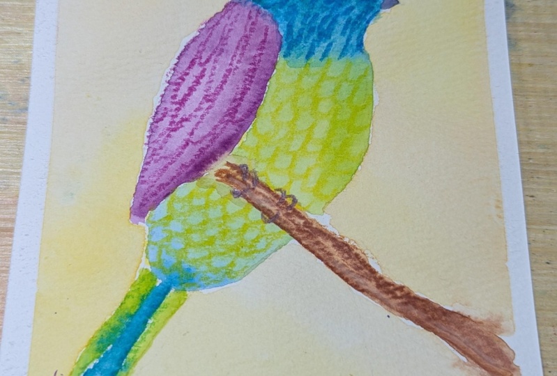
textures to paint birds. I will paint three
different illustrations. I will start from the
easiest, small quick birds, then we will paint
a bigger bird, but nothing fancy, it will
be just a bigger size. Then I'll show you how to apply the textures
to paint background. Again with birds. Don't worry, it seems a lot. But I ask you just
to pick one of the illustrations
that you prefer, maybe some of the textures
that you created. Because it is also the fundamental
part of the exercises, I would love to hear from you, Your creative process on your explorations and thoughts that you have
during the process. I'll show you how
to paint the birds, but feel free to paint any
kind of animals as you wish. For example, I will
show you some of the animals that I also paint with this
kind of techniques. So it's up to you. If
you love birds as me, you can follow the same
steps When you finish, please applaud your project, at least one of the
illustrations and your exploration of textures
if you wish as well, into the project's gallery. I encourage you to comment also on other students projects. It's very helpful to give our feedback with one
another. Are you inspired? I hope so. Then grab
your watercolor paper. In the next lesson,
I will show you exactly what tools we will need.
3. Art Supplies: Okay, let's start to see what supplies we will
use for this class. As for the paper, every paper that is mixed media or watercolor,
paper is fine. Doesn't have to
be nothing fancy, but it should be thick,
at least 200 grams. If it's 300, then
it's really perfect. If it's cotton, it's great. But if it's not
100% good as well, it should be just
thick mixed media or watercolor paper you can
use as well a sketch book. The sketchbook has a
fine quality paper which is good for water media. Okay, we will also
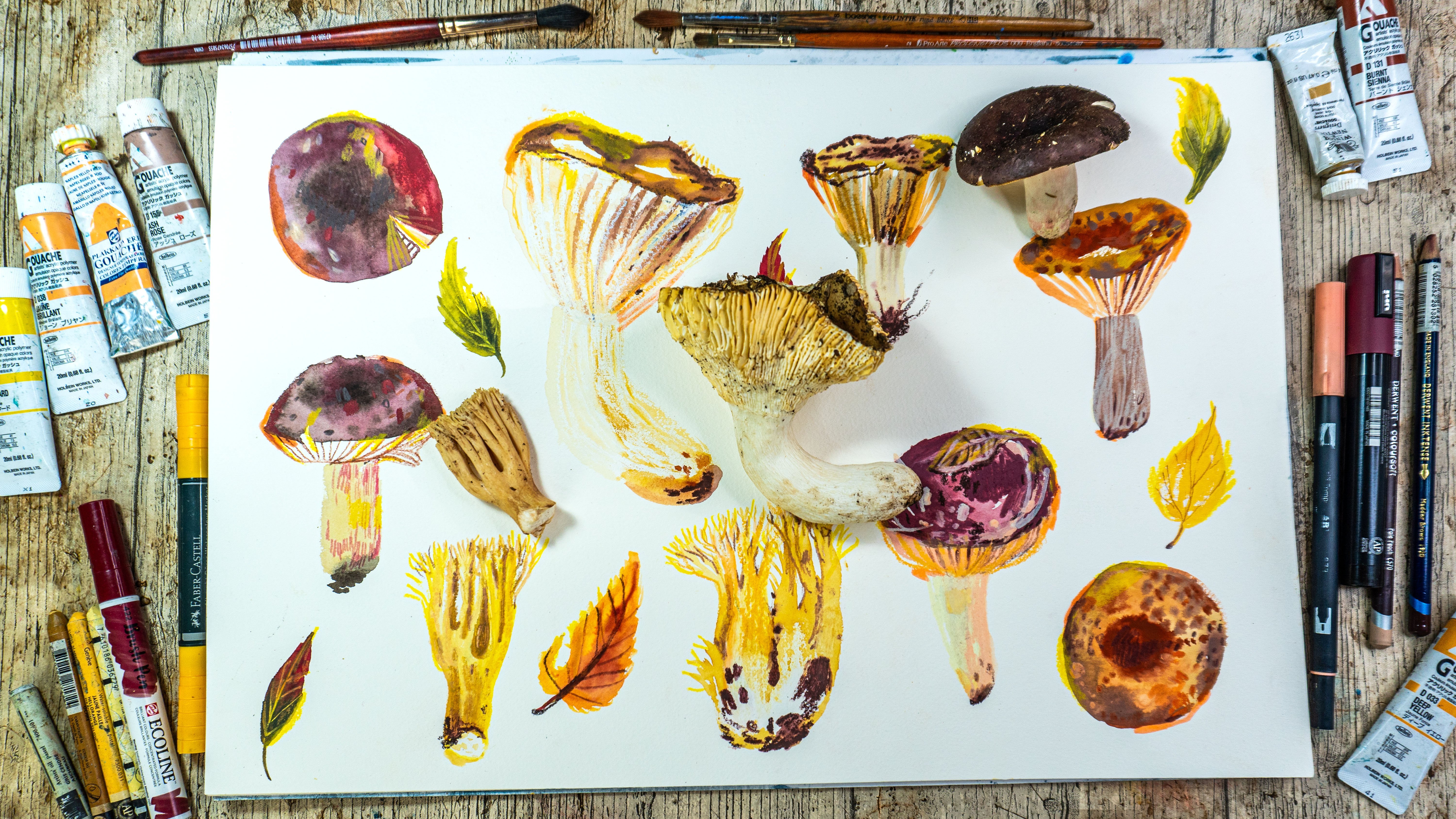
use water colors, obviously in pants or tubes. I think if you use guash for this exercises is good as well. Of course, brushes, I use
mostly synthetic brushes. Nothing fancy. And let's skip to the crents
and pencils for example, I will use those
Stabilo woody pencils. They are water soluble,
they are very oily. I think they are wax based, then I will use wax crayons. Those are from Aranda
Neocolor two aquarl. Just be careful
because there are also neocolor one which are
not water soluble. Only neocolor two
are water soluble. Be sure to check it if
you want to buy them. I will use a range of different water soluble
watercolor pencils as well, for example, Faber Castell. This one is from Derwent. This one is from
caran dash as well. It's a supra color. Went was inc tense. And this one is Card
as well, but museum. And I think that's it. Those are the brands that I will use as the water soluble. I will also use normal pencils, not water soluble
pencils as well. And I also have different
brands here, so for example, Luminus from Aranda or Went. This one is light fast. Also fabristel polychromos
are also good. What else? This one
is holbine artist. Artistic or artist?
I don't remember. Pencil. Yeah. And also this
one is derwin color soft. The characteristics
of these pencils is that they are very oily. They cover well the surface. By surface I mean other colors. What I mean is that you can draw easily with them over
the water color, over the gas, maybe
even over the acrylics. They're just oily and opaque
and cover really well. I will explain you the
specifics of the brands and tools that I use during the lessons,
during the exercises. There is also a range of pencils that are not so oily
and don't cover so well, obviously you can use it. I showed you the brands
that I consider good, that are good for mixed
media to cover the surface. Also, what I wanted you to tell is obviously use the
brands that you have at home. If you have different brands, then use whatever
you have at home. If you don't have any of those, you can buy the things
that I recommended here. I can tell all the brands
that I use here are good. I use them a lot and those are one of the main brands
that you can find. But if you find something else, if in your art supply shop
you have other brands, go for it, try it, whatever fits best for you. I will also leave the list of the brands that I use in
the classes resources, be sure to check it out. Okay, so now that you know what supplies
you should prepare, then let's jump into the first exercise where we will play with
watercolors. So see that.
4. Play With Watercolors: Okay, let's jump into the first exercise
where we will start to warm up our hand and
explore the watercolor. As you know,
watercolors are quite unpredictable and
hard to control. We won't even try to control. We will try to be led by the unpredictable
nature of watercolors. Some tips at the beginning? Yeah, try to loosen your
hand as much as possible. In this exercise, don't try to control the
brush or the stroke. Be loose with your strokes. If you're not confident
with the colors, then you can use
harmonious colors. For example, cool colors that I use here that are
greens or blues. You can use warm colors or
just whatever colors you wish. It will be easier to paint small samples in this exercise, especially if you're not
confident with watercolor. But you can also work
in bigger scales. Or you can do multiple
samples until you feel warm, upped, and satisfied
with this exercise. Okay, so let's get started. Pick your watercolor. In this first exercise, we will just start to
play with watercolor. I pick blue color. I will play with transparencies. Try to do it as well. Start just paint without, without control the stroke. Don't have to be
straight or controlled. Pick the color, makes the
pigment into the color. Just play around. See whatever your head and your hand tells you
to do, for example. Yeah, I'm here playing
with water, with pigment. Just trying to, I
warm up my hand. And we can say dance
with brush a little bit. Now we will try to
create a texture with more colors for this paint. Color, staining, color spots, try to create a puddle of color. Don't be too shy, just use a good amount
of pigment and color, try to make it more abundant, then paint beside another color. And try to blend them just to create textures with
multiple colors. A gradient texture maybe. But don't try to control it too much or influence
the blending of the colors to make
blending with water as you could do in the classical gradient
watercolor exercises. Again, explore, try to mix different pigment colors and see what kind of
textures it can create. If there will be
some cauliflowers blowing effect and don't worry, the tip here would be to
not letting the color to dry before you will paint nearby with other color
until they are wet. They should easily and
in homogeneous way. But we're not here
for the perfection, we're here for exploring. You can also paint over the colors on the
top of the colors. In this case, the water
color is still wet. The colors will blend and you can try to explore it as well. Now we will try the same thing, but with painting
the water before. It's a so called wet
on wet technique. First paint with
water and then paint the colors and let them and
see what's the difference. When you paint over the
wet surface, again, use multiple colors and explore the textures and how
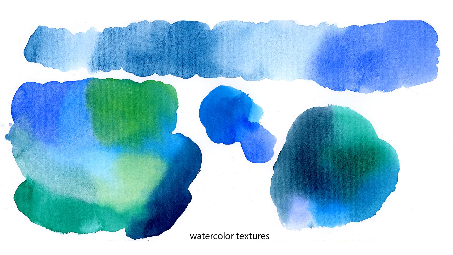
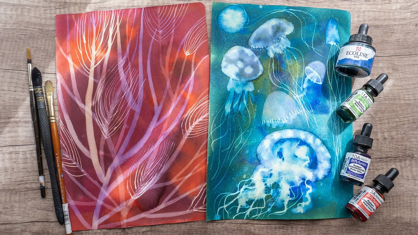
the pigments will blend. Here are my watercolor textures. As you can see, there have
been some pigmentation. The separation of pigments, it created this lovely
textured effect. It happens with some of
the pigments, for example, ultramarine often have
this lovely effect when you paint it. You can explore also
your watercolors if some of your pigments
create this if you like it. Okay, so if you want explore
as much as you want, you can create more
textures and feel free to upload it to your
project as well. Now that we painted the
plate with watercolor, we will continue
with watercolor and other supplies to create
textures. See you there.
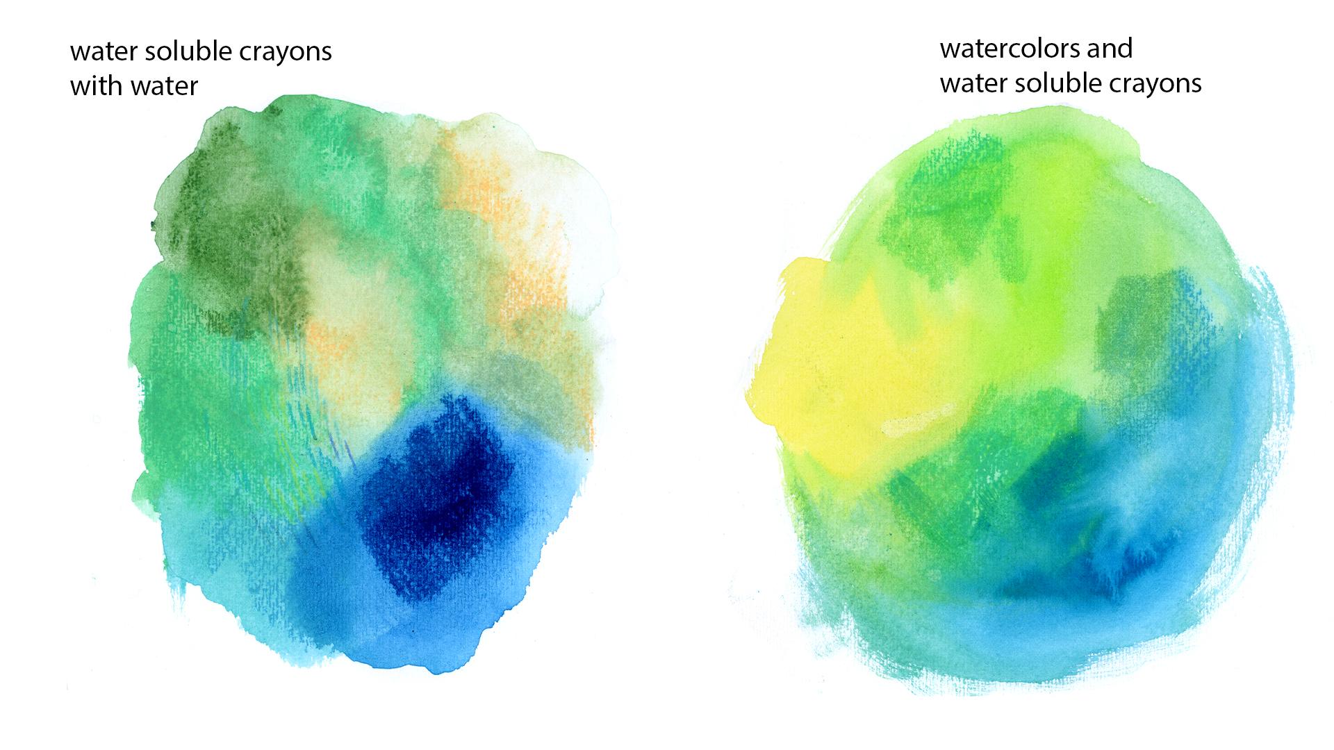
5. Creative Textures Part 1: In this lesson, we will do some similar effect like
in the previous lesson, but this time we will start to explore our water soluble crans. We will also mix it a little bit with watercolor and try to create our first
mixed media textures. Before we will start, I will leave you
some advice and tips to get your process easier. For this exercise, I would consider to use
crans, not pencils, because we will search for
bold strokes and it is faster and easier to
cover a larger surface. You can use neo colors, woody or other
water soluble wax, or maybe oil pistils
that you have. Whatever you have at
home and it will be easier to work on
a smaller size, but if you prefer, you can create bigger textures. I grabbed my neo colors, grabbed the crayons
that you have at home. If you're new to wax pastels, they are pastels
that are very oily. They are not oil pastels, they are wax based. They cover really well. They are different
brands and kinds. Just to remind you
that you can find also water soluble kind, be sure to buy the right one if you're
searching for water soluble. For example for Aranda, they are named Neocolor, 21 are the regular ones. They are quite popular because
they're good quality and I think they're worth trying
to words about paper, I use cold pressed paper, that's why you can
see the pattern, the texture of the
paper showing through. If you don't want to have
this kind of texture, you should use hot
pressed paper. But at the end, it doesn't matter because as you
can see with water, it all dissolves and disappears. Draw at least two
different colors. If you have pick more
colors this way, you will create lovely textures. Draw one color near the other one and cover the
surface that you want. I still use cold colors palette, but you can explore different colors and then
pick brush with water. They lot your pigment on paper. This is when the magic happens. I really love neocolors
because they create really lovely surface
and textures. Especially if you use more colors and blend
them together with water, they really create nice effect. Why not try to paint? Draw on the top of the texture while it's still
wet and see what happens, different possibilities of how
you can apply the pastels. I decided to blend
them with water, but you can leave the strokes, play around and explore
different possibilities and properties of the cans. Since it is a water
soluble medium, you can obviously use other water mediums
and play around. I started to paint
with water colors, like in the previous exercise, paint colors, then I will
add neocolors to that. First to different colors. Let's see how we can add neo colors on the wet
water colors nearby. Again, there are no rules here, just creative exploration. I think you should have an
instinctive approach to it. A little bit like
a child that wants to explore while painting. For example, I thought
I can try to use brush brush which has
different bristles. I often use it to create
textures as well. To blend different colors, you can use different, not classical brushes
to explore how can you add textures created by
different shapes of brushes? You could use also
different tools to blend, but we will use only
brushes for this class. Again, I'm mixing watercolors
with Neal colors. My advice for you is to paint while the
color is still wet. Add paint to it, because it really helps
to create textures. Again, this is the same brush, but of different brand. It's a little bit bigger. This brush is usually used
to paint fur or grass. I use it really often because I really like the texture it creates. Here it is. This is my outcome of
this exercise. Have fun. Again, if you want, you can add your exploration
to your project gallery. In the next lesson, we will paint another kind of textures.
6. Creative Textures Part 2: Here's the exercise
for this lesson. At this time, we will draw
over the watercolor with all the water soluble pencils
and crayons that we have. It's all about exploration of the tools, testing and trying. First, we will paint water
colors while it's still wet. We will draw with our
tools on top of it. Again, a few tips
before we will start. So we want the watercolor to
be wet when we draw on it, so you will have to be quick. Being quick is also useful exercise in
order to lose control, to not overthink while
you're painting, as it is helpful to work in a smaller size so you don't
have to paint swatches. Also, additional tip for not
letting your watercolor to dry is to use a lot of water while
you're painting with it. And also using watercolor
paper because it helps to absorb the watercolor in a
way that it won't dry fast. Also, try all the types
of the pencils that you have and write
down the names because it is useful
when you want to recreate a kind of a color or I don't know the texture so you know in the future you
will know what tool you used for the first texture. I will use wet on
wet techniques. First, painting with water. I'm trying to be quite generous, creating a barrel of water. Then I will pick my colors
and let them blend together. Again, here's another
chance to explore the water color and
its cool ways of blending and creating textures. To draw over the watercolor, I will use all kinds of
pencils that I have. Maybe not all the colors, but the palette that
I already prepared. The palette is cohesive
with watercolor background. Still, I use cool colors. You can use warm colors. You can also try to
use contrast colors. For example, if you
have blue water colors, you can test what will happen
if you will paint with red soluble pencil over it. Well, there's another
way that you can use the pencils that you can immerse the tip of the
pencil in the water. I will try yellow colors to see if yellow with blue will
blend into the green color. More or less it, you can explore in this
way also different colors. And try to see how the
colors and pigment reacts and creates different
hues, different colors. It is also helpful
to create textures. When you use different colors, it adds different pigmentation
to your textures. As for the strokes, this exercise is for
losing up your hands. I would suggest you
just to doodle. What kind of strokes or shapes do you throw
when you doodle? Maybe when you're nervous
or when you are focused. I don't know. I notice that when
I'm, for example, nervous or when I'm talking
with somebody on the phone, I'm just instinctively
grabbing my pencil and doodle. This kind of strokes, try to be guided by your
instinctive way of drawing. It could be zig zag shape, it could be circles,
maybe waves. No rules here. You can be creative, you can try to overlap the
patterns, the strokes. Try to have fun
with this exercise. Try to use different
kind of ensuls, as I already told you. To see what, how they
react, how they work. You are new to water
color pencils. You can draw with them. Obviously, as with
normal pencils, they are softer covering. We will see it better
in the next exercise. Once, when they're
diluted with water, they dissolve and behave
like water colors. Usually the main brands, the good brands are
high pigmented. It's good to try them. But I don't know all the brands. If you want share in your
project or in the discussion, the one that you
would suggest to use. As for the pigmentation,
for example, the went inc, tens
are incredible. They have really vibrant,
vibrant pigments. When you dilute it with water, they behave like
high pigmented inks. It's worth to explore
different brands and see the one that works better
for you and for your style. I finished testing the
pencils right now I'll prepare the background
for neo colors and Woody. They are, I think that
also Woody based, For sure, the
neocolorsre pastels. They are both soft create
different kind of strokes and react a little bit
differently with water. Yeah, let's explore all
the crayons pastels that I have and you can explore
the ones that you have. Again, I'm doodling overlapping
the strokes and I try different lines and
dots, patterns. I mix body with neo color
and see what happens. I also use different colors. If you don't have
too many colors, this is obviously the one
that you have at home. But if you have a
selection of colors, try to explore them. It's about trying and testing. You don't have to be
perfect unless you try. You won't know if you like
a combination of colors, maybe you will discover
something that will surprise you and that
you will really like. I already told you, I
often like to write names of the tools that I
used to keep it for future. This is the outcome
of my exercise. If you'd like to, you can share the outcome of this exercise
in your project as well. In the next lesson we will continue last part of
creating textures.
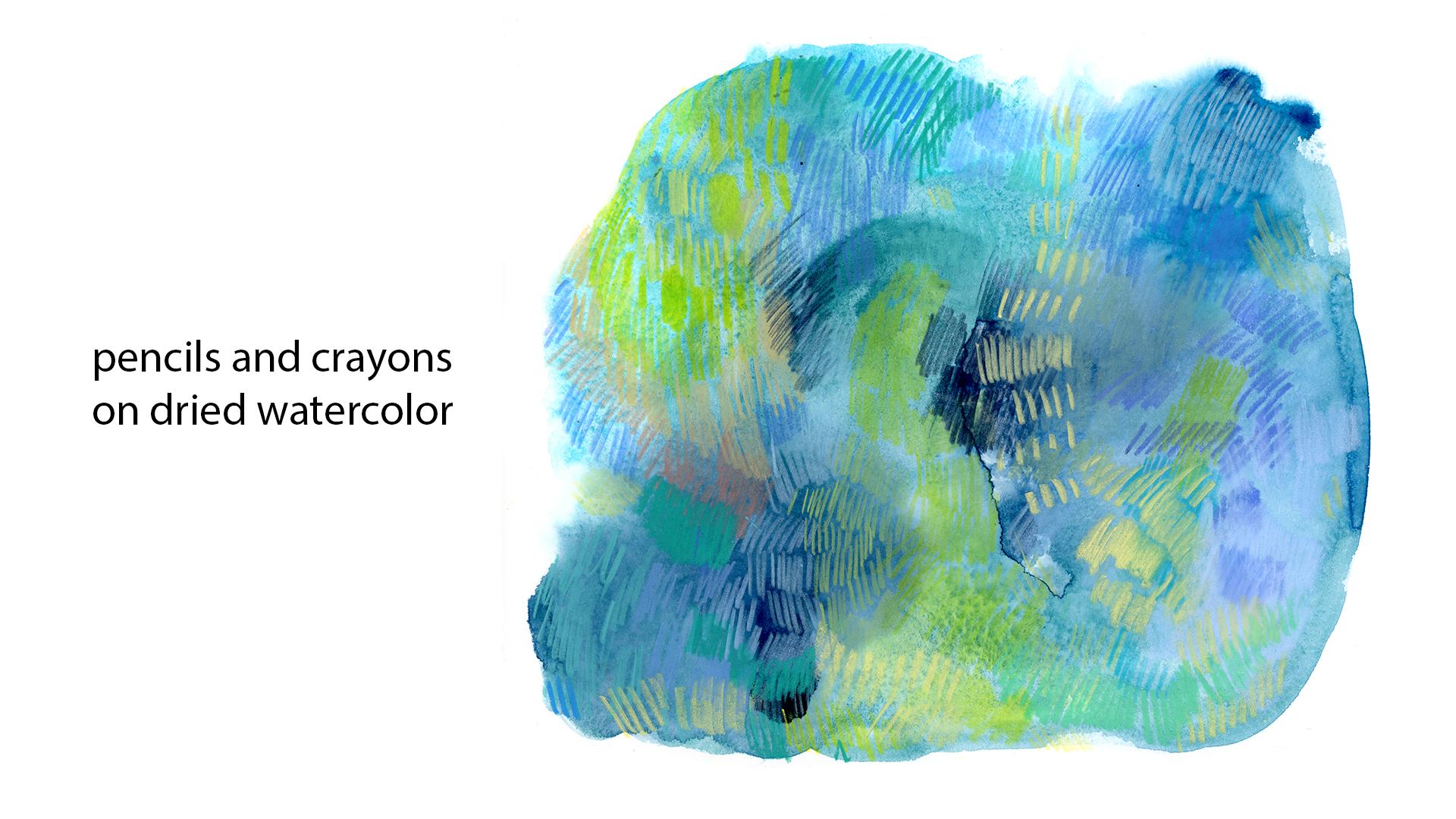
7. Creative Textures Part 3: In this last texture exercise, we will do the same as
in the previous lesson, but this time we will draw
on the dry watercolor. You don't have to be quick. You can work with slower pace. You can also work
on a bigger scale. As in the previous lesson, you can explore all the
types of pencils and cons. In this case, if you like, combinations of colors
of or textures, then you can write down the names of the
tools that you used. You can use both
water soluble pencils and normal pencils. It's a good way and occasion to discover how they
cover water color. For example, now I'm using water soluble pencils
and they are softer. Look at this one. This
one covers really well. This one is super
coolor from Rand. It's also useful exercise
to see how they cover, how they work on watercolor, the previous color
was more translucent. Again, explore
different strokes, different patterns, and
also various colors. We already mentioned that
watercolor pencils are softer. They cover usually
really well at the surface, beneath
other colors. They can also be a good
solution to use them as a regular pencils if you're
working with a mixed media. We started to testing
normal pencils, not water soluble right now. Luminas which are really good, they are also quite
oily so they cover really well the water colors. For example, this
is fabricatel poly, it's hard, it's not so soft. This is another pencil that I have and it's also quite hard. So also use this exercise to discover the differences
between your pencils. Now I'm testing, and Neocolor, they will cover more
because they are wax based. You can also use
this exercise to see how different pencils
react with each other. If you can draw over other
pencils, for example, oily pencils will cover
other pencils as well. But if you use a harder pencil, normal pencil, it will be
difficult to draw over. Neocolor, for example,
would be impossible also. This exercise is good to explore the properties of ethnic characteristics
of your tools. We finished the last
texture exercise. I hope it was
useful for you that you discovered something new. Maybe in the next lesson, we will apply all the textures
and paint first words.
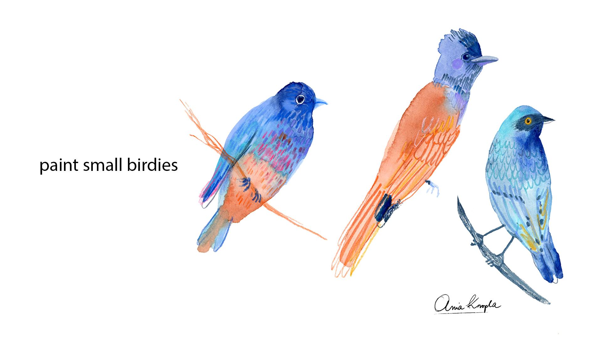
8. Painting Birds Part 1: Let's start the first
illustration of the birds. We will start small, We will try to be quick
in this exercise. In this illustration, if you
decide to paint birds as me, then I will leave you the mood board with
my inspirations. You can use it, you can search for
your own references and create your
own mood board of the birds or animals
that you want to represent or other subjects. Obviously, here are the tips. In order to do this lesson, we will be quick,
don't over thinking. I suggest to paint in small format and use the
limited color palette, even if birds are very
colorful or whatever. You decide to paint just to limit your color palette
is a good exercise. You won't have to think
about all the colors. And you can inspire yourself
by your photo references or, or even your imagination
if you want to. If you decide to use illustration as a
reference and be sure to always write the name of the original author
that inspired you, I will sketch my s, the shapes, you can sketch it or
paint directly as you prefer the color pencils instead of a regular
normal pencil. Because I think the color that I will use for
the project will blend better with the
colors that I use. For example, this
bird will be blue. I use blue pencil. You can do it, but be aware that they are harder to erase. Also, if you want to protect
white areas from painting, you can use masking fluid. I use it for eyes, so they will remain white if you're not familiar
with masking fluid. I also have a
different class about masking fluid where
I explain what is it so you can check it
out for the bird shapes. Honestly, I paint from imagination more
or less because I draw a lot of birds
more or less. I'm familiar with the shapes. You can help yourself by
drawing the geometrical shapes. For example, a circle, round circle for head and
then oval for, for the body. Yeah, that's more or less it. You can look for the
reference also in the photo. Try to use simple shapes. Don't freak out about
how the birds should be. Again, it's about
being expressive. It's about doing mistakes. Simplify your process. If you want, you can draw
the same shapes as I did or search for your
own photo references. My sketches already, I draw three birds,
three little birds. You can draw them less
or more as you wish. I will start to paint. We will start to create the water color
background the same as we did for the exercise
with water colors. I will use this time
wet on dry technique, but you can use also wet on wet. That depends what
inspires you more. I will use two contrasting
colors for this. One for the head, blue for the body, it will be orange. You can use more
colors if you want. But as I told you
at the beginning, it could be helpful to use limited color palette
to help your process. If you feel like then you
can mix many colors within your background textures while the paint is still wet. I will, with my water soluble and cells to
draw the feathers, the wings and tail. I will try to make it
as easy as possible. It's about still warming up
and not overthinking it. Try to be quick and
simplify the shapes. It's good exercise for
your style as well. I'm using the same colors as for the background, orange and blue. To add some contrast, you can use darker colors, but still it's
about exploration. If you want, you can use totally different
color combinations. You can try to use brighter colors on
the darker ones and see what will happen. Feel inspired by the
reference that you see or by the imagination image that
you have in your head. I don't want to repeat
myself too many times, but obviously you already understood that you
have to be quick. If you want your
watercolor to be wet, try to simplify it. As for the strokes, see what textures
inspires you patterns. Obviously, if you want to do some more elaborated
feathers and you can do it, can obviously do it. Be aware that watercolor will
sooner or later get dry, you can do it later on. But if you want to do
this exercise as a way to do something different and maybe a little bit far
away from your comfort zone, then try just to be quick and expressive and try to
simplify the process. It's not about the outcome, it's not about being perfect, but it's about
trying to overcome this control and see what
will happen at the end. You won't like it, maybe you won't be
satisfy, satisfied. But unless you try,
you won't know it. Maybe you'll discover something
that will surprise you, that you will like and
you won't do this kind of surprises if you want to try
some new ways of drawing for the first bird
when the color is dry, be sure that the color is dry, you can remove the
masking fluid. I will do a contrasting
yellow eye with neo colors. And I also decided to do some extra pencils
on the water color. If you have something
white, for example Posca, I'm using Posca here or some white gel pen or maybe white pencil
that is covering. You can add some light
in the eyes of the bird. For the third bird, I will draw only on the dry water color and
create feathers in this way. As in the last exercise, I'm trying to draw with a
contrasting pink over the blue. This one is, this color
is like a fluor color, but you can see that it still has quite translucent effect. Those are normal regular
pencils, not watercolor pencils. You can see better this
color on the white paper. I like flu colors, especially when
it's up to birds. You can be bald with colors because you birds are the most colorful
animals in the world. You can try to get a little
bit crazy with colors and try the combinations that you
would never try again. I invite you to be more quick. You can invent your kind of strokes and patterns
for the feathers, but if you want to make detailed illustrations,
I won't stop you. You can obviously
do that as well. We'll speed it up
and I will see you in at the end of the lesson. Okay, my three birdies.
I'm very curious. If you did this exercise,
this illustration, I hope that it helped
you to be more quick. Maybe you discovered something really nice and
exciting for your art. In the next lesson,
we will try to do more or less the same
but with bigger bird. Are up, let's try some big.
9. Painting Birds Part 2 : Again, birdies. I love birds. There will be
a lot of here in this class. If you did the previous lesson, then probably you're
already warmed up. You are more familiar
with how to paint birds. Why not to do one more bigger
birdie and explore more? It's good to repeat
the same exercises in order to fix some
ideas in your mind. Fix how to paint
shapes of birds, Maybe fix the texture
that you want to create. But anyway, my tips
for you would be to continue to be quick
at not overthink it, even if we are skipping
to the bigger scale. Also, you can explore more
textures here, more tools, because you will
have more surface. It is also a good exercise to continue to be quick
on a bigger scale. Try to keep your watercolor wet, but you already should be
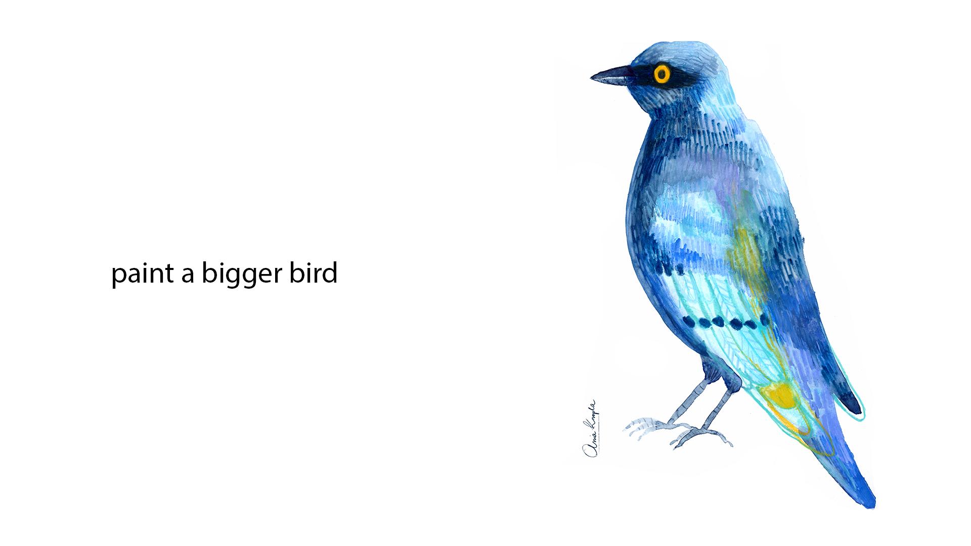
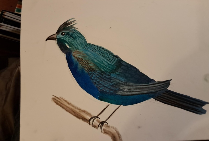
great at it at this point. This time to make a sketch, I used pencil, regular pencil. I'm inspired by one of the photos from the mood
board of the blue starling. I really wanted to recreate
this spectacular color. That's what I will do for
my second illustration. You can pick the same bird, You can pick another bird, or you can try to maybe
paint some other animal. At this point, the
decision is up to you. Remember to use masking fluid. If you want to mask some areas
and leave the white paper, prepare your color
palette Again, it's a good thing to spray
water colors with water. To activate the colors and
pigments for my styling, I will use two kind
of turquoise blue, the cobalt turquoise, and this one is cobalt
blue turquoise. A little bit darker
then three kind of blues, the delve blue. Which one again? This is ultramarine violet, which is ultramarine,
but with violet shade. And this one is indigo. If you have other colors in your palette,
then don't worry. I just wanted to show
the colors that I use, but use the colors
that you have to pay the background for
the bigger illustration. I will use wet on wet
technique because I want it to be wet
for a longer time. If you want the same that I will suggest to do it as well because first you put
additional layer of water moisture your paper, it will wet for a longer time. But it depends on the
fact that you want to a, if you don't care about
keeping water color wet, then you can also do
wet on dry as well. I'm starting to paint with neo colors until the
water color is wet. I will mix both
cryons and pencils. As for the palette, it will be cohesive to
the background colors. I will use dark blues,
blues and turquoise. I will try to simplify
again, shapes and feathers. But this time, maybe I will cover more surface
with the strokes. Some of the areas are dry. I can, for example, water the tip of the pencil
into the jar of water. Well, you can try to do it. It also creates another
type of texture. You activate the pigment
in the water color pencil. It's also fun to
explore this solution to paint feathers. Again, I dip the tip of
the Neo color in water. Right now, I will paint shapes of the feathers on the wing. On the feathers of the wings. I actually, I will
draw some details, some shapes of the feathers, patterns of the feathers. But I'm improvising here, I'm obviously watching
on the photo reference. But still I'm trying to be more synthetic and not realistic. I'm having fun by inventing
textures and patterns. I invite you to do the same. Maybe you'll come up with your own feather
shapes and patterns. I would really love to see. What did you come up with? I'm pulling off the masking
fluid and I will draw with a yellow the eye here. I decided to add a volume to my bird to add
a little bit of shading to create yeah
volume on the left side. And a little bit of shade
I paint with a darker blue over, over the bird. You can try it as well. You can try to paint over
your, over your colors. Hello, hello, hello. Now, even if you have
a color palette that you decided there's nothing
wrong to add colors, I think it's easier
to have basic, limited colors at the
beginning and add some colors later than start with too many
colors at the beginning. For example, here I like the contrast between
yellow eye and blue. I decided to add a little bit
of yellow here and there. Later on I will also
add some violet spots. It's. There's always a risk
that you won't stop. And it is normal. We often don't
know when to stop, and if we won't overwork it, keep it in mind. But we're here also to
learn and experiment. If you have harmonious
background, it is good to add some
contrast color on the top. It, it will make
your art more vivid, but it also depends on
your personal preferences, the kind of palette
that you prefer. Since I worked with
water soluble crans, I can try to blur them
a little bit with brush with water and
see what will happen. It is still a
elaborating the texture. It's time to delete
the pencil strokes, but to do that, be sure that your water color is really dry. You don't want to
smash the color. I'll show you something that
I do in my illustration. I use this precise eraser. This is a razor that
has really fine tip. You can find it online. I bought it. I don't remember. I think in art supply store, but you can find it
also on Amazon online. I often era details in
my art with this eraser. Since we worked with
water based mediums, it should be possible. It wouldn't be
possible with acrylic, probably it won't
be so easy to erase older strokes, multiple
layered colors. But you can always
search for spots where you have a lighter color. And you can create also
reflections of light. For example, with
the Z white spots. Here I'm searching to do some reflections of
light on the feather. You can create some
highlights also with the lighter pencils over the darker colors
and vice versa. If you want to create shadows, you can also use pencils. This is the second illustrations that I did for this class. Remember, you can do all three of the illustrations
or just pick one of them. If you do three, then
I'm a big fan of, I'm a fan of you anyway. But I think it would be really helpful to do all the three
exercises because you just warm up and more practice the better
your art is getting. Let's jump into the last lesson, but we will paint the
last illustration.
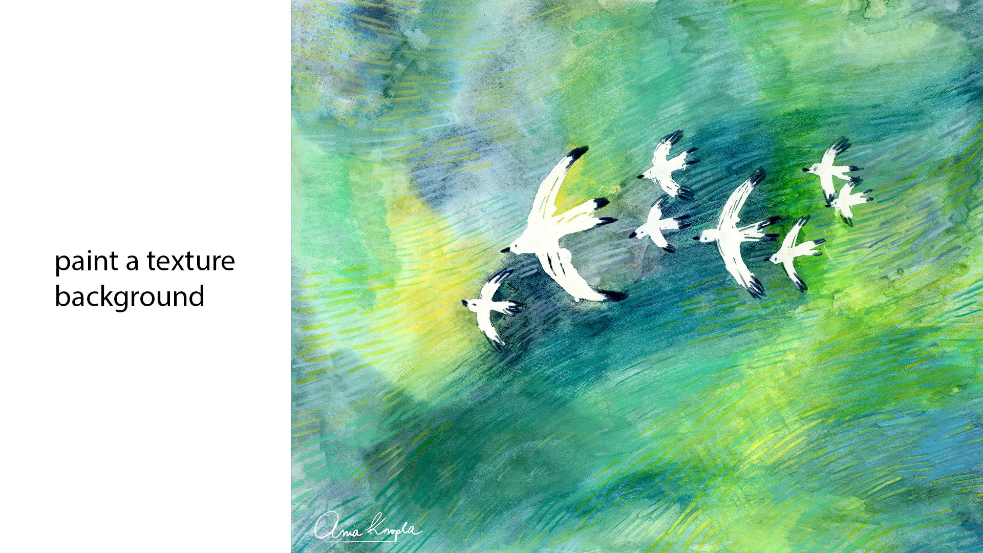
10. Painting A Background With Birds Part 1: Welcome to the last lesson
with the last mini project. The third illustration we will paint now the
background with the method that
first we will mask out the shape of the birds and paint the
texture all around it. You can follow the
same steps here. You can paint multiple
birds aside it, or you can paint one bird. Or you can paint
around the shape. If you don't have masking fluid, it's the same as well. It will be a little bit more
complicated because you will have to watch
out for the shape. And again, before we will start, I will leave you
with several tips, more or less the same as
for the previous lessons. So this time we will use more masking fluid if
you will use it as well. So be sure to use it before so it will have time
to dry to apply it. You can use an old
brush or the tip of the brush I will show you. Or a silicon brush if you have. It depends on the effect
that you want to achieve. Prefer your color palette. As always, think about the background that
you want to create. It can be grass, or maybe sky, desert, maybe ocean, or
just an abstract patterns. It's up to you if you want
your water color to be wet. So again, try to be quick, but don't freak out. At the end, it will be dry. My n was dry at the end, so sometimes you will paint, draw on the wet, sometimes
on the dry water color. So don't try to
control it too much. Try to lose control
and see where the process will lead
you without planning and without freaking out to try to explore tools and techniques in order to build
up the texture. You can, for example,
try different brushes. If you have some
strange brushes, see how they work. What kind of textures
do they create? Okay, so let's get started. Project, I will put
the masking tape on the borders to keep the
white border and margin. You can do it as well, or you can paint on all
the surface of the paper. If you follow the
previous lessons, the procedures all the same. Before I prepare
my color palette, I will limit my colors. I'm still inspired by those
turquoise, cool colors. So I will mix different
greens and turquoise and light blues for
watercolor background. And I will use the
same harmonious, cool colors, both for
crayons and pencils. I will use both watercolor
and regular pencils. The procedure is
basically all the same. This is the masking
fluid that I will use if you're not familiar
to masking fluid. Again, I told it in
the previous lesson. You can also check out
my other class where I explained how to apply
it and what is it exactly? I want to paint multiple birds that will go in one direction. I will try to create also
a sensation of movement, maybe of wind in the grass. I will see how it will work. This is my tip for you, how you can apply
the masking fluid. Usually I use silicon brush, but because I don't
have it with me, so I will use another
way that I often use, which is using the tip of
the brush to apply it. So it will create a kind
of woodcut texture. Here I'm using another
tip you can also explore. This one is thinner, I will use it for smaller birds. What I mean by wood cut texture, it is a printing technique that you use by cutting
out shapes in wood. By carving out the wood, it creates this linear texture. I really love it by applying with silicon brush
or with the tip of a brush. With wooden tip of a brush, you can somehow recreate it. You will see it later on
without further talking, I will finish my birdies. Before painting on
the masking fluid. It has to be dry. You can wait until it
dry in a natural way or you can use also hair dryer. You can understand when
it's dry it changes color. Usually when you touch it, it is wet anymore. I will use this palette to
squeeze my watercolor in tubes because I will also use the colors that I
have only in tubes. For example, this
granulating color of Schenk. I often use it in my art. If you followed
my other lessons, then you know that I love them. If you have them, you can explore them as
well because they add additional texture
to your texture. Yeah, I'm preparing greens and blues and let's start to
paint our background. To make my exploration
a little bit different, I decided to test the
other tip of the brush. This one is cat tongue brush. If you have some other brush, you can also explore
it in this way. Explore and see how you can paint water colors
for this background. I will use wet on dry technique. I wanted to join
different colors, let's say stains of colors
and create the background. You probably think
why I do that, because for the previous bird I used wet on wet technique. I was explaining that for the
wider background surface. If you want to keep it wet, then you probably should use wet on wet
techniques because it moisture your paper and
keep it wet for a longer time. You can obviously do that. I wanted to try
something different. Obviously, I have
to be very quick. And I'm aware that it won't be, it's impossible that it will be a wet when I will start
to paint over it. But I wanted to explore different kind of
applying the color. So I invite you to do the same. This way you will
start learn always something new to help yourself. You can paint abandoned pigment, abandoned water in this way. It won't get dry too soon. And you can see that I'm
switching the colors. One I use them, I'm making a patchwork here. I'm always trying
to alternate them. Let's try to add crans
to the background, as in the second exercise. And mix together
water colors and cron in order to create
the background texture. We proceed this way. For your background,
alternate your water color, the colors that you've
chosen for your palette. Alternate also watercolors
with neo colors. I will proceed in this way. I will try to include all
the colors from neo colors, different kind of
greens that I prepared, and different kind of greens
of green water colors. I will speed it up and I
will see you at the end to proceed once I covered
all the background.
11. Painting A Background With Birds Part 2: Once I covered all the surface, I will start to add the
crayon, the pastels texture. Just in the same way as we did with the other exercise when we, when we drew over
the wet water color. I will proceed in the same way. I'm not planning anything here. It's a, again, quite instinctive and maybe, yeah, you can prefer the
places that are still wet. And to draw with pastels here, I decided to paint a second
layer to add a darker color in this place because
I thought it is too light and the birds
will be white, so I thought that the
contrast will be too low. I added a darker color. If you feel that way, then you can also add a new
colors on your first layer. Otherwise, if you're satisfied, then you can leave it as it is. Since the water color is wet, then I immediately decided to draw immediately
with Neocolor. Instead of commenting
all my steps, I will tell you more or
less what I will do. Actually, I will just use different tools
and switch them. I will switch
between neo colors, then I will blur them with
brush and water, for example. Like in this moment, again, it's without planning. It's all about building texture. You just have to try different
things, different methods. I will also add pencils,
water soluble pencils, And continue to jump
between those things, drawing with neo colors, then diluting them with water, maybe adding some
water color sometime. You can also add a
little bit of water, for example, like here, if the water color
is dry in order to paint over it or to
add neocolor on it. If you want to have
the background humid, that's what I did over here. I just added a little
bit of water. That's it. I will just play around
with those three, with neocolor, with water, with water color, also with pencils in order to
build up the texture. Since I want to paint grass, then I will search for
the grassy texture. As I told you at the beginning, I would like to give this movement impression like the grass was moved by wind. Give a direction of
movement to my birds, to all the illustration this
way it will be more dynamic. Here I'm adding water
soluble pencil. I'm dipping the
tip in the water. Depending on the theme
that you will pick, you can obviously paint
the grass as well. But if you decide to
paint something else, you can think of other textures. For example, if it
could be water, then you could make
some more wavy texture. The movement would be a
little bit different. It could be desert, as I already told you. I don't know, that
will be your idea. Obviously, you can come up with your ideas for the texture
as well, the tools. You know already how they work. You can work with them
in order to create, to build the idea that
you have in your head. No, no, no, no, no. Okay, so last final
touches before we will. Yeah, I'm building up
some final textures. Strokes? I didn't
want to talk during all the process because I have impression that I
already over talked it. I think you get the process will be
my final touches. Okay, so let's peel off
the masking fluid finally. To do that, be sure that your
illustration is really dry. Otherwise, it can tear
off the, it's humid. If it's wet, then it can tear off the color that is still
wet. Sometimes apply. Masking fluid can be tricky. You can see my other class, I dive into it in a deeper way. It depends, often on paper, on the masking
fluid that you use. But of all, it depends
if it was wet or not. As you can see here
is the texture of the bird that was made by applying the masking fluid
with the tip of the brush. I like this effect. If you like it too, then
you can try it as well. If you prefer more
flat, regular shapes, then probably you
will have to use or marker pen with masking fluid
or brush and old brush. Here we are. I really like the white
color over the grass. I think this is a good contrast, but I will add some dark
details on the birds, but really small details. I think it will add additional
contrast to the birds. That's why I will use
the dark indigo color. As you can see, the bird
pops up a little better. In this way, I will proceed to add the same kind of details
to all the birds you'll call it right now, all I have to do is to
peel off the masking tape. We finished the
third illustration. I'm curious, which
one did you pick or maybe you decided
to do all of them. I can't wait to see your
projects and be sure to meet me in the last lesson where I will give you
some last informations.
12. Final Thoughts : Thank you very much
for taking this class. Congratulations, you made it. I'm very happy you joined me. I hope you had fun, and
that you learned a lot. I hope that thanks
to this class, you felt inspired and maybe
unlocked your creativity. You felt blocked. I hope that it helped to
develop your art style, maybe to become more expressive
and fresh in your art, and that you simply had fun. I also hope that you
learned how to explore art mediums and how to use
mixed media in your art. So final reminders for you. Please applaud your project
in the project's gallery, it's really important to share and to show for other
students what you created. Remember to comment and
give feedback to others. It's really helpful.
I would also like to ask you to leave
review for this class. It will be helpful for me, other students to find this and also it will be a
valuable feedback for me. Remember to download
the resources. I will leave some
additional material, so check them out. Also, you can follow me on my Instagram and on
my Youtube channel. I hope to see you there. I also hope to see you
in my other classes.
 Ania Kropla Malinowska, Award-winning illustrator