Transcripts
1. Intro: Hi, and welcome to my
new Kircher class. If you love to work with
imagination and love to create whimsical atmosphere
and also love watercolors, then I invite you to this class. My name is Anya. I'm a Polish illustrator
based in Italy. I illustrate books. I also teach art
here on Skillshare and also in the
courses here in Italy. And I decided to make this
class because I wanted to combine two of
your favorite topics and projects that you loved to do until now here
on my profile on Skillshare. And those are
combination of exploring your imagination and memory
in order to create whimsical, watercolor illustration and
negative painting technique. So in this class, again, we will explore how you can
work with your imagination, with your dreams, memory, I will show you simple tools, how to elaborate
your imagination, and we will create
dreamy illustration, dreamy place that is
your happy place. So if you are excited as I am to explore those themes
and watercolors, then I invite you to this class. And in the next lesson,
I will show you better what is the
classes project. M.
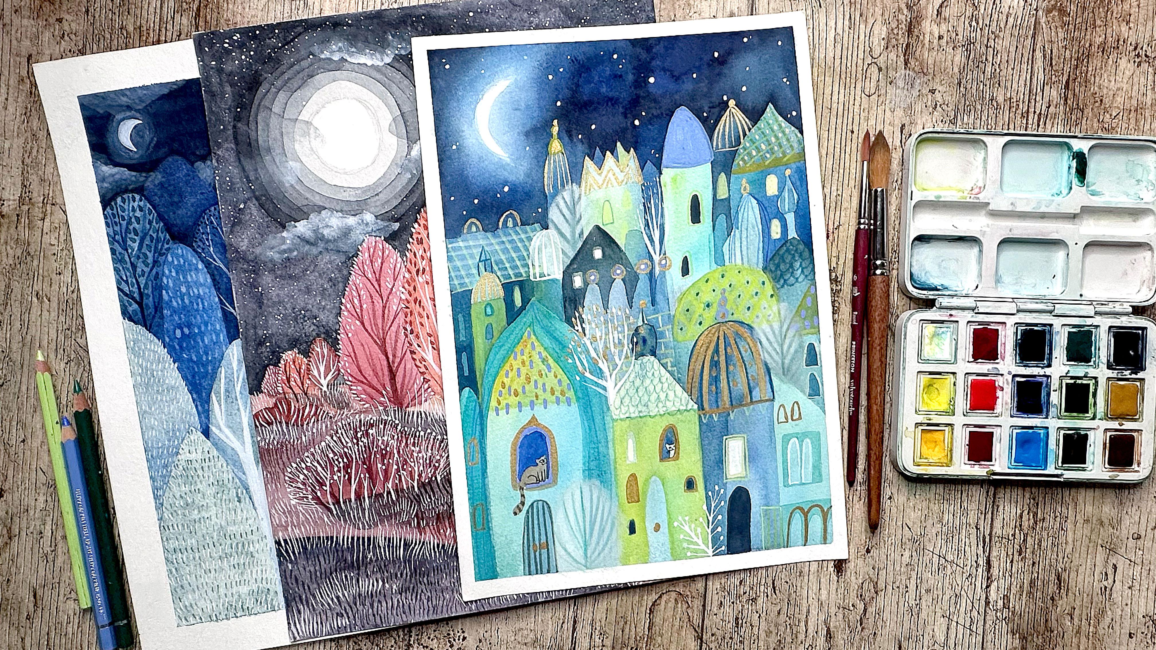
2. Class Project: For the classes project, we will paint an
illustration with watercolors and
negative painting, and we will explore the
theme that you will choose. It can be based
on your memories, on your imagination, or
maybe on your dreams. For example, I will explore theme that often comes
back in my dreams. From time to time, I dream
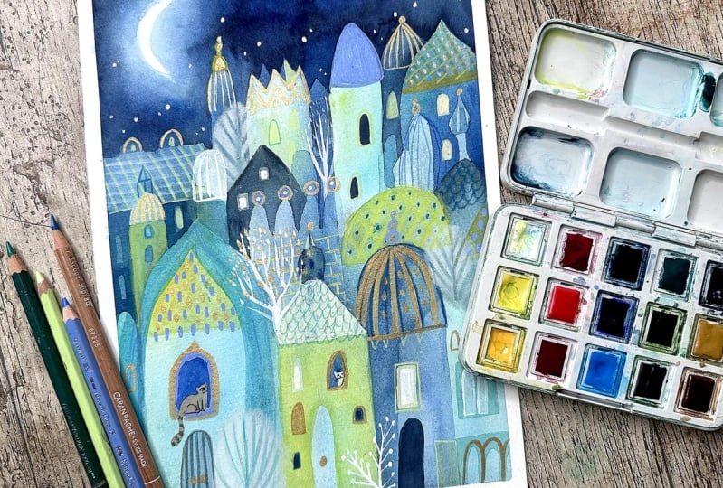
about this wonderful city, which is not realistic. It is really sometimes
breathtaking. The architecture is surreal and I wanted to try
somehow to represent it. So it might be
your case or maybe you have this wonderful
memory of a happy place. Or you have this place right now and you would like to represent it in a whimsical way, or maybe you would like to
just explore your imagination. Either way, I'm sure
you will come up with a wonderful,
magical, dreamy place. As I told, this
class is thought to be combination of
two other classes, the magical watercolor world and the watercolor
negative painting, you will find them in
the explore watercolors. Section. And I
thought to combine the theme of this
magical place based on our imagination or memories and painted with
a negative painting. So, saying that, you don't have to watch
any of those classes. If you did, if you
watch some of them, I did one of the courses, then I'm super happy
and I'm sure that you will be ready and maybe
feel more secure. But otherwise, I just
wanted to point out that if you miss any of
the tools or of the steps, then you can just go and grab any tool that you
need, for example, the negative painting
technique or some watercolor techniques that are already there in those classes. Therefore, I won't
repeat them here. And the new tool that I wanted to share with you and
the skill that you will learn from this
class rather than just watercolor
technical skills is working with your own
inspiration and imagination. But most of all, digesting
your inspiration. I will show you simple tools, how to create your inspiration
and how to digest it in the way that you will not only work on your
very personal memory, but also you will
try to represent it in your own very unique way. So you will end up with your own personal watercolor,
magical, whimsical world. I cannot wait to start this adventure with
you. Let's dive in.
3. Art Supplies: For the supplies for this class, I wanted to challenge
myself and really limit the materials
and the colors. So I hope it will be good
thing for you as well. So basically, you will need
just your watercolors, paper, brushes, obviously,
water, and if you want, you can add something
to draw your details. But if you want, you can do all the project
just with watercolor. You will just have to use a small tiny brush
for the details. Let's start from the paper. Watercolor paper doesn't
have to be fancy, but the only thing to
consider, remember, is that it should be minimum
300 grams because we will paint a lot of
layers, so it's better. The thicker, the better.
If it's thicker than 300 grams, then even better. But I work with 300
grams, so it's okay. As for the watercolors, if you know me, if you
did some of the courses, especially the one about
the negative painting, I also limited the palette, also the other course. So this is a good thing. And here, I'm already limited because I have
this tiny palette, and I must say I really like it. No, this is Van gook. Palette. I took it because
the price was good, and I thought that I don't
have a traveling palette. I have a lot of water colors, but every time I have
to pick the colors that I need every
time it takes time. So I thought I will just take the palette that I will always take with
me for traveling. And I'm super happy
with it because it has all the colors the
limited palette should have to do all
the possible mixes. If you're a beginner,
then I will just give you this information. If you want to do the
traditional mixes, then the traditional
set is that you have usually cool
and warm yellow, cool and red, cool
and warm blue, and then two earth tones. And usually with
this combination, you can mix really
a lot of colors. But here, it's a little bit extended because they
have three reds, three blues, and also
they added greens. And also what is really cool that there's
paints gray and white. I think it gives you really
a lot of possibilities. So that's the palette
that I will use. In the lesson about color
palette I will show you how I mix the
colors for my project. But I will also pick one or two of the super
granulating colors. I have this palette with
granulating watercolors. I like to add it to give
some extra texture. As for the brushes, I will use synthetic brushes,
synthetic round brushes. Obviously, here, it's good to have the variation
of sizes, for example, bigger one to paint the
background first layers, but then some tiny
and small brushes will be necessary to paint all the details because
in the negative painting, you will have to paint
around the shapes. And again, for details,
something extra, you can do all the project
with watercolors and paint the details just with a tiny
brush and dense watercolor. Otherwise, you can also use the supplies that you prefer
that you usually use. I will use colored pencils. A tip here is to use good quality colored
pencils that are greasier and cover better. So just test the pencils
that you have at home. I will use Luminance,
Fabo Castle, and this is Fabo castle, which is water, color, pencil. They're already quite
intense and greasy, so they cover well. And also, I will use some
of the acrylic markers. It also good solution for
your details because it is acrylic and usually it has a smaller tip for
the bonus details. At the end, I decided to add some extra details to
finish my illustration. I could have finished
it without it. So this is something extra
if you decide to add extra details and only if you have this kind of
supplies at home. So trusty white ink. I always use doctor
Martin's white ink if you did the other lessons, especially the one about painting from memory
and imagination. I also gave you
the comparison of different white inks and solutions that you can use to
paint fine, white details. I bought it because
I couldn't find my old doctor Martin's ink, but I found this one,
and I decided to give it a try and it
works really fine. It is good. Not sure what's the difference between
the old one and this one. You can use kind of ink
if you work with white, if you want to do
white details or also some good quality acrylic. For example, this titanium white is very opaque and covers well. So that's the other solution. Maybe you have also,
as I said before, acrylic marker, white, acrylic
marker, which is fine. And then other thing
I love to add to my art is some metallic
color. I love gold. So I used this acrylic
ink gold color. This one is from ronnie, but there are a lot
of acrylic inks and also a lot of solutions to use metallic color to your art. It could be ink. It could be acrylic. It could be watercolor or quash. Nowadays, there are
lots of solutions, and I will add also
not all of them. I will use probably
some of them I will see later because I like
to use this product. It's called Papastel
it is pastel in this form of compressed pad, and I really love it. I really like to
use it in my art. In some of the courses,
I already use it. I basically use it to paint some extra details and textures. So you apply it with
this kind of sponge. I repeat you don't
have to use it. If you have it at home and you would like to give it a try, then you can do it. I will say maybe for a foot, maybe for trees or clouds. Those are usually
the things that I paint by applying this. The pastel. Okay, so
that's it quick and easy. So let's proceed.
4. Negative Painting In Watercolors: So since we won't explore what
is the negative painting, head to my other course about it if you
haven't seen it yet. But I would like to show
you some of the examples. For example, we painted this forest scene and some other illustrations
that I did. You can apply it in different
themes and situations. This is how I do
it, but basically, a negative painting is every time and each
time that you paint around a shape with
already layer that exists. So for example, the lighter
trees are surrounded by the darker trees
and the darker trees, in this case, are the
negative painted trees. Also here, every
time that you paint around the layer of color
that already exists, you carve out the shape
that is already there, the color that is already there. This is the negative painting. And also let's explore, again, the theme of your imagination from the first course
that I did for you. And this is how I work
with my imagination. I usually explore natural
scenes, natural theme, and also this night scenes, not sure why is that, but sometimes it is also day. It's up to you. If you
love moon like as I do, then you can dive into the
night atmosphere as well. And yeah, again, night scene, but this time,
this dreamy place, this place that I often see in my dreams
during the night, I will explore it in
this final project. So find your topic,
find your theme. If you need them head to my
other classes. Let's dive in.
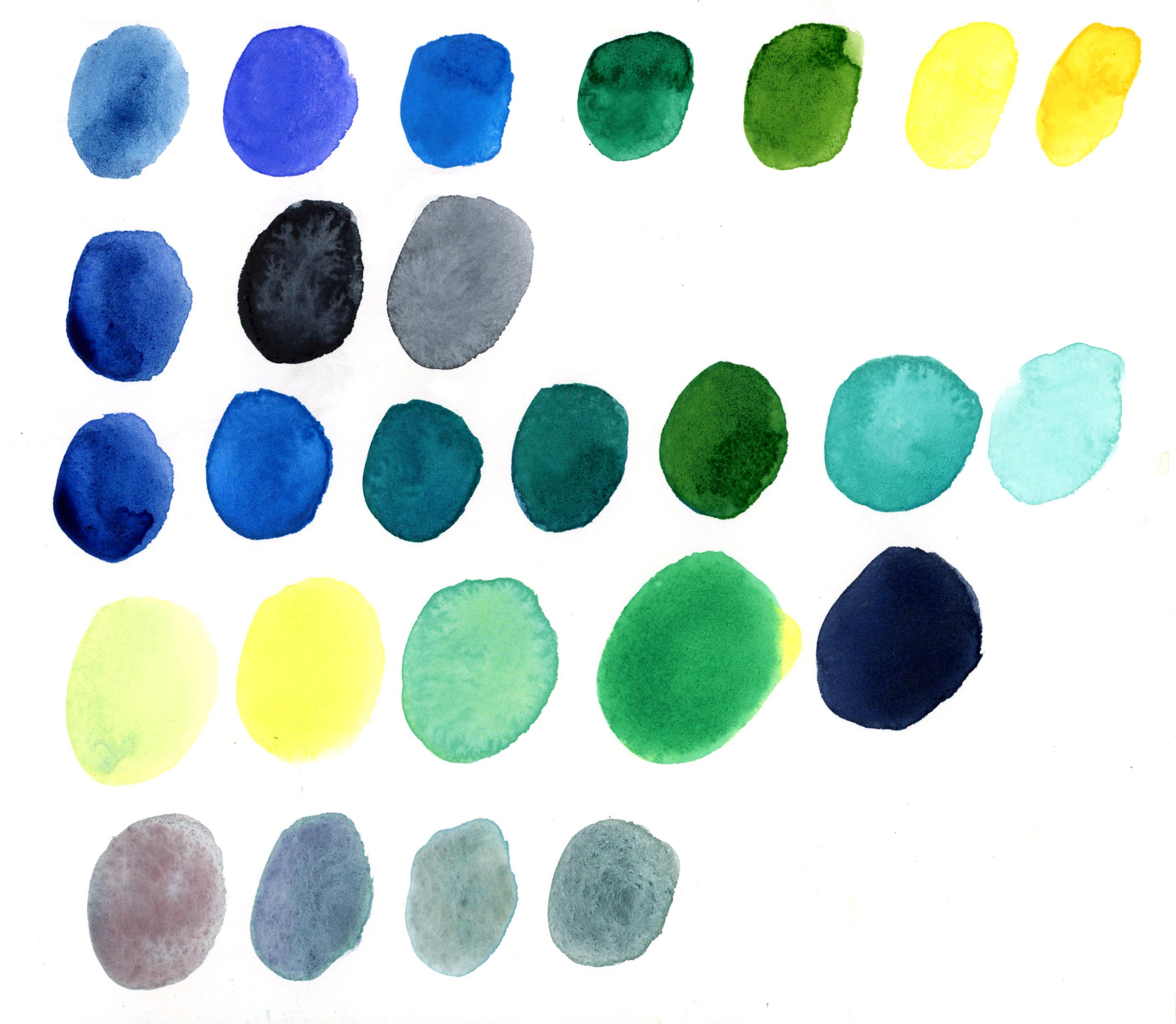
5. Quick And Easy Color Palette: In many of my courses, I teach how to prepare a
simple color palette based usually on several colors and by mixing and
combining them together. So I will do the same here. We will pick just several
few colors and do the mixes. And if you're not sure what colors you should
pick and choose, then I invite you to
see the lessons that I already did for
both of the classes, the imaginary magical
watercolor world. And also the negative painting, where I explain you better what color theory
you should explore. That is best for the negative watercolor painting
if you use watercolors. I will work with this
lovely tiny color palette. And if you have
something similar, then I invite you to explore
it because it will free you. You will have just limited
colors to work with. Otherwise, what I usually
do is in the end, I'm always selecting, picking several single colors and limit my color
palette in this way. So I'm working with a cool colors and the family
of harmonious colors. Again, if you would like to explore it more than
head to the class about the negative painting
when I explain why you should use this kind
of color palette and theory. Obviously, you can work
also with warm colors. And what I'm doing is that
I'm swatching all my blues and greens and also yellow since I want to work
also with yellows, and I will do the mixes in
between all of those colors. So I'm swatching my
blue the first blue, and I will mix it with the
other blues and greens. I also have in my palette the
paints gray and the white. So I will add them to the
mixes as well to create darker and lighter tones. You can do it as well, but you can decide that you don't want to work
with y, with white. It doesn't have any importance. That's your personal decision. So yeah, I'm doing my swatches. And now I'm mixing
the colors with my first blue color by adding the other colors
from the palette. And I can do it
directly on the paper, since the color is still wet. And in this way, I will create
and you will create easy, quick, and very vibrant and
efficient color palette. If you know me so far, then you probably know that
I love also granulating watercolors and I add them often to my watercolor
illustrations. So I will do it as well. I will just watch them here, and I want to mix them with my basic palette because they
are also blues and greens, probably I will just mix them directly into my final project. So if you have
granulating watercolors, then you know how fun they are. And how lovely textures
they can make, and you can add them to
your palette, as well. And if you're not
sure also what kind of colors you should use
in terms of the theme, then jump into the next
lesson where we will see how to explore and
fit our imagination. Sometimes the theme
will suggest to you the colors that you
should use. So let's dive in.
6. Feed Your Imagination: Take a minute to
see this lesson, where I will show
you how you can feed your imagination and
search for an inspiration, but then digest it and apply it into your own
style and illustration. So here's the first tool, the first step of how to
feed your imagination. It is very simple. And
if you already know me, then you know that I love
to create mood boards. And I find them very useful. And, you know, you can work with your imagination
based on many things, also on the books that you love, maybe from childhood,
maybe on the photos, on the things that you see. And you can collect all of those elements into one
mood board as well. For example, some of the
illustrations here are new, but some of them I know
from the books that I love. And usually they also represent
more or less the style, the style that also, was near to me when I was a kid, when I was a child
in East Europe, we have a lot of
this kind of style, like, for example,
Stefan Zabrel, which is the Czechoslovakian
or Czech right now, artists that also
worked in Italy. And I also searched
for a style that is similar from my
scene that I dreamt, from my imagination, let's say, which is curiously similar
to the Zabril style. Maybe that's some link in combination my childhood
with what I dream right now. Anyway, you can explore
different themes and topics. You can collect photos. Maybe the architecture
is different than mine. For example, you can explore more of traditional
architecture. Maybe there's a city from your childhood, place, village, town. And if you're not from Europe, then obviously think of the architecture that is near to your heart and to your style. Maybe you're from Japan, then obviously it
will be linked to Japanese oriental
architecture or maybe you love this kind of scene. So yeah, explore what you want. And the second step
will be to study and really try to explore and gaze at your mood board or
whatever images you collected. I want you to really
study it in intense way because I want you to work only with
what you will recall. I don't want you to look
at single images and illustrations because
we don't want to copy or to copy any style
or particular illustration. You can instead think of singular elements from
various illustrations. But again, try to digest it. And the tool to digest it
is to close all the tabs. Give yourself time to look
at all your inspiration. Try to recall all the details
in one that you like. For example, shapes
of the roofs, I will work with roofs. So I will think,
how what kind of roofs can I paint? The details. For example, if you will
paint these kind of houses, then what kind of
details you could apply and try to recall as much
as you can, think of it. That's the excellent exercise. No mine. I heard it from
very known teachers and illustrators that this is the best way to work with your imagination and
to develop your style. Observe, serve observe, but then work with
what you recall. So in this way, you feed
both your imagination, but also you let your
style to be free and won't be it won't
be too conditioned. Or linked to the other
styles and illustrations. This way, you will avoid, also the thing that you
may be feel that you imitate too much
somebody's style and cannot find your own way. So I guess at this
point, it is all clear. Again, recap, make
your mood board. Observe it. Give
yourself limited time. It can be 10 minutes, 15
minutes, as long as you want, but then close all
the illustrations. If you really feel insecure, then maybe you can
make some very quick and general sketches
of singular elements, not of the whole illustration, but some singular elements. But I would recommend you to do it after you close all
the illustrations. All right. And let's do it. And in the next lesson, I'll show you what I usually do next and what I
invite you to do in order to digest more and divide it into little
bites and little steps, the things that you saw.
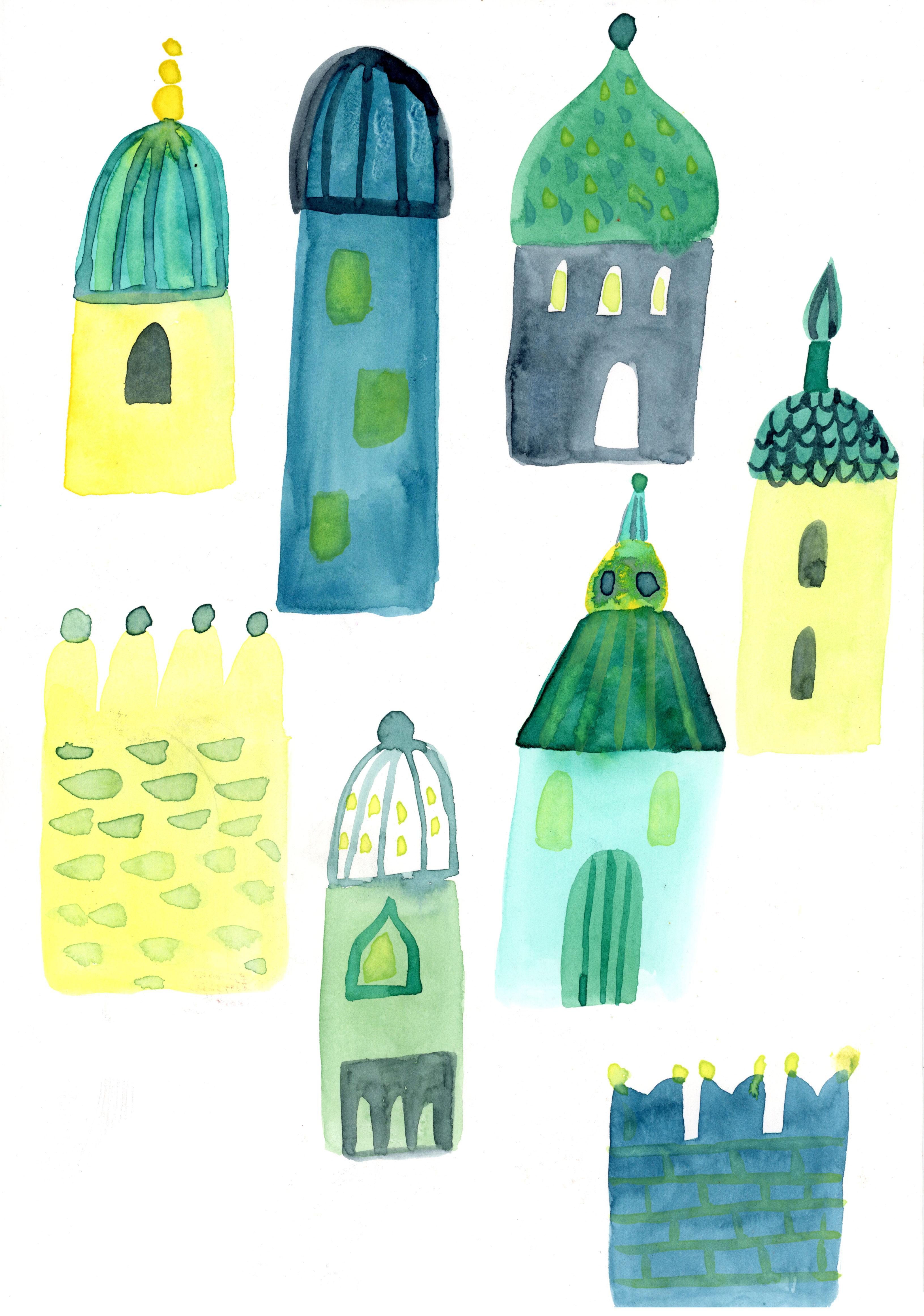
7. Digest Your Inspiration And Imagination: So the second step of feeding your imagination
is to digest it. So right now, we will
make simple studies of the things that you saw
of your mood board or, you know, images
that inspired you. Right now, I would like
you to close the computer, close all the images, work with your imagination, work with the things
that you saw, try and try to combine
those two elements. I will paint in this
lesson the architecture. And if you have
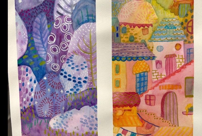
some other theme, you can paint trees. For example, the trees
that we painted for the first class about imaginary watercolor
world is a good example. I would like you to
make simple steps, simple studies of the theme
that you will explore, and you will see that
you will come out with many ideas by simple trying
and by those simple studies. And then we will apply them into our final illustration.
So let's get started. Prepare your colors. You can do only simple
sketches with your pencils, but I invite you to
warm up your hand and paint directly
with watercolors. And maybe you would like to
challenge yourself and try to paint simple forms without sketching before what I will do. And as for the colors, I will already apply the colors that I prepared for
my color palette, but obviously, feel free to paint with whatever
colors you like. You can use only one or two
colors if that's something that could be difficult
for you at this point. And so the process
is to think about all the different ways you
could paint your subject. If it's also a city houses, then think of the
way that you could paint roofs, explore
different shapes. You could, for example, paint just a sheet of roofs
at the beginning, and then all the houses, you can divide it even
in the smaller steps. And think of that's the moment when you have to
explore your imagination. I try to remember
all the shapes of the roofs that I liked
in my mood board. And there's where
magic happens when you're not looking at the
singular illustration, and if you don't copy what you see or try to
recall what you saw, then you can come up
with very new ideas, your own personal ideas. And this is something really precious in your art practice, especially if you want, and I think all of
the artists want it if you want to explore
your own artistic voice. I proceed kind of
instinctive way I improvise. In this way, I'm trying to
lose the control for example, I didn't plan to paint
those lines on the roof. I decided to paint them now because the color was still wet. And I thought that
maybe this kind of texture would be interesting. Also, those tiny circles. I only wanted to paint one, but then I painted three. Right now, it seems maybe more like Christmas tree decoration. But that's the point. You explore. You don't have to make perfect
illustration at this point. You just want to come out, come up with as many
forms as possible, as many IDs as possible. Also, if you feel like you don't come up with anything
interesting, just keep going. Because you don't have to find the solution at the beginning. Sometimes, I mean, the great
illustrators usually do hundreds of sketches before they find the
interesting solution. Don't freak out.
You don't have to make hundreds of
houses or trees. But just to let you know that sometimes it's just
about the persistence, about the resilience,
about being, you know, keep
going, keep drawing. And eventually we'll find
the things that you like. So as you can see, I
make very simple shapes, very kid style, junior
style, but that's okay. It also helps me to relax, not to freak out to find some very complex or
defined solutions because that also can block us. We're not trying to make something super
serious right now. Oh, we just try to enjoy
working with our imagination. And our artistic voice. So I will pit up the
process at this point because I won't explain you step by step all the
single thing that I do. You can see it in the video. Basically, I don't even plan. I'm not even sure
what I will draw. Just searching for new forms and new ways to paint
houses based on the images that I saw and based on more on the
things that I feel, I would like to draw and paint without asking
me why or how. I invite you to do
the same dive in, no fear, enjoy, and have fun. Y. So more or less I'm happy
with what I created. I think I want
make more studies, but you can explore
as much as you want. Explore your shapes and forms. If you want to paint trees, here is another example the studies of trees and
shapes that I applied for Gah in the Guash class about
the Whimsical forest and wash and have fun and explore. And now we're ready to dive
in into the final project. O
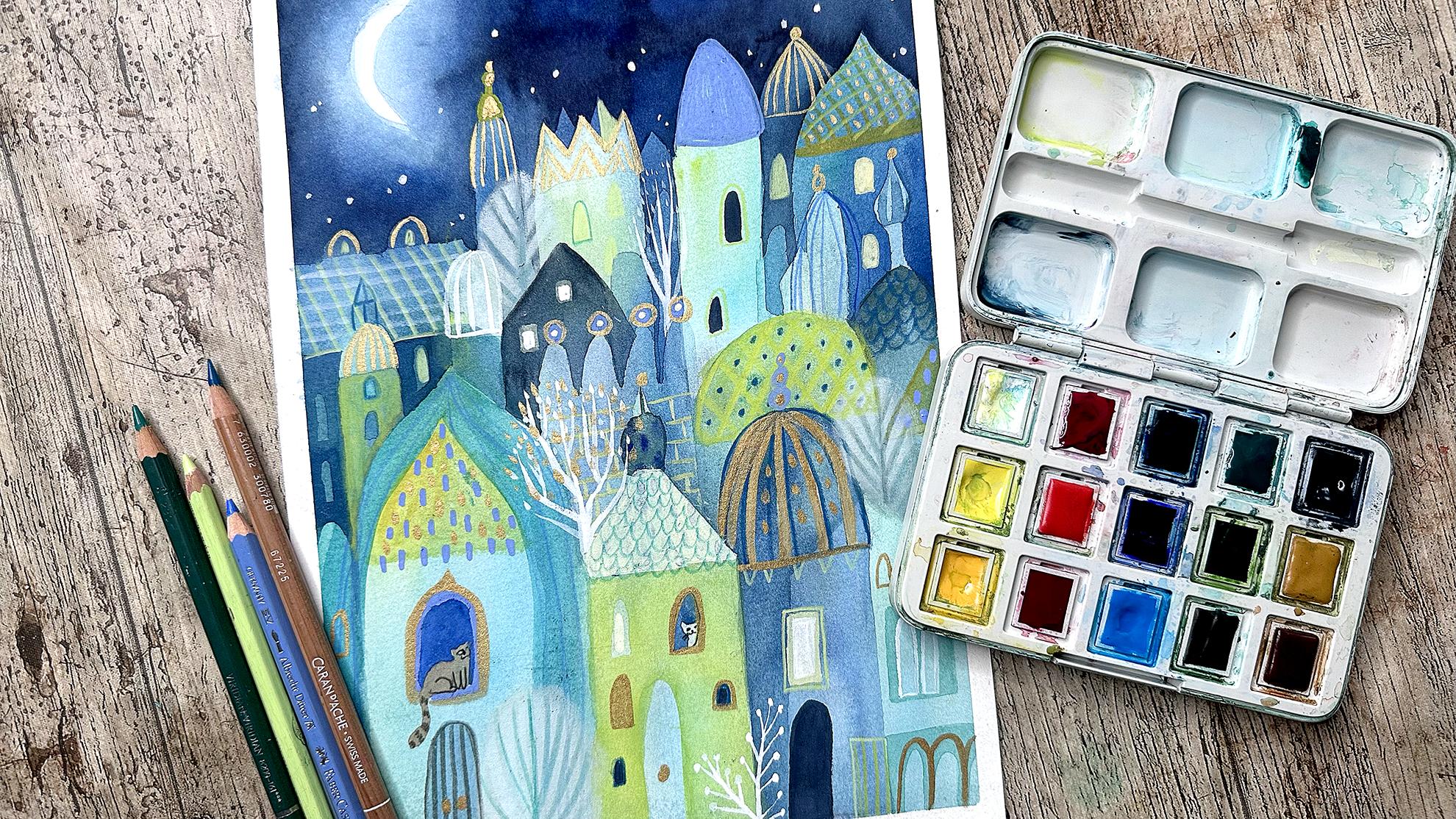
8. Final Project: We're super ready to paint our final
illustration, finally. Take your color palette. At this point, you have to decide what colors
you want to use, and it's better that you have the studies of your
subjects ready. And, um, later, you
prepare your paper. I glue it with the masking
tape into the surface. In this way, I will also
have white margins, but you can paint without
margins as you wish. You can also use
different format. I will work vertically, but you can also use a horizontal format and at this point, sketch
your composition. I would recommend you to
do it in a very light way with the light strokes and use the study of your forms
of the theme that you want to develop and try to make a
general composition. The second step is to make the first layer of
your watercolor. So the first rule here would
be to make it really light. It means that don't
use dark tones right now or don't paint
with a big amount of pigment or watercolor
just paint dilute and light swatch of color because we will
build up the tones, the darker colors gradually. I use my turquoise colors. And in this stage, I like to add extra
texture by adding my pigmented, sorry,
granulating watercolors. So this is the moment
when I usually do it. You should remember
that the first layer, the one that will be in the
lower side of the paper, in the lower part of the paper
will be the lightest one. But I will show you
that you can also leave lighter elements in the upper
side of your composition. So yeah, proceed with your
wash of the first layer. I will use hair dryer. This is the supply
that I didn't mention, but it's handy
when you work with negative painting because it will make your process faster. Otherwise, you can wait until the layers will dry naturally. But be sure that your
first layer is really dry before you will
paint the other layer. I decided to paint some
extra texture here because the color is still quite light. So I can add some extra color. As you see, I painted
around the moon shape. This way, it will be the lightest part
of the illustration. It will be white. That's the paper. Once
your layer is really dry, you can proceed with
the second layer. So the first shapes that I will paint around will be the
houses in the bottom. But I will also paint around some shapes in the upper parts. So you can decide
which elements of your composition you
want to leave lighter. In this way, it will be something different
from the forest that we painted in the other
class where we just gradually added darker
tones as we paint it. And here you can try to
leave lighter space, also in the other parts
of your illustration. Okay, so that was
the second layer. Let's start the third
one. At this point. I might it might start to
be a little bit tricky because you can start to lose the strokes that you
draw your sketch. Beneath, because the
farther you will go, the darker the color will
become and you will start to cover the strokes,
the pencil stroke. Pencil strokes. But that's also a good thing
because at this point, you can improvise even more. It can be challenging, I know, because you're losing
control at some point, but don't give up. I'm sure that in the end, you will come up with wonderful
shapes and solutions. It always happens to me. Sometimes I freak out
because I lose or I do paint something different
in the end than I want it, than I decided before. But that's a good thing as well. You don't have to make
exact copy of your sketch. Just proceed with
your exploration. Also, here, I'm
deciding which shapes I want to leave lighter. And I continue to build up
the textured layer of color. What I do usually
is that I don't use only one color for which layer, I combine different colors by painting by simply painting
with different colors. So this turquoise, for example, right now, I covered the shape because it
would be too similar. So yeah, it's all about
the improvisation. Anyway, what I was saying
that I'm using turquoise, but later, I can add
a little bit of blue. I'm just making pattern, let's say, of blended colors. If you paint the moon, but maybe even a sun, then it's good thing to good tip. You
don't have to do it. Obviously, you can leave the sharp edge of
your moon or sun, but you could also blend it
gradually into your sky by adding more diluted or
even just plain water around your shape of
your mono or sun. And then when it's still
wet, add darker color. So it will create a
lovely, blending, blurry, halo into
surrounding your shape. It What what you can do is add some houses
with a darker color. And let's say, we could
call it positive painting. And I decided to
add darker house in the front to add a little bit of contrast
to the first layer, which is, in the end,
still very light. I proceed with adding new layers because I
paint the night scene, so I can make my sky more dark. And if you paint the day scene, then you can consider if you
would like to stop earlier, make less layers, and
just use lighter blues. In the end, you
will always end up with making more layers, so the further layers will be darker than
the previous one. But just use lighter tones of blue or the color that
you will use for your sky. It could be also
orange sky. Why not? So I proceed with my ultimate
layers and the night sky. I also will add a little
bit of yellow layers. Because I wanted to add
some color that will contrast that will add a
little bit of vibrancy. So the good contrast for
blue will be yellow, which layered very cool yellow, which layered over the
blue color will give this acid green color which
I really, really like. I added some further layers
of yellow on the roofs and some of the details with yellow pencil and white
strokes with watercolor. And I decided to add a further last layer
for the night sky, and I wanted to make
it even darker. And the last and
favorite part of mine is making those details. So I can do it in many ways. I can paint with watercolor. I can use colored pencils or
acrylic markers, et cetera. So use your favorite
supplies to do that. I will combine a little
bit of everything. And also in this moment, I let my imagination flow. I just I don't plan it. I figure out, you know, during the process,
what I want to paint, what I want to dry, what
I want to draw story, and what kind of details, what kind of patterns to explore your inner
child and have fun. I left space for a tiny
kitties in the window. I think this is something
that I didn't plan before. I didn't plan to paint
cats or animals. Usually, I paint birds. That's something that
is that I usually draw, but I thought, why not to add a little bit of
life of personality. And usually when I
think of this kind of scenarios and Far East cities, there are a lot of cats. So so why not? Also, you can add some
animal to your scene. Maybe the pet the pet
sorry that you had or have or just some animals
that you simply like to draw. I continue adding details. Maybe you saw that I also
changed some of them. I covered the dots on the
roof because I thought there are too many and maybe I
exaggerated a little bit. It's always a tricky
question when to stop, when to overwork. It's something
personal, as well. Some of some of people like
more pure and clean art, and I'm more kind of
person that likes to cover and add
elements and details. It's up to you. But
in case of doubt, I would say to stop
maybe earlier rather than paint too many things and then see it as an
overworked illustration. You can also step away
for a day or two. It's good to see it
with a fresh eye the other day and see if you want to make some
new add some details. So a little disclaimer. I thought I finished
this illustration and I left it at this point
that you can see now. But I decided to add extra details a couple
of weeks later. And I do it in the separate
lesson, the bonus lesson, where I will just add some extra details and
elements to my illustration. Not sure which
version is better. At this point, I think
both of them are fine, and I could have also left at this point without
adding further details, but it's something
personal as well. If you would like
to explore more, try some different ways how you can work more on
your illustration, then I invite you to
the last bonus lesson.
9. Bonus: Extra Details And Elements : So let's add a little bit of extra sparkles
to our project. If you want, you can
add extra sparkles. Otherwise, the decide if you
want to stop at this point. But here, I will show you
some other solutions you have and mediums
that you could use. I will work with basically with white colors and pastels
to add some extra texture. In particular, I will
work with Pampa steels. This is the medium that I discovered a couple
of years ago, and I love to work with it. And I usually use it to add extra textures or details as a mixed media
art at this point. I also often use white ink, as I said, at the beginning. And if you want to see different kind of
inks and the comparison, what possibilities you have, then head to the class about the imaginary
watercolor world and to the discussion section where I showed different
possibilities. This is the ink
that I usually use, doctor PH Martins I usually had different kind of ink but since I
couldn't find it, I bought the other one, and I decided to give it a try, and it's also a
very good solution and alternative as a
very opaque white. I'm not sure if it works with a deep pen, it's really dense, but I think it's not much more
dense than the other one. You could also try to
dilute it with water if you would like to apply
it with a pen. I'm using very thin
brush and I paint stars. Usually, I also like to sparkle. Mm. The dotty texture
with a toothbrush. I did it for the
first class for sure, and I showed you
how you can do it. But here I wanted just
to add bigger stars, single dots of color. I also thought it could
be a good idea to add some extra light
into my windows. So I decided to use this ink and mix it
with the watercolor to make more opaque and
more bright light colour, yellowish color, cream color, I also had white in the
set of watercolors, but it's less opaque and
this ink is really good. So by adding just a
tiny amount of yellow, I created much more
bright yellow. I will use this mixture
of white ink and watercolors to add some
more pak lines and details. I could also work
with colored pencils. But since I saw this
ink works really well, then I decided to
proceed this way. I also decided to add some extra contrast by
adding darker elements. Maybe this was a good idea to add some darker spots
and some lighter spots. Otherwise, the previous version was a little bit too
light and too flat. H. I was also looking
as a reference to my very old
illustration that I did, I think, five years ago, and maybe I won't make it
so details and so textures, but I thought it would
be a nice idea to add some floral elements,
some plants. So I will paint trees
here and there. So I explain you this
process step by step. You don't have to obviously
follow it as a tutorial, but I give you some
ideas, and also, I would like you I wanted
to let you to know that the project can
develop during the process. And you can come
up with new ideas. You don't have to have
in beforehand an idea, a finished idea, but you can always come up with something
new during the process. And the other thing
that I usually love to do and I did in many other courses
is that I like to add metallic details. Now I will use acrylic
ink, gold colour. There are many alternatives. You could use gold watercolor
or wash or other ink. Maybe not gold, but some other metallic color if you like, obviously metallic colors. I thought it fits into
this style and theme often architecture in Far East has gold elements, gold roofs. And since it's, you know,
it's nothing realistic, I can play and
explore a little bit more also this kind of color. At this point, the
illustration is quite full, and I didn't know where
to put pam pastels, but I decided to show it to you. Anyway, so I'm searching for spots where I
could apply it. So I usually work with Pam pastels by adding
extra details or textures. I could have I could add, for example, fog or clouds, but the night is starry and there's no sense to
make fog or clouds. So, um, I decided to
paint small trees. I will show you how I
usually do it if it's something that you could
use in your art as well. And try and explore this medium. It is really fun because
the colors are very, very bright and opaque, and they're a little bit
different than pastel. Sometimes you ask me, what's the difference between
pa pastels and pastels? Why couldn't I use soft
pastel or could I just, you know, use the powder
of the soft pastel. You could, but it's different. Once you try Pam Pacel then
you will understand it, especially if you want to
make bigger backgrounds, then it really
creates a uniform, really lovely, opaque color. So, if you have it at
home, give it a try. And I'm just adding those
fluffy tree shapes. At this point, it's really full. I'm not sure if I'm not damaging
the whole illustration, but pam pastels are so good
because you can cancel them. So let's give it a try. And as you can see,
I'm using the eraser. This is a precision eraser
in the form of pencil. So you can use it to erase
really thin lines and details. I will also add a little bit of pencil here and there
because otherwise, it would be no contrast. But it's also something
I like to do. First, applying pam pastel, and then you can erase the forms that you
would like to have. You can make grass,
textures like this or this kind of trees. So at this point, it's more
Christmasy scene, I think, by adding all those whites
and gold supposed to be far East a magical dream place. But at this point, it can be also a winter scene. And it's okay because I'm doing this class when the
advent is about to start, and in a month time,
it will be Christmas. So who knows? You
could also paint a Christmas scene as
well if you're on time. Okay, so at this point,
I really finished. I feel like there's no sense
by adding more details. I'm curious. What do you think? Which version did you prefer? I think both of them are fine. This one is more candy, more. I don't know, but it gives
this vibe of Christmas tree of Christmas Christmas
Eve and maybe of the markets that you
have in the cities. So this is the version,
final version. But since I like the idea
of the Christmas city, winter city, I thought that I will also add snow even if
there's moon, but who cares? It's a dream city. I combines really well
with this time of year. And this is only
another proof that process brings you
other solutions. So trust the process, work with your imagination and create magical dream places. And this is the version
of the previous lesson. I like all of them. I hope you enjoy
this lesson and that your project will be as unique and as dream,
dreamy as you.
10. Final Thoughts: Congratulations. You've made it. I hope you enjoy the class and that it was full of
inspiration for you and that you exploed your
imagination and that you're happy and satisfied with
this small journey. Please apploud your project
into Project Gallery. I will be very happy to
see what you created. If you want, then share
with us what inspired you. What is the theme that you
decided to explore and why? And I always encourage
you also to comment on the projects of your friends that also did the same class. It is always very encouraging and sometimes
fundamental for us to have a feedback and
to see that there is someone that thinks
the same as you. If you enjoy the
class, then I also invite you to leave the review. It will help my channel to grow. I also invite you to follow
me on Instagram and YouTube, where I share my art and often
also the artistic process. I hope to see you in
my other courses, happy artistic exploration
and see you soon. Bye.
 Ania Kropla Malinowska, Award-winning illustrator