Transcripts
1. Introduction: Hi, and welcome to this
sculpture class where we will celebrate the whole year
with art with illustration, and we will celebrate each and every season with
illustrative project. My name is Anya. I'm a Polish artist
based in Italy. And I thought of this
class because right now here it's New Year
when I had the idea of making this class and I
thought to work with you throughout the whole year with new artistic challenges
and projects. So we will celebrate every season with art
with an illustration. And in this way, you will have a kind of challenge throughout
the whole year. And in the end, you
will end up with at least four beautiful
illustrations. In this way, you
will push your art throughout the whole
year and also, you will see how to apply different techniques that I
teach here on Skillshare, on my profile with new projects
with new illustrations. So if you took my other classes with the specific techniques, then you will have a
possibility to test them in new contexts in new projects. So I cannot wait to start
this journey with you, this journey that will
last a whole year, and I hope you will join me. Let's get started. Do.
2. Class Project: So for the classes project, we will work during the
whole year and create at least four projects at the beginning of
each and every season. We're starting out with
winter because right now it's the new year in
Europe and it's winter. But whatever season you're at right now, maybe it's summer. Then feel free to start with the season that you're
currently in right now. But disclaimer, if you're watching this class
when I'm making it, probably there's still no
spring and summer projects yet because I will make them when each of the
seasons will begin. So let's recap for every season, we will make one illustration. To celebrate the season. You can make just one of them, or what I really invite you to do is to do the whole year with me and make for each season
at least one illustration. As I told in the intro, we will apply
specific techniques for each and every season. So at the end, you will end up with at least
four illustration, and he will develop
different techniques. Invite you to share your projects within
the project gallery. You can start with the
first season and you can publish new season with a new project or you
can simply update your old project with new
seasons with new illustrations. So I cannot wait to see
what you will come up with. Let's start our artistic year. T.
3. Winter - Theme For Your Project: We start our artistic
year with winter. At least in this part of
Globe, January means winter. So you can start with winter
or with other season. And since winter means snow, even if usually lately, there is not a lot of snow, but at least we will represent
it in the illustration. We will use different supplies,
oil pastels, watercolors, and water soluble
crayons and pencils in order to use two kind of techniques that I teach
here on my channel, and I will explain it
in the specific lesson, and we will create
whimsical scene. So I want you to pick the theme. I will explain and show you the classes that explain
better the techniques. But as for the theme, think of some favorite place or image that represents winter. It can be your photo. It can be your memory. It can be something you saw, something you saw in real life, or maybe in a movie
or maybe a photo. So think of what
you want to draw, and let's dive in. I
hope you will enjoy.
4. Winter - Supplies: For the winter project, we will use two techniques
based on oil pastels, water soluble crayons and water mediums such as
watercolors and guash. So as for the oil pastels, whatever brand you have at home, I have different brands here, and those are all oil pastels. The important thing is that they are white or translucent. For example, I found also this big senalea
translucent bar or in the set of Chinese
cheap pastels. Those are very oily pastels. I have this white pastel, so it will work as well. And for the details, I have this Holbein
artistic pencil, which is really
greasy, really oily, so it also will work as well. And also, I will
use watercolors. You can choose whatever
watercolors you have at home. I will use also a
little bit of quash. If you don't have watercolors or if you prefer to
work with quash, you can use it as well. And for the wild details, I will use there are different
possibilities you can use, for example, white
quash, white ink. The one that I showed you
before from doctor Martin's or maybe acrylic
color, acrylic ink. And also we will use water
soluble, pencils and crayons. Those are Caran dash, neo cool water soluble, and I have different brands of water soluble pencils,
watercolor pencils. For example, Faber castle
or Caran dash museum, and as for the brushes, I suggest you to use synthetic
brushes and don't use anything fancy
because we will work over oily surface oil pastels. Therefore, oil can
dirty your brush. You can wash it out with soap. But still, don't use your
best brush that you have. Maybe try something cheaper or some brush that is
not precious for you.
5. Winter - Techniques: For our winter illustration, I thought of one specific
technique that is perfect to represent
snowy wintery scene. And this is optll technique. I explain better how you can use Opastels in fun way
within this class. And you can watch it
if you haven't seen it yet to see many
different techniques, also, the one that we
will explore right here. I will show you briefly anyway in this lesson,
what is this technique? And if you want to
dive more deeply into oil pacels and this
technique and more of them, then I invite you
to the other class. And the second technique
that we will apply in the winter illustration is using water soluble crayons
in order to create textures and paint lovely
textured elements. So if you want to
explore as well, this kind of technique then
I invite you to my class, creative adventures,
exploring art textures, and you can see specifically
what is it about. And now I will show
you really briefly those two techniques that we will use for
our final project. So let's start with oil pastels, as I explained to you
in the ad lesson with art supplies, use
different brands. You can use different
brands and kinds. Important is that the color
will be white or translucent. And we will test both
extels and the technique. So if it's the case that
you have different pastels, then I invite you to test
them all, and this way, you will see which one
will work better for you, and then you can pick
the pastel for the best, the favorite pastel for
your final project. During whatever you want, I will doodle some trees, some strokes, and test both white and translucent
frants that I have. You can also use
other light colors. I figured that other colors
can fit into my wintry scene. White obviously
will be for snow, but you can use some
other colors that you think will fit to
your wintery scene. And once you're ready, we will use watercolors
or you can also wash, but use it as it would be
watercolors so very diluted. And reveal your oil pastels. I'm sure you know this
technique, but if you don't, then you will see the magic
that happens once you paint over your white
or translucent pastels. Since they're very oily, they will repel water
and they will leave. They will stay untouched. And also, it will create really lovely texture
because it's greasy, so some dots of water will remain and
other will be repelled, it really creates lovely effect. It's really cool technique to use with kids, with children, because you can really create
a magical kind of workshop. And use the colors
that you want. I will go with bluish
grayish color. The thing that I have in
hand right now that I used before is water
soluble graphite, and I use it often. It works like watercolor, but it's graphite, basically. So I'm trying to do some
colorful textured background. And, yeah, you can see
that there's not so much not so many different
effect between the pastels, but I can tell that
some of them are more visible and that I
will probably use. I think the one on the
left in the bottom, which was the transducent
big oil bar from canalia doesn't repel
water the color so much. So probably I won't use it. Other oil cells are more
or less equally good. So yeah, I'm so I know
I can use all of them. Try test your oil pastel, see the effects that it creates. Maybe there will be
something that you prefer and that you want to
exclude and avoid. And also, it is also a
good warmup exercise. I also wanted to use colored pencils that
are quite greasy. They are not oil pastels, but since they cover
really well, they're very, very soft, and I guess
they have a little bit of wax inside or some
oily ingredient. And they are great to
work with mixed media to paint over watercolors or
gouache or other mixed media. And I want to see if they
also will repel watercolor. So what will happen if I paint
with watercolor over them. And if you have this
kind of pencils, then you can test them as well. Let's see the result.
So the spoiler is no. The effect is not
showing through, maybe a little bit
on the whole binds, which is the light one,
but it's really minimal. So I decided to test also
this greasy, oily pastel. I tested white, and
it worked good, so I tried with yellow
one and still no effect. So Anyway, you can
test your pencils. Maybe you have greasier pencils and the effect will be better. Now let's test the
other technique that involves all the water, color, pencils and crayons
that you have at home. I have different
brands, fabre castle, Albretu or Darwin,
different kinds. Usually, if there is a
brush on your pencil, it means that it can be you can paint with water over
it and it will dissolve. I can also use this
graphite stick. It's also water soluble. And the thing here is
to create textures both with drawing first with your crayons or pencils and
then diluting it with water. And the second step would
be to draw with those kind of pencils and crayons on
the top of the wet surface. It can be the surface, the background that you painted with the same crayons
or with watercolors. And when you draw
over the wet surface, they really create
really lovely textures and strokes which are more
blurry and more soft. But you can see only
by testing and trying, I often use it. In my art. I often draw over
the wet surface, and I really like what happens. When you do it when you
draw on the wet surface. Right now, I diluted
my crayons with water. I added a little bit of watercolor and it already
created love texture. And now I will
draw on the top of the textured background
both with crayons and pencils and I just play around I try different
strokes, different lines. As you can see, they
spread a little bit. They are softer, and I really
love this kind of effect. So test your crayons, test your pencils, try
different strokes. You can draw something
specific or just play and warm up by doodling
whatever comes to your mind. Also, you can see
that drawing on the wet background creates
this kind of engraving, maybe I can say etching. And you kind of engrave in the color while
it's still wet. So you move the pigment, you create white spots, and it is really
something interesting. So play around. These
different crayons, as you can see, for example, with this one, the
defect is different. It's more soft and floor. The other one is the other
pencils were harder, so the strokes are thinner. It's really something
worth to explore. Since we will use white
also to paint snow, we will achieve it
with oil pastels, but you can add
extra snowy effect to your drawing with
white wash or ink. I invite you to test how your white medium works
with different backgrounds. I mean when it's dry
and when it's wet. I usually like when the
background is still wet. For example, here, it's
still humid and wet. And in this way, your brush
strokes will be more soft, and I think it's a great
thing to paint snow. You don't want this crisp. I mean, you can do it as well if you prefer
crisp strokes, but I think it gives
better effect. Better atmosphere for the snow to make it more soft and blurry. So obviously, the more
your background is wet, the softer and blurred, your strokes will be. You can also try to paint snow and your dots
will spread as well. So you can try it or you can test it on
the dry background as well and see which
effect you will prefer. Well explore those
two techniques. Explore your materials,
and when you're ready, we will start our
final illustration.
6. Winter - Final Project: We will start to paint
our winter scene. And we already explored
materials and techniques. If you haven't decided yet what you want to
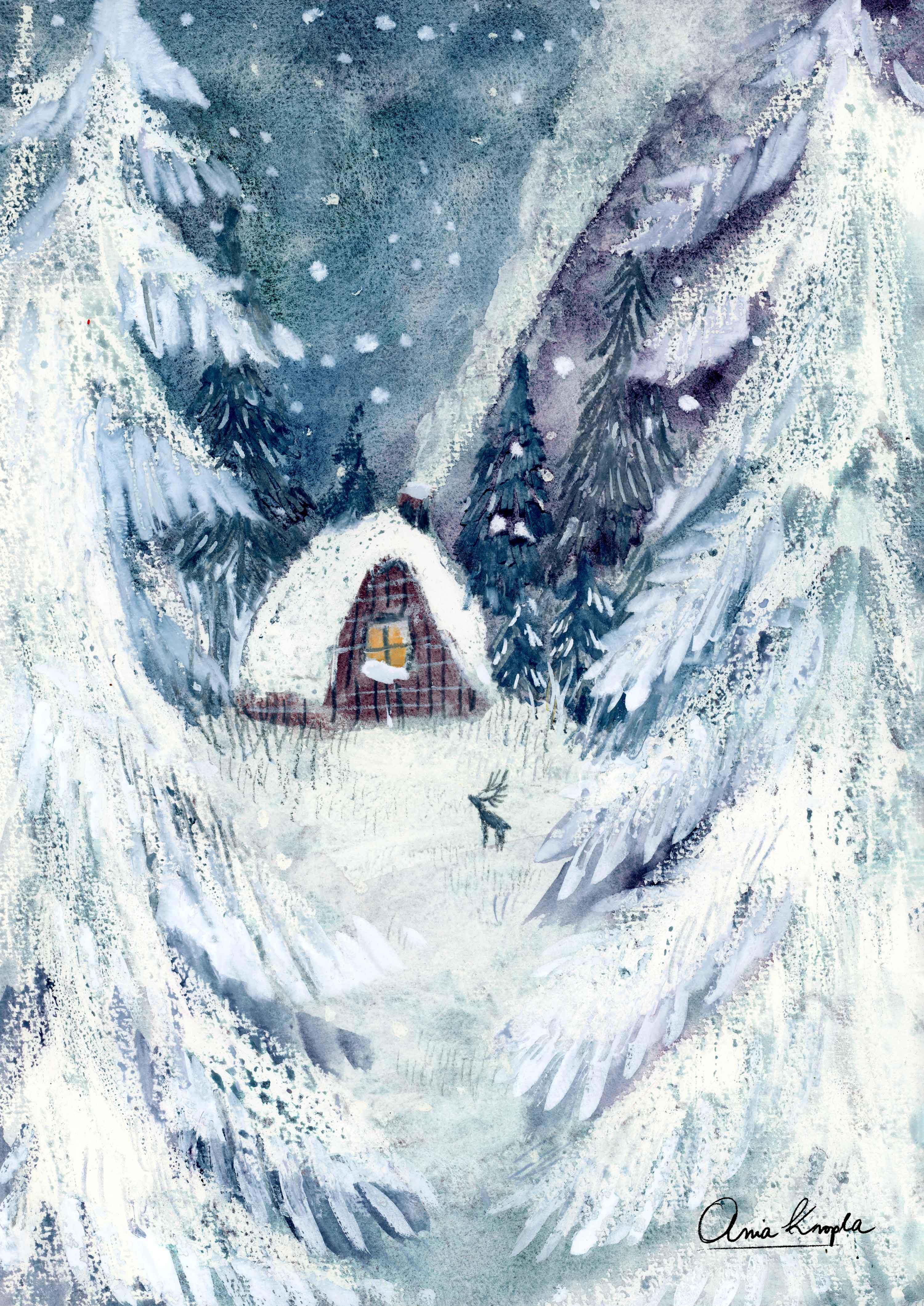
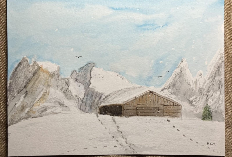
paint and do it now. I decided that I will paint a classical theme winter
little house in the woods. A theme that I painted before, maybe a couple of times, but never with pastels. So I thought that it's
something that I want to explore now with
this technique. So think of something
that excites you. If you're a beginner,
then you can obviously follow my steps and do the
same kind of illustration, but I always invite in
my class to explore your own imagination,
your own theme. Think of something that
you would like to paint, especially if you're
not a beginner. Um and explore your theme. So the first step is to
paint with oil pastels, white, translucent or
the colors that you will use for your scene. This is the time to use
it before painting with watercolors or gouache or whatever wet medium that you will apply over the oil pastels. It is a little bit challenging because if you paint
with white on white, then you obviously
don't see a lot. There are ways to see it, maybe try to move your paper and see where did you paint already? You can sketch it before, but then it will be impossible to remove to cancel
the pencil stroke. So order it in a really light way or try
try maybe not to do it. I mean, challenge yourself
and just put those pencils away and try a free hand style, try to challenge yourself
on so in this kind of way, and take off all the pressure. I always repeat the same thing. And we are here to explore. And even if you don't you
won't like your first outcome, then you can try another time. Maybe you can try on a
smaller piece of paper, maybe you can make a wind
turbostcard or yeah, just other format that you
can explore several times, as many times as you want. Um and also, I think I forgot to talk about the paper during the
art supplies lesson. Sorry about that. So I'm using quite cheap
watercolor paper. It's not a fancy paper, and it's textured. So it's okay. It's a decision that you
have to make because the textured paper oil pastel over the textured
paper will give you extra rough texture, and you will have to use a
little bit more of oil pastel. You will have to insist
because the oil pastel won't attach to textured
April immediately, and there will be some spots of paper that will show through. So maybe for this
kind of technique, the hot pressed paper, smooth paper will be better, easier to paint on, but it depends also on the effect that
you want to achieve the cold pressed paper that
I use here is okay as well. The most important thing
that your paper must be thick because we will
paint a lot of water. We will put a lot
of water into it. So that's the basic thing
that you want to have. And once you are ready, once you paint it you
drew with oil pastels, go ahead and paint
with watercolors. I will use watercolors. You can use diluted
quash as well. Your colors. For winter, you can use bluish white. You can mix it with white
as well if you for example, don't have this kind of colors, so you can mix your watercolor with white or your
wash with white. And I have those
granulating Sminka colors. This is glacier green,
which is really lovely. And I think it's perfect
for wintery scenes. It's granulating and it's
creating those gradients of bluish turquoise and a
little bit of violet colors. I'm adding white oil
pastels right now because I see that by painting over
this cold pressed paper, a lot of spots of paper
are showing through, and I wanted my old pastel to create a thicker layer of white. So I'm just adjusting it and adding an extra layer to the
first layer of oil pastel. And what I'm doing
now there is I'm painting the first
layer of watercolor, which is really diluted. And later on, I will add the more dense color into it or darker tones
with wet on wet technique. So you can do it as well. You will have to paint a
diluted layer of color. And while it's still wet, then you want to add
another color into it. You can see I covered
all the surface. So remember when I told
you that I will show you how you can paint snow so
you can do it in this way. So if you're using watercolor
or very diluted guash, while the color is still wet, pick tissue or water
or paper towel, sorry, and dab into
the wet surface. And you will lift the color up, and also you will create
really lovely texture with it. So I think it's also
a very nice idea to create snowy texture. And this is what
I mean when I add extra layer of color while
the color is still wet. And I'm talking about it a lot of times in
my other classes. So you can watch one of them, for example, the magical
watercolor world. I explain how to do
this kind of effect. It's great to paint skies. And here I'm adding granulating moonlight
from Daniel Smith, which has this violet and blue winds that are
granulating and dividing. So yeah. I will also add a little bit
of green later on twice. And here I'm adding a little bit of brownish color
to paint house. And since the roof is
made from the oil pastel, it will avoid from blending the color I want
spread into the sky. So the thing is if you paint the white oil pastels
and a lot of snow, you want to search for a contrast in order
to see the effect in order to make the
white show through. So night scene is easier
because you use darker colors. But you can paint a
day scene as well. Just use very saturated color, blue or other color
that you want. Or go for a night scene because the contrast
is easier to achieve. Well, you can paint
whatever color you want. It can be something
abstract, not realistic. You can use the colors that whatever colors
that come to your mind. And as you can see
the texture of oily layer beneath
is showing through, you can paint over it as well. So the texture will be more
visible and the dots of wet paint will be will be some of the dots
will remain on your oily greasy background. You can control this effect by adding later on the color on your oil pastel.
It's up to you. If you want to have
more of this texture, you should paint
over the oil pastel. Otherwise, you can dap
with a tissue later on and it will disappear. And I'm basically here adding darker tones to
contrast the branches, the white, snowy background. So here, for example, I'm painting another
layer of watercolor on the white oil pastel
and you can see that it remains and creates a little bit of contrast in this
lovely texture. I also dab with a tissue to
create more white space, and also I want to improve
the chimney smoke, white texture, and while the paint is
still wet, I can do it. Okay. Also while the
paint is still wet, we can try our technique both of painting with
white ink in order to have those blurry soft strokes and also to apply our
second technique with watercolor pencils and create those lovely
textured strokes. I will draw trees with my watercolor pencil and
the paint is still wet. But I also decided that I
will add a little bit of darker color to the sky because
I think when it will dry, it will become even lighter, and I want the sky
to be more dark. Some white details and snowflakes while the
background is still wet. And also, I will paint draw other trees
in the background. I often try to add a little
bit of story telling, a little bit of story
to my illustration. So I will draw an animal, and I will paint deer. So you can think as well to add some element that will tell the story what you want to tell us about in
your wintery scene. And later, I will add
just the final details, light in the window
with yellow and silk, and I will also in the trees in the background to add
further depth and contrast. And very last details,
colored pencils. A here, while the
paint is still wet, when you throw, for example, pencils on the top of your wet white gouache
or other colour ghering, you can carve out really
lovely plain strokes, and you can play with
this effect to add extra texture to your
frosts and ic elements. And alla, here you can see
how beautiful textures you can make with this technique with those techniques
that I showed you, and I'm really glad and
satisfied with the effect. So I hope you will enjoy
your process as well, and I cannot wait to see
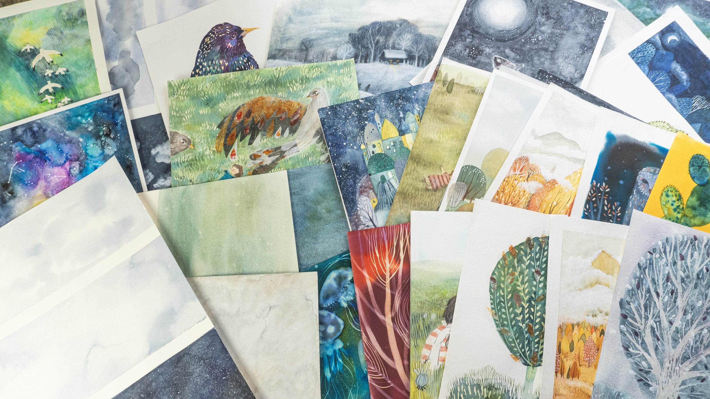
what you will come up with. For your inspiration,
I will show you other illustrations that I
did with the same technique. I just used ink instead
of watercolors. So as you can see, there
are a lot of possibilities, a lot of inspirations. And again, I cannot wait to see what you will come up with. Enjoy the process. And in the next lesson, I will share with
you extra bonus, another illustration that I will make with the
same technique, so you can see how many
things you can create. I hope you will enjoy.
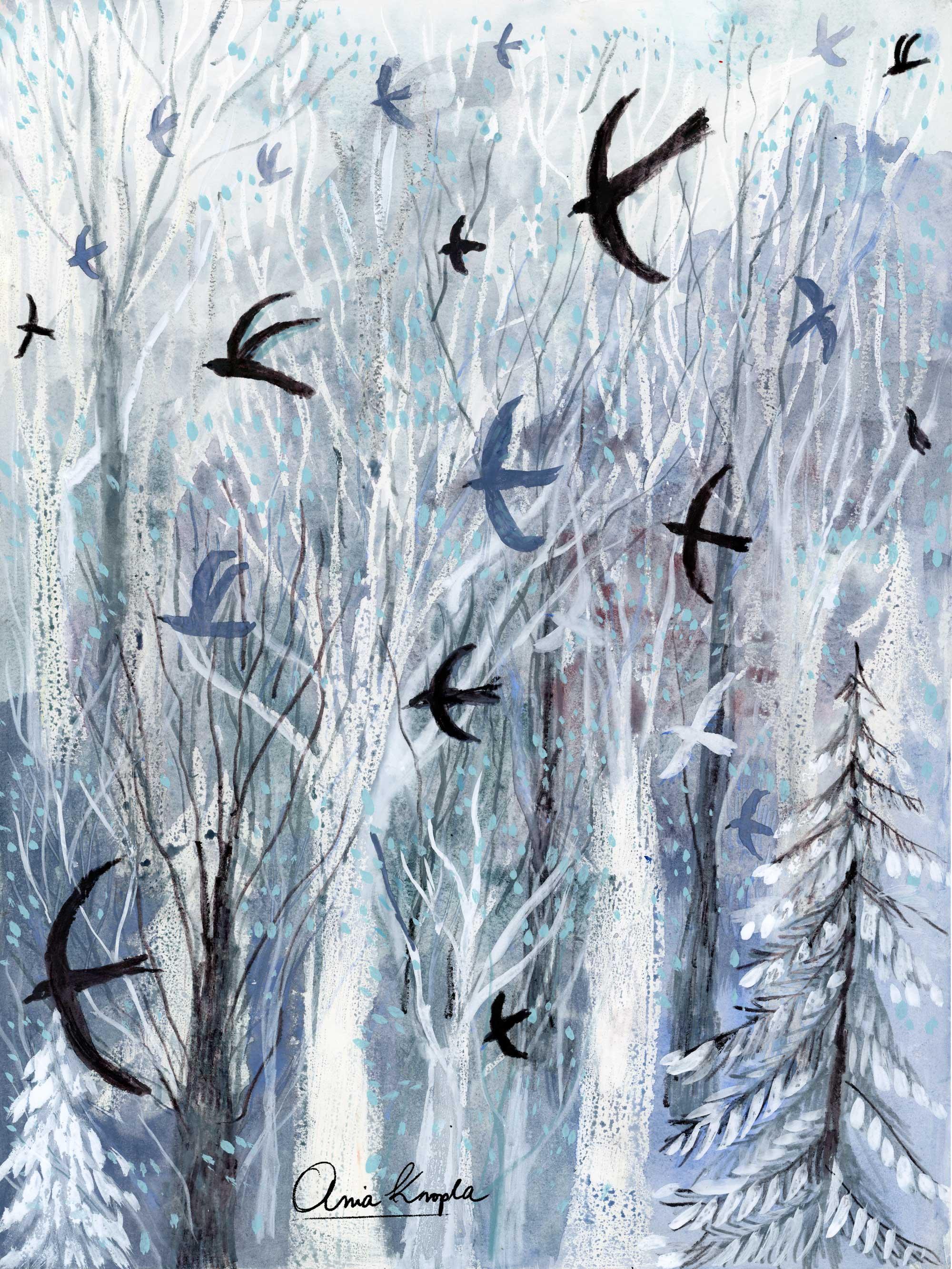
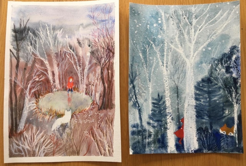
7. Winter - Bonus Project: Welcome to the bonus lesson. And here I will show you another illustration that I would do with the
same technique. That's because I really enjoyed
making the final project, and I was in the flow, and I wanted to do
something different, as well and explore
and experiment. And also I wanted to pick
another theme this time, personal theme based on the view that you
can see right now. I was hiking in the mountains, and I saw this beautiful
group of birds flying, and also another
element will be trees, my favorite theme,
which is the forest. So you can obviously
do it as well, or you can choose this kind of theme for your
final project as well. And again, I invite you to explore your themes,
your own voice, the things that inspires you
and excites you the most. So again, techniques
will be the same. The process will be the same. So first, I will draw
with oil pastels and the different thing here is that I wanted
to see what will happen when I will paint
draw with different colors. Those are light gray colors. And I will draw trees first, and we will see what
will happen when I will draw darker colors. And obviously, white colour
is perfect for winter racing. But this is also the
reason that I want to see different colors to apply
them for different scenarios, different themes, and just, you know, to experiment
and explore. So if you want, you can do it. You can do it the same
and see what will happen. So again, right now, I will finish to draw the
trees with oil pastels. And again, second step is to
create a very light layer of color of diluted water color and cover the whole sheet, be generous with watercolor, use a lot of liquidy,
let's say, layer. And if you're covering
the whole surface, especially if it's
bigger sheet of paper, maybe you will work on
the smaller format, but still try to make it wet. And then I add gradually
more saturated colors. I play with different colors. As you can see, I use
different jades and hues. Basically blues, greens, something that would give this atmosphere of winter. And as you can see,
at this point, the effect is not
so spectacular. It seems very
unfinished, undefined. And I must be honest that I thought
that maybe I should start from the beginning that's
not the very good effect. But I thought that I will continue to draw
because you never know. Well, I mean, this
kind of technique, don't use so very often. So it's good to go ahead. Don't stop and continue
with your drawing because maybe something good
will come out at the end, and you never know if you
want to try what will happen. Well, I continues
with the process, and my process doesn't
follow the steps. Obviously, you have to
follow the main steps, for example, first oil
colors and then watercolor. But during the drawing, I often make one step forward, one step backward, and
so on and so forth. So here I will
continue, for example, to add trees, then
I will skip to add, again, a little
bit of watercolor. I'm just deciding in the moment, what I want to add,
what will work best. Yeah, that's more or
less the process, but the main steps are the same as in the
other illustrations. I will continue by adding
watercolor texture and so trees later, I will add branches
with white quash, and I also add quash details. I will add dots that
can be snow or leaves. There will be light
turquoise dots. And I will continue
to add a little bit of branches in order
to make the trees pop more because right
now they really not defined It just continue
to draw my forest. Forest is more two
dimensional now, but still there's
too little contrast. So I thought to add
other elements. As in the other illustration,
I painted deer. Here I will paint draw,
actually, the birds. This is something that
I draw really often. I'll also here on Skillshare in my different projects are very important element
in my illustrations. So I add extra
contrast and dimension by painting them as really
dark spots of color. And I think this helps a lot to make the dimension and
to create contrast. I'm using ink tins,
water soluble pencils. I dip it in water before, so the color is really
intense and dark, and that's something I think it really helps
the composition. I decided at this point that I want to add a little bit of different colors since I use very colorful
watercolor background. But this time, I will use
guache because I wanted to add some more opaque color that will cover both oil pastels
and watercolor. So I will see if the guache
will stick to oil surface. So it basically work the
same as the watercolor. So shouldn't stick. But since it's also acritic then maybe it will be easier to
cover the oily surface. So the rule here would be that it shouldn't cover oil pastel, but, you know, it's
good to test and see. I will use very dense color. I want to paint
it on the trunks, but where the branches are. So I think there will be more possibility to
cover the oily pastel. So, you know, rules are rules, but sometimes you
just have to test and see on your own
what will happen. And I guess that when
the oil pastel is really thin and you can
basically cover it Yeah, basically works. And also, I'm painting. I'm not sure if
I'm painting over branches that were made with
old pastels or with gouache, but basically, it
works, so I'm happy. And I'm using this blue to paint other birds because I wanted
to add some other dimension. The lighter birds can make this effect of the background that they are not
in the foreground, but they are farther away. Therefore, there are
more light as color. And also, I wanted just
to be more colorful, not only these black
and white colors. I will also use light
turquoise squash to add some extra details to my
tree scent atmosphere. And I thought that I will
use it to paint both leaves, and that that can be interpreted
as snow or basically that will add the
icy frosty texture to the whole composition. And also we'll add a little
bit of color, more saturated, more vibrant color that will
enrich colors of my palette. I will leave you at this point, and I will leave you to the process so you can watch it until
the end, if you want, I will add some roasty details, textures, and I'm warming up myself a little
bit with hot tea. So grab the hot tea, chocolate, whatever warms you, whatever you wish and
enjoy the process. And enjoy the process of making your own art,
your own illustration. I hope this one was
inspiring for you as well. I cannot wait to
see your projects.
8. Winter - Final Thoughts: So we finished the
winter project. I hope you enjoyed the process
that you learned a lot. Make as many
illustrations as you want to celebrate your winter season. I cannot wait to see
what you created. Ploaded to the class gallery and see you in the
springtime. Bye.
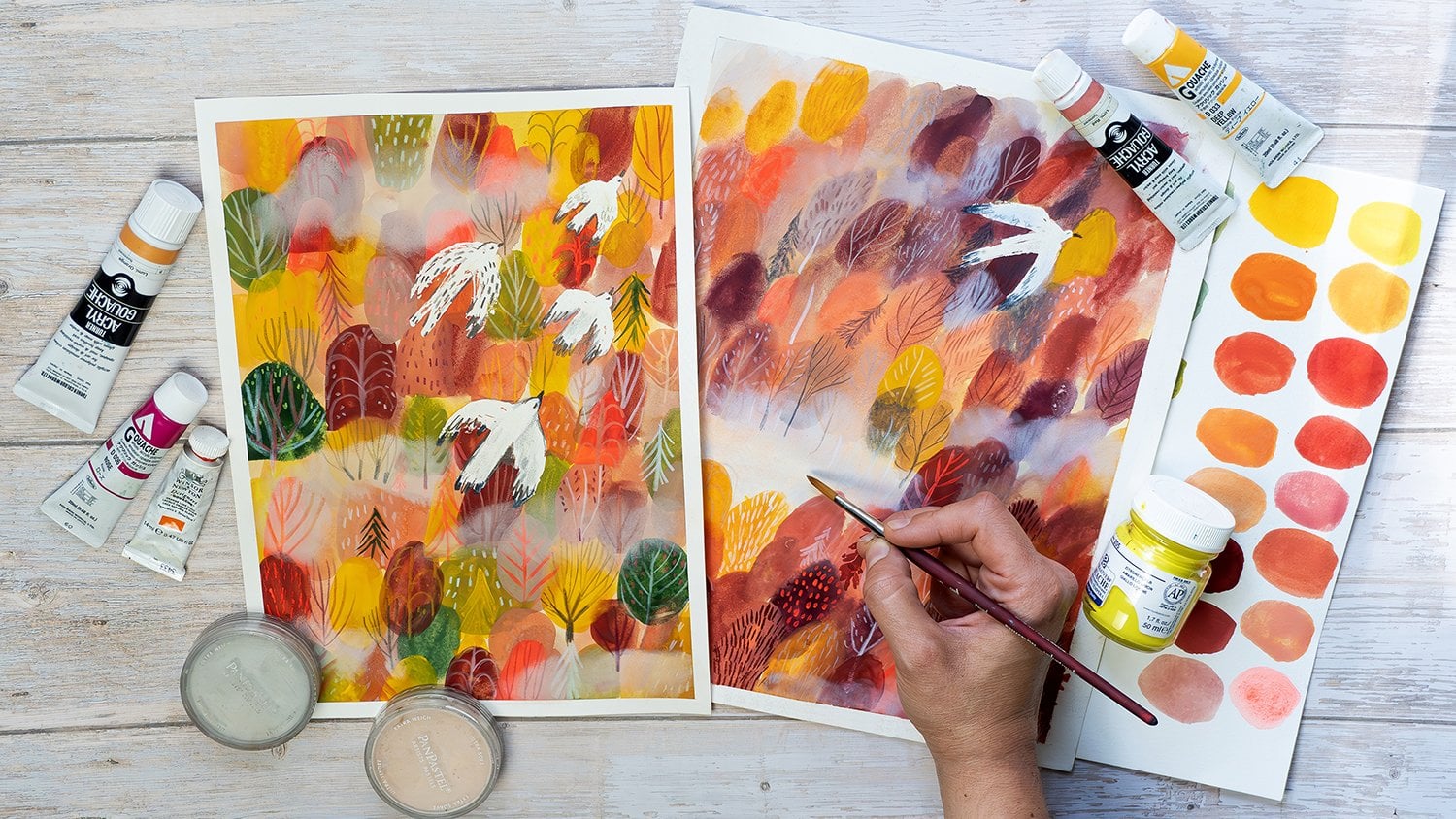
9. Spring - Theme For Your Project: And so it's spring. The ever present colors
that burst everywhere, the air becomes
warm and fragrant, is fresh, vibrant green. Our senses are bombarded and we awaken to life
together with nature. And at last, we can
go outside and find so many things to discover
and so much inspiration. And the biggest, of course, is the natural world. And not only the flora, new plants, flowers and colors waking up,
but also animals, insects, butterflies, the
return of wintering birds, everything comes alive again. So, I would like you
just to go outside and find out what delights
and inspires you, something you would
really like to paint. It can be just a
plant, a flower, or just an animal, maybe an insect or a
bird or both of them. For me, it will be
butterfly and the flower. That's because both of them
give so many possibilities of interpretation of
colors, forms and shapes. You can also paint a
butterfly if you want or think of something
that inspires you. Maybe it's something you
noticed during your walk. Maybe you took a photo of it. So just simply go outside and be inspired
by what you see. And for our project, we will use the theme
that you will pick and we will paint it using the negative
painting technique. So when you're ready, you can
move on to the next lesson.
10. Spring - Supplies : Let's see the supplies
that we will use. First, I will show
you what I use, and then I will walk you through different possibilities
that you have. So don't worry if you don't have the things that I will use
for the final project. So what I will use are so called acrylic
wash, acrylic wash. They call them in different way. It is all kind of quash
that has acrylic in it. I will use it because lately, I like to work with quash
and also acrylic quash has this quality that it won't get
reactivated once it's dry. Let's say that I will
first paint with this green and if I will paint
with a pink or red above, it won't get reactivated, so the colors won't
mix together. As you can see, there
are many brands. I have these three brands, Liquitex, Turner and Holbein. If you have them at home, you can try them. But if you don't don't worry. It doesn't mean that
you cannot work on this class or that you
have to buy a credit guh. No, you can work, for example, with
traditional Guash. If you're new to gouache, then maybe it can be a little bit more difficult
for you to understand how to paint
different layers one above another without
reactivating them. So maybe if you're
new to gouache, then I would suggest
you to work with some other supplies that
you usually work with and if you are
comfortable with using guach then you can obviously use also traditional quash for it. The traditional gouache,
if you're new to guache means that the
colors will reactivate. So it means if I use, again, green and pink, if I will use pink
over the green, the risk is that the
green will reactivate a little bit more and
will mix with pink. The other solution would
be to use just acrylics. They won't reactivate never, ever the same as the
acrylic gouache. So it means that if you
paint pink over the green, you will have this
pink, pure color. The other supply is watercolor. It is possible to
use watercolor. I explain how to
layer watercolors in my class about negative painting when we paint forest scene, and I explain you a little
bit better the color theory. That's really helpful to know when you're layering
with watercolors. Two things you have to have in mind, they're more translucent. They're not so opaque and gouache let's say,
it's more opaque. It means it covers better. And watercolors
remain translucent. It's nothing wrong. It can be even something that
you prefer as the effect. Have a look at my
class if you're new to watercolors and
about the theory, because the second thing
you have to have in mind when you're using watercolors
is the colors that you use. If you will use for this
project watercolors, I will just explain you
here quickly that what I would like you to avoid is
to use different colors. Let's say to mix worms
with cool colors because the result can be that you will end up
with a muddy colors. So I would suggest you
to use, let's say, family of cool colors for
your final project and layer, let's say blues with greens
and also yellows, let's say, but don't mix reds and pinks and warm colors because you can
end up with muddy colors. Watercolors are still
a very great solution. I use them to the negative
painting technique as well. If you remember only
about this rule, then you'll be more dense spine. The other solution, something
that I discovered lately, are the ink tense colors
from the Derwent brand. The product is named ink tans. There are different types. There are also pencils
and blocks of colors. But this is really
cool because those are pens and they work
like inks, I would say. They are like
watercolors as well, but they're more
translucent and vibrant and the characteristic of this paint is that they won't
reactivate with water. So again, our example
with green and red. So if you paint with
green the first layer, you will let it dry, and then you will
paint with red, then the green won't reactivate. They are not opaque. They are
more or less translucent, the same as water colors. You won't have opaque matte
red color over the green. But still, the good thing is
that they won't reactivate. So if you by chance, have this at home,
give it a try. So I'm sure you have at least
one of those in your home. More important thing is to
try and maybe fail rather than not trying because you think you don't have a
good product in your home. You know, that's
important for me. Don't freak out. Try what you have at home.
As for the paper. Have also different
possibilities. I will work with
mixed media paper because I will work with quash. It's 200 grams. You can use thicker 300
grams, which is perfect, but 200 grams will work as
well if you work with quash, and the big advantage
of this paper is that it's cheaper than
the watercolor paper. But if you work with
watercolors and you have as well watercolor
paper in your home, then that's maybe
a better solution, usually for watercolors. I have, for example, this one, which is a cheaper
watercolor paper. Well, you don't have to
use nothing really fancy. And as for the sketches, I will use a sketchbook. You can use sketching paper. Here, the thickness of the
paper is not so important. Maybe 90 grams, I would say no go lower because we will
sketch with water as well. And last but not least Brushes, I will use more or less three or maybe two is
perfectly enough. The most important is to
have bigger brush to paint backgrounds and a smaller brush to paint details and
where we will layer. With a negative painting, also sometimes we will
paint detailed areas, so it's good to have
one small and one big. If you have a medium as well. Just see what will
work best for you. Synthetic brushes,
round brushes. Again, nothing fancy. Watercolor maybe will be better. But if you work with acrylics, then acrylic brushes and
also something you can add, but it's not required. Colored pencils to add
some extra details, I will also sketch for the final project the
outline of my butterfly, but you can also use
regular pencil as well. Okay, so I hope
everything is clear here. If you have any questions, drop them in the comments. I will be glad to help
with any doubts or questions about the supplies
that you want to use, leave it in the comments
in the discussion panel. And let's get started.
11. Spring - Negative Painting As A Creative Tool: Before we will
start, I wanted to explain you how we will
use the negative painting. Most of all why we will
use the negative painting. Right now, I will show
you the sketchbook. So while I will explain you, you can see the images
of the sketchbook that I drew during
the course with one of my favorite
artists and illustrators. His name is Jesus Cisneros. He's Spanish illustrator. And he taught us this too. So we will use the
negative painting not only to develop and to learn this artistic
technique and skill. But most of all, I will show you as this creative tool and exercise that I learned during
the course of Jo Cisnero. So, later on, I will show you and do with
you this exercise. But right now, I'm
showing you the images. So this kind of technique
is used as a tool to develop your artistic
language and style. Let's say you don't know
how to paint butterfly, or maybe you don't
want to just simply represent the istic butterfly that you see in a
photo or in real life. And you're searching
new ways to paint it. Maybe you're asked me that
you like really fun ways, not realistic ways to represent
think whatever it is, it can be anything, really, not only butterfly. And this tool is really
genius way to search new and fine and
fun graphic ways to represent the subject to develop your artistic
language and style. So let's get started. I will show you what
it means because it's easier done than set. And now I'll show you what
this exercise is all about, and we will apply it later
on in our final project. First, before we will start, think of your animal or of the subject that you want to paint for your final project. In my case, it will be
butterfly and flower. But right now, I will focus on the butterfly and
what I want you to do is to pick the type of the butterfly
or of the animal, search for a photo reference
and take a good look at it. Take the time that you
need, but don't exaggerate. Maybe you can use three
to 5 minutes to just get familiar again with
the shape of butterfly or of the subject that
you want to paint. Once you did it, I want you
to close all the references, all the photo references, and don't look at it anymore
during the exercise. Then, grab your sketchbook. And divide your sheet of
paper into the squares. They can be smaller,
they can be bigger. I advise to divide it
because this way you will create multiple quick sketches without losing
yourself in details. So bigger images will just be too time consuming and
maybe at the beginning, just focus on small
quick sketches. So the technique here is about painting without sketching
the outlines beforehand. So no pencils, no
colored pencils. And this is the challenging
part of this exercise, not only because obviously also painting without reference
is already challenging. But here, I would like
you to focus on painting your animal without an outline. So for example, when you paint, you would probably first sketch the outline or maybe
paint it as I do. And then later on
paint around it. So in this way, you carve out the negative space by
painting not the butterfly, but all the space around it. So this is good as well. This is a good
technique as well. But let's say you're this way, you're a little bit stressed about how to paint butterfly. And eight. This technique is all
about the different thing. It's about painting butterflies without freaking
out how to paint it and letting the process to help you to find
new solutions. So what you want to do
is to paint around, paint a negative space, paint all the things that
are around butterflies, but without sketching it before. I know it sounds crazy. I know it's quite scary, but believe me, it works. So what I usually do before I will outline
the whole butterfly, maybe I will start just
with one part of the wing, maybe then I will paint
the second bottom wing. So yeah, you can help yourself by outlining the single
parts of butterflies. But it's about the process that will give you
the solutions. So you don't have to be afraid, you don't have to be worried
because you don't have to find the solution
immediately. And you don't have to find
also the perfect solutions. And my experience is that
through this exercise, I'm finding really fun
unexpected solutions that I wouldn't achieve
by just simply trying to, you know, imagine and
paint this butterfly. And usually, instead, I find funny ways by
using this technique. I hope it is quite clear at
this point, let's proceed. Right now, I will try to use
this technique and steps to do four quick sketches,
four quick butterflies. So that's why I prefer to use it in a small format
at the beginning. It helps me to be quicker and not to
distract me too much. Okay. So you can think of the
way the butterfly can be. It can be with the
wings that are open. Like I painted it above. Maybe the butterfly
can be seated on the flower with the
wings, not spread it. So think of the ways your animal can be
if you're painting maybe ladybug you can paint it from the profile
with the wings opened, closed, from above,
maybe from below. And just don't freak out. Don't overthink it. Let it be a playful exercise. It's only for you, you know, you don't have to, as I said, find immediately the solutions. And since you're making
it in a very quick way, you can make as much swatches, as much sketches as you want. So right now, I start again with this kind of butterfly with this opened wings form
and this kind of shape, this is maybe more
familiar for me. Probably it's something I
saw in the photo and I try to and I have this
image fixed in my mind. And it's a good starting point. Once I define the
shape of my butterfly, I will draw the details inside. It's also a good way to
explore different patterns, different detailed elements of your animal butterfly,
whatever you draw. You can come up with really fun and not realistic solutions, play around, use your fantasy. Obviously, I have in my mind, more or less how
the wings are made. But since I don't have a
reference, I'm also improvising. I'm coming up with
different solutions. And in this way, I'm
creating something new, something that doesn't exist. It's something that can be
really original and beautiful. I will repeat this process those steps as many times as I want. Probably the first solution
won't be satisfying. Maybe they will be even frustrating because
you have to warm up, as with all the exercises,
all techniques, it's normal to try many times before you will
find something that is fun, but I encourage you
to continue to try, and you will see that
you will find really fun sooner or later you will find f solutions that
you will enjoy and like. And here I'm trying
another form of butterfly, another way with wings that
are closed from the profile, and maybe I will try
different shapes of wings. So right now, I have
the specific type of butterfly in my mind, but maybe I will try, you know, to exaggerate the forms, the shapes of the wings. So again, I'm
trying the profile, but in a new way. And also, I can find I can
search both for new shapes, but also for new details
inside my butterfly. Right now, for example, I'm splattering the dots of
the paint as the pattern. So this is the time to explore, to play, to try. And I really hope you will enjoy this exercise because this is something really,
really liberating. And this is a place where you
really can relax and shake off all the expectations
of the anxiety of making a perfect piece
and find new ways, your own ways to paint.
I hope you will enjoy. I will show you other
four butterflies. I will speed up the
process without talking. So explore your animals as
many times as you want. You can also apply this process to paint
to find new ways and new forms of flowers and whatever subject you picked
for your spring project. Here are the
butterflies that I did for the final project, I will pick one of them to develop and here you can see some of the
butterflies from the past. Maybe they're very simple, maybe not so developed, but they're always a
good base to work on. I think overall, they have many different
interesting shapes to work on in the future. You can also see, for example, the same exercise that
I did with rabbit. I hope you will
enjoy this exercise.
12. Spring - Final Project: It's time to start
our final project. You probably already know
what you will paint. Maybe you picked a flower. Maybe I took a photo of
something that inspired you. I will personally use
a photo that I took of this beautiful butterfly
in the house for butterflies here
nearby in Italy. And also, I will look as a reference for my negative
painting exercise. I picked this butterfly
that I liked, and it will be there
as a reference. And you can do it as well. You can use one of your
exercise swatches, or you can start from
scratch and start a brand new negative
painting shape of your subject. So
let's get started. So as for the process, as for the technical stuff,
prepare your materials. Since I will use
the acrylic quash, I prepared the plate with
the wet paper towel. And in this way, the colors will last a little bit longer. If you're using
acrylic wash as well, or if you're using acrylic, then it's a good tip. The colors won't dry so
quick because once they dry, then we won't reactivate. Maybe you have the
special plate for it. There is this color palette for acrylic wash
and the gouache. With the cover that really
protects your colors to dry. Otherwise, this is
something I do. Let's say this
homemade solution. And right now, the
first step is to prepare your palette and to
prepare your background. Remember, we are working on the negative painting with a
negative painting technique. So you can do two things here. You can paint the
negative painting around the white blank paper. But what I show you here is another solution really
cool and colorful, creative solution
to the blank paper. And it is to create the textured background that
you will use as a base. And that you will apply your negative painting
on this background. So basically what
I'm doing is that I randomly paint the colors. I just create this kind of colorful blobs, strokes,
nothing specific. I just want to create
the texture, the colors. So pick the colors
you want to use. It doesn't have to be this
range of colors, obviously. It can be something
totally different. Maybe you want a
green background. Think of something
that you will paint. At this point, you probably already know what
you will paint. So since I will paint
flowers and butterfly, I want them to have
this color pinks, oranges and yellows. And, um, you can also help yourself to use
creative textures by using different tools. For example, I use
this *** brush. It has those
interesting brussels, and I really love it because it creates really
lovely brush strokes. So explore, build
up your texture. You can play with different
textures, different tools. For example, you could also splatter the water on
your color and create the dots of lighter colors by splattering water
on it and so on. I will proceed. I will
speed up the process. And once you're ready, let your background to dry. Once your background is dry, you can proceed and
paint your image. So right now, I will do
something that I advise you not to do and I will
sketch my image, my composition before I will
paint the negative painting. But this is for two reasons. First, maybe you really struggle and maybe you
really need a guidance. So if you need an
outlined guidance, outlines on your
paper, then do it. And the second
reason is the most important is not to use the
pencil in the first part, in the first drafts and sketches that we did with one color in the
previous lesson. And since I already discovered the shape of the butterfly that I wanted through this exercise, right now, I will just
sketch the solution, the shape that I achieved
within this exercise. So this is also the only
reason I'm doing it. Otherwise, if I haven't
found yet the shape of the butterfly that I'm interested in, then
I wouldn't do that. So it will be easier
for you also, in order to make a
composition on your paper. So the other way we could have
done that is that we could have sketched a thumbnail
on our sketchbook, and later on, um, painted on our final
piece without sketching, we would already have done the sketch thumbnail
somewhere else. And then we would only have to, you know, to copy it
in our final piece. So it's up to you guys. If you don't feel ready, then sketch your outlines. Otherwise, you can proceed
without. It's up to you. The only thing I
would recommend right now is to do it in
a really light way. I didn't use, for example,
the black pencil. I used colored pencil, and the color is warm
as my background. So this way, it really
doesn't show through. It's really light, and it
will be easy to cover it. Especially if
you're working with translucent colors
like water colors, then be sure to use a
really light sketch. Okay. So I already
have my warm colors, and now I prepared
my cool colors. So if you've seen the
lesson about art supplies, maybe you're wondering, why
am I mixing warms and cools? Since I told you not to do that, but I told you not
to mix or maybe to be very careful to use worms and cools when you
use watercolors. That's because by
their characteristics, they will mix with each other, especially if you're using negative painting
and worms and cools usually you create dull colors. So since I'm using
acrylic acrylic Gua sorry, it won't happen. The layer underneath
won't reactivate. Once it's dry, it won't move. And also, since the guache is opaque, it's not translucent, especially if you
use dense color, and the colors won't result. Those are really vibrant
acrylic guache colors. So that's why I'm
mixing coals and worms. I hope it is clear.
So right now, I will proceed by painting around my shapes, my
outlines, shapes. If you don't have outlines, then just paint around as
you did during the exercise. And what I will do is that
I won't premix the colors. I will do something similar
as I did for the background. Meaning that, I will use single colors and paint
them next to each other. So I started with this
kind of Prussian blue. Then I added this
sage mint green, and now I'm proceeding with this warm lavender blue and this is something
I really like to do. This is the way that I
lately that I paint lately, by doing this patchwork colors. And you can do it as well. You can try this way or you can proceed by painting
just one color, or you can premix or painting more regular
parts of your painting, for example, you want your down bottom part of your image to be green,
then you can do green. Let's say, other part, you can make a darker green because let's say
you paint a field, and you see this foreground and background different kind
of greens. It's up to you. Um how you will
apply the colors. So you can explore
this way, as well. It is really fun. Another tool for me, this kind of applying of color
for me is also a tool to make really creative way to
paint in a creative way. So right now, I'm
just trying to paint the background of
grass, of leaves. And I'm carving out piece by piece my flowers and the leaves. Once I'm ready, once I finish to do the first,
let's say, layer, right now, I'm adding
extra texture by dabbing with dry paper towel
into the wet colour. This is something I use really, really often in my classes. So if you already took
one of my classes, you probably know it. I really love textures, and I use different tools to add some extra textures into it. So right now, you see there are shapes of three
flowers and the butterfly. So we will proceed to add
right now the details. I'm sorry because the part of
the video hasn't recorded. I already started
to paint details. As you can see, I
added this border. So even if I remember that my photo reference butterfly was met was this meant green. I thought since I have I wanted to make this orange
and pink background, I decided to do another
type of butterfly, and I have in mind,
the monarch butterfly. And that's more or less
something I'm trying right now to to paint. It's easier for me
also because I already did this exercise
within my sketchbook. From the course that
I told you about, I was making this exercise
with Monarch butterfly. So it's up to you what
kind of butterfly you will create. You will paint. And what I'm doing now is
really I'm just improvising. I'm just searching for
interesting shapes. Right now, you can replicate the shapes and patterns that you painted
in your exercise, in your thumbnail phase. If you found interesting
solution, then go for it. Then just paint what you like from your
previous exercise. Or you can proceed and continue your
exploration of forms, shapes and patterns
and improvisation. This is really artistic
improvisation. Either way is fine, it's up to you. And as for the colors, also here, improvise, pick
the colors you really like. You can use the one
from the photo, or you can make it totally up. And find new colors, new solutions. It's up to you. So I continue to use wash here, but sometimes I will also
use colored pencils, and I will use those two tools
in order to paint details. If you're using colored pencil, be sure to use the one that are oil based
because they work better, especially if you will
use wash or acrylics. Example, those are
Holbein artistic pencils. They're really greasy. Doesn't mean that
they're pastels, but they are a
little bit greasier, meaning they are very opaque
and they cover really well, the color underneath,
and they are great to work with mixed media. If you have different
kind of pencils that are not so maybe they don't
cover really well. Well, then just see what
you can get with them. Maybe you can use wax pastels
or oil pastels if you want and see what will
work best for you. I will continue with this process of adding
details, improvising. I'm just I'm not planning, I'm not looking at the
photo at this point. I'm basically trying to recreate the forms and shapes
that I already created during the
previous process. And I will continue to build up the layers
with the guash, I will continue to use gouache
and my colored pencils. And since I'm using the guh, I'm able to build
up those layers, and I could continue
to build them up. Obviously, I won't do that
because I also want to leave some background underneath and the vibe of the
negative painting. And if you will use the
watercolor or ink tans more translucent medium then
just be aware that you won't be able to build opaque
infinite layers. You will be able to paint on the top of the layer beneath, but you won't be able to work the same as you would
with gouache or acrylic. So it's up to you how many
layers you want to paint, how many details
you want to add. You can really have
fun with colors, play with colors, since
it's a spring project. And if you like colors, then I really invite
you to explore them and to make your project
as colorful as you want. As for the colors that
I use, as you can see, I continue to use
the colors that I swatched already
on my palette. And this is the warm
and cool color palette. And this kind of palette gives you the
opportunity to create really lovely contrast
between warm and cool colors. It is a very vibrant and very
strong kind of contrast. And also, you can create
the other type of contrast, which is between dark
and light colors. So I do both here, but mostly it is just playing
with warm cool differences. The other thing that
you can do is that you can add new elements
to your composition. For example, I'm painting
petals and leaves, and I also added some extra space to the
wings of the butterfly. And you could do it also in
the negative painting way. So let's say I could
add some flowers by painting around the green
background. It's up to you. So you can play around at as much as you want
to your illustration, play with elements,
play with colors. And I'm really satisfied
with the results, especially with the
shape of the butterfly, I achieved it by the negative
painting exercise before. Also the flowers, I did the same to create the shapes
of the flowers. So right now, I think I
added too much details. So it's always tricky when to stop because too many elements can distract the attention, can unbalance the composition and an overall can
be overwhelming. And I think this is what's happening now, but nevertheless, I really enjoyed
the final result, and I loved the process. I think I wouldn't come up with this shape with this kind
of illustration without the creative exercises and by just trying to figure
it out by my own. Instead, the process of
the negative painting really helped me to find the
lovely creative solutions. And I hope it will
be the same for you. I really hope that
you will enjoy the process and that you will celebrate spring with
new artistic projects. I cannot wait to see them. I cannot wait what you
will come up with, what shapes you will create, what animals you will paint, maybe flowers and colors
that you will use. Um, and yeah, let's celebrate
the spring together. And here are the major steps
for your final project. You can recap them here. So applaud your project. Maybe you will update the project that you already
have from other seasons, and I cannot wait to see it and see you soon
in the summertime. Bye.
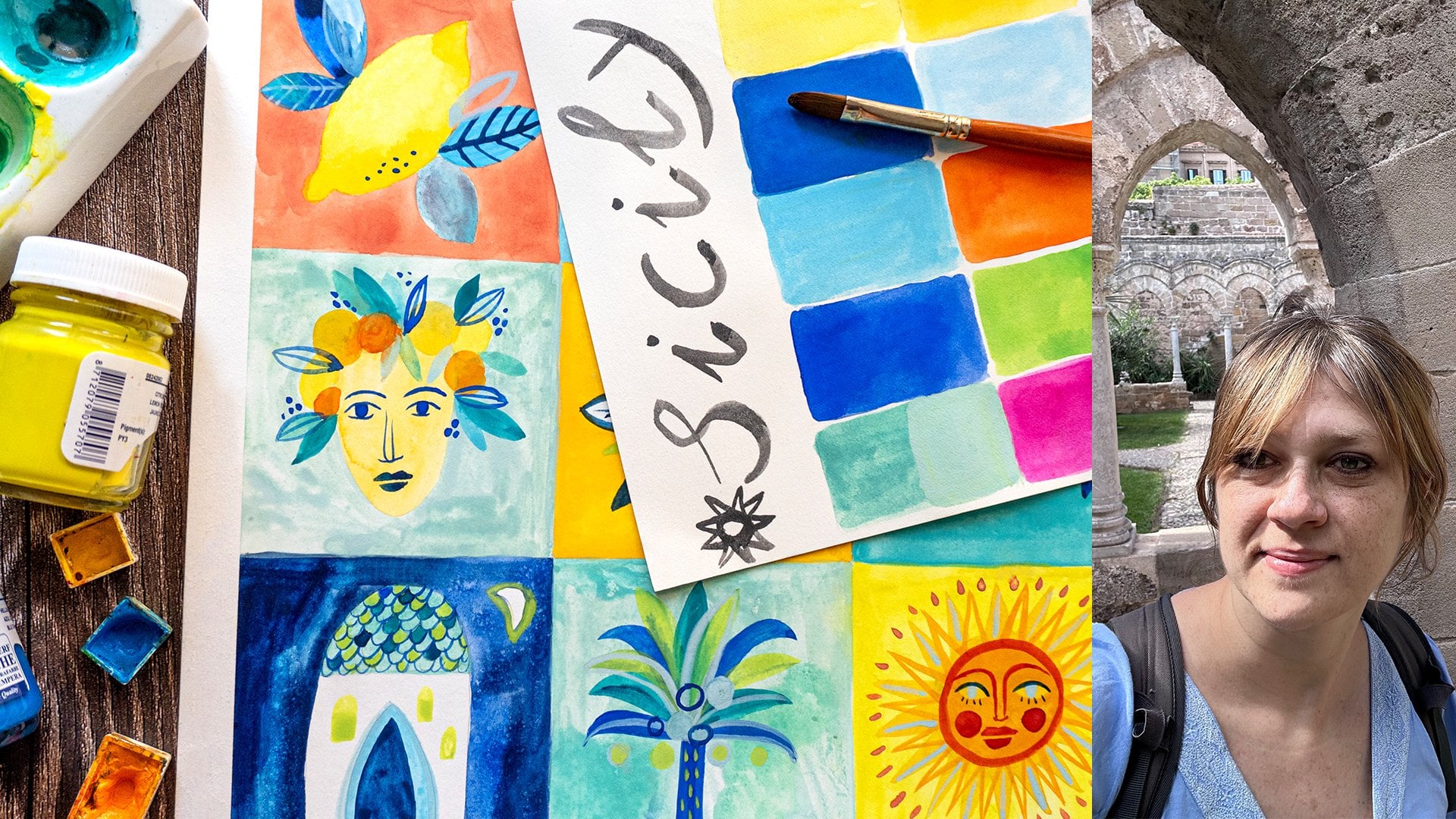
 Ania Kropla Malinowska, Award-winning illustrator