Transcripts
1. Create Color Schemes & Themes in Adobe Illustrator - A Graphic Design for Lunch™ Class: Hello and welcome to this course on making color schemes and themes in Adobe Illustrator. My name is Helen Bradley and I'm a Skillshare top teacher. I have over 250 courses on Skillshare and over a 130,000 student enrollments. Now recently, Adobe discontinued the very popular Color Themes panel in its applications, including Illustrator. Finding and using color schemes is more difficult now than it was pre July 2021. In this course, I'll show you what's gone and some workarounds for getting color themes to work with in Illustrator. If you use the old Color Themes panel, this video will give you a workflow going forward. If you didn't use the panel, you'll still get heaps of ideas and tools for creating and using color themes, including for creating document profiles complete with all your favorite color themes that gives you a one-click starter for all new documents. By the time you've completed this course, you'll be comfortable with creating and saving color themes for use in Illustrator. Of course, it wouldn't be a graphic design for lunch class if they weren't a bunch of handy additional tips thrown in. Without further ado, let's get started.
2. Pt 1 Understand the Problem: Before we look at solutions to the color themes problem in Illustrator, let's have a look at the problem itself. I have Illustrator open here. I'm going to Window and then Color Themes. The Color Themes panel opens, but there is a warning message at the top here that says that the panel is being removed from this product. In fact, it's being removed from Adobe InDesign, Photoshop, and Illustrator, and not only the most recent versions, but also a prior versions as well. Now in removing this panel, you might be wondering about what Adobe has put in its place and the answer to that is nothing. Adobe has some suggestions about color themes, but it has not replaced this panel. So far, there is no indication as to whether it even intends to do so. If you're used to using this panel to get access to the tools for searching color themes that are on Adobe's website or for creating your own color themes, this is no longer going to function for you. That's what we're going to look at in this video, the alternatives that you have. One of them is posed here, using coloradobe.com. We're going to look at that. But we're going to look at a number of other ways that you can get access to colors that all relate nicely to each other and that you can use for creating your art here in Illustrator. That's what we're about, that's a problem. Now let's start looking at some of the solutions.
3. Pt 2 Color Themes: When it comes to alternatives for the now discontinued Adobe Color Themes panel, the suggestion that Adobe has is to use their website. This is the website color.adobe.com. When you get there, there are options here for creating, exploring, for looking at trends and your own particular libraries. But before you do anything, you want to come over here to the Adobe Creative Cloud icon on the very far right. Click it, and that will take you to make sure that you are logged into your Adobe Cloud account. You need to be logged in because if you're not, you won't be able to save the color schemes and color themes that you're creating into your libraries, and you need that to be able to open them in Illustrator. Be warned that this is a really cumbersome approach, it's quite a bit of a nuisance, but it's what we're left with in terms of what Adobe is suggesting, I have other suggestions for you, of course, but let's have a look at this. Assuming that you are logged into your Creative Cloud account, you can now use this and it's got the options that you'll use to on the panel, the create option and also the explore, we're going to have a look at explore first of all. Now, by default, explore is going to show you a whole lot of things, not just color themes here, but also other bits and pieces. Now, if you only want to say color themes, what you're going to do is come across here to the View option and moment it's showing all sources. We're going to click down here and we want to get to color themes. Now, the problem is that this does not appear to work in the Chrome browser very well, because every time I try and click on that option that just disappears, it disappears, so I can't go from Color Themes to most popular or anything like that because there's this big space in the middle and it just doesn't work, so here's what you're going to do. You're going to click on "Color Themes" and then you're going to use the up and down arrow case because that does work. I want to go and have a look at most popular, only want to see color themes, I don't want to see creative projects. I don't want to see stock photo, so I'm just going to press "Enter". That gives me just the color theme. Just be aware that that may or may not work in your browser. These are the explorable color themes. As we had in the Color Themes panel, we can actually search with keywords, we can type in keywords and get color themes that are related to that keyword. They suggest things like moonlight. Let's go and have a look at beach. We're expecting with beach to say things that have a beach look to it. We've lost to her all sources again, and this is on a really annoying interface, but now, we're able to get just that color theme. Here we are with our beach color themes. You can have a look through those, just scroll through those, and when you find one that you like, you can just hover over it, and you've got three options, you can favorite it and appreciate it, you can download it as a JPEG, I'm going to come to that in a minute, and you can also add it to your library. I'm going to click here to add it to a library. Of course, the question is, what library did it go into? Well, it would be better before you start clicking on this add to libraries so that you assure yourself that you're going into the correct library. Because if you've got multiple libraries, it could be going into anything. Here, are your libraries, it's not very clear, but in this particular account, I've got Calendar colors and colors in my library, so I'm happy that's gone into my colors library. But if you've got multiple libraries, you'll want to make sure that you target the correct library before you start. If you want to make a new library, you can click on the plus sign and just create a new library, but we're going into the right place for me, so again, add to library, I can add this one to my library. At this point, you can continue to do that or you can go and look up different words, but if you're looking at creating a piece of artwork related to beach and you found the color themes you want to work with, then you're good to go and we can head back to Illustrator. Let's do that, let's head back to Illustrator. I'm going this time to Window and then Libraries, because we saved those color themes to our libraries panel inside Adobe color, they should appear here in the libraries inside Illustrator, you have to allow time for the library's panel to sync with Adobe Online. Again, this is part of why this is a real nuisance, but it's what we're left with. Here are the most recent color themes that I added, so they're at the very top, and here are some other color themes that I've added in the past. In terms of using these color themes inside a document, this is what we're going to do. I'm going to open up the swatches panel here so that you can see the swatches that I have in this document to begin with, and if I want to add these to the swatches panel, I'm going to click on the Color Theme here, right-click and choose "Add theme to swatches". I don't want to just add one color, I want the whole of this theme, all five colors to go into my swatches panel, and there, they are there. Right-click "Add theme to swatches". There are my four themes that I just located and added to my libraries inside the adobe.color.com website, and then once they're in my libraries, they're going to stay in my libraries, so they're always going to be accessible to me via the libraries in the swatches panel. Of course, we know that the way that the swatches panel works in Illustrator is that these swatches are peculiar to this particular document, and if I open another document, let's just go and choose File, New and create another document. These color themes are not going to be available in that document. We can make them. I'm going to cover that in a later video in this course, but just be aware that, unlike Photoshop, Illustrator does not work the same way and color themes that you add to a swatches panel inside a document remain belonging to that document alone, not to every other document. That's one way that you can get access to color themes for use inside Illustrator. It's the same process that you use through the Color Themes panel. It's just got this additional necessity of going to the website, adding them to libraries and then from libraries adding them to your swatches panel.
4. Pt 3 Create a Color Theme from a Photo: Let's return to the color.adobe.com website and let's go from Explore into Create. Now, there are all sorts of Create options here, one of which we're going to have a look at right now, and it's called Extract Theme. This allows you to choose a photograph that has the kind of colors in it that you would like to use for a color theme and use it as the basis for finding colors. Let's go here to select a file. I'm going to my pictures folder where I have a folder of images that have the kind of colors that I would like to use. I'm going to choose this one because it's got some flowers in it and I'll open it. Now, down here, I've got a choice of the type of color scheme that I want to extract from this image of flowers. You can see it's got green, orange, brown look to it. Those are the colors that this tool has picked out of the image, that's a colorful version. Well, we can go to Bright and we'll get a brighter set of colors, all Muted so that we can get a more muted set of colors. There's also Deep and Dark, and there's nothing at all which would allow us to gather our own colors. But we could start somewhere with, for example, Bright. Then if we weren't happy with all of these colors, we could drag one of these color spots into a different place and that will give us another color. What I want to do is to try and find a green here. At this point, if I like this particular color theme, I can add it to my library so I can get access to it back in Illustrator. I've got my colors library selected, of course we had colors and calendar, you're going to have different libraries. Choose your library, make sure it's in the right place. Give it a name. Now, at the moment it's got the name of the original image. This was shot in Port Isaac in England. I'm going to give it a different name because I really don't want to call it Port Isaac. I'm just calling it orange flowers. I could choose to publish it so it would be publicly available, I don't want to at this stage, I'm just going to click "Save". That will be saved into the library so I can now get access to it inside Illustrator. Now, there are other tools here as well. Let's go to Color Wheel. These are the colors that I had a minute ago in the Extract Theme area. As soon as I go to Color Wheel, these colors are available to me and I can make further changes to them. I'm not really happy with this green, obviously, this is the color picker for that green and I can take it somewhere else. I could brighten it or make it a slightly different color. I can also adjust its RGB values and also its brightness. If I get some way near the green I want, I can drag the brightness up to make it brighter. Using this part of the Adobe Color website, I can extract a theme from a photograph and then I can come in to the Color Wheel area and make some changes to it and then again, save it again. It's again going into colors into that library, I'm going to call it orange flowers too, and I can save it.
5. Pt 4 Create More Color Themes using Harmony Colors: In addition to creating a color theme from a photo by uploading the photo and then choosing a mood here, and then perhaps even rearranging some of the colors to suit, you can also take these colors and do something with the colors themselves. I'm going to choose this colorful option, and I'm going over here to the color wheel. Now, inside the color wheel, you can actually find color harmonies of these colors, analogous monochromatic, triad, etc. But before you start clicking away on these options, just be aware as to which color this is all going to be based on. Because as soon as you click any one of these options, everything is going to change. Let me just show you, you've lost all of your colors except the middle one here and that's because the middle one here by default is set as your base color. If that happens to you and you realize that you've done the wrong thing, just go back to your extract theme and provided you haven't made too many changes to it, you can quickly re-establish your theme and then go back to the color wheel. I'm just working on the exact theme that I was given in terms of colorful extracted from this image. Let's go back to the color wheel, here we can see that our colors are intact. Now if I want something other than this color to be the one that stays stationary while all the others change, then I need to set it as what's called the base color. What I'll do is go over here for example, and set this as the base color. This won't change, everything else will. Now when I go to split complimentary, I'm seeing the split complimentary harmony relationship that is based on this color itself and now these are the colors that are in that relationship to this color. I could choose this as a theme for example, I could go back and choose the complimentary, or monochromatic, or square, whatever I wanted. I'm going back to extract them so I can go back to my basic color theme. Again, when I come back to the color wheel, everything is as it was, including the base color. The base color is still set there. If I want to change to a different base color, I'm going to select a different base color, and then I'm going to choose a different color theme. Now whether you find what you're looking for here or not, you may and may not. I think it's a fairly hidden misprocess, but you might find nearly what you want and then from there be able to say move things around to get what it is that you do want. You can drag on these colors to take them somewhere else so that you still got this split complimentary arrangement, but you've got a different starting color, or you can just go to custom and then start dragging these things around yourself. You could use that as a starting point but say, hey, look, I didn't want to have that in the relationship with red. I wanted to have it in relationship with blue, for example. As soon as you find something you like, you're just going to give it a name, you're going to select your library for it to go into, and then you're just going to click "Save." For argument's sake, let's go and save this. I'm just calling this was orange flowers because that's what it was extracted from. I'll click "Save." Now in addition to dragging colors around here in to different places, you can also change your colors here. At the moment, we're looking at the RGB colors. This is red, green, and blue, and this is brightness for this particular color. You can choose different color modes if you want to be working in CMYK or even hue saturation brightness. Now that may make better sense in terms of picking the actual color that you want from a hue slider. You can do that using hue saturation brightness. You're still going to end up with the same basic color, it's just that you're using a different color mode to be able to adjust the colors here. Again, if you like that, you're just going to give it another name and you'll click "Save." It's going to be saved into the library that you specify.
6. Pt 5 Colors from Jpeg images: Before we finish up in this Adobe Color tool, I just want to return quickly to the Explore option. I'm going to look at color themes and I'm going to say, if this is a color theme that I want to use, there is an option here for downloading it as a JPEG. The question becomes, why would you bother doing this? Well, the answer is in some instances you may find it difficult, if not impossible, to sync your library with the Adobe website. I have one computer that the sync just doesn't work on. But if I save this as a JPEG image, then I'm able to get access to that in Illustrator and there is a way that I could grab these colors to use as a color theme. I've just downloaded that as a JPEG image. Let's swing back to Illustrator and see where we're going with this. Well, firstly, we have some color themes that we added to the libraries and, of course, are not appearing inside this document. This will again go back to Window and then Libraries, it's updated pretty quickly. Here are my color themes, I'm going to right-click on this, "Add the theme to the swatches", and I'll do that for a couple of these. There are the themes that we created inside color.adobe.com, and we're able to now add them to the swatches panel. But I also downloaded a color theme as a JPEG image. I'm going to choose "File" and "Place". I'm going to locate that particular image, click "Place" and just drag it into my document. Now, what I want to do at this point is to bring these colors in over here as a color group. Simplest way to do this is to click here to create a new color group. You can call it something or you can just click to create it. Now that I've got it targeted, I'm going to the eyedropper tool here and I'm going to shift and click on the first of my colors because that sits whichever of these options is targeted, in this case, it's the stroke color to this color here. I just want access to this color. It doesn't worry me at this stage whether it's a stroke or a fill. I'll retag at my color group here, click the "Plus sign" and add this swatch as a color to my color group. I'll shift click on this color, re-target my color group, add my color. If you don't target your color group each time, you'll find that your color appears at the top here. Let's just do that. Let's forget to do that and we'll add it and you can see it's appeared up here instead of down here so I'm just going to drag it into position. It's easy enough to move this around. You'll also see that these are all coming in as global colors. I've got that little white triangle in the corner and global colors are exactly the same as regular colors. I just have some more features available in them in the sense that if I change the global color, anything that is colored with that color will change automatically. I'd like to bring these swatches in as global colors, but you don't have to. You could just disable that check box. Again, making sure I target this color group so that my new color gets put into that color group, so now I have these colors here. Here as a color theme. I can just delete the image because I don't need that any longer. That's the benefit of bringing in a JPEG image. We'll give you an example of what you can do if you find a color scheme image online, so you might download a color scheme image from a website and if it's got the colors in it, then you can just open the image, place it inside an Illustrator document, sample the colors from it, make up a color group of those colors, and you're good to go. The benefits of being able to sample colors from a JPEG image if your library doesn't sync, then that's the way you're going to need to create your color groups. But also if you get access to colors by way of a JPEG image, then this is how you can create them into your own little color groups.
7. Pt 6 Edit Swatch Colors: Now, once you have colors inside the swatches panel, these aren't set in concrete, you can make changes to them. For example, I really don't like this color theme at all, so I'm going to click on it and I'm going down here to this icon which is edit color group. This gives me access to the ability to edit this color group. If this panel's not open, you can just click here to open it. Now, hovering over this particular option here will tell you the status of the link of these colors. Right now the tooltip is telling me that if I click on it, I will unlink the harmony colors. The subtext here is that these harmony colors are linked. If I drag these around, I'm going to take all of these colors keeping the same spatial relationship. This would be my new color group. I'm thinking I'm not getting any better for having done that so I want to return to the original colors. I'm just going to double-click on that, and that resets these colors to the originals. I'm going to unlink my harmony colors. Now, I can drag on these colors to put them somewhere else. I'm really not happy with this color at all. I can drag it to a different position. I can also adjust it. You can see here we've got hue saturation and brightness, so I can make it brighter and perhaps more saturated. There are also options here for showing the brightness and hue on the wheel or saturation and hue on the wheel. You can choose what the wheel shows you so that you can drag into different positions. What I'm going to do is just fix these colors up because I don't like them at all. Let's see if we can come up with something better. Just reducing the saturation on this color. I do also want to make it a bit darker. Now, if I'm happy with this set of colors as being a color group, I get two choices. Either I can save this back over the existing color group, or I can create a new group from it. I'm happy with just getting rid of this color group. So I'm going to click here to replace it and click "Okay". You can see now that the color group has been replaced with a better set of colors here inside the swatches panel. I can do the same with any of these color groups, just click on it, click here on the "Edit Colors" dialogue, and we get access to the ability to change those colors.
8. Pt 7 Swatch Libraries: In addition to sourcing colors from the colors adobe.com website, you also get access to color themes here inside Illustrator. With the swatches panel open, I'm going to click here on the "Swatch libraries" menu. There are color themes here. I'm going to choose one of these so we can just explore it. Let's choose "Art history" and let's go to "Renaissance." These are a nice OnStar color themes. These have been extracted from images or created with a view for the colors to be reminiscent of a renaissance painting. If there's a color group here that you like, you can just click on it and you can see that it too will be added to the swatches panel. Of course, we can change the colors here by just clicking on the "Color group" and then click on the "Edit colors dialogue", which would again give us access to these colors, we can make changes to them. There are heaps of colors that you have access to here from the swatch libraries menu. Once you've got one of these swatch libraries open, it's very easy to navigate to the others by just clicking on the load next button here. You can go back the other way to the load previous. That will take you through the color themes that are shipped with Illustrator. You may find some of these are useful to you. You can read off the top of the panel here what you're looking at. From the Flyout menu, you can also choose how these are displayed. I'm going to choose "Large Thumbnail View" because that's a better way of looking at these colors, it's a little bit easier for me to see what's going on. Again, a color group that I like, I'll just click on it and it's added into my swatches panel.
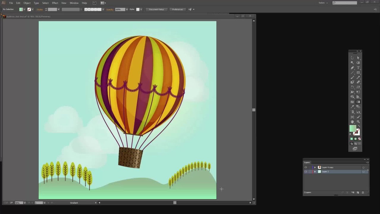
9. Pt 8 Colors from a Photo: You'll recall that we were able to sample colors and create a color scheme from an image using the colors adobe.com website. Well, we can also do that from inside Illustrator. I'm going to choose File and then Place and I'm going to locate an image to use. I'm going to stick with this same image that we've been working with. But what I am going to make sure is that this is not set to link, that the link option here is unchecked, or else this next step after this is not going to function. Make sure that link is disabled. Choose your image and just choose Place. I'm going to just drag out this image inside my Illustrator document. With it selected, I'm going up here to object and then create object mosaic. If create object mosaic is disabled, if it's grayed out, the reason is that you've linked your image, you haven't embedded it. That's all, so you can just go back and start over. Let's just click on Create Object Mosaic. What this allows us to do is to create a mosaic from the colors in this image. We want quite a few tiles, because if we have a small number of tiles, we're going to get a small number of colors, and we run the risk of getting colors that are very similar to each other. I'm going to choose 10 by 10. The width is going to be 10 tiles, the height is going to be 10 tiles. That'll just be rectangles because this is a rectangle. They won't be squares, doesn't matter what shape they are. 10 by 10 means I'm going to get 100 tiles. If you want more, just up these numbers. Right now, all I need to do is to click "Okay". What's happened is that the image has been turned into color tiles and we can get access to these colors really easily. With this still selected, I'm going to choose object ungroup because that will ungroup these tiles, these little boxes so I can get access to them. What I'm looking to do is to build my own color scheme. I'm just going to grab the colors I like here. I'm going to go for three greens and a couple of oranges. If I don't like one of them, I can just pull it to one side. I think these are the colors that I like. I can delete this or I can just leave it there and just not use it. Now if you're the person who looks at this and says that these are not nice and evenly arranged, let me show you how to fix that. I'm going to select over all of these and you're going to Window and then Align. In the align dialogue, you can show this little panel here by just clicking on this icon. You want to click on it until you see this panel. You want to align the key object because that gives you access to this option here. I've got it set to 10, and I'm going to click here on Vertical Distribute Space. What that does is that it ranges each of this box with exactly 10 pixels of space between each of them. They're also not aligned to the left, so I'll just click over here to align them to the left. Now the neatness freak in me is happy because these all look nice and neat. I'm going to select over them, and what I want to do is to create a color group of these colors. I want to take these and put them in the swatches panel, and I can do that all of them together all at once. I'm selecting this, I'm going to the swatches panel and click here on new color group. It's just going to be called Color Group 2. I can give it whatever name I like. I'm choosing Selected Artwork because this is the artwork I have selected. I'm going to convert process to global, so these are going to be created as global colors. If you don't want global colors, just disable that option and I'll just click "Okay". Here are these five colors added as a color group inside the swatches panel in Illustrator, and if I don't need this any longer, I can just select everything and delete it. If I wanted one of those pretty little color swatches inside my document, I could just leave those here and continue on working inside the document. I can, of course, delete them. It's going to have no impact whatsoever over this swatch over here.
10. Pt 9 Color Themes from Blends: It's possible to create your own custom color schemes using blends and we're going to look at that now. I'm going to drag out a small square. I'm going to make sure that it has a fill, but it has no stroke at all and that's really important because if it has a stroke, things are not going to work as expected. I'm going to fill it with one of my colors. I'm going to effectively create a gradient of colors across this documents. I'm going to choose one of my colors. I'm going to choose yellow, a sort of warmish yellow to start off with. I'll alter our option drag a copy of this square. I'm using the Alt key on a PC, on a Mac, you would drag using the Option key to make a duplicate. I'll double-click and fill this with my second color. I'm going to have a gradient of colors between this warm yellow and this sort blue. To do that, I'll select over both of these shapes and I'm going to use a blend. I'll choose "Object" and then "Blend" and then "Make" and I get a gradation of color from yellow through to the blue. Now, you may not see exactly the same blend as I'm saying here in terms of the steps, you can always adjust your blend by selecting it and double-clicking here on the "Blend" tool. Mine is set to smooth color, but I'm going to bring it down to specified steps. There are 21 steps from this color to this color. If I reduce that number, you can say that each of these steps is a different colored box. I'm happy with this because this is going to give me the choice of colors that I want to use. I'll just click ''Okay''. But if we have a look inside the layers palette here, we'll see that we have a blend. Here's our layers palette and inside this layer is a blend. To be able to get access to these individual squares, we have to expand our blend with it selected, I'll choose "Object" and then "Blend" and then "Expand". That breaks it up into individual squares, but you'll see that they are trapped inside a group. To ungroup them, I'll choose "Object" and then "Ungroup", and that breaks them out. They're just a series of individual squares. Now, I don't have to use any of these colors in particular. If I don't want to use the end ones, that's just fine. I can use a selection of the colors that I want for my color scheme. When I've got the colors I want to use, I'll just select over them. Go to the swatches panel, click here on "Create New Color Group", and I'll select ''Selected Artwork'' and then I'm going to create this as a global color, color group. Each of the colors will be global colors. I'll click ''Okay'' and here we have our color group. We don't need any of these squares any longer. Now, it's also possible to create one of these blend gradients with more than two colors. Let's choose one with three colors. Going to drag out my first square. I'll Alt drag a duplicate away, and drop it in the middle and then I'll drag another one and drop it at the end. This middle color I'm going to set to be as sort of purpley color and this end one will be one of my blues. Now, I have three colors for my blend. I'll select over everything and choose "Object" and then "Blend" and "Make". Now, I have a gradient from yellow to purple and then through to blue. We do the same thing here. I can break it up a little bit more by double-clicking on the "Blend Options", go to specified steps and decrease the number of steps until I can actually see my colors. There's no need to do this, but I think it just helps a little bit in choosing my colors later on. To expand my group, I'll choose "Object" and then "Blend" and "Expand" and then to ungroup these objects, "Object" and "Ungroup". Now, I have squares that can each be individually selected. I'm going to choose the ones that I want for my color scheme. Again, selecting over all of this, going to the swatches panel and adding them as a new color group. Now, just a heads up when it comes to creating these blends, let's have a look at an issue here. I'm going to make a duplicate of this set of colors. I'm just going to Option drag or Alt drag a set of those up here. Let's go and select the ones that we just made a duplicate of and let's make a blend from these with Object, Blend, and then Make. You may notice that the purple has disappeared entirely from this blend. Let's go and make a duplicate of this set of colors and let's go and turn this into a blend. Exactly the same colors, very different result. You might end up with a blend that looks like this, where you've lost your middle color and be wondering what it is that you did. Well, it has to do with the ordering of these colors. You need to make sure that these are stacked in the last palette in order. This one should be at the bottom, this one should be above it, and then this one should be at the top, or vice versa. This can be at the bottom, middle, top. But putting these two together and then this one on top or on the bottom is going to cause your blend to go from here to here and then come back, or from here to here and then come back where you can see it's going to overwrite this particular color. Just be aware that the order of the colors inside your blend is critical. These worked perfectly, let's select them and just see what they look like in the last pallet. Here they are yellow, purple, blue. They're working just fine because they are stacked correctly. These other colors up here are not stacked correctly. Here they are yellow, blue, purple. The blend is going from purple to blue and then from blue to yellow and this one, because it's on top, this is the second part of the blend that's made, is just going to overwrite this purple one entirely. If I reorder these, so they're in a different order, let's go and select them and make a blend from them, and prove that the colors are just fine, it was the ordering of the blend, that was the problem, the ordering of the squares before we actually made them into a blend. Just be aware of that. If your blends fail, then just undo the blend, reorder things and try again.
11. Pt 10 Save Swatches: Now at this point, you might be wondering what's going to happen. I've created all these lovely color schemes that I would like to have available in other documents in future. But we already know that none of these are going to be available in any other document in future because of the way that Illustrator works, that's different to Photoshop. In Photoshop you put colors in the swatches, they're available in all documents. In Illustrator, that's not the case. If we want to create these swatches in such a way as we could use them in other documents in future, this is what we'll do. First, we will get rid of anything that we don't want, that we haven't actually created. I'm going to get rid of this set of swatches, just delete them. I'm also going to get rid of everything else here. I'm going to click on this and shift-click on this up here. I can't get rid of none and I can't get rid of "Registration", so there's no point in selecting them and trying to get rid of them. I'll just click on the delete option and click "Yes". Basically, these are the color schemes and themes that I want to be able to get access to in future. What I'll do is click here on the flyout menu, and I'll choose "Save Swatch Library as AI". Now you can save this as an ASE or an AI, just be aware that you can't save patterns or gradients as ASE. Typically, I'll just save them as AI because it's just easier. I don't have to think everything's always going to be saved as an AI. I'm going to give this a name. I'm just calling them helen flower swatches. You can call them whatever you like. By default, Illustrator, we'll put them where illustrator expects to find them. Just let it go to wherever it expects to find them later on and just save them away. Now we've saved them, let's go to a document that doesn't have them in there. It's a very easy process to put them in there. We'll go to the swatch library here, and we'll go to "User-defined" and here are "Helen flower swatches". I'll click here. These are all opened, and we know that we can get access to them now by simply clicking on these and adding these swatches to the swatch panel. Now we can just close this dialogue, because we don't need it any longer. The swatches are in the swatches panel, so they'll be saved with this document and accessible to this document anytime we open it in future. Of course, that begs the question. Couldn't we make it even a bit easier? Well, in the next video, yes, let's see how we can make it even easier.
12. Pt 11 New Document Profile: As promised in the last video, let's go and see how we could create a situation where when we created a new document, all these colors were just there. Let's see how we'll do that. We're going to start by creating a document of the size and type that we want to base our document on. What I use a lot is this Web profile. I use a web large document. It's 1,920 by 1,080. I'm going to check that all these settings are what I want. Yes, I do want RGB color. I'll click "Create". This is a document size and style that I use all the time. It would be really helpful to me if the colors didn't look like this, if they looked more like this. Let's go and see how we're going to do that. Firstly, I'm going to clean this up. I'm going to get rid of any colors that I don't want. I don't want that color scheme. I also don't want any of this, but I would like black and white and I would like this sort color theme. That would be really helpful. Let's go to the flyout menu. Let's choose User Defined. Here is our Helen flower swatches. What I need to do is to move all of these across to here. I'm going to click on the first one, shift click on the last one. Then right-click here and choose "Add to swatches", and they're all being added to the swatches panel. You'll see that the first one that I selected is there, but it's only there once. Illustrator is smart enough to realize that it's already in that panel, so it doesn't double add it. Let's just close that dialogue, we don't need it. Here are all my colors. On the face of it, I'm ready to go and create the document that I'm going to base all new documents on. But while I'm here, there's something else I can do. Let's go to the Layers panel, because the layer thumbnail here is really small and I like it to be much bigger. If I set it up now, it will end up being much bigger in all future documents that are based on this particular document that we're saving. Let's go here to the flyout menu, Panel Options. Let's go to Other, and make it 50. Now, my thumbnail is much bigger. That's going to be persistent in this particular document. Let me just go and zero everything back out. This document is all set up, ready to go. It's got swatches and it's got its nice little panel options set. I'm going to choose File, then I'll choose Save or Save as, it's never been saved before. Now the place I want to put it, is on the C drive. Go to Windows C drive. We're going to Program Files, we're going to Adobe, we're going to Adobe Illustrator version that we happen to be using. In this case, it's 2021. We'll choose Support Files and then Required. Then we'll go to New Document Profiles. What we're doing is creating a new document profile. We'll continue to navigate through here until we get to this point here. This is where the new document profiles are, one that I've created myself and all the others are from Illustrator. I'm going to call this Helen's new web document. I'll click "Save". I'll get an error message, because on this computer, I don't have permission to save into that folder. But that's just fine, because Illustrator is offering me an option. I'll just click "Yes". I'm going to save it in my Window Users Helen folder, still got the same name. I'll just click "Save". It's not in the right place, but at least I know where it is. What I'm going to do is actually just close down Illustrator, because I need to close and reopen Illustrator for the process to work anyway. I'm going to File Explorer, because I know I've got a file in my Windows, Users, Helen folder that shouldn't be there. Here it is, Helen's new web document. I'll right-click and I'll choose to cut it, because I'm going to place it where it should be. I'll go back to Windows, and I'll go back to navigate to that exact same folder as I did earlier. Program files, Adobe Illustrator 2021 or whatever version of Illustrator you happen to be using. Support Files, Required, New Document Profiles, English US or whatever language you happen to be using. Right-click and let's choose "Paste". I need administrator access here. Well, I'm an administrator on this machine, so I'll click "Continue". You can see it's now a document inside this New Document Profiles folder. If you close Illustrator and reopen it, then you're going to get access to that file. Let's just reopen Illustrator. I'm back here in Illustrator. I'm going to click "Create new". We have to find the document profile we just saved. Well, when I created that document profile or the file from which I created the document profile, I started off with web. Let's go to web, and we'll just peruse the presets that are here. When I open up this presets panel, here is the Helen's new web document. That's the document profile that I just created and saved. I'll click on it, and so I'll be creating a document with all the specifications that I determined I wanted in my new document. I'll click "Create". When we open up the Swatches panel, here are the swatches, only the swatches we asked to have in that particular document. When we go to the last panel, here are nice big thumbnails. We now have a document profile that's going to be accessible when we choose File New. Anytime we want to create an Illustrator document, the document is going to be this size. It's going to have everything in it. Basically, it is a one-click option for not only creating a document, but also having access to all the swatches that we want to be using. We can add more swatches, we can delete them, but it is a really good starting point for working in Illustrator. Now, if you're using a Mac, you're going to be locating these files in a different place on your Mac. On the Macintosh, they're going into your Applications folder. You'll choose the version of Adobe Illustrator that you are using. You'll go to Support Files, you'll go to New Document Profiles, and you'll go to English US or whatever language you're using, and into that location is where you're going to save your document profile so that you can get access to that inside the Mac.
13. Pt 12 Symbols for Colors: Before we finish up, let's have a look at one additional thing that we can do to speed up document creation in Illustrator, if you like, those little boxes of color down your document. We're going to create a new document and we're going to base it on the profile that we created. Now because I used it recently, it's in the recent group making it even more accessible to me. I'll click "Create". Now I'm going to create some boxes. I'm just going to drag out small rectangles. I'm going to make sure that these are filled and they have no stroke. That's pretty important when you want these little color boxes. I'm going to Alt drag a series of duplicates of this away. I've got five colors in most of my color scheme so I want five boxes. I'll select over them. Now I'm going to align them with the Align options. Let's come over here to the Align dialogue, make sure that we have Align to key Object selected, which allows me to set a spacing of 25 and to adjust the vertical spacing. Now with each of these, I'm going to add a color to it. It doesn't really matter what color I do, but it's important that you don't use black or white because otherwise, you're going to sabotage this process just a little bit. But I'm just going to choose one of my color schemes. It doesn't really matter which one of them. I'll select these now. I'm coming across here to the symbol's panel. I'm going to add them as a symbol. I'm going to call these color boxes, and I'll click "OK". Now they're included in the symbols in this document, of course, they are not concluded in the symbols in any other document. What I'll do is go ahead and save this as a new document profile. But we know that it is not able to be saved into the correct location so let's just put it somewhere where we know where it is. I'm putting it in my Helen area. I'm going to call it new document profile with symbol. I'll save it. Of course, at this point, I'm going to close Illustrator and I'm going to move it into the correct location. Here's my document, right-click and cut it. Back to Windows, Program Files, Adobe. Choose your version of Illustrator, Support Files, Required, New Document Profiles, English US, right-click and I'm going to paste my document in. Here's my Helen new document with symbol. It's in the correct location. I can re-start Illustrator because Illustrator will now know that that file is there. I'll click "Create new". Then because the document profiles that we've been creating were initially created on the basis of a web one, if it doesn't appear in recent then we're going to find it in web. I'm going to Web, I'll go to View All Presets, and I need to locate the preset that I'm looking for. This is the one here that we just created. I'll click it and click "Create". Of course, in future, it's going to appear in the recent ones if I have recently used it. If I go to the Symbols panel now, you'll see that I've got this color scheme in here. I'm going to just drag and drop it out of the symbols panel. I'll right-click and I need to break the link to the symbol because I don't need it to be a symbol anymore, I just need color boxes pre-filled with colors because it's going to make life so much easier for me. I'll select over the color scheme. I'm going to recolor artwork. This panel is different in Illustrated 2021 and it's also different to the one that we got in the bottom of the swatches panel. You'll just come down here and click "Advanced Options". Here are the five-color color schemes that I have in the swatches panel. All I'm going to do is to click in the middle here on the one I want to use. You can see that those colors have now been appended to these boxes. The boxes have been precreated, they've been spaced, they've been filled with colors. Don't fill them with black and white or you're going to get into trouble with this remapping option. But at this point, we can just select whichever color scheme we want to use and the little boxes will be pre-populated with those colors. Just click "OK" and you're good to go because you can then select colors and you can work as you used to working in Illustrator. I hope that in addition to learning a little bit about color schemes here, that you're starting to see the potential of creating your own custom document profiles in terms of making things a little bit more easily accessible to you in Illustrator in future.
14. Project and Wrapup: We've now completed the video portion of this course, so it's over to you. Your class project will be to create one or two color themes for you to use in your work in Illustrator, post an image of the colors as your class project. Now as were watching these videos, you will have seen a prompt asking if you would recommend this class to others. Please, if you enjoy the class and learn things from it, would you do two things for me? Firstly, answer yes, that you would recommend this class to others. Secondly, write just a few words about why you enjoy this class. These recommendations help other students to say that this is a class that they too might enjoy and learn from. If you see the follow link on the screen, click it and you'll be notified when my new classes are released. If you'd like to leave me a comment or a question, please do so. I read and respond to all your comments and questions, and I look at and respond to all of your class projects. My name is Helen Bradley. I hope that you enjoy this course and you learn things about color schemes in Illustrator of which you were previously unaware. I hope to see you in another graphic design for lunch class here on Skillshare in the future.
 Helen Bradley, Graphic Design for Lunch™