Transcripts
1. Intro to Dimensional Line Art in Illustrator: Hello and welcome to
this class creating dimensional line art
in Adobe Illustrator. My name's Helen Bradley and
I'm a Skillshare top teacher. I have over 270 courses
here on Skillshare and over 168,000 student
enrollments. In this class, we'll look at
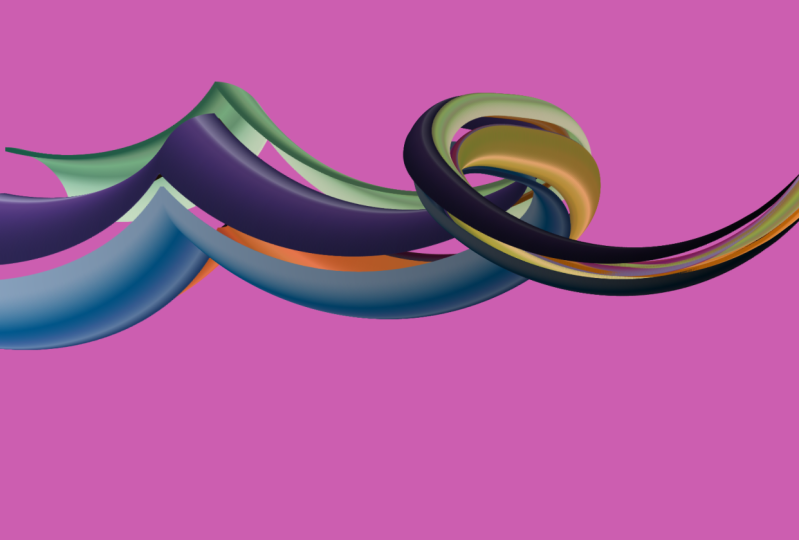
two very different ways to create dimensional line art
in Adobe Illustrator CC. One of these methods uses
the new 3D tools to add dimension to the lines and the
other uses the blend tool. In this class, I'll take you step-by-step through
creating each effect. So that by the end of
the class you'll have a range of finished
designs ready to use. Along the way, you'll also
overload some handy tips and techniques for working in
Adobe Illustrator every day. So without further ado, let's get started making dimensional line art
in Adobe Illustrator.
2. Before we begin: Before we get started on the
effects that we're creating, a word about the version of Illustrator
that you're using. The very first two videos, use a tool that isn't the most recent versions
of Illustrator. You can check to see that
you've got those tools by choosing Window and
then 3D and materials. And this is the panel
that you should see. It's got tabs for objects, materials, and for lighting. If you don't see this, you want to check
to see if you have the ability to upgrade to the most recent
version of Illustrator. So you will have access to
these tools and you can complete the first
two video projects. If you don't have access to the most recent versions
of Illustrator e.g. you're using Illustrator CS6, then you won't be able to
complete the first two videos, but you will be able to complete the remainder because
they use the blend tool. And the blend tool
has been around in Illustrator for years and years. So please just be aware that the first two videos rely
on features that are only available in the most recent newest
versions of Adobe Illustrator.
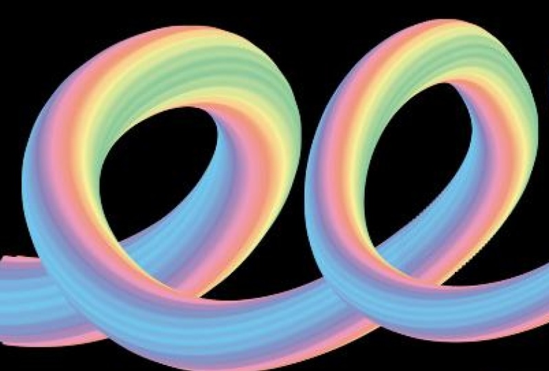
3. Pt 1 Line Spiral Using 3D in Illustrator: The effect that we're
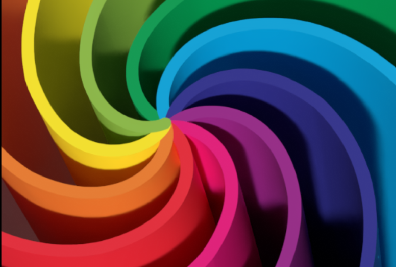
going to create here in Illustrator is inspired by
something I found online. I really liked these
spirals of colors. And so we're going to
create something that looks a little bit like
this in Illustrator, and we're gonna be
using the new 3D tools. I'm going to create a
brand new file here. It's going to be very
small because again, the overhead on the computer
is going to be quite high. And these are until we
expand them vector shapes, so they are very scalable. So I'm going to choose
for a two-by-two 70, which is going to give me
a ratio of 1920 by 1080, which is screen size. Just going to reset
my screen here, we're going to
start with a line. So I'm going to select
on the Pen tool if you're a little concerned
about using the pen tool, don't worry because this
is really easy to do. I'm removing the fill and I'm just going to be
left with a stroke. I'm going to about the
middle of the document and I'm going to click
and drag downwards. If I add the Shift,
I'm going to go in a perfectly
vertical direction. That's what I want to do. When I get something that
looks a bit like this, I'm going to let go
the left mouse button and let go the Shift key. Now, I'm coming over here and I'm going to
do the same thing. I'm going to click and drag in one movement and
add the Shift key. And that's going to finish off the line it with this
nice, gentle curve. I'll press escape. We're going to
select the line and then adjust the stroke on it. And I'm going to
increase the stroke to around about three points. I also want it to
have round tip. So from the Stroke panel here, I'm just going to
select the round tip. I'm gonna move
this stroke down a little bit and we're
going to select over it. We're now going to
rotate it around to create all the strokes
that we're going to use. So I'll choose Effect
and then Distort and Transform, and then Transform. I have a very easy way
of getting nine colors. So we're going to work with that because it's
going to save us a little bit of time
selecting colors. So I'm going to select these
little nine boxes here, the one on the top right corner, which is fitting this point
here as the rotation. So everything's going
to rotate around it. As I said, I've got nine colors, so we're going to
take eight copies, which is one original
and eight copies. We're going to divide
nine into 360 here because we need a
rotation of this amount. I'm just going to type 360/9 and it's going
to rotate perfectly. Let's just tap away from here. And this gives us all the
shapes we need. I'll click. Okay. So now that we've
got our rotation, I'm just going to expand this with object, Expand Appearance. And then I'm going to
choose Object and Ungroup until ungroup is no
longer an option. So what that's virtually done is it has created nine
individual lines. Expanding the
transformation just turns this from a
single line with a transformation applied to it into nine separate lines
and ungrouping it, just ungroup them so
that they're going to appear as individual objects
in the layers panel. That's pretty important
because it just makes life a little bit easier in
terms of coloring these. So I'm going to select
the first of my lines, doesn't matter which
one you select. Open up the swatches panel. I'm going to swatch
libraries menu. I'm going to kids stuff here and I'm just
going to click on it. And in the middle here is our
nine color color palette. So I'm just going to click
here on the rainbow, and it's going to
be automatically added to your swatches panel. Click away to close
that library. Now you're going to select
each line in turn and just go around and color it with the next color in the rainbow, because we want the colors to be a rainbow presentation here. Now of course, you can choose your own colors if you prefer. This is to my way of thinking. Just an easy way of getting
some nice colors to work with without having to do
too much work ourselves. Now we're going to be using the new 3D tools in
Adobe Illustrator. And to use they successfully, we're going to have
to group everything. So I'm going to
select everything and just put them
back in a group. We ungroup them so
we could color them, were grouping them now so that the 3D tools are going
to work as expected. Will choose with our group
selected, choose window, and then 3D and materials
will go to Object because we need to select the type of 3D effect that we're going to use and we're going
to use an extrusion. So I'm just going to
select my extrusion. I'm going to increase the depth to something like about 400. 450 doesn't really
matter too much. You're just going
to really go by I virtually in
what you're doing. And then we want to bring
this over so that we can see this area here. So you could use these
tools here, this widget, you could select an
option from here and just see if it's going to give you a better result,
which it didn't. So I'm just going to undo that with Control or Command C. Or you could adjust the settings
here. To a certain extent. I prefer to use these
settings at this point because I just think
that they make life a little bit easier. I'm going to increase
the perspective because that can help you
fill in the gaps. And what we're looking to do here is to fill in these gaps. We want to rotate this around so that we've
got something that is pretty full of detail and you may need to
increase your depth as well. But I wouldn't lose too much
sleep over it right now because there is
something else that we're going to do
with this shape. So we've still got our
shapes selected in one of the benefits of
this three-day tool in Illustrator is that we can
actually make edits to our object while we're
actually working in 3D, we're doing this at a small
size because we don't want to increase the overhead on
our machine as we do this. So what I'm gonna do is
I'm going to twist it. So with this group selected, I'm going to choose
Effect and then warp. And I'm going to twist. And for my twist, I already have this set, so I'm not sure what yours
is going to look like, but we're going to
select it to horizontal. We're going to set
Horizontal and Vertical Distortion to zero. And we're going to
drag the band all the way to negative
100 per cent. And you can see that that's
added a twist to our shapes. I'm going to click, Okay, I'm going to target the twist here in the appearance panel. If you don't see your
appearance panel, just go to Window and
then Appearance to open it with the warp twist selected. I'm going to click here on the Plus sign here
to duplicate it. Then I'm going to do it again. You can do it as
many times as you'd like to get a twist
on your shape. And of course now
you're going to look at your shape again and say, can I improve it? So can I do something
with it in terms of its placement to get a
better presentation. And since this is pretty close to where we want
to be right now, what we're looking at is being
able to crop out of here a rectangle or a
square shape that has all this interesting
stuff in the middle. So this is the point at
which you're going to make some creative
decisions about what your spiral is
going to look like. And you can use any of
these tools to get it. Basically just work now at
positioning there so that you get the maximum possible area that does not have
whitespace in it. Once you've got
it looking pretty much the way you
want it to look. You can go ahead and just
adjust the lighting. Now, typically, I've been using materials and setting
the roughness to zero so that it
gets a shiny surface. I wouldn't do that
with this one. I've had the experience
where reducing the roughness actually gives it this
sort of weird light law. Can I don't like that at all. So I'm just going to undo it
for this particular shape. I'm leaving roughness
where it was by default. So I get shiny objects. In the lighting area. You can choose where you
want your life to come from. So you can just work around what you've got here in
terms of light options, just decide which
one you like best. And then of course, you
can adjust the intensity. You can adjust the
rotation of the light. Again, keeping an eye out on the rectangular or square
area that you're going to be cropping tool so that you're
getting the best result that you can in the area that
you're most interested in. I'm going to call this good. And so now I'm going
to click to render it. Now, even though this is
a really small document, this rendering is
really appalling. It's really, really low quality. I'm going to open up
the Rendering panel and I'm going to choose Hi, I'm also going to click on
Raster Settings and I'm going to set my
resolution to high. So that's setting the
document resolution to a really high value and asking for a ray tracing that is going to be
out of high-quality. Now when I click Render, I'm going to get a
much better result. You can also expect
that it might take a little while for your
computer to render this object. I'm going to click away from it so we can see what we've got. Now I want to reduce this
to a square or a rectangle. So I'm going to click
on my rectangle shape. I'm going to drag out what's
going to be my crop area. We're going to use a
clipping mask for this. So I'm just going to
drag out a rectangle over an area that includes
all this wonderful swirl, but none of the white area. So I don't want any
white to be here. And so you can just make
a creative decision here as to what you want
everything to look like. I'm not really happy with
this bottom edge here. I think I'd rather
cut that off and use this spiral is
located a little bit more interestingly,
within my shape. Once you're happy with
what you've got here, you're going to
select everything. And since everything is a
rectangle and our spiral, we can just press Control a
on a PC Command a on a Mac. And that's selected
everything so I can go to object and then
clipping mask make. And that just uses that
rectangle to clip out object. The object is still alive. So we could potentially
make changes to it. We could remove
the clipping mask and go ahead and clip
it in a different way. We could do all sorts of things. But this is the object
that we would save. Now word of warning, something not to do and
that is to go start dragging on this clipping
mask to make it bigger, e.g. because what that does
is it starts fracturing the underlying design
and you're going to get areas of white appearing. And then if you press Stop
to stop it from rendering, then you can end up with just your spiral
lines on the screen. It can be really
religious appointing. So basically what you've
got now is really probably what you want
to sit and work with. If you are concerned
about your clipping mask, you can go to your layers panel. In your Layers panel you can target just the
clipping mask layer. This is the rectangle that's
controlling a clipping. And now you can increase
that and so you can adjust its size to get something
a little bit different. But you can see that it's having no effect on the
underlying spiral. The underlying spiral
is not re-rendering. And what you want to avoid
is that re-rendering option. So just be careful that
you don't go dragging on the sides of the shape when you've got everything selected, this entire clipping
group selected. Because believe me, you're not going to be happy with
the results and you're going to panic because
everything is going to start to break up to save this. So e.g. if I wanted to
just save this object, I would go to a file and I like to use Export and Save for Web Legacy because this
is going to save it as either a ping
or a JPEG image. So if we were going to save
it as a high-quality JPEG, I would just de-select
here clipped to art board. So what I'm doing is
I'm going to export a JPEG image that is
just the content. Just be really
interesting spiral. But you can see that
the width and height are really, really small here. But that's fine because
we can increase them. So I can take them
up to 500 per cent. And you'll see that this
is a really nice result. It's now 1,100 by 785 pixels. So just be aware that
this is where you can do your scaling naught by creating a larger document
that lists to start off with, because they really are processor-intensive and I'll
just go ahead and save this. And of course, you will
probably want to save your AI version of the file so that you have access
to that as well. And you're just going to save
it as a regular AI file. But again, be aware that
because you're saving an active and live 3D object, this could take a little bit
of time in terms of saving, might take a little bit
of time to open it. When you come to open it again.
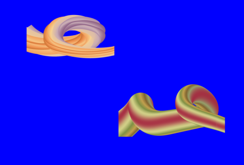
4. Pt 2 Multiple Lines 3D Effect: The next line effect
we're going to create is going to look
something like this. So we're going to
start with again, a new small size document
because we will be using the 3D tools in Adobe
Illustrator 2022. I'm going to start
with the pencil tool, so I'm just going to
double-click on it and make sure that it's set
all the way to smooth. I'm also going to set on
Keep selected so that when I draw my line it's
going to be still selected. I'll click. Okay. I'm going to remove
the fill from this. I just want a stroke.
At this point. I'm going to draw out
some sort of bumps that are going to get
successively smaller. But you can make
your line pretty much any shape that you like, except you will
want curves in it. So you can see that
the pencil tool really is quite forgiving, which is really nice because if you've drunk a lot
of coffee that morning, you're going to find
that your bumps could look really pretty awful, but this is really
lovely and smooth. If you want a smooth it
out a little bit further, you can select the line and go to the smooth tool and then just drag over
little bits that you think need a little
bit of smoothing out. And the smooth tool does a pretty good job of
smoothing things out. I'm pretty happy
with this right now. I'm going to increase
the stroke width to ten. Because this is going to be
the front face of my line. If you want the front face of your line to be
thicker or thinner, then you're going to set
it to a different value. But just remember what
value you set it too, because we're going to use
that in just a second. So with our line selected, I'm going to choose
object and then path. And I'm going to
choose Offset Path. What this does Is adds an offset to the park
that I have selected. I'm setting it to the
same ten points as the stroke width so
that my lines are going to be the same length
and I'll click Okay. So this is a point that you
need to watch out for here. And here you can
see that these are starting to get a
little bit pointy. I probably haven't got those quite as smooth as
they might have been. And so if you wanted to at
this stage, just undo this, smooth out your line a little
bit more and try again, that would be fine as well. But I'm going to persevere
with this because I think it's gonna be just fine. Now in my layers palette, you're going to say
that we've got the path which was the
original line I drew, and I'm actually turning
that off for now. Then we've got this other
path which is the offset. So this is a line that went
around that other line. I'm going to the direct
selection tool here. I'm going to de-select the
line that's really important. And then I'm just going
to come in here and just select over the
very end line here. Now, I can't see that it's
selected, but I know it is. And you'll get a bit
familiar with this when you get to work with this tool, all you're doing is
selecting this line here. So you want to make
like a really, really small selection and
then just press delete. And that's what should
happen is that you shouldn't have
deleted that M line. If you didn't just
undo it and try again. You want to be selecting it when nothing
else is selected. So I'm coming over
for this line here, so I'm making sure
that nothing is selected at this point. I'm also using the
direct selection tool that's critical because
I want to just come in here and just select this line
here and press delete it. Now, in the last pallet, you'll see that this
line has split. So I've got three lines and these little lines
I'm going to color. So I'm going to go and grab my kids stuff color
palette again. But this time I only
need three colors. But I will also find
that my lines are in the wrong order because
this is the middle line. So I'm just going
to drag it down to the middle and just check that the top line
is actually a top line, which it is on the bottom
line here is the bottom line. So that makes it a
little bit easier in terms of re-coloring, I'm going to select
the topmost one. Choose a color for that. I'm going for this pink, the middle one, going
through this purple, and the bottom one. I think I'll go for
this blue today. And so I'm just
going to click that. Now. All of these lines have
got solid ends on them. I'd like them to be rounded, so I'm going to
select over them. And from the stroke
dropped down here, I'm going to set
them to round cap. So every one of those three
lines has a round cap on it. I'm also going to
group them because of the way that the 3D tools work. They work better when objects
are grouped together. So I'm going to choose
Object and then Group. I now have one group that
is these three objects. So with it selected, I'm going to Window and
then 3D and materials, my panels actually over here. So let me bring it back. We're going into object and
we're going to extrude. And you're just
going to set your extrude depth to however deep you want the
area here to be. So this is the extrude depth. I'm going to bring
mine down to 40. But you can take yours up if
you want it to be deeper. It's just a personal choice. I'm selecting here
off-axis front because I think it
looks really good. But you can again choose
whatever you like. And if you want to
adjust some perspective, you can do that as well. In materials. I'm gonna come down here to
base properties and I am going to dial back the
roughness to zero. So that will allow me to create slightly
more shiny shapes. Then we'll go into
lighting and we can pick our lighting
at this stage, we could go top-left
or we can cause standard diffuse,
whatever you like. Adjust the lighting to get
the look that you want. When we're actually
pretty happy with this. So I'm going to render it, but I am going to render it at high-quality because right
now it looks pretty awful. So I'm just going to drop
this render settings down. I'm going to set it too high. I'm going into raster
settings and I'll set my Document Raster
Settings to 300 ppi. And click Okay. And then I'm just going
to re-render this. Then at this point you
can have a look and see if you want to make
some changes to it. It's just going to re-render
at this high value. I've made this a few times
and I've found that at some levels of light, I get some really quite
light specs across it. So if you find that you get white light and you don't
want it to be white, you'd rather it to
be slightly colored. You can come in here and
just color the light. So I'll make it a slight pinky color so that if you get really, really obvious areas of light
reflecting on your shape, they're going to be pink
rather than dead white. But it doesn't seem
like right now, I'm gonna be able to get those really, really bright areas. It may also be a function
of this roughness settings. So if you want to, you could increase
your roughness again and see if that gives
you a better result. Because we've found that although roughness
is supposed to give you something that's really shiny if you remove it to zero, sometimes it just doesn't
work quite the same way. I just want this to be a
little bit darker down here. So I'm thinking that maybe
adjusting the height will give me a little bit darker colors
underneath this shape. Reasonably happy with that. So let's just close
that panel down. Now the other thing that
you can do is because these are still just
individual lines, is that you can move them. So I'm going to, again, the direct selection tool, I'm going to select over
my object because that allows me to see
where the ends are. And because I've altered
the perspective of this, you can see that
these are not bearing a direct relationship to
actually where the shapes are, but you can pick
them up very easily. This is the top one, and
this is the blue one here. Well, I'm just going
to target the blue one and just adjust
it very slightly. You probably want this
to be pretty subtle. But you can see now I've
got a split between this. I'm getting something that's just perhaps a little bit more interesting in terms of
the ends of these shapes. But again, the
smaller adjustment, the better you're going
to get just a slight flip rather than something that's
totally broken apart. And so I'm going to
look at these here and maybe just target this
blue one a little bit. And with this purple one here, just make sure that
I've got the right one, that this is the purple one. I could actually extend it, so I could also just drag it out a little bit so
it's going to sit a bit further away from
the pink and blue. So you can work at
adjusting the shapes once you've got your
extrusion and your lighting, and every time you
adjust it because they are alive 3D effects, then you're going to
have them re-render. Of course, if you've got a really large document is
taking a long time to render. It's going to take long time to render every time you do that. So just be aware of that. Now, I have actually
made this a few times with more of these lines
using the exact same process. I've made it up to five lines. It does tend to get a little
bit pointy in these areas. So you will want to watch that. I think three looks pretty good. But now that you
know the process of extracting lines that are exact fits for
every single one of those lines using that
offset path option, then you should
be able to expand this two more lines
than just the three that you see here.
5. Pt 3 Curvy Blended Line: This design, we're
going to create something that looks 3D, but it's actually not
created using 3D tools. I'm going to click here to
create a brand new file. And because this doesn't have a huge overhead in terms
of computer processing, I'm just creating a document
that is the size of my screen, 1920 by 1080. I'm going to create
a star shapes. I'm going down here
to the Star Tool. I'm going to click once in
the document because we want a little bit of
control over this. The difference between
radius one and radius to some of the times they can be larger radius one and smaller radius to
it doesn't really matter. But the difference going to be how big the points
are on the star. So I'd like them to be a little
bit shallower than this. So I'm going to set
radius one to 35, radius two to 50. So there's less of a difference between these radii
if you'd like. And I'm going to set
my points to 20, I want a good number of points. This is a pretty small shapes, so I'm going to just selected, hold down the Shift key to enlarge it so it is
a little bit larger. I want this shape to be filled, so I'm going to turn
off the stroke. I'm going to target
the fill here. I'm going across here
to the swatches panel. I'm going to click the swatch libraries group
here and go to gradients. And I'm just going to
spectrums at this stage, I'm going to choose this
bright colored spectrum, going to make a
duplicate of this shape. So I'll hold down the Alt key on a PC that would be
option on a Mac. I'll just drag
from the middle of this shape to create
a smaller version. Hold the Shift key
as I scale it down. I'd like these two to be
aligned across their middle, so I'm just going to
select over both of them. You could go to the alignment
panel to choose this, or you might find
your Align options up here on the top
of the screen. Wherever they are,
you're going to click on vertical
aligned center, because that's going to align the centers of
these two objects. We're going to make a
blend out of these. I'm for a blend will just
select the two objects and then choose Object and
then Blend and Make. What you see here may differ. And don't worry about that because you need to make
some blend settings. So you may just see one
object in the middle. You might see lots of
really just depends. You'll come over here to the blend tool and you'll
double-click on it. And from this
drop-down list here, you're going to select
specified steps. Because this allows us to
specify how many steps we want, how many intermediate shapes we want between this large
one and the small one. And the maximum you
can use as 1,000. So I'm just going to
type in 1,000 and hit the Tab key to
just move away. And now you can see that
we've got this blend from the large shape
to the small shape. We're also missing some colors, but don't worry about
that because we're going to get them back very soon. I'm just going to
move this shape up to the top of the
document here for a minute while I get working on something to use this blend on. And so I'm going to
the pencil tool, I'm going to click here
on the pencil tool and then I'll
double-click on it. Because I want to set some
settings for fidelity. I want it to be as
smooth as possible. And this is particularly
the case if you're using a trackpad on a laptop or e.g. a. Mouse. Because if you don't
have a really steady hand, then smooth it's going to
smooth everything out for you. You can also leave
on Keep selected. That will mean
that you'd be able to smooth the shape
really quickly without having to
select it again because the line will be selected
as soon as you draw it. So I'm just going to click Okay, those are the two settings
that I was most worried about. What I'm going to do is
just draw some loops. Because I've got
smooth turned on. These are going to be
smooth out as I draw them. And you can see that they've
got the gradient as a fill. Well, I want that to be on the stroke so that I can
actually see the lines. If you've got some bumps in
your shape at this point, go back here to where
the pencil tool is, open up this little
group of tools and go for the smooth tool. If you haven't already
got your lines selected, then select it
before you do that. And here you can just drag over parts of the line to smooth it. So if you've got bumps
that you don't like or you want to smooth a
little bit of an edge, then you can just come over
that and just smooth it out. I'm pretty happy with this. I think that
Illustrator has done a pretty good job on what was a pretty poor attempt at
drawing some curvy lines. I'm going back to the
selection tool and I'm going to select this
line and this line, it doesn't matter in what
order I select them. It doesn't matter
whether this lines got a gradient or a fill or no fill. Totally irrelevant. Just going to select
either both of these. Illustrator recognizes
these for what they are. This is a line and
this is a blend. If we go to Object
and then Blend, we can do what's
called Replace Spine. Now this blend here has got a spine that is
a straight line. In fact, you could see it
when you select that blend, you'll see that there is a
straight line through it. And what we're saying
to illustrators, replace that straight
line with this curvy one. So I'll click here
on Replace Spine. You can see what's happened now. We've got the blend now
extended across this spine. We've also got some edges here. It's got an, a fuzzy edge
on it because we've got only 1,000 shapes and that
was a fairly hefty line. So at this point you may
want to shrink things down a little bit so that you
smooth out the edges. I'm just going to hold
the Shift key here and just smooth this
out a little bit. Still got a fair
few bumps on it. But now you can see the colors that are coming through
from the other side of that blend because this line is twisting as it's rolling along, we're getting to see
the other colors from the edges of the blend. Now, all of this is editable. If we go to the Layers panel and open up the Layers panel, you'll see what you have. You'll have what's
called a blend. That'll be a group, if you like, that is your blend. And it's made up
of three things. It's made up of your spine, whether or not
replace the spine, you're still going to see
a spine at this point. If you didn't
replace your spine, this would be a straight line. And then you've got
the two shapes. The top one is the
second one we drew, which is this one here and the bottom one is
this one over here. If you want to make
changes, then you can. So I'm going to select or
target this bottom one. You can see it's got
little icon selected here. You can see that there
are handles around this. If I go here with the
direct selection tool, I'm going to see
those little widgets because I have my
widgets turned on. If you don't see your widgets, you can come down
here and choose Show Corner Widget because if
you don't see your widgets, then you've got the corner
widgets hidden at this stage. My option of course, is to hide them because I've
caught them showing. So let me just go
back to this shape. Let me just target again here. And I can just drag down on this corner
widget a little bit. And what they will do is make the edges of this star curvy. And so instead of being pointed, they're going to be curvy. And you could say that that's
had an effect on the line. And we could come
to this other end and do the exact same thing. We may want to
zoom in over this. And so we can see things a
little bit more clearly. Again, go for the
direct selection tool. Again, go for one of these widgets because all
of them are selected. And then you're
just going to make it ever so slightly curvy. And then let go and everything's
going to curve off. While this shape looks as
if it's three-dimensional, it's actually not
created using a 3D tool, It's created using a blend. And we're going to
see in the next video some things that you can do with blends that are
really quite interesting.
6. Pt 4 Second Curvy Blend Line: For this next blend, we're going to do pretty much
the same thing, but with a set of circles. Though, again, creating the
document of screen size, I'm going to select
the Ellipse tool, drag out a circle. I'm going to make sure that
I remove the stroke from it. You want to remove the stroke. Otherwise the blend is actually just going to sharp the stroke. So if you feel that your blends are not
working correctly, just make sure that they
don't have strokes on these shapes at least unless you deliberately
meaning to put them on, which we will see shortly, but not right now. I'm going down here
to the gradient. So into the swatches panel, click on this swatch
libraries option here, go into gradients and I'm
going into the sky gradients. And I'm just going to
grab a couple of days. If I just click on them, you'll see that they're
added to the swatches panel. So I'm just going
to grab a couple of these that have sort of
got yellows and pinks. And then once I've chosen
my gradient to use, I'm going to make a
duplicate of this shape. Makes sure that you have the
selection tool selected. Hold down the Alt key on
a PC option on a Mac, drag away a duplicate and
then holding the Shift key, just scale it down because we do want this to be a circle. Select either both of these
and make sure that they are vertically aligned with
them still selected. We're going to make
our blend with Object Blend and then Make, again, we're going
to double-click on the Blend tool here, set it to specified steps, and crank up our
number of steps to as close to the maximum
as we can get. Now, again, we're not seeing the full value from this
gradient that we're using. But we know that that's going to be the case because it was the case with the last
object that we created. Let's go back to
the pencil tool. Let's go back to creating
some of those loops. This time I'm just going to do one loop, Just checking it. It could use a little
bit of smoothing. So let's just come here to the smooth tool and
let's see if we can on the bumps here
a little bit better. Then we'll select over
both shapes the line, what's going to become our
spine and our blend and go to Object and then Blend and
we'll choose Replace Spine. Now you can see that the blend is actually
twisting with this shape. So we're getting some
of the darker areas of the gradient and some of the lighter areas of
the gradient in this shape. Now you don't have to blend
from one gradient to itself. You could blend across
different gradients. So let me just get
my layers panel. I'm just pressing
the F7 function K to get my layers panel. If it disappears, I'm going
to target this end here, which is this top one here. And instead of using
this gradient, I'm going to go and source one of the other
gradients that I had. And as soon as I click
on that gradient, you can see the
entire blend changes. It's going to be closer to the original gradient
at this end, and then it's going
to transition into this different gradient. So you can experiment with different gradients
at this point. You can experiment with
those at both ends. Of course, you could change the gradient on
this end as well. You'll find plenty of
gradients that you can use in the
gradient section here, I just happen to really
like the sky gradients. I'm going to focus
on those right now. I've found a sky
gradient that has a lot of purple in it and it's working quite nicely here because I have this
circle selected. It's also possible to rotate it. And when I rotate it, the gradient is
going to rotate and so it's going to
affect the blend. So anywhere where I
rotate this circle, the blend is going to change the starting point and
its impact on the end.
7. Pt 5 Third Curvy Blend Line: For this final blend, we're
going to have a look at a different way of
setting up our circle. Now you could do this
with other shapes. I'm just choosing to
do it with a circle. I'm going to again choose this same size
file, 1920 by 1080. I'm going to drag out a circle. This time I'm going to remove the fill and leave
the stroke in place. That's pretty important
and I am going to increase the stroke so we
can see it pretty clearly. I'm going to target the
direct selection tool, which is up here, the white arrow tool click away from my shapes so
nothing is selected. And then I'm going
to select over just the top quarter
of the circle. And you will see that we've got just this area here selected. A little bit difficult
to understand that. But if you say these two anchor
points looking like this, you can rest assured
that you have selected this area here. And you're going to
choose Edit Cut. You could of course use
the keyboard shortcut Control X on a PC
command on a Mac. And this is what you should see. You should see that
that quadrant of the circle has been removed. But we want to put it back
exactly where it came from, just not stuck there. What we're going
to do right now is choose Edit and then
Paste in Place. Paste in place, which
is Shift Control V on a PC or Shift
Command V on a Mac. We'll put that shape
back where it came from, but it's still a separate shape. So let me just show you that
it is a separate shape. And that's really important because then it can be colored. I'm going to color
this turquoise blue. Then we're going to
do the same thing all the way around the circle. I'm going to select with the
direct selection tool over this portion of the
circle, choose Edit, Cut, edit paste in place so we stick it back where
it came from, it's selected, we're going
to apply a color to it. I'm going to repeat that for the other two quadrants
on this circle. Once I've done that, I'm going to the selection tool and I'm going to group these
shapes so they'll travel as a single object. So I'll choose Object
and then Group. Then I'll make a duplicate
by holding down the Alt or Option key and just
dragging a duplicate away, hold the Shift key
as I re-scale it. Now you want to make sure that these lines are still
the same weight. This will depend on
setting that you've got it in Illustrator solve your lines weren't
the correct weight. You can come back in here and make them the exact same weight. So I'm just using eight points. My preference for scaling
shapes as keeping the same line weight on my strokes yours
might be different. Let's just select over both of these shapes and line
them up vertically. And let's go and make our
blend Object Blend, Make. Double-click on the Blend Tool, go again to specified steps. Again, set it up to
1,000 on the Blend. Again, we can only see
two colors in our blend, but we already knew that that
was probably going to be the case because it's been
happening like that all along. Let's go and get
the pencil tool. This time I'm creating a
slightly different shape. It's got a bump in the middle, just going to squeeze
things up a little bit so we'll be able to see it a
little bit more clearly. Select over both of these, the line and also the blend again doesn't
matter in what order, go to Object and blend
and then Replace Spine. You can see that
we've got this sort of loop happening and we've got a definite division between these colors that are around
the stroke on our shape. Now, those lines didn't
have to be solid colors. So let's go into our
Layers palette and let's identify the individual lines and see what else we
can do with them. So this here is this
shape over here. I'm going to target it and
just open up the panel here. And you can see
these are the lines, the colored lines going to ignore these because
they're nothing. They just don't have anything
to do with our shape. I'm concerned with these
that do have colors in them. And here's this green. While you may know
that strokes on shapes in Illustrator
can be gradients. So let's go across
to our gradients. Let's open up our
gradient collection here. And let's go e.g. to fruits and vegetables
because we'll get some nice colors in there. So in place of this solid green, I'm going to go for a gradient that is a
sort of green look. And this gradient's got some
yellows and things in it. And now in place of
transitioning from a Green color, solid green color to another solid green color. We've got this starting
point is a gradient. Of course it's ending up
as a solid green color, but we could go and
change that one as well. Here it is here. So we could make that
a gradient to let me choose a slightly
different gradients. So this one's broccoli. Actually, I think I'll go
back and use the same one. And so we can go back and
select any one of these colors, just noting which circle
you're working with. This bottom one is
this larger one. Select the stroke here and apply instead of a solid color and apply a gradient to it. Here's the corresponding
end to this gradient. We can add a different
color gradient. Now we're going to
this turquoise blue. And of course you could edit
these gradients yourself. You could make these gradients whatever you wanted them to be. I'm just using the easy
way out if you like here. I'm using gradients that are actually already shipped with illustrator because
that's going to make my work a little bit easier. But these could be
gradients that you create. Now let's have a look
at the pink here. So this is the pink
on the larger circle. So let's go and find a sort of ready gradient to use there. And then we'll have a
look at the pink on the smaller end and find
a gradient to use there. So here again, we've
got this blend, which is a sort of twisted
shape, very interesting shape. This time it's done by
quartering offer circle and giving each of the quarter
circles strokes are different. Look whether it be a solid
color or a gradient itself. Now, any one of these
shapes could be clipped. So e.g. if I wanted
just a portion of this, I'm going to the Rectangle
Tool and I'm going to select around the area
that I want to keep. I want a document that is filled with this really
interesting shape, but not with either
end of the shape. I just want the middle bit. I'm going to create my
rectangle over my blend. I'm going to select
everything by just dragging over it with a rectangle on top. I can create that
as a clipping mask, go to object and
then clipping mask and make the rectangle itself is sacrificed in
the process so that you don't see any border or color that would have
been in the rectangle, but we do have a clipped shape. If we go to the Layers palette, we're going to see
what we've got. We've got a clipping group at the top is this
clipping rectangle. And you can turn that on or off. So if you wanted
to move it, e.g. you could actually
just targeted and then adjust that you can
make it bigger or smaller. Actually just move
it so that it's showing a different
area of your Blend. If you wanted to edit the blend, then you can come down
here because you've got all the objects that go
to comprise a blend. You've got your spine
and then you've got the two circles that are
either end of your blend. So clipping groups
can be edited. It just worthwhile opening up the last pallet so that
you make sure that you're targeting what you think you're targeting when it comes
to making changes to it. You certainly don't
probably want to be selecting both the blend and the clipping mask and start
adjusting it because that can have unexpected results. You can say here that
I've actually dragged this outside since slightly
different proportions. Now I'm just going to undo that.
8. Project and wrapup: We've now completed the video training
portion of this course, so it's over to you. Your project for this class
is to create one or more of these dimensional line
effects in Adobe Illustrator. Post an image of your
completed design as your class project. I hope that you've
enjoyed this course and you've learned
lots about using the new 3D tools and the blend
tool in Adobe Illustrator. If you did enjoy this course
and when you see a prompt that asks if you would
recommend this class to others, please do two things for me. Firstly, answer yes that
you do recommend it. And secondly, write even in just a few words why
you enjoyed the class. Your recommendations help other students to
say that this is a course that they too
might enjoy and learn from. If you see the follow
link on the screen, click it to be alerted when new classes of
mine are released. If you'd like to
leave me a comment or a question, please do so. I read and respond to all of
your comments and questions, and I look at and review
all of your class projects. My name's Helen Bradley. Thank you so much
for joining me for this episode of graphic
design for Lunch. And I look forward
to seeing you in another class here
on Skillshare soon.
 Helen Bradley, Graphic Design for Lunch™