Transcripts
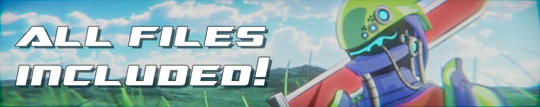
1. Introduction: We. Hello, and welcome to the exciting world of Retro Aime Aesthetics and Blender. I'm Harry, a season three D
artist with over a decade of professional experience
and the privilege of being recognized as a top teacher
here on Skillshare, specializing in
blender tutorials. In this class, we'll embark on a creative journey together, diving into the nostalgic world of retro anime Aesthetics. Whether you have
fond memories of staying at pastor
bedtime to catch your favorite anime
or waking up early on a Saturday morning for thrilling battles
between characters. This class is designed to replicate that
enchanting aesthetic. Even if you're new to
the world of anime, you'll pick up techniques
that can be applied to various types of
stylized renders. My blender classes are known for their clarity and ease
of follow through. Thanks to my step by step
beginner friendly approach. In this class, we'll use
a pre made character, which you'll gain access to as both an untextured
starter file and a fully textured file available to download from
the project resources. Please note that Blender
version 4.1 or newer is required to use
these provided files and follow along in class. You can download the
newest version of blender completely free
from their website. Throughout our journey, we'll
focus on the low fidelity and hand drawn aspects of
this retro anime style, from creating stylized
anime materials with vibrant colors to accentuating them with linework that
adds a hand drawn feel. You'll learn all the
essential elements of this unique aesthetic. To recreate this
nostalgic atmosphere, we'll also utilize layered compositing effects and blender, adding all the low
fidelity artifacts that time may have erased
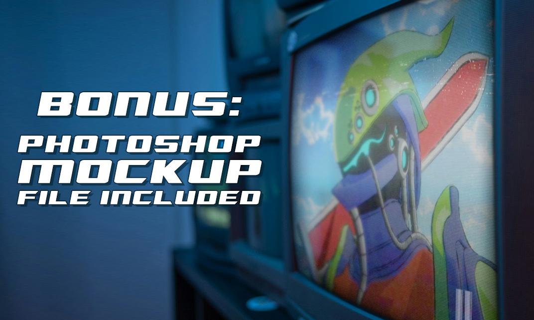
from our collective memories. As a bonus for students
with access to photoshop, we'll even place
our final render on a real CRT television
for an authentic touch. By the end of this
class, you'll be amazed at how convincingly
you can transform your renders into images reminiscent of your favorite
anime from childhood. So if you're ready for a
fun and creative adventure, I invite you to
join me in class. Let's jump into our
first lesson together.
2. Starter File Exploration: Week we we In this lesson, we'll beginning familiar
with our starter file. Let's begin. If this is your first time taking
a blender class, I'd highly recommend
you start with my complete beginners
guide to Blender first. This class was designed for the absolute beginner to Blender and three
D art in general. We cover every single
necessary topic in order to get you up to
speed and running and blender. We'll accomplish this with
short and focused lessons that cover each topic from
a beginner's perspective, utilizing a well
organized starter file. We end the class with an
easy project where you set up and customize your
very own cozy campsite. With that out of the way, let's
continue with the lesson. As an additional disclaimer. If you've never touched
blender before, I strongly suggest that you try my complete beginners guide
to Blender three D first. This anime class will
follow a very clear and beginner focused
step by step method, just like all of
my other classes. However, I will be taking
for granted that you have at least a very
basic understanding of blender and
navigating the viewport. You'll still very
likely be able to follow along in this class
if you're completely new. However, you'll get a lot
more from the class if you completed at least one
of my other classes first. Before we begin, make sure
you've downloaded all of the files from the class resources section
for this class. This includes things
like the starter file shown on screen now, and the texture images we'll
use throughout this class. Make sure you have
the starter file, Underscore retro anime render, underscore 01 file open now, as that's the file we'll be
discussing in this lesson. If you're using
Blender 4.2 or newer, you'll need to download
and open the Blender 4.2 version of this
starter file instead. This starter file has the
word Blender 4.2 in the name. This file has some
adjusted settings and light positions to make it work better for
the updated version of the EV render engine. One thing to note
about this new version is that you'll notice a slight difference between the look of your highlights and shadows
on the character due to the way that Blender
4.2 handles lighting. This will not prevent
you in any way from following the
lessons in this class, but don't be worried if
the shadows and highlights on your render appear slightly
different than the video. You'll still end
up with an awesome retroime render by
the end of the class. Files that I've provided in the class resource section already have most of their
settings done for you. However, I figured it might be beneficial to
walk you through some of these settings
to get familiar with our file before we start. The first thing that you'll notice is that I've
already created a custom anime style character for us to use in the class. This character has a few
materials already finished, and it has placeholder
materials applied for the ones that will
create together in class. I've also created and positioned the camera for us so that we can focus on materials and post processing effects
during the class. We can switch this
left viewport here, which shows our camera view to the rendered mode by clicking this button
here at the top right. So we can click
this button here. And then that'll
switch it to show the actual materials that are currently applied
to the scene. If for some reason,
you're unable to see this button hovering
above the left viewport, click and hold your
middle mouse button in, so click in the mouse
wheel and then drag on this to slide it back and forth to reveal this button
here on the far right. That leads us to the next
aspect of this file, and that's the render engine. Over here on the right side, inside the render
properties tab, which is the back side
of this camera here. We'll see that we're using
the EV render engine. We'll be using the EV render engine for this class as it's the easiest way to achieve the anime style materials
that we want to replicate. I'll explain this process
in a later lesson. It's also worth noting that the EV render engine
is lightning fast, so your final render should take less than a minute
in most cases. The last thing that I want to discuss is our render
output resolution. We can find that here
in the output settings by clicking this
little printer icon, which is the output properties. I've opted for a 43 aspect
ratio for our render. This means that our
final render will match the same aspect ratio of
an old CRT television, which works great for the nostalgic look
that we're after. A resolution here of 2000 by 1,500 works really
well for this. With this last explanation
out of the way, we're ready to proceed with
the rest of the class. And our next lesson, we'll add some HDRI lighting to our
scene. I'll see you there.
3. HDRI Lighting Setup: We we seven. In this lesson, we'll add some HDRI
lighting to our scene. Let's begin. The first step to this whole process will be
to finalize our lighting. You might have
noticed that we have some lighting in
our scene already. You can see that here on the shoulders and
here on the chest. This is thanks to the
three point lights that I already placed
around the scene. These lights provide
a nice amount of highlighting around the
edges of our character. However, we are missing some general fill lighting to illuminate the darkest areas. We'll be accomplishing
this, utilizing an HDRI light that is set
to a relatively low value. If you're unfamiliar with HDRI lighting in
the simplest terms, it's light that's
generated by an image. This image needs to be a
high dynamic range image, which is where the
term HDRI comes from. These types of
images have a lot of extra data inside them
that allows blender to use them to generate accurate lighting,
shadows, and reflections. This stylized anime scene won't really have
true reflections, so all we really need from it is the lighting
and the shadows. Luckily, for us, Blender
already includes some HDRIs when you
download the program. However, they are a bit hidden. I've provided a Sunrise HDRI
in the class resources. However, this is the
exact same HDRI file you can find in
the program files for your Blender install. I've just taken the time
to find it for you, so you don't need to search
through your folders for it. But again, it's the
exact same image. Due to this type of lighting
being imaged based, we're actually going
to need to switch to our shading workspace
to add it to our scene. We can find the shading workspace
here at the top center, and then we can click
here on the word shading to switch over to
the shading workspace. In this top right viewport, we're going to want to switch to our rendered
viewport mode again. So we can do that by
clicking this button here. And this will allow us to see the full effect of the lighting. Again, if you're unable to see these buttons
for whatever reason, hover over top of this toolbar, click in your middle
mouse button, which is the scroll wheel, and then paint it back
and forth until you can see these buttons here and
then click the far right one. The last thing we
need to do before adding our HDRI is to switch the Shader editor down here on the bottom from the object
mode found here on the left. We're going to click this, and we're going to
switch it to world. That's where this HDRI
image is going to live. If this is the very
first time you're seeing the node system
within blender, let me give you a
very brief rundown. This work space down here is
called our Shader editor. You can zoom in and out on the
Shader editor by scrolling up on your mouse wheel or down on your mouse wheel
to zoom in and out. You can pan around this
view by clicking in your mouse wheel to slide the view left or
right or up and down. Each of these squares
that we're seeing on screen are called nodes. Nodes pass their attributes
from left to right. Each node has colored dots
on it, called sockets. You pass the properties
of a left node to a right node by connecting its sockets together
with a wire, such as this green line here, connecting the background
socket to the surface socket. To add more complex effects, you'll simply add another
appropriate node and connected together with the other nodes in the system going
from left to right. Going to be keeping
most of our textures pretty simple for this project, so we won't be using
too many nodes overall. Our first step to add our HDRI texture is to
actually add the image. To do this, go down here to your shader editor
on the bottom, and then hit Shift and A at the same time to bring
up your ad menu. Now in the search bar,
we can click Search, and then we'll type
in environment. E N V should be enough to bring it up
to the top of the list. We see here,
environment texture, so we'll select
this from the list, and then we'll place it
over here to the left. Now drag from this color socket here on the new
environment texture and plug it into
the color socket here on the background node. For now, the scene
will turn pink, as Blender is warning us that we don't have an
image loaded yet. Now let's load our image, which is the HDRI image that
I talked about earlier. To do this, we'll go over
here toward says pen. Now navigate to wherever
you saved your textures folder that you downloaded
from the class resources. Don't forget to unzip
the textures folder that I provided before
you load the HDRI. If you're on a Windows computer, you can right click on the
zip folder called textures, and then choose Extract A. Now navigate into the newly
extracted textures folder. And then in here, we're
going to choose sunrise EXR. The EXR file type is pretty
common for HDRI images. So we'll select Sunrise and
then choose open image. Now that we have
our image loaded, we can see how much brighter
our scene has become. This additional light
will help us balance the shadows in our scene to
give it a more vibrant look. We're not quite done
with this HDRI yet, though, as we want to adjust
the rotation of this image. This will allow us to change the direction of the
sunlit lighting. To do this, we'll need
two additional new nodes. Let's scroll out a
little bit here so we can zoom out and see a
little bit more to the left, and then we're going
to hit shift and A to bring up our ad menu again, and then go to search, and first, we'll
type in mapping. So MAP, and then right here
we should see mapping. We'll choose this and then click over here to
the left to place it. Then we add one more, so
we'll add shift and A, bring up our ad. Quick search. This time we're going
to type in texture, and then space C for
texture coordinate, and then we'll choose that here, and then place it
here to the left. Again, let's connect these
nodes to the system. We're going to drag
from generated here on the texture coordinate, and then place that into the vector socket
here on the mapping. Then we'll drag from the
vector socket here on mapping, and then place
that down here and the vector socket for
the sunrise D EXR. This mapping node that we added will allow us to
change the rotation, the position, or the
scale of our HDRI image. Our case will only be
using the z rotation. The texture coordinate
node that we added simply tells blender how
to display our HDRI. The generated mode in this case works best for our purposes. Now let's adjust
the z rotation on the mapping node so we can rotate the sun behind
our character. We can find the z rotation here about halfway down the
list on the mapping node. If you wanted to, you
could simply just click and drag on this to
use it as a slider, and we'll see as we rotate this. We can see that the
lighting direction changes and it moves our shadows
around the scene. However, for our case, I
already know that a value of 274 looks the
best for our render. We just click on this
number and then type in 274, hit enter. We'll get the
position that we'll be using for this class. If you're using Blender
version 4.2 or newer, you want to use a value of 289 for the z rotation instead. This will help make
our render a bit more similar to the 4.1 version. By rotating the light
behind our character, we're getting some
really nice shadows and illumination across the side
of our character's face. We can see that here. We have some nice soft lighting here, but we're still getting
some nice dark shadows across the front of the helmet, as well as down the front of the chest and on the side armor. Now let's zoom out a little bit here on our shader editor. Then the last change we're
going to make is to change the strength here on
this background node. Currently, it's set to one. The strength value here
is what determines how bright this lighting is
created by the HDRI image. If we increase this number, our lighting will
become brighter, making our scene
really blown out. And if we lower the number, the lighting will become dimmer, making the scene overall darker. For this class,
we're going to set the strength here to 0.5. So we're going to have the
brightness of this HDRI image. This is because we
really don't need the full illumination that
the HDRI is providing. It's more or less just there to support the lights that
are already in the scene. We only want the lighting to
fill the darkest shadows, but not remove them entirely. The value of 0.5 is just
enough lighting to do this. With our lighting finalized, we have a couple of settings in the render properties to adjust. Before we do that, though, don't forget to switch
the Shader editor back to the object mode instead of the world mode
that it's on now. We can find that here
on the left side, so we're going to
click this drop down and then switch
it back to object. This will allow us to
see the material that's currently applied to whatever
selected object we have. Now let's go over here
to our render properties tab and make sure you're
switched to that tab now. You can find it here with the
backside of a camera icon, and then you should see the word render engine EV
here at the top. The main thing that we want
to adjust is our shadows. We can find the
shadow settings down this list by twirling
open the shadow settings. So we'll find those
just by scrolling down until we see here shadows. If for some reason, yours
isn't twirled open like this. You just need to click this
little triangle next to it, and that will open it up so
you can see the options. Our main goal here is to make our shadows as high
resolution as possible, while also removing
the soft shadows that don't work well with
a stark anime style. The main reason
this is important is we want to have the
shadows in our scenes to have a very strong
and distinct edge to achieve this retro look. Older animes would have
simplified the lighting on their characters to make their
animation process easier. So we're going to mimic this simplification and
our render as well. So we have a few
changes to make here. The first one is
we're going to change our cube size from 512, All the way up to the
maximum of 40 96, we'll change cascade size, again, all the way up to 40 96, we'll turn on high
bit depth shadows, and then we'll turn
off soft shadows. By adjusting all
of these settings, we've increased
the resolution of our shadows and remove
their soft edges. This will help our lighting
and shadows work with our retroesthetic rather
than fight against it. To see an example of how
these soft shadows work, if we zoom in here to
the line on the chest, just by scrolling
in on this image. We can see when we
turn on soft shadows, it gives this kind
of blurry edge, which in most cases works well for a more
realistic render. However, in the
case of trying to replicate a very
hand drawn look, we actually want to get
rid of these soft shadows, so it looks more like
a straight pen line between two different colors, rather than this soft gradient between them that we have now. Again, make sure you have
soft shadows turned off, and then all of these other settings
here just made sure that these shadows are as straight and high
resolution as possible. As of Blender version 4.2, the EV render engine
we're using for this class has been
completely overhauled, and most of the old
settings no longer exist. For this reason,
we'll need to change which settings we adjust
to achieve sharp shadows. You also notice that your
shadows and highlights don't 100% match the
look of the video. This won't prevent you from following the class in any way, and you'll still be
able to follow along with all the lessons
with no problem. But your render will
just look a little bit different by the end than
mine does in the video. This is due to how
the new version of EV handles lighting. There are two settings
that we'll need to adjust to make sharp shadows, but I've already adjusted
one of them for you. The first setting is
still found underneath the shadow settings in the render properties
panel like before. So on our right side, we should met in our render properties. Then we'll go down here
to where it says shadows. We'll twirl this open. Then the setting that we need to change here is called Steps. We're going to
click on this value here and then set this to one. Now you'll notice after you
hit enter that your program might freeze for a second as it converts it down to one step. The setting here will limit the calculated steps per
shadow ray to just one time. In simple terms, this
will help get rid of some of the soft edges that
we're seeing on our shadows. The last setting that
I've already changed for you is found on
the lights themselves. Even though I've already
changed this setting for you, I will show you where it's at for your own personal projects. First, let's go up here to the outliner list and select
any one of these lights. In my case, I'm going to
select this main light here. Now we'll go down
here and click on this green light Bowl icon for the object data properties. And then we're going to twirl
open these shadow settings. The setting that we'll
need to change is called the resolution limit, and it's found here at the bottom of these
shadow settings. By default, this setting
is typically set to 0.001. However, I've added
an additional zero here to make this
number even smaller. The smaller this number is, the higher resolution
your shadows will be. Higher resolution shadows
will remove some of the blurriness from the shadows and give us a sharper edge. For your own personal projects, you'd need to change
this resolution limit on each light in the scene to
achieve nice sharp shadows. This is because this setting is handled on a per light basis. With that last change made, we're ready to proceed
to the next lesson. Don't forget to save
your file, however, that way all of these
changes we've made will proceed with you
into the next lesson. You can do that simply by
going up here to file and then choosing save or hitting Control S if
you're on windows. In the next lesson, we'll add
a sky texture to our scene. I'll see you there. Wait.
4. Creating the Sky Texture: In this lesson, we'll add a
sky texture to our scene. Let's begin. With our lighting finalized in the last lesson, we're ready to begin
working on the materials. I'm sure you've
noticed by now that the sky behind our
character is gray. Let's fix that by adding a painterly sky texture to
help complement our anime. Start by switching
to the shading workspace if you're
not there already. You can find the
shading workspace here by clicking on the
shading tab at the top. Also, make sure that
this top right viewport is set to the rendered mode. You can do that by clicking
this far right button here. And again, if you can't see it, click on your
middle mouse button to paint it to the side, and then click this button here. Now, let's select the
sky plane object found over here on the right
side inside this outliner, so we can just click
the name here. Or we can simply click it here in the viewport to
selected as well. With the sky selected,
and we can now see the placeholder material
that I have applied to it, which is currently just a
sort of light gray material. Our first step is to
add the sky image. To do this, we're going
to hit Shift and A. Then go to search and
type in the word image, IM AG then we can pick here image texture and place
that over here to the left. Now, before we
connect our image, make sure you go down
here to the bottom of this principled
BSDF node and make sure that this emission
setting here is tolled open. It should already
be tolled open for you because of the starter
file when I saved it, it had it tolled open, but if
for some reason, it isn't. Make sure it's open so you can see this color socket here. Now, click and drag
from the color socket on the image texture. Over to the base color, and then again, drag
from the same socket. So we're dragging
a second lire out here to the emission
color socket down here. Then lastly, set the strength which is currently set to zero. We're going to set this
to one for the emission. I'll explain these two sockets
here in just a moment, but for now, let's
load our image. We'll do that by
clicking the open button here on the image texture. Again, navigate to your textures folder that you've downloaded
from the project resources. And then in here, we're
going to choose the sky JP. So we'll choose that image
and then hit open image. Now that we have our
sky image loaded, we can actually see it
behind our character. The reason we can see it is because we've connected it here to both the base color
as well as the emission. Technically, the emission
is not required. If I cut this cable here, so if I cut the wire
by holding control and then right click dragging
across this wire, it'll cut it, so it
removes that connection. We can see now that we can
see the sky back there, but it's really blown out. You can just barely make out
the clouds here on the left side.'s because we've removed
the emission socket here. When it's just plugged
into the base color, that means it's showing
the color on this plane, but also any light inside the scene is also being
applied on top of that image. So far lighting
is really bright, then it's going to really
blow out the image. By adding it as well to
the emission down here, we're making this plane
self illuminated, we're essentially making
this sky glow its own light. It's no longer being affected
by the light in the scene. It's just showing
the actual color of the image and it's emitting
that light itself. Most materials, this isn't
actually something you want unless you want
your material to glow, such as these glowing
eyes or the mouth. But in the case of our sky, we really don't want the
lighting in the scene to affect the sky because that's not really how it
works in real life. We're essentially making the sky glow by plugging it
into the emission. We also changed our
strength slider here by setting it to one, which makes the color on this emission the exact
color of the image. One is the default value. If you set the strength
value down to zero, which is what it
was before, we're essentially just removing
all the emission. Then if we increase
this above one, we'd be making it even
brighter than it normally is. As we raise this value, it starts becoming blown out again. So again, for our example, we're just going to
leave this at one. Now that we're seeing clouds
behind our character, let's fix how stretched
out they look. To fix this stretching,
we're going to be using the mapping and texture
coordinate node that we used in the last lesson. I'm going to zoom out
a little bit here. Move it over and then
hit Shift and A. Go to search. Type in mapping, place that here to the left, and then hit Shift and A. Type in texture, space C, and then choose
texture coordinate and place that here to the left. Now that we have
our nodes placed, let's start connecting
them together. Rather than using generated
like we did last time, this time, we're going to use
the window mode down here. We'll drag from Window and then place that here into vector, and now drag from this vector on the mapping node down
into the vector on the sky p. By using this windowed mode here on
the texture coordinate, we're disregarding the rotation and unwrap of the sky plane and instead telling
blender to only look at the orientation
of our window. This allows us to adjust the position and the size
of the skyplane if we need to without affecting the position of the sky
texture applied to it. Essentially, the texture
is going to remain static, even if we move
this object around, unlike a normal material. At this point, our sky
is looking better, but we can use the mapping node to further improve
the look of it. We're going to
start by adjusting the scale of this image. To do this, we're
going to go down here for the scale on the bottom
of the mapping node, and we'll start by
adjusting the y scale. So we're going to click this
number here and then type in 0.68 and hit enter. This is going to stretch the
image slightly vertically. We're going to
remedy this vertical stretch so in just a moment. Now we can go to the x
scale and click this, and then we're going
to type in negative 0.47 from the hit enter. We've accomplished two important
things with this change. First, we've fixed the
stretch on the image by lowering this number and
making the image wider. By adjusting these scales and making the number
smaller than they were, we're making it repeat less in whatever direction we've
typed in the number. And if it repeats less, then that means you'll
see less of the image, but overall, it'll
be a bit bigger. Second, by adjusting
this x value here and making it negative, we've actually
mirrored this image. With a positive number
in the x scale, the sun is on the left
side of the image, which doesn't actually make
sense for our lighting. We want it to be
on the right side. By making it negative
and mirroring the image, we've changed the sun to the
right side of the image, which makes a lot more sense for our lighting as it
appears to have the lighting coming from
behind the character here on the right rather
than the left side. Now that we fix the size and
the mirroring of our sky, let's get it to the
correct position so that it makes for
a nice background. First, let's zoom out
a little bit here. Then we can move up by using our middle mouse button,
clicking it into pan, and then we'll move
to the location, and we're mostly concerned
here with the x and the y. Now we can move our sky around just by simply
clicking on the slider here and then sliding it left and right to find a
position that we liked. We can also hold down
shift while we click and drag here to make it
move a little bit slower, so it's not quite so fast. In the case of our
example here though, I already know two
values here for the x and y that make for
a pretty good background. So we're just going
to type those in now. So we'll set the x value
here to negative 0.24. And then for the y, we're
going to set this to 0.13. These changes here have moved the sky down to the
left a little bit. This perspective better matches the lower angle of our camera. We mostly see the sky
behind the character, but there is a little
bit of a landscape here on the bottom left. With that last change, our sky texture
placement is finished. However, the colors
feel a bit muted compared to the other colors
in the scene right now, such as the red on the sword or the bright blue on the
mouth and the eyes. Let's fix this by using a gradient overlay with some
more vibrant blue colors. So we're going to start
by zooming out here so we can see our full
system at the bottom. Now we can hit Shift
and A to bring up the add menu. Go to search. Then type in mix space C, and then we're going
to choose mix color. Now you can drag and drop this node that we have attached
to our mouse right now. On top of either
one of these lines, you'll notice that when
you hover over it, it's going to turn white letting you know that
it's highlighted. I'm just going to drag
it here on the top one. It's going to automatically connect the one that
was highlighted. However, this other one is still bypassing it. To remedy this. We're going to zoom in here, and then we're
going to drag from result down here into the
emission again for the color, which means now
that this sky image here is passing through
this mixed node, and then it's pumping
out the result to both the base color and then
the emission color as well. This mix node here will allow us to combine
two images together. In our case, we're
going to overlay a blue gradient on top of our sky image to make
it more vibrant. Currently, right now,
though it's only overlaying this white that we see
here in the B socket. Which is why our
background here is a little bit more washed
out than it was before. Before we add our gradient, let's zoom out
here a little bit. Then we're going to drag select or top of these
three nodes here. The texture coordinate,
the mapping, and the sky, we're just going
to move these up slightly. That way, they're not quite
so close to this B socket, so we have more room to
fill in at the bottom. Now let's begin
adding our new nodes. We'll hit Shift and
A. Go to search. This time we're going
to type in gradient, GAD, and we can choose
gradient texture. Place that here.
And then, again, we're going to be
making a new mapping and a new texture
coordinate node. Shift A, mapping. Place this. And then one more time, Shift A, search texture space C
for texture coordinate. We'll place that
here to the left. Before we connect
anything together, we do need to make a change
to this mapping node. We're going to
switch the type from point to texture instead. This texture mode
here will allow us to actually affect
the gradient texture. The point mode here doesn't work as well for the
gradient texture node. Now we can begin
connecting these together. Again, we'll use the window, and we'll drag this
into the vector, and then we'll drag
from the vector here on mapping down into the vector
for the gradient texture. Then one more time, we're
going to drag the color from the gradient texture
to the B socket here, which is the second of the two images that we're
going to be overlaying. To get a better idea of what this gradient texture is doing, we're going to adjust
this factor slider here on the mixed node. We're going to set this
all the way up to one, so we can just click
and drag this and drag it all the
way to the right, which will set it to one. And by doing this, we're
telling this mixed node here to only display
the B socket. If we had set this all
the way down to zero, now we're telling it to
only display the a socket, and we can see that
reflected here at the top. By default, it's
usually set to 0.5, which is an even mix of the two. It's half the a socket with half the B socket
laid on top of it. But again, for our example here, let's set this all
the way up to one, so we can see just what
this gradient looks like. We should see here it's a
black to white gradient. Now let's rotate this gradient
so that it flows from the top to the bottom
rather than left to right. To do this, we're
going to go down to the mapping node that's plugged into the
gradient texture. Not the top one. That one's
only for the sky image. We're going to be using
just the bottom one and we'll set this z rotation to 90. Nine zero, I enter, and now you can see that
the gradient has rotated 90 degrees and now it's black on the bottom and white on the top. Now that our gradient is
positioned correctly, we're ready to change the
colors from black and white to a nice set
of vibrant blues. To do this, we're going
to need a new node. First, let's zoom out. This
new node is going to be placed here between the gradient texture and the mixed node. I'm just going to move
my gradient texture over a little bit to make
some more room here. Now we can hit Shift
and A, go to search. Then we'll type in color
space R for color ramp. I'll choose color ramp here. Now we can just click
and drag and place it here on top of this wire here, and that'll automatically
connect it for us. This color ramp
node that we just added is what's
going to allow us to change the color
and distribution of the colors on this gradient. This gradient texture simply
generates a gradient for us. It doesn't allow us to
change anything about it. Whereas the color ramp allows us to change
both the colors as well as the position of these
colors within the gradient. You can see here by clicking and dragging on these sliders, I can move where these
colors start and stop. Let's start by
changing the colors. To start with, click on this black slider
here on the far left, and to make sure
that it's selected, just click on this little tiny
triangle here at the top. Sometimes it's a little
hard to see if you don't zoom in, so you
can zoom in here, click on that, and
then you should notice that the color bar at the
bottom is fully black. Now we can click
on this black bar, then we'll be
adjusting these values here on this color picker. If you're unfamiliar
with this color picker, it's relatively easy to use. Right now it's set
to completely black because all of these values
here are set to zero. To start with, we can use just these dots
here to adjust it. I'm just going to drag
this right side here, which adjusts how dark
or light the color is. I'm going to just drag it
all the way up to the top. Then if I wanted to change
the color really quickly, I can just click and drag on this little dot here and place
it wherever I'd like to. You can see those sliders
at the bottom are adjusting with wherever
I place this dot. Normally, when I'm
picking colors, I'll move this dot to
roughly where I want it. Then I'll go down
here and adjust these sliders to more
fine tune these. You can see as I move
these sliders that dot changes position to
wherever I place it. In the case of our example here, I already know exactly which values I'd like for
these numbers here, so we're just going
to type them in. For our hue, we'll type in 0.58, and then enter for
the saturation, we'll type in 0.71, and then for the value, and
you can leave that at one. In case you don't already know, hue here is what
changes the color, that slides it
around the circle. Then the saturation here changes how vibrant that color is. Whether it's a little closer to white or if it's really,
really colorful. I'm going to set my values
back to what I had them at 0.58 and then 0.71. Okay, so that's our
first blue color. Now if you just hover
over the side here, that color picker
will disappear. And this light blue
color that we created here is going to be
placed near the horizon, which is at the
bottom of the image. This is to mimic
the lighter blue that appears at the
horizon on a sky, and then it gets darker
as you look upward. So now let's make
the darker blue, which is going to be on
top of this white slider. So first, we need to select this white slider by clicking the little triangle
here above it. We can see here it's
switch to white. Now we'll click
on this color bar at the bottom to
change our color. Again, I'm going to be just
typing in numbers here. So for our hue, click on
this and set it to 2.6. Our saturation will
set it to 0.94. Then for the value,
we'll set this to 0.46. Now we have this
darker blue color here at the top of our sky. With our colors finalized, let's adjust the position
of this gradient so that it better
matches our sky. We'll start with the slider that we already have selected, which is the far right or the dark blue slider
down here at the bottom. Then we're going to go here
to this position slider, which we can either click
and drag to adjust it, which is also the same thing as just clicking and
dragging the slider, or we can actually
type a number in. For our case, we're just
going to type the number in. So we'll type in
0.565 hit enter. And now we can select
the left slider here, which is the light blue. And then for the position here, we're going to click on
this and then type in 0.18 and then hit enter. By moving these sliders, we've moved these colors
closer together and made the transition between
them a lot more sharp. So, for our sky, we get
a little bit more of a clear delineation between the top blue and
the bottom blue. It's not quite so gradual. However, by moving
them closer together, we've also created this
dark line here on our sky. It might be pretty
subtle in the video, but you might be able to
see it on your own screen. Let's get rid of this dark blue by changing the gradient type. By default, it's set to linear. However, if we click
this drop down here, we have a few different options. In this case, we're going
to be using B spline. So we can select this now. And now we'll notice on our sky. It's a little bit softer
than it was before, but we've managed to remove this dark line here
that was in the middle. That's because in general,
this B spline mode is a lot more soft than
the linear mode is. Now that we have our
gradient set up. The last thing we need to do is to blend it with our sky image. To do this, we're going to
switch from the mix mode here, and we're going to set
it to overlay instead. We can find overlay about halfway down the list
here in the middle. Now we can see that our
sky has inherited a lot of this blue color from our color
ramp that we just added. That's because this
blue gradient is being overlaid on top of our
original sky image, making it a lot more saturated and vibrant than it was before. This overlay mode
that we chose here is just one of many
different blending modes. All of these different
modes will combine these images together
in different ways, and they work
largely the same as other programs such as photoshop if you're familiar with them. We'll be using some of these other modes later
on in this class. Now that we have a
nice, vibrant blue sky gradient overlaid
with our sky image, we have a much more
colorful and saturated sky that works well with the
other colors in our scene, such as the greens, the reds, and the blues on the character. In the next lesson, we'll create colorful anime
style materials for our characters armor.
I'll see you there.
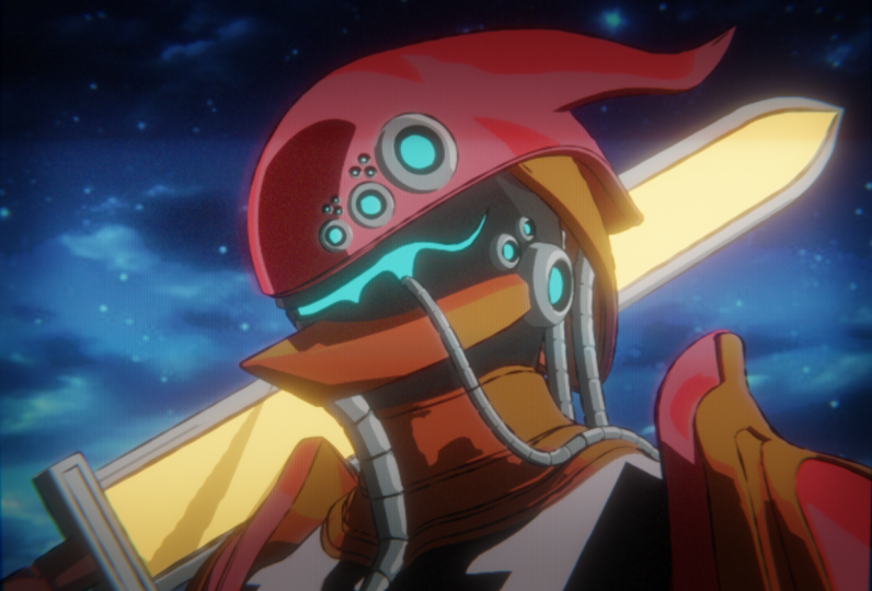
5. Creating the Armor Materials: I lesson, we'll create colorful anime style materials
for our character's armor. Let's begin. We're
finally ready to add some materials to our character.
So let's jump right in. These materials will all be
very similar to each other, and we'll primarily just feature different colors in
different amounts. We'll spend some
time understanding the process on the
first material, and then we'll practice
this new knowledge a bit quicker on the
next two materials. As usual, start by switching to the shading
workspace if you're not there already by clicking on the shading tab
here at the top. And then make sure
this top right viewport here is set
to the rendered mode, which is this far right button. Now let's click on this
character's horned helmet by clicking here in the viewport to select it or by selecting helmet from here on the
list on the right side. Now, let's um in here on our placeholder
material at the bottom, and then to start our material, we're actually going
to be deleting this principled BSDF node that we've had on
the sky material. This node is useful for
many types of materials. But in our case, it
won't actually help our anime style material,
so we can just remove it. To do that, we can just select this node and then hit
Delete to remove it. Now let's add the three new
nodes that are going to replace this
principled B SDF node. Going from left to right, we're going to hit Shift A to add our new node, go to search. Then we'll type in Diffuse DFF. We're going to choose Diffuse BSDF Place that
here to the left. Now hit Shift A, go to search. Type in Shader, space TO. We're going to choose
Shader to RGB. Place that here.
Then one more time, shift A search color space R, and then choose color ramp, and then place that
here between these two. Now let's link all of
these nodes together. We'll drag from this
PSDF socket down to shader on the
shader RGB node, drag from color down here to
factor on the color ramp, and then drag from color to surface here on
the material output. I'm just going to space
these out a little bit, so they're not quite so cramped. Now that we have our
three nodes added, let's discuss how
they work together. First off, we have
the diffuse node. This diffuse node
is here just to give us a simple
shader to start from. Technically, we could have used the principled P SDF
node to do this. But the shader node is just a little bit more clean looking, so I prefer it for these
anime style materials. All we really need is to just have a base color to start from. In this case, it's
just this white color. Our next node, shader RGB is actually the most important one for the anime effect
that we're after. By running our diffuse BSDF
into this shaded RGB node, we're converting the
shader information into color information instead. This might seem like
an odd distinction, but it's actually
really important. If we had left the shaded RGB
node out of this material, we wouldn't be able to
affect the colors and the light using our color
ramp that we placed after it. That's because this
color ramp here can only affect
color information. By default, this
diffuse B SDF node cannot output color information, so we need to convert it into color using the
shader to RGB node. We can see here now it's
outputting color on this socket, which we can then plug
into the color ramp. This leads us to this
color ramp node. This is almost as important
as the shader to RGB node as this is how we'll be
controlling the color and the placement of these
colors on our model. We'll notice that
if we click and drag either of these sliders, we can change the amount of
light and dark on our model. This allows us to sort of break the true
lighting in the scene, and for it to place the shadows in the highlights wherever we'd like them to be
rather than where the actual light and
shadow would appear. It will also allow us to have sharp breaks between each color
just like an anime would. Now that we know a little bit about how these nodes interact, let's begin adjusting
the color ramp to turn our characters armor
into a vibrant green. I'm going to start by setting these sliders here back to
their default positions, so far left and far right. And then our first change
to this color ramp will be to get the separation in
our colors nice and sharp. The sharp break between
colors is the key to the anime or cartoon
look that we're after. Luckily, for us,
this color ramp has a gradient mode that
makes this super easy. Again, we'll be
using this drop down here to change it from linear, and then instead of Bast
blind like we did last time, we're going to choose
constant instead. You'll notice after making
this change that the armor has turned mostly black with a small amount of
white highlights. You'll also notice that we now have really sharp lines between these black and
white colors rather than the soft gradient
that we had before. You can see that here at
the top of the helmet. This is exactly what
we're looking for when we're using this
constant gradient mode. Now let's get the positions
of these sliders set up. First, with this white slider selected, so the far right one, we're going to set the
position here to 0.66, which will move it further into the gradient and add more
white to the texture. We'll adjust the
colors in a moment. But for now, let's
add another slider to our gradient so we can
have three unique colors. In general, you'll want
to limit your materials to having either two or
three colors at most. Older anime and even
some modern anime limits the amount of colors present on their characters to simplify
the animation process. The more colors they have,
the more they need to worry about the shading
on the character, depending on the lighting. Which slows down the
break neck speed and which enemy is produced
in most cases. By limiting our color to no
more than three variations, we're adhering to this
real life limitation, and as such, retaining the
look that we're after. Now with your white
slider still selected, we're going to go
over here to the top left and then click
this little plus icon. This is going to create
a brand new slider here between the two
that we already have. Now let's select this
new middle slider, which is here in the middle. And we're going to set the
position for this one to 0.27, and then he enter. We can also go down here to this color bar at
the bottom and just change it to any
sort of medium gray for now, just as a placeholder. That way we can see the
break between the colors. Now that we have our gradient
separated how we like, we're ready to
change the colors. We're going to start
with this white slider here on the far right. So we're just going to
click on this slider here and then go down
here to the color bar. Select this to bring
up our color picker. Again, I'll just be giving
you values here to type in. For the hue, we'll type in
0.27 for the saturation. We'll do 0.55, and then for the value, you
can leave that at one. We're going to make this
a really pale green color that's meant to represent the highlights on our
character's armor. Now we can select
the next slider to the left, which
is the middle one. So we'll select a
little triangle, go down here, select
the color bar. Again, let's type
in some numbers. So for the hue, we'll type
in 0.27 for our saturation, we'll type in 0.93. And then for the value,
we can type in 0.8. This will be the main
color for our armor and represents the mid
tones of the gradient. Lastly, let's adjust this black slider
here on the far left, which is going to be our shadow. So we have the black
slider selected. Go down here to the color bar. For our hue, we'll type in 0.38, our saturation,
we'll type in 0.73, and then for the value,
we'll type in 0.4. You'll notice that for
this shadow color, we've pushed our green color a bit more towards
the blue direction. This is because we want to give our shadows the feeling that they are being illuminated by the blue sky instead of the warm sunlight because they're on the shadow
side of the character. It's a relatively subtle change, but it helps vary the colors in our scene and give it a
bit of a stylistic flare. With our colors finalized
for the green armor, we're finally able to
get the full effect of this anime style material. These flat colors with
sharp breaks between them, give the model of really
hand drawn anime vibe. One important thing to
note about the colors we chose and their
distributions on the gradient. We're trying to replicate a shiny painted armor
for our character, so we have a lot of highlights, and the color is
pretty close to white. If you wanted to have your
armor look a little bit more like fabric instead
of a painted metal, you would want to
have your highlights be a little less prominent, meaning that there should
be a little less of them, and the color should be
closer to the middle color. So it doesn't appear as glossy. These are important
things to think about when picking colors
for your own projects. Now that we understand how
this material was created, we can go a bit faster through the next two materials
utilizing our new skills. The first step is going to be to copy the work that we've
already created down here. We're going to drag select over top of these
three nodes here. Then we're going to hit
control and C to copy these. Then this will allow us
to save some time by reusing these nodes
for our next material. Now we can move on
to the next piece, which is going to be
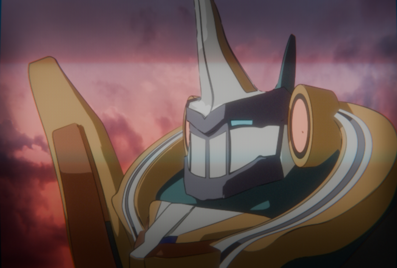
the jaw armor here. We can select the jaw here or we can select it
here from the list. Again, down here, we'll
now see that we have the placeholder material for
the jaw armor listed below. Our first step,
just like before, is to delete this
principle B SDF node. So we can select it here and then hit Delete to remove it. Now we can hover over
the shader editor here at the bottom and then hit control and V to paste in the nodes that we copied
from the last material. Let's move those over so they're not overlapping anything else. Then lastly, we're just
going to connect this color here down into the surface
for the material output. Now that we have this
base to work from, all we need to do is
adjust the colors and the positions on
this color ramp node. You may have noticed
that this material is already named purple, so that's the color that
we're going to be changing our gradient to instead of
the green that it is now. Now we can just go
one by one on each of these sliders and adjust their positions and their colors. So we're going to start with
the far right slider here, which is the light green. So we'll select
this to make sure we can adjust the
color down here. Click the color
bar, and now we can type in for the hue, 0.65. Saturation is also 0.65, and then our value
will set this to 0.6. Then lastly, for the
position for the slider, we're going to set this to 0.5. So we're moving in a little bit further in creating
more of this color. Now we can select
the middle slider, which is this vibrant green. Click the color down here, and then for our hue, we'll
set this again to 0.65. Our saturation this
time will be 0.85, and then the value will be 0.62. Just like the last one, we are going to change the position, so we'll set the position
for this slider to 0.3, a relatively small change. And now the far
left slider here, which is our shadow color. Select the slider, select
the bar at the bottom. Change the hue, 2.65. Change the saturation to 0.93, and then change
the value to 0.56. As you can see, utilizing
a previous material as a base for this one has
really sped up our workflow. You'll also notice that
the colors we picked for this material are a
lot closer to each other. As such, look a little bit less glossy and metallic than
the green material. It's important to include
some variation in the perceived material types on your character to give it a bit more complexity
and realism. But this purple material done, there's just one left to create. Let's select the body now. We can select it here in
the viewport or we can select the body from the
list over here on the right, can zoom out a little bit. Select the principled
B SDF and delete it. Now again, we'll hover
over the bottom, hit control and V to paste in those green
nodes from before, move them over a little bit, and then we'll drag from
color down here to surface. And now, this material
is going to be orange. We need to change the colors, but we'll also be eliminating
one of the sliders as well. We want this orange
material to look a little bit more like
fabric than glossy armor. We're going to remove
the highlight slider and limit it to just two colors. This will simplify the shading
and give it a softer look. Now, let's zoom into the color
ramp down here and we're going to select the
far right slider here, which is the highlight. Then we can just click this
little minus button here, and that will
delete that slider. So now it's just two colors. Now we can select this
bright green slider here, which is currently the
furthest right slider. Select the color
bar at the bottom. Now we can change the hue. We're going to set this to 0.02. Go to the saturation, and set this to 0.96. Then for the value,
we'll set this to 0.75. Now we can adjust
the last slider, which is the shadow
slider here on the left. Go down to the color bar. And then for the hue, we'll
set to 2.01 saturation 2.93, and then for the value,
we'll set this 2.48. Now, over here on our character, we can see that by eliminating
the brightest color, we've made this feel a
little bit more like fabric, such as they're
wearing a shirt with maybe a piece of leather or something like
that on the neck, and then a more metallic look
here on the green metal. With this last material created, we're officially finished
texturing our character. If you're curious how
the other materials we didn't create during
this lesson were made, you can select those objects and explore the materials yourself. If you were curious
about this red sword, you could just click
this sword here to see the material and how it's created and how the
colors are distributed. If an object has multiple
materials applied to it, such as the sword or the eyes, you can swap between
those applied materials using the slot drop
down here on the left. You would just click on
this, and then you can see all three materials that are currently applied to this sword. If you wanted to see
the silver material, you could just click silver from this list and you still
have the sword selected, but now you're previewing
the silver material that's applied to the sword. The same thing here,
if you wanted to see the brown handle, you
could see the brown here. You'll find in general, that the materials
all use pretty much the same method as the three that we created
in this lesson, with the exception of
the blue eye material, which uses a solid
emissive color to give it a slight glow. We can see that here by
just selecting the eye. Go to the slot and
then choose blue eye. You can see this material is
much more simple and it's just using an emission node here to create a
glowing blue effect. Because this blue
color is solid, it matches perfectly fine with the other colorful
materials in the scene. In the next lesson, we'll
add line work on top of our render that gives the
character a hand drawn look. I'll see you there.
Ring ring ring winging.
6. Adding Freestyle Linework: In this lesson, we'll add line work on top
of our render that gives our character a hand
drawn look. Let's begin. At this point, all of
our colors are in place, but we're still missing a
pretty important aspect to our retro anime aesthetic,
and that's the line work. To start this
process, we'll want to switch to our
rendering workspace. We can find that here at the top by clicking the word rendering. The line work method
that we're using only appears after you've
rendered your image, so we might as well do all of
our work in that workspace. The very first step
to this process is to simply render our image. We have two ways we can do this. We can either go
up here and click Render and then
choose render image, or alternatively, you can hit F 12 to quickly
render your image. I would suggest you
get used to using F 12 as it makes your
life just a bit easier. I'm going to hit F 12 and
then render my image. This process should be pretty fast on most computers as the EV render engine we're using is quite fast for simple
renders like this. Now that we have
our render visible, let's start adding
some linework. We'll be adding this linework using a setting
called freestyle. We can find the
freestyle options at the bottom of the
render properties tab. You can find the render
properties here at the top right. Click this little icon here that looks like the
backside of a camera, and then go down here
and we'll see freestyle. You also want to
twirl this option open if it isn't open already. To start with, we're
just going to click this box here to
turn one freestyle, and we won't adjust
anything just yet. Now let's do another quick
render by hitting F 12, and then we'll see here
that it's going to apply the linework
on top of our image. So we can see that it's added these little black lines here along the edges of our model. This is the very
first step to making your character look
like it was hand drawn. These lines are pretty
thin right now. Let's increase the line
thickness down here at the bottom rate from one pixel
up to two pixels instead. We have some thicker and
more noticeable lines. Now you'll notice
after I changed the setting here,
nothing has happened, and that's because
every time you make any changes to these lines, you do need to re
render the image. So we can hit F 12 to re render our image again to
see these new thicker lines. Now that we have thicker lines, we're ready to start adjusting the shape and placement of them. We'll be adjusting the lines
in the view layer settings. We can find that
setting here under this icon that looks like three images stacked
on top of each other. This is your view
layer settings. If we scroll down here,
we can see all of the free style settings underneath this larger
freestyle section, and then there's a bunch of
other subsections below it. We have a ton of
options here that can change the look of our lines
in many different ways. I won't be explaining all of
these options in this class, as that could be an
entire class on its own, but we will be using a few of them to improve the
look of our lines. The first thing that
we'll be adjusting is under the edge type settings. You can find those
here near the bottom, you'll see a whole bunch of
little check boxes here, and that's under edge type. These check boxes below are all the different
ways that blender can decide where to place lines. We won't be using most of these. However, enabling
material boundaries, we'll clean up some
of the broken lines that we have right now by making sure that there is
always a line between materials applied
to the same object. We can find material
boundaries here. It's a little bit cut off.
But if you click on this, we'll enable the material
boundaries option. This option is going to be the most noticeable on the eyes, the shoulders and
also on the sword. Again, this material
boundary option only works on materials applied
to the exact same object. It's not necessarily going
to create a line between this purple and the silver because these are two
separate objects. But in the case of this sword, it's going to carry this line through all the way
up through to the top and have a line between
this silver and the red because they
are the same object. Now that we have this
option checked on, go ahead and do another
render by hitting F 12. Now we can see again, this
area here that I was just calling out on the sword now has a line that goes all the
way up to the very top. Okay, so now that we
have all the lines placed in the correct areas, let's start adjusting the
shape of these lines. This is where we're really
going to start getting into the more hand drawn
look of the lines, so they don't look so
robotic as they are now. One of the simplest changes
we can make is the cap type. We can find this option under the freestyle strokes menu down here below
this checkbox list. We'll to all open here,
freestyle strokes. Then we can see here caps. We're going to switch this
to the round cap type. Then we can just sum in on
any one of these spaces here. Maybe I'll look at the top here, we can see the end
of these lines right now come to a blunt end. They just come to
a nice square end. But by changing it to round and then hitting F 12
to re render it, we'll see here now that
instead of a square end, we have a nice round end. Which looks a little bit more
hand drawn because that's how an actual pencil or a
pen would create this line. It's a relatively subtle change, but it helps with the
overall hand drawn look. Now let's move on to the
two most impactful changes, which we'll find underneath the freestyle
thickness settings. We can find that over
here on the right side, so we're just going to scroll down until we see
freestyle thickness, and again, you might
need to roll this open. The main thing that we'll be
doing in these settings is adding modifiers to adjust
the line thickness. Let's start by adding
the first one, which is called noise. To do this, we're going
to click the ad modifier. And then choose noise
from this list. Now let's scroll down so
we can see the settings. Let's start by making
some adjustments to these values and then I'll
explain what they do. First, we're going to set
our influence really low. We're going to set this to 0.07, and then go down
here to the period, and we're going to switch this
to 20 and then hit enter. With these changes made, Let's go ahead and hit F
12 to re render our image. Now the change
that this has made should be relatively
obvious right away. If we zoom into this
line work here, we can see that rather than really consistent
flat lines, instead, we have these wiggly, thicker and thinner lines
across the entire model, which gives it a lot
more hand drawn look. This changes the really robotic and straight
lines that we had before into a more flowing and sketchy look that we like
for this anime style. This noise modifier is adding variation to our line work
by making parts of the line thicker or thinner
than the base value of two pixels that we set
in the previous settings. If we look at these
settings over here, the influence value here is the overall strength
of the effect. In our case, we want it
to be relatively subtle, and a value of 0.07 keeps
this effect manageable. You can see even with this
relatively low value, we're still getting a
lot of wiggly lines here on this model. So anything higher than 0.07
is just going to make this even stronger and might start making it look
a little too sketchy. The amplitude here,
which we didn't change, we just left at ten is how
tall these changes are. So if you think of
each of these changes as a peak on a
mountain and a valley, it's changing how different are these peaks
in these valleys, so it's making it more vertically
different essentially. You can also think
of this as just how strong the thickness
changing effect is. Then lastly, we have the period, which is how far apart these
thickness changes are. You can also think of this as the frequency if that
helps makes more sense. So a higher value here
for the period will make these peaks and
valleys further apart. Smaller values will make them
a lot closer and we'll make the lines look a little
bit more zigzag or jagged. All of these effects
add together to give us lines that are much more
organic and hand drawn. We're trying to mimic
the variations you'd see in these lines if
they were created by a real ink pen by hand due to variations in the flow of ink
or the pressure of the pen. Now that we have some variation, let's add some tapering
to the lines so that they aren't all the same thickness throughout the entire stroke. We'll again be doing this using a modifier under the
freestyle thickness settings. We'll go down here
again and click Add modifier underneath
freestyle thickness. This time, we're going
to choose a long stroke, which is here at the very top. Let's scroll down so we can see the long stroke settings
down here below the noise. Then the first thing we
need to do is change the blend mode. Right
now it's set to mix. We're going to switch
it instead to multiply. This method tends to make your lines much thinner
than you intend. Switching it to the multiply
mode first will help retain some of that thickness
you're losing by adding taper to the lines. Next, we'll change
the mapping mode from linear to curve instead. Now we can scroll down to see
this graph at the bottom. Changing from linear to curve, will allow us to change
the shape of our lines and add a taper to the beginning
and the end of the stroke. Now, let's adjust this
graph down here at the bottom to make that taper that we talked
about before. Start with, click on this
line here in the middle. And that will create a new point that allows us to
bend this line. We're going to move
it all the way up here to the very top center. And then down here, you
can see these values. So you want the right
value to say 1.0, and then this left value here, we're going to type in 0.5, which ensures that this dot here is exactly in the middle, left and right, and then it's
at the very top vertically. Now on the right
side, you can see a tiny dot here at
the top right corner. We're going to click and
drag on this dot and move it all the way down here to
the bottom right corner. So we're making this
rounded hill shape. This graph that we
just edited here, you can visualize as being the left and the right
side of the stroke. The left side of the stroke
is going to be very thin. The middle of the stroke
will be its max thickness, and then the far
end of the stroke will be as thin as
possible as well. So I'll start thin, get
thicker in the middle, and then it'll taper off to
nothing again at the end. This helps mimic different pressures being
applied to the pen as the animate artist is adding linework on
top of the color. Now we can go ahead and render our image again one more time. So we can see the final
results of these tapers. Now if we zoom in here,
we can see in general, our line work looks a lot
less robotic and generated. The line thickness variation
and taper combined together to make a pretty convincingly
hand drawn character. We can see examples
of this tapering happening here on the sword, where the line gets really
thin here at the end of the stroke and is much
thicker further down. We can also see this taper
effect here on the eye, where it's coming to a
nice point at the end, as well as on the helmet here, where we're getting a
nice break in the line, and it goes from much thicker down to almost
completely gone, and then it gets much
thinner down here. Overall, it just
adds more variation in life to our render. In the next lesson, we'll begin our exploration of compositing
effects in blender. I'll see you there.
Way way way way.
7. Compositing: Color Correction: In this lesson, we'll
begin our exploration of compositing effects in
blender. Let's begin. A lot of the retro anime effects that we want for our render will be accomplished utilizing compositing effects
inside blender. I've broken this compositing
process down into eight mini lessons that explain each distinct effect that
we're trying to achieve. These changes might seem really subtle or disjointed at first, but I'll ask you to trust
me that by the end, they will all work
together to give us the nostalgic retro
anime look that we want. Smaller lessons will also
allow you to return to the class and reference them individually in
their own lessons. If you need a refresher in the future for
your own projects. With that explanation
out of the way, let's dive into
our first effect. We're going to
start by switching to the compositing workspace found here at the top directly next to the rendering workspace. We'll just click this tab here at the top to switch to this. I've already set up
this workspace with a custom layout to
make our lives easier. If you're interested in how
this layout was created, you can learn how to
create it for yourself and many of my other
beginner classes. For now, let's render our image again so that we can see
the current progress. Again, we can just hit F 12, and that we'll re
render our image. In my case, I already
had it rendered because I haven't closed my file
since the last lesson. But if you're starting again
after closing your file, you won't see anything
on the right side until you render the image. And again, you can
do that with F 12 or just going up to render
and choosing render image. You should now see your render
here on the right side. However, if it's missing, go here to this backdrop button. Turn it on, and then
immediately turn it off. Now your render should
show here above this node as well as over
here on the right side. This compositing editor here
on the left side works very similarly to the shader editor that we used in
previous lessons. It uses nodes that pass their attributes
from left to right. By layering these nodes, we can create complex effects that alter the look
of our render. This is how we're
going to achieve that complex retro look. Now let's begin the
first effect for our render color correction. We'll be adjusting the colors of our render to make
them less vibrant and contrasty to make them feel aged and degraded by
older technology. Before we start, let's zoom
out here on the left side. We're going to click and
drag over everything here. These two nodes is including
this little dot here. And we're just
going to drag them over to the right to
create some room. Now that we have
some room created, we can add our new nodes. Let's hit Shift and
A. Go to search. Then we're going
to type in glare. GLA now you should
see glare here. We'll click and place that here. We're just going to place
it below this line for now. We won't automatically
connect it just yet. Now hit Shift and A again. Go to search, and
then type in RGB, and we're going to look for
RGB curves. Let's use this. Again, place it just below
the line to the right. Then lastly, shift and A. Search type in H E, and we're going to
choose saturation value. Then again, place it here to the right just below the line. Now let's go through each
of these nodes to get an idea of what they do and
how they help our retro look. The first step is to
connect our first node. We're going to drag from image down here into the image
socket on the glare node. Then we'll drag from
the image socket here at the end of the glare
node on the right side. We're going to drag it to
this little yellow dot here, which we'll then plug it into both of these nodes
over here on the right. Don't worry about
these other two nodes yet. We'll connect those later. Now, let's zoom in here to the glare node so we can
get a better look at it. This glare node is
typically used to add lens flares or
bloom to your render. Bloom is just another name for the glow that surrounds
bright light sources. We'll need to make
some adjustments to this node to make it add a soft glow rather than the lens flares that we're
seeing now in our image. Let's start that process now. First off, if we zoom
in on our image, we can see what it's doing now, which is adding these kind of star light flares or
a top of our image. To change it from the star light flare pattern to the
glow that we want, we're going to need
to change the mode. Right now, it's
defaulted to streaks. We're going to click on the
drop down here and then choose fog glow instead. Now we'll see after
switching it to fog glow, those
streaks are gone. We have a really subtle glow around the brightest
parts of our image. This effect is also referred to as bloom, like I said before. Now we're going to need to
lower this threshold value, significantly lower so that we get more glow across our image. This threshold value dictates what is bright enough in
order to receive glow. The lower the value,
the more glow is applied to the dimmer
parts of the image. We don't have
anything in our image that's super bright right now, so we'll need to
lower this number to get a lot more of
that desired glow. Now let's go to this
threshold value, and we're going to lower it from one point instead to 0.1. By making our value so low, we're telling blender to apply the glow effect to
almost our entire image. This might seem
counterintuitive, but we really want to get
this fuzzy and soft look for our image to lean
into this retro look. We're going to further
enhance this look by increasing the size
of this glow effect. Right now, our size
is set to eight. However, we're just
going to increase it by one up to nine instead. And you can see here that
the glow is even more prominent as the glow
itself is larger. One thing to note
about the size slider is that nine is
actually the maximum. So it's kind of a weird slider. It goes from as low as
six, which is the minimum. And you can see here it's
really significantly lowered the amount of glow all the
way up to a maximum of nine. So there's not a whole lot of choices here between the sizes, but you can see that each
individual step makes a pretty big difference
in the amount of glow on your image. Now that our glow is done, let's move on to our next node, so we can zoom out a bit. Now let's connect our RGB
curves into the system. So first, we're going to drag from the image socket here on the glare and run it down into the image socket
on the RGB curves. And then we'll drag
from the image socket on the right side and drag it over here
onto this dot so that it's routed into
both of these nodes. This will be the first
node that we're using to adjust the actual
colors on our image. This RGB curved
node is primarily used to adjust the light and
dark values for the image. We'll be using it to clamp the bright values in
our image and give the whole image generally a darker and less
contrasty look. So let's select
this top dot here. So the top right one,
and we're going to slide it down until about 0.6. So we'll notice that here
on the bottom right, we have values that
we can type in. Now, if we click this, we'll see that it's not actually 0.6, it was hiding a lot
ofthose numbers. So we're just going to
type in 0.6 hit enter. You want to make
sure that this value here is set to one because you want to make
sure that this dot here is touching
the far right side. We're only interested in
lowering the y value, which is the right one,
and we're going to keep the x value here set
all the way to one. You might have noticed now that our image is a bit darker. So you don't have to follow
along with this part, but if I just move it
back up to the top, we'll see how much
brighter our images. In this case, we're just
trying to lower the contrast of our image by making the
highlights a bit darker. Again, I'm just going
to type in 0.6. That way, it's the
value needs to be. Now, lastly, we need to hook up this hue saturation
and value node. So we'll drag from
the image socket here to the image socket on
the hue saturation value. Then again, drag the
image here to this dot, so it routed into both of these. Now we can zoom in here
to get a better look. This hue saturation value node does pretty much exactly
what it sounds like. It allows us to change any of these three aspects of our image by adjusting these sliders. We're only going to be
changing the saturation of our image by lowering
it down to 0.95. If we go to saturation and
type in point, nine five. We'll see here
that we've lowered the saturation of our image just a little bit to give it a bit more of a
washed out look. Again, this step is to
mimic the lower quality of older televisions and helps add to that retro
look of the image. We won't be adjusting any of the other sliders for our image, but one that you might find interesting is the hue slider. By using the slider,
you can shift all the colors in the
image along the hue scale, which is what
determines the colors. This is a way that
you could get a unique and slightly
alien look for your image if you
wanted to slide the colors a bit left
or right on the scale. For now, however, we
are going to leave ours at the default,
which is 0.5. That way, our colors
remain as we wanted them. As a final step, let's organize these nodes that
we added into a frame. This will allow us to keep
our nodes organized and at a little label so that we know what effect they
accomplish in the future. So first, let's zoom out. Then let's pack these
nodes together so that they're relatively
well organized. We don't want them
overlapping or anything, but just get them nice
and close together. Now we can drag select over
top of these three nodes, and then we'll hit n to
bring up our side menu. Now that we have
the side menu up, we're going to hit
control and J to put a frame around these
three selected nodes. And that's shown here with this black box that sits behind them. Now when I select this
black box, if I move this, it will move the entire grouping together because they're
all part of the same frame. Now on the side menu
that we brought up, make sure you're on
the node tab here, and then for the label, we can type in anything we'd like. In this case, we're
going to type in color correction
and then hit enter, and now we'll see the color correction label
here on this frame. That way, later on, if we're
looking through this again, we don't have to wonder what
these nodes we're doing. We know that any
node that's inside this grouping here is responsible
for color correction. Now we can hit N to hide the side menu again until we need it later for
another grouping. With these few nodes adjusted
and our node frame made, we've successfully
corrected the colors and values in our image to
give it a more retro look. In the next lesson,
we'll continue our compositing mini lessons with pixellation and smoothing. I'll see you there. Way
8. Compositing: Pixelation and Smoothing: In this lesson, we'll add some pixelation and
smoothing to our render. Let's begin. It might seem counterintuitive to
pixelate our image. You might be thinking, don't we want our image to look
as good as possible. And in this case,
you're not wrong, but good in our
case is relative. A good retro anime image mimics the technical limitations of the time to achieve
a believable retro. For our image, that means
lowering the resolution to mimic the resolution of
an old CRT television. In theory, you could just lower the output resolution
of the render. But rendering the image at
a full resolution and then lowering it with
compositing effects gives it a lot more control. We'll start with
pixilaating our image. Then we'll move on to
the smoothing process that brings it all together. Before we begin, make
sure that you're in the compositing workspace and you've rendered your
image recently. You can find the compositing
workspace here at the top, next to the rendering tab, and then you can
render your image by hitting F 12 on your keyboard or by going over here to render and then
choosing render image. When your render finishes, you should see the image
over here on the right side. If for some reason you don't see your render over here and
you have rendered the image, go over here to the
backdrop button, Turn it one, and then
turn it off again. Okay, so let's add
our first new node. We're going to hit
Shift and A to bring up the ad menu. Go to search. Then we're going to type in Pix then we'll see here
Pixelate, we'll choose this. Then we're going to drag it
down here and place it on top of this wire here
when it turns white. I just want to make sure
that's placed after the color correction grouping that we made in the last lesson. Now let's zoom in here
to get a better look. We can see the settings
here for the pixilate node. As you can see, there aren't
really many settings. It's basically just
one slider here. We'll be using this new
pixilate node to lower the resolution of our image to just one third of its
starting resolution. This will get it a lot closer to the actual resolution of
an old CRT television. To pixelate our image, we're just going to
type in the number three here for pixel size, so we'll change it from one
and then hit three instead. This will make our pixels
three times larger and make the resolution of the image appear three times lower. It's a relatively
subtle effect overall, especially on the smaller
version of our image. But if we zoom in here to
the front of the head, and we set this back to one, we can see what the original
resolution looked like. In this case, every line here is relatively smooth and
it's all pretty cohesive. Now if we set our image back
to three for the pixel size, we can see now we're getting
a lot more jagged lines here and the image overall
looks lower resolution. Now that we have our
image pixilated, it looks a lot older due
to the lower resolution. However, something
isn't quite right yet. We'll notice that the
pixilated effect has created square edges
on each of our pixels. This is what's
causing this zigzag or stairstep look here
on this block line. This all makes sense for a
low resolution modern image. However, CRT television
didn't have modern pixels. It had vertical elongated
pixels that had rounded edges. We're going to add two nodes that help smooth the edges of these pixels and make them a little smoother
and more round. While this won't recreate the exact same effect
as a CRT television, at least gives the impression that it's not a modern screen. To begin this process, let's zoom out here over
here on the left. We're going to
click and drag over the last two nodes as well
as this little reroute node, and we're just going
to drag them over to create some room
for these new nodes. Now let's hit Shift and A
to bring up the add menu. Go to search. We'll
first type in blur, BLU R, and we'll choose Blur. Then for this one,
we're just going to place it below the line. Then second, we hit Shift
and A, go to search. And then we'll type in Kahara K. That should be enough to bring this to the
top of the line. And we want this
here called Kahara. Again, we'll place this below. For now, let's only
hook up the blur node, and we'll be placing that
after the pixelate node. We'll explain
Kuhara in a moment. To hook this up, we can
just click and drag this blur node and place it
directly on top of this line. That will automatically
connect it to the system. Our first step to
smoothing these pixels out is to simply just
blur the image slightly. We'll be doing that
with this blur node. This is going to
soften the edges of the pixelation effect
that we just added. To blur our image, we'll just go down here to the bottom
of the blur node, where it says x and y, and we're going to set
both of these to four, so you can go to
each one of them, type in four and go
down to the last one. And then if you
didn't know this, you can also click and drag
across the top one and drag down to the lower one to change both of
them at the same time. You have to do it
relatively quickly. But if I click and drag and hold on top of the X and
then drag down, you can see here I've
highlighted both of them. So it allows me to
adjust not just the one, but if I click and drag, I can adjust both of them
at the same time. But again, we're going to
set both of these to four. Such a slightly blur image. Now we can see on the right, that we've slightly blurred
these pixelation effects, but we haven't
completely removed them. There's still pretty
obvious that the image underlying this blur effect has somewhat of a jagged edge. And now we're ready to
use the Kuahara node. First, let's move this up
to organize them slightly, and then we're going to
drag the Kuahara on top of the wire right after blur to automatically connect
that to the scene. You can see right
away after connecting this that our image has
changed pretty dramatically. The Kuahara node is used to mimic a painterly
feeling for your image. At high values, it makes your image almost look
like an oil painting. We're going to be using a much more subtle effect, however. We can see here
at a size of six, our image is starting to lose
a lot of detail and has, like I said, almost
a painterly look. The higher you make this number, if I turn this all
the way up to say 20, and I let the effect
process here, you can see our image is
pretty dramatically changed. Now, this is great for other
types of stylized effects, but it doesn't work very well for the effect
that we're after. For our situation, we actually only want to set this
to a value of one. We can see here
after turning it to one and zooming in on our lines. Our lines have a pixilated look, but the edges of
them have all been rounded off thanks to the blur, as well as the uahara
affecting the blurred image. We're getting these
pixelated edges. You can see this has a
vaguely blocky look, but each of these blocks
has a rounded corner on it. This has overall really
softened the pixilation on our image and made it look
more like a CRT television. With this final adjustment
made to the pixelation. We're ready to add all of
these here to a group. So we'll drag select over top
of these new three nodes, Pixelate, blur and Kuahara. Then we'll hit Control and J, add them to their own frame. Now we can hit n to
bring up the side menu. Make sure we're on the node tab up here, and then for the label, we're going to type in
the name pixilation and smoothing, and
then hit Enter. Now we can hit N to
hide the side menu. In the next lesson, we'll add some color bleed
to our render, then combine all of these
effects together into one. I'll see you there. Way
way way way way way.
9. Compositing: Color Bleed and Mixing: We green green green. In this lesson, we'll add some
color bleed to our render, then combine all of
these effects together. Let's begin. We have our colors corrected and the images
appropriately pixelated. Our next step is to add some blurring between these colors. We'll achieve this by blurring a copy of our image
horizontally, then overlaying it on top of itself to add some bleed
between these colors. This is another effect and a long list of
effects that we'll add to imply a low fidelity
and aged look to our render. As always, with these
compositing lessons, make sure you're in
the compositing tab, and also make sure that you've rendered your image recently. By either hitting F 12, we're going to render image. And then you should
see your image here on the right side
after it finishes. If not, go up to backdrop, turn it on, and then turn it off and your image
should pop up here. Now, let's jump right
in with some new nodes. To start with, zoom in slightly
and then drag select over the last two nodes
plus the dot and then drag them over a little bit to the right to make some room. Now we can hit Shift and A. Let's bring up the ad menu. Go to search. Then this time, we're going to type in
directional. So DRE. That should get you close
enough to see directional blur, and we'll place that down here. Now shift A again, go to search, type in blur BLR. We're just going to get
the regular blur node. Place that after the
directional blur. Then lastly, we'll hit
Shift and A. Go to search. This time, search mix Mix
and choose mix color. And we're going to place
that up here near the top. This effect is only really visible when combined
with the base image. Let's get our mixed
node set up now. We'll remember the
mixed node from when we combined our sky image
with a blue gradient. We're doing something similar
here with the final render. To start with, we can zoom
in here to the mixed node, and we're just going
to drag this on the line after Kuahara. We'll click and place that here, and that will automatically
connect it for us. Don't worry about your
image disappearing for now. We'll be fixing that
in just a moment. Now on the bottom two
blur nodes that we added. We're going to click
and drag over these, move them slightly
to the left so that they're more lined up
with this grouping here. Now we can click and
drag from image on directional blur down to the
image on the regular blur. So here to here, and then we're going to plug
in the image from the blur node into the bottom image socket
here on the mix node. And then the last connection is over here all the
way on the left. We're actually going
to click and drag on this render layers and move it down so that it doesn't
intersect with anything else. And then we're going
to drag a line here from the image socket on the render layers and plug it in down here on the
directional blur. If you're having trouble seeing both of these sockets
at the same time, you can always zoom in slightly, so it's easy to see one of them, then click and drag and move your mouse to the
edge of the frame here, and you'll notice that
it starts scrolling it wherever your mouse moves, and then here you
can just plug it in. That way, it doesn't
have to be quite so small when you're plugging
these sockets in. Now the reason that we
decided to bypass all of these things here at the
top and run this line directly from the
base image down to this directional blur is that this effect is
relatively subtle. So we want to start out with the most saturated and
colorful version of our image, which happens before
this color correction. If we didn't bypass these
two groupings here, we would actually be blurring
the more desaturated, lower contrast and pixilated image on top of
the image itself. The blurring color effect would be a little
less noticeable. Now let's go back over here
to our mixed color mode. We're going to zoom in here, we're going to switch
this mixed mode here from this dropdown, and we're going to
instead choose color. This color blending
mode will overlay only the color information from the blurred version on top
of the pixelated image. This is important because
we're only interested in getting some of the
bleed between the colors, not overlaying a blurred version of the actual image
on top of each other. And the last change
for this mixed color node is going
to be changing the factor slider from one down to 0.2 to make it
a lot more subtle. That means this blurry
version is only laying on top of the image at
about 20% opacity. With our mixed node set up, we can zoom out
here, and then go down here to the bottom where
we have our blur nodes. Our first step is to adjust
the directional blur. So we're going to
go through here, change a bunch of
these settings, and then we'll go through
them one by one and give you a rough idea of what it was
that we actually changed. So let's start at
the very top here. And we're going to
set our iterations to ten instead of one. For the center values, we're going to
switch the x to one, and then the y to zero. Then lastly, for the distance, we're going to set
this to 0.009. You may notice after making these changes that your image
takes some time to update, and you'll see a progress bar
down here showing how long it roughly it's going to take to composite the rest of the image. Depending on the speed
of your computer, this compositing process
may be faster or slower. Now let's go through some of these settings
that we changed to get a better idea of
what we did to the image. First up, we have the iteration
slider that we changed. This slider changes how
smooth the blurring is. The higher the value, the smoother the blurring effect is. Given the level of
blur that we need, ten iterations works fine. Next up, we have
the center sliders broken into the x and the y. These sliders change
which direction the blur is occurring in. By limiting the effect
to only the x direction, we're telling blender we
only want our blur to happen horizontally
and not vertically. This horizontal blur
is meant to mimic the scan line effect
of a CRT television. Old TVs used to update the
image using horizontal bands of color that would transition the TV from one
frame to the next. Depending on the speed
of this refresh, you could sometimes see
horizontal blurring on the frame on particularly
fast movements. This is the effect that we're mimicking with this
horizontal blur effect. Lastly, we have the distance. This value here simply controls how strong
the blur effect is. Higher numbers produce
a stronger blur. It's a pretty strong slider, so we really only need
a pretty small value to achieve the level
of blur that we want. In our case, a value of 0.009 was enough to achieve the level of
blur that we wanted. Now that we have the
horizontal blur taken care of, let's add an overall blur to this image overlay to further increase the
bleed between colors. We're going to do this
by increasing the x and the y values on
this blur node here. All we need to do is change
this x and the y both to 25. So we can do that now. Now with this directional blur
blurred by the blur node, we've softened the horizontal
blur effect that we added before and increase the level of bleed between each
of these colors. With this last change made, let's quickly organize our file. So first, we'll drag select over the bottom two blur nodes here, hit Control and J. Then hit n to bring
up the side menu. Go to the node tab, and then for the label,
we'll type in Color bleed. And then before we
hide this side menu. We can go up here to the
single mixed color node. We'll drag select over this, hit Control J to add
it to its own frame, and then we're going
to call this combine color corrections,
and then hit enter. This last frame here is somewhat unnecessary as it's only
housing a single node. However, it does allow us to label what this node is doing. So I'm still going
to include it. Now we can hit n to
hide the side menu. This color bleed effect
that we added adds some interesting effects such
as the red from the sword, blurring here on
top of the helmet. As well as the blue from the sky and the green
from the helmet mixing together to
create this somewhat of a white halo around
the front of the head. This is an important,
if not relatively subtle effect to achieve the
retro look that we're after. In the next lesson, we'll add our first overlay to make
our render look like it's being displayed
on a CRT television. I'll see you there.
10. Compositing: CRT Overlay: In this lesson, we'll add our first overlay to make
our render look like it's being displayed on a
CRT television. Let's begin. Our next few lessons will all be relatively similar
because each one will focus on overlaying
a different image on top of our render to
achieve a new effect. All of these overlay images
have been provided in the textures folder that you downloaded from the
project resources. Our first overlay will add a subtle indication of the CRT pixel pattern
to our image. Before we begin, as always, make sure you're in
the compositing tab, and you've rendered your image recently and it's shown
here on the right side. Now, let's make some
room for our new nodes. Over here on the left side, we're going to click
and drag over top of the last two plus the dot and then move them
over to the right. Now we can hit Shift and A
to bring up our ad menu, click Search, type in image. Place that here to the left. Shift A again, search, and then we'll type in blur, and then one last node, shift a search, and
then we'll type in mix color and we'll
place that here. Now let's zoom in down here to this image node
that we added. We're going to click on
this open button here, which is the little folder icon, and then you'll want
to navigate into the Textures folder that you downloaded from the
project resources. This is the same place that
we took the sky image from, as well as the Sunrise HDRI. The image we'll be
using this time is CRT pattern underscore
four x three. I'll choose this and
then click Open image. As a side note, you can avoid having to create the image node by simply dragging it directly into this editor
from a file browser. If I just move my file browser
here and then click and drag from this image
and drag it over here, We'll automatically
create the image node and load that image
into the image node. Either method
works, but if you'd prefer just a drag and drop,
you can do that as well. I'm going to delete
the second version as I won't need both of them. Now let's link all of
our nodes together. First, we're going to drag
from the image socket here down to the image
socket on the blur. Then we'll drag from the blur to the bottom image socket
here on the mix node. Then we can drag
from the combined color corrections
mix node over here. Into the top image socket
on the new mix node. Then lastly, we're
going to click the output image socket here and place it
on this dot here, which is the re route, which plugs it into
both of these nodes. I'm going to quickly give this a little bit more room
here just so they're not quite so cramped and just organize them so they're
a little bit more tidy. Now without making any
adjustments to these nodes, we can look over here on
the right side to see that our image has been
replaced with this image. If we zoom in here, we
can see what the pattern on a CRT television
typically looks like. These red, green, and
blue blocks of color are the equivalent of
pixels on a CRT television. The images on old
televisions like this, were created by lighting up different combinations of red, green, and blue to create
the colors for the image. We'll be overlaying
this pattern on top of our render to give a subtle
indication of these pixels. Let's start by getting
our mix node here set up. So we can zoom in a little bit here so we can see this node. To start with, we're going to switch it from the mix mode, and we're going to change
it instead to darken, which is just below mix here. Lastly, we're going to
change the factor 1-0 0.25. So we're lowering it to about
25% of its normal opacity. Now if we zoom out
a bit on our image, we can see that we
have this pattern overlaid on top of the image. We want a pretty subtle
blending mode for this effect as we only want the indication
of these pixels, we don't want them
dominating the image. The darkened mode
works well for this, and setting the factor to about 0.25 also ensures that this
effect isn't too strong. Even with these relatively
subtle values here, we can still see it pretty
clearly on top of our image. The last thing we're going to do is blur this pattern here slightly to get rid of some of the hardest edges caused by
this darkened blend mode. We can do that by just
changing the x and the y value on this blur
node to two instead. This wide of roughly
two pixel blur here to this image just to soften
it up just a little bit. And that's it for this
pretty simple effect. So at this point, let's drag select over top of
these three nodes here, hit Control and J, to add them to a frame it N
to bring up the side menu. And then for the
label, we'll type in CRT pattern overlay,
then hit Enter. Now we can hit N to
hide the side menu. And then you can
position this frame wherever you'd like to
make sure that none of these lines overlay each other and make it
look too cluttered. Our first CRT image
overlay is done. However, we have quite
a few more to add to the full render before
we're finished. In the next lesson, we'll
add a noise overlay to our render to give
it a low fidelity look. I'll see you there. A
way way way way way.
11. Compositing: Noise Overlay: In this lesson, we'll add a
noise overlay to our render, to give it a low fidelity look. Let's begin. Our
last overlay applied the CRT television's pixel
pattern to our render. This time, we're going to add a noise overlay that we'll not only vary the values and the colors on our
image slightly, but also give our virtual TV a bit of static in the signal. This effect should add
the low fidelity and slightly degraded
image quality we're looking for in
this retrosthetic. We'll again need three new
nodes for this effect. So let's add them now. Before we add them,
Let's move over here, drag select over
the last three and then drag them to the
right to make some room. Now we can hit Shift and A. Search, we'll add an image, place that here, shift and A. Search and add a scale. Then lastly, shift and a search, and then another mix color, and we'll place that over here. As another reminder,
you can simply drag the color noise image
from the textures folder into this editor to
save yourself some time. If you decided to
make the image node manually like I did here, first click on this
open button here, then navigate to the
textures folder, and then choose color
noise here at the top, and then click Open image. Now we can connect all
these nodes together. So we'll drag from image to image on the color
noise to the scale. And then quickly
before we connect the scale to this mixed node, we're just going to drag
the mixed node here on top of this wire so that it
automatically connects its here. And now we can drag
from the scale to the bottom image socket
here on the mixed node. We'll again see that due to this mixed nodes
default settings, we can see our overlay image
here on top of the render. This isn't a bad thing, though, as it lets us zoom in to see what this noise
actually looks like. The noise pattern we
added simply adds a random color pixel
across the entire image. This accomplishes the static
effect that we want and a subtle variation to the
color on individual pixels. One thing we will
want to do though is increase the
size of this noise. This isn't mandatory, but I think it looks a
little bit nicer when the pixels aren't quite so
small for the CRT style image. We'll use the scale node
that we added to do this. All we need to do is
zoom in on the scale, and we're going to
change both the x and the y to a value
of three instead. So I'll make it
three times larger. This also has the added benefit of softening the noise pattern slightly and making
these color blocks closer to the size of
our CRT pixel pattern. Now let's get our mixed
color node set up so that it blends with the
underlying render correctly. We're going to switch
it from the mix mode instead to the screen mode here, and then for the factor, which is essentially the
opacity of it. We're going to set this 2.01, which is a very, very low value. We want a really subtle effect
for this noise overlay, so it's not too distracting. The screen mode
allows the colors and the light values
to show up nicely, and the really low factor
value ensures that it doesn't distract too much
from the image quality. If you want a stronger
static effect, all you need to do is
increase this factor. I say I set this 2.2. We'll see that the static on the screen here gets
much, much stronger. If you wanted a really
staticy television, this would be the
way you could do it. But for ours, I'm going
to set it back down to 0.01 and then leave it there. As always, let's organize these nodes here into
their own frame. I'll just drag select
over the bottom two here. Move them up so they're
not quite so spread out, now that they're more compact. I can drag select over
all three, Control J, hit n then we'll call
this noise overlay, Enter and then hit N one more
time to hide the side menu. Now we can move it closer
to the last frame, so it's a bit better organized. With our noise set up, we'll now notice slight variations in the color across the swathes of flat color that
we had before. It's particularly noticeable in the dark materials that
we have on the face, and especially around
the mouth here. See all these
variations in color and also brightness and darkness
here in the shadows. In the next lesson, we'll continue to accentuate
the retro look of our render with a
CRT banding overlay. I'll see you there.
12. Compositing: CRT Banding Overlay: We green. In this lesson, we'll continue to accentuate
the retro look of our render with a
CRT banding overlay. Let's begin. It's time to add yet another overlay for
a retro anime render. This time we're replicating a phenomena only seen when you take a picture or a video
of an old CRT television. The dark bands in
this reference photo are caused by the camera
taking the picture, not being synced with
the refresh rate of the CRT television's
electron gun sweeping to update the image. Basically, in simple terms, it means that you're
seeing something that you're not able to see with your own eyes due to the camera interpreting these visuals in
a different way than we do. To further add to the
retro effect of our image, we're going to be mimicking
these dark bands. As always with
these mini lessons, make sure that you're on
the compositing workspace, and you've recently
rendered your image, and you can see it here
on the right side. Now let's start the process
of adding these new nodes. First, we're going to zoom
in a little bit here. Drag select over these
last three things here, and then move them over to
the right to make some room. Now we can hit Shift and A. Go to our ad menu, choose search, and I'm
going to type in image. But again, if you
don't like doing the two part process of
bringing in the image node, you can instead just drag
the image directly in. In this case, we'll be
using CRT banding dot JPEG. But for me, I'm going to
choose the image node, place it down here, and
then shift A again, search and we'll search mix color and we'll choose the mixed color node and place it here to the right. As usual, let's get
everything hooked up. We'll start by
dragging this mix node directly on top of this wire. That'll automatically
connect it for us. Over here, we can drag the image node down here into
the bottom image socket. Then we're going to click
the open button here. Again, navigate to the textures folder that you downloaded
from the project resources and then choose CRT banding
JPEG then click open image. This effect is a bit
more simple than previous overlays as it only requires us to
adjust the mix node. Before we do that,
though, you should have a pretty good view of what this overlay is actually doing. We're overlaying black on the top and the bottom of
the image to darken it. Then we have a
bright white band, about two thirds
of the way up with a little bit of red and blue
on the edges of the band. We're not only darken
the top and the bottom, but also add a little
bit of red and blue for some added color just like the reference image
we looked at before. Let's get the mixed
mode set up now, now that we know what this image is actually
doing for us. We're going to change it
from the mixed mode here on the drop down to instead
the multiply mode. The next we'll set the
factor from one down to 0.5. Multiply blend mode that
we chose will only allow the darker parts and the colors to overlay on top of our image. That means that the black
on the top and the bottom, as well as the slight blue and slight red that we had are the only things
that are visible. Anything that is pure
white is essentially made invisible by the
multiply blend mode, so it's not affecting
the image at all. This area here in the middle
where the white band is is basically exactly what it looked like prior
to this overlay. We're also using a
value of 0.5 for the factor to make sure that the overlay isn't too
dark on our image. Obviously, our
effect is much more subtle than the reference image that we looked at earlier. But this is so we can
give the indication of banding without totally
obscuring our image. If you want a stronger and
more realistic effect, feel free to increase
the factor value, if you want it to
be more pronounced. Something maybe in the 0.8
range might look good. But you'll notice as you
increase this factor value, the top and the bottom of the image start to
become pretty obscured, so the image definitely takes
on a more degraded look. For now, I'm going to
set mine back to 0.5. Okay. So I'm sure you already
knew this was coming, but let's get our nodes
organized into a frame. So I'm going to zoom
out here a bit. Move these notes a little closer together so they don't take
up quite so much room. Then I can drag select
over both of them. Control J to put them
into their own frame. Hit N, bring up our side menu. And then for the label,
I'm going to type in CRT banding and then hit Enter. Now we can hit N to
hide the side menu. And then I'll just
organize it over here by moving it closer
to the other frame. With another overlay added in a long line of
other overlays, we're inching ever closer to our perfected retro
anime aesthetic. In the next lesson, we'll add a dark vignette to the
edges of our image to mimic a rounded CRT
television screen. I'll see you there.
13. Compositing: Vignette: In this lesson, we'll add a
dark vignette to the edges of our image to mimic a rounded
CRT television screen. Let's begin. This is it. Our last overlay image. This time, we'll be
adding a vignette overlay to darken the edges
of the render. This will help simulate
the lower illumination present on the edges of a
curved CRT television screen. Without further delay, let's
add this last overlay. So we're going to zoom in here. Okay. Drag select over this
last grouping as always, move it over to make some room. Now we can hit Shift and A, go to search, and
then choose image. Or alternatively,
you can just drag in the vignette image from
the textures folder. So I'll choose image and
then shift A one more time. Search mix and choose mix color. Now let's zoom in here and
get these nodes connected. So we're going to zoom in. Drag this mixed node on top of the wire here,
automatically connect it, drag our image into the
bottom, and then click open, navigate to our textures folder, and then choose CRT vignette. And then click Open image. This overlay image is
pretty self explanatory. It darkens the edges of the image while leaving
the center in white, making it pretty much untouched. The only thing
we'll need to do is adjust the mixed node.
So we can zoom in here. Again, for this one, we'll be
choosing the multiply mode, and then we're going to
set the factor to 0.7. Just like last time, the
multiply mode will only overlay the dark parts of
the image and leave the middle white part of the vignette pretty
much invisible. This works great for only darkening the edges
of the frame. A factor value of 0.7 ensures that the edges are dark
without being fully black. If you'd prefer the edges
to be a bit darker, simply increase this factor
up to something maybe 0.9. I would avoid going
all the way up to one, but a value of 0.9 will increase the darkness
quite a bit. But for our image, I'm
going to leave it at 0.7. Again, this was a
relatively quick overlay. So we're basically
done at this point, we just need to add
these to a frame. So we're going to zoom out, move them a bit closer to each other, drag select or both, Control J, hit, go to label. And then this time,
we'll just type in VG, and then hit Enter. With that done, we can hit
N to hide the side menu. Then we can zoom out a bit, and then just move this
frame next to the other. With this last
overlay image added, we're just about done
with the compositing. In the next lesson, we'll
finalize our render with some lens distortion and
then save our final image. I'll see you there. A winging.
14. Compositing: Lens Distortion and Final Render: In this lesson, we'll
finalize our render with some lens distortion and
then save our final image. Let's begin. We've
made it the last compositing effect before
we save our final render. This time, we're not
overlaying an image, and instead we're processing our image through a node
called lens distortion. Let's add this new node to the very end of our system so we can filter the entire render up to this point
through the effect. So we're going to zoom
in here at the very end. And then you're only going
to need a small amount of space here because
it's a single node. Just make sure you have at
least this much space and then we'll hit shift
into A. Go to search. This time, we'll
search Lens LEN S and then choose lens distortion. Then we can place that
here after the vignette, but before these
last three nodes. Now, let's zoom in on this
new lens distortion node so we can get a
better look at it. We're going to accomplish two main effects with this node, and they both revolve around using these sliders
here at the bottom. Our first effect is distorting the image so that the center of the image appears to
come towards us and the corners appear to
push away from us. The subtle effect will help sell the curved screen that CRT
televisions used to have. To do this effect,
we're just going to go down here to where
it says distortion, and we're going to type
in 0.01 and then enter. This effect is pretty strong, so we only need a
really small value here to get the effect
that we're after. Now if we zoom in on the
corners of our image, we can see here that the
corners have been pushed away and they're
actually pulling away from the edge of the image. If we zoom out here and
look at the middle, it's a little harder
to tell in the center because there's nothing to
really reference it against, but the center of the image has actually been
brought towards us, so it's slightly
bulging in the center. It's kind of pushing
out towards us, making the whole image, making the whole image look convex. If you want your screen to look more curved and distorted, a higher value here,
we'll do that for you. Or if you just
wanted to see what this effect looks like
in a less subtle format, instead of 0.01, you
could type in 0.1. Now this is probably
much too strong, but you'll see that the
amount of curve changes. Now you can see a really clear example here of the corners being pushed away and the sensor being
brought towards us, which you can tell right away, this looks like an
old television. Now right now, this effect is a little bit too strong
for my tastes. I'm going to lower this
back down to 0.01. But feel free to use whatever
value you like here. In my case, 0.01
looks good for me. Now that we have a subtle
curve to our image, let's add some
chromatic aberration to the edges of the render. In simple terms,
chromatic aberration is a rainbow blur effect that you see around
the edges of an image when light is being split
into different channels. This is similar to
the effect that you see when light shines
through a prism. We can add this
effect by changing the value here on
this lower slider. Right now it's being cut off, but if I move this over, we can see here this effect
is called dispersion. Again, this is a
relatively strong slider. I'm going to start up
by setting mine 2.02. Now that the effect is applied, we can zoom in down
here on the edges of the image or in the
corners specifically. And here we can see this kind of rainbow we color
here we're seeing. So we're seeing some
yellow, some red, some blue in an area that
it didn't occur in before. It's also adding a
slight blur to the edges of the screen as well.
You can see that here. However, if we zoom out and
look here in the middle. Notice that we're
not really seeing any of that rainbow blur effect, as the dispersion effect from the lens distortion node really only affects the
edges of the image, especially at lower values. If you wanted this
effect to be stronger, we can increase this number. Just something maybe
in the range of 0.1. With this effect increased, we can see the blur and the rainbow effect is
much, much stronger. Also, this effect extends
further into the image. We're starting to
get a little bit of this rainbow blur here even
as far as the shoulder pads. The effect right now is
probably a little bit too strong to be
mimicking a television. However, it is a
cool effect to add a stylistic flare to any
of these stylized images. You might find it useful in some of your other
personal projects. In the case of this
image, though, we're going to set this
back down to 0.02, so that it has a more
realistic effect. Neither of these two
effects that we just added are 100% necessary, but I do think they
add a something extra to an already
complex layered effect. With that last effect
added, that's it. We're officially done with
compositing our render. We have one last important
effect to add to our image, but we need to start
saving the image first. Let's save our image so
we can share it with all of our friends and
family on social media. The easiest way to
save your image is to go over here
to the right side, where we have our
image shown right now. Go to image and then choose
either Save or Save as. Either one will work. Now, find a location that you'd like to save your image and
give it a name. We can give our name
down here at the bottom. Then for my case, I'm
going to call mine retro Anim Underscore final
render, underscore zero one. Now, before we save our image, I did mention we have
one last effect to add, and that's how we
save the image out. Over here on the right
side, we can see the file format for the
image we're about to save. Right now, it's defaulted to P and G. We're going to click this drop down here and
instead change it to JPEG. And then, lastly, we're going to change the quality slider, which is currently set to 90%, and we're going to set it
all the way down to 40%. And again, you might be
thinking right now, wait, what? Why are we degrading
the image quality? And my response to that question
would be good question. The reason that we're lowering the quality slider is to add even more artifacting
to our image. This gives the final render the appearance that this image has been downloaded and shared hundreds of times
on the Internet. And with each
successive download, the image loses a little
bit more quality. This has a unifying effect
for the whole image, similar to what the noise
of relay did for us. It applies a low fidelity
effect that mixes all of these effects together and makes it that much
more believable. It gives the impression
that this render is a well loved photo
from your childhood, from your favorite anime. And now, now we're done. So now we can save our image. I hope you found this process
both interesting and fun. Now go share your
render with all of your friends and family to
show off all your hard work. Our next lesson is a
bonus lesson of sorts. It requires you
to have access to photoshop in order to
follow along directly. However, even if
you don't have it, you might be
interested in watching the short lesson to
see how it all works. Regardless, don't
forget to watch the class project lesson to learn how to
customize your project, even if you decide not to watch the bonus
photoshop lesson. In the next bonus lesson, we'll add our final render
to a real CRT television, utilizing a photoshop mockup
file. I'll see you there.
15. Bonus: Using the Photoshop Mockup: In this bonus lesson, we'll add our final render
to a real CRT television, utilizing a photoshop
mockup file. Let's begin. As mentioned at the end
of the previous lesson, this bonus lesson does require you to have access to photoshop. Don't worry if you
don't have photoshop as this lesson is
entirely optional, and is only meant to add just a bit more detail to
the setting of your render. Feel free to watch
this short lesson regardless of your
access to photoshop, so you can get an idea of how our final render can be incorporated into
real photography. To start with,
make sure you have the two photoshop mockup files downloaded from the
class resources. You'll need to have
access to both of these files to get the final
effect for our render. We'll start by opening
the old TV mockup underscore zero one file. You can leave the old TV mockup underscore screen image
file closed for now. Again, we're just going to
open the Old TV mock up one by either double clicking on it or opening photoshop and then
opening the file from there. Now that we have this file open, we can see that this file has an image applied
to the TV for us. At the moment, it's only a
placeholder image on the TV, but we'll be replacing it
with our render from class. However, before we replace
this image on the TV, let's explore this file a little bit so you
know how it works. First off, this type of photoshop file is
known as a mock up. You can find free and paid mock ups online for
all sorts of purposes. One of the most common
purposes is placing an image, such as our render, on a piece of clothing
worn by a model. You might also see them used to replace TV screens like this or used to change the cover of a book or a magazine
with your desired image. These mockup files can
get pretty complex. But the one that we're
using in this lesson is a simple one that I've
made from scratch for you. At the bottom right layer panel, you can see how these images are layered to create this effect. The very bottom layer,
TV background is simply the image the rest of these effects are
layered on top of. This is the room
with the TVs in it, along with a black square
I've placed over top of the image to get rid
of the original image. As a quick preview of that, this is what it looks like
when I slow this layer. Next up, we have our
placeholder image, which is found just above that. This is the layer
that will feature our render from class soon. However, this layer
is actually more than just a simple
photoshop layer. You can see by the
little chain link here that this is a linked
photoshop file instead. The second photoshop
file had you download is actually linked
directly into this layer. This is actually an
important distinction as it will allow us to edit the
linked file in isolation, then warp that layer into this whole photoshop
file inside this one. This ability to affect the files individually is the key to
this whole mock up process. We'll explore this linked
layer in just a moment. After the linked layer, we have a folder with some
screen corrections inside it. We can see that here
by twirling it open. This adjusts things
like screen brightness, screen darkening, and
some additional noise to match the rest of the photo. Due to the black and white
mask on this folder, these effects are only
targeting the screen. We can see what this folder
is doing just by clicking this eyeball here to turn
the visibility on and off. You can see it's
relatively subtle, but it does make an addition
to the image that helps it fit better into the
overall photography. After these changes, we have the background image overlaid
one more time just to clean up the edges
of the image and make it conform perfectly to
the bounds of the screen. This is essentially
an image with a window cut out of it so we can see our
image through it. We can see an example of this here by turning this on and off. You can notice it doesn't
make a huge difference, but when it's turned
off, the screen here goes a little bit
outside the bounds of where we would expect it to. So by turning this back on, it keeps everything
in the correct spot. Lastly, we have a
simple layer of reflections that are
applied on top of everything to make
our image feel like it's behind the reflective
glass on the screen. We can find that
layer over here as a grouping of a few different reflections
that I've created. This makes the image really
feel like it's part of the room and not just a pasted image on top
of the background. We can see what it
looks like without these reflections by
turning off this folder. As soon as we turn
this folder off, the image still looks good, but it definitely
doesn't feel like all of the other
TVs in the room. When we turn this back on, now we're getting reflections
from the rest of the room to make this feel like the image is actually behind glass. With this brief rundown
of the file complete, let's jump into the linked file. First, if you've opened
any of these folders, you can go ahead and
collapse them just by clicking the small
arrow next to them. Now let's jump into
this linked file. To do this, all you need
to do is double click on the image thumbnail
next to the link layer. Which is found here. So we'll
double click on this image. And then you may notice
that photoshop has difficulty locating where this linked file actually lives. If this happens to you,
you'll notice that this link icon now has a little red icon
sitting on top of it. So when you double click on this thumbnail to jump
into the linked file, Photoshop doesn't know exactly which linked file
you're talking about. In this case, it'll pop up a navigator window and ask you
which file this should be. Luckily, for us, we already have the other photoshop
file downloaded. So all we need to do
is tell photoshop that the correct file that is
linked is this one here. Old TV Mockup. Underscore screen
image zero one. So we're going to
select this file and just make sure that you're
linking the correct one. It's the one that has screen
image inside the name, and then we'll choose Place. After choosing Place, it'll
open up that new linked file. And with our linked file open, we can now see all the layers inside this version of the file. At the bottom of the list
over here in the layer panel, we'll see our placeholder image. This is the image that we'll be replacing with our final
render from class. After that, we have this
little pause icon over here. This gives the image the
impression that it's a video that's been paused before taking a
picture of the room. It adds a bit of realism to
our mock up and provides a clever reason as to why our anime isn't playing
like a video at the moment. After the pause icon, we have some VHS
style pause lines. We can find those here above the pause icon in
the layer panel. This is where these
scattered lines, about a third of the way from
the top are coming from. This just further adds to the illusion
that we're watching an old anime on VHS and we've paused the
show for a moment. Lastly, we have
the TV scan lines found here at the very top. This is an effect that
further accentuates the CRT pixels that we
added to our render. It simply darkens
every other pixel to make a subtle line
pattern across the image, similar to an old television. You can see the individual
effect of each of these layers by simply
turning them off. So here we can see
the pause icon. Then we have the
VHS pause lines, which also add some noise
to the image you'll notice, so we can see some scattered
artifacting and noise. Then lastly, the TV scan lines, which had a horizontal
banding across the image. Now that we have an idea of what all these
overlays are doing, let's bring in our final
render from the class. To do this, simply drag from
your file browser here, and then drag your final
image that we saved in the last lesson and just place it directly on top
of this canvas. Now that our image has appeared, we can either hit Enter
on our keyboard or go up here and click this little checkbox to place the image. Now that you have
your final render placed inside this linked file, Go over here to your layer panel and then click and drag on this newly placed file and place it above
this red layer here. So place it above the
place render above file. I would now recommend
that you select this red file down here
and then delete it. That way, it keeps the
file a bit smaller. However, if you want to keep the placeholder in
there for some reason, just simply make sure
that your render sits above that
placeholder image. That way you can't see
the placeholder below it. And now, as long as your render is at the bottom of
this layer stack, and it fills the entire screen, we're ready to save
this linked file. To do this, we can just
go up here to file, and then choose Save. Now let's go up to this tab here and click back to
the original mockup. We'll click this tab here on
the left to switch files, and we can see right away that our render is actually
displayed on this TV now. And this is all thanks to this mockup file as well as this linked photoshop file here
that we just edited over here. Any changes that we
make to this file and then save if we go back
to the original file, we'll see those changes
updated inside this mockup. Due to this linked layer file, already having all of
the necessary warping and filters applied to it, our image pops into the
screen without any hassle. And again, if you wanted to make any changes such as adding, say, subtitles to the bottom
of the screen or changing the render or getting
rid of any of these overlay effects or
adding more of your own, you would just make
those changes here, save it, and then go back to this file, and
then it's ready. Now that our mock
up file is done to save our final render
from this mock up, we can go up here to file. And then choose Save a copy. Now choose wherever you'd
like to save this file, and then go down here
to change its name. In my case, I'm going to call this retro anime
underscore Mockup. Underscore zero
one. Then lastly, makes you change the file type. So we're going to
click this drop down, and then we'll choose
JPEG from the list. After you've chosen JPEG, we can go over here to save It'll pop up another
window here, and this time, we are going to leave it on the maximum quality. So you can just leave
it set here to 12, or just drag the slider all
the way to the right side. As we don't want to degrade
this image any further, we'd like it to stay as it is. And then once we're done
here, we can just hit. And now you have a JPEG image of this mockup file that
you can share with your friends and family
on social media. Feel free to use this
CRT TV mockup file for any project
that you'd like to. This is also a great
way to display your class project on a real TV. In the next lesson,
we'll discuss how to customize your class
project. I'll see you there.
16. Class Project Explanation: In this lesson, we'll
discuss the class project. Let's begin. This is it. The last step in your
retro anime journey. To finish this whole process, I'd like you to customize this character or environment
to make it unique to you. There are a lot of different
ways that you could customize your character
or your scene. And in this lesson, I plan on explaining some of the ways
that you could do this. Before we begin, I recommend you save a new
version of this file. That way, any
changes made during this lesson don't affect the
original file from class. To do this, go up to file. Then Save as. Then down
here at the bottom, where we have this red name. I would just simply add the word class project underscore
to the front of it. That way you know
this version of the file is specifically
for your class project. Then we can just hit Save as. This will ensure
that any changes that we make to this
file now during this class project demo
are contained just to this file and won't affect
anything in the prior class. Let's start with
the most simple and straightforward method,
changing the colors. This method is exactly
what it sounds like. You can just change
the color palette of your character
to make it unique. Maybe you like the green helmet, but you think the
purple would look nicer as maybe a dark red
to match the sword. Now it's your chance to do that. To do this, let's head over to the shading workspace here
at the top and then make sure your top right viewport is set to the rendered
mode found here. That way we can see all the materials as
well as the lighting. For now, don't worry
if you don't see your render shown
here in the top left. You'll only see this
if you've rendered your image since
opening this file. Now let's jump into making
some color adjustments. In this case, let's select the jaw armor found
here in the viewport. Or over here in the list. Once you have the objects
selected, go down here, and then make sure
you're on slot four to make sure that you're
actually adjusting the purple material. Again, that can be found
here on the drop down menu, and then just select the material that
you'd like to edit, which in this case is purple. Now we have two different ways that we can adjust this color. I'll show you the least
destructive method first. This method will allow you
to adjust the colors as a whole without changing
the original purple at all. We'll need to add a new
node for this method. So let's add that now. So
we'll hit Shift and A. Go to search, and then type in, HE, and we want to choose u, saturation and value, which
is the top option here. Now we have this
selected. We're going to place this after
the color ramp. So hover over this wire until it turns white and then
just click to place it, and it'll automatically
connect it for you. Now that we have our
purple color ramp routed through this
saturation value node, all we need to do is adjust the settings on
this new node here. Let's zoom in now so we
can see the settings. The most obvious change is
to adjust the hue slider. The slider is responsible for the perceived color
of your material. You can simply slide
this hue slider back and forth to adjust the
color of this purple, so we're sliding it along the hue slider and making
it a different color. Now you might notice that this slider is very touchy,
it's very sensitive. So if you hold shift before
dragging on this slider, it'll go a lot slower
so you can get a little bit better
of control on it. For the example of making
this purple into a dark red, we want to set our hue to
around 0.85 and he enter. This will start out by
converting this purple into a red color that pretty much matches
the sword back here. Now, feel free to make this
color, whatever you'd like. You don't have to choose
red in this case. That's just the
example I'll be using. Now, if we'd like to
make this red darker, we're going to need to use
the value slider down here. Again, this is another slider
that we could just hold shift and then drag to make
the color either darker, lighter, and we
can go above one, so if we make it
higher than one, it'll actually
lighten the color. But in our case, we
want to make it darker. Value for us that might work
would be something around 0.45 to make it a slightly darker red but
not significantly darker. The last slider that
you could use here is the saturation slider
found here in the middle. In general, I'd caution against using this
slider as anything but the smallest adjustments
will significantly affect the shadows and the highlights on our anime style materials. In some niche cases, however, you might find it useful. So if we slide this
back and forth, we can see here that
sliding it down mostly just makes the material
just less vibrant. So it's reducing the saturation,
making it more gray. But as we start increasing this, we can see here we start losing the banding in our colors. It kind of collapses down into mostly just one color as
we go a little higher. If you're going to use
the saturation slider, I would recommend
relatively small movements. But in general, if
you're going to use it, it also works a little
bit better going lower saturation
than it does higher. For now, I'm just going
to leave mindset to one. With our changes made,
we can now hit F 12 or go to render and then
choose render image. I've customized the
shading workspace for you so that at the top left
here, we can see our render. That prevents us from having to switch back and forth between the shading and the render workspace to see what
our render looks like. So we go over to the shading. We just see a smaller
version of it here, but this is the final render. So now that we know what
the easiest method is, what's the slightly
more involved method? This would involve changing the actual colors listed here
on the color ramp itself. By adjusting the
colors individually, we have a lot more control over the effects
that we achieve. This would allow
us, for example, to make our red armor
material that has dark purple shadows and
bright orange highlights. This is something that wouldn't
be possible by just using this slider here as this is changing all three colors
all the same time. We won't have the
ability to make just this orange and
just this purple. Let's quickly set
up this node system so that we can preserve
our previous work. So we're going to zoom
out a little bit here. Then drag select over these two nodes and move them down to make
some room above. Now we're going to select
just this color ramp here on the left and then hit shift
and D to make a duplicate. We're going to place that
above here in the center. Now we're going to drag from
this color socket here on the shader to RGB node
down into the factor, and then from the color
over here into the surface. This will allow us to
make a new version of this material without completely losing
the original colors if we decided we
preferred them instead. Even though these wires
here connect to two nodes, because these don't connect
to the end output here, the material output, we're
not actually seeing them. They're just a part
of this chain, but they don't go anywhere. It's essentially a dead end. So the only effects
that we're seeing realized here are
just this node here. Now that we have a
new color ramp added, all we need to do is adjust
the colors on the sliders. Let's zoom in here
to our color ramp, and then let's use my
previous example of red armor with dark purple shadows and
brighter orange highlights. I'm not sure if this is
going to look great, but it should be a good
example for us to play with. Again, in all of these
situations here, feel free to make
your own changes. You can follow along exactly if you want to get
a feel for it. But if you already know
what colors you like, feel free to just to choose the colors you like
for your example. So our first change is
going to be selecting this mid to slider here,
so the middle slider. And we're going to switch
this to a red color. So with the slider selected, go down here to
your color bar and then just find a red
color that you like. In my case, I'm just
going to find kind of a darker red color.
Slide these down. And don't worry about
these exact numbers here. Just pick a red color if
you're trying to fall along. Okay, so I'm pretty
happy with this red. Now, let's get our
shadow color sorted out. So first, before we select
this shadow slider, I'm going to hit Control C on top of this color bar
here to copy this color. So I'll just hit Control C
while hovering over top of it. Now I'm going to select this shadow slider
here, the far left one, hover over this color
bar again and this time, I'll hit control
and V to paste it. This will allow us to copy
this exact red color and then paste it into this bar here to use as a base for
the adjustments. This just saves us some time in trying to get the
exact color match. So what this color pasted. We're just going to click on
this bar here at the bottom, and then we're going
to shift this more towards the purple direction. So we'll use our
hue slider here, and then just slide it backwards until it moves towards
the purple side. Now we can adjust the value to make it a little bit darker, and then we can
play with the hue. Maybe we want a little
bit more red in our hue. So we'll slide it more
towards this pink band here. Okay, I think that looks
good now for the example. And then lastly,
we're going to go over here to the
far right slider, which is our highlights. And then, again, we're going
to hit Control V to paste that same red color
that we copied before into this color
bar to use as a base, select this color bar,
and then we're going to try to make this one a little bit more of
a bright orange. So we'll use our hue
slider, and this time, we're going to have to slide
it all the way back to basically the beginning
of the slider and then find something
in this orange range. We'll increase the value,
increase the saturation, and then maybe play with the
hue a little bit more to get it more of a kind of
bright, fiery orange color. If at any point, you're not satisfied with
any of these colors, simply select the slider
you want to change, click on the bar at the bottom, and then adjust
the hue to match. So maybe I want this to be
a little bit more yellow, a little more saturated. Just keep pulling it
towards the yellow, and then we'll
increase the value. Okay, I'm pretty happy
with this color now. Okay, so I do kind of
like these colors. I think they work well together. However, it seems
like we could adjust the slider positions to get a better distribution of them. So let's do that
now. In this case, let's pull our yellow
slider here to the left. Try to make a little bit
more of this highlight, and then maybe we move the
red slider up a little bit. So we're seeing more
of the purple and the yellow and a little
less of this red. Again, this is pretty much
just personal preference. If you'd like to see a lot
more of your mid tones, then you would slide this
slider here to the far right. So if you wanted
something like that, maybe we would just
move it to about here so that these
lines are connected. And then we could play with
this red slider here to make maybe more or less
of the purple rather. So we'll move it to about here. This is really just
personal preference. Put these sliders
wherever you'd like. And there we go. These
colors might not be perfect. Their placement
might not be great. But in general, it's
pretty interesting look, so I think it's worth keeping. Now that we know a little
bit about what we can do to adjust the colors for our
character, what else can we do? One thing we haven't
mentioned yet is customizing the model
of your character. The easiest way to
do this and avoid any custom modeling would be to simply remove things
from the character. This might be removing
pieces of the armor, deleting the eyes, or getting
rid of some of the wires. Some of these changes can be
pretty easily accomplished by using the outliner over
here at the top right, just by hiding specific objects. So in this case, maybe we didn't want to see
the shoulder armor. So if we wanted to
do that, we would just go to the
shoulder armor here. Now, you don't necessarily
have to select it, but if you click on these
little eyeball icon as well as this
camera icon here, that will hide it from
both the viewport, which is what the
eyeball icon is for. And then the camera will hide
it from the render as well. Now, we haven't
deleted this object. We're merely just
making it invisible. So it doesn't show up
in both the viewport, which is what we're seeing here. As well as the render
once we final render it. If you don't remember to
uncheck both of these, so say if you only uncheck the eyeball here and you
notice that it's gone, but you forget to
uncheck this camera. When you render this, you'll
still see it in the render, even though you don't see
it here in the viewport. So make sure that you
uncheck both so that it doesn't show up in
either. So as an example. Let's just hit F 12 to render our image to see what these
new colors look like, as well as the lack
of shoulder armor. So we can see now that
just by removing pieces of the armor or changing
colors on our character, we can really start to adjust this character and
make it unique. Now, what if we wanted
to do something a little bit more difficult, such as removing the horns
from the helmet here. To do this, first
go over here to your right viewpoort
and select the helmet. Now hit tab, ten
to your edit mode, then hit three, ten
to your face mode. Then first, just click and drag off the side of your model, to make sure you have no faces selected and then hover
over this horn here. This model part here, and then hit L to select
all linked faces. Now that we can see we
have just this horn selected because the horn is
technically a separate mesh, even though they're part
of the same object. These faces are to each other. Now we can hit x or delete, so we'll delete this horn, and we're going to choose
delete faces, which is here. And just like that,
the horn is removed. Now, from this
current camera angle, you can't really
see the other horn. There are technically two
horns on this helmet, but the other one is
completely obscured. So if you also wanted to remove that in the same view over here, we're going to rotate our view. That we can see around
the other side of the character and then hover over this horn here on the left, hit L to select
all linked faces, and then again, hit delete
or x and choose faces. So now we have both of
these horns deleted. Now let's jump back
into our camera view by clicking this little camera
icon over here on the right, so we'll click this and it jumps us right back
into the view. And then lastly,
don't forget to hit tab to exit the edit
mode on the helmet. After making these changes, you might also want to move the sword down a
little bit to meet the new lower shoulder because of the lack of the
shoulder armor. To do this, just select
the sword back here, and then we can hit G
ten to our move mode, G for grab in this case, and we're just going to
slide it down so that it looks like it's
contacting the shoulder. So right about here
looks fine in this case. The last method
that we're going to discuss is changing
the camera angle. The first step is going to be to make a duplicate of our camera. So to start with, go over
here and then click on this little white box here
next to camera and lighting. That will make this
collection, the default. That way, the new
camera that we're about to paste goes directly into this collection instead of the character
collection above. Next, we're going to
select our camera here, which is currently grade out
just because it's hidden. And we're going to
hit Control C to make a copy and then hit Control V
again, to make a duplicate. And we can see that pop up
here called camera 001. Now, next to both
of these cameras, you'll notice a little
green camera icon. This tells you which
of these cameras is currently the active camera. Right now, our old camera
is the active camera because this camera icon
has a white box around it. So in this case, let's click this little green camera icon here to make this
the active camera. That way the camera that we're seeing through this view here is actually from the new
camera, not the old camera. This will allow us to have
two different camera angles inside the same file
if we'd like to. Now that the new camera is
marked as the active camera, all we need to do is move it. One word of warning, however, This character was
primarily made to be seen from the
current camera angle, and as such, has no body or
arms below the camera view. This will limit the amount of angles that you can
display them from. However, that shouldn't stop
you from trying new angles. The easiest way to
adjust this camera is using the camera
to view setting. You can enable this setting
by simply clicking on this little lock icon here shown below the
white camera icon. So we'll click this
to turn it on. And now that we have
the setting turned on, we can rotate our view while
looking through the camera, and it will adjust
the position of the camera to align
with our movements. Meaning that instead of
rotating our view and it popping us out of
the camera, instead, we can see here
that we're staying inside the camera and it's actually moving the camera
wherever we move our view. I find this mode a lot more intuitive than
trying to position the camera by hand using the move tools while also
looking at the camera. For this quick example, I'm just going to move this
camera a lot closer and maybe move the camera more towards the front
of the character. We'll position it
somewhere around here, maybe make it kind
of an extreme close up on the character's face. This is a camera
angle that might have been used for a
reaction shot during an action sequence to see the expression on
this character's face. When you're happy with wherever your camera is currently placed, don't forget to uncheck
this lock icon. This will turn off the
camera's view settings and make sure that you
don't accidentally move your camera position
when you're just trying to zoom in and out or pan
the view left and right. This camera angle is another situation where you might need to adjust the position of your sword to match
the new view. So you might want to just select your sword here and then hit R to start rotating it and
rotate it down slightly. That way you can
see it in the view. Maybe we push it back a
little bit or lift it up, wherever it looks good to you. Lastly, if you made a significant adjustment
to the camera angle, like I did here, you'll likely need to move this
sky plane as well. We can see here that
it doesn't actually fill the view behind
the character. Before we do this, we do need to adjust a constraint that
I added to it, though. So first, we're going to
select the sky plane, then go down here to
the bottom right. We're going to choose
this blue icon here. It kind of looks like a belt
wrapped around two wheels. This is the constraint menu. And then over here where
it says Target camera. We're going to select
this list here. We're going to change
it to the new camera. So right now it's linked
up to the old camera. Instead, we're going to link
it to the new camera that we just moved, which is camera.001. This constraint that I have
added here to the plane, just make sure that
the plane always points towards the camera
regardless of where we move it. It's subtly adjusting
the rotation of this plane to always
point towards the camera. It was important that
we told it to point to the correct camera
before moving it. Now that we have the
constraint fixed, simply select your
plane back here, and then hit G to
begin moving it. And just move it anywhere that it fills up the entire view. It doesn't really matter
anywhere in this direction, just as long as you see the
sky go from edge to edge. Now, depending on how different
your camera angle is, you might also want to
adjust the position of the sky texture in the
shader editor below. Let's zoom mount down here with our sky still selected so
we can see the material, and then we'll be
going over here to the mapping node
that's plugged into the sky P then we're going
to zoom in down here to the mapping node on
the location section. I'm just going to hold shift and then start
dragging on one of these sliders to get the position of the sky
a little different. So maybe in right
around here looks okay. We're starting to see
some nice clouds here. And then for this one, I'm going to move it
down a little bit. So I'm going to
increase this number, so I basically just see the sky. This angle is pretty
different than the original angle
that we had before. So we're going to need to
change the position of the sky to make sense with
this new camera angle. In most cases, just seeing
more or less of this grass in the background or
more or less of the sky will be enough to
make the believable view. If you need to, you could also adjust the scale found down here to make your sky either appear larger or smaller
in the background. In my case, I'm just going
to leave mine as is. Now that I've shown you some of the easy changes you can make
to customize your scene. What are some of
the more advanced techniques that you could use? In this case, I won't be
showing you how to do any of these specific
changes as they would require a separate lesson
or a class on their own. But let's discuss them so you at least have an idea of
what's available to you. In general, it's a
lot more work to add things to your scene than
it is to remove them. In this case, maybe you
could replace a piece of this character's armor with a new model of your own design. Maybe your character
doesn't use a sword as their weapon and instead
prefers some magical staff. Both of these options
require a bit more work due to them needing a
new model to be created. But it could be a
really exciting way for you to make
this render unique. You might also consider changing the sky background to
a nighttime scene, adjusting the lighting
positions, and material colors. Displaying your
character at nighttime can totally change the mood of the render and make
your character take on a completely
different personality. Just don't forget to
change the tint of your material colors to match
this new lighting scene. In the case of nighttime, You need to shift all of
your materials towards the blue or purple direction
to simulate moonlight. The color of your lighting also has no effect on the color of your materials when using
this anime style material. So you'd need to
handle that by hand. Meaning that you would
have to go through each of your materials and shift all of the colors towards a more nighttime color palette. You can't just change the
color of your lights to blue and expect it to change all of the
colors in your scene. Lastly, you could design your own character
from scratch and use all of these skills
you learned during the class to make
something truly unique. This is by far the
most ambitious option, but can be incredibly rewarding
to realize a character of your own design in this
really interesting style. As a quick example of taking the methods discussed
in this lesson, just a little bit further, I created this alternate
version of our character. Aside from the changes that
we made in this lesson, all I've really done is
changed more of the colors and swap out the daytime
sky for a nighttime one. This was done simply by
changing the image for the sky. I've also darkened the
colors overall and shifted them more towards a blue to match the
nighttime lighting. Hopefully, this gives
you some inspiration for your own class project. Regardless of the
method you choose, your hard work and practice
will be rewarded by your skills improving and your confidence in
blender growing. When you've finished
your class project, don't forget to render
and save your image, so you can share it
with all of us in the project gallery
for this class. I'm always amazed by
the creativity and talent of students when they
post their class projects. I can't wait to
see what you make. And the next lesson,
we'll end the class with some conclusions and
farewells. I'll see you there.
17. Conclusion: And that's it.
Congratulations on reaching the end of the class. I wanted to take a
moment to express my heartfelt
gratitude to each and every one of you for being
part of this journey. Your participation
and excitement for learning is incredibly
rewarding for me as a teacher, and I can't thank you enough. I hope you've had a
blast diving into this world of retro animate
aesthetics and blunder. It's been a pleasure guiding
you through the basics, and I hope you've
found the experience both fun and valuable. Now that you've
got these awesome new skills under your belt, I can't wait to see where
your creativity takes you. I wish you the best of
luck in your adventures in crafting your own
unique anime renders. If you like this class, let other students know
by leaving a review. Your feedback really helps me understand what you found
most valuable in class. You can leave a review easily by going to the reviews tab just below this video and clicking
the Lava Review button. I appreciate the support. After leaving a
review, you might want to follow me here on
Skillshare as well. You can follow me at any time by clicking the
follow button above this video or by going to my teacher profile and clicking
the follow button there. Following me is the best
way to get notified when I release a new class or make
an important announcement. Don't forget to check
out my teacher profile for more classes just like this. You might find something
else that interests you. Lastly, I want to thank you
all again so much for taking my class and supporting me by participating in
the class project. I can't wait to see what
you all come up with. Farewell for now, and I hope to see you in
another class soon.