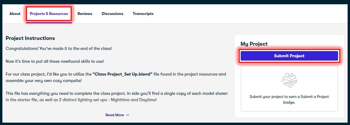
Transcripts
1. Introduction: Hi, my name is Harry and I'm a professional three D artist with over a decade
of experience. I've been making blender
beginner tutorials for a while now In this class we'll be using this
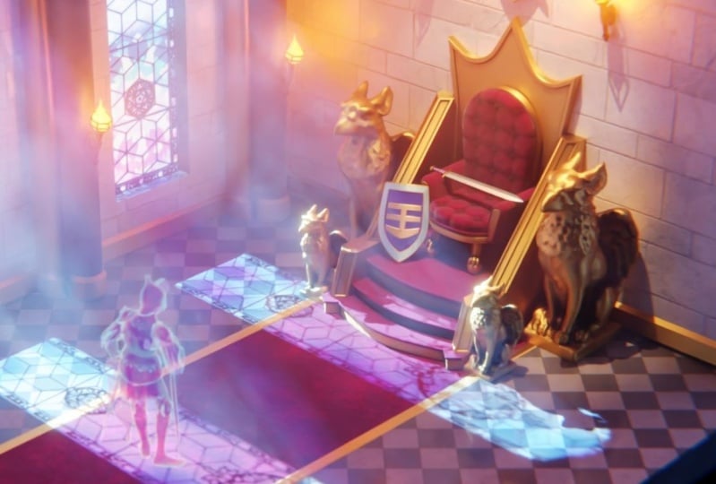
magical wizard study to learn the basics of
materials and blender. You'll have access to
this complete scene as both an untextured
starter file and a fully textured end file by downloading them from
the project resources. Please note, Blender
version 4.0 or later is required to follow along with this class and use
these provided files. Throughout this
class, we'll be going through the entire
process of learning material creation from a
beginner's perspective to avoid as much
confusion as possible. That means I won't be
skipping any steps or going too fast for
you to keep up with me. While we won't be texturing every single object
in this scene, we'll focus on key
objects that cover many different nodes
and techniques such as metal emission for nel
image based textures, simple unwrapping and more. In addition to texturing, we'll also learn the append
feature in Blender to combine our two files together
into one complete file. And how to relink missing
textures in your scene. We'll also discuss how lighting affects your textures and how to set up a volume scatter material to create fog in
your final render. We'll learn how to use simple unwrapping techniques
to make sure your materials are
placed correctly on your model without
being distorted. I'll also show you how simple
compositing effects and blender can accentuate the look of your materials in
the final render. Lastly, we'll render our
final image and blender so you can share it
with your friends and family on social media. When we're done, you'll have all the skills you need to start creating awesome materials
for your own projects. For our class project, you either use a
provided studio file to create your own material from scratch based on
reference images, or you can make a
custom version of this wizard study
that's unique to you. I'll personally review
every project uploaded to the gallery and give you
feedback on your render. I hope you'll join me in this
beginner's journey through texturing and blender I'll
see in the first lesson.
2. Setting Up Our File: In this lesson, we'll
beginning our file set up for the
class. Let's begin. If this is your first time
taking a blender class, I'd highly recommend
you start with my complete beginners
guide to Blender First. This class was designed for the absolute beginner to blender and three
D art in general. We cover every single
necessary topic in order to get you up to
speed and running and blender. We'll accomplish this with
short and focused lessons that cover each topic from
a beginner's perspective, utilizing a well
organized starter file. We end the class with an
easy project where you set up and customize your
very own cozy campsite. With that out of the way, let's
continue with the lesson. If you have any questions at all throughout this class,
please let me know. Down the discussion
section below this video. I'll do my best to
help you out with any issues you encounter
during this class. The files I've provided already have most of their
settings done for you. However, we will need to combine them together into
a single file. This was mainly
done to get around the size limitations on uploaded files for
some platforms. However, it gives us
a unique opportunity to learn about this
very useful tool. First, make sure you have
all four blender files downloaded from the
class resources, as well as the
textures dot zip file. As a reminder, this class
in these files are made specifically for
Blender 4.0 or later. You'll need to make sure you
have that version installed. Now, place all of these
Blender files into a single folder and extract the textures folder
here as well. On Windows, you can
simply right click on this textures zip folder and
then choose extract All, then go through the
extraction process here. After doing that, you'll
likely have two folders here and then we can delete
this compressed zip version. We won't need this
one any longer. We can just select this
compressed one and then delete it before we begin using the append feature
to combine these files. Let's quickly learn how
to fix missing textures. To start with, open
the final file, underscore isometric
Wizard's room, underscore 01. That's
this file here. We can open it just
by double clicking on it or first opening Blender
and then opening it. From there, I already
have my file open. However, make sure
that the file you're opening is the one without
the word append in it. We'll be using the
append file later. Now that we have the file open, you may notice on
the left viewport here that many of these
textures are bright pink. If you don't see this bright
pink in the left viewport, go to the top option bar here. And then use your middle
mouse button to pan this bar back and forth so that we can see the
far right side of it. And then click on this button here to switch into our
Material Preview mode. Another reason you might not see this pink color is because Blender successfully located the textures as
you open the file. If that's the case, feel
free to watch along, but you won't need to
follow any of these steps. This pink color that we're
seeing is a warning from Blender that these materials should have had images
attached to them. However, it doesn't know
where to find them. This is because this file
was created on my computer, but now you're opening
it on your computer. The file paths have
changed during this transition from
computer to computer, and now Blender doesn't
know where they are. Luckily, this is
a super easy fix using the find
missing files tool. The first thing we'll need
to do is go up to file, then go down to external data. Then at the very
bottom of this list, we'll see find missing files. Now we can choose
this. This will bring up a file browser that
we can now navigate to. Wherever we save this Textures folder that we
extracted earlier, double click on this Textures
folder to go inside it. Now down here, we can
click Find Missing Files. Now hopefully for you,
on the left side here, all of these pink textures
have disappeared and now are replaced by
the actual textures. If for some reason
this didn't happen, go up here to file,
then save this file. We're going to save
directly on top of it with this new file path set up. And then we'll close
this file and reopen it. And then all of these textures
should be back to normal. The quickest way to reopen
this file would just be to go to File, Choose Open, and then navigate directly
back to this file, select it and then reopen
it on top of itself. You can also just
close the file and then double click on
the file to reopen it. Now with our file reopened, all of this pink
has disappeared. And now we can see these actual textures here that
are supposed to be there except for this
little pink crystal over here, which is actually pink.
And it's not an error. Now that we have
our textures fixed, we won't actually be using
this specific file for class. However, we can save this
file so that you can use it as a reference during the class or after
if you'd like. Again, to save it,
just go up here to file and then choose Save. Now let's open the actual file that we'll be using for
the rest of the class. We can do that by
going up here to file open and then navigate
to the starter file. Underscore Isometric Wizard's
room under score 01. Again, we'll want to
choose the one that does not have the
word append in it. With our file selected, we can
just go down here to open, and that'll open the
actual starter file. We won't need to
relink these materials as I've already removed
them from the models. We'll be recreating them from scratch later on in this class. You'll also notice
that there seems to be missing models on
the right side here, such as the table and chair. That's where the append
feature comes in. With the append feature, we can combine two files
together into one. We do this by taking any
number of settings materials, or models and more from one file and appending
them into another. In our case, we want to append the missing objects
from another file into this one so that we have a complete scene to do this, we're going to go up here to
file, then down to append. It's the one with a little
paper clip next to it. Now make sure you navigate
to where we saved our four blender files
from the beginning. Then we're going to
choose starter file, a Pend Isometric Wizard
room, underscore 01. With our file selected,
we can choose a Pend. Now this will show us all the different things
inside the scene. The main one that
we want is object, so we're going to navigate into object here we'll see all
the objects in our scene. We'll select the very
top one, padded stool, hold shift, Then
select the last one. And that'll select everything in this list from top to bottom. Now down at the bottom right, all that we have to
do is hit a pend. And that will add these objects
directly into our scene. And then we can see it here. Lastly, let's make sure
that we organize our file, just like the rest
of it is right now. The files that we added in here, these objects were just popped into this
list by themselves. They're not inside a collection like all the other objects. To fix that with these
objects still selected. So we can just select all
of them from the list Here, we're going to hit M
for move to collection, then we'll choose
New Collection. We'll name this furniture. Then once we have our name typed in here, we can hit okay. And that'll place all
of these objects here into a nice collection
that we can collapse so it's organized
like the rest of the file with our files
successfully combined. The last thing we need
to do is go up here to file and then choose Save. That way we don't lose any of our progress for
the next lesson. In our next lesson, we'll
learn the differences between the different Viewport
rendering modes and how to use the region render.
I'll see you there.
3. Viewport Render Modes and Region Render: In this lesson, we'll learn
the differences between the viewpoint rendering
modes and how to use region renders. Let's begin. Before we learn how to
texture our objects, we'll need to be able to
see them on our models. First, that's where the viewport
rendering modes come in. We'll be using our
two viewports to view our scene with two different rendering modes while we work. Now let's discuss the main
modes that we'll be using. First off, the right viewport is using the solid rendering mode. This is the most
common view you'll see while modeling or animating. As it's fast and informational, we can clearly see all
the forms of our model, but we aren't able to see
any of our materials. Up here at the top right, we can see that if we hover over this blue highlighted button that we're currently
set to the solid mode. Now let's move on to
our first full color Viewport rendering
mode, Material Preview. We can enter the Material
Preview mode by clicking this little button here directly to the right of the solid view. Our viewport here
will change over to the exact same mode that's currently being displayed
on the left side. We don't need to
see the same mode shown in both viewports. I'm going to switch this
right one back to solid. Now we'll just look over
here at the left side. If for some reason
this left viewport isn't currently in this
material preview mode, it might be because
it didn't open in it. If that's the case, again, we can use our
middle mouse button click in your
middle mouse wheel, and that will allow you to
pan this bar at the top. Pan it all the way
over to the left, so we can see these buttons. And then just simply
click on this button here to switch into the
Material Preview Mode. Material Preview Mode is pretty much exactly
what it sounds like. It allows you to
preview your materials. An important thing to
note is this view uses the EV render engine to
preview your textures. As such won't 100% match the look and feel
of your final render. This is because we're
using the cycles render engine to create
our final image. The difference
between EV and cycles isn't something
that we're going to dive into at the moment. Just know that that's
the reason why these modes look so
drastically different. With all of that said,
this material preV mode still has a lot of uses. The main benefit
is how fast it is. It's nearly as quick to
render as the solid view. If we rotate around here, we can see our materials here
in pretty much real time. There's no delay to render them. It also gives us a clear view of our textures in a
well lit environment. We don't need to look through all the shadows and the
darkness of our scene. If we're trying to
make a moody scene in order to see our textures, we can pretty clearly see them here in a test environment. This bright, unobscured view is an important
tool when we need a clear idea of what
our texture looks like without any obstructions
such as shadows or fog. Now that we're done seeing
the speed of this view, we can hop back into
our camera view by simply clicking this
little camera button here. Lastly, let's discuss the
rendered viewpoint mode. We can enter the
rendered viewpoint mode by clicking this far
right button here. This bar we hover over this, we can see here
it says Rendered. And if we click it, it'll switch our view here to a much more
accurate view of our scene. We'll notice right
away that this view is pretty different from the
material preview mode. First off, the lighting
is now accurate to the actual light
placement and colors. You'll also notice, however, that this view is
much slower due to the added quality and
accuracy of the view. As we zoom in here, we'll notice that our
file actually takes a few moments here to clear up and show us a
view of our scene. Even still, it's still blurry as it continues
to render it. Anytime we zoom in or out or
pan our view left or right, we're going to have to wait
for it to clear up this view. This is the tradeoff
in order to see the actual lighting
conditions and material conditions
of our scene. Now that we know about the
uses for each of these views, let's learn how we can speed up our workflow just a little bit. We'll be doing this using the rendered viewpoint mode and a tool called Region Render. Region Render will
allow us to limit the amount of view
currently being rendered. This will significantly lessen the amount of time it takes for Blender to display our changes while using the rendered
viewpoint mode. By using Region Render, we can retain the benefits of a more accurately lit preview while mitigating some of the slowness to use
this region render. First, make sure that you
are in rendered mode. You won't be able to do this
inside material preview and you really don't
have any reason to. And now hit Control and
B at the same time. Hold down control
and then hit B. And then here we can see
we have a cross hairs now. Now we'll just
click and drag over the area that we'd like to
set the region render for. I'm going to drag mine over top of this treasure chest here. Now after letting go, we can
see here that everything in our view has disappeared except for the area
that we highlighted. Now that we have
our region defined, blender will put all
of its rendering power just into this area
that we've defined. This will allow us to make
changes and zoom in and out without having to wait quite as long for it to update. Rather than waiting for it to render the entire scene here, we're only waiting for it to render this small square area. Now even with our
render region set up, this is still
significantly slower than using the material
preview over here. We can see here that
it's much faster. We can do whatever we want. Really in this it's
basically as fast as this solid view on the right. However, it's not
nearly as accurate. If we want to see a
more accurate view, we do need to switch back
to our rendered mode. When you're done
with your rendered region and you want
to get rid of it, we can hover our mouse over
this left viewport again. And now hold down control Alt. And then hit the B key. So we're hitting
three keys here. Then that will clear
our render region. If you have difficulty with
either of these key binds, you can instead
use this top bar. Click in your middle
mouse button to pan it to the side until we find this view section
here. Now click View. Go down to View Regions, and then here we can either
choose Render Region, which will allow us
to then bring up the crosshairs and draw
our render region. Or if we already have one, we can choose clear
render region, which will get rid
of it and make it go back to the
entire camera view. The last thing that I'd like
to show you is how I've hidden the lights in this
scene on the right viewport, you'll notice that
in the rendered viewport here on the left, this scene clearly
has lights in it. However, you can't see them over here in the right viewport. This is because I have them
hidden using this Show overlays option over here
in the right viewport. If we go up to this menu here with these two
overlapping circles, we can click this drop down
menu to see all the options. Then here under objects, you can see I have the
word extras unchecked. If you turn this back on now we can see all the different lights that we have in the scene, which is what you're seeing
over here on the left side. For the majority of this class, we won't be focusing
on lights at all. You'll want to leave
these hidden as this will keep them out
of the way as we work. And it'll clean up your
view a little bit, again over here on the right. And we want to turn them off, at least visually
in this viewport, but not actually turn
them off in our render. Click this little drop down here next to this overlapping circle, and then uncheck extras with these explanations
out of the way, we're ready to move
on with the class. In the next lesson, we'll learn the differences
between the terms, shader, texture, and
material. I'll see you there.
4. Shader vs Texture vs Material: In this lesson, we'll learn
the difference between the term shader,
texture, and material. Let's begin. Don't worry, this is one of our only
pure theory lessons. And I'll try to keep it quick. These are important terms
that you'll want to know, that you have the best
foundation possible. Just sit back and relax as we quickly
discuss these terms. There's no need to
follow along in your starter file
for this lesson. These three terms have
similar meanings. However, they are technically
different things. Let's quickly discuss each
of these terms and get a basic understanding of how each of them differ
from each other. As a quick disclaimer, I am unfortunately guilty of using these terms
somewhat interchangeably. I'll do my best
throughout this class to use the correct term for
what we're discussing. My hope is that by explaining these terms to you early
in your blender journey, you won't fall into the
same bad habit as I have. The most important thing is that regardless of the word used, you at least have a
general understanding of the small differences
between these terms. With that out of the way,
let's jump right in. What we're looking
at here on screen is an example of a relatively
simple material. It has all of the most
common nodes in it and I've gone ahead and labeled them clearly for you on screen. These labels won't exist in your own materials unless you
take the time to make them. However, for the
sake of example, this should keep our
lesson nice and clear. First term is shader. We can find that over
here in this green block. You can think of a shader as
the brain of our material. You can't really have a material without a shader of some sort. It's responsible
for the basic look of the material you're creating. Such as controlling what color it is or how reflective it is. The most basic materials
such as glass, metal, or reflective solid color, can be made only using a shader. In blender, the
most common shader is the principled BSDF shader. Virtually all of
the materials in this class will be
using the shader. Shader nodes within blender will have a green bar at
the top of them. In this on screen example, this large green node here is the shader
in this material. Each of these squares on
screen is considered a node. However, each node has its
own type, such as shader. In the case of this
large green square, we'll explore more
about what a node is and how they're connected
in a later lesson. Our next term is texture. We can find that over here
in this large orange block. Typically, if I use a term
interchangeably with material, this is the one that I use. Again, this is a bad
habit of mine and you should try to use the
correct term when you can. What exactly is a texture? Texture is typically referring
to an image such as a Jpeg loaded into blender to control a shader parameter
like the color. It's a procedurally generated
texture native to blender, such as a noise pattern that
is used to control a shader. Parameters, such as the
roughness procedurally generated in this
case means that it doesn't rely on a
pixel based image. It's a pattern or an image
that is created using an algorithm that can be endlessly adjusted
by changing values. Texture can also refer to utility nodes that
change some parameters, such as texture coordinates
or math operations. Though I will typically refer to these just as nodes
during the class, as I don't want to
confuse them with the more obvious
examples of textures. Again, in this on
screen example, the left side here in
this orange block, these are all
considered textures, as well as this gray block here. These are considered textures. However, there are
more utility nodes based on the way I teach them. The last term we need
to discuss is material. We can find that over
here inside this red box. You've heard me use this word
quite a few times by now. I'm assuming through
context that you have an idea of what
this generally means. Essentially, a material is the final output of
your shaders and your textures combined together into something that you can
actually see on the model. You don't apply a shader or a texture directly to a model, but you can apply a material containing a shader or
a texture to a model. It's a small but somewhat
important distinction. The material is like a
container holding all of the different parts
that give your model its surface properties, like the images, the colors, the reflection, the bumpiness,
or the transparency. With these brief
explanations out of the way, you should be better
informed when you hear these words when used
in regards to blender. In the next lesson, we'll
learn the basics of the principled BSDF shader node. And we'll end the
class by creating a golden metal for our
scene. I'll see you there.
5. Shader Node Basics and Gold Metal: In this lesson, we'll learn
the basics of shader nodes. And we'll end the
class by creating a golden medal for our
scene. Let's begin. We're going to start by
learning a little bit about the anatomy of nodes
in the shader editor. That way you understand
what we're doing throughout the class
and why we're doing it. Let's head over to the shading
workspace at the top of our interface so we can see where we'll be doing
the bulk of our work. We can find that tab up
here just by clicking shading that we'll switch us here to our
shading workspace. I've already customized
this work space a little bit for us to
free up some visual space. On the top, we
have our viewport, just like the previous
layout work space that we were in currently. It's set to the
material preview mode. We can tell one by
looking at it and we can see that we have our materials
previewed in the scene. We can also look up here
at the top right and see that this second button
from the right is checked. If for some reason your
scene is not currently using the material preview
mode on this viewport, be sure to switch into it. Now you can do that
just by clicking this button here on the bottom, we have our shader editor. This is where the magic
happens, so to speak. We'll be assembling our
materials down here by combining nodes together into increasingly
more complex materials. The shader editor at the
bottom of the screen can be navigated using
your mouse wheel. If you click in
your mouse wheel, you can pan the view around. If you scroll your
mouse wheel in and out, you can zoom closer or further
away from your material. We'll be working on a golden metal material in just a moment. Let's prepare for
that by selecting the lesson alchemy stand object. We have two different
ways we can do this. The first is we can just go up to our viewport
here at the top. And then use our
mouse wheel to scroll in to the bottom
here of this jar. And then we're going to select
this metal object below. This is the alchemy stand that we'll be making this
golden metal for. Alternatively, we can search the word lesson in the search bar at the
top of the outliner. If we go over here
to the top right, in the search bar
at the very top, we can type in lesson
L, E, S, S, O, N, and I've named every
single object that we'll be using inside a
lesson with the word lesson. To begin with, it's really
easy to find them in the list. You don't have to search
around for them again, If you'd like to select
it from the list, we'll be selecting
Lesson Alchemy. Stand here, and we can just
click on the name here. After you have this
object selected, make sure you zoom in on
your viewport here at the top so you can get a better look at the alchemy stand. If you accidentally
rotate your view at the top and you pop out of
your camera view like this, you can just click
on this little camera icon here to the right. That'll jump you back
into your camera view. As a quick note, this
object already has a placeholder material
applied to it in order to simplify the process if this model didn't already have
a material applied to it. This name here where
we see Golden Metal. Instead of seeing the name here, we would see the word new. And then we would click that to generate the material
that you see here. I haven't changed anything
about this material. This is the default material. It's I've already named it
for you just as an example. And you don't need to follow
along here if I remove this material and then I
have this object selected. You can see here
now it says New. And then I can click
New and it makes the exact same material
that I had on there before. It's just no longer named. If I name this gold metal, we're basically back
to where we started. I am, however,
going to undo this just so I'm at the exact
same state that you were in. Okay, with that out of the way, what exactly are we looking
at inside the shader editor? As mentioned in the
previous lesson, materials are created
based on a node system. If this is the first
time that you're seeing the node system
within Blender, let me give you a rundown
of the anatomy of a node. Each of these squares
that we're seeing down here in the bottom
are called nodes. Nodes pass their attributes from the left side toward
the right side. This node is currently passing its attribute to this node. Each node will have colored dots on the sides called sockets. You pass the properties
of a left node to a right node by
connecting its sockets together with these
lines here called wires. To add more complex effects, you'll simply add
the appropriate node and connect it to the
other nodes in the system. The most simple
materials will only use a single shader node plugged into the material output node. Now that we have a basic idea of what a node is and
how it's used, let's go through a couple of the most useful parameters on this principled
BSDF shader node. First of all, this
principled BSDF shader node, basically the default node, it contains most of
the basic properties that almost any
material will need. We could connect more nodes to the system to add
more complex effects, but for simple materials, this single node
has a lot of power. You also notice
that when I deleted this gold medal
material placeholder that I have on the object now, and then added a
brand new material, it started out looking
exactly like this. A default material will have this principled SDF
already created for you. We'll be starting at the
top of this node and I'll explain the most useful
and common properties. I won't be explaining every single property at this moment. However, I encourage
you to mess with all of these sliders on your own and see how they affect the
look of the material. We zoom in here. Starting
at the very top, we have our base color. This property is pretty much
exactly what it sounds like, It changes the color
of your material. For this simple gold medal, we'll need a pale yellow color. To change the color from white, we just need to click on
this white color block here, and that'll bring up
our color picker. We have a couple
different modes to adjust the color
for this setting. However, the most
commonly used is the HSV mode, which is here. This stands for Hue
saturation and Value. The most simple way
to choose a color would just be to go to
this top color wheel here. And then click anywhere
on this wheel. And we'll move this
little white dot to somewhere within
this rainbow. Wherever we place the dot
that will place the color. If we wanted a
pale yellow color, we can move this dot here to somewhere between
yellow and orange. We'll also notice that
in this circle that the center of it is less
colorful and less saturated. The outside of the
circle is more colorful or more saturated. If we place the dot
further to the outside, we'll get a more vibrant yellow. And if we move it
closer to the center, we'll get a more pale yellow. Over here on the right side, we also have a scale
from white to black. Again, we have a dot here
that we can move up and down to change how dark
or light this color is. The other way to
adjust the color would be to use the sliders
here at the bottom. These sliders are the
most useful when you have an exact color in mind
and you know the hue, saturation and value
of this color. I typically use the color circle here at the top to
get a basic color. Then use the sliders
at the bottom to make fine tune adjustments
to that color. As mentioned before, we need a pale yellow color for our gold material.
Let's set that up now. I know the exact
settings for this color, so feel free to follow
along with me or do your best to match the color with your
preferred method. Starting from the top here, we're going to click
on the word hue. Then we can type in 0.085
and then we can hit Enter. And then we'll
just be going down this list here. Saturation. We'll type in 0.85
Then for our value, we'll set this to 0.8 If you didn't want to click
on this to type in a number, you can also just click and drag on here to
slide this around. Although this is a little
bit more free form and more similar to using
just these bars up top. Again, I'll set this back to 0.8 Now that we have
our color set up, we can move on to
the next parameter. Our next setting is
the metallic slider. This slider does pretty much
exactly what it sounds like. It makes your objects
look metallic. If you have the
slider set to zero, your object isn't metallic and if you have it all
the way up to one, then your material is metallic. I won't be going into the
exact differences between metallic and
nonmetallic materials as I think everyone has at least a basic understanding of what it means
when I say something is metallic or is not
metallic, I will say. However, you don't
generally want this number to be
anything but zero or one values in the middle like 0.5 aren't all
that realistic. You might cause your
material to look a bit odd. This is because in
real life things are either metallic
or they're not, they're not usually
someplace in between. However, feel free to
play with this effect and get a more stylized
look if you'd like to. In my mind, they wouldn't
have made this a slider with middle values if
they didn't want you to use them, at
least some of the times. For now, let's set our metallic slider all the way up to one. That way we have a
metallic material. We also notice up here in our viewport that
our alchemy stand is looking less like painted yellow and more
like metallic gold with deeper shadows and
brighter highlights. Next up, we have our
roughness slider. This slider controls how sharp or blurry the
reflections caused by the IOR slider or the metallic slider are
more on that in a moment. If we set this roughness
slider all the way up to one, we'll make our reflections
as blurry as possible. This is the setting for things like concrete or sand paper. If we set it all the
way down to zero, our reflections will be
as sharp as possible. This is where you'll find
things like mirror or chrome. Based on the type of metal
that we're trying to create, we can actually leave
this roughness slider set to 0.5 which is
actually the default. If you wanted a more sharp
or chrome like metal, you could lower this value slightly to something
maybe in the 0.25 range. Then we'll see here. And it makes the gold a
little bit more shiny. But for my example, I'm
going to leave it at 0.5 Now let's move on to
the IOR slider down here. This slider controls
how much reflection is present on your materials. However, we'll notice if we start sliding this
back and forth, we don't actually see any
change happening on our model. It looks pretty much exactly the same regardless of where
we put the slider. This is because the metallic
slider we just set to one is essentially
overriding this IOR slider. You can think of this
metallic slider as making your material 100%
reflective at all times, and as such, won't allow
it to drop any further. For the sake of
example, let's set our metallic slider back
to zero for a moment. So we can see what the effect
of this IOR slider is. To do this, we can
just click and drag a Metallic and drag it
all the way down to zero. We can also go down here
to our IOR slider and set it back to the
default of one point. 45 and then it enter. Ior stands for index
of refraction, which is a scientific way of calculating how much
light is reflected off of a surface based on its angle relative
to the viewer. Most materials will reflect more light on faces that
point away from the viewer, like the edges of
this bottle stand. And it will reflect less light as the faces point
towards the viewer, like the center of
the bottle stand. By increasing this IOR value, we allow more and
more light to be reflected back on the
faces pointing towards us. Meaning the object will look
overall more reflective. If we set this IOR slider
all the way down to one, which is the lowest value, we'll see that it removes all reflection from our material. Typically, setting this
slider to one and removing the reflections is meant
for a more stylized effect. As almost nothing in real life
has no reflections at all. This would even
include things like concrete, sandpaper, or fabric. If we increase this IOR slider, our material will get
more and more reflective. Though you won't really notice much change once you
get to about 50. Once your IR is set to 50, it technically goes higher. But visually you're not really going to notice much
of a difference. Now let's set this
back to the default of 1.45 Before we move on, we'll also be
coming back to turn the metallic slider back
to one in just a moment. But first we need to
discuss our next setting. The rest of the settings in
this principled BSDF node are collapsed into their
own little sections. We can see those here. Let's go through the most useful settings now inside these sections. First, let's switch into our
rendered viewpoint mode. However, this will give us a slower but more accurate view of our material for a moment. To do this, we can go up here
into the top right and then click on this far right button here to switch into
the rendered view. You can also hit Control and B to start drawing
out a render region. And we're just going to drag
a render region over top of just this little stand here to make our preview
a little bit faster. An alternative method to
make this render region would be go up here
to the view tab. Click this, go down
to View Regions, and then choose Render Region. That I'll give you
the exact same thing where you can just
drag out an area. Okay, let's move on
to our next section, which is here called Subsurface. We can click this
little arrow here to twirl open our
subsurface options. That will show us all the
options with inside it. This subsurface parameter isn't one that we'll be using
for our gold medal. However, let's
quickly discuss it. You have a basic idea
of how it's used. This subsurface
section allows you to adjust how light scatters
through your material. Subsurface scattering
is most common in real life for things
like candle wax, milk, or human skin. By setting this weight slider
here all the way up to one, we tell blender
to allow light to bounce around under the
surface of our material. This effect is different to how glass or water is rendered. However, as it isn't letting
light pass straight through it and it is instead scattering around
underneath the surface. We can also adjust the
scale value here below to change how far the light is allowed to scatter
inside of our object. The higher your value for scale, the more translucent
your object will appear. We can see here by
increasing this number, our object here is
much more scattered and almost like a frosted glass. But again, don't think of this as glass as
it's not letting, it's just allowing light to
bounce around inside of it. To turn this effect off, all we need to do is go down here to where
it says weight. We can drag it all
the way down to zero and that will remove
the effect entirely. We don't have to
worry about what this scale value here is set to because we're
not even allowing light to scatter underneath it. It doesn't matter what
the scale is set to. Okay, now we can collapse
this subsurface section here. We can go back up to
our metallic slider. Turn that all the
way back to one. Our metal is looking
more metallic. Now we're ready for
the next section. Now let's go down
here to where it says specular and then twirl
these options open. The specular section
has settings that adjust the look
of our reflections. This IOR level slider here, we'll fine tune the
amount of reflections. If we slide this all
the way up to one, we'll double the
amount of reflections. Our reflections
here will just be twice as bright as
they were before. And if we set it down to zero, we'll remove all of the
reflections that we have. Just like setting our
IOR value down to one. Now in this specific case, it is competing with
the metallic slider. It still looks
reflective at the top. If we set it back to the
default value of 0.5 now, the reflections aren't being adjusted one way or the other. They're not being made
more bright or more dim than what the IOR
slider is currently set to. I would say in general, you should get your
reflections where you'd like them using
this IOR slider first. And then fine tune them
if you need to with this IOR level slider
underneath specular. Next up we have our
tint color here. This will allow us to add
colors to our reflections. If we wanted to, we could
select this tint color here and then change it to something more
vibrant like red. We'll notice though,
up on the top, that this effect is pretty
subtle in a metallic material. We'll get a more
noticeable effect if we scroll up here to the top. Set our metallic
back down to zero and then increase our IOR
value up to something higher. Then we'll start seeing
this red effect, a lot more strong. For now, let's set our
metallic back to one, our IOR back to 1.45 then we'll go down to tint and we'll
change this back to white. We can do that just by
setting the saturation down to zero and setting
our value to one. Next We have our anisotropic and anisotropic
rotation sliders. This next pair of parameters
is somewhat unique to metal materials as it's the
most common place to find it. Used in basic terms, the anisotropic
slider will elongate the default circle highlights
into longer ovals. By increasing this value here, the anisotropic will elongate the default circular reflections into longer oblong reflections. This property can be
seen in real life on materials like chrome
metal or brushed aluminum. However, due to the
shape of our object up here being made of
essentially long tubes, this anisotropic parameter
isn't super noticeable. We'll get the strongest effect by setting this all
the way up to one, just so we can see the most extreme version of
it on our model. Up here, the anisotropic
rotation slider is exactly what it sounds like, it rotates the
anisotropic reflections. Again, this isn't the best test object for this parameter. But if we set this
anisotropic rotation to 0.25 this will rotate our
reflections by 90 degrees. This 90 degree rotation
makes the reflections run perpendicular to
the object rather than parallel along
the typical direction. For now, let's set both of these values here
back down to zero, as we won't really be needing them for our metallic material. Now we can go back up
to our top viewport, hit control Alt, and at the same time to
clear out our render region. Again, if you didn't
like doing that, you can go up here to view view regions and then clear
render region instead. Then we can also
switch this back to the material preview section. We'll switch it
back to this mode and that I'll speed
up our preview. There are plenty of
other parameters on this principled BSDF node that will cover
in later lessons, but for now we've got
a pretty simple but effective gold material
for our scene. The next lesson
we'll be creating our first image based
material and learning about the node regular add
on. I'll see you there.
6. Wood Floor and Node Wrangler (Part 1): In this lesson, we'll be
creating our first image based material and
learning about the basics of the node
reangular add on. This lesson will be
a bit of a long one, so I've preemptively broken
it into two lessons. We'll finish the
concept started here in the next lesson. Let's begin. We're going to start
this lesson by enabling a very useful add on that's
built directly into Blender. All we need to do is turn it on in the
settings to do this, go up here to the Edit
button at the top left, then go down to Preferences. Then this window, we'll go to the Add on section
here on the left, so we can just click
on the word add ons. And then in the search bar
here at the top right, we're going to type
in the word node N, O, D, E. Then you'll want to check on the box
next to node wranglar here. After you have the
box checked on, you've successfully
enabled the add on. Again, this is a free
add on native to Blender and won't require you to restart your
program or anything, and it doesn't cost any money, it's just built
right in the node. Angular Add On is probably one of the most used
add ons in all of blunder due to the tons of different features it adds
to the shader editor. We'll be explaining
these features in more depth as we proceed
through this class. But in general, this add
on simplifies a lot of the tedious operations
when making materials. It also adds some new
functionality that allows us to easily
preview individual nodes. For now, let's move on to creating our wood
floor material. This will be our
first material using image textures to
control settings on the principal
BSDF shader node we used to create
our gold material. First, we can close this window here now that we have
our Doe enabled. And then again, we're
going to go up here to the shading workspace just
by clicking this tab. Now we can select the
wood floor object. Either in the Viewport,
which is relatively easy, It's a pretty large object, so we can just select it here. Or if you'd prefer, again, you can just search the word lessen up here at the top right, and then find the object here. Lesson wood floor. Just like the gold
material that we created, I've already applied
a placeholder white material for
us to start with. Again, this placeholder
material we see here is no different
than if this object had no material at all
and we just clicked the new button and generated
a brand new material. We'll be customizing
this placeholder into an aged wood plank floor. For our wizards study, we're going to jump right into loading our texture images. And this new node,
angular add on, will be at the forefront
of this process. Normally, without this add on, we'd have to drag our
images in one by one. You don't need to follow along with this process
as I'll be showing you something that you no longer need to do due to this add on. But it's important
to know what this add on is actually
doing for you. As I mentioned, we would
actually need to bring our images in and then hand drag them down here one at a time to place these images
onto this field here. And we'd have to do that
for every single image that we want it attached
to this material. Then we'd have to go through, select each one of these images, decide which of these
sockets to connect it to wait for the
material to update. And then we'd also have to
change the color space for this image based on what the
image actually is doing. Then we would need to add
any supporting nodes, such as a texture
coordinate or mapping node. And then again,
manually adjust these, touching these all together
to get the desired outcome. After this was done,
we need to do this three more times in the case
of this wood floor texture, because there's three more
images that I need to drag in. As you can see, this is
a pretty tedious process with many parts and some are a little bit more
annoying than others. Luckily, the node
angular add on is going to make this
significantly easier for us. First, I'm going to
start by deleting these nodes here as
I won't need them, and we'll be using
the add on instead. Now the first step to
using this add on is first to just select this
principled BSDFshader node. That way it knows what to
connect these images to. We can tell it's
selected because it has this little white
high layer around it. Now we're going to hold
down Control Shift and then hit T to bring
up this menu here. Now navigate to wherever
you've saved your Textures folder that
we unzipped earlier, and we'll go inside here. Then the textures we're
looking for are wood planks. We'll go into this
folder as well. Once you've found the four
images for this texture, you can just drag select over top of them to select all four. Then go down here and then click this blue button to automatically load
them into the program. Now we can zoom out here
to see what it's done. We'll notice now that
the node Angular add on, has taken all four
of these images and connected them
automatically with all the required
support nodes to the correct places on the
principled BSDF shader node. We could basically
call this material done at this point
if we wanted to. But let's explain things a
little bit further so you have a better understanding
of what actually happened. First, let's look at
these texture images. You might have noticed
when we were selecting them in the list before
we imported them, that each of them
had a unique name. The add on uses the naming
convention of these images, such as the word
color or roughness at the end of it to know which
socket to attach them to. This image here was the
color and it knew that it was the color
because of the name color at the end of the name. If I mouse over the name here, you can actually see the
name of the file below wood planks, color peg. And then the same thing down
here for the roughness. If I have mouse over
this, you can see it was called wood planks
roughness Jpeg. It knew to plug this
into the roughness. Another thing you'll
notice that it's created these large gray blocks
here called frames, to help organize these images. If we click off of these
nodes to deselect them, we'll notice that
if we click and drag this large gray block here, that we can actually move all
of these at the same time because they're all attached
to this specific frame. It's also added
little labels here at the top of them just so we
know what they're doing. This is a relatively
simple material. All things considered,
these frames aren't super necessary, but it's still a nice
thing to have regardless. And it's something the add on
does automatically for you. Another thing that this
add on does automatically, while loading the images and connecting them
to the right place, is changing the color
space for each of these images based
on its intended use. If we zoom in here on
the very top texture, we'll see under color
space here, it says SRGB. The primary use of this
color space, dropdown menu, is to change a
texture from SRGB, which is the default
to non color instead. We'll notice that
if we move down this list where
the top one here, which is the color,
is set to SRGB, the others are set to non color. Let's first explain what
these two modes mean. In basic terms, the RGB
mode is the default. When you import an image. This mode generates
what you would consider to be a normal
looking color image. It will produce a
color image with bright highlights and dark
shadows like you'd expect. This RGB mode is used for any texture image
that you plug into the Base color socket here on
your principled BSDF node. While SRGB is the default mode, it's not actually the
most commonly used mode. We'll notice as we
move down this list that basically every
other texture here, they're all set to non color. The non color mode is the most
commonly used setting for any texture image that isn't plugged into our
base color socket. When you hear non color, you might assume
that that means that the image is now
black and white. However, that isn't
actually the case. What it's actually changing
is the gamma of the image, which affects how
light and dark values are distributed
within your image. An image set to the
non color mode will appear to be very washed
out In low contrast. However, most images plugged into sockets like roughness or normal or displacement are meant to be viewed this
way To work correctly, we can see an example of
this washed out look if we scroll in here to our
base color image. And then change this color space by clicking on this drop down from SRGB to non color instead. Now if we look at our wood floor appear being displayed
on the color channel, the image has lost much
of its color and no longer looks like a saturated
and contrasty image. If we zoom in here, we can see that it's not actually
black and white. It's not removing the color, it's just washing it out. Let's set the color
space now back to SRGB, which is down here
at the bottom right. The specifics of how each of these modes work isn't
super important. But you should try to remember
that all images aside from your base color image
should be set to non color in order to
have them work correctly. Luckily, this node,
Angular add on, has already handled
that for us and left every other one aside from
the top set to non color. Now let's go through some of these newly created nodes and explain their
purpose and how they affect the principled BSDF node. Firstly, it's important
to understand what plugging an image into a
socket actually does for us. As I mentioned before, this base color texture
image has been plugged in to this base color socket on our principled BSDF shader. By plugging an image or
any node into a socket, we're overwriting the
original parameter and replacing it with
the information generated by that new node. In this case, we're replacing the default white base color with an image of wood planks. Instead, you can see
here that this white box here has actually
just disappeared because we can't affect it. It's being overridden, this
image that we've used. This allows us to create
more complex materials by substituting solid colors
with any image we'd like. Now let's move down this
list and explain how each of these images
affect the final material. Next up we have our
roughness texture. Let's utilize another useful feature of the node, Angular. Add on to preview this
texture on our model. To use this feature,
we're going to hold control and shift
at the same time. Then we're going
to left click here on this roughness texture node. We'll just left click it with the control and the
shift key held down. This will override the currently combined node network that we've made and instead display
only the selected node. In this case, it's the
roughness texture. That's what we're seeing
here applied to the model. Now that we can see
the roughness texture, what exactly is it doing for us? Well, remember from
the past lesson, when making the gold material, we had a zero to one slider for roughness that we
could use to make our materials reflection
more or less blurry by utilizing this
black and white image. We've instead controlled
these zero to one values with black and white
pixels inside this image. In the areas of this texture where the image is more white, the reflections will
be more blurry. In the areas of the texture
that are more black, the reflections will
be less blurry. This means by using this image, we're able to have many
different levels of blurriness or sharpness
in our reflections. And we can control exactly
where they are based on where the black and white pixels appear in this texture image. For many materials like
these wood planks, controlling the roughness
and varying amounts across the material rather than all at once is a vastly
superior method. As mentioned before though, we'll notice that the
slider is completely gone. We're relying entirely on this roughness image
that we've plugged in here to control
the roughness values. Let's continue down the list of textures and move on
to the normal texture. We can see that down here, just below the roughness. In order to see the next
two textures effects, we're going to need to
switch to the rendered mode instead of the
Material preview mode that we're currently in. To change the mode again, we can just go up
here to the top right click this far right button here to turn it to
the rendered mode. We can also zoom out
a little bit here, and then we're going to be
making a render region, so we're not rendering
this whole thing again. You'll do that with control
and at the same time, while hovering over
the top viewport here. And then just drag out an area here that has a lot
of the floor in it. Right here. Looks pretty good. Now I realize that Normal is a bit of an odd
name for a setting. However, it's referring
to how light is interpreted along the
surface of your model. You can also think
of this setting as controlling the bumpiness
of our material. Let's preview this image
on our model again, using the control and
shift holding those down and then left clicking this texture image
here called normal. We'll notice that this image
has a general blue color across it with little green
and pink mixed in as well. These colors are what
tells blender how bumpy our material is and how it should bend light
across the surface. One important thing to note with this normal map, however, is that it's only
creating the illusion of bumpiness on the
surface of our object. It doesn't actually move
any faces or vertices, and it doesn't increase the face count of our models either. It's also important to note
that this normal texture requires a normal map node in order to be
processed correctly. And we can see that here,
this little purple node, we can see that
this normal texture is first being ran through this normal map node to
convert it into useful data. And then this node is ran into the principled SDF node where it can be
correctly visualized, get a view of what
this is actually doing for our texture. Let's hold down
control and shift. Then over here we can click
on our principled BSDF node, so that we can see
the full texture here applied to our model. Now if we zoom in here,
we'll notice that this texture here
actually appears as if the light is going down into the cracks here between
each of these planks. It doesn't just look like
a completely flat texture, this light is actually
bending around it and casting shadows and
catching highlights. This is thanks to the
normal texture here, as well as the displacement, which we'll talk
about in a moment. If you wanted to
increase the strength of this normal map and make this
bumpiness more prevalent, we could increase the
strength slider down here. And we can do that just
by dragging this up. The higher we make it, the more bumpy our texture
is going to be. Now ten is an
incredibly high value and you probably wouldn't
be able using this, you might only ever go
above to maybe two. But in the case of
our texture here, I think one works
perfectly fine. So we'll set our
strength down to one. You can also lower this
value if you think that the normal map is
a little bit too strong and you want
it to be less bumpy. Now we can move to the
last image texture. The displacement, which is here directly below
normal displacement, visually looks similar to
the roughness texture. However, it behaves more
like the normal texture. If we hold down
control and shift and then left click on this
displacement texture, we can see it previewed up here. We can also see that it's actually a black
and white image, not the blue that
the normal map was. However, unlike the
roughness texture, this actually controls
the displacement of the vertices and
faces of our model. The white areas on this
texture are pushed outward and the black areas are pushed inward in this way. It is similar to
the normal texture, but it does have some
key differences. The main difference is that
while the normal texture has no effect on the
actual shape of our model, the displacement texture does
actually move the geometry. For this reason, we will
want to be pretty careful about using displacement
too often in our scene. And it should be
reserved for materials where it's the most
impactful and necessary. Another similarity to
the normal texture is that it also requires a utility node to convert it into useful data
for the material. We can see that node down here. Let's zoom out here
on the bottom. And then hold control
and shift and left click the principled BSDF shader so we can see the full
result of this material. Another thing that
we'll notice is that this utility
node down here, this displacement
node, doesn't actually plug in to this
principled BSDF node. Instead, it bypasses it and goes all the way to
the material output, and then plugs into this
displacement socket here. If we go down here
to the utility node, this displacement node here, we can adjust how strong this push and pull effect is by changing the scale
value on this node. Right now it's set to
the default of one, but let's lower ours down to 0.2 so that it's not too
strong on our material. We can see after lowering this, we've gotten rid of
this shadow that we were seeing along each
of these black lines. It's still there subtly, but it's not nearly as
strong as it was before. Let's clear this region
render by hitting control Alt and B to remove it. And then we're going to
be switching back to our material preview mode
here at the top right. I can do that just by
clicking this button here. As I mentioned
before, in order to keep this lesson
manageable length, we'll save the last nodes
for the next lesson. In the next lesson,
we'll be finishing our wood floor material and learning more about the
basics of the node. Reangular. Add one.
I'll see you there.
7. Wood Floor and Node Wrangler (Part 2): In this lesson,
we'll be finishing our wood floor material and learning more about
the basics of the Node Angular Add
on. Let's begin. If you're not there already, make sure you switch back
to your shading workspace. And then also select
this wood floor so that we can see the material
down here in the bottom. In the last lesson, we
nearly finished talking about all the nodes that
nodular created for us. So let's do that now.
The last pair of nodes that it made can be
found here on the far left. So we can zoom in
down here to them. Now we can see now that we have a texture coordinate
and a mapping node. Typically, when you see
either of these nodes, they're found alongside
each other in a pair. This is because both
of these nodes help get your texture placed on
your model where you'd like. We'll start with the
texture coordinate node here on the left. Let's zoom in now so we
can get a better view. This node here is responsible
for choosing which method your material will be displayed on the
surface of your model. All of these different
modes that we see here are useful one
time or another, but the three that you'll
find the most useful are the generated
object and UV mode. This generated mode here is
actually the default mode, and it's what's used
when you don't even have this node plugged
into your material. It's basically just using the initial texture
placement that was generated when you created your model for simple objects. Typically generated or work well enough as long as your
texture isn't too complex. The object mode is pretty
similar to generated. However, it will often fix
stretched materials on your model caused by pushing
and pulling geometry. If we wanted to see what
this generated mode looked like for this floor, we can zoom in here so we
can get a better look. Then we just need to drag
this generated socket here down to this vector here. We can see here,
for the most part, these wood planks don't
look that bad in general, they still look like
a wooden floor. Some are a bit bigger,
some are a bit smaller. But then there's areas here on the side where they're
completely stretched out. This is where the generated
mode here is falling flat. Now if we go down here
where it says object, we can look at
this mode instead. Let's start by switching it to the object mode by clicking on the socket next to object and then dragging
that to Vector. Object mode is pretty
similar to generated. However, sometimes it will
fix stretched materials on your model caused by
pushing and pulling geometry. We'll notice that it didn't
fix this stretch on the side, but it did change the size of these planks to be more
similar to each other. After switching to object mode, you may need to change
some scale values on your materials depending on how your material was created. Because we can see here that these planks are pretty small. Now this is because
Object mode is using a different calculation to place your textures
on the model, and as such, might need you
to change the size of them. When in doubt, object is a
good place to start with your slightly more
complex materials that are getting stretched out in noticeable ways
across your model. It also has a pretty
cool feature by using this object eyedropper
down here at the bottom. You don't need to follow
along with this part. I'm just going to show
it to you as an example. We can select this eye dropper here and then select
any model in our scene. In this case, I'm just going to click on these shoes over here. After selecting an object, you can see now
that this material has aligned itself
with this object, now it's running
the same direction as these shoes are pointing. Now that the material is
linked to this object, I can select this object here
and then move it around. And you'll see it moves
the material with it. Or I can scale it
up and it will also scale the material with
it, or I can rotate it. This can allow you to
get some more fine tuned control over where
these materials are facing. Now I'm going to undo
all those changes because that messed up a
bunch of things in my scene. And then once I get
back to the state here, if I want to remove this object, if I want to remove
the shoe here, I'll just click this little
X button here to remove it. And it'll go back to
the default object. The UV mode that it
was set to by default, thanks to Noderangular, is actually the most
useful of the modes. However, it requires the
most work to set up. Now let's switch it back to UV, which is the one we'll be using. We'll just click and drag from UV socket over here to vector. Reason that we're able to use this UV mode is because I've already went through
all the work of unwrapping this model for us. By default, your models are not unwrapped when
you create them. That's something you
have to do in addition to the modeling process. However, I've already
done this for this model, and that's why you
can see here that all the planks are
the same size, they run the correct direction. Then on the side here,
we're not getting those stretched out pixels
that we had before. This UV mode will look
at the UV channels for your model and
place the textures based on their placement. We'll be exploring UV unwrapping in more depth later
in this class. I won't go too much into it now, but unwrapping a
model is like taking your three D model
and cutting it into small pieces that you
lay flat out on a table. By doing this, we simplify the forms in the model and
allow ourselves to place two dimensional images like this wood plank texture
on three D objects. You can almost think
of this like wrapping a present in gift
paper, but in reverse. Again, don't worry
too much about this for now as we'll learn
more about it later. Now let's move on to
the other node in this pair, the mapping node. And we can see that
here to the right, this node is a bit
easier to understand as its primary function
is to simply move, rotate, or scale your texture. This can be useful
when fine tuning the position of your
textures on your model. It's the most useful one
using modes other than UV, such as on the object
or the generated mode. When using the UV mode, you'll hopefully have
gotten the placement of your texture perfect during
the process of unwrapping. So you won't really need
to tweak the placement. If we slide any one of
these sliders here, we can see an example
of what this is doing. Now you also notice that
they're quite sensitive, so if you move them, they'll move the texture quite a bit. But if we move any of these, we'll move the texture
back and forth. As a side note, if you hold down shift while sliding any
slider within blender. So if I just hold shift down and then click to drag the slider, it'll slow the slider down so it can be a little
bit more detailed. We also have things down here like the rotation
of the texture, depending on the
orientation of your object, some of these won't
actually do much. Then lastly, we
have our scale down here which can squash
or stretch the texture. We won't actually be using
any of these values here. We're going to leave them
all back to their default. If you changed any
of these values to set them back to normal, just hover over any one of these sliders here and then hit the backspace key
that'll set them back. Or alternatively, you
can just go into here and set them to whatever
the default value was. Then for the scale, make
sure you don't set to zero. This two at the top here
are set to zero by default. These you actually need
to set to one by default. If you set it to zero, your
texture is going to basically disappear because you'll have
scaled it into infinity, so it'll be very, very tiny. Even though we're not adjusting any of these values
for our texture, it's not hurting anything by leaving it inside
this chain here. So we're not going to delete it, we'll just have it pass through back to the stures over here. Before we call this
material complete, let's add one more node to the system to
improve the look. This material is the only
one in our scene that is using images taken
from real life photos. This causes a bit of a
jarring difference between the more stylized
look of the scene and the realistic look
of these wooden planks. We can soften this difference
by making the floor a slightly more solid brown
color using a mix node. First, let's go down
here to the bottom. We're going to zoom
out a little bit. And then we want to go
to this area between base color and our
principled BSDF node. This is where we'll be
adding our new node. Let's add this new
mix node now by hovering over the shader
editor at the bottom. And then hitting Shift and
A to bring up our ad menu. Now at the top here,
we have a search bar, so we can click on Search. Then we'll type in
the word mix, I, x. We have a few different options here when we type
in the word mix, but the one that we
want is mix color. We'll choose mixed color. Now we're going to drag this new node
and then place it on top of this wire connecting the base color image and
the base color parameter. And we can see when we hover over it here, it turns white. Once we hover over it and
then click to place it, we'll notice that it
automatically connects it for us. We'll be using this new node
to blend our image with a solid brown color to help simplify the look
of the material. Now that we have
the node linked up, we'll notice that it's
washed out the color of our material due to it blending it with white
rather than brown. Let's zoom in down here to
where we see the B socket. And then we have
this white color. Click on this white box here. Then we're going
to change this to a nice medium brown color. Technically, you could
use whatever color you'd like and it'll blend it
with that color instead. If you wanted blue floors,
you could do that. But in general, I think this
medium brown looks the best. Let's get these values set
up now for our hue value, we're going to type in 0.06 For our saturation we'll set it 2.7 And then for the value, we're going to make
it a good bit darker. We'll set this down
to to 0.15 0.06 0.7 0.15 With our color chosen, we can adjust how much
of this color will be mixed with our original
wood plank texture. We can do this by changing
this factor slider here. This factor slider
works similar to like an opacity slider in other programs, if you're
familiar with that. If we set this factor slider
all the way up to one, it'll only be using this socket, which in this case is
just a solid brown color. If we set it all the
way down to zero, it will only be
using the socket, which is our image. However, if we set it
to anything in between, it's going to mix them
based on that value at 0.5 it's exactly
half of our image, half brown for our material, we only want a little bit of this brown added to our texture. So we're going to
set our factor to 0.25 This will mix 25% of this brown color on
top of our wood planks, helping dole them
down a little bit. With this last change made, we're officially done with
our wood floor material. In the next lesson, we'll
learn about the power of image plane materials and
emission. I'll see you there.
8. Feather Quill and Torch Flame: In this lesson, we'll
learn about the power of image plane materials
and emission. Let's begin. We'll
be starting with the feather quill material and learning about
alpha channels. First off, let's switch
to our shading workspace. We can find that up
here at the top. And then also for
your top viewport. Make sure you're using the Material Preview
mode found here. If you're not Material Preview, just click this button here. Now in this top viewport, let's in down here to the table. And we're going to be selecting this white rectangle here. This is actually the
Feather quill object. You can select it here in the viewport by
left clicking it. Or you can find it over here
in the list by structuring the word lesson here
at the top, L, E, S, S, O, N, and then
finding it here. Lesson feather quill. Now at first glance, this really won't look
like a feather quill, but that's where
the power of image plane materials come in. An image plane material is
a technique which helps three D artists mimic the look
of a very complex object, such as a feather quill
with wispy edges. By applying materials with transparent edges to a simple
object like this plane, by using this technique, we can save ourselves the hassle of having to model and texture a very complex object while still getting
the look that we want. Another way to think of this
technique is like placing a realistic looking sticker on a piece of completely
transparent glass. We'll be using the
noderangular add on again to load up
our texture images. Let's start that process now. You may also be running into the same issue that I'm having where I can't actually see my material down
here on the bottom. It's not because it's not there, it's just that it's out of view. If that's happening
to you, you can hit the home key
on your keyboard, which is above the arrow
keys on the right side. And then it'll zoom us
right into the material. If you'd rather not
do that and you can't find the home
key on your keyboard, you could also just zoom out really far until
you start seeing it. And then you can pan
over and then zoom in. Okay, so now let's start
loading our images in. We'll start by selecting
this principled BSDF shader. We can zoom out a
little bit here. And then we'll hit
Control Shift. And at the same time now you
can navigate to wherever you saved your
textures folder that you downloaded from
the project resources. Then we can go into this
folder by double clicking it. Then here we see two textures with the word feather
quill at the front of it. I'm going to select
the first one, then hold shift and
select the last one. It's just these two images here. Then down here we can
click this blue button. Just like the last time that we use the noangular Add one. It's automatically hooked
up all of our textures for us and set them to the
correct color spaces. One important thing
to note is to make a successful
image plan material, you'll need to
have an image that has an alpha channel
built into it, such as a transparent PNG, like the color
texture I provided. Or you'll need a separate
black and white image that will serve as
the alpha channel. This black and white image
will have the silhouette of your sticker shown in white and the C through
areas shown in black. If your image already has an
alpha channel built into it, like our color image does, blender can utilize that instead of a black
and white image. Now that all the
images are loaded and automatically connected
thanks to Node Wrangler, we can begin making
adjustments to our material. The first thing
we'll notice is that our feather still has
this black box around it. Let's get the alpha
channel texture set up. Luckily, this will actually
be really easy to fix. All we need to do is go down
here to our shader editor, then we're going to drag from this alpha socket here on
the base color texture, and we're going to
drag it down here into the alpha socket on
the principled SDF. We'll just place it right here, and then we'll notice
our texture update. And now all that
black is gone and all that's left behind
is the feather. This is because we told
Blender to inherit the alpha channel from our PNG format image and
apply it to the material. This makes all of
the areas outside the pixels of the
image see through. Our simple flat plane now appears much more
complex and intricate, like the frills of
a feather quill. And we can see that
here along the edges. In theory, we could stop here and have a pretty
convincing material. However, there are some
adjustments we can make in order to make this
quill look even better. First, let's turn
down the strength of the bump map that
we added right now. It's set to one
for its strength. We can find that down
here on this bump node. Having it set to
one is making it really bumpy and somewhat
unnatural looking. We're going to turn this value
down all the way down to 0.15 We're making it significantly less
bumpy than it was. We're just giving it a soft indication of some bumping here. Before we move on, I
did want to point out something specific
about this bump map. You may have noticed here
that this bumped node is not called normal like it
was on the floor texture. While these nodes here are
ultimately plugged into the exact same spot as it
was on the floor texture, they're actually doing something
a little bit different. The ultimate end result is still a bumpy looking material. It's still making the surface look as if it has
some texture to it. And it's a little bit bumpy, but the way it's doing it
is a little bit different. If we hit control
and shift and then left click over here on this texture here
that says normal, so the image that we plugged in. We'll notice that
this is actually a black and white image, not the multicolor blue, pink and green image that
we saw for the floor. That's because this
is a bump texture, not a normal texture. As I said, they are accomplishing
a similar goal here. They're making this
texture looks bumpy, however, they're doing
it in different ways. With this black and
white bump texture, it's making the white areas pop out and the black areas pop in. However, it's not really reading anything in terms of curvature. Areas are either pushed
out or pushed in. Whereas a true normal texture, the one that we save for the
floor that has blue, purple, pink, green color,
those are actually reading both in and out
as well as curvature. So it's a little bit more
of a complex material for something as simple and
small as this feather quill. We really don't need all
of that extra detail. It's just as easy to use this
black and white bump map. This is also a
texture that can be pretty easily created
just from using the color image and then desaturating it and making
it black and white. Then the other change we'll
notice is that instead of plugging this into
a normal node here, instead we're plugging it into a bump node and then
running that into normal. This is converting this
black and white texture into useful information
that can then be plugged here into
the normal socket. In general, the
colorful normal maps that we saw for the wood floor
will give you a little bit more of a high quality
result resulting in some curvature and
a little bit more complex bumpiness
on your object. But for really simple
objects like this, you can get away
fine just by using this black and white
image here and then feeding it
into a bump node, and then using that
for your normal. With that brief explanation
out of the way, let's go back to
our full material by holding down control and shift and then clicking over here on the
principled BSDF node. The next change
we're going to make is in regards to its reflection. Right now, it's a little bit too reflective for a feather quill. What we'll be
changing is our IOR as well as our roughness. First, let's set our
roughness here to 0.75 which make the reflections on it a little bit more
rough, a little more blurry. Then down here for our IOR, we're going to set this to 1.25 Essentially what we've done is we've made
our reflections more blurry than
they were before. We've also lowered the amount of reflection that we're
seeing on this object. It's overall less reflective and the reflections that are there
are a little more blurry. It gives the feather
quill a more soft look. Lastly, let's adjust the
color of our feather. This part is really more
of a personal preference, but I'll show you how to make this fiery orange color that we have now into a warm
white color instead. This gives us the opportunity
to learn some new nodes and change our feather into a more typical color
for a feather quill. Let's start by zooming out a little bit here on
our shad er editor. Then we're going
to hit Shift and A to bring up our ad menu. And we're going to hit
the search bar up here. And then type in
the word hue H U E. And then we're going
to choose this one here that says hue
saturation and value. Now this new node that's
currently attached to our mouse, we're going to drag this
onto the yellow line connecting the color image
to the base color socket. We can see here when we do
that it highlights in white. And then when we click it'll automatically connect it for us. Once it's placed, it'll
overlap a little bit here. If you want to,
you can move it up just so it's a little
cleaner looking. Let's zoom into our nodes so
we can get a better look. This node here will
allow us to easily shift the color of our feather to something a bit
more desirable. The only change that
we'll actually be making for this is
setting our saturation here down to 0.3 which will just lower the
saturation of our feather. However, if we set
this back to one for now and then we start sliding this hue
slider back and forth. We can see here that
this actually changes the entire color of the feather. For some reason you really
wanted a blue or purple, or a green feather, You could do that here with
this hue slider. Again, pretty much any
slider inside blender. If you hold down shift before
you click and drag on it, you'll move the
slider much slower. So you'll be able to get a lot more control in the slider. If you just wanted
to push this more towards pure yellow,
you could do that. Or if you wanted to move it
all the way over to blue, you could do that here as well. For now, I'm going to leave
this hue slider set to 0.5 We'll set our
saturation down here, 2.3 Then also this slider down here for value
we won't be using it, but this just lowers
the brightness. If you wanted to make
a black feather, you could do that down here. But for now, I'm just going
to set this back to one. We're going to add
one more node here. Before we do that, let's
make some room for it. To make room, we
can just click and drag over top of
these two nodes. And we're just going to
move them over here to the right to give ourselves
a little bit more room here. Now that we have some space, we can hit Shift and A again, to bring up our ad
menu. We search here. We're going to type in
brightness, just the word bright. And it'll filter
it out enough here to get brightness contrast. We'll select this
node. And then again, we're going to drag
it here between now the hue saturation
and the base color. We'll play it right after
this placing it on the line, so it automatically connects it. Now we can zoom in on this node. Then for this one, it does pretty much exactly
what it says. You have your brightness
slider up here, which just changes how
bright the material is. Then you have your
contrast here, which changes how contrasty it is from top to bottom
here, the brightness. We're going to set
this to negative 0.2 We're actually making
our feather a bit darker. And then our contrast
right now is messed up, but we're going to set this to 0.5 What we've done here is made our feather
a little bit darker. Just a little bit darker here using the
brightness slider. Then we've also
lowered this contrast. If you wanted to see
the difference here, we could set it back to one to see what it
looked like before. If it's set to one
here, you have a little bit brighter
whites and a little bit darker of this
deep red color up here. And if we set this down to 0.5 we make everything a
little bit more muted. A little softer. It's a
pretty subtle change, but I do think it makes a
difference for this feather. With this last node added, our feather quill material
is officially done. For the last part
of this lesson, we'll be creating a stylized flame material for
the wall torches. Let's zoom out in
her viewport up top. We're going to go over here to this left torch on the wall. So we can zoom in here. And then left click here
on the flame itself, we'll only be texturing
the flame again. You can also select it over
here on the right side from the list lesson
Torch, flame left. We'll only be texturing
the left flame for now. However, they'll both
actually receive the exact same material due to them having
linked materials. I'm again having the same
issue here down on the bottom where I can't see the material
so I can hit the home key. Or alternatively, I could
have just zoomed out until I started seeing it and then pan over and then zoom into it. Instead, this torch flame
will be our first material utilizing the
emission parameters on the principled BSDF shader. Emission is the
technical name for a material that glows and
emits light into our scene. This allows us to illuminate
small parts of our model, such as the flames
inside these torches, and have them behave like
real lights in our render. Let's begin working
on our material. Unlike other materials
we worked on, we won't actually be adjusting the base color
parameter as we'll be getting all the color
for the material from the emission property at
the bottom of this node. There are a few things
we need to change quickly before we move on
to the emission though. Let's change them now. The
first thing we'll do is we're going to set our IOR
all the way down to one. We don't want our flames
to look reflective at all. If we set this to
value to one here, we won't have to
worry about that. In real life, flames
wouldn't have a reflection. So we don't want to
have to deal with that here in three D either. Next we're going to go down here to where it says transmission. And we're going to twirl
this open and we'll see it just has a single slider. We'll set this slider now, all the way up to
one for the weight. This step won't make a whole
lot of sense right now, But I promise we'll explain the transmission slider in more detail in the
later lessons. For now, just
understand that it's making our material refractive, which allows light
to pass through it. This is important due to the way that I've constructed
these torches, but it wouldn't
be a typical step for all stylized
flame materials. This is unique, just
basically, to this torch. With those two changes made, we're ready to
start the fun part. The emission properties are split into two
parts on this node, and we can see those
down here at the bottom by twirling open the
emission options. The first setting we
can change here is the color represented
by this color block. Down here, we have the
strength of the emission, which is currently set to zero. Let's start by changing
the strength down here, because as of right
now, it's set to zero, which means it's
not glowing at all. We just click and drag
on the strength slider. We'll start increasing the
amount of glow that we have, the strength of this light. And the higher we make it, the brighter the light will be. Now that we have the
strength turned up now, we can change the color here. By just selecting
this color block, we could set it to any
color we'd like to change the color of this
glow if we wanted to. To make it look
more like a flame, we could set it to some
yellowy orange color here. We'll be replacing this
color here in a minute. Don't worry about
getting it perfect, but feel free to adjust
the color here to see what different glows you can get and
see what you like. But in general, for a flame, we would want something around this range for this torch flame. Let's set our
strength here to 20, so we're going to make
it pretty bright. And now we can move on and
start changing the color. Now that we have a basic
glowing torch effect, we could, in theory,
just stop here. But I have a few
tricks that we can do to make this flame a
lot more interesting. This effect will require two brand new nodes to
create. Let's add those now. Let's zoom out a
little bit so we have some room down
here on our screen. And we'll hit Shift and A, and now go up here
to our search bar. We can type in color. And then the one
we're looking for here is the second
one in this list. We're looking for a color ramp. We'll select that. We can
place that node here. There's nothing to connect it to for now. We'll do
that in a minute. Then again, we'll hit
Shift and A to bring up our ad menu. Go to search. This time we'll type in
the word layer, L, A, Y, E, R. We're looking for layer
weight. We'll choose this. We can place this off
here to the left. Now let's get these hooked up. So we're going to plug the facing socket to this
bottom socket here on layer weight down here into the factor socket
on the color ramp. Now we can plug this
color from here into the emission color found here with these nodes plugged into
the emission color socket. We've lost our orange color, but we've gained this
interesting black and white look that we can adjust to make
a cool, stylized flame. First, let's discuss what each of these nodes
is doing for us. Starting with this layer weight node over here on the left. This layer weight node has two different modes that we
can use to weight a property, in our case the emission, differently based on
whether the face of the model is pointing
towards us or away from us. Both the franele and the facing mode produce
similar results. However, I find the facing
mode to be a bit more useful due to the higher contrast of
the black and white values. If we wanted to see the
difference between these, we can just simply drag
from the Freel socket down here to the same factor
and it will replace it. And now we can see it
up here in the top. You can see we're still
getting a little bit of this difference between the white and this
lighter gray color. But it's not nearly
as impactful as the facing If we drag from
facing down this factor again, we're getting a much
stronger effect here. Which works better
for a stylized look. Again, both of these
modes here are looking at whether the faces are pointing towards us or away from us. Just displaying that
information in different ways. For now, we'll leave the mode
to facing for our flame. Lastly, down here we
have our blend value. This just changes the amount of black and white
in this material. If we slide it to the left, we'll get more and more black. And if we slide it to the right, we'll get more and more white. In our case, 0.5 actually
works perfectly fine. We're going to leave that
here to the default value. Now let's talk about
the color ramp node. This color ramp node is
somewhat of a superhero. When it comes to
the utility nodes, you'll see a color ramp in
all sorts of materials, both stylized and
realistic because it's capable of so many
different things and is generally just a really, really useful node in our case, it's controlling the
color of our flame, which is right now set
to black and white. And it changes how much of each color is present
in this material. We can adjust the color of
each of these sliders here, and we can also
move them back and forth to change the
amount of that color. We can see here as I
move this to the right, this is making a more stark
transition between the black and white. Then the
same thing over here. If I move to the white
over here to the left, it's a little less noticeable. But we're actually making
the transition a little sharper for the white and
we're making more of it. Let's start by changing the colors of each of these sliders, and then we can change
their positions. We'll start by selecting
this left slider, which is currently
black, To select it, usually you need to select
just above this square here, Select the little
triangle above it, and that should select
the slider for you. You can tell you have the
right one selected because this color bar at the bottom
has switched to black. Now we can select this color bar to bring up our color picker. Because it's set
to default black, the value is set all
the way down to zero, which means we really can't see anything on this color wheel. Let's set the value all
the way up to one so we can actually see the colors
that we're looking for. I already know the exact color we'll be using for this slider. We can just type in the
exact values for it, for our hue, we can select this, we're going to type in
0.095 Then our saturation, we can just turn this
all the way up to one to make a nice
warm yellow color. Now let's select this
white slider over here. Again, select the little
triangle above it. To select it down here, we'll click this white bar, and we're going to change
this color as well. We'll start by setting the saturation all the
way up to one. We'll set the hue to 0.007 And then for the value we can type in 0.2
we made this deep red color. Now that we've removed all
the white from the material, let's change the position
of these sliders. So we control how much
of each color is shown. We can hardly see this deep
red color that we added. Let's slide this
slider to the left so we can add a lot more
of it to our material. We can do this
simply by describing this little slider here and then start dragging
it to the left. We'll notice as we
move it to the left, we start seeing more and more of this red color shown
in our material. We'll also notice
below that we have a position slider here that as we move this slider
back and forth, also changes the number. Let's go down here to
where it says position. And we're going to type
in 0.2 for this slider. After moving this
slider to 0.2 our flame looks a lot better now and it's a lot more
stylized as well. We have a pretty even distribution
here of these colors. And we're having nice dark
oranges here along the bottom, as well as these really
bright hot spots here where it's more yellow. The stylized look that
we're getting is because of this nice hard
transition that we've made by pushing these
sliders closer together, and we've given
them less time to gradiate between each
other and transition, we're making it
happen a lot faster, which gives us
these harder edges. This helps replicate that
cartoony look that we're after. Lastly, let's add one more
color to this gradient to make the transitions just
a little bit more complex. With your red slider
still selected, we can hit this
little plus button here to create a new
slider in between the two. Let's start by changing the
color of this new slider. It should already be selected from being created brand new. Then we can go down here
to this little color bar and we're going to set our
value all the way up to one. We can leave our
saturation set to one. Then for our hue, we'll type
in 0.01 and then hit Enter. Now we have this bright
fiery orange color. Then lastly, we are going
to move the position for this down here with the
slider still selected, we can go to the position
value and then type in 0.05 and then hit Enter to move it a little bit
closer here to the yellow. This new color adds
a pretty subtle but important color
transition between the yellow and the
red colors to make our material just a
little bit more complex. As a result, we can see that value here between
these two colors, we're getting this soft
orange between them. But it's still
retaining that sharp, cartoony, stylized effect
that we were after. With this last change made, we finished our stylized
torch flame material. In the next lesson,
we'll learn how to use the volume scatter node to add volumetric fog to our scene. I'll see you there.
9. Volume Scatter: In this lesson, we'll learn how to use the volume scatter node to add volumetric fog to
our scene. Let's begin. This volume scatter material is a bit different
than the rest, so we'll be working on it in the layout workspace
for this lesson. If you're not already in
the layout workspace, you can find it up
here in the top left just by clicking
on this tab here. We'll also need to switch
our left viewport, this one over here, to the rendered mode in order to see the full effect
of this material. We can do that by selecting this rendered mode button here to switch our
viewport to that mode. Again, if you're not able to see these buttons here
on the right side, click in your middle mouse
button and slide this back and forth so that you
can reveal these buttons. First, let's discuss what exactly volume
scatter does for us. The primary use for volume
scatter is to create fog in the air that the lights in our
scene will illuminate. You would see this
effect in real life, in a dusty room or
outside on a foggy night. This allows our lights to essentially fill the
air, so to speak, inside our scene,
so that it gives the whole room a more dense
and atmospheric look. If we zoom into the bottom
of our Beanstalk here we can see an example of this
volume scatter effect. The subtle orange and
pink fog that we're seeing in our scene is thanks
to this volume scatter. There are a few ways to apply this volumetric
fog to your scene. However, in this lesson, I'll be explaining the most
common method. The first thing we'll discuss is the model that you'll be
applying this material to. In our right viewport, you should see this
cube here made of thin black lines surrounding
the entirety of our scene. Let's start by selecting one
of these black lines here. We can find it down
here at the bottom is probably the easiest
place to select it. As always, you can just
search the word lesson and then find it in the list here, lesson volume, scatter. And then here it says Fog cube. Although it's a little cut off, this thin black line cube is not actually what
this model looks like and is instead being created by a Viewport
display override. Let's look at that now. With
this model still selected, we can go down here to the
Object Properties tab, and it's this little orange box. So we select this tab,
we'll switch to that tab. Now. Now that we're
looking at this tab, we can scroll all
the way down to where it says Viewport display. And then twirl these options
open if they're not already. If we look down here,
this display as drop down menu is
responsible for this cube being shown
as black lines. It's currently set
to the bounds mode. What you're seeing is actually
the outermost bounds of this model and not the
actual shape of the model. Let's change this
display mode here from bounds to either
textured or solid. I'm going to switch mine
to textured for now. In our case, both texture and
solid will look identical, but textured is actually the default option for
newly created models. With our model now visible
inside the viewport, we can see what it
actually looks like. This model is essentially a
modified cube that follows the exact same footprint as the floor in our scene,
including the stairs. This gives it a bit of an
irregular shape that is otherwise hidden when this model is set through the bounds mode. By setting it to bounds, we also make the model almost
entirely see through in our viewport without losing the ability to apply our
volume scatter material to it. So why do we even
need this model? This model will be like the container for the
fog in our scene. Think of this cube almost
as like a large glass box that we're pumping fog into so that it only affects
the areas that we want. That's why it's important to
have the cube exactly match the shape of the stairs and the small window
alcove in the back. We want to make sure
that our fog fills the entire room without
going outside of it at all. Now that we have an idea
of what this model is for, let's set it back
to the bounds mode under the Viewport
display options. Again, we can do that down
here where it says display as. Then for this dropdown, we'll just switch it back to bounds. Let's start looking at the
volume scatter material. Now for this example, I've decided to leave the
final volume scatter material applied to the model as
we explain its settings. Then at the end of
the lesson, I'll show you how to create
one from scratch. For now, let's stay in the
layout workspace that we're in now and then go to the Material preview tab on the right side. We can find that tab down here
at the very bottom right. And it's the circle with this
checker icon on top of it. Let's select that.
Now, we haven't really utilized this
tab yet in this class. It's basically just
a simplified view of what we've been working on in the shading tab For the
most simple materials that use just one or two nodes, like the gold medal material we made or in this case
the volume scatter. It works pretty well for
anything more complex than that, you'll find it much
easier to work in the full shading workspace like we have been
in recent lessons. This volume scatter material uses just a single shader node. It will be fine to use
this more simplified view. Typically, you would see
your shader properties listed under the
surface options. However, volume scatter
isn't considered a surface. Its options are located under the volume
settings instead, if it's not already twirl up in these volume
settings here, so we can see the settings
for this volume scatter. Now that we can see
all the properties, you can see how simple
this node really is. We only have three parameters
that we can change. You typically only change
two of these parameters. First up, we have the
color which is here. This is the parameter
that you'll leave white in most cases. If we leave it white,
the fog will take on the color of whatever
is illuminating it. Meaning a red light.
We'll tint your fog red. But a blue light in
the same exact scene will tint the fog blue. If we change it to any
other color than white, we'll tint the fog itself to a specific color such as red. So if we select this
color bar here, we'll see the exact
same color picker we've been working
with in the past. And then we can freely change it to whatever color we'd like. But we'll notice as we change
the color of this fog, we are changing the
color of our scene. So we're making the scene predominantly one color
due to this fog color. We're kind of removing the ability of these
lights to determine the color of the fog and just making all the fog
a uniform green. This could be useful for
a more stylized look. However, it does rob your
scene of some color. To the fog being
essentially monochromatic. I would say nine
times out of ten. I recommend that you
leave this color white, or a very desaturated color, if you do want to
use a color for now, let's set this color back
to white so we can turn our saturation all the way down and then the value
all the way up to one. It doesn't really
matter what your hue is set to because there's
no saturation. But if you want,
you can just set that back to zero as well. Next we have the
density parameter. The setting does pretty much exactly what
you think it does. It either increases or decreases the density of
the fog inside your scene. Usually you'll want
a pretty low value like 0.1 which is what
we're currently using. If we start to
increase this density closer to one or above, we see that the
fog becomes much, much thicker and it's hard
to even see through it. Usually you want to keep
this value below one, and usually you're going to want to keep it significantly
below one. Somewhere in the 0.1
maybe 0.2 range, we can see here as we
increase the value here, it almost looks
like there's smoke inside of our room
rather than fog. This might be useful if you're trying to replicate thick smoke. But for a subtle, dusty
room that we're after, a value of 0.1
looks a lot better. Let's set our density
back to 0.1 Lastly, we have the anisotropy, this one isn't quite
as obvious as density. Unfortunately, you can think of the anisotropy value as controlling the
concentration of your fog. This value defaults to zero. However, I've already
increased stars to 0.5 As you increase this
number towards one, you make the fog in your scene concentrate around
your light sources. This means as we
increase this number, we'll see less general
fog across our scene. But we'll have brighter,
more intense fog concentrated around the
actual sources of this light. We can see that down here. By increasing this value, we'll start seeing
overall less fog in the less illuminated areas. And we'll see a
little bit more fog in the more illuminated areas. If we set it down to zero, which is the default,
we'll see that our room has just a more
generally foggy look. Because we're not concentrating the fog quite as heavily
around the lights. It's typically a good idea to raise this value slightly as it removes that washed outlook that fog can sometimes cause. By raising this value, it strengthens the beams of light in our scene
that we wanted to see. Anyway, for now, we can set
ours back to 0.5 Lastly, let's learn how to create
this material from scratch if you'd like to use
it in your own projects. We can technically do this from either this more simplified
material properties tab or the shading workspace. For the sake of familiarity, let's head over to the
shading workspace. Now we can get to there by just going up to the top
and choosing shading. We'll also want to switch
this top viewport to the rendered mode for this
shading workspace as well. So we can do that by clicking
this far right button here. Now down here in
the shader editor, find your material, then select this volume
scatter node here. And we can just delete it. We can see after deleting it, we still have this cube here, but it has no material
applied to it at all. It's rendering it completely black and blocking
our entire scene. Now let's start the
simple process of re, adding this volume.
Scatter down here. We're going to hit Shift and
A to bring up our ad menu. Go to Search and then
search the word volume. We can see here that there are a few options to choose from. However, we're looking for
the volume scatter option. The principled volume
also creates fog. However, it doesn't work very well when applied to a cube. So we'll want to continue
using this volume scatter. We can just choose
volume scatter here, the second one down on this list that will
create the node. Then we can left click
here to place it. Now let's plug this
volume scatter node into the volume socket here
on the material output. The fact that we plug this into the volume socket is an
important distinction. Typically, materials will be plugged into the surface socket. However, this isn't
a typical material. We'll need to use a
different socket. We'll also note that because this isn't a typical material, we don't need a principled
BSDF shader node. All of the other
materials we've made, all we need is this volume
scatter shader node. Now let's quickly set these parameters back to what we had before deleting it so we can leave our color set to white. We'll set our density down
to 0.1 and then we'll set this anisotropy 2.5 With
these changes made, we've successfully recreated the exact same volume scatter material that
we deleted before. In the next lesson, we'll
learn how to create a stylized glass material for the large alchemy bottle.
I'll see you there.
10. Stylized Glass: In this lesson, we'll
learn how to create a stylized glass material for the large alchemy
bottle. Let's begin. We're going to start by making a pretty standard
glass material, but then we'll be
adding a stylized glow around the edges to accentuate
the shape of our bottle. We'll also notice the rest
of the glass bottles, beakers and tubes in
our scene will receive the same glass as they all
use the same material. Start by switching to
the shading workspace if you're not there already, we can do that by clicking
Shading here at the top. Now let's change our
Viewport rendering mode to the Rendered instead
of Material preview. We can do that by just clicking the far right button here. This is an important step
as the glass method I'll be showing you here won't be visible in the EV render engine, which is how the material
preview mode is rendered. Making transparent glass
is possible inside EV. However, it's a slightly
different method. I'll leave you to explore these different methods in
your own projects. Now let's zoom in here to this large bottle so we can
get a better look at it. Then we can also select
it here in the Viewport. Or we can select it
over here in the list, Searching the word lesson. Now let's apply a render
region around this bottle. We don't have to wait for
the entire scene to render. We can do that by
hitting control and while hovering over
top of this viewport. Then we can just drag out a square here around
just the bottle. Now down here on
the shader editor, make sure that this
left drop down menu here we have the
alchemy glass selected, which is in slot one. This is a way that you
can switch between all of the different materials that are currently applied to this model. However, the only one
that we need to work on right now is alchemy glass, which is again in slot one. Now with everything set up, let's begin working on
our glass material. The first step to
any glass material, set the transmission
slider all the way to one. Let's do that now. Let's zoom out a little bit here.
Down here at the bottom. We'll twirl open transmission. Then we're going to set this weight all
the way up to one. That way our material is clear. This will make the
material refractive, meaning light will be allowed to pass
through the material. This is the core of what
makes glass look like glass. With our transmission set up, we'll now see the green glow
from the liquid inside. However, it appears
really blurry and almost like a frosted glass. This is because the
transmission value responds to the roughness
of our material. Currently, the roughness
here is set to the default value of 0.5
If we lower this value 2.1 we'll be able to see
through the glass much better without totally removing the slight blur that gives our glass a little
bit more complexity. Another thing that
we'll notice is that our glass seems to be
a little bit tinted. Meaning of the glass isn't 100% see through in some of
these thicker areas, we can see it has
this dark look around the edges as well as here at the top on the neck
of the bottle. This is due to the base color. By default, the white
color blender uses for a new material is actually a
light gray, not pure white. Let's change this color now to a pure white and see how
it affects the glass. We can do this just by
clicking Base Color. Then here we can
see the culprit is the value is not set
all the way to one. That's a 0.8 Let's turn
this all the way up to one. Now we can see on our glass
here that the edges are a lot more clear as well
as the neck of the bottle. We can see through it
a little bit better. It's still a little
dark up here, but that's because we're
seeing this cork of the bottle through the
neck here at the top. By changing the
color to pure white, we've made the glass
color brighter. And as such, we have
removed the worst of this dark tint that
we saw near the top. Alternatively, if you wanted
to make a colored glass, you could set this base color
to a desaturated version of your desired color to get
a colorful tinted glass. If I wanted to make
this glass a different color other than clear,
I could just click. Actually, let me use
it out a little bit. My color picker isn't
quite so large, so if I click here, I can make this a slightly different color. And now I can see my
glasses a light blue. I can make the glass green or red, whatever color I'd like. It is important to
keep your color here. If you are going to
make a colored glass, I wouldn't make it
fully saturated. As it starts to removing
the glass aspect, the more desaturated you make this color closer to the center, your glass is going to look
a little bit more realistic. But for our purposes, I'm going to leave my
saturation set to zero and also set the hue to
zero for our bottle. We want the green liquid inside to be the primary
source of color. With our color
set, we've created a simple and successful
glass material. However, we're not
quite done yet. We'll start by adding
a small amount of bump to our glass to break up the perfectly smooth
surface it has and imply some varying
thickness in the glass. While this will be a
very subtle change, it does make a difference in the overall look of the bottle. Down in our shader
editor on the left side. We'll hit Shift and A to
bring up the ad menu, go to Search, and then
we'll search the word bump. Ump, we can see it here. So we'll choose bump from this list and then place
it here to the left. Before we add our next node,
let's first plug this in. So we're going to plug in
this normal socket here on the bump node into normal
on the principled BSDF. And then we're going to set our strength all the way down to 0.01 This bump effect
should be very subtle. To get the desired effect, we're going to need
to use a really small value to begin with. Now right now we won't
actually see any bump, and that's because
we haven't added the image that is going
to drive this bump. We'll be using a black
and white noise texture to add a little
waviness to our glass. We can add that now by hitting
shift and a go to search, then search the word noise I. Then here at the very top
we'll see noise texture. Make sure you choose
noise texture, not white noise texture as they are two completely
different nodes. So we're going to
choose noise texture, the top one here, then we'll
place that here to the left. Now let's connect
the factor socket on our noise texture down here, and to the height on the bump map by using
the factor socket here. On the noise texture, we're using a black and
white version of this noise texture rather than a colorful rainbow
version that we would normally get from the
color socket here. In this case it wouldn't make a huge difference one
way or the other. But in general, bump
works better when it's working with just
black and white values. We've also chosen to plug this into the height
socket down here on the bump as we want this black and white image to determine the
height of the bump. Whether it's going down up. The strength is a completely
different property and that's what we're just
controlling here with a number. We explained how bump and normal differ from each other
in the last lesson. However, just as
a quick reminder, the bump value here
is going to use a black and white image to
determine whether things are going up or down
on the surface of this texture by plugging
this black and white image, this noise texture, into
the bump we're telling the surface of this material here where the
bumpiness values are, we're changing the way the light is bending over the surface. The reflections as well as the light bending
through the surface. The refraction, which is what we're getting the
glass material from. The black and white texture
that we're choosing to use in this case
is noise texture. And this is a pretty
commonly used procedural texture
inside blunder. If we hit control and shift at the same time and then left click on this noise
texture node, we can see what it looks
like on our model. The noise texture is creating varying patches of dark
and light on our model. Now let's adjust some of the parameters on
this noise texture to get it looking a little bit better for the model
that we're making. We'll start by setting
the scale here to 3.83 0.8 That will make this noise pattern a
little bit larger. The lower the number
for our scale actually, the larger the texture
will appear on our model. If we made this
something really high, like 20, we'll make our
noise pattern much smaller. It's an inverse
relationship between these. Again, we'll be
using 3.8 for this. We're going to set our
detail all the way down to zero as we want this to
be a pretty soft texture. We don't want a lot of
really hard edges on this noise texture by
setting our detail very low, we'll make sure that it
stays nice and soft. We can increase the roughness
here from 0.5 up to 0.6 to add a little bit more
sharpness here to the edges, but not nearly as much as
what the detail is doing. Then lastly, probably the most important of
the sliders here, at least for our case, is this distortion slider
here at the bottom. As you increase this
distortion slider, you start swirling
this noise pattern into like a watery look. Now in our case, we won't be using a value quite this high, but you can see the
difference between this soft, cloudy look that we had before. Then as you increase
this, it starts making it distorted and swirly looking. Let's set our distortion
value now just to one. Instead, changes that we've made have given
our noise texture a soft swirled pattern
that is meant to resemble a handmade
glass material. Now that we're done
adjusting the noise texture, we can zoom out a
little bit here, hold down control and shift, and then left click over here. On this principled BSDF, we can see the entire texture. If we zoom into this glass
bottle a little bit, we can see the subtle
bump that we've added the most on the
edges of our bottle here. It's giving this wavy
look to the edges, implying the varied
thickness of this glass, as if it was made by
hand And it's not completely perfectly
thick all the way around. It's a little thinner and a
little thicker in some spots. We can also notice a
very slight waviness here on the surface of
the bottle as well. Of course, this is
all an illusion caused by the bump map, but it still adds to the overall handmade look of our bottle. Lastly, we're going to end
this lesson by creating a stylized glow for the edges of our bottle to make it really
stand out in the scene. We'll be creating
this glow using the emission property on
the principled BSDF node. First, let's add our
two utility nodes. We can do that by
going down here, hitting shift into A to
bring up our ad menu. We'll search color, then we'll choose color
ramp, place that here. And then shift in A again
to bring up our ad menu. Then again we're going
to be looking for layer and then layer weight. Again, these probably
look pretty familiar given that we just use
those to make the flame, But we'll be using them for a different purpose
in this case. Now let's get these
all hooked up. First we'll twirl open the
emission settings here. Now we can plug the color ramp. We're going to plug
the color socket into the color for the emission. Then over here we're
going to be using the Fornell instead
of facing this time. So drag the Fel socket down here into the factor to connect
it to this color ramp. The reason we're
using the Fel mode on the layer weight instead
of facing last time, is that the Franel gives a softer transition between color. Which in this case actually
looks better for a bottle. As a side note, the
Franel mode is also a great way to visualize what
the IOR value looks like, mapped to black
and white values. If we hold down,
control the shift and then left click
here on layer weight, we can see what this
Franel actually looks like if I zoom out here, this IOR value here that we've been using to change
the reflection is essentially what this
looks like if we mapped it into more
of a visual sense, instead of just using a number here to try to guess
what it looks like. This is what IOR
looks like when your model the white areas here
on the edges of the bottle, you can think of as the
most reflective areas. The darker areas
here in the middle, you can think of as the
least reflective areas. When we increase the IOR value, you allow the white areas to move further into the bottle, into the center of the object. When we lower it, we
retract these white areas. So the less of the
model is reflective, because the less of it is white. We can see an example
of what this might look like if we adjust the
blend value down here. If I increase this, I make more and more
of the model white. And if I decrease it, I make more of the model
black in the center. And I keep the white
mostly just on the edges. This would be an example of what a very low IRR would look like. Then this is an
example of what a very high IOR would look like. Anyway, with that
explanation out of the way, we can set our blend back to 0.5 Then we can hit
Control and shift. And then left click over here on our principled BSD to get a view of what this
material looks like. Again, we won't be adjusting this layer
weight any further, aside from just using the frontal mode and
then leaving it at the default 0.5 now we can start adjusting
this color ramp. However, before we do that, let's increase the
strength over here up to one so that we can actually see what this color
ramp is doing. It doesn't really matter what
we do to this color ramp if the strength is
set all the way to zero and we can't
actually see it anyway, Now that we have
our strength here set to one for the emission, now we can actually
see what this is doing before we begin changing the colors or the positions of these
sliders on this color ramp. One important thing
to consider is when black is used
for an emission, it essentially turns
it off in those areas. In this black slider here, which is in the
center of our bottle, we're not really having hardly any emission considered
from the black. You can't really make something glow black in the center here. It just doesn't show
up very well at all. In this case, that interaction
actually helps us. This will allow us to keep the center of our
bottle nice and clear while we add a faint glow to just
the edges of the glass. Let's start by changing the
colors in the positions. Now first up, we'll be changing the white slider to
a light blue color. This will give our glass a subtle blue glow around
the edges of the bottle, which will help
accentuate the shape of the bottle and make it look
a little bit more magical. We can do that now by going
down here to the color ramp, selecting the little
triangle selection above the white slider
on the far right, clicking this color bar here. And then I'm just going to
type in certain values here, so you can follow
along with these. For the hue, we'll set this to 0.5 Then for the saturation, you can set that to 0.7 We'll be leaving the
value here set to one. Now with this blue
slider still selected, we're going to set
our position here to 0.5 which will move it
right to the center. By moving this blue slider
closer to the middle, we're making the glow along
the edges more intense. Now we need to move
this black slider here, further to the right as well. This is meant to
eliminate a lot of the blue glow that we're seeing in the middle
of the bottle. And keeping it
just on the edges. Let's select this black
slider here on the left. Then for the position,
we'll set this to 0.25 We can see now in the
center that it's more clear. As I mentioned earlier,
black is essentially invisible when
used for the color in the emission parameter. This will make the center
here appear more clear. Okay, so the center of
our bottle is nice and clear now thanks to the
last slider movement. However, the blue
glow on the edges of our bottle is still strong. This is hiding a lot of
the interesting details we added to the class and
the liquid inside of it. We can fix this simply by
lowering the brightness of the emission so it's less opaque on the surface
of the bottle. The easiest way to
do this would be to go over here to the
emission strength. And we're going to lower it
from one all the way down to 0.2 And then it enter by lowering this value to just
20% of the original value. We're letting a lot more of the actual bottle be visible
through these glowing edges. We can still see the blue glow and get that magical effect, but it's less strong and
therefore a little bit better. Now in our top viewpoint here, we can hit Control Alt and B
to hide our render region, So we can see the
rest of our scene. Now we can see that the
rest of ours materials are also this nice clear
with blue edge material. This is because every one of
these objects here that are using glass are using
this exact same material. Any changes made
to this material will also change those as well. With those last changes made, we've officially
created a magical, stylized glass for
our alchemy set. In the next lesson,
we'll be creating the fabric material for the wizard's hat.
I'll see you there.
11. Wizard Hat Fabric: In this lesson,
we'll be creating the fabric material for our
wizard hat. Let's begin. We'll be creating a
velvet style fabric for our hat to give it a really
soft and interesting texture. Befitting a powerful wizard. Let's start by setting
up our workspace. As usual, we'll be switching
to our shading workspace, which we can find
here at the top. Now we'll switch
our top Viewport into the rendered viewport mode, which we can find here
on the far right. This material is pretty dependent on the actual
lighting in our scene. We'll need to use
the rendered view to get the best preview. Now let's um in
onto the Wizard Tat here on the top viewport, and then we're going to
make a rendered region with control and B. And then we'll just drag
out a region directly over top of this hat so
it speeds up our render. Lastly, make sure you
select your hat from either the viewport here or from the list
on the right side. And then down here on
your shader editor. Make sure that
you're in slot one. We want to be working on
the Wizard hat fabric, not the hat rope, which I
already have done for you. Again, make sure you're
in wizard hat fabric here and you should see that
name listed here at the top. Now that we're all
set up, let's begin. We'll start by
adding a new texture that we'll be using to power a lot of the
different parameters inside this principled
BSDF shader. So down here on the left side, and we'll hit Shift into a, let's bring up our ad menu, Then click Search,
and we're going to look for Musgrave Us. That should be
enough to find it. We're looking for the
Musgrave texture. As of Blender 4.1 the Musgrave texture has been removed and merged with
the noise texture node. This ads the ability to use distortion on Musgrave textures, which wasn't possible before, but has resulted in the node
being changed significantly. With that said, it's still
entirely possible to create the effect that we use the Musgrave texture
for in this lesson, utilizing the new noise
texture for the remainder of this lesson and any time
Musgrave textures are used. In this class, I will include
a small pop up that shows you the settings needed for the new noise texture
which replaced it. This is only required
if you're using Blender 4.1 or newer. One of the most important
things to remember about making the new
noise texture look like the old musgrave texture is to turn off the
normalized check box. This is the main thing that
will convert the look from a simple noise to a
Musgrave style texture. It's also important to note that some of
the settings have been removed and merged
into other settings. Meaning the terms
and values won't always line up with
the old method. If you're using
Blender 4.1 or newer, simply replace the musgrave
texture in this lesson with the noise texture and settings displayed in this
pop up on screen. Don't forget to uncheck the
normalized checkbox though. Now back to the lesson. We'll click this and then
place it over here to the left muscrave texture. Here is just another type of procedural texture
native to blender. This muscrave texture is
particularly good for creating a pattern that
resembles rough splotches. Let's start by plugging
this height socket here on the musgrave texture into the base color socket here
on the principled PSDF. Now select the Musgrave
texture node here, and then hit Control. And at the same time to create a texture
coordinate and mapping node. The shortcut that we just used is thanks to the
node regular add on. It saves us just a few clicks
over here on the left side, we're going to switch it
from the generated mode instead to the object mode by clicking from
the object socket here and replacing the
vector with it instead. This is a pretty subtle change, but in general this
muscrave texture will lay out a bit better with the object mode rather than generated mode on
this hat object. We can see that change
reflected up here. Now let's get the parameters set up on the muscrave
texture down here, so it looks a little
bit more like velvet. A key aspect of velvet fabric is that it has a
slightly metallic look, almost like silk or satin. But it also has a
texture that allows your fingerprints to be
visible on it like swede. You can see in this example here all of the different
variations across the surface. We'll be mimicking this look, using our muscrave
texture to get a simplified and stylized
version of this. There's a few things
we need to change down here on this
musgrave texture, so let's work on those now. Each of these parameters changes a different aspect of
the musgrave texture. We'll start by changing the
scale for our scale here, we're going to change it
from five down to four instead what we'll notice we'll just make this scale
of this texture here a little bit bigger. Next we're going to change
our detail from two, which is the default,
all the way up to 15. The detail is a somewhat subtle
change here in this case, but what it's doing is making the edges of these
spots a little sharper. So we're getting a
little bit harder edges on these and they're
not quite so fuzzy. Next we're going to change
this dimension from two down to 0.5 This dimension was actually
a pretty noticeable change. What it's doing is adding
a rough splatter texture to the edges of
these white spots. They're not nearly so uniform. We can see here it has this
rough splattery cloudy look to the edges to
help break them up. We won't be using the lacinarity slider here at the bottom, but this is just a secondary
scale for these white spots. However, as I mentioned before,
we won't be using this. We can leave this at two. It's not super important
that you understand on a technical level how each one of these sliders
work exactly. Only that you can play
with their values until you find a look
that fits your material. We can see now how this musgrave texture is helping us mimic those fingerprint marks that I mentioned earlier in
the reference image. Now let's begin
adjusting the color of our material into a
royal, purply pink color. We'll need a color
ramp to adjust the colors of our Musgrave.
Let's add that now. First down here on the bottom, let's Zum out a little bit. We're going to click and drag over top of these three nodes. And we're going to
move them all the way over here to the left, because we need some room
here to add some new nodes. Now that we've moved them
off to the left side, we can hit Shift
and A to bring up our ad menu, go to Search. Then we'll search Color, And we'll choose color ramp. With our color ramp
still on our mouse, we can just click and drag
it here on top of this line. Click to place it, and it'll automatically hook it up for us. Now let's zoom in here on the color ramp so we
can start adjusting it. First, we'll adjust
this white slider by selecting this little
triangle above the top of it, and then clicking on the
white bar at the bottom. We're going to change this
into a rich purple color. So we can go up here to the hue, we'll type in 0.7 Then
for our saturation, we'll set this to 0.9
Then for the value, we'll set that to 0.18 It's going to be a relatively
dark color overall. Now, with this white
slider changed, we can use a little
trick to transfer the color from this one
over to the black slider. First with this white slider, or in this case it's now purple. Still selected. Hover over this color bar down
here at the bottom. And then hit Control, and C for copy. You just hit that on
top of this color bar. Now select the black
slider over here. And then hit Control and V on top of this
black bar down here. Now we'll paste that exact
color into this bar instead. One important thing to note
is that this trick here with control C and control V for these color bars works pretty much anywhere
inside blunder. If there's a color on a light
that you want to transfer to a material or a
light to another light, or in this case one slider to another can always control C on top of the color you want. And then control V to place
it into the next place. Now with this color pasted, let's click on this and
make sure you're still selected on the far left slider, in this case, what
used to be black. So we're going to click this and we're just going to
change the value here. So we're going to
set the value to 0.015 to make it a bit darker. Then we can increase the saturation here
all the way up to one, just so it doesn't look quite so black just adds a little
bit more color to it. Then the last change here is for this black slider here
on the left side. We're going to change
the position of this to 0.15 This will help add just a little bit more of this color here to the
overall color ramp. Okay, we have our colors picked. However, it's looking
pretty dark still. Let's start adjusting that with the other parameters on
this principle BSDF node. Let's start by zooming
out a little bit. Then we're going to move
this color ramp upward a little bit to make
a room underneath it. Now let's twirl open the specular section here
on the principled BSDF. Then we'll hit shift
and a go to search. Then here we don't actually have to search the word color ramp, because it was the very
last thing we did. This is a history of all
the nodes we've been using. We can just choose color ramp
right here from this list. If it's not there,
you can just search the word color, but it
should be there for you. We'll click Color ramp,
Click to place it here. Then again, we're going
to need to hook this up. We'll drag from height
on the musgrave, down to the factor
at the bottom. Then over here we'll
drag from color. In this case, we're
going to plug it into the IOR level slider here. The only change that we're
going to be making to this color ramp is to the
black slider on the left side. Let's make sure we have
that selected now. Then go down here
to the color bar. Then we're going to
set our value to 0.2 and then hit Enter to make it more
of a medium gray color. This IOR level slider that
we plugged it into here is particularly useful for controlling variations
in reflections. As it works with black
and white values to determine how
reflective a material is. When an image is
plugged into this, it reads white as
extra reflective, Up to two times more
reflective if it's pure white, and black as not
reflective at all. By changing the black slider
here to a medium gray, we've made sure that no part of our material has no
reflectivity at all while still retaining the
slight variations in reflectivity that we're
looking for in velvet. We can see these
slight variations up here in the high
light of this hat. These little white
spots here are catching a little bit
more of the light, whereas the darker
areas here are just a little bit dimmer
in the reflections. And it just helps
add a little bit of complexity to
these materials. Another important
detail is by using the exact same musgrave texture here to power both of
these color ramps, we can freely
change the muscrave texture if we wanted to. And both the color and the specular will update
automatically with each other. Meaning if I go over here
and just for example, if I change the scale of this and changed
it significantly, I don't have to worry
about updating both of these parameters to make sure that they overlap correctly. Instead, both of these will
update automatically because they're both being powered
by the exact same texture. I can control Z that change to get it back to the
value that I had before. Before we move on to the
next major parameter, we're going to adjust the
specular tint color down here. Typically your reflections will show is white on your model. This is a normal property
of non metallic objects. As mentioned before,
velvet fabric has a slight
metallic look to it. And as such, we want to tint our reflections slightly purple. To mimic that, the first
thing we'll need to do is click on this tint color down here under the specular section. Now we can go over here
to this eye dropper. Then with our eye
dropper selected, now we can click anywhere inside this program to
sample that color. In this case, we're
going to hover over a light purple area on our hat. Let's find an area maybe
here on the left side. It's right where it starts transitioning to this
most bright highlight. We're going to select
right about here. To sample this like
purple color down here, try to make sure
that your purple is pretty close to mine. In this case, if
you'd like to use pretty similar values
to what I have here, I'll make my values a little
bit more easy to type in. I'm going to make
it 0.8 for the hue. We'll do 0.45 for the saturation and then
0.68 for the value. That way you have a very
similar purple to what I have. The specular tint is going to
be a pretty subtle change. But it tints our reflections
with just a hint of purple, which helps sell the
realism of our velvet. Now that we have our
reflections dialed in, let's adjust the
anisotropic slider. We can find that here
just below tint. This one here, we're going
to set all the way up to 0.7 Increasing this anisotropic
value will stretch our reflections out into
a slightly oval shape. This further adds
to that metallic feeling that the velvet has, and we can see that change
reflected here on the hat. The reflections now follow the flow of the
geometry for this hat. Also, before going too
far down this list, let's adjust the roughness
parameter near the top. We can zoom out here, and
then here we can find the roughness fabric rarely
has sharp reflections. We'll need to have a pretty
high roughness value to blur the reflections. In this case, setting
our roughness to 0.65 should work pretty well. Now let's move on to the
next major parameter near the bottom of the
list called sheen. We can find that down here
by zooming out a bit, going to the bottom of the list, and then twirling open
these options here. For Sheen, the Sheen
parameter controls a very subtle fuzziness seen
around the edges of objects. This helps simulate
small fibers on the surface of our object
catching light from behind. This effect is most
commonly seen in fabrics, so we'll be using
it here as well. Let's start by increasing the sheen amount here
for the weight slider, all the way up to one so that we have the full effect
of the sheen. Now if we look at our hat, it has this kind of subtle, well, in this case not quite so subtle because we have
it entirely maxed out. But it has this
kind of fuzziness or dustiness on the
surface of the hat. It actually looks a
little bit better here at the very top of
the hat than it does on the brim because we're
getting a little bit less of the effect and getting a more realistic effect in general. Now we can adjust the roughness slider down here
to adjust how far this fuzziness effect extends into the center of our object. The lower we make
this roughness value, the more concentrated
this fuzziness will be at the edges
of our object. We can see here by
lowering this value, we're only getting it basically
just along the edges. But if we make it really high, we'll get a fuzziness that basically encompasses
the entirety of the hat. We can't see anything basically other than the sheen effect. We'll set our
roughness down here to 0.3 so that it stays mostly
along the edges of the hat. We can see an example of that here along the edge
of the brim in the back as well as along the top side of the
point of the hat here. Lastly, for the
sheen, we'll adjust the tint color for
the sheen as well. To save ourselves some time, we can zoom out here and then hover over this tint color
that we have in the specular. We'll just hit control C
hovering over this tint color. Then we can go down
here to the sheen tint and then hit control V to paste that exact
same color in here. We can see here again that this control V method for color blocks works pretty well in saving
ourselves some time, especially when
we're going to be using basically the same color. Okay, now we're ready for the
last parameter, the bump. Let's go over here
to the left side. We're going to hit Shift
and then go up to Search, and then we'll search
the word bump B, U MP, and then choose
bump from the list. I'm going to place my bump
value right here. For now. Actually I'll place it down here so I don't overlap these lines. Then I can move this color
ramp down to make room for it. And then move it up here. Now let's get it connected so we can plug the height socket here from our musgrave down here into the
height for the bump. And then we'll plug
the normal socket over here into this normal socket
on the principled BSDF. We can see right away that
our heat is very bumpy now, which is actually
making the sheen effect more noticeable across the
entirety of the surface. So let's lower the
strength here on the bump because it's at this
point much too high. So we can select our strength. And then we'll set this
all the way down to 0.15 And then it'd enter, We've used this bump
node a few times by now, but just as a reminder, it's taking this black and white musgrave texture and
converting it into surface data that's mimicking bumpiness along the
surface of our object. We can actually see
that over here a little bit on this back side of the sprim because
it's breaking up that sheen effect with
that last change done. I hope you can see how even seemingly complicated
materials such as purple velvet can
be replicated with just a few nodes in the
knowledge of how to use them. And the next lesson will create a gnarled Beanstalk material for the twisted vine in our
scene. I'll see you there.
12. Beanstalk: In this lesson, we'll create a gnarled Beanstalk material for the Twisted
Vine in our scene. Let's begin as always. Let's start by getting
our workspace set up. If it isn't already,
we'll start by switching to our shading
workspace here at the top. We also want to make
sure that we're using the rendered viewport mode
found here at the top right. Again, this is a
material that's pretty dependent on the actual
lighting in our scene. We need to use the rendered
view to get the best preview. Now in my case, I still have the render region from
the last lesson set up. I'm going to hit Control Alt and B to clear this
render region. Now I can zoom out a bit. Then I'm going to recreate
this render region, hitting Control and
B at the same time. This time I'm going
to try to highlight the bottom half of
this vine here. Okay, that should be enough
to get a good preview. Lastly, select your
Beanstalk here in the viewport or from
the list on the right. Now that we're set up,
let's begin down here. The first thing we're going
to change is the color. For this material,
we'll actually be using a new technique
for the color this time. Let's start that
now. First we'll hit Shift and a hit Search. Then we'll use a color ramp. We can choose color ramp
here from the list, place that here, and then to
the left of the color ramp. We'll hit Shift and a
bring up the ad menu. This time we're going to
type in ambient MB I. And that should get
you enough here to see ambient occlusion. So we'll choose this and
then place that to the left. Now let's took these
nodes together. First we'll drag the
color socket from this ambient occlusion node down here into the factor
for the color ramp. And then last, we'll connect
the color socket from the color ramp to the base color here on the principled BSDF. Okay, I'm pretty sure you can already guess that
the color ramp will be used to adjust the colors and quantity of our base color. But this ambient occlusion
node is a mystery. Ambient occlusion
is an effect that typically is seen
in lighting where the crevices of an
object and where it touches other objects
receives less light. This causes shadows to
appear in these areas. You can see an example of the shadowing between each fruit, as well as each part where they touch each other
and touch the bowl. This effect is also
shortened to the term AO, as ambient occlusion can get a little tiresome to
say over and over. Now that we know what AO is, how is this lighting effect useful for the color
of our material? Well, in this case, rather than using it as a
lighting effect, we'll be using it to
place a dark green in the inner crevices of
our twisted beanstalk. And then a lighter,
more saturated green on the outer
surfaces of the Beanstalk. This allows us to really
accentuate the separations in the Beanstalk without relying entirely on the
lighting in our scene. We can already see a little
bit of this effect here, where this Beanstalk is
broken apart into two pieces. We can see this really
dark black shadowing here, and that's because of this AO as well as the
shadows in the scene. Let's Zuman now to get a look at this ambient
occlusion node. So first up we have the
samples here at the top. This controls how smooth the shading caused by the
ambient occlusion is. The default value 16 is
almost always enough and you should avoid increasing this as it will slow
down your render. Next up we have the inside
check box here below. This reverses what surfaces
the AO is looking at. With inside checked, you'll
instead be shadowing the outer faces and leaving the crevasses in
a lighter color. This is most useful
and stylized materials like the glowing crystals you may have seen around
the scene already. We can see after checking
this inside box here, that this is all
entirely black now, and then the crevasses
here should be light. But in our case,
they're actually being overridden by the
lighting in the scene. Everything basically
just looks black. For now, we can uncheck
this inside checkbox. Next up we have only local
if we check this on, this tells the material
to only look for AO from the object that the
material is applied to, and nothing else
around the scene. In our Beanstalk example, this means that
the crevices will still receive the AO shadow. But the areas where
the wizard's hat touches or where this crow gets close to the side
of the Beanstalk, it will not gain any
AO because those are different objects
and they don't have that exact material
applied to them. When we have this turned off, it will sample the
entire scene and it will apply AO based
on objects nearby, even if they don't have this
exact material applied. The setting can be useful
in very small objects. As you may find,
surrounding objects cause the entire object
become shadowed. In our case here, we
can leave on only local as we want to
avoid some of the over, excessive shadowing
that we're getting. Next up we have our color block. By default, O is black in the crevices and white
on the outer faces. By changing this color block, we change the white to
a color of your choice. We can see an example
of that here. If we click on this color block and then change it to
a different color, we can see in general this
effect is pretty subtle. We don't really use
this color that often. For now, I'm going
to set this back to white by turning
both the saturation and the hue back to zero. In most situations, you'll
want to just leave this white and then change the color of this effect using a color ramp, like we'll be doing in a moment. The last slider we have
here is the distant slider. This slider changes how far your shadows extend
from your crevasses. A higher value here
will mean that the shadows extend further
outside of the crevss area. And a lower value means that the shadows stay more
inside the crevasses. We're going to set our
value here to 0.5 Lastly, up here at the top, we
have both a color and an AO socket that we can use
as the output for this node. The color socket here
will output your AO, including the tint
color down here. If you output with the O socket here and plug that into
the factor instead, this will output only
the black and white AO. And it will disregard whatever
color you have down here. In our case here, it really
doesn't matter which one we use because we're
leaving this color white. For our example, I'm just
going to set it back to color. But again, in this
specific case, because we've left this white, this really doesn't make much of a difference with these
settings explained. Now let's move on to
our color ramp to get this looking more
like a Beanstalk. We'll start by adjusting
the white slider here on the right so
we can select this, go down to the bottom,
select the color block. Then we're going to
change to a light green. We'll set this hue to
0.3 Set the saturation 2.9 Then we'll set the value here to 0.3 that
way it's not too neon. Now let's move over here
to the black slider. We'll select the
black slider here. By selecting the little triangle,
select the color block. Now for this, we'll set the
hue again to 0.3 saturation, this time to 0.7 Then our value, or make it much darker, we're going to set this to
0.008 We can see below, this is just barely
green, it's mostly black. The last thing we'll
be doing here is moving the position
of this darker slider up to 0.65 We're
moving it pretty far up. By moving our dark
green slider forward, we've increased the amount of our shadows and made them a
bit sharper at the edges. We can see an example up
here of where these shadows now really extend pretty
far into the vine here, and they have a
pretty distinct edge along the edges of the shadow. That's because we've increased the amount of this
dark green color and we've also shortened
the amount of time it has to transition
between the two. This helps add to that
stylized shadow effect that we want for the crevices
with the color finished. Our next parameter is the
subsurface scattering. We discussed the setting a little bit in a previous lesson. However, we'll be
going into more specifics this time around. Now let's zoom out a little bit, and then we can twirl
open subsurface here so we can see
all of the settings. First up, hopefully
you'll remember that subsurface scattering
is a property of materials that allows
light to pass through them and then scatter
around inside the object. This is different than
something like glass. However, as the light doesn't
pass entirely through the object and instead bounces
around inside the object, giving it a translucent effect. Let's start by adjusting
the subsurface value here under the weight slider, we'll be setting this weight
slider all the way up to one to turn on the
subsurface effect entirely. Now that we've allowed light to scatter around
inside the object, let's determine what
color that light is as it bounces around under
this weight slider. We'll see radius values here. Each of these sliders
corresponds to either red, green, or blue from
the top to the bottom. The point of these sliders is to determine how far each of these wavelengths of color
scatter into the object. By default, these
sliders are set up so that red
scatters the furthest, and as such, makes the
scattering mostly red. We can see that here
by the red value, the top one being the
highest and then the green, and then the blue being smaller. We don't really want our
bean stalk to look red. We'll be changing these values.
We'll start at the top. For the red, we're
going to set this to 0.4 We're significantly
lessening the amount of red. And then for the green,
right now it's at 0.2 but we're going to push
that up to 0.4 as well. We're increasing the
amount of green. And then for the
blue, the last one, we're going to set this 2.2 to add just a little bit
of blue to the color. By adjusting these values, we've removed the heavy
red bias and made them a bit closer to a
yellowy green color. We also have another way to tint the color of
our scattered light, utilizing an RGB node. This radius socket that
we see here can actually take color information
from a single RGB node. Let's add one of those now. It's over here to the left. We'll hit Shift and A. Go to search, then type in RGB, and then we'll choose
the top one here. We can place this node
here to the left. And then we can connect
this color socket here directly into
this radius socket. By plugging this RGB
node into this socket, we can avoid having to
guess what our color looks like and instead use a more
familiar color picker. Let's go over here and just
pick a yellowy green color. Don't worry about
it being perfect. Just make it this yellowy
green color right about here. Now that we have
our color set up, let's determine
how far this light is allowed to scatter
into the Beanstalk. We can do this utilizing
this scale slider here. The lower the number,
the less the light we'll be able to scatter
under the surface. The higher the number, the more the light we'll
be able to scatter. You can also think
of the scale slider as having low numbers be shallow scattering and then high numbers
be deep scattering. We're going to increase
this value here up to about 0.2 0.2 for the scale here. And this will get
us a nice amount of scatter without looking
too unrealistic. We've allowed the
light to scatter 0.2 meters under the surface. With our subsurface
scattering set up, we only have one more
parameter left to set up, and that's the bump first, let's zoom out down
here a little bit. Then we need to make room
because we're going to be using this
normal socket here. Let's click and
drag over the top of these two, move them higher. Then we can click this
to drag it down to make sure we have some room
here for the normal socket. This bump will be
responsible for the rough texture on the
surface of our Beanstalk. We'll be using two different
bump maps to create a more complex look for the Beanstalk. So
let's jump right in. First we need to hit Shift and
A to bring up our ad menu, click Search, And then we'll
type in the word mix, I, x. We'll choose the top one here, Mix. We can place that. Now we'll hit Shift and
a again, click Search. Type in bump MP. Choose this, place
it to the left. And then one more
time, shift a search, and we'll type in Musgrave MUS. And then choose
Musgrave texture. And then place that to the left. Before we do anything here, let's click and drag over top of the bump in the Musgrave node
here. So just these two. And then we'll hit Shift and D, shift and D at the same
time to make a duplicate. And we're going to drag
these duplicates down here. Then the next thing
we need to do is go to this mixed node here, which is currently set to float. We're going to click
this drop down and then switch it to
the vector mode. It looks like I didn't leave
quite enough space here. I'm going to move my
RGB node down here, that way they don't overlap. By switching our mixed node
here to the vector mode, we've given it both vector
inputs and a vector output. This will allow it
to correctly mix these two bump nodes
and then output them correctly for
this normal socket here on the
principled BSDF node. In simple terms, if you're combining vector
nodes such as bump, you need to switch your mixed
node to the vector mode. That's because these bump nodes are creating vector information. You also get a clue here
that these are the same now because they're all using the same purple color as a clue. Now let's go through here and connect all of these
nodes together. First, we'll connect the height to the height from
Musgrave to bump. We'll do that for both of these. Now we can connect the
bump, this first bump, we're going to connect that into the socket here on the mix node. Then below, we're
going to connect this one to the B socket. Then lastly, we can connect
the result over here into the normal socket on the principled SDF with all
of our nodes connected. Let's start adjusting the
parameters on the nodes. We'll start with
this top pairing of Musgrave and Bump nodes.
These top two here. We're going to
switch the scale to two detail here to 6.5
and then our dimension. We're going to set that 2.6 Next we're going to
change the strength for this top bump to 0.25 Now if we hit control
and shift at the same time, and then left click on
this muscrave texture, we can see here on
this vine here that we've made a really large
and soft noise pattern. This will provide some
subtle bump across the entire surface of the Beanstalk by just
moving large areas, either in or out, this will give us
a nice amount of waviness to the
overall Beanstalk. Now let's go down here
to the second pairing, and we're going to
start adjusting these. So for this bottom musgrave, we're going to set
the scale to 25, which will make it much smaller. Set the detail to 4.7 and
then again for the dimension, we'll set this to 0.6
Lastly, for the strength, we're going to set this
even lower down to 0.1 Now let's hold down
control and shift. And then left click on this muskrave texture to
get a preview of it. Instead, we can see here
now that we've created a much smaller and sharper noise pattern
across the surface, This will create smaller
and more gnarly bumpiness across the surface
of the Beanstalk, giving it a more rough look. Lastly, let's zoom out
here so we can see the principled BSDF node
will hold control and shift. And then left click
this one instead, so we can see the full material. Now now we can see
the surface of this Beanstalk isn't nearly
as uniform as it was before. It has some subtle
bumpiness and wavingess across it to make it look
a little bit more gnarled. Before we finish up here, let's hit control Alt and B to clear our render
region at the top. And then we can
also switch back to our Material Preview
mode up here, instead of the rendered mode, Now that we're done
texturing the Beanstalk with the use of ambient occlusion,
subsurface scattering, and mixed bump maps, we've created a gnarly and stylized Beanstalk
material for our scene. In the next lesson,
we'll learn how to create an
entirely procedural, stylized wood texture.
I'll see you there.
13. Cabinet Wood: In this lesson,
we'll learn how to create an entirely procedural, stylized wood
material. Let's begin. Up to this point,
we've either used images to create complex
materials like the wood floor, or we used procedural
textures to create more simplified materials
like the glass or the fire. This time, however, we'll be using procedural
textures to create a stylized wood material for our apothecary
ingredient cabinet. By using procedural
textures will retain full control over
the look and feel of the material while
also being left with a completely seamless
material as well. Seamless, when referring
to materials means you can't tell where the edge of the texture image
starts or stops. This is the most common in pixel based images
like our wood floor, as they aren't infinitely
repeatable and require a special workflow
to hide these seams. Luckily, our wood
floor already went through this special process
to make it seamless. But by creating this
wood cabinet material with procedural textures, we won't have to worry about
that at all. As always. Before we begin,
let's make sure we get our files set up
and ready to work. So we'll start by switching
to our shading workspace. Now in your top viewport, make sure that you're
in the material preview mode that
you can see here. Again, it's the second
button from the right. This material won't
be as dependent on lighting as some of our
other recent lessons. We can utilize the much faster material preview
mode while we work. This also means
that we won't need a render region
like before either. Lastly, let's select the apothecary cabinet
over here on the left. We can also zoom in on it. And then down here in
your shader editor, make sure that
you're in slot one, which is wood
apothecary cabinet. Now we can zoom in
down here to get a better look at our nodes.
And we're ready to begin. This material is going to use quite a bit of nodes
and we'll combine different techniques
from previous lessons to accomplish a
wood green effect. Let's start by working on
the color for our material. First, we'll start
by hitting Shift and A over here on the left side
to bring up our ad menu. Then go to Search, and we'll search Noise N, O, I, S, E and then choose Noise
texture here at the top. We can place the node over
here just by clicking. And then we're going to
connect this factor, the FAC socket here, over to the base color. Now with our noise texture still selected here
in the shader editor, we can hit control and to have noderangular make the mapping
nodes here for us as well. We can move these over here
to the left a little bit and then move them up just to get them a little
bit more tighty. We specifically use
the factor socket here on the noise texture because we actually want
this black and white image rather than the color. So if we chose color instead, we'll see here that it
makes it a rainbow color. For our purposes, we
actually want the black and white because we'll
be adding color later. We don't need to worry about it being black and white now, because we'll be adding
the brown color later on. Let's start with making adjustments to this
noise texture, then we'll move on
to the mapping node. First we can just zoom in here so we can see the
noise settings. Now we can change
our scale to six, which will make it a
little bit smaller. We'll go down here
to the roughness, set that 2.65 Then lastly, the most important setting here is actually the distortion. So we're going to set the distortion all
the way up to five. Then we'll remember
from a previous lesson that by adjusting
this distortion, we've made our noise
instead of being cloudy, now it's swirly, which looks a lot more like
wood to begin with. This roughness parameter that we adjusted just made the edges of this wood green
that we're trying to simulate a
little bit sharper. Now that we have the basis
of our wood green look, let's stretch it out a
little bit to make it look a little bit more
like real wood green. Most wood green travels in just one direction when it's
used to make furniture. We'll be mimicking this detail by stretching our
noise texture in just one direction
to make it feel like these swirls travel
in one direction as well. We'll be doing this skewing
of this wood green, utilizing the mapping node that we created a
few moments ago, which can be found here
directly to the left. The only settings that we're
actually going to change are down here, and
it's the scale, the first change we'll make
is we'll set this Y scale to 1.5 and then we'll
set our Z scale, 2.6 By increasing this Y scale up to 1.5 we're squishing the
texture in the Y direction. This essentially
narrows our texture and allows us to see
even more wood green, but only along the y
direction of the cabinet, which is the front side. Now, rather than repeating just one time like
the X currently does, it now repeats 1.5 times
across the length of this. By lowering the Z scale. Here we're causing it to repeat
less in the z direction, thereby stretching
it out vertically. This gives us this longer,
more stretched out. Wood green look that we're after with just
these two settings. Here we've squished
it in this direction. And then we've stretched
it out in this direction. Now that we have the basic
look for our wood green, let's fine tune the
shape of it utilizing, you guessed it, a
color ramp node. So we can do that down
here in our shader editor. We're just going to zoom out, Hit Shift and a go up to
Search, Type in Color. Now go down here to color ramp, then we're going to
place this between the noise texture
and the base color. We can just drag
it onto this line. Click and then it'll
automatically hook it up for us. At this point, our entire
scene has a stylized look. We'll be trying to capture that same feeling
in this wood grain. This means that we
want to have a stark, almost cartoony look
for this wood grain. Accomplish this by limiting almost all of the gray
values in the wood green and strip it down to just black and white for a
really chunky green look. Now let's zoom in down
here to our color ramp. And then we're going to
select the white slider here. And we're going to
move the position to 0.5 So I'll move it
right to the center. This removes most
of the light gray. However, it also gets rid of a lot of the black
tones as well. Let's fix that. Now we can go over here to
our black slider. Select the top of it here. Then we're going to set
the position for this to 0.45 We're putting them really close together by adding a lot more
black to the texture. And moving these sliders
right next to each other, we've made a sharp
transition between each color and made this wood texture really
bold and stylized. And we can see that effect here. Now that we have our basic
wood green sorted out, the last thing that we need
to do is add in the color. We'll be doing this using
the mix color node again. However, before we make
that node down here, let's zoom out a little bit. And we're going
to click and drag over all of these nodes here. And then just move them over
to make some room here. Now we can hit Shift
in a Go to Search, Type in Mix I, X, and then choose Mix Color. Now we can place it here between the color ramp and
the base color. Now let's zoom in down here to the mix node we just added. And we're going
to click and drag this wire that's currently plugged in from the color
ramp into socket A. We're going to click on
this and then move it down to socket B instead. This mix node essentially
has two layers inside it, and the B layer is placed
on top of the A layer. We want our wood grain to sit
on top of the base color. We'll want to move
it to the B socket instead, like we just did here. We've already used
this node in the past. However, we'll be utilizing another setting on
the node this time. First we'll set the
color for socket A. We can just go over here
to this color block. Click on this and then we're going to go to the saturation. We'll set this 2.75
We'll go to the hue. Click on here, type in 0.03
And then for the value, we're going to set this to 0.25 This color we've picked here is going to be the color for the wood overall. We can see our brown
color on the model now, but it's only in the black
parts of the wood green. We can fix this by going down
here to where it says Mix. On this drop down menu, we can click on this dropdown. And then we're
going to go all the way up here to the top. And then choose multiply. Instead, by switching
from mix to multiply, we've told blender to overlay only the black parts of the wood green on top of the brown
color that we chose. Meaning that all of the
white that was on this wood green before is now invisible,
so we can't see it. Only the black is visible. In the case of the
white now it just shows the color that we put in
the socket down here. And then for the black,
it's now overlaying that on top of that color
at 50% opacity. I won't be explaining every single one of these modes here, but if you're familiar with
software like Photoshop, these function pretty much identical to blending
modes there. If you see something
here that you recognize from another software, chances are it works pretty
similar here as well. If you're not familiar
with these modes, I suggest you just
go through these, click on them and see how
they differ from each other. See if you can find any other
effects here that you like. But for now, we're
going to switch it back to multiply
before we move on. As I mentioned before,
our opacity is set to 50% and that's because of
this factor slider being set to 0.5 We'll be
leaving this set to 0.5 But if we wanted to make our wood grain more
or less visible, we could raise or
lower this slider. If we increase it, it'll
make the wood grain more and more dark until
it's basically black. And then if we lower
it down to zero, the wood grain essentially
just disappears again. For now, we can just leave
this at 0.5 Before we move on, let's quickly adjust to
two different sliders on our principled
BSDF node over here, before we move on
to the next nodes. First thing we want to change is setting our roughness here to 0.6 This will make our wood reflections just
a little bit more blurry. Now let's go down here
to where it says coat. We can twirl that open, then zoom in on the settings
for the coat weight. We're going to go
here and then type in 0.25 to add a little
bit of the coat. And then for the roughness, we're going to increase this
slightly and set this to 0.05 This is a somewhat
new parameter, even though we discussed it
briefly in an earlier lesson. This coat parameter
adds a second layer of independent reflections on top of the base reflections
for the material. In real life, you would see this on materials like car paint. Or in our case a shellac
or clear coat on top of a wooden piece of furniture
to make it shiny and smooth. This roughness slider down here inside the coat
parameters simply controls the roughness of only the reflections caused
by this clear coat parameter. This is one of those sliders
that you typically want to have either set
to zero or one. But in our case, due to this
being a very stylized scene, we can get away with
setting this to 0.25 and it won't really make too much
of an issue for us. We're just adding a
little bit of clear coat on top of the original
reflections for this wood. To give it a clear coat or shellac on top of
the wood furniture. The only thing left to do for our stylized wood is add
a little bit of bump. We'll be making
independent bump maps for the base normal as well
as the coat normal. This step isn't 100% necessary, but it does give me an
opportunity to teach you just a little bit
more. So let's begin. We'll start with
the base normal, which is just this
normal socket here attached directly to this
principle BSDF node. This is the bump map responsible
for the bumpiness of the actual wood without the
clear code on top of it. In real life, even well
sanded wood furniture would have a little bit of
bumpy texture on its surface. When the clear code is
applied on top of this wood, that bumpiness doesn't go
away and in some cases can still be seen below the
clear surface applied on top. This is the detail that
we're trying to mimic. Now first let's
zoom out down here. We're going to be moving
some of these nodes around just to make a
little bit more room. Let's move these up just
by over top of them, drag selecting, and then just pulling them up to
make some room. Then we're going
to click and drag over these three over here. And we're going to
move those down and get them a little
bit more centered. Now let's hit Shift
and a go to Search. Then first we can either
choose color ramp from here, which is already in the list because it's on we've
used in the past. Or you can just type in color again and then
choose color ramp. We'll take this and place it here directly below
the other color ramp. And now we can hit Shift
and A go to Search, and then type in bump U and then choose this and
place it to the right. Now let's zoom in here and
get everything connected. We're going to drag from this noise texture
the factor socket. We're going to drag
it down here into the factor on the bottom
of this new color ramp. And then we can drag
from the color on the color ramp down here into the height
for our bump map. And then lastly, we'll drag from the normal socket over here to this other normal socket That's right on the
principled BSDF. We don't want to drag
it yet into this coat, as these are two
different normal sockets. So we're going to
choose the top one for now with these two
nodes linked up. Now we just need to
adjust the settings. Before we adjust any
of these settings, let's get a better view
of our wood up here. Right now at the angle
that we're looking at, we don't really see a
whole lot of reflections. Let's go to the top viewport and we're just going to
rotate our view. And then zoom in to our
cabinet here so that we can see some of the reflections here caused by this lighting. Just get it to a point here
where you can start seeing some highlights on the
surface of the wood. Right about here, Looks good. Okay, so now we can start
adjusting the settings. The first thing we need to do is turn down the strength
of this bump. Right now, it's
really, really strong, so we're going to
set this down to 0.25 This is a lot
more subtle effect, but we are still seeing the
effects of it over here, where the reflections
are the strongest. We're only currently seeing
the reflections from the coat because this has no
normal map plugged into it. There's no bump detail, it's just perfectly flat. However, over here
on the right side, we can see where the reflection
isn't nearly so strong. We're starting to see a little bit of this bumpiness that we talked about before showing up through the
clear code itself. This is the small detail
that we're adding now. Now it's time to adjust
this color ramp over here. We'll be using a
new gradient mode for this color ramp node. So let's hold down control shift and then left click on
near this color ramp. So we can actually see
it displayed here on the model over here in
this dropdown menu. We can see right now it says linear, which is the default. We're going to
click on this word here to bring up the dropdown. And then instead we're going to go down to the
bottom of the list. You might need to
zoom out a little bit if it's cutting
off your list. And we're going to
choose constant down here at the very bottom. This constant mode
will completely remove any transition between
colors and our gradient. It will be either
black or white, no shades of gray in between. This is a useful mode for making hard edged and
stylized textures. Right now, we can see that our
texture is entirely black. However, if we grab
this white slider here and start moving
it to the left, we'll begin to reveal
some of this white grain. Again, notice how sharp these edges are between
the black and white. There's no gray at all
between these transitions. It goes from one pixel being black to the next
one being white. This is thanks to the
constant mode that we switched into for
this white slider. With it still selected, we're
going to set the position 2.5 That way it matches the same position as the other color ramp
that we had here. With that change made, now we can hit control and
shift at the same time. And then left click over here on the principled BSDF so that we can see the entire
material displayed. We can again see
on the right side how it's changed the
look of this bump map. Now we're getting a
really stark transition here between the
black and the white. And it's making this
darker areas of the wood green look like
they're pushed in slightly. This base normal finished. Let's move on to
the coat normal. Now, due to the clear coat being applied on top of
the base material, this bump map will
have a lot more impact on the overall look
of our material. Let's start creating this
effect by going down here. Now we're going to drag Select over top of both of these nodes. So we have both selected. And then we'll hit Shift and D at the same time
for duplicate. And we're just going to
drag them down here below. This just saves us a
little bit of time by duplicating the work
we've already done. Now let's go over here
to our noise texture. And we're going to click and
drag on this factor socket. And then drag it down here. We can see as we drag
this to the edge of our screen and we'll
pan it down slightly, you don't have to worry about
it starting out off screen. Just plug it into the color
ramp here at the bottom. Then lastly, we're going
to plug this bump, the normal socket here, into the coat normal. It's the normal socket here
inside the coat settings. And we'll plug that in
here. The first thing we're going to do is
go down to this bump. And we're going to turn the
strength way, way, way down. We can turn it to 0.01 Due to this coat normal being significantly more noticeable
than the base normal, we'll need to lower our strength to match its overall impact. Now let's go over here to the color ramp and get
this set up again. We can hold down
control and shift. And then left click over here on the color ramp to get
a better visual of it. And now we're going to
switch it from constant, which is what we switched to
two before back to linear, so that's a little bit softer. And first we'll select
the white slider, and we're going to set this to 0.7 And then over here
for the black slider, we'll select this and then
go to 0.4 for its position. We can see that by keeping
these two sliders a little bit further apart than we
did for the base color, we've allowed more shades of
gray to exist between them. This makes for an overall
softer look on the wood green, which will help the
look of the clear coat. Let's get an idea of
what this new effect looks like by zooming
out down here. And then hitting
control and shift. And then left clicking here
on the principle BSDF. Now we can see up on our top viewport that as we zoom out, we still have a lot of
bump on the surface here, even though we set this
to really low value. That's because a lot of the
reflections we're seeing here are entirely dictated
by this code parameter. Any adjustment we make to those reflections will
be very noticeable. The effect right now looks a
bit stronger in this view, the material preview mode, than it will in an
actual final render. Due to this being a
stylized material, it's okay if this
material has a little bit more of a punchy reflection
with stronger bumps. It just adds that overall stylized effect with
our material complete. Let's jump back into our camera view on the top Viewpoard. We can do that by just clicking on this little
camera button here. Now we can zoom out so we
can see the full image. Hopefully this lesson showed
you just how powerful even a simple procedurally
generated material can be, when all of your parameters
are infinitely editable. The possibilities
of what you can create are equally
endless as well. In the next lesson, we'll create our stone wall texture
and learn how to unwrap the model so that the
material displays exactly how we want it
to. I'll see you there.
14. Stone Walls and Unwrapping: Miss lesson will create our stone wall material
and learn how to unwrap the model so
that the material displays exactly how we
want it to. Let's begin. Up to this point, we've
only applied materials to models that either didn't
really need to be unwrapped, like the gold metal, or objects that have already
unwrapped for you, like the wood floor for the
stone walls in our scene. I'll be walking you through a relatively simple
process for unwrapping these faces so a wall texture
looks correct as always. Before we begin,
let's make sure we get our file set up
and ready to work. We'll start by switching over
to the shading workspace. Now in our top view, we're going to switch
to the rendered mode, which is the button
here on the far right. This material relies pretty
heavily on lighting. We'll want to use this mode so the reflections and
shadows are more accurate. We can also set up a
render region here near the alchemy set to get
the most varied preview. Let's zoom in here to the right side here
where the wall is. Then I'll hit Control
and at the same time, and then just find a
place here on this wall. And I'm just going
to drag it over top of this entire area. Lastly, we can select the walls just by clicking them
here in the viewport. Now go down to your
shader editor. Click on this drop down and make sure that
you're in slot one, which is the walls material. We can find that here. Now let's zoom in on the nodes
and we can begin. Our first step is to create
the material for our walls utilizing texture images as well as the node
reangular add on. We'll start by clicking on
the principled SDF node here, then hit Control Shift, and at the same time to bring up the image
import options. Now navigate to the
Textures folder that we downloaded at the
beginning of this class. We can double click
to go inside it. And then up at the
top here we see another folder
called Stone Wall. We can double click
that. Then lastly, we're only going to be
selecting the textures here that have the
word wall in them. I can select the first
wall texture here, wall bump, and then
hold down Shift, and then click the last one. And that will
select all three of these with just the
wall textures selected. We can go down here
and then click this blue button to
import the images. Let's make a few quick
adjustments to this material before we move on to the unwrapping portion
of this lesson. First, let's zoom, and then we'll go down here
to the bump node. And we're going to set the
bump map strength down to just 0.2 There's a lot of
detail on this bump map. We don't really need
a very high value for the details
to be noticeable. Next we'll be adding a
little bit more black to our roughness map using
a color ramp node. We want our walls to have a
bit of a glossy look to them. Our glowing objects reflect
off of them really well. The easiest way to sharpen these reflections is to add a little bit more black
to the roughness map. First, let's zoom out
here on the bottom. We're going to click and drag over these two nodes
here on the right side. And then we'll just drag
them over a little bit to make room for a color
ramp here in the middle. Now we can hit Shift
and a go to Search. Then again, you can either just choose it from the
list if it's there, or type in color and
choose color ramp. Now we can move it over top of this middle line here,
which is the roughness. And then click to place it, and it'll automatically
hook it up for us. This will be a pretty
easy adjustment as we only really need to
move this black slider. We'll just select
the black slider, Go down to the position
and then set a 2.4 Now we can see over here by this alchemy bottle that the reflections
on the wall, this green color as well as
the pink behind the skull, are a little bit
more pronounced. And that's just because the wall itself is not quite so blurry, at least in terms
of its reflections. We can see more of these
colors reflected on the wall. We're now done with the
render region up here, so we can hit control halt and B to remove
that render region. With that last adjustment made, we're ready to begin
our discussion and practice of UV unwrapping. First, let's discuss
what UV and wrapping is and why we need to do it
for the stone wall material. Uv and wrapping
is the process of visually flattening your
complex three D materials into flat two D shapes so that the materials can be displayed correctly across their surfaces. The best real world example
of UV unwrapping that I've ever seen is actually this
little Santa Claus chocolate. In this reference photo, we can see that if you carefully unwrap this little
chocolate candy, you'll reveal this really interesting looking
foil wrapper. This flattened foil wrapper on the left side is the equivalent of this
little Santa's material. When the foil is carefully
placed on the chocolate Santa, you can see how all of these
seemingly random blocks of color and shapes are applied to the correct
areas of his body, giving the illusion that he has golden shoes or rosy cheeks. I'm sure you can imagine that if these little golden elements or rosy cheeks weren't so
meticulously placed, we'd have quite the
abstract looking santa when we wrapped them
back up in his foil. That's where the concept of
UV and wrapping comes in. We're essentially choosing where these golden shoes and rosy
cheeks are on the model. Everything looks correct. We'll be doing this by
telling each of the faces on our model where it should be
placed on the texture image. This allows us to dictate
exactly what shows up on each face of the model and how the material
looks on the model. With that brief explanation
out of the way, let's get a better look at
our stone wall so that we can see why unwrapping
is necessary. Let's start by heading over
to the UV editing workspace, as that's where the bulk
of our work will be done. We can find that up here on this top bar to the left
of the Shading workspace. We can click that now. Now over here on
your right viewport, we're going to set that to
the Material preview mode. We can find that over here on the second, from
the right button. Again, if you're not
able to actually see these buttons on
this right viewport, you might need to
click in your middle mouse button and then pan this bar over so that you
can see these buttons. We don't need to see a super accurate version
of this material, but we do want to see clearly
where the bricks are on the wall and this Viewport
mode works just fine for that. First, let's get a good look at our material on the walls. We can do that just by
navigating around in this viewport and seeing where these bricks
lay on the wall, and also roughly
how large they are, which direction they're facing. And those things,
the first thing to note is that these bricks are supposed to be
going horizontally, like they are on this wall. We can't see them very well right now because
they're so large. But the bricks right now
are running horizontally. They're going this direction. However, we'll notice if we zoom out and then look at this, wall bricks are actually
going vertically, which means they're going
the wrong direction. And that's because this model
isn't correctly unwrapped. We'll also notice on
these rounded portions of the wall that there are bricks
that are being cut short. They're not displaying
the entire brick, and instead of just
being cut in half, they also don't meet
up correctly either. All of these problems
are occurring because the current unwrap for
these walls doesn't take into account that these
bricks should remain intact and flow around
the corner of the model. It's also responsible for the fact that these
bricks over here on the left side are pointing up and down rather
than left and right. Now that we know
what to look for, we can find examples of these mismatches in
other places as well. All of the problems that
we see here are what we're about to fix by unwrapping
this model properly. There are many, many different techniques for
unwrapping models, and they vary based on
the type of model you're unwrapping and how your texture image was
created to begin with. For this class,
I'll be showing you a simple method of unwrapping
that uses some built in tools that blender gives
us for simple models such as these walls or this table,
or this treasure chest. This method will work just fine. The process I'm teaching you will also be a little bit more simple than most due to the type of texture
that we're using. On the left side, we can see the UV editor displaying
the texture for this wall. And if we zoom out, we can
see the full texture here. If you don't see
this texture image, you can go up here to
this top bar and then you might have to click
in your middle mouse button to pan it over. We want to see this
drop down menu here. You click this drop down, you can search
through this list. And the one you want to click on is wall underscore color. If we went to some of
the other ones here, we could choose
wall roughness and then that would display
the roughness for this. Or if we wanted to
see the bump map, you could see that here. But for now we're going to
leave this on wall color. This texture that
I've created for this class repeat seamlessly
in all directions. As long as we
assemble our faces on the model together
in a logical order, it should be really
easy to find a place to put our walls and have
the texture look great. This means that we don't
have to worry about getting this exact window exactly
here on the texture. As long as we have
all these walls connected anywhere we put
it on this field here, the texture should look fine. That's because this image here repeats seamlessly
in all directions. For more complicated examples like that Santa candy
that we showed before, then you would need to be
very specific about where you put certain faces of your
model. One, your texture. You would want to put his
face exactly where the eyes, and the mouth, and the nose are. You wouldn't want that hovering around over here if it
was all red for his hat. Don't put his face there because then his face will
be entirely red. But as I mentioned, for a simple model like
this for our walls, it really doesn't matter
where they fall on here. So this makes for
a good example. Okay, at this point
we're ready to start the process of
unwrapping these walls. So the first thing
you'll need to do is make sure that you have
your walls selected. If they're not already selected, like they are here, where I'm able to select
each of the faces. First, hit tab to
exit your edit mode. Now you should see
an orange highlight around whatever you
currently have selected. If you don't have
anything selected, you won't see any
orange highlight while we're still
in our object mode, which we can see up
here in the top left. Select your walls,
then hit Tab to make sure that
you're in edit mode specifically on the walls. Now you want to hit three on the number row at the top
of your keyboard here. You can go up here and select the face mode from
this icon as well. Now select off the
side of the model. Just by clicking anywhere in this gray area to make sure you have nothing
currently selected. We want to make sure
that we don't have any faces selected
to begin with. As the next step, we'll
select our faces. Now on this right side, we're going to go to the
Material Properties tab. Which can be found
down here with this little red circle with this checker icon in
the middle of it. Now on this list,
at the very top, we're going to select walls, which is the walls material
that we just created. Then down here we
have a select button. If we hit Select,
this will select every single face that this material is
currently applied to. We'll notice as we spin around this model that
it's only selecting the front faces of
this model because that's the only place that this walls material is
actually applied. The stone material
that we see here is applied to the back side as well as the sides
of these walls. All these changes that
we're making now are only going to affect the
selected faces, which in this case is
the walls material. Now that these
faces are selected, we'll notice that a bunch of overlapping faces appear over
here on the left view port. These are the faces of our model flattened out into a
two dimensional space. You can think of this as the
foil wrapper of our model, like the Santa
candy from earlier. But its pieces have been
ripped and they're a little out of order
to fix our material, we'll need to stitch all of these torn pieces back
together in the correct way. Ordinarily, your pieces wouldn't even be quite as
orderly as they are. Now, I've actually given these
a really basic unwrapping, just so we could
see the material properly as we were creating it. The process I used to give it this really messy unwrap is the same thing that
we'll be learning now, except we'll be doing
it a better way. Let's start by doing a
similar process again, just so you can
see how it's done. And then we'll start arranging our pieces over here
in the right viewport, your faces still selected. We're going to hit U on
the keyboard for Unwrap. This will bring up the different unwrapping options that we have. You can also get to this
menu by right clicking, and then choosing
UV unwrap faces. And then that'll show
you the exact same menu, but I find just hitting to be a lot faster and
a little easier. Now we have a whole bunch of different options and
ultimately most of these are just different
methods of giving you a starting point for
your unwrapping process. For very simple objects
with flat sides, like a cube or
something similar, you might want to
use cube projection, which we can find
here in the list. This will find faces that exist on flat sides of a cube and then break your models UV's to pieces based on
those directions. If we just click this, we
can choose cube projection. And then we can see over here, it's changed the orientation of all those pieces that
were laid out before. Then our cube size here just changes the size
of those pieces. If we look over here
at the material, it's a little hard to
see through this orange. But if we make the cube smaller, we'll also make our
texture smaller. And if we make it larger, we'll make our texture larger. This cube projection model here works pretty
well if you have a very simple material and a very simple object
to accompany it. Objects like this that have
these rounded corners, you might find it hit or miss whether or not
it does an Ok job. In some areas it's doing okay, but then at others you can
see here it's cutting it off. Again, this is a very
simple method here and it's usually used as a starting point for
further adjustments. If our walls didn't have the
small circular alcove here, this projection would
probably have worked. Not too bad actually, because the only seams
we would have seen, these areas here would have just been mostly in
this back corner. That might not have
been super noticeable. Unfortunately, our walls are a little bit more
complex than a cube, so it gets pretty
confused about what it should be doing
around these windows, resulting in our UV's being
separated in some odd ways. If we hit you again to
bring up this menu again, we can see that there
are other options just as a really quick example. Two of the other simple
options would be the cylinder projection
or the sphere projection. In general, you want
to choose these when your object most similarly represents one of these shapes. If it's most like a cube,
you could start with cube. If it's more like a cylinder,
you could choose cylinder. And if it's more like a sphere, and you could choose a sphere. Just as a quick example
what these look like. We can see here that it's made quite an interesting layout
for our pieces over here. It's also really stretched
out our texture. That's because cylinder doesn't
really match the shape, So it's not doing a great job. Then if I hit you again
and choose sphere, it's probably going to
be even worse again. Because these are not cylindrical walls and nor
are they spherical walls. So it's not doing
a very good job. So now we're done messing around with the modes that
don't really work. Let's hit again, and
then we'll be talking now about the smart UV project, which is the mode
we will be using. This mode looks at all
the selected faces of your model and
tries to figure out the best way to
break them up so that it cuts it into a few
pieces as possible. It won't do a perfect job by any means, But in most cases, it's the best option for models that don't fall neatly into a category such as cube
or sphere or cylinder. So let's start by selecting
Smart UV Project, and then we're going to
get this pop up here. The default for this
is actually 66, although yours might say 30, which is actually the
settings that I used to get that kind of messy layout that we had here
at the beginning. But in general, this will
say 66 for the angle limit. Now before we make
any changes here, we're just going to hit, okay? And we'll see over
here, it's doing a similar job to
what we had before, except it's a little bit better because this angle
limit is higher. However, now that we hit okay, we have the same exact options that we had before down here. And now we can adjust
them on the fly, so we can see the
actual live changes that we're making to
these settings down here. If for some reason you don't
see this menu down here, it's probably because
it's collapsed. So just hit this little
tiny triangle icon here. And that will open
these settings up so that you can
actually see them. Let's go through
some of the most useful settings down here, so we can see how it affects the Unwrap over here
on the left side. One of the most
important settings here is actually
the angle limit, which is what we had set
before to 30 and then we changed it to 66 by
adjusting this angle limit. We can see over here
on the left side that we're telling blender
to either prioritize making as few pieces as possible or to remove as
much distortion as possible. The default value of 66 works
pretty well in most cases. However, you might find
you get a better result if you shift the
number back and forth. In general, the
higher the number, the more pieces you'll have. But the less distorted
these pieces will be, the lower numbers will result
in less overall pieces. But they will have a little
bit more distortion. What I mean by distortion
is that these pieces won't exactly reflect the exact
proportions of your model. You might find that
one of your windows is a little wider
than it should be, or it's a little taller
than it should be, or a wall is a little more
squished. That's distortion. These lower numbers will have more pieces connected
together in line. But they'll be a little
bit more wonky in terms of whether or not
they're too wide or too tall. Again, if we use
a higher number, we'll have less
distortion overall, but we're going to
have more pieces. These limits here are
only general guidelines. You might find that the
higher number ends up having more distortion
and the lower has less. It really just depends
on your model. In general, you want to
avoid as much distortion as possible because a
distorted UV over here. So one of these faces,
if they get distorted, then it'll make your texture
look stretched out as well. Because wherever these
faces are laying, if they're really stretched out, it's going to display a
stretched out texture over here on the actual model for
this model in particular, I've found that a value of 63
seems to work out the best. It has a good balance
between being a few parts but not
distorting them too much. Another useful setting is the island margin
setting down here. By increasing this number, we tell blender to add just a
little bit of space between these pieces made by the
angle limit setting above. This just makes it a little
bit easier to visualize exactly how many pieces there are when it's
done cutting them up. If we go down here and
set our island margin 2.1 we can see we only have three pieces
here, which is great. Lastly, we have the
area weight slider. This setting will
attempt to weight the distortion in
favor of larger faces. If we increase this value here, it will make the
largest faces as perfect and distortion
free as possible. At the expense of making
the smaller faces, like the windows, possibly
even more distorted. To accommodate this change, I usually prefer to have
this setting set to zero, as I'd rather have uniformly distorted faces all
over just a little bit, rather than a few perfect ones, a bunch of really
stretched out and weird ones at the bottom here, we also have two check boxes
that we can turn on and off. This correct aspect
check box that we have automatically
checked on by default at the bottom here will
automatically stretch or squash our faces to match the
aspect ratio of our image. This is really useful if you're working with a
rectangular texture. However, it doesn't
really do anything. If your texture is
square like ours, we can leave this on as it
really isn't hurting anything. But if we turn this off,
we also won't notice any change either
because it's not actually doing anything for us. You can leave it
on or turn it off. It really doesn't matter
for this texture. The last check box here
is scale to bounce. If we turn this on
by checking it, it will scale all
of our pieces up to meet the edges of
the texture image. We can see here that we've lost the little gaps that
we had on the side, and now these pieces reach
all the way to the edge. If our pieces were arranged into a perfect square already, then this simply would just scale them up to meet the edges. However, our pieces are arranged in more of
a rectangular shape, Meaning that if we
turn this off again, we'll notice that we have
a larger gap here on the right side than we
do on either the top, the left or the bottom. By checking this box on, it's actually
scaling these faces up and down a little bit. But it's scaling them
left and right much more. So we can see an
example of that. If we turn this back
on, we'll see that it scales it up just a little bit here on
the left and right, but it's scaling it a lot
more in this direction. This causes some of our faces to get distorted from
their original shape. And it isn't really
all that useful to us. So for now, we're going
to leave this one off as it doesn't really help and
it only hurts our texture. Okay, so now that we have
our initial unwrapping done, we're ready to arrange our
pieces together so that our texture flows seamlessly
across the walls. We'll be doing the
bulk of our work over here on the left port, which contains this UV editor. Due to our faces being broken
up into just three pieces, we should have a
pretty easy time connecting them back together. There is one setting
that we want to toggle on before we
get started though. We can find that up
here on the left side, and it's these two
diagonally facing arrows. We're going to click
this on as it's not on. By default this button here
is called UV sync selection. If we zoom out on
this UV editor, we can see all the faces
down here at the bottom. However, before when
this was turned off, we can't see these faces because they're not
currently selected. Which means that if we select somewhere off this model
on the right side, and we have these faces
no longer selected. We haven't deleted them, we just can't see them
because they're not selected. So if we selected one of these faces, we'll
see it over here. It's still in the same spot. However, if we turn
this setting on, which again is not on by default until we
turn this on now, now we can see every single face whether or not it's selected. I find it much easier to work. Faces in the UV in general, when I can see
everything, regardless of whether I have
it selected or not, pretty much most
cases I'll be turning this selection on whenever
I'm doing UV selections. Don't worry about all
these other faces below our newly
unwrapped ones up here. These are the other faces on this exact same model that I've already given
a basic unwrap for. Some of the plain stone
material that you see along the edges of the
wall as well as behind it. We won't be working with
these faces down here, and we only have to worry about the front facing ones that we have up in this
box at the top. Now let's begin finding all these edges that
need to be connected. I find it's best to get all of your pieces rotated in the same direction
before you begin. The little puzzle
that we need to figure out is as
easy as possible. We can see here
that we have two of these windows that
are upside down. And we can tell because
the rounded edge here is on the bottom, but on our model here,
it's actually at the top. And then this window over
here is rotated sideways. Let's get them all facing
perfectly up and down. And then we'll arrange them
left to right as well. To begin with, we're
just going to click off of any faces here
on the left side. Just click into any
of these empty areas. Now, hover over any one of
these chunks of pieces. Currently, we have
like three chunks. I'm going to hover over
this left one and then hit L on my keyboard
for select Linked. We can see here
that it's selected all these faces that
are linked together, which in this case is
this entire chunk. Now that I have it selected, I can hit R to
begin rotating it. So I'll just hit R now, I can hold down control
as I move this. And it'll snap it into
five degree increments. I'm going to rotate
it exactly 90. And I can see at the
very top left corner it says rotation 90. And then once I get it to 90, I can just click to place it. Once I have it rotated, I'm just going to zoom out. Hit G to grab it,
which will move it. And I'm going to move
it off to the side just to get it out of the way. Now let's do the same
process over here. I'm going to hover over
any one of these by clicking off first to make
sure I have nothing selected. Hover over any one
of these pieces. Hit L, then hit R,
hold down control, and then rotate, in this case 180 degrees because
it was upside down. Then once it's fully rotated, just hit, move it
off to the side. And then one last
piece, click off, hover over it, hit L, hit R to begin rotating. And then hold down
control so that it snaps and rotate it
exactly 180 degrees. Now that we have them all
rotated in the correct way, we need to line them
all up to look like one complete wall rather
than three separate pieces. The easiest way to figure out
which of these edges should be connected together is by
going into our edge mode. So we can hit two on our
number row at the top. Or we can select the edge mode from up here on the top left. Now we can click off of any
one of these pieces here, so we have nothing selected. Let's zoom into this
little piece here. And we're going to select
just this outer edge. We'll just click
on this edge here. Now we'll notice that
it's selected this edge, but it's also
selected this edge. This is because
these are actually the same exact edge
on the three D model. We can see that reflected here by this white
selected edge, they've just been visually
separated on the UV editor. We know that because
these edges are actually the exact same edge that they
must be connected together. Now that we know
this, we can hit three to go back
into our face mode. Or we can click this button. Now we're going to drag Select over this
whole piece here. Or you could just hover over it and hit L. Either one works. Now we're going to begin the job of actually moving
these together. We're just going to hit G to begin grabbing this
and moving it. And first we're
just going to get it as close as we
can to the other. Our goal here is to line them up so that these
little black dots, the vertices, lay on top of each other as if they were
already connected. Once you get them pretty close, now you can zoom into any one of these vertices that are on
this border between the two. So I'm just going
to choose this one. Zoom in as close as I can. We can see here, I didn't
get it quite perfect. As I zoom in, now I can hit G to begin moving this
piece again and again. We're going to place
them as close as we can, and then zoom in again as
close as we're able to. And then finally hit G again to move them so that they're
as close as possible. And right about there
looks pretty good. Now we can see that
this line here flows pretty seamlessly
into the other. And if we zoom out,
we should notice the same thing for the
other areas right here. It's pretty close. Then the same thing
at this top corner. They're also very close. Now that we've sat them
next to each other, but not actually connected them, we're going to
physically connect these edges using vertex mode. Let's hit one on our number row, or click this button up
here at the top left. Now let's zoom out
and we're going to go to the very top
intersection here, which is right here. First we'll just click off the model, so we have
nothing selected. Then we're going to drag select
over these vertices here. It only looks like
one right now, but it's actually two vertices with both of these
vertices selected. Now we can hit M merge, and then we're going
to choose by distance. This is important here.
We'll choose by distance. The reason that this is
important by choosing by distance specifically is if you choose one of
the other modes, it will also merge one of the other matching vertices from the other side of the wall. As I mentioned before,
these lines here, these two edges are not
actually two different edges. They're the exact same edge. That's true of this
vertice as well. This vertice is not two vertices laying on top of each other. It's the same vertice
being visually separated. In this case, it's
actually going to see the vertice at the top
of the wall as well. If we zoom out, we see that we not only have this
vertice selected, but we also have this vertice
over here selected just by. Example here. Now
you don't have to fall along because
this will mess it up. Hit M and then choose any
one of these other ones. If I choose at center, it's actually going
to stretch these out. And it's going to merge all
three of these together if I hit control Z
instead to undo that. And now I hit M and then
choose by distance. Now we'll only merge together, vertices that are close
enough to be merged. And the closeness value that we're determining is down here. If they're not within this
distance of each other, they will not be merged because these are so close and
this one's so far away. If we use a small enough number here and we'll only
merge these two, this default value of
0.02 in this case, because we line them up so closely to begin with,
works pretty fine. Now these are merged together
into one single vertice. If for some reason it looks like your vertices
aren't actually merging together and they still appear to be two
different vertices, you can just increase
this value slightly until they start snapping
together with this top vertice. Done, let's zoom out now we can just drag select over
both of these bottom ones. In this case, these are pretty
easy to select together. We don't need to do
them individually. Now with both of them selected, we're just going to do
the exact same thing. Hit M to bring up
the Merge menu, then just choose by distance. As soon as we do that,
these vertices that were broken up heart into two pieces are now merged back into one. Now all that's left
to do is attach this last piece here to
this grouping as well. At this point, it's
pretty obvious to tell where this last
piece connects. However, just for the
sake of thoroughness, let's switch back
to our edge mode by hitting either two or
choosing this icon. And then we can select
this edge here just to make sure that this edge and
this edge both light up. In this case, they do,
which means we know that this edge is
identical to this edge, which means they
should be connected. So we're going to switch
back to our face mode. And this is actually an
important step here, switching to face mode and then selecting these
before we move. It is important because
if we tried to move this in either edge
or vertice mode, we'll see like before,
it's selecting all of these edges or
vertices down here as well. If I hit G, moving this, it's going to move
every connected vertice or edge along with it. Now in this case, we
don't want to do that because we don't want to
stretch anything out. Control z and then switch back to my face mode before moving. We can see it's
only illuminating. It's only selecting these faces. That's because this
face is its own thing. It's not connected
to anything else. Because the face is not shared. The edges along
the edges of it or the vertices in the corner are
shared among other pieces. But the face themselves are
unique to this selection. Now let's quickly zoom in Hit and then start
moving this over again. We're just going
to visually line this up as close
as we can get it. I'm going to zoom into
this corner here. Keep hitting and then
clicking to place. And then just
continue zooming in to your as close as possible. Move it to roughly
where it should be. It doesn't need to be perfect as we'll be merging them anyway. And then click to place
it at its last placement. Lastly, we can switch
to our vertex mode and then drag Select over
these top two vertices. And then we'll begin
quickly merging them. We can just hit M and
then choose by distance. Again, this value here is working fine, so I won't
need to change it. As soon as I do that,
they're already merged. I can zoom out, find these
last two vertices here. We can tell that they're
correct ones to merge because they're directly
below this edge here. We're just going to
drag select over these, Hit M and then choose
by distance again. Let's hit three to go
back to our face mode. Now we can zoom out and
we can see here and that we have one fully
connected wall segment. Now in face mode, we
can just click and drag over top of this
entire area here. Which will select all the faces for the inside of our wall. And then we're going to move them back over here so we can get a better visual as to
where these things will land, what G to move it over here. And we can see as we
move this around, it's moving the texture
on this wall with it. And now we have the
choice as to how large to make this UV over here, which will affect the size of our bricks on
the wall itself. If we hit S to scale, the larger we make this piece
over here on the left side, the UV, the smaller it will make the texture
on the right side. And that's because the larger we make this wall on the left, the more bricks can be shown
vertically and horizontally. Scale our wall up here.
You don't need to follow along exactly with
how large I'm making. Mine just get it roughly close or whatever you think
looks good for your wall. I'll continue to scale
mine up about here. In this case, it's almost
as wide as the windows. This color block here that we're seeing, the
actual texture, it's about as wide
as the windows are, a little bit shorter. We can see here
how that's changed the look of the
material on this side. We can see a lot more
bricks now on our wall. And then the last thing
I'm looking for is where exactly to
place this wall. I want to actually be
looking over here on the right side as I'm
placing it on the left side. Because this is really
what I care about. I don't necessarily care
about where it is over here, only about what it looks
like on the model. The area in particular
that I'm concerned about is this area right here that
we were looking at before. This big green bottle casts a lot of really cool
green light on the wall. And I'd like to have
a few bricks there to catch the light over
here on the left side. With these faces still selected, I'm going to hit G, to start
grabbing it and moving it. And I'm going to
move it down until I get some interesting bricks
here on the bottom right. Somewhere about in this range. I can see I have a lot of
interesting bricks here. And I'm also getting
light shadows as well as reflections
because of that. If you feel like you're not seeing quite enough bricks here, you can also scale this up
again after you've moved it. It is an entirely
editable process. If you're not happy
with what you see, just make some changes. Maybe I'll scale mine up
just a little bit more, then hit a
15. Compositing Effects and Your Materials: In this lesson, we'll discuss how compositing can help
accentuate our materials. Let's begin. The first step to viewing our final render
is to actually render it. Let's head over to the
rendering workspace. Now we can find the rendering workspace here at the very top. We'll just click
the word rendering, and then I'll switch
us through this tab. Now we just need to
render our image. This will take a few
minutes, depending on how powerful
your computer is. For now, we can either hit 12 on our keyboard or we can go
up here, it says Render. And then choose Render Image. So I'll do that now.
Let your image complete the full render process before
continuing this lesson. If you'd like to follow along, if you're comfortable
just watching what I do, you can continue to
watch the lesson as your own image renders. We can see the progress for the render down
here at the bottom. I'll see you in
just a moment when my image has finished rendering. Okay, so my render is
finished and it looks great. It took my computer about 4 minutes to complete the image, so hopefully your computer wasn't too much
slower than that. Now that the image
is fully rendered, you can see there are some
additional effects applied to our image to give it a bit
more of a magical look. Let's head over to the
compositing workspace to see what these effects are
actually doing for the image. We can find the compositing
workspace here at the top, next to the rendering tab. Now that we're in our
compositing workspace, you'll see a node editor here on the left side and our
render here on the right. If for some reason you don't see your render here
on the right side, go up here to the
top and then turn on this backdrop button and then turn it off again to
make your render appear. The default method
of compositing and blender has you working with your nodes directly on top of your image by using
this backdrop. I don't find that to be
that pleasing to work with. I find it a bit distracting. So I opt for this custom
layout that I learned from the fantastic content
creator, Blender guru. So for now, we can go over
here and then turn off this backdrop button and we'll be using this custom
layout that I created. If you're interested in how this custom layout is created, I explain it in many
of my other classes. This node editor that we
see here on the left side works very similar
to the shader editor that we've been
using in the past. In the case of compositing, we're combining different nodes to add additional effects on top of our final render for our wizard study
render over here, we're currently adding a glow
effect around the lights and we're also adding
a subtle distortion around the edges of the image. Let's go through these effects
now to see how they work. The first step is to
see what our image looks like without these additional
effects applied to it. To do this, we'll
be dragging from this image socket here
on the left side. I'm going to zoom
in a little bit. So we'll drag from this
image socket here, we're going to drag it
all the way over here. And we're going to plug
it into this little dot here that I have
that branches out. Just plug it in
here and that will bypass these two nodes. It might look like this line
is still connected here, but it's actually passing
behind these nodes. So we'll notice that
if I move these down, it's not actually
connected to them, it's going right past them. This small yellow dot
here that we can see that branches this line is
called a reroute node. And it just allows
us to simplify our node system a bit by extending wires from
one common point. We also saw the node
rerangular add on. Create these reroute nodes when adding in our text images. If you'd like to create a
reroute node of your own, you can hold down shift
and then right click and drag across any of these lines right at that intersection
here. It will apply. A new node allows you to drag it out and branch
it from that point. This is an unnecessary
node here for now. I'm going to hit control
Z to undo that change. Okay, so now that we've bypassed all these additional
nodes and plugged it directly into this
view node over here, we can not see what
our render actually looks like without these
compositing effects. The image still
looks pretty great, but it is missing
important things like the glow around
bright objects, and it's missing the
distortion effect that we saw along the edges that gives it
a dreamy and magical look. These effects aren't
absolutely necessary, but they really accentuate the magical feeling that we're going after with
these materials. A torch without a glow
around it is still a torch. But a torch with a glow around it is a much
cooler looking. Let's start with the
glow effect now. The glow around the
brightest parts of our image is caused by this node
over here called glare. This glowing effect is
also known as bloom in the EV render engine as
well as other software. Let's start by connecting this glare node back into our system. We're going to drag from
the image socket here, one glare, and then
we're going to drag it over here and plug it
into this reroute node. And we can see right
away after doing that, now we have all of that
glow back in our image. For now, we are still bypassing this lens distortion node. We'll talk about
that one next of our two compositing
effects in this image. The glare node is
by far the most impactful and important to
the look of our render. If we zoom in over here
to the right side, we can see all these different locations
where this glow is. The more important locations
that the glow is being applied is actually these
candle flames here. If I again, just as an example, you don't have to
follow along with this. But if I bypass this
glare again and then drag it back so it's
just the base image, you can see the rest of the
image isn't too bad looking. But these candles here look
really flat and unrealistic. But if I drag this
glare back in, we can see that
the candle flames are much improved by
this glow around them. It actually makes them look like they're glowing and
they're hot fire. There's also just areas
that look a little bit more magical and
interesting with this glow, such as this glowing
pink crystal inside the skull or
the end of the swand, or over here around this
glowing green liquid. We can pretty clearly see by
this example of the candle, as well as these other objects, that compositing effects
can completely change how your materials are perceived
and how realistic they look. Let's explore this glare
node quickly so you know how to make it work for
your own personal projects. We can find that node over
here on the left side. We'll zoom in here so we
can get a better look. So the first thing
we have here is a dropdown for the glare type. We currently have our set
to the fog glow mode. This is the most
commonly used mode. However, it's not
actually the default. If we click this
dropdown mode here, we can see all the
different types we have. And the default mode
is actually streaks. If you want to see
what that looks like, we can switch it
back to streaks. And then we'll notice
over here that we no longer have this soft, foggy, glow around our
lights, and instead, we have these
starbursts around them. Now in this case, it's mimicking more lens flares than it
is a bloom or glow effect. And this could be useful
for some renders. In our case, it's a little bit overpowering and it's not
quite what we're looking for. But we have all these
different settings here that we could
change if we wanted to. The main one here would
be the number of streaks. This will change the amount
of points on these stars. Can also change the angle of these stars here using
the angle offset. But for now, let's go check
out the other options. So we have simple star here, which is pretty
similar to streaks. You can see it's just a slightly less complicated
version of streaks, but it looks visually
pretty similar. And then the last one is ghosts. Now, this one is probably the least useful of
them in my opinion, but it adds this ghostly, sort of kind of an explosion
looking effect here. And it all radiates out
here from the middle. So this could be used for
particularly stylized renders, but in general, I don't use
this one all that often. For now, let's switch it back
to the fog glow, which is, again, I think,
probably the more useful of the different
options here. Then let's zoom in down here so we can see our table again. Next up we have here is
the quality dropdown, and by default it's
set to medium. In most cases, you can
just leave this set to medium by setting
this to high. So if you switch it here, you make the placement
of your glow a bit more accurate based on the actual bright
pixels in the image. In most cases, your
glow is so soft and generalized that this accuracy
really isn't that needed. So in general, you
can usually just leave this on the
default, which is medium. We can see over
here, it does change the look of our
glow a little bit. It's a little bit tighter
when we switch it to high. But again, I think
medium looks fine, so I'm going to leave
mine on medium. The next setting we have
here is the mix slider. This setting simply changes how the glowing effect is
mixed into your image. It's primarily a
testing setting, as 99% of the time you're going to be
leaving this at zero. However, if you move
this towards one, it'll start overlaying
your glow on top of black instead of
mixing it with your image. This is somewhat useful
if you wanted to see where your actual glow
is being applied. So if you're not sure that
something actually is getting glow and you
want to make sure it is, you can set your mix
to one and then see if the area that you're looking at actually is
receiving any glow. But for now, I'm going to
set this back down to zero. That is the default
and it's also the setting that actually
mixes it with your image. Our next setting
here is Threshold, although it's getting
cut off for some reason. If I make this a
little bit wider here you can see the
full word threshold. This slider changes
what blenders considers bright enough to
receive the glow effect. If we lower this number, here we make blender
start applying this glow effect
to dimmer objects. Dimmer pixels will
still receive glow. So if you make this really low, then we can start seeing that a lot of our images getting glow, even the parts that
aren't particularly bright and don't really
need the glowing effect. However, if you raise
this above one, then it starts reducing the amount of areas that
are going to gain glow. So the higher you make this, the less of your image is
going to receive glow, so only the absolute brightest
parts will receive it. So if you find that your image has way too much glow on it, you might need to increase
your threshold for now, Let's set our image
back to one for the threshold as that looks
fine for our image overall. Lastly, we have here
the size slider. This is a pretty self
explanatory setting as it increases or decreases the
size of your glow effect. The one weird thing
though is that this is a 66 is the minimum
to nine slider, so it's not a one to ten
or anything like that. It goes from the
lowest being six, all the way up to the
highest being nine. And we can see as we
increase our number, the glow is a lot larger. It takes up more of the image. It goes further out,
and as we lower it, it's a little bit closer and it stays tighter to the object. So we're going to
set ours to seven. As I think just having
the glow go out a little bit further than the
lowest value looks fine, but we don't need it to be
the highest value either. Now that we know a little bit
more about this glare node, let's zoom out here, and
then we're going to connect in this lens
distortion node next. This lens distortion node is a lot more subtle than
the glare node, but I think it adds a nice magic looking effect
to the image overall. Before we connect this lens
distortion node, however, let's zoom out on our
image and find a spot on our image that will actually
notice the effect the most. In general, this lens distortion effect
that we're going to be using is the most noticeable on the outside of your image, the furthest outside
bounds of your image. In our case, this corner here would be a
good place to look. This top right
corner of the room. Now let's hook this back up. So we'll click from
this image socket here. And then we'll plug
it into this re route so that we can connect all
the nodes back together. Now we'll notice over
here that we're getting this rainbow e blur on
the edges of our objects. This is a relatively
subtle effect that we're getting
here along the edges, but it's still interesting. Let's discuss this
lens distortion node a little bit more so
we know how it works. First, let's zoom in here so
we can see the whole thing. We'll start with these
sliders at the bottom, as they're actually
the most useful settings on this node. First up, we have the
distortion slider here, which is currently set to zero. This slider will create a fish eye effect on your renders. We zoom out here so we
can see the full image, and then we start
adjusting the slider. We'll notice that
as we increase it, we start making the image form
into this spherical shape. If we make the number positive, it'll make it into
this ball shape here. Where the center is pushing towards us and the corners
are being pushed back. However, if we make it negative, it'll do the opposite. Where the corners
will be brought forward and then the center
will be pushed back. This effect is useful for
stylized images or when you're trying to mimic a specific lens effect
in your render. In general, you'll be using
really small values in this slider to keep the effect manageable as
it's really, really strong. You can see here,
even at negative 0.2 the effect is
pretty noticeable here. It's pushing these
corners almost outside the bounds of the image. For now, let's set
this back to zero, as we won't be using
that for this render. Next up we have
dispersion slider, which is by far the most
useful effect on this node. And we can see here
at the bottom, if I make it a little
bit wider here, we can see the
fullward dispersion. And this slider here
is what's responsible for this rainbow blur that
we're getting along the edge. The higher we make this value, the more pronounced this blur, this rainbow effect
along the edges is. You can see here if I turn
it all the way up to one, we're also getting
this spherical effect that we had before, but we're getting a really
pronounced rainbow E explosion looking effect here
along the edges. If you're trying to go for
a really stylized look, this could be a pretty cool
effect for your image. However, in most
cases we're going to be using a lot lower values. We'll also notice that
the very center of our image here is
pretty much unaffected, so the bottom of this really
doesn't look that different. However we zoom out, the effect is primarily focused along the
edges of our frame. For now, let's set this
back to our original value. We're going to set it to 0.03 This is the look that
will be going for our image. It's a really subtle effect, but it combines together with our depth of field to create this nice rainbow E and
distorted look along the edges, which again, is being used to
create a more magical look. The name for this rainbow
effect here along the edges is actually
chromatic aberration. And it's an effect
that you can see on real cameras in real life. In our case, we're
using it to create a stylized magic blur at
the bounds of our image. But this can also be used to add some realism to more
realistic renders. Because as I said, this is
an effect that happens in real life along the edges of a frame from an actual camera. The last effects on this node are these three check
boxes here at the top. In general, these boxes here at the top aren't super useful, but I'll go through
them briefly. First up, we have the
projector box here at the top. When we check this
on this box limits these effects caused by this node to just the
horizontal direction. However, in many cases,
when you turn this on, it will basically just turn off the effects we can see here. We're not really getting any of this dispersion
value anymore. In general, I don't really use this checkbox
all that often. Next up we have
the jitter effect here when we turn this on. So first, let's zoom
in into our blur here. By turning this on, we make this dispersion effect much
more grainy and noisy. This makes it render faster,
but significantly degrades. The look of your render,
gives it this grainy look. This might be useful if you want a low fidelity look,
but in general, you can usually
leave this oft as this effect isn't too
difficult to render. So I'm going to turn
this off for now. And then lastly, we
have the fit box here. This check box will scale up
your image so that any gaps caused around the outside of the image are removed
by being scaled up. If we zoom out here and
then turn this on and off, see that the scale of our
image here is changing. And it's zooming it in just
a little bit to avoid any of the clipping that we get on the edges from using
either of these effects. Now if we turn this
distortion value up to a really high number, we'll notice that
this Fit checkbox really severely crops our image. If we turn this off, we'll notice that we're getting
a lot more of our image, but we are actually
getting these gaps here on the side where
the image doesn't touch. By turning on fit, it zooms the image in so that everything
has some pixels in it. But you can see here that
it also zooms your image in so much that you really can't see the whole
thing anymore. In general, if you're
using smaller values for either of these values
here at the bottom, you really don't need to
use this fit check box. We can usually just leave this off before we
finish this lesson. Now that we know about
these two nodes, let's make sure that we
save our final render. We can do this in the
right viewport of this compositing workspace by going up here to
where it says Image, and then choosing
Save, or Save As. So if we choose Save As, then navigate to wherever
you'd like to save your image. We can go down here and
change the name of it. So we can call this Wizards
Study Underscore 01. It's a good idea to number
your renders that way, if you make a new
version of this, you can just change
the number at the end to say two in this case. And then you know that you have two different
versions and you're not overwriting the original
over here on the right side. This is where you
also would change your file format for
this still image. So by default it'll
set it to PNG. However, if you wanted to
say save it to a Jpeg, we could switch it to Jpeg. And then you can increase this
quality slider up to 100. And then once you're
done, you can go down here and then choose Save As. So that's one way that
we can save our image. We can also go back to our rendering work space
here at the top. And then we can save our
image from here as well. So we could go to image
and then save, or save as. However, one important note
is this render will display the current state of your compositing effects
at the time of the render. Meaning, if you made
any adjustments to your compositing
effects, such as adding, removing, or adjusting
any of these nodes, these changes won't
be reflected here. Just as a quick example here. If I went back to this
render and then I changed the distortion all the way up to one and made it
really distorted. If I go back to
the rendering tab, we won't see that change here because that wasn't
set to that setting, that high distortion when
we rendered the image. This is only showing what was there at the time of the render. It has all of this
glow down here as well as the dispersion over
here on the corners. But it doesn't have that
really strong distortion that we just changed over here. Compositing tab. So if
you already had all of your settings set
up and you were just doing a few
different renders. Say you were moving the hat or you were changing the
color of this rug. Then every time you render, you don't have to
worry about going to the compositing tab each time If you haven't made
any changes to this, as long as you've
re rendered it, then you're fine to save
the image from this tab. And again, you can just do
that from image and then save, or save as whichever
you'd prefer. But if you have made any
changes to the compositing, you will have to save it from this compositing tab instead. For now I can go back here, is that my distortion
back to zero. And then if I wanted
to, just as an example, I could go here, file our
image rather and then save as. And then I'll just name
this as Wizard Study two. And then save it out as a J peg. Just as an example of
changing the name. These compositing
effects might seem like an optional
step, and they are, but hopefully you can see how just a few simple nodes can make a huge difference in how
your materials render as well as the overall
look of your final image. In the next lesson, we'll learn how the color and brightness of our lighting can
change the look of our materials. I'll
see you there.
16. How Lighting Affects Your Materials: In this lesson, we'll learn how the color and brightness of our lighting can
change the look of our materials. Let's begin. The lighting in your
scene might seem like it's completely independent
from your materials, but it actually has a
really profound effect on the look of some materials. We're going to discuss
this effect and go through some examples in
this lesson so you can better appreciate how
these two properties work together to create the
final look for your image. There are a few
things we need to do before we begin this discussion, however, let's start
with that now. First, make sure that you're
in the layout workspace. We can find that here
at the top left. Now on your left viewport, we're going to switch this to
the rendered viewport mode. Again, you might
have to pan this over using the middle
mouse buttons. You can see these buttons here. And then click the far right
one for the rendered mode. Now before we go any further, let's go up to the top here. We're going to go to File,
and then choose Save. So we're going to save
this version of the file. Now that we've saved this
version of the file, let's make a copy of it so
that we can make changes to the lighting without fear
of messing up our original. To do this, we're
going to go up here to the top left click file, and then this time we're
going to choose Save As. And then down here at
the bottom center, you should notice that the
file name is listed in red, which is a warning
to you that this is the exact same name
as the original file. If we don't change the name
of this file when we hit Save As it's just going to
save over the original. To change that,
we're going to go down here to our file name. And yours might look a
little different here. Yours probably
won't have the word class demo in front
of it, but mine does. All we need to do is type in the word lighting
and then underscore. And then yours
should say lighting. Underscore starter file, Isometric wizard's
room, underscore 01. By saving this file
with the new name, with the lighting
word in front of it. That means that we can
freely mess with this file without having to worry about adjusting the old file as well. So we're free to experiment,
change some lightings, move things around, do
whatever we'd like, and we won't mess
up the original. Now with the word
lighting down here, we can just go to save As and save this file
with our new file. Copy made. Let's begin. First, we need to make
sure that our lights are visible in the
right viewport. Currently, they're hidden to clean up the view a little bit, but we'll need to see
them so that we can adjust them and move
them around more easily. To do this over here
on the right viewport, click in your middle mouse
button to pan this over. And then we're looking
for this menu here, so it's these two
little overlapping circles with this blue button. We're going to click this
drop down menu next to it. And then down at
the bottom here, we're going to see
the word extras. And it's currently unchecked. Let's check this on now with
these extras turned back on, which is actually the default, usually this is
turned on, not off. We can see over here, all of our lights are
back in our scene. One thing that's
important to note is that these lights
were already here. As you can see over
here on the left side. These lights were
affecting our scene, We just had them hidden
in this right viewport. This was done mainly to clean up this view during the lessons, but now that we're working
with the lighting, we need to actually see it. Another thing that you
can do if you'd like to is in the same dropdown menu. We can click this button
here that says light colors. So if we click this
one, not we'll notice around each
of these lights we have a colored dotted line that shows you the color
of that actual light. So it's just an easy way
that at a glance you can look at each of these lights and see which color they are. Now that we have our lights
on, we can see right away that this scene has a
lot of different light types, colors, and positions
in order to achieve the look that we
see here on the left side. The most impactful lights in this scene are the largest ones, as they cast the most light
in the broadest areas. So those would be these
large lights here on the top as well as each
light here on the side. If you find that you're
unable to select these lights by just clicking and dragging on top of them, it might be because
you're still in edit mode from the
unwrapping lesson. And we can tell that over here
by clicking and dragging, we can see that currently
I'm in edit mode. And I can also see
all these tools here on the left side
as a clue as well. So we can just hit Tab
Texit, our edit mode. Now if I select a light, you can see it
actually highlights it with that selection
issue fixed. Let's start by selecting this large pink light
here at the top. So it's this large one here. And when you select
it, you should notice a very large
orange circle. We can also select it over
here on the outliner. But first we'll have to
clear the word lesson. And then we can twirl open Cameron Lighting
Collection here. And then we're going to
choose light pink fill above. This light that we
currently have selected is casting a soft
pink light across the entire room and
is responsible for much of this warm pink
color scheme that we have. We can adjust the color
and brightness of this light to really change the overall vibe of our space. To adjust these parameters, first we need to switch to this tab here on the right side, which is the object
Data properties. And it's shown here
with this green light bulb that we're in. This Object Properties tab, we can see all of the
settings here for the light. We'll start by
adjusting the color, as this will be a little bit
more of a subtle change, but it's still quite impactful. So first all we
need to do is just click on this color box
here for this light. And then we're going
to play around with this hue slider here at the top. And the hue is responsible
for which color it is. So we can slide it back and
forth here to see how it changes the look of our scene by changing the
color of the light. So if we switch it from
pink instead to green, we can see that it has a
pretty profound effect. Now, all of that nice
warm pink glow has been replaced by this kind of
sickly looking green. The most obvious changes here
is the flooring material, and it's gone from
that nice, warm, pinky brown color
that we had before to this desaturated and
as I mentioned before, sickly looking color, which has a completely different
feeling for the render. Now keep in mind that this obviously hasn't changed
the floor material at all. It's simply casting a different color on it and mixes with the color of the material to produce a really different look. You can imagine
this effect almost like wearing tinted sunglasses. With a green color, the
world hasn't changed, but your perception of it has things that
used to look red, will now mix with the green lens and look more brown
and desaturated. We can use this effect to either increase the saturation
of a color on a material or to desaturate it and make it
look more muted in our image. You can also experience
this effect in real life. If you buy a T shirt
or a sweater in a store that has warm
lighting on the inside. And then you take it
outside into the sunlight. And now the colors appear different than
when you bought it. Now that we've
seen how the color affects the look of our scene, let's hit control Z
to undo this change. So it goes back to
this pink color. Now let's change
the brightness of this light to see how
that affects the scene. Instead, change
the brightness of our light by going down here
to where it says power. And let's increase this number much higher to make our
light much brighter, we're going to set it
to something like 700, so we're going to make it significantly
brighter than it was. We'll notice that the
scene overall has kept that pink hue because we
didn't change the color. But all of our materials appear much brighter
than they were before. That's thanks to the
much brighter lighting. As they start to
recede more lighting, they will obviously
get a lot brighter. But you might also notice
that they start to lose some of their
saturation as well. By increasing our brightness
across the entire scene, we've started to
wash out the image. In simple terms, we've added so much illumination
that we've removed the light and dark contrast
from our image and washed out the entire
room in one flat color. Particularly obvious with
this light due to how large it is and how much of
the scene that it affects. Lights with a smaller
impact on the scene will cause a less pronounced
washed out effect, but it will still
happen in their small areas of influence. Let's hit control Z
again to set the light back to its original
brightness of around 55 watts. What does the effect of all this lighting mean to us as artists? We have to keep in mind that our choice of lighting color and brightness has a huge effect on the overall perception
of our render. If we want to make our
scene dark and moody, but we want a particular
element to be more visible, such as the focal
point of the image. We might need to artificially
brighten the color of a material or make it more
reflective than it should be, so that it can be still
seen in the darkness. Alternatively, if we want a really bright
and cheery image, but we want to avoid
certain elements from becoming too
bright and washed out. We might need to
make some materials darker than they
otherwise would need to be in order to avoid
the whole image from losing contrast and
becoming washed out. Lastly, as an example
inside this exact scene, let's turn on the
Material Preview mode in the right viewport. This viewpoint over
here on the right side. Click and drag over here, so
we can see these buttons. And I'm going to click
Material Preview, So I can actually see a
Material preview in this side. If we zoom in down here
to the trader chest, you might have noticed
that the wood on the treaser chest
looks really green. This was an intentional
choice and not because I wanted to make our treaser chest look green in the final render. My goal for the treaser
chest was to use the exact same wood
that we created for the apothecary cabinet above it. But then change the colors slightly so that they
didn't look too similar. I noticed, however,
that as I desaturated this wood to make it slightly
darker and less saturated, that I really wasn't getting the effect that I was looking for. Overall, these woods still had a really warm pink look to them. Didn't look
that different. That's when I realized
that for the most part, all of the lighting illuminating this trader chest was
either orange or pink. So if I just made the wood for this trager chest a
gray brown color, it would still inherit all of this orange and
pink lighting and look basically the same as it did before I changed the color. After realizing
what was happening, I made the choice to
shift the color of this wood specifically towards
the green yellow color. In isolation. This makes for
a pretty ugly green wood. But when mixed with all of this orange and pink
lighting in my scene, it combined together
into the perfect dark, desaturated brown color
that I was after. I was able to get the perfect
color for this wood and a scene dominated by
predominantly warm lighting. Understanding how these
colors mix together and how I can use this
interaction to my advantage. Now that we have a copy
of this file made, feel free to change the colors, brightnesses, and positions of all the lights in the scene. And see what interesting
ways you can affect the look of the scene
with just light changes. What would the scene look like if all the lights were blue? What about turning
all the lights off? I'll leave you to explore
these questions on your own. In the next lesson,
we'll be discussing the class project.
I'll see you there.
17. Class Project Ideas: In this lesson, we'll discuss the class project. Let's begin. We'll be going through a
few different techniques in this lesson that
will make your class project both easy and fun. First, let's talk about the most focused version of
this class project. In the class resources section, I've provided a file
called a class project underscore Material
Studio underscore 01. This is a file that I've
created for you that contains an unwrapped
material preview object, simple studio lighting, and
a preset render setting. The purpose of this
file is to give you a standardized studio to
create your own textures in. If you don't already
have this file open, go ahead and open it. Now you can see after
opening this file, that I've created a
preview model with a simple unwrap and a placeholder checker
material applied to it. If you don't see these
checker materials go over here to the left
side on the left port. And we're going
to switch this to the rendered preview
mode up here at the top. The shape of this object
provides your materials with various types of
surfaces to be viewed on. You have round areas, flat areas, concave
areas, and convex areas. This placeholder
checker material also displays the correct
wrap for this object, as all of the squares are
roughly the same size. Lastly, the lighting is a neutral three point
lighting system that provides some nice shadows and illumination on this
preview object. I've also set up all the
render settings for you, so you shouldn't
need to tinker with them to get a good
looking image. For the class project,
I'd like you to use this file to create your
own material from scratch. The most successful
projects would include a reference image of
the material you are attempting to
recreate as well as your three D render showing
your version of the material. This isn't entirely necessary, especially if you're making
a unique procedural material that you're coming
up with on your own. However, it is a good
exercise in showing how close you've matched
your original idea. If you don't have a good
reference image to match two, simply describe
what you are trying to create in your
project description. As an example of
this, I've created this orange mosaic tile
material utilizing images from ambient Cg.com We'll discuss this
website in just a moment. Using these textures,
I've matched this reference image
as close as possible. If you decide you'd like
to match a reference but change something like the
color or the reflectivity, let me know in your
project description so that I know what
your goals were. If you'd like to utilize this preview object for
your class project, simply select the model
here on the right viewport and then go down here to your
Material Properties tab. Now that we're in the
Material Property tab, you can go over here to
the list on the top right. Make sure you have the
checker Material selected. And then click this minus button here to remove the material. Now we can head over here
to our Shading workspace. And then click this new button
down here at the bottom to create a brand new material with your new material created. Don't forget to give it a name. So in my case, I could
call this tiles. And then I would want to
switch this top viewport to the rendered mode
so that I can see all the lighting as well as
the material once I start it. At this point, it's up to you to create your brand new material, utilizing all the skills
we learned in class. If you'd like to create
a material utilizing realistic image textures like my mosaic tile example or the wood floor from
the Wizards study, you can find completely free and high quality images at ambient Cg.com This website is a fantastic resource of high resolution and completely
free to use images. You'll be provided
with all the images you need for your material, such as the color,
roughness and normal maps. These images are also seamless, meaning that they can
repeat infinitely in all directions without showing obvious brakes in the image. As far as free resources go, it's hard to beat the quality
and value of ambient CG. As a quick example of
how to use this website, we can go here to the home
page first by going to ambient G.com And then we can go down here to explore all 2,260 assets which is currently being updated every day.
So we'll click this. This will lead us to a
list of all the materials. And then at the top here,
we can either search a specific term like
bricks or tiles, or concrete, or we can use some of these pre made
terms here at the top, you can just choose
one from the list. So in this case I'll
go over here to the right side. I'll
choose this brick. Now that I'm on this brick page, I can go down here to see
a tiling preview to see how this image tiles repeated
over and over again. So we can see here it
repeats pretty well. I can switch back
to the thumbnail by clicking this button here
to see a rendered preview. And then at the top
right here, these are all the different downloads. If I hover over any one of
these download buttons, we can see here, it'll
show you what is inside each one of
these zip folders. So we can see all the
different file types. And in this case,
we can see that it includes the color image, a few different normal maps, the roughness which are the main ones that you'd be using. As far as resolution
or file type, that's entirely up to you. Typically, I would
download something either in the two K or four K range. This is the pixel
size for your render. The two K is probably fine. So if we just click two K J peg, this will download the
zip file after you have that zip file downloaded and extracted to open
up the zip folder. We can see here all the different maps
that it comes with. So we have the color,
we have a displacement, we have two different
types of normals, the roughness as well as any immune inclusion in
the case of blender. When using the normal maps, you specifically want to use
the normal GL Normal Map. This website provides both
formats of normal Map, both DX and GL. In our case, we want to be
using normal GL for blender. When using these files
for your class project. I'd recommend that
you unzip this file, then go through here and select all the files that you want to actually use for your texture. So in this case, if I just
wanted to use the color, the roughness and
then this normal GL, I would copy these using control C and then paste
those into a new folder. That way I know I have just the files that I need and then I can remove all these other ones while utilizing the
provided material. Studio file is the most focused and smallest scope for
your class project. That's not your only option. Another way you
can participate in the class project
is to customize the wizard's study file. These customizations could
include things like adjusting the currently applied
materials by changing their color or other properties
like the reflectivity. You could also remove
the existing material and create a brand new
one of your own design. For example, you could
change the floor from wooden planks
to stone tiles, utilizing a free
texture from ambient Cg.com You could also adjust the layout of
the room by moving, adding, or removing objects. Maybe for your wizard study, you want to remove the
Beanstalk and instead have a large crystal skull floating over top of
the broken planks. Or you could scale up the
little wizard frog and have them working on a special
potion at the alchemy table. The choice is entirely yours. Don't be afraid to create brand new objects for your room. If you're feeling ambitious, maybe you have an
even cooler idea for what could be emerging from
the hole in the floor. I'd love to see
how you customize this room for your own purposes. The final way to complete
the class project would be to design a room
entirely unique to you. This is by far the most
ambitious and involved option. But it can be
really rewarding to create something from
scratch on your own. If you'd like to use some of
the models in this scene, feel free to use the
appended feature we learned at the
beginning of this class to bring these objects into your own scene as an example
of this final option. As an example of
this final option, I created a fantasy throne room featuring a fallen king
returning to his castle. The scene features
brand new materials such as the Ghostly king, but it also features
some old favorites like the gold medal
on the pillars. For the final portion
of this lesson, I'd like to show you
a few useful features to help you create your
own class project. First off, I'd recommend
you create a copy of any file you plan
to use as a base. This includes things like
the Material Studio file or the Wizards study
file from class. To do this, simply open the file that you'd like
to make a new version of. Then go to file, save As, and then give the
file a new name. You can either just change
the number at the end of the file name or add a word to the beginning of it
to make it a new name. In my case, maybe I would name this my class
project underscore. And then this I would know is my class project version of the file and not the original. And then I could just do
save as with your new file, copy made, you're ready to
begin your own class project. Now let's go over a few tips and tricks to help you in making
your own class project. Plan on following along with these tips as I show you
them to get practice, you might want to make
a test version of this file as I'll be more
focused on showing you how to use these tools
rather than making changes that will necessarily
improve the render. We could just go up
here, do file save as, and then I'll just replace
the my class project version of it with the word test. Then once I'm done
showing you these tests, you can just delete this
file if you'd like. The first tip is how do we duplicate an
object in our scene? For example, let's
say we wanted to make a second version of this
treasure chest here. To make a duplicate
of any object, simply select the object you'd like to make
the duplicate of. And then hit Shift and D at the same time
when your keyboard. We can see here as
I move my mouse that I now have a
second version of this. I can just left click to place the new
duplicated version. However, if I control Z, this to undo that change
with this object selected, I hit Shift in D, and then instead of the left
clicking, I right click. I will still make a
duplicate of this object. However, I've created it
directly on top of the old one. If I wanted to move this
object now I would have to move it so that it's not sitting directly on
top of the original. If I wanted to stack them, I could do it that way as well. Then lastly, I'll control Z
to undo this change again, I can instead hit Shift and D to start making a duplicate. And then hit an axis
key to make sure I only duplicate it in one
specific direction, X. In this case, I will duplicate
it only on the X axis. That means it won't move up,
or down, or left and right. It can only move
forward and backwards. This is useful when making a duplicate that you
want to make sure stays on a floor or on a
table top here as well. Because by default,
if I just hit Shift and D and then
start dragging it around, we can see that it goes
up and down in the scene because it's only moving it
based on the screen space. If I move it back here,
it's actually floating now. And that's because
I didn't bind it to either of the axes as
I was duplicating it. Rather than control Z in here, if I wanted to delete some
objects in the scene, if I just wanted to delete
these two objects here, I can either select both of
them and then hit Delete. Or I can hit X to remove
the I get delete those. And then say maybe for
your class project, you know you don't want a
stool in your class project. You can just select the stool and then hit delete
to remove it. Now that we know how
to duplicate objects, how do we duplicate materials? First off, why would you want
to duplicate a material? The main reason to do this
would be to save yourself some time in the process of making a new version of a material. This is specifically
useful when you want to keep the original
material on the scene, but you also want a new
version of it as well. For this example, let's use the spilled green liquid
here on the table. So first we're going to switch
to our shading work space. We'll convert the top viewport into the rendered view mode. Now let's zoom into
the table down here. Then we're going to select
on this object here, which is this green
spilled liquid. Down in our shader
editor down here, we have a few different options. We just drag these up so it's a little bit easier to
see them altogether. If I wanted to change the color of just this spilled liquid. I can't just select this color here on
the ammine eclusion, which is what's
controlling the green. And then change the
color because it'll change the color of all
the liquid in the scene. Let's control Z to
undo that change. Now if I want to change just this spill and leave
everything else green, I need to make a
duplicate first. To make this duplicate, all we need to do is
make sure we have the correct model selected
Mer in the correct material. In this case Alchemy Liquid Green.001 And then we can
click this button here, which looks like two pages of paper laying on
top of each other. This is the New Material button. When we click this, we'll
notice that the name changes. It's now 002 instead of 001, meaning that this is
a new duplicate of that material that's been
applied to this object. This duplicated material will only be applied to
the selected object. In this case, only
the liquid spill has this new material on it and every other green liquid
is still the original 001. Now that we have this
duplicated material created, we're free to change
this liquid color without affecting any of
the other alchemy objects. In this case, if I
wanted to change it from green to instead pink, I can do that and it won't affect anything
else in the scene. This duplication method
that we just used to create this pink spill
is exactly how I created these two potions
over here in the cabinet and made them both orange and
purple instead of the green. This is the exact same material. It started out, at least
as the green material. But I made duplicates of each of these to convert
them into an orange, and then this purply pink
potion in the cabinet, just to give some
variety in the scene. Lastly, let's learn
how we can use an existing material on the scene and apply it
to a different object. For this example, let's zoom out here and go down
to the bottom left. And then we're going to select
this wooden staff here. So make sure you select the actual staff here at the bottom. And let's say in this
case, we want to change the staff from
wood, which it is, now to instead gold like we have on the rest of the scene
with our staff selected. We can see here that
it's displaying the incorrect material. It's actually showing us this crystal material
here at the top. So first let's switch it to wood staff here which
is slot and one. So we're going to
switch it to this. And now we can see this material
which is the wood staff. And then to replace
this wooden material with the gold from the
rest of our scene, we can go over here
to this little tiny dropdown next to the
name for the material. And then we have a
search bar here. Or we can just scroll through this list to find any other
material in the scene. However, for this
case, let's type in the word gold, G, O, LD. And then we can choose any of these different
golds that we have. Let's just choose gold
metal for this example. Now we can see that instead
of having a wooden staff, we instead replaced it with this gold material that we made at the very
beginning of this class. One important thing
to remember, however, is that this is the
exact same material as the other gold in the scene. If we change anything
about this gold material, it's also going to change
the other gold as well. If we change this
color base color here to something different, we changed it to blue, we'll see that this
staff has turned blue. But also all the gold over here on this table has
also turned blue. And that's because it's
the exact same material. If we control Z, this
change to undo that, instead of changing this
gold material right away, first we would need
to make a duplicate. So we could click this
little duplication button here to make a duplicated metal. We can see here it
has 001 at the end. And now if we change this
to blue for some reason, we can see that this
stuff hasn't changed. However, the staff is now blue with this last
tip explained. I hope your imagination
is already running wild with all of the possibilities
for your own class project. I'm always amazed by
the creativity and talent of students when they
post their class project. I can't wait to
see what you make. In the next lesson,
we'll end the class with some conclusions and
farewells. I'll see you there.
18. Conclusion: You've made it to the
end of the class. Congratulations. I want to thank you all so much
for taking my class. It really means a lot to me. I hope you've found the
experience valuable in learning the basics of
material creation and blender. Hopefully, the knowledge you've gained throughout
the class leads you to exploring your own
unique materials and projects. If you like this class,
let other students know. By leaving your review,
your feedback really helps me understand what you found most valuable in class. You can leave a review
easily by going to the Reviews tab just
below this video, and clicking the Leave
of Review button. I appreciate the support. After leaving your
review, you might want to follow me here on
Skill Share as well. You can follow me at
any time by clicking the Follow A button
above this video, or by going to my
teacher profile and clicking the
Follow A button there. Following me is the best
way to get notified when I release a new class or make
important announcements. Don't forget to check out my teacher profile
for more classes. Just like this, you might find something else
that interests you. Lastly, I want to
thank you all, again, so much for taking my class and supporting me by participating
in the class project. I can't wait to see what
you all come up with. Farewell for now and I hope to see you in
another class soon.
 Harry Helps, Professional 3d Artist