Transcripts
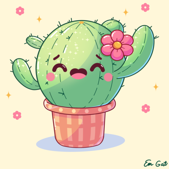
1. Introduction: Hello, everyone. I'm
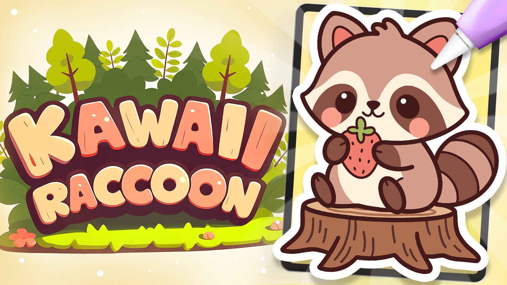
Jenny, and in this class, we are going to draw this
cute kawaii illustration of an adorable
cactus in Procreate. During this class,
you'll get familiar with a lot of useful features
like QuickShape Tool, recoloring with reference,
clipping masks, and blending modes, and in the basics of drawing
in Procreate. By the end, you'll not only draw an adorable illustration
you'll be proud of, but also feel super
confident using Procreate. And now let's spend
some time drawing.
2. Line Base: Begin this class by firstly deciding what kind of
canvas we're getting Vigon. Today we're sing a standard square canvas from
Procreate with Pixel Width and Pixel
heights the 2048 pixels. DPI a 300 and our color profile is set as
SRGB with this loan number. When it's all done,
let's hit done. Let's take a look at
our new Canvas and then before starting to
work onto our illustration, let's go under the
project and res stab and download all the materials
mentioned for this class. You did it, let's continue
our preparational part. Firstly, by going to a brush. We are going to the
calligraphy folder and we will choose moonin brush. We want all of our lines to be pretty smooth and
easy to work with. So let's tap onto the brush, go inside the brush studio, go under stabilization
on the left, and we'll be playing
with amount of streamline and amount
of stabilization. You can go to the drawing pad
and try it out right here. You can go to the sliders
and tweak them to your liking or set
the settings the same way as you see them right
now onto your screen. When you are satisfied
with everything, let's hit down over
our top right, and let's continue by going to our layers by going to
the background color. Go to the palette on the
bottom and cards on the top, and we'll select the color
with the title background. When we did it,
let's continue by going to our actual
color palette. Again, going under palette on the bottom and under
cards on the top, and we will go and select the color with the
title green line. With this color, we will
go to the size slider and set it to something around
9% and with one line, we will start to create
our illustration. We will need to go to our canvas and create a shape
of the ellipse, hold it at the end, and you will see that you snap
it to a better shape. While you are holding it, let's
lift it up and we will go to this option dt on the you
can see we have some nodes, and we will go and
adjust our shape slightly by making it
little bit more open. Let's go toward one
of the nodes on the sides and we will drag
it more toward the side. When we have it, when the
shape is pretty rounded, let's hold our Apple pencil at some length space and move the shape more
toward the center. We'll need to have a bit more
space on the bottom than we have on the top and some of
the equal space on the side. When we have the
results like that, let's tap on the screen
to accept the changes and let's continue by creating a
little pots on the bottom. So for the pot, firstly, let's go to our layers, and we'll tap on the plus icon
to create lay right here. Then we will go to our color
palettes to change the color to red lines and with the same brush and with the
same size of the brush, let's go toward the bottom
part of our cactus, and we will start by
creating a shep like that. We are creating a very nice
looking curve going toward the bottom part of our
holding our line in the end, and when we have it,
we will go toward our Edit two on the top
to adjust it slightly. So decide on the placement of this element, you
can move it slightly, so we will have less space over the bottom part or
more space if you prefer. When you find the placement, make sure that you have some
tips on the sides and that they are positioned quite
equal on both sides. When we have it, let's
tap on the screen. And when we have
the line like that, we will need to
make a copy of it. So let's go to our layers. We will go to this layer
where we have this line. We will swipe it
from right to left, and we'll choose the
option duplicate. Now when we have
the second Opie, we will go to our Aoki
on the top left using the option uniform
and going under snapping to turn on
snapping into the settings. When we did all of this, let's get back to the canvas. We will hold our
Apple pants and we will drag our shape down. We are going along
these three lines that we have right here,
our guiding lines, and that means
that we are making this line parallel
to the land that we have on the top without moving it toward
the left or right. When we have something
like that, this side onto the size, you can go with a bigger size or smaller size of this element. This is our top part of the pot. When you are satisfied
with everything here, let's go straightly
to our layers, and we will merge the
two layers together. Go into the layer on the top, tapping on it, and using
the option merge down. Now, when we have these
two lines onto one layer, let's get back to our brush, and we'll go toward the side and we will close this sheet. So go in from the bottom from this line that
we have right here, and we will need to create a rounded sheep
going in that way. So hold your line
in the end to be able to adjust it through
your editing mode. Go to this editing mode
and make sure that you are creating some kind
of the seamless line. So we'll need to make it look as if we've created the
line with one line, so we don't need to have
the very visible gaps or some kind of the continuation of the lines right
here, the connections. When we have the
results like that, let's tap onto the screen, and let's go toward
the opposite side to create something
similar here. So again, starting from the bottom and creating
the curve going. Holding it at the end, go
into our editing tool over the top and adjusting the placement by moving this
little note right here. Try to make it quite similar to what you have onto
the opposite side. So if you need to take
a look at it from the distance while you
are at the editing mode, go and zoom out your canvas. Try to create something similar when you are satisfied
with everything, tap onto the screen to
accept the changes. If you see that you have some minor little shape that
you need to work on, go grab your eraser
and adjust everything. In a way that you
would like to see it. We will need to have a pretty
smooth line right here. So let's go right here
and make it happen. And when we have the
result like that, we can go and get rid of all the lines
that we don't need. Firstly, let's get back to these little parts that we
have our connections at, and we will go to them and with the smaller size of the eraser, we will cut the
parts right here. Go into the opposite side
too and create and the cut here too to create a nice
connection between the colors. We have the result
like that, let's get back to our layers, and we will go to layer
with our cactus on the top. We will grab eraser. We will make it slightly bigger, and we'll go toward
the bottom part and erase this line completely
because we don't need it anymore and we will have the overlapping part
over this little part. When we have the
result like that, let's get back to our layers, and we'll merge these
two layers together. So go into the layer on the top, taping on it, and using
the option merge. Now when we have the
result like that, let's continue working
onto our pots. Firstly, getting
back to our brush, go lower than we have the shape right here and creating something
similar right here too, creating a curve in the middle. Hold your line in the end
if you are holding it and if you are snapping
it to a straight line, try it out one more time by creating a slightly
bigger curve. Hold your line in the
end and let's go to our editing tool over the top to adjust everything
that we have right here. Let's try to make this line quite parallel to what
we have on the top. Try to position
it at the center. So if you need to
move it, move it, make the size the one that you would like
to see right here. So go a little bit higher or a little bit lower
with your shap. When you have the
result that you like, let's tap onto the screen, and let's get back to
our brush to connect this shape that we've created on the bottom with the
shape on the top. So let's step a bit from
the side that we have onto our top part of the pot and we will create a line
going down in that way. Connect it with the
ship onto the bottom, and let's do the same
onto the opposite side. So try to make the similar size where you are stepping
from the edge. And then we will get to the bottom part and we will
connect it with the ship. Now, let's work a little
bit onto these corners. We will soften them up
firstly by going to them and creating the curves instead of these very
straight corners. So create a curve,
hold it at the end, try to match it with the previous line so everything
looks pretty simless. When you have it, let's go to our erasm and get rid of this corner that
we have outside. So with the smaller
size of the eraser, let's go and create
something going in that way. When we have it,
let's get back to ash and go to the opposite side to create something
similar here. Firstly, creating a curve inside this very
straight corner, holding it, going into our
editing tool over the top, if we need to adjust
it in any way, matching it with the previous
lines that we have and then grabbing our eraser to erase the corner that we
have onto the bottom. When we have the nicely
looking element like that, let's go and work more
onto our top part.
3. Finishing the Lines: So firstly, let's get back
to our green line color. We'll get back to our leas and create one more leaf on top. With the same size of the brush, let's go toward
the sides firstly, and we will create some segments of our little cactus right here. So let's go toward
the right firstly. We will go a little
bit inside the shape, and we will create the line or the shape going in that way. If you need to try
it out a couple of times to create the
shape that you like, go and do what you need to do. You can go a little bit higher, a little bit lower
with the shape. So try it out a couple of times. When you have the
result that you like, let's go toward
the opposite side and create something
similar here. Let's go a little bit
maybe lower or higher, so we don't have a very
symmetry looking element, and we will go and create
it in a smaller way. So for example, let's go with the shape
going in that way. When we have it, we will also go toward the top and create
some parts here too. For example, let's go from the middle part and create
the angoon in that way, some of the ear
looking elements. Again, you can hold
your line at the end, go to the editing tool, adjust it from here,
make it bigger, make it smaller, adjust the
rotation, the placement, everything that you want
to adjust right here, you are welcome to adjust. When you are done with
it, tap on the screen and go to the opposite side to
create something similar here. You can go with the
symmetrical elements right here or you
can play around with everything that
you have right here and adjust it to the way
that you want it to be. When we have the
result like that, let's grab our eraser and get rid of all the lines
that we don't need. Firstly, let's go toward these little parts where we have the overlapping elements. We will grab eraser, bigger size of it and erase
the lines that we don't need. If you want to work on these
little parts right here, you are welcome to
go and do that. We can go and maybe make
them a little bit smaller by respecting the thickness
of the lines that we have. When we have it on the top, let's go toward the
bottom and create the little cut right here to create a nicely
looking element. If you need more
time to work on it, go and do what you need
to do right here to create a very
softly looking cut. When we have the
result like that, let's go toward the
previous layer, go into our layers
panels firstly, going toward this layer
that we have on the bottom, grabbing our eraser, and going toward this overlapping
part that we don't need. Now when we have the
result like that, let's get back to our layers, and mercy still layers together. So go into the layer on the top, taping on it, using
the option merge down. Now, when we have it,
let's go and create one more layer on top
and with the same color, but with slightly smaller
size of the brush, firstly, let's get
back to our brush. For example, let's go
with the size of 4%. We will go toward the top and we will make a little
markdown right here. So in the middle, we
have this markdown, and from this markdown, we will be going toward the bottom part with
little segments like that. So hold the line at the
end, go to the 182. If you need to adjust it. You can go and make it quite parallel to what you have
on the outside part. When you have the first line, go again toward this little markdown that we've created on the top and continue creating the lines going right
here in the middle. When we have it on one side, let's do the same onto
the opposite side. Again, starting from our
little markdown on the top, going down with
our little curve, going to the editing tool if we need to adjust it right here. So for example, going in that
way and trying to make it similar to what we have onto
the outside little line. When we have it going
toward the middle and creating one more
line going inside. Again, holding it at the end
and if we need to just it going toward our editing to
and adjusting it from here. When we have the
result like that, let's tap onto our
screen with our brush, and let's go to our
eraser and we will go and erase these parts that
we have onto the bottom. Make sure that we are not going toward this land that
we have on our put, we can get back to our las, grab this la that we
have our little lines on and get it underneath the
layer with our lines, so everything will be
hidden right here. Now when we have
it, let's get back to a brush and let's go toward this little parts that we have outside and let's add
these lines here too. Go, for example, right
here onto the right, repeating the overall
curve right here, going toward the next side, and starting to add this
little line here too. Going toward the top here, let's go and create
two lines like that, so we will emphasize on
this little rounded part, going toward the last element and adding something
similar here too. So now when we have
the result like that, let's make lt bit interesting by getting to our eraser first, and we will make some cuts into the lines to
make some pattern. So firstly, let's go toward this little lines
that we have inside. We will grab the bigger size
of the eraser and we will go and make some pattern
with our little cuts. So you can go and
create the bigger cuts, the smaller parts on the cuts. You can go and create
something in that way, try it out onto your lines
and create something pecular. When you are done with
adding these elements, little cuts toward
the middle part, go toward the next lines
that you have right here onto the sides and
add the cut here too. You can go with the smaller size of the eraser with
the bigger one, create some pattern that
will look nice to you. When you have the
result like that, let's get back to our brush. Go toward the size that we
use for our outlines so 9% and we will go and add
little spikes right here. Firstly, let's go over
the top and we will be going and creating some random
little lines like that. Going toward the
outside parts firstly and adding a couple of details
in the shapes like that. Going toward all
of the elements, try not to overdo it
at a few of them only, and go and create
something in that way. When we add down with it, let's also go toward the inside parts and let's
add little spikes here too. Firstly, if you want to add more little details toward these little outlines
that you have, go and add them and
create something pecular. Now when we have the result like that with the same
size of the brush, let's go inside and let's go and add a couple of
details here too. So go and add these
V shapes like that, so we will create some of
the spikes right here. Try not to go too close toward the middle part because we will have the facial
features right here. So let's go and add a couple
of details going like that. Maybe go on toward
the bottom part and add these little
details here too. If you have some
overlapping elements, for example, right here, we can wrap our
eraser and work on these connections by erasing the parts that we don't need. Let's go through all of them, and if we see that we need to add something or
erase something, we will go and do it manually. And now when we have
the result like that, let's go and add some
beautifications. Firstly, we will get back
to our lays and we can go and merge these two layers together by going to
the layer on the top, tapping on it, merge down, and we will tap
onto the plus icon to create a new layer on top. Now, you downloaded the brush
that we can use right here. So let's go and find the folder with the simple stem brushes, and we will go toward
the bottom and we will select this flower
six little brush. When we have it, we will go to the size slider and set it
to something around 13%. If you want to try it out in a bigger way or a smaller
way, it's up to you. When you have the
brush selected, let's get back to
our color palette and select this red lines color. Make sure that you are on the right layer, and
when we have it, let's go toward this
right part toward the top and we will put
a flower right here. Find the placement, if
you want to go with a bigger size of this
lement or smaller one, go toward the size slider
and adjust it from here. Now, when we have
the flower pleased, let's get back to the
brush that we used before. So going again to our calligraphy
folder, moonlan brush, going toward our
layers and go into the layer that we have
all of our lines at. Get in our eraser and we will
need to go toward this part where we have our flower and erase all the overlapping parts, so everything that is inside
the flower should be gone. So let's go with our eraser and very carefully
erase everything, so everything will
be looking nice. When we have the
results like that, let's get back to our layers. Again, merging these
two layers together, go into layer on
the top topping, merge down, and we will
create one more layer on top. Now, let's switch
the color to face and we will go with slightly
bigger size of the brush, for example,
something around 30% and we will start to add
artificial features. Let's start with the eyes. We'll go more toward the center so you can eyeball
where the center is and we will go with a simple shape like
that for our eye. Hold your line at the end. If you need to adjust it, go to the editing
tool over the top, maybe work a little bit onto the curvature or the
placement of this element. When you are satisfied
with everything here, tap onto the screen to
accept the changes, and let's go toward
the opposite side to create the second
I right here too. Repeat the shape, make it similar to what you have
onto the opposite side. Adjust it through
your editing mode if you need to make it a
little bit smaller. If you need to adjust the
placement, go and move it. You know how to do that, hold
your Apple pencil and move it more towards the place
that you want it to be. When you have the
result like that, let's tap onto the screen. Let's make the size of the
brush slightly smaller. For example, something
around 20% and we will go above our little
eyes and we will add little eyebrows like that. You can go with
different shapes, you can go with different
facial features. It's up to you. You are
welcome to experiment. And when you are done
with the eyebrows, let's go with slightly
bigger size of the brush, and we will go and
create the so we can try it a couple
of times size wise. So for example, let's
go with something around 50% and we'll go right between our
eyes and we will create a little mouth
going like that. The heart shape will
create with the curve, we'll hold it at the end, and we'll go to our 18 tool
if we need to adjust it. So adjust the placement. If you want to adjust
the overall look, go toward these notes
and adjust them too. Find the placement
for this element, go a little bit lower, a little bit higher. It's up to you. Make it cute. When we have
the results like that, let's tap onto our screen
to accept the changes. And when we have the
result like that, we will need to add one
more detail over the top. So let's go toward our
little color palette and change the colour to orange. We will get back to our brush, and we will go with slightly
smaller size of the brush. We will get back
to our layer where we have our mean lines, and we will go
toward this maridan that we've created right
here onto the top, and we will create a little shape of the allots right here. So hold it in the end, try to
make it straightly looking, and when we have the
result like that, we are done with our lines. So let's move on
to our next part where we'll start
to add the colors.
4. Base Colors: Let's begin this part firstly
by going to our layers. And if you want, we can merge these two layers
together or we can use the layer with our
official features later on to add
details very easily. So for example, let's go toward this layer that we
have on at the bottom. So our main lines
will tap on it, and we will use the
option reference. Then we will be able to add the colors on the separate
layers by using these lines. Let's create one
more layer on top, and we will gram
this layer and drag it underneath our
layer with the lines. When we have the
placement like that, let's get back to
our color palette, and we will select
the green main color. Let's go and recolor
everything that belongs to our little cactus
with this green color. One by one, we drag the
colors and when we did it, let's get back to our list. Let's create one
more layer on top, go into our color
palette one more time and selecting the
color with the title pot. With this color, we'll
go toward the pots and we'll recolor everything
that belongs to it. When we did it, let's
get back to our leaves, creating one more layer on top, changing the color to pin
create and one by one, we'll recolor all the petals that we have right
here for our flour. Go like that, recoloring everything, and
when we are done, let's change the color
to orange one more time, and we will go toward the
inside part of the flour, and we will recolor it too. So now when we have
the result like that, let's work a little
bit on our bottom part by adding some pattern
to our little pots. Let's get back to
our color palette, and let's select the color with the title highlights
and we will go to our layers and go toward the layer with
our little pots. Let's create one
more layer on top. Let's tap on this layer and
use the option clipping mask. That we will be able to stay inside only the colored areas. Now getting back to our brush, making the size of it
a little bit bigger, and we can go and add some
pattern to our little pot. So for example, let's go
with something like that. Or if you want to experiment, you are welcome to create the pattern that you would
like to see right here. So when we are done
with the top part, let's go toward the
bottom part of our pot and let's maybe add some stripes right here. So
let's go like that. Go alone the whole shape. So we are going not
with straight lines, but go a little bit
with the angled lines. When we have the
result like that, let's go toward bottom
right here toward the side, we are using the editing tool
if we need to edge out fi. So when we have the
result like that, if you have some extra elements that you need to take care of, let's get back to
our erasa and erase all the overlapping parts that we don't need for our pattern. Now, when we have the
result like that, we are done with
our basic colors. So let's go and start to work ta our shadows and highlights.
5. Shadows: Begin this part. Firstly,
by going to our lays, we will go to the
layer where we have our reference and our lines on. We will tap on it
and we will turn on reference because we
don't need it anymore. When we did it, let's get back to our little sheep that we have for cactus and we will start by adding a
little shadow regia. Let's create one
more layer on top. Let's tap onto this layer, and let's use the
option clipping mask. We also will go toward the end icon and change
the blending mode to multiply and set the aposte to something around 75 per set. When we did it, let's get
back to our color palette, and we will select the color
with the title reflection. Win this color and with slightly smaller
size of the brush, let's go toward the bottom
and more toward the right, and we will start to
create a shadow here. Again, you can hold
your line at the end, you can go to the editing
tool right here to adjust the curvature
of the elements. Let's go and make the shadow going toward
the bottom part. When we have it tap
onto the screen, make the size of
the brush bigger, and let's go toward
the bottom and manually add the color
toward this area. So go like that,
going toward the top, trying to make no
gaps into our shadow. If you notice something, go and manually recolor these elements, let's go toward the top part
two and add the color here. When you are done,
you can go toward this little part and
manually add the color toward this part to create some kind of the shadowy
looking element like that. When we have it, let's get back to our smaller
size of the brush, and let's go toward this part. Let's add the shadow toward the right and more
toward the bottom. Going toward this
little top part, going toward the
bottom like that. We can create the shadows
in different ways, but we will need to try to
be consistent with them. So that means that
we will need to position them
mostly on one side. So when we have it, let's go toward this little part
that we have right here. Let's step a bit from
the like age right here, and we will start to create
the shadow going in that way. Let's go and again, manually
add the color inside. You can go with the
bigger size of the brush, with the smaller size of
the brush, it's up to you. Try to make the line first and then add the
color in that way. And then we will go
toward this little part on the opposite side and
create a shadow here too. So let's go and add the
shadow going like that. And then we also can go with slightly smaller
size of the brush, and we will go toward
one of the segments. For example, this one, and we will go and add
the shadow to it too. So let's go and create the
shadow going like that, repeating the overall shape that we have for this segment. So when we have it, we also can go and make
sure that we have the shadow right here on the
bottom part of our flowers, going underneath
it and repeating the overall shape to create
the shadow going in that way. We have the result
like that, make sure that you like the
amount of opacity. If you want to adjust it,
you can go to your layers, tap onto the icon right here and adjust it from opacity slider. If you are satisfied with it, let's continue by going to
this layer that we have right here onto the pot, and we will create
one more layer here. Let's tap on it, clipping mask and icon multiply blending mode, opacity of around 60 or 70%. If we need to adjust it later
on, we can get back to it. When we are done with it, let's get back to our color palette, and let's select the color
with the title shadow. With this color, we
will need to go first toward the back parts
that we have on our pot, and we will go and put
them in the shadow. If you see that the
color is not right, it might be because our blending mode
setting didn't work. Let's tap onto our N icon and change our blending
mode to multiply back, and then we'll continue
adding our shadows here. Let's adjust the
size of the brush and we will go toward
this little parts, create the curve firstly, and then manually add
the color inside. We can go along this
whole shape and make the shape closed and then drag and drop the
color in that way. Then when we have it,
let's go underneath the whole shape
that we have right here and we will create
a big shadow right here. Following the direction
that we have on the top, creating something
like that, manually adding the color
toward this part. Then continue by going
toward the bottom toward this little part
that we have right here and again creating
the shadow here. Let's go around like that, add the color inside
when we are ready. Make sure that all of the
lines are looking nice. If you need to zoom in your canvas and manually
go to some places, go and do what you need to do. When we have the
results like that, decide onto the level of apace whether you
like it or not. If you want to change it,
go back to your layers, tap onto the icon, and adjust it from here. For example, let's
go with something around 75% and when we have it, let's continue by
going to our flower. Again, creating
one more lay here, tapping, clipping mask,
tapping on the N icon. Setting the multiply
blending mold right here. Again, going with something
around 80% of opacity, using the same color that we used for this
shadow that we have on the bottom and going toward the bottom part of our petals, going through all of them, and starting to add the
shadows here too. Either by going and rigging
the colors when you have the line that doesn't
have any gaps right here, doing it in that
way, we're going manually and adding
the colors manually. Let's go through all
of the petals and also toward the bottom part of
our little middle parts, going toward these parts
and adding our shadows. When we have the
result like that, one more time,
decide the opacity. If you want to change
it, go and change it. So find the level
that works for you, maybe 85%, make it a
little bit more pop up. When we have the amount of
opacity that works for us, we are done with our shadow, so let's move on to
the highlights part.
6. Highlights & Final Touches: The highlights, firstly, let's again start
from the bottom. We'll go to this layer where we have our shadow onto our cactus. We'll create one
more layer here, taping, selecting clipping mask, go into the icon, and we will change the
blending mode to overlay. Let's also change the
color to orange firstly, and then we will get back
to our brush library. We'll go to the
airbrushing folder and we'll select
soft blend brush. We'll set the opacity of
this brush to something around 35% or so and we will make the size
of the brush pretty big. We'll go to the
opposite side from our shadows and we will start to add the
secondary color here, maybe even with the
bigger size of the brush. We are trying to make a
very smooth transition right here between the colors, so we will need to
blend the colors nicely and we will need
to go toward all of these elements
that we have right here on the opposite
size that we have for our shadow and add this little highlights
in this color. When we are done with it, decide on the amount of opacity. So if you need to adjust
something, go toward the layers, tap onto the O icon, and adjust the opacity
onto this layer. Everything should
be blending nicely. And when we have the
result like that, let's create one
more layer on top, tap on it and use the
option clipping mask. We also will go to the N icon and change the
blending mode to add, and then we'll get back to our color palette to
select the white color. Also we'll get back to our brush library
to this brush that you downloaded with the title
scatter Confetti solid. Let's select it and
we will go toward this little pie that we've
added with the second color, and we will go and add some little peculiar
details like that. You can go and add
very much of them. You can go only to the elements that we have in the
middle or to all of them and add these additional little
sparkles like that. If you are not satisfied
with the amount of apace right here, if
they are too bright, we can get back to our as tab on the A icon and adjust
the apastu right here. We need only a glimpse
of these elements, so they are not the
main course right here. When we have the
result like that, let's continue by creating
one more lay on top and we'll tap on it and we will use the option clipping
mask one more time. Let's change the
blending mode to overlay and we will keep
the same white color, but we will go again to our
brush library and we will go to the calligraphy folder
and choose monoline brush. Let's add the actual
highlights the same way as with these little
lighter elements, we'll go to the opposite
side from our shadows and we will add little highlights in the
shape of the dots, little lines like
that to go into some of the places and add in
these little elements. We will go towards all of
the parts that we have right here onto our cactus and we
will add the highlights here. Let's go toward all of
these little elements and add our little
additional sparkles. When we have the
result like that, we also will go and add a bit of the reflection
toward our shadow. Let's go and do it in that way. Going again to our layers, creating one more layer on top, tapping on it, and
using clipping mask. Again, going to the N icon and
changing the blending mode to overlay and then changing
the color to reflection. Now with this color, we will go toward
the parts where we have our shadows and
we will start to add the reflections here to
go closer to the edge and repeating what we have
for our lines right here. These elements doesn't
need to be very much seen, so we will go and create
something going like that. Let's go through all of
these elements that we have our shadows on and we will go and create our
little reflections. So now when we are done with it, we are adding them only
onto the right part. If you want to go
toward the left and maybe try to
add them here too, you can try to do that, but
probably don't do that. When we have the
results like that, let's continue by
going to our lays. And again, we will continue
by going to the next layer. So let's go to our put to this layer where we
have our shadow. Let's create one more lay here, tap in using the
option Clipping mask, tap in on the icon, and we will select the
overlay blending mode. Then we will get back to our color palettes and we will select the white
color or if you want, you can try with the highlight. So select one of these colors, and let's go again toward the opposite side that
we have our shadows on, and we will create a
little highlights here. So going toward
the top like that, toward the edge, creating a
little highlight like that. If you can go with
different shape, if you want to create something else, you are welcome to do it. If you want to add
a little highlight toward the bottom part to
you are welcome to do. Decide ta the opacity
level of this layer, go to the opacity slider, adjust it to your liking, make it not too bright. When we have it, let's go toward our lays and we will again
create one more layer on top, tap on it, clipping mask, or the blending mode, and choosing our
reflection color. Let's go toward the
shadow part and we will add a bit of the
reflection here too. So again like that,
starting to add these little additional
elements, very subtle. When we have the
results like that, let's continue by going
to our next layer. So our next layer is our
layer with the flour. Let's create one
more layer here, tap on it using the
option clipping mask, and again, changing the
blending mode to orlay. Let's change the colour
to white firstly, and with the smaller
size of the brush, let's go towards the opposite
side from our shadows. And let's start to add our
little highlights right here. Want to go toward
the middle part and add the highlights here to
you are welcome to do it. When we have the
result like that, let's get back to our layers, created one more layer on top, tapping, clipping mask, changing blending mode to overlay and changing the color
to reflection. With a smaller
size of the brush, let's go toward this part
where we have our shadows, and let's go and add a little
highlights to them too. Now, when we have the
results like that, we are mostly done. Let's go and work a little bit on the
artificial features. Firstly, let's get
back to our layers, and let's go toward our layer
with artificial features. We will create one
more lay on top, tap on it, and use the
option clipping mask. Let's change the
color to pin cred. We'll go with slightly
bigger size of the brush, and we will go and create a
little tank onto the bottom. Going like that and very
boldly creating the shape, you can go with a bigger size, with a smaller size,
it's up to you. When you have the
result that you like, let's switch the color to white. We'll go with very small
size of the brush of 4%, and we'll go inside
the ice right here, and we will put
little highlights right here. You can go randomly. You can go with bigger
size, smaller size. It's again up to you. You can make something
different right here. When we have the
result like that, let's go and also
add the checks. So firstly, let's switch the color to pin
cret one more time, and we will go underneath our layer with our
facial feature. Let's create one
more layer here. Let's grab our brush. Let's go with the bigger
size of the brush, and we will go right
here underneath the ice and we will put our little
dots for the checks. You can go again with
the bigger size with different placement
with anything that you want to
change right here. If the color is too bright, we can go again to our last, tap onto the icon, and adjust the
opacity right here. For example, let's
go with something around 85% of opacity. And when we have the
results like that, we are done with
our illustration, but let's go and add a couple of details
to the background. Firstly, let's change
the color to reflection and we will get
back to our layers and create one more layer. We will need to drag this layer underneath
everything that we have, so we are holding it
and dragging it down. When we've positioned
it in that way, we will go with the smaller
size of the brush underneath our little pot and we will
create a shape of the ellipse. Hold it in the end, hold one of your fingers
on the screen to make sure that you are creating it in a horizontal way. When we have it, let's dragon drop the color inside the shape. Let's adjust the opacity
of this layer by tapping onto the end icon onto
our layer with the shadow, going toward the
opacity and making it at something
around 30%, 30, 40%. We have it, let's also
create one more layer on top and let's go and add some
additional elements outside. For example, let's go to this folder that you
downloaded, simple stamps. We can go, for example, with this flower six full. We can change the color to pink, go towards some of the
empty spaces right here, and we will go with
different sizes of the brush and add a couple
of details right here. Also can change the
color to orange, change the brush to
something sparkle. So for example,
sparkle thin full, and we can go and add
some sparkles here, too. If you want to add more
details or different elements, you can explore this
folder that you downloaded and create
something peculiar. And when we have the
result like that, when we are satisfied
with everything here, we are done with
our illustration. Thank you for
watching this class. Let review if you like
this and continue subscribing for Markawi
videos in the future. Looking forward to
Senior project.
 Uni Corn, ⭐Kawaii Art Enthusiast⭐