Transcripts
1. Introduction: Hi there. I'm Devika, an artist, Illustrator
surface pattern designer, and more recently a
small business owner. I'm a coffee-loving introvert
juggling the worlds of creativity, entrepreneurship,
and motherhood. It's a beautiful mess, and I absolutely love it! But I wasn't always an artist. I actually have a master's
degree in architecture. The thing is, painting has
always been my happy place, and even during my
architectural career, art is what truly made me happy. So In 2018, I took a
huge leap of faith and decided to leave architecture behind to pursue my
passion full time. That's when The Artsychoke was born in this corner of my room. I create unique artwork
that's inspired by nature, architecture, and more often
classical textile prints. I love to use bright
and bold color palettes in everything I create, whether it's a
botanical illustration, an architectural sketch
or a floral pattern. I make art for my own
brand, The Artsychoke as well as for
licensing on print-on-demand websites like
Society6and Redbubble. You can find my
art on a range of products like textile, clothing, home decor, tech accessories, wedding invite, and
stationery and lots more. I recently started illustrating monograms and discovered how interesting it is to transform a simple alphabet into a
stunning piece of art. Monograms are such a
unique and fun way to personalize anything. I have illustrated monograms
for friends, family, and businesses,
helping them express their individuality in
a truly creative way. And in today's class, I'm going to show you
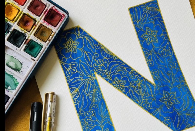
how to transform a simple alphabet into a stunning monogram illustrated with Indian block print pattern. This is my sixth Skillshare class, and I'm so excited to guide
you on your creative journey. In addition to talking about all
the supplies you will need, We'll cover six
steps to transform a simple alphabet into an
illustrated monogram. First, we will start by
picking the perfect font and getting our monogram ready
for illustration using Canva. We will be using
the free version of Canva so that everyone
can follow along. Next, we'll dive into exploring various pattern elements
and motifs like flowers, buds, leaves, et cetera. This is where you can let
your imagination run wild and experiment with different
floral motif designs. Once we have our elements, we'll put them all
together to develop the pattern composition
on the alphabet. This step is all about
harmony and balance, ensuring that the pattern flows uniformly and aesthetically
throughout the alphabet. Then we'll trace our final
sketch onto a watercolor paper, preparing it for the
fun part - adding color. Once this step is complete, we'll bring our
monogram to life, adding in the outlines and
details with a gold gel pen. I want to highlight that,
while I will show you how to illustrate the monogram
with an Indian floral pattern, the class does not dive deep into developing the
pattern elements. The focus is on developing
the pattern composition, that is, getting the
right balance, density, and flow of the entire
pattern through the alphabet to make
it visually appealing, rather than designing the individual elements
of the pattern. If you are interested
in designing a pattern along with its
elements in this unique style, I do have another class on it called Botanical
Illustration: Paint a Simple Indian Floral Pattern in Gouache. In that class, I teach you
everything you need to know, starting with
gathering inspiration, designing the
individual elements, developing a pattern layout, choosing a color palette, and painting the pattern
using gouache. You'll find today's class a little more easier if you've taken that one, but it is not a prerequisite. I've developed
this class keeping all skill levels in mind,
especially beginners. You only need some basic sketching skills
to follow along. The entire process is
broken down into simple, easy to follow steps. That said, the class is
not just for beginners. There's something
here for everyone. Join me if you're
looking to personalize your space or create
a unique gift, design a monogram
for your brand, or just exploring
your artistic side. This class is all
about expressing your creativity and
creating something special. After finishing this class, in addition to having a
finished piece that you can proudly display or give
to someone special. You will also be equipped with the proper understanding
and other skills to design more such monograms or even texts like names or
positive affirmations. So are you ready to
have fun turning letters into works
of art? Let's go!
2. Class Project: Your class project is simple. Make an illustrated monogram using the techniques you
learned in this class. You can pick any
alphabet you like. How about your own
alphabet monogram? Or a special someone's? Maybe you can make
a monogram for somebody whose
birthday is coming up. It'll make a truly special gift. To make your job easier, I'm sharing with you my PDF file with all the letters
of the alphabet. You can download this from the Projects and
Resources section. This file has all the letters in the exact font that we're
using in this class, so you can skip this step of selecting a font
if you want to. But if you prefer to
use another font, you're more than
welcome to do so. In fact, if you
want to illustrate your own hand lettered text, I highly encourage that too! Once you finish your project, I'd like you to upload them
to the project gallery, so I can have a look at it and give you feedback. To
upload your project. All you have to do is click
the Submit Project button on the right side under the
Projects and Resources tab. And it'll be a bonus for me
if you decide to throw in some process pictures as well because I absolutely
love seeing those. Looking forward to seeing your
illustrated monograms!
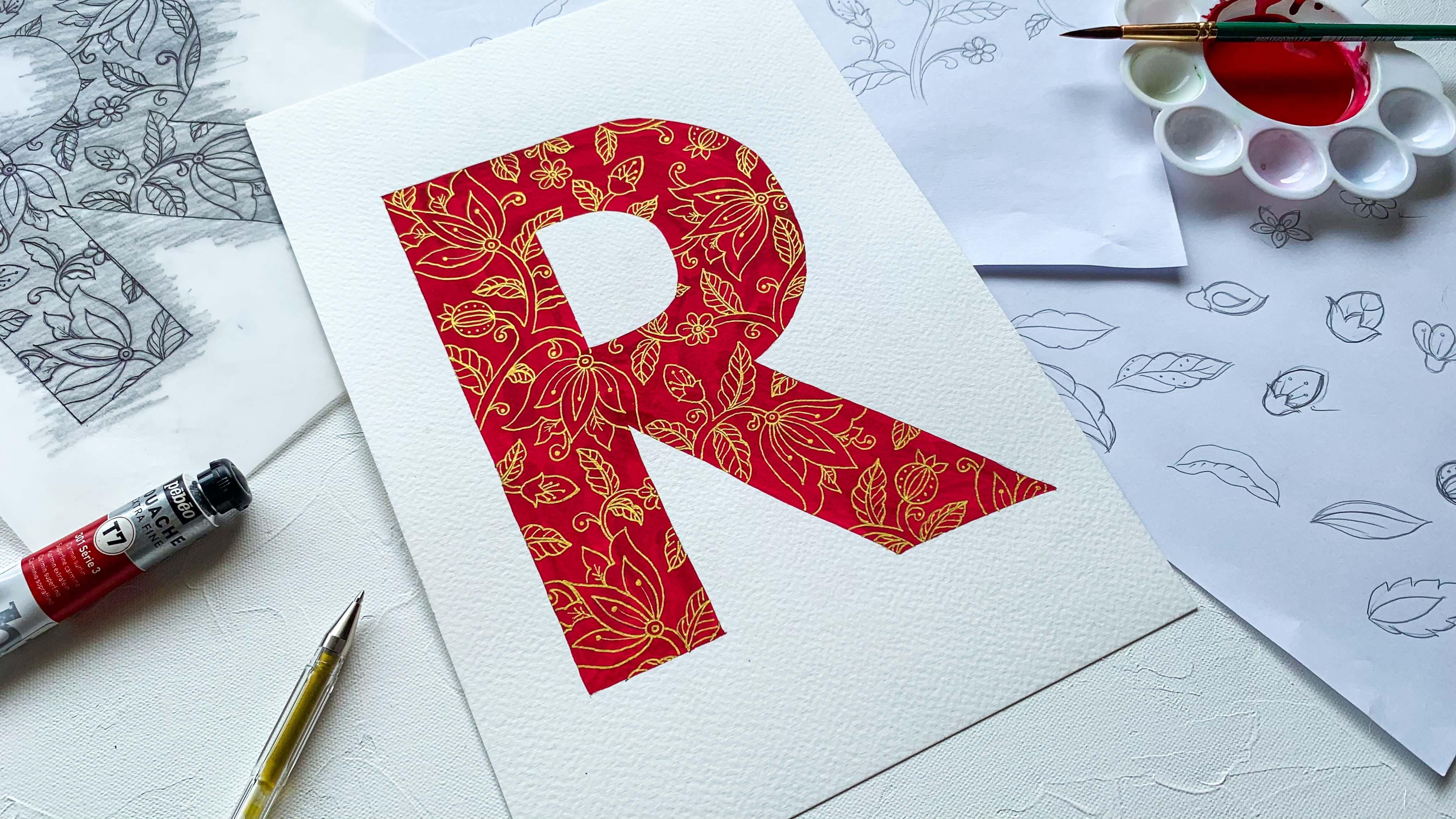
3. Supplies: Let's have a look at all the supplies you'll
need for this class. First of all, you'll
need a printout or sketch of the alphabet
you'd want to illustrate. For this class, I'm
illustrating the alphabet R, and I've printed it out
on regular printer paper. Don't mind those white lines. My printer was running low
on ink when I printed this, so it just came out that way. I prepared the file on Canva, which is an online
graphic design website. We'll cover more on how to use Canva in the
following lesson. As for the paper, I'll be using an A4 sized watercolor paper, which is cold pressed
and 300 GSM thick. This is my favorite kind of paper and I use it for all
of my paintings. You can use hot pressed or cold pressed depending
on your preference. If you like a smooth
texture for your paper, go for hot pressed paper. But if you prefer a
mildly rough texture, cold pressed would be better. For the thickness,
I would recommend not going below 250 GSM, as a thinner paper
will buckle when you paint with watercolor
or gouache on it. You can also use
mixed media paper, especially if you're
using gouache paints. As for the brand of paper, I'm using an Indian
brand called Brustro. Next on the list
is tracing paper. We will design and develop our pattern on this piece
of tracing paper. Tracing papers come in
rolls and cut pieces, and for today's class, you will need just one
A4 sized sheet. Okay, let's discuss pencils. I'll be using a Staedtler mechanical
pencil with 3H lead, although even a regular 3H
pencil works just as well. I prefer 3H because it
contains less graphite and is harder than regular HB
or any grade B pencil, which reduces smudging
on the paper. When sketching, I often make a lot of back and forth strokes, which results in a
very dark sketch if I use a softer
pencil like HB, and that's not ideal
to paint over. So, I use H grade pencils. If you have a 3H
pencil, great, use it. If not, you can just
use whatever you have. You will anyway need a HB or a softer grade B pencil while transferring the final
sketch to paper. An eraser will be much needed. A kneadable eraser is
used to take off excess graphite from
the final sketch on the paper just
before painting. This one is optional, though. It is a great little
tool to have, but you can still get the work done with a regular eraser. So if you don't have a kneadable
eraser, don't worry. We'll use a regular
ballpoint pen to trace the pattern onto
the watercolor paper. You'll also need
a fine liner pen. I'll be using a 03 Pigma
Micron from Sakura. We will be inking the pattern twice - once on the tracing paper, and again on the
watercolor paper. Now, neither of these will be visible in the
final illustration, and we'll go over the inking on our watercolor paper
with a gold gel pen. Your fine liner nib shouldn't be thicker than
the gold gel pen. Plus the tracing paper has a very smooth, waxy surface
and not all pens work on it. Micro pens do. That said, you can use anything that
works on tracing paper. We need a golden gel
pen for the final step, which is outlining
the entire pattern. Here I'm using a
Uuniball Signo gold pen. If you wish, you can
even use a silver pen. Pain brush comes
next on the list. A medium sized regular round brush is good
for this class. I'm using a round brush in size nine from an Indian
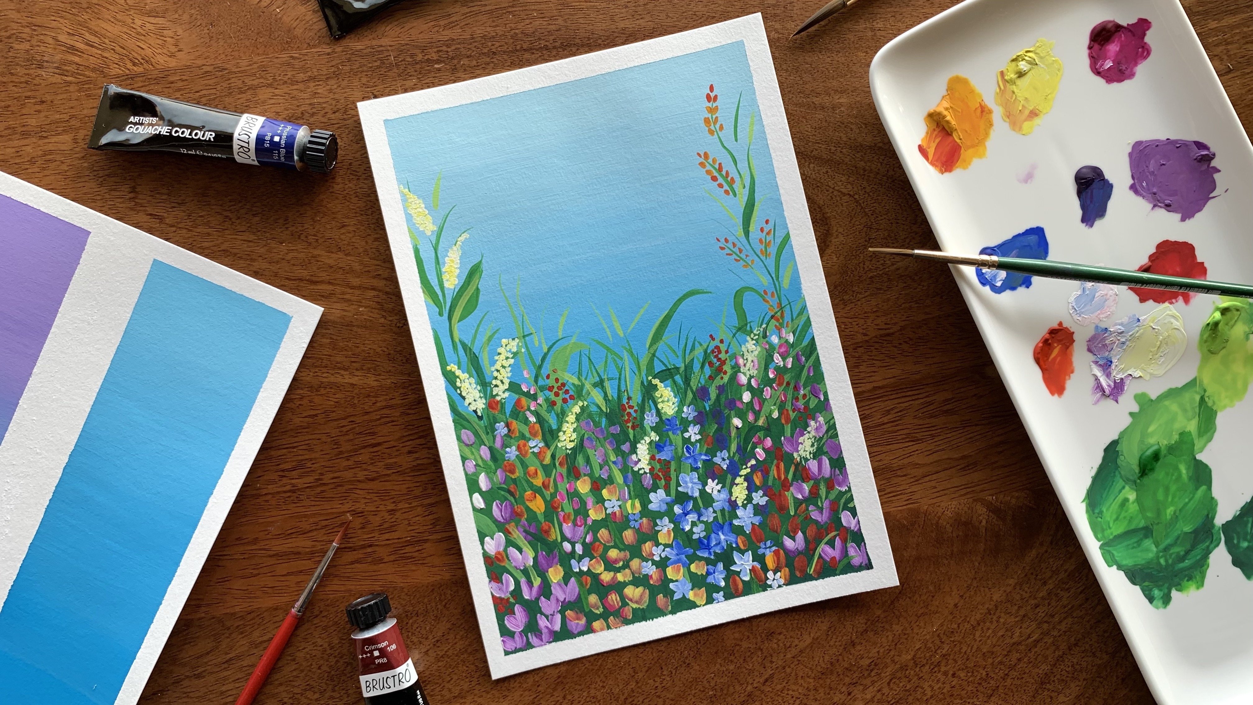
brand called Fine Art. As for the paints, I'll be
using gouache in today's class. The shade is Superfine Carmine
from Pebeo Extra Fine gouache. But you're free to choose
any color you like. You can use watercolors as
well for your monogram. Gouache will give a more
opaque, even wash of paint while you may get a slightly patchy texture with watercolors. I'm honestly a fan of both and I frequently switch
between the two. We will need masking
tape to secure the tracing paper in place
while we do our tracing steps. We'll need a palette
to mix the paint. I have the small plastic one. Since we'll be mixing
just one color, we don't need a big palette
with lots of pools. Honestly, anything you can mix a single color
paint in will work. You'll also need
tissue papers for drying and dabbing the
brush after washes. And finally, a jar of water
to wash your brush. So here's a complete list of all
the supplies you'll need. Now that supplies are covered, let's jump right
into our lessons. We'll start by selecting a font for the
monogram in Canva. I'll see you in the
next video for this.
4. Selecting the Right Font: Now, before we get
started with this lesson, I'd like to tell
you that it isn't necessary to use a printed
alphabet as a base. You can sketch it out by
hand as well if you'd like. Ideally we need a font
that is thick and bold so that there is enough space to fill
with a pattern. Try to keep it basic and
without much ornamentation. It is also a good idea to keep the thickness uniform or mono-weight. I use a website called Canva
to prepare my alphabet. Now you can just type
and print an alphabet from any application
like Word or PowerPoint. But Canva has a much more extensive library
of fonts that you can access with a free account and it's super easy to use. Now this isn't a comprehensive
lesson on using Canva, as that is beyond the
scope of this class. I will be specifically
showing you how to prepare and download your alphabet
for illustrating. Okay, start by opening up Canva
on your web browser. You can just do a Google search and
it'll come up for you. Log in if you already
have an account. If not, you can easily sign
up using your e mail ID. It will only take a few seconds. I'm creating a new account
here for showing you how the Canva interface
looks when you start out. And as it's setting up your account, Canva will give you a few options to choose for the purpose
you want to use it for. I'm choosing personal, but pick any that best suits
your requirement. You can always upgrade to
a paid account anytime. And there, my free Canva
account is all set up. Now, to create a document, you can just click
on this create a design button here
on the left side. Once you've clicked
that, Canva will open up a window with multiple pre
built template options. As you can see, there are a ton of options to choose from. But I'm specifically looking for an A4 sized
printable template. I'm clicking on
more at the bottom to see what more
it has to offer. Worksheet could work since
it's an A4 portrait, but I'm not quite sure. I do remember there is
a template for flyer, which is A4,
so I'm just going to search it up and there it is. Clicking on that
and opening it up. Now I've got a
blank document with various text and graphic
editing options. You'll also get an
option for a tour on your first time so you can
choose to skip it or take it. So I just need one
alphabet per page. For that, I'm going over to the left side menu and
clicking on the T, which is the option for text, and then on Add a heading
because I do want a large text. To change the text, I
just need to click on the text box and then
type the alphabet I want. So I've got this A here. Now I can increase
the size either here by clicking on
the plus continuously, or an easier option
would be to just drag out the alphabet
from the corner points. This will just
stretch the text out proportionally without
distorting it. Now it's time to select a font. Go over to the top bar menu
to click on Font option. Once you click
that, a window with the complete list of
available fonts will open up. And there are so many fonts
available in Canva. The best part is that
you can pull up fonts by searching categories up
here, like handwriting, corporate, modern, bold... This is in fact the primary reason we are
using Canva in this class. It just makes picking
a font so much easier. So we know we need a bold font, So let's click on that and see
what all options we get. Now all the font options
that are shown in black are the ones that are available with the free version of Canva. The ones that are greyed out and have a little crown next to them will be accessible only if you upgrade to a paid plan. But there are already so
many free options available, so you really don't need
to get a paid plan yet, at least not for this class. I'm just trying out
different fonts here, looking for one that's classic
clean and not too funky. Nope. This one won't work either because there's too much of contrast
in the thickness. There's hardly any space for the pattern
on the left side. I do have a particular font in mind and I'm just
looking for that, but I can't find it here today. Maybe I missed it.
It's called League Spartan. So you can always close a specific
font category here and press this back arrow to go back to the full list
of all the fonts. And you can scroll
through them again, or if you know which
font you want, you can just search for it
up here like I'm doing now. Right! Now that I found the font
that I was looking for, I'm closing this window. I can click and drag the
text box to move it around and I'm also just readjusting the size to make it fit
better on the page. Now, I have the option
of adding a page either by clicking on
add page down here, which will open up
a blank new page. Or I can click on
this little icon on top of the page here, and this will just create a duplicate of the current page. This is a little easier as
you can just double click on the existing text to select
it and type in the new text. And in this case, the alphabet
B or any alphabet you need. Try out a few
alphabets like this. Some alphabets may take up lesser or more space with
the same font size, so, you may need to tweak the
size and position a bit. Q is definitely too
big so it needs to be made smaller by dragging
in the corner points. Another advantage Canva
has over Microsoft Word or other generic apps is the ease in editing the size and
moving the text around. For this class, I'll be
illustrating the Alphabet R, so I've typed that
out, and I'm just readjusting and
making little changes to the size and position. I want it in the middle of
the paper, and that's it. So now I have a few alphabets here, and I think it's safe to
assume that you've gotten a good idea about setting up your alphabet for illustration. It's now time to
download your file. For this, click on the Share button on
the top right corner. It will open a drop down menu, and you can select
Download option. There are a bunch of options to choose from for the file type. There's JPG, PNG, PDF standard, PDF print, GIF and
even MP4 for video. I'm selecting PDF print because I do need
to print this out. You also have the option of downloading single
or multiple pages. If you want all the pages
in one document file, you can click on
the All Pages option, or if you want single
or even a few pages, you can select them separately. I want to download a single
PDF file with all the pages, so I've selected
All Pages option. And then, once I click download, the file will be downloaded to my computer, and that's it. Now, all I have to do is
just print the alphabet. So I've got my R
printed out here, and I just printed it
out on the back of a discarded document because it's just for tracing anyway. So yeah, if you've got your alphabet printed
or sketched out, let's move on to the next lesson to explore some
pattern elements.
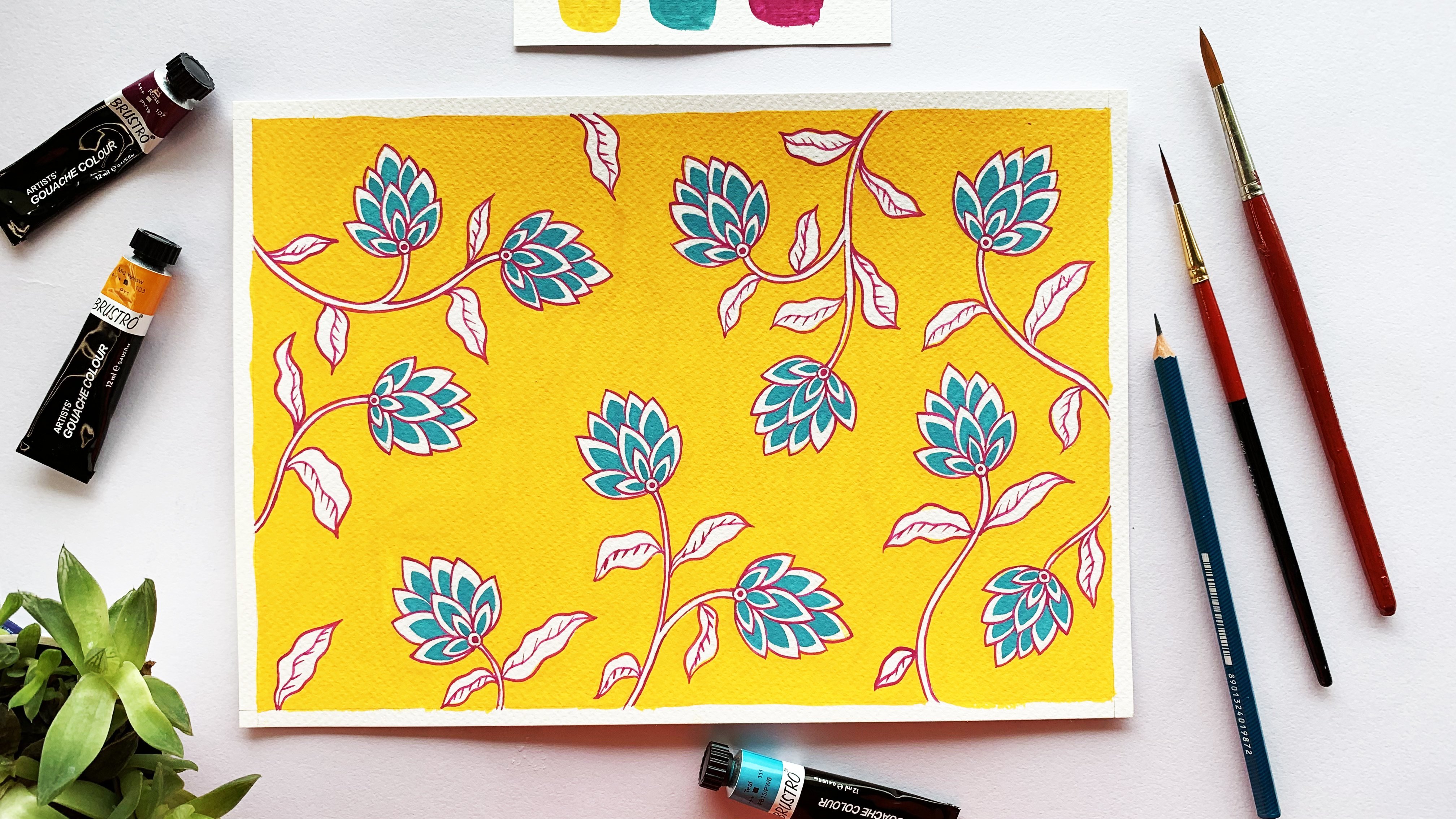
5. Exploring Pattern Elements: We need the pattern to be pretty dense to really fill
up the alphabet, which means we need a
lot of pattern elements. Now, whenever I
design a pattern, I usually categorize all
the individual elements. Here's how I break it down. There is one hero element, which is the main floral motif. This is also the biggest and most prominent motif
in the pattern. Then there are about three
smaller motifs which are simpler flowers,
buds, and fruits. Pomegranate is my
usual favorite fruit. Next, there are leaves,
of course. And stems. Now, I see stem as the most underrated
element of the pattern. It's not the most eye
catching part for sure, but it is so important
because it connects all the other motifs
and how we sketch the stems really define the visual flow, direction and balance of the
whole pattern. Finally, there are fillers. These are tiny little motifs
that I add in at the end, wherever there's an empty
space in the pattern, which isn't really big enough
to accommodate a motif. Fillers also help make the pattern look more
complete and dense. So let's start exploring
some design options for pattern elements. We'll start with a hero element, which is our main floral motif. I'm going to start sketching out a few designs to see
what I really like. I like to keep my motif
simple yet stylized. And I usually draw inspiration
from real flowers or block print patterns and sketch them out in
my own version, which is kind of a simplified variation of classical block print
patterns like chintz. Now, just a reminder, I do
have a detailed class on designing pattern elements from scratch called
Botanical Illustration: Paint a Simple Indian
Floral Pattern in Gouache. It's super useful if
you want to learn to design your own
motifs in this style. Trying out another one,
kind of a cup shaped flower, which is loosely
inspired from a tulip flower. This is nice but I'm just
trying out another option. Let's see, three petals
shooting off like this, not too big or open. And I'll add in two
smaller ones behind. Okay, this one is nice. I'm
going to go with this. We have our hero motif. Now for the three
smaller elements, starting with the second flower. Since the bigger floral
motif is cup shaped, I want this one different,
maybe circular. It needs to be in contrast, but not fight with the hero
element for attention. So I'm keeping the design pretty basic. Just a simple flower with
six petals would do. This one is nice.
Now I'm going to try one with pointed petal
tips as well, and let's see. I think I'll stick
to the first one. Next, I'm moving on to
sketching the flower bud. I want this motif as well to be an entirely
different shape. Keeping the basic
shape of the elements different brings in a sense
of variety to the pattern. So I'm just trying
out different buds and seeing what fits best with the motifs we have so
far. This is one option. Or I can sketch one that's a
little more like this paisley shape. I'm not quite satisfied
with either of these, so I'm sketching
out another option, this time with some
rounded petals. Now, this one is too similar
to the small flower, so no. I actually like the first bud so I'm going to go back to that option and just
tweak it a little bit. This is good. Time
for the fruit now. Like I said earlier, pomegranate is my favorite
fruit for patterns. There are multiple ways you
can sketch pomegranate. It can be like this with little fish scales, or something like this
with the seeds showing. Maybe the fruit can even be
a pineapple like this one. It doesn't necessarily
have to be a pomegranate. And if it's a pineapple, you can
maybe draw it like this. I'm going back to my pomegranate and trying out one
more variation. And I like this. Okay, onto the leaves next. Now there are so many
different ways we can sketch a stylized
leaf as well. It can be like this or something a little more
ornamental like this one, where you draw the basic leaf
shape first and can give in the little bumps so as
to get a nice leaf shape. A wavy one is also. Just like
with the other elements, I'm trying out different design
options for leaf as well. And I quite like this bumpy one. Now, I'm just going to see if it fits well with our
floral motif. For that, I'm sketching it
next to the motif I selected. So this is something
you need to pay attention to while
designing your elements. They should all
go well together. There needs to be some
harmony between them all. For example, you can't have a very heavily
ornamental floral motif along with a highly
ornamental leaf. Your floor motif has a
lot of lines and accents, keep your leaf motif relatively simple to maintain balance. Another thing to
keep in mind is that the leaf is a most repeated
element of your pattern. So if you have an extremely
detailed leaf motif, in addition to making your
pattern look extremely dense, it will also take the attention away from all the other motifs. Well, these two are
a good fit indeed, and I think they compliment
each other quite well. I've decided not to give
those dots though because I thought it was making the
leaf motive too ornamental. Now, I don't do any
design explorations for the stem separately. I just sketch it out as I
develop the pattern layout. Lastly, let's sketch
out some fillers. These can be anything really. They can even be like small leaves or buds or something like this. This is one of my
favorite fillers to use. And, this is the other one. It can be like this or, any
shape really, like I said. I even use multiple fillers
in a pattern sometimes. They just need to be anything
that fills up tight spaces. And for today's pattern, I'm
going to use one of these. Now we pick the individual
elements we want and it's a good idea to sketch
them out together to see if they all fit
well and are cohesive. So I'm roughly sketching
them out here and right now I'm not bothered
with getting them perfect. It's just a rough sketch to
see if it all fits well. In case you're wondering
how you can make sure all your elements
are cohesive and your pattern is well balanced. Look out for a few
of these things. The motifs should all be of different shapes to
ensure a good variety. Simplicity is key. While you can embellish your
motifs with lines, dots, etc. try
not to overdo it. Focus on one key
motive that's well ornamental and stylized
and most eye catching. The others should work
as supporting elements. The leaf design
shouldn't be more eye catching than
your floral motifs. So we picked all the
elements for our pattern. Now it's time to put them all together and design the
pattern on the alphabet. Let's move on to the
next lesson for that.
6. Designing the Pattern on the Alphabet: Before we start
developing the pattern, we need to trace out the
alphabet onto a tracing paper. My tracing paper
is the same size as the printout, that is A4, and I'm just placing
it over the printout and securing it with
masking tape so that it doesn't move when I trace the R. You can stick the tape on all four
sides if you want to. I'm sticking it just at the top since this will be a
quick tracing step. Now I'm going to trace
the R with my fine liner. Feel free to use a ruler for the straight
lines if you want to. Okay. We've got the alphabet transferred onto
the tracing sheet, and it's time for the fun part - designing the pattern on it! I'm also placing the
tracing sheet on top of a blank white sheet just to
see everything more clearly. As you can see, I have my final pattern elements
right here on the side, so I can keep referring to
them as I develop the pattern. I'm also switching to
my pencil for this step because there's
going to be a lot of back and forth sketching. So I always start
designing my pattern by roughly placing the hero
elements all around. I'm starting with one here, and I'm lightly sketching
the basic shape. I'm not sketching out the
entire motif right now. I'll do that once I've decided the positions of
all the elements. I am consciously sketching outside the outline of
the alphabet as well. It's necessary to do this as it helps give continuity
to my design. If I try to stick within
the boundary at this point, it will be very restrictive
and I may end up trying to squeeze my pattern into the
R, and I don't want that. The goal is to design a
seemingly continuous pattern that is visible
through the alphabet. And I try to place the
motif kind of evenly, but not too strictly
equidistant. There just needs to be some sort of a balance in their distribution. But more importantly,
I make sure all the motif are facing
in different directions. Placing these motifs in
this way first helps me sketch out the stems in
all possible directions. This in turn helps develop a free flowing
pattern design that seemingly flows in
different directions. Okay, I think I have enough
hero motifs placed out through the R. Next, I'm going to repeat
the same step for the smaller
elements as well. So I'm sketching very basic
outlines as placeholders for each of the small flowers,
buds, and pomegranates. This one is a small flower, so I'm sketching a
circle within a circle. Hmm. There can be a
stem coming out of this flower and going over like this with a bud at the end. Oh, and make sure you do
all this sketching, very lightly because this is just the rough draft
of your design. This will leave lesser and
lighter marks when you get to the stage where you have to rub off all those extra lines. The tracing paper gives
us the added benefit of making it super easy to
rub off pencil marks. You can rub off any number of times without
leaving marks on it. This means more margin for errors and flexibility
for redesign. For example, I felt these two motifs are
too close to each other So I'm rubbing this one
and resketching it a little smaller and
away from the lower one. So this is why I don't sketch the full motifs at this point. There tends to be a
lot of sketching and resketching happening at
this initial design stage, and I don't want to sketch
out the entire element, then rub it off, if required. Only when I'm
completely satisfied with the size and position
of all the elements, will I go in and
develop them further. I find this process of designing more efficient as it
saves me a lot of time. Coming back to our
flowers, buds and fruits, I'm following the same
principle and distributing and positioning them evenly
throughout the layout. I try to avoid placing two of the same motif
close to each other. And I also add in some
more stems going in or out wherever I can utilize
it to fill up space. Now I have one, two pomegranates and three small flowers
and three buds. I think I'll add in one more pomegranate just to sort of even it out. And there's some empty space here, so I'll fit that in right there. I'm not sketching
it fully inside. I know that while sketching or doing anything
for that matter, we naturally try to work
within the available space, and here as well, you might
instinctively want to try and fit in all your pattern
elements inside the alphabet. But I want you to deliberately make an effort to make
your pattern spill out. This will help you design
your pattern more freely. In fact, sketch on the
whole page if you want to! No, no, I'm just kidding. Don't sketch on the whole page. It'll be a bit of
a wasted effort. But I hope you get what
I'm trying to say. Anyway, I've got this light skeletal layout
of the pattern now, and I'm quite happy with the overall placement
of everything. So now I will get to sketching out all the motifs
more in detail. And as always, I start
with the hero motif. This time, I'm giving darker,
more deliberate lines. Giving a little thickness
to the stem as well. I didn't quite like the
curve on that stem, so I'm redoing it. So you still have
full freedom to make as many changes and
corrections as you go. Nothing is final until it's inked over. It's a good idea to erase all the extra construction lines around a motif
after sketching it. This will declutter the
whole layout and help get a better sense of the
empty space in between. Alright, I'm done with my main motifs and now it's time to sketch
out the smaller elements. Now, it's not a rule
that you need to finish up your
hero motifs first or any one particular element before moving
on to the next. Feel free to do it
however you want. This is just my way of
working and it's not necessary for you to do
it the exact same way. Next, I'm sketching
all the buds. Here again, I feel this bud is too close
to this big flower, so I'm shifting it
a bit to the right. Like I said earlier,
it's not too late to make design
changes until it's been inked over. Okay. Now that I've finished sketching all these motifs and erased
off the extra lines, I'm taking a good look at my pattern to assess
the space that's left. Next step is adding the leaves, but before that, I'd still like to add some
stems if possible. And I'm adding one going
out like this. And yeah, I think we're good to move
on to sketching the leaves. So this is our leaf design
and I'm starting to draw leaves starting
with one here. And I've decided to tweak
the design a little bit. In our design exploration, we had just one line running through the
middle like this. I'm making that a little thicker like a central leaf vein. Time to add in more leaves. I'm just drawing them wherever there's space along the stems. And I also make sure I vary
the size and angles as well to make it more interesting
and less repetitive. You can even give
two bumps instead of three while drawing
really small leaves. I also add in some leaves coming into the pattern along the
boundary of the letter. This is a super
easy way to fill up all those little pockets of
empty space along the edge. I'm not drawing the
leave veins right now as that's something I can
add in much later as well. I think that's as much leaves
as this pattern needs. Now let's finish up by
adding in some fillers. So, there's really no
rule to follow here. You can add a filler
anywhere along the stem or even
attached to a motif. The idea is to simply fill up empty spaces that are too
small to fit a motif. Adding a filler shooting
out of this flower here. Alright, that's done as well. It is now time to erase everything that's spilling
outside the alphabet. And we're getting a first
look at that monogram design. Looks pretty good to me. The final step in this video is inking this sketch
with a fine liner. So let's do that. You can see that I'm adding
the leaf veins and other details
as well this time. And with that, our final sketch
is inked and ready to be transferred onto
watercolor paper and then, finally painted. I'll show you how to transfer the sketch onto paper
in the next video. But before that, here's a quick overview of the steps
we covered in this lesson.
7. Tracing the Final Sketch: Now that we have our final
monogram designed ready, let's transfer it onto
the watercolor paper. This is when a soft
tip pencil like HB pencil comes into use. So what we have to do is coat the entire backside of the
monogram with the graphite. Be very thorough with this and
avoid gaps in between the lines. And make sure the
sketch is fully covered. You can do this step a
lot more efficiently by holding your pencil slanted
rather than upright. Try to have it about 30 to
45 degrees to the sheet, and this will give
broader lines. Okay, I've completely coated
the pattern surface with graphite from the back. Now I'm taking the
sheet and lightly shaking it off to get rid
of excess graphite powder, and then, I'm placing
it very carefully over the watercolor paper with
the graphite side down. Then I'll secure the
tracing paper up and down with masking tape so
that it doesn't move around. You have to be very
careful with this step. Be really gentle with
the tracing sheet and avoid pressing down
wherever there's graphite. Once that's done, I'm going
to use my ballpoint pen and outline the whole sketch pressing down
firmly as I sketch. This will transfer the
graphite from the back of the tracing sheet onto the watercolor paper
wherever I press down. So, essentially, we're using
the same mechanism as a carbon copy paper. You can see here that the line I just sketched over
has been copied onto the watercolor
paper. All right, so I'm going to outline the
whole R and once that's done, I'll do the same with the pattern. Now, the reason I taped just two sides of the
tracing sheet instead of all four is to make it easier to check the
progress from both sides. I can just lift up
these two edges of the sheet and check if I got everything. All right. The outlining is done. I'm just checking if everything
is okay from both sides. Yup, everything looks good. And I double check again
after peeling off one tape. And since I'm sure I've
got everything, I'm peeling off the
second piece of tape as well and removing
the tracing sheet. You can see that the sketch has been transferred quite well onto the paper and all
without a carbon sheet. Oh, I did miss a little
detail after all. No worries. I'll just use my
pencil to sketch it. I did not trace the leaf
veins because again, it's something that
can be done later on. Besides, I wanted to transfer as little graphite as possible to avoid smudges on the
watercolor sheet. Now the graphite
is a bit loose and powdery and may cause
smudging on our paper. So I'm taking my kneadable eraser and rolling it over
the whole sketch. This will take off all
that excess powder and yet retain some just enough to
keep the sketch visible. There is one more thing to do before we paint our alphabet. Now that my sketch
is super light, it'll be completely covered
up when I paint over this, especially with gouache paints,
which are quite opaque. This will make things difficult as I can't outline
the pattern with gold pen if I can't see through the paint. To solve this problem, I'm going to have to ink
this sketch as well. Now you might be thinking, why did we make this
sketch lighter there? Well, it was necessary because all that graphite would have smudged through
the paint anyway. So I'm inking the whole pattern once again with a fine liner. It's important to note that
I am inking the alphabet. We need to create a base
sketch for inking with a gold pen and that's going
to be only for the pattern. So we don't need to outline the alphabet with
the fine liner. You would have noticed I'm
using a different pen here. Well, my Pigma
fine liner ran out of ink halfway through
filming this class, So I had to switch to another
fine liner for this step. But don't worry, it's
the same kind of pen with the same nib thickness. The only thing different
about this pen is the brand. This is a reminder to myself
and you to make sure you're well stocked with the
necessary supplies before starting a project. For this step of
inking, as well, I'm avoiding all the details
like dots and lines. All right, let me finish inking this and meet you
in the next video.
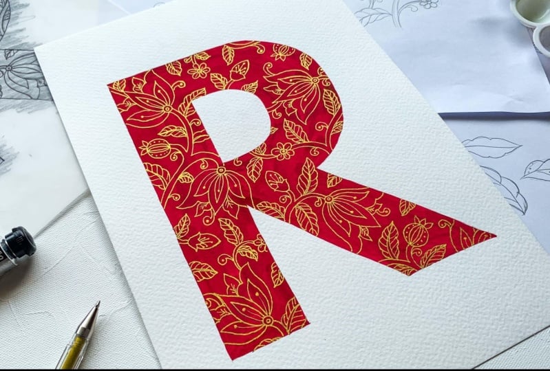
8. Colouring the Monogram: Time to paint my monogram. I'm using gouache, and the
color is Superfine Carmine. So I'm putting a little
bit of paint on my palette and mixing it up to a
nice creamy consistency. And I start painting
all over the R. You can see that the pattern is still
visible from under the paint, thanks to the black
outlining we did earlier. The gouache will get a little more opaque
when it dries though, which will cover up the pattern more, but I think I'll still be
able to see through it. Got to be very slow and
careful along the edges. If you want, you can
use masking tape or even masking fluid
to protect the edges. All right. That's done. So I painted over
my whole alphabet, and now all that's left is to outline the pattern yet again. I know it's been a
lot of outlining, but I promise this
is the last one. And it'll be fun because this time we're
doing it with a gold pen! Let's wait till our
paint is completely dry, and then I'll meet you in the next video for
the last lesson.
9. Outline and Final Details: Now that our paint is fully dry, we can start outlining our
pattern with the gold pen. I've got my Uniball Signo, and I'm ready to
shimmer up my monogram! The black outline
is a big help as I can see the pattern through
the red paint because of it. Once I'm done with the basic outlines, I'm adding in the inner
details for the flowers, buds, fruits and leaves. That's done as well, and finally, our alphabet
monogram is ready. Let's meet one last time in the next video to
wrap up this class.
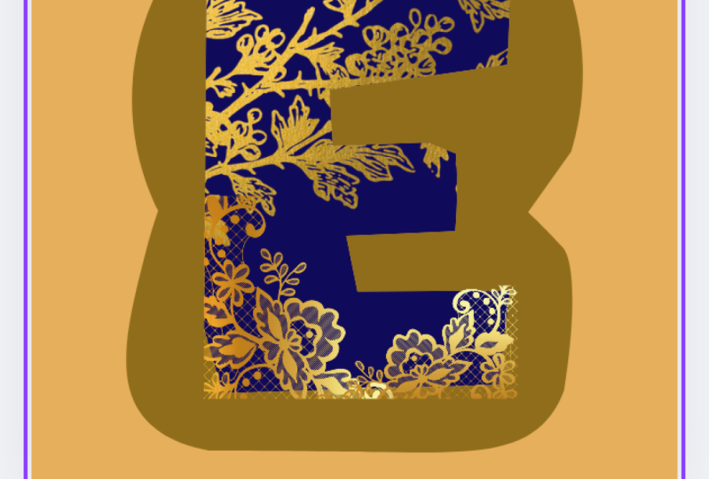
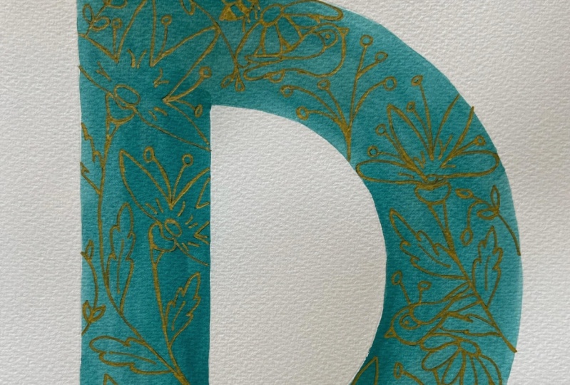
10. Conclusion: Congratulations on
finishing this class. I hope you enjoyed
all the lessons. Here's a quick recap of everything we covered
in this class. We used Canva to choose a font that is suitable for designing
a pattern on it. After setting up the
alphabet on an A4 sheet, we printed it out to use
as a base for the pattern. We then explored a
few design options for all the pattern elements, followed by designing
the pattern composition and layout on the alphabet. Then we traced the final
pattern sketch onto watercolor paper and
colored it before outlining and detailing the pattern
with a gold gel pen. If you need help or
get stuck somewhere along the class, please
reach out to me. You can just ask a question on the discussions panel and
I'll be happy to help. Don't forget to upload your monograms to
the project gallery. For me, the best part about teaching is seeing
my students works. I would greatly appreciate
it if you could take a moment to leave a
review for this class. Reviews are super important
as they are feedback that would help me
improve my teaching and make better classes for you. If you want to
keep updated about new classes or other
announcements, you can follow me on
Skillshare by clicking the Follow button next to my
name under the class title. You can also follow me on
Instagram if you're keen to follow my art journey
and see my other works. oh, if you post your
work on Instagram, please tag me so
I can re-share it. I love showing off
my students works. And don't forget
to tag Skillshare. Thank you for taking this class. I absolutely enjoyed
creating it for you and I can't wait
to see your monograms. Take care until next time. Bye!
11. Quick Update!: Hi again. I just wanted to update you guys on
a new development. I am now offering
1-on-1 sessions. 1-on-1 sessions are great
because they let you have a more focused, responsive and personalized
learning experience. Pre-recorded classes are great, but sometimes they lack that personalized touch which can make all the difference
in your learning journey. In a 1-on-1 one session, the focus is entirely on you, your strengths, your goals, and your areas of improvement. Every minute of the session is dedicated to your unique needs, and I'll be able to give you immediate guidance and
feedback as and when required. I offer two different sessions. One is a 15 minute
feedback session for any of my classes
on Skillshare. So if you enjoyed this
class and need a personalized feedback or need a little bit more help
somewhere along the class, you can book a 1-on-1
session with me. You can show me your
progress or ask me questions regarding the
class and I'll help you out. The second session is
a 30 minute session on finding inspiration for
drawing botanicals. Over the 30 minutes, I will list and explain eight places to look
for inspiration while drawing botanicals for your illustrations or patterns. Unlike pre- recorded classes or other online courses which follow a one size
fits all approach, 1-on-1 sessions can
be personalized to your specific needs
and learning pace. To book a 1-on-1
session with me, just go to my Skillshare
profile page. It's really an investment
in your creative journey and I hope I can help you
and guide you through that.
 Devika Mahajan, Artist and Founder of The Artsychoke