Transcripts
1. Intro: Hey there nature-loving
creative! Do you have a constant
desire to paint every leaf and
flower that you see? Me too. I love to make
botanical illustrations in a stylised and
minimalistic way. I'm Devika, an artist, illustrator and surface pattern
designer from India. I'm also the artist behind
the art brand, The Artsychoke. I have always loved
painting and back in 2018 I took a huge leap of faith, put a stop to my architecture career and started making art, hoping to make it a
full-time job. Today, in addition to
selling paintings, I also license my work on print on demand
websites like Society6, Redbubble, and Teepublic. If you go through my art portfolio you will see a lot of
different kinds of art like abstract acrylics,
watercolor landscapes, architectural illustrations
and botanical paintings. But if I had to pick a
favourite theme to paint it would always be
botanical illustrations. I love to make
nature inspired art - be it a hand painted floral
pattern or a digital one, or minimalistic
watercolor paintings like the ones I will
teach you in this class. This is my fourth
Skillshare class and I'm so thrilled
to have you here. We will start the
class by talking about the class project and the list of supplies
that you will need. Then we will explore some
brush control techniques and how to gather inspiration
for your paintings. After that, we will
paint a variety of leaves and florals
in watercolors. We will not cover any
complex techniques of layering or shading using
watercolors in this class. Instead, the class primarily
focuses on teaching some essential brush control techniques that are required to make those smooth curvy profiles that we often see in nature And to look at reference images of flowers and leaves and to paint simplified and sometimes
stylized versions of them. This class is suitable for all levels and is especially
beginner friendly. And if you are a beginner
who's also looking to get a better hang of brush
control, look no further. I have included four practice
sheets with exercises that are specially
designed for you to practice and improve
hand control. These exercises are
ideal for beginners, but they're also great for you even if you are an
established artist, as you can use them to warm up before you start
painting anything. You will find this class useful
if you're looking for an easy introduction to
botanical illustrations, or if you're someone who loves to send out beautiful nature inspired greeting cards and notes that you've
painted yourself. This class is also great
for you if you are someone who loves to
paint as a hobby, but don't get much
time to do so. These illustrations are
super simple and effortless, but impactful
at the same time. What you will learn in
this class will help you design your own bookmarks,
greeting cards, gift tags and envelopes, journals, or even art that you can frame
and display at home. When you're done
with this class you will have a set
of beautiful leaves and florals that you've
painting in watercolors, and much more confidence
in using a paintbrush. So, what are you waiting for? Let's get started! I will meet you in
the next video.
2. Class Project: Your project for this class, if not already obvious is to paint as many leaves
and flowers as you like. You are of course, free to paint the same leaves and flowers
that I do through the class. But I would love to see
something different. I'd like to see something
that you loved and choose to paint. To
make your job easier I have created a
Pinterest board with images of leaves and
flowers in two sections. Feel free to use these
images as reference. We will in fact be using some of these images in the class. You can find the
practice sheets that I designed under the projects
and resources section. Download them and practice
these templates as much as you want before
you start painting. I will also be showing you
some more exercises in addition to these practice
sheets in the coming lessons. And once you've finished
your illustrations, upload them to the
projects gallery by clicking the Create
Project button. And I would love to get some insight into your
painting process. So feel free to upload some
process images as well. I can't wait to see your
pretty botanicals.
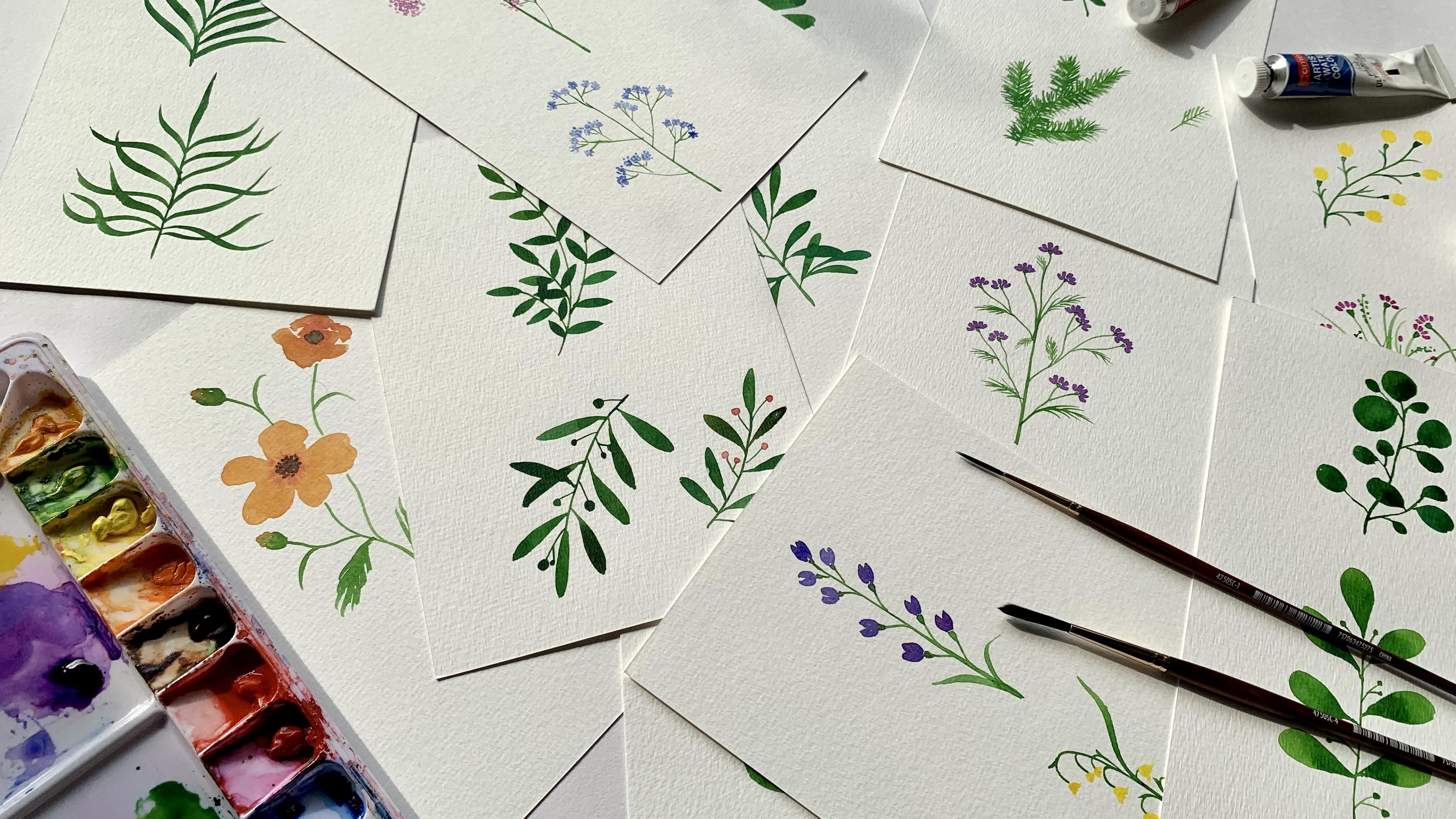
3. Supplies: Time to gather all the supplies you'll need for this class. So the first item on
the list is paper. Now, I always, always use
300 gsm thick watercolor paper. For absolute beginners - gsm stands for grams per square meter and refers to
the thickness of the paper. So higher the gsm, the thicker, and heavier
the paper will be. 300 is kind of medium thickness and is ideal for watercolor, and anything lesser than 300 would buckle when you
use watercolors on them. So make sure the paper you
uses is at least 300 gsm thick. Some other qualities I
look for in my paper are that it's cold
pressed and acid free. Cold pressed paper has a
nice mildly rough texture which I quite like. This is just a
preference and you're free to use any paper, even rough or hot pressed paper, which has a fine smooth finish. But watercolors dry faster
on hot pressed paper so keep that in mind while
you work on your paintings. I would advise you to make
sure your paper is acid free, especially if you want to keep your paintings for
a long time as acid free paper last longer and will not turn yellow time. In this class, I'm using 300 gsm cold pressed
watercolor paper from Canson. You can of course use
any brand you'd like. Next, you'll need watercolors. The only thing I look for in my watercolors is that
they're artists grade. In my years of working
with and trying out different quality and
brands of watercolors, I've realized that
it's best to choose artist grade watercolors as
they are a lot more pigment, behaves better on paper and lasts longer
without fading. But these are things
you need to consider mostly if you plan
to sell your art. If you're just a hobbyist, definitely don't worry
about these factors. We will obviously be using a
lot of green for the leaves. Mostly sap green, since it's
my favorite shade of green. You can actually use any
shade of green you'd like. And for the flowers, we will use
some bright colors like red, yellow, magenta,
blue, et cetera. You don't need to strictly stick to the colors I
use in the class. The color of your flower is
totally up to you to decide. In fact, I want you
to know that you can give any color
even for the leaves. It doesn't strictly
have to be green. You are free to choose your own color palette of
watercolor for this class. You will also need a
palette to mix your paints. So I have my palette filled here with watercolors from
different brands. If you don't have a
palette, don't worry. Just use an old dinner
plate or a lid. You will need two round
brushes for this class, one medium-sized
and one thin brush. For the longest time I have used regular
non-branded brushes I picked up from my
local art store. But a friend recently gifted me this Princeton long head
script brush, and I love it. So I'll be using this as
my medium-sized brush. It's a script brush, meaning it has longer bristles than a
regular round brush. And it's in size
four. The other brush I'll use is this liner
brush from a local brand, and it's in size
double zero double zero. But honestly you don't need a script brush or a liner
brush for this class. You can easily get the job done with any regular round brushes. Just use one medium
and one thin brush. Next you'll need a
jar or cup of water and some tissue papers
or paper napkins. Alright, so that's all
with the supplies list. Let's move on to the next video where I will show you some
brush control exercises.
4. Brush Control Exercises: In this video, we will explore some brush control exercises. This is the stage
where you'd want to work on those practice sheets. If you haven't
already downloaded them, you can do so by
clicking the link on the right under the Projects
and Resources section. Now these exercises are
especially designed for beginners to practice and
improve hand control. It starts with very
basic line movements and then proceeds to slightly more advanced strokes
like curved lines. These practice sheets are pretty simple and
straightforward to use. But if you do need detailed explanations on how to use them, I have covered them in my
previous Skillshare class, Botanical Illustration: Painting a Simple
Indian Floral Pattern in Gouache. I explain
each exercise in detail and give
lots of tips on how to control your
hand movements and pressure for getting different
line types and strokes. So I highly recommend
you to take these classes while using
the practice sheets. The only difference is that in that class I use gouache paints. But that really doesn't change anything for you in this class. Once you have completed
the practice sheets, we can proceed to some
additional exercises which are more specifically
relevant for this class. Ideally should do
these second set of exercises after completing
the practice sheets, because some of these
exercises are evolved versions of the exercises
you'll do in the practice sheets. Alright, if you've completed
your practice sheets let's move on to the
second set of exercises. I'll be using my medium-size
brush for these. For the first one,
I'm going to draw a single vertical line
with the tip of my brush. And then I'm going to draw these small angular lines
on either side of the line. I'll complete one side first and then move
on to the other. But that's not a
rule and you can do both sides together as well. Do whatever you're
most comfortable with. Now, try to keep all
of these little lines the same length and
parallel to each other. Now if you want these
lines to sort of taper out towards the end
or be more pointy you can start your strokes
from the vertical line and outwards, rather than the other
way around. Like this. This way you are
using the drag and lift technique we
learned earlier. And you can move your
paper around as you want. Okay, now let's try the
same with the small lines in the opposite direction. So instead of them
slanting upwards, they all point downwards. And same as before, to get pointy lines, start your stroke from the vertical line and use the drag and lift
method downward. Alright, that's done. Now let's make this a bit
more interesting and try to give these little strokes
on a curved central line. So I'm drawing a thin
curved line like this. And give the outward
strokes along the curve. Try to keep the strokes
the same length. There. We're done. Now let's do this exercise with the lines getting longer
towards the bottom. So I draw a thin vertical line and start giving these
small downward strokes. And I make each stroke longer
than the previous one. And that's done. And I do the same
thing again with the strokes in the opposite
direction as well. All these exercises we do
now are going to help us paint different types of
leaves in our coming lessons. Okay, let's try a new
brushstroke now. What I'm doing is
touch just the tip of the brush first and move
it slowly downward. And as I move down, I press down, drag it, and then lift it up off the paper to get a
pointed tip down as well. Now let's try that again. Touch the tip of the paper, press down and drag,
and then lift up. Do it a few times to
get the hang of it. Now let's do the same stroke
in the horizontal direction. So touch the tip of the brush, press down and drag it to the
right or left if you want, and just lift your
brush off the paper. Do this exercise
also a few times. Now I want you to try this
brush stroke in an angle. Slowly press and drag and move your hand upwords in
an angle, like that. And you already have a leaf. Let's do this a
few times as well. And now in the other
direction like that. And we do that also a few times. Alright, now for
the next exercise, we combine the two
previous exercises we did - the strokes with the central line and this
press and drag technique. So I'm drawing a thin
central vertical line and I'm giving these
angular brushstrokes on either side of it instead of the small
straight lines. Press, drag and lift. Now on the other side as well. And feel free to turn
your paper around whenever you feel
the need to do so. I usually turn my paper around a lot when I sketch
or paint something, so it's actually quite hard
for me to keep it stationary. I'm trying to do it as much
as I can for this class. Okay, that's done.
And look at that - we have a small twig of leaves. Now if you want, you can do the same thing on a curved line. Draw a thin curved line, and give these press and drag little strokes
on either side. And that's a very basic
leaf bunch for you. I want to show you
two more exercises before we wrap up this lesson. So the second last one
is a modification of these wavy lines we did
on the practice sheets. So instead of
drawing these lines in one uniform pressure, I'm going to vary the
pressure a little. Applying more pressure
as I move to the left and releasing as I move
the brush to the right. I'm basically doing
the drag and release technique in a continuous
wavy sequence. And now I'm doing the same thing in the opposite direction. I'm applying a
little more pressure on the paper every time I move my brush to the right and release it as I
move to the left. Now the last exercise
is super simple. I'm just going to draw a circle and fill
it up with paint. So I'm drawing the
outline of the circle first and then I put a blob of paint and just drag and spread that paint around
the whole circle. This is how you get an
even wash of paint. I'm drawing some more circles of different sizes and
doing the same. Now you could also
take a darker shade of the green and slightly dab in some of it close to one
edge of the circle. It kind of adds some drama
and depth to the circle. And it doesn't just have
to be a darker shade. You can also add in a lighter shade, or even an
entirely different color. Everything is interesting, so keep trying and let
your imagination flow. And it's best to do this while
the paint is still wet so that the new paint you add blends in well with the first coat. And that was the last of the
brush control exercises. I hope after the practice
sheets and all these exercises, you feel a lot more
confident in using a paintbrush. In addition to getting you comfortable
while using a paintbrush, the goal of these exercises
is also to give you a sense of confidence painting directly with a paintbrush, rather than having to make
a pencil sketch first. Alright, now that we've
covered all the exercises, Let's move on to the next
video where we talk about how to gather inspiration
for your paintings.
5. Gathering Inspiration: Now as a nature lover, I always look to nature first for inspiration. I love to go out in my garden and click a few
leaves and flowers. But it's winter here
right now and there's hardly any flower
blooming in my garden. If you are in a sunnier
part of the world and have a few flowers
blooming in your garden, Do go out and pluck them along with some leaves you
find interesting. I did manage to pluck a few leaves for my
sad looking garden and I'll be using these as
reference for my paintings. Here's a useful tip -
Always click pictures of flowers and leaves you pluck
before they start to wilt. I clicked pictures of these
leaves as soon as I plucked them because I know they
will start to wilt soon. This really helps me paint at my own pace rather
than having to rush to paint them
before they start to wilt. This way, if they do wilt by the time I get
to painting them, I can just look at
the picture and can avoid another trip to
the garden in the cold. Additionally, I can
use these images as reference in the future
for any project. It always helps to have
a library of images. One thing to keep in mind
while clicking pictures, especially for the kind of botanical illustrations
that we'll do in this class is to preferably
click flatly images. Flatly images are
basically pictures that are clicked directly
above the subject. Place your flower or leaf on a plain flat surface and click
a clear bright picture. I usually place them on a regular A4 paper or
even watercolor paper. Now for anyone who
doesn't have a garden, you can always look at the
Internet for inspiration. The best place to look
for images is Pinterest. And if you want
copyright-free images, you can look at
websites like Pixabay, Pexels, Unsplash, etc. Alternatively, you can just
do a Google image search. Use clear specific keywords. Some great examples
of keywords are minimal botanical bunch,
flowers close-up, leaves close-up, botanical
flatly, simple leaf bunch, simple bunch of flowers etc. Remember, we're not painting a
complex composition. So you don't want to use
a complex looking image. The simpler the image, the
easier it is to paint. And like I mentioned earlier, I have created a
Pinterest board with a section each for
leaves and flowers. And you can use these images as reference for your paintings. You can find the
link to the board in the class description. All right, Now that
we've covered how to gather material for inspiration, Let's move on to painting
our leaves and flowers. I will meet you
in the next video where we start with
painting leaves.
6. Painting Leaves Part 1: We will first illustrate
the leaves I plucked from my garden and then move on to some images I found
on Pinterest. Let's start with
this fern here. I'm using my medium
brush for this one. I load my brush with
sap green and then draw that central vertical line first and then start
painting the leaves. I start with the smaller
ones on top and move downward. And as I move down, I make each pair of leaf bigger than the
previous pair above it. Now when you look at the image, you'll see that the top
few leaves are folded, but I'm just going to
keep things very simple for us and draw flat leaves. Keep making them bigger. I draw the outline of the leaf first and then fill
it up with paint. This is an application of the last exercise we did
in the previous lesson. Now just to add some interest I'm dabbing in some darker
green to these leaves. And I'm painting the next leaf
also with this darker green. I like to vary the shades
of green as it adds a little drama to complement the simplicity of
the illustration. I can keep adding
leaves on either side, but I'm stopping here
and extending the stem a little down so it
sticks out a little. Alright, our first
leaf painting is done. The original fern leaf
is tall and slender, but ours is a shorter and
fatter version of it. The next illustration
is going to be a variation of the
one we just did. Instead of rounded leaves, I'm going to paint pointed
leaves on this one. So again, I start
with a thin central line. And this time I'm making
it slightly angled. And then I start painting those pointy leaves on either side. And just like in the first leaf, I make each pair longer
than the previous. I switch to a darker green
somewhere along the middle. And there's really
no method to it. I switch up shades of green
whenever I feel like it. And we'll be doing this in almost all of the
leaf paintings. I'm just finishing up
the last pair of leaves. And there, we are done
with this one too. Let's move on to our
third leaf painting. Now this one has these
little rounded leaves. It's a pretty
simple composition. So I'm going to draw the
central stem first and then the smaller ones
branching out from it. This is actually how I
start all my illustrations. I identify a main
central branch, draw that first, then paint
little branches on it, and finally add in the leaves. I find this method works
best for me to understand the composition and make the process of
painting it easier. So now that I've painted
the branches, I start painting the leaves. I don't try to recreate
the composition as it is, I'm just using it
as a vague reference. I'm also adding in a few dabs of darker green here and there. Now I don't really
like this branch ending left empty like that So I'm just adding a leaf there. And one up here as well. I still feel the
whole composition looks a little unbalanced so I'm adding a couple
of leaves more. Okay, I'm happy
with this one now. Alright, ready for
the fourth leaf? I'm using a lighter shade
of green for this one. So I'm mixing a little bit
of yellow to the sap green. And same as before, I draw the central line first. I'm painting this one
vertical instead of slanted. And then onto the leaves. These leaves have
this teardrop like shape so I'm painting them that way. And I draw the outline
first and fill them in. Painting leaves on
either side of the stem. And they get darker in
color towards the stem so I'm dabbing in
some dark green there. I'm painting one more row of leaves and adding in dark
green and all of them. Now this looks a little
too plain to me, so I'm going to add
in some more detail. I'm taking my thin liner
brush for this and drawing little stems on
either side of the main stem. And then I'm adding
these little berry-like elements. I'm painting them in green itself because I like to keep
it monochromatic. I feel it retains the minimalistic character
of the painting. And this leaf is finished as well. You see how we spruced up this rather plain
looking leaf by adding some contrast in the green and accessorizing
it a little bit? The next leaf painting is a slight variation of
this previous one. This time, instead of the
tear drop shape leaves, I'm going to paint more typical leaf like shapes
with pointy ends. And for this, we're going
to use the press-drag-lift exercise from
the last lesson. I'm drawing the central stem. And then I'm giving
these angular strokes. Press, drag and lift. I want the leaves bigger
and fatter on this than what I can get with just
one stroke of the brush so I'm sort of scaling
up the exercise here by using two strokes instead of one to get the
shape of the leaf. I first define the shape with an outline and then
fill it up with paint. And I'm going to
give the leaves on the other side of the stem. Same way, two strokes and
a fill for each leaf. And done. The sixth leaf is super pretty and has these little butterfly
wing shaped little leaves. I'm using a darker shade
of green for this one so I'm mixing some viridian
green with the sap green. And I start drawing these very casual butterfly wing shapes starting from one point. Hm, they kinda look like hearts too! Butterfly wings or hearts, whatever they look like
to you, go for it. I'm filling in my
butterfly wings with paint. And it's alright if your brush goes a little
outside the outline, you can just modify the whole
outline with your brush. Now I'm drawing this very
curved stem for it as well. And then dab in some darker green towards the
corner of the leaves. I want to add one more leaf on the side because this one
looks a little too lonely. So I'm just drawing
another leaf here. And just like the first one, drawing the outline first
and then filling them up. And lastly, I add another stem like this
connecting the two leaves. Finishing this off
with some dark color dabs. And our sixth leaf
illustration is done. For the next leaf, I'm taking inspiration from the
one we just painted. I want these little
butterfly wings on either side of a single stem. So I start with
the central stem and then paint in those butterfly
wings on either side. Now there isn't much
we can do to add some kind of interest
to this illustration. So what I do is I just vary the shades of green
here and there. And that's done as well. For the next leaf,
I will be using my thin liner brush because it's got these little
thin pointy leaves. I'm taking a lighter green
on my brush and start with the one central line and pick a few smaller branches
I want and draw those. And now, I'm just giving these small little lines
all along the branches, starting with the main central one. Remember the first
exercise we did in the second set of brush
control exercises? This one is essentially
the same strokes, but here, don't try to make the strokes parallel
or same length. Vary them up. Give the lines
a little more haphazardly. And you can even
give them one on top of the other at
different angles. This adds some thickness to
the whole leaf bunch. And as I progress, I
vary the shades of green. Like here I'm
using a darker green. You can move the paper around whenever you feel
the need to do so. I'm moving onto the
smaller branches and given these little lines
on those as well. And finally, I
finish off by adding a few dark green strokes here and there to give
a sense of depth.
7. Painting Leaves Part 2: Alright, we've painted all the leaves I collected
from the garden. And now let's paint a few from the Pinterest
board I created. You will find all the images
in the leaves section of the board and some more
images you can use also. Now let's see. Let's start with this palm leaf. I'm going back to my
medium brush for this. And as always, I start
with a thin central line and then start giving typical press-drag-lift
strokes for each leaf. I drag them out a little more
to get these longer leaves. You can see that I'm
not copying the image. I'm just using it as a
reference and painting a more wavy, stylized
version of the leaves. I make the leaves
longer as I move down. And finishing it
up with this leaf, that's curving in a
different way to give a feeling of movement
to the whole leaf. Let's try painting the same palm leaf in a little
more stylized way. I'm opening up the
leaves a lot more and really exaggerating
those curves. I'm also making them intersect
and flow over each other. I'm using the same press-drag-lift motion here and just adding more fluidity
to my strokes. There. Isn't that
beautiful? I love it! Next image is this
delicate looking bunch with little simple
pointy leaves. I'm switching back to my thin
brush for this painting. So let's simplify the composition. I see one main branch, two smaller branches on the left, and another one on the right. So I draw those. And then I start
painting the leaves. These leaves are small ,oval with pointed tips on either end, kind of like the shape of an eye. Adding in some
darker green now by mixing the sap green
with some viridian green. By the way, if you
don't have viridian green, you can just add some blue to your green to get
a darker shade. Likewise, if you want to
make your green lighter, mix it with some yellow. I'm painting over a couple of
leaves to get more depth to the painting. I don't worry
about the paint smudging. But if it's something that you don't like, you can just wait till the leaves are completely dry before painting
over with them. Alright, let's move on
to the next illustration. Our reference image this
time is an olive branch. I'm using my medium brush for this one because the
leaves are bigger on this. Starting with the central branch and then moving
on to the leaves. Olive leaves have this
long oblong shape, with the ends extending out
to join the main branch. After painting the first couple
of leaves in sap green, I'm adding a bit
of olive green to the sap green for
the next few leaves. If you don't have
olive green color, you can make some up by
adding burnt sienna, which is a brown to sap green. You could paint the whole
branch in olive green, considering it's
an olive branch. But I'm personally not a
big fan of olive green so I'm just adding in a tint of it here and there in
this illustration. I quite like that
all the leaves in this picture are pointed
in different directions. Let's paint one leaf in front of this one. That should do it. Now, instead of the olives I'm going to give small berries growing out of
the main branch. So I'm taking my thin brush for this and drawing these
little stems from either side of the main branch. And adding these
little green berries. Actually I think I'll make
some bigger than the other. This makes it a lot
more interesting. Now, like I said earlier, you can paint these berries in some other color and it
doesn't have to be green. In fact, let's just quickly paint one branch with
colorful berries. I'm painting an upright branch with the same type of leaves. And I'm adding the small branches. Now I'm taking some red color in my brush and painting
little berries with it. There. That's super
pretty as well. So it's up to you to
keep your illustrations monochromatic or
colorful like this one. Let's paint this little
branch of leaves. You are familiar with the
process now. That's right, draw the central line first
and then the leaves. I'm giving the same type of
leaves we painted earlier, but much smaller this time. And I try to vary the direction of the leaves as
much as possible. So we get this thin
delicate strand of leaves. And as always, don't forget to use different
shades of green. Alright, let's see which
leaves to paint next. I quite like this one. I'm mixing up some dark green on my brush and painting
that main branch. And I slightly increase the
pressure on the brush as I drag down to make the branch
a little thicker there. Then I'm painting
the little branches which connect to the leaves. And after that, I switch to the medium brush to
paint the leaves. The leaves have these
irregular circular shapes so I'll draw those and
then fill them in. And once I'm done with that, I take my thin brush
again and paint these little stems and add
in the buds at the tip. Giving the buds in green,
no surprises there. I feel like there's
too much gap here so I'm just adding a
small stem here as well. And done. The last leaf illustration
we will do is yet again, that of an olive branch. I'm using my thin brush for this and drawing
the central line, slowly increasing
the pressure to make the line thicker
as I move down. And I'm painting the
first leaf up here. Then the second leaf
in a darker shade. Now I'm adding in some branches and then painting the
rest of the leaves. Just like I did with the
rest of the illustrations, I'm picking some leaves here and there from the
reference image instead of copying
all the leaves. I want to balance the
composition out a little bit, so I'm adding some
more leaves here. And this illustration is
complete as well. So we have painted all
our leaf illustrations. Are you ready to paint the florals now? Let's proceed to
the next video for that.
8. Painting Florals Part 1: In this video, we will
illustrate some florals from a few reference images I saved
from the website Pexels. The first image is of
this yellow floral bunch. I'm taking my thin brush, loading it with sap
green and drawing a thin central line
for that stem. And I'm drawing
these little stems sticking out from either
side of this main stem. Now I'm drawing
these tiny triangles for the lower green
part of the flower, which connects to the
stem called receptacles. By the way, I had no clue
that these parts were called receptacles and I had to
Google it for this class. So yeah, I learned something
new myself while teaching this class. Those are done. Now I'm taking my medium
brush to paint the petals. Loading some yellow on it. And I'm painting these oval shaped petals above
each receptacle. They're not strictly
oval-shaped petals. I'm actually just
using a few strokes to get a vague petal
shaped blob there. And I'm leaving tiny gaps between the petals
and the receptacles because the green
paint is still wet and I don't want the
yellow mixing with it. You can see that here again, I'm not replicating
the reference image. I pick the prominent features
of the floral bunch, like the stem, the
receptacles and the petals. And I illustrate them
in a simplified style. Alright, I'm just adding
in a few details with my thin brush, just to fill
up those empty spaces. There you go, first floral illustration is done. The second illustration
is going to be of these pretty
little buttercups. I'm mixing a lighter shade
of green on my thin brush for this. And I'm drawing these multiple stems which bend and point in
different directions, just like in the picture. Now these flowers don't really have prominent receptacles, but I'm painting them
anyway because I like them. So I paint a receptacle
at the tip of each stem. Next, I'm adding in some loose curvy
strokes to fill up all that space
between the stems. I see those little green
buds in the image. And I'm modifying them a little
and painting them like this. I also make sure they're evenly distributed across
the illustration. Time to paint the petals now. Instead of yellow, I'm going to paint them in a magenta color. So I'm taking some magenta
in my thin brush and painting these small rectangular
shapes for each petal. Just like in the
previous illustration, I paint them very close
to the receptacles but don't touch them. Now I know buttercups
have five petals, but I'm just painting four here. Giving these small rectangles
above the receptacle. 1, 2, 3 and 4.Like that I'm finishing up
all the flowers. I also want to add in
some flower buds and I'm painting single rectangles
here and there for that. Adding some stem to these buds. And we're done. Let's paint this bunch of baby's
breath flowers. I'm taking sap green on my thin brush and drawing
the branches first. Drawing the main central one, and I'm increasing the
pressure a little towards the bottom to make the
stem thicker there. Then I'm painting the smaller
stems that branch out. I'm going to paint these
flowers as well in magenta, but I'm using a very diluted
version of the color, so I'm mixing it up
with a lot of water. And I'm just dabbing in random small dots
for the flowers. I'm giving a cloud-like
shape filled with dots for each
cluster of flowers. Trying to cover one
whole bunch with dots. That bunch is complete and
I'm moving on to the others. Keep giving random
dots with your brush. Now there's no
particular pattern to this and they don't have to be precise dots
at precise distances apart. And don't be afraid
to dab your brush over areas that you've
already covered. Be as random as possible
in giving the dots. And if you want, you can take a darker shade of the color
and dab a little over some regions already painted to give a nice shading effect. I'm finishing up the
other bunches as well. I feel like this
bunch is too thin so I am adding some more dots to make the whole
cluster bigger. And that is it. Super simple. For the next illustration, I want to paint the same bunch, and this time I want to make the clusters of flowers
more segregated, similar to what we
see in the image. So just like earlier, I start with the central stem
and the smaller branches. This time I'm choosing
blue for my flowers. So I'm taking very
diluted ultramarine blue and making small
bunches with dots. It's the same process as
the previous illustration. But here, instead of painting the whole cluster of flowers
in one big cloud of dots, we're painting each little
flower bunch separately. And this illustration
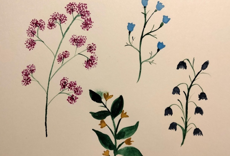
is complete as well. Let's paint this stem
of flowers and leaves. I'm using my medium
brush for this one. So I'm going to draw
the central stem and the leaves first, and then the flowers. I start with the stem, and
then draw some leaves. You're quite familiar with this now, we painted very similar
leaf illustrations earlier. And now I'm drawing small stem sticking out from
the central one. This reminds me of the olive
branch illustration we painted earlier with little
berries between the leaves. It's very similar to that, but instead of berries, I'm going to paint flowers here. The flowers are going
to be red this time. So I'm taking some
red on my brush. And I'm painting these
simple three-petal flowers at the end of each stem. So there, that's our illustration
based on this image. You see how we looked at a
rather crowded composition and simplified the whole thing into our own minimalistic
interpretation. Let's move on to these
little blue lilies. I'm switching back
to my thin brush. And I'm using a darker
shade of green, so adding a tint of
viridian to my sap green. And as usual, I start
with the central stem. And draw the little
stems which are bending down from either side
of the central stem, because most of these flowers
are facing downwards. I also paint little
receptacles here. Then I take some blue and
paint that bud right on top, and then move on to the flowers. The flowers have this
bell-like shape so I paid those. A little
bell-shape with pointed ends. And then another pointed
petal in the center. I also make sure I leave
a tiny bit of gap between the receptacle and the flower to avoid the blue
and green mixing. Now if you don't want
to leave this gap, you can just wait
till the receptacle is dried to paint the flowers. I'm finishing up
this illustration with some leaves here and there. Next we're going to paint
this bunch of daisies. Similar to the buttercup
illustration, I start painting a few stems which bend in
different directions. A few of them intersect as well. Then I paint the receptacles. And some grass-like
leaves to fill up the empty gaps between
the long stems. Now I'm taking some violet
in my brush and giving these little lines starting
from the receptacles. Give small short strokes
of similar length. Similar being the keyword. Don't make them all
exactly the same length. We want them to look more
natural and organic. Imagine painting a thick short crown of hair
for the receptacles. I'm starting my
strokes right from the receptacles and not leaving
a gap between them here, because I know the green
has already dried up, so the paints won't mix. Alright, this illustration
is done as well.
9. Painting Florals Part 2: Let's now paint some flowers I've pinned on the
Pinterest board. You can find all these
images along with others in the Flowers
section of the board. The first image is
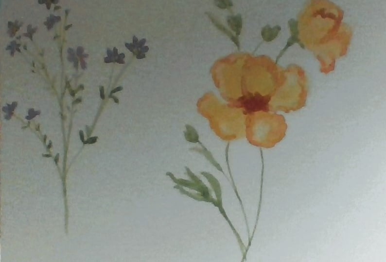
of these tulips. I'm using my thin brush to mix a light green and
then draw two stems. I'm also painting receptacles. You've probably guessed by
now that I love to paint these receptacles even
when they're not there in the reference
image. I don't know, I feel they're a nice feature
to add on to the flowers. Right, now I'm taking my medium
brush to paint the leaves. And once I'm done with the leaves, I'm mixing a little bit
of orange with red to get a nice coral-like shade
and painting the flowers. I'm changing up the
tulips a little. And I'm adding a little bit of red here to give a darker shade. I feel the stem looks a
little too long and empty so I'm adding a few green
lines with a thin brush here and there. Okay this one's turned into a whole new leaf but that's okay. I'm going to stop myself
before I overdo it. And done. Next, we're going to
illustrate this image. I don't know what these flowers
are called, to be honest. They kind of look like orchids but I'm not sure if they are. Anyway, let's get
to painting them. Their structure is
very similar to the blue lilies we
painted earlier. And I start with painting
that central stem with my thin brush. And then little stems
on either side of it. And of course, receptacle. To get that lavender shade, I'm adding a little
bit of blue to violet. And I'm starting
with the petals. There's mostly two petals
visible for each flower. And they have this
hoof-like shape. I'm finishing up the petals. And then adding a
couple of leaves. It looks complete now. I can totally imagine this
illustration on a bookmark! Our ninth illustration is going to
be this - lilies of the valley. I'm sticking to my thin brush and drawing the central
stem that's drooping down. Then these little side stems that
are drooping down as well. I'm also painting these
little pointy projections that are seen on
all of the stems. Now I'm going to paint
the lilies in yellow. I start with small
flowers on top and then make them bigger as
I move down the stem. The shape of these
flowers remind me of a Disney princess skirt! Or they can be little bells. Finishing it up with a
single statement leaf. And maybe one more down here. For our tenth illustration, I'm picking this bunch of pretty little
flowers. As always I'm going to start
with the central stem and then the little branches, and then the leaves and flowers. So drawing the stem
with my thin brush. I'm using sap green here. And yes, I am painting little receptacles at
the tip of all the stems. Now some leaves. They're like these
little branchy leaves. Time to paint the flowers now. And I'm painting them in violet. Now, making these
flowers similar to the buttercups we
painted earlier. But instead of four petals I'm giving them five petals. You can start with
one little rectangle right above the receptacle, and then paint two petals each on either side
of it, like that. One middle petal and two
on either side of it. Let me finish that up. Now because I'm painting
a very small area I don't want my brush to
be overloaded with paint, so I dab off excess paint from the brush on
a tissue paper. This prevents a
large blob of paint coming onto the paper and
messing with my flowers. I'm adding a few more
leaves wherever I feel there's too
much empty space. And our tenth floral
illustration is complete. Let's paint one
last illustration. I'm using my medium
brush for this one. To get that mild orange. I'm adding a little
bit of yellow to red. And I'm just painting a
rough outline of the flower. Remember, it doesn't
have to look exactly like the
reference image. We're only painting something
that looks like it. So don't stress on getting the shape of the flower perfect. I'm filling in the
outline with paint. And I'm dabbing in a few drops of red color right
at the center. Now I'm painting
the smaller flower on the top right as well. Same way, drawing the outline
first and then filling it in. And adding a tint of red there. Now I'm taking my thin brush, getting some sap green on it, and drawing the stems and buds. And then a couple of leaves. I also add a touch of
the orange to the buds. Now this time I want them
to merge with the green, so I don't wait till the
green dries for this step. And I'm finishing up our last
illustration by taking some brown and dabbing a few dots right at the center
of both the flowers. So we have completed
all the illustrations and with that, we've reached
the end of this class. I will meet you in the coming
video to wrap things up.
10. Conclusion: Congratulations on
finishing the class. We started this class
with some basics like those brush
control exercises, which really set the
base for painting not just leaves and flowers
but anything really. I hope you feel a lot more
confident using a paintbrush now. We then talked about
how to get inspiration for your painting and then painted these beautiful
minimalistic illustrations. I hope you enjoyed this class as much as I did
creating it for you. If you need help or tips
somewhere along the class, feel free to ask a question in the discussions panel and I'd be happy to answer them for you. Once you finish
your illustrations, upload them to the
project gallery. You can do this by clicking
on the Create Project button. And if you decide to share
your work on Instagram, make sure you tag me @the_artsychoke so
I can reshare it. I love to show off my students' work. And don't forget
to tag Skillshare. Your feedback is extremely
important for me, so please take a moment
to leave a review. This will also help me make
better classes for you. You can also follow me here
on Skillshare so you get a notification every
time I publish a new class or make
a new announcement. Thank you so much for
taking this class and I can't wait to see
your illustrations. Take care until next time. Bye.
11. Quick Update!: Hi again. I just wanted to update you guys on
a new development. I am now offering
1-on-1 sessions. 1-on-1 sessions are great
because they let you have a more focused, responsive and personalized
learning experience. Pre-recorded classes are great, but sometimes they lack that personalized touch which can make all the difference
in your learning journey. In a 1-on-1 one session, the focus is entirely on you, your strengths, your goals, and your areas of improvement. Every minute of the session is dedicated to your unique needs, and I'll be able to give you immediate guidance and
feedback as and when required. I offer two different sessions. One is a 15 minute
feedback session for any of my classes
on Skillshare. So if you enjoyed this
class and need a personalized feedback or need a little bit more help
somewhere along the class, you can book a 1-on-1
session with me. You can show me your
progress or ask me questions regarding the
class and I'll help you out. The second session is
a 30 minute session on finding inspiration for
drawing botanicals. Over the 30 minutes, I will list and explain eight places to look
for inspiration while drawing botanicals for your illustrations or patterns. Unlike pre- recorded classes or other online courses which follow a one size
fits all approach, 1-on-1 sessions can
be personalized to your specific needs
and learning pace. To book a 1-on-1
session with me, just go to my Skillshare
profile page. It's really an investment
in your creative journey and I hope I can help you
and guide you through that.
 Devika Mahajan, Artist and Founder of The Artsychoke