Transcripts
1. Introduction: If you're interested
in art and follow a lot of artists
on social media, it's quite likely that
you've come across this new medium called
gouache a lot recently. Book illustrators, surface
pattern designers, lettering artists,
graphic designers, they all seem to
love this paint. So what is gouache and what's
all the fuss about? Well, this class
covers it all for you. I'm Devika, an artist illustrator and surface
pattern designer from India. I'm also the artist behind
the brand. The Artsychoke. I have been painting
since forever and art has always been
my one true passion. In 2018, I put a stop to my architectural practice
and started making art, hoping to make a
career out of it. Thus, the Artsychoke was born in this little corner
of my room. Today, my little studio still
remains the same, but the Artsychoke has
grown into a brand selling original artworks
and illustrations, handmade products and
patterns for licensing. You can also find my
art on a wide range of products like tech
accessories, home decor, clothing, stationery,
et cetera on print, on demand
websites like Society6, Redbubble, and Teepublic. My work portfolio is quite
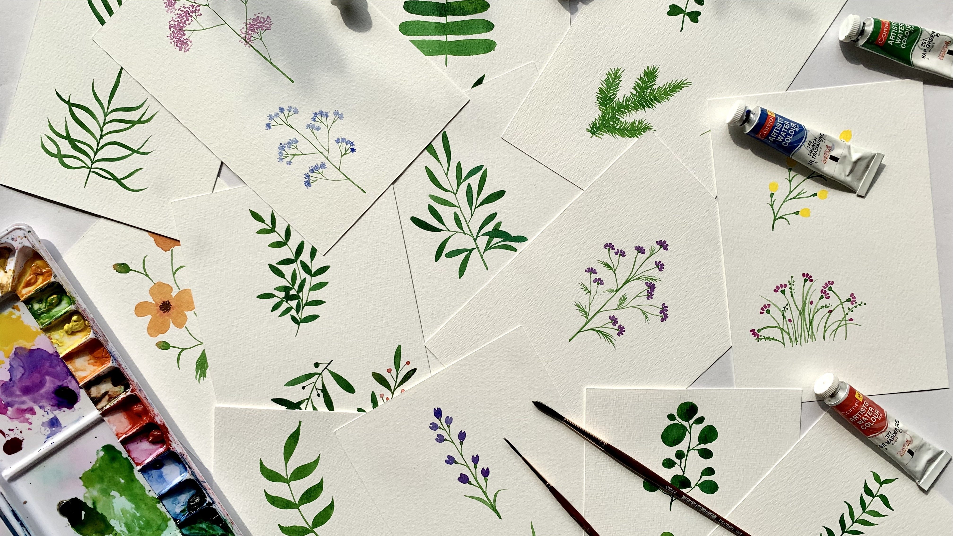
varied because I like to dabble with lots of different
kinds of art and medium. You'll find a lot
of botanical art, architectural illustrations,
traditional Indian art like these Kerala
mural paintings, abstract acrylic paintings, watercolor landscapes, digital and hand drawn
patterns, and many more. And much like other artists, I've taken a fancy to gouache
in the recent years as well. I paint almost all of my illustrations and
patterns using gouache, and I'm in love
with this medium. In this class, I will
teach you how to paint a vibrant wildflower
garden using gouache. And by doing so, I
hope to teach you everything that I know about
this fascinating medium. So, I welcome you to my
fifth Skillshare class. We will really get to know
gouache by playing around a lot with it in this class. We will explore different
characteristics of gouache, and three techniques
of painting with it. And once we're past the formal
introduction stage, we will paint this vibrant wildflower garden
with our new friend. Additionally, in this class, you will also learn a couple of more simple tricks
or techniques. I will show you how to
paint colorful flowers by loading different
colors on your brush. This is a simple technique
called one stroke painting. And you can use it to get beautiful color gradients
in your brush strokes. This is a technique that you can apply not only
with gouache paints, but with other wet mediums
like watercolors and acrylics. Through this wildflower
garden illustration, you will also learn to paint a rather busy looking
composition that has depth and dimension using simple methods
of painting in layers. So in addition to being an
introduction to gouache, this class is also loaded with techniques and
tips of painting with gouache. And these are
techniques that you can apply to other
wet mediums as well. We will start the
class by talking about all the materials we'll need. Then we'll cover lessons
on introduction to goache, its properties, its
differences and similarities to
watercolors and acrylics. After that will be a fun lesson on just testing the paints, playing around and experimenting and trying out different
painting techniques like blending and layering to really get the hang of
painting with this medium. Then I will show
you how to paint a few colorful flowers by loading the brush with
different colors. And after that, we will move on
to paint our wildflower garden. This is a super easy
beginner level class and it's ideal for anyone looking for an easy
introduction to gouache, through a short
and simple project. That said, it is not
exclusively for beginners. It could be a fun class for you even if you're
not a beginner because who knows, you might learn something new
and interesting. The goals of this class are to introduce you to gouache
paints and hopefully make you like them. To teach you a couple of
painting techniques with Gouache. To show you how to get multiple colors in one brush
stroke for painting flowers. To show you how to paint
a vibrant garden filled with flowers in
three simple steps. All right, if you're ready
to dive into the class, I'll meet you in the next video.
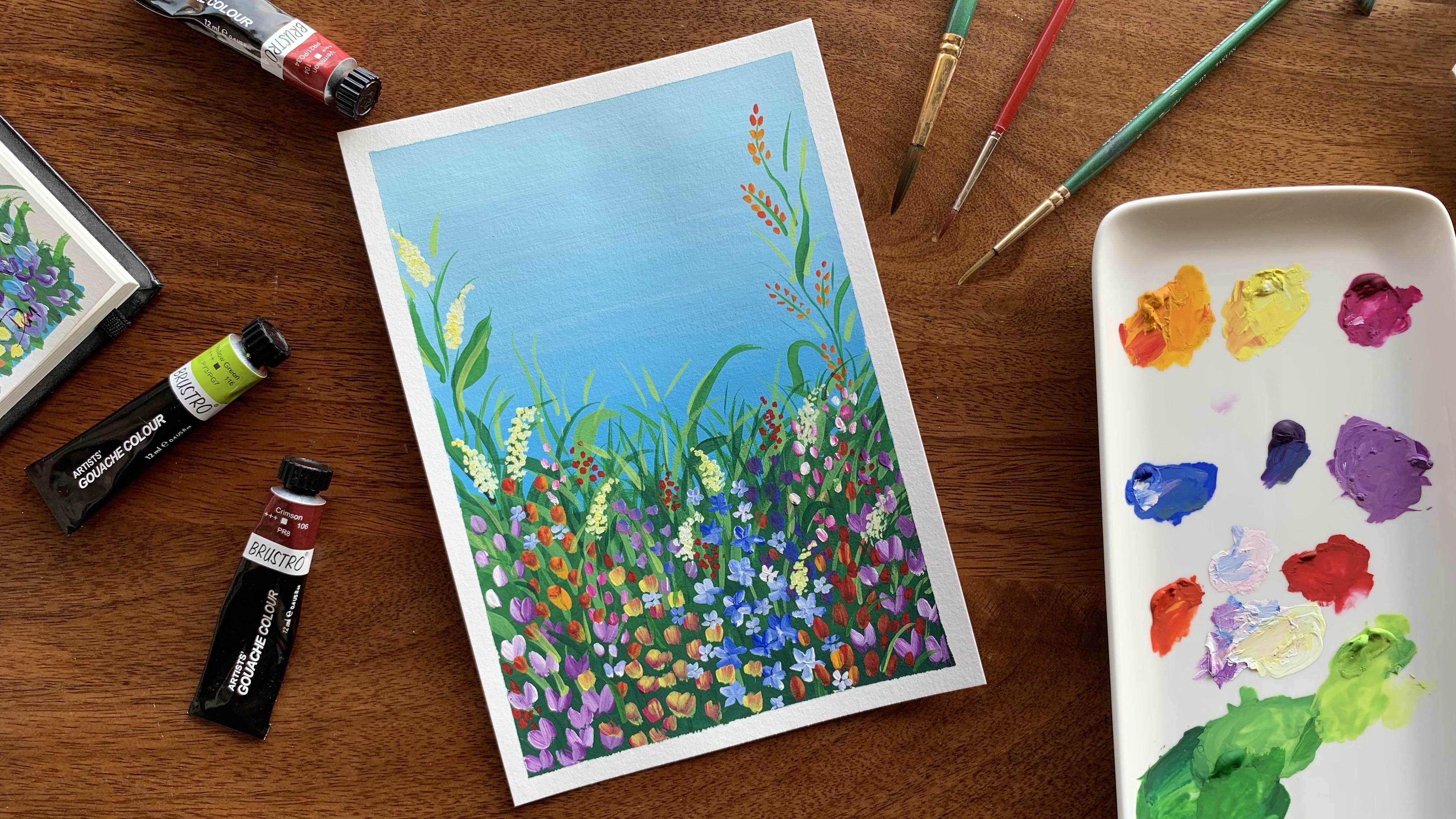
2. Class Project: The project for this
class is to paint this little garden
filled with flowers. But don't worry, I'll be painting along with
you through the class, taking you through the
whole process step by step, I'll show you how
to mix your paints, blend your background blue, lay your greens, and
add the flowers. It'll be fun, I promise. And once you're done
with your project, please upload them to
the project gallery, because I would love
to see your work. You can do this by clicking the Submit Project button under the Projects
and Resources tab. All right, let's
start the class by talking about the materials
you will need.
3. Materials: You don't need a lot of
materials for this class, you just need gouache
paints, obviously. Paper, brushes, palette,
two jars of water, paper napkin and masking tape. Now, this one isn't compulsory. It will be helpful to use masking tape when doing
our blending exercise though. Now let's go over the materials
a little bit in detail. There are a lot of brands of gouache available in the market. I'm using this
brand called Brustro. It's great quality and pretty economical compared to other
artist brands out there, so I can recommend this
for you to start with if you're looking for a
budget friendly option. Now when it comes to paper, there are multiple options
available for gouache. Essentially, what
you need to look for is paper that
can hold water well. Hence, watercolor paper
is a great option. I usually use 300 gsm
watercolor paper. 300 is pretty thick so it
can hold the paint well. Now, watercolor paper itself comes in two different types, cold pressed and hot pressed. Cold pressed paper has a
more distinctive texture, while hot pressed paper
is more smooth. I usually use a lot of
cold pressed paper for my floral illustrations and patterns because I
love this texture. But I do occasionally use
hot pressed paper as well, So it's really just a matter of personal preference.
For this class, I'm using the smooth
hot pressed paper from a brand called Scholar. Now some other brands that
I have tried and like for watercolor paper are Brustro,
Strathmore, and Canson. They're all very good. You can also use multimedia
paper for gouache paints. Just make sure that they're at least 250gsm thick so they don't buckle
while painting on them. Let's talk about brushes. Now the rule of thumb for
choosing brushes when it comes to gouache is simple
and straightforward. Pick small brushes for smaller areas and larger
ones for larger areas. This rule is especially
important while layering paints. Because
gouache paints are water based, regular watercolor
brushes work just fine. For this class, I'll be using
an assortment of brushes. I'm using round
brushes in sizes 9, 5 and 1. And flat brushes in sizes 6 and 1.
When it comes to brushes, I don't usually stick to
one particular brand. I just go to my local art store and pick
out ones that have soft bristles and feel like they're decently
good quality. Let's talk about palette. Now anything that has a smooth, clean surface would
work as a palette. You can use an artist's palette, a plate, a shallow dish, or even lids of
plastic containers. I usually switch
between two favorites, this ceramic plate and this biggish palette with
a lot of compartments. The reason for picking one over the other
usually depends on things like the purpose and the quantity
of paint required. For example, for today's class, I'm using the ceramic
plate because I know I won't be using large
quantities of any color, and I don't foresee doing a lot of mixing to
make new colors. But when I work on
larger paintings where I know I will need to mix
a large quantity of paint, I will use my larger palette. It has these little wells where I can mix up a lot of paint. And, if there is any leftover paint, I can just store them
in this palette itself. I cannot store any paint on the ceramic plate
since they'll dry out and also they'll be exposed
to dust and other things. We will definitely
need a jar of water for mixing the paints
and washing the brushes. From my experience, I
have learned that it's better to have two jars
of water while painting, not just with gouache,
for any wet medium actually. You can use one jar to wash paint
off your brushes, and another jar for adding to
the paint to mix it up. That way you don't
have to keep changing your water multiple times
through your painting session. It just makes the whole
process more efficient. Paper napkins are
essential to dab your brushes and take off
excess paint or water, or quickly clean up any mess
or mistakes that may happen. It frequently happens
when I paint. Now, like I said earlier, artist tape is not a compulsory requirement for this class, but it would be
extremely helpful to have one when we do our
blending exercises. We will be doing the
same blending exercise for our wild flower garden also, so it'll be good if you can
try to get hold of one.
4. Hello Gouache!: It's time to introduce you
to gouache. So what is gouache? Well, in technical terms, gouache is a water based
paint that combines natural or synthetic
pigments with water and a binding
agent like gum Arabic. And in simpler terms,
it's commonly called opaque watercolors because it behaves a lot like watercolors. But unlike watercolors
which are translucent, gouache is opaque. It's also thicker and
creamier than watercolors, which makes it a little more
similar to acrylic paints. It is also highly pigmented, which means the colors
are vivid and saturated, again, quite similar
to acrylic paints. So because of these characters, gouache can be categorized as a hybrid between
watercolors and acrylics. Oh here's a little fun trivia - Gouache has been around for
quite a long time, with documentation of it
being used in some form or the other since
ancient Egyptian times. So, although we started hearing
about it only recently, gouache is actually old news. It started regaining
popularity with artists and illustrators recently
because of its vivid colors, flexibility, quick drying, and
a lot of other properties. So what's all the
fuss about anyway? To understand that, we
will have to go over the characteristics of gouache
a little bit in detail. A lot of artists love
gouache because it has both qualities of water
colors and acrylic paints. Let's do small swatches
of all three paints to get an idea about their
similarities and differences. I'll make swatches
of the same color in all three mediums to make it, let's say, a fairer comparison. I'm starting with
blue in watercolor. And as you can see, it's really
transparent and free flowing. It's actually going to
be even more lighter when it dries. Now making a swatch of blue in gouache, and it's much more thicker and creamier and way more opaque. It may look glossy now because it's wet, but once it dries, you'll see that it has a matte
texture. And as is obvious, it's a lot more pigmented
than the water color. That said, if I add a
lot more water to this, it will look very, very similar to the
water color swatch. But we'll get into
that in a bit. Next, I'm doing a swatch
of blue in acrylic paint. And you can see that
the paint itself is much heavier than watercolor, though may be a bit
similar to gouache. It is also pretty pigmented
and opaque like gouache. But when it dries though, the glossiness will remain. So the paints are all dry now, and you can really see how translucent the watercolors
are once they've dried. They're also a lot
less saturated as compared to when we
applied them on the paper. The gouache, on the other hand, is still very saturated and
opaque, and so is the acrylic paint. It's dried opaque, is as
saturated as it was when wet, but it still has a glossy sheen. Now, let's see what happens when we try to rewet the paints. I've just dipped my brush
in some clean water and I'm lightly running it along
the edge of the watercolor swatch here. And you can see
how the color is getting reactivated and I'm able to just pull some of that
paint out with the brush. I'm trying the same with gouache, and yup, the same
thing's happening. The colors are
activated again and I'm able to pull them
out to some extent. I'm doing the same with
the acrylic swatch now. And, nope. It's still dry and
completely permanent now. So gouache shares its reactivation
property with watercolors, but not with acrylics, as acrylics become permanent and resistant to water
once they are dried. Here's a broad comparison chart for you to better understand the similarities and
differences between gouache, watercolors
and acrylic paints. You can pause the video and
have a thorough look at it. And once you've had
a good look at it, we'll meet in the next lesson to learn more about
painting with gouache.
5. Painting with Gouache: The first step in getting
to know any kind of paint is to test out the
colors in little swatches. I would recommend doing
this not just for gouache, but any new medium
that you want to try. I always make little
swatches of all the colors whenever I want to
try out a new medium. You can see all the
swatch charts that I've made of all the paints
that I've ever tried out. I cannot emphasize how important
and useful this step is. In addition to giving
you a good understanding of the thickness, opacity, pigmentation of the colors, you also get a
fairly good idea of how the colors behave
on that surface, how they dry - whether they
dry translucent or opaque, and how some colors dry
faster than the others. You get to know so much
through this one step. And also, you will have
a reference chart of all your colors whenever you want to pick colors
for a new painting. Here's my Top Tip: Always
make swatch charts of all the colors whenever you want to test out a new medium. Here's a time lapse video
of me making my swatch chart. As you can see, I've
put little drops of all the colors of my gouache
paint set on my palette, and I'm just painting
little rectangles of each color on
this A4 sheet. I've used a bigger sheet
because having them all on one single
sheet makes it easier to use them as a reference
in the future. All right, that's the finished swatch
chart for my gouache paints. I've also written the names of the colors as well
for easy reference. And, to be honest, I actually
hadn't made a chart like this because I had initially done
the swatches on my notebook. But now I also have
a swatch sheet that can go up on my
wall with the rest. Now another noteworthy quality of gouache paints is that they don't always dry to the same
value as when they were wet. Lighter colors
sometimes dry darker, and darker colors dry lighter
than they are when wet. Let me show you what
I'm talking about. I have here a dry
swatch of flesh tint. And I'm applying a bit of wet
flesh tint right next to it. I'm not sure if it's
evidence through the camera, but the wet paint is visibly
lighter than the dry coat. Similarly, I'm painting
a bit of this blue right next to this completely dry
swatch of the same color. And this fresh, wet paint is a lot darker than
the dry swatch. So it's all the more important
to make swatches, to know how a color dries
on your finished painting. This particular quality of gouache brings me to
my next top tip. Always mix up a good
quantity of paint if you know you will
need a lot because it's very very hard to match the colors
if you need to remix them. Now let's play around
with the consistency of gouache. We can change up the consistency by varying the amount of water
we add to it. So here, I'm applying a little
bit of this red color. The consistency is
what's straight out of the tube and I haven't
added any water to it. And as you can see, it's
really thick and patchy. It's actually quite hard to
spread around with the brush. Now, let's add a few
drops of water to this. I'm just dipping the
tip of my brush in the water jar and mixing
it up with the paint. It's slightly better as in, it's easier to spread
the paint around, but the strokes
are still kind of patchy. I'm adding a bit more
water to the paint now, and this time the mix is
pretty creamy and velvety. And you can see that my brush just glides smoothly on paper. The paint is still
very pigmented and opaque though, and I would say this is the ideal consistency that we typically want for gouache. Okay. I'm adding more water to the same mix and
painting a swatch. and the paint is more
runny but still pretty saturated. And like that, I'm just going to do few
more swatches, each time slightly increasing the amount of water I add to the paint. And you can see that as I keep
adding more water to it, the red keeps getting
less saturated and it's starting to look and
behave more like watercolor. So that's how gouache behaves when mixed with different
amounts of water. Like I said earlier,
to get a smooth, vibrant, and opaque texture. I would say the
consistency we used for this third swatch
here is ideal. It wasn't too dry or too watery, and it had just enough
water for the brush to glide and cover an
area uniformly. So usually to get this smooth
flowing and opaque effect, I always try to achieve the consistency of
melted ice cream. That said, you can get a full coverage with thicker
consistency of paint, like the second swatch or
maybe even the first swatch, but you'll need to
use a lot more paint to cover the same area, it would end up being a
thick layer of paint. The problem with that is gouache paints tend to
crack after drying if they're used with
too less water. So that's something
you need to keep in mind and be careful about. Also, whenever you do add
water to gouache paints, keep adding water
little by little and not a whole lot
right in the beginning. That way you have
more control on the mixing process and know when to stop adding more water. Now, a lot of artists use gouache in different
consistencies. It really depends
on the kind of painting and effect that
you're looking for. Say, for example, if you want
a scratchy rough texture, then you can use
it with no water or very little water,
like the first swatch. And if you want something
saturated and opaque, but need to blend two colors, then you need to add
just enough water so that the consistency is such that the paints blend
with each other but still retain their
opacity and saturation. You can get different
textures with gouache just by varying the
consistency of the paint. And that is one of
the many reasons a lot of artists are
in love with it. It's such a versatile medium. Let's move on to some techniques of painting with gouache now, and I'll meet you in the
next video for that.
6. Technique 1: Layering: The first technique we'll
go through is layering, that is painting one
color on top of another. Since gouache is an opaque medium, it's relatively easy to
layer colors on top of each other even if it's
a lighter color on top of a darker color. Well, most of the time, I believe now is
the time to draw your attention to a
tiny little detail that might prove
useful while painting with gouache, especially when layering. So all artists quality gouache comes with an indication of
opacity of its colors. I have this tube of
Prussian blue here, and if you take a
closer look at it, you can see this
little square here. This square, which
is a filled one, indicates that it's a
fully opaque color. Now take a look at
this lemon yellow. The square is half filled
and that means the color is not completely opaque.
Probably half opaque. So, if I were to paint this lemon yellow over
the Prussian blue, it won't fully
cover up the blue. And this isn't particularly because lemon yellow is a lighter color. Here I have this
tube of flesh tint, and despite being
a lighter color, the square marking indicates that it is a fully opaque color. So it probably depends on some factors like the
quality and the character of the pigments used
to make the colors or some other substances
that go into it. Anyway, this little square
tells you whether you can effectively layer a lighter
color over a darker one. That said, it is still a good idea to test out your colors on paper to see how they really
turn out. So let's do that. I've made these biggish
swatches of a few colors here. And I've deliberately picked
both dark and light colors so we can try layering light on
dark and dark on light. This one here is burnt umber, This is flesh tint,
lemon yellow. Then there are teal,
ultramarine blue and viridian green. Now rule number one in the
layering technique is always make sure the bottom layer of paint is completely dry before
painting over it. That's why I painted
these in advance. All these colors
are completely dry. If you paint over a layer
that isn't completely dry, the colors will blend with each other and it might
end up looking muddy. Let's start layering
some colors over these. I'm just mixing a
flesh tint with some water and painting a
circle over the burnt umber. and, maybe a line. And you can see that despite the
square on the tube, indicating that it's
a fully opaque paint, it's only partially opaque and the burnt umber is still
showing through a little. So now you know not to completely
trust that little square! Now let's see... I'm trying the
flesh tint over the teal now. Drawing a few lines. I also want to vary the
consistency of the paint so I'm taking a dry brush and let's just see
how it turns out. You can see that since
the paint is pretty dry, it's coming out quite streaky. It's actually a nice texture though. Now, what if I were to apply
a thicker coat of paint? I'm making a circle with
a generous amount of paint and it's looking
a little more opaque. Same over the green. Now I'm taking a bit of the blue and layering it over
the burnt umber here, and you can see that
it's pretty dark. Yep, the blue is quite opaque. Let's try it on the yellow now. Now you can see here, as
I'm painting the circle, the blue and yellow
are starting to blend. That's because while
painting the circle, I moved the brush a lot over the yellow underneath
and sort of disturbed it, and this caused the
paint to reactivate. I'm switching to a bigger
brush as it's better to stick to as few brush strokes
as possible while layering. There, that's much better! So if you want to
paint a large area, switch to a larger brush so that you can paint more
in less strokes. And if you just want
to draw a line or dot, try to achieve that
in single stroke. Another thing to keep
in mind is that if you use too much water
for the top layer, that might also cause
your lower layer to reactivate since
gouache is water based. So make sure your second
coat is not too watery. Now, if you do end up activating the paint
below, don't panic. It is a fixable mistake. Just wait till the
paint is completely dry and paint over
it, but this time make sure you do it in
single, smooth strokes. Now at this point, I'm just playing around
with the colors, and I encourage you to do the same. Make some lines, circles,
dots, strokes, patches. Try different consistencies, and maybe even
different brushes. Do whatever you feel like
and follow your instinct. Go with the flow.
Oh, and have some fun. This is a great learning
experiment and you will get to know how
different colors behave one on top of each other with different consistencies
and application methods. You can also see that I've
invited red to the party. Now the paints are all dry. And it's interesting to see that
the yellow, when we applied, was kind of translucent, but
now it's more opaque. And the teal is also pretty
opaque over the burnt sienna. So yeah, some things to keep in mind
while layering colors in gouache: Make sure the bottom layer is completely dry before
painting over it. The top layer of paint
should not be too watery and avoid too
many brush strokes while painting over a layer. Use larger brush if
you have to cover a larger area and use smaller
brush for smaller areas. All right, now it's
time to move on to the next technique and I'll meet you in the
next lesson for that.
7. Technique 2: Blending: The second painting technique, we'll try out with
gouache is blending. And this is where we'll
need the masking tape or as some call it - artist tape. As you can see, I've
taped the paper down on all four edges. Since we'll use a lot of
paint for this exercise, the paper would end up bending after absorbing all
that paint and water, and that's why we need
to tape it down. It'll just be a lot
easier to paint on a flat paper than a bent one. Now I will show you two blending exercises in this lesson. The first one is painting
a monochromatic gradient. That is, we'll be blending
different shades of the same color to achieve
a smooth gradient. And in the second exercise, we'll try to blend two different colors to get a gradient. So first, we'll do a
gradient of blue, going from dark to light as we go down. I'm mixing up this cerulean blue with water to get that nice,
creamy consistency. The pain shouldn't be
too thick or too runny, and I'm using my number six
flat brush for this. And I start applying the
paint from the top. And I try to stick to the same direction of strokes as much as possible because this helps in achieving a smoother finish. And when my strokes
start to get patchy, I know it's time to reload the
brush with more paint. Now once I've reached a little
above the middle of the paper, I add a little bit of
white to the blue to get a slightly lighter blue. And I paint that in with the same
horizontal strokes. Since the original
blue is still wet, both the shades blend in nicely. One thing to keep in
mind while mixing up the paint is as you add
more paint to the mixture, you also need to keep adding water to maintain the
consistency of the mixture. Otherwise, your paint might
end up getting too thick. And as I move down, I keep adding more and more white to
make the blue lighter. Now you can see that
I'm moving the brush up and down quite
a lot as I blend. I'm just trying to smoothen out any rigid transitions I see and achieve a smoother
blending effect there. I'm washing my
brush at this point because it's already got
a lot of blue in it, and I want to get more white than blue for the last region. So I'm mixing up more white with a little bit of
blue and applying that. And again, I'm moving up and down just to smoothen
out the transitions. Okay, now that I've applied
the paint all over, what's left is some finishing
touches here and there. So I'm washing my
brush and dipping it in a little bit
of clean water and slightly running it
along, wherever I feel the colors are not
as smoothly blended. All right, our monochromatic
gradient is finished. So we worked in one main direction, top to bottom, adding more and more white to the
blue as we move down. Now, it's not a rule
that you should work from top to bottom
or bottom to top. You can do it anyway really.
This is just how I work. Now it's time to do the second blending exercise. For this one I'm blending this
lighter blue with a light violet or
lavender color. So I'm mixing up the blue with some white to get
that lighter color and applying that on top. And I'll fill up almost half
the strip with this blue. Now I'm mixing some white with violet to get the
lavender color. And this time I start painting the second color
from the bottom. I'll start from here and work
my way up towards the blue. Giving those same
horizontal strokes. And once I get closer to the blue, I mix that lavender
with the blue to get that in between color and apply that in the space
between the two colors. I'm mixing up some more blue to this transition color as
I bridge that gap here, because I know
that as I move up, the ratio of blue should
be more than the lavender. This makes the
gradient look more even and the
transition smoother. Next, I'm washing my brush and applying some fresh
blue paint again and blending up and down. And I just keep blending
more by moving my brush up and down to
spread that paint around. So the idea is to even out the rough transitions
wherever you see them. I'm not happy with
how the lavender is looking streaky here so I'm redoing that area with some fresh paint and
nicely blending that up. So, these are two ways you can
do blending with gouache paints. In the first
exercise, we started from top with one
color and just kept working our way downwards slowly adding more and
more of the second color. In the second exercise, although we blended two colors, we actually used three colors, the blue, the lavender, and the transition
color in between. And we worked in both directions. I also want to point
out that we can paint the monochrome blue gradient the same way as we painted
the second one. That is, we could have
mixed all three colors and worked top to bottom first
with the darkest blue, bottom to top with
the lightest blue, and then the transition
color in the middle. So there is no right or
wrong way to go about it. You can work
whichever way you're comfortable with. And with that we've completed two techniques
of painting with gouache. I know it's a lot of
things to keep in mind when you're just
starting out with gouache and it may seem like it's hard to get the hang
of painting with it, but trust me, all it takes is some patience and a
little bit of practice. It's always good to do little practice sessions or trial sessions before
starting a new painting. And these little exercises
that we just did are great ways to get practice
and have some fun. You've gouache this! In the coming lesson, I'll
show you how to paint some multicolored flowers and through that we'll explore the
third painting technique.
8. Let's Paint Some Flowers: The third technique
of painting that I will show you in this class is something that's very similar to a technique called
one stroke painting. Basically, one stroke
painting is a method of painting in which you dip your
brush in multiple colors and when you paint with it, you get all these colors in a
single stroke of the brush. Now typically in one
stroke painting, the different colors
are used to get highlights and shadows
on a single element. But in this class,
we're not trying to emphasize the shading or
highlights on an element. Instead, the aim
is to get vibrant, colorful strokes
with your brush. It's a very simple
technique, really. All you have to do
is take your brush, load it up with one color, and then dip the tip again in another color
and paint with it. So let's give it a try. Now, I've grabbed a few images of flowers for us to use as reference
for this exercise. So let's start with this marigold. I'm loading a good amount
of this mid yellow onto my round brush first, and here as well I'm mixing up the usual
consistency of melted ice cream. And then, I lightly take a little bit of red just
onto the tip of the brush and I paint the petals
of the marigold with the simple drag lift
technique of the brush. And you can see that each stroke of the brush is giving
a nice double color. So that's it. This is technique three. So, to break down the
technique into two simple steps. First, you generously load
your brush with a base color, and then you dip the
tip of the brush in the second or even
a third color. Now I'm going to see what
happens if I switch the colors. That is, using red as a base color and only dipping
the tip in the yellow. And I'm trying out a few strokes. Okay, I need to take
some more yellow. That's better. It's a very nice, smoothly blended gradient. For
the center of the flower I'm mixing a little of rose and red and just dabbing
in the color. Actually I want a darker color So I'm just dabbing in a little
bit of violet there as well. Note that I'm using this
image as a loose reference, and I'm not trying to
paint it exactly as it is. It's just for getting
some inspiration for colors and shapes
of the flower. So keep that in mind while
you're doing this exercise. The primary focus here is to practice the
technique of getting these multicolored strokes and not illustrating these flowers. So don't stress on making them
look exactly like the image. All right, let's
paint these tulips now. Now I'm using the same two
colors, yellow and red. Yellow as the base color and
the red as the secondary color. And I'm painting these three petals
to get the tulip flower. Now I want to try
a different flower with this rose and yellow. So I'm loading the brush with rose and taking a little bit
of yellow on the tip, and just giving these
simple strokes. I realize that the
yellow is too much so I'm loading the
brush with more rose and just a touch of yellow. I'm just trying out different
flower shapes here. It also helps to get more out of the brush if you slowly
rotate the brush as you paint. And keep reloading the yellow when your strokes
start becoming more of rose. Okay, let's try something pink and white
like these tulips. So I'm using white as
the base color here and dipping the tip of
the brush in this rose. I think it'll be better if I
use rose as the base color so I'm washing and
reloading my brush. Rose first and then
a tint of white. And the strokes are coming
out much nicer. It always takes a little bit of trial and error
to get things right. And it's okay if you feel like this technique is a
bit of a struggle. Like I said earlier, all
it takes is some patients and more practice. Right. I'm trying to paint a lotus now. No idea how it's going to
turn out at this point. I don't really like how those
lower petals turned out so I'm trying to fix it. Yeah, that looks
better now. And you can see how easy it's to correct
mistakes in this technique. I can easily just paint
over the petals and it's actually giving more of a three dimensional
effect to the flower. Now I'm going to
paint these flowers. I believe they're called Lupin? For someone who loves
flowers and paints them a lot, I'm spectacularly bad
at knowing their names. Anyway, I'm starting out by drawing two thin
stems with green with my thinner round brush. And I'm actually switching to
my size one round brush because it's a little
stubbier than the size five, and I think for this
particular flower, I'll get better results
with this brush. I'm loading a violet as the first color and
then some white. and I'm just doing a trial here to see how the
strokes come out. The flowers are hoof shaped, so I give two little
strokes like these. I actually notice tints of
pink on the flowers as well so let's just add that in as well. It's okay if all
the three colors don't turn up in
a single stroke. When you look at
the whole bunch, you'll see that there are traces of all three and that's enough. Now on this stem, I'm painting a bunch of single
stroke flowers. And again, I just want to
see how it'll turn out. Giving a bit more
of the violet at the base and some emphasis
on white at the top, so that I get a nice
gradient along the stem. It's come out quite nice actually! Let's try another type of flower that
grows along a stem. I'm using a combination
of mid yellow and rose this time, and I'm painting these simple press and drag strokes along the
length of the stem. Maybe I can even just
paint a thicker bunch with varying strokes...and draw the stem in the end. That's
looking nice as well. So try out different
things on your own as well, just to see
how they turn out. I'm painting these
saffron flowers next. I've taken my big round
brush again for this one, and I'm mixing a white on it and then a touch of the violet. Giving these slow,
simple strokes. You can see how
the darker violet mixed with the white and
gave that lighter tone anyway. So that's something
to take note of. You also need to have an idea of the resulting color when the two or three colors that you
use blend with each other. It usually works out fine when you use white in
the combination. But you need to a bit more
vary well using other colors, like complimentary
colors, which may end up giving you muddy strokes
if they blend too much. Which is why it's necessary to emphasize that with
this technique, the goal is to get the
individual colors on your brush strokes and not
the blended mix of them. So keep washing your
brush and reloading it whenever you see that the colors are starting to mix up too much. Coming back to the
saffron flower, I've also added these
little yellow stigma, and I'm very happy with
how that's turned out. And now I'm just going to try out a few random strokes
with my flat brush. I'm using the size
one flat brush, doing a bunch of strokes in
viridian green and white. I'm using the thinner
side of the brush to get these triangular
shaped strokes. Now I'm making another
bunch using yellow and red. Okay, I didn't wash my
brush thoroughly enough, And you can see that the
strokes are a little muddy because of that little bit of green still left on it. And honestly, it's time to
change my water as well, but I'm just pushing on because this is just
a practice session. But guys, please wash your
brushes and use clean water always! Don't be
lazy like me. Now I'm just trying out
a few more strokes, and flowers. You know you can even use this technique
with leaves. Here I'm just using a combination of viridian and yellow green to get these dual colored leaves. Trying out a few
different strokes. All right, that's the
third technique we learned in this class and my
favorite of the three. It's really a lot of fun. And there's a certain level of suspense to this
technique because you don't really know how exactly your strokes
are going to turn out, and I find that exciting. So give this technique
a try as well. Paint with different
colors, different brushes. Try to paint different
types of flowers. And again, have a lot of fun
experimenting. And with that, we have completed all
the techniques. And now it's about time we painted our wildflower garden,
don't you think? So let's get on with that
in the next video.
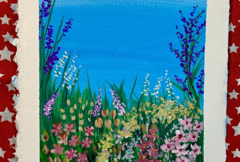
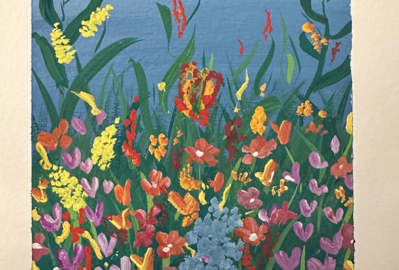
9. Wildflower Garden Painting Part 1: It's finally time to
paint our wildflower garden, and by now, I hope you're feeling a little more comfortable
painting with gouache and excited to start
your class project. We'll be painting the
garden in three stages. First we'll paint
the background sky, which is a soft
gradient of blue. Then we'll block in the green. Then in the third stage, we'll paint all the flowers. Let's start with the
blue background. Now you did this in
the blending exercise so you've already got a bit
of a practice for this. The only difference
here is that we'll be working from a lighter
blue to a darker blue. So I'm mixing Cerulean blue
with a lot of white. Need to mix up a good
quantity of paint. Oh, I'm using my number six
brush, as you can see. And just starting from the top, and then slowly moving down
in horizontal strokes. So after painting a strip of
roughly an inch thickness, I'm adding a little bit
more blue to the mixture and blending that in. And I paint downwards for
maybe another inch more. You don't have to stick to an absolute thickness of an inch. In fact, it's better if
it's varied and organic. I'm just trying to
be as clear and specific in my instructions
for you to follow along. So just like the blending exercise, I keep adding blue to the
mixture as I move down, blending each layer with back
and forth brush strokes. I'm painting the blue a little here because it's all
going to be green after this. So I'm washing my brush and mixing
up some more of the lightest blue shade
and running it along, trying to smooth out that area. Now here I'm actually going to pull down some of that
lighter blue over the darker areas
because I want to get a mildly streaky effect to
make them look like clouds. I'm not applying a lot of paint, just taking an extremely
little amount. My brush is almost dry here and I'm just running my brush
very lightly over the sky. Okay. I'm stopping
now because I don't want to overdo it. All right, we've painted the
sky and with that, we've completed step one. Now we have to wait
till the blue is completely dry before we
can start with the green. That's because we'll be layering a little bit of the green
on the blue area as well. Okay, so the blue paint is fully dry and we can
start with the green. Now we'll need three
tones of green - light, mid tone and dark green. I'm using sap green
for the mid tone, yellow green for
the highlights. And I'll mix up some dark green using sap green
and Prussian blue. As for the brush, I'm using
my size nine round brush. Now, we're not going to follow any specific rules of
shading or highlights here, but generally you'd observe the green on trees
and bushes getting darker from top to bottom because the top gets
more direct sunlight. That's how we'll paint
the green as well. I'm starting at the
bottom of the dark green I mixed using sap green
and Prussian blue. I'm applying the
paint in random, uneven strokes and not
really sticking to one particular direction to make it look more organic
and natural. I actually want the
green to be darker, so mixing that and applying it. And now I'm adding more of the sap green and blending that
with the dark green using the same messy strokes
and I'm working my way up. I don't stop exactly
where the blue ends. In fact, I paint
a little bit over the blue and make it a
very uneven boundary. I'm also adding a little patch of dark green there and blending that up because I don't want the green patch to look
like a rigid gradient. Next step is to give these
grass like strokes. The idea is to just cover up that
border line between the blue and green with lots
of these grassy strokes. And try to vary the
length, direction, and thickness of these strokes to make them look more natural. Now I want to paint a few double toned leaves going upwards, sort of like those taller grass
with the bigger leaves. For that, I'm loading my
brush with sap green as the base color and dipping
the tip in dark green, and painting these
leaves on the left. I just realized a thinner
brush would be better so I'm switching to my
number five round brush. Loading that up, and painting a combination of
leaves and thin stems. Next I'm adding a
few leaf strokes in dark green here and there, mostly sticking to the top
part of the green patch. We'll be covering up the lower
area, mostly with flowers. After that, I'm painting a few grass like strokes with the light green as well to
add some highlights. You can be quite
random with this. Maybe even give a few further down, here and there as well. And we just completed step two. Next comes our last
and my favorite step, adding the flowers. But got to wait a little bit
for the green to dry. Don't worry. You
know, it won't be a long wait because
gouache dries pretty fast!
10. Wildflower Garden Painting Part 2: The green patch is
completely dry as well, And it's time to fill this
garden up with wild flowers. But before we start painting, let's talk about the
composition. Now how do we decide what
kind of flowers to paint, what color, how to distribute
them around, et cetera? Well, I usually just make
these decisions as I paint. It's pretty intuitive and I don't follow any
particular rule or order. I just paint
different flowers in bunches and sometimes
quite randomly. But if you do need some
help with inspiration, you can have a look through
Pinterest just to get an idea how wildflower
gardens usually look like. I've already created a
Pinter board for you with a few images that you
can have a look through. You can get the link to the board in the class description. So the first thing I notice when
I go through these images is that there's quite a
different variety of flowers. Different flowers of
of different colors. And the second thing is that they grow in bunches here and there. And these bunches are
very organically spread, like you can see this bunch
of lilac color flowers here. And then another bunch
of the same over here. And these yellow flowers are
growing in bunches here and there. And let's see...in this image as well, the bunches are very spread out. There's a bunch of
wild flowers here, and then some yellow flowers, and the blue flowers are
just scattered around. So that's pretty much what
you need to take away from these reference images and apply to your own
wildflower garden. I've put a few colors I want to paint my flowers
in on my palette. I'm using bright colors
like yellows, reds, blues, rose, violet,
mauve, and white. And I'm starting with the white
and yellow flower bunch here. I'm using my size one round brush and using the one stroke technique
to dab, dab, dab and make a bunch that's shape of an
inverted bunch of grapes. Now painting another
bunch down here, and a fourth one here. Now let's see. I'm using my size nine round brush and painting some of these flowers
in mauve and white. And I want to paint buds instead
of flowers as I go up, So I'm just giving these single
strokes instead of two. Now, adding a few more
flowers down here, because I want the bunch
a bit more spread out. You can also have
overlapping flowers by the way. We saw in the Pinterest images
that bunches of the same flower type can
be found here and there, So I'm repeating the same bunch of flowers on this side as well. Now I want to bring in some
blue to my composition. So I'm going to paint some in
ultramarine blue and white. I'm actually spreading
this white out a little on my palette so that it's easier to take with
the tip of my brush. And speaking of brush, you
can see that I've taken my small round brush to
paint these flowers. Don't hesitate to keep switching your brushes as you
paint different flowers. You'll be able to paint
a lot more variety of flowers with
different brushes. So I'm painting these little blue white flowers right
in the middle here. And don't forget
to load your brush with more paint when necessary. Okay, I think I should
stop with the blue now. All right. Now, how about
some rose color in there? Yep, I'm definitely
feeling like rose so I'm giving a few
simple ones here. And a bunch about here as well. Time to add some mid
yellow to the painting. I think I'll paint a few
flowers in mid yellow and red. Taking my size one flat brush and loading that
up with yellow and a little bit of
crimson and dabbing in some flowers using the
thinner side of the brush. Oh, I like how that's coming
out. And like I said earlier, don't be afraid to paint over some older flowers. Give a few flowers scattered as well. Now I'm painting some
flowers of the same shape but using blue and
violet over here. So I'm painting different bunches
of flowers here and there, spreading out the different types and colors here and there. I'm deciding what
colors to use and what kind of flowers
to paint as I go. You don't really have to
paint the exact same flowers or even stick to the same
composition as this painting. I give you full freedom to
explore your own creativity. In fact, I'd love to see something you've
created on your own. So please don't stress about making your wildflower
garden look like mine. There are so many different ways you can combine the flowers. So many different
types of flowers and different color
combinations you can use. All right. I'm painting a few
red berries here and there, just to add to
the pop of colors. That's looking good. Though I feel like there could be
a bit more of highlights, so I'm painting in a few
smaller flowers with white as a prominent
color here and there. More like fillers. These are those odd little
flowers that stray away from their bunch and grow along
with another group of flowers. I'm also making the berries a little bigger to make
them more prominent. And adding a few more red
flowers as fillers wherever I feel there's too much open space
between the flowers. And I think we're done. I'm pretty happy
with the flowers. Now, the very last step of this painting is adding some green highlights
here and there. I'm giving a few strokes
of this yellow green with my size five round brush. I'm painting some thin
lines and grass like leaves, very randomly to make it look like they're growing outwards in
between the flowers. I'm also adding in
a few strokes in the mid green, and
the darker green. This process is
also very random. I'm just painting random
strokes here and there. I know I said the leaves
are the last step, but I feel like
there needs to be a bit more of these
light yellow flowers So I'm painting in a few more. Okay, I'm going to
stop now because I'm very much in danger
of overdoing it. All right, now our wildflower garden painting is complete. And it's time to do the most
satisfying thing ever, which is peel off
the masking tape. And there you have it! A vibrant wild flower garden
that's popping with color.
11. Conclusion: A big congratulations
on finishing the class. I'm so happy to see
you till the end. Through this class,
I've shared with you everything
that I know about, gouache and painting with it. We went through multiple lessons covering the various
qualities of quash, including a comparison of its properties with
watercolors and acrylics. Then we did some exercises like making the swatch chart
and playing with different consistencies to get a deeper understanding of working with this
wonderful medium. And then, we explored three
different techniques of painting with gouache - layering, blending, and one stroke painting, before finally painting
our wildflower garden. I hope all these
little exercises and experiments helped you
get to know gouache a lot better, and maybe
like it a little more. If you need help
somewhere along the class, all you need to do is
ask me a question in the discussion panel and I'll be happy to
answer them for you. Once you finish your work, please upload them to
the student gallery as I would love to have a look
at it and give you feedback. And while you're at it, throw in some experiment
pictures as well. It'll be great for me and the other students to get an insight into your
painting process. If you post your
work on Instagram, do tag me @the_artsychoke
so that I can repost it. I take great pleasure in
showing off my student's work. And of course, do tag Skillshare. I would really appreciate
it if you can take a moment to leave a
review for this class. Feedbacks are always
welcome and will help me make better
classes for you as well. You can follow me here on
Skillshare to get updates about any classes that I release or announcements
that I make. You can do this by clicking the Follow button next to my
name under the class title. And if you're interested, do
check out my other classes. You'll find them all on
my Skillshare profile. Thank you so much for
taking this class and I'm looking forward to
seeing your completed work. See you again soon. Take care.
12. Quick Update!: Hi again. I just wanted to update you guys on
a new development. I am now offering
1-on-1 sessions. 1-on-1 sessions are great
because they let you have a more focused, responsive and personalized
learning experience. Pre-recorded classes are great, but sometimes they lack that personalized touch which can make all the difference
in your learning journey. In a 1-on-1 one session, the focus is entirely on you, your strengths, your goals, and your areas of improvement. Every minute of the session is dedicated to your unique needs, and I'll be able to give you immediate guidance and
feedback as and when required. I offer two different sessions. One is a 15 minute
feedback session for any of my classes
on Skillshare. So if you enjoyed this
class and need a personalized feedback or need a little bit more help
somewhere along the class, you can book a 1-on-1
session with me. You can show me your
progress or ask me questions regarding the
class and I'll help you out. The second session is
a 30 minute session on finding inspiration for
drawing botanicals. Over the 30 minutes, I will list and explain eight places to look
for inspiration while drawing botanicals for your illustrations or patterns. Unlike pre- recorded classes or other online courses which follow a one size
fits all approach, 1-on-1 sessions can
be personalized to your specific needs
and learning pace. To book a 1-on-1
session with me, just go to my Skillshare
profile page. It's really an investment
in your creative journey and I hope I can help you
and guide you through that.
 Devika Mahajan, Artist and Founder of The Artsychoke