Transcripts
1. Intro: Hi there. I'm Devica, an artist, illustrator and surface pattern designer from India. I'm the artist and face behind the brand, The Artsychoke. In addition to selling original paintings, I also license my work on print on demand at sites like Society6, Redbubble, and TeePublic. I do a lot of different kinds of art like abstract acrylics, watercolor landscapes, and architectural illustrations like the ones I teach in my previous Skillshare class. But my all time favorite theme to paint are botanical illustrations. I recently started painting a lot of patterns inspired by Indian floral designs, and we have received so much love on Instagram. So I decided to create a Skillshare class on how to create them. This is my second Skillshare class and I'm so happy to have you here. In this class, you will learn how to sketch and paint a simple floral pattern inspired by classical Indian floral designs using gouache paint. Throughout the class, I will run you through multiple steps in holding my process of creating these beautiful minimal floral patterns. I will show you what art supplies I use, how I get the material for inspiration, create stylized pattern motifs and elements, sketch the pattern layout, and paint the pattern. We will also cover various ways to select a color palette for the patterns. This class is great for selfie pattern designers, illustrators, artist looking to start creating patterns, or even hobbyists. Whether you are a traditional artist working with paper and paints, or a digital artist, this class will help you take some of the first steps enrolled in pattern design. This is an intermediate to advanced level class, primarily because it requires some sketching skill and a steady hand. But don't be discouraged to take it if you're a beginner because I have included a practice template with exercises especially designed to help beginners get better at hand control. These are great exercises even if you're not a beginner as you can use them to warm up before you start. When you're finished with the class, you will have a beautiful Indian floral pattern which you would have created from scratch, and a good knowledge of the various design development processes of creating a floral pattern. Let's get right to it. I hope you're excited. I will see you in the next video.
2. Class Project: For your class project, I want you to apply everything you learn in this class and create an Indian floral pattern of your own. You're free to be in the same pattern along with me through class, but I highly encourage you to try to come up with something of your own. Choose any flower and leaf you like, stylize them, and create a unique pattern of your own. For reference, go to your garden and pick a few flowers and leaves, or if you don't have a garden, you can always use Pinterest. Once you complete your patterns, upload them to the student projects gallery below. You can do this by clicking the Create Project button. Don't be hesitant to share some process pictures because I love seeing those too. You can find the practice template I specially designed for this class in the projects and resources section. This template is especially helpful if you're a beginner, and it's a great warm-up exercise if you're at a more advanced level artist. Use this template to practice and control exercises as many times as you want before you start working on your patterns. I can't wait to see your patterns. Happy painting.
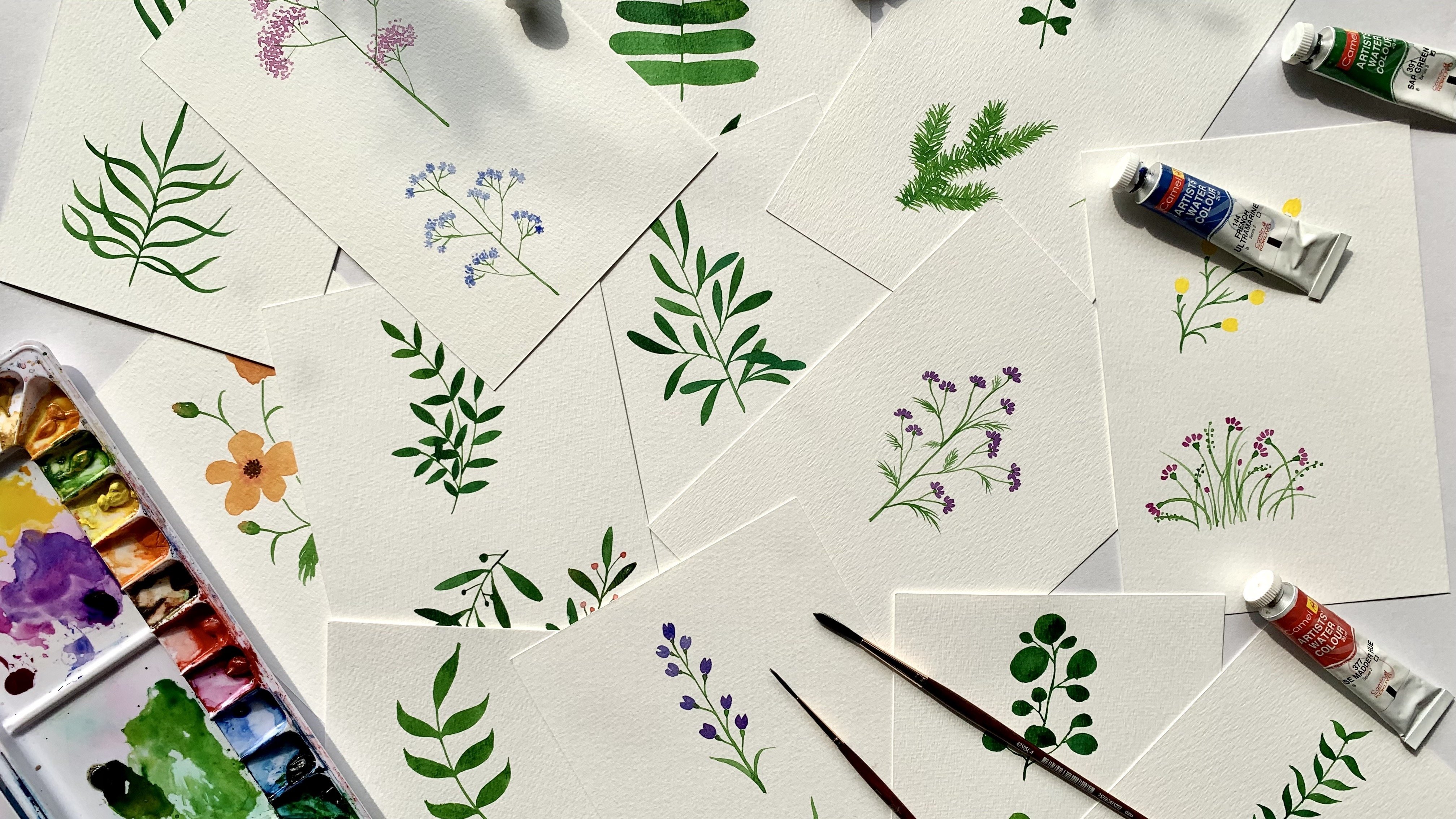
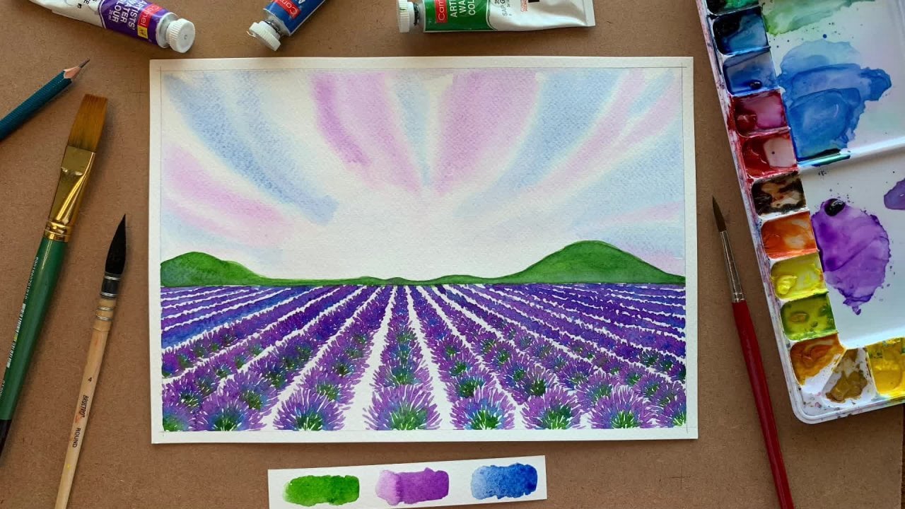
3. Materials: Let's talk about the materials we'll need. The first item on the list is paper. I always use 300 GSM cold pressed watercolor paper. GSM stands for grams per square meter, and it's basically the quality of the paper. The higher the GSM, the heavier the paper will be. I use 300 GSM because while using gouache paints which are water-based, we need a paper thick enough to absorb all the paint and still [inaudible]. I prefer cold pressed paper because it has a mildly rough texture, which I quite like for my outlook. If you prefer a paper with a smoother finish, you can go for the hot pressed paper. I'll be using A4 size paper for this illustration and regarding the brand of paper in this class, I'm using an Indian made brand called Brustro, but you can use any brand. Next, you'll need gouache paints. I'm using the same brand called Brustro, again you're free to use any brand of your choice. You'll also need a palette to mix the paint. I have this one I got just for mixing gouache. As you can see, it's pretty new and still has a lot of empty space. What I like about it is that it has a lot of deep compartments so I can mix some good amount of paint while doing bigger paintings and I can just store the leftover paint in the palette itself. But again you don't need a special palette, you can use any available option, even a shallow plate or a lid would do. We'll be sketching with a pencil first, and I use a 3H pencil which has a harder graphite and hence merges less on paper. If you don't have 3H pencil with you, don't worry, even a regular HB would do. You'll definitely need an eraser. I'll be using two types of eraser, the regular eraser and also a kneading eraser. The kneading eraser is used to take off any excess graphite or pencil marks from the paper after our final sketch, but don't stress if you don't have one. While it's great to have one, it isn't a necessity. Next on the list are brushes for mixing the paint. I will be using two sizes today, one medium-sized round which is a size 8, and one thin liner brush which is in size 0000. Liner brushes are basically these super thin long hair brushes, which are great for detailing and getting very thin lines. If you do not have a liner brush, you can use a regular round brush in a size like 0 or 00, if you've another brush, the better. I always draw borders on my sheet before starting a sketch and I use a ruler for this. You'll also need a jar or a cup for water to wash the brushes along with paper tissues or an old cloth. Now that we've covered the supplies, let's move on to the next video which is a brief introduction to the history of Indian floral patterns
4. History of Indian Floral Designs : Plants and flowers have inspired Indian artists for centuries. But it wasn't until the 17th century under the Mughal dynasty that these started being extensively used in Indian textile design. The floral designs are more dense, they're initially very naturalistic, with the whole flowering plant complete with its flower, stem, leaves, and sometimes even buds. These motifs are repeated to form a pattern. However, towards the end of the 17th century, they became more stylized and unrealistic. You can see how they are more whimsical and ornamental here. Soon, this style and other designs started spreading out from palaces and houses of the elite emirate to rural parts of India like Gujarat and Rajasthan. In 1600, with the establishment of trade between India and Europe, they started being exported to Europe. In Europe, they gained massive popularity. They became so popular that many European designers and print houses started manufacturing wall papers and printed textiles inspired by these patterns in large scale. Today, these floral patterns are so popular and still widely used in India and all over the world. You can find them on garments, bed linen, curtains, furnishing, and home decor. In this class, we will create a pattern inspired by these Indian floral designs, but in a very unique and different style. Much like Indian block print patterns, we will create our own floral models and repeat those models to create our pattern. Now our pattern won't be as intricate or brightly colored as a typical Indian floral pattern. Instead, we will have a very simple pattern layout and minimal color palette. I usually use two or three colors for my patterns, and I almost always leave some paper or space unpainted. I love the contents of white of the paper creates with these few colors. Let's get right onto it. But before we start, I will show you how to use and practice template I designed specially for this class.
5. Practice Template Part 1 - Pencil: In this video, I will show you how to use the practice templates included with this class. You can download know from the projects and resources section and print them out on regular printer paper. Now this template contains exercises specially designed for beginners to practice and get a better hand control, feel free to skip this lesson if you're already quite comfortable and confident with your hand control. However, I would still recommend you to give it a try because they also make great warm-up exercises. Let me show you how to use them. We're going to do these exercises twice actually, once with a pencil and then again with the brush and paint. We have four sheets each with three exercises. There are boxes on the top with gray lines and blank boxes below that. All you have to do is draw over these gray lines with a pencil and then try to recreate them in the empty boxes below. Try to finish each line in one stroke. That is don't break them up. You can see that I'm finishing my line without stopping at all. The next thing to focus on is the movement of your hand. You can see that I'm moving my entire hand to draw and not just my fingers. If I moved only my fingers, I wouldn't be able to make a long enough line. The focus here is to engage the whole arm to draw instead of just your fingers. I finished drawing over the gray lines. Now I'm going to reconstruct these lines in the empty box below. You may find this a little more challenging as there are no guidelines here. It will take a couple of, or maybe even more than a couple of practice sessions for you to feel quite at ease with your hand control if you're a beginner. But try not to feel discouraged or frustrated. Do it as many times as you want at your own pace. It doesn't matter how much time you take to finish one exercise or how many times you have to do it to feel confident about your strokes. Remember, practice makes perfect. Like that I'm moving onto the rest of the boxes and I'm repeating the same steps here as well. I first draw over the grid lines and then do the same thing in the empty blank box below. Don't worry too much about drawing precisely over the gray lines. It's all right if you go a little off track and don't try to redo them, just move on to the next one. Try to complete each box in a steady, uninterrupted flow. Another thing to pay attention to here is the pressure you apply on the paper. It shouldn't be too hard. Applying light pressure will help move your hand more smoothly. Now this box has some wavy lines. This exercise involves a little more exaggerated movement of the wrist. I'm lightly moving my wrist along with the hand movement to get that curve. I'd also like to mention that you don't have to recreate an exact copy of the lines in the blank box below. The idea is to get as much practice, so fit in as many wavy lines as you can in there. The next exercise is similar to the previous one. The motion here will again be a combination of moving your wrist as you drag your entire hand down to create these vertical wavy lines. Remember to ease up the pressure you apply on the paper if your fingers are starting to hurt. This box here is filled with swirls that are looping in clockwise and anticlockwise direction. This is an exercise for your fingers. Sometimes we tend to end up holding the pencil too hard or applying too much pressure on the paper while doing this, try to avoid doing that because your fingers would end up hurting soon if they do. Remember to draw them in one go. You can start as well from the outside or the inside. It doesn't really matter, now to fill up the blank box, again, focus on getting in as many swirls of different sizes and direction. Rather than copying exactly what's in the box above. You can start with bigger swirls, and you can go in and fill up the voids between them with smallest swirls later. We've reached the last practice sheet. This box has circles. You know what to do here. The last two exercises are slightly different from the previous ones. Let me show you how. In this box, you will see these short horizontal strokes. To get these, you've got to apply a slight pressure at the starting point and then do a quick short drag with the pencil tip, lifting off the paper as you draw. You basically drop a point on the paper and drag the tip off, lifting it as you draw the line. Think of the pencil tip as airplane taking off. Now do that super fast. That's it. Time to fill up the blank box with these little strokes. In this last exercise, you pretty much have to do these little strokes in all directions. You can draw a little dot to orient the origin points of these strokes. Then just start drawing in all directions around this dot. Feel free to move your paper around if you want to get a better angle.
6. Practice Template Part 2 - Paint Brush: We've completed our practice template with the pencil. Now let's try it out with a brush and paint. I'm using wash paint and my thin liner brush in size double zero, double zero. Don't worry if you don't have a liner brush, just use the thinnest round brush you've got. I'm using green paint here because I have some leftover paint already in my palette. Just mixing up my paint with water. To get a smooth gliding finish on paper, the consistency of the paint should be like cream or thick melted ice cream. Once you get the mixture to that consistency, load the brush with paint, and just go over the lines in the boxes. The hand movements are pretty same as when you use the pencil. Just like with the pencil, try your best to finish one line without stopping at all. Now this is probably going to be a slower process than when you use the pencil and that's totally normal. Take your time and don't rush it. Remember, speed is not our goal here. It's steadiness. Always make sure there's enough paint loaded on the brush to get that smooth line. When your lines start getting patchy, you know it's time to reload your brush with paint. This exercise, you don't need to draw the whole figure in one go. You can break the lines at each turning. I understand it's pretty hard to get sharp corners with a brush in one go. Instead, focus on getting each line straight. Now it's nearly impossible to get swirls in one go with a brush unless you're a super experienced artist. What I do is break them up into curves. I basically gave small c-like shapes in all directions to achieve this. I'm not going to draw these swirls in the empty box, because I hardly ever draw swirls directly with the paint brush. I always sketch it out with a pencil first and then paint over it with a brush. This is almost always the case when I do curved lines. For the next exercise involving circles as well, I won't be filling in the empty blank box. You can use the same technique for the circles as well. Give your brushstrokes in the shape of the alphabet C. I usually try to finish one circle in two strokes. Now for this exercise, I'm also going to do an additional little bit. I'm going to fill in those voids in between the circles with paint. This is an additional exercise in brush control for filling up really tiny spaces in your illustrations. It is also an exercise in patience. For the short strokes, it is the same movement as with the pencil. Start from a point and just drag and lift. Pretty simple, right? I'll try doing that a little faster, so you get lighter, shorter strokes. Now we've reached the last box in our exercise template and you already know what to do here. That's right. Quick strokes in all directions. Feel free to move the paper around for better angle. I use these strokes a lot in my illustrations to give the denser petals and leaves. You may end up doing a lot of them if you're planning to do a lot of these illustrations. With that, our practice template is complete. Like I said earlier, do these exercises as many times as you'd like. Keep doing them, even if you've reached that certain level of skill where you're quite confident with your hand control. They are great warm up exercises. Time to move on to the next lesson in which we will get an inspiration for our pattern motifs.
7. Gathering Inspiration: In this video, we will explore the different ways in which we can gather inspiration for our pattern elements. Now we know in these floral patterns are heavily influenced by nature and nature is exactly where we will first look for inspiration. If you have a garden or backyard, step outside, take a walk around and pluck a few flowers and leaves that catch your eye. I'm going to do the same. See you in a bit. I'm back on my table with the flowers and leaves that I have plucked. The first thing I did was click pictures of them on my phone before they start wilting. That way I don't have to rush to sketch them. If at all they do start wilting, I can always look at these pictures on my phone for reference instead of making another trip to the garden. Now if you don't have a garden or flowering plants, then the next best place to look for is, of course, the Internet. It is a treasure trove of inspiration and in fact, you will find a lot more online than your own garden. Pinterest is a great place to search for pictures of flowers and leaves or you could just do a Google search. If you already have a particular flower in mind that you want to sketch, you can search for pictures of that. Or if you're like me, someone who loves flowers but can't remember the names of most of them, you can just type in the keywords flowers or flowers close up. Running a search with the keywords flowers photography also bring great results. Another idea is to search for flowers that are most common in your country. You could search for something like popular flowers of India or flowers of Spain or even tropical flowers. See the options are endless. These are the ways in which I gather material and inspiration before I start a piece. Additionally, I also keep clicking pictures on my phone whenever I see something so I have a little library for future reference.
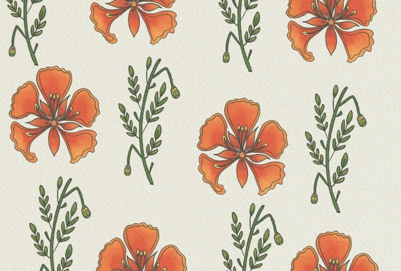
8. Drawing Elements - Flowers: Now it's time for the fun part. Sketching up after elements. What we will do in this video is use the flowers I plucked from my garden as reference and sketch out stylish floral models. We will also do this with some reference images I pulled from the internet so those of you who don't have real flowers don't worry. Now let's start with the flowers from my garden before they start wilting. I'll sketch this one first. I'm going to explain my usual process here. What I always do first is I observe the basic outer shape of the flower. Like this one has a circular outer side. By that I mean, we can sketch it inside a circle. I draw a circle first. This has to be very light pencil stroke because this is just meant to be a guide for drawing the flower. The next step is I identify an origin point for the petals. That is the point from which all the petals seem to branch out from. For this flower, it's right at the center of the circle. I mark that. The next step is I count the number of petals. This flower has five petals. I divide the circle I drew into five segments with five lines emerging on from the center. Then I start sketching the petals using these division lines as guides. Right now I'm again just drawing a very light sketch because I'm still constructing the shape of the flowers. I always like to give a small circle around the central point. Now if you look carefully at each petal, there is a slight peak at the tip. I'm going to exaggerate that little beak on my sketch. I think that's about it. Then I erase off all the guidelines I don't need and keep justifying an outline sketch. That's the final sketch of the flower. I've also decided to give one last bit of detail with these strokes on each petal. Remember, we learned to do these in our practice template. These are the basic steps that I usually follow when I sketch any flower motif. Now let's do the rest of the flowers in this process. I'm sketching this flower next. I don't know if you can see, but it already has started to wilt. That's why we need to create picture soon after we pluck them. Again, here when it's fully open the basic outer shape of the flower is a circle, so I'm sketching a circle. Then mark the center. There are five petals again. I divide the circle into five segments and start drawing the petals. This time I'm drawing the petals in between the guidelines. Each petal has a dip towards the middle of the edge. I'm sketching it like that. They're kind of heart-shaped. Now that we've got the shape of the flower, It's time to rub off the guidelines. Once that is done, it's time to add some detailing. I'm splitting each petal through the middle like this. Remember, we're not making a realistic sketch and we want to make them as stylized and whimsical as we can. Now there are these tiny stamen like things in the center of the flower. I'm going to add them in my sketch. I'm sketching them in this way. That's how you can adopt a feature of the flower and kind of illustrate them in any way you want. Let's move on to the red flower. If you want to just get one flower it has five petals. By now you know what the process is. A very light sketch of the basic shape, which is a circle. Then the central point. Divide the circle into five segments. Then I start drawing the petals. These are long-ish, kind of oblong shaped petals. Then erase all the guidelines. Now this looks too clean and simple for me. To make it a bit more interesting and stylized, I'm drawing these smaller petals within each petal. That's nice. I like it now so we can move on to the next flower. This flower is quite interesting. It has petals which are slightly overlapping on each other. Again, the basic shape period is a circle, so I'm doing that. Marking the center. As always, I'm dividing the circle into segments. But this time with these curved lines, there are five petals hence five lines. Now I'm developing the petals from these lines. I'm using these curves as one edge of the petal and giving a slightly different shape on the other edge. I get kind of these contrasting edges on each petal. Time to erase off the guidelines. Now some details. Each petal has this little fold. I'm sketching that in my way. I also want to give this little stripes on these folds. I quite like how that turned out. Now it's time to sketch the last of the flowers I plucked. This is the only flower of the lot whose name I do know. It's called mogra in India. Unlike the other flowers, I'm going to sketch this mogra from the side. Now when you look at it from the side, this flower has kind of a pine cones like profile. That's what I'm sketching for the basic outline. I'm also sketching a stem and all these petals stacked on top of each other like that. Now let's darken these petals. I want to give some ornamentation like these inner profiles for each petal and maybe give them a little shading. Our mogra is also done. Cool. Now that we've sketched the flowers from my garden, let's do the same with the reference images I pulled from the internet. The first flower I have here is a gilmore. It's a very common flower in India. You will see it in boulevards in many cities across the country. It blooms on these big trees around April, May, and I tell you it looks glorious when they bloom. Anyway, this is what the flower looks like up close. Let's sketch this in our own whimsical exaggerated style. I start with the basic shape outline, which is a circle. Then I mark the origin point of the petals and divide the circle into five segments because there are five large petals. Draw a circle as I usually do. Next, I'm lightly sketching the petals around the small circle. These start out thin and become the sort of bulb like shape. Now keep in mind that these initial lines need to be really light strokes. Now I also see these smaller petals in between the big ones so I'm sketching those as well. This lemon pointy and not so curvy. I like that contrast and the shapes playing out here, time to darken the petals. As I do the larger petals I'm modifying the shape a little. I'm giving this curvy dip for each of them and I am to darken the smaller petals too. Now I erase the guidelines. I'm giving any inner detail for the smaller petals. Final touch, these strokes. Here we have a gulmohar. The next one we have here is the jasmine. It's a delicate white flower which blooms at night. This one is pretty simple to sketch. There are five petals, again. We know how to get started on this. The basic shape outline is a circle. Five petals mean five lines shooting out from the center and a small circle around the central point. It's got these simple elliptical petals, so I lightly sketch those. Since I want to add a bit of character to them, I give little bumps or peaks at the tip of each petal and some detailing after I rub out the guidelines. Our jasmine flower model is also ready. Let's try a lotus next. It's one of my favorite flowers to sketch. I'm starting with a line for one central petal and a few lines on either side shooting out from the same base point. The basic outer shape is like a novel. I start drawing the petals, a central teardrop shape petal and a couple of petals on either side. I've basically sketched a typical lotus flower here. Now it's time to make it a bit more ornamental for our motif. As I darken the lines, I give these little bumps on the side petals. I give two bumps for the petals on either side of the central petal and one bump for the outer petals before they get pointy. I do the same for back petals too. Now, the petals still look a little blank with big empty spaces to me, so I'm adding some more detailing. Now I'm happy with my lotus. Now I'm going to take some examples of flowers that aren't characteristically Indian because I want to show you guys that although we are working on an Indian floral pattern, it doesn't mean we have to use Indian flowers. You can use any flower and stylize them in this way. Let's start with a bougainvillea. We can sketch it out similar to how we did the lotus, one central petal and another on either side. I'm making them curvy and pointy tip as well. I can see these flower petals have these wings running across them them, so I'm going to draw something like that and maybe little dots at that tip, just to give it a nicer look. I think our bougainvillea is also done. Now let's sketch a petunia. This is another flower that's not indigenous to India, but we do still have them in India. Following our usual steps, the first thing I do is draw an outer boundary or shape, which is a circle here. The flower has five petals, so five lines from the origin point outwards. Then I start developing the petals. Now I can see a slight fold or depth through the middle of the petals. I want to exaggerate that depth and make it curvy. Because there's another color in the center of the whole flower, I want to emphasize that division. What I'll do for that is draw another set of smaller petals there and just some final detailing strokes, and the petunia seems complete. Next one on the list is about a buttercup. As usual, I start with the outer circle and mark the center. Then I divide it into five because the buttercup has five petals. There's a smaller circular part at the center, so I sketch a circle for that also. The buttercup has these very plump, rounded petals, so that's what I sketch first. Then I work on stylizing them. I'm making the tips of the petals pointy and I give the inner circle a bumpy outline. Then I add in some lines there. Since the bigger petals still look too empty, I'm adding in more details. The idea is to fill up empty areas with as much detailing as you can. Notice how we started with a sketch that was a simple buttercup flower and we finished with this very ornamental stylized motif that just vaguely resembles a real flower. All right, let's move on to the next flower, a cosmos. Again, the usual steps here as well. The outer circle, central point. The cosmos has a lot of petals, so I'm dividing the circle into eight segments. Then I start with the petals. The petals are actually pretty similar to those of the jasmine we sketched earlier, so I'm just sketching them the same way. Time to do our last two flowers in the lesson. The next flower I saved is the daffodil You know the process well by now. I'm just going to quickly sketch it up. I'm drawing some rounded, small petals on the inside and these petals are coming in between the origin points on the larger petals. Then, some final details. Our daffodil is complete too. Now for the last flower, which is the lily. The lily has a vaguely triangular outer shape and six petals. I divide the triangle into six, and then three petals in the front and three in the back. Now the flower has these prominent stamens. I don't want to skip them. I'm drawing them one for each petal like this. Our final flower motif is also done. I hope you noticed how in all the cases we started off with this simple, almost realistic sketch of the flowerless base and then we started building on that to develop it into a floral motif by adding all these ornamental details here and there. Here is a tip I want to give you guys. It always helps to keep a library of these sketches in a sketchbook or something, I always do. Whenever I see a flower that I like, even if I can't sketch it at that moment, I take a picture and sketch it out later on my sketchbook. This practice helps you save a lot of time in future because you'll have a ready supply of motifs you can use when you start a new pattern. Now that we've covered floral motifs, let's move on to the next one, leaves.
9. Drawing Elements - Leaves: Time to sketch the leaves that I collected from my garden. The first leaf I'm sketching is this one. It has a very nice shape. Hence, I'm trying to make them more very similar to the original shape. There is a central vein running across the whole length and this smaller veins on either side. Now, I don't usually do much declaration for the leaves and keep them pretty simple and similar to their original geometry because I want the flower motif to be the central focus of my patterns. I'm doing the second leaf now. This one is gorgeous. I love the shape and that contrast in color. I'm sketching the basic outline and the shape of the whole leaf, then I add in those little spikes on the edge. It's just easier to sketch it this way rather than drawing the spiky edge right at the beginning. I'm mocking out the difference in color, and that's it. That's how I'm leaving this leaf motif. Now, the third leaf is also similar to the one we just drew. I draw the outline sketch first and add in some exaggerated spikes along the sides. Then I'm just adding some basic leaf-like wings. Of course, we always erase the guidelines. Remember, the initial outer sketch which acts as a guideline needs to be very light. I'm drawing them dark to make sure you guys can see it. Time for the next one. Just like the first leaf, I'm drawing this one very similar to its original form. It may look pretty simple, almost too simple to be a pattern motif, but trust me, it will make a huge difference when combined with a nice complementing floral motif. Now, this leaf has wavy edges, so I'm sketching it out like that. Just giving loose wavy lines and a central wavy line for the main leaf vein. The next leaf is very interesting. It may look complicated to draw, but trust me, it's super simple. Let me show you how. You just have to draw a single long line, which will be the central vein. Then you draw these up and down wavy overlapping lines on both sides. Let's try that again. This time I'm making the central line itself a little bend and slightly wavy. Then super wavy lines in as exact way on either side. It's like the double helix of a DNA. Let's do this one now. It has three pointed tips, so sketching that in and the central vein with little branches on all three of them. Pretty nice and simple. The last one. For this, I start off by drawing the central branch first and then give little branches on either side where I want the leaves. Then I start sketching these teardrop-shaped leaves on all these little branches. Now let's make it a little more interesting by giving these little veins on one-half of each leaf. That's done too. Now, I also want to show you guys some more examples of leaves motifs. You can sketch a simple basic leaf shape like this one. Go with a pointed tip or one like this, which is basely shaped. Or you could sketch the same thing with the veins only on one-half of the leaf, making it a bit more unrealistic and motif-like. Another leaf type is this long thin knife-like leaf. It can also be very bent like this. Or maybe a leaf that is a bit more elaborate like this one with three-pointed tips. There are so many different ways you can draw a leaf motif. You can either look at actual leaves and draw them or maybe even draw them out of your own imagination. That's it with the leaves. We've covered our pattern elements, and now it's time to start working on our pattern, so let's get right to it. I will be doing the next video where we'll start building our pattern layout.
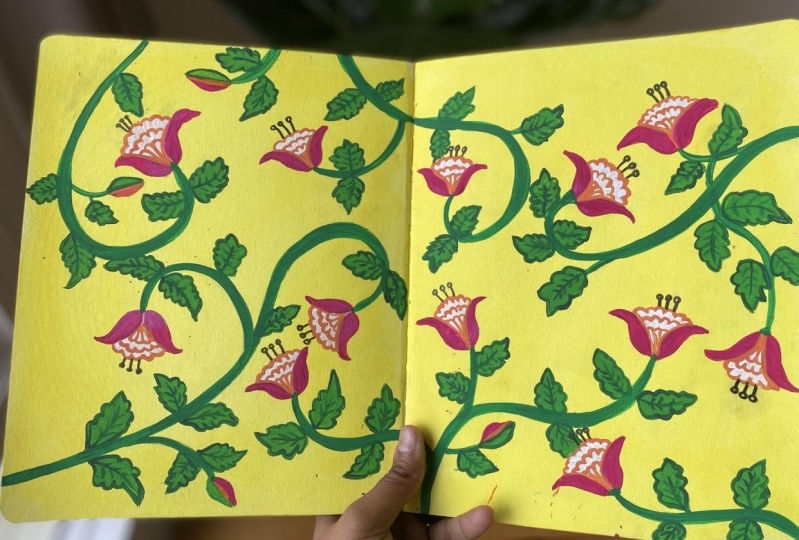
10. Pattern Layout & Sketch: It's finally time to start working on a pattern. The first step here is to decide a motif elements. Let's do that before we start our layout sketch. Now, we already have a small library of motifs we sketched in our previous lessons. I've already picked the flower motif I want to use. I will use this mogra motif, but I want to modify it a little bit. I'm just going to rework on it a little. Let's see. I want to add a circle down here where the petals start from, then I start with three small petals like this, and add larger petals around then. Then I'm adding other petals above in the valleys between these petals, like that. Darkening the final sketch. Now I'm also giving these inner petals for each petal, which I plan to fill with a different color. Let me darken them to get a rough idea of how they'll look filled with color. Looks good. The floral motif is ready. Now it's time to decide on the leaf. Because our flower is pretty filled and ornamental, it's better to stick to a very simple leaf motif. So I'm giving these baby leaves without much detail. Maybe a few little inner strokes on one-half of the leaf for a more artistic look. Our pattern elements are decided. Now we can finally start sketching our pattern. I've got my 300gsm A4 paper ready, and I'm using my 3H pencil for the sketch. The first thing I do always when I start a new painting, is give thin borders on my paper. This is not a mandatory step, it's just something I always do. The borders are also ready. Now, to start the sketch, first of all, I decide where all I want the floral motifs to be. Let's say I want one here. I very lightly sketch the rough outer shape of the motif. We know the basic shape is this conical pine cone shape, so I sketch that, and I also lightly mark how I want the stem to go. Then I want another motif about here, so I'm sketching a rough shape there with the notch stem, and then one over here with a nice curvy stem. Now, these sketches are supposed to be very light because they are just placement guides for the motifs. Another one goes there. I'm drawing motifs all over the paper. The idea is to make them spread out evenly on the paper. I also make sure the stems are always smooth and curvy, and coming out from all four sides of the frame, just to give it a more uniform look. I'm darkening the sketch a little so you guys can see more clearly on the screen. But remember, very light strokes at this stage. We start with this light rough skeletal system of the pattern, and then keep adding more details with each step. The pencil marks also get darker as we proceed to the next steps. Now that we're marked out where we want our motifs, we can go in and sketch them. I'm starting here. We know the motifs we've picked. A small circle and three small petals, then come the bigger petals, then I erase off the guidelines, and now we can darken the final motif. The whole process of the sketch is done in three stages. One, very light skeletal sketch to mark out the position of the motifs and stems, then a slightly darker step where we construct our motifs, and then the final step where we can darken our final sketch. Now I'm going to develop all the floral motifs and stems. You may have to move your paper around to get the right angle to sketch. You can see that I don't strictly adhere to the basic outer shape I sketched earlier while developing my motifs. That's totally cool because this initial sketch was anyway supposed to be markers for the motif position. You can still make adjustments and changes to it if you don't like how you place a particular motif. You can just rub off the initial one and sketch a new one somewhere else you like. That's why it's important to make that first skeletal sketch very light. You might wonder why we can't use a stencil or stamp to repeat the motifs on the pattern. While that may be an easier and in some cases more practical option, I quite like the imperfections that come with hand drawing the whole pattern. All our motifs will be similar, but none of them will be the exact same as the other. I often embrace that hand-drawn non mechanized feel these patterns have. We've developed all our floral motifs, including the stems. Now let's go in and sketch the leaves. There's no rule or pattern to the placement of leaves here. I usually just draw them wherever I can find place on either sides of the stems. I'll use these simple wavy ones. I usually like to vary the sizes depending on the space I have. It also adds more interest throughout the pattern. You can see how just adding this simple leaves have filled up our pattern, giving it a bit more complete look. I'm also adding a leaf down in this corner because that area looks too empty and adding another one on the edge here as well. Leaves are also done. With that, our final sketch is ready. Now, the next and final step in sketching is, I remove the excess graphite or pencil marks with my kneading eraser. To use a kneading eraser, you have to pull it apart and knead it first, and just roll it all over the paper like a rolling pin. It just picks up all that excess graphite and even makes the sketch lighter. Not too light, just light enough for us to see. Don't stress if you don't have a kneading eraser, you can just use a regular eraser and very lightly run it all over your entire sketch. It gives pretty much the same result. Now, I don't know if you can see it on the screen clearly where the pencil sketch is getting lighter. This step is especially useful if you're using a softer pencil like HB, which usually leaves much more graphite and dark marks on the paper than a 3H pencil. Our final step in sketching is also done, and now it's time to paint. But before we start painting, we have to choose a color palette. In the next video, I'll show you a few ways that will help you pick a color palette for your pattern. I'll see you there.
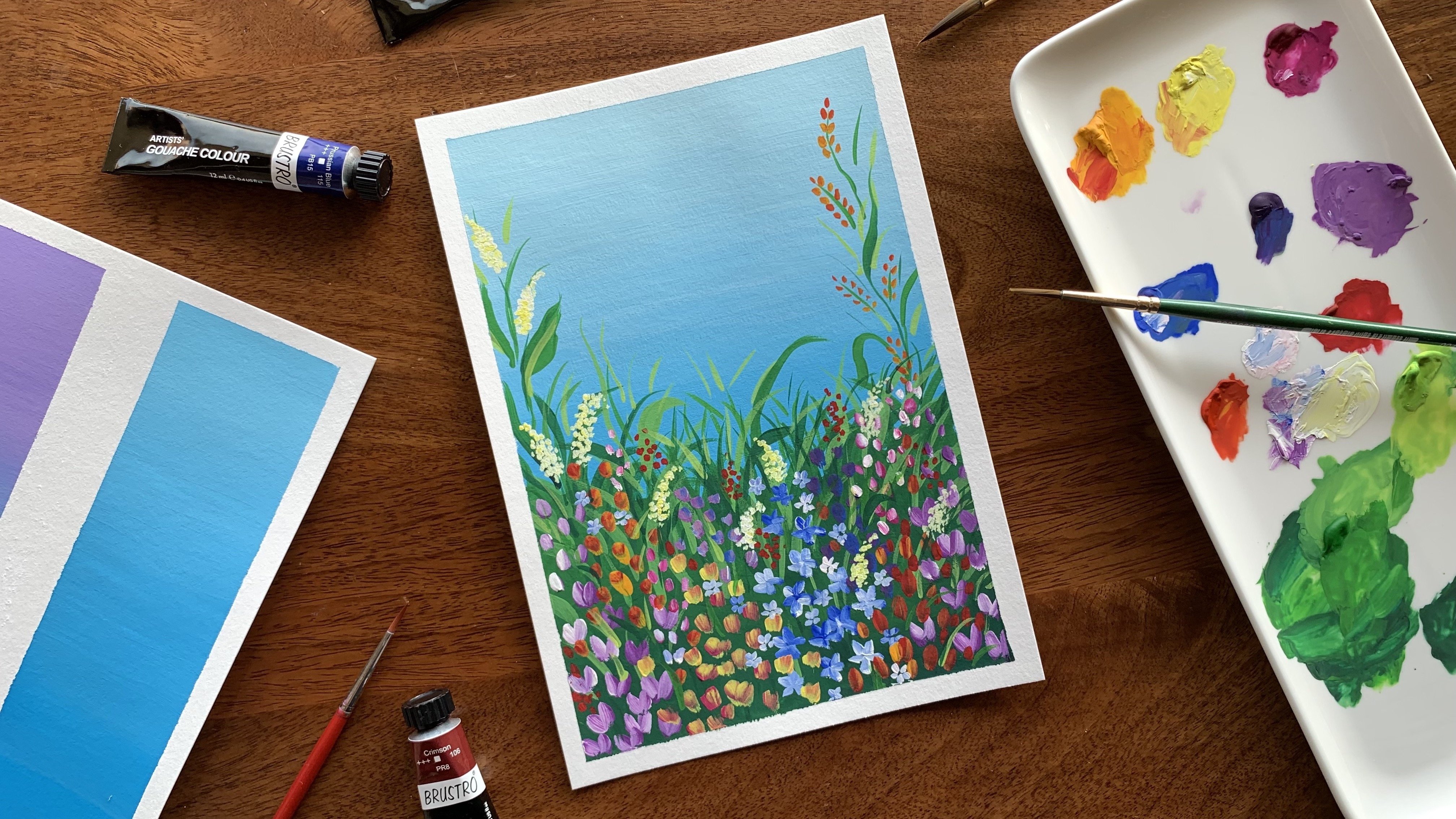
11. Choosing Colour Palette: In this video, I will give you a little insight into how I select colors for my patterns. Now, like I mentioned earlier, I almost always like to stick to a minimum palette of just two colors. Sometimes I add in a third color. My process of color selection is almost always intuitive. I paint doodle swatches of the colors that I like, put them next to each other and see how I feel about it. If I like it, I go ahead with it. This might sound simple, but it is actually a rather long and time-consuming process, which involves a lot of thought and trials and errors. If selecting colors isn't something that comes intuitively to you, there are other ways you can use to pick a palette for your patterns. One option is to do a little bit of research on the latest color trends in the fashion industry. This is a great idea if you intend to sell your patterns for fabric or home decor. Choosing colors that are relevant and trending at the moment will give you patterns a higher chance of being noticed. Another thing you could do is observe the newly launched collections of your favorite fashion or interior design brand. Brands often follow global color trends and keeping up to date with their favorite colors for the season will also give a better idea into what colors would work best for your patterns. A few brands that I frequently follow are Target, Liberty London and some Indian brands like Fabindia and Good Earth. I occasionally go back to my library of photos I collect while on my travels to see if I can find some color inspiration there, and I often do. If you get an opportunity to travel, don't forget to keep clicking pictures of anything and everything that catches your eye. Another great and pretty straightforward option is to just search for color palette on Pinterest. You'll be amazed at the number of results you will find there. Some more great search options are colorful architecture or colorful interiors or just fashion. Now, even when I look with my color palette from a reference image, I always still do little swatches of them on a paper to see how well they work together. Because I use a white of the paper, even if I pick two colors from my reference image, I still end up with three colors, including the off white of the paper. I need to make sure all of them work well together. What I know two colors and little swatches before you start painting your patterns is highly recommended. For this pattern, I have selected a color palette of a mid yellow rose, which is a deep magenta, and teal blue. Now that you've picked our colors, let's start painting our pattern.
12. Painting the Pattern: Time to start painting. We already know what colors we're going to be using. We fill in the background first with a mid yellow, then outline the motifs with the rose, and fill in those smaller inner petals with the teal. I'm using my size eight-round brush for giving the yellow in the background. I'm mixing up some of that mid-yellow on my palette. Like I mentioned earlier, the consistency of the paint should ideally be nice and creamy or like melted ice cream. That looks good. I'm going to start painting. I usually start from the top left corner and move towards the bottom right while painting because I'm right-handed and I want to make sure I don't accidentally run my hand on wet paint as I keep painting. I've realized I need to make some more water with my paint because it's coming out a bit patchy. It takes a couple of trials to get that perfect consistency. You can even do a patch test of your mixed first on a rough paper before you start painting your pattern. I'm just making the adjustments as I go because I'm starting with a very small area. Here is a tip for painting. Outline the region you want to paint first and then fill it in. This helps get nice clean paint edges, especially around the motifs. I'm painting the edges of this region first and then filling in the paint. Again, move your paper around as much as you want to get a good angle to paint. Now, my paint strokes are getting patchy so, it's time to load my brush with more paint. Another thing to keep in mind by mixing your paint is, make sure you have enough to cover the entire area you need to paint. Since your background is a pretty big region, I've mixed up a good quantity of paint. It gets tricky if you run out of the paint mix half through because it's very, very difficult to get the exact same consistency of paint every time. This is especially important if you're mixing two or more different colors. Always have a good amount of paint mixed up. Now, I'm going to break that and start with this region below. You can switch to a smaller brush for tight areas if you are more comfortable with that. I'm just going to finish filling the whole background. I know this looks a little patchy, but that sometimes happens because the paint is still wet. It might look more even when the paint is completely dry but if it doesn't as it happens with some things, I may give another coat of paint over this layer to even it out. I don't always do it. Like I said, it happens with some paints. I'm going to wait till this layer is completely dry. If it is still uneven and patchy, then I'll give a second coat. The second coat will not be as thick as the first coat, that is, I'll add more water to the mixture. This makes sure the pain doesn't appear more patchy or even clumpy than both the coats are dry. This is a little trick I do to even out patchy paint coats. I ended up giving that second coat of yellow and now you can see that it is so much better and even and both the coats of paint are completely dry. We can move on to the next step, which is outlining the motives with rows, which is a deep magenta color. I'm using my double zero liner brush for this tip, mixing up the paint on my palette to a nice creamy consistency. Similar to the previous step, I'm starting from the left and moving to the right as I paint. You got to give this slowest steady strokes. This is where the practice template exercises would really help. This is a very slower step which requires some hand control and a lot of patience. I'm going to finish this one up as well and I'll speed up the process to save us some time. I have finished outlining the motif. The next thing I'm going to give is some minor details for the leaves. I'm giving these little strokes on 1.5 of every leaf. Remember we practice these strokes also in our practice template. You can randomly pick any half, but try not to stick to only one particular half for all the leaves, mix them up. I'm done with the leaf details as well. Before we move on to the next color, we need to make sure that all the paint on the paper is completely dry. Let's give our third and final color, which is teal. I want to add in here that I highly recommend washing your brush and changing the water in your cup after painting each color. This is a good practice to exercise whenever you paint anything. I've loaded my liner brush with enough paint and I'm just going to go in and paint those inner petals. Like the previous step, this one is also a very slow process. Try not to paint all the loose lines, but if you do end up doing it, don't worry about it. You can go in later and paint all to the throws or you could just leave it as it is. It adds to that hand-painted charm. Now, it's time to finish up all the flowers.With that, our flower pattern is fully painted. Before we wrap up, there's one final thing that I do. After my painting is completely dry, I take my eraser and very carefully rub out any excess pencil marks that are still picking out on the unpainted parts of the paper. I use the sharp edge of my eraser for this and I don't apply too much pressure either. I use this large brush to dust out those eraser shavings. I avoid using my hand for this because my hands may not be as clean as I think and any grease or dot that's there might get transferred onto my painting. Alright, that's done as well. We can say that our pattern is complete. Here's a quick review of this lesson. They adopted a three-step process to painting a pattern, starting with the larger areas and proceeding to the finer details. We started with filling up the background with mid-yellow, then the outlining for motifs with our rose paint, and then the final details for the inner petals with the teal color. We finished up by dumping out the excess pencil strokes after making sure our pattern is completely dry. There it is, our [inaudible] flower pattern is ready. With that, we've reached the end of this class. I may do in the next video to wrap things up.
13. Conclusion: Congratulations, you've reached the end of this class. I've tried to give you a step-by-step insight into my artistic process of creating these floral patterns. We covered multiple steps starting with gathering inspiration, creating the different pattern elements and motifs, sketching the pattern and painting it, including how to pick a color palette. I hope you found it to be useful and fun. I thoroughly enjoyed creating this class for you and I'm so looking forward to seeing your work. As soon as you're done with your patterns, please upload them to the project gallery. If you post your work on Instagram, please tag me @the_artsychoke @skillshare. If you have any questions or need some help somewhere along the class, you can just start a conversation in the discussions panel and I'll be happy to answer them for you. If you like this class, please take a moment to leave a review. It would mean a lot to me and help me get better as a teacher. Don't forget to follow me here on Skillshare to stay up to date with any announcement on new class releases that I make. You can do this by clicking the Follow button below the class title. Again, thank you so much for taking this class and I'm so looking forward to seeing your work. See you next time. Take care.
14. Quick Update!: Hi again. I just wanted to update you guys on
a new development. I am now offering
1-on-1 sessions. 1-on-1 sessions are great
because they let you have a more focused, responsive and personalized
learning experience. Pre-recorded classes are great, but sometimes they lack that personalized touch which can make all the difference
in your learning journey. In a 1-on-1 one session, the focus is entirely on you, your strengths, your goals, and your areas of improvement. Every minute of the session is dedicated to your unique needs, and I'll be able to give you immediate guidance and
feedback as and when required. I offer two different sessions. One is a 15 minute
feedback session for any of my classes
on Skillshare. So if you enjoyed this
class and need a personalized feedback or need a little bit more help
somewhere along the class, you can book a 1-on-1
session with me. You can show me your
progress or ask me questions regarding the
class and I'll help you out. The second session is
a 30 minute session on finding inspiration for
drawing botanicals. Over the 30 minutes, I will list and explain eight places to look
for inspiration while drawing botanicals for your illustrations or patterns. Unlike pre- recorded classes or other online courses which follow a one size
fits all approach, 1-on-1 sessions can
be personalized to your specific needs
and learning pace. To book a 1-on-1
session with me, just go to my Skillshare
profile page. It's really an investment
in your creative journey and I hope I can help you
and guide you through that.
 Devika Mahajan, Artist and Founder of The Artsychoke