Transcripts
1. Introduction: My name is Harry and I'm a professional 3D Artist with over a decade of experience. I've been making Blender
beginner tutorials on Skillshare for a while now. In this class,
we'll be mastering portrait lighting in Blender. The purpose of this class is to show you how to replicate the dynamic and moody
portrait lighting you've seen in
professional photography, while also giving
you the knowledge to create your own unique
lighting schemes. In this class, you can expect to learn the common light types. We'll explore the five main light types in
Blender while also learning about their
key parameters and how they affect
our final image. Lighting terminology. During our five
unique exercises, we'll discuss common
lighting terms such as main, fill, and rim lighting. We'll focus on critical
thinking and analysis. We'll analyze all five
reference images to get an understanding of how each
lighting scheme was created. This includes aspects like
what type of light was used, where the light is
within the scene, what color the
light is, and more. Every lesson ends with
recreating the reference. We'll take all that
we've learned throughout our analysis to recreate the
reference photo lighting as closely as possible using the pre-made starter file provided in the
project resources. When you're done, you'll
have all the skills you need to recreate
reference lighting, as well as design your own. For our class project, you'll be tasked
with finding your own unique reference image and then recreating the lighting
as closely as possible. When you're done, share
your reference photo as well as your re-creation
to the project gallery. I personally review
every project uploaded to the gallery and give you feedback
on your render. This class is meant
for intermediates, but that doesn't
mean that you'll be hopelessly lost if
you're a beginner. However, I will be moving
through these lessons with the assumption that
you're somewhat familiar with Blender already. If you're just
getting into Blender, I'd highly recommend you look at my teacher profile for a
beginner class of mine. These beginner
classes will give you the best starting experience if you're brand new to Blender. I hope you'll join me
on this journey through the fascinating world of
portrait lighting in Blender. I'll see you in
the first lesson.
2. Light Types: In this lesson, we'll
be going through all five main light
types in Blender. We'll also explaining their
key parameters. Let's begin. To start with,
make sure you have the portal lighting_Start
File Open. You can find it in the project
resources for this class. I have this file
preconfigured with all of the view ports
you'll need for this class, as well as the render
settings we'll be using. We won't really be discussing
the render settings. But please note that this
class is made specifically for the Cycles Render Engine
and maybe difficult to follow if you want to use
the Eevee render engine. The general concepts we talk about will transfer to Eevee. However, the render settings
will differ significantly and will require some work around us to achieve
a similar result. If you're fine with the
Cycles Render Engine, you don't have anything
to worry about. The file is already
set up for you. Lastly, before we start, set your middle viewport to
the rendered viewport mode. We can do that by going up
here to the top center and clicking on this button here to switch it to the
rendered viewport. Now, in this case you'll
see black and that's fine. That's because we don't have
any lights in the scene yet. If for some reason you don't see this button over here
on the center viewport, you can click and hold
your middle mouse button, the mouse wheel in on this top toolbar and you
can pan it left and right. These buttons are all the way to the right side of this toolbar. This rendered viewport mode will ensure that we can actually see the rendered results of the lights we
will be discussing. Now let's begin going
through each type of light, as well as their key parameters. The most basic form
of lighting is the ambient lighting produced by the World Properties tab. We can find that over
here on the right side. It's this little red globe
icon on this tab here. Once you click this, you'll see the surface category and
then you'll see a color, as well as the strength. Right now I have
our set to black, which means there is no
lighting being produced. But the actual default for
this value would be and normally it's about
a middle gray. By setting this
ambient light back to this medium gray that it was at, you can see in the
central viewport here, we now have a soft ambient
from all directions. Almost shadow lists, but not entirely gray light being produced across
the entire scene. You can change the color of this light to pretty much
anything you'd like. It will add that color into the ambient
color for the light. The reason setting this
to black and removing all of the ambient
light is so important, is because we want
to have full control over the lighting and the
shadows and are seen. When we rely on this
ambient lighting, we give up some of the control
by essentially putting a cap on how dark areas
of our scene can be. If you leave this at
the default gray value that Blender starts with, you're seeing we will
have this washed out low contrast look, but it's very
difficult to overcome without turning this off. As an important note, this ambient light
texture is also where you would set up an
HDRI light as well. We won't be setting up HDRI
lighting in this class as it differs pretty
significantly from the other
types of lighting. If you're unaware of
what HDRI lighting is, it's lighting that's
produced by importing a high dynamic range image
in HDRI into Blender. Then allowing it
to source all of its lighting information
from that image. It produces a very
realistic results with accurate reflections. However, you also have very little control over
the lighting in general. You can basically just make
the lighting a bit brighter, a bit dimmer, or change the z rotation
of that HDRI image. You need to find the
perfect HDRI for your lighting situation for it to produce the
results you'd like. We'll be focusing on light
types that allow for much more detailed
control in this class. For now, let's set this color back to black for
the ambient light. We can move on to
our next slide type. We can set that color back
to black by just grabbing this little dot here
on the top right and pulling it down to black. Over in our right viewport,
let's zoom out a bit. We're going to add
a point light, which is our first slate. We can hit shift into A, go down to light and
then choose point. Now let's grab this
light and move it up to the top right
of our statue. We will notice as
we move this up, we can start seeing
the elimination. We also noticed that gets brighter as we move it closer to the statue and dimmer as
we move it further away. I'm sure this effect
is something you're familiar with in real life. If you move the light
closer to an object, the light will appear
brighter and the further away that light is,
the dimmer it will be. So let's begin discussing the particular aspects of
what a point light is. A point light you'll see here is basically just like
a little orb here in our viewport and it's an
omni-directional light, which means it casts light
in all directions, up, down, left, right, basically in every direction
you can see here. The directionless nature of this light makes it
particularly easy to use because you
only really need to find the correct
position for the light. The rotation doesn't
matter at all. We can adjust the
parameters of this slide by going down to the
Object Properties tab, which is this little
green light bulb icon. We click this. Now we see the different settings
for this light. The three main components
of this light and many of the other ones we'll
talk about in a few moments are color, power, and radius. The color is exactly
what it sounds like. It changes the
color of our light. We can do that by clicking
on this color block here and then using this color wheel here to switch the
color of the light. We can also use this value slider to change how
bright that color is. We'll notice that it also
changes the brightness of the light because a darker
color will emit less light. We can also manually change the color by typing
in the exact hue, saturation and
value that we like. We could just type
in 0.7 for this hue, one for the saturation, and then maybe 0.5
for the value. I'm going to set the
light back to white by bringing the value
back up to one, saturation down to zero, then in this case the
hue doesn't matter, but also just drop that
down to zero as well. With an understanding
of the color, let's move on to power now. Power is essentially the
brightness slider for the light. It works on a Watts unit scale. However, it isn't
a typical watts you might know in
your daily life. It's actually displaying
the Radian power or visible watts of the light, rather than the
typical electrical watts you're familiar with. That means if you type in
40 watts for your power, this isn't the typical 40 watt
light bulb you're used to. Essentially what this
means to us as artists is don't get hung up on the number you see in this power slider. Focus on how the
numbers relate to each other and how they
affect your scene. We are concerned with
the final product of our lights and less so with
their technical values. If you would like to work
in a more technical way, there are charts online that you can find that'll show you the exact Radian power
conversion for Blender. If you wanted to make like
an 800 lumen light bulb, you can find what the
power exactly should be. That way it's accurate
within your scene. Going with the more
technical route, however, will result in you
needing to use the exposure values to make
a bright enough image. Otherwise, everything
will be really dark. The last thing we'll talk
about for this light, is the radius parameter. This dictates how large the light source
is in your scene. By default, you
won't actually see your light source even if
it's in view of your camera. If we move this light down here directly in
front of our statue, you can see here we
don't actually see, say, glowing orb
creating this light. You only see the light that
is produced in your scene. Just because you don't
see the light though, doesn't mean it doesn't have
an effect on the scene. The larger your light source, the softer your shadows will be. So if we go down here
to our radius slider, we make this much larger. You can see much softer
this lighting is. There's less harsh
shadows and it's more diffused across the scene. However, if we make it smaller, you'll see the lighting starts
getting brighter and our shadows get more pronounced
and sharper as well. We can take this
down really small and we can see we get
a really stylized, very hard edge shadow look now, and that's by making
the radius tinier. With our larger light source, you'll have softer lighting
and softer shadows. In basic terms, this is basically because the
larger your light is, the less focus the beams
emitting from it are. This is really useful
if you want soft, pleasant lighting
for a portrait. Conversely, the smaller
your light source is, the harsher the light is and the sharper your shadows are. Harsh lighting and sharp shadows aren't necessarily a bad thing, but it's typically something you want to use with a purpose. One last thing you'll
notice about the radius is it's directly tied to the
brightness of your light. So the larger your light is, the dimmer the light is as well, which might seem
a little bit odd. Typically, a larger
light will be dimmer than a smaller light
with the exact same power. You can visualize this
as the power value needing to be spread thinner
across a larger light, resulting in an
overall dimmer output. Almost like applying
a thin coat of paint across a large surface versus applying
that same amount of paint across a much
smaller surface, you get a much more
solid coat of paint on the smaller surface because
there's less area to cover. With this last
parameter discussed, we're pretty much done
with our point light. Now let's quickly explain
a light we won't be using, but it's still worth
knowing, the sunlight. You can convert this
point light directly into a sunlight just by clicking this button here that says sun. You can see there's
other ones over here and this works the exact same
way for those as well. For now, we can just
click the Sun button to convert this point
light into a sunlight. The sunlight, like the rest of the lights we're
going to discuss, is a directional light. That means we'll actually
need to point the light at our object for it to
receive the elimination. The easiest way to direct the
light in Blender is to grab this little yellow dot and then drag it on top of the object you want
it to point at. You'll notice that
this little yellow dot actually sticks to the surface of the object that
you're mallocing it over. You'll see it snaps to
the surface back here. Then if I move it
over top of the head, it will snap to the
head then instead. The sunlight is a bit of
a weird light overall, as it doesn't use the
typical parameters we just went over
with a point light. The color works the same, so I won't bother
explaining that again. However, the strength and the power slider are
a bit different. The strength slider
on the sun is similar to the power slider
on say the point light, except this is measured
in watts per square meter rather than the radiant power that we were measuring before. As I mentioned before, we're
not terribly concerned about the technical
aspect of this value. But we will notice
that this light will operate on a slightly
different power scale. In general, it's a
lot more sensitive, so the strength won't
need to be as high as the power slider might
get on the other lights. We can lower this
down pretty low, and we'll notice that
even a low value here still has a fair bit of
illumination in our scene. Another interesting caveat of the sunlight is the brightness is not at all determined by
how close it is to an object. If we move this light really
close to this head here, basically sitting it
directly on top of it, you'll notice the brightness of this light hasn't
changed at all. It doesn't get any
dimmer or brighter as we move it closer
or further away. The only way to make
this light brighter is to actually
increase the strength. This is meant to
simulate the sun being essentially an infinite
distance from our objects. You'll also notice that
the light doesn't actually originate from the
little sun icon. It's just a visual guide. The light is coming from
an infinite distance away at whatever
angle we decide. If we move this past our statue, you'll see we're still
getting illumination here on our statue even
though the light is technically behind the statue. That's because this
light is coming from an infinite distance all the way up here
in the top right. The only thing we can
really adjust here is just the angle of this light. The last parameter is
the angle of the sun. This is actually
pretty similar to the radius lighter
on other lights. The higher the number,
the softer the shadows, but also slightly
dimmer the light is. With that last
parameter explained, now let's convert this
sunlight into a spotlight. Now I'm going to move this
spotlight here up above our statue and then use this little yellow dot here
to point it at the head. We'll notice the
spotlight has many of the same parameters as the point light with
a few additions. We'll notice that the
spotlight has many of the same parameters as
the point light did, except with a few additions. Let's start by increasing
our power up to 200 so we can see it a little
bit better in our scene. We can just type in 200 and then hit "Enter"
for the power. The brightness of this
value will depend on how close the spotlight
is to your subject. If your light is really close, 200 might be too bright, or if it's really far away, 200 might be too dim. So either move your light to the correct position or
adjust your value to match. Now let's discuss the main
differences of the spotlight. The main difference is
the illumination from a spotlight is cast in
a directional cone. It starts at the
light source and then fans out from there
based on the beam shape. The cone is visualized by
these orange lines here. We can change the size of this cone and how
sharp the edges are by using these settings
down here under beam shape. The spot size determines
how wide this cone is. As we make this angle larger, you can see that
cone grows and also the influence of this
light spreads out further. We can now see it here
on our background. However, if we make it smaller, it starts diminishing
it on the background until it eventually
it is gone entirely. Making the spot size larger won't change the
brightness of the light. However, making it much smaller will make the
light dimmer slightly. Now change your spot
size and the angle of your light to cast some illumination here
on your background. This will help explain
the next setting. Now let's talk about
the blend value. The blend of a
spotlight effects how sharp the edges of
your illumination are. If we change our blend
value down to zero, the edges of our
spotlight will be as harsh and as sharp as
they possibly can be, given the distance the
light is from the object. If we move it closer, you'll notice the edges
gets sharper and sharper until it's eventually almost
a completely solid line. Now if we move it back
to the original position and we set our blend value
all the way up to the max, which is one, we'll
see that the edges of our spotlight are soft and as gridated as they
possibly can be, given the distance it
is from the object. If we again move this close
to the background again, we'll see that the edges here remains softer than
they were before. Ultimately, the distance the light is from the
object matters the most, but this blend
value here can help change how soft or how
hard those edges are. You also notice that with
a smaller spot size, the blend value actually
will dim your light. We can see the brightness
of the light here. The higher the blend value is, the more dim your light
will eventually be, and that's because
it's trying to make these edges softer and it's actually pulling the light inward to the middle
of that cone, thus darkening the edges. If you already have
a smaller spotlight, it's going to make the whole
light dimmer as effect. One last setting that
you can turn on is the show cone option down here, and that's just the
checkbox. We turn this on. You can now get a little
bit more of a clear visual as to how
large this cone is. Now, it won't really show
your blend value here, but it does show a pretty
good representation of the spot size. I don't find this
checkbox super useful, but if you're having
trouble visualizing where the light cone is hitting
on your viewport, this might be useful to you. For now I'm going
to turn this off, and now we're ready to
move to our last light, which is the area light. We can switch to the
area light by just clicking the area
button here at the top. Area lights and spotlights
share a lot of similarities. They are both directional
lights that emit light from a specific source in
just one direction. The main difference between a spot and an area
light however, is the shape of
that light source. Area lights are flat shapes, such as a square, rectangle, or circle, the projector light from
that surface rather than a sphere that projects it's light in a cone
like a spotlight. In the real-world,
these would be very similar to lights
like a soft box, which is very commonly used in photography and videography. We can change the
shape of this light by using this drop-down here. By default, lets set the square, but you also have the
option for a rectangle, disk, and ellipse. You can also change the size of the shape using the
size sliders below. The ellipse and the
rectangle will have independent X and Y sizes
that you can change. You can make it a little
bit more stretched out in one direction. If you switch it to
either the circle or rather the disk
or the square, then you're locked
in because it's making it a uniform size. Another easy way to
adjust the size of your light source is by
hovering over the shape here in the viewport and then
just grabbing one of these little yellow handles and then dragging it from there. This is an easy way to
quickly adjust the light if you're not concerned
with making an exact size. Just like the radius
parameters on other lights, the larger we make
this light shape, the softer and more
diffuse the light will be. The last parameter unique
to the area light is the spread value located down here under the beam
shape options. Spread is similar to spot size on the spotlight, however, there isn't a visual
representation of this in the viewport
unfortunately. As we lower the spread, the angle at which the light is emitted from this
shape is lessened. This is pretty
similar to lowering the spot size angle
on the spotlight. The main difference
is that it has an opposite effect on the area light in
terms of brightness. As you lower the spread, you drastically increase
the brightness of the area light and make
the shadows much sharper. It's really uncommon to use
a spread value of one on [inaudible] unless
you're looking for a very specific look. In this class, we
won't really go below about 60 for the spread value. There'll be usually
pretty specific reasons as to why we need to
lower it this far. With our last light
type explained, you should now have a pretty
solid understanding of how each light type works and what their unique
properties are. In our next lesson, we'll
be starting our first of five lighting
exercises where we put this knowledge to the
test. I'll see you there.
3. Reference 01: In this lesson, we'll
be working through our first of five
lighting exercises by focusing on a main light and color background light
setup. Let's begin. The first thing we'll
want to do is load our reference image in
the leftmost viewport. I've turned this
into an image editor viewport for you that will basically be just using it as a place to view our
reference image. To load your reference image, simply drag and drop the reference image directly
into this leftmost viewport. You can find all of these
reference images in the project resources you
downloaded with this file. If you'd prefer to use the
interface to open this image rather than dragging
and dropping it, you can do that up here. If you go to your
top toolbar up here, click in your middle mouse
button to pan it over. You can go to Image
and then Open, and then you can choose the
correct reference image. In this case, we'll be
using reference 01. You can use your mouse wheel and the middle mouse
button to zoom in and move this image back-and-forth so we can see the whole thing
in the viewport. I'd make it roughly
the same size as the camera view in
the middle viewport. Basically, this little gray box is the bounds of our camera. I'm going to make my image
about that same size. Just like the first lesson, make sure that this
middle viewport here is set to the rendered
viewport mode. Again, you can use your
middle mouse button here to pan this
view at the top, so you can see this button and then choose the
right-most button. Now, let's begin analyzing
the lighting on this image. We have a better understanding of how they achieved this look. We'll be doing this by
looking at four main things. The light position, the light brightness,
the light size, and the light color. After we determine
these four things, we can begin working
through our lighting setup one light at a time. Let's start with the main light, also known as the key light. This is the brightest and most dominant lighting in our scene, which is probably I like
to call it the main light. We can tell right away that
the most dominant light in this scene is the light on
the left side of his face. It's essentially the only
light illuminating him. We can tell that this
light to the left side of the image due to the
direction of the shadows. The shadows are primarily on
the right side of his face, which is in complete darkness. Now, let's determine the height and the position of this light. To do this, we're going to need to look at
where the light is hitting him and where the
shadows fall on his right side. Down here on his hand, we can see the light is
illuminating the top of his fingers and most of
the backside of his palm. The shadows don't start until his thumb starts bending
towards his body, thus moving out of
the beam of light. We can also see the shadow of his hand cast onto his shirt. The shadows to the right of his hand and appears
to be casting the shape of his hand
lower than it actually is. With these clues, we can
assume the light is to the left and slightly in front of him and is
higher than his head. The reason we can make
these conclusions is due to the light hitting
the top of his fingers, which means it's above them. The light is hitting
the back of his palm, which means it's in front of it, and the light doesn't hit his hand as it
turns towards him, which means the light
is pretty far to his left and not
very far forward. Let's double-check
this hypothesis on another part of his body
to make sure it holds up. The light hits the
top of his head, which means it's higher than it. The light illuminates more than just the left side of his face, which means it's slightly
in front of him, and the light quickly stops as the surface of his
head goes backwards, which means the light isn't
very far in front of him. Our conclusions hold up on
another part of the image, so we can have some confidence that we're right
about its position. Let's begin placing
our first light in the scene collection
over here on the right, make sure this little white
folder is clicked and highlighted next to
reference 01 folder. This will make sure that
all of our lights go directly into the
reference 01 folder. If you don't see either
of these sections here, just click this little
arrow here to open up this collection so you can see the rest of the
collections inside of it. Same thing goes down
here for the models. Over on our right viewport, we can zoom out now. We're going to add
an area light. We can shift into A, go to light, and then we
can make an area light. We're using an area light
due to the softness of the shadows and the evenness of the light that we
see in the photo. This could easily be done
with a spotlight as well. However, I think the area light will be a bit easier
in this case. Let's start by adjusting some of the initial parameters
of this light. We can do that by
going down here to the Object data properties tab, this little green light bulb. We're going to start by
just setting the power of this light to 150, so we have a bright
light to start with, and then we can leave our
size here set to one meter. We'll also be using the default square shape
for this light. Now, let's begin
moving this light. We're going to start by moving
it up above their head, then we're going to move
it off to the left side. We also need to angle it
towards the head of the statue. We can do that just
by clicking on this little yellow icon down here to angle it
towards the statue. We can just choose a location
anywhere here on the head. The lighting is already looking pretty similar to
our reference photo. However, we'll notice that we're missing this light
here on the cheek in the front and that's because we haven't actually moved
our light forward at all. Let's move our light forward
in this y-direction. We can see as we move
it forward slightly, we start seeing this
elimination here on the cheek, just like the reference photo. Now that we have the general placement
of the light sorted, we can start making some
fine adjustments to the light position to better match the shadows of this image. I think right now I actually got lucky and pretty much placed it almost exactly where
it needed to be. But the area is where
I'm looking at to get an idea of whether
or not this light is in the right spot or the shadows coming
off the nose here. We can see our shadows
here match very similarly. Both coming off at that
45-degree angle and the nose is casting a shadow downward onto the
lips and the chin. We can also look at
the shadows cast onto the neck by
the head itself. We could see here
that our shadows here resemble pretty much what
the reference image has. Now, don't get caught up on
all of the exact specifics of this exact reference image versus ours because obviously, the face shapes are different, two totally different people, so the light is going to
hit them differently. Also, the angle
of the head isn't an exact match so there will
be some slight differences. But overall, we can look at
this image and then look at ours and say that
they are really close. If you're curious of the
exact position of my light, if I hit the N key over here on my right side and then
switch to my Item tab, you can see here these are the exact positions that I have for the location
of my light, as well as its rotation. If you'd like to type in
these values exactly, go ahead or type in
something close. You can pause the video
here to see those values. I can now hit N, tie the side menu because
I won't need it. Our light angle
now looks correct. However, we'll notice
that the light is hitting the background
pretty heavily. Our goal is to match the dark background or the reference, so we'll need to adjust
the spread value to accomplish this. If we go down here to
the beam shape and change our spread
value down to 90, hopefully, that's enough to
limit the spread here onto the background while still providing a nice
elimination on the face. Depending on the exact
position of your light, if you didn't follow
along exactly with mine, then you might need to adjust your spread value to make sure that it doesn't
show up say, down here at the bottom where I'm getting a little
bit of light, if I have it set to 93. In my case, it looks
like 90 or possibly even slightly below, is
what we're looking for. By lowering this value, we did make our light brighter but that's okay because this is a relatively bright light over here on this
reference photo. Our shadows got a little
bit sharper but again, that's also okay
because this has a relatively sharp
shadows as well. We won't need to change
the color of our light here and blender because
on our reference photo, this is also using
a white light. The only other light to create
is the background light. We can mimic this dark halo behind the subject in
the photo reference. Over here on our right viewport, we're going to create
a point light. We can hit Shift and day, go to light, and
then choose point. We're going to
lower the power of this light down to five watts. Let's make it a bit
dimmer because this is a relatively dim background. We're going to leave our
radius here at 0.25. Now, let's begin
moving this light. We're going to move it behind the statue and then
up behind its head. Now, in this case, we're
going to need to move it actually slightly
above its head. We can see over here
on our camera angle, our camera is slightly
lower than the statue. In order to mimic this look of being directly
behind the head, it will actually be
slightly above it. We can move it here
and we don't need to move it left or right at all, just up and down on
the z-axis is fine. Then for our distance
in the y direction, if I hit my N key to
bring up my side menu, I'm going to want
this relatively close to the background itself, so that this five-watt power is brighter on the background. I'm going to set it to
2.8 and then hit Enter. It's much closer
to the background, which means it'll be a
much brighter illumination on the background as well. It also means that this
light now is pretty much not casting any light on the back of our statue, which
is what we want. If the light moved closer
to the background, we might need to move
this up a little bit. I'm going to center it right
about where her eyebrow is. We have the illumination on our background pretty similar to the amount of illumination on the back of the reference image. However, the colors
aren't quite right. Let's change the
color of our light to match this pale blue, purple color on the
reference image. We can do that by going over
here to our color block. Then click on here.
This is primarily a process of trial and error
to find the perfect color. But I found that these values match the color relatively well. We can go to the hue, I can type in 0.71, hit Enter. Then for the saturation, type in 0.42, and
then hit Enter. If you'd like to make
any adjustments to this color, feel free to. You can adjust the saturation if you think it's too
saturated or you can change the color entirely if you just prefer to see a
different color behind our statue but the values that I gave you here are
relatively close. We can set these back. With that last slide placed, I think we've done a
pretty good job of matching the look and feel
of this reference photo. There are obviously
some differences between them if you look at them side-by-side like
this but that's inevitable due to having a
different face to light. Each face shape is
unique and will affect the placement of your shadows
on your model accordingly. We also need to take into
account that our statue has essentially no skin tone due to the neutral gray material
we have applied. We lose the complexity
of real skin colors, reflectivity, and
subsurface scattering due to this simplified example. In the next lesson,
we'll be tackling a lighting exercise which revolves around
focus-up lighting. I'll see you there. [MUSIC]
4. Reference 02: In this lesson,
we'll be tackling a lighting exercise which revolves around
focused up lighting. Let's begin. We'll start
just like the last exercise, by loading our reference image. This time you can
load Reference 02. I'm going to click and drag this directly into this
left viewport. Let's zoom out so I can
see the whole image. You'll notice the angle
and head position of this reference photo is pretty different
than the last one. We won't be adjusting
our camera angle, but I did make a
modified version of our statue to better match this reference's head position. Under the models collection
over here on the right side, you can uncheck Bust Left 01, to turn that off, and
then you can turn on, Bust Right 02 and 04 by checking on this
little checkbox here. I made a unique bust for each reference to help us
match the lighting better. I also renamed them, so it's obvious which
reference they match. In this case, this
bust would be used for Reference 2 and
also Reference 4. Lastly, go up to your lights
and uncheck Reference 01, to turn those lights off, and then turn on Reference 02, which is currently empty, and then click this little
white folder icon here to make the Reference 02 the
default folder so any lights we create will go
directly into this folder. Now, let's jump right into evaluating this reference image. Our first job is to figure out the position of this main light. In this case, it's
pretty obvious our light is from
below the face, and not very far forward at all. We know this due to the
shadows on the top of the nose and the light hitting
the bottom of the nose. Over in our right viewport,
let's create a new light. We'll hit Shift and A, go to "Light", then we're going to
make a point light. We'll increase the power
a little bit here, we'll set it to
15, for the power. Then our radius, we're going
to make it a bit smaller, we'll set that to
0.1 for the radius. We're going with a
relatively low power because the light on our
reference image is pretty dim. We've also used the
small radius to match the sharp shadows and concentrated lights that
we're seeing in this photo. Let's figure out the
position for our light. We know it's slightly
in front of, and below our face, so let's move the
light there first. We can do that by moving it
on the z and the y-axis. We're going to move it up here, roughly where the break in
this statue platform is. When placing our light, we
should be mainly paying attention to the shadow
on the top of the nose, as it's our best indicator
of the light's position. In this case, our
light is pretty close right now but
I'm going to move it forward a little
bit on the y-axis. Then I'm going to
move it up slightly. If you'd like to know
the exact positions I'll be using for this light, we can hit the N key to
bring up our side menu, and then I'm going to
type in negative 0.25, so it's a little bit closer, and then one for the Z height, to make it a little bit taller. I can now hide the side menu. The last thing we need to do
with this light is move it very slightly to the
right side of the statue. We want the shadows
being cast by this nose to be perfectly
parallel with the nose, just like it is here in
the reference photo. That requires us shifting this in the x-direction
to the right, very slightly, so it's more in line with the point
of the nose here. I'm going to move mine here, and I'm paying attention to the shadows here on the center. As I move it, I can
see the shadows shifting left and right. I'm going to move it so that it pretty much centers at right in the middle, so
right about there. This was a very small movement, in this case, about 0.15. Again, it's really subtle, but it just helps
make this look a little bit more
like the reference. With our main light placed, we're about 90% done already. Let's add one last
point light to our scene to serve
as a fill light. Over here, on our
right viewport, we can hit Shift and A, go to "Light", and then we're going to add
another point light. This light is going to
be very dim and large, so it has really soft shadows. Let's start by
switching our power all the way down to one, and then we're going to
leave our radius here set to 0.25 meters, so it's a bit bigger
than the main light was. A fill light is a secondary
light to the main light and it's meant to fill in
the shadows of our scene. It is typically much dimmer
than the main light, and it's only there to
support the main light. Let's move this light well above the head, roughly about here. We're just going
to move this up in just the z and the y-axis. We're going to place
it right around here. The position of this light is a lot less important
than the main light because this is casting hardly
any shadows in the scene, it's just there to illuminate
these pure black shadows. We can see if we
turn this light off by clicking this
little icon here, the little eyeball to hide it, we can see how much darker these shadows are in our scene. When we turn it on, and
helps fill those shadows in, and mimics this very
slight illumination we're seeing within the shadows
on the reference image. With the fill light
added, we're done replicating the light setup
of this reference photo. Just like the last reference, we'll notice some
difference in our render versus the photo due to
differences in our model. Most notable, our model
has sharper features that cast more shadows than the woman in the
reference photo. The overall intent of
our lighting matches the look and feel of the
reference photo though. In the next lesson, we'll continue our
journey through the third lighting exercise that focuses on rim lighting and silhouettes. I'll see you there.
5. Reference 03: In this lesson, we'll
continue our journey through the third lighting exercise that focuses on rim lighting
and silhouettes. Let's begin. As usual, let's get our file
prepared for the exercise. We'll be using Reference
03 for this exercise. We can just click and drag
this into our left viewport. Now let's zoom in
here on this image. There is a lot of dead
space up here in the top, so I'm going to zoom
mine in a little bit closer so I don't need
to see the full image. Right about there is good. I'm going to make my head about the same size as
my actual model. Over here in our
scene collection, we can turn off Reference
02 for the lights, turn on Reference 03, click the little
white folder icon to make that the default folder, and then go down
here to the models. Turn off the right
02 and 04 busts, and instead turn on
the profile 03 bust. Now let's start analyzing
the reference image. The first thing we'll notice
is that the light comes almost exclusively
from behind the model. It also doesn't seem to have
a clear left or right bias. It's just as bright on the right side as it is
over here on the left side. The shadow side of
the head that faces the camera is almost entirely in shadow and shows very little detail aside
from these headphones. The background also has a
soft dark blue gradient from the bottom up to the top. We can conclude from this reference image
that we basically have two perfectly
balanced main lights. We have a main light over
here on the left side and then also basically a duplicate of that light over here
on the right side. Let's start with the
first main light. We can go over here to
our right-viewport. I can hit "Shift" and
"A" to add a new light. We're going to add
an area light. The only thing we're
going to change is setting the power to 25 and then hit "Enter". A power of 25 watts should match the intensity of the lights from the
photo reference, and the one meter size should make sure our shadows
are pretty soft as well. Let's start by rotating
this light negative 90 on the x-axis so that it faces
the backside of our statue. We can do that simply
by hitting "R", then "X" to bind
it to the x-axis, and then type in negative
90, and then Enter. We can also rotate this
slide about 25 degrees on the z-axis so that it's facing towards the right
side of our frame. Again, we can do
that easily just by hitting "R" to start rotating, then "Z" to bind
it to the z-axis, and type in 25, and
then hit "Enter". With the rotation correct, let's start moving it
behind our statue. We can first move it
up and to the left. Now we need to move it behind the statue so that all
the light pretty much focus here on the backside of it. Let's move it back here. We want to achieve the
strong high lighting we're seeing here on the
front side of the face, while still making
sure that the rest of the head stays pretty
much entirely in shadow. You want to pay attention to
the areas like the ridge of the nose as well as
this closest cheek. I'm going to slide my light
just back a little bit, see how that affects the light. I think about here is okay. I'm seeing about the same amount of illumination
here on our cheek. Again, the face shape
is a bit different, so we're getting a little
bit more elimination on ours than theirs. We might be able to fix
that by moving it a little bit closer to the statue in just the x-direction,
so around here. I'm pretty happy with that. Then the ridge of our nose here, we're getting this
harsh high light here right along the
ridge of the nose, which looks pretty accurate
for the reference. One key difference I'm
noticing here though, is the bottom of his chin doesn't match the
bottom of ours. We're getting quite
a bit of light on the bottom of our chin. We're also not getting
very much light on the top of the head,
unlike the reference. That means our light
is a little bit too low. I'm going to
lift my light up. I'm starting to
see approximately the same amount of
high lighting on the top and I'm also getting a lot less light here on
the bottom of the chin. Let's make sure that we
can have any improvement made by moving it
backwards on the z-axis. We can see here as we move it
further behind the statue, we are lessening the
amount of light that's peeking through and
hitting the shadow area, which in this case
actually helps. Let's move our light back
a little bit further. Right around here, it
looks pretty good. We can see here the
lighting on the cheek is pretty similar to our reference. If you'd like to match your
light position to mine, the values I'm using are here. The one thing I
will change though, is I'm actually going to
manually type in a little bit nicer of a number
here for the X value. Instead of 0.53 and
a bunch of numbers, I'm just going to make this
0.54 and then hit "Enter". This will be important
in a moment. Otherwise, the rest of
these values you can just make relatively
close to mine. Now with our first slate placed, we're now going to
make the duplicate. We're just going to go over
here on the right side. To make our duplicate, just make sure you have your
light selected. Hit "Shift" and "D"
to start duplicating, and then you can
hit the "X" button to bind it just to the x-axis. That way it doesn't move
all over the place, it's only going to
move to left or right. Just move it over here, some arbitrary position
to the right side. The first thing we
want to do is change the Z rotation to the negative version of
what it currently is. That way it's facing exactly
the opposite direction that the first light was. In this case, we can just type in a negative symbol
in front of the 25 and that'll rotate it exactly opposite
of the other side. Then the last thing
we need to change is, if we select our
original light here, we can see that I made the
X value a nice number here. I did negative 0.54. On the right side,
I'm going to select this light and instead
of negative 0.54, I'm going to type in just 0.54. That way it's exactly
the same distance on the right side as the left
light was to the left side. I'm making them essentially
mirror each other. We can see now here
on our camera that our lighting here matches pretty well to the reference photo. To the difference in
our hair shape here, the backside of the
head is a little bit different and also our model isn't wearing a big
puffy jacket with a hood. We're actually
seeing the backside of our neck, but otherwise, the overall intent of this lighting is carried
over to our image. With the main lights done, now let's work on the
background light. We'll start by going over
to our right viewport, hitting "Shift" and "A" and then adding a
new point light. Let's start out by making this light a little
bit brighter. We're going to set
this to 18 watts for the power and we can
leave the radius at 0.25. Setting the power to 18
watts by keeping it pretty far from the background
will make sure that this light
remains pretty dim. It'll also produce
somewhat soft shadows as it moves up the
background plane. Now we can move this
light basically directly behind this bust statue base. We're just going
to move it right pretty much down here at
the bottom of the floor. I would just move it until it's not clipping into the floor or the
base of the statue. We can see by placing our
light here that we're getting slightly brighter lighting on the background here at the
very bottom of the frame, and then as it moves up, it gets slightly darker, so it gives it a
subtle gradient. The position for this light
here isn't too strict. Basically, it does make
sure it's down here near the bottom of the
base of the statue. Lastly, let's change
the colors so that it matches this dark blue we
see in the reference photo. Much like the first
exercise we did, finding the correct color
for the background would normally be a bit of
a trial and error, but if you'd like to
follow along with me, I found that these values work pretty well to
match the color. For our hue, we can type in
0.6 and then hit "Enter", and then the saturation, 0.65 and hit "Enter". We now have a nice dark
blue background that does a pretty good job of mimicking
the photo reference. With the background
light finished, we've completed the final
look for this exercise. I think this light setup
looks great and has a really dark and
moody feel to it. The reference photo uses a
fourth light in their scene, set off to the
front right side to specifically highlight
these headphones. However, that light would
serve no purpose in our statue example as we
don't have headphones on, so we won't bother with it. In our next lesson, we're going to be working on our first of two exercises focusing on colorful accent lighting.
I'll see you there.
6. Reference 04: In this lesson, we'll be
working on our first of two exercises focusing on
colorful accent lighting. Let's begin. As usual let's get our file setup
for the exercise. We'll be using Reference
04 for this exercise. So we can grab this image and then just drag it over
here on the left. We can now zoom out
a little bit on this image and then
move it down so it roughly matches the head
height of our actual camera. Somewhere around here
is probably fine. Now let's go over to our
collections and turn off Reference 03 for the lights, turn on Reference 04, click the little white
folder icon and then turn off Bust-Profile-03, and then turn back on
Bust-Right-02 and 04 in this case. With the setup done, let's start analyzing
our reference image. This will be our most
complicated lighting setup yet. There's actually two lights present in this reference photo. But due to the significantly
different setup of our scene versus
the reference photo, we need to use four lights
instead to get the same look. The first thing we'll notice is the vibrant red accent light
in our reference photo. Let's start with that. The
color of this light is obviously no mystery as it's the most dominant
thing about it. We can also tell
that this light is to the right of
our camera frame. We know this due to
the harsh red lighting on the right side of the face. We also know that this
light is actually below his face as well. We can tell this due to the shadows on the
wall behind him. The shadows go up on the wall
from where the model is at, meaning that the light
must be lower than the person casting
these shadows. Now that we have a
rough idea of where this red accent light is, let's try to place
it in our scene. On our right viewport, let's make a brand
new area light, "Shift" "A", Light
and then Area light. Go down here to your
object properties tab this little green
light bulb icon. Now let's increase the power for this light up to 100 watts. The red light and the reference
photo is pretty bright. So we're going to start with
100 watts to reflect that. We'll also notice that it has
relatively sharp shadows. So let's decrease the size
of our light to mimic that. We can set this
down to 0.5 meters. Before we change the
color of this light, let's quickly move
it above the statue just so we can get an idea of
what the color looks like. Now we can go over here
to change our color. We're going to set the saturation
all the way up to 100%. We can see here the
default value of zero for the hue is pure red. I find this 100% pure red value to be a little bit off-putting, so I usually include just a tiny bit of
orange in this light. For your hue if you type in
0.001 and then hit "Enter", you'll notice your
light takes on just a very small
level of orange in it. I think this is a little
bit more pleasing of a red. The lighting over all
fills a little bit less flat when there's that tiny
bit of an orange highlight. Now that the light
parameters are set up, let's position the
light in the scene. As we discussed a moment ago, we want this light
to be on the lower right side of our model's face. Let's start over here
on the right viewport. We'll start by moving it roughly about where
the chin level is, so just below the chin. Now let's rotate it
towards our model. We can do that just by
quickly hitting "R". Now it matters that I'm actually looking at it from
the front view here. Otherwise, you might
want to bind it to the y-axis as
you're rotating it. Now let's move this
slightly a little bit in front of the head. Then we're actually going to be rotating it past the head, so we're going to
rotate it so it's pointing more to
the left over here. I can do that just by
hitting "R" and then "Z" and then rotating it. Now let's start sliding this
light around to finetune the adjustment of where
this light actually lands. We need to pay
attention to areas like the chin and
the forehead to make sure that we have
about half of them illuminated while the rest of the face remains in darkness. So let's start sliding
this light around and I'm just going to do it on
the x and the y-axis, so I won't be moving
it up or down at all. I need to move my light a
little bit backwards and I might need to also move it out further away from the
model in the x-direction. I'm basically just sliding this around and paying attention to the reference as I'm moving
this. It's almost there. I might need to just
slide it backwards just a little bit, so
right about here. Now I have pretty
much half of my chain illuminated as well
as half the forehead. I also have almost no red light at all on the left
side of his face. If you'd like to follow along with the rough
position of my light, these are the settings here
that I'm currently using. Now there's still one last
thing we need to change, and that's the beam shape and
the spread value down here. Let's start by lowering
this down to about 60. This is probably the
lowest we'll take it. I'm going to type in 60
and then hit "Enter". By lowering the spread value, it improved our image in
a few different ways. First, it increased
the brightness of this light by making the
intensity of the red a bit more. It made our shadows a
bit more sharp like the reference image and it also removed all of the red light
off the background here. With our red light placed, let's focus on the
bright white light filling the rest of the scene. We can tell by the
shadows on the bottom of his arm that this white
light is above him. We can also tell by the
reflections on his face that this light is slightly to the right side of the image. We know this because the
left side of his face is receiving very little
lighting or reflections. Over on our right viewport, let's make a new area light, "Shift" "A", Light
and then Area light. We're going to be
setting the power of this light pretty low. We're going to set it
down to three watts. We'll be keeping the
power pretty low in this light because
the small size and low spread values will drastically increase
its brightness. Now let's change the shape to rectangle instead of square. We'll be using a
rectangle to better focus the light on only the
areas that we want. Now let's change the
size of this rectangle. We're going to set the
size for the x down to 0.13 meters and then the y, we'll set that to 0.3 meters. Before we change
the spread value, let's get the light
in a better position so we know how low
make this value. As we found out earlier, this light is slightly
to the right of the model and above his head. So let's start by
lifting the light up. We're going to lift
it up to maybe right around where
the hairline starts. Now let's move it in
front of the model. We also need to move it
off to the right side. Right around here
is probably fine. We can finetune it later. Now let's zoom in on the light so we can see it a
little bit better. Then we're going to
rotate it on the x-axis. So we can just hit "R"
"X" and then rotate it. We're rotating it a little
bit more towards the face. It doesn't need to be
completely vertical. We want to have a little
bit of a rotation to it, it's maybe a little bit further. Now let's rotate it towards the left side so it's not
facing past the model. We can do "R" and then "Z", we're going to
rotate it over here just to the left
side of the face. Now the key to this
lighting setup is keeping these red and white lights
from overlapping too much. To do this, we're
going to need to lower the spread value
pretty significantly. Let's start with a
really low value here. We're going to type
in 35 degrees, and then hit "Enter". We can see right away
the light covers less of the scene and it's also
significantly brighter. Now our job now is to
move this light to avoid the overlapping of the red and the white
light on the face. Let's start moving
this light around to see where it needs to
be to make that happen. We need to pay attention
to the areas like the left cheek and the shadow cast by the nose
when placing your light. Now let's start
finetuning the placement. I'm going to start by sliding it a little bit to the left here because there's too much overlap between the white and the red. We'll start sliding
it left and we can see as we slide it
further and further left, that becomes less and
less overlap and that's mainly thanks to this low
spread value that we gave it. So we're making this
light very focused. So it's really very
touchy in terms of its movement as to where
the light hits the model. We can see here after
moving the light slightly to the left
to avoid the overlap, we now have a nice crispy break between the white light on the left side and then the
red light on the right side. If you've been following along
exactly with my numbers, you can see up here, this is
where the x value is now. We can see now that we have the bulk of the
light setup created. However, there are still
two more lights to add. We're going to add a very
subtle fill light to the left side that fills in these really dark shadows
that we've created. In the reference photo, the model's left
cheek is in shadow, but it's not completely
in darkness. We're still able
to see the details like the beard and the jaw line. Let's add a new light over
here in our right viewport, "Shift" "A", Light and we're going to
create an Area light. The only thing we're
going to change on this area light is just setting the power
down to two watts. So it's going to be really dim. We're only looking for
a subtle fill light to keep these shadows
from being too dark. Now let's move this light
over to the far left side of the model and then we can
rotate it towards the head by hitting "R" "Y" and then negative 90,
then hit "Enter". We can see now on the left side of our model that we've removed pretty much all of those pure black shadows that
we had before. If it seems like your lighting is a little bit too bright, you can either lower
the power or just simply move the light
further away from the model. I'm going to move mine
out to about here. I'd like these to
remain pretty dark, but I still like to see some of these details such as the ear. The position of this light
can be pretty imprecise but if you'd like to
follow along exactly, this is roughly where
my light is at. Our last light to
handle is going to be the background illumination
for our scene. The background and
the reference photo has a gradient of light across it with the right side being the darkest
part of the image. We're going to mimic this
effect with our backlight by turning it away from the
right side of the background. This background
light will be almost identical to this fill light we have on the left side so we can just duplicate
this light. With our fill light selected, just hit "Shift" and "D" to
start duplicating and then we hit "Y" to make sure that it
binds it just to the y-axis. I can move it down
to just about here. Doesn't really matter
exactly where you place it. Now let's significantly
increase the brightness of this because it's going
to be illuminating something much further away. We're going to set
the power up to 300 watts and then hit "Enter". This light needs
to be positioned behind the statue
on its left side. Let's move it over here for now. Now we need to rotate it towards the background and
away from the statue. We can just hit
"R" and then "Z", and then rotate it
away from the statue. We can see as we
start rotating it past the center point
and towards the left, the right side of our image actually starts getting darker, which is how we're going
to create that gradient. Just rotate it until you enjoy the amount of darkness that
you have on the right side. It doesn't need to match this exactly because we're doing
a different effect here. We're just matching this
intent but get it to the darkness level
that you like on the right side and
then the brightness you like on the left side. You might also find
that the lighting looks a little bit
better if you move it closer or further away
from the background plane. As you move it closer,
you're going to get a more stark line here
and a harsher gradient. If you don't like that,
you can just move it away from the background to
avoid that harsh line. With the last light placed, we've officially replicated
this lighting scheme. This is by far the most
complicated lighting scheme we'll be covering in this class. If you felt comfortable
during this process, you can give yourself
a pat on the back. In the next lesson, we'll complete our final
exercise by tackling visible light sources and volumetric lighting.
I'll see you there.
7. Reference 05: In this lesson, we'll complete
our final exercise by tackling visible light sources
and volumetric lighting. Let's begin. For the
final time this class, let's get our file setup. We'll be using reference
5 for this exercise. We can just click and drag
this into the left viewport. Zoom in on this image. It's about the same
size as our camera. Now we can turn off
reference 04 and the lights category and
then turn on reference 05. We can also turn off
bust right 02 and 04 and then turn
on bust front 05. In this exercise, we're going to be a little bit
less focused on directly replicating the
look of the reference photo. And instead, we'll be learning some new lighting
tricks that aren't directly related
to light objects. The most obvious feature
of this reference is the light tube that
the model is posing with. It casts a really interesting
laid across their face, as well as providing a
secondary focal point. It's also the first
visible light source that we've seen in any
of these examples, meaning the light
isn't off-camera. We can directly see the object casting light on their face. We'll also notice that
this photo features a slight glow or fog around
this bright light tube. Lastly, the scene has a dim blue light filling
in all the shadows. Let's start with making
this glowing tube as it's the main
light in the scene. You will have noticed by now
that I've already included the cylinder in the
starter file for you, we won't be concerning ourselves with placing it in the scene, only generating light from it. We'll be doing this by applying an emissive material to it. Emissive materials
are very simple materials that emit light. They work on a simple color and strength parameter to
create their glow. It's also important to note
that emissive materials will only cast light and the cycles
render engine by default. If you plan on using
Eevee to do this effect, you'll need to find workarounds
to achieve the same look. Let's start by selecting the
cylinder here to the left. Then we can go down here to
our materials property tab to adjust the material
on this cylinder. We can click the new button here to add a brand new material and then we need to
scroll all the way down to the very
bottom of this list. We're looking for
the emission in the emission
strength parameters. Let's start with the color. We can change the
color by clicking on this black bar here and then changing the color
with either the wheel or these sliders down
here at the bottom. Let's start by increasing
the saturation. We're going to set this
up to one and then we'll set the value
here to one as well. By changing the color of the
emission from black we'll immediately start seeing light
project from the cylinder. Now let's try to match
the orange color from the reference photo. We'll change the
hue to 0.03 to make it slightly orange and then we can lower the
saturation down to 0.9, so it's a little
bit less saturated. This orange color matches the reference photo
relatively well. Now we need to increase the
strength of this light by increasing the emission
strength. We can do that here. We're going to set
ours up to 100, so we're making it significantly
brighter than it is now. So we'll type in
100 for emission strength and then hit enter. The emission strength
slider doesn't reference Watts like
the other lights. So you need to just play with the number until
it seems correct. With the light tube finished, let's create a volume
in our scene to make a foggy glow around it. Volumes allow lights in
our scene to illuminate the air or the fog around
the lighting objects. It's a great way to make your
lights feel a little bit more moody and dynamic
within your scenes. We'll start by creating
a cube in our scene. Make sure you have this
little white folder. Clicked next to the reference
05 under camera and lights so that the cube populates into that
collection first. Now we can zoom out here
on the right viewport. It shift and a then this
time we're going to go up to mesh and then choose cube. The size of this cube doesn't matter as will just
be scaling it up. It's now we can hit
S on our keyboard here to start scaling the cube and we're
going to scale it up. So it's about the same size as the background plane that
we have behind the statue. So we can move it to about here. With it scaled up,
now move it so that it is below the actual
background plane. So we want it to completely
encompass this background. Right about there is fine. Now our entire scene is encompassed with
inside this cube. With the cube still selected, go over here to your
object properties tab. It's this little
orange box icon and then scroll down here
to viewport display. Then we're going to change
this display as we're going to switch it from textured
to wire instead. By switching it to wire, the cube still exists. We're just in the viewport displaying it as a
wireframe instead of that solid cube so we can actually see through
this object. Now let's actually add
the volume to this cube. We're going to do
that in the material properties tab down here. Click on the new button to
add a new material and then the first thing we
need to do is actually delete this part
of the material. We're just going to click
on the principled BSDF right here and then we
want to remove this. We can do that by scrolling
up to the very top of this list and then
choosing remove. Now that the material is empty, we can go down here to volume, which is what we are
actually concerned with right here
where it says none we'll click on that and then
choose principled volume. You should now notice
that your camera view here has a thick fog in it. If it didn't update
right away with the fog, simply just move your cube
and then hit Control Z to undo the movement and it should update this view
port here in the middle. With our volume created, let's go over the
two main parameters you'll be adjusting
most of the time. The first one is density, and it's exactly
what it sounds like. It changes the
density of the fog. So if it's a lower number, the fog will be thinner until
it's essentially invisible. The higher the number,
the thicker the fog. We don't need a whole
lot of fog in our scene, so we're going to set
this value pretty low. We'll type in 0.1 for the
density and then hit enter. The next most
common parameter to adjust is the anisotropy. This one's a little bit less
obvious than the last one. Anisotropy will
essentially focus your fog around light sources. So the higher values will cause your fog to be tightly focused around the bright
lights will not doing much to the
areas around them. So if we increase
this value here, we can see our fog starts pulling in and it's
a lot tighter, basically just around
the light source itself and it's not doing
much to these darker areas. A lower value, like zero will basically leave the fog completely even
across your scene. We want our fog to
be pretty close to this light tube
so we're going to be using a relatively
high value. In your anisotropy,
we can type in 0.95 and then hit Enter. With this value, it does a
pretty good job of mimicking this soft glow that's basically just surrounding the light tube in the reference. There's just one last
thing to add to our scene, and that's the subtle blue light from the reference photo. This process will
be basically the same as all of the
other exercises. Let's go over here to
our right viewport. We can hit shift and a. Then we're going
to go down here to light and we can add a
new area light will. We'll set this power to 20. The size, we'll make it a bit
bigger and we'll set it to two so it's nice and soft. Now let's move it off to
the far right side of our model and also just above it so we can rotate
it down towards the statue. The position of this light
doesn't matter a ton, basically just needs to be above and to the right
side of your statue. The reason we know this
light is higher in our statue in the
reference model is because of the shadows on the
bottom side of the chin here and also on the
bottom side of this cheek. The last thing we need
to do is just change the color to a nice soft blue. We can do that over here. Click the color bar
and then for our hue, we're going to type in 0.63, hit enter and then our saturation we'll
take that up to 0.9. So not entirely saturated. The color looks pretty good. But if it feels like it's
too dim in your model, you can just move
the light closer to make the light feel a
little bit brighter as well. Right around here, I think
that brightness looks fine. With this last light placed, we're finished with
our final exercise. Hopefully, this lesson showed you that
there's more ways to light your scene other than just placing area lights
around the model. In the next and final lesson, we'll be discussing
our class project. I'll see you there.
8. Class Project: You've made it to the end of
the class, congratulations. I want to thank you all so
much for taking my class. It really means a lot to me. I hope you found this
experience valuable in learning the basics
of Lighting in Blender. We're also making you
more comfortable with the process of analyzing
photo references. For our class project, I'd like you to take
all of the knowledge you've gained through this class and put it towards re-creating a unique lighting
scheme of your own. Feel free to source
your reference from whatever place you'd like. This could include places like a scene from
your favorite movie, an awesome video
game screenshot, or your favorite
photographer's work. Your goal should be to find an interesting lighting
scheme and then recreate it using the methods of lighting and analysis
we discussed. When you're done,
post your render and your reference
image you based it on to the project gallery. I'll personally
review every project uploaded and give you
feedback on your render. If you want to try letting
a different statue, you can go to 3dscans.com and download a free statue
model to work with. Many of these statues are
STL or OBJ file types. You'll need to use
the Import menu when you add them in to
your blenders scene. You might also need to enable these file formats in the add-on section
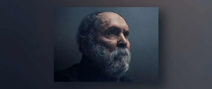
within Blender as well. For my class project, I recreated the scene
from the movie, The Pale Blue Eye. The main properties of
this lighting scheme were diffused blue lighting
and thick fog. If you liked this class, let other students know
by leaving a review. Your feedback really helps me understand what you found
most valuable in the class. You can easily leave a review by going to the Reviews tab, just below this video and clicking the Leave
a Review button. I really appreciate the support. After leaving a review, you might just want to follow me here on Skillshare as well. You can follow me
anytime by clicking the Follow button
above this video, or by going to my
teacher profile and clicking the
Follow button there. Following me is the best
way to get notified when I release a new class or make
an important announcement. Lastly, I want to thank you
all again so much for taking my class and supporting me by participating in
the class project. I can't wait to see what
you all come up with. Farewell, and I hope to see you again in
another class soon.
 Harry Helps, Professional 3d Artist